Category Archives: 2 Fox

Art by Joe Simon, Chapter 4, Footnote

FG pose 3 ed
Flash Gordon (7/3/38) by Alex Raymond

Stan Taylor has sent me some scans of panels from Flash Gordon done by Alex Raymond. Four of these have figures that so closely match work by Joe Simon as to leave no doubt that they were used as sources for swiping. I include one here because it is such a good example of Joe’s working method. For the cover of Blue Bolt #3 Joe made significant changes but we shall see later that he used this same figure again this time with only a little modification.

Please excuse the odd coloring on this image. Stan remarked to me about the similarity of the holster but his scan was a little dark for me to see it. So I did some Photoshop adjustments to make it clearer. But these adjustments brought out artifacts of the jpeg compression used. The original does not have all the odd rectangular color areas.

Art by Joe Simon, Chapter 4, Transition

Art by Joe Simon, Chapter 5, Side by Side

Art by Joe Simon, Chapter 4, Transition

Blue Bolt #1
Blue Bolt #1 (June 1940) “The Human Lightning Streak” by Joe Simon (signed)

Most of the work that Joe Simon penciled having cover dates from May to July of 1940 were the Fox covers discussed in the last chapter. But Joe was still a freelance artists and he did some work for other publishers. For Novelty Press, the same publisher as Target Comics, Joe created the titled feature of a new comic, Blue Bolt. For this Simon returned to the science fiction genre, but adds a superhero to the mix. Even though this story was done at the same time as the Fox covers, Joe does not try to imitate Lou Fine here. Nor is there any reason that he should since Fine never did any work for Novelty. However the work that Joe did on the Fox covers seemed to have some affect on his style, his lines seem lighter. The previous damsel in distress now reappears as the falling Green Sorceress. Either he is copying from Silver Streak #2 cover, or I was wrong and this form was not an altered version of the appearance in the Phantom Bullet and the cover of Wonderworld #13 but instead there is another source for the swipe. Either way Joe is still using swipes.

Blue Bolt #1
Blue Bolt #1 (June 1940) “The Human Lightning Streak” by Joe Simon (signed) (close-up of panel 4 on page 6)

Blue Bolt #1
Blue Bolt #1 (June 1940) “The Human Lightning Streak” by Joe Simon (signed)

Blue Bolt #3
Blue Bolt #3 (August 1940) by Joe Simon

Jack Kirby joined Joe on work for Blue Bolt after the first issue, I’ll be discussing that in the next chapter. This seems the best place to present the cover for Blue Bolt #3. Despite the appearance of the Blue Bolt character on the covers to #1 and #2, issue #3 is the first time Joe would provide the art for the cover. You can tell it is by Joe by the way the eyes are done, particularly in the smaller soldiers. Also the rock formations are similar to the ones Joe did for page 2 of Blue Bolt #1 (see above). As we seen before Simon likes to emphasize the importance of the hero by enlarging him. In this case he does this by using a low view point so that perspective provides the results he wants without looking unnatural. The cover is a close copy of a panel from the story. Greg Theakston (The Complete Jack Kirby, 1917 – 1940) has attributed that page to Jack Kirby, but I do not believe he is correct. I will include a scan of the page in my next chapter. Maybe by the time I write up that post I will have changed my mind.

Champion #8
Champion #8 (June 1940) by Joe Simon

The Champion Comics title was published by Irving Manheimer. Manheimer was the president of Publisher Distributing and as the name says it was a distribution company. Printers wanted to keep their presses busy so Irving also acted as a comic publisher. That helped to keep the printers active, gave PD more items to distribute, and provided Irving some profits from the comics themselves. Joe Simon drew the cover for one of Manheimer’s title, Champion Comics #8 (June 1940). Again although Joe made no attempt to mimic Lou Fine, this cover is very different from his previous ones. Inking is finer then Joe’s earlier covers but not nearly as fine as the Fox covers he was doing. Joe uses the brush more often with bolder markings. He also is more concerned with defining forms then before. Forms are suggested by rows of close or touching brush stokes, kind of like the reverse of a highlight.

Champion #8
Champion #8 (June 1940) by Joe Simon (close-up)

One new inking technique appears on the bottom of the background buildings. Small areas are covered by parallel lines. Nearby areas have similar lines but at a different angle. This provides a similar tone to the entire area while giving it a mottled looked. This technique appears on a few covers that Joe is associated with over the next year or so and then disappears and does not become part of the S&K shop inking. A similar inking was used on some of Al Avison’s work where it appears for a longer time. Did Al learned it from Joe and later Joe abandoned it? Or was this an Avison trait that indicates Al inked this cover? I lean toward the former explanation because the inking of this cover is pretty good. The Fox covers show that Simon had become an accomplished inker while the earliest efforts I have seen by Avison, done even later then this cover, are not all that impressive.

Science #4
Science #4 (May 1940) “Cosmic Carson” by Jack Kirby

In the last chapter I stated I felt that the Fox covers did not show any Kirby influence. On the other hand I feel Champion #8 does. For the first time on a Simon cover we find a hero’s punch being portrayed. The villain that received this hit is shown falling backwards. This type of action scene would become a Kirby trademark. The only problem with my suggestion is that I am not aware of Jack having drawn this sort of action up to the time this cover was made. Another Kirby-like feature is the futuristic ray gun that Joe has drawn. Just the last month Jack included a similar weapon in “Cosmic Carson”. Some have called Joe’s version a swipe, but I find it so done so differently that I feel Jack’s gun was more a source of inspiration then an actual swipe.

Champion #9
Champion #9 (July 1940) by Jack Kirby

When I first showed Joe my restorations of the covers for Champion #8 to #10, he said that he had not yet met Kirby and that he had done all of these covers. Carmine Infantino looked at Champion #10 and said that surely Jack had done it. When Joe looked again he agreed, but insisted that he (Joe) had done the other two. The hero’s more square face in Champion #9 does seems much closer to that depicted in #8 then that of #10. But the scene has more action then anything Joe had done before. Also as Greg Theakston has pointed out (The Complete Jack Kirby, 1917 – 1940) the hero is shown running with the sole of his foot turned toward the viewer. This is something Jack has already done in the Blue Beetle strip but has not yet shown up in any of Joe’s work to date. Because of these two facts I have to respectively disagree with Joe and attribute primary pencils of this cover to Kirby.

The inking of the cover is a good match to the work done on Champion #8. It even has an area with the mottled type of inking in a strip in the purple arch. The portal in the upper right is inked in the way Joe had picked up from Lou Fine leaving small irregular uninked areas. I therefore feel, as others have proposed, that this is the earliest Simon and Kirby work.

Champion #10
Champion #10 (August 1940) by Jack Kirby

Although previously I have made some comments about Joe Simon’s inking it was for art that I feel we can be pretty confident that Joe was doing his own inking. This series is really about Joe as a penciler. So why am I including a cover drawn by Jack Kirby? Well I believe it is important from time to time to show what Jack was doing as a comparison. Part of what this serial post is about is distinguishing Joe’s work from Jack. Besides which I do not think anyone is going to object showing some Kirby work, after all this is the Simon AND Kirby blog.

In my next chapter I will examine other work Joe Simon did in his newly formed partnership with Jack Kirby.

Art by Joe Simon, Chapter 3, Working for the Fox

Art by Joe Simon, Chapter 4, Footnote

Art by Joe Simon, Chapter 3, Working for the Fox

Fantastic Comics #7
Fantastic Comics #7 (June 1940) by Joe Simon (signed)

Originally Fox comics were produced by the Eisner-Iger shop, with Lou Fine doing many of the covers. But the owner Victor Fox apparently had little scruples and asked the shop to come up with a superhero based on the popular Superman. Out of this work came Wonderman. Superman was big money for the publisher DC, so it is not surprising that they took Fox to court over this imitation. Victor Fox’s initial strategy was to get Eisner-Iger to say they came up with the idea for Wonderman on their own. It may not seem surprising today, but times were tough then and it must have been difficult for Eisner-Iger to refuse to take the blame. But it may not have been just a moral stand for Eisner-Iger. Any lawsuit initiated by DC against their shop would almost certainly have driven them out of business regardless of the outcome. With the failure of Victor’s initial strategy, it would appear he did not have a very good replacement idea. Fox lost the court case on April 7, 1939. The Eisner-Iger’s Wonderman testimony lead quickly to a end of their business relationship with Fox. At least by December 2 when an ad appeared in the NY Times, Victor Fox was looking for artists to provide work for his comics. The above summary is largely based on an excellent history by Jon Berk first published in Comic Book Marketplace #107. Berk has further expanded it into a web version. It is a superb piece of scholarly writing that my summation just does not give justice to. I heartedly recommend a visit.

Science Comics #5
Science Comics #5 (June 1940) by Joe Simon

Joe Simon was one of the artists to answer Fox’s ads. But Joe got more then an artist position, he became the editor although on a freelance basis. This may seem surprising considering that Joe had not been in the comic book business for very long when he got this job. But then again the industry was still very young. One of the things Joe did as editor was to personally draw most covers. Previously many of the covers had been done by Lou Fine, the last cover by Fine would be Weird #2 (April 1940). Lou Fine did incredibly beautiful and exciting covers that certainly helped in the success of those comics. As editor Simon wanted that success to continue and so in the covers he created Joe copied Fine’s style. Simon did this so well that for years experts have been attributing some of Joe’s covers to Lou. In fact a recent volume of Lou Fine reprints includes a checklist that has some of the Simon covers listed as work by Fine. Fortunately Joe signed many of the covers, but the signature were small and easily overlooked. Actually once you start comparing these signed Simon covers with the rest, it really is not that difficult to pick out even the unsigned Simon covers. But the experts apparently were used to searching out Fine’s stylistic features without realizing that if they could see those features someone like Simon could also.

Fantastic #7 closeup
Fantastic #7 (June 1940) by Joe Simon (close-up)

One important thing Joe did for these covers was to adopt Fine’s use of a pen for intricate spotting. Joe did not abandon his use of a brush completely but when he did use a brush it was generally done in a much finer way. Joe copied from Fine the use of crosshatching. Now in areas that Simon wanted a shadow he might use crosshatching instead of flooding the area with black. But the pen lines in some this crosshatching were done without the aid of a ruler and the lines are not perfectly straight. The result is a crosshatching that I think of as a cheese cloth pattern. A good example is the shadow behind Samson from the Fantastic #7 cover. Note that in this example the shadow if rather abstract, it does not show a the same shape as Samson. Instead the shadow has wavy edge with an overall arch. Abstract arched shadows, without the wavy edge, would be a trademark of the S&K studio inking style in later years. Crosshatching an area would also show up in S&K inking later, but usually not so finely done. However the use of cheese cloth crosshatching appears to be limited to this time period.

Science #5 closeup
Science Comics #5 (June 1940) by Joe Simon (close-up)

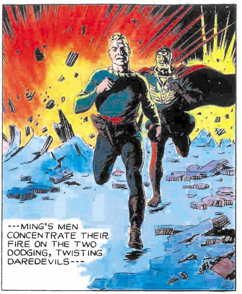
Joe begins to use a crosshatching technique I think of as picket fence. Two long lines following a similar path are intersected at a right angle with regularly spaced shorter lines. The arms of the villain in the Science #5 cover is a good example. Once again in later years we will find picket fence crosshatching done in a bolder manner as part of the S&K shop inking technique.

Science #5 closeup
Science Comics #5 (June 1940) by Joe Simon (close-up)

Another Fine procedure copied was a special way of inking shadowed areas. Instead of flooding the area completely with ink, Joe would irregularly crisscross the area with brush marks. When enough of this sort of brushing was done the end result would be an area mostly black but with small irregularly shaped areas without ink. When looking at just the line art this type of spotting can look rather sloppy. On the printed cover these areas are filled generally with blue or purple, occasionally with the ground color. This gives the shadowed area a texture that is really very effective. This spotting technique, and some variations of it, would be used in S&K inking for a number of years before eventually being abandoned.

Wonderworld #13
Wonderworld Comics #13 (May 1940) by Joe Simon (signed)

Some of the Simon Fox covers seem (at least to me) to be successful attempts at producing a Lou Fine-like composition. Wonderworld #13 is a good example. The monster looks like it could have been done by Fine. I do not know of any Fine cover that one could say Joe swiped this monster from. But Wonderworld #7 does have monsters that could have served as a template. Joe also seems to have added elements from his Silver Streak #2 cover, particularly the hands. As for the figure of the Flame, again I do not know of any particular source that Joe swiped, but I would not rule it out either. There are some covers not too dissimilar in pose that Joe might just have adapted. The whole ensemble is put together in a manner not unlike covers by Lou Fine.

Damsel in distress
Silver Streak #2, Daring Mystery #2, Wonderworld #13 all by Joe Simon (close-ups)

Look at the bottled female on Wonderworld #13 and compare her to the cover of the Silver Streak #2 and a panel from Phantom Bullet in Daring Mystery #2. Joe obviously like the source material as this is the third time he swiped it. But also notice that Joe is not at all adverse to making changes. Simon swipes seem to range from pretty close copies to the much altered.

Blue Beetle #2
Blue Beetle #2 (May 1940) by Joe Simon

Although Joe seemed to produce layouts that look like they could have been done by Lou Fine, he also did some with features I would not expect Fine to have used. In the cover for Blue Beetle #2 (above) Simon draws the hero much larger then the rest of the figures. This is not to be taken literally, no powers of growth are being suggested for the Blue Beetle. The use of size to indicate importance is not a technique used much in western art since the Renaissance. However it is a common in the art of many other cultures. I know of no example of Lou Fine doing this, but Joe would return to oversized representations of the hero from time to time.

Blue Beetle #3
Blue Beetle #3 (July 1940) by Joe Simon

Blue Beetle #3 exemplifies another feature that Simon would use but Fine probably would not, exaggerated, or in this case distorted, perspective. Joe preferred to show buildings not with their sides all parallel, but with sides going to some common vanish point. In most cases this was used when the view point was up high looking down. In that case Joe’s common vanish point provides an exaggerated perspective that gives a dramatic depth to the image. On the cover of Blue Beetle #3, the vanish point is below while the viewer is looking at the sides of the building. This results in an impossible perspective. I have no doubt that Joe was fully aware that this was inaccurate. Later we will see other examples of techniques Joe used that were not literally correct but provided pictorial interest. In the case of exaggerated perspective Joe is doing something very different then what Jack Kirby would do. Jack would put his figures in exaggerated perspective but seemed to have little interest in doing it to his buildings.

Fantastic #7 closeup
Fantastic #7 (June 1940) by Joe Simon (close-up)

Because Joe gives more detail in the Fox covers, some of the stylistic features seen in his prior work do not occur. However Joe still seems to be having trouble in drawing a woman’s long hair. He now provides more lines but he still has difficulty depicting curls. Generally on these covers Joe will indicate a curl with a crescent or circular outline. It is better then not indicating a curl at all but still gives the hair an unnatural appearance.

Joe only worked for Victor Fox a short time. Over a period of three months he did 16 covers (cover dates May to July). He probably left Funnies Inc when he began to work for Fox. But Joe still did some work during this period for other publishers, that will be examined in the next chapter. It was while Simon was at Fox that he first met Jack Kirby. Jack had done some small comic book features and was currently doing Blue Beetle syndication strips. Unfortunately Jack had not yet done any comic book covers. Nonetheless Kirby had developed into good artist. As far as I can detect, none of the work that Joe Simon did for Fox shows any Kirby influence. But Joe did seem to notice Jack’s talent and that will also be touched on in the next chapter.

Art by Joe Simon, Appendix 3, Daring Mystery Comics #3

Art by Joe Simon, Chapter 4, Transition

Enter Joe Simon, Pocket Comics #1

In his book “The Comic Book Makers” Joe Simon describes how his friend Al Harvey approached him to do a cover for Al’s new concept, a small sized comic book. Joe also tells how Harvey offered to make Joe a partner for $250. But Joe was then working on Captain America. At Timely he and Jack Kirby were supposed to get a share of the profits for this very popular comic. So Joe felt the safe thing decision was to stay at Timely and so turned Al down. It probably seemed at the time like a no brainer, but Simon would never saw much royalty money from Timely and would leave before the year was out. As for Harvey his new comic book concept would not last long but he still managed to build up a very successful comic publishing business.

Pocket Comics #1

Joe’s first effort for Harvey appeared on Pocket Comics #1 with cover date August 1941. This comic came out in the same month as Captain America #5. Jack Kirby was doing some great stuff at that time, but the true Simon & Kirby style had not yet emerged. The Pocket #1 cover was not in the Simon & Kirby style either, and in fact it does not show much in the way of influence from what Jack was doing. Here we get Joe doing Joe.

There are things about this cover which I find unfortunate. The field of stars gives me a claustrophobic feeling. But the biggest problem may not have been Joe’s fault as he said he was working from a mock-up. Nearly half the top is occuppied by the comic’s title. If that was not enough the left side has a list of the comic’s contents. This left little room for Joe to work, but he uses it well. Joe came up with a terrific design and he executed it well. The scene portrayed actually is not logical, but it works.

On the cover Simon provides a Satan that is a bit differant then that in the comic itself. This is not just due to the colorist’s use of yellow instead of the classic red. Instead Joe has turned to a cover he did for Fox, Wonderworld #13 (May 1940). For the Fox cover, Joe was trying to work in the style of Lou Fine. His success is shown by the fact that that cover was often attributed to Lou despite the presence of a Joe Simon signature.

Wonderworld #14

But there is also an even earlier version of Satan. That was the Claw as portrayed on Silver Streak #2 (January 1940). That, along with Keen Detective Funnies #14, were Joe’s first cover work. Simon gave the Claw more of a Frankenstein look in the face, but the hands are similar to both Wonderworld #13 and Pocket #1.

Silver Streak #2