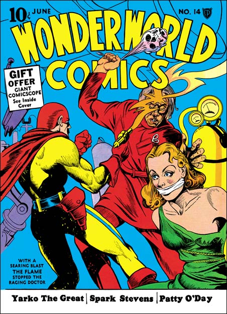
Wonderworld Comics #14 (June 1940) by Joe Simon (signed)
What makes a great comic book cover? Well many will say you need an artist capable of drawing realistic figures. Others desire intricate details and finely rendered lines. All that is well and good but for me what is needed more then anything else is a great story teller. You need someone like Joe Simon. As editor for Fox Comics Joe drew sixteen covers. Not a lot of covers but in my opinion if Joe had left comics then, never partnered with Jack Kirby, those sixteen covers alone would have entered him into the select group of the greatest golden age artists. As can be seen in the cover I am featuring for this post, Joe’s anatomy was often inaccurate. The Flame’s rib cage is much too short. Joe also had problems with form. The woman’s right bosom appears rather ample. That makes it surprising to find that even with the dress torn her left breast appears rather flat. A woman’s hair is also very important, at least for a comic cover from the 40’s. But Simon has problems in presenting curls and flowing hair. If that was all Joe had going for him this cover would have been a failure.
With a searing blast the Flame stopped the raging doctor
That is what the blurb in the lower left corner tells us. But who needs the blurb, the picture tells us all that and more. Because it is red, the villain’s clothing might not seem to belong in a laboratory. But look at the pair of scissors (or forceps?) in a pocket clearly designed for them. Obviously this is some sort of medical scientist. Mind you this is not a mild manner researcher. His gaze is intent on the woman. With one hand he reaches for her while with the other he swings a weapon. She maybe conscious at this moment but he intends that she will not be for long. And what a weapon our mad scientist has, a skull that he swings with (can that really be?) the former victim’s own hair (I bet you did not know that the hair is the last thing to detach from a decaying skull?). A skeptic might question what use would the scientist have for a beautiful woman. However anyone raising such an issue obviously is unaware that attractive young women have a long history of providing the essential ingredient for many nefarious elixirs. Hey, the eye of a newt may have been good enough for for a witch of yesteryear, but not for a modern scientific antagonist. Things would look bleak for our damsel in distress if not for the sudden appearance of the hero. Even if you are not familiar with the Flame, you can feel assured that whatever the hero has shot at his foe’s forehead has got to be effective. Once again the Flame has saved the day.
Rescuing a woman from a mad scientist was a common subject for Simon Fox covers. I have previously posted Fantastic #7 and Wonderworld #13. For WC #14 Joe has whittled the theme down to its bare essentials. The background is nothing more then a blue field. We are only provided with a few pieces of scientific apparatus to indicate that the action is taking place in a laboratory. Most of the objects have been given shades of purple. Therefore the apparatus blends with the blue background so as not to distract from the figures done largely in red, yellow and green. The only exception is the gas canister on the right which balances off nicely with the yellow of the Flame’s uniform on the left. Above, under the comics title are just the outline drawing of the gun’s flame and more equipment. This was really a smart compromise. If fully colored the upper drawing would have distracted from the title. However if the lines had been eliminated the top would have been much too plain. Joe may or man not have done the color guide, but if he did not as editor he likely have provided guidance. In any case the total design is well done.
I do not know much about the origin of the Flame. But the story inside shows him appearing out of fire such as from a criminal’s match. In a few months Simon and Kirby would create a character call the Vision for Timely. The Vision would appear out of smoke. What a surprising coincidence!

