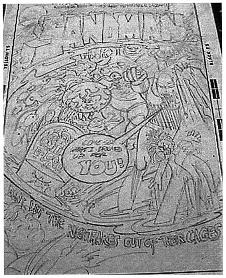
Sandman cover rough by Jerry Grandenetti
Some time ago I received an email from Kris Brownlow asking if I knew anything about a Sandman cover drawn by Jerry Grandenetti. Kris thought he remembered seeing it on eBay in the late 90’s. Unfortunately I knew nothing about the cover nor was Kris able to find anyone on various comic lists who knew anything either. When I asked Joe Simon he confirmed that Jerry was involved in the early stages of the Sandman proposal. That tantalizing state was were things remained until recently Kris stumbled on a printout that he had made, and forgotten, of the original eBay image. I would like to thank Kris not only for the scan of the printout he provided but also for his diligence in uncovering this fascinating piece of comic book history. I have done some Photoshop adjustments of the scan, but because it is a second generation copy of what was probably a poor scan to begin with, there was a limit to what I could do.
Both Kirby and Simon were working for DC in the early 70’s. Jack’s New Gods titles had not been as successful as hoped and DC had him doing other things such as Kamandi. Joe’s DC work was more on the lines of a creator, writer and editor. The art for Joe’s books was done by others, including Jerry Grandenetti. Since Joe’s titles would last only a few issues I would hazard a guess that his books were not big sellers. It must have seemed obvious to Carmine Infantino to try re-uniting the Simon and Kirby team. Perhaps with a bit of arm twisting, Carmine persuaded Jack. So after many years of working separately, Joe and Jack produced Sandman. The comic seemed to sell well enough but Kirby had his own personal goals which did not include turning back the clock to a long past working relationship. More issues of Sandman would follow and Jack would contribute covers and eventually some story art, but he would do so without Joe’s help.

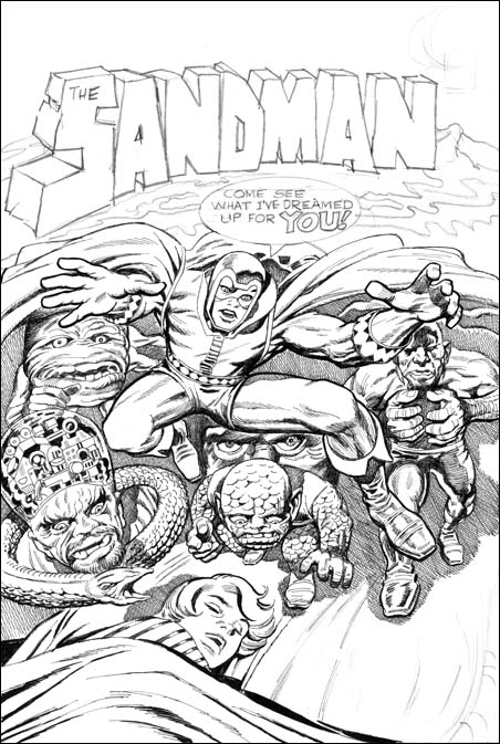
Unpublished Sandman cover, pencils by Jack Kirby and inks by Joe Simon.
Joe Simon inked a version of the Sandman cover drawn by Jack Kirby. Perhaps because of Joe’s use of crosshatching (which DC staff derogatorily called hay) or because of the liberties that Joe took (such as rounding off of finger tips), this cover was never published. But it does stand as an intermediate state between Jerry’s version and the final published cover. Kirby must have seen Jerry’s rough, or perhaps some other intermediate layout that we do not know about, because Jack keeps a couple figures. Most notable is the machine headed guy on the left in both versions. The pose of the legs of a scaling demon on the second state is similar to a larger figure higher up on the page in Jerry’s sketch. Jerry had a number of serpents on the left side which was reduced to a single one in the Kirby/Simon cover.
The above similarities were unchanged in the final published state. But there are other features shared between the Grandenetti and the Kirby/Simon versions that did not survive to the final cover. Both have the Sandman logo looking like it was made of stone. The logo in both sits on what looks like a swirling river. This river sweeps down from the right to the left but in Jerry’s rough, though not the Kirby/Simon art, the river turns back in to form part of the divide between the nightmare world and the sleeping boy. Both early states seem to have a mountain formation the immediate right of the end of the logo.
On the Grandenetti version the Sandman declares:
Come see what I dreamed up for you!
This was modified slightly for the Kirby/Simon art:
Come See what I’ve dreamed up for you!
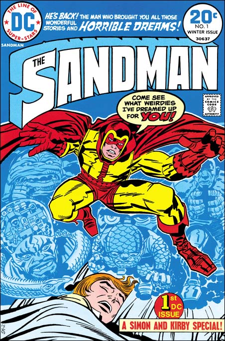
The text was again altered slightly in the published cover to:
Come see what weirdies I’ve dreamed up for you!
Other features are only found in the initial Grandenetti state. Such as the text that also separates the nightmare scene from the sleeping boy. Or the hand raising up from the river holding a doll. There are other figures but with the poor quality of the scan of Grandenetti’s drawing it is hard to make out what some of them represent. The most dramatic change was made to the Sandman. In Jerry’s rough the Sandman is easy to overlook standing on the right among all the chaos. With the second state the hero becomes front and center with the exaggerated perspective that Kirby so favored.

Sandman #1 (Winter 1974) art by Jack Kirby
Except for the inking, the published cover is not very different from the rejected Kirby/Simon version. The rock formation logo has been replaced with a more modern and sleek version, but otherwise keeps the overall form. The flowing water and mountain have been completely eliminated.
Since we have three versions of the Sandman cover, are there more? Joe’s collection includes two copies of the Kirby/Simon state. These copies do not differ significantly in layout from the second state and I believe they were actually made years later. The published comic has a job number of SK-2 so what was SK-1? Very likely SK-1 was the Kirby/Simon version. I have seen on a couple occasions the original art of another Sandman cover rough purportedly done by Joe Simon. On that example the drawing is very amateurish and was certainly not done by Joe. Who knows, maybe there are more Sandman covers out there?

