Category Archives: Topic

The Black Rider Rides Again, Again

Gunsmoke Western #51
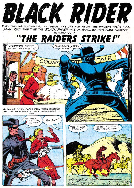
Gunsmode Western #51 (march 1959) “The Raiders Strike” page 1 art by Jack Kirby

I recently posted on the Black Rider Rides Again #1 that Jack Kirby did for Atlas prior to the Implosion. I find this period fascinating because the work Jack did seems a mixture of material that he had a good deal of creative control and others which he did not. Jack’s efforts after the Implosion seem to me to decidedly fall in the latter category. Tom Lammers in his “Tales of the Implosion” discusses job numbers and the existence of an inventory of pre-Implosion work that was published after the Implosion. Among these are work with a job number starting with an “M”. This would include “The Raiders Strike” from Gunsmoke Western #51 (March 1959). Actually job numbers are not the only reason to believe that this story was pre-Implosion. Three Black Rider stories were published after the Implosion as back-up features. This is just the right number for a Black Rider Rides Again #2 but that title and did not survive the Implosion.

“The Raiders Strike” is very much like the older Black Rider stories. A gang of thieves rob the receipts from a county fair. The Black Rider is present and manages to wound one, but is without his horse so he cannot follow. Still he vows to recover the money. Resuming his secret identity as the local doctor he frets that since he has no lead he will be unable to fulfill his promise. Some of the thieves arrive and take the doctor at gun point to treat their wounded partner. The doctor is hit after he performs his services. When he recovers he pursues the gang as the Black Rider. He catches up with the thieves and of course recovers the money.

This is a repeated plot with the Black Rider wounding a villain, the doctor tending the wounds, followed by the Black Rider saving the day. In my opinion, the writing style does not sound like Kirby did it. That Jack probably was not the writer is not too surprising. I did not believe he was the scripter for the earlier stories either.

The big difference between this and the earlier Black Rider stories is that Kirby was not the inker. This inker provides a more detailed and realistic inking then Jack’s. Unfortunately I find it a poor marriage between the pencils and inks. Jack drew this Western and “No Man Can Outdraw Him” with a elongated figure style. This seemed quite interesting to me when inked by Jack’s more abstract Austere Style (the subject of a current serial post). This story’s more realistic inking sometimes makes the figures come off rather freakish looking. Still the inker was sensitive to many of Kirby’s nuances and he does not overwhelm the pencils.

Jack Kirby’s Austere Inking, Chapter 1, Introduction

Most of the work by Jack Kirby that people admire they only know second hand. They know Kirby inked by Dick Ayers, or Kirby inked by Joe Sinnott, or Kirby inked by Mike Royer, and so on. By its very nature this means we are seeing various artists’ interpretations of Kirby’s pencils. Even in his late years when Jack pencil’s provided indications of how the spotting should be done and inkers tried to be faithful to the pencils, it is still an inker’s interpretation. This is the state of affairs during Jack’s more recent career when he did extremely little inking.

Earlier, during the Simon and Kirby years, things were very different. Most, if not all, of the S&K studio artists inked their own work. The inking style for each artist seem unique and consistent. Most did not produce enough output to support heavy use of assistants. Mort Meskin was more prolific so perhaps he was an exception. However for Jack Kirby we have some eye witnesses such as Martin Thall who have reported group inking sessions at the S&K studio. Examinations of the finished product adds support to this because often different hands seem involved. However other observers such as Carmine Infantino have reported Kirby providing the final inking touches to his own work. Who inked what is often the subject of contentious debate since the comics do not provide credits and comic book experts rarely provide explanations for their attributions. Someday I may wade in with my own inking attributions, and even explain why, but this is not that day.

After the breakup of the S&K Studio Jack began to do freelance work. We find Kirby work published by DC, Atlas and Prize. Among the early freelance period I see some consistencies in the inking that indicate one hand at work, I think we can rule out Joe Simon since there is no evidence that he ever did any work at this time for DC or Atlas. Further the style is dissimilar to the inking found on some of Simon’s own work of the period. Nor does the inking style match that by artists who in the past did work for S&K such as Mort Meskin, Bill Draut or Marvin Stein. The spotting is done with enough talent that I think we can rule out some new, unknown inker. Besides which although at times Jack might have been doing enough penciling to support an inking assistant this changed. Kirby began to supply DC and Atlas with just penciled art with the publisher assigning the inking to others. After that this inking style only appears in Prize’s Young Romance and that was not enough work for Jack to support any inking help. My conclusion is that this inking style was Kirby doing his own inking. As such it provides a rare opportunity to see Kirby first hand.

I have mentioned this inking style previously. Once when I was discussing the break up of Simon and Kirby. Again more recently when I posted on The Black Rider Rides Again. I think it might be interesting to examine the evolution of this inking style. To do so I needed to give it some sort of designation. I thought of referring to it as Kirby’s late inking style but I suspect that is too confusing. The inking may be late in his inking career since it was the last style that Jack used while he still commonly had a hand in inking his own work. But Kirby had a long career and using a term such as “late” to describe a period that ended in 1959 just seems inappropriate. So I am going to call it Kirby’s Austere Style of inking because of its typical lack of embellishments.

To understand the development of the Austere Style is really helps to go back to what it evolved from. I think the best place to start is toward the end of the Simon and Kirby studio. But like an old adage, to tell that story I have to tell another story. I need to describe how inking of Kirby pencils was done in the S&K studio. This is a very different topic from who did the inking.

Pages of S&K art went through distinct stages. These stages are known because sometimes comics book titles were unexpectedly cancelled. When this happened work on future issues was already in progress. Work on any of these cancelled titles would immediately stopped no matter what stage it was in. Sometimes the art could be salvaged for other projects, but not always. Not a lot of these unfinished pages survived but what has tells a consistent story.

The first stage was, of course, the penciling. This included rough placement for the work balloons and captions. Some covers in this stage have been published in The Jack Kirby Collector. But the rough placing of balloons can be observed even when a page has advanced to further stages because it often was not completely erased.

Unpublished Boy Explorers
Boys Explorers (unpublished) art by Jack Kirby

Next the lettering was done along with inking of the word balloons and the panel borders. It is in this stage that most unfinished pages are found and it is the stage that I can provide an image. Note that Kirby’s pencils are still uninked. Jack’s drawing is pretty tight but he does not shown any indication of how blacks are to be arranged. Outlines are provided and the folds of the clothing is indicated by simple lines. On one hand the inker was given clear indications of where ink lines should be applied. On the other hand application of black areas, what is called spotting, was completely left up to the inker.

Unpublished Boy Explorers
Boys Explorers (unpublished) art by Jack Kirby

For the third stage line inking was done. Since for the most part Kirby’s pencils were tight this required little more then the ability to carefully follow Jack’s lines. This meant that finesse with the inking pen or brush was more important then artistic ability. I suspect that often the outline inking was done by studio assistants and after the studio breakup even by Kirby’s wife Roz. Sometimes there seems to have been no real attempt to adjust the width of the inked lines. In the example I provide above it is almost as if the outlines were made by bending wire. If the outline required any emphasis it could be introduced in the next stage. We shall see in the next chapter that a more artistic inking of the outlines would sometimes be done.

The final stage, known as spotting, supplied the blacks to the image. As remarked above there really was nothing in the pencils to indicate how this should be done. For good results a talented inker would be required. But it is a simplification to call this one stage. Particular spotting chores, such as foliage or backgrounds, could be assigned to different artists. However there did not seem to be any fixed procedure for how or by whom this was done. Jack, Joe or both could do the final touch ups.

S&K studio inking was a different thing altogether then how inking was handled in the Silver Age and beyond. Then the penciler’s work was handed over to another artist who would provide all the inking. Under such a system it makes sense to say a particular piece was drawn by Jack Kirby and inked by say Dick Ayers. Unfortunately people apply the same terminology to Simon and Kirby art. When they say a Kirby piece was inked by say Joe Simon what do they really mean? That the Joe did all the work, both outline and spotting? Or that he did just the spotting? Or could it be that Joe’s did some spotting along with others? Generally I try to be specific about what type of inking I am talking about.

Jack Kirby’s Austere Inking, Chapter 2, Mainline
Jack Kirby’s Austere Inking, Chapter 3, A Lot of Romance
Jack Kirby’s Austere Inking, Chapter 4, Prize Covers
Jack Kirby’s Austere Inking, Chapter 5, Harvey
Jack Kirby’s Austere Inking, Chapter 6, Atlas
Jack Kirby’s Austere Inking, Chapter 7, DC
Jack Kirby’s Austere Inking, Chapter 8, More Harvey
Jack Kirby’s Austere Inking, Chapter 9, More Prize
Jack Kirby’s Austere Inking, A Checklist and a Glossary

other post with Kirby inking Kirby:

Strange Tale Indeed
Battleground, Jack Kirby’s Return to Atlas
Captain 3D

Battle Kirby

Recently I posted in some details on Foxhole, Simon and Kirby’s own war comic book. I thought it might be fun to examine some of the work in this genre that Kirby did later in his career. In this post I will look at a couple of stories from Battle, an Atlas title.

Kirby’s work for Atlas as a freelancer was interrupted by the Implosion. Thomas G. Lammers has a marvelous paper called “Tales of the Implosion”. I use the self published version (if you are interested in getting your own copy email Tom at tlammers@new.rr.com). Tom points out that some of the work after the Implosion was from a sort of inventory. He indicates that for Battle new work started to appear with issue #62 (February 1959). By the time Kirby work appears in Battle #67 (December) the comic is produced entirely from new material. The job numbers allow us to distinguish newly produced work from pre-Implosion inventory. All the Kirby battle stories have job numbers starting with T which allows us to say that they are all post-Implosion creations.

Battle #65
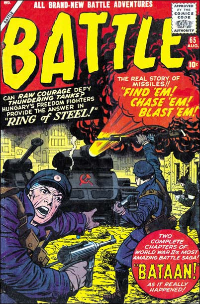
Battle #65 (August 1959) cover by Jack Kirby

Although Kirby may not have had as much control over his work for Atlas after the Implosion, at least he started to produce covers. The covers that Jack did for Atlas/Marvel varied greatly in quality. Some of that variation is of course due to Jack himself. However for me most of it is due to the various inkers used. Some were more sensitive to Kirby’s pencils, others tended to overwhelm them. Cover layouts for Jack’s Atlas/Marvel period are generally quite different then produced under the Simon and Kirby collaboration. The questions is was this new look really Kirby’s or could it have been due to his working from someone else’s layouts?

I am not going to try to provide a blanket answer. Jack would do a lot of covers for Atlas/Marvel and I suspect the answer to who was responsible for the layouts may have varied. Instead I will focus on the covers Jack did for Battle and use issue #65 as an example. Note the fighter on our left and how he seems to be looking out of the page calling for reinforcements. This is a device that Jack used earlier in his career when depicting combat. Now at the time the combat included superheroes or kid gangs but the general concept was the same. An example of this compositional technique is Champ #23 (October 1942). This is an effective device as it acts to place the viewer as part of the action. Sometimes this can be a bit paradoxical as Jack would sometimes portray a foe as the caller which would place the viewer as one of the enemies. This device was later abandoned by Simon and Kirby. Now part of this can be explained as due to WWII being over. But when S&K produced Foxhole Jack penciled all the covers and he never returned to using the calling figure.

Not only does Battle #65 use this calling soldier device, but it also shows up on issues #66 and #67. When we look at earlier Battle covers although we find soldiers looking out toward the viewer none of them are calling out. Therefore I would suggests that this figure was Kirby’s. On all the Battle covers that use this calling figure it plays an important part of the total composition. I consider it a good indication that Kirby is responsible for these layouts.

It is interesting to observe that once more Jack has turned to using a technique from early in his career. We previously observed circular panels and figures extending past panel borders. Those two techniques resurfaced in Challengers of the Unknown, The Yellow Claw and the Black Rider Rides Again. However in those cases the technique would be dropped after a short period of use, perhaps because the publishers felt it was too old fashion. This fate did not happen to the calling figure device. Jack would not use it frequently but he would occasionally use it throughout his career. The goofy Captain America #197 (May 1976) is a good example.

Battle #65
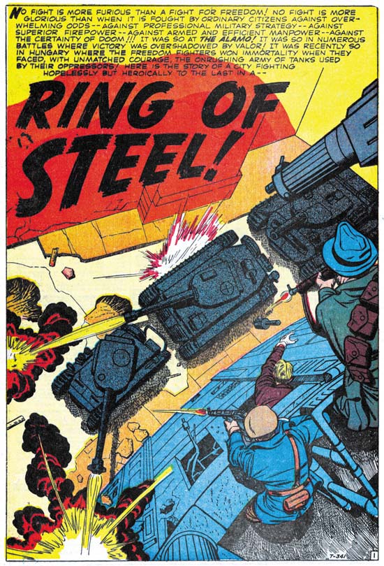
Battle #65 (August 1959) “Ring of Steel” art by Jack Kirby

1959 found the U.S. in the grips of the Cold War. The Hungarian Revolt had occurred less then three years before. “Ring of Steel” does not include the start of the rebellion, when a student protest escalated to the point that the Communist government in Hungary was deposed and the Russians expelled. Instead the comic story begins with the reports of Russian tanks grouping outside the city. When the Russians enter the city the citizens fight desperately to keep their freedom. Of course in the end they are defeated by the overwhelming force sent against them.

I was rather young when the Hungarian Revolt toke place. and was raised during the height of the Cold War. My father’s side of my family was Polish with relatives still living under the Communist regime. With my background it is not at all surprising how moving I find “Ring of Steel”. Still even an inspiring story needs a good writer to be truly effective. I feel the author of “Ring of Steel” did an excellent job. For example page four has three rows of panels with two or three panels per row. Each row starts with how the patriots would fight the Russians. Each row would then end with the unfortunate results of those attempts. The same caption is used on the last panel of all the rows, “… against hopeless odds”. Very good scripting. I wish I could credit Jack Kirby with this writing. Frankly it just does not read like his work to me. Particularly things like page four sound more like something from a writer then a visual artist.

A good comic book story needs more then just good writing. It requires great art as well. Of course with Jack Kirby as the artist, the great art in the story is not much of a surprise. I do not know the inker, Silver Age inkers are not an area that I am knowledgeable about. I can say that Jack did not ink this job himself. Whoever the inker was he did a good job. He did not attempt to “correct” Kirby’s pencil nor did he overpower them.

I want to take particular note about the splash page whose image I provide above. Jack was famous for his use of exaggerated perspectives. Still there is something unusual about this splash. In “The Comic Book Makers” Joe Simon describes the proper way to create art for 3D comics. Joe’s prescription is that the art should project out to the user, not into the page. Well Jack generally followed that rule not just for 3D art but whenever he used his special perspective. Early in his career Kirby did not follow that procedure, he developed it as he gained experience. For this splash he completely disregards this canon, but with good reason. The perspective directs us from the freedom fighters with their small arms down to the object of their assault, the massive power of the Russian tanks. In doing so Jack not only condenses all the action into a tightly knitted scene, but also makes the viewer feel as if he is participating in the fight. Kirby’s cover on the same theme (see image above), wonderful though it is, pales by comparison to the splash. What a masterpiece.

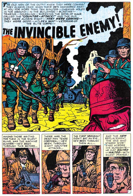
Battle #67
Battle #67 (December 1959) “The Invincible Enemy” art by Jack Kirby

The main character of “The Invincible Enemy” is a new replacement, but some other battle hardened soldiers play secondary roles. They are part of a force trying to hold a town from some elite German forces. The replacement is clearly frightened and when the German counter attack begins he initially freezes up. Prompted by his sergeant he then joins the fray but it is the more experienced fighters that take the lead. One by one these fighters succumb to the Nazi onslaught. The replacement is suddenly filled with fury and becomes a one man assault team. He not only overcomes the German soldiers that attach him, but also takes out a tank. By the time his fury is extinguished, the fight is over and the German counter attach has failed.

This story reminded me a lot of “The Replacement” from Foxhole #2 (December 1954) drawn by Bill Draut. Both concerned an inexperienced replacement and an intense German attack. There are important differences between the two. The replacement is really the only character for the Foxhole story. We are shown some of the “veterans” but none of them stand out or take any significant part of the story. While in the Battle story there are three other soldiers that are unidentified and play a part in the tale. Draut’s replacement fights heroically but you never get the impression that he is any different from the other soldiers in his unit. With Kirby the rest of the unit is defeated while the replacement becomes a sort of super-soldier. In some ways “The Invincible Enemy” is “The Replacement” on steroids. Having said all this, for me it really is not a case of one story being better then the other. Each has their own theme and flavor and I think both are superb works of comic book art. Jack Kirby was a better artist, but Bill Draut’s efforts should not be dismissed.

Jack has once more supplied excellent art. Again Kirby is not inking his own work. After the Atlas Implosion and outside of the late Prize romances, Kirby inking Kirby would be very rare occurrences. Here the inker does a great job and does not overwhelm Jack’s pencils.

You can tell that Kirby and the writer are making great efforts to provide high impact while skirting the Comic Code. The best example of this it the fate of the machine gunner. At the start of the fight we see a German soldier throw a grenade. In the next panel The caption accompanying the violent explosion says that the machine gunner was driven back to another position. But in the following panel we see the German soldiers storming into opening. At their feet on one side are the upturned legs of the machine gun while on the other side a pair of boots are visible and they show that the gunner is face down. Clearly indicating the machine gunners new position actual is. Despite the fierce fighting this is the only death depicted.

Jack did other work for the Battle. The two stories that I discuss here are my favorite, but by no means do I denigrate his other work for this title. All of them are great examples of what Kirby could do. As for the other artists whose creations appear in Battle, well they really are outside of the focus of this blog since they never worked for Simon and Kirby. Still there is some worth while stories here besides those by Kirby. Marvel has been reprinting some of their older material. This effort has largely been focus on their superheroes. But a few volume of their “monster” and western comics have been reprinted. Perhaps, just maybe, someday Battle might be reprinted. I think it would be worth it. Hey a fellow can dream can’t he?

The Black Rider, Another Early Westerns by Jack Kirby

Black Rider Rides Again #1
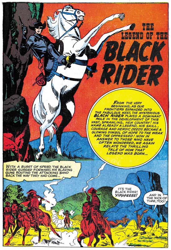
Black Rider Rides Again #1 (September 1957) “The Legend of the Black Rider” page 1 art by Jack Kirby

The Black Rider was a western costume hero along the lines of the Lone Ranger. Apparently his first appearance was All Winners Western #2 (Winter 1948). Black Rider Rides Again #1 reintroduces the hero after a lengthy hiatus. Therefore the first story provides information about his origin. We learn that as a very young man our hero’s family was killed by an outlaw. When he was older he tracked down the outlaw and killed him in a gunfight. At his trial he threw himself on the mercy of the court, which gave him probation. The judge then helped him to become a doctor. Doc started his profession during a dispute between some ranchers and rustlers. Doc refuses to help, saying he is not a fighting man. In the end he finds he cannot ignore what is happening, so he puts on a black suit and a mask and saves the day.

The origin story told in the legend has many similarities to that of Bulls-eye, a Simon and Kirby creation. In both the hero’s family is massacred, the hero becomes phenomenal with a gun, maintains a secret identity that projects a unheroic personality, and adopts a mask when performing his heroic exploits. The first appearance of the Black Mask was in 1948, very much earlier then that of Bulls-eye in 1954. However the origin of Black Mask as described by Jess Nevins at A Guide to Marvel’s Pre-FF #1 Heroes sounds like it might be a little different. There is no mention of the death of Black Rider’s family. The circumstances involving the shootout that gets the young hero before a court are vague with no mention of a revenge killing. It sounds that the Black Rider may have been retconned slightly in this relauch attempt.
Black Rider Rides Again #1
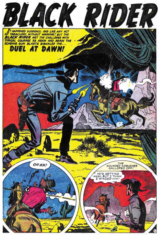
Black Rider Rides Again #1 (September 1957) “Duel At Dawn” page 1 art by Jack Kirby

We enter the story as the Black Rider responds to an ambush attempt. He manages to wound the attacker but did not get a chance to identify him. Back home and back to being a doctor, a man comes in with a wound from a accident with barbed wire. Or so he says, the Doc recognizes it as a bullet wound. Later the Black Rider visits the man who under questioning admitted to having been offered money to ambush him. Before the man was able to say who offered the money, he is shoot. Once again our hero takes on the role as the Doc and saves the man’s life. Now the man will not say who is responsible. While recovering his assailant returns to finish the job, but of course the Black Rider saves the day.
Black Rider Rides Again #1
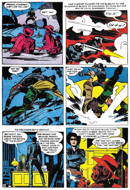
Black Rider Rides Again #1 (September 1957) “Treachery At Hangman’s Bridge” page 6 art by Jack Kirby

The midnight stage coach gets blown up but the Black Rider is nearby and arrives quickly. But not soon enough because he hears The thieves departing. Our hero changes his identity to become the Doc in order the help the wounded. The sheriff finds some men in the area but no sign of the stolen gold so he has to let them go. Doc keeps his eye on them and follows one who purchased supplies. Another change and the Black Rider surprises the thieves as the attempt to recover the stolen gold from the river.

These are not bad stories, but somehow I really cannot get that enthusiastic about them. The Black Rider is a little too successful. When he arrives he saves the day with no real effort. It is never quite clear why the Black Rider must hide his real identify. The rancher’s beautiful daughter’s interest in the Black Rider but not the Doc is a little too contrived. While Jack may have had something to do with retconned origin, on a whole I do not find many convincing Kirby-isms. If Jack was involve with the writing, his more personal touches were edited out.

The art is rather nice with lots of fist fights, blazing guns, galloping horses, and exaggerated perspectives. Just the sort of things that you would expect from a Kirby western. Maybe it is mostly the inking, which I will discuss below, but this comic has more of a Simon and Kirby look then a Lee and Kirby one. Still no matter what your favorite Kirby period was, it is hard to imagine that you will not find something to appreciate in the art. There are also some interesting aspects to the panel layouts. Often figures extend beyond the panel edges. That sort of technique was more commonly used during the earlier days of Simon and Kirby most noticeably in the Captain America stories. But it was used much more sparingly if at all towards the end of the S&K collaboration. Another trait from Black Rider that was frequently used early on but abandoned later is the use of round panels. Interestingly circular panels also occur some of the initial Challengers of the Unknown stories done several months before.

Most of the inking is very much like what we found previously in “No Man Could Outdraw Him”. There generally is no crosshatching, spotting is more limited giving the art a light look, but when black is introduced it generally is produced by flooding an area with ink. In some ways it is very reminiscent of S&K shop style inking. In particular the way that black areas are used in the overall design. Conversely the lack of crosshatching is very unlike the S&K shop style of inking. As I said before I believe Jack developed this austere style of inking after the Simon and Kirby studio had disbanded. It allowed Jack to ink more quickly yet still provide a beautiful and effective job.

Although most of the inking appears to have been done by Jack himself, there are parts that look different. Some areas have been spotted using closely spaced lines, sometimes laid down using a straight edge other times by free hand. Generally the lines are roughly parallel, but occasionally there are some areas of true crosshatching. These lines appear to have been done using a pen, while most of the Kirby inking seems to have been done with a brush.

The splash page for “Duel At Dawn” (see above) provides some good examples of what I am talking about. Most of the inking is the severe style that I attribute to Kirby. But take a look at the mountain in the left part of the right story panel. The lines seem weak and the mountain seems mushy. Not only does it not look like Kirby’s work but the mountain itself seems to detract from the art. The line spotting of the mountains in the splash panel itself seem different and look more like Kirby’s hand. But most of the fine line inking in this book look like the panel version.
Black Rider Rides Again #1
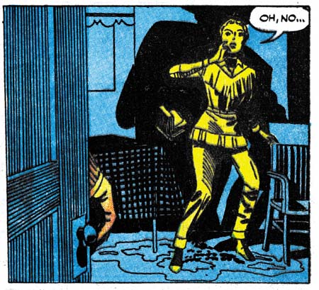
Black Rider Rides Again #1 (September 1957) “Duel At Dawn” page 5 panel 4 art by Jack Kirby

Above I give an example of the use of ruled lines for spotting. For me this use is less objectionable then things like in the hills because it does not change the overall design. But it still seems unnecessary. I believe that this fine pen inking not only was not by Jack, but it was not done under his direction either. I suspect that it was added after the art was delivered to Atlas.

In the past I have remarked that Jack seemed to have a good level of control of the work that he did for pre-Implosion Atlas. But that does not seem to be the case for Black Rider Rides Again #1. If Jack had been involved in the writing, it has been strongly edited. The pencil work is all Jack but the inking is not.
Black Rider Rides Again #1
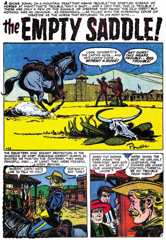
Black Rider Rides Again #1 (September 1957) “The Empty Saddle” page 1 art by Bob Powell

Besides the Kirby Black Rider stories, this comic also includes a short non-Black Rider story drawn by Bob Powell. Now Powell was a very prolific artist and I have only seen a small fraction of his work. I know it is not what he is famous for, but he did some gorgeous art for various Harvey romances. Everything I have seen by him has always impressed me. That is up to now. I got to say I really do not care for the art done in this particular story. Still it is a nice splash panel.
Black Rider Rides Again #1
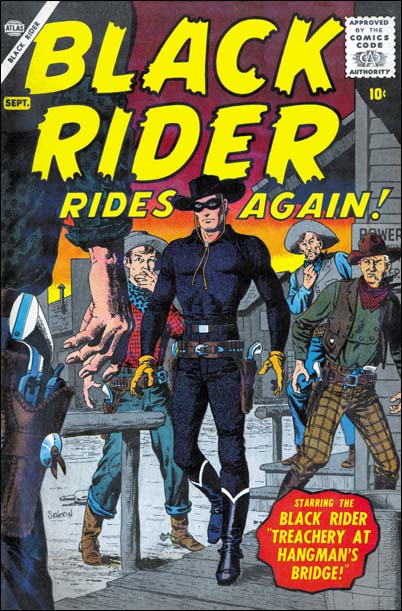
Black Rider Rides Again #1 (September 1957) cover art by John Severin

Jack Kirby only did a small amount of work for Atlas prior to the Implosion, my database shows 20 stories. What Jack did not do was any covers. I find it surprising that even though Kirby would do all the main stories for Yellow Claw and Black Rider Rides Again, someone else would do the covers. For Black Rider it was John Severin. I guess I really am supposed to say what a fine artist John was. But in all honesty I find most of what he did in this period rather dry. For me this cover is one of his better efforts.
A Simon and Kirby Screen Play

Joe Simon has a large collection of original art, proofs and published work. Among it are a number of unusual pieces of work. Perhaps the most unusual, and certainly for me the most unexpected, is a screen play called “Fish In A Barrel”. When I asked Joe about it he said it was done about 1955. He added that it had already been included in his book. I was a bit puzzled because I did not remember any screen play in the book. Well I looked at a copy of “The Comic Book Makers” and with his help found what he was talking about. It was a write up on the Simon and Kirby legal conflict with Feature Publications. Now the book version is a historical account, not a screen play. I will discuss the relationship between the play and the book later.

“Fish In A Barrel” is a script for a three act screen play. It is 77 single sided pages long with the text in a column on the left half of the page. I presume the right hand side of the page was left empty to allow for hand writing of notes and alterations. I call this a screen play because camera directions are often provided. Although a screen play it was meant to be performed in front of spectators since at one point there is a note about spontaneous laughter from the audience. There are three sets all of which are in offices or in the hallway entrance to the offices.

It has a small casts of characters, six main ones. There is the comic book publisher, powerful and used to getting his way. The publisher’s assistant, eager to please his boss. The publisher’s lawyer, trying to keep conflicts to a minimum while still negotiating an agreement favorable for his client. On the other side are the comic book artist, trying to regain his financial security. The artist’s accountant, shrewd and manipulating. The artist’s lawyer, at turns succumbing to the allure provided by the publisher’s big time lawyer, and at other times following the accountant’s directions. The artist’s wife, afraid for her family’s future, plays a smaller part. A receptionist also makes a short appearance.

The plot concerns an out of court negotiation attempting to resolve questions about royalty fees. The artist had formerly worked for the publisher for whom he had created the popular comic, “Bulls-eye, the Sharpshooter”. While working for the publisher the artist received royalties but these stopped when he left to start his own publishing company. the new company has failed and now he was attempting to get the unpaid royalty payments, and if possible to get his old job back. The dominant force on the one side is of course the publisher. The equivalent power on the other side is not the artist, but the accountant.

Now this all my sound rather dry but actually it is a fascinating story. Each character is given their own personality and part to play in the story’s development. Well maybe the part provided by the receptionist is not that important, but although the wife plays a small part it is a significant one nonetheless. The plot is not all so straight forward either, as the accountant uses a rather interesting ploy. I am really not that knowledgeable about drama, particularly when just the script is available. But it does seem to me that this really was well done and thoroughly enjoyable.

I had no idea what to expect when I started to read “Fish In A Barrel”. As my reading progressed I came to realize that it seemed written for a type of television programming that no longer exists. When I was very young there were TV shows that provided what were essentially plays filmed live for TV with but also before a small audience. Although I was too young to fully appreciate them, these shows were truly exceptional. There was some writing on the first page of the script. I did not make it out at first, but when I finished reading the play I realized that what it said: Alcoa, Kraft, Studio One. There were the names of the better of the shows I am talking about.

As I said in the beginning, “The Comic Book Makers” included a description about a legal disagreement between Simon and Kirby and Feature Publications. The chapter was actually entitled “Fish In A Barrel”. It is easy to see the parallelisms between the play and the actual events described in the book.

  1. A conflict about fees owed.
  2. The artist(s) had started their own publishing company which in the end had failed.
  3. A comic named Bulls-eye about a sharpshooter.
  4. A similar cast of characters (with the exception that the real Simon and Kirby are replaced by a single artist in the screen play). There is a publisher, business manager, a lawyer for each side, an accountant and the artist(s).
  5. The accountant played a leading role in reaching a settlement.

However there are differences between the book versions of events and the screen play.

  1. Simon and Kirby had not stopped working for the Features (the publisher) while they started and ran Mainline, their own publishing company.
  2. In the book the conflict started about reusing of art by Simon and Kirby and concluded with the revenues that Features received that had not been shared with Simon and Kirby.
  3. Simon and Kirby’s accountant discovered the money owed by close examination of Feature’s books. In the play the accountant employed a trick to disclose the publisher’s improper dealings.
  4. The real life publisher could not pay the complete money owed to Simon and Kirby. In the play the publisher had no problem absorbing a substantial payment.

Therefore although the play was inspired by real events, it was still fiction. Wherever the screen play deviates from actual history it did so to make a better story.

With A Little Help From My Friends

I admit it, when I post about the work that Jack Kirby did after the breakup of the S&K studio I am getting into an area that I really do not have a lot of expertise. But what Jack did during S&K is important to understanding what he afterwards, and visa versa. Further I really feel I have something to contribute in areas such as Kirby’s style of inking his own work. However when it comes to things like DC editors, artists and inkers I am really at a loss. Fortunately I had a couple commenters provide some useful information to a recent post of mine.

I did not respond to Nick Caputo in the comments but I did email him offline to ask him to review the entire Kirby story in All-Star Western #99. When Nick did so this is what he had to say:

I took a look at the All Star Western story and, comparing it to the other stories in that issue which I believe Giella inked (“The Double Life of Sherrif Trigger, pencilled by Carmine Infantino and “Duel of the Twin Indians” penciller unknown, as well as the cover pencilled by Gil Kane) I would credit the majority, if not entire, Kirby story to Frank Giacoia inking. Giacoia has a sharper line than Giella and his faces are more defined. There is also some different techniques used on figures and backgrounds (for instance, the lines on the rocks on page 5, panel 2). While it’s possible that Giella did some background work in places, I see more Giacoia here than Giella.

Bob H. also felt that Giocoia was the inker for this story. But he also added an interesting observation:

… given that it was the only story Kirby did for Julius Schwartz’s editorial stable, where Giacoia was a regular, and the “Foley of the Fighting 5th” was an ongoing feature, this was probably more of a ghosting job for Kirby, which is probably why a lot of his tendencies are repressed. Kirby did similar ghosting for Giacoia on some “Johnny Reb” comic strips in the same period.

Well like I said I do not know much about DC at this period, but Bob’s suggestion that Jack was ghosting makes complete sense.

So my thanks to both Nick Caputo and Bob H. for their contributions.

Joe Simon and the Death of Captain America

Marvel has killed off Captain America. So what is this the third time Cap has died in the Marvel Universe? For me the death is not as surprising as how well Marvel has spinned it this time. To be honest when I first heard about this my reaction was they can’t be serious. Did Marvel really think that killing off a character would increase sales? It has been done before, remember the death of Superman? Surely no one will care this time, by now everyone should know that no one stays dead in comic books?

But boy was I wrong. Newspaper articles and television interviews. The buzz if all over the internet. The comic itself sold out within hours of hitting the shelf. There someone selling the two variant covers for $90 on eBay. Marvel was prepared for that because they will be shipping more copies of the first printing next week. Hey Marvel does not care how much a comic’s resale value is. They care about how many comics they can sell. If that kills the value of the comic to collectors, too bad.

I have heard all sorts of theories about this. One of which is Marvel killed off Cap so they would not have to share royalties with Joe Simon. Now I cannot say what arrangement Joe reached with Marvel over the copyrights. Nondisclosure was part of the settlement. But I can say that I have been talking to Joe during all of this. Not once has Joe expressed any annoyance about what Marvel has done. Quite the contrary Joe seems to be having a blast. He is been giving interviews to all sorts of newspapers and even TV.

What about any concerns Joe might have about the character he helped create with Jack Kirby? Well just because the newspapers and TV has bought Marvel’s spin, that does not mean Joe has. He knows this is not the true end of Captain America. Once during another confrontation about Captain America copyrights, Marvel threatened to kill him off. Joe’s response was to make a painting based on the Leonardo’s Last Supper with Cap playing the leading role.

Many have observed, as I did above, that Cap has died before. They suggest Captain America will return real soon. I think they have missed the point. Marvel did not set up all this spin just to throw it away. That was the mistake they made the last two times. No I suggest that Marvel will play this out for some time to come. We will not be seeing the return of Steve Rogers anytime soon. But Steve was not the only person to wear the Captain America uniform in the past. I see no reason why that could not happen again. Many have suggested that the Punisher will take on that role. At the end of the Civil War he was shown picking up Cap’s mask. I suggest this was a red herring. I doubt Marvel would sacrifice any of the characters that play a significant part in the Marvel Universe. Nor are they going to take some minor hero to be Cap. It must be someone with a special connection with Captain America. I can think of only one person who fits that bill. If you have been reading Captain America lately you know who I mean.

Two Early Westerns by Jack Kirby

Both Joe Simon and Jack Kirby had drawn some Western comic stories at the start of their careers. After their team up, Simon and Kirby would return to this genre but would combine it with others. Boys’ Ranch was Western plus boy gang and Bullseye added costumed hero to the mix. Simon and Kirby would even produce comics that joined the romance with the Western genre. As for pure Westerns, the only work Simon and Kirby did was some covers. After the break up of the Simon and Kirby collaboration, Jack began doing freelance work for both DC and Atlas, some of which included Westerns. I thought it might be interesting to examine some examples from early in Jack’s freelance period.

All-Star Western #99
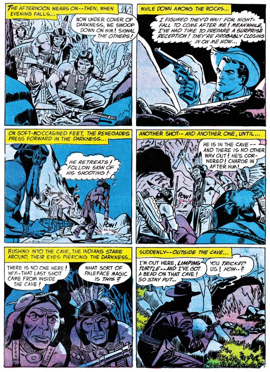
All-Star Western #99 (February 1958) “The Ambush At Smoke Canyon” page 5 art by Jack Kirby

I am going to do this backwards and start with the later of the two stories. “The Ambush At Smoke Canyon” was published by DC with a cover date of February 1958. The six page story begins with the return of a scout’s horse to Fort Desolation without the scout himself. Realizing that something is amiss but with most of the force away on detail, Lt. Dan Foley goes out alone to try to follow the horse’s trail. Foley finds the scout pinned down by some Pawnee. Dan sneaks past the attackers and finds the scout wounded but not badly. Dan convinces the scout to sneak out and use his (Dan’s) horse to get help. Meanwhile Dan lures the Pawnee into a cave and traps them there until help arrives.

I got to say this is not that great a story. Does it seem reasonable that not only was Dan able to sneak past the Pawnee but that the scout was then able to sneak back out again? Even the method Foley uses to lure the Indians into the cave seems more contrived then ingenious. All and all a rather forgettable story.

However Jack Kirby has rescued otherwise uninspiring stories just by the visual excitement that he can add. Unfortunately that is not the case for this story. In fact a quick glance at the art might leave one unsure that it was done by Jack. I believe Kirby did the art, the two Indians of panel 5 of page 5 (see above image) look to me to be good evidence of Kirby’s pencil. There are some other examples in the story as well. But why does Kirby’s involvement seem so unobvious? One reason is a recurring problem now that Jack was freelancing. More and more in the future someone else would ink Kirby’s pencils. At times, and I think this is one of them, the inker seems to deliberately mask some of Jack’s eccentricities and make art look more like the house style. Whether the inker of this story was trying to correct Kirby or just was not talented enough, his overbearing inking has done a great disservice to the art.

Sometimes no matter how poor the inking, Jack’s powerful drawing would shine through. I do not know why that did not happen here. The layouts are not very interesting. There is little use of some of Kirby’s favorite techniques such as exaggerated perspective. Much of the action is from a distance, while Kirby usually favored his action up close and personal. Even the one fight scene included was handled rather poorly. I may not be able to explain why Kirby’s art in this case was one of his more forgettable efforts, but clearly freelance work did not always provide the best circumstances for Jack’s art.

Two-Gun Western #12
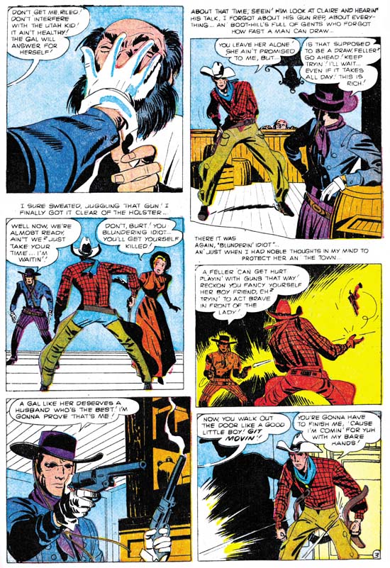
Two-Gun Western #12 (September 1957) art by Jack Kirby “No Man Can Outdraw Him” page 3 art by Jack Kirby

The next Kirby Western we will examine is a five page one done for Atlas with a cover date of September 1957. It tells about the arrival of a gunslinger into a small town. He is “the fastest gun in the west” and no one in the town is anywhere near his match. Therefore the Gunslinger is largely unopposed when he orders people about and takes what he wants. That is until he becomes interested in a beautiful girl.

Two-Gun Western #12 was one of the last comics published before the Atlas Implosion. Like other work for Atlas prior to this event, in “No Man Can Outdraw Him” Kirby seems to have a lot of control over the content. I can not say for sure whether he did the script, but there is something about some of the dialog that is has that slightly over the top quality that Kirby so often used.

The inking looks very different from what Jack for recent work in Yellow Claw (December 1956 and February 1957) or Astonishing #56 (December 1956). For those prior works Jack had adapted the Simon and Kirby house inking style. This style makes use of a special type of crosshatching using a brush instead of a pen. Common to the S&K house style are a set of long roughly parallel lines intersected by a series of shorter lines which I like to think of as a picket fence design. Another technique is the use of a row of tear shaped dots. Kirby used this style for the early Atlas work I mentioned but modified it by using a finer brush. However none of this is found in “No Man Can Outdraw Him”. In that story there really is no crosshatching of any kind. Instead spotting is used more sparingly so that the art has a light look to it. When larger dark areas are introduce they tend to be made by completely flooding an area with ink.

Despite the different styles used between these stories I think it would be a mistake to discount Kirby as the inker for the Two-Gun Western story. Look at the forearm of the gunslinger in the fifth panel of the image I provide above. Notice how the nearest portion is made from a couple of closely placed black strips followed by a larger area of black taking up the rest of the forearm. This same sort of technique for spotting clothing became common around the time of the Mainline titles such as Foxhole. A good example can be seen in the lower leg of the paratrooper in the cover for Warfront #28 cover dated January 1956. This concept of modifying the S&K studio inking style but dropping crosshatching and simplifying the spotting can also be seen in other Kirby works of about this period. For instance in “Town Full Of Babies” (Black Cat Mystic #60, November 1957). I have also previously remarked on this showing up in the all Kirby Prize romances that Jack did staring about November 1955 and going to December 1956). Kirby would evolve the style even further in the late Young Romance (starting about February 1958 and ending with December 1959). I believe that Kirby found the inking technique he used for Yellow Claw too time consuming. His inking therefore evolved into a quicker style. But the style was not just faster, Jack was much too good an artist to settle for that. Instead he used it to great advantage to give his art a stylized or abstract look.

Jack’s drawing seems to adjust to his new inking style, it also adopts a more stylized look. Jack’s figures often take on exaggerated but very expressive posses. Sometimes this results in some strange distortions such as the small torso of the hero in the second panel shown above. For Kirby it was always about depicting the story and giving his figures life, never about being anatomically accurate.

In short “No Man Can Outdraw Him” is a small masterpiece. It did not provide Jack Kirby’s wild imagination an outlet like he had in Yellow Claw but otherwise it shows what Kirby could do when he had control over what his work. The reverse, which is when Jack lost that control, is shown in “The Ambush At Smokey Canyon” that I started this post with. In all fairness these two are extreme examples, there was a whole lot of middle ground that Jack would occupy in later years. Still it brings to mind two “what ifs”. What if Kirby had continued to ink his own work for the Challengers of the Unknown? Wally Wood’s inking is very beautiful but I cannot help but think it would be more expressive had Kirby used his new style on it. Or what if Atlas never imploded? Kirby seem to have more freedom before the Implosion then after. Who knows what sort of masterpieces Jack might otherwise have produced for Atlas?

You can never provide real answers for such “what if” questions. All we can do is enjoy what was actually done. Unfortunately most of Jack Kirby’s pre-Implosion work for Atlas are obscure and have not been reprinted. However I have one other Kirby Western to discuss but that will have to wait for another post.

Foxhole #4, Enter the Comic Code

Foxhole #4
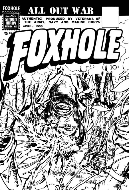
Foxhole #4 (April 1955) unused cover by Jack Kirby

Public criticism about the contents of comics had lead to the creation of the Comic Code. Although not a legal requirement, publishers knew that they must submit their work to this agency for approval or be rejected by most newsstands. Simon and Kirby’s company Mainline was no exception to this. So when along with their other titles Foxhole #4 was submitted for approval the Comic Code rejected the cover. Its depiction of a dead enemy sniper was too much for the delicate sensibilities of the young. In all honesty even without showing any direct signs of violence it is a very compelling but disturbing piece of art. S&K’s substitute cover had a close-ups of a face wear camouflage makeup. Simon and Kirby could still produce great covers within the Comic Code framework.

Foxhole #4
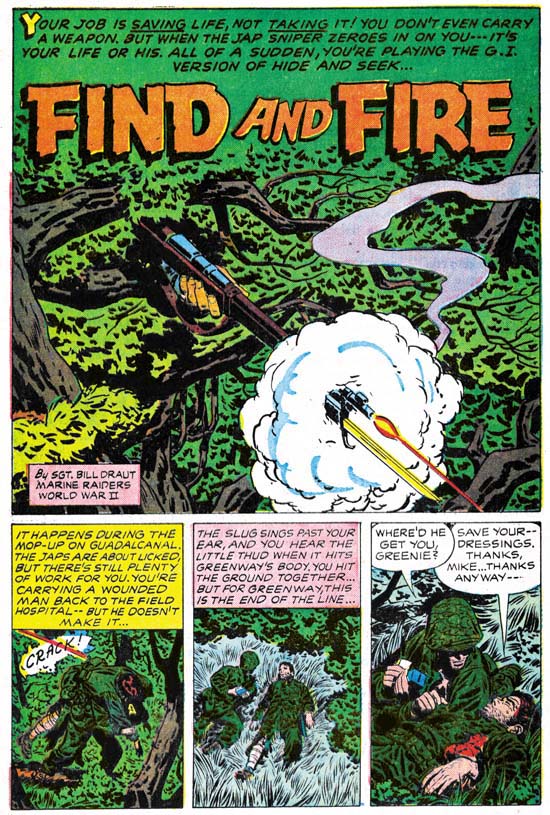
Foxhole #4 (April 1955) “Find And Fire” page 1 art by Bill Draut

The rejected cover for Foxhole #4 was based on an interior story “Find And Fire” by Bill Draut. It is unclear to me whether the cover developed from the story or the other way around. Often Simon and Kirby productions have this cover/story connection. Not infrequently each does not tell quite the same tale. Draut’s story starts with a splash very different from Jack’s original cover. Most of what we see is just the tree foliage. Only the sniper’s hand and firing rifle are visible. By doing so Bill has captured horror of having to cope with an unseen foe. The story itself is about a medical corpsman having to deal with a Japanese sniper alone. As a medic he is not supposed to fight and does not carry a gun. The Japanese, and the sniper in particular, did not care about such niceties and the American is forced to confront the sniper armed with only a knife. Its a great story illustrated by one of S&K’s top talents.

Foxhole #4
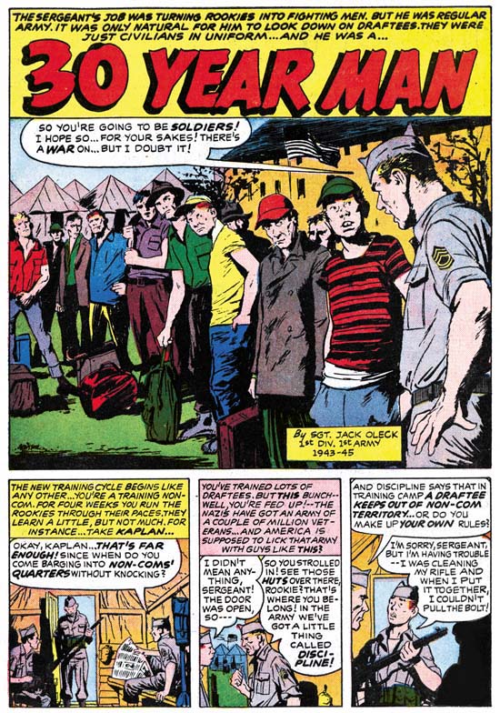
Foxhole #4 (April 1955) “Thirty Year Man” page 1 script by Jack Oleck art by Joe Albistur

This time instead of Jack Kirby, Jack Oleck provided the script for the artist Joe Albistur. It is a great story about a professional soldier and the outfit he first trains and then fights with. The plot is not all that surprising but with it Albistur manages to present some great art. Look at that splash panel. Joe is marvelous at capturing people and their gestures but here he out does himself. There twelve individuals portrayed, each one uniquely. Only the face of two men are partially visible and yet Joe infuses them with personality. Elsewhere in the story there is a fight sequences with four panels without text. Previously we saw Bill Draut draw something similar. Could Oleck have written Draut’s story also and provided similar directions? Or could both artists have decided to do this themselves? However the decision was made it was an effective device to use in cases like this were the image was sufficient and words were not only superfulous but were actually detrimental.

This is the second Foxhole piece credited to Jack Oleck. Two scripts are not much to work with in trying to understand Oleck’s writing style, but it is all we have. Actually that is not true. From Joe Simon’s collection I have part of another script by Oleck. That will be the subject of a future post.

Foxhole #4
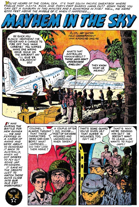
Foxhole #4 (April 1955) “Mayhem In The Sky” page 1 art by Art Gates

As I have said before I enjoy most of the stories in Foxhole. They are generally well written and the artists are very talented. I also get a kick out of “Mayhem In The Sky” but probably for reasons that were not originally intended. It is like watching a slasher movie where much of the fun is knowing that when someone goes out into the night to investigate a noise that he will be the next victim. This story is about an American plane that will be bringing some Japanese prisoner to Australia. The only guard will be wounded Australian soldier. Did I hear the background music become foreboding? When the plane reaches altitude it is placed on autopilot and the co-pilot takes a nap! At this point the background music is downright chilly. Needless to say it is not a stalker that is unleashed but a plane full of Japanese soldiers. Yeah it all seems a bit unbelievable but it is fun.

Foxhole #4
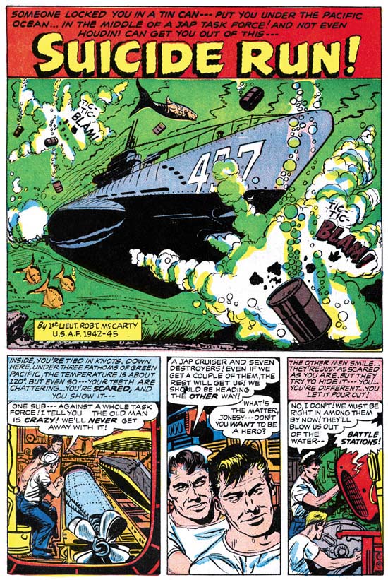
Foxhole #4 (April 1955) “Suicide Run” page 1 art by Bob McCarty

Bob McCarty, a veteran of the Air Force, illustrates a submarine story. This is typical of Foxhole. Although written by veterans they are not autobiographical stories. Still the real service that the creators experienced does imbue Foxhole stories with special qualities. The men in the stories are not the clean cut heroes depicted in movies of that time.

Foxhole #4
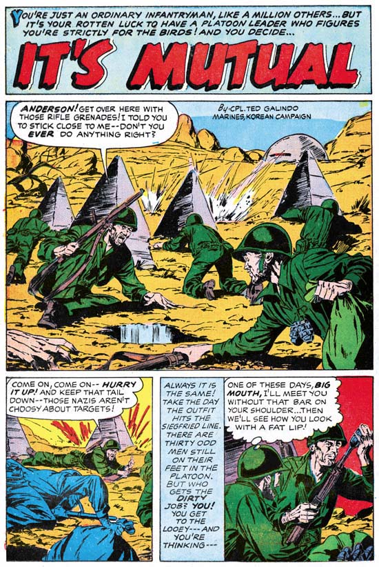
Foxhole #4 (April 1955) “It’s Mutual” page 1 art by Ted Galindo

“It’s Mutual” is the earliest artwork for S&K by Ted Galindo that I am aware of. Hereafter Ted would often be employed by Simon and Kirby and, after the S&K studio breakup, by Joe Simon. Generally Simon and Kirby used the more talented artists of their day. Unfortunately I feel Galindo is an exception, I would call his work adequate at best.

Featured Cover, Fighting American #4

Fighting American #4
Fighting American #4 (October 1954) by Jack Kirby

Another great FA cover done during the period when this title was more about humor then about being the typical superhero. In common with the cover for Fighting American #3 we find our hero about to spring a surprise on his clueless foes. I love the line “let me kill Speedboy just this once”. It is a great cover filled with Kirby’s unique humor touches such as the absurdity of Rhode Island Red lighting her cigar with a torch. I find that Jack had his own way of humor which includes the physical appearance of the subjects. To me it is very different then what Joe Simon did for the covers of Sick. It is also why I am always surprised that many still think that Guys and Dolls was done by Jack when its visual humor is so much like Joe’s.

I am rather surprised about the green face that the colorist provided for Yuscha Liffso. It makes him look not so much funny as weird. I guess it is the only thing about the cover that I find objectionable.

There were three more issues to Fighting American, not including the Harvey issue. Unfortunately these later covers just do not have the “punch” found on the first four issues. These last issues came out at the same time as the Mainline titles so I suspect Jack’s creative energies were going there instead.