Category Archives: Topic

The Fly, A Case Study of Swiping

“Swipe” is a rather unusual term which in my dictionary is defined as a slang for to steal or pilfer. It has also found use in discussions about comic books as a term for copying. Considering its original slang usage it is not surprising that the word has a very derogatory association in comics. Other art studies, including the fine arts, do not use the term. That is not to say that activities equivalent to swiping do not occur, it is that more neutral words are used to describe those activities. The word swipe is so entrenched in the discussions about comic book art that I that I continue to use it. But I do not share the disapproval that most have who use this term. Swiping was common in comic book arts, actually in all the arts. Even Jack Kirby has been shown to swipe.

The first four issues of the Adventures of the Fly provides some good examples of various types of swiping that could be done. Some call this a Simon and Kirby title, but it seems to me that Simon was really the driving force. Joe brought together artists other then Jack to work on the books. In fact Jack’s involvement was less then what some people thought because of the use of swipes.
Adventures of the Fly #1
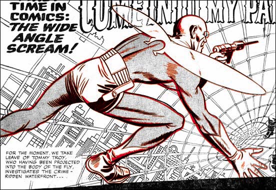
Adventures of the Fly #1 (August 1959) pencils by Jack Kirby (splash art in black, cover art line art in red)

The four Fly covers only provide an interesting assortment of Joe’s working method. The cover for issue #1 is not really a swipe. Included in the story art that Jack did for the Fly #1 was a double page splash. The cover is basically parts taken from the splash and rearranged somewhat to fit the narrower proportions of the cover. It is possible to overlay the line art of the Fly from the cover and the splash with good accuracy. That is not to say you get perfect alignment between the two. In the overlay image I provide above I was as careful as possible in adjusting the size and angle of the images. I was able to get good agreement between the two in the area of the Fly’s head and foot. But look closely at his right hand and you will see they deviate slightly. Actually this is to be expected considering the various equipment used. I have often overlaid original art or proofs of line art over the published cover and have never seen one that could be perfectly aligned in all parts. The alignment in this case is especially good so I have little doubt that stats taken of the splash was used to assemble the cover. Since some of the fine spotting lines are present in both the cover and the splash the stat was taken after the splash had been inked. The cover had to be prepared at about the same time as the rest of the comic, so I believe Joe had the stats made of the splash made while assembling the book. Later the printer for Archie did stats of the entire comic in preparation for publication. In this case the small difference in alignment was due to different stat cameras being used.
Adventures of the Fly #1
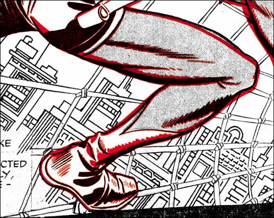
Adventures of the Fly #1 (August 1959) pencils by Jack Kirby (splash art in black, cover art line art in red)

Even though some of the fine spotting aligns well, changes were made. For instance some new spotting was added in the shoulder region. Also the outlines were strengthen, often significantly, is some areas. This was not simply a retracing of the outline. By shifting the wider ink lines the form would be exaggerated in some places and subdued in others. There are two areas where the newly inked lines deviated significantly. One is the upper line for the right thigh as it approaches the knee. The cover version is more tapered while the splash has more of a bulge. The other change made was to the Fly’s goggles which were made more prominent on the cover.

I cannot prove it, but this entire process used to create the cover suggests to me that it was done by Joe Simon. When you consider how wide the splash was compared to the cover it is amazing how well the cover composition works. As for the inking alterations that is the sort of thing I have seen Joe often do today. When he wants to make a reduced copy of some art where the original is too large for his copier Joe copies it in pieces and then reassembles reduced sized parts. This often leaves lines where the parts were joined which Joe will retouch. But frequently he also proceeds to retouch the art on the copy as well. This is what I believed happened to the cover. For me most of the changes made greatly improved the art. The one exception is the tapering to the upper thigh. I feel the bulging in the splash is more appropriately as it makes it seem that the Fly is about to spring into action. If I am right that Joe re-inked the cover, then I doubt that he was the inker for the splash or the rest of the story.
SwipeFly2Cap7.jpg
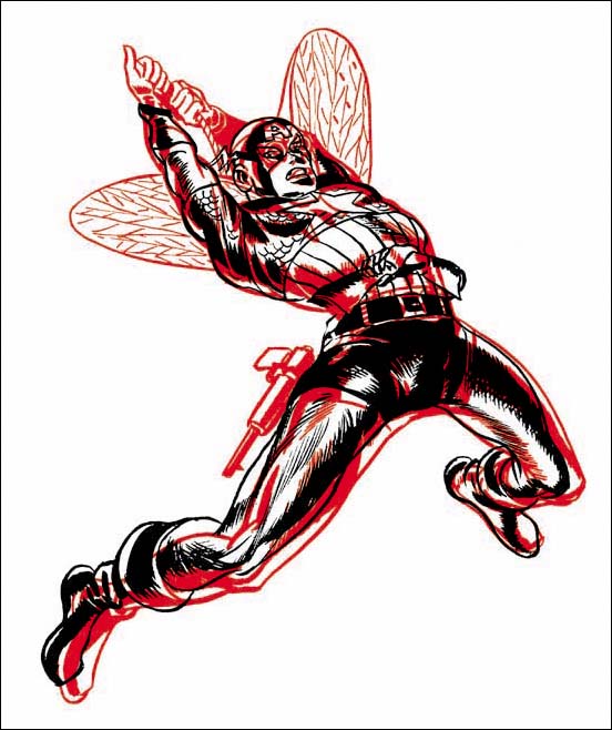
Overlay of figures from Adventures of the Fly #2 (September 1959) in red and Captain America #7 (October 1941) in black.

Many have recognized the fact that the swinging Fly on the cover of issue #2 was swiped from the cover of Captain America #7 (October 1941). When I produced the above overlay I found that a good alignment simply could not be done. So I aligned the top of the heads and an approximation of the figures left foot. This provided pretty good alignment for the torso. I will not provide a line by line description of the differences, there just are too many. Cap and the Fly figures are dissimilar both at the small and the large scales. As an example of a large scale note how the Fly’s right leg is further forward then Cap’s. For the other scale compare the figures’ right (as drawn this would also be the lower) outline to the torso. For one thing Cap had an indent to delimit the shoulder that is completely absent of the Fly. Of special interest is the figures’ left thigh. Cap’s has a distinct bulge to the upper part leading into a comparatively thinner region just above the knee. On the other hand the Fly’s thigh is more evenly tapered. This is the same sort of alteration that had been made to the cover of Adventures of the Fly #1, an indication that both may have been done by the same artist. With all the differences between the swipe and the source it is clear to me that the Fly for the cover was not done using a stat or any other mechanical copying device. However in my opinion there are way too many similarities for the Fly #2 to be based on just a remembrance of the Cap #7 cover. No the Fly figure was done by freehand copied from the Cap #7 cover. Joe has since used the pose on a number of occasions, although not as far as I know for a published comic. So once again I attribute this work for this to Joe Simon.
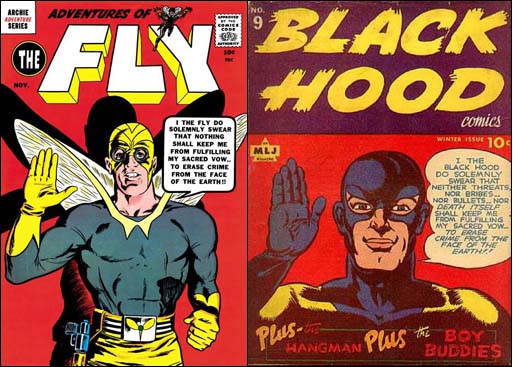
Adventures of the Fly #3 &  Black Hood #9
Adventures of the Fly #3 (November 1959) art by Joe Simon and Black Hood #9 (Winter 1943) [the Black Hood #9 image is from the Grand Comic Book Database (GCD)]

When I previously wrote about the cover for the Adventures of the Fly #3 Scotty Moore left a comment pointing out the similarity to the cover for Black Hood #9. Not only is the pose pretty much the same but both take an almost identical oath. It is hard to believe that the relationship between the two is just a coincidence. Particularly since Black Hood title had been published by the same company as the Fly. Although the pose and concept was swiped I would hardly call the Fly a close copy. Joe once told me he did this cover using himself in a mirror as model. This does sound right because the art does look like Joe’s work.
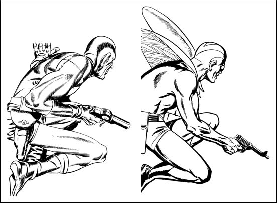
SwipeFly4Ad88.jpg
Figures from Adventure Comic #88 (October 1943) art by Jack Kirby and Adventures of the Fly #4 (January 1960) art by Joe Simon

This is another example where the figure of the Fly was obviously a swipe, in this case from Sandman on the cover of Adventure Comic #88. I provide a side-by-side image of the two figures because overlaying them would just be confusing. It can easily be seen that the Fly is not a close copy of the Sandman. Things like the positions of the limbs, details of the anatomy, and the size of the ear all have been changed. Clearly the Fly was freely drawn with the Sandman source used only as a casual reference. Both were originally shown peering through a window but Sandman had been shown squatting on flat ground while the Fly was on a slanted roof. The change in the nature of the foundation probably had a lot to do with some of the changes made.
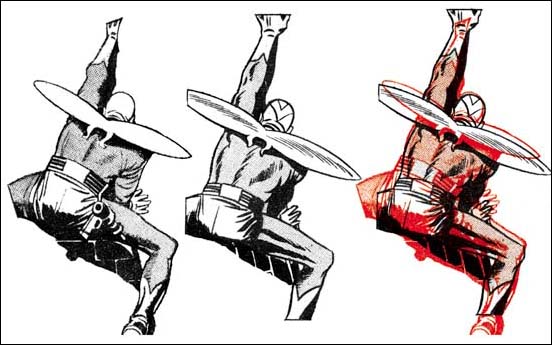
SwipeFlyWindow.jpg
Left figure from Adventures of the Fly #1, “Come Into My Parlor” page 4 panel 1 art by Jack Kirby.
Center figure from Adventures of the Fly #4, “Duped By The Dazzler” page 5 panel 4 (rotated and flipped)
The two overlaid where red is the Kirby figure.

The Fly comics swiping is not limited to the covers. The examples I have chosen from story art both show the Fly clinging to a building wall just outside of a window. However to place them in the same pose I had to rotate the one from Fly #4 and then make a mirror image (that is flipping the image so left becomes right and visa versa). I provide an overlay of the two but it is impossible to get them to properly align. The side-by-side versions give a better idea as to what the problem is. The limb and torso proportions dramatically differ between the two. Even small details such as the angle taken by the right hand fingers in relation to the legs is not the same.

There can be no doubt that the one from Fly #4 was a freehand drawing. But who actually drew the swipe? Well although the pose was swiped from Kirby, the artist articulates the muscles very differently then Kirby did. The same way of handling the figure’s form is found in all the other drawing of the Fly from the same story and these other Fly appearances do not seem to be swiped. I have little doubt that the swiper is the same as the story artist.

There are other swipes in the first four issues of the Fly as well as in the companion book The Double Life of Private Strong. Further more then one artist was used to draw these stories and all the swipes seem to be off of Jack Kirby. Kirby was greatly admired by other comic book artists so all the artists for the Fly and the Shield used Kirby as a source to swipe. Well that seems highly unlikely, there should be a more reasonable explanation. Joe Simon has said that he provided artists with layouts. Now Joe did not say what titles he did that on but his collection still includes a layout for the Fly that Carl Burgos did. I suspect that the layouts Joe provided for the artists already included the swipes. The layouts may have been as rough as the Burgos example so Joe may also have provided copies of the Kirby source for the artist to complete the swipe from.

Jack Kirby’s Take At Imitating Bob Powell

Hi-School Romance #55
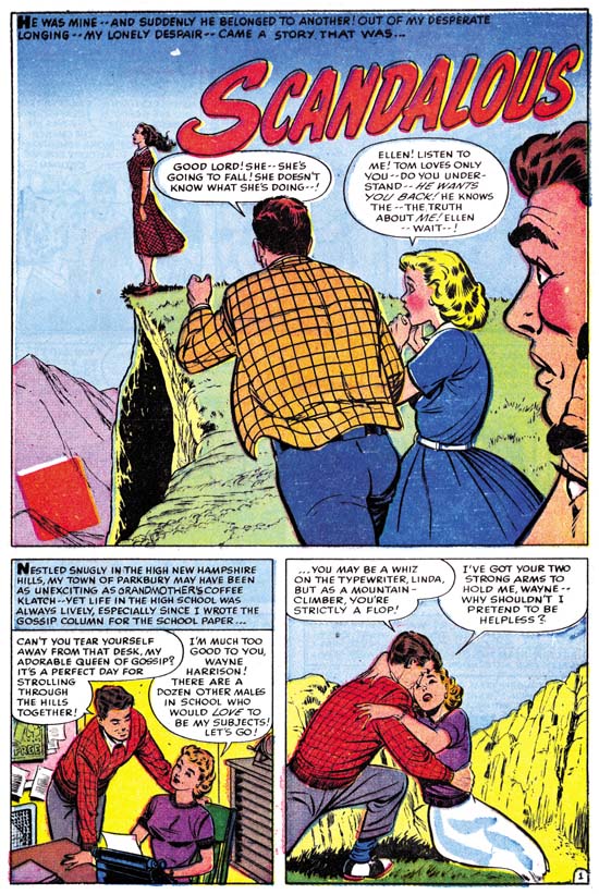
Hi-School Romance #55 (September 1956) “Scandalous” page 1, art by Bob Powell

A relationship starts between two high school students, Tom and Linda. Apparently Tom’s interest in Linda was not too strong because he begins seeing another girl, Ellen. Linda finds out about this and in an article for the school’s newspaper reports about her relationship with and love of Tom. When Ellen reads and finds that she has unknowingly come between the two, she breaks off with Tom. Tom confronts Linda and declares his love of Ellen. Realizing that Tom and Linda are meant for each other, Linda regrets what she has done. Tom and Linda go off to find Ellen and after a long search find her at the edge of a cliff. Distraught about breaking with Tom, Ellen has decided she cannot go on. Linda calls out to she regrets what she has done and Tom only loves her (Ellen). The couple re-unite for a happy ending.

This has got to be about the worse love story I have ever read. Histrionics rules all. It is bad enough that everyone’s emotions are overblown, they seem to switch to the complete opposite at a moments notice. The thing is I can imagine a young girl might actually enjoy reading this story. But for an adult male reading it fifty years later it is just painful. It is so bad that not even Bob Powell’s art can save it.

Hi-School Romance #55
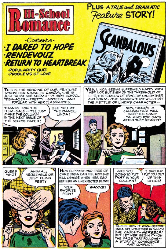
Hi-School Romance #55 (September 1956) content page, art by Jack Kirby

It seems that the harder Jack tries to imitate another artist, the more his own personal touches disappear. Not just the expected facial features but his layouts as well. Well for the contents of HSR #55 Jack hardly tried to imitate Bob Powell at all. That explains why this shows the most Kirby traits of any of the contents that I have examined so far. It is certainly the most interesting of the introduction stories. Not only is the art rather nice but the script is pretty good as well. I suspect that Jack added his own input to the writing, the exchange in the last panel seems pure Kirby to me.

Joe Simon’s Turn At Imitating

All the Harvey content with introduction stories that I have posted on so far have been drawn by Jack Kirby with Joe Simon’s involvement limited to supplying a splash panel. But that was not the only formula used for creating Harvey content pages.

Hi-School Romance #56
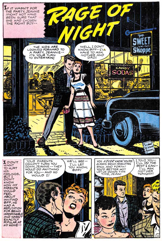
Hi-School Romance #56 (October 1956) “Rage of Night” page 1, art by Bob Powell

Jean’s parents did not approve of her boyfriend Biff. Biff convinces Jean to have a party at her house. Her parents will not be home and would not permit a party that included Biff without their supervision. Jean tells Biff that he cannot come to the party. Nick was a friend who went away to college but is back in town. Biff arrives at the party despite not being invited. Trouble begins which Nick helps to stop. Jean then realizes her true feeling for Nick.

Generally when I discuss Harvey romance stories I write about Bill Draut or John Prentice. After all these two artists did a lot of work for Simon and Kirby and that in turn is the subject of this blog. The truth of the matter is that most of the Harvey romance artists are not worth writing much about anyway. However Bob Powell does not deserve the same neglect. Bob was a talented artist with, at least during his earlier career, his own unique style. Unfortunately I believe he was one of the artists whose stay at Marvel had deleterious affect. Stan Lee asked his artists to use Kirby as a model of what Marvel wanted. These were not young artists just starting their careers. Rather they, like Bob Powell, had a proven track record and their own style. In trying to please Stan, Powell and others ended up surrendering too much of their own uniqueness while not gaining sufficiently from their attempts to apply Kirby’s methods.

Hi-School Romance #56
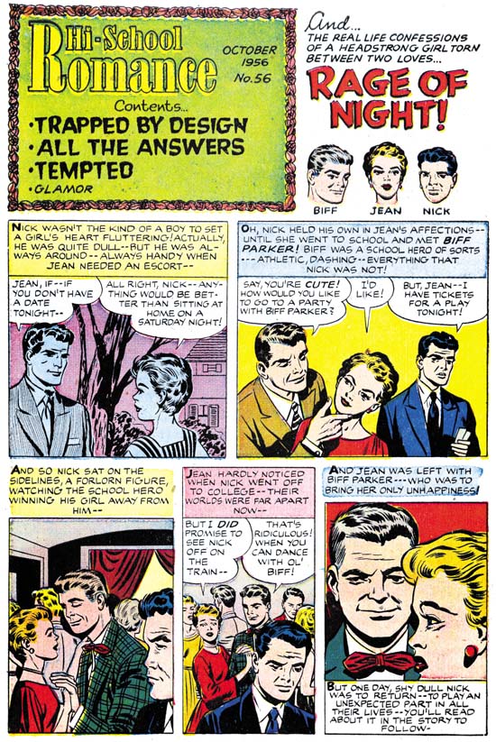
Hi-School Romance #56 (October 1956) content page, art by Joe Simon

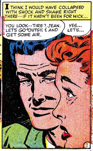
Often it is not easy to make attributions for the Harvey content pages. That is with the exception that it is pretty easy to see that that the artist for the feature story did not do the introduction story. This introduction has a number of layouts very similar to Kirby’s. In particular the second panel with Jean and Biff in the foreground and Nick forlornly looking on in the background. But the drawing itself just does not seem Kirby to me. Now why that is may be hard to explain. It requires you to mentally delete traits that are imitations of Bob Powell. When I do this what I am left with does not look as much as Kirby’s work then the examples I previously provided for Harvey contents. What I see, once I look past the Powell imitations, remind me of Joe Simon. In this particular case there really is no reason to expect that Joe was trying to copy Kirby since Powell was really the artist to imitate. But I suspect that Simon had so often imitated or inked Jack that he just adopted some of Jack’s mannerisms. I believe the Kirby layouts we see in this contents are all second hand via Joe Simon.

Hi-School Romance #56
Hi-School Romance #56 (October 1956) “Rage of Night” panel 7 of page 3, art by Bob Powell

But not all the layouts look like Kirby’s. The last panel in particular would be unusual for Jack, or Joe for that matter. Jean is shown in a close profile with her chin and the back of her head cut off by the panel border. Despite Biff being behind Jean he is still brought forward. The pair of heads take up almost all of the panel. I do not think I have ever seen Jack or Joe do anything like this. But a search through the rest of Powell’s story shows that it was clearly swiped from panel 7 of page 3. Now we have already seen a Kirby swipe in a Harvey introduction story, still this sort of thing is more characteristic of Joe.

Kirby Imitating John Prentice Again

I got more of a response from my query about whether to continue posting on Kirby’s “ghosting” then I expected. Let me be frank, these are probably the poorest examples of Kirby art that you are likely to find. Because Kirby was imitating another artist he would give up much of what we admire about his artistry. At the same time Jack just was not very successful at adopting the other artist’s style. The shortness of the pieces and their marginal nature does not help much either. Although they are not great works of art, I still find them fascinating. It is interesting to see what Jack would keep, what he would let go, and what he would try to adapt.

Anyway my game plan is to do a couple posts each of Kirby imitating two other artists. Also an example which I believe is Joe Simon doing the ghosting. Then perhaps a more casual examination of some other content pages.

True Bride-To-Be #20
True Bride-To-Be #20 (October 1956) “Homecoming” page 1, pencils and inks by John Prentice

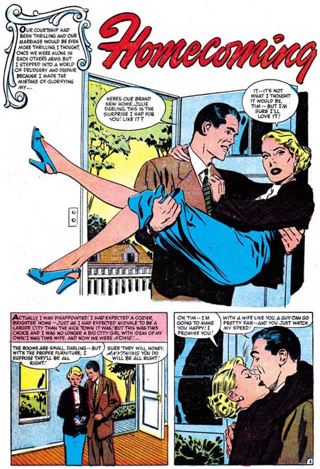
Newlyweds start their life in a small town. Originally the wife as a city girl and she finds life in a small town difficult. She struggles as best she can but the feeling of isolation takes its toll. Just as she decides to return to her family in the city things make a turn for the better. People, including her husband, begin to realize how difficult it has been for her and start to provide support.

A very different splash by John Prentice then the last one I reviewed (First Love #70). But still a real nice design and a great segue into the story. Once again Prentice leaves out a normal panel boarder. But this time he also leaves out some of the background as well, in particular the walls. Not all of it is eliminated, we can still see a view of the outside through the open door. Not much there, just a picket fence, a small house and some trees. (And this time picket fence does not refer to an inking technique). Just this simple view is all what we need to place the story in some small town. The man carrying the woman over the threshold is pretty much completes the visual introduction.

True Bride-To-Be #20
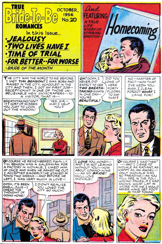
True Bride-To-Be #20 (October 1956) Contents page, pencils by Jack Kirby and Joe Simon

This content pages follows the most common pattern, a splash panel (in this case not much bigger then the rest of the panels) and a short introduction for the feature story.

The splash panel is a close copy of from the third panel of the first page. Well in this case close means without much change in the posture. That hardly means that it is a good enough copy to really look like a Prentice. Still the woman is closer to John’s version then found in the introduction story. The splash does not provide much to go on but it does not look like Kirby’s work. The inking does not look like Jack’s either but it could be by Joe Simon. Because of that and in view of previous examples of contents, I am going to attribute the splash to Joe.

The introduction is once more a prelude to the feature story. Showing how the couple met and fell in love. Yeah it really is superfluous but at least it does not spoil the story much.

Ignore superficial traits such as eyebrows we can see some typical Kirby poses and layouts. Also some typical Kirby rendition of architecture. Jack even uses a similar architectural drawing style for penciling the interiors. I feel confident that this is Kirby “ghosting” for Prentice. But it is another not so good imitation. This time Jack does the best job on the man’s eyes. Eyebrows are not so well copied but at least they are closer to art by Prentice then they are to that by Bill Draut. The woman still has Jack’s preference for a triangular face with widely separated eyes. Not at all the longer, more oval face and closer eyes that Prentice preferred.

Kirby Imitating John Prentice

First Love #70
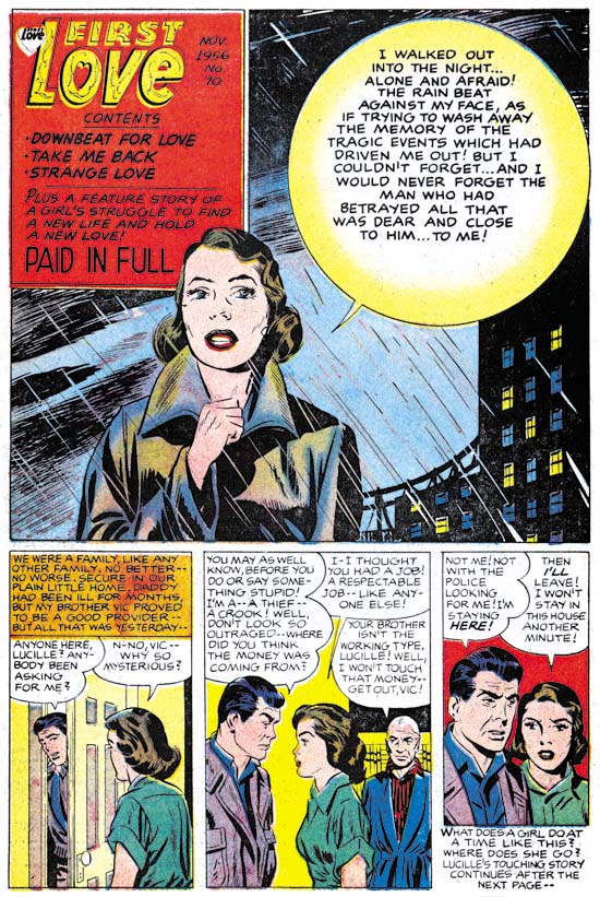
First Love #70 (November 1956) “Paid In Full” page 1, pencils and inks by John Prentice

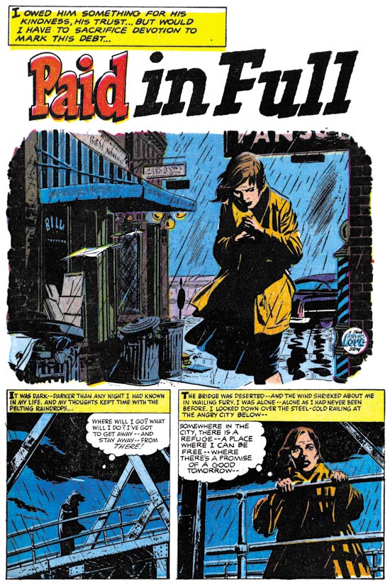
It is a dark and stormy night that we find our heroine. Alone and unsure as to what to do or where to go, she still is determine not return home. Looking out from a bridge (no mention of suicide but you got to wonder if that was the suggestion) a policeman confronts her. Rather then taking her in (as a vagrant?) he takes her to a boarding house run by an elderly lady. With the help of the cop and the landlady, our heroine begins a new life. A romance begins with the policeman. The lady is unsure about revealing her past to her love. However the cop has such high standards that she decides to keep it a secret. What this secret actual consists of is finally revealed when her brother suddenly appears. The brother is a criminal and is on the lam from the law. It was the discovery of that fact that originally led our heroine to leave home. The lady finally reveals her past to the policeman, but not about the actual presence of her brother. He is outraged because she is not the good person he thought she was. He breaks off there relationship. Later he has second thoughts and goes to her home. The brother pulls a gun but the lady prevents its use. A fight ensues between the criminal and the cop, which of course the cop wins. Afterwards the cop expresses his regrets and asks forgiveness, which the lady gives.

As usual, Prentice did an outstanding job on the art for this story. Particularly nice is his handling of the start of the story. The woman is alone, at the mercy of her inhospitable environment. A good visual presentation of her inner turmoil and despair as describe by the writer. The splash panel starts it off just right by rejecting a normal panel border and instead providing an rough edge to the art. John had a more realistic approach then most comic book artists. As seen in this example, John did not depend on that naturalism alone. He had a good sense of design and story telling as well.

First Love #70
First Love #70 (November 1956) Content page, art by Jack Kirby and Joe Simon

The content page for FL #70 follows the same sort of pattern I posted about for FL #68 and FL #69. That is Jack Kirby providing a short story introduction to the comic’s feature story. As before Kirby is purposely imitating the feature artist. For FL #70 the introduction story is quite short, only three panels. Therefore there is less to go on for the correct attribution. Forearmed with previous examples of Kirby “ghosting” we know to ignore some superficial traits such as the eyebrows. So even with what little we have it looks like Jack was the actual penciler.

The Prentice imitation really does not come off that well. Actually the previous Draut imitations were not that close either. Draut’s very stylized eyebrows stand out in his art. Do a good imitation of the eyebrows and other inaccuracies get unnoticed. Prentice, on the other hand, did not have any single outstanding trait. All of his style’s traits must be mastered in order to make a good pseudo-Prentice. Jack succeeds most in the brother in panel 3, and to a lesser extend the father in panel 2. Kirby completely misses with the woman. This best seen in panel 3. Prentice’s females have a sophisticated beauty. This is due in part to the eyes being closer together and the face being longer and more oval. Jack’s version still has the more widely separated eyes and triangular face that he favors. Surprisingly all the eyebrows are closer to Bill Draut’s art then they are to Prentice’s manner.

Not all failure to provide a good imitation of Prentice can be laid on Jack. It seems to me that the inker has to take some of the “credit”. In FL #68 and #69 there was not enough of the inking for me to be certain who did it, although it clearly was not Draut. In FL #70 there is more then enough spotting to say that Jack did not do this inking. I am not certain, but some of it looks like Joe Simon’s work. Perhaps someday I should do an analysis of Simon’s spotting techniques. (I can see my readership dropping to even greater depths).

Before I leave the topic of the introductory story I would like to add a short comment on its use. Frankly in this case I think this was a really bad idea. A lot of the impact of the actual feature story rests on not providing the reason for the lady’s plight for most of the story. This effect is completely destroyed by the introduction which provides the explanation. This not only ruins the start of the story but makes story’s explanation repetitious.

First Love #70
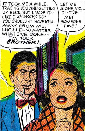
First Love #70 (November 1956) “Paid In Full”, panel 3 of page 4, pencils and inks by John Prentice

The splash panel of the contents page was clearly not done by Jack. At a glance it would seem to have been done by John Prentice. Since previously we have seen Simon do close copies from the story art I went looking to see if that were true here as well. Sure enough the woman is from panel 3 of page 4. In this case the copy is so close that I really cannot see any distinctive Simon traits. There is a significant deviation in the exaggeration done in the lady’s eyebrows, but that cannot be considered characteristic of Simon. Because this sort of copying was previously Joe’s modus operandi for the First Love content page, I am going to attribute this swiping to him as well. Besides some of the inking looks like Joe’s.

True Love Problems and Advice #42 Cover

The Jack Kirby Blog has recently posted a scan of the cover to True Love Problems and Advice #42 (November 1956). I would like to think Bob was inspired by my recent serial post (Jack Kirby’s Austere Inking). A little over a week ago I did a chapter on Kirby’s Harvey work which included romance covers.

TLP #42 is certainly drawn by Kirby. Actually not one of his better efforts. I agree with Bob that the cop is the best part of the cover. This cover was not inked by Kirby. Judging by the spotting on the cop and his eyebrows I am certain this was inked by Bill Draut. Not one of his better inking jobs either. Again the best inking on the cover was done on the policeman.

Strange Tale Indeed, The Ending Revealed

I am always unsure how to handle how much to reveal in my Feature Story posts. I have received a request to provide the end of “Poker Face”. So I have decided to provide the ending as a comment to this post.

SPOILER ALERT: Do not click on comments if you do not want to know the ending for “Poker Face”.

Strange Tale Indeed

Strange Tales of the Unusual #7
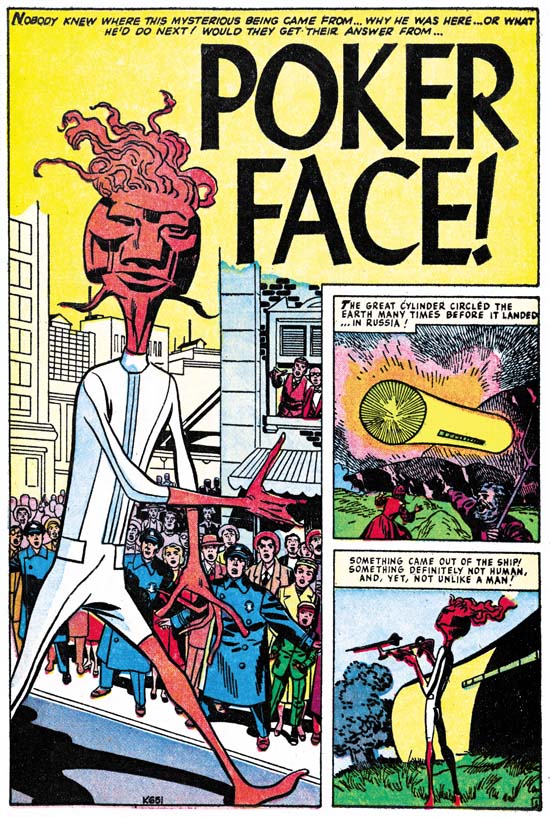
Strange Tales of the Unusual #7 (December 1956) “Poker Face” page 1 pencils by Jack Kirby

A giant alien arrives in an odd cylindrical spaceship. Without any attempt to hide, he makes visits all over the world. People’s responses vary, the Russians fire with all their available weapons, most citizens of Indian hide in the bushes but a few approach closely, New Yorkers gawk but quickly get bored and return home. But it seems that no matter how the people of earth react, the alien completely ignores them and just goes about his business. Only nobody can figure out what he is doing. He just seems to go everywhere with his weird gadgets. The answer to the riddle is provided at the end and of course it is an unexpected explanation.

When I was young I remember reading some DC comics, Superman, Batman, the Flash and so on. What I remember most about them was how boring they were. My DC phase did not last long and was never very intense. I then progressed to Marvel pre-hero fantasy, which was still filled with stories very much like “Poker Face”. I remember enjoying them very much for a while. Eventually I got tired of the formula. It may sound strange but I found the use of a surprise ending repetitious after a while. So I drifted out of comics. But later I somehow stumbled on an early Fantastic Four (probably FF #4) and I was hooked, a confirmed Marvel junkie.

This is another of those pre-Implosion Atlas where Kirby inked his own pencils. As described in Chapter 6 of “Jack Kirby’s Austere Inking” the spotting was a pared down version of the formerly used Studio style. Jettisoned from that older style were brush techniques like drop strings and picket fences. New to the inking was the use of a pen, often in parallel lines to provide grays.

Jack Kirby Swiping From Bill Draut

First Love #68
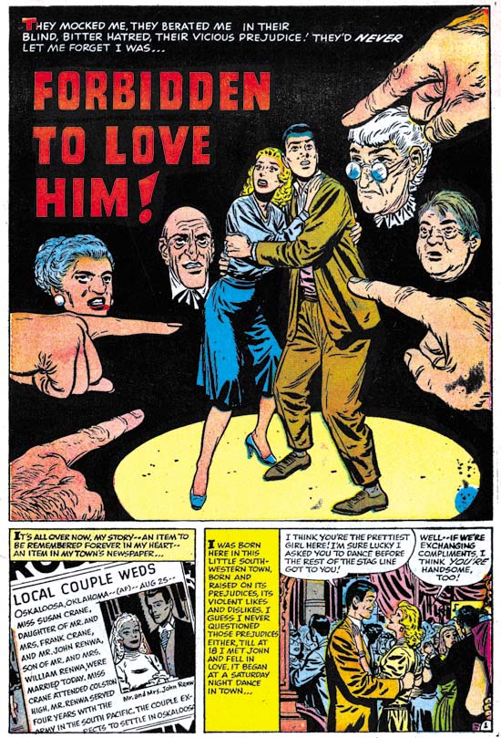
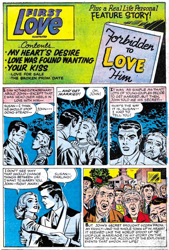
First Love #68 (September 1956) “Forbidden To Love Him”, page 1, pencils and inks by Bill Draut

A young lady meets a man at a dance and quickly falls in love. Early in the relationship the man tells the woman that he is an Indian. The lady is surprised and then ashamed at her response. She loves him and wants to marry him. On her return home she finds her parents waiting. They have heard from neighbors that her date was an Indian and they insists she stop seeing him. Of course she refuses and the conflict at home continues. The man gives a speech at a bond rally before the entire town. It is revealed that he is a war hero. He gives an impassioned speech about the importance of foreigners in the history of America and the true meaning of freedom. The town is ashamed about their treatment of the man and the couple wed with everyone’s approval.

The story of “Forbidden To Love Him” is based in Oklahoma and the chief character is an Indian. Nevertheless it is hard not to a consider this story a more universal condemnation of the racial or ethnic intolerance in much of America during the 50’s. It is a topic that Simon and Kirby had touched on in “Different” (Young Romance #30, February 1951). But their version was much more circumvent and not nearly as bold as this story. “Forbidden To Love Him” may have been a little heavy handed but it effectively highlighted the hypocrisy involved.

First Love #68
First Love #68 (September 1956) contents page, pencils by Jack Kirby, inks by Jack Kirby?

As with FL #69 we have a contents page with an introductory story that at a casual glance could appear to be the work of Bill Draut. In FL #69 the story was a sort of prequel to the feature story. Here in FL #68 it is more like the comic equivalent of a movie trailer. We have less to work with in determining the correct attribution because in four panels all we have are the couple with limited background. Still once you ignore the Draut style eyebrows Kirby characteristics keep popping out. The poses for panels 3 and 4 look particularly like Kirby’s and not the way Draut would have done it. I am discounting Joe Simon’s as the penciller because FL #69 provided examples of both Joe and Jack copying Draut. The art in FL #68 contents page matches Kirby’s version of Draut then it does Simon’s.

First Love #68
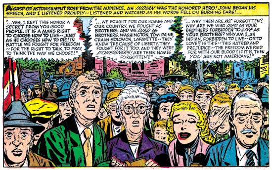
First Love #68 (September 1956) “Forbidden To Love Him”, page 5 panel 1, pencils and inks by Bill Draut

The last panel of the introduction story is more complicated and provides more clues as to Kirby’s involvement. In places Jack seems to forget that he is supposed to be imitating Draut and some faces look like pure Kirby. What is particularly surprising about this panel is that it is a swipe from one that Bill did in the story. Bill’s original depicted the crowd’s shame as the man revealed his wartime heroism. Jack has converted the scene to town’s anger about the coming marriage. But there is no mistaking the derivation because the lady’s father and mother have the same positions. The bride-to-be herself was left out by Jack because it would not have been appropriate for her to share the town’s anger. It is interesting to compare Bill and Jack’s approach to the crowd. Bill provides more people and arranges them to regularly diminish in size as we go from front to back. Jack draws fewer individuals and we are less aware of the size of the crowd because we cannot see the back. By doing this Kirby is able to provide clearer representation of the emotions for the people he does shows. In the comments to FL #69 Stan Taylor correctly remarked how the architecture looked like Kirby’s. This panel in FL #68 does not provide as many buildings but it still is interesting to compare Jack’s method to how Bill handle’s architecture.

Bill Draut And His Imitator, Jack Kirby

First Love #69
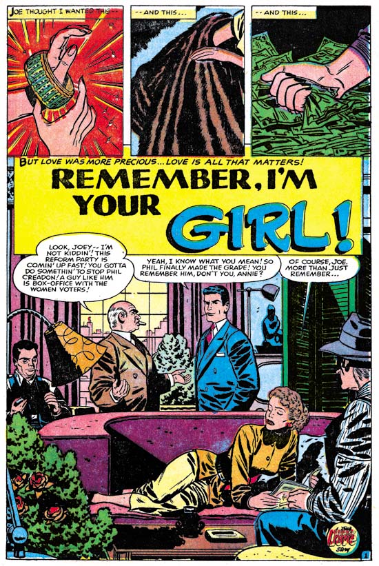
First Love #69 (October 1956) “Remember, I’m Your Girl”, page 1, pencils and inks by Bill Draut

With the period having 1956 cover dates Kirby was pretty much the only artist working on the Prize romance titles (Young Romance, Young Love and Young Brides). During this time Bill Draut and John Prentice who had previously been doing work for those titles began to appear regularly in the Harvey romance books instead. “Remember, I’m Your Girl” is typical of the work Draut did for Harvey. Bill still had an distinct style particularly characterized by simple but prominent eyebrows.

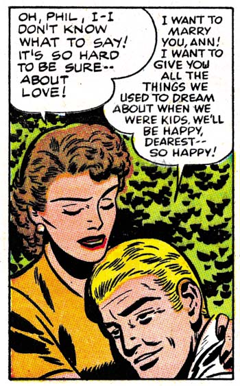
This a story about a man (Joe), his sister (Annie), and a former friend (Phil). Joe is now a successful politician and his sister is enjoying the financial fruits of that success. There is an approaching election and his position is being threatened by Phil, a rival candidate. Years before all three were good friends so Joe asks Annie to reconnect with Phil in order to find some weakness. His sister refuses but runs into Phil by accident and a romance develops. Joe wins the election but the sister continues her romance. When Joe confronts Annie to choose between her previous financial rewards or the rival, she chooses Phil.

First Love #69
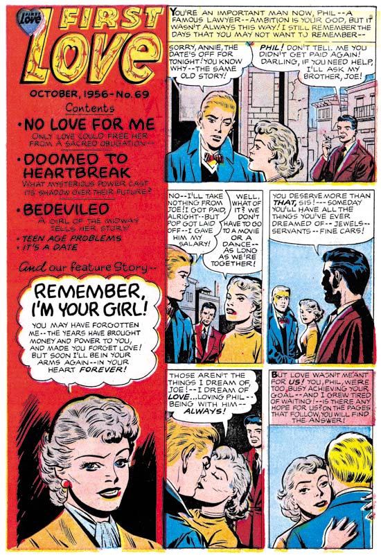
First Love #69 (October 1956) contents page, pencils by Jack Kirby and Joe Simon, inks by Joe Simon?

Joe Simon was probably working for Harvey as an editor at this time. I generally do not consider works such as “Remember, I’m Your Girl” as Simon and Kirby productions. The format and length match Harvey romance stories from well before Joe’s time as Harvey editor. However something unusual happened in FL #68 and FL #69. Generally Harvey romances has a content page with at most a portion of the splash for each story. In FL #68 and #69 the content pages had a short original art that served as an introduction to the featured story.

For First Love #69 the feature story was Bill Draut’s “Remember, I’m Your Girl”. The same characters that appear in the feature story are presented here. The text makes it clear that the trio are shown in the earlier days while they were all still friends. A casual glance at the introduction story could result in attributing it to Bill as well. What particularly stands out are the simple but prominent eyebrows, which as I said was a Draut trait. A close examination reveals that the faces are not quite like Draut would do them, particularly in the story panels. There is not much to go but the spot inking does not look like Draut’s either. But I do not think it is just the case of some other artist inking Draut’s pencils. The layouts in the introduction story are not quite like Bill’s.

It is the layouts that provide a suggestion who the real artist was. In the first panel Joe is shown lighting up a cigarette. This is a typical Kirby theme and pose. In panels 2 to 4 the main speakers are placed in the front while those not speaking are placed in the background. This is a typical Kirby layout. Even the way Annie looks over Phil’s shoulder as they embrace is a typical Kirby pose. Although the artist tried to draw the characters like Bill Draut did he really could not completely adopt Bill’s more stylized pencils. Keeping in mind that he is imitating Draut, a close look at the faces suggests Kirby was the penciler.

First Love #69
First Love #69 (October 1956) “Remember, I’m Your Girl”, page 4 panel 1, pencils and inks by Bill Draut

In the past I have often warned about using some Kirby-esque features for attributing a work to Jack. Joe Simon was also familiar with Kirby’s techniques and was pretty good at mimicking most of them. If you ignore the attempt to copy Draut’s style, the number of Kirby-isms seems rather high even for Joe. But look at the drawing of Annie that appears in the bottom of the contents panel. It appears to be the done by yet another artist. A search of the actual story shows that the contents drawing was swiped the first panel of page 4. It would seem to be a reasonable deduction that Joe Simon did the contents drawing. If that is true then he was not have been responsible for the penciling of the introduction story.

The possibility of Kirby ghosting another artist was brought up recently by Bob H. in a comment to All-Star Western #99. I do not know if what Jack did for FL #69 introduction story would properly be called ghosting. It was not a case of fooling the editor, Joe was also involved in copying Draut on the content page. Nor was Draut a regular artist recognized by the reading public. Harvey romances are all unsigned and the artist used for the feature story would change. This was just a case of trying to maintain visual continuity between the contents page and the feature story. Imitating another artist was not something Jack did very often. Although his Draut was not perfect, it was good enough to fool many.