Category Archives: z Archive

Jack Kirby’s Austere Inking, Chapter 7, DC

Atlas may have started to use Kirby’s freelance work first but it was DC that published the majority of Jack’s art from this period. Part of the reason for this imbalance is due to Atlas undergoing the episode now call the Implosion. Although Atlas only stopped actual publication for a few months, a lot of what was used after the Implosion was left over inventory work. The Implosion may have biased Jack’s freelance work toward DC, I am sure the another reason was simply that DC paid better.

In any case there is a lot of work done between Jack starting at DC (February 1957) until when he left (June 1959). Potentially this chapter could have been the most significant one in this serial post about Kirby’s inking. Unfortunately I have very limited access to Jack’s DC work. Therefore I consider this chapter to be my most tentative. A more thorough analysis of Jack’s DC inking will have to wait but I fully intend to return to it someday.
Showcase #6
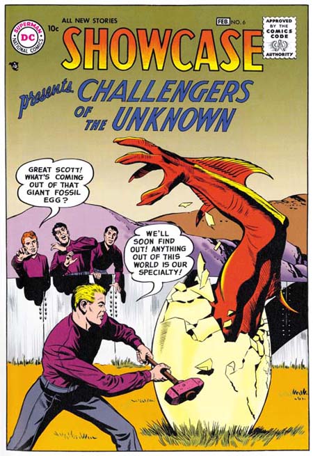
Showcase #6 (February 1957) from the Challengers of the Unknown Archives, pencils and inks by Jack Kirby

The Challengers of the Unknown was Jacks first freelance work to be published by DC. The Challengers were a Simon and Kirby creation but I have not detected any involvement of Joe in the production of the art. Jack did all of the inking of his pencils for the first two issues (Showcase #6 and #7). Considering the date, it is not surprising that we do not find any use of the Studio style. Besides Joe Simon has said that DC did not like the use of crosshatching, which they derogatorily referred to as hay. S&K Studio techniques such as the picket fence would have been seen by DC as particularly offensive. Perhaps DC’s attitude is why Jack abandoned the Fine Studio style that he used so successfully in the Yellow Claw. I may also explain the absence of pen work that Jack had been using for Atlas. So Jack used the Austere style when inking the Challengers. There are some holdovers from the earlier styles such as the abstract arch shadow that appears on the right side of the cover to issue #6.
Showcase #6
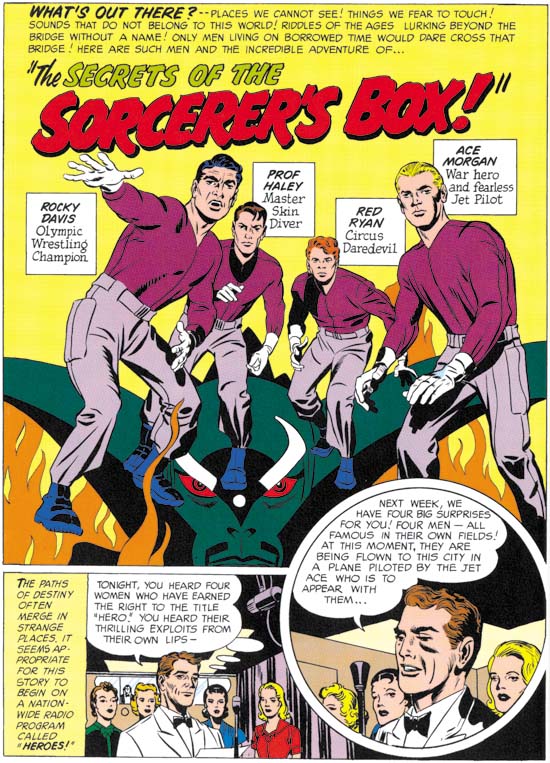
Showcase #6 (February 1957) “The Secrets Of The Sorcerer’s Box”, from the Challengers of the Unknown Archives, pencils and inks by Jack Kirby

The first page of Showcase #6 probably gives an even better example of how Jack would ink the Challengers. No picket fences but there is the use of what could be called a modified drop string. Cloth folds are generally simple spatulate shapes. The image looks lighter with larger blacks done by flooding the area with ink. Also notice the shoulder blot in the circular panel. Kirby does nice inking for these stories but they seem to lack some of the spontaneity found in his Atlas and Prize work. It is possible that this is due to someone having “cleaned” up his inks. Since my observations are based on the DC Archive this might even have been done during restoration.

After the first two issues other inkers began to be used. I used to think that Jack may have been involved in inking some of the later covers. But on reviewing them again for this post I no longer think that is true.
House of Secrets #4
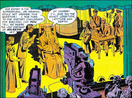
House of Secrets #4 (May 1957) “Master Of The Unknown”, pencils and inks by Jack Kirby

I am sure that for Kirby, and DC as well, the Challengers were probably Jack’s most important effort. It was not, however, the only material that he produced for DC. Jack also did a number of stories and some covers for DC’s horror comics. Perhaps because this work had a lower profile Kirby would do more of his own inking then he did for the Challengers. The inking style used was the same for both. The example of the splash panel from House of Secrets #4 is typical Austere inking.

I would like to draw attention to the casting of the chair’s shadow. During the Simon and Kirby collaboration, shadows often were presented in a very abstract manner. So abstract that I am not always sure what things like the shoulder blots or abstract arch shadows are supposed to represent. The shadow for the chair provides some its source’s distinct features such as its oddly shaped legs. It seems to me that in Jack’s DC work there is more of an effort to provide more “realistic” shadows.
Tales of the Unexpected #16
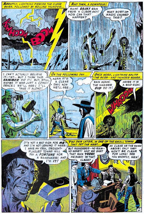
Tales of the Unexpected #16 (August 1957) “The Magic Hammer”, pencils and inks by Jack Kirby

Although we do not find pen work in the Challengers art, it does show up sometimes in what Jack did for DC’s horror genre. Often pen use is limited to special purposes, such as the depiction of rain and stormy weather. It is almost as if rain images provided Kirby with an excuse to use a pen, which he otherwise avoided when doing work for DC.
Tales of the Unexpected #17
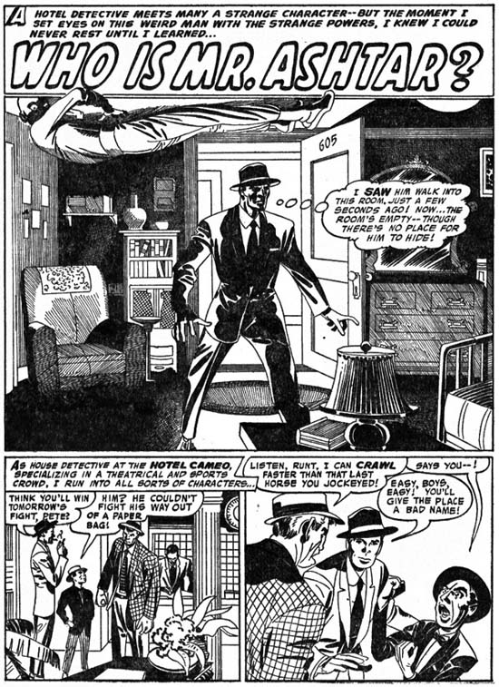
Tales of the Unexpected #17 (September 1957) “Who Is Mr. Ashtar?”, pencils and inks by Jack Kirby from Fantastic Tales #6 (reprint published by Thorpe and Porter, scan provided by Ger Apeldoorn)

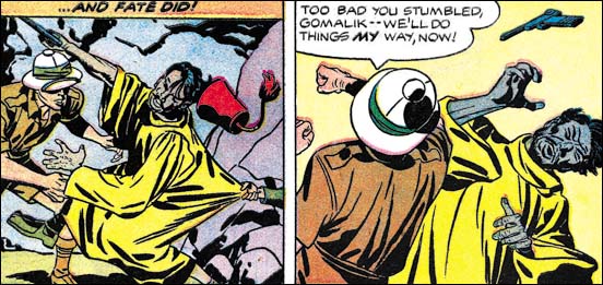
The above splash is a case that received a lot of spotting using a pen. Is this an exception or was a pen used more frequently then I thought? Unfortunately my very limited examples of DC Kirby do not allow me to say. This example has more elaborate then pen use then what was done for Atlas. The frequent use of parallel pen lines, the spacing between lines, and some of the irregularities match what was done for Atlas. I suspect that the same hand did both. What I am less sure of is whether that hand was actually Kirby’s. The above example may look like complicated pen work but it is actually has a simple layout. Just the sort of thing that Jack could have directed an assistant to do. Provided that the assistant became comfortable with the use of a pen, they need not even had been an artist.
Tales of the Unexpected #22
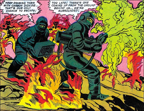
Tales of the Unexpected #22 (February 1958) “Invasion Of The Volcano Men”, pencils and inks by Jack Kirby

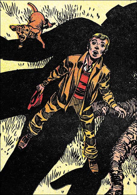
Most of this splash page from Tales of the Unexpected #22 is typical Austere inking. But look at the spotting along the centers of the arms and legs of the right figure. Spot lines of this general type often are not used to indicate shadows but just used to provide an volume to the art. Therefore I refer to these as form lines. In this splash these form lines are unusual in how densely that are used. Kirby is using this special treatment because the men are wearing special uniforms, almost like spacesuits. This is probably done to suggest a metallic nature to the suit’s surface. Years later Jack would devise a totally different way of handling the same thing. But this type of form lines was used frequently by Jack early in his career when he was doing science fiction stories (Early Jack Kirby Chapters 2, 3, 5, and 9.
House of Secrets #11
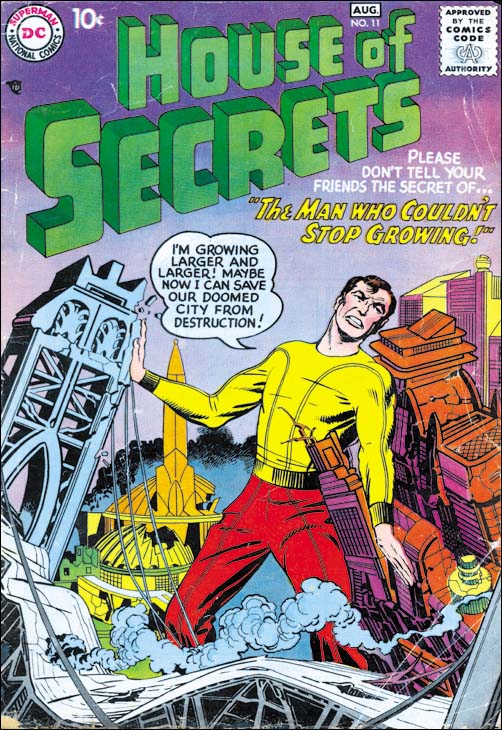
House of Secrets #11 (August 1958) pencils and inks by Jack Kirby

Kirby would also provide some covers for DC’s horror genre comics. These are inked in the Austere style very much the same brush techniques as the covers Jack did for the Challengers. Note the presence of drop strings which continue to be used but in a more reserved manner. There is some spotting using a pen but it is very unobtrusive. In this case the pen is limited to the dust cloud in the background.
Adventure #253
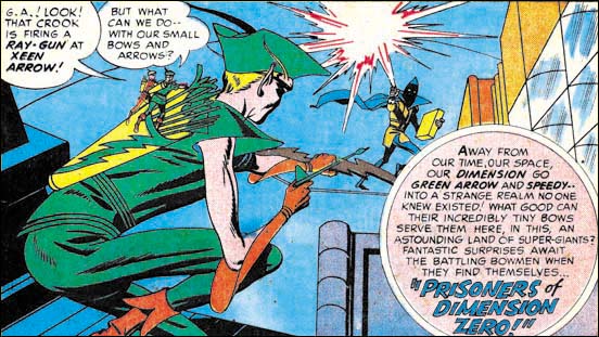
Adventure #253 (October 1958) “Prisoners Of Dimension 0”, pencils and inks by Jack Kirby

DC had a wide array of superheroes but Kirby would only get to work on one of them, the Green Arrow. The Green Arrow appeared in Adventures Comics where it was effectively a backup feature to Superboy. I do not know if I can say that the Green Arrow was DC least significant superhero, but it certainly was among the less popular ones. Was this reluctance to use Jack for standard superheroes because most of his recent work was outside the superhero genre or was it because they feared that Jack’s unique style might conflict with the previous image of these superheroes? In a way DC’s management was probably correct because the Green Arrow immediately showed the Kirby touch. Not just in the art either, the stories showed Jack’s influence as well. This may explain why Kirby only lasted seven issues. Jack had done something that was considered almost criminal by some at DC, he made the Green Arrow interesting.

Jack did his own inking for all of his Green Arrow pencils. The inking was the same Austere brushwork that we have seen used else where at DC. Perhaps because the stories were on a regular schedule the inking seems a little bit more rushed then some of Kirby’s other DC work. In the introduction to the tradeback reprint, Mark Evanier says that Jack’s wife Roz helped with the inking. This was probably limited to filling in blacks or maybe even doing some outline inking with a pen.
Adventure #254
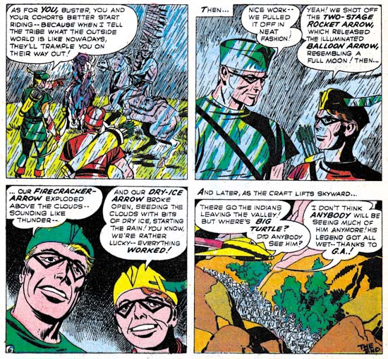
Adventure #254 (November 1958) “Green Arrow’s Last Stand”, pencils and inks by Jack Kirby

Spotting with a pen also limited in the Green Arrow art. But it does show up and once again is used for rain scenes. Could Roz have done some of this pen work under Jack’s direction? It is hard to tell from these stories but this is a topic that I will return to in this series.

Jack Kirby’s Austere Inking, Chapter 1, Introduction
Jack Kirby’s Austere Inking, Chapter 2, Mainline
Jack Kirby’s Austere Inking, Chapter 3, A Lot of Romance
Jack Kirby’s Austere Inking, Chapter 4, Prize Covers
Jack Kirby’s Austere Inking, Chapter 5, Harvey
Jack Kirby’s Austere Inking, Chapter 6, Atlas

Jack Kirby’s Austere Inking, Chapter 8, More Harvey
Jack Kirby’s Austere Inking, Chapter 9, More Prize
Jack Kirby’s Austere Inking, A Checklist and a Glossary

other post with Kirby inking Kirby:

Strange Tale Indeed
Battleground, Jack Kirby’s Return to Atlas
Captain 3D

True Love Problems and Advice #42 Cover

The Jack Kirby Blog has recently posted a scan of the cover to True Love Problems and Advice #42 (November 1956). I would like to think Bob was inspired by my recent serial post (Jack Kirby’s Austere Inking). A little over a week ago I did a chapter on Kirby’s Harvey work which included romance covers.

TLP #42 is certainly drawn by Kirby. Actually not one of his better efforts. I agree with Bob that the cop is the best part of the cover. This cover was not inked by Kirby. Judging by the spotting on the cop and his eyebrows I am certain this was inked by Bill Draut. Not one of his better inking jobs either. Again the best inking on the cover was done on the policeman.

Strange Tale Indeed, The Ending Revealed

I am always unsure how to handle how much to reveal in my Feature Story posts. I have received a request to provide the end of “Poker Face”. So I have decided to provide the ending as a comment to this post.

SPOILER ALERT: Do not click on comments if you do not want to know the ending for “Poker Face”.

Strange Tale Indeed

Strange Tales of the Unusual #7
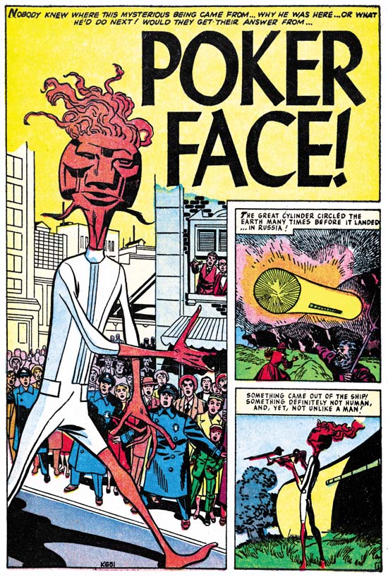
Strange Tales of the Unusual #7 (December 1956) “Poker Face” page 1 pencils by Jack Kirby

A giant alien arrives in an odd cylindrical spaceship. Without any attempt to hide, he makes visits all over the world. People’s responses vary, the Russians fire with all their available weapons, most citizens of Indian hide in the bushes but a few approach closely, New Yorkers gawk but quickly get bored and return home. But it seems that no matter how the people of earth react, the alien completely ignores them and just goes about his business. Only nobody can figure out what he is doing. He just seems to go everywhere with his weird gadgets. The answer to the riddle is provided at the end and of course it is an unexpected explanation.

When I was young I remember reading some DC comics, Superman, Batman, the Flash and so on. What I remember most about them was how boring they were. My DC phase did not last long and was never very intense. I then progressed to Marvel pre-hero fantasy, which was still filled with stories very much like “Poker Face”. I remember enjoying them very much for a while. Eventually I got tired of the formula. It may sound strange but I found the use of a surprise ending repetitious after a while. So I drifted out of comics. But later I somehow stumbled on an early Fantastic Four (probably FF #4) and I was hooked, a confirmed Marvel junkie.

This is another of those pre-Implosion Atlas where Kirby inked his own pencils. As described in Chapter 6 of “Jack Kirby’s Austere Inking” the spotting was a pared down version of the formerly used Studio style. Jettisoned from that older style were brush techniques like drop strings and picket fences. New to the inking was the use of a pen, often in parallel lines to provide grays.

Jack Kirby’s Austere Inking, Chapter 6, Atlas

Towards the end of 1956 (I am using comic book cover dates throughout this serial post) Jack Kirby began to do freelance work for Atlas and DC. This did not mean the end of Simon and Kirby productions but their working relationship must have changed. Although Joe Simon took part in presenting the Challengers of the Unknown to DC he was not involved in any of the actual freelance work that Jack did for DC or Atlas.

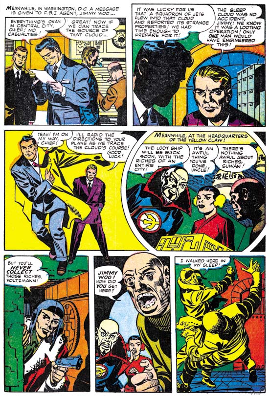
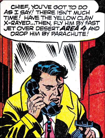
Among the earliest of the work Jack did for Atlas was the Yellow Claw. He started with issue #2 and therefore did not have anything to do with the title’s creation. Nonetheless Kirby clearly had a lot of control on the contents of the issues he did (#2 to #4). The stories are nothing like those from YC #1 and are pure Kirby. As I said in Chapter 7 for my serial post of The End of Simon and Kirby, I consider These Yellow Claw work by Kirby to be nothing short of masterpieces. The issues of interest for this serial post on Kirby’s inking are YC #2 and #3, in those issues Jack did his own inking. Whereas YC #4 was inked by someone else, with pretty horrendous results.

Yellow Claw #2
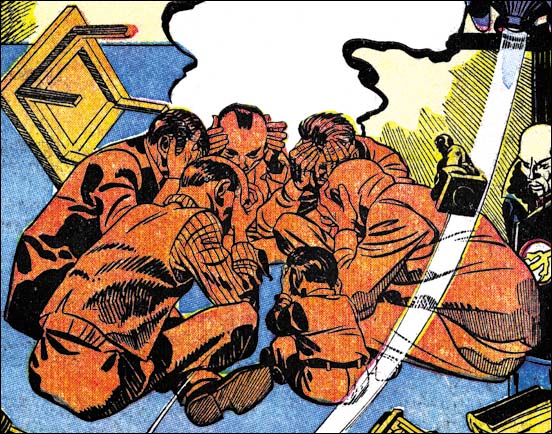
Yellow Claw #2 (December 1956) “Concentrate On Chaos” splash panel from page 1 pencils and inks by Jack Kirby

If you have been following my serial blog on Kirby’s inking styles this splash should be recognized as a Fine Studio spotting. Jack had used pretty much the same method in some of the Prize romance covers earlier in the year. The Studio Style had been a mainstay of S&K for about a decade. Not that it was entirely static but if anything it evolved into even bolder effects. I cannot say why, but in a short time Jack transformed it. Going from coarse to a finer lines may not seem like much, but it had a big effect on the final image. New here to Jacks inking was the use of a pen, previously all spotting was done using a brush. It was a pen that now did all the pickets of the picket fence patterns. Even further from the standard Studio Style was the use of a pen to just provide grays, such on the sole of the foot.

Yellow Claw #2
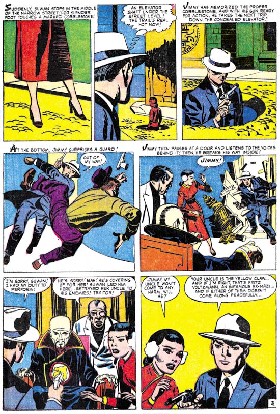
Yellow Claw #2 (December 1956) “The Yellow Claw” page 3 pencils and inks by Jack Kirby

Not all the work in Yellow Claw used pen work and picket fences. These techniques take greater effort and more time. As can be expected it was in the regular story panels where the finer work was sometimes abandoned. When that happened, as for example page 3 from the story “The Yellow Claw” (see above) the results look very much like the Austere Style. A lighter look, black areas often made by flooding an area with ink and simple spatulate cloth folds. Note the presence of shoulder blots, this is a quintessential Kirby trademark although possibly used by Joe Simon as well.

Yellow Claw #3
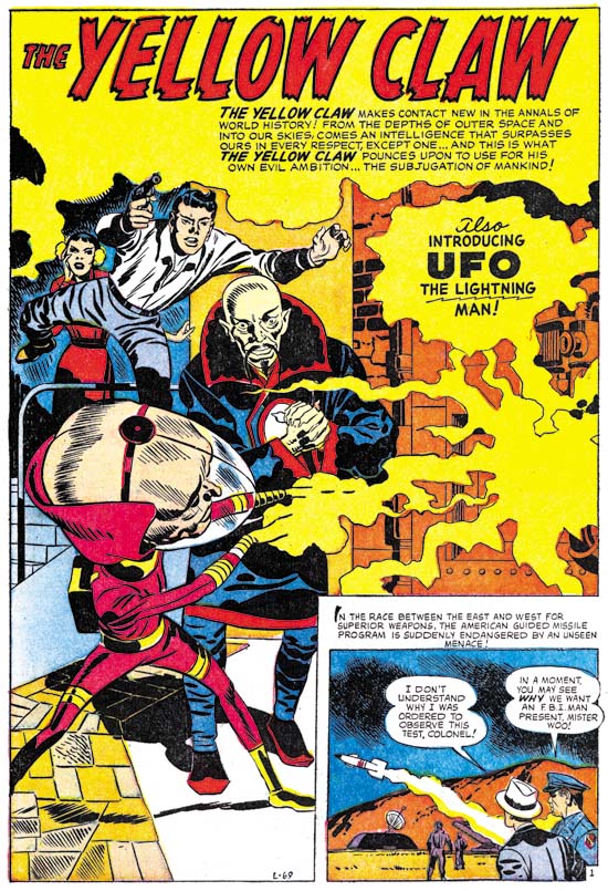
Yellow Claw #3 (February 1957) “UFO, The Lighting Man” page 1 pencils and inks by Jack Kirby

But Austere Style inking was not limited to Yellow Claw story panels. Look at the above splash from YC #3. Although the use of a pen is still evident what is missing are typical Studio Style brushworks such as drop strings or picket fences. Ignoring the use of the pen, the actual brushwork looks like very typical Austere style.

Yellow Claw #3
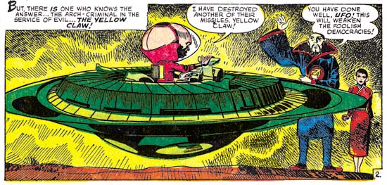
Yellow Claw #3 (February 1957) “UFO, The Lighting Man” page 2 panel 6 pencils and inks by Jack Kirby

The last panel on page 6 shows that pen work could also appear in the story art as well.

Yellow Claw #3
Yellow Claw #3 (February 1957) “Sleeping City” page 4 pencils and inks by Jack Kirby

Another example of mostly Austere type of inking on a story page. But look at the last panel with Fine Studio style using pen.

Yellow Claw #3
Yellow Claw #3 (February 1957) “The Yellow Claw Captured” page 4 panel 1 pencils and inks by Jack Kirby

I wanted to end my examination of Kirby’s Yellow Claw inking with a panel showing spotting technique that is a holdover from the standard Studio style. This is what I call the abstract arch shadow. It was not used nearly as often as some of the other inking methods that I have discussed. But it has a long history of use and given enough pages any work done in the Studio style is bound to have examples of abstract arch shadows. This is another inking method that I have not seen used outside of Simon and Kirby (or just Kirby) productions. Like shoulder blots, I do not quite get what abstract arch shadows are supposed to represent. Nonetheless when present they can be important components of the composition and make the page more interesting.

Asonishing #56
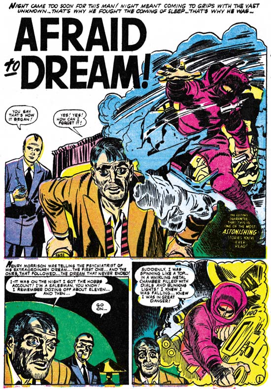
Astonishing #56 (December 1956) “Afraid To Dream” page 1 pencils and inks by Jack Kirby

I previously discussed this work. Looking over it again for this serial post I still conclude that the spotting looks like Jack Kirby’s work. It is another example of his Fine Studio style. That is not to say that it is as nice an inking job as Jack’s work in Yellow Claw. Instead the inking looks a little rushed.

Also done at this time was “Poker Face” published in Strange Tales of the Unusual #7. I will be posting an image of that story in an accompanying post. As for the inking it is typical Austere style along with occasional pen work. This job was as nicely done, if not so elaborate, as Jack’s Yellow Claw inking.

In a comment to another of my posts Ger Apeldoorn advanced his hypothesis that “Afraid To Dream” and “Poker Face” may have been originally been Simon and Kirby productions created for Harvey’s Black Cat Mystic. As I mentioned in the previous chapter, Black Cat Mystic had an incredibly bad schedule with long periods between issues. Ger suggestion is that due to that schedule Jack took the work to Atlas instead. Without a doubt either of these two stories would have fit quite well with the others that S&K did for Black Cat. The only thing that bothers me about this thesis is that the inking on these two stories, particularly the use of a pen, fit better in with the rest of Kirby’s Atlas work then they do for his Black Cat jobs. Still the inking could have been done or modified after the decision to change venues. Anyway Ger’s suggestion is intriguing.

Black Rider Rides Again #1
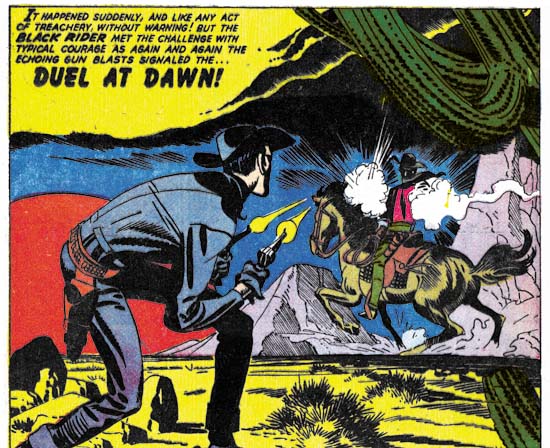
Black Rider Rides Again #1 (September 1957) “Duel At Dawn” splash panel from page 1 pencils and inks by Jack Kirby

When recently I posted on Black Rider Rides Again #1 I had concluded that the pen work was added to the art after it was delivered to Atlas. Now that I have reviewed the Yellow Claw work I feel I have to withdraw my previous opinion. The pen work in Black Rider matches what was done in Yellow Claw. In YC there can be no question that the pen work was part of the original inking, it is so perfectly integrated with the rest of the spotting. This use of a pen still bothers me. It seems so out of place from the days of the Simon and Kirby studio, I cannot recall his using a pen before. I will return to this issue next week in my chapter on freelance work done for DC.

Black Rider Rides Again #1
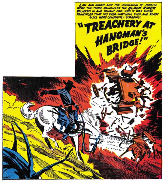
Black Rider Rides Again #1 (September 1957) “Treachery At Hangman’s Bridge” splash panel from page 1 pencils and inks by Jack Kirby

Other then the use of pen, the rest of the spotting for Black Rider is a good match for the Austere style. There is not much use of drop strings or picket fences. Well that is generally, Jack did use a modified drop string to texture the cactus in the “Duel At Dawn” splash panel. When dramatic effects called for it (such as the Hangman’s Bridge splash above), the image would be rather dark. Still over all the art has a light look that is decreased only partly by the use of a pen.

Black Rider Rides Again #1
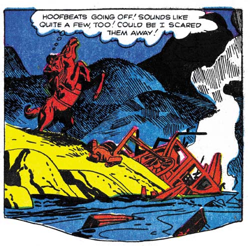
Black Rider Rides Again #1 (September 1957) “Treachery At Hangman’s Bridge” page 2 panel 2 pencils and inks by Jack Kirby

Sometimes I feel the pen work is effective, sometimes intrusive. Oddly sometimes I find it both. In the second panel on page 2 of the Hangman’s Bridge story the contrast between the Austere brush work in the foreground and the use of pen in the background gives depth to the image. Unfortunately it also distracts from the drama provided by Black Rider’s rearing horse.

Two-Gun Western #12
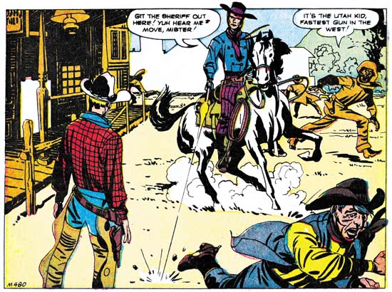
Two-Gun Western #12 (September 1957) “No Man Can Outdraw Him” splash panel from page 1 pencils and inks by Jack Kirby

This is another story that I have posted on recently. Here Jack provides a pure Austere inking. Very minimal brushwork without any of the more complicated techniques. Next to Yellow Claw, this is my favorite Kirby piece from this period. I cannot say if Kirby did the writing, but it is a great story. The figures are more elongated then typical for Kirby, a trait also found in Black Rider. This and the matching inking gives the art an almost expressionistic look which Jack puts to good use.

So far all the Kirby inking Kirby pieces I have seen that were done for Atlas were all pre-Implosion. Kirby did not ink even some with job numbers that indicate they were made before the Implosion but were published afterwards. I am not very knowledgeable about Atlas so perhaps Kirby did some inking later that I have not seen. But it sure looks like Kirby stopped inking for Atlas after the Implosion.

Jack Kirby’s Austere Inking, Chapter 1, Introduction
Jack Kirby’s Austere Inking, Chapter 2, Mainline
Jack Kirby’s Austere Inking, Chapter 3, A Lot of Romance
Jack Kirby’s Austere Inking, Chapter 4, Prize Covers
Jack Kirby’s Austere Inking, Chapter 5, Harvey

Jack Kirby’s Austere Inking, Chapter 7, DC
Jack Kirby’s Austere Inking, Chapter 8, More Harvey
Jack Kirby’s Austere Inking, Chapter 9, More Prize
Jack Kirby’s Austere Inking, A Checklist and a Glossary

other post with Kirby inking Kirby:

Strange Tale Indeed
Battleground, Jack Kirby’s Return to Atlas
Captain 3D

Jack Kirby Swiping From Bill Draut

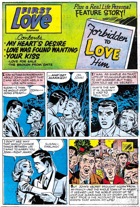
First Love #68
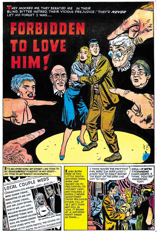
First Love #68 (September 1956) “Forbidden To Love Him”, page 1, pencils and inks by Bill Draut

A young lady meets a man at a dance and quickly falls in love. Early in the relationship the man tells the woman that he is an Indian. The lady is surprised and then ashamed at her response. She loves him and wants to marry him. On her return home she finds her parents waiting. They have heard from neighbors that her date was an Indian and they insists she stop seeing him. Of course she refuses and the conflict at home continues. The man gives a speech at a bond rally before the entire town. It is revealed that he is a war hero. He gives an impassioned speech about the importance of foreigners in the history of America and the true meaning of freedom. The town is ashamed about their treatment of the man and the couple wed with everyone’s approval.

The story of “Forbidden To Love Him” is based in Oklahoma and the chief character is an Indian. Nevertheless it is hard not to a consider this story a more universal condemnation of the racial or ethnic intolerance in much of America during the 50’s. It is a topic that Simon and Kirby had touched on in “Different” (Young Romance #30, February 1951). But their version was much more circumvent and not nearly as bold as this story. “Forbidden To Love Him” may have been a little heavy handed but it effectively highlighted the hypocrisy involved.

First Love #68
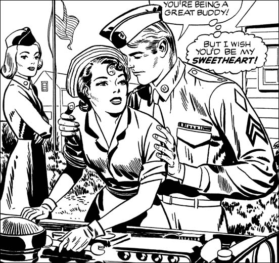
First Love #68 (September 1956) contents page, pencils by Jack Kirby, inks by Jack Kirby?

As with FL #69 we have a contents page with an introductory story that at a casual glance could appear to be the work of Bill Draut. In FL #69 the story was a sort of prequel to the feature story. Here in FL #68 it is more like the comic equivalent of a movie trailer. We have less to work with in determining the correct attribution because in four panels all we have are the couple with limited background. Still once you ignore the Draut style eyebrows Kirby characteristics keep popping out. The poses for panels 3 and 4 look particularly like Kirby’s and not the way Draut would have done it. I am discounting Joe Simon’s as the penciller because FL #69 provided examples of both Joe and Jack copying Draut. The art in FL #68 contents page matches Kirby’s version of Draut then it does Simon’s.

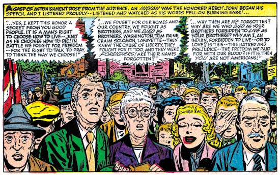
First Love #68
First Love #68 (September 1956) “Forbidden To Love Him”, page 5 panel 1, pencils and inks by Bill Draut

The last panel of the introduction story is more complicated and provides more clues as to Kirby’s involvement. In places Jack seems to forget that he is supposed to be imitating Draut and some faces look like pure Kirby. What is particularly surprising about this panel is that it is a swipe from one that Bill did in the story. Bill’s original depicted the crowd’s shame as the man revealed his wartime heroism. Jack has converted the scene to town’s anger about the coming marriage. But there is no mistaking the derivation because the lady’s father and mother have the same positions. The bride-to-be herself was left out by Jack because it would not have been appropriate for her to share the town’s anger. It is interesting to compare Bill and Jack’s approach to the crowd. Bill provides more people and arranges them to regularly diminish in size as we go from front to back. Jack draws fewer individuals and we are less aware of the size of the crowd because we cannot see the back. By doing this Kirby is able to provide clearer representation of the emotions for the people he does shows. In the comments to FL #69 Stan Taylor correctly remarked how the architecture looked like Kirby’s. This panel in FL #68 does not provide as many buildings but it still is interesting to compare Jack’s method to how Bill handle’s architecture.

Jack Kirby’s Austere Inking, Chapter 5, Harvey

While Jack Kirby was almost single handedly penciling all the Prize romance comics (see previous chapter) Joe Simon seems to have been doing some editorial work for Harvey. I say “seems” because I have no firm evidence to indicate when Joe started doing this work. Joe’s collection still includes some proofs of Harvey romance content pages. Also Bill Draut and John Prentice, long time Simon and Kirby artists, both start appearing in the Harvey romances at this time. Perhaps related to Joe’s editorial work, Jack would also provide some covers for Warfront and the romance titles. Harvey would also publish Western Tales (#31 to #33) and Black Cat Mystic (#58 to #60) which appear to be actual Simon and Kirby productions.

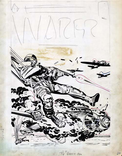
Warfront #28
Warfront #28 (January 1956) original art, pencils and inks by Jack Kirby

The inking on this cover is done in typical Studio style manner by Kirby. Not much in the way of picket fences but lots of variants of drop strings. Particularly convincing are the negative folds on the paratrooper’s right lower leg. What is not quite so certain is whether this art was originally meant for the cover of Warfront #28. The plane engulfed in flames was modeled (by no means a close copy) from a panel in “Hot Box”, a story that appeared in Foxhole #2 (December 1954). This suggests the possibility that this art was originally meant to be the cover for Foxhole #2. Certainly the penciling and inking are both good matches for some of the Foxhole covers such as issues #2, #3 or #5. However we saw in chapters 3 and 4 that early in 1956 Jack would still do a typical Studio style inking. With only four months separating the last Foxhole issue from Warfront #28, I am not sure we much we can deduce from the stylistic similarities.

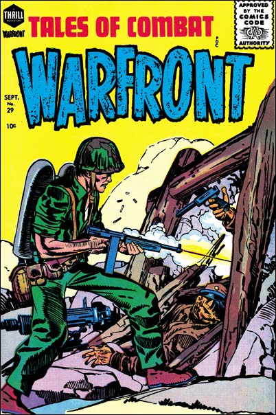
Warfront #29
Warfront #29 (July 1956) pencils and inks by Jack Kirby and Joe Simon?

Jack did the pencils and inks for much of the Warfront #29 cover. Excluded is the torso where both the penciling and inking seems to have been done by another hand. I previously discussed this cover in my serial post on the End of Simon and Kirby. There I concluded that originally the man held a flame thrower but had been reworked to avoid problems with the Comic Code. Since Jack did not do the reworking, the most likely candidate would be Joe Simon. The parts I think were inked by Jack were done in typical Studio manner.

The Jack Kirby Checklist, and some comic scholars attribute the cover drawing of Warfront #30 (September 1957) and #34 (September 1957) to Jack. I disagree with those attributions. But as far as I can remember no one has claimed that Kirby did the inking for these covers. Therefore they need not concern us here.

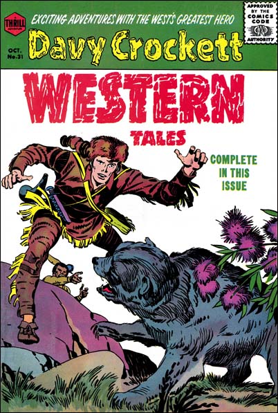
Western Tales #31
Western Tales #31 (October 1955) pencils and inks by Jack Kirby

With the end of the Mainline/Charlton S&K would want to produce new material to take their place. But what was likely to sell during these troubled times in the comic industry? Well it did not take an expert to figure this out, at that time it must have seemed that all the kids were wearing coon skin hats. Walt Disney had aired “Davy Crockett, King of the Wild Frontier” in three episodes (December 15, 1954, January 26, 1955 and February 23, 1955. The response, at least among young boys, was overwhelming. For comic book publishers, what was especially attractive about Davy Crockett was that he was a historical figure and therefore not subject to copyright or trademark protection.

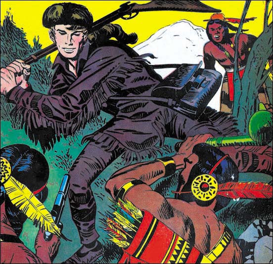
Probably the only thing unusual about these Western Tales issues was how much Kirby was in them. Actually this really was not too surprising as it was the modus operandi of S&K when launching a new title. Not all of it was new, also included in each issue was a reprint story from Boys’ Ranch. The new art was typical Simon and Kirby and used Studio Style inking. This is what would be expected judging from what we have seen for the Prize romances at that time.

Western Tales #32
Western Tales #32 (March 1956) pencils and inks by Joe Simon

Although Kirby did pretty much all the new art for Western Tales, I believe the cover for WT #32 was penciled and inked by Joe Simon. A comparison with WT #31 shows that Joe did a pretty good job with the Studio Style. Nice picket fence and drop string work. The spot inking on Davy’s right leg seems a little different then Jacks, particularly the negative folds.

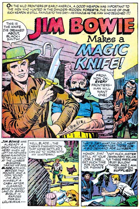
Western Tales #33
Western Tales #33 (July 1956) “Jim Bowie Makes A Magic Knife” page 1 pencils and inks by Jack Kirby

A comic on Davy Crockett might have seem very topical and free from legal hassles. The only problem was that it was obvious to other publishers as well. By the time WT #31 hit the stands there was already numerous competitors doing Davy Crockett material. Not only that but one of them was Dell who had the Disney franchise and could use a photo cover of Fess Parker, the actor from the Disney TV shows. To avoid the competition, a changed seemed in order. So the new hero for WT #33 was Jim Bowie. There was a television show for Bowie as well, but it did not air until September 7, 1956. Much too late to be any influence on Simon and Kirby. Even the movie “The First Texan” was probably too late as well (June 1956). But S&K were well aware of the Alamo, they included a double page splash on it in an issue of Boys’ Ranch. So Jim Bowie was in all likelihood just an obvious choice for a new hero.

There is a marked similarity of the art in WT #33 as compared to issues #31 and #32. This is a little surprising because by July the Prize romances were showing frequent use of the Austere Style. In WT #33 all the inking continued to use the Studio Style. With the long time between Western Tales issues I cannot help but wonder if the art was done earlier then the July cover date would indicate.

Love Problems and Advice #38
Love Problems and Advice #38 (March 1956) restored line art, pencils and inks by Jack Kirby

As if doing almost all the art for the Prize romance titles was not enough of that genre for Jack, he would also do some of the covers for the Harvey romances. Although Kirby used the Studio Style for Harvey’s Warfront and Western Tales covers, he never used it for the romance covers. None of the covers have picket fences, and even drop strings get limited use. Actually the Harvey covers are not good matches for the Austere Style either. I would give Jack’s Harvey inking a name except there are still some unresolved issues as I will discuss below.

The inking for Love Problems and Advice #38 cover is probably the one I am feel most sure about attributing to Jack Kirby. Although on a whole not in true Studio Style it does have some similarities. The way the modified drop strings are handled is the same as in the Studio Style. The clothing folds are done in a similar manner as well. New, at least for Jack, are the roughly parallel lines that cover some areas. Jack had done something similar, as for instance in the Warfront #28 cover shown above. But for Warfront #28 the lines are bold in keeping with the Studio Style. In Love Problems #38 the lines are finer, although I would still hesitate to describe them as truly fine. There are some areas flooding with black as in the Austere method, but the overall image does not have the lightness typical of that style.

True Bride-To-Be #19
True Bride-To-Be #19 (August 1956) original art, pencils by Jack Kirby inks by Joe Simon

Many, probably most, of the Harvey romance covers were not inked by Kirby. The one from True Brides-To-Be #19 that I show above is a good example of inking by another artist. Jack did indicate the folds for the clothing in the pencils so once again we find a bunching up of folds in the elbow and shoulder regions. The inker has also picked up of Jack’s flooding of ink in certain areas. But the treatment of the blacks on the man’s jacket do look a little unnatural. I am not certain, but the way the elbow folds are handled remind me of some work Simon did later so I attribute the inking of this cover to Joe.

First Love #70
First Love #70 (November 1956) pencils by Jack Kirby inks by Jack Kirby and Bill Draut?

The line inking of the First Love #70 cover remind me of Kirby. The spotting is a more questionable issue. Much of the gray of the image is created by the use of fine parallel lines. These lines are similar to those found in Love Problems #38 only finer. It could very well be that this could reflect the same move to finer brush work that we found on some of the Prize romance covers. That was in fact the conclusion that I previously reached. While reviewing the matter for this serial post I have come to a different opinion. Note the man in the background, he seems to be treated to a different spotting style. That did not bother me before because this man was a late addition. His upper part was done on a piece of paper that was pasted over previous art. The paste has held so the original art is not visible but by using a strong light from behind it looks like his place used to be occupied by the side of a house. Anyway the spotting on the man in the background reminds me of Bill Draut’s work. Bill would sometime use fine parallel lines. Compare the lines on the jacket collar of the man in the front with some of the brush work for an unpublished cover by Bill Draut shown below. Perhaps he was responsible for the spotting of the whole cover. I now think Bill did most of the spotting but I still feel outline inking of the couple were done by Jack.

The story gets more complicated. There may be two hands involved in the spotting. The first one did all the fine work that I described. The second came in later and strengthen certain areas on the man’s arm and in his hair. This was done with a very bold and assured brush. You can still make out an area on the arm where this was done with a sort of coarse picket fence brush work. If Jack was the first inker then I suspect the touch up work was by Joe Simon. The need for such strengthening is more likely seen by someone other then the original artist. If Draut was the initial spotter then Jack probably did the correction.

Artists and Models
Artists and Models unpublished cover from about December 1954 pencils and inks by Bill Draut

The Black Cat titles present a difficulty to any chronological analysis. Harvey’s support seemed to be lukewarm to publishing Simon and Kirby productions. Four to five months separate the Western Tales issues described above. That was bad, but Black Cat was much worse. Black Cat Mystery #57 is cover dated January 1956, Black Cat Mystic #58 is September of the same year. Black Cat Mystic #59 was not released until a year later (September 1957). With such long periods between releases who can be sure when the art was actually done. I will leave of a discussion of Black Cat Mystic #59 until a future chapter, but we shall see that stylistically BCM #59 was very much like BCM #58.

Black Cat Mystic #58
Black Cat Mystic #58 (September 1956) “Read To Us Mr. Zimmer” splash panel from page 1 pencils and inks by Jack Kirby

Jack drew and inked the cover for Black Cat Mystery #57 (January 1956). Considering the cover date it is not surprising that it was done in a typical Studio style, although without the use of picket fence brush work. Similar Studio style inking is found even in Black Cat Mystic #58 despite the late September date as can be seen in the splash panel above.

Black Cat Mystic #58
Black Cat Mystic #58 (September 1956) “Gismo” splash panel from page 1 pencils and inks by Jack Kirby

But not too much should be made about the absence of picket fences in the Mr. Zimmer splash. Elsewhere in the comic very typical use of picket fences can be found as for instance the splash to “Gismo”. It is a perfectly good example of typical Studio style brush work.

Black Cat Mystic #58
Black Cat Mystic #58 (September 1956) “Read To Us Mr. Zimmer” panels 4 and 5 from page 4 pencils and inks by Jack Kirby

However some of the art for BCM #58 does begin to look like Austere inking, particularly when you get into the story panels. So what should be made about this combination of Studio and Austere style inking? Considering the late date for this title it is surprising that Studio style seems predominant. I suspect that some of the art was create earlier. But since some Austere inking can be found I do not believe the all the art was done right after BCM #57 and then held until Harvey was ready to publish.

Jack Kirby’s Austere Inking, Chapter 1, Introduction
Jack Kirby’s Austere Inking, Chapter 2, Mainline
Jack Kirby’s Austere Inking, Chapter 3, A Lot of Romance
Jack Kirby’s Austere Inking, Chapter 4, Prize Covers

Jack Kirby’s Austere Inking, Chapter 6, Atlas
Jack Kirby’s Austere Inking, Chapter 7, DC
Jack Kirby’s Austere Inking, Chapter 8, More Harvey
Jack Kirby’s Austere Inking, Chapter 9, More Prize
Jack Kirby’s Austere Inking, A Checklist and a Glossary

other post with Kirby inking Kirby:

Strange Tale Indeed
Battleground, Jack Kirby’s Return to Atlas
Captain 3D
Credit Where Credit Is Due

The recent edition of Time magazine (May 7) has a very short article about a new Hulk movie. It provides a time line which starts with:

MARVEL COMICS: Created in 1962 by writer Stan Lee and artist Jack Kirby …

It is nice to see a national publication take the time to get the credits correct. Too often in the past Stan Lee alone would have been called the creator.

Bill Draut And His Imitator, Jack Kirby

First Love #69
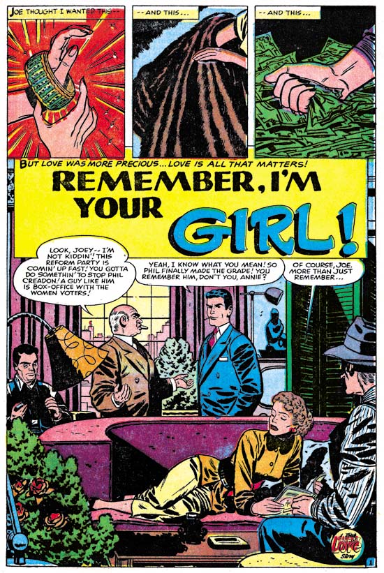
First Love #69 (October 1956) “Remember, I’m Your Girl”, page 1, pencils and inks by Bill Draut

With the period having 1956 cover dates Kirby was pretty much the only artist working on the Prize romance titles (Young Romance, Young Love and Young Brides). During this time Bill Draut and John Prentice who had previously been doing work for those titles began to appear regularly in the Harvey romance books instead. “Remember, I’m Your Girl” is typical of the work Draut did for Harvey. Bill still had an distinct style particularly characterized by simple but prominent eyebrows.

This a story about a man (Joe), his sister (Annie), and a former friend (Phil). Joe is now a successful politician and his sister is enjoying the financial fruits of that success. There is an approaching election and his position is being threatened by Phil, a rival candidate. Years before all three were good friends so Joe asks Annie to reconnect with Phil in order to find some weakness. His sister refuses but runs into Phil by accident and a romance develops. Joe wins the election but the sister continues her romance. When Joe confronts Annie to choose between her previous financial rewards or the rival, she chooses Phil.

First Love #69
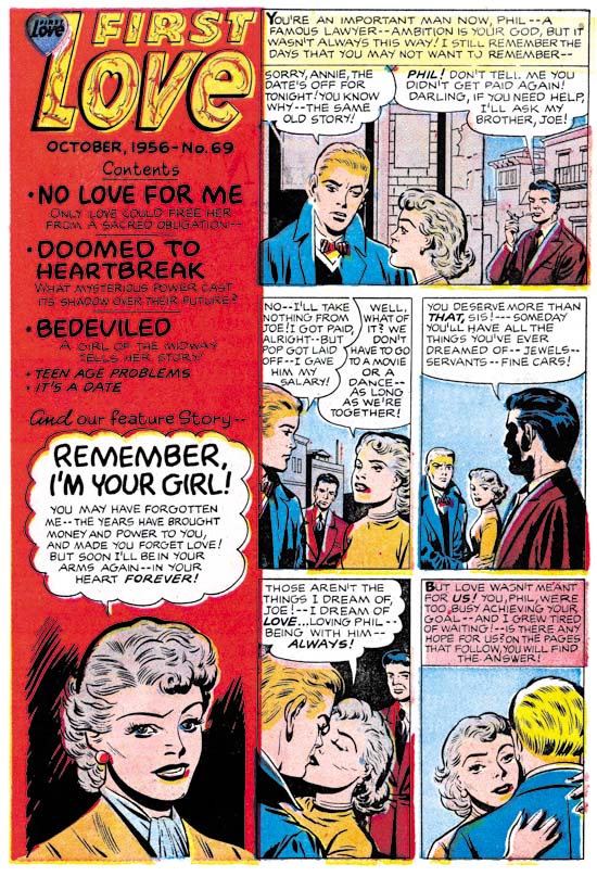
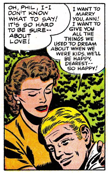
First Love #69 (October 1956) contents page, pencils by Jack Kirby and Joe Simon, inks by Joe Simon?

Joe Simon was probably working for Harvey as an editor at this time. I generally do not consider works such as “Remember, I’m Your Girl” as Simon and Kirby productions. The format and length match Harvey romance stories from well before Joe’s time as Harvey editor. However something unusual happened in FL #68 and FL #69. Generally Harvey romances has a content page with at most a portion of the splash for each story. In FL #68 and #69 the content pages had a short original art that served as an introduction to the featured story.

For First Love #69 the feature story was Bill Draut’s “Remember, I’m Your Girl”. The same characters that appear in the feature story are presented here. The text makes it clear that the trio are shown in the earlier days while they were all still friends. A casual glance at the introduction story could result in attributing it to Bill as well. What particularly stands out are the simple but prominent eyebrows, which as I said was a Draut trait. A close examination reveals that the faces are not quite like Draut would do them, particularly in the story panels. There is not much to go but the spot inking does not look like Draut’s either. But I do not think it is just the case of some other artist inking Draut’s pencils. The layouts in the introduction story are not quite like Bill’s.

It is the layouts that provide a suggestion who the real artist was. In the first panel Joe is shown lighting up a cigarette. This is a typical Kirby theme and pose. In panels 2 to 4 the main speakers are placed in the front while those not speaking are placed in the background. This is a typical Kirby layout. Even the way Annie looks over Phil’s shoulder as they embrace is a typical Kirby pose. Although the artist tried to draw the characters like Bill Draut did he really could not completely adopt Bill’s more stylized pencils. Keeping in mind that he is imitating Draut, a close look at the faces suggests Kirby was the penciler.

First Love #69
First Love #69 (October 1956) “Remember, I’m Your Girl”, page 4 panel 1, pencils and inks by Bill Draut

In the past I have often warned about using some Kirby-esque features for attributing a work to Jack. Joe Simon was also familiar with Kirby’s techniques and was pretty good at mimicking most of them. If you ignore the attempt to copy Draut’s style, the number of Kirby-isms seems rather high even for Joe. But look at the drawing of Annie that appears in the bottom of the contents panel. It appears to be the done by yet another artist. A search of the actual story shows that the contents drawing was swiped the first panel of page 4. It would seem to be a reasonable deduction that Joe Simon did the contents drawing. If that is true then he was not have been responsible for the penciling of the introduction story.

The possibility of Kirby ghosting another artist was brought up recently by Bob H. in a comment to All-Star Western #99. I do not know if what Jack did for FL #69 introduction story would properly be called ghosting. It was not a case of fooling the editor, Joe was also involved in copying Draut on the content page. Nor was Draut a regular artist recognized by the reading public. Harvey romances are all unsigned and the artist used for the feature story would change. This was just a case of trying to maintain visual continuity between the contents page and the feature story. Imitating another artist was not something Jack did very often. Although his Draut was not perfect, it was good enough to fool many.

Jack Kirby’s Austere Inking, Chapter 4, Prize Covers

Simon and Kirby always seem to put special effort into their covers. So it is on the covers that we are most likely to find the use of techniques such as picket fence or drop strings. In the last chapter we saw how in the Prize romance interior art these Studio Style methods disappeared by the end of 1956. What occurred on the covers was a bit more complicated.

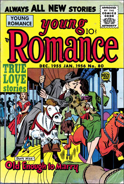
Young Romance #80
Young Romance #80 (December 1955) pencils and inks by Jack Kirby

The YR #80 cover was the first cover that Jack did upon returning to working on Prize romances. At first look one might believe that Kirby had immediately jumped into the Austere Style. Nowhere do we find any picket fence brush work and only a limited use of a drop string like technique. However the absence or limited use of these special brush work was probably due to how complicated the image was. Without the colors this becomes a difficult image to read. Because the surface was already so busy it would have been difficult to add picket fences. So the absence of picket fences can be misleading. What spotting there is more closely resembles the use in the Studio style. Later in this post I will present another cover truly done in the Austere inking which will highlight the difference between that style and what was done for YR #80.

Young Romance #81
Young Romance #81 (February 1956) restored line art, pencils and inks by Jack Kirby

YR #81 is an cover inked by Jack not long after his returned to working on the Prize romances. In the previous chapter I gave examples from the interior art of this same issue for both Studio and Austere style inking. The cover seems a good example of Studio style work. In fact if you did not know what was coming it would be easy to overlook the ways that it deviates from previous work in this style. The picket fence patterns are done every so slightly in a finer manner. Some of the spatulate cloth folds on the man’s shoulder seem more typical of the Austere style. Note how they just seem to attach themselves to fine ink lines almost like they were leaves. Also there are some fine form lines used in the man’s forearm. The entire image has a lighter look to it without being anywhere near as light as the true Austere inking. But I want to repeat that none of this would be particularly surprising except in view of what is to come.

Young Romance #82
Young Romance #82 (April 1956) restored line art, pencils and inks by Jack Kirby

Jack’s next cover for Young Romance looks rather different from the standard Studio style. It has the overall lighter look typical of an Austere piece. Yes there are blacks but they have been concentrated on the young man at the center. Elsewhere most of the spotting is rather sparse. In many respects it is a good candidate for showing the evolution from Studio to Austere inking. But look at all the drop strings and picket fences. It is not their presence that is surprising is the fact that they are now done with much finer brushings. This is the start of what I am going to refer to as the Fine Studio style. It might not warrant a special designation if it was limited to these Prize romance covers. However we are going to encounter it again when Kirby begins freelancing with Atlas.

Young Love #71
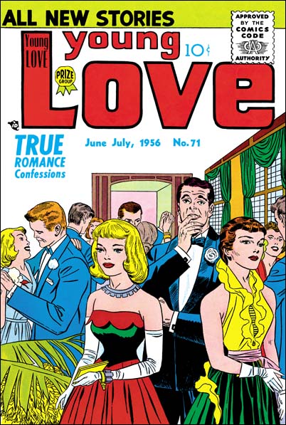
Young Love #71 (June 1956) pencils and inks by Jack Kirby

About midway through the year, Jack provides a cover that can easily be said to be done in the Austere style. Note the lighter look and the simpler treatment of clothing folds. When blacks are used they tend to flood the area as in the jacket of the man or the woman’s blouse. The ink lines are so fine that I originally thought they were done using a pen. However I have seen the original art for this cover in Joe Simon’s collection and it shows that a brush was used. Note how the folds in the jacket of the man dancing on our left seem concentrated in the elbow and shoulder regions leaving the other areas of the arm relatively plain. Although a complicated image with lots of background figures, this cover still looks very typical of the Austere style. It makes a good contrast to the Studio style used on the cover for YR #80 that I showed in the start of this chapter.

Young Brides #29
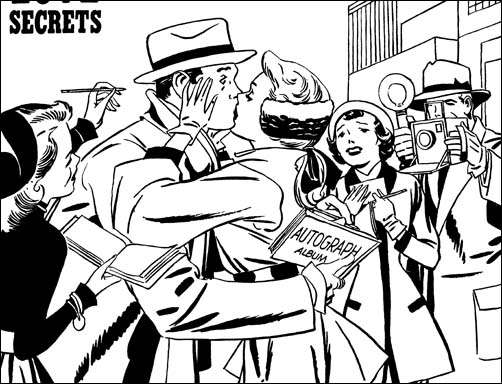
Young Brides #29 (September 1956) restored line art, pencils and inks by Jack Kirby

This is excellent example of Jack Kirby’s Austere style in inking a cover. The over all image has a very light appearance. Black is used, here in the blouse and hat of the lady on our left, by flooding the area with ink. Some of the brush work looks like a modified drop string but are for the most part done in an overlapping manner forming a ragged line.

Once again I cannot restrain myself from commenting about the art. The cover shows some celebrity surprised while signing an autograph by a kiss from an adoring fan. Very charming. But you can still see the celebrity signing the autograph book. So how did the attractive lady get into his arms? Of course she could not if we tried to interpret this cover as if it was done by a camera. But this is not a photograph nor should it try to act like one. Although not logical as a frozen moment in time, this cover makes perfect sense when view as presenting a story. Had it been more logical the story would probably have been less clear.

Young Romance #84
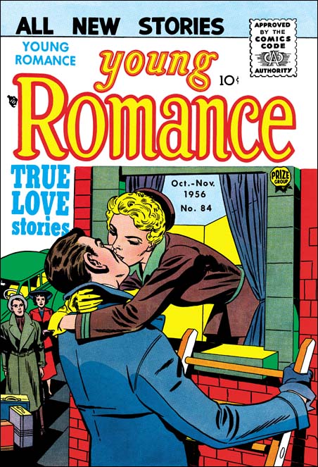
Young Romance #84 (October 1956) pencils by Jack Kirby inks by Bill Draut

This serial post is about Kirby inking Kirby. Still during this year Jack did not ink all of his pencils. So I like to include examples of other inkers of his drawings. The above image of YR #84 looks like it was inked by Bill Draut. It is interesting to see how Draut’s inking also has the lighter quality present in the Austere Style. While Kirby’s pencils did not provide any guides to the spotting, it did indicate where things like clothing folds should be placed. The more limited use of such folds gives the image the lighter look. Spotting was still up to the inker as indicated by Draut’s different handling of the woman’s jacket.

Jack Kirby’s Austere Inking, Chapter 1, Introduction
Jack Kirby’s Austere Inking, Chapter 2, Mainline
Jack Kirby’s Austere Inking, Chapter 3, A Lot of Romance

Jack Kirby’s Austere Inking, Chapter 5, Harvey
Jack Kirby’s Austere Inking, Chapter 6, Atlas
Jack Kirby’s Austere Inking, Chapter 7, DC
Jack Kirby’s Austere Inking, Chapter 8, More Harvey
Jack Kirby’s Austere Inking, Chapter 9, More Prize
Jack Kirby’s Austere Inking, A Checklist and a Glossary

other post with Kirby inking Kirby:

Strange Tale Indeed
Battleground, Jack Kirby’s Return to Atlas
Captain 3D