Category Archives: Topic

Joe Simon, Art Director

I have previously discussed Joe Simon’s work as an art director for Timely’s detective magazines. In this post I will therefore be going over familiar ground, but I cannot resist including in my blog some further example that Tom Morehouse has kindly provided. While in my previous post I was largely about the art, this one will chiefly be concerned with layouts that do not use art.


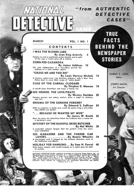
National Detective Cases vol. 1 no. 1 (March 1941)

Joe Simon (since he is listed as the art director, I attribute the layouts to Joe) surrounds the table of contents with a collage. Note how some of the figures encroach across the content’s border. This is of course the converse of having figures extend beyond the panel boarder that Simon and Kirby made such effective use in Captain America at this time. I have seen something similar in the table of contents in a later competitor detective magazines; one wonders whether it already was a common technique in such magazines when this issue of National Detective Cases came out or whether Joe introduced this device and others followed? In any case I particularly like the way the policeman on the left seems to be peering around the content edge.


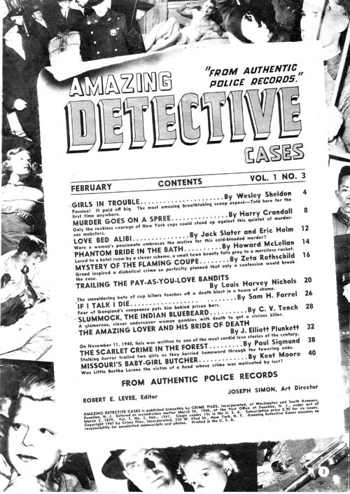
Amazing Detective Cases vol. 1 no. 3 (February 1941)

Above is another content page with a collage background. Nothing crosses the edges of the content proper but Joe gives it all a very 3-D effect by placing the contents at an angle and providing a trompe l’oeil curled top edge.


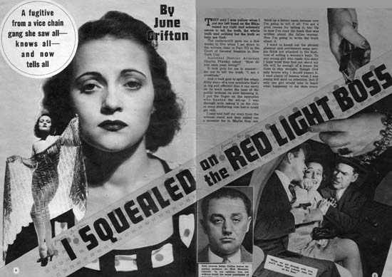
Complete Detective Cases vol. 3 no. 1 (January 1941) “I Squealed on the Red Light Boss”

But it is the opening pages of the stories that Simon provides his most interesting efforts. Pages like those in the image above can obviously be compared to the double page splashes that Simon and Kirby would in a few months do in Captain America (#6, #7, #8, #9 or #10). In some ways there are valid correspondences between the Timely detective layouts and the Captain America double page spreads. Both have designs that include a number of elements in innovative manners. For instance, both share the use of design elements such as circular fields. However the similarity between the magazine and comic spreads is not complete. The magazine layout uses some design techniques that I do not believe were ever used by Simon and Kirby in their comic book work. One of these, the placing of the start of the text at the top and almost in the center, can be explained. The equivalent in a wide splash would be putting the initial story panels in a similar location but that would not be good design because it would result in a confusing layout. This problem does not exist in the magazine layout because by its nature the text is easily distinguishable from the imagery of the rest of the layout. Another design feature for the magazine that I do not believe S&K every used in comics is the diagonally position title. In this case there was no reason why this design technique could not have been incorporated into comic books but I cannot remember any comics where Joe and Jack every used it.


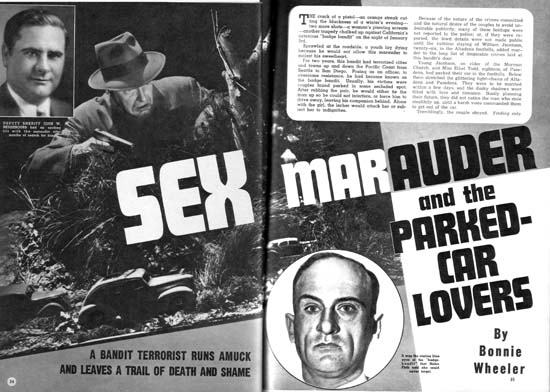
National Detective Cases vol. 1 no. 1 (March 1941) “Sex Marauder and the Parked-Car Lovers”

Above is another layout with a layout with emphasis on the diagonal and the text starting at the top of the second page.


Amazing Detective Cases vol. 1 no. 3 (February 1941)

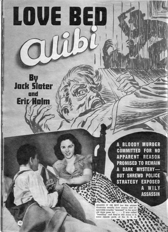
Of course layouts did sometimes include art so I will close this post with one of Jack Kirby’s best efforts for the Timely detective magazines. In “The Amazing World of Carmine Infantino” Carmine describes Kirby’s advice on how to draw a man hitting a woman:

No, try it like this: Do the scene but don’t show the people; just put the shadow on the wall. Let the reader’s imagination fill in the details.

“Love Bed Alibi” shows Jack using a shadow for somewhat different reasons. It is not so much an attempt to mitigate a violent scene as to force the viewer to go to the background shadows in order to make sense of the foreground action. It is as good a crime drawing as any Jack would do years later for Headline or Justice Traps the Guilty. The only detrimental aspect is the photo of the “bundling” bed placed on the bottom of the layout. While it is an interesting digression a more appropriate photograph should have been used.

Joe Simon, Editor

Joe Simon’s first comic book art was published in January 1940 (cover dates for Keen Detective #17, Daring Mystery #1, and Silver Streak #2). Yet just five months later he was already an editor for Fox Comics. On the face of it this was a rather dramatic rise in his career. Joe was (and still is) a talented artist but during those early days of the comic book industry there were other even more talented artists who never got further then the drawing board.

Some have attributed Joe’s success to having come from a more privilege background. Joe’s family did not live in one of the boroughs of New York City but that does not mean they were well off. Most of the time the family lived in Rochester where Joe’s father, Harry, struggled to support the family. Harry was a tailor by trade but his attempts at union organizing made finding jobs difficult. At one point the family moved to Chicago into a particularly rough neighborhood. Joe tells how at age ten he was in a fight almost every day as other boys tried to take from him what little he had. (Afterwards Harry would examine Joe’s knuckles to verify that he had given a good account of himself.) No there is nothing in Joe Simon’s background to suggest he had some advantage over his contemporaries.

Others have suggested that Joe’s college education was the reason for his quick career rise. One of the originators of this idea was, of all people, Jack Kirby. Jack should have known better. Joe did not attend any college and never received a degree.

Of course it was not just luck that Simon became an editor. Joe was obviously ambitious and a self promoter. One evidence of this can be seen in how Joe made sure to include his signature on much of his early art. Joe was not alone in being ambitious, other artists were as well. Will Eisner started as an artist before quickly seeing an opportunity of starting studio with Jerry Iger. Al Harvey started as an artist before becoming a publisher. But not all artists were so quick to try new opportunities. Perhaps if he had started earlier or had more money, Joe also would have tried setting up a studio but he did apply for the Fox editor position instead. Although not all artists were ambitious as Joe, there must have been some others who applied for the Fox editorial job. The other artist would likely have more experience in the comic book industry then Joe’s 5 short months. How did Joe manage to get the job?

Actually the experience of most, if not all, of Joe’s possible job competitors did not amount to much. It really amounted to having spent more time drawing comic books. Being a good artist, however, really was not a necessary feature of an editor. There were other tasks that an editor would need to do such as providing layouts, putting together an entire book, or interfacing with the printer or publisher. Joe had an edge up on other applicants in some of these other tasks. Previous to entering the comic book industry, Simon spent about seven years as a newspaper staff artist. “Meanwhile”, the Milton Caniff biography by Robert C. Harvey, provides a wonderful examination of his experiences as a staff artist and I am sure Joe’s was not that much different. Yes the job consisted in providing illustrations and such for the paper, but it also doing meant doing layouts, creating decorative embellishments (dingbats) and other similar choirs. It was the experience as a staff artist for a period of seven years that Joe could use to promote himself as a good candidate for the editorial position.


Acton Langslow

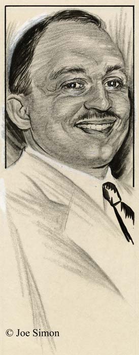
My thinking about Joe’s time as a staff artist was brought on by recent work that I have been doing on inventorying Joe’s personal collection. I have previously discussed some of Simon’s newspaper work. Work like sport and fiction illustrations, and political commentary cartoons. Recently I have scanned another aspect of his newspaper career, political portraits. There are 21 portraits all done on stipple board in crayon, ink and white out. Most of them are stamped on the back at the time of delivery. Unfortunately this stamp includes the day but not the year; the dates range from October 1 to 23. Some have names on the front and through the wonders of Google and the Internet I have found some of the names on a site called The Political Graveyard. Those that I have been able to identify are all politicians from Monroe County, New York. It is there fore likely that this was done while Joe was working for the Rochester Journal which according to his book, “The Comic Book Makers”, was from 1932 to 1934.

The above portrait was of Acton Langslow who, according to The Political Graveyard, was a Democrat, Candidate for New York state assembly from Monroe County 1st District in 1935. The two I selected for this post were both Democrats, but there were some Republicans as well.


Francis J. D’Amanda

Another has the name D’Amanda, which based on The Political Graveyard, was Francis J. D’Amanda a Democrat. Candidate for New York state assembly from Monroe County 3rd District, 1928, 1932; candidate for New York state attorney general, 1950; delegate to Democratic National Convention from New York, 1952 (alternate), 1956.

The manner of execution is quite interesting. The crayon (by this term I am referring to artist crayon, not those used by children) is used in a very loose manner with distinctive individual marks by the crayon. The hair and ties are done in ink using a brush with the ties being particularly rough. Yet when the original art is shrunk down in size, as it would have been for publication, the rough mannerisms disappear into an almost photographic representation. It was quite a performance by an artist who, if my dates are correct, was just out of high school.

Tiger 21

Joe Simon’s personal collection includes two large illustration boards of an unfinished syndication proposal, Tiger 21. The art on each board is composed of a long title section (empty on one of them) and three rows of panels each row nominally with four panels. They therefore were intended for use in the Sunday comics section. The work was never completed; the outlines for the panels, captions and word balloons were all inked and the lettering finished however all the pencils remain uninked. In the upper left corner of each board, outside of the actually art area, are the numbers 1 and 4 which represent the individual page numbers.

This posting is by no means the first report of Simon and Kirby’s Tiger 21. John Morrow wrote an article about them in The Jack Kirby Collector #15 (April 1997). Morrow discussed six pages but the illustrations he provides indicate that he worked with copies, probably stats, of the original art. However the copies were made the process had difficulty in reproducing the pencils. John provides an outline of the story which I will not repeat here. If interested you read it in Google Books. Basically Tiger 21 is science fiction about adventures in space. There was also a concept presentation piece for Tiger 21 that was included in Kirby Unleashed and Volume 2 of the Jack Kirby Treasury has a full page reproduction (page 5), again apparently from a second generation copy, of the original art.

Simon and Kirby were apt to recycle syndication proposals into comic books. I previously discussed the work they did in turning the strip “Inky” into “Artist Loves Model” published in In Love #3 (December 1954). Joe and Jack also transformed a Tiger 21 story (not one of those reported in TJKC #15) into “Homecoming: Year 3000” for Fighting American #4 (October 1954). The Fighting American only appears at the start and the end while the rest of the story is given over to Tiger 21’s Starman Zero.


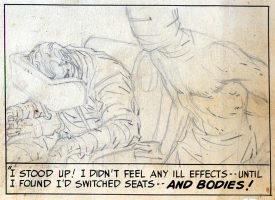
Tiger 21, page 1, panel 11, art by Jack Kirby

Starman’s appearance in Fighting American was somewhat apt as the two shared a similar origin. Both involved the use of a machine to transfer the mind from one body to another. In Fighting American it was the mind from a frail body into that of his recently deceased brother. For Starman Zero it was into a synthetic body much more durable then that of a human.


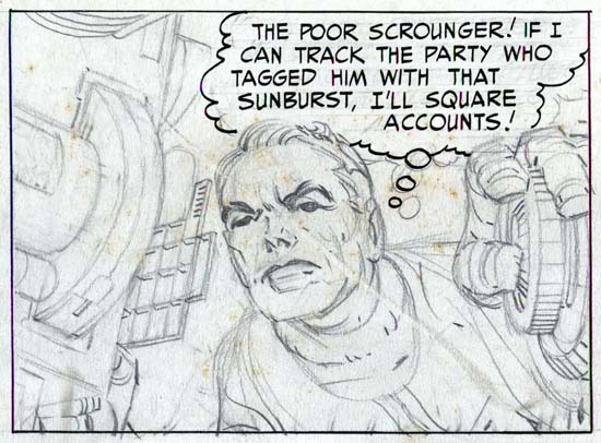
Tiger 21, page 4, panel 3, art by Jack Kirby

The artwork is quite well done in tight pencils which can be very light in certain areas. As was his practice during this period, Jack provided only lines with nothing to indicate how the spotting should be done. Cloth folds were indicated by simple lines and it was up to the inker on how to interpret them. Shadows and inking techniques were all left to the inker as well.


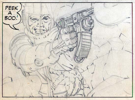
Tiger 21, page 4, panel 9, art by Jack Kirby

The pencils are very bold with lots of effective use of exaggerated perspectives. The best comparison that can be made is art that Kirby did toward the end of the Simon and Kirby studio for titles like Foxhole. This would suggest a dating to the mid ’50s. This is at odds with John Morrow’s article which assigned Tiger 21 to the late ’40s. The best way to resolve this issue would be the lettering. Howard Ferguson was Simon and Kirby’s first letterer while later this job was done by Ben Oda. I must admit I have not done a careful study of the lettering but that for Tiger 21 seems to match that used for Stuntman and Boy Explorers which were presumably done by Ferguson. Based just on a casual examination and therefore quite possibly in error, it seems to me that the switch of Ferguson lettering to that by Oda seemed to occur in early 1950. Therefore, admittedly with much uncertainty, a late 40’s date seems the most likely.

Although in his article John Morrow wrote that the title of the newspaper strip was Starman Zero, the first art page clearly shows it was actually Tiger 21. The oddly named title refers to a distant star that, in the strip, is reachable via something called the time jump. Tiger 21 was also the name of a television science fiction show that Kirby proposed to NBC in the early ’50s. For the television version, Tiger 21 was the name of the hero’s space ship. NBC eventually picked up another show instead called “Man In Space” that starred William Landigan.

Joe Genalo, Prize Editor and Colorist

Recently Lawrence Genalo, Joe Genalo’s son, left a comment to my post The Lineup. He mentioned that the center man in the lineup of the comic cover, who Joe Simon had identified as Joe Genalo, did not look like his father.

Simon and Kirby Studio
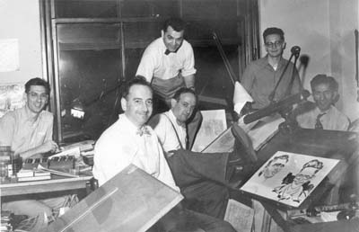
Simon and Kirby studio (probably from 1951 or 1952). Left to right: Joe Genalo, Joe Simon, Jack Kirby, Mort Meskin, Jimmy Infantino and Ben Oda

I sent Larry a copy of the studio photograph (shown above) and he has verified that the man on the left is his father. Joe Genalo is shown working on a color guide. Before him are two low boxes filled with small jars, these are the dyes he is using for his coloring. You cannot tell it from this image, but a blowup of the original photograph reveals that Genalo is working on a cover for Prize Comic Western. Joe Simon has told me that color guides were the responsibility of the publisher, Prize Comics. Joe Genalo was therefore being paid by Prize and although he worked in the studio (the publisher did not have their own bullpen) he did not actually work for Simon and Kirby. In a further email Larry mentioned that as a teenager, he and his older brother (also named Joe) would help color proofs that their father brought home.

Please allow me a brief digression. In the photograph on Joe Simon’s drawing board are two caricatures. I am usually critical about identifications based on similar photographs, but the art looks like Simon’s work. The caricature on the right is obviously of Jimmy Infantino, but the one on the left does not match anyone in the photograph. In a recent issue of Alter Ego (#76) provided in Jim Amash’s interview of Joe Simon is a photo of Jack Kirby, Joe Simon, Bill Draut, Ben Oda and Marvin Stein. When I saw the second photograph I immediately recognized the left caricature was of Stein. I strongly suspect that the reason that Marvin did not appear in the first photograph is that he was the one taking the picture.

Besides being a colorist, Joe Genalo was also an editor for Prize. The Postal Statements issued annually in comics may not be completely reliable but at least in the case of Prize comics there is no reason to discount them either. The GCD list Joe as the editor for Frankenstein Comics throughout its run (1945 to May 1956). Unfortunately I am unable to confirm that. I am in a better position for some of the other Prize titles but even with those there still are gaps due to issues that I do not have access to. The postal statements that I can verify that list Joe Genalo as the editor are:


All For Love
     #12  (v.3, n1)  April 1959

Headline
     #58  (v.8, n4)  March 1953
     #65  (v.9, n5)  May   1954
     #71  (v.10, n5) May   1955
     #76  (v.11, n4) May   1956

Justice Traps the Guilty (Prize)
     #48  (v.6, n6)  March   1953
     #60A (v.7, n6)  March   1954
     #72  (v.8, n6)  March   1955
     #81  (v.9, n3)  Aril    1956
     #89  (v.10, n5) October 1957

Personal Love
     #10  (v.2, n4)  March 1959

Prize Comics Western
     #98   March 1953
     #105  May   1954
     #111  May   1955

From this I would say that Joe Genalo was the editor for all Prize comics not produced by Simon and Kirby from at least 1953 until 1960. In 1960 Joe Simon returned to edit the romance comics, which were the only titles that Prize was still publishing. Genalo continued to work for Prize even after Simon’s return although I cannot say in what capacity.

On a more personal level, Joe Genalo was born in Brooklyn on October 21, 1920. He was actually Joseph Genalo Jr. but is never listed as such in the comic books. When young, Joe played baseball for the Brooklyn Eagles, a semi-pro team. He was an outfielder and eventually a first baseman. Joe lived in Brooklyn until moving with his family to Levittown in 1950 and in 1958 to North Bellmore. In the 50’s he was an excellent bowler, according to his son one of the best in the New York region. Other members of the Simon and Kirby studio joined Genalo in some bowling games but none were quite as good.

From his son Lawrence I learned that as a child Joe had rheumatic fever which caused two valves of his heart to be smaller then normal. Apparently Genalo did not talk about his heart problems because Simon was unaware of it until the day before Genalo left for Houston to have it operated on. His doctors were Denton Cooley and Michael DeBakey. These doctors would later become famous for their work in heart transplants, the first to be performed in the United States. Unfortunately when operating on Genalo the doctors were only aware of the problem with one of the valves. When the single valve was replaced, the other faulty valve could not take the increased pressure and it burst during the surgery. Joe Genalo died on March 15, 1963. He wife, Lorraine Mandella Genalo, lived until the age of 49 dying in 1973. They had three sons that are all still living, Joe Genalo III is now 64, Lawrence is 62 and Don is 50. Larry tells me that all are active bowlers but Don is the most successful. Don has won six national PBA titles from 1981 to 1991 and is ranked among the top 50 pros for financial success.

I am grateful for the information that Joe’s son, Lawrence Genalo, has provided. It is nice to put a more human face to one of the contributors to Prize Comics. It is also rewarding to be able to identify with certainty all the people in the above photograph of the Simon and Kirby studio. Unfortunately it also means that the man in the center of Marvin Stein’s lineup cover remains to be identified.

Prize Comics Western, a Rough History

Ger Apeldoorn’s comments to chapter 9 of “It’s A Crime” led me to search Prize Comics Western for examples of artists that had also worked for Simon and Kirby. Because of that search I have decide to post a rough outline of this western title. It is rough because I only have access to a little more then half the issues. The biggest gap consists of three missing issues (PCW #86 to #88, March to July 1951). So while it is quite probable that I may miss some artists it is unlikely that any of them played an important part in the title’s history.
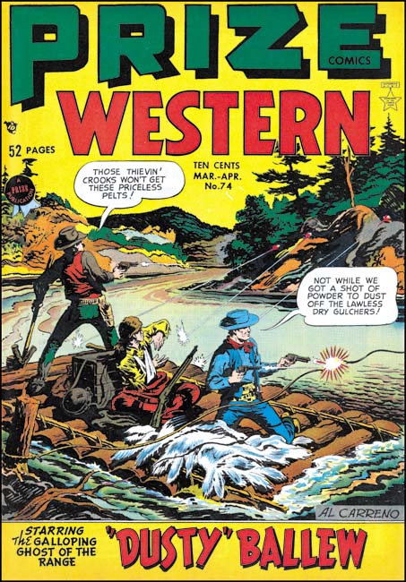

Prize Comics Western #74 (March 1949), art by Al Carreno

Prize Comics started as a superhero anthology in March 1940 (cover date). However the popularity of superheroes was in a decline in the late 40’s. Probably spurned on by the success of Simon and Kirby’s crime and romance titles, Prize Comics was renamed Prize Comics Western with issue #69 (May 1948). The primary feature was Dusty Bellows which was a typical, if nondescript, western genre piece. One of the recurring backup features was the Black Bull. While the hero had a western theme, his costume really makes him look like a typical superhero and a bit out of place in the western genre the title had now adopted. Another regular backup was the Lazo Kid.

The earlier issues of PCW would use Al Carreno as the primary artist. Carreno would do the art for the cover and the lead story as well as generally providing a backup story as well. It was Al that was most often called on to work on the title’s main feature, Dusty Bellows. Al Carreno was a competent artist but I have to admit I am not particularly moved by his work.
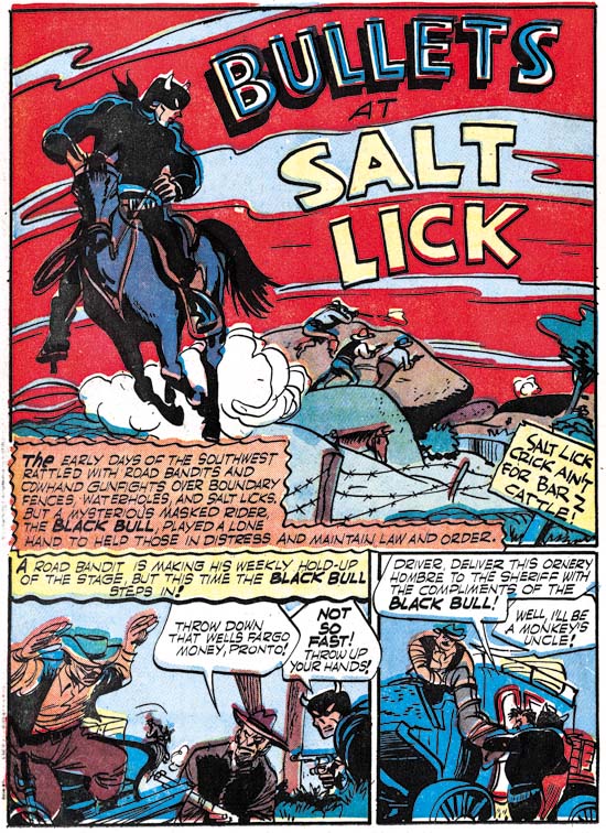

Prize Comics Western #71 (July 1948) “Bullets at Salt Lick”, art by Dick Briefer

Other artists besides Al Carreno would appear as well. As Ger indicated in his comment, one of them was Dick Briefer. Besides “Bullets at Salt Lick”, Briefer also did “Rod Roper” (PCW #69, May 1948) and “Black Bull Bulldogs a Bandit” (PCW #77, September 1949). Due to the gaps in my collection, it is quite possible he did other stories as well. Briefer was most famous for his long work on Frankenstein, but as seen in my serial post, It’s A Crime, Dick also did some work for a period for Simon and Kirby. Briefer’s work for S&K appeared in Charlie Chan, Headline and Justice Traps the Guilty from October 1948 to October 1949 which was slightly later then his work in PCW.
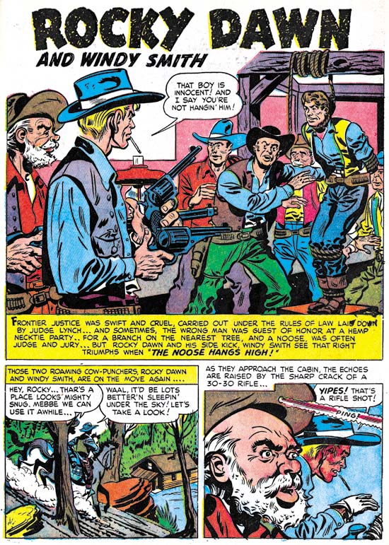

Prize Comics Western #70 (July 1948) “Rocky Dawn and Windy Smith”, art by Warren Broderick

Another Simon and Kirby artist that appeared in PCW was Warren Broderick. So far I have only found one example of his work in this western title but it a good match for the works that Broderick did for Simon and Kirby. There are 11 stories I credit as having been drawn by Warren they are all from the crime titles Headline and Justice Traps the Guilty. Broderick was involved in only one romance story (“Mother Said No”, Young Romance #7, September 1948) and even then only as an inker on Kirby’s pencils.
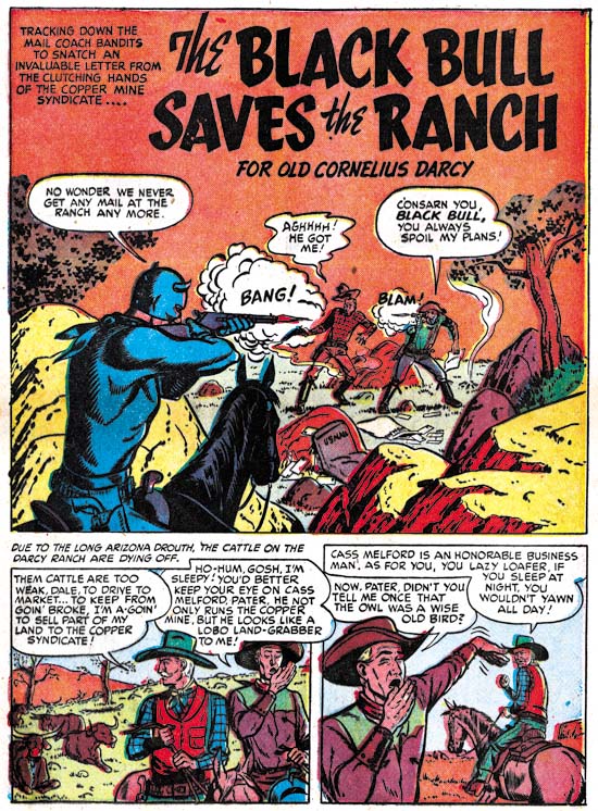

Prize Comics Western #73 (January 1949) “The Black Bull Saves the Ranch”, art by John Severin

The first appearance of John Severin in PCW was with issue #73 (or possibly #72 since I do not have that comic). This was some months before the first work that he did for Simon and Kirby (Headline #35, May 1949). In the early period of PCW, Severin only did backup stories and he did not sign his art. But once he arrived he did seem to be a consistent presence in Prize Comics Western.
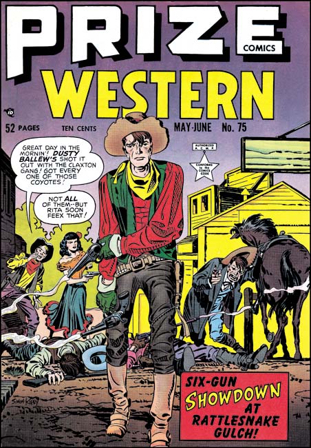

Prize Comics Western #75 (May 1949), art by Jack Kirby

Most, if not all, of the covers for the early period of Prize Comics Western were done by Al Carreno. The one exception that I am aware of was the cover for PCW #75 which was done by Simon and Kirby. What can I say, while I find it hard to be enthusiastic about Al Carreno’s covers, the one drawn by Jack is a gem. When a gunfight is depicted on a comic book cover it is usually either the moment before the fight begins or it would show the actually fight. Here Kirby shows us the aftermath, or nearly so as the Senorita is just about dispatch the sole surviving enemy. This is very fortunate for Dusty Bellew as he has already turned his back to his fallen foes. Dusty does not have any obvious injuries but the way his right arm hangs suggest he might have been winged. But even if he is physically unscathed, his expression shows that the fight has left him wearied. Pathos in triumph, Jack has depicted Dusty as an unconventional hero. Jack Kirby would draw the cover for PCW #83 as well but it was no were near as effective as this cover.
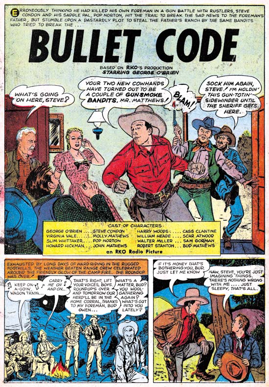

Prize Comics Western #78 (November 1949) “Bullet Code”, art by Mart Bailey

Like most of the comics published by Prize, PCW switched to photographic covers with issue #76 (July 1949). More importantly there was a change in contents. Al Carreno no longer provided work and his place as lead artist was taking by a new comer for the title, Mart Bailey. As part of the change, the lead story became a movie adaptation. I suspect it was because of the movie adaptation that Bailey was used. While Al Correno could draw well I doubt that he was able to achieve the type of realism Bailey showed in these movie adaptations. I am not saying Bailey’s realism was better art but it probably was more acceptable to RKO. The use of movie adaptations was not long lasting, the last one may have been “Stage To Chino” from PCW #79 (January 1949). However Mart continued used as the primary artist and his artwork was no longer quite so realistic.
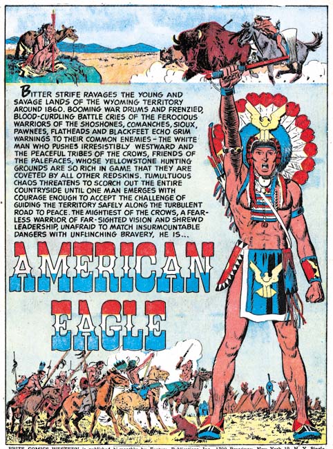

Prize Comics Western #85 (January 1951) “American Eagle”, art by John Severin

Issue #85 started the third period for Prize Comics Western. American Eagle was introduced as the new main feature. From this point American Eagle would be on every cover and always was the lead story. Generally there would be at least one backup story, sometimes more, on the American Eagle as well. John Severin had appeared in PCW for some time but now he became the lead artist. It was a position he would retain for much longer then his predecessors Al Carreno and Mart Bailey. Bailey continued doing some backup stories for a few issues before disappearing from the title. John Severin had also worked for Simon and Kirby but not after having attained the position of lead artist for Prize Comics Western.
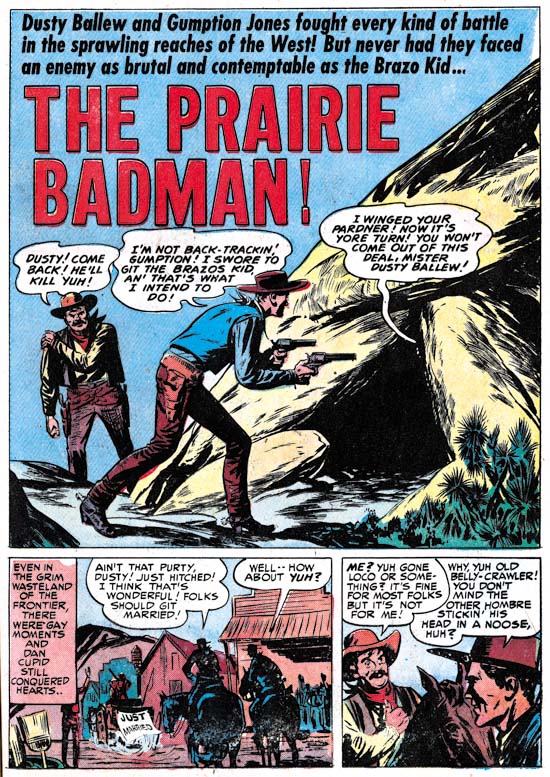

Prize Comics Western #85 (January 1951) “The Prairie Badman”, art by Marvin Stein

Another artist who had also worked for the Simon and Kirby studio began providing art for Prize Comics Western during this period. Initially Marvin Stein did various backup stories but he most commonly drew the Lazo Kid feature. In his interview with Jim Amash, Joe Simon describes “trading” Stein. Besides his work for PCW, Marvin also became the primary artist for Headline and Justice Traps the Guilty.

The period with John Severin as the primary artist came to an end with issue #113 (September 1955). A short period followed where Marvin Stein became the primary artist. However, unlike before this did not mean that Marvin did all the covers and lead stories.
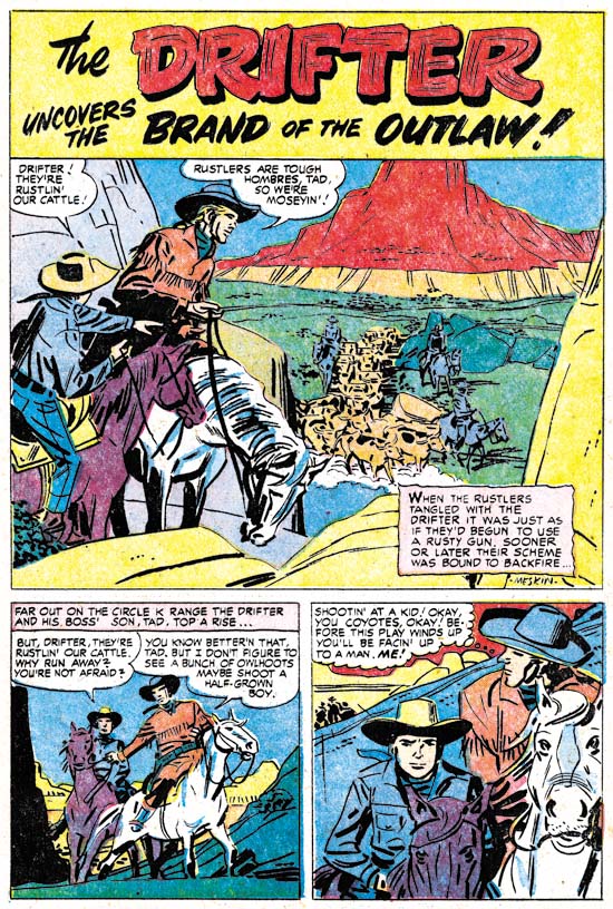

Prize Comics Western #115 (January 1956) “The Drifter”, art by Mort Meskin

It was during the fourth period that Mort Meskin began doing some backup stories for Prize Comics Western. Of all the artists that had work on PCW, Mort is certainly the one with the greatest ties to the Simon and Kirby studio.
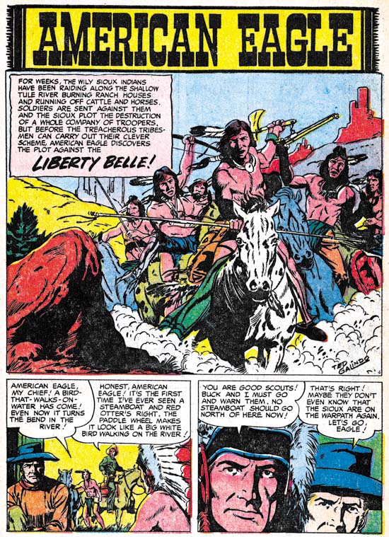

Prize Comics Western #118 (July 1956) “Liberty Belle”, art by Ted Galindo

Another artist with Simon and Kirby connections who appeared during the fourth period was Ted Galindo. Ted even did the lead story, “Liberty Belle” for issue #118. Galindo did a piece for Foxhole #4, but most of the work he did for what might be called Simon and Kirby productions came after the breakup of the studio.
The fourth period was short and it marked the end of the title with issue #119 (September 1956).

There are a number of artists used throughout the history of Prize Comics Western that I have not discussed here. The number of stories they provided were limited, I have not been able to identify them, and their artistic talents were limited.

In his original comment that prompted this post, Ger wrote that Vic Donahue was one of the artists common to the Simon and Kirby studio and Prize Comics Western. I did not encountered Donahue in the search I did on my PCW issues. I asked Ger to double check and he has not been able to find him either. I am not sure that even the combined collections are not complete so there is still the possibility that Donahue did work on PCW.

One artist, who shows up in Prize Comics Western that I have discussed yet in my serial post, It’s A Crime, was Moe Marcus (“Buffalo Stampede”, PCW #92, March 1952). While Marcus appeared in Headline and Justice Traps the Guilty he did so during the period that these titles were not produced by Simon and Kirby. “Buffalo Stampede” was inked by Rocco “Rocke” Mastroserio. Rocke is most widely known for the work he did for Charlton.

At this point it might seem that there were a lot of comics artist that work on Prize Comics Western as well as on Simon and Kirby productions. However there were more Simon and Kirby studio artists that, as far as I have been able to determine, did not work on PCW. Important studio artists like Bill Draut, John Prentice, Vic Donahue, Leonard Starr, Bruno Premiani?, Jo Albistur and Ann Brewster. There are some lesser S&K studio artists as well such as A. C. Hollingsworth, Charles Nicholas, George Gregg, Manny Stallman and Al Eadeh. Conversely, two of the primary artists for Prize Comics Western, Al Correno and Mart Bailey, never worked for Simon and Kirby. John Severin did work for both, but by the time he became primary artist for PCW he was no longer providing work for Simon and Kirby. I have already written about Joe Simon’s statement about trading Marvin Stein. Mort Meskin was an important S&K studio artist and he provided work for PCW as well. But the work Mort did on PCW was largely done after he stopped working for Simon and Kirby. Actually it is a little surprising that Mort did not supply work earlier then that as he had provided such work for Headline and JTTG when these were not produced by S&K.

The handling of Prize Comics Western seems very different from Simon and Kirby productions. As described above the history of PCW the title was very much defined by the primary artist. During each period it was the primary artist that supplied the covers, did the lead story and at least one backup story as well. Jack was the primary artist for Simon and Kirby productions. If there was a cover to be made it was almost always done by Kirby. But Jack would only dominate the contents of a new title. After the initial launching period of a title, Kirby would not dominate the contents so much and a variety of artists would be used. The type of handling of Prize comics Western was similar to that used for Frankenstein Comics and, as we will see in a future chapter to “It’s A Crime”, the same reliance on a primary artist would be adopted by the crime titles as well.
Cover for The Best of Simon and Kirby

Posted in Odds & Ends, Topic and tagged

Titan is now showing the book cover for the up-coming The Best of Simon and Kirby.

Happy Birthday Joe!

Today is Joe Simon’s birthday, he is now 95 years old. My original plans were to get a picture of Joe on his birthday and post it late today. However when I talked to Joe he remarked that he had told his family he wanted nothing special to happen on his birthday; no party or unexpected visitors. So I decided that taking a picture during my visit might not be a good idea. So in substitution here is Joe with one of his creations taken at the New York Comic Con in 2005.

French Fly


Strange #6

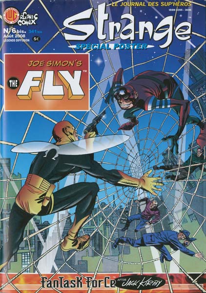
The French company, Organic Comix, has released a translated reprint of “Come into My Parlor” which was first published in Adventures of the Fly #1 (August 1959). This reprint was originally meant to be released earlier under a license agreement with Archie Comics. The only problem was Archie Comics did not have the copyrights for the Fly, those belong to Joe Simon. I am not sure why such a mistake had been made since Michael Silberkleit, then chairman and publisher of Archie Comics, had previously signed an agreement acknowledging Joe’s copyright renewal of the Fly. Whatever the reasons for the error, it was straightened out and Joe gave permission for the publication of Strange #6 with some minor alterations to indicate his ownership. There even was a friendly meeting between Silberkleit and Simon during the New York Comic Con. Unfortunately Silberkleit passed away recently (August 8, 2008).

The format for Strange #6 is rather unusual; it was published as a single folded sheet. The comic unfolds nicely to allow reading of the Fly story, but when completely unfolded the backside reveals a large poster of a Kirby female costumed character. Frankly I am not familiar with this presumed superhero. I suspect it was one of the proposals Jack made late in his life. I would include an image, but the poster is much too large to be scanned.

The Most Poorly Reworked Story in the History of Comics

Harvey comics had a long history of reprinting stories. According to Joe Simon, any comic that included previously published material was supposed to be labeled as such but that Harvey generally ignored that restriction. At the time comic book readers typically lasted on a few years before giving up comics. Use older material and it was unlikely that many would notice. However when the Comic Code arrived, Harvey Comics had a problem. There was nothing in the code against reprints, but the Code was stringent enough that older stories were unlikely to pass unless edited. I have previously provided an example of such editing (Rewrite!) although at the time I did not fully understand why it was done. I have not found a copy of it yet, I am sure the story that I had posted about, Gangster’s Girl, was originally published before the Comic Code.

The editing used to produce “Remember, I’m Your Girl” from “Gangster’s Girl” was relatively seamless. Despite the extensive editing involved, nothing obvious in the final story betrayed its reworked status. The handwriting was found on the margins of the original art looks like Joe Simon’s and so it likely Joe retrofitted “Remember, I’m Your Girl” for post-Comic Code publication. I have recently come across another example of editing done to reprint an older story for Comic Code approval. But in this case the final result was anything but seamless.

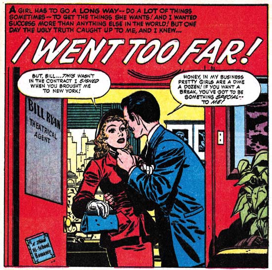
“I Went Too Far” from Hi-School Romance #19 (February 1953) was not that unusual for Harvey Comics. Harvey romances at that time were a little bit more risque then those produced Simon and Kirby for Prize Comics. By today’s standards they were still pretty tame stuff. Even then a youngster could see similar “adult” themes in the movies. When the Comic Code was introduced (the stamp started to appear on comics with cover dates about February 1955) what was suitable for a comic book reader underwent severe limitations. So when Harvey decided to reprint “I Went Too Far” changes had to be made. That changes had to be made is not at all surprising, but how they were made certainly was. The final results must have been the most poorly reworked story in the history of comics. If not I shudder to think what the worst one looked like.


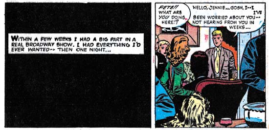
Hi-School Romance #19 (February 1953) splash

Hi-School Romance #43 (September 1955) splash

The problem faced by “I Went Too Far” under the Comic Code started with its title and theme. The whole suggestion underlying going too far was strictly taboo. Not that “I Went Too Far” truly went too far. There was nothing truly explicit presented but the protagonist Jennie was involved with men whose ulterior motives clearly extended beyond just aiding her career. Removing traces of the theme throughout the story would require significant editing, but the changing of “Gangster’s Girl” into “Remember, I’m Your Girl” showed it could be done. To start with a new title had to be used and “Broadway Lights” was a good beginning. However the caption that accompanied the title and the script in the speech balloons of the splash would never get Comic Code approval. Right away it can be seen why “Broadway Lights” would be such a disaster. Rather then come up with some new, more innocuous text, the editor simply discarded all the offending writings. That was bad enough but when combined a decision to keep the original color plates it would only highlight that something had been done. Areas could be removed from the color plates, but colors could not added. So the top of the splash page became emptied of all color.


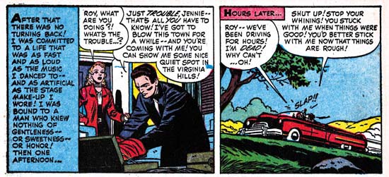
Hi-School Romance #19 (February 1953) page 4, panels 4 and 5

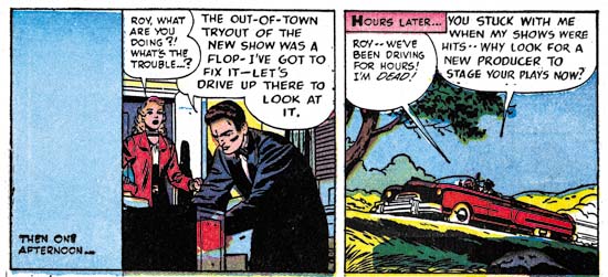
Hi-School Romance #43 (September 1955) page 4, panels 4 and 5

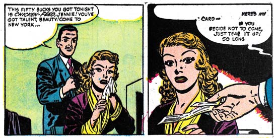
Just about any pre-Code romance story had art that needed to be changed in order to get approval. For instance any prominent display of the female figure, even when clothed, had to be adjusted. Normally this was done by judicious application of ink to shadow the offending art. This was also done in “Broadway Lights” and was the most successful of the editing changes done on that story. The Comic Code would never approve of Jennie showing her leg during an audition in “I Went Too Far”, so the leg was just shadowed in panel 4 above. Yes it left her in an inexplicable pose, but only the more observant reader would have noticed. Similar, relatively minor, additions of ink can be found throughout “Broadway Lights”.

But changes to the art were not all that needed to be done in panel 4 as the manager request for Jennie to show he leg had to be removed. Also the description of Mr. Tindal’s importance in panel 5 was obviously considered too explicit. These panels highlight another shortcoming of the editing done. It was bad enough that a shorter text was to be substituted for the manager’s speech in panel 4; no effort was made to center it in the balloon. The editing to the speech balloon in panel 5 required just the removal of previous text, but since no attempt was made to center the remaining speech the balloon looks ridiculously spacious.


Hi-School Romance #19 (February 1953) page 3, panels 1 and 2

Hi-School Romance #43 (September 1955) page 3, panels 1 and 2

As bad as the examples were of poorly edited speech balloons that I provided above, take a gander at panel 2 from page 3. Could the editor have made it any clearer to the original readers that they were getting damaged goods? In panel one Jennie’s remark was completely eliminated but the color plates left behind a trace of the original balloon like some sort of ghost. The primary reason of all this editing was the need to remove any reference to the agent offering Jennie a check for a train ticket! The editor felt that it would be okay under the Comic Code to offer a business card but not any money! Unfortunately in all likelihood the editor was probably right. Note also the editor felt that agent’s running his fingers through Jennie’s hair was also objectionable and so his fingers get the shadow inking treatment.


Hi-School Romance #19 (February 1953) page 6, panels 1 and 2

Hi-School Romance #43 (September 1955) page 6, panels 1 and 2

Most of the art changes made were done with covering over areas with black. One exception was the first panel of the last page. The original version showed Jennie’s man, Roy Tindal, packing a suitcase. This was probably the most explicit indication of the extent of the relationship between Jennnie and Roy. It was probably too subtle for most of the story’s readers to understand, but not subtle enough for the Comic Code. The suitcase was redrawn as a set of drawers or a filing cabinet. It is hard to be sure which, but that was enough. Since the color plates were not altered, this art modification left an inexplicable red patch on the side of the bureau.


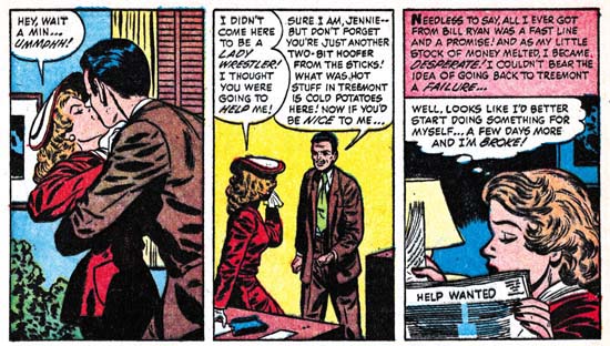
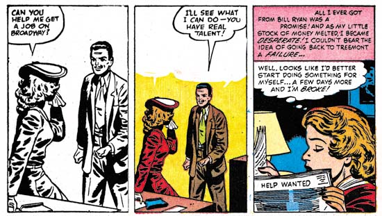
Hi-School Romance #19 (February 1953) page 4, panels 1 to 3

Hi-School Romance #43 (September 1955) page 4, panels 1 to 3

In order to remove the “went too far” theme anything remotely suggesting the trading of sexual favors by Jennie in order to advance her career had to be eliminated. Actually there was little to suggest that in the original “I Went Too Far” but there were two stolen kisses. Jennie’s reaction to the first showed it clearly was unwelcome but that did not matter it still had to go. A little shadow to a kiss scene would not hide the kiss, so more drastic measures had to be done. The logical approach would have been to have some artist provide a new panel, but obviously little in the way of artist’s fees were going to be added to the costs of updating “Broadway Lights” to the Comic Code. Instead the editor toke a copy of the line art from panel 2 enlarged it slightly and used it to replace the kiss in the first panel. Naturally the color for panel 1 was no longer appropriate so all color was removed. The results are glaringly unnatural.


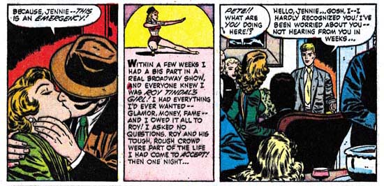
Hi-School Romance #19 (February 1953) page 5, panels 3 to 5

Hi-School Romance #43 (September 1955) page 5, panel 3 to 4

While inking in a little shadow would not hide a kiss, inking in a lot would. Completely filling in the panel was the editor’s solution for the other stolen kiss. This drastic solution for modifying art was used in another panel as well. I do not know what I find most egregious; duplicating art or completely removing it.
I have by no means pointed out all the changes made to this story in order to get it approved by the Comic Code Authority. Every single page had multiple examples of glaring obvious changes of very heavy handed editing. I am sure even the most unsophisticated original comic book owner must have known that they were reading reworked material. That reader must have been confused by the ending because while Jennie’s former small town boyfriend comes to the rescue, the scenes where he punches out Roy Tindle and the one where the cops lead Tindle away have been inked out. While in the original ending Jennie’s attempt to renew her relationship with her rescuer fails as he reveals he is to be married the next day, for the rework version the relationship is repaired. Frankly the “I Went Too Far” version really did not go too far. Nothing was explicit or beyond what might been seen in the movies of that day. None of Jennie’s actions were at all glamorized. The story was a true morality tale with Jennie’s ill made choices resulting in her loosing everything she previously had while gaining her preciously little. The Comic Code “Broadway Lights” version completely looses the moral message because despite some of her errors Jennie looses nothing of significance.
Ironically the Simon & Kirby studio regular, Bill Draut, was the artist for both the more kindly editing of “Gangster’s Girl” to “Remember, I’m Your Girl” and well as the horrendous job of transforming “I Went Too Far” into “Broadway Lights”. In neither case would the reprinting of the stories have been of any concern of Draut as he almost certainly did not get any reprint fees. Joe Simon once remarked to me that Harvey had used the left over material from Stuntman and Boy Explorers without any permission from Simon and Kirby. As Joe put it, in the comic book business even a friend would take advantage you.

Some Examples of Early Work by Leonard Starr


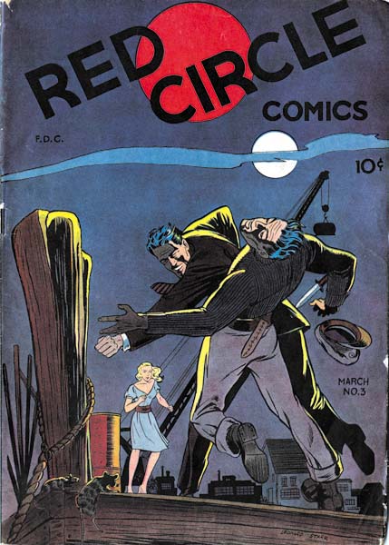
Red Circle #3 (March 1945), art by Leonard Starr

Leonard Starr began his career in 1942 and 1943 doing background art while attending Pratt Art Institute. Afterwards his worked for a variety of comics including Red Circle published by Rural Home Publishing. Red Circle #3 was released in 1945, just four years before Starr’s appearance in Simon and Kirby productions (April 1949). What a difference a few years can make. While I can detect some familiar features in Starr’s earlier art, I doubt I would have identified any of it if the signatures had been absent.

A fight scene dominates the cover for Red Circle #3. A brave man wins with his bare hands against a knife carrying opponent. An exciting cover that is excellently drawn. However in my opinion, a good cover should tell a story. Part of the story is here. The man on the wrong end of the fist had, as indicated by his hat, a maritime profession. This is fitting as the mooring ropes and rats show the locale to be some seedy port. But what is the cause of the conflict? Is it the woman who looks on? She shows an interest but no fear, so a heroic rescue is unlikely. So what does it all means? The art is well done but the story is confusing. Unfortunately the cover has nothing to do with the contents of the comic, so we will find no answer to the question.


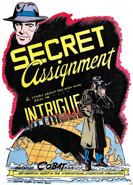
Red Circle #3 (March 1945) “Secret Assignment”, art by Leonard Starr and Frank Bolle

Starr and Bolle provide a better job for the splash of “Secret Assignment”. Anthony Cobat literally casts his shadow over the globe; he is an agent in a fight against international crime. With a briefcase under his arm, a nondescript overcoat and his face shadowed, the image of Cobat is derived from Hollywood; the use of “intrigue” in the title is superfluous.


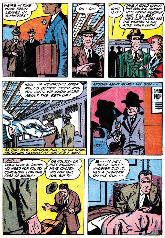
Red Circle #3 (March 1945) “Secret Assignment” page 5, art by Leonard Starr and Frank Bolle

Starr and Bolle also did a great job in the story. Their playing off of fore and backgrounds is well done. For example, the man in the stripped green jacket in the foreground is pointed out as an agent by one of the two men in the background in panel 3. In Panel 4 the foreground is dominated by a pair of gloved hands. These hands could have mistakenly been attributed to some woman except just enough of a sleeve is left to show the same green with stripes. Of course the caption also identifies the owner of the gloves and indicates that there was purpose behind the simple act of putting on gloves. My only complaint to offer about this page can probably be laid at the writer and it is an all too common error. There was really no reason to add the caption “ANOTHER AGENT RAISES HIS GUN” to panel 5, the picture was sufficient and would have been more effective without the caption. Panels without captions or word balloons were rare exceptions during the golden age of comics.

“Secret Assignment” was jointly signed by Leonard Starr and Frank Bolle. Bolle is an artist just a little older then Starr. Like Starr, Bolle’s career has included both comic book and syndication strip work. Since his name follows Leonard’s, Frank may have been the inker. But we have seen that such an interpretation maybe over simplistic for some teams such as Robinson and Meskin, or, for that matter, Simon and Kirby.

For work that Starr did for Simon and Kirby, he showed a preference for a page layout with one or two rows consisting of three, vertically extended, panels. That type of page layout is not found in “Secret Assignment”. However a related layout can be found; one where a panel row is unequally divided into three panels one of which assumes a narrow shape. The effective use of this narrow panel may have made it a forerunner of the vertically extended panels found in Starr’s Simon and Kirby work.


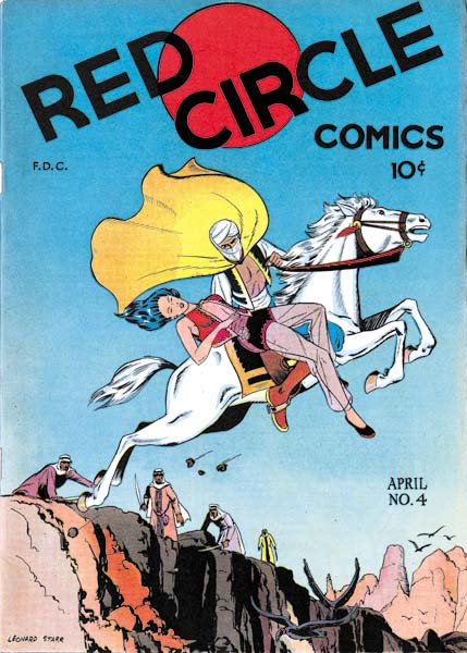
Red Circle #4 (April 1945), art by Leonard Starr

Another nicely drawn cover by Starr with, once again, a confusing story. The woman being carried away seems limp so very likely she has fainted. It is an abduction perhaps from the men in the background who are unable to pursue. A jump over some gorge might be indicated but the vultures flying below suggest a cliff instead. Was the horse magical or was there an unseen but safe landing? Who can tell? Of all the art the woman’s face is the closest to the style Starr would use later for Simon and Kirby.

It would be great to be able to show an image for the story Starr provided inside of Red Circle #4 but I am unable to do so. The interior of my copy is filled with Dorothy Lamour stories. If that was not bad enough, the first one does not even have the splash page. None of this matches what the contents of this issue should be. It looks like a Frankenstein; a combination of the Red Circle #4 cover with an old Dorothy Lamour contents. There is no sign of trimming so I believe this was done years ago. I have heard of publishers who repackaged material for resale, but this seems like an egregious example of that practice. According to the GCD, Fox Comics published a couple of issues of a Dorothy Lamour comic in 1950, but the story titles that GCD provides do not match those in my comic.