Category Archives: Serial Posts

Lettering S&K Chapter 1 The Beginning

It has been about eight years ago that I ended regularly posting to my Simon and Kirby Blog. It was a sudden ending not brought on by the lack of subject matter but rather a lack of free time. When I retired I did a couple of posts on the covers that Simon and Kirby did for Harvey. But I was pretty much convinced that I would do no other postings. It is not that I lost an interest in the Simon and Kirby subject, just that my attention and time had become directed to other projects. Along came Covid-19 and sheltering in place and suddenly my current projects could not proceed for the duration. I am not one to remain idle for long so I decided to take up a Simon and Kirby investigation I had always wanted to do. While I had once posted on Simon and Kirby letterer Howard Ferguson, I had never gotten around to doing something similar for Ben Oda. Although my initial intent was about Ben Oda alone, I found my research expanding bit by bit until it ended up covering most of the Simon and Kirby collaboration. Unfortunately I no longer have as a complete access to the comics that I once had. I made much use of the Digital Comic Museum to help with what I was missing. Even so there are some gaps and unanswered questions which I will point out at the appropriate occasions. Because my topic became so extensive, I have decided to break it into seven chapters.

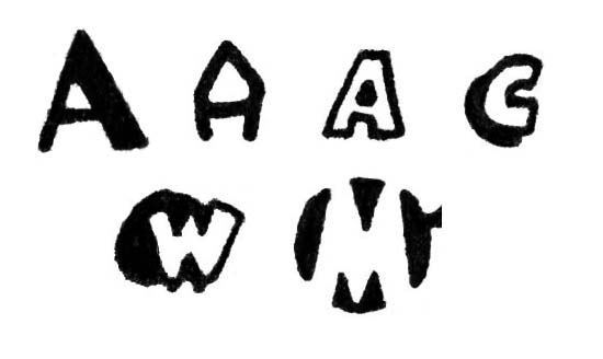
Drop Cap Types: Simple, Elaborate, Outline, Shadow, Geometric and Negative

Before proceeding it would be best to explain some of the terminology I will be using. In literature the first letter of a chapter of a book is often enlarged and sometimes made elaborate. These are called drop capitals, or as I prefer, drop caps. Something similar is sometimes used in captions found in comic books. Generally comic book drop caps can take six basic forms that are shown in the image above. While simple and elaborate drop caps may ultimately derive from literature, I do not believe outline, shadow, geometric and negative drop caps do so. I have not done the research but I suspect comic book drop caps my have originated from syndication comic strips, particularly the Sundays.

At times a description will be made of which way a part of a letter tilts. This will always be as going from left to right, the same direction that reading is done. So the character ‘/’ could be described as sloping up, while the character ‘\’ slopes down.

Identifying an individual letterer can be tricky. As a general rule, comic book lettering is done in a non cursive manner and is made to be clearly legible. Therefore identifying comic book letters is more difficult than recognizing someone’s cursive hand writing or even someone’s casual printing. One of the aids I will provide will be letter charts showing examples of all or most of the letters of the alphabet plus a couple of punctuation marks. But letterers are not machines and there will be variations in how their letters get written. Plus there is always the chance that some alterations were made by another letterer. So when assembling a lettering chart I first try to find six examples of each letter and then select the one that seems to be close to the mean of the variations.

In my experience it turns out that not all alphabetic letters are equally useful when trying to identify a letterer. Some like ‘Q’, ‘X’ or ‘Z’ are not common and may not even occur in a particular comic book feature. Other letters are common enough but often are not helpful; such as ‘L’, ‘V’ or ‘T’. The common letters that are useful for identification varies depending on the letterer. The letter ‘J’ falls in between in terms of frequency. It can almost always be found but often not enough for six examples to be located. Still I have often found the letter ‘J’ to be useful when studying letterers.

Generally only capital letters are used in comic book panel pages. Therefore letters have only one form (discounting bold and italicized lettering). That is except for the letter ‘I’. Some letterers draw all the uses of ‘I’ as a simple vertical bar. But many consider this to be amateurish. For them the correct rule is to apply small horizontal serifs to the top and bottom of the vertical bar when the “I” is used in the first person singular and without the serifs when used within a word. I do not know how this rule became established but perhaps it was to make clearer the distinction between the ‘I’ of the first person singular and the number ‘1’. There seems to be some difference of opinion about the use of ‘I ‘ in a contraction (such as “I’LL”). Some letterers provide serifs in this case, some do not.

This series of posts are largely devoted to Howard Ferguson and Ben Oda. While they were responsible for the bulk of lettering done for Simon and Kirby, many other letterers were also used. Not all these other letterers will be discussed in these posts but for various reasons many will be. The generally lack of credits during the golden age presents a problem because in most cases a name cannot be provided. But a lack of a name to attach to these letterers resulted in confusion during my research. So as an aid, nicknames were created. Although it was not clear at the start of my studies, it turned out these other letterers would show up to do some work for Simon and Kirby for a relatively short time, never to return. So while these nicknames will be used in this serial post, do not feel a need to memorize them. I suspect I will forget them before long.

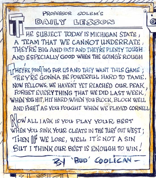
Syracuse American (1938) in “Professor Solem’s Gridology Klass” by Joe Simon

Joe Simon’s career did not begin in comic books. Actually he would likely had remained a newspaper staff artist if his employer was not one of the upstate New York papers to go out of business. While the above selection from one of Joe’s sport features was clearly not done in the same manner used in comic book lettering, it already shows some of Simon’s characteristic letters. In particular note the execution of the letter ‘W’. This ‘W’ is one of the most distinctive of Joe’s letters. It can be found not only in some of the comic book features that Simon lettered himself, but also be found in editorial alterations Joe made right up to the end of the Simon and Kirby collaboration. Also note the vertical outer bars he used for the letter ‘M’. While other letterers also used a similar design, it was not the most common form used for ‘M’. Even at this early date there appears the use of both outline and shadow drop caps.

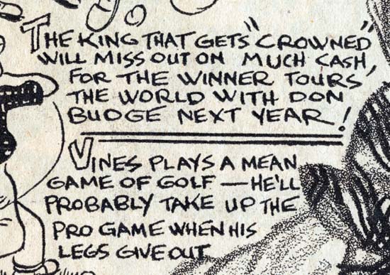
Syracuse American (April 1938) “Ellswort Vines” by Joe Simon.

The above is perhaps an example closer to the lettering used in comic books. Still the previous observation still hold, although the outer strokes of some of the ‘M’ letters are not vertical.

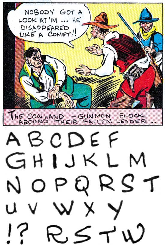
Amazing Man #10 (March 1940) “Ranch Dude” by Joe Simon

“Ranch Dude” was the first comic book work that Simon executed although it would not be the first published having been delayed by two or three months. In the early days of comic books it was not unusual for the artist to do all the writing, penciling, inking and lettering, and this was true with Joe as well. Some of the characteristics seen in Joe’s newspaper work are also found here. Particularly Simon’s distinct ‘W’. While the outer strokes to the letter ‘M’ are not quite vertical they nearly so. Sometimes Joe cannot help doing small elaborations on his letters; some examples are provided in the last line. In this particular example only simple drop caps were used. Joe’s lettering exhibits much variation in the letters and the spacing between lines. Note Joe did not use serifs on any of his ‘I’ nor do they appear on his ‘J’.

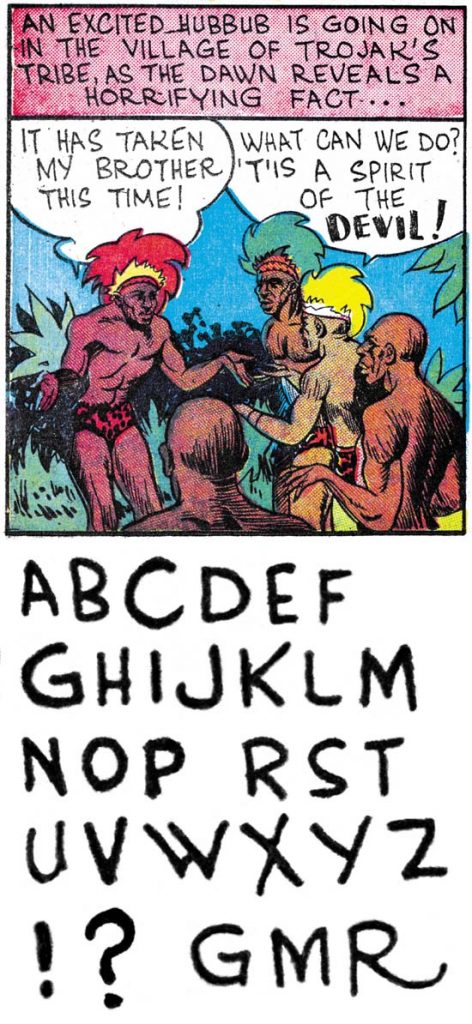
Daring Mystery #3 (April 1940) “Trojak” pages 1-11 and part of 13 by Joe Simon

Daring Mystery #3 probably was done some three or four months after “Ranch Dude”. Simon’s lettering has improved somewhat but his characters were executed pretty much the same. Perhaps the most significant difference is that the vertical stroke on his ‘G’ generally no longer extends down to form a distinct serif although as can be seen in the final line that is not always the case.

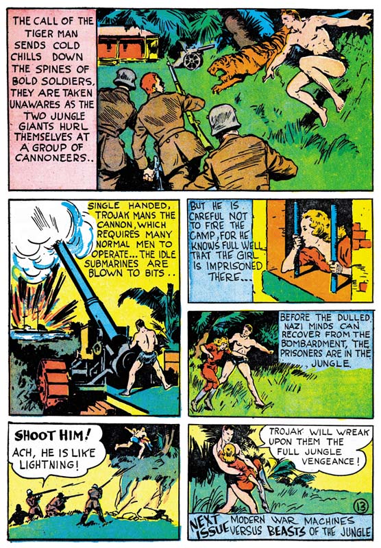
Daring Mystery #3 (April 1940) “Trojak” page 13

The GCD correctly comments that Simon did not do all the art for this feature although I would disagree in that I also credit page 11 to Joe. They surmise that perhaps Simon left the art unfinished when he went on to become the editor for Fox Comics. That however would be very unlike Joe who never hesitated to do jobs on the side while working for any particular publisher. A more likely explanation is that Simon submitted a 12 page feature but someone decided to extend it to 13 pages. So a new page 12 was drawn and lettered by someone else and Joe’s original page 12 was altered to become the new 13. The art for page 13 was redone as was much of the lettering. However Joe’s original lettering can still be found in panels 3 and 4 as well as the closing caption.

Black Buccaneer panel by Jack Kirby

Jack Kirby’s career also did not start in comic books. Rather much of his earlier efforts were directed at attempts at syndication comic strips. Perhaps because of those efforts Jack’s lettering was already more professional than that of Joe Simon. I would point out Kirby’s distinctive ‘U’ with its horseshoe shape.

Crash Comics #1 (May 1940) “The Solar Legion” by Jack Kirby

Jack Kirby’s early comic book work was done about the same time he met Joe Simon. However they do not appear to be a collaboration as Jack did all the writing, penciling, inking and lettering himself. Kirby’s comic book lettering had not changed much from his syndication strip work. His distinctive horseshoe ‘U’ remains. No serifs were used on either ‘I’ or ‘J’ but do appear on the at the bottom of the vertical stroke of ‘G’.

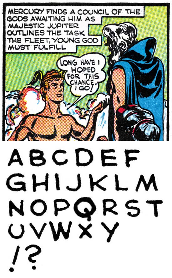
Red Raven #1 (August 1940) “Mercury in the 20th Century” by Jack Kirby

Five months later, Kirby’s lettering has not undergone any significant changes. I wanted to provide this letter set because it includes the question mark.

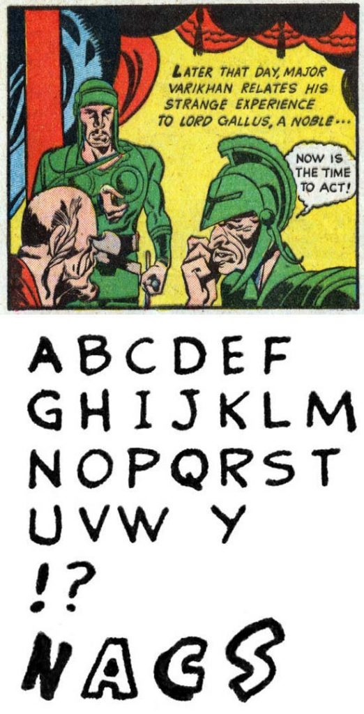
Blue Bolt #4 (September 1940) “Blue Bolt” pages 1-8 and 10 by unidentified letterer

As the collaboration between Joe Simon and Jack Kirby began they would often turn to others to do their lettering. Since credits were not provided during the golden age we do not know who these letterers were. Letterers like this example may be used for one feature and not again. In this letter set note the use of serifs on ‘I’ and ‘J’, the almost vertical outer strokes for ‘M’ and the vertical stroke for ‘G’ that provides just a suggestion of a serif at its bottom. Also the use of simple, outline and shadow drop caps.

My research for all the coming chapters has already been done so I hope to be posting a new chapter every couple of days.

Lettering S&K Chapter 2 Timely, DC and the War
Lettering S&K Chapter 3 Return from the War
Lettering S&K Chapter 4 The Oda Monopoly
Lettering S&K Chapter 5 Mainline and the Studio End
Lettering S&K Chapter 6 Post Studio
Lettering S&K Chapter 7 Conclusion

Lettering Checklists:

Alias
Draut, Bill
Ferguson, Howard
Kirby, Jack
Oda, Ben
Simon, Joe

The Wide Angle Scream, The Unpublished Stuntman

Some years ago I wrote a serial post called the Wide Angle Scream  where I discussed the various Simon and Kirby double page splashes that were published over the years. I did include one Stuntman double page splash that had not been published (Terror Island) but there were two others that I did not discuss. Actually it is a not quite accurate to say these wide splashes had not been published as they were included in Joe and Jim Simon’s “Comic Book Makers” (colored, I believe, by Greg Theakston) and more recently in “The Simon and Kirby Library: Superheroes” (colored by yours truly). At the time I did not have scans of the original art and “Terror Island” was the only spread that I had a reduced size copy of. Now I would like to return to these unpublished Stuntman splashes as a crossover with my serial post Speaking of Art.


Stuntman Comics #3 (intended) “Terror Island”, pencils and inks by Jack Kirby
Enlarged view

As mentioned above, I had discussed the splash for “Terror Island” previous but a few comments about the original art seem appropriate. This splash is missing a heading at the top of the page. One probably was present as there appear to be stains left by rubber cement. The Stuntman logo is a recent addition as the original also fell off. But most noticeable about the original art is the damage found along the margins of the illustration board. In Joe Simon’s autobiography “My Life In Comics” he writes:

The spreads had been kept in the attic where they suffered decay at the hands of the weather and damage at the paws (and teeth) of marauding squirrels.

While I am sure that this original art, and the splashes for “Jungle Lord” and “The Evil Sons of M. LeBlanc” spent some period in an attic, I doubt that the damage that they show was due to squirrels as I found no sign of marks from teeth or claws. Rather I believe that the heated conditions frequently found in attics has left the illustration boards brittle. Comic book collectors are familiar with the brittle pages sometimes found in golden age comics caused by the presence of acid in the newsprint paper. The illustration boards that Simon and Kirby used probably did not have as much acid as found in comic book newsprint but there seems to be enough that these art boards typically yellow with age. In the case of the Stuntman original art the heat has accelerated the detrimental effect of the acid making the boards brittle. Most of the damage occurs at the corners which would be expected since that is where the boards are most likely to hit up against more unforgiving objects. The boards are not actively crumbling but must be handled with care.

I should also mention the Stuntman Comics issue number I have assigned these pieces to. Simon and Kirby only used double page splashes in the centerfold of the comics. That way there would be no problems aligning pages properly with the rather primitive publishing methods used for comic books of the day. Only two issues of Stuntman ever reached the newsstands. A third issue was mailed to subscribers but it was much reduced in size and contents. Most importantly the third issue did not use a wide splash. The three unpublished Stuntman wide splashes would have appeared in Stuntman Comics issues #3, #4 and #5 if not for the unfortunate sudden cancellation of the title. I have assigned the different splashes to the intended issues based on completeness of the art. The splashes for “Terror Island” and “Jungle Lord” were both completed. However on “Terror Island” has story art at least some of which was completely inked while the story art for “Jungle Lord” on received outline inking without any spotting. As we will see the inking of the splash for “The Evil Sons of M. LeBlanc” was never finished and therefore it was worked on last.


Stuntman Comics #4 (intended) “Jungle Lord”, pencils and inks by Jack Kirby
Enlarged view

Like “Terror Island” the inking of “Jungle Lord” appears to have been completed. Only a small area in the lower right corner seems to have only received outline inking. The board is stained in this area so it seems that originally a square piece of paper or stat covered the area until it was lost when the rubber cement failed. The Stuntman logo is a new addition to replace the original which also seems to have become detached.

Previous Stuntman double page splashes had been visually complex but in “Jungle Lord” Simon and Kirby have distilled it to the essentials. Or as essential as could be expected with five main characters. A dramatic fight scene between Stuntman and a gorilla is balanced with a humorous scene of a skinny individual in a Tarzan suite carrying off a similarly clad Sandra Sylvan while below the ironically named Don Daring bridges the two. While visually complex would be done in the future (“Social Night in Town” and “Remember the Alamo”) simpler designs like this one would dominate.


Stuntman Comics #4 (intended) “Jungle Lord” close-up, pencils and inks by Jack Kirby

All the unpublished Stuntman double page splashes had terrific inking, not surprising since Jack was doing his own spotting. But in my opinion “Jungle Lord” has the best inking of the three. Jack used his blunt brush in a free but controlled manner that is just marvelous to behold.


Stuntman Comics #5 (intended) “The Evil Sons of M. LeBlanc”, pencils and inks by Jack Kirby
Enlarged View

Clearly Kirby was working on “The Evil Sons of M. LeBlanc” when Simon and Kirby received the news that Stuntman had been cancelled. Three of the figures appear to be fully inked, one (the Tumbler) may be almost but not quite completed (mainly work is lacking on his left forearm) and two only have outline inking. Stuntman figures large, probably the largest figure in a splash that Kirby ever drew during the period he partnered with Simon.


Stuntman Comics #5 (intended) “The Evil Sons of M. LeBlanc” close-up of Lash, pencils and inks by Jack Kirby

Standard inking procedure for Simon and Kirby was to first provide simple line inking. Because Kirby’s pencils were pretty tight this task could be assigned to a less talented artist. It is interesting to compare the lined inked Lash with an unfinished Boys Explorer page that did not progress beyond the line inking (Jack Kirby’s Austere Inking). The lines found in the Boys Explorer page show little variation in width almost as if they were made from wire. On the other hand the lines used to construct Lash show variation in thickness line as compared to line and also along the length of a line. The difference is not great but it does suggest a more talented hand did the line inking for the Stuntman #5 splash. Although it is hard to be certain, but I believe that on this splash Jack did the line inking himself.


Stuntman Comics #5 (intended) “The Evil Sons of M. LeBlanc” close-up of Stuntman, pencils and inks by Jack Kirby

The figure of Stuntman is almost certainly complete, it is hard to imagine how anymore spotting could be applied without having a detrimental effect. While the spotting does not have quite the bravura brushwork as found in the “Jungle Lord” splash it can still take the breath away.

Kirby Inkers, Al Williamson

I have previously posted on some of the artists that have inked Jack Kirby’s pencils (Mort Meskin, Marvin Stein and Captain 3D). Unfortunately my restoration work for Titan’s Simon and Kirby Library takes up so much of my time that I have been unable to pursue this topic further. However my work for the upcoming Science Fiction volume has allowed me to examine in detail the inking used for Race for the Moon and Blast-Off. It was particularly fortunate that I had available either the original art or flats (production proofs of the line art) of pretty much all the interior art for these two titles*.

Before discussing the evidence from the art, it would be best to start with a presentation of some of what has been said by others. In his book, Joe Simon, My Life in Comics Joe writes about Race For The Moon:

When I proposed the title, Jack welcomed the work. I wrote most of the stories, although Dick Wood, Dave Wood and Eddie Herron contributed some scripts. Because Kirby was penciling some of them, I was able to sign up three of the best inkers in the business. Reed Crandall, Angelo Torres, and Al Williamson, each of them a brilliant artist in his own right, all wanted to work with Jack. In addition to inking Jack’s pencils, they got to illustrate some stories on their own.

In an interview with Al Williamson from the Jack Kirby Collector #15:

TJKC: Did you and Wally ever discuss how to approach inking Kirby?

AL: No, it was a job. I remember going up to Harvey and getting work there. They said, “We haven’t got any work for you, but we have some stories here that Jack penciled. Do you want to ink them?” I’d never really inked anybody else before, but I said, “Sure,” because I looked at the stuff, and thought, “I can follow this.” It’s all there. I inked it, and they liked it, and they gave me three or four stories to do.

TJKC: I was just reading some of those Race For The Moons. There’s some beautiful stuff there.

AL: Well, he did a beautiful job. Some of it was redrawn by somebody there, I guess because it didn’t pass the Comics Code or something. There’s parts that I didn’t ink, because it’s not my drawing or Jack’s drawing. Somebody went over it and changed some things, like a monster or something to make it more pleasing to the eye, which bothered the hell outta me. I never really thought I did him justice, though. The drawing is there, because it’s Jack Kirby’s drawing, but I just traced what he penciled.

TJKC: Did you feel intimidated to add too much of yourself to it?

AL: I don’t do that. If the job is penciled, I would ink it the way the guy penciled it, because it’s his pencils. If I think it needs something, I’ll call the artist up and say, “Listen, I kinda would like to add a black here. Is this all right with you?” And as a rule, they say, “Sure. No problem.” But I don’t do any redrawing on anybody’s work unless I talk to the artist-and I very seldom have to do that.

Also in the interview, Williamson remarked that he did not ink any covers. So we have Simon crediting the inking to three different artists (Crandall, Torres and Williamson) and Williamson saying he inked somewhere between three and five Kirby stories. It is important to remember that such testimonials is evidence but not the proof that all too many comic book historians take it for. I am continually surprised that so many take evidence based on memory as fact. I would have thought that from what has been learned from legal cases over the years would discredited over reliance on memory. People’s memories are not created like a video recorder saving all that a person sees and hears. Rather memories are more like stories that people create and retell over and over. Such stories are biased and often are like a morality tale that tell more about the person telling them than what actually occurred. As years pass, the memories are effectively retold and change even further. Inaccuracies are expected and not a sign that the person is lying, that is trying to deceive. So I prefer to treat such interviews as evidence but I also turn to the work itself to find further evidence to support or refute what has been said.


Alarming Tales #6 (November 1958) “King of the Ants” page 2, pencils and inks by Al Williamson (from bleached page)

Artists have their own inking techniques that they use over and over. One place to start would be to examine how an artist inks his own work. Fortunately Williamson created a story, “King of the Ants”, for Alarming Tales #6 at the same times that Race for the Moon #3 came out. Regrettably Harvey’s had very poor printing so I use a bleached page to use as an example. Page 2 illustrates a number of techniques that Williamson was fond of. One was the use of multiple very broad brush strokes that are somewhat irregular and placed side by side. Examples can be seen in the lower right corners to panels 2 and 4 in both cases right above the figure’s shoulder. As far as I can tell, these irregular inking patches are not meant to depict any realistic feature but rather serve as an abstract pattern. I do not have a good name for another technique but I sometimes describe it as mottled crosshatching. This can be found in the right side of panel 4 just above the other inking technique described above. Sometimes Williamson uses a looping ink line to describe foliage such as found in bottom center of panel 1 right in front of the fallen tree trunk. Another technique is more of an anti-inking process where Williamson removes a panel’s border such as in panel 6. I have not seen the original art for “King of the Ants” but on original art that I have seen Williamson has cut page with a razor and peeled off the panel border. Of course anyone could have done it but such borderless panels are commonly found in work that Williamson inked but not other stories done for Harvey so I attribute the action to him.


Blast-Off #1 (October 1965) “Space Court” page 5, pencils and inks by Al Williamson

It might seem odd to use work published in 1965 to illustrate Williamson’s inking techniques from 1958 but in fact the Comic Code Authority stamp on the original art was dated March 6, 1958. This date was a few weeks earlier that the approval date for the art for Race for the Moon #3 (cover dated November 1958 but Comic Code approval date of March 28, 1958). It may be a minor mystery about what title this story was originally intended or why it was not published until years later, but it is a perfect match for this discussion about inking techniques.

Some of the previously discussed techniques can be found in the “Space Court” story as well. For instance the removal of panel borders, in whole or in part. Also note the background inking for panel 5 appears to be an expansion of the technique described above. What this page shows is another technique that is not technically inking, that is the use of Ben-Day dots. These are found in panels 3 and 4 giving both a grey background. The Ben-Day patterns were applied as transparent overlay sheets that were carefully cut with a razor to cover the desired areas. Williamson used Ben-Day dots with the standard dot patters arrange in the angles used for printing but also irregular dots (mezzotint patterns) and hexagonal arrangements.


Race for the Moon #2 (September 1958) “Lunar Trap” page 2, pencils by Jack Kirby, inks by Al Williamson

The inking of the Kirby pencils for Race for the Moon and Blast-Off can be placed in three groups that show related features. The first group consists of “The Thing on Sputnik 4” and “Lunar Trap” both from RFTM #2. These works were inked using both pen and brush. They differ from the next group is the general lack of some of the techniques that I have describe Williamson as using. None of the panel borders have been removed in these two stories and there is no use of Ben-Day dots. There is only one example of the looping ink line but this is not too surprising since Williamson often used this technique in rendering foliage and there are no plants on the moon. Two other Williamson inking techniques only appear in one panel; panel 2 from page 2 of “Lunar Trap” shown above. There we find the mottled crosshatching and that irregular broad brush strokes. Despite the infrequence or absence of some of Williamson’s inking techniques I still credit the inking to Al. As far as I can see only one hand was involved in the inking of these two stories and the pen and brush work looks very much like that found in stories I am convinced were inked by Al Williamson. I suspect these two stories were the first ones by Kirby that Williamson inked and he was just getting comfortable with working on Jack’s pencils.


Race for the Moon #2 (September 1958) “The Face on Mars” panel 2 page 2 and panel 5 page 4, pencils by Jack Kirby, inks by Al Williamson

The next group of five Kirby stories are the ones that I am pretty confident in crediting the inking to Al Williamsons. These are “Island in the Sky” and “The Face on Mars” from RFTM #2, and “The Long, Long Years”, “Saucer Man”, “Space Garbage”, and “The Garden of Eden” from RFTM #3. These contain all the techniques that I describe above based on Williamson’s inking of his own pencils. I do not want to leave the impression that these techniques are abundantly found in Williamson’s inking but rather the usually can be found when enough pages are examined. I provide scans of panels from two different panels above to show some of the Williamson techniques found in these stories.


Blast-Off #1 (October 1965) “The Great Moon Mystery”, pencils by Jack Kirby and inks by Al Williamson

The third group consists of the Kirby penciled stories that appeared in “Blast-Off #1 (October 1965) which are “Lunar Goliaths” and “The Great Moon Mystery” Although I have examined the original art for these works they still are another of those minor mysteries. Neither story has Comic Code approval stamps. Further neither story has any indication of a previously intended title. Typically the original art would have on the top left just above the art the comic book title and page number it was intended for. Even when the title changed white out would typically be used to remove the outdated information so the new title and page could be added. No white out was used so the Blast-Off #1 information placed on the original art was the first applied. But both stories are Three Rocketeer stories and that feature first appeared in RFTM #3 so these two stories were likely intended for the unpublished RFTM #4. Certainly Kirby’s pencils are in the same style used for the 1958 RFTM and not at all a match for what he was doing in 1965 for Marvel Comics.

The inking of the two Blast-Off Kirby stories is more like the first, presumably earlier, group. Absent are any sign of most of the techniques I have described from Williamson’s inking of his own pencils. The only exception is the relatively frequent use of Ben-Day dots in “The Great Moon Mystery”, but they are not found at all in “Lunar Goliaths”. You can see the Ben-Day dots in the moon-scape background for the splash panel shown above. Although the comic book shows no sign of Ben-Day in the second (left) panel the original art shows that they were there. However Williamson used such a fine dot pattern that they complete got lost in Harvey’s rather crude production. Despite the fact that some of Williamson’s inking techniques, I still feel that the inking is very much the same as Williamson’s other work, just not as much embellished. I admit that this group and the first one require further study of the techniques used to either confirm or refute my attributions but for now I credit all the inking of Kirby’s pencils for RFTM or Blast-Off to Al Williamson.

In the interview Williamson says that he closely followed Jack’s pencils, as he described it “it’s all there”. My studies seem to support that. Unlike some of Kirby’s inkers, Al does not overwhelm Jack’s pencils, there is never any question that whose penciled it. Most of the effects of Williamson’s inking come from the spotting. It would appear that for RFTM Kirby provided tight line art but left the spotting to the inker. That was the typical technique Kirby used during the Simon and Kirby collaboration. Williamson was a talented artist with great control of his pen and brush work. In my opinion the inking Williamson did was some of the finest ever done on Kirby pencils. Unfortunately the printing used for Harvey Comics in the late 50’s was incredibly poor and some of Williamson’s efforts were lost.

Williamson also claims that someone reworked sections of the stories. “There’s parts that I didn’t ink, because it’s not my drawing or Jack’s drawing”. This clearly indicates that the rework would have happened after Williamson did the inking. However Joe Simon’s collection includes all the original art for the Kirby except for “The Long, Long Years” and I studied them all. Any changes that was done after the initial inking would have to have used white-out or other techniques to remove the original art for replacement with newer work. None of the original art shows any sign that this was done. The only use of white-out or paste-ups was on the lettering. I am sure Williamson believed what he recalled for the interview but it is just another example of the failings of evidence based on memory.

footnotes:
* 40 pages of original art and 11 pages of flats leaving only a single introduction page based only on the printed comics.

Harvey Horror: Alarming Tales #3


Alarming Tales #3 (January 1958), pencils and inks by Joe Simon

For a long time this cover was considered the work of Jack Kirby but it was actually created by Joe Simon. This confusion is understandable because it is a swipe from an unpublished cover that Jack did (for a more complete discussion see Alternate Versions of the Alarming Tales #3 Cover, although I no longer believe Kirby was the inker on the unused cover).


Alarming Tales #3 (January 1958) content page, pencils and inks by Joe Simon

The contents page was used is an house advertisement in Black Cat Mystic #61.


Alarming Tales #3 (January 1958) “This World Is Ours”, pencils by Jack Kirby

The inking of this story has in the past been attributed to Steve Ditko but I think we can confidently reject that claim. The figure in the lower right corner of the splash does look a little like Ditko’s work, however the blunt brushwork is nothing like Ditko’s inking at the time. One explanation could be that the inking of the splash was done by Mort Meskin whose work greatly influenced Ditko. Beyond the figure’s appearance, nothing in the brushwork suggests Meskin’s inking. Still I find it hard to believe that Kirby inked the splash either. The rest of the story does look very much like the inking of Kirby himself.


Alarming Tales #3 (January 1958) “They Walked On Water”, pencils and inks by Doug Wildey

There is a lot of work by Doug Wildey in AT #3 and in fact he would be frequently used in later issues of Alarming Tales and Black Cat Mystic. Wildey was an accomplished artist but unfortunately sometimes worked in greater detail than the crude printing of Harvey comics could handle properly.


Alarming Tales #3 (January 1958) “Get Lost”, pencils and inks by Ernest Schroeder?

I am really not that familiar with the artists from Harvey at this time and this attribution is from GCD. Ernest Schroeder is said to have worked for Simon and Kirby around 1954 (Who’s Who). I do not find him in my database but that just means that I have not identified his work not that he did not work for them. If he did work for Simon and Kirby he did not sign his efforts. “Get Lost” has some interesting art, particularly the way Schroeder uses lighting to provide dramatic effects.


Alarming Tales #3 (January 1958) house advertisement, pencils and inks by Joe Simon?

The art for this house ad was used as the contents page for Black Cat Mystic #61. Someone commented in my post of that issue that Nostrand was no longer working for Harvey at that time. IF that is true it may be that this content page/ad was done by Joe Simon swiping from an earlier Nostrand piece.


Alarming Tales #3 (January 1958) “The Strange One”, pencils and inks by Doug Wildey

I have to admit I am not a great fan of all the Harvey stories particularly those from after the Comic Code came into effect. While I like the Wildey’s art work for “The Strange One” the story is a bit contrived for my tastes.


Alarming Tales #3 (January 1958) “The Man Who Never Lived”, pencils and inks by Doug Wildey

It appears to me that Wildey often worked from photographs. That is not to say that all his drawings were done based on photos but that some were. “The Man Who Never Lived” seems to have a larger than normal amount of drawing from photographs.

Harvey Horror: Black Cat Mystic #61


Black Cat Mystic #61 (January 1958), pencils by an unidentified artist?

A dramatic change in the Black Cat Mystic title has come with issue #61, there is no Kirby. Issues 58 to 60 of Black Cat Mystic as well as Alarming Tales #1 and #2 were essentially all Kirby comics (with the exception of a two pages story drawn by Marvin Stein in AT #2). We shall see later that Kirby would continue to appear in Alarming Tales but even that would be a limited contribution in both quantity and duration. Jack had begun doing freelance work for DC which paid more than Harvey. However that does not seem like a likely explanation because he did not get as much work from DC as he would have liked. So Kirby sudden absence from Black Cat Mystic must remain a minor mystery.

The cover is an adaptation of the splash page for “Colorama”. Bob Powell drew the interior story and but I am not completely convince he drew the cover. Joe Simon once told me that he did the cover but to be honest I cannot detect his hand in it. The flying figure and his mount do not appear in the story but oddly show up in the contents page. The flying figures is surrounded by something very much like Kirby Krackle. It is an odd but very effective cover.


Black Cat Mystic #61 (January 1958) contents page, pencils by Howard Nostrand

The contents page for Harvey comics were sometimes used as a sort of prequel to one of the book’s stories. It is possible that this was an innovation introduced to Harvey by Joe Simon. While both Kirby and Simon did some of this content pages for the Harvey romance titles, this particular one appears to have been executed by Howard Nostrand, an artist commonly used by Harvey at this time. It is here that the flying figure from the cover appears and not the actual story.


Black Cat Mystic #61 (January 1958) “Colorama”, pencils by Bob Powell

Bob Powell was another regularly featured artist in Harvey titles. Powell was a great artist, at least before he was instructed at Marvel to work like Kirby. His style was particularly well suited for the horror genre and this story is a minor masterpiece. The entire story is based on what the narrator sees.


Black Cat Mystic #61 (January 1958) “Unknown Worlds”, art by unidentified artist

It is hard to believe anyone would present a feature that seriously suggests that there were worlds to be found at the center of the earth. Such an idea may have been the inspiration for fictions writes such as Jules Verne and Edgar Rice Burroughs, but by the 50’s science had already known that the earth had a molten core incapable of supporting life.


Black Cat Mystic #61 (January 1958) “Line-Up”, pencils by Howard Nostrand

Besides doing the contents page, Nostrand was responsible for “Line-Up”. This is another odd story and like much of the book rather different than Simon and Kirby pieces. If Joe was still the book’s editor, he was using Harvey writers and artists.


Black Cat Mystic #61 (January 1958) advertisement, pencils and inks by Joe Simon

That Joe was still working for Harvey is apparent with this in house advertisement for Alarming Tales #3 (January 1958). Both the pencils and inks for this ad appear to have been done by Joe, and judging from the humor I suspect the writing as well. I remember from my days in art classes that artists often unconsciously draw people that resemble themselves. I detect something like that in the panel introducing “The Man Who Never Lived”.


Black Cat Mystic #61 (January 1958) “Knockout”, pencils by Joe Certa

I have to admit that I cannot get very excited about the work by Joe Certa, but he was another one of Harvey’s regular artists.


Black Cat Mystic #61 (January 1958) “Strange Superstitions”, art by unidentified artist

Single page works such as this one, called fillers, were often used and were generally done by lesser talents.


Black Cat Mystic #61 (January 1958) “Cancelled”

I have only a passing knowledge of the various artists found in Harvey comics and no idea who this one was. Unfortunately Harvey seemed to have a policy prohibiting artists from signing their works (with the occasional exception of Lee Elias).

Harvey Horror: Alarming Tales #2


Alarming Tales #2 (November 1957), pencils by Joe Simon

I have discussed this cover on at least three prior occasions. I still feel that my last assessment of the cover art is correct, that is it was drawn by Joe Simon. The large figure looks as though it was done by Mort Meskin but this is easily explained as Joe swiped it from a story that Meskin drew.

While there is a lot of Jack Kirby in this issue, it is technically not an all Kirby comic book as it includes one two page story by Marvin Stein. But the main reason that AT #2 is not as desirable a comic as Alarming Tales #1 or Black Cat Mystic #58 or #59 is the inking which is just not quite as good as those other issues.


Alarming Tales #2 (November 1957) “Hole In The Wall”, pencils by Jack Kirby

This is another story of dimensional travel (Jack Kirby’s Trips to the Fourth Dimension). Only this time there is no explanation of how the “hole in the wall” came to be. Further the other dimension turns out to be a rather nice place to live.


Alarming Tales #2 (November 1957) “The Hero”, pencils and inks by Marvin Stein

Marvin Stein entered the advertisement field sometime in  1958 (Commercial Work by Marvin Stein) so this work from AT #2 is from near the end of his comic book career. Actually that is not completely accurate because Stein continued to provides some comic book art up to June 1959. Stein’s late style was simple but done with great assurance. I am not sure how he went about creating his story art but his covers were first very roughly drawn with a blue pencil, really nothing more than quick layouts. Marvin would then add details and finish the drawing not in pencil but directly in ink. It is a procedure that very few comic book artists adopted. Stein inked his own art with a very blunt brush but this was by choice. Marvin did some inking for DC on Superboy adhering to the house style with a finer brush. His ability to do quality inking with fine detail can be seen in the inking he did for Jack Kirby in syndication proposal called Space Busters (Bleeding Cool or What If Kirby).

This very short (two pages) story is about the exciting adventurous life of a spaceman. But not everyone could be a spaceman, you had to be very special. Special in this case is of a very small stature. Jack Kirby would take this same theme for one of the story lines he used in Sky Masters (a syndication strip that debuted on September 8, 1958).


Alarming Tales #2 (November 1957) “The Big Hunt”, pencils by Jack Kirby

Another story of dimensional travel, in this case to dimension five. I find it humorous that a scientist would hire a big game hunter to test his device. Or that the hunter would return without anything from the new dimension. Big game hunters was imposing figures in the culture of the time. A lone individual faced against dangerous prey exemplified bravery. But with today’s the threat of mass extinction, big game hunting seems out of place. Most people would prefer to see a wildlife documentary than some trophy hanging on a wall.


Alarming Tales #2 (November 1957) “The Fireballs” page 2, pencils by Jack Kirby, inks by George Roussos with some touchups by Kirby

“The Fireballs” is the story featured on the cover although in the story there is no monster like figure associated with the fireballs. Such deviations of the cover from the story are not that unusual for Simon and Kirby, or comics books in general at that time.

Previously I had considered this story as inked by Kirby as well. That was based on the inking found in certain sections. Notice the inking on the elderly man’s sleeve in panel 4 of page 2. This type of inking I refer to as picket fence inking (Inking Glossary). The manner that its done, drop strings with penned pickets is typical of Kirby’s inking at this time. I am still very much convinced that Kirby inked this particular piece and some other found in this story.

However inking done on Kirby pencils was often done by more than one individual. At one time inking was often done like an assembly line with different inkers working on different aspects of the same pages. With the end of the Simon and Kirby studio such assembly line inking was no longer used but it was still very common for someone to ink Kirby’s pencils and then Jack would go over it providing touch-ups. That is what happened in the inking of “The Fireballs”. The more simplified eyebrows, use of crosshatching by pen, the rather rush looking to the work, and the common use of lighting directed up from below all remind me of the work of George Roussos to whom I now credit with the majority of the inking of this story.


Alarming Tales #2 (November 1957) “I Want To Be a Man”, pencils by Jack Kirby

Robots appeared relatively frequently in Kirby stories during this period (Year of the Robots). I have no good explanation for this. Yes robots appeared in various science fiction movies but none quite like the type of robots that Kirby created. His as large and distinctly mechanical. The one in “I Want to be a Man” is filled with mechanical forms. Throughout his career Kirby had a love of what I call Techno Art (Some Early Jack Kirby Techno Art). Such art would include a multitude of shapes and devices that serve no purpose other than to suggest advanced technology.

Harvey Horror: Black Cat Mystic #60

Black Cat Mystic #60 (November 1957) was another all Kirby issue. Previously that was quite unusual but with the launch of Challengers of the Unknown (Showcase #6, February 1957) all Kirby comics became more common. In my opinion BCM #60 was not quite as good as BCM #59 or Alarming Tales #1 it is still a rather nice read.


Black Cat Mystic #60 (November 1957), pencils by Joe Simon

Some people still attribute this cover to Jack Kirby but that position is hard to understand. Kirby was the master of comic book perspective. One look at the gentleman’s raised hand should convince anyone that this was not drawn by Kirby. It was Joe Simon that actually drew this cover. Joe was quite good at adopting styles used by other artists, particularly Kirby’s.


Black Cat Mystic #60 (November 1957) “A Snap Of The Fingers”, pencils and inks by Jack Kirby

Success requires a good appearance and exceptional talent, at least according to “A Snap Of The Fingers”. Two down and out individuals lack one or the other quality so they join forces. Of course this tale belongs to the horror genre so this story does not end with happy ever after. I have to say that I suspect that the story has been modified to get past the Comic Code. In the story an accident occurs that I believe originally was planned murder. The change would not affect the art work only some of the text.


Black Cat Mystic #60 (November 1957) “The Woman Who Discovered America”, pencils by Jack Kirby, inks by Joe Simon

At one time I thought this piece had been drawn by Joe Simon but I later realized it was Simon’s inking that gave the appearance that he had penciled it as well. This is a short piece (two pages) that is about a supposedly true prophecy of the discoverer of the new world. I wonder what Simon and Kirby’s source was for this tale. I had thought it might have been “Stranger Than Science” by Frank Edwards. I remember reading Edwards’ book when I was young and it was full of such stories. However “Stranger Than Science” was first published in 1959 and so is too late to be the source.


Black Cat Mystic #60 (November 1957) “A Town Full Of Babies”, pencils and inks by Jack Kirby

This story was inked by Kirby himself except for the last page. I am not sure who did that page but it was not Joe Simon. The theme of getting a chance to relive one’s life was used once before by Simon and Kirby. I have to say that somehow this would seem more like a death sentence unless somehow they retained their original memories. But even that might not be such a great gift. Would anyone really want to relive their childhood while retaining the memories of an adult?


Black Cat Mystic #60 (November 1957) “The Ant Extract”, pencils and inks by Jack Kirby

A diminutive scientist creates a solution that endows the drinker with amazing strength. What is particularly surprising about this discovery is that the scientists announces it before he has even tested it. Simon and Kirby had a rather peculiar idea about what a scientist was and how he would go about his work. But while it was not an accurate portrayal it did make for an interesting story. What would society do with his new scientific breakthrough? It is a humorous story but I will not reveal anything more. You will just have to wait for Titan to release the next volume from the Simon and Kirby Library.


Black Cat Mystic #60 (November 1957) “Shadow Brother”, pencils and inks by Jack Kirby

Another story featuring scientists, in this case a professor type and a boy genius. The story contains some rather bizarre physics but hey, its just a comic. Unfortunately “Shadow Brother” is marred by rather poor printing. Harvey’s comics from the late 50’s had particularly bad printing that affects some stories more than others.


Black Cat Mystic #60 (November 1957) “Shadow Brother”page3 panel 4, pencils and inks by Jack Kirby

Comic books sometimes provide glimpses into the past. Panel 4 from page 3 shows a night watchman at a college. But why does the night watchman carry a purse? Well it is not a purse but a guard tour clock. Night watchmen were expected to petrol premises throughout the night when no one was expected to be around. But since no one was around how could an employer be sure the guard was actually conducting patrols and not sleeping on some couch? This clocking device was the solution to this problem. Special keys would be chained to the wall at various locations usually stored in a small container also mounted the wall. When the night watchman made his rounds he would insert these keys into his guard tour clock which would report what key was used and the time of its use. A record was therefore made that the employer could then examine later to verify that the watchman was performing his duty. Video cameras are so prevalent today that I would have thought that guard tour clocks would have become obsolete but a quick Google shows they are still being sold.

Harvey Horror: Alarming Tales #1

Harvey released a new title, Alarming Tales, with a cover date of September 1957. This is the same month that Black Cat Mystic #59 was released. Both titles covered the same genre, horror and science fiction. In fact the cover story for Alarming Tales #1 (“Donnegan’s Daffy Chair”) was originally intended to be used in Black Cat Mystic #59 (as shown by the original art for an used cover). Since both titles were bimonthly publications, it was unusual that they would have the same schedule. Normally such similar comics would alternate months (such as Simon and Kirby’s Young Romance and Young Love did). The original art for the unused cover of Black Cat Mystery #59 has a July cover date so perhaps the original intent was for alternating months but something delayed it.


Alarming Tales #1 (September 1957) pencils by Joe Simon and Jack Kirby

I had previously credit the cover art for AT #1 to Joe Simon alone but I now realize that the art is a “Frankenstein” made from different pieces of art. It was not that unusual for Joe to piece together different art (see Cover for Alarming Tales #2, My Third Attribution Attempt). In this case that lower portion came from art that Jack Kirby drew while the upper portion was done by Simon. I suspect that the original art that Kirby made included a figure in a fly chair very much like the one in the actual story. That is the way that the unused cover for BCM #59 was done. That included goggles that covered the figure’s eyes. Such an depiction would fit the story but Joe probably felt (and I agree) that the cover would be more dramatic with the full face exposed. The portion of the art that Simon did was done on a craft tint board with irregularly shaped dots that sometimes is referred to as a mezzotint pattern. Lines were then “inked” over this with a pen to provide interesting dotted lines.


Alarming Tales #1 (September 1957) “Contents”, pencils by Joe Simon and Jack Kirby

It appears that except for the lettering the contents page was created entirely by stats from parts of the book. Simon and Kirby did not do use stats to create comic pages very often while they had their own studio but apparently Harvey either had a stat camera or used a service bureau to provide copies. I love the way the images of Donnegan’s chair are woven through the contents page.


Alarming Tales #1 (September 1957) “The Cadmus Seed”, pencils and inks by Jack Kirby

Scientifically engineered humans sounds like something out of more recent newspapers. However the Simon and Kirby story never mentions DNA or cloning. The structure of DNA had been discovered by this time and it’s importance was well known in the scientific world. But science fiction had not yet caught up with science fact. Nonetheless “The Cadmus Seed” is a delightful story with a mildly humorous ending.


Alarming Tales #1 (September 1957) “Logan’s Next Life”, pencils by Jack Kirby, inks by Joe Simon

“Logan’s Next Life” is the only story in AT #1 that could be describe as belonging to the horror genre. Since is consisted of only two pages it was not that much of a contribution to AT #1. Most of the stories from the Alarming Tales and it’s companion title Black Cat Mystic could best be described as science fiction. But despite being in the minority horror stories would still play a significant part of these titles.

The art for “Logan’s Next Life” was based on an earlier story named “When I Live Again” that had appeared in Black Magic #13 (June 1952, see Little Shop of Horrors, Chapter 5). The original story was penciled and inked by Bill Draut. While Kirby was known to do an occasional swipe, such extensive swiping for a single story would be rare. One example would be “Invisible Irving” from Fighting American #5 (December 1954, see A Simon and Kirby Swipe). Another example of an extensive Simon and Kirby swipe appears to be “Deadly Doolittle from Fighting American #6 (February 1955, see Fighting American, Jumping the Shark) but in that case it was Joe Simon doing the swiping.


Alarming Tales #1 (September 1957) “The Fourth Dimension Is A Many Splattered Thing”, pencils and inks by Jack Kirby

This story was included in a recent post concerning Kirby’s use of extra-dimensional traveling (Jack Kirby’s Trips to the Fourth Dimension).


Alarming Tales #1 (September 1957) “The Last Enemy”, pencils and inks by Jack Kirby

This story has longed been recognized as a prototype for Kamandi title that Kirby did for DC from 1972 until 1976. The most significant change is that while except for the protagonist, humans were completely absent from “The Last Enemy” they were present in Kamandi but usually as nothing more than speechless animals. But otherwise the theme of talking animals taking over the world was common to both. Frankly I do not recall how this change was explained in Kamandi, but in “The Last Enemy” it was the results of an atomic war. While that is a perfectly understandable explanation for the lack of humans it is not clear how the change in animals occurred.


Alarming Tales #1 (September 1957) “Donnegan’s Daffy Chair”, pencils and inks by Jack Kirby

Oddly the story featured on the cover of AT #1 was the second shortest in the book. Stories from Black Cat Mystic and Alarming Tales were pretty consistently five pages long but “Donnegan’s Daffy Chair” was only four.

Harvey Horror: Black Cat Mystic #59

Nine months separated Black Cat Mystery #57 and Black Cat Mystic #58. Such a lengthy delay would make it difficult for the title to pick up a following of readers. That was bad enough but it would be a further year before Black Cat Mystic #59 hit the stands. What was Harvey thinking? The inking style used by Jack Kirby for BCM #59 does not match very well with his inking found in other publications from 1957 but it is a good match for the inking he did in BCM #58 (Jack Kirby’s Austere Inking, Chapter 8, More Harvey). The original art for one of the stories (“The Great Stone Face”) has a Comic Code approval stamp dated June 1956 which shows that the art was in fact created in 1956. Normally getting the Comic Code approval was the last step before getting ready for the printers which would suggest a planned publication date of October or November 1956. That is just the date that would be expected had Harvey not put the issue on hold. Again what was Harvey thinking? This is not a suggestion that Harvey made a poor decision (although that was true) but a real question on why the apparently sudden change in plans. Poor sales does not seem a likely explanation. Sales figures for BCM #58 would not have been available at the time the decision was made to hold back on BCM #59.


Black Cat Mystic #59 (September 1957), pencils and inks by Jack Kirby

The cover for BCM #59 shows a figure erasing himself away, a rather unusual image to say the least. The figure has six fingers per hand and a large head which indicate he is not truly human. That the figure was also chained indicates that he was considered a threat by the scientist and soldiers shown on the cover.


Tales to Astonish #49 (November 1963), pencils and inks by Don Heck (image from GCD)

While by no means identical a similar cover was created years later for Tales to Astonish #49 (November 1963). The cover artist was Don Heck but the story was drawn by Kirby and inked by Heck. Apparently the Living Eraser was for years used as an example of occasional failures by Lee and Kirby collaboration. While the Living Eraser was not up to the standards of comic book antagonists like Galactus he seems better than some of the other early creations such as Paste Pot Pete. At least the Living Eraser provided a memorable image.


Black Cat Mystic #59 (September 1957) Introduction, pencils by Jack Kirby, inks by Joe Simon

A contents page was pretty much standard at Harvey when Simon began working there as an editor. But it appears to have been Joe that converted the page into an introduction page. This introduction would be a sort of a prequel to one of the stories in the comic. Joe would often try to draw the introduction in the same style as the artist who did the story (Joe Simon’s Turn At Imitating). Joe was good enough of a mimic that some experts still attribute these introduction to the story artist. Jack Kirby also did some introductions for Harvey (Bill Draut and His Imitator, Jack Kirby, Jack Kirby Swiping from Bill Draut, Kirby Imitating John Prentice and Kirby Imitating John Prentice Again). Previously I believed that Jack was imitating the story artist as well. However Kirby was a rather poor imitator and except for one swipe Jack was just being himself. I now realize it was Simon who was purposely inking of these pieces to made them look the story artist. But in the case of the Introduction for BCM #59 Kirby was the story artist and Joe inks the piece in his normal manner.


Black Cat Mystic #59 (September 1957) “Today I Am A…”, pencils by Jack Kirby, inks by Joe Simon

Jack Kirby is famous for his high action comic art. Understandably because he was so good at it. But Kirby was also master at building tension into a story and “Today I Am A…” is a great example of that. In the hands of a lesser artist this might have been a rather mundane story but Jack transforms it with his usual magic. “Today I am a man” is a bar mitzvah cliché that was probably lost to most of the young readers when this story first was published but it is a clever title for a story of an exceptional individual becoming of age.


X-Men #1 (September 1963) “X-Men”, pencils by Jack Kirby, inks by Paul Reinman (image from GCD)

The Introduction and story “Today I Am A…” never mention the word mutant. However despite his physical and mental differences the main character Paul was born of normal parents. He was clearly meant to be a sudden and dramatic stage in the evolution of mankind. Normal humans fear and seek to confine him. I do not think I am out of line to suggest that in this story from BCM #59 we find the concepts that would eventually become Homo superior feared by the rest of humanity that would be the basis for the X-Men created by Stan Lee and Jack Kirby. Some fans object to provided creation credits to Lee and Kirby because of all the individual X-Men that were created by other artists. However it was Lee and Kirby that created the premise of mutants and public mistrust that is the foundation of this series right up to today.


Black Cat Mystic #59 (September 1957) “A Weemer Is the Best of All”, pencils and inks by Jack Kirby

“A Weemer Is the Best of All” is a story in a more humorous vein. Not side-splitting humor but definitely a story not meant to be taken seriously. Humor was frequently a part of Simon and Kirby’s repertoire. Even action stories often had humorous parts to them.


Black Cat Mystic #59 (September 1957) “The Great Stone Face”, pencils and inks by Jack Kirby

A monumental stone sculpture of unknown origin, an African tribe with technical skills, and a rifle slinging anthropologist. This is one of those stories so imaginative that one wonders where they came up with it. I can understand the anthropologist but where did the rest come from? Both Joe and Jack were science fiction fans and I suspect somewhere in the pulp magazines they read supplied the kernels that eventually formed into stories such as this one.


The Eternals #1 (July 1976), pencils by jack Kirby, inks by Frank Giacoia (image from GCD)

The theme of gigantic aliens residing on earth for immense periods of time for mysterious reasons is common to both “The Great Stone Face” and the Eternals (a title Kirby created for Marvel in 1976). Jack would often expand on story lines he worked on earlier in his career.


Black Cat Mystic #59 (September 1957) “Take Off, Mr. Zimmer”, pencils and inks by Jack Kirby

The ghost Mr. Zimmer was presented in BCM #58 and seems to have been planned as a recurring character. In BCM #58 Mr. Zimmer was presented in the first, featured, story. However in BCM #59 Mr. Zimmer became delegated to the final story in the book. While the title Black Cat Mystic would suggest the horror genre the contents were predominately science fiction. So perhaps Mr. Zimmer fall from grace was just a recognition that he was somewhat out of place in the direction the title had gone. But then again horror, although a rather mild version suitable for the Comic Code, would continue to play a roll in the title. In any case this would the last appearance of Mr. Zimmer.

Harvey Horror and Science Fiction: Black Cat Mystery #57

The break up of the Simon and Kirby studio, was not the end of Simon and Kirby collaborations. Even after Kirby began freelancing, Simon would still turn to Jack to help with comic book titles that he would work on. While Kirby contributed to these projects, particularly for the initial issues of a title, these were essentially Simon’s projects. Nonetheless I am sure that Jack had much creative freedom on the pieces he actually drew. I will begin examining, in some cases re-examining, these late collaborations beginning with Black Cat Mystery #57 (January 1956). There is some question as to exactly when the Simon and Kirby studio disbanded. In my opinion the latest date that can be assigned to the breakup would be August 1955 (cover date) when the final issues of the former Mainline titles were published by Charlton (Foxhole #6 and Police Trap #6). However is possible that some of the art to be discussed in this serial post could have been created before the studio breakup.


Black Cat Mystery #57 (January 1956), pencils and inks by Jack Kirby

The Black Cat series had undergone a number of title changes. Starting out as Black Cat based on a female superhero (#1, June 1946), then becoming Black Cat Western while presumably retaining the female hero (#16, March 1949), returning to Black Cat (#20, November 1949), switching to Black Cat Mystery and a horror genre (#30, August 1951), returning once again to Black Cat but retaining the horror content (#44, June 1953) before returning again to Black Cat Western without the horror and with the titled superhero (#54, February 1954). The last switch from horror content may have been prompted by all the adverse public criticism of genre which lead to the establishment of the Comic Code Authority. Black Cat Western #54 (February 1954) and #56 (October 1956) contain much reprint material from earlier issues according to the GCD. Black Cat Mystery #57 brought a returned to the old title and the horror genre although the horror was the mild form suitable for passing the strict Comic Code.

Jack Kirby only contribution to the issue #57 was the art for the cover. With Simon and Kirby there is always the possibility that a particular cover art could have been recycled from an earlier unused cover. However in the case of the cover for BCM #57, there are two reasons to believe that did not happen. The somewhat humorous aspect to the cover would have been out of place for Black Magic the only appropriate alternate source for this type of cover. Further the cover is based on a story found inside (see below). It is doubtful that the inside story was recycled because Black Magic was a pre-Code comic and therefore any story from it would have had difficulty getting Comic Code approval. I suspect that Kirby had not actually seen the interior story since that story had nothing to do with an underwater fish civilization.

The original art for this cover still exists and it would be interesting to see the date of the Comic Code Approval. While this cover was probably made for this issue it is still possible that the entire issue was put together some time previously.


Black Cat Mystery #57 (January 1956) “Pushin’ Up Daisies”, pencils by Bob Powell

Although Bob Powell had occasionally done work for Simon and Kirby, he was largely a Harvey artist having provided much work to that company over many years. Earlier Harvey horror stories were too extreme to pass the Comic Code without modifications but there are no signs of changes so this was almost certainly a new piece created for this title.


Black Cat Mystery #57 (January 1956) “20th Century Man”, pencils by John Giunta, inks by Manny Stallman?

John Giunta only did a few pieces of work for Simon and Kirby (see Art of Romance Chapter 9 and It’s A Crime Chapter 7). Giunta seems to have worked for a variety of publishers including a few pieces for Harvey. His style is a little dry for my tastes particularly for the crime or romance genre. However his style works very well for this particular story. I especially like the splash. The background with is jumbled silhouettes and scratchy and splashy inking is very effective. It is a little surprising to see such rough work for this artist but otherwise the inking looks like that found in some of his other work inked by Manny Stallman so I believe Stallman may have been the inker here as well.


Black Cat Mystery #57 (January 1956) “Underwater”, pencils by Howard Nostrand

Howard Nostrand is another artist that normally I cannot get too enthusiastic about. But the opening sequence for “Underwater” is just superb. Nostrand was a frequent contributor to Harvey Comics but as far as I know never previously worked for Simon and Kirby.


Black Cat Mystery #57 (January 1956) “The World of Mr. Chatt”, pencils by Mort Meskin

The final story, “The World of Mr. Chatt”, was drawn by a former Simon and Kirby regular (or what I sometimes refer to as one of the usual suspects) however Mort did very little work for Harvey. The only other Harvey piece that I am aware of was “Credit and Loss” from Chamber of Chills #24 (July 1954, a real masterpiece) but I have heard he did another earlier piece for Black Cat as well. Meskin was doing a lot of work for DC at this time. Many have criticized Mort’s DC work but in many ways he was still doing great art. But the emphasis of this late work was the almost cinematic approach that Meskin used to graphically tell a story. Mort’s careful control of pacing and view points was just masterful but unfortunately involved subtleties that many readers failed to notice or appreciate. “The World of Mr. Chatt” is a good example of Meskin’s late approach. Note the simple but effective opening sequence to the story. My main criticism of this particular work of art concerns the inking. I have not done a careful study but I suspect that Mort did not ink a lot of this later work and I am pretty certain he did not ink this piece. Again without careful inspection the inking reminds me of George Roussos.

I believe that Joe Simon was responsible for putting Black Cat Mystery #57 together although I have little evidence to back that up other than the cover that Jack Kirby provided. With the exception of Meskin, the artists used in this issue mostly seem to be drawn from Harvey’s talent pool. This is not too surprising as it suggests that the title had to be put together quickly. We shall see later that something similar happened with the first issue of Race for the Moon. The next issue would more clearly show the Simon and Kirby touch.