Category Archives: Periods

The Gangs of New York

Simon and Kirby crime tales, at least the earlier ones, were based on true stories. In a recent post I wrote about Simon and Kirby’s “Let Me Plan Your Murder” and the serial killer H. H. Holmes on which the story was based. I noted differences between the story which Joe and Jack presented and the facts that can be found on the Internet. These differences could be explained either as “poetic license” or inaccurate sources. Unfortunately there is no way to decide between the two explanations without knowing the actual sources used by Simon and Kirby. I remember reading somewhere (but regrettably I am not sure where) that one of the books Simon and Kirby used was “The Gangs of New York” by Herbert Asbury (1928). The book covers New York’s criminal elements from 19th to the early 20th centuries. Apparently this book was quite popular as there were four printings in the first year alone.


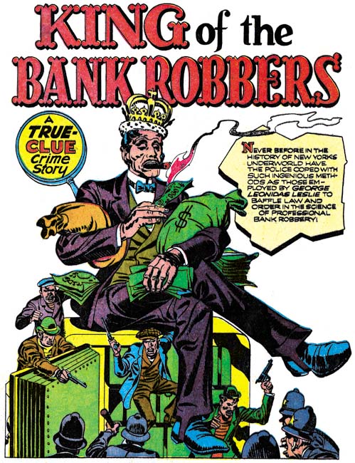
Clue Comics vol. 2 no. 1 (March 1947) “King of the Bank Robbers”, pencils by Jack Kirby

One of Simon and Kirby’s first entries in the crime genre was “King of the Bank Robbers” which was about George Leonidas Leslie. The same title was used for Chapter 10 of Asbury’s TGoNY. Asbury’s presentation pretty much matches the story depicted by Simon and Kirby. The main difference between the two takes is that Asbury went into more details than Simon and Kirby. However Joe and Jack embellished the facts to make it more of a story.


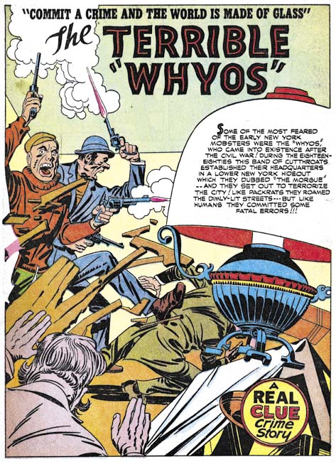
Real Clue Crime Stories vol. 2 no. 5 (July 1947) “The Terrible Whyos”, pencils and inks by Jack Kirby

Another example of a story taken from TGoNY was “The Terrible Whyos”. Without Asbury’s book a reader might doubt the accuracy of some of the things presented by Simon and Kirby. For instance in the story of perspective new member to the gang being rejected because he had not killed anyone. This might seem like an exaggeration but according to Asbury:

It has been said that during their period of greatest renown the captains of the Whyos would accept no man as a member until he had committed a murder, or at least had man an honest effort to thus enroll himself among the aristocracy of the underworld.

At one point Pike Ryan presents a poster showing the business rates, that is what to charge for commissioned crime ranging from blackening eyes to “da big sleep”. In the book Ashbury describes how when arrested Pike Ryan was found to have just a list and while the wording is not identical the rates were just as Simon and Kirby provided.


Real Clue Crime Stories vol. 2 no. 4 (June 1947) “Dandy Johnny Dolan”, art by unidentified artist

Simon and Kirby where not the only ones making use of Ashbury’s TGoNY. “Dandy Johnny Dolan” had no involvement from Simon and Kirby. While it just does not have the Simon and Kirby magic touch, it still is a rather nicely written and drawn story. But once again the events found in the story match what Ashbury presents in TGoNY, particularly how a cane Dolan took off one of his victims lead to being arrested for the crime.

All the comic book artists that used “The Gangs of New York” took liberties with the facts presented by Ashbury. In some case just to make a better story but in other cases because the true facts might be a little bit too much even in those pre-Comic Code days. Simon and Kirby might present some woman as a gangster’s girl friend but in reality she might have been a prostitute (and the criminal a pimp).

Even today “The Gangs of New York” is an enjoyable read. I understand it was reprinted about the same time as the movie of the same name came out. Ashbury does have a peculiar take on gangsters. As he tells it the gangs were all a thing of the past:

for there are now no gangs in New York, and no gangsters in the sense that the word has come into common use

It is hard to understand what Ashbury’s use of the word gangsters was if it excluded organized crime of his day. “The Gangs of New York” was published in 1927 about eight years after prohibition came into effect with the Eighteenth Amendment of the Constitution. Trade in illegal booze provided an abundant criminal income which propelled organized crime to great strength. Ashbury may have been blind to the new gangster, but the crime comics, including Simon and Kirby, were not.

Another Brief Pause and a Joe Simon Interview

Normally I provide at least one post every week. This is often difficult because I have a full time day time and in my “spare time” I am actively working on restorations for Titan’s Simon and Kirby library. The only way I can succeed in keeping my blog going is plan my post ahead of time and write it during my lunch hour. Unfortunately this week when I came to do the actually writing I realized that my planned subject (an opinion piece) really did not warrant posting. But with my tight schedule I was unable to switch to another topic. So this will be one of those rare weeks when I will have to take a brief pause. I should return to my normal blogging next week.


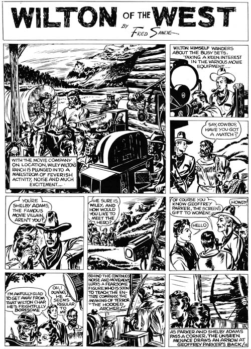
“Wilton of the West”, pencils and inks by Jack Kirby

However, I do not want to leave my readers without something to look at so I will follow the example of an earlier pause (A Brief Pause) and provide an image from Jack Kirby’s early work for the Eisner and Iger studio. This particular strip appeared in Jumbo Comics #3 (November 1938) but my image is from a scan of what was either a proof or presentation piece. Presentation pieces were made to be provide potential clients with examples of a proposed syndication strip. The nice thing about proofs like this one is that the paper was of a much higher quality and so provides a superior copy.


“Wilton of the West” panel 1, pencils and inks by Jack Kirby

The work that Kirby did for Eisner is interesting because you can see him learning his trade. Jack was already better than many of the contemporary comic book artists but that is not saying much because there were a lot of really poor comic book artists at that time. However Kirby was not yet as talented as the artist then working on published syndication strips. On this particular “Wilton of the West” you can see Jack not completely successful experimenting on his inking. Kirby has put a lot of effort into the brush work, particularly on the splash like panel I show above, but it is not very effective. I believe much of the problem is that all parts of the panel seem to get the same amount treatment. The final result seems cluttered and unfocused. Kirby quickly learned from his mistakes and had already improved in a Dr. Hayward strip done a short time later (shown in the same A Brief Pause post that I linked to before).

On a different subject, the reader might be interested in a recent interview that Joe Simon gave Big Shiny Robot.

Simon and Kirby and Their True Stories


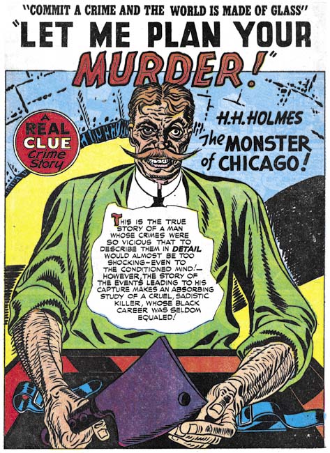
Real Clue Crime Stories v. 2 n 6 (August 1947) “Let Me Plan Your Murder” pencils by Jack Kirby

During Joe Simon’s deposition given in DC versus Fawcett he described the work that they were presently doing as being based on true stories. At that time (1948) Simon and Kirby were producing crime and romance comics. It is hard to say how true their romance stories were but they did run advertisements offering to pay for reader submitted stories. While romance did not usually make the newspapers, crime certainly did. Therefore it is possible to compare what Joe and Jack created with historical facts.

I plan to research a number of crime stories but here I will start with “Let Me Plan Your Murder, H. H. Holmes the Monster of Chicago”. There really was a murderer with the name Henry H. Holmes, or rather that was the name he was using when finally captured (his original name was Herman W. Mudgett). Holmes was a famous serial killer whose exploits can be found in great detail on the Internet (The Murder Castle of H. H. Holmes, The Master of the Murder Castle, and Wikipedia’s H. H. Holmes  to mention just a few). There is no definitive count of the number of Holmes’ victims. The best estimates are in the range of 20 to 200. I will return to this issue below.

I will not summarize what is known about Henry Holmes as it is covered in detail in the links I supplied above. There is a lot to his story, much too much to cover in seven pages of a comic book. So it is not surprising that that much was left out in the story that Simon and Kirby told. But the question that interests me is how accurate were Joe and Jack for what they did tell? To start with how accurate was their portrayal of Holmes himself. The most prominent feature that Holmes’ possessed was his moustache. Kirby drew a distinctive moustache but that went out and slightly up while the real Holmes had a moustache that went down at the ends.

The story produced by Simon and Kirby have seven essential facts:

  • Holmes constructed his castle with frequent firing of the workers so that no one would understand the true nature of what he was building.

This is an accurate description of how Holmes’ constructed his castle. Frequent dismissal of the work crews not only hid what he was doing but Holmes would also refuse to pay them. Holmes may have built his elaborate building without spending any of his own money!

  • Numerous visitors to Chicago mysteriously disappeared.

Holmes operated his castle during the Chicago World’s Fair. He would rent out rooms to visitors. Apparently many visitors to the Fair never returned home. Did they stay at Holmes’ castle and become his victims or did they just go on to a new life and never return home? I cannot imagine that such a question could not be answered today but in 1892 they were left with only suspicions.

  • Holmes concocted an insurance fraud with Howard Pietzel but instead of substituting the body of some victim actually kills Pietzel.

This is correct. Left out of Simon and Kirby’s account was the story of Pietzel’s wife and children. Holmes somehow convinced Mrs. Pietzel to give him custody of three of her five children. Holmes would end up killing the three children and there are suggestions that was to be the fate of Mrs. Pietzel as well.

  • The cellar to Holmes’ castle was uncovered during the construction of a tunnel.

Simon and Kirby present this as an accident that started the unraveling of Holmes’ killing spree. Actually the tunneling was done after Holmes was apprehended and was done from the castle’s cellar. A large metal tank was found which when opened produced a horrendous stench. Despite the odor someone lit a match to see what was inside. The result was an explosion that fortunately left the workers without serious injury but any evidence of what the tank was used for was destroyed. 

  • Police investigated the Pietzel case for proof of Holmes’ criminal doings.

The tunnel was not what brought Holmes to justice what did that was fallout from the Pietzel insurance scheme. Holmes offered another criminal Marion Hedgepeth, a fee for the name of a lawyer who could be trusted. The lawyer’s name was provided and the fraud executed but Hedgepeth never was given his finder’s fee. A bad move on Holmes part because in revenge Hedgepeth reported Holmes scheme to the police. A examination of Pietzel’s remains did show that he had been murdered.

  • Holmes’ real name was Herman Mudgett.

Not much to say on this point as Simon and Kirby got it right.

  • After conviction Holmes confessed his crimes.

His confessions were well publicized but apparently not specific enough to indicate how many people Holmes actually killed. Probably so many that Holmes lost track.

Simon and Kirby got six of the seven essential facts correct. The one thing they got wrong (Holmes’ cellar discovered during tunnel construction) was not completely made up but did not play the part Joe and Jack presented. I do not know what source Simon and Kirby used for the story. Was the source material inaccurate or did Joe and Jack make the change on purpose? Without know the source we simply cannot tell.

On a side note, Simon and Kirby present “Let Me Plan Your Murder” as if told to a researcher. The motif of using someone tell the story was commonly used by Joe and Jack. The researcher of this story looks very much like “Red Hot” Blaze who regularly played the story telling roll in the Headline Comics stories that Simon and Kirby were doing at the same time. It is quite likely that “Let Me Plan Your Murder” was originally meant for Prize’s Headline Comics but for some reason switched to Hillman’s Real Clue.
Crime’s Better Half


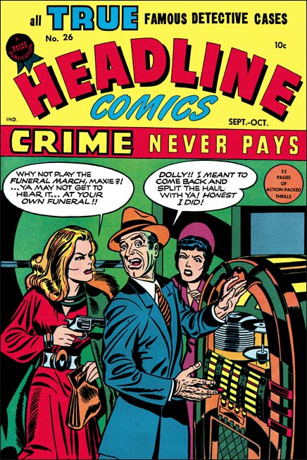
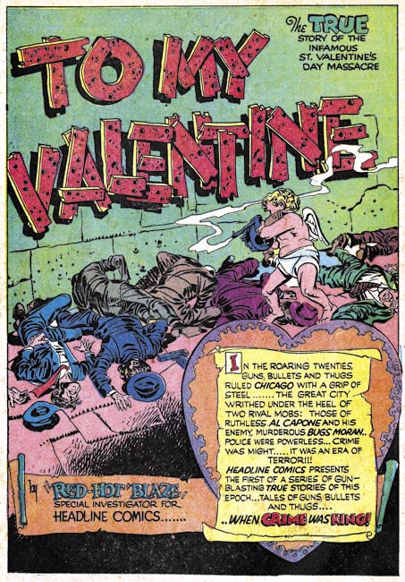
Headline #26 (September 1947), art by Jack Kirby

Simon and Kirby only worked in the crime genre during two periods. The first, and most extensive one, was from 1947 to about 1950 when the worked on Clue and Real Clue Comics for Hillman, as well as producing Headline and Justice Traps the Guilty for Prize. The second occasion was when they produced Police Trap for the own publishing company Mainline. Joe and Jack were always very creative and the crime genre gave them a wide range of subjects. They produced stories about gangsters, western outlaws, and other historical criminals. Another variation Simon and Kirby seemed fond of were women criminals. By no means were Joe and Jack the sole comic book creators that did work about crime by females (there even was a title Crimes By Women published by Fox). However like pretty much everything Simon and Kirby did, they created some very memorable work about women criminals.


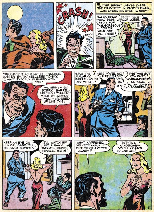
Clue Comics volume 2, number 3 (May 1947) “The Battle For Packy Smith” page 11, pencils by Jack Kirby

The first of Simon and Kirby’s beautiful villains was Velvet. She appeared in the second story about Packy Smith, a gentlemen highly sought after for the element X contained in his body. Packy was much very taken with the charming Velvet Silver, only to end up betrayed by her for the bounty that a crime lord had placed on his head. But once she was paid for her efforts, Velvet then proceeded to betray in turn the crime lord and freed Packy. Velvet may have been larcenous but she also had a heart of gold. A villain you cannot help but love.


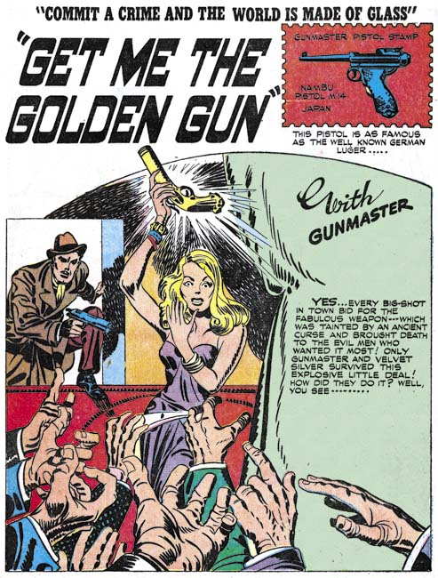
Real Clue Crime Stories volume 2 number 6 (August 1947) “Get Me the Golden Gun”, art by Jack Kirby

Packy never made a third appearance, but Velvet returned without Packy in “Get Me the Golden Gun”. It was the hero, Gunmaster, who now fell under her spell. While Packy had been a criminal himself, Gunmaster of course was not. So he found his attraction to Velvet to be very troublesome. While she was not quite so villainous as Velvet, Simon and Kirby developed a similar relationship between Riot O’Hara and Link Thorne in “The Flying Fool” (produced at the same time and for the same publisher Hillman).


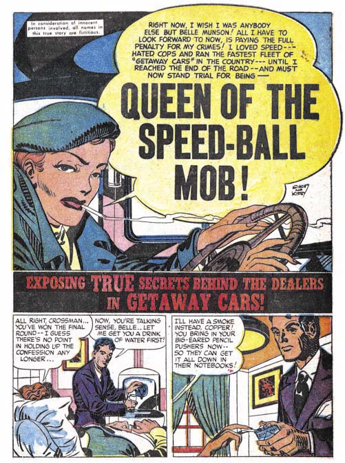
Justice Traps the Guilty #4 (May 1948) “Queen of the Speed-Ball Mob”, art by Jack Kirby

Gunmaster and Velvet were clearly meant to be fictional however the work Simon and Kirby produced for Prize were meant to be considered as true stories (or at least initially). So similar mismatched romance between a hero and a criminal were not repeated in Headline or Justice Traps the Guilty. Still women criminals played an important part of the Simon and Kirby repertoire for Prize. Often when the lead character was a female, Simon and Kirby would present the story as if it was told by the woman. Generally in such cases, the story would start with what I describe as a confessional splash. A splash were the main character introduces the story with their speech balloon forming the feature’s title. This device was common in Simon and Kirby romance publications but only seems to be used by Joe and Jack for the crime genre when the protagonist was a woman. Most likely this was because male criminals generally had a very bad ending while the woman repent and paid her debt to society. Apparently Simon and Kirby preferred not to kill or execute even villainous women but had no qualms about providing the male criminals with such fates. In all honesty this form of sexual discrimination is still very much prevalent today.


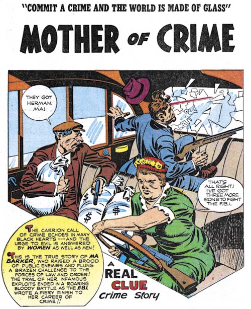
Real Clue Comics volume 2 number 4 (June 1947) “Mother Of Crime”, art by Jack Kirby

The Simon and Kirby rule was all female villains where young and beautiful and would in the end repent their life in crime. But of course every rule has exceptions. I doubt many would call Ma Barker either young or beautiful. Not only does she come to a bad end, she does not sound very repentful either. It is a marvelous story that fortunately was included in “The Best of Simon and Kirby”. If you have not bought the book yet, what are you waiting for?

Headline #25 (July 1947), pencils by Jack Kirby, inks by Joe Simon

Replacing Simon and Kirby, Chapter 4, Sandman

Sometime ago I posted about the artists that replaced Joe Simon and Jack Kirby during the period that both were performing military service. (Replacing Simon and Kirby, Chapter 1, Chapter 2 and Chapter 3). My previous postings concerned the Newsboy Legion but here I am going to discuss Sandman. Unfortunately the reader will be at a greater disadvantage compared to previous chapters. While DC’s Newsboy Legion archives included work done by other artists, the Simon and Kirby Sandman Archive was limited to just Joe and Jack (at least that was DC’s intention).

To refresh the reader’s memory, while working for DC Joe and Jack realized that they would soon have to leave to perform their military duty. So they worked hard at creating an inventory that could be used while they were gone. Simon and Kirby were able to provide quite a bit of inventory but eventually it ran out.


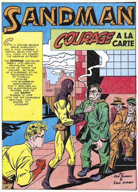
Adventure #91 (April 1944) “Courage a la Carte”, pencils by Jack Kirby

The Sandman covers and adventures that appeared before issue #91 were done by Simon and Kirby. While the splash for “Courage a la Carte” was not Joe and Jack’s finest job, I am confident that Kirby did the pencils. The most obvious give-a-way is the thug at on the right of the splash. I have no idea who the inker was but obviously it was neither Joe nor Jack. Like I said this was not their finest effort but their inventoried work often was not quite as nice as their less rushed efforts.


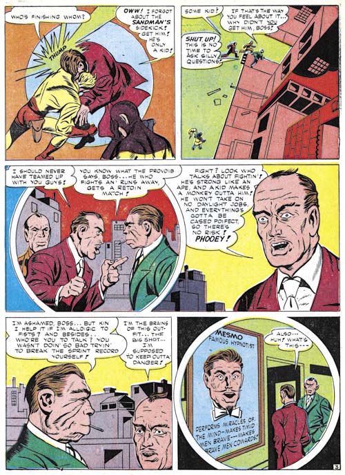
Adventure #91 (April 1944) “Courage a la Carte” page 3, pencils by Gil Kane?

But what followed the splash to “Courage a la Carte” looks pretty crude, much cruder than would be expected even for the inventory work. For good reason because it was not penciled by either Jack or Joe. Kane would have been very young at the time and even he admitted that his efforts at the time were rather poor. The attribution of this art to Gil Kane is not based on the art itself, instead I base this attribution on a statement that Gil made

I got a “Newsboy Legion” job to do by myself (like I had done the rest of them except they didn’t fix it up or do the splash),

So far “Courage a la Carte” and “The Lady of Linden Lane” (Star Spangled #30, March 1944) are the only stories for DC that I have seen with a Kirby splash for a story otherwise done by another artist (although I have not studied the Boy Commandos stories yet). Since the circumstances matches Gil’s remarks, I have tentatively credit him for these pieces. The two Kane stories were published at about the same time (while I use March as the cover date for Adventure #91, that title was actually a bimonthly) but were likely to have been done earlier and inventoried like the rest of Simon and Kirby’s work.

Unlike most of the Sandman art that I cover in this chapter, “Courage a la Carte” was one of the stories included in DC’s Simon and Kirby Sandman Archives. It is also listed in the Jack Kirby Checklist. But as I said above, Kirby only drew the splash.


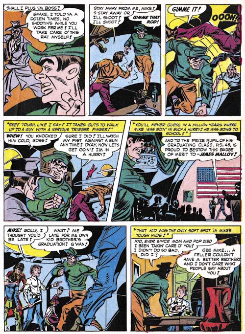
Adventure #92 (June 1944) “Tough Guy” page 3, pencils by unidentified artist

After Kane, work on Sandman was done by another artist, the same one who followed Gil on the Newsboy Legion. Earlier I had misidentified this artist as Kane but the timeline simply will not support that. Kane entered military service in April or May 1944 but work by this artist appeared until October 1945. Joe Simon suggested that this might be the Cazeneuve brothers, but I have seen enough of their work to discount them. Other suggestions have been made but I have not found them convincing either.

The work by this artist is nothing like that for Simon and Kirby but it would be a mistake to discount him. I find his art to be interesting and original. The quality varies from story to story but I have now come to believe that much of that was due to the various inkers used on his pencils.


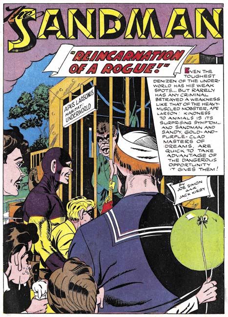
Adventure #94 (October 1944) “Reincarnation of a Rogue”, pencils by unidentified artist

The same replacement artists discussed above worked on a number of Sandman stories. The stories were still credited to Simon and Kirby but were any of their fans really fooled? I really enjoy much of his story art but find most of his splashes not all that interesting. I include above one of the better examples of his splashes.


Adventure #95 (December 1944) “The Riddle of the Rembrandt”, pencils by unidentified artist

The main replacement for Simon and Kirby had an uninterrupted run for the Newsboy Legion (Star Spangled #31 to #49, April 1944 to October 1945). But he only did three issues of the bimonthly Sandman (Adventure #92 to #94, June to October 1944) before another artist was used. Like most of the replacement artists, I really have no idea who did “The Riddle of the Rembrandt” but his talent is pretty obvious.


Adventure #97 (April 1945) “No Curtains for Cupid”, pencils by unidentified artist

The main replacement Simon and Kirby replacement returned after a single issue absence. “No Curtains for Cupid” looks rather different from the other examples I provided above. I still feel they were done by the same penciler but in my opinion much of the apparent differences can be assigned to the wide range of inkers used. Regardless of the inker, the art retains a unique style.


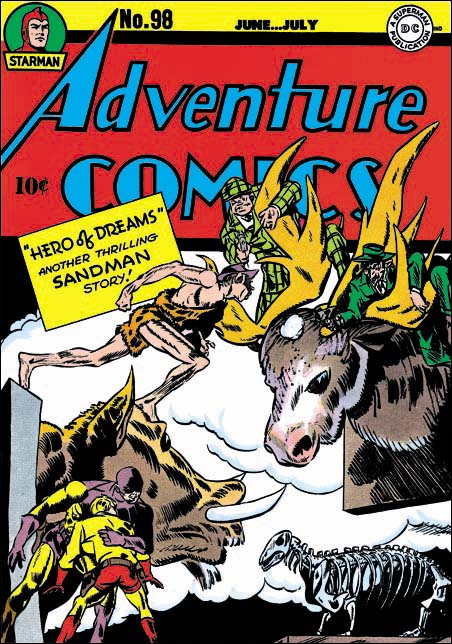
Adventure #98 (June 1945), pencils by unidentified artist

The cover to Adventure #98 was previously discussed on this blog (Not Kirby, Adventure #98). In that post I recounted a number of reasons why I felt the cover was not done by Jack Kirby but the most important of them was the manner that the caveman’s right forearm was drawn. Kirby’s anatomy was not accurate but he always made kept a solid underlying form. The form of the caveman’s forearm is broken in a manner that Jack never did. To all the reasons I previously presented I can now add another. a mirror image of the caveman figure (in more modern clothing) is also found twice on the cover of Star Spangled #45 (June 1945, Replacing Simon and Kirby, Chapter 2). This is much too much use of the same image to credit to Jack. Swiping is a much more obvious explanation.

The main replacement artist would also provide the work for Adventure #99. This means with the exception of a single issue (Adventure #95) the main replacement artist would draw Adventure #92 to #99; June 1944 to August 1945. This matches pretty well with his uninterrupted run for the Newsboy Legion.


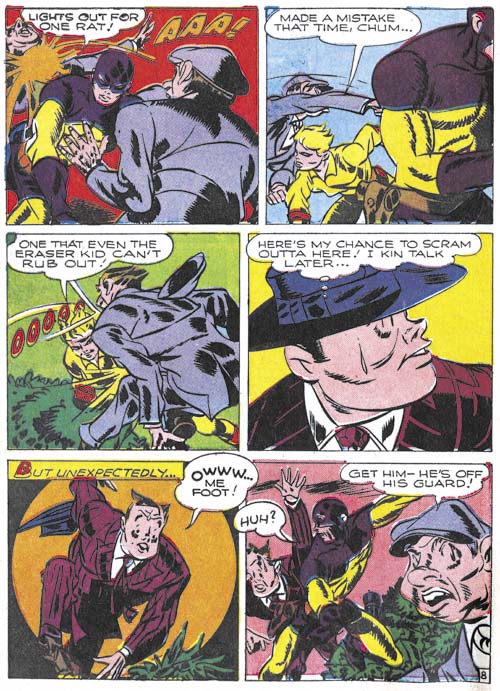
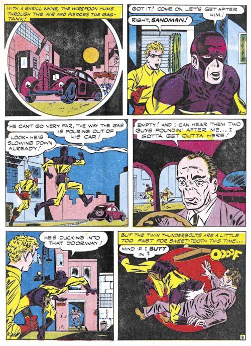
Adventure #100 (October 1945) “Sweets For Swag” page 9, pencils by unidentified artist

Jack Kirby returns to Adventure Comics with issue #100. However Kirby only provided the cover while the interior Sandman story was done by a rather inferior penciler. The primitive art for “Sweets for Swag” remind me of the work that I am now attributing to Gil Kane. In fact the main replacement artist run for the Newsboy Legion was also followed by what looks like the same artist in Star Spangled #52 (January 1946, Chapter 2). In Chapter 2 I had questionably credited it to Gil Kane but I am having second thoughts. Gil would have been entering the armed forces at the time this art was created so it seem unlikely he would have drawn it. This story is another one that was mistakenly attributed to Kirby in the DC Simon and Kirby Sandman Archives and the Jack Kirby Checklist.


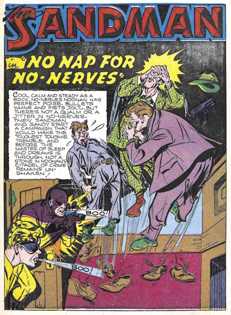
Adventure #101 (December 1945) “No Nap for No-Nerves”, pencils by unidentified artist

Once again Kirby provides a cover for Adventure #101 (December 1945) but did not draw the interior story. The artist who did do “No Nap for No-Nerves” did a good job although I got to say that in his splash Sandy and the Sandman appear to be blowing the thugs away and not scaring them out of their shoes.


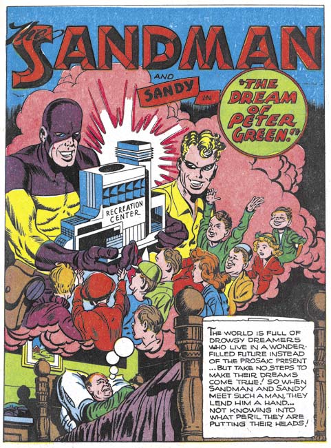
Adventure #102 (February 1946) “The Dream Of Peter Green”, pencils by Jack Kirby

With Adventure #102 Kirby is finally back to drawing both the cover and the story art. Sandman was back in safe hands and all was once again good with the world. Or that would have been the case if this was not the last Adventure issue to include the Sandman and Sandy. Yes the Sandman was replaced with Superboy and Kirby would not appear in the title again until 1958 when, without Simon, he drew Green Arrow. A convenient explanation for the sudden demise of Sandman so shortly after Kirby’s return would by that it was a reprisal to Simon and Kirby going to a competitor, Harvey Comics, to publish their Stuntman and Boy Explorers. While that would make an interesting story the timing just does not work. While Adventure #103 and Stuntman #1 would both come out in April, DC would have to have made the decision to change directions with Adventure before they were likely to have found out about Simon and Kirby’s defection.

While Simon and Kirby were away, the two titles followed a similar timeline.

  • March/April 1944 – Kirby drawn splash, rest of story by Gil Kane?
  • April/June 1944 – First story by the main replacement artist
  • June 1945 – First cover by the main replacement artist
  • August 1945 – Last story by the main replacement artist
  • September/October 1945 – First cover by the returned Kirby
  • February 1946 – First story by the returned Kirby

There remains one other feature to be considered, the Boy Commandos.

Bullseye #7, This is the End


Bullseye #7 (August 1955), pencils and inks by Jack Kirby

The bulls-eye pattern returns to the cover image for Bullseye #7. The overlapping figures creates an interesting design where the background figures are carefully framed by the foreground ones. It is always little more than guesswork when trying to credit who did what in the Simon and Kirby collaboration, in this case I suspect that Jack did the layout since this sort of careful arrangement of figures was often found in the work he produced later when working without Joe. While it is an interesting composition, it is not at all clear what is being depicted. All three individuals appear to be aiming their arrows at different targets, so it does not appear to be a shooting contest. Bullseye’s smile would be out of place for a combat usage. In any case why would a cavalry soldier be using a bow and arrow? While Simon and Kirby covers generally can be decoded to reveal a story, the cover for Bullseye #7 seems meant to be nothing more than an compelling image.


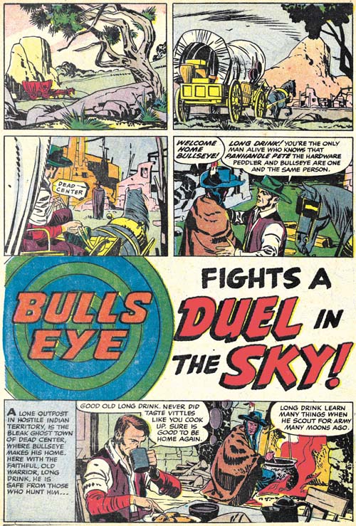
Bullseye #7 (August 1955) “Duel in the Sky”, pencils and inks by Jack Kirby

The first story, “Duel in the Sky”, has an unusual opening; no splash panel and the title occurs below two panel tiers and above another story panel. Kirby has used splash-less stories before but this one is special. The first three panels have no text and show nothing more than Bullseye’s alter-ego traveling over a western landscape. Simon and Kirby usually try to fill their stories with as much as possible so allocating the three panels used in this introduction is quite special. Obviously the introduction was considered worth it but perhaps the splash was sacrificed to make room for it (it is the only Bullseye story without a splash). This introduction shows Bullseye returning to Dead Center, his birthplace, to visit his friend Long Drink. Normally Bullseye traveled about; only in one other story (“The Ghosts of Dead Center”, Bullseye #3) does Bullseye visit Dead Center. This sort of reference to his past was unusual at that time where continuity was pretty much neglected in comic books.

Kirby always had a penchant for technology so I suspect it was his idea to include balloons in this story. The use of such a technology at that period is not unrealistic. During the civil war an attempt was made to use hot air balloons for observation. Unfortunately the balloons became a target and at least one was shot down. In any case the balloons adds interest to another Simon and Kirby masterpiece. It does not hurt either that the story ends with another fantastic Kirby fight.


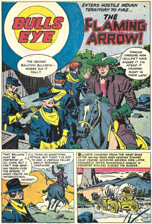
Bullseye #7 (August 1955) “The Flaming Arrow”, pencils and inks by Jack Kirby

While “Duel in the Sky” has a perfectly acceptable ending, “The Flaming Arrow” picks up from there with Bullseye going off to prevent an errant balloon from falling into the hands of Mexican bandits. It is a short but rather nice piece that ends with Bullseye returning to visit Long Drink once again, the last page being a bookend to the first page of “Duel in the Sky”. In fact the same three panels, with slightly different cropping, that showed Bullseye traveling show up again.


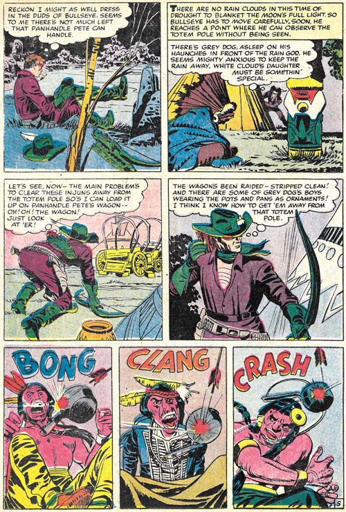
Bullseye #7 (August 1955) “The Stolen Rain God” page 5, pencils and inks by Jack Kirby

The next and what would turn out to be the final Bullseye story, “The Stolen Rain God” opens with a double page splash. I have discussed this piece of art previously in my yet to be completed serial post (The Wide Angle Scream, Almost an Afterthought). Simon and Kirby had a long history of the use of these wide splashes but there were only two created during the Mainline/Charlton period and this was the only one actually published on two pages (the other from Win A Prize #1 was rotated and printed on a single page, see the previous link).

Since I have already posted on the splash page, here I include an image of page 5. It serves as a reminder that while action was the key component of many Simon and Kirby productions, and Bullseye in particular, humor also played an important roll. The very physical humor found in the last three panels is very typical of Kirby.


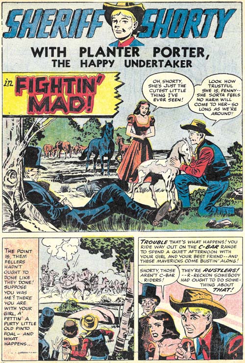
Bullseye #7 (August 1955) “Fightin’ Mad”, pencils by Jack Kirby, inks by Joe Simon?

This issues ends with a Sheriff Shorty feature drawn by Kirby. This makes Bullseye #7 the only issue from that title entirely drawn by Jack. Normally this would make issue #7 a very special comic. The Sheriff Shorty story is special alright but for the wrong reason. It is a rare example of a clunker drawn by Kirby. The action scenes are uncharacteristically poorly executed and this cannot be blamed on the inker. Further the humor does not quite work. Hey everybody can have a bad day.

None of the Mainline titles lasted very long at Charlton, they were usually terminated after two issues (except for Foxhole which lasted for a third issue but that last issue appears to have been produced by Charlton without any involvement from Simon and Kirby). Bullseye was not an exception and issue #7 would be the last. In my opinion, all the Mainline titles were special but for Kirby fans Bullseye would be the most important. None of the other Mainline titles has anywhere near as much of Kirby drawn material. The only comic from this period that does was Fighting American. Which makes it especially unfortunate that Bullseye has never been reprinted. With the resurgence of interest in Kirby, hopefully that will change in the not too distant future.

Bullseye #6, The Missing Tomahawks


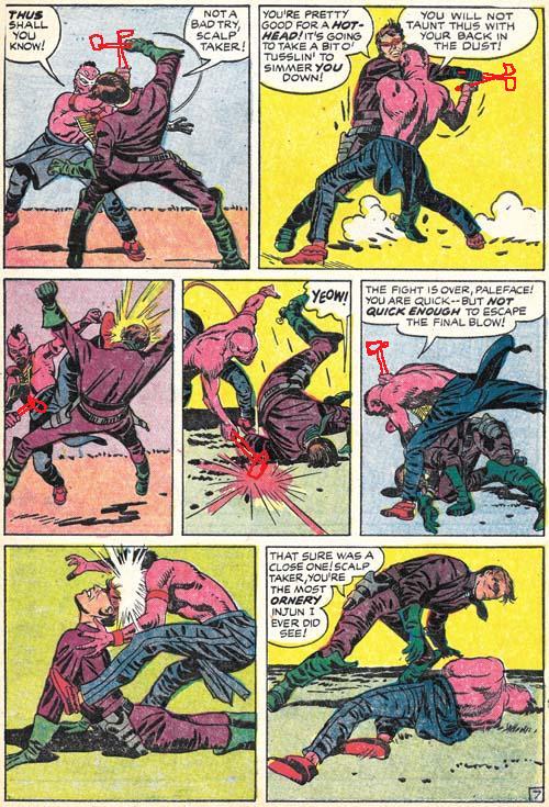
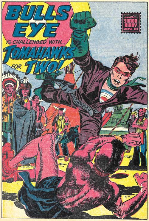
Bullseye #6 (May 1955) “Tomahawks For Two” page 7, pencils by Jack Kirby, inks by Joe Simon and Jack Kirby

Sometimes I miss the most obvious observations. Fortunately often one of my readers sets me straight. Shortly after putting up my Bullseye #6 post I got an email from Charles R. Rutledge:

Just out of curiosity, did the Comics Code make S&K remove the Tomahawks from the hands of the fighters? They’re fairly obviously blocking and hitting with things that aren’t there. It’s especially evident in panel four of page seven. Look at the Indian’s hand and follow it to where an object, presumably a tomahawk would be hitting the ground as Bullseye rolls out of the way. See my hastily scribbled tomahawks below. Also, one would expect tomahawks on the splash page of a story called tomahawks for two and Bullseye’s upraised hand does look as if it might have been drawn.

His tomahawks may be hastily scribbled but they made his point completely obvious. I have never seen the original art but I have absolutely no doubt that it would show white-out in those areas. The Comic Code was recently introduced, for Bullseye first appearing on issue #5. Either “Tomahawks for Two” was drawn before the Code was enforced or Joe and Jack had felt that the fight scene was not too violent even with the tomahawks. After all children could see that sort of thing on television at the time. But the Comic Code was rather excessive when it came to the use of weapons so the tomahawks had to go.

Nice work and thanks Charles.

Bullseye #6, The Composition


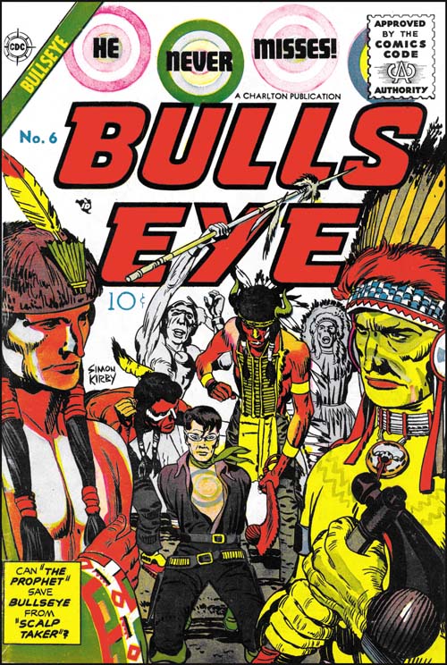
Bullseye #6 (May 1955), pencils by Jack Kirby, inks by Joe Simon and Jack Kirby

Among other things, Simon and Kirby are today celebrated for all the successful creations. Most comic book artists were fortunate if they had one popular creation while Simon and Kirby multiple successes (Captain America, the Newsboy Legion, the Boy Commandos and the romance genre are perhaps their most significant). But not every Simon and Kirby creation received favorable recognition. While today many consider Boys’ Ranch as Joe and Jack’s finest creation, in its day it just did not sell well enough to avoid an early cancellation. It is unclear how successful Mainline, the Simon and Kirby owned publishing company, would have been with Bullseye or any of their titles as Joe and Jack were doubly unfortunate in their timing. One problem was that under the pressure of public criticism the entire comic book industry had started to crash. The other difficulty was the economic difficulties that plagued  Mainline’s distributor, Leader News. The second problem was not unrelated to the first as Leader News depended greatly on the revenues from EC, a comic publisher particularly attached by critics. When Leader News folded so did Mainline. Simon and Kirby then turned to Charlton to publish the former Mainline titles. Joe has said that Charlton offered them the best deal but with the collapsing comic publishing industry there probably were not many alternatives. Because of the amount of time required to print and distribute a comic book, the art for Bullseye #6 was probably already finished before Mainline had actually failed. The fact that Bullseye #6 was released by Charlton on its normal scheduled time indicates that Simon and Kirby spent little time looking for a replacement publisher for their Mainline titles.

The cover for issue #6 was the least successful of the Bullseye series. Unlike all the others issues, the bulls-eye pattern plays a part in the design of the title but not the actual image. What is presented is little more than an illustration from the interior story. Only from the cartouche would the reader understand the significant of the two foreground figures. It does have the distinction of being one of the only two cover art of the Mainline/Charlton titles that bares a Simon and Kirby signature (Foxhole #5 was the other).


Bullseye #6 (May 1955) “Tomahawks For Two”, pencils by Jack Kirby, inks by Joe Simon and Jack Kirby

“Tomahawks for Two” is the start of the most ambitious story that Simon and Kirby did for Bullseye. With a total of twenty pages divided up into four sections, it is a much longer Bullseye story than any other. Actually it is longer than most Simon and Kirby stories created after the war. I use the term sections, because although they are essentially chapters, they are not actually called such.

It is not just the length that is special, the story is probably the most unusual Bullseye tale as well. Two Indian brothers, twins actually, one of who is peaceful (called the Prophet) and another a warrior (named Scalp Hunter). Bullseye saves the Prophet but later ends up in a hand to hand combat with Scalp Taker.


Bullseye #6 (May 1955) “Tomahawks For Two” page 7, pencils by Jack Kirby, inks by Joe Simon and Jack Kirby

I could not resist including the fight scene. Kirby was unequaled when it came to choreographing such fights and this is one of his best. In this case he deviates from the 3 by 3 panel layout that he typically used for such battles. Although this is not a grid layout, there is enough symmetry that the reader’s attention is not drawn away from what really matters. As usually Jack has also minimized the background so as not to distract from the fight.


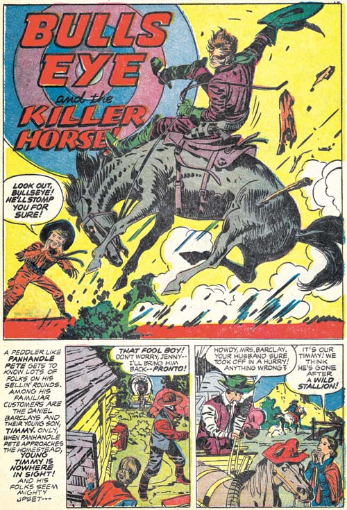
Bullseye #6 (May 1955) “Bulls-Eye And The Killer Horse”, pencils and inks by Jack Kirby

In an unusual and untypical manner, Simon and Kirby turn away from the tale of the two Indian brothers and now tell one about a boy and his love of a wild stallion. It is quite possible that this story was originally a stand-alone feature that was retrofitted into the Indian brothers story. If so its last panel was reworked to include a distant Indian observer and a caption that ties the scout to the next chapter of the story.


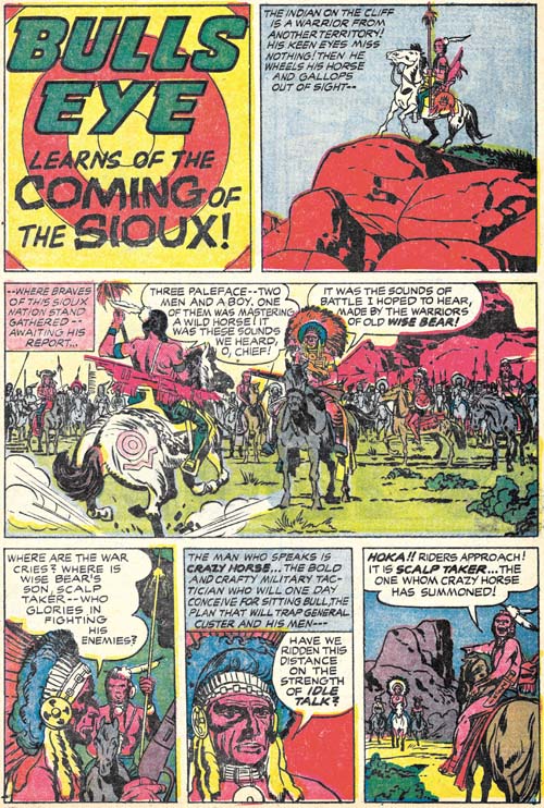
Bullseye #6 (May 1955) “The Coming of the Sioux”, pencils by Jack Kirby, inks by Joe Simon and Jack Kirby

This story picks up with the scout seen in the last panel of the previous chapter. Next we see Bullseye and the family from the “Killer Horse” story being interrupted at their dinner. This is followed by plenty of action and a rousing battle between two Indian tribes. I really do not want to provide too many details for fear of spoiling it for those who have not read it yet. But it is perhaps the most complicated plot ever used by Simon and Kirby and it ends with the death of one of the two Indian brothers.

While “The Coming of the Sioux” has a true ending, Joe and Jack follow it with a short coda, “The Man Who Lived Twice”. This piece in a way mirrors the beginning of “Tomahawks for Two” that initiated the story arc. Here we find the fate of the surviving Indian brother. Again I do not want to go into any spoilers but this story arc is one of the best that Simon and Kirby ever presented. Kirby’s art is in really top form as well. Bullseye #6 is a forgotten Simon and Kirby masterpiece.


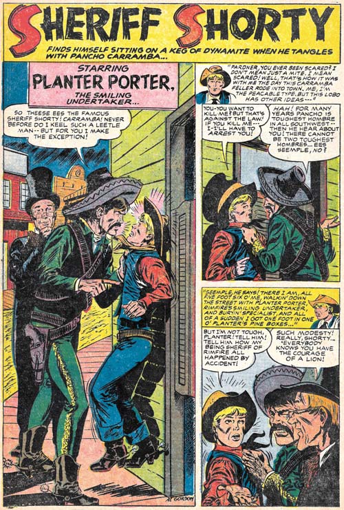
Bullseye #6 (May 1955) “Sheriff Shorty”, art by Al Gordon

Bullseye #6 marks the return of Sheriff Shorty, a feature first introduced in Bullseye #3. This time the artist was Al Gordon, whom I am not at all familiar with. Gordon’s depiction of the characters follows those from Bullseye #3 so closely that some have attributed that story to Al as well. However as we have seen (Bullseye #3, Here’s Kirby) the origin story was drawn by Leonard Starr. While Gordon is not as good an artist as Starr, he still does a respectable job on this short (four page) piece.

Bullseye #5, The Secret is Out


Bullseye #5 (April 1955), pencils and inks by Jack Kirby

Simon and Kirby were big self promoters. They often signed the art they created and included a “Simon and Kirby Production” label in the books that they put together for Prize Comics. Which is why it was so unusual that their names were never used in any of the earlier issues of the Mainline titles. Bullseye #5 was the first to include a stamp reading “another Simon and Kirby smash hit”. The exclusion of their names from the Mainline titles up to now was probably an attempt avoid a conflict with Prize for whom Joe and Jack continued to produce comics. I do not think it is a coincidence that the first issue with the Simon and Kirby stamp was also the one with the first postal statement in which Joe and Jack are listed as the editors. If the people at Prize had not figured out who was behind Mainline Comics before this, the gig would certainly have been up with this issue.

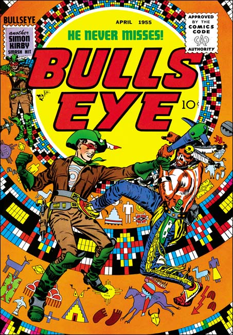
My favorite Simon and Kirby cover keeps changing depending on my mood, but if I were to pick the top dozen covers they would always include that for Bullseye #5. The bulls-eye pattern has played the central design element of all the title’s previous covers, but it was truly inspirational to convert it using Indian motifs. The bulls-eye now looks like some sort of flattened teepee. It is a pretty busy pattern, so the foreground is just Bullseye grappling with an Indian. The whole thing is topped of by some really beautiful inking of the figures by Jack Kirby. The image I provide has not been restored but rather was based on progressive proofs. Progressive proofs were made of the individual color plates and the sequential combinations that they would undergo during printing. This usually was done from the lighter colors to the darker ones so that proofs were made of yellow, magenta, yellow + magenta, cyan, yellow + magenta + cyan, black then the completed combination of all plates. The above image was made by scanning the individual proofs for yellow, magenta, cyan and black then overlapping them in Photoshop. No editing was needed to provide the most accurate recreation of the original Bullseye cover possible.


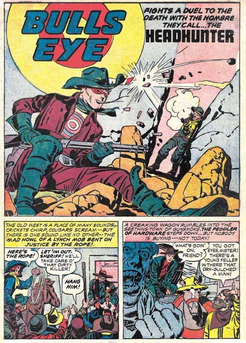
Bullseye #5 (April 1955) “Headhunter”, pencils and inks by Jack Kirby

A classic western tale of a cowboy accused of murder, a lynch mob looking to bypass justice, a bounty hunter aiming for a payoff at any price, the true killer trying to pin his crime on an innocent man, and off course Bullseye to save the day. This is the first issue of Bullseye published under the overbearing eye of the Comic Code Authority. However Bullseye was never overly violent and so the censorship does not really detract from this fine story.


Bullseye #5 (April 1955) “Grandma Tomahawk”, pencils and inks by Jack Kirby

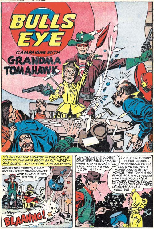
“Headhunter” was pure drama so Simon and Kirby backed it up with a humorous piece, “Grandma Tomahawk”. A small but spunky elder lady leads a crusade against alcohols and immorality with secret help from Bullseye. One again inked by Kirby himself except for page 2.


Bullseye #5 (April 1955) “Tough Little Varmint”, art by unidentified artist

Another humorous piece but this time drawn by an artists other than Kirby. Frankly few attributions have given me more trouble than trying to figure this piece out. There are suggestions of Mort Meskin throughout but on a whole this look so unlike his work that I very much doubt that he was the penciler. The inking is very distinct from Mort’s style as well. I played with the idea that this might be have been done by George Roussos whose work often shows Meskin’s influence. But comparing side-by-side this piece with some by Roussos shows they are very distinct. And again the inking is nothing like that by Roussos. It is very frustrating not to be able to come up with a convincing attribution because the artist clearly was very talented.


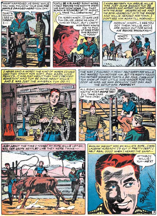
Bullseye #5 (April 1955) “Tough Little Varmint” page 3, art by unidentified artist

Mort was not that common a name so I consider the placard with that name in panel 4 as a homage to Meskin by the artist of this piece.

I do not think it is a coincidence that the leading lady of “Tough Little Varmint” and “The Adventures of Sheriff Shorty” (Bullseye #3 link 1) were both named Penny. The most likely explanation would seem to be that the scripts for both were done by the same writer.

Bullseye #4


Bullseye #4 (February 1955), pencils and inks by Jack Kirby

The cover prominently includes the target in its design, as do all the Bullseye covers. The original art for this cover still exists. However apparently the top of the original art had been cut off (probably by Simon and Kirby to be recycled for another cover). In cases like that it is common that the art would be restored by adding a stat of the missing piece but in this case the entire top section was inked by hand. The restorer did a good job with the lettering but pretty much botched up the small figure of Bullseye throwing a tomahawk.

Like the last issue, this one has two Kirby penciled and inked Bullseye stories. As I mentioned before this was much more Kirby than any other Mainline title.


Bullseye #4 (February 1955) “The Pinto People”, pencils and inks by Jack Kirby

A wounded man seriously in need of medical attention, an Indian warrior desperately seeking a rifle, an Indian tribe that runs with their horses not on them, and two villains out for what they thought would be an easy score. This is a very imaginative but rather meandering tale. It would seem to me that this story has more of Kirby and less of Simon than usual. Some readers may like that others may not.


Bullseye #4 (February 1955) “The Pinto People” page 3, pencils and inks by Jack Kirby

Not only faster than their horses, the Pinto braves never stop running. You even have to lasso one down in order to have a discussion. I am not sure why they have the horses to begin with or where they are running to. For that matter where are the rest of the tribe? But the story moves so fast and the art is so terrific that chances are the reader does not even get around to be bothered with all of that.


Bullseye #4 (February 1955) “Doom Town”, pencils and inks by Jack Kirby

“Doom Town” is a more classic Simon and Kirby story. Here our hero is accompanied by an unusual creation, Major Calamity. A magnet to bad luck so disastrous that people either want to kill him or flee. But Major Calamity is not the villain of the story that dishonor goes to Big Red Devlin. Only Major Calamity can save the town, with of course Bullseye’s help. What follows is pure Simon and Kirby. Plenty of action, a great fight and a touch of humor. Fortunately this story has been reprinted in “The Best of Simon and Kirby”.


Bullseye #4 (February 1955) “Ghost Town Ambush”, art by unidentified artist

No sooner that the Sheriff Shorty feature gets introduced than its place is taken by another story. (Do not worry Sherriff Shorty will be back.) Frankly “Ghost Town Ambush” is a pretty poor replacement. I do not know who the artist is but he really is not all that good. If anything the writing is even worse. It tries to use all the cliches but nothing seems to work. A one point a villain on a horse sneaks up behind a sentry all the time saying out loud what he is doing. Boy some sentry. All in all this is surely the most forgettable story in the entire Bullseye title.


Bullseye #4 (February 1955) “Ghost Town Ambush” page 7, art by unidentified artist

Why such a clinker? Well the lettering provides a clue. That first letter in the captions is often enlarged and colored. While Howard Ferguson often used that device when working for Simon and Kirby it was not used by his replacement Ben Oda. Its appearance in “Ghost Town Ambush” suggests that this story was not actually produced by Simon and Kirby. This was the time that the comic book industry was starting to crash. Simon and Kirby picked up some