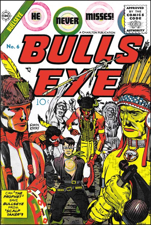
Bullseye #6 (May 1955), pencils by Jack Kirby, inks by Joe Simon and Jack Kirby
Among other things, Simon and Kirby are today celebrated for all the successful creations. Most comic book artists were fortunate if they had one popular creation while Simon and Kirby multiple successes (Captain America, the Newsboy Legion, the Boy Commandos and the romance genre are perhaps their most significant). But not every Simon and Kirby creation received favorable recognition. While today many consider Boys’ Ranch as Joe and Jack’s finest creation, in its day it just did not sell well enough to avoid an early cancellation. It is unclear how successful Mainline, the Simon and Kirby owned publishing company, would have been with Bullseye or any of their titles as Joe and Jack were doubly unfortunate in their timing. One problem was that under the pressure of public criticism the entire comic book industry had started to crash. The other difficulty was the economic difficulties that plagued Mainline’s distributor, Leader News. The second problem was not unrelated to the first as Leader News depended greatly on the revenues from EC, a comic publisher particularly attached by critics. When Leader News folded so did Mainline. Simon and Kirby then turned to Charlton to publish the former Mainline titles. Joe has said that Charlton offered them the best deal but with the collapsing comic publishing industry there probably were not many alternatives. Because of the amount of time required to print and distribute a comic book, the art for Bullseye #6 was probably already finished before Mainline had actually failed. The fact that Bullseye #6 was released by Charlton on its normal scheduled time indicates that Simon and Kirby spent little time looking for a replacement publisher for their Mainline titles.
The cover for issue #6 was the least successful of the Bullseye series. Unlike all the others issues, the bulls-eye pattern plays a part in the design of the title but not the actual image. What is presented is little more than an illustration from the interior story. Only from the cartouche would the reader understand the significant of the two foreground figures. It does have the distinction of being one of the only two cover art of the Mainline/Charlton titles that bares a Simon and Kirby signature (Foxhole #5 was the other).
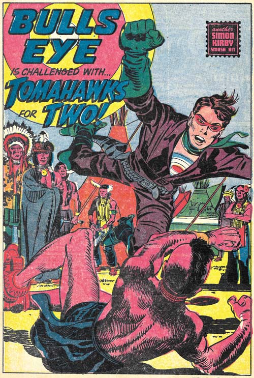
Bullseye #6 (May 1955) “Tomahawks For Two”, pencils by Jack Kirby, inks by Joe Simon and Jack Kirby
“Tomahawks for Two” is the start of the most ambitious story that Simon and Kirby did for Bullseye. With a total of twenty pages divided up into four sections, it is a much longer Bullseye story than any other. Actually it is longer than most Simon and Kirby stories created after the war. I use the term sections, because although they are essentially chapters, they are not actually called such.
It is not just the length that is special, the story is probably the most unusual Bullseye tale as well. Two Indian brothers, twins actually, one of who is peaceful (called the Prophet) and another a warrior (named Scalp Hunter). Bullseye saves the Prophet but later ends up in a hand to hand combat with Scalp Taker.

Bullseye #6 (May 1955) “Tomahawks For Two” page 7, pencils by Jack Kirby, inks by Joe Simon and Jack Kirby
I could not resist including the fight scene. Kirby was unequaled when it came to choreographing such fights and this is one of his best. In this case he deviates from the 3 by 3 panel layout that he typically used for such battles. Although this is not a grid layout, there is enough symmetry that the reader’s attention is not drawn away from what really matters. As usually Jack has also minimized the background so as not to distract from the fight.
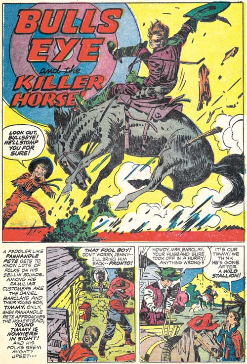
Bullseye #6 (May 1955) “Bulls-Eye And The Killer Horse”, pencils and inks by Jack Kirby
In an unusual and untypical manner, Simon and Kirby turn away from the tale of the two Indian brothers and now tell one about a boy and his love of a wild stallion. It is quite possible that this story was originally a stand-alone feature that was retrofitted into the Indian brothers story. If so its last panel was reworked to include a distant Indian observer and a caption that ties the scout to the next chapter of the story.
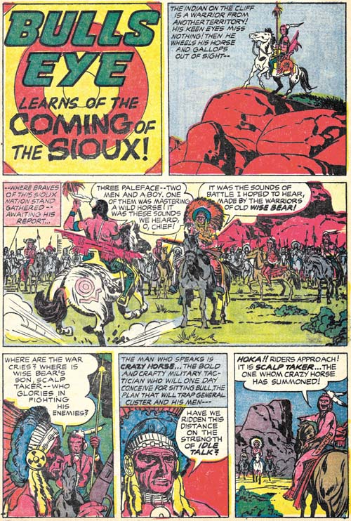
Bullseye #6 (May 1955) “The Coming of the Sioux”, pencils by Jack Kirby, inks by Joe Simon and Jack Kirby
This story picks up with the scout seen in the last panel of the previous chapter. Next we see Bullseye and the family from the “Killer Horse” story being interrupted at their dinner. This is followed by plenty of action and a rousing battle between two Indian tribes. I really do not want to provide too many details for fear of spoiling it for those who have not read it yet. But it is perhaps the most complicated plot ever used by Simon and Kirby and it ends with the death of one of the two Indian brothers.
While “The Coming of the Sioux” has a true ending, Joe and Jack follow it with a short coda, “The Man Who Lived Twice”. This piece in a way mirrors the beginning of “Tomahawks for Two” that initiated the story arc. Here we find the fate of the surviving Indian brother. Again I do not want to go into any spoilers but this story arc is one of the best that Simon and Kirby ever presented. Kirby’s art is in really top form as well. Bullseye #6 is a forgotten Simon and Kirby masterpiece.
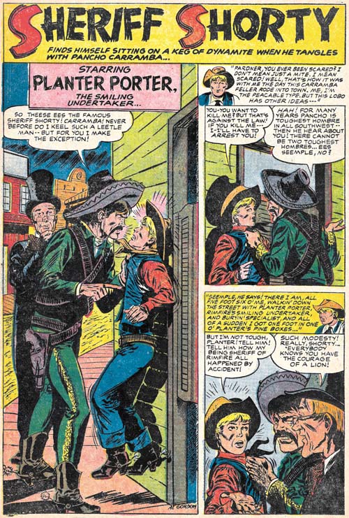
Bullseye #6 (May 1955) “Sheriff Shorty”, art by Al Gordon
Bullseye #6 marks the return of Sheriff Shorty, a feature first introduced in Bullseye #3. This time the artist was Al Gordon, whom I am not at all familiar with. Gordon’s depiction of the characters follows those from Bullseye #3 so closely that some have attributed that story to Al as well. However as we have seen (Bullseye #3, Here’s Kirby) the origin story was drawn by Leonard Starr. While Gordon is not as good an artist as Starr, he still does a respectable job on this short (four page) piece.


I have written about Gordon on my blog, who was sort of an enigma. He appeared first at Timely, always inked by Joe Kubert. In fact, in their first collaboration Kubert almost overpowered him and as far as I can tell even brushed in Gordon’s name in his own style. Later on, Gordon did (or was allowed to do) more and more by himself. Finally he seems to have developed his own style (weaker than Kubert’s, but who isn’t) and ended up working for Charlton, among others. My idea was, that he would have been a young pupil of Kubert, who was worked in that way. I can’t really think of another reason why Kubert would uniquely ink this guys work. On the other hand, there seems to have been an older Al Gordon, already doing comics in the forties. If it’s the same guy, why would Kubert assist him in the way he did? So, I should really have a look at this story, as it cmes sort of in between the Timely and Charlton work…