Category Archives: Periods

Featured Story, “Unfit To Manage” by Bill Draut

True Bride-To-Be Romances
True Bride-To-Be Romances #18 (June 1956)
“Unfit to Manage” by Bill Draut

In 1956 Jack Kirby was doing pretty much all the artwork for the Prize romance comics. This was after the failure of the Simon and Kirby publishing company called Mainline. It seems that Joe Simon was doing some editorial work for Harvey Comics. Jack provided some covers but does not appear to have done much else for Harvey. Although I believe Joe was the editor, I think it would be a mistake to consider these Harvey romances as Simon and Kirby productions. Some of the artists had been doing work for these comics before Joe was editor. Also the format of the stories did not change with Joe’s arrival. But two regulars for Simon and Kirby productions, Bill Draut and John Prentice, started to provide material for the Harvey romances. I presume this helped these artists to makeup for the loss of work from the Prize romances since Kirby was now doing all of that. For reasons that can only be guessed at Mort Meskin, another S&K regular, never made the transition to Harvey.

I must admit I generally prefer the S&K produced romances over the Harvey comics. The Harveys tend to be done to a formula while the S&K productions are more variable. But there are some real gems in the Harvey romances and it probably is not a coincidence that these tend to occur with Simon as editor and Draut or Prentice as artist. “Unfit to Manage” is one of those small masterpieces.

Bill Draut is one of those artists that nowadays tends to be overlooked. Part of the problem was that much of Bill’s work was for the romance comics, a now pretty much extinct genre. Further most of Bill’s work was for Simon and Kirby productions. This meant that he was overshadowed by Jack Kirby (weren’t most artists?). Some of Bill’s work has even been attributed to Jack (here, and here). Finally after S&K, Draut went to DC where his art seemed to suffer. I suspect he was trying to adapt his drawing to be more like the DC house style. Although I am not very familiar with this period it seems to me that Bill lost some of his best features without gaining enough in his newer manner.

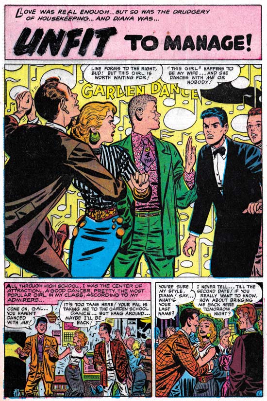
The panel layout for the first page of “Unfit to Manage” is one very typical of Harvey romances. But the splash panel itself is a real gem. The background is a field of floating musical notes and the words “Garden Dance”. The “Garden Dance” might suggest a banner but otherwise the background is abstract. This sort of suggestive rather then depicted background was a device rarely used in S&K productions and probably never by Kirby. Here it is very effective for Draut and there is little doubt that we are in some dance. An especially good touch are the characters that Bill presents almost like they are some sort of frieze. Starting from the left we find a young man so engrossed in his dance that he is oblivious to the unfolding drama. What a dancer he is with his left leg brought up high and his head thrust back. Next is is partner who has already stopped dancing and looks surprised to our right. The next character is what I am sure was meant to be a hipster. Was the somewhat comical figure he presents due to our modern eyes or was it apparent when the comic was published? Look at that wild shirt and the incredibly short but wide tie that reads “U 4 Me”. Our hipster asserts his right to be the woman’s next dance partner. Our eyes are continued to be directed to our right by his turn of the head. Our direction to the right is finally halted by an angry man looking in the opposite direction. He declares himself the woman’s husband and denies others any dancing privileges. Although limited to half a page, this splash panel does everything you could expect of it. It is visually interesting, the composition controls what we see and when we see it, and that with a few short sentences provides a summary for the story to entice the potential purchaser.

In the story we find a popular and fun loving young woman. Surprising she falls in love with a young man who acts older then his years. The woman does try to be a dutiful wife and then mother, but still enjoys going out. The husband reluctantly indulges her until he looses his job. Unable to support their nice house and the life style his wife enjoys, the man wants to move. The wife refuses to go along and the man leaves with the child and divorce court follows. The lady finally recognizes what she is about to loose and convinces the man to try again before the divorce becomes final. It is a well written story. The overall story of couple meet, couple have problems and couple reunite at end is a standard for romance comics. Keep in mind other that genre at that time such as superhero comics followed their own predictable overall formulas. But “Unfit to Manage” has enough variations within that story outline to make it rather different from most romance comic book stories.

I am unable to read these older romance stories without reflecting how much different the world that they project is from our present one. Actually that is one of the things I enjoy about these romance comics. In “Unfit to Manage” the woman is presented in a bad light while the man comes off rather lightly. This despite the fact that in one scene the woman reaches for her child who the man grabs and raises out of her reach. I am sure that such a use of a baby as pawn in the battle between a couple continues today, but most of the public would consider it unacceptable behavior. The divorce court is interesting because the judge clearly is taking the man’s side and is about to award him custody. But it is not at all clear that the woman’s action were truly so negligent as to justify such an action. Of course a comparison between now and then was not original a goal for such a story. But that does not mean it cannot or should not be one for us today.

Featured Cover, Foxhole #3

Foxhole #3
Foxhole #3 (February 1955) by Jack Kirby

I love the Kirby list, but sometimes Kirby fans just get carried away. Even the most unsubstantiated claims become accepted fact. Not too many years ago the concept of Kirby Kolors burst into the list. This was the idea that Jack created the color guides for many Simon and Kirby comic work. Not only did Jack do color guides, but experts could tell which ones he did. Never mind that no evidence was ever presented to back up this amazing claim. Never mind that color credits was never given in any of the Simon and Kirby productions. Fans and experts seem to vie with one another in spotting Kirby Kolors. When asked how they did it, the best you would get was talk about years spent examining S&K comics and Jack’s frequent use of “salmon” as a color. If the start of this craze was not bad enough, it soon went to ridiculous extremes. Some were even call some Kirby Atlas/Marvel work as Kirby Kolors! This was at a time when Jack was a freelancer providing pencils for someone else to ink. Yet some fans believed Jack sent in his pencils, it was inked by some other artist, and copies then sent back to Jack to make color guides. Did they think Kirby was being paid the low rates that colorist received at that time, or that Marvel was willing to pay him the same rates for penciling and coloring? I have no idea what these fans were thinking. If that was not bad enough someone asserted that a Bullseye story reprinted by Super Comics in the 60’s was a Kirby Kolor! It was colored differently then when first printed by Simon and Kirby. So if it was Kirby Kolor that meant Jack did them later for Super Comics at a time he was busy with Stan Lee creating the Marvel Universe.

If the comics do not provide credits, what do we know about colorists who work on Simon and Kirby productions? Well one thing is that Joe Simon has said that they did not do the coloring work, that was done by the publisher. This statement may be a little misleading. There is at least one photograph showing a colorist at work in the Simon and Kirby studio (working on a Prize Western cover). When I asked Joe about this, he said that the colorist worked for the publisher. Even though the colorist was not being paid for by S&K, it made sense for him to work in the studio. I am sure under that sort of arrangement Joe or Jack would provide guidance on how the coloring should be done. But it is not believable that Jack would do coloring when he was not getting paid for it. Joe and Jack were too much of businessmen to do that.

Joe still has some color guides for work done after the Simon and Kirby studio breakup. When I asked him if he did the coloring he replied that he might do an occasional color guide for a cover, but never for the stories. Do we have any reason to believe that Jack thought more highly of coloring then Joe did?

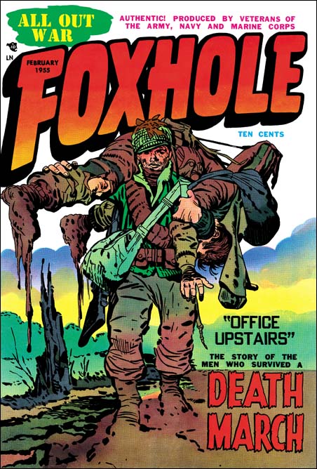
By now I am sure you are wondering what has all this talk about Kirby Kolor have to do with the cover for Foxhole #3 Well I do believe that for most of the comics that Simon and Kirby produced the coloring was at least the financial responsibility of the publisher. But for a short period Joe and Jack had their own publishing company called Mainline. Obviously for Mainline they must have been responsible for having the coloring done. That by itself does not mean that Joe or Jack personally did it, but it does raise the possibility. I find it suggestive that so many of the Mainline comic covers have exceptional coloring. I have previously posted on Foxhole #2 and Foxhole #4 covers both of which have unusual and very powerful coloring. With its watercolor effect Foxhole #3 is another example of unusual coloring. Some of the other Mainline titles may not have such extraordinary coloring, but they are all extremely well done. It may not be safe to provide an attribution based solely on quality, but it does make one wonder whether Joe or Jack could have been directly involved in some of this coloring. Although I accept this possibility that does not mean I accept Kirby Kolors. I can think of no way judge between Joe or Jack as the source. Joe has always been a fine colorist. I have seen less of Jack’s efforts in color but all were nicely done. I am not sure how anyone could take any of this work done so late in their careers and use it for attribution of work done during the 50’s for comic books.

Coloring is not the only thing that makes Foxhole #3 a superb piece of art. The inking is just fantastic. The inking for the Mainline covers, and this one in particular, is probably the best Simon and Kirby have ever produced. Bold and assured, but also sensitive. Spotting varied from very sparse in sections to areas of carefully orchestrated lines and dots. However large areas of black are avoided. The composition is nice and takes full advantage of the cover. Even the placing of the blurb in the lower right was carefully handled and balanced with the tree stump on the left.

The blurb announces a story called “Office Upstairs” about the “Death March” while the cover shows a soldier carrying one of his comrades. The reference is to the Bataan Death March. At the start of the war the U.S. army in the Philippines was forced to surrender to the Japanese. The Americans were poorly feed and treated badly. Executions were common, for instance any soldier found to possess Japanese souvenirs was summarily killed. The U.S. soldiers, who were malnourished, were forced to march to a camp 100 miles away. Any prisoner who could not keep up, was executed. The treatment of the Americans was no better when they were interred in the camp. After the war the Japanese general who ordered the march was tried and executed as a war criminal. But the Japanese government has never apologized for their abuse of their prisoners of war.

Foxhole #3
Foxhole #3, “Office Upstairs” by Bob McCarty

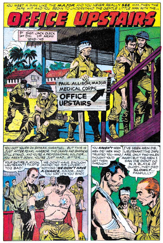
A story about the Death March and the prison camp is not something you would expect in a comic book which at that time was aimed at young readers. But the story “Office Upstairs” is a small masterpiece. The “hook” for the Foxhole title was that it was produced by veterans. This story has a box saying that it was by Jack Oleck. Jack was Simon and Kirby’s main writer and Joe’s brother-in-law. Since writing credits were not generally given in S&K productions, these Foxhole issues are real treasures. Although there is no credit for the art it appears to be the work of Bob McCarty. Bob generally did not sign his work for S&K, but because he was a veteran Foxhole gives him credit in some other stories.

Foxhole #3
Foxhole #3, “The Face” by John Prentice

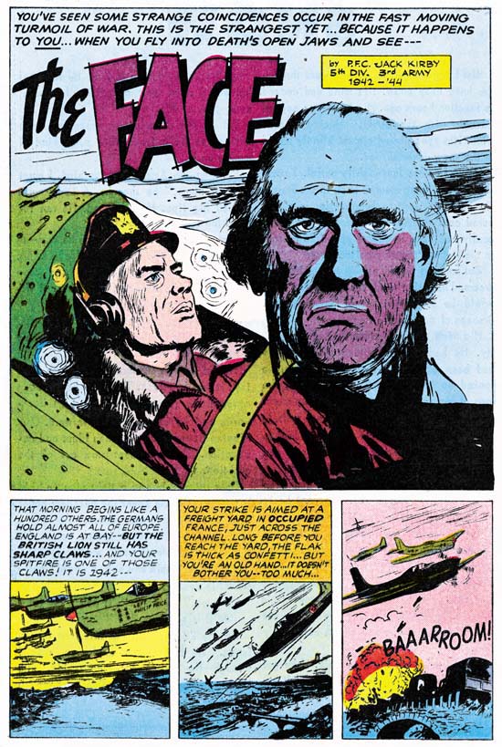
This issue provides yet another writing credit, this time by Jack Kirby. Another gem of a story. This time it was drawn by John Prentice, one of my usual suspects (artists who did frequent work for Simon and Kirby). John did some other work in the Foxhole series but surprisingly never was given credit. This is surprising because not only was Prentice a veteran, he was at Pearl Harbor when the Japanese attacked.

UPDATE (2/18/07): My attribution here of “The Face” to John Prentice is incorrect. The proper identification of the artist is Joe Albistur.

The Human Torch #2

I do not think I will surprise anyone by observing that the early Timely comics are high price items, particularly the key issues. There are probably very few, if any, comic book collectors who can afford to purchase complete runs of early Timely comics. That is why I am grateful that Marvel has reprinted some of them in their Marvel Masterworks Golden Age series. I would like my readers to always keep this in mind as I write some negative criticism on one of these books, The Human Torch Volume 1.

Human Torch #2
The Human Torch #2 (Fall 1940) “The Strange Case of the Bloodless Corpses” by Joe Simon

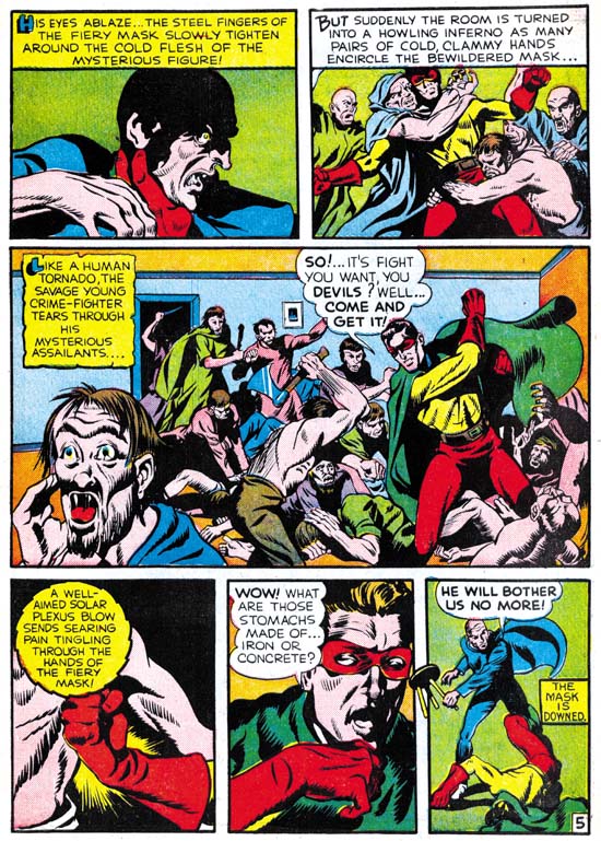
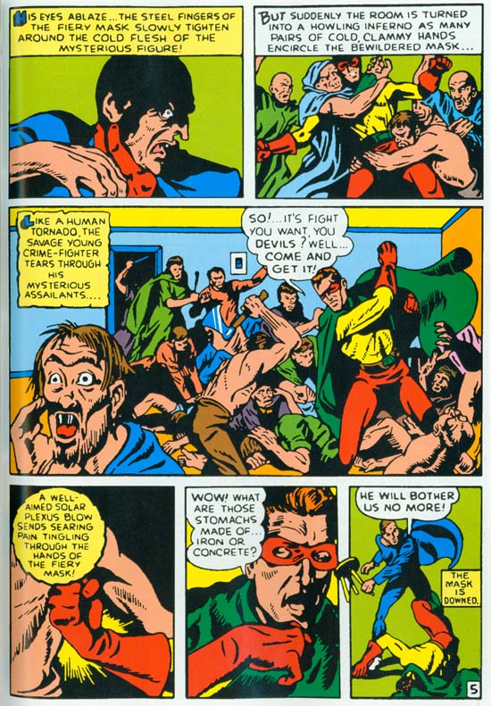
I have recently been able to scan a coverless but not too beat-up copy of Human Torch #2. That is actually the first issue for that title as it took over the numbering from the defunct Red Raven Comics #1. Seeing the original comic was a revelation. In Chapter 2, “Before Kirby” of my serial post on The Art of Joe Simon I discussed the Fiery Mask story by Joe Simon. I included an image of page 5 scanned from the Masterwork book. You can see the image I used below. I have since replaced it with a scan from the original comic, which you can see above. Take the time to compare the two images. Even with the relatively low resolution that is needed to include in this blog page it should be pretty obvious the difference in quality. The reprint version looks rather blurry. Because of the glossy paper used and the modern printing technology this cannot be blamed on the printing. Rather it looks like it was re-inked with an insensitive hand. Joe did a much better job inking this story then you could tell from the reprint.

Hunan Torch #2
The Human Torch #2 (Fall 1940) same page as above as reprinted in Marvel Masterworks.

Simon’s story was not the only story to be adversely affected by the poor art restoration. Actually all the features in this comic look so much better in the original. Colors in Golden Age comics just can not compare with what modern presses can produced. Yet the colors in this reprint are actually inferior to the original.

Hunan Torch #2
The Human Torch #2 (Fall 1940) “Introducing Toro, The Flaming Torch Kid” by Carl Burgos

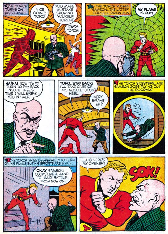
I could not resist including an image by Carl Burgos. Not because it shows how much better the original art was, since the reprint’s job on this page was better then most. I include it because it is such an great example of Carl’s excellence at telling the story. His progressing from the entrance of the Human Torch, the weapon removing his flame, the villain issuing his threat to the now disarmed hero, and ending with the Torch showing what he can do with his intelligence and courage. The only problem I have with this page is the awkward use of the circular panel. In a few months Simon and Kirby would show the right way to use this device.

Hunan Torch #2
The Human Torch #2 (Fall 1940) “Sub-Mariner Crashes New York Again” by Bill Everett
Enlarged Image

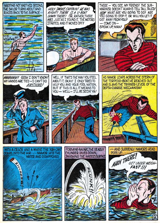
Sometimes the differences between a masterpiece and a more routine piece of art is actually very small. When I originally read Everett’s Sub-Mariner story in the Masterwork volume I was not very impressed. Do not get me wrong, you could tell Everett was doing a great story telling job. But the art itself did not do much for me. In my opinion none of the stories in this comic suffered as much as Everett’s from the reprint. The reprint inking was not any worst in Sub-Mariner but it completely masks what a masterpiece this story really is. Even the image I provide above does not do it justice, but I hope you can get a better idea from the enlarged image.

I am not able to compare the reprint with the original for the other issues in the Masterpiece volume. But it sure looks like they suffer from the same problems. I want to repeat what I said above, that even in the current somewhat poor restoration this Masterwork volume is a welcome addition to a fan’s library. But it is a shame that Marvel missed a chance to provide a volume that could have been absolutely amazing.

Featured Cover, Strange World of Your Dreams #2

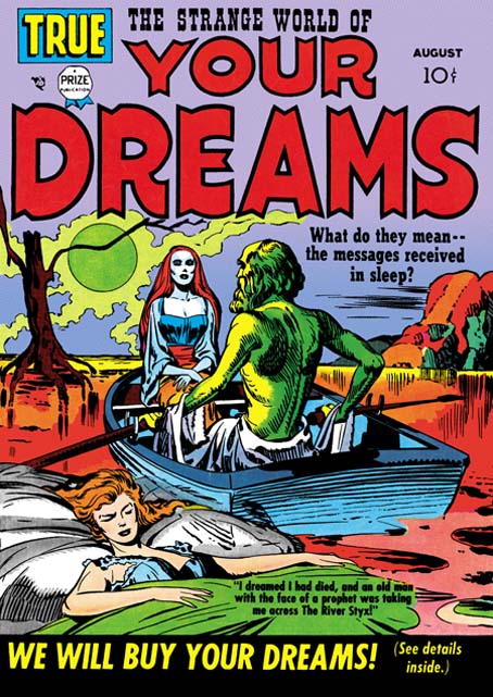
Strange World of Your Dreams #1
Strange World of Your Dreams #1 (August 1952)

I had a brief discussion with someone at the Big Apple Con yesterday. He mentioned a Kirby cover of a woman in a rowboat and suggested a name of the comic. Neither the comic name or the image rang any bells with me at first. Then I thought perhaps he was thinking of Strange World of Your Dreams #1. I suggested he visit my blog because I had posted on SWYD and thought I had included the cover for issue #1. When I finally got around to check it turned out I that in the post I had used SWYD #3 instead. So in case the gentleman decides to check my blog out here is the cover for SWYD #1.

As I said I have already posted on Strange World of Your Dreams. This title is as unusual as its name but unfortunately the comics themselves are a bit expensive. For anyone with a more limited budget who is curious about this title you might want to check out DC’s Black Magic #8 and #9 which reprint a few stories:

  • BM #8 “The Girl In The Grave” (from SWYD #2)
  • BM #8 “Send Us Your Dreams” (from SWYD #2)
  • BM #9 “The Woman In The Tower” (from SWYD #3)

These were published in 1975 and can still be found at a reasonable fee at comic conventions and eBay. As I have said before, I have mixed feelings about DC’s Black Magic. On the one hand it is great that some of these stories were reprinted. But unfortunately the artwork restoration looses some of the special inking quality of the original comics and gives them a sort of woodcut look. The three SWYD stories that were reprinted are good selections. “The Woman In The Tower” is not only the best in the original series, it is also one of Simon and Kirby’s most unusual stories ever.

Featured Cover, Treasure #10

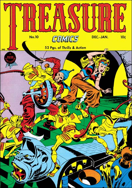
Treasure Comics #10
Treasure Comics #10 (December 1946) by Jack Kirby

I come across lists all the time; the top 100 artists, the 100 most important comic books, and so on. All listed in a nicely hierarchy with one selected as the best. I do not know how people are able to make such lists. What criteria does one use to rank one artist as #100 and another as #101 (and so be excluded from the list)? Even the selection of the best can be wroth with difficulties. Should the best comic book artist be based on who did the best work or who had the most influence on the comic books of today? It should come as no surprise who I think is the artist that did the best comic book art. Subtle hint, look at the title of this blog. However if it is influence that counts then I might wonder if Will Eisner may be more appropriate. While not denying Jack Kirby’s tremendous influence on pretty much the entire history of comics, Eisner’s graphic novels launched a whole new genre, one that has even made it into the N.Y. Times Book Review.

But even if I try to adopt a subjective viewpoint I do not find myself in an easier position. My favorite painting varies from day to day. My response to a piece of art depends as much as my mood as with the work of art. But ask me what my favorite Simon and Kirby cover is and most days I would say Treasure #10. This is a rather oddball cover for S&K. Treasure #10 comes not long after the failure of Stuntman and Boy Explorers. The publisher was Prize, Joe and Jack had done some work for them early in their career (Prize Comics #7, 8 and 9; December 1940 to February 1941). In March 1947 Simon and Kirby would launch for Prize the crime genre version of Headline Comics. Treasure #10 was used to introduce the new version of Headline. It includes a crime story (“Tomorrow’s Murder”), the earliest Simon and Kirby crime genre piece. There is an advertisement at the end of the story announcing the “bigger and better” Headline. It includes a copy for the cover for Headline #23. Both the ad and the illustrated comic indicate a January-February cover date. Headline #23 was actually cover dated March-April. Further the cover illustrated in the ad was really used for Headline #24.

Treasure Comics appeared to once have an Arabian Knight feature, it is listed on the cover for Treasure #7. However there is no such feature, or anything like the cover, in TC #10. The GCD shows Treasure #6 and #7 covers (April and June) with an Arabian theme signed by H. C. Kiefer. I am not familiar with Kiefer’s work and it would be easy to dismiss him as a inferior artist compared to Jack Kirby. But such comparisons are really unfair and uninformative. The cover for TC #7 may be a bit crude and the demons looking more goofy then threatening. But TC #6 is a rather nice cover with lots of action and a good composition. Both TC #6 and #7 covers show shields with similarities with that used by Jack for TC #10. Further TC #7 adds an unusual point to the turban, a trait shared with TC #10. This suggests that Kirby used Kiefer’s covers as a jumping off point.

What a cover Jack provides! An Arabian Knight seeks to escape with a beautiful princess. Well perhaps she may not really be a princess, but her exotic diadem suggest she is more then just a beautiful woman. The pair are faced with a swarm of adversaries intent on preventing their escape. Not your usual adversaries but a group of yellow bodied, red tailed monkeys. Not what you normally would think of as much of a challenge to our hero. But these monkeys are armed with exotic weapons and quite energetic in their attack. These are scary monkeys indeed. But not your normal scary monkeys, these wear exotic clothing and rather weird hats (how do those hats stay on?). Judging from the sculpted banister I would suspect there is a whole population of these monkeys that our desperate pair must somehow evade.

Take a look at the monkey with the knife in the center of the picture, look carefully at his feet. The big toe is on the outside of the foot contrary to what is found in either monkeys or men. I used to think that this was done by Kirby on purpose to give them an even more exotic look. But during restoring the cover I noticed that the toe is on the correct side of the foot for the two monkeys on the left. So now I guess it is just another of those errors that Kirby is so famous for.

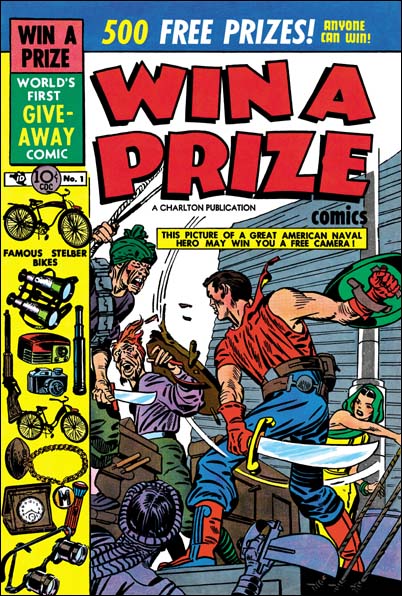
Win A Prize #1
Win A Prize #1 (February 1955)

Simon and Kirby did not do many of this sort of swashbuckler covers. Win A Prize #1 comes to mind as one other. (I wrote about the Win A Prize comic before during my serial post on The End of Simon and Kirby). But Jack was a master of action art and seemed to create such covers almost effortlessly.

Joe Simon, The Patriot

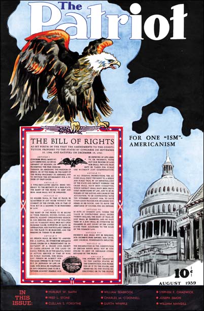
The Patriot #3
The Patriot #3 (August 1939) by Joe Simon

Today it is hard to believe that there every was much of a Nazi party in America. But in February 1939 22,000 Nazi supporters attended a rally at Madison Square Gardens. At this rally Fritz Kuhn attack the president, calling him Frank D. Rosenfeld. But the rally also attracted numerous protesters. So although the American Nazi population then was enormous by today’s standards they still a fringe group that would not have been considered patriots. Even though there was a large isolationist movement and no signs yet of the US entering the war, there was also many who could called themselves patriots and considered the Axis powers as enemies of the United States.

The Patriot #2
The Patriot #2 (July 1939) by Joe Simon

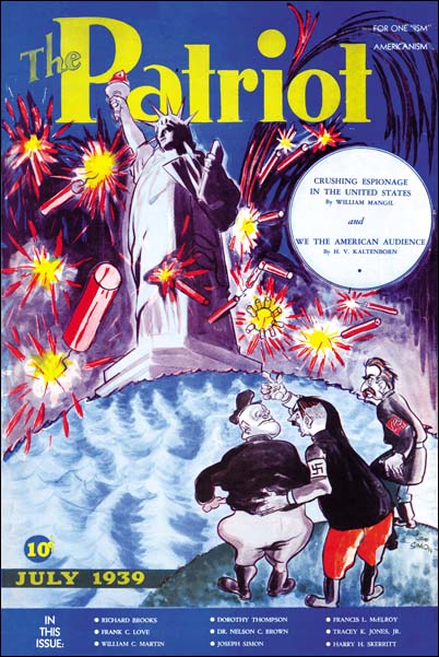
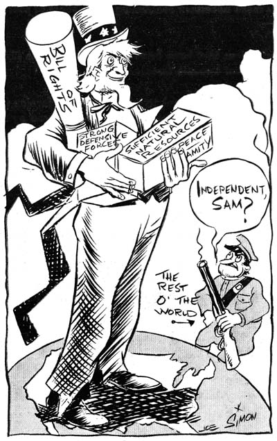
In 1939 Joe Simon was working in the newspaper business, his efforts in comic books had not yet started. Any doubts where Joe stood politically can be erased by his contribution to a publication called “The Patriot”. Joe provided that quintessential American symbol, the bald eagle, for one cover. On another he mocked the three dictatorial leaders, Adolf Hitler, Benito Mussolini, and Joseph Stalin. The Patriot was a slightly over tabloid size magazine. It was rather thin, 20 pages including the covers. There was a lot of local advertisement, so it probably had limited distribution. With a title like The Patriot one might suspect it was suitable for reader with an extreme right political philosophy. But the articles in the magazine are about extolling American scenery, products and of course freedom. Pretty tame stuff and very much centrist for the political spectrum of those days.

The Patriot #2
The Patriot #2 (July 1939) by Joe Simon

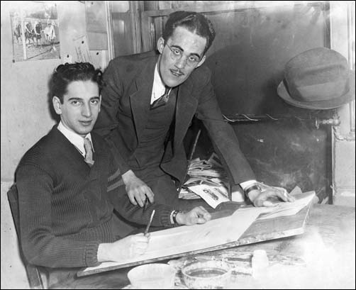
But Joe’s views were not shared by all the people he worked with. Joe got his initial start in newspapers and a lot of guidance from Adolf Edler. Adolf sometimes would tell people he had been off to a nudist colony. In reality he was off to a Nazi Bund camp. You would think Adolf’s political convictions would have problems working with someone Jewish like Joe Simon. Quite the contrary, in fact Adolf seemed to actively hire Jewish workers and got along with them quite well. Apparently Edler’s tie to the American Nazi movement was due to his fondness for his homeland. But letters he received letters from Germany told of increasing persecution of Jews. Dismayed with what he learned led him to abandon the Nazi Bund group.

Joe Simon and Adolf Edler

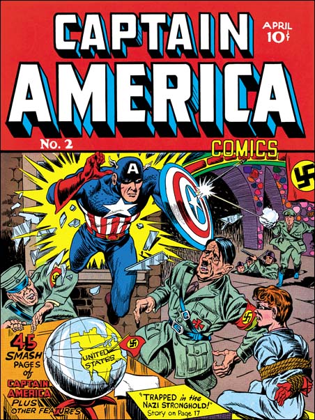
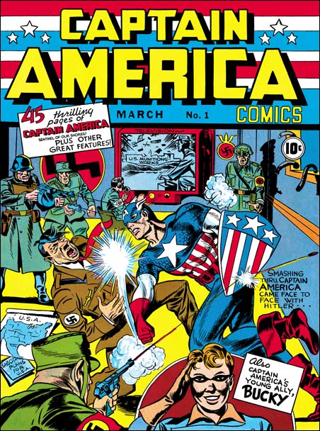
There was a lot of newspaper buyouts and closings and Joe lost his job. Joe moved to New York City and entered the comic book industry. Perhaps due to the experience he got from newspapers or perhaps just due to pure ambition, Joe rose rapidly from an artist to an art editor. When Joe and Jack Kirby created the ultimate patriotic hero, Captain America, who better to appear on the first cover as his adversary then Adolf Hitler himself. America had not yet entered the war, but there can be no question where Joe and Jack stood. Captain America Comics was a big hit, so many in the public probably agreed. In the 1954 Simon and Kirby created a new patriotic hero, the Fighting American. But times had changed and the Fighting American had a short run. S&K returned to the same thing once again in 1959 with their own version of the Shield (Secret Life of Private Strong) but this time it was cancelled due to legal threats from DC. Still the patriotic spirit did not leave Joe. In 2001 after 9/11 Joe responded by creating an altered version of the classic Captain American #1 cover. I wish I could include an image but alas because of legal questions I cannot. It shows Captain America delivering his famous punch not to Adolf Hitler but to Osama Bin Laden. Since I cannot show the 9/11 cover let me end this post with an image of the less often seen confrontation between Hitler and Captain America from the cover of issue #2.

Captain America #2
Captain America #2 (April 1940) by Jack Kirby and Joe Simon

The Wide Angle Scream, “Terror Island”

Stuntman
Stuntman #3 (unpublished) “Terror Island”
Enlarged view

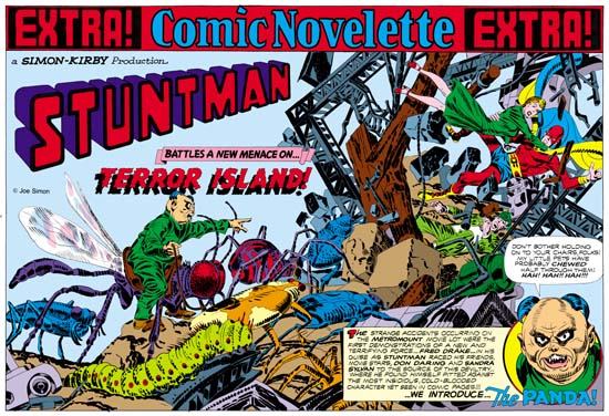
Joe Simon and Jack Kirby must have had high expectations for their creation, Stuntman. There exist three double page splashes that were never published, at least not as regular Simon and Kirby productions. Since S&K always placed their wide splashes in the centerfold, this meant that they had already started working for up to Stuntman issue #5. That is until the post-war comic book glut caused the early demise of their new comic books. Joe still has the three splash pages and with their double size art they are really marvelous to behold. However when reduced to the size necessary for use on the Internet they can be difficult to appreciate. Therefore I hope my readers will understand that I felt it necessary to provide my own coloring for use in this blog. I would have like to have used the color version that Joe did for his book “The Comic Book Makers” but so far I have not found it in his collection. The “extra!” strip on the top, the “a Simon-Kirby Production” and the Stuntman title are missing from the art and I provided them from other wide splashes. Glue marks clearly indicated that the “extra!” strip is was present, or something like it. However I did not scan the original art (it is much too large) and the source of the image does not indicate the placement for the “production” (if it was even present) or the title.

Because two of the double splashes are completely inked I am not absolutely sure which was originally meant for Stuntman #3. I choose “Terror Island” to post on first. However this choice was not completely arbitrary. As mentioned above “Terror Island” clearly had an “extra!” along the top a feature that it shares with the double wide splashes for Stuntman #1 and #2. The other completely inked splash did not have this “extra!” strip, the lack of which it shares with the unfinished Stuntman double splash.

Mao Tse-tung“Terror Island” introduces a new antagonist, the Panda. Of course Stuntman had faced various opponents in his previous stories but they all were rather generic. None of the earlier villains really stood out and it is clear that none were ever meant to reappear in future Stuntman stories. The Panda seems special and I believe was Simon and Kirby’s first attempt to create Stuntman’s nemesis, the equivalent of the Red Skull for Captain America. Basing a villain on a panda may seem an odd choice, after all what could be more cute and cuddly then a panda, at least in the mind of the public. Sure Jack draws the Panda to look as vicious as possible without loosing his panda look. But the real source for this character is not the bear, but China’s leader Mao Tse-tung (nowadays his name is normally transcribed as Zedong). Today with all the world companies scrambling to get a share of the Chinese market it is easy to forget at that time communist China was a very closed society. As China’s leader and his with description of the U.S. as a “paper tiger” Mao was considered a special menace. Still it is not at all clear whether the Panda really could fulfill the role Joe and Jack were casting him for.
The art for this wide splash marked a new approach. All previous double splashes were actually composed of various different sections. But for the “Terror Island” splash no similar attempt was really made. It is true that there is some introductory text and a round panel portraying the Panda, but this hardly compares to the cast of characters often provided in older double splashes. Yes it is also true that space has been left in the upper left for the titles, but no art is associate with these titles. What we are presented with for the first time is an enactment that dominates the entire splash. But what a scene! It sprawls across the pages from the lower left to the upper right. It is just the sort of chaos that we have seen before in the Boy Commandos wide splash. There is some control over the composition. The Panda and his attacking bug army occupy the left page. All are advancing toward the right where we find Stuntman, Sandra Sylvan and Don Daring amid a mass of falling wreckage. Although the uncolored ink art might be a bit confusing, I am sure Jack (who did the penciling) knew how much the final coloring would help to make it understandable. This splash is one of those that Jack could just let his imagination run wild. Previously when discussing the cover for Adventure #98 I had mentioned how Jack was often inaccurate when drawing animals but nonetheless was very successful in giving them a certain life. This splash provides and example of what I meant. A biologist would shudder and the giant bugs Kirby presents us with. Some of the inaccuracies can be explained by the needs of the subject. The wasp like insect that the Panda is mounted on could never fly with its wings in their present location. But if that beast’s wings were in the correct position the Panda could not mount it. But other errors have no artistic excuse. The legs of the insects and the spider are attached in the most bizarre places. If Jack used a biology book for a reference he obviously did not make any attempt to follow it closely. Regardless of these “errors” these giant bugs have a very menacing life to them.

My personal preferences is for the earlier wide splashes with their greater emphasis on design. But there is just no denying the shear brilliance that radiates from these post war double splashes. When you look at the original art for the “Terror Island” splash there are no signs of hesitation or rework. Jack seemed to have it all figured out in his mind before he put it on the illustration board. But with such a complicated drawing how was he able to do that? It just astonishes me.

Byrne and Simon, An Unlikely Collaboration

Captain America Collector's Preview
Captain America Collectors’ Preview (March 1995)
by John Byrne and Joe Simon
Larger Image

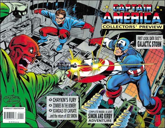
In 1995 Marvel was going to do one of their periodic changes of direction for Captain America. So they produced a Collectors’ Preview. Although it included a reprint of a Simon and Kirby Cap story from All Winners #1, the Preview was not a comic book. Rather it was a comic book size magazine. That time was a good point in the relationship between Marvel Comics and Joe Simon. Joe’s first attempt at challenging the ownership of Captain America had been settled years before and his next copyright fight was years into the future. So the Preview announced “the return of Joe Simon”. Inside was a nice article showing Joe doing cover recreations for all the Captain America covers produced by Simon and Kirby for Timely. The photos are of Joe at work in his own apartment, the same one he still lives in. You might get the impression from the photographs of spacious living conditions. But I can tell you it is a typical New York apartment which I suspect most Americans would consider rather cramped. Joe’s stat camera did not help. A stat camera is a rather large device that once found common use in the publishing industry. In the days before copier machines (let alone scanners) stat cameras were used to cheaply reduce comic art to the actual publication size. In 1995 Joe was using it to blow up old comic covers. Eventually Joe got rid of this outdated camera and he now uses copiers. You would think this would help provide more room but Joe has three different copier/printers, each one having some preferred characteristic. Lately he has purchased a fourth but I have no idea where he is going to put it without loosing one from his collection.

Since in 1995 Marvel’s relationship with Simon was good and John Byrne was perhaps their hottest artist someone came up with the idea of John drawing the Collectors’ Preview cover and having Joe ink it. Despite my title to this post, it was not a real collaboration. John and Joe never met, nor did they even talk over the telephone. Joe was sent the pencils, he did a tracing and inked on that. The original pencil was sent back to Byrne. Joe had this to say about this job.

Inking John Byrne was easy. For Jack Kirby you had to developed your own way of inking. But with Bryne everything was already there.

During the Simon and Kirby years of collaboration Jack would provide tight pencils but without any of the spotting. On the other hand Byrne had not only provided tight pencils but also had indicated all the spotting. Actually in later years while working for Marvel where Kirby was providing pencils alone he also began to indicate spotting as well for the inker.

The Byrne and Simon art for the Collectors’ Preview was a wrap-around cover. The wrap-around was one format that Simon and Kirby never did. In fact the whole idea would have been ridiculous during the Silver Age or earlier. During those years comics were sold on racks and the whole purpose of covers were to attract a potential buyer’s attention. For that purpose anything on the back would be a complete waste of money. It would take the rise of a collector’s market before wrap-around covers would become more common. One might be tempted to compare such a cover format to the double page splash that Simon and Kirby did so well. But the wide splash worked as a story introduction a function that certainly does not fit the Preview cover as there was no Red Skull story inside. A better comparison would be to the double page pin-ups that S&K made for comics like Boys’ Ranch. I will not be doing a detailed comparison of the Preview cover with S&K wide pin-ups. It just would not be fair since there really is no comparison. After all there is a reason that this is the Simon and Kirby blog, not the John Byrne blog. Still John did a nice piece with lots of excitement. The composition is well done with the arms of the various characters visually linked into an oval. My biggest complaint is there is too much text cluttering the art. John seems to have designed the cover with the placing of the title in mind. But the rest of the text appears to be unplanned for. I suspect the clutter was not John’s fault.

Featured Cover, Wonderworld #14

Wonderworld #14
Wonderworld Comics #14 (June 1940) by Joe Simon (signed)

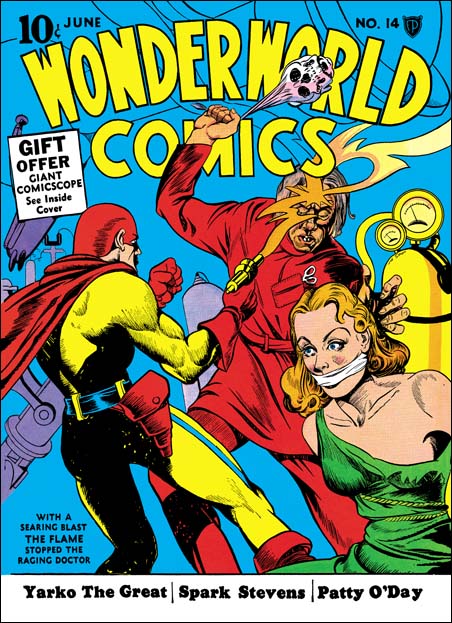
What makes a great comic book cover? Well many will say you need an artist capable of drawing realistic figures. Others desire intricate details and finely rendered lines. All that is well and good but for me what is needed more then anything else is a great story teller. You need someone like Joe Simon. As editor for Fox Comics Joe drew sixteen covers. Not a lot of covers but in my opinion if Joe had left comics then, never partnered with Jack Kirby, those sixteen covers alone would have entered him into the select group of the greatest golden age artists. As can be seen in the cover I am featuring for this post, Joe’s anatomy was often inaccurate. The Flame’s rib cage is much too short. Joe also had problems with form. The woman’s right bosom appears rather ample. That makes it surprising to find that even with the dress torn her left breast appears rather flat. A woman’s hair is also very important, at least for a comic cover from the 40’s. But Simon has problems in presenting curls and flowing hair. If that was all Joe had going for him this cover would have been a failure.

With a searing blast the Flame stopped the raging doctor

That is what the blurb in the lower left corner tells us. But who needs the blurb, the picture tells us all that and more. Because it is red, the villain’s clothing might not seem to belong in a laboratory. But look at the pair of scissors (or forceps?) in a pocket clearly designed for them. Obviously this is some sort of medical scientist. Mind you this is not a mild manner researcher. His gaze is intent on the woman. With one hand he reaches for her while with the other he swings a weapon. She maybe conscious at this moment but he intends that she will not be for long. And what a weapon our mad scientist has, a skull that he swings with (can that really be?) the former victim’s own hair (I bet you did not know that the hair is the last thing to detach from a decaying skull?). A skeptic might question what use would the scientist have for a beautiful woman. However anyone raising such an issue obviously is unaware that attractive young women have a long history of providing the essential ingredient for many nefarious elixirs. Hey, the eye of a newt may have been good enough for for a witch of yesteryear, but not for a modern scientific antagonist. Things would look bleak for our damsel in distress if not for the sudden appearance of the hero. Even if you are not familiar with the Flame, you can feel assured that whatever the hero has shot at his foe’s forehead has got to be effective. Once again the Flame has saved the day.

Rescuing a woman from a mad scientist was a common subject for Simon Fox covers. I have previously posted Fantastic #7 and Wonderworld #13. For WC #14 Joe has whittled the theme down to its bare essentials. The background is nothing more then a blue field. We are only provided with a few pieces of scientific apparatus to indicate that the action is taking place in a laboratory. Most of the objects have been given shades of purple. Therefore the apparatus blends with the blue background so as not to distract from the figures done largely in red, yellow and green. The only exception is the gas canister on the right which balances off nicely with the yellow of the Flame’s uniform on the left. Above, under the comics title are just the outline drawing of the gun’s flame and more equipment. This was really a smart compromise. If fully colored the upper drawing would have distracted from the title. However if the lines had been eliminated the top would have been much too plain. Joe may or man not have done the color guide, but if he did not as editor he likely have provided guidance. In any case the total design is well done.

I do not know much about the origin of the Flame. But the story inside shows him appearing out of fire such as from a criminal’s match. In a few months Simon and Kirby would create a character call the Vision for Timely. The Vision would appear out of smoke. What a surprising coincidence!

Kirby Or Not, Young Romance #84

Young Romance #84
Young Romance #84 (October 1956)

The Jack Kirby Checklist does not include the cover for Young Romance #84 among works by this artist. Unlike my previous post on YR #85 in this case I can understand why. The woman has an angular face which is not typical of Jack’s work. The man’s face is of no help because it is almost completely hidden. But the man’s overly large ear is one clue. In earlier years, particularly while working for DC, Jack always seemed to make large ears for heads viewed from the back. Later Kirby seemed to make a conscious effort to correct this. But he would still slip into his old habit from time to time as in this cover. Another Kirby touch, although by no means unique to him, is the perspective view provided here. Jack was the master of the use of perspective. But for me it is the couple looking up on the left that provides the best evidence that this cover was penciled by Kirby. Despite their small size, or perhaps because of it, they seem to be classic examples of Jack’s distinctive background figures.

YR #84 was one of the comics from the period where Kirby was doing almost the entire comics for all the Prize romances. Previously in “The End of Simon & Kirby” I posted on this period. In that blog post I commented that some of the outline inking in these all Kirby romances seems to have been done by Bill Draut. Although it is difficult to be sure, I suspect Bill may also have done outline inking for the YR #84 cover. The simplicity of the woman’s eyebrows reminds me of Draut. I hasten to add that woman’s face it not due to Bill. Although not typical of Kirby, the woman is even less typical of Draut. In particular Bill preferred much longer eyebrows. The spot inking for this cover was not done in Bill’s own manner either. Most of the spot inking for the all Kirby romances seems to have been done by Jack himself and I think that is true for this cover as well. Inking for the all Kirby romances ranges from the exceptionally beautiful to the rather poor. My suspicion is that with all the work Jack was doing sometimes he was quite rushed and the inking would therefore either suffer or be minimal. The inking for YR #84 is an example of a job done well but with limited amounts of spotting.

The main part of the story depicted on the covers is pretty obvious, the ladder indicates that the man and woman are about to elope. I am less clear about the part played by the couple on the left. With the bags in front of them it is certain that they are not just on lookers. Either this is going to be a double marriage (the bags are theirs) or they are going as witnesses (the bags belong to the foreground couple). In either case the car that will be used to take them all away is parked behind them. Like most Simon and Kirby covers this one is carefully crafted. But it is constructed to best tell the story, not to be the equivalent of a snapshot. The ladder the man is on is way to far to the right of the window. It is hard to believe that the woman could safely transfer to the ladder. But placing the ladder correctly in relationship to the window would mean the man would also be moved more to our left. This would be disastrous to the composition, all the figures would be on one side of the cover while the other would be pretty much bare. Correcting the ladder placement would also mean covering the background couple and hurt the story that the cover is meant to tell.