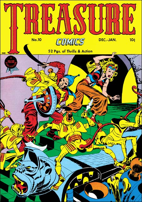
Treasure Comics #10 (December 1946) by Jack Kirby
I come across lists all the time; the top 100 artists, the 100 most important comic books, and so on. All listed in a nicely hierarchy with one selected as the best. I do not know how people are able to make such lists. What criteria does one use to rank one artist as #100 and another as #101 (and so be excluded from the list)? Even the selection of the best can be wroth with difficulties. Should the best comic book artist be based on who did the best work or who had the most influence on the comic books of today? It should come as no surprise who I think is the artist that did the best comic book art. Subtle hint, look at the title of this blog. However if it is influence that counts then I might wonder if Will Eisner may be more appropriate. While not denying Jack Kirby’s tremendous influence on pretty much the entire history of comics, Eisner’s graphic novels launched a whole new genre, one that has even made it into the N.Y. Times Book Review.
But even if I try to adopt a subjective viewpoint I do not find myself in an easier position. My favorite painting varies from day to day. My response to a piece of art depends as much as my mood as with the work of art. But ask me what my favorite Simon and Kirby cover is and most days I would say Treasure #10. This is a rather oddball cover for S&K. Treasure #10 comes not long after the failure of Stuntman and Boy Explorers. The publisher was Prize, Joe and Jack had done some work for them early in their career (Prize Comics #7, 8 and 9; December 1940 to February 1941). In March 1947 Simon and Kirby would launch for Prize the crime genre version of Headline Comics. Treasure #10 was used to introduce the new version of Headline. It includes a crime story (“Tomorrow’s Murder”), the earliest Simon and Kirby crime genre piece. There is an advertisement at the end of the story announcing the “bigger and better” Headline. It includes a copy for the cover for Headline #23. Both the ad and the illustrated comic indicate a January-February cover date. Headline #23 was actually cover dated March-April. Further the cover illustrated in the ad was really used for Headline #24.
Treasure Comics appeared to once have an Arabian Knight feature, it is listed on the cover for Treasure #7. However there is no such feature, or anything like the cover, in TC #10. The GCD shows Treasure #6 and #7 covers (April and June) with an Arabian theme signed by H. C. Kiefer. I am not familiar with Kiefer’s work and it would be easy to dismiss him as a inferior artist compared to Jack Kirby. But such comparisons are really unfair and uninformative. The cover for TC #7 may be a bit crude and the demons looking more goofy then threatening. But TC #6 is a rather nice cover with lots of action and a good composition. Both TC #6 and #7 covers show shields with similarities with that used by Jack for TC #10. Further TC #7 adds an unusual point to the turban, a trait shared with TC #10. This suggests that Kirby used Kiefer’s covers as a jumping off point.
What a cover Jack provides! An Arabian Knight seeks to escape with a beautiful princess. Well perhaps she may not really be a princess, but her exotic diadem suggest she is more then just a beautiful woman. The pair are faced with a swarm of adversaries intent on preventing their escape. Not your usual adversaries but a group of yellow bodied, red tailed monkeys. Not what you normally would think of as much of a challenge to our hero. But these monkeys are armed with exotic weapons and quite energetic in their attack. These are scary monkeys indeed. But not your normal scary monkeys, these wear exotic clothing and rather weird hats (how do those hats stay on?). Judging from the sculpted banister I would suspect there is a whole population of these monkeys that our desperate pair must somehow evade.
Take a look at the monkey with the knife in the center of the picture, look carefully at his feet. The big toe is on the outside of the foot contrary to what is found in either monkeys or men. I used to think that this was done by Kirby on purpose to give them an even more exotic look. But during restoring the cover I noticed that the toe is on the correct side of the foot for the two monkeys on the left. So now I guess it is just another of those errors that Kirby is so famous for.

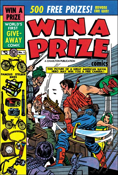
Win A Prize #1 (February 1955)
Simon and Kirby did not do many of this sort of swashbuckler covers. Win A Prize #1 comes to mind as one other. (I wrote about the Win A Prize comic before during my serial post on The End of Simon and Kirby). But Jack was a master of action art and seemed to create such covers almost effortlessly.

