Category Archives: 7 Freelance

Adventures of the Fly, the First Issue


Adventures of the Fly #1 (August 1959) “The Strange New World of the Fly”, pencils by Jack Kirby

Recently I posted about Jack Kirby’s work on the origin story of Private Strong, aka the Shield. In Adventures of the Fly #1 (August 1959) Jack also had the honors of doing the same for the other new Archie hero, the Fly. Only in this case Kirby based the story on art that C. C. Beck did for the unpublished Silver Spider. Some have called the Silver Spider a Simon and Kirby creation but that simply is not true. Kirby had nothing to do with the Silver Spider which was a creation of Joe Simon, C. C. Beck and Jack Oleck. When I previously discussed the Silver Spider (The End of Simon & Kirby, Chapter 10, A Fly in the Mix) I dated this creation as 1953. To be honest I no longer remember where I got that date but it is not an unreasonable one. This would put it during the time of the Simon and Kirby collaborations but in “The Comic Book Maker” Joe writes about how the Silver Spider was created as a favor to Beck. An examination of xerox copies of the original art confirms Kirby’s absence.

Tommy Troy was an orphan like Lancelot Strong but the resemblance ends there. We meet Tommy in an orphanage but he ends up hired out to an elderly couple. Not kindly Kent-like farmers, but a mean, elderly couple with a reputation of dabbling in magic. Beck’s Silver Spider story had included a genie to add an element of humor, but Kirby has dispensed with him. However concept of a young boy who transforms into an adult superhero was Beck’s who repeated it from Captain Marvel.

Adventures of the Fly #1
Adventures of the Fly #1 (August 1959) “The Fly Strikes”, pencils by Joe Simon

Just like in Private Strong, the origin story for the Fly is actually told in a series of separate stories. The first one ends with the Tommy Troy being given a magic ring and transforming into the Fly. The second, “The Fly Strikes”, tells of the Fly’s first combat against criminals. This second story is actually based on the end of the origin story that Beck drew.

“The Fly Strikes” is generally credited to Jack Kirby but I am not convinced. I suspect that it is another case of Joe Simon swiping from and imitating Kirby. Joe was particularly good at doing this. Note the Fly peering into the window in the second story panel. This is a swipe from Fighting American #1 (Captain America Returns). I have no indications that Kirby was working from layouts in the stories that he did for this issue. Nor do I believe Jack would bother to swipe from himself. Why would he when he could do it much faster without a swipe? So as I said I believe this story was actually done by Simon.

Adventures of the Fly #1
Adventures of the Fly #1 (August 1959) “Buzz Gun”, pencils by Jack Kirby

While the origin story came from Beck’s Silver Spider and the Fly’s powers seemed to be based on directives from Joe Simon, the Fly’s costume is derived from the Night Fighter, a Simon and Kirby creation that was considered for Joe and Jack’s publishing company, Mainline, but never used (Night Fighter, an Abandoned Superhero). Two characteristics stand out. One was the goggles. Similar eyewear appeared in the Black Owl from 1940 and 1941 (Simon and Kirby’s Black Owl). The presence of these goggles in two superheroes with a night theme suggests they were meant to be an aid for seeing in the dark. Of course such night vision would not be that appropriate for the Fly nor is it a power that the Fly ever used. Perhaps the eyewear was nothing more then a visual reference to the insect’s compound eyes or perhaps Jack saw no reason to remove them when he based the Fly’s costume on that of the Night Fighter.

One of the other features that the Fly inherited from the Night Fighter was a pistol of some kind. All that remains of the art for Night Fighter are two unfinished covers and neither offers any clues as to what use the pistol was put to. My guess is that it was for shooting a wire for scaling buildings such as that used by the Sandman, another superhero that Simon and Kirby worked on during the war. While a wirepoon might be a useful device for the Night Fighter it would be rather superfluous for a superhero like the Fly who is able to walk up walls. Well in “Buzz Gun” Kirby shows how the Fly’s pistol is used. It makes a noise! Oh well.


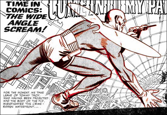
Adventures of the Fly #1 (August 1959) “Come Into My Parlor”, pencils by Jack Kirby
Larger Image

Jack Kirby’s last chapter for the origin story opens with a spectacular double page splash. The title exclaims “for the first time in comics: the wide angel scream”. Of course this really was not the first use of a double page splash a subject that I covered in a still unfinished serial post (The Wide Angle Scream). The chances are that none of the Fly readers had seen any of Simon and Kirby’s earlier uses. While Simon and Kirby did not originate the double page splash, nobody else did it better. Further by 1959 the wide splash was no longer used by anyone. I can imagine the impression the centerfold splash made for potential buyers of the comic. How could they resist. I am sure I would not have. I would have been 9 at the time but sometime around that period I had read some of the DC superhero comics. I found them boring and had given up on comics for a while. Unfortunately I never saw any of the Simon and Kirby creations.

Adventures of the Fly #1
Adventures of the Fly #1 (August 1959) “Sign of the Triangle”, art by Joe Simon

The Jack Kirby Checklist includes this among the work that Kirby did for this issue but I am not convinced. To me it looks like Simon did the drawing. However this confusion is really understandable because the illustration appears to be a swipe from the cover of Foxhole #3 (February 1955) which had be drawn by Kirby. It is not an exact copy, but I do not believe Simon ever did exact copies. The inking looks like Joe did that as well.

Adventures of the Fly #1
Adventures of the Fly #1 (August 1959) “The Search”, pencils by Joe Simon

I may not be confident about attributing the illustration for “Sign of the Triangle” to Simon but there seems little doubt that Joe did the two page Shield promotional piece called “The Search”. This one is full of swipes from art by Kirby. For instance the man being punched through a wall and then left hanging was from the origin story in Fighting American #1 (April 1954, Captain America Returns). Note that while Joe follows pretty closely the man stuck in the wall he has added the man’s face for the punching image which Jack had cut off by the panel edge.

Adventures of the Fly #1
Adventures of the Fly #1 (August 1959) “Magic Eye”, pencils by George Tuska?

The final story is completely independent from the Fly origin and done by another artist, I believe it is George Tuska. I questionably attributed some work from Private Strong #2 to George as well; let us see if some of my more knowledgeable readers will agree with me on this one as well. This is another example where I do not see any obvious swipes of Kirby.

Double Life of Private Strong, the Last Issue

Double Life of Private Strong #2
Double Life of Private Strong #2 (August 1959) “The Toy Master” page 5, art by unidentified artist

While the first issue of Double Life of Private Strong was almost completely drawn by Jack Kirby, he played a much smaller part in the second. I am not sure who drew the first story, “The Toy Master”, but he obviously was working from some sort of directions. In “The Comic Book Makers, Joe Simon writes about using Carl Burgos to create layouts. In fact Joe’s collection still includes layouts for a Fly story (Carl Burgos does the Fly). By supplying the artists with layouts, Joe was able to give the comic a distinct Kirby feel. Scattered through the art are swipes; most of them from the previous Simon and Kirby superhero, Fighting American. For instance the Shield in panel 4 of page 5 was based on a splash from Fighting American #1. Some experts have claimed that these are either stats or mechanical copies but I have disproved that by overlaying the art (The Fly, A Case Study of Swiping). Apparently all that was done was a free hand copy was created for the layout and the artist would finish it. This would provide the desired Kirby-feel to the story without making the swipe too incongruous with the rest of the art. There are other examples were the copy deviated even more from the original. I believe, for instance, that the Shield in panel 3 was swiped by the one Kirby did for the splash of “The Menace of the Micro-Men” from Private Strong #1.

Double Life of Private Strong #2
Double Life of Private Strong #2 (August 1959) “Upsy Daisy”, art by George Tuska?

I going out on a limb because I am not familiar enough with his work, but I believe “Upsy Daisy” might be the work of George Tuska. Joe Simon has written in “The Comic Book Maker” that Tuska worked on the Archie comics for him so it is not an unreasonable guess. Perhaps I missed them, but I do not spot any obvious swipes from Kirby in this story.

Double Life of Private Strong #2
Double Life of Private Strong #2 (August 1959) “I Wish I Were the Shield”, art by George Tuska?
Larger Image

The two tier panel layout is pretty much identical to the one used for the double page splashes found in Adventures of the Fly #1 and #2. However there is no mention of “the wide angle scream” nor are the curved black bands of the top and bottom of the splash (The Wide Angle Scream, What Was Old Is New Again). Again my attribution of this story to George Tuska is by no means firm.

Here there are some examples of swiping from Kirby. For instance the Shield in the splash was based on the cover logo that first appeared on Fighting American #4 (October 1954). The presences of these swipes and the overall superiority of the story art over that for “Upsy Daisy” suggests that this story was done from layouts.

Double Life of Private Strong #2
Double Life of Private Strong #2 (August 1959) “The Ultra-Sonic Spies”, art by Jack Kirby

The use of swipes was clearly an attempt to improve the look of the art not actually drawn by Kirby. But of course it was only partially successful since after all nothing beats the real thing. The single story by Kirby in this issue, “The Ultra-Sonic Spies”, just out shines all the rest of the comic. What a mixture of action and humor. Since the Shield’s alter ego, Lancelot Strong, was a private in the U.S. army, Jack was able to return to and improve upon the humor that was done years previously in Captain America. While Simon and Kirby had always preferred less powerful and more human heroes, Kirby makes exciting use the Shield’s greater power. I would say Jack was much more at ease with the Shield than he was with the Fly. What Kirby did in Private Strong prefigures more than any of his other work what was to blossom in the Marvel superhero line in a few years.

Double Life of Private Strong #2
Double Life of Private Strong #2 (August 1959) “The General’s Favorite Private”, art by Joe Simon

There is a single page text piece about the Shield which tells how Lancelot Strong’s secret identity is discovered by General Smith. The story is nothing special but it contains an illustration by Joe Simon. Since the work that he did for the J. C. Penny (1947, A History Lesson) Joe drew very little comic book art. Probably the most significant work was “Deadly Doolittle” for Fighting American #6 and even that was a reworking of an earlier Sandman piece originally drawn by Kirby. After the Simon and Kirby studio broke up Joe did some more work on his own. Simon mostly did some covers but he also occasionally did an interior illustration such as the one accompanying the General Smith text story.

Double Life of Private Strong #2
Double Life of Private Strong #2 (August 1959) “The Boy Sentinels” page 2, art by Joe Simon

For the most part one thing Joe Simon did not draw late in his career was full stories. Private Strong #2 included what is essentially an advertisement for the Fly, “The Boy Sentinels”. Should this two page piece be considered a story? What is interesting to me is that Joe makes little, if any, use of swipes from Kirby. Instead Simon drawing reflects back to the work he did for backup pieces for Stuntman and Boy Explorers, especially Vagabond Prince. The villain in the piece resembles that from “Trapped on Wax” (meant for the unpublished Boy Explorers #2), the close-up of the Fly hitting the villain seems taken from “The Madness of Doctor Altu (Black Cat #8, October 1947), and the young boys look like the one from “Death Trap De Luxe” (Black Cat #7, August 1947).

In “The Comic Book Makers” Joe writes:

Years later, I learned why John Goldwater had dropped his beloved Shield like a hot potato. DC Comic’s lawyers had sent him a cease-and-desist order which put forth the amusing claim that The Shield’s powers aped Superman’s too closely.

On the face of it this seems rather remarkable. After all the only important powers that the Shield and Superman seems to be the ability to fly and run at super fast speeds. The Fly can also, well fly, but there seems to have been no problem with that similarity. While not denying the question about some shared powers between the Shield and Superman, I would suggest there were other features that made the Shield more vulnerable to legal action than the Fly. While the Shield’s uniform was modeled on that Simon and Kirby created for Captain America, it unfortunately shared a color scheme with Superman; the same overall blue with red shorts and boots. Also regrettably the Shield’s origin story shared features with Superman’s; orphaned as a baby and raised by an elderly farming couple. All these factors probably contributed to Goldwater’s cold feet when presented with a legal challenge. After all the Shield had not yet shown whether it was a large enough money maker to warrant fighting a legal battle.

Double Life of Private Strong, the First Issue

For me it is still an open question exactly when the Simon and Kirby studio dissolved but it certainly had by the end of 1956 because Jack had begun doing freelance work for DC and Atlas. That did not mean the end of Simon and Kirby collaborations as Jack did most of the art for Race for the Moon issues #2 and #3 (September and November, 1958). Even though Joe and Jack were clearly not working in the same studio, I consider these issues of Race for the Moon to be the same sort of collaboration that had been done in the past. Certainly the results looked very much the same. However Race for the Moon was not very successful; actually none of the work Simon and Kirby did for Harvey Comics ever were.

In the early days of the silver age of comics DC had shown that once again there was money to be made in superheroes. John Goldwater, president and part owner of Archie Comics, thought it might be a good idea for his company to try superheroes again. Actually Archie Comics had started with superheroes only at that time the publisher called itself MLJ. Their flagship comic, Pep, featured the Shield, the first patriotic superhero. Simon and Kirby had even produced a cover for Shield Wizard #7 and (perhaps inadvertently) redesigned the Shield’s costume.

Goldwater approached Simon to create two new titles and Joe came up with up with the Fly and the Shield. Although they shared the same name, Joe’s Shield was to be a very different character. After receiving Goldwater’s approval, Joe approached Kirby to provide some initial art work. Now this work can properly be called collaborations but the collaboration was nothing like what had occurred before and the results looked very different. While I am sure that Kirby had made significant creative contributions to the stories he worked on he was doing so with directions from Joe. In the past the inking of Jack’s pencils either involved Jack himself or was done by others in similar style. But for the new Archie titles Jack supplied only the pencils and all the inking was done in a more modern silver age style. Also Joe lined up other artists to work on the titles so it is clear Kirby was only meant to work on the initial issues.

Double Life of Private Strong #1
Double Life of Private Strong #1 (June 1959) “The Double Life of Private Strong”, pencils by Jack Kirby

The new Shield appeared in a comic with the awkward title “The Double Life of Private Strong” with Jack Kirby providing all the story art. Besides great strength, the new Shield could fly, throw lightning bolts, run rapidly and see in the dark; perhaps there are some other powers that I have forgotten. In some respects the origin story is a variation on the Superman origin. The main difference is that the new Shield was not an alien but acquired his powers as a result of being the subject of his father’s experimentation. However he ended up an orphan found and adopted by a farming couple. Basing the Shield’s origin on that of Superman’s may have had negative consequences.

PS1SpawnXWorld
Double Life of Private Strong #1 (June 1959) “Spawn of the ‘X’ World”, pencils by Jack Kirby

The stories in issue #1 are actually chapters in one long origin story. The first story dealt with Lancelot’s youth in the next, “Spawn of the X’ World” we see his discovery and first use of his powers. At the beginning of the story Lancelot is accompanied by a friend, Spud, but at the end of the story we find that while Lancelot was off saving the world Spud was in critical condition having been caught in a fire. Some comic experts have tried to equate this with the death of Uncle Ben in the Spider-Man origin story. However it just does not wash. Uncle Ben’s death was the result of Spider-Man’s unwillingness to intercede in a crime while Lancelot was very much fulfilling the role of a hero when he left Spud. Further it is not clear that Spud would in fact die as the policeman says that they will try to save him. And if that was not enough, Lancelot does not seem that remorseful (“if only the Shield had known”) and was more concerned about learning about his powers.

Double Life of Private Strong #1
Double Life of Private Strong #1 (June 1959) “Mystery of the Vanished Wreckage”, pencils by Jack Kirby

The next “chapter” begins with Lancelot and a friend. Is the companion Spud? It is not clear but the person had been told of Lancelot’s deeds except he just does not believe it. At the end of “Mystery of the Vanished Wreckage”, Lancelot has received a draft notice.

Double Life of Private Strong #1
Double Life of Private Strong #1 (June 1959) “The Menace of the Micro-Men”, pencils by Jack Kirby

The final story of the issue takes place when Lancelot has just entered the army. It involves a villain who is able to shrink men, a theme that Kirby has used before (Yellow Claw #3, February 1957, “The Microscopic Army”).

The origin stories that Simon and Kirby produced had evolved as their career progressed. For Captain America the origin story seems little more the something to get past as quickly as possible. Greater attention was paid for the origin stories of the Newsboy Legion, Manhunter and the Boy Explorers but they still occupied a single 10 to 13 page story. For Boys’ Ranch Kirby drew an impressive 17 page story. For Fighting American the origin was broken into two stories; the first detailing how the hero came to be Fighting American and the second how he acquired his sidekick, Speedboy. With Private Strong and the Fly the origin story would be spread out over several stories in the first issue. As far as I know this early use of continuity, limited though it was, cannot be found in any other comics before the Marvel age. Unfortunately neither Kirby nor Simon seem to realize what they had stumbled upon and once the origin story was over, so was any real continuity.

Double Life of Private Strong #1
Double Life of Private Strong #1 (June 1959) “The Hide-Out”, art by Jack Kirby

The first issue also had a single page feature, “Tommy Troy Teaches Judo”. The first Fly comic had not been released yet so at the bottom of the page announces “see more of Tommy Troy in Adventures of the Fly”. I do not know who the artist was. Nor can I identify the artists who provided illustrations for the required text piece except to say it was not by either Simon or Kirby. “The Hide-Out” was a two page promo for the Fly also drawn by Kirby. Despite its short length (15 panels) it is really a nice piece. Kirby always seemed to give his work his best effort no matter the length.

I’ll write about the second issue next week.

Cover for Alarming Tales #2, My Third Attribution Attempt

Alarming Tales #2
Alarming Tales #2 (November 1957)

Trying to provide the proper credit for comic book art is always filled with uncertainties in certain cases. All one can do is use what evidence is available and make the best judgment possible. The willingness to try must be joined with acceptance of the errors that will sometimes be made. Case in point, the cover for Alarming Tales #2.

Alarming Tales #4
Alarming Tales #4 (March 1958), art by Joe Simon

My original take on the cover for AT #2 was that Joe Simon was the artist. Joe can be a difficult artist to identify. While he signed much of his work at the start of his career a lot of his later work lacks a signature. An even greater difficulty lies in Joe’s skill in adopting different styles. Experts have attributed some Fox covers to Lou Fine having overlooked Joe’s small signature. Joe did so good a job at mimicking Jack Kirby that much of the admittedly limited amount of work Simon did while collaborating with Kirby continues to be attributed to Jack. I do not claim to be able to identify all Joe Simon’s work; there is some late romance cover work that I do not a good understanding of and I sometimes doubt that it will ever be possible to confidently determine which Dick Tracy covers Simon ghosted. The Art of Joe Simon provides an overview of Joe’s career although I have changed my opinion about a few of the attributions in that serial post*. Among the styles Joe used was one more personal in that it does not seem to be an attempt at mimicking another artist. One of the best examples of this style can be found on the cover for Alarming Tales #4. The man in the cover for Alarming Tales #2 shares that style and for that reason I first assigned AT #2 to Joe Simon.

Alarming Tales #2
Alarming Tales #2, original art from the collection of Paul Handler

But there were problems with my original attribution of this cover to Joe Simon, the most important of which was that the spaceman look like he was done by Mort Meskin. Mort Meskin had not worked for Joe Simon since the breakup of the Simon and Kirby studio and there are no examples of Mort’s work in any Joe’s productions after that time. However when the original art for the cover surfaced I reevaluated my position. The original art clearly shows that the cover was made by joining two separate pieces of art. I therefore concluded that Joe had used an old piece of art by Mort Meskin combined with new art by his own hand. But a Simon and Meskin joint attributions was not completely satisfactory. What was the original source for the Meskin art? It was too large to be story art. The only comic that the art might have been meant for was Black Magic. Jack Kirby did all the covers for the first run of Black Magic so this left the possibility that the spaceman was originally for a splash page of a story meant for Black Magic left over from the sudden cancellation of that title.


Black Magic #5 (June 1951) “Sleep, Perchance to Die” page 3 panel 4, art by Mort Meskin

That is how my opinion stood for almost two years. Recently, however, I was reviewing some Black Magic comics when I noticed a page from Mort Meskin’s “Sleep, Perchance to Die”. The story concerns a rivalry so intense that it carried over into prophetic dreams. The protagonist was a bookish student and one of his dream involved being chases by an overgrown version of his athletic rival (but no bites from a radioactive spider). There can be no doubt that the oversized and somewhat monstrous figure was the bases for the spaceman of the Alarming Tales #2 cover. The final, and almost certainly the correct, conclusion was that Joe Simon drew the entire AT #2 cover using the panel from Meskin’s Black Magic story from 1951 as source material. While the AT #2 figure retains enough of the original that Meskin’s touch can still be recognized, a comparison between the two shows how much Simon has transformed it. This is the first case of Simon swiping from Meskin that I have seen but I am sure there are other examples yet to be found. Joe still has great admiration for Mort Meskin’s talent. The Joe Simon collection includes a group of proofs of various Meskin splash pages. No other artist received a similar treatment, not even Jack Kirby.

footnotes:

* I no longer believe Joe Simon penciled “The Woman Who Discovered America 67 Years Before Columbus” (Black Cat Mystic #60, November 1957) or the cover for The Spirit #12 (Super Comics, 1963).

Bill Draut’s Demon

After Joe Simon and Jack Kirby had fulfilled their military service they could easily resumed working primarily for DC. Instead a deal was made with Harvey to produce some new titles, Stuntman and Boy Explorers. Ignoring very short features these comics included:

Stuntman #1 (April 1946)
 3 Stuntman (Kirby)
 1 Furnished Room (Draut)
Boy Explorers #1 (May 1946)
 1 Boys Explorer (Kirby)
 1 Duke of Broadway (Simon)
 1 Danny Dixon Cadet (Riley)
 1 Calamity Jane (Draut)
Stuntman #2 (June 1946)
 2 Stuntman (Kirby)
 1 Duke of Broadway (Simon)
 1 Furnished Room (Draut)

At this point both titles were cancelled, victims of the glut of new comic book titles that appeared now that wartime paper restrictions were lifted. However Harvey sent to subscribers small issues of Stuntman and Boy Explorers. These were small not only in size but also in content (only two stories) and without color printing.

Stuntman #3
 1 Stuntman (Kirby)
 1 Kid Adonis (Simon)

Boy Explorers #2
 1 Boy Explorer (Kirby)
 1 Danny Dixon Cadet (Riley)

However original art in Joe Simon’s collection indicates that a Vagabond Prince story (“Trapped in Wax”, Simon) was also originally meant to be included in Boy Explorers #2. This origin story would never be published.

Comic book art is created well before it appeared on the newsstand, so when the two titles were suddenly cancelled it would be expected that some of the art would already be completed for the unpublished issues. This would not go to waste as Harvey would include them in some of their other titles in the following year (as well as reprinting most of those from Stuntman #3 and Boy Explorers #2). These previously unpublished inventory stories included:

1 Stuntman (Kirby)
2 Duke of Broadway (Simon)
1 Vagabond Prince (Simon)
2 Kid Adonis (Simon)
1 Furnished Room (Draut)
4 The Demon (Draut)
7 Danny Dixon Cadet

The more observant reader may have noticed two anomalies in the list of inventoried stories published elsewhere by Harvey. While most features had only one or two stories there were 4 for the Demon and 7 for Danny Dixon Cadet (the subject of a future post). The Demon was also unusual in that it had never previously appeared in either Stuntman or Boy Explorers. My original reaction when I was reviewing this was that perhaps The Demon really was not a Simon and Kirby production but something that Bill Draut pitched to Harvey after the two titles were cancelled. However on further thought I considered this unlikely because the origin story was the third Demon story that Harvey published. This sort of error would have been unlikely to happen if The Demon was new feature but just the sort of thing to be expected if the Demon was just inventoried material.

I think a better explanation for the Demon anomaly would be that a third title was originally proposed. Work may have already progressed when Harvey decided to test the waters with just two titles. If there was to be a third comic book it was most likely that the Duke of Broadway would have been the title feature. The Duke’s appearance in the other two titles would have been a means of generating interest. Bill Draut’s Demon would have been a backup feature.


Black Cat #6 (July 1947) “The Midnight Killer”, art by Bill Draut

Simon met Bill Draut through a mutual friend while Joe was stationed in Washington during the war. Bill was in the marines working as a combat artist. I used to believe that Bill did not have any previous comic art experience but in fact in 1945 and 1946 he worked on the syndication strip Stony Craig. Joakim Gunnarsson has written a nice post about this with some examples (Coming Soon and Stony Craig by Bill Draut). This work would have been done while Bill was still in the marines. After fulfilling his military service, Bill accepted Joe’s invitation to join him in New York and try his hand at comic books. The work Draut provided for Stuntman and Boy Explorers was his first published comic book art

Draut’s art for the Demon, the Furnished Room and Calamity Jane along with Stony Craig was already very distinctive. Not that all the characteristics of his later work for Simon and Kirby were present but there is enough that it is easy to recognize his hand. I had previously considered Jack Kirby a big influence on Bill but the Stony Craig art clearly shows that is not strictly true. Many of the similarities between Draut and Kirby are the due to their common interest in Milton Caniff’s art.


Black Cat #6 (July 1947) “The Midnight Killer” page 7, art by Bill Draut

As I mentioned above, the origin story for the Demon was not the first one printed. This can be clearly seen from page 7 of “The Midnight Killer”. Here the judge posing as a bank thief on the run finds the costume worn at a party by the murdered victim. This device would make no sense unless it was the origin story.

Black Cat #4
Black Cat #4 (February 1947) “Double Trouble”, art by Bill Draut

Because so much of the work Bill Draut produced for Simon and Kirby would be for romance titles there is not much depiction of action in most of his art. However action plays an important part of the early work by Draut particularly in the Demon. Frankly in some cases Bill is not very effective in drawing fight scenes. In the splash for “Double Trouble” it is clear that the woman has thrown the man into the Demon. But how did she accomplish this feat, was is some sort of Judo trick or was she stronger then she looks? How was the man standing before the throw that could explain his final position? Draut’s splash is just not very convincing.


Black Cat #7 (September 1947) “Too Cold for Crime” page 4, art by Bill Draut

But it would be a mistake to conclude that Draut simply could not handle action scenes. The page shown above from “Too Cold for Crime” is a great example. While the layout is not done the way Jack Kirby would have handled it, it still is very dynamic page. The high angled view used in the first panel along with having the fight occur during a snow storm both are very graphically interesting. Unfortunately the page is marred somewhat by the colorist use of blue for both figures in the first and third panels.


Black Cat #4 (February 1947) “Double Trouble” page 8, art by Bill Draut

Although I now credit Milton Caniff with jointly influencing Bill Draut and Jack Kirby (among many other comic book artists) there are still aspects of Bill’s art in the Demon that suggests that he had lately studied Kirby’s art. The use of exaggerated perspective when depicting a fist fight is not something associated with Caniff, but it is a classic technique for Kirby. While I do not think Jack would have made the slugger in panel 4 so relatively small, the perspective of the sluggee does remind one of Kirby’s art.


Black Cat #5 (April 1947) “The Man Who Didn’t Know His Own Strength” page 9, art by Bill Draut

I will close with another action sequences. This page opens with the Demon battling his opponent only to end with the hero turning to the villain for help. Of course an unknown writer should likely be credited for this plot but Draut does a great job of graphically presenting the story. I love the way the smoke is introduced in one corner of the first panel and how the fire progressively takes over more and more of the panel until the fourth one where the Demon carrying his defeated foe is almost lost in all the smoke and flames.

Joe Simon’s Political Comics

Joe Simon’s book, “The Comic Book Makers” (written with Jim Simon), includes a chapter “Marty, The Unknown Writer” that discusses Joe’s work on political comic books and how it came about. As usual it is interesting reading, however no examples of the comic books were provided. I thought they might provide the subject of a further post of Joe’s work outside the standard comic book field.


“The Rockefeller Team”, art by Joe Simon, script by Martin A. Bursten

The above image is from the cover but like all examples that I provide here the covers were done on the same newsprint paper as the rest of the comic book. The individuals shown are, from left to right, Judge John P. Lomenzo, U. S. Senator Jacob K. Javits, New York Governor Nelson Alodrich Rockefeller, N. Y. Attorney General Louis J. Lefkowitz, and N. Y. Lieutenant Governor Malcolm Wilson. Actually those are the titles they had at the time, but some went on to hold other positions. For instance Nelson Rockefeller was selected to be U. S. Vice President with Gerald Ford after Richard Nixon resigned from the presidency. The comic book is undated but had to been done between 1959 when Nelson first became Governor and 1974 when he left that position to become Vice President.


“The Rockefeller Team”, art by Joe Simon, script by Martin A. Bursten

The art for all these comics was done in a realistic style which is not unexpected given the political purpose they were created for. They are all short in length having only 8 pages (including the cover). Generally the layout have the standard comic book panels, but occasionally, as shown above, a more interesting panel arrangement is presented.


“Our Friend Ken”, art by Joe Simon, script by Martin A. Bursten

The Ken of this comic is Kenneth B. Keating, U. S. Senator from 1959 until 1965 when he lost the seat to Robert F. Kennedy. This provides a narrower period for when the comic was published and Keating’s absence from “The Rockefeller Team” suggests that comic was produced after 1965.

Joe Simon is credited with the art to both of these comics while the script is by Martin A. Bursten. This is the same Bursten whose name appeared in “Mercury in the 20th Century” (Red Raven #1, August 1940) that Jack Kirby drew which previously led to the mistaken idea that the name was an alias of Jack’s. In “The Comic Book Makers” Joe explains that he did this political comic book work on a free lance basis for Bursten’s advertising and public relation firm. The name of that firm was Burstein and Newman and was located in Marty’s home in Great Neck. Both “The Rockefeller Team” and “Our Friend Ken” were produced by Country Art Studios in Woodbury, which is where Joe lived at the time.


“Solo en America, La Historia de Louis J. Lefkowitz” art by Joe Simon, script by Martin A. Bursten, translation by Dr. Carmen Marrero

Lefkowitz appears a little older then in “The Rockefeller Team” so I believe this was done even later. There are no art credits in this comic but the style is so similar to the others that I have no doubt that Joe Simon was responsible for it as well. Unfortunately I cannot read Spanish so I am unsure if this was just a translated version or if the comic was made specifically for a Hispanic reader.

These three are the only political comics by Simon that I have seen. But given their use in political campaigns their survival is even more unlikely then standard comics. These copies were all given to me by Joe himself and I have never seen examples anywhere else. But although Joe liked to keep copies of his work for his own collection that does not mean that these were the only ones he did. Perhaps others will eventually be found.

The Wide Angle Scream, What Was Old Is New Again

Sometime after the demise of Mainline, Simon and Kirby’s attempt at becoming publishers, Joe and Jack’s partnership broke up. Jack returned to being a freelance artist but whenever Joe had some comic to produce Jack would always give a hand, at least for the initial issues. In 1959 Archie Comics asked Joe Simon to produce a couple of superhero comic titles for them. For one of the new titles Joe decided to resurrect an old proposal. Years before Simon along with the artist C. C. Beck and the writer Jack Oleck had created Silver Spider. Oleck wrote some scripts and Beck drew the origin story and it was proposed to Harvey Comics but was then rejected. Joe retrieved the original art and at least one script (which he still has) from Harvey but decided, probably because of the previous rejection, the hero should be changed from the Silver Spider into the Fly. Simon asked his former partner, Jack Kirby, to draw the art for the first issue using the C. C. Beck art as the basis for the origin story. (What happened to the C. C. Beck art is a tale that I will not repeat here, suffice it to say that through no fault of Jack’s the Beck art was never returned to Joe. All Simon has now are large photocopies of the original art. You can see some images of the Silver Spider in Chapter 10 of The End of Simon and Kirby) Kirby was also apt to turn to old ideas and so he based the Fly’s costume on an unused Simon and Kirby creation, the Night Fighter. (It is not pertinent to the theme of this post, but this was not the end of the recycling of the Silver Spider as years later it played a part in the creation of Marvel’s Spider-Man.)


Adventures of the Fly #1 (August 1959) “Come Into My Parlor”, art by Jack Kirby
Enlarged view

The centerfold of the first issue of The Adventures of the Fly featured a double page splash with the declaration:

NOW FOR THE FIRST TIME IN COMICS: THE WIDE ANGLE SCREAM

This is of course where I have derived the name for this serial post about the Simon and Kirby wide splashes. Since Joe and Jack have been using double page spreads since Captain America #6 (September 1941), this issue of the Fly was hardly the first time for the use of this dramatic opening for a story. But in 1959 comic book readers were young and unlikely to know about the earlier comics.

The Fly splash pages are divided into two sections, the splash proper and the start of the story. At the top and bottom of the splash are two parabolic shaped borders making the image wider at the sides then in the center. The background buildings on the two sides of the splash tilt in different directions. All of this was to give the feeling of a wide angle presentation. But this was all just suggestive as a true wide angle lens would not distort the scene in these manners.

The two adversaries face off from opposites sides of the splash. The Fly seems quite at home on the Spider Spry’s web while it is the criminal cohorts of the Spider that seem to be most encumbered. The scale of the figures makes no literal sense. No realistic perspective would cause the rest of the criminals to be so much smaller then either the Fly or the Spider. The size difference is not due to any problem Kirby had with rendering perspective; he was the master of the illusion of space. Rather Jack has reverted to a pre-Renaissance technique, actually common to a great number of art cultures, were size indicates importance.

Not Jack’s best splash but still superior then most artists of the day could have produced. Some have said this was inked by Kirby but I cannot see Jack’s hand in any of the inking of these Archie comics. I doubt Joe Simon did the inking on the splash either.

Adventures of the Fly #1
Overlay of the figure of the Fly from the cover (red) and the splash (black)

The cover for the first issue of the Fly is basically the same scene as this splash with the composition altered for the vertically oriented space. As I have shown previously, the cover is based on the splash and not the other way around. (See The Fly, A Case Study of Swiping, for further details.) First a stat was made of the splash and then cutup and reorganized for the cover. Then someone, most likely Simon, touched up some of the inking. It was all well done because cover is every bit as good a designed as the splash.

The Most Poorly Reworked Story in the History of Comics

Harvey comics had a long history of reprinting stories. According to Joe Simon, any comic that included previously published material was supposed to be labeled as such but that Harvey generally ignored that restriction. At the time comic book readers typically lasted on a few years before giving up comics. Use older material and it was unlikely that many would notice. However when the Comic Code arrived, Harvey Comics had a problem. There was nothing in the code against reprints, but the Code was stringent enough that older stories were unlikely to pass unless edited. I have previously provided an example of such editing (Rewrite!) although at the time I did not fully understand why it was done. I have not found a copy of it yet, I am sure the story that I had posted about, Gangster’s Girl, was originally published before the Comic Code.

The editing used to produce “Remember, I’m Your Girl” from “Gangster’s Girl” was relatively seamless. Despite the extensive editing involved, nothing obvious in the final story betrayed its reworked status. The handwriting was found on the margins of the original art looks like Joe Simon’s and so it likely Joe retrofitted “Remember, I’m Your Girl” for post-Comic Code publication. I have recently come across another example of editing done to reprint an older story for Comic Code approval. But in this case the final result was anything but seamless.

“I Went Too Far” from Hi-School Romance #19 (February 1953) was not that unusual for Harvey Comics. Harvey romances at that time were a little bit more risque then those produced Simon and Kirby for Prize Comics. By today’s standards they were still pretty tame stuff. Even then a youngster could see similar “adult” themes in the movies. When the Comic Code was introduced (the stamp started to appear on comics with cover dates about February 1955) what was suitable for a comic book reader underwent severe limitations. So when Harvey decided to reprint “I Went Too Far” changes had to be made. That changes had to be made is not at all surprising, but how they were made certainly was. The final results must have been the most poorly reworked story in the history of comics. If not I shudder to think what the worst one looked like.


Hi-School Romance #19 (February 1953) splash

Hi-School Romance #43 (September 1955) splash

The problem faced by “I Went Too Far” under the Comic Code started with its title and theme. The whole suggestion underlying going too far was strictly taboo. Not that “I Went Too Far” truly went too far. There was nothing truly explicit presented but the protagonist Jennie was involved with men whose ulterior motives clearly extended beyond just aiding her career. Removing traces of the theme throughout the story would require significant editing, but the changing of “Gangster’s Girl” into “Remember, I’m Your Girl” showed it could be done. To start with a new title had to be used and “Broadway Lights” was a good beginning. However the caption that accompanied the title and the script in the speech balloons of the splash would never get Comic Code approval. Right away it can be seen why “Broadway Lights” would be such a disaster. Rather then come up with some new, more innocuous text, the editor simply discarded all the offending writings. That was bad enough but when combined a decision to keep the original color plates it would only highlight that something had been done. Areas could be removed from the color plates, but colors could not added. So the top of the splash page became emptied of all color.


Hi-School Romance #19 (February 1953) page 4, panels 4 and 5

Hi-School Romance #43 (September 1955) page 4, panels 4 and 5

Just about any pre-Code romance story had art that needed to be changed in order to get approval. For instance any prominent display of the female figure, even when clothed, had to be adjusted. Normally this was done by judicious application of ink to shadow the offending art. This was also done in “Broadway Lights” and was the most successful of the editing changes done on that story. The Comic Code would never approve of Jennie showing her leg during an audition in “I Went Too Far”, so the leg was just shadowed in panel 4 above. Yes it left her in an inexplicable pose, but only the more observant reader would have noticed. Similar, relatively minor, additions of ink can be found throughout “Broadway Lights”.

But changes to the art were not all that needed to be done in panel 4 as the manager request for Jennie to show he leg had to be removed. Also the description of Mr. Tindal’s importance in panel 5 was obviously considered too explicit. These panels highlight another shortcoming of the editing done. It was bad enough that a shorter text was to be substituted for the manager’s speech in panel 4; no effort was made to center it in the balloon. The editing to the speech balloon in panel 5 required just the removal of previous text, but since no attempt was made to center the remaining speech the balloon looks ridiculously spacious.


Hi-School Romance #19 (February 1953) page 3, panels 1 and 2

Hi-School Romance #43 (September 1955) page 3, panels 1 and 2

As bad as the examples were of poorly edited speech balloons that I provided above, take a gander at panel 2 from page 3. Could the editor have made it any clearer to the original readers that they were getting damaged goods? In panel one Jennie’s remark was completely eliminated but the color plates left behind a trace of the original balloon like some sort of ghost. The primary reason of all this editing was the need to remove any reference to the agent offering Jennie a check for a train ticket! The editor felt that it would be okay under the Comic Code to offer a business card but not any money! Unfortunately in all likelihood the editor was probably right. Note also the editor felt that agent’s running his fingers through Jennie’s hair was also objectionable and so his fingers get the shadow inking treatment.


Hi-School Romance #19 (February 1953) page 6, panels 1 and 2

Hi-School Romance #43 (September 1955) page 6, panels 1 and 2

Most of the art changes made were done with covering over areas with black. One exception was the first panel of the last page. The original version showed Jennie’s man, Roy Tindal, packing a suitcase. This was probably the most explicit indication of the extent of the relationship between Jennnie and Roy. It was probably too subtle for most of the story’s readers to understand, but not subtle enough for the Comic Code. The suitcase was redrawn as a set of drawers or a filing cabinet. It is hard to be sure which, but that was enough. Since the color plates were not altered, this art modification left an inexplicable red patch on the side of the bureau.


Hi-School Romance #19 (February 1953) page 4, panels 1 to 3

Hi-School Romance #43 (September 1955) page 4, panels 1 to 3

In order to remove the “went too far” theme anything remotely suggesting the trading of sexual favors by Jennie in order to advance her career had to be eliminated. Actually there was little to suggest that in the original “I Went Too Far” but there were two stolen kisses. Jennie’s reaction to the first showed it clearly was unwelcome but that did not matter it still had to go. A little shadow to a kiss scene would not hide the kiss, so more drastic measures had to be done. The logical approach would have been to have some artist provide a new panel, but obviously little in the way of artist’s fees were going to be added to the costs of updating “Broadway Lights” to the Comic Code. Instead the editor toke a copy of the line art from panel 2 enlarged it slightly and used it to replace the kiss in the first panel. Naturally the color for panel 1 was no longer appropriate so all color was removed. The results are glaringly unnatural.


Hi-School Romance #19 (February 1953) page 5, panels 3 to 5

Hi-School Romance #43 (September 1955) page 5, panel 3 to 4

While inking in a little shadow would not hide a kiss, inking in a lot would. Completely filling in the panel was the editor’s solution for the other stolen kiss. This drastic solution for modifying art was used in another panel as well. I do not know what I find most egregious; duplicating art or completely removing it.

I have by no means pointed out all the changes made to this story in order to get it approved by the Comic Code Authority. Every single page had multiple examples of glaring obvious changes of very heavy handed editing. I am sure even the most unsophisticated original comic book owner must have known that they were reading reworked material. That reader must have been confused by the ending because while Jennie’s former small town boyfriend comes to the rescue, the scenes where he punches out Roy Tindle and the one where the cops lead Tindle away have been inked out. While in the original ending Jennie’s attempt to renew her relationship with her rescuer fails as he reveals he is to be married the next day, for the rework version the relationship is repaired. Frankly the “I Went Too Far” version really did not go too far. Nothing was explicit or beyond what might been seen in the movies of that day. None of Jennie’s actions were at all glamorized. The story was a true morality tale with Jennie’s ill made choices resulting in her loosing everything she previously had while gaining her preciously little. The Comic Code “Broadway Lights” version completely looses the moral message because despite some of her errors Jennie looses nothing of significance.

Ironically the Simon & Kirby studio regular, Bill Draut, was the artist for both the more kindly editing of “Gangster’s Girl” to “Remember, I’m Your Girl” and well as the horrendous job of transforming “I Went Too Far” into “Broadway Lights”. In neither case would the reprinting of the stories have been of any concern of Draut as he almost certainly did not get any reprint fees. Joe Simon once remarked to me that Harvey had used the left over material from Stuntman and Boy Explorers without any permission from Simon and Kirby. As Joe put it, in the comic book business even a friend would take advantage you.

The Boys’ Ranch Landscape Swipe

Boys' Ranch #2
Boys’ Ranch #2 (December 1950) “Lead Will Fly At Sunset”, art by Jack Kirby

In a recent post about Boys’ Ranch I wrote about what is probably the most unusual splash the Jack Kirby ever drew. The reader need not go back to my original post because I include an image of the splash above and here is what I wrote:

Not only did Boys’ Ranch include exceptional pinups, the splash pages are among the best that Jack Kirby did and that is saying a lot. Most of them are full page splashes filled with excitement. However the most unusual splash that Kirby did, not just for Boys’ Ranch but for any Simon and Kirby production, was certainly the one for “Lead Will Fly at Sunset.” Not only does it have no action, it does not even have any characters at all. That is Boys’ Ranch we see below from a distance but there is only the caption to confirm that. What we are provided with is nothing more then a landscape. Well that is a little misleading as this was drawn by Jack Kirby who shows here that he can embody a landscape with interest as well. Partly this is due to the unusual perspective Jack has depicted. In the foreground a steep trail descends to a panoramic vista. The nearby terrain is so rugged that only a few twisted trees have managed to cling to the rocks. With the extensive view it is easy to overlook the most significant inhabitant, a coyote on our left descending via the trail.

But if a reader still wants to go back to my original post here is a link.

Book of Cowboys
Illustration from “The Book of Cowboys” by Holling C. Holling

Kirby scholar and sleuth Tom Morehouse added a comment to my post:

Part of the reason this may stand out is that Jack swiped this particular landscape from The Book of Cowboys by Holling C. Holling (published in 1936).

and he kindly sent a scan of the landscape in question.

Frankly I am not at all surprised that the splash was based on a swipe as it was so unusual. Further that fact that Kirby sometimes used swipes is now too well documented (mostly by Tom) to provide any shock. The equivalent of swiping is a fundamental process in art but only comic art fans use such a derogatory term (swipe is slang for steal). I hasten to add that I believe Tom uses the term for the same reason that I do; the word is so entrenched with comic book fans and requires no explanation. Personally I find cases such as this not a source of embarrassment or condemnation, but as valuable windows into the mind of the creator. Despite my having referred to it as a swipe the splash is truly a Kirby creation and not a mere copy. Compare any detail and it will be seen that Kirby has not followed Holling’s closely. For instance Kirby has only kept one of the distant mountains and even that has been rendered in a manner suggesting that it may be a cloud. This has the effect of making the closer bluffs more dramatic then in Holling’s illustration. Also Kirby has added clumps of trees in the background in places that Holling had left rather featureless.

Although I was not surprised that Kirby swiped this splash I would never have guessed the most important change that Jack made. The most unusual aspect of the comic splash, particularly for an artist like Kirby, was the complete absence of people. It would never have occurred to me that this would not also be found in the original source of the swipe. Yet Holling has foreground figures descending the trail. The most natural expectation would have been that Jack would replace Holling’s figures with Boys’ Ranch members. Unexpectedly Kirby removed Holling’s figures entirely and introduced the lone coyote in their place. It is one of those creative leaps of a great artist that provide awe but can never be truly understood. It seems counter-intuitive, but the removal of all people has made the splash more dramatic.

That the Boys’ Ranch splash was now been shown by Tom Morehouse to be based on a swipe does not diminish it in my eyes. Quite the contrary, seeing how Kirby has used Holling’s book illustration has increased my appreciation for the splash. I may use the term swipe but in reality Jack has not stolen anything.

Boys’ Ranch, Simon and Kirby’s Most Successful Failure, Part 2

Boys’ Ranch can conveniently be separated into two groups. The first three issues featured work by Kirby (with one exception), had three stories per issue, and the stories were longer. For the final issues there is much less use of Kirby, only two stories per issue, and shorter stories. Actually each final issue had a single story, but broken into two chapters. It was part of the Simon and Kirby modus operandi to make heavy use of Kirby’s talents in the early issues of a new title and afterwards make more frequent use of other artists. For Boys’ Ranch the change seems much more dramatic then in other titles. The last three issues are good, but they are not the masterpieces that the earlier issues were.


Boys’ Ranch #4 (April 1951) “The Bugle Blows At Bloody Knife”, pencils by Jack Kirby inks by Mort Meskin

In the last three issues of Boys’ Ranch there is only one story completely penciled by Kirby, “The Bugle Blows at Bloody Knife”. However Mort Meskin does all the inking for this story other then the splash page (which looks like Kirby’s inking to me). Both “The Bugle Blows at Bloody Knife” and “I’ll Fight You for Lucy” are good references for Mort Meskins’s use of the Studio style of inking. For his own work Mort generally did not so fully use the Studio inking style and so his thorough adoption of it in Boys’ Ranch provided a more uniform appearance throughout the title. Mort’s inking is very distinctive and he was careful not to overwhelm Kirby’s pencils. Kirby characteristics such as his eyebrows are generally maintained. The two stories also provide good examples of the differences between Kirby’s way of graphically telling a story and that used by Meskin.


Boys’ Ranch #4 (April 1951) “Fight To the Finish”, art by Jack Kirby

Although Jack contributed less work for the title, care was taken for putting his efforts where they would be of the most use. One way this was done was having Jack pencil the splash page even for stories illustrated by others. With the exception of “I’ll Fight You for Lucy”, every splash in the Boys’ Ranch comics was drawn by Kirby and they are all full page splashes. What splash pages these are. “Fight to the Finish” is certainly among the best. It is a pure Kirby battle, up close and personal. To thrust the viewer into the action, Kirby creates a foreground showing only parts of some fighters. This is the same technique Jack used with a horse as seen in last weeks post and the Bullseye #7 double page splash. Here Kirby presents contrasting arms and heads. The antagonists are clearly identified by the officer sword versus tomahawk above, and below the soldier sporting a Calvary hat confronting an Indian warrior with suitable head apparel. The colorist wisely blocked the foreground elements in the same purple color. The background provides an only slightly better view of other contestants. Among some soldiers, we find Clay, Dandy and Wabash. Perhaps Angel had to be left out because even the truncated cast limited the number of Indians that could be included.


Boys’ Ranch #4 (April 1951) “How Cowboys Say It”, art by Marvin Stein

If Jack Kirby was used less in the final Boys’ Ranch issues the natural question then becomes who did the art? The Jack Kirby Checklist lists these stories as having a “Mort Meskin assist”. Well as we have seen Mort Meskin was involved with Boys’ Ranch so he certainly is a candidate to consider. The Marvel reprint volume lists the books creators as Jack Kirby, Joe Simon, Mort Meskin and Marvin Stein. So should we add Marvin Stein as a possible contributor? The earliest date that my database has for Stein is for Headline #40 (March 1950, “The Case Of Joe Andrews”). But I am not very confident of that attribution as it is unsigned and has only a passing resemblance to work by Marvin. The earliest dates for work more securely attributed to Stein would be the cover for Justice Traps the Guilty #20 (November 1950, unsigned) and “Brute Force” from JTTG #22 (January 1951, signed). These dates indicate that Marvin Stein was certainly available for work on the last issues of Boys’ Ranch. “How Cowboys Say It” was one of those single page contributions to the Boys’ Ranch title. In the panel for “Quirly” we find a cowboy viewed from above and to the side. This view along with the distinctive manner of handling the eyes and eyebrows indicates to me that this certainly was done by Marvin Stein. The inking was done in a manner typical of Stein’s work. Note the rather blunt brushwork and its often scribbly nature. Marvin did not adopt many features of the Studio style when inking his own pencils and this page from Boys’ Ranch #4 is no exception.


Boys’ Ranch #4 (April 1951) “Fight To the Finish” page 3, art by Mort Meskin? and unidentified artist

In my opinion, the story art for “Fight to the Finish” has only a passing resemblance to work by Jack Kirby. Take a look at panel 4 from page 3 (shown above). The horse’s front is angled in an opposite direction to its rider and posterior. I do not recall Kirby ever having drawn such an odd arrangement. In the first panel Dandy and Angel look much shorter as compared to Clay Duncan then either Jack Kirby or Mort Meskin drew them (although Wabash seems about right). The eyebrows, particularly in the second and third panels, have some of the angular nature typical for Mort Meskin. There are some aspects of the Studio style however the inking as a whole looks much too sloppy for Meskin.


Boys’ Ranch #5 (June 1951) “Bandits, Bullets and Wild Wild Women” page 4, art by Mort Meskin? and unidentified artist

A similar situation is found in “Bandits, Bullets and Wild Wild Women” from Boys’ Ranch #5. Once again some of the eyebrows resemble Meskin’s mannerism. There are more techniques typical of the Studio style but it is still a rather sloppy performance not at all typical for Meskin. However I have seen Marvin Stein use the same coarse picket fence as evident on the back of Wee Willie Wheehawken. Most of the drawing is rather crude but look at Willie in the fourth panel. Willie is really nicely penciled and even the inking is not badly handled. The comparison of Willie’s portrait with how crudely the rest of the page was done suggests that there may be more then one hand working on this story.


Boys’ Ranch #5 (June 1951) “Last Mail to Red Fork” page 4, art by Mort Meskin? and unidentified artist

Much of what was said previously can be applied to “Last Mail to Red Fork” as well. There is one spotting techniques that shows up more on this page then previous examples. Many of the cloth folds are constructed by multiple overlapping brushstrokes creating long narrow folds. This is a typical Meskin inking technique but its actual use here seems too poorly handled for Mort. Of particular interest is the punch thrown by Clay in the fourth panel. This is not at all the way Kirby would have done it so again I do not believe Jack even supplied the layouts. With Kirby the whole body responds when being hit with a fist, not just the head and arms as in this panel. Clay’s swing and Drapo’s response does look like Meskin’s style to me (see the page from Black Terror #23 from my last weeks post).


Boys’ Ranch #5 (June 1951) “Last Mail to Red Fork” page 6, art by Mort Meskin? and unidentified artist

One final example is from “Last Mail to Red Fork”. Here Mr. Larson from panel 4 distinctly looks like Meskin’s work and is much more carefully inked then most of the story.

So let me summarize my findings for “Fight To the Finish” (BR #4), “Last Mail To Red Fork” (BR #5), and “Bandits, Bullets and Wild Wild Women” (BR #5). In all cases the splash pages were by Jack Kirby, but he otherwise did not have any significant contributions to the art, not even providing layouts. Some of the fight scenes are done in a distinct manner that looks like the work of Mort Meskin. Mort’s touch is also apparent in some of the eyebrows. So I would say the pencils were done by Mort Meskin. Although some of the inking is done in a manner similar to Meskin’s technique on a whole it just seems too sloppy to have been Mort’s. However the inker does seem to have been following the Meskin’s directions. Could these stories have been inked by Marvin Stein? I really cannot say because Stein did not seem to use the Studio style for his own work and so I have little to compare these Boys’ Ranch inking with. So for the moment I am going to leave the question of inking attributions unresolved. But was the second artist just an inker or did he make a contribution to the drawing as well? My current inclination is to provide joint credits.


Boys’ Ranch #6 (August 1951) “Teeth for The Iron Horse” page 3, art by Jack Kirby and unidentified artist

The stories from Boys’ Ranch #6 have a much more Kirby feel to the layouts. In the page from “Teeth for the Iron Horse” shown above the discussion between Clay and Palomino in the first two panels is done in a manner that is very typical for Kirby. There seems to be a progression of art that looks the most like Kirby’s at the beginning of the story grading into work less typical for Jack. I usual take this as a sign that an artist was doing “in between” work. That is Kirby would supply a layout that would be tighter in the beginning and then getting rougher. In cases such as this I give joint credits. The inking, while still somewhat clumsy, is handled better then that found in “Fight To The Finish” (BR #4), “Last Mail To Red Fork” (BR #5), or “Bandits, Bullets And Wild Wild Women” (BR #5). The eyebrows still have the distinct Meskin angularity to them.


Boys’ Ranch #6 (August 1951) “Happy Boy Carries the Ball” page 2, art by Jack Kirby and unidentified artist

The page above from “Happy Boy Carries the Ball” has in my opinion a much more Kirby feel to it. This is particularly noticeable in gentleman in panel 5. The layout of the entire page is much more like Kirby’s then the other stories reviewed earlier. I suspect that as in “Teeth for the Iron Horse”, Kirby may have been supplying layouts that were tighter in some places then in others. I do have some reservations. The ending page of the story is really not done were well; it is not always clear what is happening. This would be very unusual for Jack as he was above all else an excellent graphic story teller. So either this work was edited with some panels removed, or the ending was not based on Kirby layouts. The original art for this story is still in Joe Simon’s collection. That is all but the last page and so cannot resolve this question. All and all, I think that joint credits should be used here as well even if I cannot say for certain who the second artist was.


Boys’ Ranch #2 (December 1950) illustration from “Jack McGregor’s Bluff”,
Boys’ Ranch #4 (April 1951) illustration from “Killer Stallion”, art for both by Jack Kirby (these illustrations were not included in Marvel’s reprint volume)

Even with the decline in the last three issues, Boys’ Ranch certainly was one of Simon and Kirby’s greatest creations. Stories were given enough length to fully develop. Some stories had themes that normally never showed up in comics. Pinups were used to an extent that would never be repeated by Simon and Kirby. With such great pinups, splashes and stories you can tell Joe and Jack gave Boys’ Ranch their all. It failed. There is no getting around it. No paper glut or a failing distributor can be used to explain it away. No matter how highly esteemed Boys’ Ranch may be today, it only lasted six issues. Having been given a year to catch on, apparently sales were too low to warrant its continuation. It was Simon and Kirby’s greatest failure.