Category Archives: 7 Freelance

Boys’ Ranch, Simon and Kirby’s Most Successful Failure, Part 1

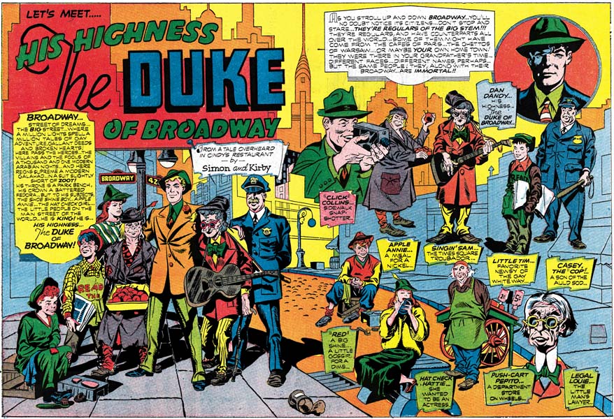
I have long held off discussing Boys’ Ranch since with so much written about that title I feared I would have little new to add. Today Boys’ Ranch is probably one of the most popular Simon and Kirby post-war creations. There is good reason for this modern esteem as the title has much to commend it; action, humor and lots of Kirby. Nothing has done more to keep the Simon and Kirby brand name alive as Marvel’s Boys’ Ranch and Fighting American reprint volumes. Although published in 1992 these volumes are still readily available in the resale market at reasonable prices. Of the two, the Boys’ Ranch volume most accurately reflects the original published comic books. Harvey’s reprinting of Boys’ Ranch stories occurred prior to the establishment of the Comic Code and so the art and stories did not suffer from censorial abuse. I have examined the comics and the Marvel reprint side by side and so far the only changes I have detected were a very few coloring alterations. Unfortunately Harvey reprinted Fighting American during the Comic Code’s reign and the Marvel volume makes use of Harvey’s reprinted version. Mark Evanier’s “Jack Kirby, King of Comics” provides an example from the Fighting American of the removal of an ice pick from one panel leaving an attack without a weapon. All is not completely well for the Marvel reprint volume as a few pages of general interest fillers have been dropped. These single page graphic articles were not drawn by Kirby so many readers will not have lost much. The more hardcore Kirby fans will regret the absence of the text stories some of which had included illustrations by Jack.


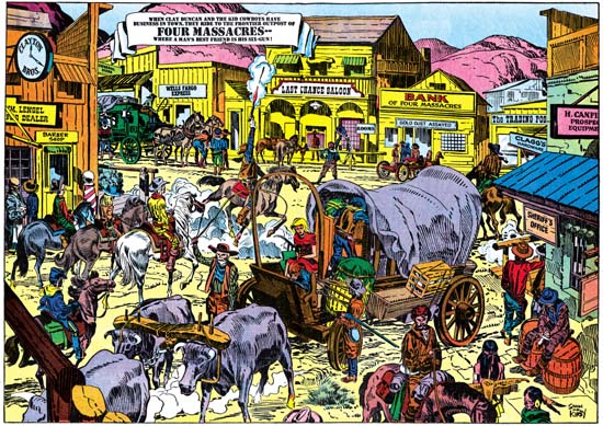
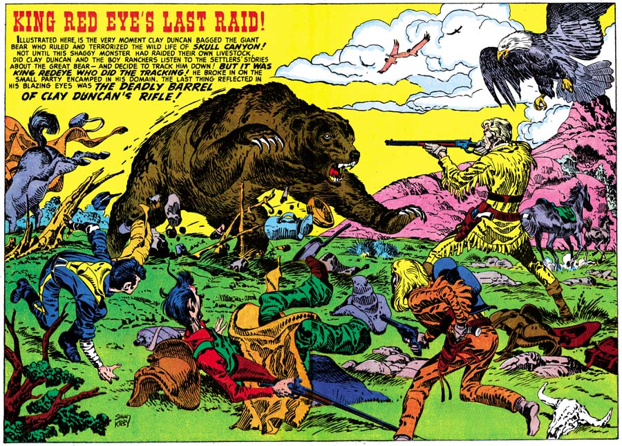
Boys’ Ranch #2 (December 1950) pinup, art by Jack Kirby

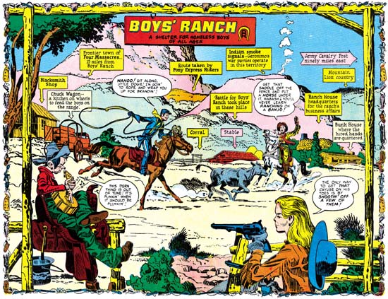
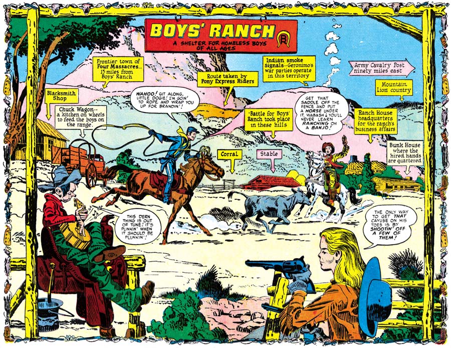
I have not completely ignored Boys’ Ranch in the Simon and Kirby Blog. Recently I have included the double page pinups from this title in a couple of chapters of my serial post “The Wide Angle Scream” (here and here). The use of pinups, both single and double page, was something new for Simon and Kirby. Each issue of Boys’ Ranch would have a single page pinup at the beginning of the book along with the centerfold pinup. Such extensive use of pinups would not be repeated in any other Simon and Kirby production. The pinups are not only numerous, they are also consistently of high quality. I would be hard pressed to pick the best one. I do want to provide an example and so choose one that provides the best portrait of the main cast of characters. Boys’ Ranch is not just a western, it is also belongs to the boy gang genre so favored by Simon and Kirby. There are significant parallels between the Boys’ Ranch gang and say the Newsboy Legion. Most S&K gangs have one adult member to act as a type of guardian. Clay Duncan does that part and although he lacks a secret identity he does have his own unique origin. One constant in S&K boy gangs is a handsome character that the readers can relate to; in Boys’ Ranch this is Dandy. There is always a gang member to take on the humorous aspects. Often this individual has some regional identification. This role is taken by Wabash who plays a southern hillbilly. The other two main characters are unusual members of this particular gang. Wee Willie Weehawken (I guess New Jersey seemed to be out west to New Yorkers Joe and Jack) was different in being a second humorous member and in being an adult although otherwise treated as another gang member. The most unique member of them all was Angel. Most Simon and Kirby kid gangs included one intellectual but I guess Simon and Kirby felt that such a character would be out of place out west. Instead Angle is sharp shooter with a bit of a temper. The 50s were a time with great emphasis on conformity and Angel’s long hair was definitely a distinction. Not included in the splash was another cast character, Palomino. Her place at Boys’ Ranch was often obscured but she would play important rolls. One was to help shape Clay’s image. Her obvious love for Clay was used to promote him as a hero figure. This also allowed Clay to be disinclined to actively return her affections thereby showing to his young readership that he as a real man’s man (at least by the criteria of youthful readers at that time). When Clay and the boys would go off to some adventure Clay would pointed tell Palomino that she could not come as it was too dangerous for girls. She would reluctantly agree only to following them anyway and save the day at some critical point. Action heroines were not unheard of but generally not used by Simon and Kirby whose women normally play the roll of victims. Palomino is a refreshing exception. Another minor player in Boys’ Ranch is the diminutive and silent Indian, Happy Boy.


Boys’ Ranch #2 (December 1950) “Lead Will Fly At Sunset”, art by Jack Kirby

Not only did Boys’ Ranch include exceptional pinups, the splash pages are among the best that Jack Kirby did and that is saying a lot. Most of them are full page splashes filled with excitement. However the most unusual splash that Kirby did, not just for Boys’ Ranch but for any Simon and Kirby production, was certainly the one for “Lead Will Fly at Sunset”. Not only does it have no action, it does not even have any characters at all. That is Boys’ Ranch we see below from a distance but there is only the caption to confirm that. What we are provided with is nothing more then a landscape. Well that is a little misleading as this was drawn by Jack Kirby who shows here that he can embody a landscape with interest as well. Partly this is due to the unusual perspective Jack has depicted. In the foreground a steep trail descends to a panoramic vista. The nearby terrain is so rugged that only a few twisted trees have managed to cling to the rocks. With the extensive view it is easy to overlook the most significant inhabitant, a coyote on our left descending via the trail.


Boys’ Ranch #1 (October 1950) “The Man Who Hated Boys” page 14, art by Jack Kirby

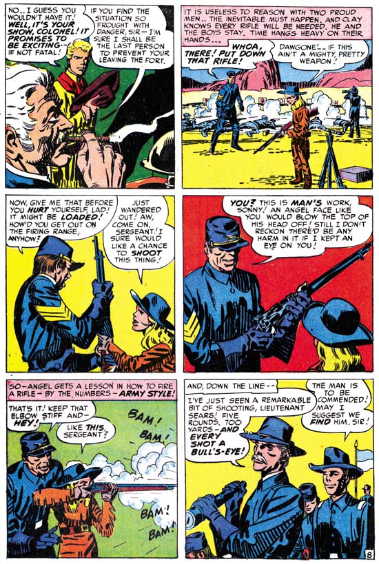
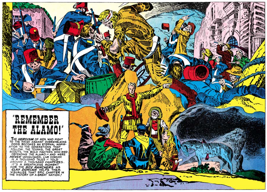
When Simon and Kirby created Captain America their origin story was only 8 pages long. Only one other Captain America story from the first issue was shorter while the rest were substantially longer. The Red Skull story had twice as many pages as the origin story. The origin was clearly something to get over with as quickly as possible so as to get into the adventures. With the work that Simon and Kirby did for DC and Harvey (Stuntman and Boy Explorers) the origin story was a much more successful story by itself. None of the other Joe and Jack’s origin stories compares with what they did for Boys’ Ranch. It is not just that “The Man Who Hated Boys” is 17 pages long, it is also how S&K weaved the story. Unlike the first Newsboy Legion story, the members of the boy gang are not introduced as a unit. The reader is first shown Dandy and Wabash meeting while Clay Duncan and Angel make their appearances later. All the character introductions are all mixed in with typical Simon and Kirby action. As for example page 14 shown above. Previously Clay, Dandy and Wabash had been pinned down by Indians. At the start of this page we find Angle arriving on horse back with some other reinforcements. Other creators might be satisfied with having the arriving party drive off the Indians, but not Simon and Kirby. We find in the last panel the fight has become the way Kirby preferred, up close and personal. Let me digress for a moment to point out how in the first panel only the mouth and knee of the closest horse is depicted. Kirby would use the same device years later in Bullseye #7 (August 1955). “The Man Who Hated Boys” was a justifiably lengthy introduction but even it does not present all the cast of characters. “Meet Wee Willie Weehawken” would introduce that character and other stories would bring in Palomino and Happy Boy. There would also be a separate origin story for Clay Duncan. Never before had Simon and Kirby invested so much in the backgrounds for the characters of a feature. I am sure this is one of the characteristics that make Boys’ Ranch so appealing for today’s reader.


Boys’ Ranch #3 (February 1951) “Mother Delilah”, art by Jack Kirby

If a poll was conducted on what was the best Simon and Kirby story ever, I have little doubt that “Mother Delilah” would be chosen by a wide margin. It certainly deserves such a distinction. Jack Kirby’s pencils are superb and the inking is consistently both sensitive and powerful. The writing is just exceptional and was given plenty of space to fully accomplish its plot and theme (at 20 pages it is the longest Boys’ Ranch story). The theme, well it is literally biblical in nature. The characters and their motivations have a complexity that is rarely seen in comic books even today.


Boys’ Ranch #3 (February 1951) “Mother Delilah” page 7, art by Jack Kirby

Clay’s rejection of the advances of the saloon girl Delilah leads her to a vow of vengeance. It is through Angel that Delilah seeks to get her revenge. Angel, the story’s main protagonist, is shown to be more then a sharp-shooter with a temper. His bravado is depicted as hiding a longing for a family he has long lost. Even at this level “Mother Delilah” offers more then most comic book stories. However the story goes on to show Delilah as torn between here need to strike back at Clay Duncan and her horror at what this was leading her to do to Angel.


Boys’ Ranch #3 (February 1951) “Mother Delilah” page 2, art by Jack Kirby

Angel and Delilah could have been enough for the story, but the writer choose to include some other cast members as well. There is one, Curley Yager, whose own villainy acts as a foil to that shown by Delilah. Who is the most evil? Curley who, without any thought, treats anyone weaker then himself as a target for his assaults? Or Delilah who realizes the evil she will inflict on Angel but proceeds anyway? Delilah’s self-sacrifice at the story’s end provides the answer as she receives a redemption that Curley could never achieve.

My favorite character plays a minor part in the plot but is of great importance to the story nonetheless; it is Virgil Underwood. His name suggests the classics of Imperial Rome but the part he plays is that of the chorus from Greek tragedy. He is always there to reflect on the action of others.


Boys’ Ranch #3 (February 1951) “Mother Delilah” page 15, art by Jack Kirby

Jack Kirby always thought of himself as primarily a story teller. For many fans his greatest works were the many brawls that he staged. It is true that Kirby was the master of the action sequence. However what amazes me time and time again is how Kirby could handle other types of story lines. Angel, shorn of both hair and pistols, encounters a crowd previously fearful of his sharp-shooter talents. The treatment he receives initially is meant more to humiliate him then to cause bodily harm. Yet before the harassment of Angel goes even further it is suddenly terminated. At first all that is seen are firing guns but that panel is followed by one showing the quick departure of the mob and the arrival of Wabash, Dandy and Clay. The page ends with Dandy and Wabash in the foreground with their backs to the shattered Angel and the comforting Clay. Dandy and Wabash mean to avoid Angel loosing more face then he all ready has, while sheltering him from the views of others, including the readers. It is a very poignant end to the sequence. Who, other then Jack Kirby, ever presented pages like this one?


Boys’ Ranch #3 (February 1951) “I’ll Fight You for Lucy”, art by Mort Meskin

For some few exceptions, the first three issues of Boys’ Ranch is all Kirby art. One departure is the single pages about western subjects. These are pages such as how to make moccasins, how to spin a rope or how to ride a horse. Some art dealers claim these were done by Mort Meskin using Kirby layouts. I agree that Meskin did many of them but I doubt very much Jack had anything to do with it. The art for all of them is rather stiff and I suspect are based on some photographs or illustrations. There is also a short section in Boys’ Ranch #1, “Introducing the Kid Cowboys”, that was clearly drawn and inked by Mort Meskin. The most important exception to the all Kirby nature of issues 1 to 3 is “I’ll Fight You for Lucy”. This story is usually credited as Kirby pencils and Meskin inks. There is no question that Meskin did the inking, but I find the layouts and pencils all look like Mort’s work. It is interesting that this is the only Boys’ Ranch story that does not begin with a full page splash. The splash panel is also unusual in how the characters are all placed together in a compact group on the left side. This would have been an unusually arrangement for Kirby who usually composed his figures to spread out and occupy all available space.


Boys’ Ranch #3 (February 1951) “I’ll Fight You for Lucy” page 5, art by Mort Meskin

Perhaps the most convincing evidence that this story was not drawn or even laid out by Jack Kirby is the fight scenes. Kirby was justly famous for his slug-fests but the fight from “I’ll Fight You for Lucy” (see above) does not show Jack’s characteristic style. For the later part of his career Mort Meskin did not draw much hero genre comics and so did not do many fight scenes. There are some brawls in the unpublished Captain 3-D #2 story but unfortunately the one image I used in my post about that story is not the best match for the fight from “I’ll Fight You for Lucy”. Better comparisons can be found by turning to work that Mort did earlier. Compare the Boys’ Ranch page with a page from Black Terror #23 (see below) by the team of Jerry Robinson and Mort Meskin. Usually when comic art has two signatures the first often indicates the penciler and the last the inker. The division of labor used by Robinson and Meskin seems to have been more complicated. (As, of course, it was for Simon and Kirby)


Black Terror #23 (June 1948) “Danger In The Air” page 3, art by Jerry Robinson and Mort Meskin

The modus operandi for Simon and Kirby seems to have been to heavily use Kirby in the initial issues for a title and afterwards have other artists do more of the work. This was the case for Boys’ Ranch where the final three issues use Kirby in some interesting variations. That will be the subject of next weeks post.

Black Rider’s Final Ride


Kid Colt Outlaw #86 (September 1959) “Meeting at Midnight”, art by Jack Kirby

“Meeting at Midnight” is the last Kirby Black Rider story to be published, and the last one that I have occasion to post about as well. The job number (M-556) indicates that the story was likely to have been done prior to the Atlas Implosion. The existence of two other Kirby Black Rider stories (“Trouble in Leadville” and “The Raiders Strike“) that also have ‘M’ job numbers suggest that all were originally intended for an unpublished Black Rider Rides Again #2, a casualty of the Implosion.

The story opens with the Black Rider arriving in town as shots are fired. He finds the shooter but looses him in the pursuit. Changing back to his identity as the town doctor he treats a man who claims to have been wounded while cleaning his gun. Suspicious, Doc reverts back to the Black Rider and observes his patient providing money to another; the wounded man is being blackmailed. The two men arrange for another meeting the next night. Back in his public identity, the Doc slips his patient a sedative and goes as the Black Rider to the appointment with the blackmailer. A gun fight ensues and, while trying to escape, the blackmailer falls to his death.

The plots of this and the other Black Rider stories are so repetitive that this feature is not one I care for very much. That repetition is so unlike Jack’s writing style that I seriously doubt whether he made any substantial contribution to the plotting or the writing. One of the reasons for my interest in Kirby’s pre-Implosion art for Atlas is the amount of control Jack seemed to have on some of that work. Unfortunately for “Meeting at Midnight” not only was Jack not the writer, he was not the inker either. I personally cannot say who the inked this story, Atlas inkers are a subject I know next to nothing about. The Jack Kirby Checklist credits Bill Everett as the inker, while Atlas Tales and the GCD attribute it to George Klein.

The drawing of all the Kirby Black Rider stories, excepting “Meeting at Midnight”, is very stylized with elongated figures or limbs. A similar style can be found in another western that Jack both penciled and inked “No Man Can Outdraw Him” (posted on here and here). The stories from Black Rider Rides Again #1 and “No Man Can Outdraw Him” were inked by Kirby in a manner that I think works quite well with the stylized drawing giving the final art an expressionistic look. The inker(s) of “The Raiders Strike” and “Trouble in Leadville” adopted a different, more intricate, inking but otherwise remaining faithful to Kirby’s pencils. I find that this results in figures that look freakish. The figures in “Meeting at Midnight” do not look so stylized and I think this was the result of the inker adjusting Kirby’s pencils. As I said I am no scholar of Atlas comics, but I will hazard an observation that the art for “Meeting at Midnight” looks closer to Kirby’s later Atlas/Marvel westerns. Perhaps the inking was not done at the time of the Implosion but only when it was decided that this story would be published in the Kid Colt Outlaw title.

Captain 3-D #2

As discussed in my last post, an artist approached Al Harvey saying that he had figured out a way to make 3-D comics. With this process Harvey comics would produce 3-D Dolly, Funny 3-D, Adventures in 3-D and True 3D and Captain 3-D. The first two belonged to the funny animal genre intended for a very young audience while the next two were non-superhero adventure comics. Unfortunately for Harvey it turned out that the artist had not figured out the 3D process himself as he claimed but instead picked it up while he had worked for St. John Publications. I am not at all sure whether St. John had sufficient reason to legally complain but complain he did. The process St. John used was originally developed by Joe Kurbert, Norman Maurer and Lenny Maurer (the last two are brothers) having previously seen some European magazines with 3-D photos. However when they sought a patent they found that someone else had previously applied for one. Without a patent I just do not believe that they had any legal recourse against Harvey. To complicate things further, the original patent became involved in a court case between Bill Gaines (EC) and St. John. Probably none of the legal questions mattered much to Al Harvey because it turned out that 3D comics were not so much a craze as a fad. The very first 3-D comics were big sellers but sales dramatically dropped after the initial issues. Faced with disappointing sales and the legal questions, Al Harvey discontinued publishing further 3D comics.

The cancellation of 3D comic titles was sudden but work had already begun on Captain 3-D #2. We know Jack Kirby had completed a cover because it shows up in an advertisement in Adventures in 3-D. The cover was based on a nine paged story that had been drawn by Mort Meskin but remained uninked. I believe the story was already penciled when Jack did the cover because the cover is derived from a panel on the last page. Unfortunately the title for the story was not provided on the surviving pages of art. The inking would have been done on several layers of acetate. The splash panel of the first page already had pencil markings indicating how parts of the image were to be distributed on the different acetate layers. The markings are numerical from 1 (deepest) to 4 (closest) and the letter ‘B’. The ‘B’ layer was where the panel borders would be placed. For some reason there are no marking for layer 3, perhaps it would be the same layer as ‘B’. The layer markings are only found in the splash panel and not on the two story panels from the same page or from any of the other pages in the story. Presumably that was as far the process had gotten when the cancellation was announced.

Perhaps a short discussion about a few of the technical aspects of 3D comics would be in order here. The 3-D glasses have a different color filter over each eye and the comics are printed in two different colors. The result is that each eye only sees the art printed in one of the two colors. As mentioned previously the original art is inked on acetate. These layers are shifted sideways in relationship to each other when preparing the different color printing plates. The layer of acetate representing the closest plane would be shifted the most while more distant layers would be shifted less. The result is that the art printed by the two colors is not identical and when viewed through the 3-D glasses provide the sensation of depth. To prevent the shifting planes of one panel from interfering with another, a wider then normal gutter is provided between panels. To account for the sideways shifting of the acetate every panel that Meskin drew in this story has an image then extents outside the panel on the left. That was an artifact of the process and would not be seen in the final printed comic. Because the process involves shifting the acetate layers only sideways most art in Meskin’s story do not extend beyond the top or bottom margins of the panels. There are many panels however where some of the art does go beyond the lower panel edge. This is not an artifact as it was meant to be seen in the printed comic providing an even greater sense of depth. Surprising this technique was not used in Captain 3-D #1 despite the fact that Jack Kirby had used it in regular comics such as Captain America.

Captain 3-D #2
Captain 3-D #2 (unpublished) page 6, art by Mort Meskin

Mort Meskin’s talent has largely been ignored in recent years. In 2006 Meskin was nominated for Eisner Hall of Fame but failed to be voted in. While some fans still appreciate the comics he did during the war most dismiss the work that Mort did for Simon and Kirby and afterwards. However it was not Meskin’s talent that changed but rather the type of stories that he worked on. The crime, romance and horror genre that dominated Mort’s later years just did not call for the same story depictions that his earlier superhero provided. This Captain 3-D story by Meskin shows that not only could he still do superheroes, he was probably better at it then he had ever been before. Mort’s handling of action is just superb as is his control of perspective which is very important for a 3-D comic. It is very informative to compare Mort’s perspective with that used by Jack. Kirby is a master at perspective but a comparison with Meskin’s work highlights just how artificial Jack’s was. This is not a criticism of Kirby, far from it. Jack’s distortions of perspective gave his art an impact that I have never seen with any other comic book artist. While not possessing Jack’s exaggerated perspective, Meskin’s more natural approach is still more exciting then any other artist I can think of. It is a pity that issue #2 was never published. Who knows perhaps Meskin’s later career may have been different. In Golden-Age Men of Mystery #15 Bill Black quotes Greg Theakston’s tale of showing copies of Meskin’s Captain 3-D story to Steve Ditko. Ditko’s reaction leaves little doubt as to how highly Meskin was in Steve’s esteem. I am not surprised because I have always felt that Mort Meskin had a large influence on Ditko’s art.

Most of the art for Meskin story can be found in Golden-Age Men of Mystery #15 (only the first page is missing). I will provide a synopsis of the story in the comments section of this post so as not to spoil it for anyone who wants to check it out for themselves. The surprising thing about the story is how much it differs from those in Captain 3-D #1 or any other Simon and Kirby production. Nowhere in the story do we find the Book of D that Cap was supposed to spend his time when not fighting crime or the cat people. The story opens up with Captain 3-D and Denny in a cab! Cap enters a boat race to give someone a lesson; his conflict with criminals was an unexpected consequence. A new use of Captain 3-D’s power pack is revealed. The story ends with a type of humor not normally found in S&K productions. All of this convinces me that if Meskin did not write the script himself, he modified it substantially. I have long considered that Kirby did this all the time, the romance stories Jack drew are very different then other artists in the same titles. However up to now I have never thought of Meskin doing this as well. Something I will keep in mind as I continue with my “Art of Romance” serial post.

Kirby Museum Post Original Art from Captain 3-D

Rand Hoppe has posted seven images of page 10 from “The Man from the World of D” story in the Jack Kirby Museum. This page inked by Mort Meskin includes the large panel that I feel is the masterpiece of the book. It is really great to see how the images were distributed over the different acetate layers. It is definately worth of visit to the Jack Kirby Museum, then again the Museum is always worth a visit!

PS. I had a little trouble going from page to page using the “next” link but found that if I first choose the “full size” link first before using the “next” it worked.

Captain 3D

I have decided to examine Simon and Kirby’s most neglected superhero, Captain 3D. So set your computer to 3D viewing. What your computer does not have the 3D view feature? Oh well, I can see most of you have not upgraded to the latest Pear computer. In that case through the magic of Photoshop I will convert scans of the Captain 3D #1 comic to restore the line art. Seriously I have never been a fan of 3D comics feeling that it is largely a gimmick where too much is lost (color) with too little gained. Besides I find it an annoyance to have to wear special glasses just to read a comic.

By their very nature, superheroes require a suspension of critical judgment in order to be enjoyed. I think the barrier is even higher in the case of Captain 3D due to link between the comic’s 3D gimmick and the hero’s jumping out of a book when viewed with special glasses. Along with the ability to come out of the book when needed, Captain 3D has a power pack that allows him to fly. Otherwise Cap, and he is referred to by that nickname, does not seem to have any special powers or strengths. Captain 3D’s main adversaries are the cat people. The cat people had in the past killed the rest of Cap’s people and now want to enslave mankind as well. Normally Cat people look no different from the rest of the population but when viewed with the same 3D glasses that release Captain 3D from the book, the cat people show their feline features. However Cap also fights more everyday criminals as well. Like many superhero comics of that time, Captain 3D has a young sidekick named Danny, the guardian of the book of D.

Captain 3D
Captain 3D (December 1953) “The Man from the World of D” page 11 panel 4, pencils by Jack Kirby, inks by Mort Meskin

There is little doubt that Jack Kirby penciled all of Captain 3D #1. Perhaps more then any other comic book artist, Kirby has worked on supplying the extra dimension to comic’s flat plane. He has done so starting perhaps from his days at Timely until the very end of his career. I am not sure how he felt about 3D comics but he came to them already knowing how the images should be composed. Joe Simon’s comments about this can be found in his book “The Comic Book Makers”. There Joe’s basic premise is that the images should project out of the comic, not into. The actual art found in Captain 3D confirms Joe’s observation; there are only a few panels that project into the page. One of them is very effective despite breaking this rule; it is a composition that would be repeated years later in the comic book Battle. Late in life Jack would adopt a style where perspective would be exaggerated to such an extent as to appear unnatural. This style is exemplified by a pose the Kirby would use often where the hero jumps toward the user with one arm held straight and fist closed. Captain 3D has the earliest example of the pose that I am aware off, although without the extraordinary exaggerated perspective. After Captain 3D the pose would not be repeated for many years, but obviously it was not forgotten.

In his book Joe Simon describes Al Harvey requesting Simon and Kirby to produce a 3D book. Neither Joe, Jack nor any of the artists working for them had any experience with making such a comic before. An outside artist had come to Harvey saying he figured how to make 3D comics himself and offered to show Harvey’s people how. Harvey wanted the comic done quickly in order to cash in to what looked like a lucrative craze. As an incentive Harvey offered special rates but I sometimes wonder if Simon and Kirby had every turned down a job because they were too busy.

Joe says the Captain 3D book was created by him, Jack, Mort Meskin, Steve Ditko and “other key artists” working for the S&K studio. As I said above Jack Kirby was responsible for all the pencils. The inking is another question. Frequently the inking has been attributed to Steve Ditko by comic art dealers. Not long ago I saw one offering a page from Captain 3D as created by Steve Ditko, never even mentioning Jack Kirby’s involvement! Determining inking attributions for the Simon and Kirby studio is fraught with difficulties as inking credits were never provided. So comparison of inking methods with that used by different artists on their own work is the only technique that can provide help. There is the added difficulty in a case like Captain 3D when a number of different artists were involved on the same project. If that was not enough, the acetate used to create the 3D effect was a very unforgiving and unfamiliar material for the artists to ink on. Brush control that the artists normally exhibited cannot be expected to show up in the Captain 3D inking. Therefore it would be the risky, to say the least, to try to sort it all out. So naturally I cannot resist.

Captain 3D
Captain 3D (December 1953) “Iron Hat McGinty and His Destruction Gang”, pencils by Jack Kirby, inks by Mort Meskin

The inker easiest to spot is Mort Meskin. I have previously discussed Mort’s inking techniques. Despite the problems acetate presented many of those techniques can be found in Captain 3D. Here the inking technique that seems to stand out the most is Meskin’s manner of doing picket fence brushwork (for explanations of some of my terms please see the Inking Glossary). Although picket fence crosshatching was part of the S&K Studio style, Mort’s can usually be distinguished by “rails” that are lines of strong but even strength, almost like wires laid down on the page. Even the “pickets” tend to be more mechanical then those by S&K. I have found picket fence brushwork in 13 pages all but 2 of which look like Meskin’s work. Mort also had a way of depicting clothing folds with multiple long parallel, sometimes overlapping, brush strokes. Perhaps because of the difficulties acetate presented, I have found this Meskin brushwork only on 4 pages. Meskin had a special way of drawing and inking eyes and eyebrows. He modified it when inking Kirby’s pencils but it sometimes still retains enough of his personal touch so that it can be recognized. In Captain 3D I found 9 pages with Meskin’s eyes. Mort occasionally would place on one side of a form a wider then normal line that also served as a sort of shadow. There is one page that has this Meskin technique. I came to notice that Meskin sometimes gave a sinuous shadow to Cap’s helmet; this can be found in 6 pages. All together I attribute 11 out of 32 pages to Mort Meskin. For those interested these are “The Man from the World of D” pages 5 and 8 to 11; “The Living Dolls” pages 2, 3 and 10; “Iron Hat McGinty and His Destruction Gang” pages 1 and 9; a figure of Captain 3D in an advertisement at the end of the book.

Captain 3D
Captain 3D (December 1953) “The Man from the World of D” page 10 panel 2, pencils by Jack Kirby, inks by Mort Meskin

Mort Meskin did an outstanding job on the splash page for “Iron Hat McGinty and His Destruction Gang”. However for me the tour de force of the entire book is page 10 of the “The Man from the World of D”. You can tell Mort was struggling with the acetate surface but he still managed to create a masterpiece in the bottom, almost splash-like panel. I believe there is a reason Mort put so much effort here, this is probably the most powerful image that Simon and Kirby had every produced. I am not referring here to the graphic qualities of the image but to its subject matter. Simon and Kirby never went the extremes such as could be found in EC comics. That is not to say they avoided violence; guns, knives, whips and other weapons can be found but S&K usually refrained from making the use of these devices so obvious. The only exception to this seems to be found earlier in the Captain America art where one time they even went so far as to depict the hanging of a fake Captain America and Bucky. Even then we only see a back view of their dead bodies.

Captain 3D
Captain 3D (December 1953) “The Living Dolls” page 7, pencils and inks by Jack Kirby

The next most easy to spot inker in Captain 3D is Jack Kirby himself. Jack’s involvement to the inking should not be too much of a surprise. After all it was a rush job and Jack would finish pencils before all the inking had been completed and so would be expected to join in. What is surprising is the inking technique he adopts for Captain 3D. Kirby does not use the Studio inking brushwork that was ubiquitous of his inking at that time. Instead Jack works in a style remarkably like the Severe style that would not appear in his inking for several years hence. I think Kirby used this style because it allowed him to work more quickly and it overcame some of the difficult problems presented by inking on acetate. Missing from the Kirby inked pages are techniques like picket fence crosshatching or drop strings. Part of the Severe style is a technique of inking a clothing fold with simple elongated ovals or tapers sometimes attached to a thin line giving it the appearance of a narrow stem ending in a long leaf. This brushwork is found on two pages I attribute to Jack but only in a single panel of one of them suggesting that there Kirby was retouching another inker’s page. Kirby was an excellent inker which gave him an advantage in interpreting some of the nuances of his own pencils. The acetate undoubtedly made it difficult for Jack to achieve such subtleties. Nonetheless I feel I have detected nuances in the treatment of eyes and eyebrows that look like Kirby’s hand. Although Kirby’s brush can be confidently detected Jack did not ink much of Captain 3D. There is not much to go on but the two small heads found in the introduction look like Kirby to me. More certainly Kirby’s inking are panel 1 of page 7 of “The Man from the World of D”, page 7 of “The Living Dolls”, and page 5 of “Iron Hat McGinty and His Destruction Gang”. There are some other possible candidates that I will discuss below.


Captain 3D (December 1953) “The Man from the World of D” page 4, pencils by Jack Kirby, inks by Joe Simon

I have not yet presented to my readers a thorough examination of the inking techniques used by Joe Simon. Joe presents a particular problem in determining inking attributions. My normal methodology is to examine the inking of art penciled by the artist to find clues on how that artist might in turn ink Kirby’s pencils. Unfortunately Simon did not pencil much art during his collaboration with Kirby. Further Joe has shown himself in the past as adept at mimicking other artists’ styles. While at Fox Joe did such a great job that even experts have missed his signature on some of the covers and attributed the art to Lou Fine. Joe has also mimicked Kirby’s pencils and there is no reason to believe he would not also try to do so with Jack’s inks. Therefore what I present below should only be viewed as a preliminary assessment. Joe Simon’s brushwork was coarser then Kirby’s and in particular his clothing folds did not have the same almost puddled appearance as those Jack used in this comic. In Captain 3D 6 of the pages have a coarser brushwork that looks like Simon’s to me. Like Meskin, Simon has a way of doing eyes that can sometimes show through when inking Kirby’s pencils; 3 pages look like they have Simon’s eyes. I previously mentioned that in Captain 3D picket fence crosshatching was used by Meskin but not by Kirby. There are 2 pages that have picket fence brushwork that do not appear to be Mort’s. I feel that they were done by Simon, but it is possible that this could be misleading due to the difficulty of inking on acetate. Both Simon and Kirby used shoulder blots and these can be found among the pages I attribute to Simon. Shoulder blots do not appear on any of the pages I have credited to Meskin but they do on one that assigned to another artist to be discussed below. All total I credit Joe Simon with inking 8 pages of Captain 3D. For those interested these pages are “The Man from the World of D” pages 3 and 4; “The Living Dolls” page 2; “Iron Hat McGinty and His Destruction Gang” pages 2 to 4, 6 and 8. Keeping in mind the problems about distinguishing Simon from Kirby and the difficulties presented by working on acetate it is quite possible that some of the pages I have attributed to Simon might actually been done by Kirby. Particularly suspicious are the number of Simon pages found in the last story. Assuming that was the last story actually penciled it is just where we might expect the greatest inking contribution by Kirby.

Captain 3D
Captain 3D (December 1953) “The Man from the World of D” page 2, pencils by Jack Kirby, inks by Steve Ditko

Those keeping tally would realize that there are still a number of pages in Captain 3D that were not done by Meskin, Kirby or Simon. I believe most of them were done by the same artist. I credit them to Steve Ditko but frankly this also is very provisional. Since I have not done a careful review of Steve Ditko’s earliest efforts I really do not have a lot of inking traits to rely on. The most distinguishing feature of his inking, at least compared to Simon and Kirby studio artists, is his reliance on a pen for most of his spotting. Some fine pen work does show up in Captain 3D. However there are often brush spotting on the same pages sometimes covering over some of the pen lines. Some of this may be Ditko’s own efforts but some of it looks like Joe Simon going over and strengthening Steve’s work. The presence of a shoulder blot on one of these pages supports that suggestion. The lower part of the man’s jacket in the last panel of the page 2 of “The Man from the World of D” shows a type of feathering that I have never seen before in work produced by Simon and Kirby or artists that worked for them. Ditko also seems to have his unique touch in his way of doing eyes that shows up in Kirby’s pencils. I notice that Ditko had his own way of inking Captain 3D’s helmet. Ditko would create two simple bands or when the top band was near the peak it would be formed into a small semicircular field. All in all I assign 8 pages to Ditko; “The Man from the World of D” pages 2, 6 and 7; “The Living Dolls” pages 5, 6, 8 and 9; “Iron Hat McGinty and His Destruction Gang” page 7.

Captain 3D
Captain 3D (December 1953) “The Living Dolls” page 4, pencils by Jack Kirby, inks by unidentified artist

I am concerned that since I do not yet have a good handle on Ditko’s inking style, especially on acetate, that perhaps some of the pages assigned to him may actually been done by some other artist. There is one page (page 4 of “The Living Dolls”) that I simple am not comfortable to assigning to any of the artists that I have discussed so far. I feel this indicates there was at least one other artist inking Captain 3D but I have no idea who he was.

Captain 3D
Captain 3D (December 1953) “The Man from the World of D”, pencils by Jack Kirby, inks by Mort Meskin

I have saved for last a short discussion about the cover. The art for the cover was also used as the splash page for “The Man from the World of D”. Therefore it would have been done on acetate in order to achieve the 3D effect. It must have been a difficult task to ink on acetate carefully enough so that it could also be used for the cover. Perhaps because of that spotting is very minimal. It appears to have been done with either a pen or a fine brush. This might suggest Ditko inking but I feel it was actually done by Meskin. Meskin did not do much fine inking in the other interior art but some does show up particularly on splash pages where greater effort was made as for example the first page of “Iron Hat McGinty and His Destruction Gang”. The method used to spot the muscular forms on the cover does appear similar that used in the splash. Captain 3D on the cover also has eyes that suggest Meskin’s personal style. There are not much clothing folds but some on the upper torso are made using close parallel lines like those Meskin prefers. Finally Captain 3D’s helmet has a sinuous curve to the shadow; a device similar to what Mort used in the interior art.

The final breakdown is 12 pages inked by Meskin, 8 pages by Simon, 7 2/3 pages by Ditko, 3 1/3 pages by Kirby, and 1 by an unidentified inker. This is a little misleading because one of the pages attributed to Kirby consists only of two small heads and one of the pages credited to Meskin is an advertisement with only a single figure of Captain 3D.

In my next post I hope to discuss Captain 3D #2.

The Wide Angle Scream, More Pinups

Boys� Ranch #4
Boys’ Ranch #4 (April 1951) “King Red Eye’s Last Raid” art by Jack Kirby
Larger image

A rampaging grizzly bear, escaping horses, a kicking mule, and the scrambling youngsters of Boys’ Ranch make this image one of chaos. That is except for the firm figure of Clay Duncan as he calmly aims his rifle to make the most of his shot, probably the only one that he will manage to get off. Although the scene is supposed to be chaotic, the composition is anything but that. The mule, boys and Duncan form a broad ‘U’ shape with the bear occupying the center. Each element that forms that ‘U’ directs our attention toward the grizzly. The bald eagle might seem out of place in the portrayed scene. We would not expect the eagle to have been sleeping among the crew and there certainly would seem to be enough Americana in the picture without it. But its does serve the purpose of balancing off the caption on the opposite side of the splash. All in all a carefully composed image not at all like the true chaos found in last month’s splash “Social Night In Town” but every bit as great a piece of art.

Before I continue, I would like to offer a little digression. In 1972 I lived for a short time in Denver. One weekend I went out into the front range of the Rockies to collect fossils. The weather was dry and my original plans were to roll out the sleeping bag and spend the night under the stars. However the area I was in was cattle country and there were absolutely no trees. I found that the cattle liked to visit my car so that they could use it to rub against. I did not relish the possibility of one of them stepping on me while I slept, so I spent the night in the backseat of the car. When I returned to Denver I heard on the radio that a bear had killed some cattle only a few miles from where I was. I felt that I was pretty lucky since the cattle congregating around my car could have easily attracted the bear and had I been outside he may have found me a much easier prey. After a few weeks of killing cattle the bear was finally shot, he was the largest bear killed in Colorado in over 25 years.

Boys� Ranch #5
Boys’ Ranch #5 (June 1951) “The Riders of the Pony Express” art by Jack Kirby
Larger image

The Pony Express rider runs his horse at full speed as he tries to escape some attacking Indians. The horse seems frantic but the rider appears almost casual with his rifle held over his shoulder. A trail of smoke exits from the gun barrel showing that the rider has already fired it once and will surely do so again if necessary. There is no question about the unpleasant intent of the Indians but the Pony Express rider seems in control of the situation. The Indians are not trailing behind the rider so they appear to have been trying to cut him off. It makes for an interesting composition with the farthest Indian almost at the center with nearer natives placed increasingly towards our right with the Pony Express rider bring the movement back towards the left. That is not the only way the eye is directed, an overhanging rock formation and some tree branches form an oval with all the riders. The caption rests comfortably on the right portion of the rocky arch. It is truly amazing the variations that are found in these wide pinups, each have their unique composition.

Boys� Ranch #6
Boys’ Ranch #6 (August 1951) “Remember the Alamo” art by Jack Kirby
Larger image

Clay Duncan enthralls his friends while spending the night out in the prairie with tales of the heroics of the defenders of the Alamo. The lower half of the splash depicts the cast of the Boys’ Ranch while the upper half portrays a dramatic battle. What a battle it is, fully in the Kirby tradition. Gun play takes a decidedly second place to hand to hand combat. This is not an all-over composition like we saw in “Social Night in Town”. A large figure occupies the center separating a left portion of large, mostly Mexican, figures from a right field where the large fallen Mexican figures reveal smaller fighters and a building behind. It would almost seem that the Texans were winning the battle! The only Texan that appears to be in immediate trouble is one in the right background who holds his hands to his face. Of course the Texan success could only be true for a relatively short time before they would succumb to the overwhelming numbers of their opponents. The hard struggle they have had up to this point is suggested by the head bandage and torn costume of our central fighter. He, and two others, one on each side, are obviously frontiersmen. I am tempted to identify the center figure as Jim Bowie because of the large knife he welds, mostly out of the frame. Also tempting would be to identify the wearer of a coon-skin hat as Davy Crockett except that there are two of them. Note how the one on the right brandishes his rifle in the same matter that Crockett does on the cover to Western Tales #32 (March 1956). The central figure’s outfit visually links him to the similarly garbed Clay Duncan below but more importantly suggests a common heroic nature. What a shift from the drama above to the quiet scene below. The members of the Boys’ Ranch are bunched up in the center with backdrops of rock formations and night sky. A lone horse is seen on our right compositionally balancing the caption that appears on the opposite side of the splash. The horse should be unsaddled for the night but a shoe horn and stirrups can be seen but not the rest of the saddle. It is the sort of thing I would expect from Jack, but not from Joe who rode a horse in the Coast Guard. It is however a minor and easy to overlook flaw.

Often the inspiration for Simon and Kirby creations can be found in cinema of the period. Jack and Joe were both of the age that they likely saw the movie “Heroes of the Alamo” but that was released in 1937 and thus does not explain the appearance of the Alamo theme at this particular time. Alamo movies and TV shows became more popular a few years later starting with “The Man from the Alamo” (1953), then “The Last Command” (1955), “Davy Crockett at the Alamo” (1955), “The First Texan” (1956) and pretty much ending with “The Spirit of the Alamo” (1960). The “Davy Crockett at the Alamo” is particularly important as it was part of the made for TV series that Disney produced about Davy Crockett that started a craze among young boys. Afterwards the Alamo largely disappeared from popular culture. At least part of this can be blamed on a shift in social attitudes; one of the freedoms the Texan’s were fighting for was the right to own slaves. Another attempt at the theme was done in 2004 with the film “The Alamo” but it did not achieve much success.

It would not be possible for me to overemphasize what a successful piece of art I think “Remember the Alamo” is. The combination of the action and quiet scenes was done so well it is easy to overlook how unnatural it really should have been. It is arguably the best of the double page pinups from the Boys’ Ranch titles and one of Simon and Kirby’s greatest creations. With the end of the Boys’ Ranch title wide pinups or splashes would disappear from S&K publications for the next few years. For Simon and Kirby it was a relatively quiet period with only one new title, Strange World of Your Dreams in 1952. This was followed by a flurry of new comics starting with Captain 3D (December 1953). The wide format’s small part of the activity will be covered in the next chapter.

The Wide Angle Scream, The Pinup

Towards the end of 1950 Simon and Kirby had some hit titles all published by Prize. For the crime genre there were Headline and Justice Traps the Guilty. Having two titles in the same genre is always a sign of a success. More important would be the Young Romance and Young Love titles for the romance genre that Joe and Jack started. However Simon and Kirby were not ones to just sit back and milk past achievements, they were always trying to produce new titles. October of 1950 would see the release of two new S&K productions. For Prize again they would release their first in the horror genre, Black Magic. That title would run for about five years and would be joined in 1952 by Strange World of Your Dreams, again an indication of success. Simon and Kirby would also release in October Boys’ Ranch, only it would be published by Harvey Comics. Boys’ Ranch is considered by many fans as one of Simon and Kirby’s greatest creations. Unfortunately it was not so well received at the time and the title only lasted six issues.

Boys’ Ranch may not have been as big a success as Joe and Jack had hoped, but it was not for lack of trying. S&K used in Boys’ Ranch some things that they had never tried before, among which were pinups. I am not sure where the idea for the pinups came but Simon and Kirby put it to good use. Each issue of Boys’ Ranch contained both introductory and centerfold pinups. Pinups are unlike splash pages since without any attachment to a story a pinup can be a self sufficient entity. In this respect they are much more like cover art except the image need not be crowded by a prominent title. As stand-alone pieces of art, The Boys’ Ranch pinups represent some of the finest work that Simon and Kirby did. With the expanse that the double page provides, the centerfold pinups are particularly effective.

Boys� Ranch #1
Boys’ Ranch #1 (October 1950) “Boys’ Ranch”, art by Jack Kirby
Larger image

The centerfold for the first issue introduces the cast and the locale. We find Tommy learning how to lasso cattle while Wabash loafs with his guitar. Angel threatens to use his marksmanship to get Wabash moving. Three sides of the image are framed with rough timber with the title hanging from the top post. The complete circumference is edged with cattle skulls, pistols and other western paraphernalia reminiscent of the bottom edge of the wide splash from Captain America #8 (November 1941). This emphasis on design, unusual in the Boys’ Ranch splashes, does not save this particular centerfold. The more distant view used is not Jack Kirby’s forte for he generally does better when he thrusts his cast into the foreground. There are lots of assorted details provided, many requiring explanations from captions, but just not enough interest to hold our attention long. This is a rare example, in my opinion, of a Kirby double page piece of art that does not come up to his usual high standards.

Boys� Ranch #2
Boys’ Ranch #2 (December 1950) “Four Massacres”, art by Jack Kirby
Larger image

Another more distant view but this time Kirby makes it more interesting by providing more to look at. It is a crowded image but because this is in a comic book and a reader would tend to view it from left to right there should have been no difficulty in finding the Boys’ Ranch characters on the far left as they enter the town. I will leave it up to my readers to ferret out all the details. This splash is filled with individuals and groups all telling their own little stories, no need for captions to explain it all. Whatever the reasons for the short comings of the wide pinup from Boys’ Ranch #1, Jack is now clearly getting into the control of this new format.

Boys� Ranch #3
Boys’ Ranch #3 (February 1951) “Social Night in Town”, art by Jack Kirby
Larger image

With “Social Night in Town” Jack Kirby is in top form; this is certainly one of his classic drawings. This is Kirby at his best, a slugfest up close and personal. I like to think of this sort of composition as Kirby’s comic book equivalent of Jackson Pollock. There is no true focus to the image as it is an all over drawing with every portion as important as any other. Jack’s mastery of exaggerated perspective allows him to make this look easy but I honestly cannot think of another comic artist who could come close to providing such an exciting fight scene. Kirby has done this sort of thing before in for example “The Villain from Valhalla” in Adventure Comics #75 (June 1942), but the wide format allows a treatment just not possible on a single page. It would sound much too dry to describe all the details but I cannot help point out Wabash clinging in relative safety high on the near center post enjoying watching all the proceedings. Relative is the operative word because note the knife sticking in the post below him and the chair flying high on the right. The theme of cowboy’s letting off steam in a bar fight may not have been a cliche in 1950 but it soon would be. Comic books could do it in a way that television or movies simple could not match no matter how hard they tried. Not that their directors would likely have noticed Kirby’s work in 1950, but they should have.

As wonderful as “Social Night in Town” is, the best was yet to come. Unfortunately that will have to be covered in the next chapter.

The Wide Angle Scream, American Royalty

I have decided to resurrect this old serial post. I originally started it when I had then begun to restore S&K’s double page splashes. I wanted the restoration to be on the same level that I do for covers. However that required an awful lot of effort since these splashes have twice the area of the covers and the printing quality is much inferior. Eventually the amount of work proved too excessive and other restoration projects became more important. I feel that the subject matter of the serial post is too important and should not be completely abandoned. So I return to the subject although in the future the quality of the restorations will not be quite so high. Since it has now been over a year since my last chapter, I thought I should provide a very broad summary of the previous posts.

Simon and Kirby’s use of a double page splash began with Captain America #6 (September 1941). The five Cap double page splashes had a strong emphasis on design (#6#7#8#9, and #10). The splashes would consist of three sections. One section common to all was what I called the enactment; it is a scene or tableau but is not part of the actual story. The second section is also common to all Captain America wide splashes; it consists of panels for the true start of the story. Although the third section is present in all of these splashes what it comprises of is not consistent, it can be a cast of characters, floating heads or a sort of comic book equivalent of movie trailers.

During the period that Simon and Kirby worked for DC they only produced one double page splash, that was for Boy Commandos #2 (Spring 1943). Here once again the splash was made in three sections. The enactment is present but it consists of a larger number of individuals then ever attempted in Captain America. Some organization is achieved by deploying them around the glass case containing a sleeping beauty, but even so there is so much chaos that it takes some time to sort out all that is taking place. There is also a cast of character sections. Unlike the Cap wide splashes there is no start of the story; instead the third section is given over to a large introductory text.

After returning from the war, Simon and Kirby launched Stuntman and Boy Explorers that were published by Harvey Comics. A wide splash was used with Stuntman. Only two were published but Jack had made worked on three others. The first one (Stuntman #1, April 1946, “The House of Madness”) used an unusual design, effectively two enactments laid out as large panels separated by a sweeping gutter. The second (Stuntman #2, June 1946, “The Rescue of Robin Hood”) reverted to a more standard tri-part design with sections for the title, enactment and cast of characters. Although the exposition is pretty much isolated from the rest of the splash, the title and cast of characters are nicely integrated. I also posted on one of the unpublished wide splash ( “Terror Island”). For the first time Kirby provides just one section, an enactment. There is a title, an introduction and even a floating head of the Panda, but these are subservient to the large enactment and do not achieve the status of their own section.

Because of copyright issues I do not consider it appropriate to reproduce the other two double wide Stuntman splashes. They can be found in Joe Simon’s book “The Comic Book Makers”. Both are further variations of a single large enactment section found in “Terror Island”. In one (“Jungle Lord”) Jack presents a smaller cast as compared to that for “Terror Island”. The enactment takes place in the tree tops where we find Stuntman battling a gorilla in the foreground while in the back Don Daring clings to a tree and a jungle boy makes off with Sandra Sylvan. Since the cast is smaller in the “Jungle Lord” splash as compared to “Terror Island” the action can be brought closer to the reader with dramatic results. The inking of the final wide splash (“The Evil Sons of M. LeBlanc”) was never completed, so it clearly was the last one worked on. This is another single section with Stuntman confronting three opponents. I find that the plain room in “The Evil Sons of M. LeBlanc” as compared to all the foliage of “Jungle Lord” brings greater focus and excitement to the depiction.

The Stuntman period is interesting because it marked the only time during his collaboration with Kirby that Simon did a significant stint at drawing. Early in his association with Jack, the two would draw different pages from the same story. Initially this seemed to be the working method for Captain America but quickly Jack took over all the drawing choirs for the S&K partnership. With the exception of some work done while in the Coast Guard, Joe did not seem to contribute much penciling to what was produced by S&K during the war. But while Kirby was penciling Stuntman and Boy Explorers Joe would pencil three backup features; the Duke of Broadway, the Vagabond Prince and Kid Adonis. Despite what some experts have said, these were drawn entirely by Joe except for a few small parts that Jack altered in his role as an art editor. Joe has said that Harvey kept track of the mail and that the Duke of Broadway got a better reader response then Stuntman. This was likely to be during the period after the original titles had been cancelled and Harvey was printing the unused work in comics such as Green Hornet. After the Harvey Stuntman/Boy Explorers period and until the breakup of the Simon and Kirby team, Joe’s penciling contributions would be uncommon (48 Famous Americans for J. C. Penny and “Deadly Doolittle” for Fighting American).

Boy Explorers #1
Boys Explorers #1 (May 1946) “His Highness the Duke of Broadway”, art by Joe Simon
Larger image

Joe only did one double wide splash for his Harvey features (“His Highness the Duke of Broadway” from Boy Explorers #1, May 1946). It is actually surprising that he did any considering the short lives of these titles (due to a comic book glut) and the fact that his stories are all back-up features. Like the one from Stuntman #1 a month before, this double page splash is comprised of two sections. Not that use of the same number of sections makes these two splashes truly similar. While that from Stuntman #1 is unusual in being composed of two enactments, the splash for the Duke feature is made of two familiar sections, an enactment on our left and a cast of characters on the right. The cast of characters consists of both full figures and floating heads accompanied by short captions that provide their names and a short description. At ten in number it was quite an ambitious cast, Joe obviously wanted a lot of supporting characters so as to provide the potential for much variation in his stories (unfortunately there would only be five). In this splash much of the cast are floating in front of the cityscape. Even those that are attached to the ground seem unnaturally placed because of the way they block the small avenue (surprisingly small since it is meant to be either Broadway or 42nd Street). The cityscape itself is carefully drawn so to provide an interesting background but subtlety rendered so that the cast would still stand out.

Such a large number of cast members required the use of half the splash. But this was the cast for the feature, only some of them would show up in this particular story. With such a large assemblage on the right side Joe needed something on the left to balance. His solution was to present most of the cast together solidly placed on the sidewalk. While this was a satisfactory solution as far as the composition was concerned, frankly it is not very exciting. Joe would do much better and more innovating designs for some of the regular splashes for his features. Still this double wide splash shows an emphasis on design that would disappear from the later ones by Kirby for Stuntman.

Stylistically the drawing for the splash differs from what Joe did in the story itself. Click Collins and Legal Louie are exceptions as they seem to better match what was done for the story. It still looks to me that it was penciled by Simon, only it is closer to what Joe had done previously and to what he would again do later in his career. Nothing on the splash refers to what will be found in the story. Everything is very generic, describing the feature as a whole and not this particular story. All this makes me suspect that Joe did the splash some time before as a presentation piece for the pitch he made to Harvey. Joe was not one to let all that effort to create this splash go to waste, so he appended it to the first story.

Horrible Mort Meskin

By 1954 Mort Meskin had been providing work for the Simon and Kirby studio for four years. Even more important then the amount of time spent was the volume of work; Mort executed more work for S&K then any other studio artist. There were even periods that Mort’s page production rates exceeded Kirby’s who was justly famous for his productivity. Mort’s contribution went beyond volume; he played an important part in the S&K classic Boys’ Ranch (1951). It was Mort who persuaded S&K to create that unusual title Strange World of Your Dreams (1952) for which he listed as an Associate Editor. 1954 was an important year for both Meskin and S&K as well. In that year Simon and Kirby would return to the superhero genre with Fighting American published by Prize. Even more important Joe and Jack would create their own comic publishing company called Mainline. Considering Meskin’s contributions in the past, it would be expected that he would play a significant role in these projects, but he did not. Mort provided no help with Fighting American and only shows up in a few initial issues of the Mainline titles. Since Mort was creating art for the Prize romances (still being produced by Simon and Kirby) his absence from the other projects is hard to explain. 1954 was of note for Mort because it marked his return to providing art for DC. This was not an exclusive arrangement, as mentioned above Mort would continue to provide work for the Prize romances. Meskin also did one work for Harvey’s Chamber of Chills.

The hero of this story is the meek and troubled Oscar Pert. He could have been happy, if only he was not oppressed by his wife, Martha. The only important thing in life for Martha was the continual depositing of money into the bank. Everything else must be sacrificed. Oscar lost his friends when he was no longer able to pay club dues. Martha would not even let him spend a little money for milk to give a stray cat. But finally Oscar devises a new means to happiness. We see him in his cellar stealing moments away from Martha, designing some project. His increased sense of contentment is noticed by all but understood by none. That is until Martha discovers his drafting ruler and pawns it off. Apparently that is the last straw because that night Martha hears a strange ticking noise coming from the cellar. She finds a box down there and when she investigates the box’s opening the trap is set. The story ends with Oscar making his own rather gruesome deposit to the bank vault.

Chamber of Chills #24
Chamber of Chills #24 (July 1954) “Credit and Loss”, art by Mort Meskin

The story was not written by Mort, but he makes the most of it. He is at the top of his form in story telling, and that means a lot because Meskin was a consummate graphic story teller. His shifts in distance and perspective are done not just to provide variation, but as a means to advance the story itself. Take the sequence that starts the tale; a panel of a broken record introduces the theme of repetition, the next panel has advances the theme with a close-up of a woman’s nagging mouth, with the final panel a more distant shot providing an introduction to the main characters of the story and their relationship.

Chamber of Chills #24
Chamber of Chills #24 (July 1954) “Credit and Loss” page 4 panel 5, art by Mort Meskin

Mort’s art is excellent, particularly the inking. The splash panels uses the S&K studio style with bold picket fence brush work (for an explanation of this term, see the Inking Glossary). The image of the skeletal hands with ledger is not a literal summation of the story but it does effectively symbolize the theme. I cannot explain what the ruled background represents, perhaps another visual reference to a financial ledger? In any case it is a pleasing pattern as if designed by Mondrian. After the splash Meskin drops using the S&K studio style and adopts his more typical inking methods. However that is a little misleading as Mort’s inking is here much more elaborate then what he had previously been using in work that he had done for Simon and Kirby. For example Meskin typically constructed eyebrows as a couple of overlapping simple brush strokes, but for close-ups in “Credit and Loss” the eyebrows are made with numerous brushstrokes that suggest the individual hairs. Instead of simple brushing for shadows on faces, here Mort provides some careful crosshatching. Meskin even seems to take much more effort with the drawing as well. The close-ups of Oscar are some of the best portrayals that Mort has ever done. The large soulful eyes and small chin suggest his submissive character. But note how in the panel I provide above how Mort subtlety reveals Oscar’s awakened spirit of resistance.

With such a great piece of art it is a wonder that Mort Meskin did not do more work for Chamber of Chills. I really do not have the timing of Meskin’s non-S&K work down very well, but perhaps it is nothing more then having been returned to the better paying DC Mort felt no need to pursue work from Harvey. Joe Simon’s collection includes the complete original art for “Credit and Loss”, as well as some other art from the same Chamber of Chills issue. So maybe even at this early date Joe was giving Harvey a hand. If so, Simon was not passing onto Harvey excess S&K material, this story much more deserves being called horror then anything found in S&K’s own Black Magic. The tale goes beyond what Joe and Jack would have considered to be in good taste. Whatever the explanation for its unique status, “Credit and Loss” is a masterpiece. Unfortunately its presence in a rare comic means it has not been seen by many. Maybe someday it will get the reprint treatment it so richly deserves.

Kirby Inkers, Mort Meskin

Jack Kirby had a lot of different inkers throughout his long and productive career. During the time of Jack’s collaboration with Joe Simon, most of his inkers were also artists that worked for the S&K studio. Mort Meskin, for one, had a extended and fruitful association with Simon and Kirby. The earliest S&K production that included a Meskin signature was “The Inferior Male” from Young Romance #6 (July 1948) (see previous posts here and here). That particular piece was also signed by Jerry Robinson, the usual assumption is that the first signature (in this case Robinson) was the penciler and the second (Meskin) was the inker. Here support is found in that at least some of the pencils do not appear to by Mort, while the inking is typical of his work that follows. The first work to be signed by Meskin alone came over a year later with “His Engagement Ring” (Young Romance #16, December 1949). There is an even earlier work then both of these that Meskin at least participated in (“Love Or A Career” in Young Romance #3 January 1948). To be honest I am holding back some information that I want to be the subject of my next week’s post. Although Mort’s earlier work for Simon and Kirby was sporadic, from 1950 on he became the most prolific of the studio artists. During this time Meskin’s output may have even exceeded Jack Kirby’s.

Young Romance #18
Young Romance #18 (February 1950) “I Own This Man”, pencils and inks by Mort Meskin

I provide above a splash by Meskin from early in his association with Simon and Kirby. It gives examples of a number of Mort’s spotting techniques. Mort’s most common brush method, actually used much more frequently than apparent in this splash, is to describe clothing folds by using two or more narrow brush lines in close or overlapping paths. These can be found in the pressman’s blue jacket. Note how what the original individual brush strokes are sometimes revealed at the ends of the folds. Another Mort inking style was to often distinctly outline shadows. Once again this splash does not provide the best examples but two of them are present one near the center of the wrestling mat while the other is near Mort’s signature. The wrestlers give Meskin the opportunity to do some real nice simple hatching. The lines vary from thin to quite bold. Often one and occasionally two lines are used to delimit a hatching area. This type of brushing technique is very reminiscent of the S&K Studio style picket fence work. (See the inking glossary for an explanation of my inking terms such as simple hatching and picket fence). I do not know enough about Meskin’s prior inking to say whether this is typical of his work at the time or if this shows he was influenced by the Studio style. The dark spot on the reporter’s right shoulder are suggestive of the Studio style’s shoulder blot. That is misleading as Mort always seems to use these in a way to suggest realistic shadows while in the Studio style they generally appear on both shoulders without any natural explanation.

Young Romance #37
Young Romance #37 (September 1951) “Just to be Near Him” page 2 panel 1, pencils and inks by Mort Meskin

Although it maybe debatable whether my first image represents true Studio style brushwork, later work can certainly be called that. In the above image the pickets of the picket fence inking have become bold and the rails more consistently applied. Mort would sometimes also use standard crosshatching, as seen on our far left and on the lower part of the woman’s dress. When doing so, he would frequently place the crossing lines at an acute angle so that the white spaces are elongated.

Young Romance #29
Young Romance #29 (January 1951) “Diagnosis: Love” page 5 panel 3, pencils and inks by Mort Meskin

The above panel provides a better example of Meskin’s penchant for outlining shadows. That the boldly brushed dark spot on the center man’s jacket is a shadow can be seen by the presence of the profile of a nose. Mort would occasionally have a dark shadow trace a path down one side of a figure, such as the man on our left.

Justice Traps the Guilty #56
Justice Traps the Guilty #56 (November 1953) “G-Man Payoff” page 5 panel 6, pencils and inks by Mort Meskin

When artists both draw and ink their own work the two art stages will sometimes reinforce one another. That is what I believe happened with the eyebrows that Mort gave his men. These eyebrows are inked with a method similar to how Meskin handled clothing folds, two or three narrow overlapping brush strokes would trace the path of the eyebrow. This resulted in eyebrows that were wide, simple and made somewhat angular turns. As we will see below, Mort became so entrenched in inking eyebrows this way that it could affected how he inked Kirby’s pencils.

The above panel also shows how Meskin would sometimes fill in part of a blank background with crosshatching. As is generally the case, here his lines meet at an acute angle, not at right angles some other inkers prefer.

Young Romance #30
Young Romance #30 (February 1951) “My Lord and Master” page 3 panel 1, pencils and inks by Mort Meskin

Sometimes Mort will use his brushwork to create a side of a figure that is both a narrow shadow and a wide outline. This does not show up often, but is very distinctive when it does. I am sure further study of Meskin’s abundant output will show other inking techniques that while not common can be useful in determining attributions.

Young Love #68
Young Love #68 (December 1955), pencils and inks by Mort Meskin

Covers are important for the sale of a comic and the higher quality paper allows a superior printing. Therefore artists take more care in the creating artwork for covers. However the S&K studio artists usually did not get a chance to provide cover art, Jack Kirby would do all cover art when a photograph was not used. But when Simon and Kirby launched their own publication company, Mainline, Jack was so busy that for a year the covers for the Prize romance titles would be done by other artists, including Mort Meskin. On none of his romance covers would Mort use picket fence patterns or any of the other traits of S&K Studio style inking. For the spotting on Young Love #68 Mort relied mostly on his use of narrow brush strokes. Note how on YL #68 the back of the man’s jacket and pants has that narrow shadow or wide outline that we saw before.

Mort Meskin was such a prolific artist that the possibility of the use of assistants has to be considered. In preparation for writing this post I reviewed a lot of Mort’s work from 1950 to 1956, there is so much work that I did not have the time to review it all. This review confirmed my previous conviction, Mort had little if any assistance in inking his art. Almost all the spotting looked like it was done by the same hand.

Some of Meskin’s inking techniques are not limited to him alone. The use of narrow, often overlapping brush strokes can also be found in stories by George Roussos as well. This is not too surprising since Mort and George worked together in the late 40’s. The narrow brush strokes were not the only think George picked up from Mort, a lot of his penciling was clearly influenced by Meskin as well. Nonetheless Roussos did not adopt all Mort’s inking techniques so the two can be distinguished. However a discussion about Roussos will have to await another post. I will say that I have yet to find an example of Roussos inking Kirby (that is until the Silver Age).

Boys’ Ranch #4
Boys’ Ranch #4 (April 1951) “The Bugle Blows at Bloody Knife” page 8, pencils by Jack Kirby, inks by Mort Meskin

The Jack Kirby Checklist attributes most of the inking in the classic Boys’ Ranch to Joe Simon. Actually it is not hard to recognize Mort Meskin’s inking in much, if not most, of it, particularly after the first couple of issues. The biggest difficulty I faced with choosing an example of Mort inking Kirby from Boys’ Ranch was that I believe Mort was the penciler for at least some of the work in that title that has generally been credited to Jack. But the drawing in “The Bugle Blows at Bloody Knife” looks so much like Kirby’s that I am confident that he was the penciler. I am equally as confident that Meskin did the inking. Note the narrow clothing folds in panels 3, 4, 5 and 6. See how the shadows have a strong outline, most obvious in panel 4, but can even be found on the officer’s forehead in panel 1. The back of the soldier in panel 3 could be described as either a narrow shadow or wide outline. The eyebrows in panel 1 and 6 are simple with angular turns. All of these are typical Meskin traits.

Police Trap #6
Police Trap #6 (September 1955) “Only the Guilty Run”, page 1, pencils by Jack Kirby, inks by Mort Meskin

The two gun carrying detectives in the background are so typical of Jack Kirby that he must have been the penciler. At a glance the inking appears typical S&K Studio style. But note how the clothing folds are long and narrow. The final giveaway is the thief’s eyebrows are simple with angular turns. There is little doubt that this is another example of Meskin inking Kirby.

Western Tales #32
Western Tales #32 (March 1956), pencils by Jack Kirby, inks by Mort Meskin

My final image is the cover of Western Tales #32. This work was not included in the Jack Kirby Checklist. The last time I posted on it I attributed both the pencils and inks to Joe Simon. The fact that it was not Kirby’s inking and the stiffness of the Indians (especially the one in the right foreground) suggested to me that Joe might be responsible. After all Simon has shown himself to be excellent at mimicking Kirby. However Crockett’s pose seems more dynamic then what Joe has ever done without using swipes, and it was just the sort of thing that Jack was so good at. Perhaps the awkward pose of the Indian on the right was due to the limited area left over from Davy’s figure. As for the inking it simply is not Kirby’s work. Note the long and narrow clothing folds, Davy’s angular eyebrows, and the way his back is outlined by a narrow shadow. None of these are Kirby traits but all are characteristic of Mort Meskin’s inking. This magnificently inked cover shows that Mort had complete mastery of the S&K Studio style. Mort’s brushwork has the same sort of bold confidence that Jack and Joe also possessed. Although it may not be a reliable enough trait to rely on in determining attributions, Meskin’s brush does seem a little more mechanical then either Simon’s or Kirby’s.

A few months after Western Tales #32 Meskin would stop providing work to Simon and Kirby. If the GCD is correct, Mort had actually returned to working for DC a couple of years earlier. Now having left S&K, DC would become Mort’s main source of income until he abandoned the comic book industry. Meskin’s final DC period overlaps Jack Kirby’s time there, however none of Kirby’s DC work that I have seen was inked by Mort.

I have not made a thorough examination of Jack Kirby’s work for the purpose of determining what ones were inked by Mort Meskin. I want to hold off on that effort until I review some more S&K artist/inkers. So far the only other one I have posted on was Marvin Stein.