Category Archives: 5 Studio

Kirby Inkers, Marvin Stein

I have written about Kirby inking Kirby, but what about Jack’s other inkers? Scholars of the Silver Age have it comparatively easy, many of Jack’s inkers are actually given credit. This provides a head start even in those cases where no inking credits are given. But in the Simon and Kirby years no inking credits were ever provided. Fortunately most S&K studio artists inked their own work. Therefore examining the work by the studio artists can give insight into what to look for in order to determine if they also were Kirby’s inkers.

I am going to start with Marvin Stein. What I am going to say about Marvin is pretty preliminary. I really have not studied Stein as an artist as much as I have other who had worked for Simon and Kirby. This is probably because I have mixed feelings about Marvin’s art. On the positive side Stein was often good at depicting action. However some of his drawing seems a bit crude.

Marvin Stein starts showing up in Simon and Kirby productions in 1951. Not long after his appearance there seems to have been a change in the production of Headline and Justice Traps the Guilty, two crime titles that S&K had created. Well actually Headline had existed before S&K but was not a more general anthology, it was S&K who converted the title to crime. The postal statement for Headline #46 (March 1951) lists Nevin Fiddler as the editor. About that time the artists for both crime titles changed and Jack Kirby work would no longer appear. Marvin Stein would become a prominent part in the new Prize crime issues. Stein did almost all the covers and usually the first story. It was not that unusual for Stein to provide a second story as well.
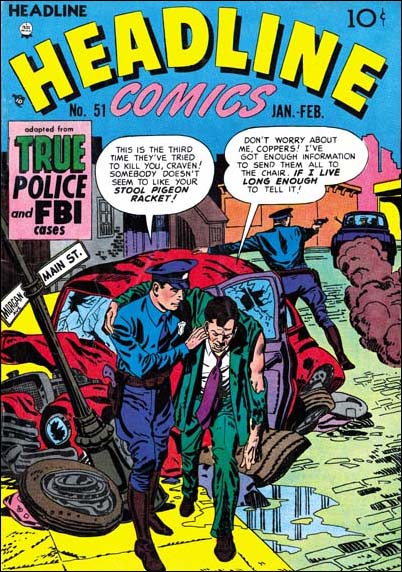

Headline #51 (Jan 1952) art by Marvin Stein

There is a photograph that indicates that Marvin worked at the Simon and Kirby studio at one time. Certainly he was greatly influenced by Jack Kirby, particularly in the portrayal of action. But Stein did not pick up any of the typical S&K studio inking. Missing from Marvin’s own work are things like picket fence brush work, abstract arch shadows or shoulder blots (see the inking glossary). Stein did occasionally use something like drop strings.
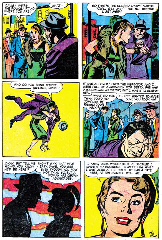
Justice Traps the Guilty #88
Justice Traps The Guilty #88 (August 1957) “The Spoilers” page 7, art by Marvin Stein

The above image is a typical page of Stein pencils and inking. Marvin’s brushwork tended to be rather blunt. This can be very apparent when the faces are of a smaller size, as for instance in panels 1, 2 and 4. A blunt brush work can even be seen in closer faces as in the criminal in panel 4. Stein often would use very broad cloth folds that seem slightly bent at about the middle of their length as seen on the man in the foreground in the first panel. Cloth folds often have ends that stop abruptly at a right angle (as in the first panel) or a slight angle (there are a couple examples on the man in the second panel). Form and shingle lines are often quite robust. Although not apparent in the image above, Marvin would sometimes make long and simple eyebrows. These eyebrows can resemble those by Bill Draut.
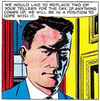
Justice Traps the Guilty #91
Justice Traps the Guilty #91 (February 1958) “Power Failure” page 4 panel 5, art by Marvin Stein

Occasionally Marvin would like to depict faces with a sort of negative highlight, as in the image above. This is done with diagonal brush work and like so much of Stein’s inking in a rather crude manner.
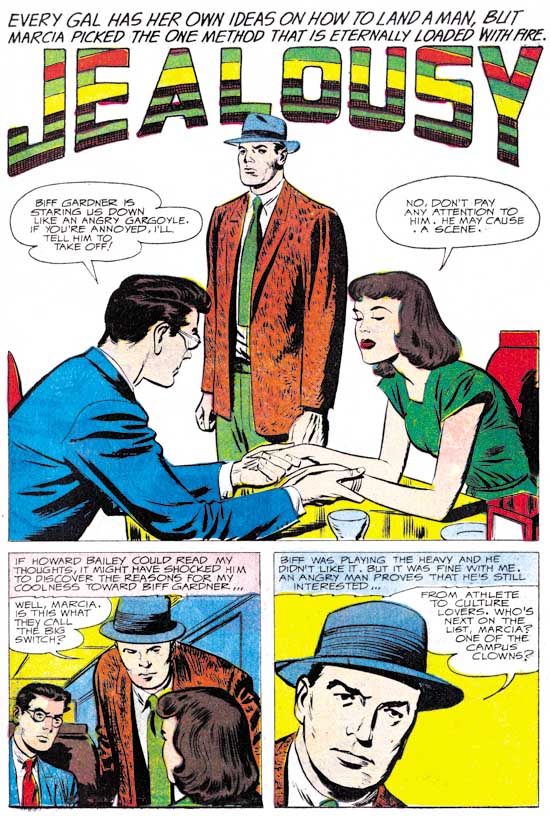
Young Romance #93
Young Romance #93 (April 1958) “Jealousy”, pencils by Jack Kirby, inks by Marvin Stein

Among Jack Kirby’s late Prize romance art is one story, “Jealousy”, where the spotting for the facial features is rather blunt. The facial inking looks so much like Marvin Stein’s that I am certain he was Jack’s inker. Note the final panel where the man’s right eyebrow is extended into a crease above the nose. This is a characteristic often seen in Stein’s own art, for instance panel 3 from the Justice Traps the Guilty #88 page I showed earlier. Surprisingly the spotting other then for the faces in this story seems more carefully done then is typical for Stein.

This blunt treatment of facial features does not seem to occur in inking for any other of Kirby’s work for Prize. But otherwise similar spotting can be found in the inking of a number of Kirby stories. Could it be that Marvin Stein used greater care when inking for Kirby then he did on his own work? Depending on the answer to that question, Stein could have been a frequent inker of Kirby or a rare one.
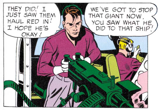
Showcase #6
Showcase #6 (February 1957) “The Secrets of the Sorcerer’s Box”, page 6, panel 3, pencils by Jack Kirby, inks by Marvin Stein (from DC Archive edition)

When I wrote the DC chapter to “Jack Kirby Austere Inking” I was hampered by my limited access to the work. I am still not ready for a more thorough evaluation of Jack’s DC period but I have gone back over it with Marvin Stein fresh in my mind. Previous I attributed the inking to the initial Challengers of the Unknown stories to Jack. With my latest review I find a number of examples of inking that look like Stein’s work. Take a look at the face in the panel image I provide above, it has Stein’s blunt brushwork style. Also note that a couple of the cloth folds have the slightly off right angle ends that Stein prefers. There is still inking in the first two Showcase issues that look like Kirby’s brush. The red giant in “Dragon Seed” from Showcase #6 seem much better done then I have every seen Stein do. Also the second page from Showcase #7 with its scenes of the Challenger members doing various daring deeds. The problem is that Stein’s blunt brushwork is rather similar to Jack’s Austere style. I now suspect that most of the inking for Showcase #6 and 7 was actually done by Stein with Kirby doing the more difficult parts and perhaps touching up Marvin’s work as well.
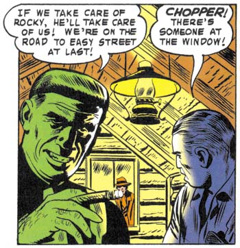
Challengers of the Unknown #3
Challengers of the Unknown #3 (August 1958) “The Menace of the Invincible Challenger”, page 10, panel 2, pencils by Jack Kirby, inks by Marvin Stein (from DC Archive edition)

Marvin Stein did some of the inking for later Challenger stories also. The image above from COTU #3 has the same shadow highlights we saw before from Stein’s crime work. But these later inking differ from Showcase #6 and #7 in that Jack Kirby does not seem to have taken a hand in any of the spotting.

I have added a checklist for Marvin Stein, which like all my checklists are works in progress. However a checklist of Stein’s inking Kirby will have to wait, at least until I have reviewed some of the other Kirby inkers.

Jack Kirby’s Austere Inking, Chapter 1, Introduction

Most of the work by Jack Kirby that people admire they only know second hand. They know Kirby inked by Dick Ayers, or Kirby inked by Joe Sinnott, or Kirby inked by Mike Royer, and so on. By its very nature this means we are seeing various artists’ interpretations of Kirby’s pencils. Even in his late years when Jack pencil’s provided indications of how the spotting should be done and inkers tried to be faithful to the pencils, it is still an inker’s interpretation. This is the state of affairs during Jack’s more recent career when he did extremely little inking.

Earlier, during the Simon and Kirby years, things were very different. Most, if not all, of the S&K studio artists inked their own work. The inking style for each artist seem unique and consistent. Most did not produce enough output to support heavy use of assistants. Mort Meskin was more prolific so perhaps he was an exception. However for Jack Kirby we have some eye witnesses such as Martin Thall who have reported group inking sessions at the S&K studio. Examinations of the finished product adds support to this because often different hands seem involved. However other observers such as Carmine Infantino have reported Kirby providing the final inking touches to his own work. Who inked what is often the subject of contentious debate since the comics do not provide credits and comic book experts rarely provide explanations for their attributions. Someday I may wade in with my own inking attributions, and even explain why, but this is not that day.

After the breakup of the S&K Studio Jack began to do freelance work. We find Kirby work published by DC, Atlas and Prize. Among the early freelance period I see some consistencies in the inking that indicate one hand at work, I think we can rule out Joe Simon since there is no evidence that he ever did any work at this time for DC or Atlas. Further the style is dissimilar to the inking found on some of Simon’s own work of the period. Nor does the inking style match that by artists who in the past did work for S&K such as Mort Meskin, Bill Draut or Marvin Stein. The spotting is done with enough talent that I think we can rule out some new, unknown inker. Besides which although at times Jack might have been doing enough penciling to support an inking assistant this changed. Kirby began to supply DC and Atlas with just penciled art with the publisher assigning the inking to others. After that this inking style only appears in Prize’s Young Romance and that was not enough work for Jack to support any inking help. My conclusion is that this inking style was Kirby doing his own inking. As such it provides a rare opportunity to see Kirby first hand.

I have mentioned this inking style previously. Once when I was discussing the break up of Simon and Kirby. Again more recently when I posted on The Black Rider Rides Again. I think it might be interesting to examine the evolution of this inking style. To do so I needed to give it some sort of designation. I thought of referring to it as Kirby’s late inking style but I suspect that is too confusing. The inking may be late in his inking career since it was the last style that Jack used while he still commonly had a hand in inking his own work. But Kirby had a long career and using a term such as “late” to describe a period that ended in 1959 just seems inappropriate. So I am going to call it Kirby’s Austere Style of inking because of its typical lack of embellishments.

To understand the development of the Austere Style is really helps to go back to what it evolved from. I think the best place to start is toward the end of the Simon and Kirby studio. But like an old adage, to tell that story I have to tell another story. I need to describe how inking of Kirby pencils was done in the S&K studio. This is a very different topic from who did the inking.

Pages of S&K art went through distinct stages. These stages are known because sometimes comics book titles were unexpectedly cancelled. When this happened work on future issues was already in progress. Work on any of these cancelled titles would immediately stopped no matter what stage it was in. Sometimes the art could be salvaged for other projects, but not always. Not a lot of these unfinished pages survived but what has tells a consistent story.

The first stage was, of course, the penciling. This included rough placement for the work balloons and captions. Some covers in this stage have been published in The Jack Kirby Collector. But the rough placing of balloons can be observed even when a page has advanced to further stages because it often was not completely erased.

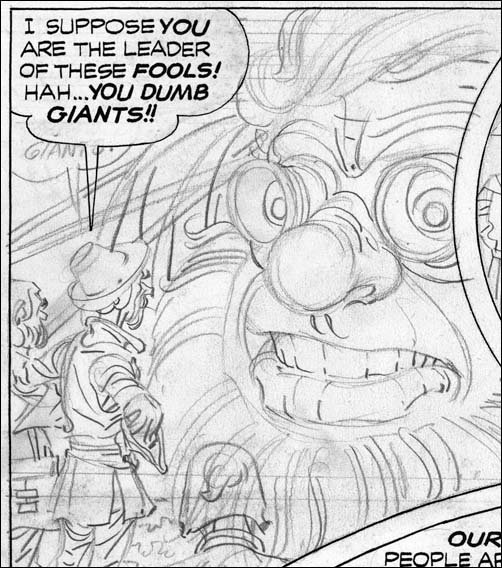
Unpublished Boy Explorers
Boys Explorers (unpublished) art by Jack Kirby

Next the lettering was done along with inking of the word balloons and the panel borders. It is in this stage that most unfinished pages are found and it is the stage that I can provide an image. Note that Kirby’s pencils are still uninked. Jack’s drawing is pretty tight but he does not shown any indication of how blacks are to be arranged. Outlines are provided and the folds of the clothing is indicated by simple lines. On one hand the inker was given clear indications of where ink lines should be applied. On the other hand application of black areas, what is called spotting, was completely left up to the inker.

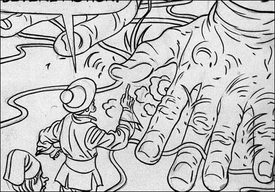
Unpublished Boy Explorers
Boys Explorers (unpublished) art by Jack Kirby

For the third stage line inking was done. Since for the most part Kirby’s pencils were tight this required little more then the ability to carefully follow Jack’s lines. This meant that finesse with the inking pen or brush was more important then artistic ability. I suspect that often the outline inking was done by studio assistants and after the studio breakup even by Kirby’s wife Roz. Sometimes there seems to have been no real attempt to adjust the width of the inked lines. In the example I provide above it is almost as if the outlines were made by bending wire. If the outline required any emphasis it could be introduced in the next stage. We shall see in the next chapter that a more artistic inking of the outlines would sometimes be done.

The final stage, known as spotting, supplied the blacks to the image. As remarked above there really was nothing in the pencils to indicate how this should be done. For good results a talented inker would be required. But it is a simplification to call this one stage. Particular spotting chores, such as foliage or backgrounds, could be assigned to different artists. However there did not seem to be any fixed procedure for how or by whom this was done. Jack, Joe or both could do the final touch ups.

S&K studio inking was a different thing altogether then how inking was handled in the Silver Age and beyond. Then the penciler’s work was handed over to another artist who would provide all the inking. Under such a system it makes sense to say a particular piece was drawn by Jack Kirby and inked by say Dick Ayers. Unfortunately people apply the same terminology to Simon and Kirby art. When they say a Kirby piece was inked by say Joe Simon what do they really mean? That the Joe did all the work, both outline and spotting? Or that he did just the spotting? Or could it be that Joe’s did some spotting along with others? Generally I try to be specific about what type of inking I am talking about.

Jack Kirby’s Austere Inking, Chapter 2, Mainline
Jack Kirby’s Austere Inking, Chapter 3, A Lot of Romance
Jack Kirby’s Austere Inking, Chapter 4, Prize Covers
Jack Kirby’s Austere Inking, Chapter 5, Harvey
Jack Kirby’s Austere Inking, Chapter 6, Atlas
Jack Kirby’s Austere Inking, Chapter 7, DC
Jack Kirby’s Austere Inking, Chapter 8, More Harvey
Jack Kirby’s Austere Inking, Chapter 9, More Prize
Jack Kirby’s Austere Inking, A Checklist and a Glossary

other post with Kirby inking Kirby:

Strange Tale Indeed
Battleground, Jack Kirby’s Return to Atlas
Captain 3D

Featured Cover, Boys’ Ranch #2

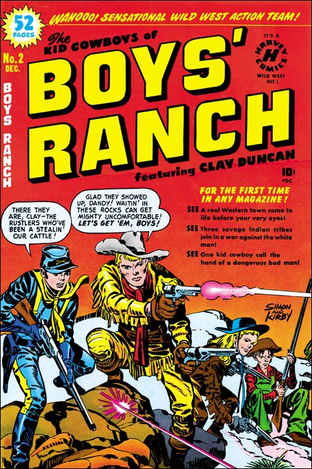
Boys' Ranch #2
Boys’ Ranch #2 (December 1950) by Jack Kirby

I have to admit that Boys’ Ranch along with Fighting American get short shift here in the Simon and Kirby blog. This is not because I feel that they are inferior work, quite the contrary. Much of what appears in this blog are the result of scanning and restoration work that I have been doing. I want to restore all the Simon and Kirby work. In all honestly it will be a long time, if ever, for such an effort to be completed. Boys’ Ranch and Fighting American have already been reprinted by Marvel, therefore they are low on my list of scanning to be done. I do have a particular love for Simon and Kirby covers and I take particular care in cover restorations. So you can expect that from time to time I will post on Boys’ Ranch and Fighting American covers.

Actually the covers from Boys’ Ranch are special in that all are really great covers. This is pretty unusual for Simon and Kirby productions. Well I guess you can say that all the Stuntman and Boy Explorers covers are all really fine but those were really short lived titles. Fighting American, Foxhole, Bulls Eye, Police Trap and In Love had great covers but the final covers just were not the same quality as the initial ones. The reason for the short comings of the final covers for these titles is that they were done when the Simon and Kirby studio was going through difficult times and would shortly disband. Because it was produced in the middle of the Simon and Kirby collaboration, Boys’ Ranch did not suffer from that problem.

The cover for Boys’ Ranch #2 puts special emphasis on Dandy and Clay Duncan but Angel and Wabash play their part as well. As first glance it might appear that we are looking at one moment in time, sort of like an illustration of a snap-shot. That however cannot be farther from the truth. The text in the balloons indicate that our heroes have been waiting to catch some cattle rustlers. Dandy has announced the arrival of the rustlers and is in the middle of rising up to fire his rifle. Clay has already begun firing. I am not quite sure about Angel. He appears to be rising up like Dandy but on the other hand is that smoke coming out of his right pistol? Wabash sits as if he is still waiting with no sign that he is even aware that their quarry has arrived. Although Clay may be in the midst of firing the first shot their prey has already returned fire with the bullet ricocheting off the rocks at Dandy and Clay’s feet.

Boys’ Ranch was published by Harvey and Joe Simon has said that S&K did not do the coloring for the comics they produced. Well whoever the colorist was he did a particularly nice job here. I especially like the use of graduated tones and highlights on Dandy and Clay Duncan. The red background grades to yellow near the horizon. This gives the impression of an approaching dawn and that our gang has been waiting all night. The colorist has shown in the left foreground that he is quite capable of effectively coloring rock formations. However he has wisely chosen to color the background rocks a neutral grey so that all our heroes stand out. Jack Kirby drew a great cover and the colorist made it even better.

Featured Cover, Boys’ Ranch #4

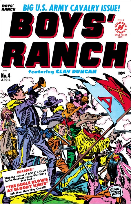
Boys' Ranch #4
Boys’ Ranch (April 1951) by Jack Kirby

I lament so often about the fact that various Simon and Kirby productions have not been reprinted that is nice to be able to write about Boys’ Ranch. Although there are other comics I sure wish would be available again, if I had to pick a single S&K title as most worthy of the reprint honor it would be Boys’ Ranch. Fortunately Marvel already has published it in a nice volume. It is out of print but shows up often on eBay and at comic conventions. It has not gotten too pricey and deserves to be in the library of any Kirby fan. Not all Simon and Kirby productions were actually drawn by Jack as the studio used a number of talented artists. However a lot of Boys’ Ranch truly was penciled by Kirby, although not as much as claimed by many authorities. We can blame the failure of Stuntman and Boy Explorers on the comic glut. The downfall of the Mainline titles can be laid at the anti-comic sentiments among many adults at that time. For Boys’ Ranch we have no similar explanations and we must accept the fact that they just did not sell well enough. That reflects on the times not, in my opinion, the product.

Boys’ Ranch followed the general practice of S&K productions in having Jack Kirby pencil all the covers for the title. As far as I am concerned not a single cover for the title is anything short of a masterpiece. I am not sure how I would manage to pick my favorite, but one of my Featured Cover Contests participants did and he choose issue #4. With a main cast of three boys and an adult it is not an easy achievement to give them all prominence on a cover. But then add some soldiers and Indians to the mix and it might be an insurmountable task for many artists. But Jack was not a typical comic book artist and he overcomes these challenges with such ease as to make the viewer unaware how hard it really is. What exciting action Jack has provided. Although only four Indians are actually presented we are made aware of the fierce struggle that is occurring. One soldier is on his back, obviously seriously wounded, while another continues fighting but is unable to stand. A third soldier in the background has entered hand to hand combat with an Indian foe and appears about to loose. This is all in midst of a cloud of smoke from all the shooting. It all brings to mind Custer’s last battle. Actually in the cover for issue #4 one boy, Dandy, does get special treatment. He appears prominently on the left while the other three form a triangle on the right. Dandy stands pausing from his firing to blow the bugle. This is the reason for his prominence because it is a reference to the story title “The Bugle Blows as Bloody Knife”. Our heroes are defiant but will they face an end similar to Custer? Of course originally you were meant to buy the comic to find out. I will give a subtle hint, the Boys’ Ranch title ran for two more issues.

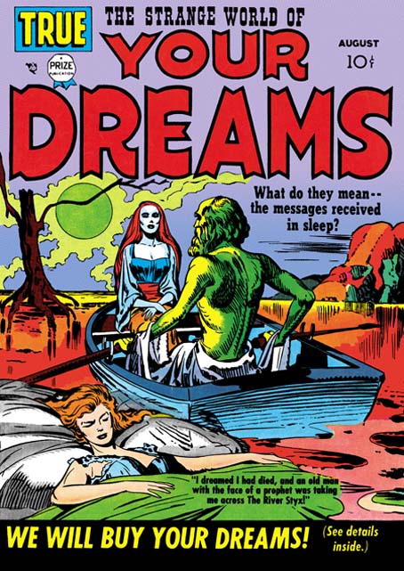
Featured Cover, Strange World of Your Dreams #2

Strange World of Your Dreams #1
Strange World of Your Dreams #1 (August 1952)

I had a brief discussion with someone at the Big Apple Con yesterday. He mentioned a Kirby cover of a woman in a rowboat and suggested a name of the comic. Neither the comic name or the image rang any bells with me at first. Then I thought perhaps he was thinking of Strange World of Your Dreams #1. I suggested he visit my blog because I had posted on SWYD and thought I had included the cover for issue #1. When I finally got around to check it turned out I that in the post I had used SWYD #3 instead. So in case the gentleman decides to check my blog out here is the cover for SWYD #1.

As I said I have already posted on Strange World of Your Dreams. This title is as unusual as its name but unfortunately the comics themselves are a bit expensive. For anyone with a more limited budget who is curious about this title you might want to check out DC’s Black Magic #8 and #9 which reprint a few stories:

  • BM #8 “The Girl In The Grave” (from SWYD #2)
  • BM #8 “Send Us Your Dreams” (from SWYD #2)
  • BM #9 “The Woman In The Tower” (from SWYD #3)

These were published in 1975 and can still be found at a reasonable fee at comic conventions and eBay. As I have said before, I have mixed feelings about DC’s Black Magic. On the one hand it is great that some of these stories were reprinted. But unfortunately the artwork restoration looses some of the special inking quality of the original comics and gives them a sort of woodcut look. The three SWYD stories that were reprinted are good selections. “The Woman In The Tower” is not only the best in the original series, it is also one of Simon and Kirby’s most unusual stories ever.

Featured Cover, Treasure #10

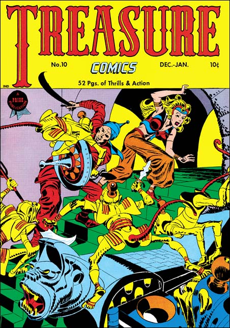
Treasure Comics #10
Treasure Comics #10 (December 1946) by Jack Kirby

I come across lists all the time; the top 100 artists, the 100 most important comic books, and so on. All listed in a nicely hierarchy with one selected as the best. I do not know how people are able to make such lists. What criteria does one use to rank one artist as #100 and another as #101 (and so be excluded from the list)? Even the selection of the best can be wroth with difficulties. Should the best comic book artist be based on who did the best work or who had the most influence on the comic books of today? It should come as no surprise who I think is the artist that did the best comic book art. Subtle hint, look at the title of this blog. However if it is influence that counts then I might wonder if Will Eisner may be more appropriate. While not denying Jack Kirby’s tremendous influence on pretty much the entire history of comics, Eisner’s graphic novels launched a whole new genre, one that has even made it into the N.Y. Times Book Review.

But even if I try to adopt a subjective viewpoint I do not find myself in an easier position. My favorite painting varies from day to day. My response to a piece of art depends as much as my mood as with the work of art. But ask me what my favorite Simon and Kirby cover is and most days I would say Treasure #10. This is a rather oddball cover for S&K. Treasure #10 comes not long after the failure of Stuntman and Boy Explorers. The publisher was Prize, Joe and Jack had done some work for them early in their career (Prize Comics #7, 8 and 9; December 1940 to February 1941). In March 1947 Simon and Kirby would launch for Prize the crime genre version of Headline Comics. Treasure #10 was used to introduce the new version of Headline. It includes a crime story (“Tomorrow’s Murder”), the earliest Simon and Kirby crime genre piece. There is an advertisement at the end of the story announcing the “bigger and better” Headline. It includes a copy for the cover for Headline #23. Both the ad and the illustrated comic indicate a January-February cover date. Headline #23 was actually cover dated March-April. Further the cover illustrated in the ad was really used for Headline #24.

Treasure Comics appeared to once have an Arabian Knight feature, it is listed on the cover for Treasure #7. However there is no such feature, or anything like the cover, in TC #10. The GCD shows Treasure #6 and #7 covers (April and June) with an Arabian theme signed by H. C. Kiefer. I am not familiar with Kiefer’s work and it would be easy to dismiss him as a inferior artist compared to Jack Kirby. But such comparisons are really unfair and uninformative. The cover for TC #7 may be a bit crude and the demons looking more goofy then threatening. But TC #6 is a rather nice cover with lots of action and a good composition. Both TC #6 and #7 covers show shields with similarities with that used by Jack for TC #10. Further TC #7 adds an unusual point to the turban, a trait shared with TC #10. This suggests that Kirby used Kiefer’s covers as a jumping off point.

What a cover Jack provides! An Arabian Knight seeks to escape with a beautiful princess. Well perhaps she may not really be a princess, but her exotic diadem suggest she is more then just a beautiful woman. The pair are faced with a swarm of adversaries intent on preventing their escape. Not your usual adversaries but a group of yellow bodied, red tailed monkeys. Not what you normally would think of as much of a challenge to our hero. But these monkeys are armed with exotic weapons and quite energetic in their attack. These are scary monkeys indeed. But not your normal scary monkeys, these wear exotic clothing and rather weird hats (how do those hats stay on?). Judging from the sculpted banister I would suspect there is a whole population of these monkeys that our desperate pair must somehow evade.

Take a look at the monkey with the knife in the center of the picture, look carefully at his feet. The big toe is on the outside of the foot contrary to what is found in either monkeys or men. I used to think that this was done by Kirby on purpose to give them an even more exotic look. But during restoring the cover I noticed that the toe is on the correct side of the foot for the two monkeys on the left. So now I guess it is just another of those errors that Kirby is so famous for.

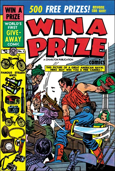
Win A Prize #1
Win A Prize #1 (February 1955)

Simon and Kirby did not do many of this sort of swashbuckler covers. Win A Prize #1 comes to mind as one other. (I wrote about the Win A Prize comic before during my serial post on The End of Simon and Kirby). But Jack was a master of action art and seemed to create such covers almost effortlessly.

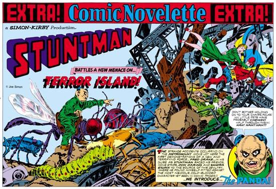
The Wide Angle Scream, “Terror Island”

Stuntman
Stuntman #3 (unpublished) “Terror Island”
Enlarged view

Joe Simon and Jack Kirby must have had high expectations for their creation, Stuntman. There exist three double page splashes that were never published, at least not as regular Simon and Kirby productions. Since S&K always placed their wide splashes in the centerfold, this meant that they had already started working for up to Stuntman issue #5. That is until the post-war comic book glut caused the early demise of their new comic books. Joe still has the three splash pages and with their double size art they are really marvelous to behold. However when reduced to the size necessary for use on the Internet they can be difficult to appreciate. Therefore I hope my readers will understand that I felt it necessary to provide my own coloring for use in this blog. I would have like to have used the color version that Joe did for his book “The Comic Book Makers” but so far I have not found it in his collection. The “extra!” strip on the top, the “a Simon-Kirby Production” and the Stuntman title are missing from the art and I provided them from other wide splashes. Glue marks clearly indicated that the “extra!” strip is was present, or something like it. However I did not scan the original art (it is much too large) and the source of the image does not indicate the placement for the “production” (if it was even present) or the title.

Because two of the double splashes are completely inked I am not absolutely sure which was originally meant for Stuntman #3. I choose “Terror Island” to post on first. However this choice was not completely arbitrary. As mentioned above “Terror Island” clearly had an “extra!” along the top a feature that it shares with the double wide splashes for Stuntman #1 and #2. The other completely inked splash did not have this “extra!” strip, the lack of which it shares with the unfinished Stuntman double splash.

Mao Tse-tung“Terror Island” introduces a new antagonist, the Panda. Of course Stuntman had faced various opponents in his previous stories but they all were rather generic. None of the earlier villains really stood out and it is clear that none were ever meant to reappear in future Stuntman stories. The Panda seems special and I believe was Simon and Kirby’s first attempt to create Stuntman’s nemesis, the equivalent of the Red Skull for Captain America. Basing a villain on a panda may seem an odd choice, after all what could be more cute and cuddly then a panda, at least in the mind of the public. Sure Jack draws the Panda to look as vicious as possible without loosing his panda look. But the real source for this character is not the bear, but China’s leader Mao Tse-tung (nowadays his name is normally transcribed as Zedong). Today with all the world companies scrambling to get a share of the Chinese market it is easy to forget at that time communist China was a very closed society. As China’s leader and his with description of the U.S. as a “paper tiger” Mao was considered a special menace. Still it is not at all clear whether the Panda really could fulfill the role Joe and Jack were casting him for.
The art for this wide splash marked a new approach. All previous double splashes were actually composed of various different sections. But for the “Terror Island” splash no similar attempt was really made. It is true that there is some introductory text and a round panel portraying the Panda, but this hardly compares to the cast of characters often provided in older double splashes. Yes it is also true that space has been left in the upper left for the titles, but no art is associate with these titles. What we are presented with for the first time is an enactment that dominates the entire splash. But what a scene! It sprawls across the pages from the lower left to the upper right. It is just the sort of chaos that we have seen before in the Boy Commandos wide splash. There is some control over the composition. The Panda and his attacking bug army occupy the left page. All are advancing toward the right where we find Stuntman, Sandra Sylvan and Don Daring amid a mass of falling wreckage. Although the uncolored ink art might be a bit confusing, I am sure Jack (who did the penciling) knew how much the final coloring would help to make it understandable. This splash is one of those that Jack could just let his imagination run wild. Previously when discussing the cover for Adventure #98 I had mentioned how Jack was often inaccurate when drawing animals but nonetheless was very successful in giving them a certain life. This splash provides and example of what I meant. A biologist would shudder and the giant bugs Kirby presents us with. Some of the inaccuracies can be explained by the needs of the subject. The wasp like insect that the Panda is mounted on could never fly with its wings in their present location. But if that beast’s wings were in the correct position the Panda could not mount it. But other errors have no artistic excuse. The legs of the insects and the spider are attached in the most bizarre places. If Jack used a biology book for a reference he obviously did not make any attempt to follow it closely. Regardless of these “errors” these giant bugs have a very menacing life to them.

My personal preferences is for the earlier wide splashes with their greater emphasis on design. But there is just no denying the shear brilliance that radiates from these post war double splashes. When you look at the original art for the “Terror Island” splash there are no signs of hesitation or rework. Jack seemed to have it all figured out in his mind before he put it on the illustration board. But with such a complicated drawing how was he able to do that? It just astonishes me.

Lone Shark!

I saw an unusual post today in one of my favorite blogs Pharyngula by PZ Myers. (A warning to those religious, the Pharyngula blog is largely about evolution and atheism). In it PZ talks about a comic book called Action. What interests him about this comic is the depiction of a giant squid. PZ has a fondness for squid and other cephalopods. (Actually so do I and I am proud of the fact that a fossil cephalopod was named after me, Nostoceras mendryki Cobban). As a biologist Meyers credits the demise of this comic book not to the graphic violence, but to the inaccuracies inflicted by the artist (actually I am sure this suggestion was done tongue in cheek).

The source PZ Meyer used was something in scans_daily (In this case I must warn readers about the graphic violence). Action started in 1976 but only lasted 21 months. Apparently one feature from Action called Hook Jaw had a man eating shark as the protagonist. Hook Jaw was obviously inspired by the Jaws movies. Although I warned the this stuff was pretty violent, I find it does not affect me very much. Frankly I find the depictions so unrealistic that they seem silly. In one panel body parts go flying even before the sharks mouth full closes. Some might credit the demise of Action as due to criticism they received about the violence, I believe it was more likely due to the poor writing and drawing. It just tries too hard to be gruesome.

Black Magic #33
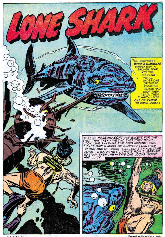
Black Magic #33 (November 1954) “Lone Shark” by Jack Kirby

But the idea of a killer shark as a protagonist was certainly not new. Simon and Kirby had provided just such a story back in 1954. Actually S&K even went further by providing the shark with intelligence so that with thought balloons we can read the story from his viewpoint. This particular shark was unique, atomic radiation had caused it to develop a tumor. But the growth was not cancer it was actually a second mind! Hence the shark’s intelligence. The idea that some sort of mutation can provide an immediate evolutionary leap was a concept some scientists shared about the time this story came out. Some referred to such a mutate as a hopeful monster. Today the belief in hopeful monsters has been pretty much discredited in evolutionary science. But hey this is a comic book so the heck with the objections of PZ Meyer and other biologists.

Black Magic was a Simon and Kirby production, at least up to this point. Joe and Jack were not interested in the sort of gruesome stories that someone like Bill Gaines would produce. In fact this story was not so much as a chiller as a black comedy. Read the opening page, it really is funny. The whole story is filled with similar humor. Of course there is a final unexpected twist but I hate to give any spoilers. This story is one of my favorites and certainly deserves to be reprinted some day.

After issue #33 Black Magic would be discontinued for a few years. We can only guess why this happened. My belief is that Black Magic found itself in an unfortunate position. Although I find the stories very well done, it cannot be denied that some of the comic book readers preferred horror stories that were stronger and more gruesome. So Black Magic probably lost some of its readership to the publications of Bill Gaines and others. At the same time (adult) public sentiment was rising against comics. Bill Gaines and his horror comics acted like lightning rods attracting much criticism. Black Magic became associated in the minds of many adults with the more extreme fares. In response some newsstands began to refuse to sell certain comic genre, horror in particular. Eventually a comic code would be created and the more extreme comics would cease to exist. But that was too late for Black Magic, at least until it resumed in 1958.

Black Magic #33
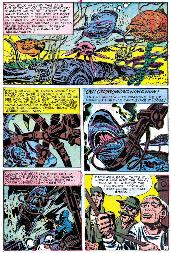
Black Magic #33 (November 1954) “Lone Shark” by Jack Kirby

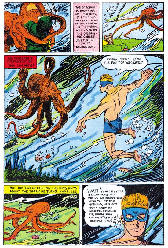
Jack even included in this story another extinct cephalopod. But I was really hoping for a more exciting use of a cephalopod by Jack Kirby. At the moment I cannot think of one. So I will close with one with a tenuous link to Simon and Kirby. At the start of his career, before Joe Simon teamed up with Jack, he did some work for the agency Funnies Incorporated. I previously posted on what have been Joe’s first comic book work which eventually appeared in Amazing Man Comics #10. In the same comic there is a feature called The Shark by Lew Glanz. I guess it was attempt by Funnies Inc. to duplicate the success they had with Bill Everett’s Submariner. In there story is a page with a great octopus, another cephalopod. It shows the confrontation of the Shark with the killer beast. Unfortunately Glanz ruins it all by having the octopus turning coward and fleeing. The whole story is filled with similar build ups with disappointing conclusions.

Amazing Man #10
Amazing Man #10 (March 1940) “The Shark” by Lew Glanz

Alternate Takes, The Thirteenth Floor

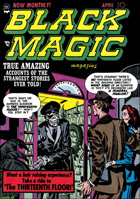
Black Magic #11
Black Magic #11 (April 1952) by Jack Kirby

For this cover Jack Kirby provides an interesting combination, an elevator made out as a funeral parlor. The operator is even stranger with a white complexion, an eye patch and (despite the gloves he is wearing) skeletal hands. The man is taken aback by it all, but it the woman who is most surprised and seems to be drawing back. The old fashion floor indicator shows them on the third, but the operator invites them to a ride to the thirteenth floor. Do you really think the couple will take him up on it? Although imaginative this is not one of Kirby’s better efforts. The elevator operator is meant to be spooky, but he comes off more like one of those friendly old men you would sometimes meet years ago when many elevators did not run automatically.

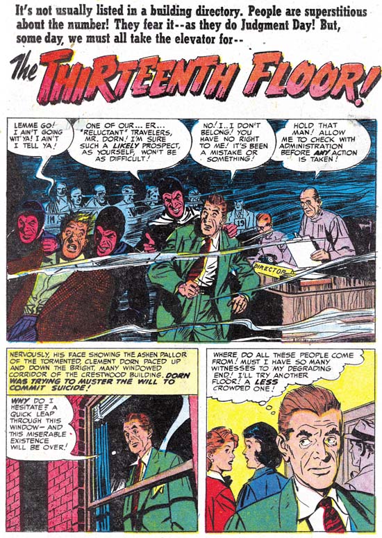
Black Magic #11
Black Magic #11 (April 1952) “The Thirteenth Floor” by John Prentice

John Prentice did so much romance work for the S&K studio that it is easy to mistakenly believe his talents were limited to that genre. John also had done some fine work for Black Magic (he would further go on to a very successful run of the syndication detective strip Rip Carter). A story like “The Thirteenth Floor” actually would suit his talents more then Kirby’s. In this story we are not presented with any unnatural demons. The devils can only be distinguished by their red complexion and angular eyebrows. This “humanization” of the characters is a necessary part of the story. Nor is there much in the way of action. This is much more of a talking heads kind of story about a man planning suicide who takes the stairs to the thirteenth floor but finds himself in an eerie waiting room. The “people” running the operation do not know what to do with him since he is not in their records. Eventually the man convinces them to let him return back and they direct him to an exit door. But when the man uses the door he wakes up in an elevator and his former life.

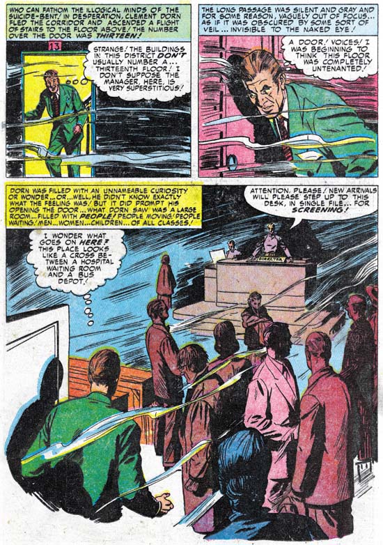
Black Magic #11
Black Magic #11 (April 1952) “The Thirteenth Floor” by John Prentice

The splash panel that John provides is little more then a double panel. Prentice provides a scene from the waiting room. The splash illustrates one of the few action events from the story, when the devils escort away a very reluctant individual. It is hard to image a splash more unlike the cover that Kirby provided for the same story. John did some great splashes, but this is not one of them. On the second page John provides a story panel much larger then the splash. The large story panel is even more unlike what one would expect had Jack done the story. The scene is very mundane with just a group of shadowing figures standing around and a director at his desk in the background. Although seemingly mundane, John’s careful use of shadows and a few wispy lines make the whole panel rather unnatural. This pivotal panel sets up the mode from which the rest of the story develops. John was much more effective with this large story panel then he was with the splash.

It seems odd that the cover emphasizes the use of an elevator to go to the thirteenth floor but in the story the man walks up a staircase to reach it. From this it might be implied that Kirby had no idea what the story was really about. But the text in the title of the story also refers to the elevator. This makes it seem more likely that S&K was well aware of the story. But the story did not seem to have anything in it that suited Jack’s strengths. Therefore this became one of the minority of covers where Jack just made something up. Because the story is so far removed from Kirby’s vision it is hard to believe Jack had much to do with it. This work seems to contradict the claim made by some that Jack Kirby did the layouts for the stories done by artists working for the S&K studio. It is rare to see Kirby do such a small splash panel. But I have never seen Jack do anything like the large panel on the second page. Like Bill Draut and Mort Meskin, John Prentice was much too talented a comic book artist to require layouts by Jack. Further Joe and Jack were much to savvy business wise to spend time doing work that was not needed by the artist they would have draw the story.

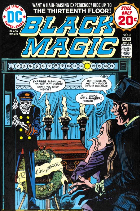
Black Magic #6 (DC)
Black Magic #6 DC (November 1974) by unidentified artist

DC ran a series of Black Magic reprint comics produced with the help of Joe Simon. The covers for these reprints were generally new interpretations of original Kirby covers. I do not know who this particular artist was but it is hard to believe that anyone thought that this was an improvement. I would say that this cover is more goofy then scary. There are covers that I call goofy as a complement, but this is not one of them. Even though Kirby’s BM #11 is not a favorite of mine it is so much better then this one that I will forego any comparison. I am also a critic of the art in these DC Black Magic reprints. Generally I find the reprints look like wood cuts, loosing much of the effects of splendid inking of the originals. However the job done on the reprinting of “The Thirteenth Floor” actually came out rather well.

Alternate Takes, A Curse on You!

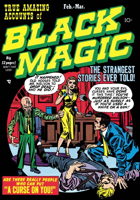
Black Magic #3
Black Magic #3 February 1950) by Jack Kirby

As I mentioned previously, Jack Kirby would often draw a cover based on a story done by another artist. This is not unexpected because Simon and Kirby produced comics. They came up with the plots, had writers provide the scripts, made alterations to the writing, farmed the work out to various artists to draw, made corrections to the art that was returned, and provided the publisher with a complete comic. All of that activity was paid for by S&K, they would then get a share in the profits. The only work that they did not finance was the coloring. But although the colorist was paid by the publisher, a photograph shows one working in the studio. Having all this control S&K were well aware what would be in a particular comic. Some of these artists were very talented but Jack would earned the title “the King” for a reason. S&K were well aware Jack’s importance to the sales. The cover was also vital for attracting the comic buyer so Jack would end up providing pretty much all the covers for S&K productions with the exception of photo covers. Sometimes Jack would draw a cover for a story that he also drew but often it was for a story based on another artist.

This is the case of the cover for Black Magic #3 (February 1950). The goal for a S&K cover seemed to be to provide a summation of an entire story in just one scene without of course giving the ending. Both Joe and Jack were just so good at that. Although BM #3 was obviously drawn by Jack, who can say exactly what Joe’s contribution was. However their collaboration worked, what was produced were cover masterpieces the likes of which were never seen again after their breakup. We may not know exactly how the man died on the cover to BM #3, but there is little doubt who was responsible. The sight of the frail little man shaking his fist over the body is just chilling. The other characters provide the information needed as well as the appropriate reactions. The scene is enclosed in a circular field. Well perhaps enclosed is not completely accurate because the characters and the rug interrupt the circle at various points. The use of this design technique dates back to one of Joe Simon’s first covers, Keen Detective #17 (January 1940). Black was often used as a background color for Black Magic and it is particularly effective when used with the circular field here in BM #3.

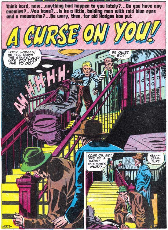
Black Magic #3
Black Magic #3 February 1950) “A Curse on You” by Mort Meskin (signed)

Mort Meskin seems the perfect artist for a story like this. Jack was great but action was he forte. Mort was able to develop a story very effectively and “A Curse on You” is no exception. This is the 50’s and S&K are not Bill Gaines so you know that in the end that little man from the cover will get his just desserts. Some have unfavorably compared Black Magic to the more extreme horror comics of the time. But the use of excessive violence or gruesome depictions were never an interest for Joe and Jack. The stories in Black Magic are very much the same as Simon and Kirby did for titles in other genre. It is hard to understand how someone can praise Simon and Kirby but condemn Black Magic.

Usually the splash panel served a purpose similar to that of the cover, it tries to visually grab the reader’s interest for the story that follows. Mort’s splash panel is rather unusual in that it is also very much part of the story. Here we are provided with the details of how the cover’s victim met his demise. The cast of characters is not quite the same, Jack had replaced the boy with the woman who plays a different part in the story.

A number of people have made the claim that Jack provided layouts for even artists like Meskin. It is really hard to believe in this case. I am sure Kirby would never had shown a man falling down a staircase like this. He would have shown the man with the face in horror and the arms stretching to the reader as the figure almost flies through the air. Mort provides a more literal version of a man who trips and ends up helplessly heels over head. Kirby’s version would be more exciting visually but Mort’s sets up the story better. These sort of differences are also found throughout the story.