Category Archives: Featured Work

Boys’ Ranch, Simon and Kirby’s Most Successful Failure, Part 2

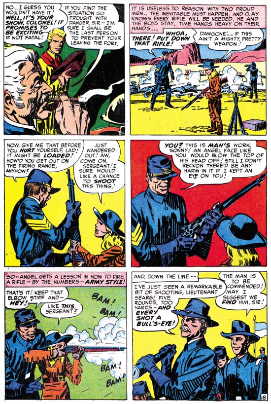
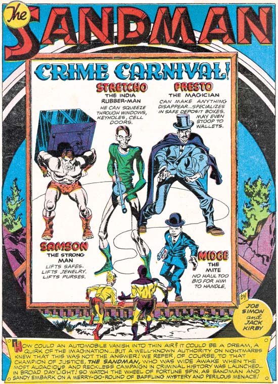
Boys’ Ranch can conveniently be separated into two groups. The first three issues featured work by Kirby (with one exception), had three stories per issue, and the stories were longer. For the final issues there is much less use of Kirby, only two stories per issue, and shorter stories. Actually each final issue had a single story, but broken into two chapters. It was part of the Simon and Kirby modus operandi to make heavy use of Kirby’s talents in the early issues of a new title and afterwards make more frequent use of other artists. For Boys’ Ranch the change seems much more dramatic then in other titles. The last three issues are good, but they are not the masterpieces that the earlier issues were.


Boys’ Ranch #4 (April 1951) “The Bugle Blows At Bloody Knife”, pencils by Jack Kirby inks by Mort Meskin

In the last three issues of Boys’ Ranch there is only one story completely penciled by Kirby, “The Bugle Blows at Bloody Knife”. However Mort Meskin does all the inking for this story other then the splash page (which looks like Kirby’s inking to me). Both “The Bugle Blows at Bloody Knife” and “I’ll Fight You for Lucy” are good references for Mort Meskins’s use of the Studio style of inking. For his own work Mort generally did not so fully use the Studio inking style and so his thorough adoption of it in Boys’ Ranch provided a more uniform appearance throughout the title. Mort’s inking is very distinctive and he was careful not to overwhelm Kirby’s pencils. Kirby characteristics such as his eyebrows are generally maintained. The two stories also provide good examples of the differences between Kirby’s way of graphically telling a story and that used by Meskin.


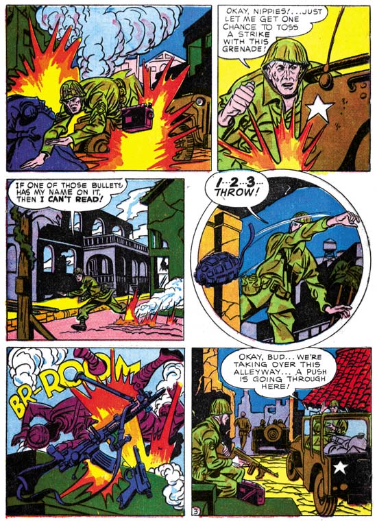
Boys’ Ranch #4 (April 1951) “Fight To the Finish”, art by Jack Kirby

Although Jack contributed less work for the title, care was taken for putting his efforts where they would be of the most use. One way this was done was having Jack pencil the splash page even for stories illustrated by others. With the exception of “I’ll Fight You for Lucy”, every splash in the Boys’ Ranch comics was drawn by Kirby and they are all full page splashes. What splash pages these are. “Fight to the Finish” is certainly among the best. It is a pure Kirby battle, up close and personal. To thrust the viewer into the action, Kirby creates a foreground showing only parts of some fighters. This is the same technique Jack used with a horse as seen in last weeks post and the Bullseye #7 double page splash. Here Kirby presents contrasting arms and heads. The antagonists are clearly identified by the officer sword versus tomahawk above, and below the soldier sporting a Calvary hat confronting an Indian warrior with suitable head apparel. The colorist wisely blocked the foreground elements in the same purple color. The background provides an only slightly better view of other contestants. Among some soldiers, we find Clay, Dandy and Wabash. Perhaps Angel had to be left out because even the truncated cast limited the number of Indians that could be included.


Boys’ Ranch #4 (April 1951) “How Cowboys Say It”, art by Marvin Stein

If Jack Kirby was used less in the final Boys’ Ranch issues the natural question then becomes who did the art? The Jack Kirby Checklist lists these stories as having a “Mort Meskin assist”. Well as we have seen Mort Meskin was involved with Boys’ Ranch so he certainly is a candidate to consider. The Marvel reprint volume lists the books creators as Jack Kirby, Joe Simon, Mort Meskin and Marvin Stein. So should we add Marvin Stein as a possible contributor? The earliest date that my database has for Stein is for Headline #40 (March 1950, “The Case Of Joe Andrews”). But I am not very confident of that attribution as it is unsigned and has only a passing resemblance to work by Marvin. The earliest dates for work more securely attributed to Stein would be the cover for Justice Traps the Guilty #20 (November 1950, unsigned) and “Brute Force” from JTTG #22 (January 1951, signed). These dates indicate that Marvin Stein was certainly available for work on the last issues of Boys’ Ranch. “How Cowboys Say It” was one of those single page contributions to the Boys’ Ranch title. In the panel for “Quirly” we find a cowboy viewed from above and to the side. This view along with the distinctive manner of handling the eyes and eyebrows indicates to me that this certainly was done by Marvin Stein. The inking was done in a manner typical of Stein’s work. Note the rather blunt brushwork and its often scribbly nature. Marvin did not adopt many features of the Studio style when inking his own pencils and this page from Boys’ Ranch #4 is no exception.


Boys’ Ranch #4 (April 1951) “Fight To the Finish” page 3, art by Mort Meskin? and unidentified artist

In my opinion, the story art for “Fight to the Finish” has only a passing resemblance to work by Jack Kirby. Take a look at panel 4 from page 3 (shown above). The horse’s front is angled in an opposite direction to its rider and posterior. I do not recall Kirby ever having drawn such an odd arrangement. In the first panel Dandy and Angel look much shorter as compared to Clay Duncan then either Jack Kirby or Mort Meskin drew them (although Wabash seems about right). The eyebrows, particularly in the second and third panels, have some of the angular nature typical for Mort Meskin. There are some aspects of the Studio style however the inking as a whole looks much too sloppy for Meskin.


Boys’ Ranch #5 (June 1951) “Bandits, Bullets and Wild Wild Women” page 4, art by Mort Meskin? and unidentified artist

A similar situation is found in “Bandits, Bullets and Wild Wild Women” from Boys’ Ranch #5. Once again some of the eyebrows resemble Meskin’s mannerism. There are more techniques typical of the Studio style but it is still a rather sloppy performance not at all typical for Meskin. However I have seen Marvin Stein use the same coarse picket fence as evident on the back of Wee Willie Wheehawken. Most of the drawing is rather crude but look at Willie in the fourth panel. Willie is really nicely penciled and even the inking is not badly handled. The comparison of Willie’s portrait with how crudely the rest of the page was done suggests that there may be more then one hand working on this story.


Boys’ Ranch #5 (June 1951) “Last Mail to Red Fork” page 4, art by Mort Meskin? and unidentified artist

Much of what was said previously can be applied to “Last Mail to Red Fork” as well. There is one spotting techniques that shows up more on this page then previous examples. Many of the cloth folds are constructed by multiple overlapping brushstrokes creating long narrow folds. This is a typical Meskin inking technique but its actual use here seems too poorly handled for Mort. Of particular interest is the punch thrown by Clay in the fourth panel. This is not at all the way Kirby would have done it so again I do not believe Jack even supplied the layouts. With Kirby the whole body responds when being hit with a fist, not just the head and arms as in this panel. Clay’s swing and Drapo’s response does look like Meskin’s style to me (see the page from Black Terror #23 from my last weeks post).


Boys’ Ranch #5 (June 1951) “Last Mail to Red Fork” page 6, art by Mort Meskin? and unidentified artist

One final example is from “Last Mail to Red Fork”. Here Mr. Larson from panel 4 distinctly looks like Meskin’s work and is much more carefully inked then most of the story.

So let me summarize my findings for “Fight To the Finish” (BR #4), “Last Mail To Red Fork” (BR #5), and “Bandits, Bullets and Wild Wild Women” (BR #5). In all cases the splash pages were by Jack Kirby, but he otherwise did not have any significant contributions to the art, not even providing layouts. Some of the fight scenes are done in a distinct manner that looks like the work of Mort Meskin. Mort’s touch is also apparent in some of the eyebrows. So I would say the pencils were done by Mort Meskin. Although some of the inking is done in a manner similar to Meskin’s technique on a whole it just seems too sloppy to have been Mort’s. However the inker does seem to have been following the Meskin’s directions. Could these stories have been inked by Marvin Stein? I really cannot say because Stein did not seem to use the Studio style for his own work and so I have little to compare these Boys’ Ranch inking with. So for the moment I am going to leave the question of inking attributions unresolved. But was the second artist just an inker or did he make a contribution to the drawing as well? My current inclination is to provide joint credits.


Boys’ Ranch #6 (August 1951) “Teeth for The Iron Horse” page 3, art by Jack Kirby and unidentified artist

The stories from Boys’ Ranch #6 have a much more Kirby feel to the layouts. In the page from “Teeth for the Iron Horse” shown above the discussion between Clay and Palomino in the first two panels is done in a manner that is very typical for Kirby. There seems to be a progression of art that looks the most like Kirby’s at the beginning of the story grading into work less typical for Jack. I usual take this as a sign that an artist was doing “in between” work. That is Kirby would supply a layout that would be tighter in the beginning and then getting rougher. In cases such as this I give joint credits. The inking, while still somewhat clumsy, is handled better then that found in “Fight To The Finish” (BR #4), “Last Mail To Red Fork” (BR #5), or “Bandits, Bullets And Wild Wild Women” (BR #5). The eyebrows still have the distinct Meskin angularity to them.


Boys’ Ranch #6 (August 1951) “Happy Boy Carries the Ball” page 2, art by Jack Kirby and unidentified artist

The page above from “Happy Boy Carries the Ball” has in my opinion a much more Kirby feel to it. This is particularly noticeable in gentleman in panel 5. The layout of the entire page is much more like Kirby’s then the other stories reviewed earlier. I suspect that as in “Teeth for the Iron Horse”, Kirby may have been supplying layouts that were tighter in some places then in others. I do have some reservations. The ending page of the story is really not done were well; it is not always clear what is happening. This would be very unusual for Jack as he was above all else an excellent graphic story teller. So either this work was edited with some panels removed, or the ending was not based on Kirby layouts. The original art for this story is still in Joe Simon’s collection. That is all but the last page and so cannot resolve this question. All and all, I think that joint credits should be used here as well even if I cannot say for certain who the second artist was.


Boys’ Ranch #2 (December 1950) illustration from “Jack McGregor’s Bluff”,
Boys’ Ranch #4 (April 1951) illustration from “Killer Stallion”, art for both by Jack Kirby (these illustrations were not included in Marvel’s reprint volume)

Even with the decline in the last three issues, Boys’ Ranch certainly was one of Simon and Kirby’s greatest creations. Stories were given enough length to fully develop. Some stories had themes that normally never showed up in comics. Pinups were used to an extent that would never be repeated by Simon and Kirby. With such great pinups, splashes and stories you can tell Joe and Jack gave Boys’ Ranch their all. It failed. There is no getting around it. No paper glut or a failing distributor can be used to explain it away. No matter how highly esteemed Boys’ Ranch may be today, it only lasted six issues. Having been given a year to catch on, apparently sales were too low to warrant its continuation. It was Simon and Kirby’s greatest failure.

Boys’ Ranch, Simon and Kirby’s Most Successful Failure, Part 1

I have long held off discussing Boys’ Ranch since with so much written about that title I feared I would have little new to add. Today Boys’ Ranch is probably one of the most popular Simon and Kirby post-war creations. There is good reason for this modern esteem as the title has much to commend it; action, humor and lots of Kirby. Nothing has done more to keep the Simon and Kirby brand name alive as Marvel’s Boys’ Ranch and Fighting American reprint volumes. Although published in 1992 these volumes are still readily available in the resale market at reasonable prices. Of the two, the Boys’ Ranch volume most accurately reflects the original published comic books. Harvey’s reprinting of Boys’ Ranch stories occurred prior to the establishment of the Comic Code and so the art and stories did not suffer from censorial abuse. I have examined the comics and the Marvel reprint side by side and so far the only changes I have detected were a very few coloring alterations. Unfortunately Harvey reprinted Fighting American during the Comic Code’s reign and the Marvel volume makes use of Harvey’s reprinted version. Mark Evanier’s “Jack Kirby, King of Comics” provides an example from the Fighting American of the removal of an ice pick from one panel leaving an attack without a weapon. All is not completely well for the Marvel reprint volume as a few pages of general interest fillers have been dropped. These single page graphic articles were not drawn by Kirby so many readers will not have lost much. The more hardcore Kirby fans will regret the absence of the text stories some of which had included illustrations by Jack.


Boys’ Ranch #2 (December 1950) pinup, art by Jack Kirby

I have not completely ignored Boys’ Ranch in the Simon and Kirby Blog. Recently I have included the double page pinups from this title in a couple of chapters of my serial post “The Wide Angle Scream” (here and here). The use of pinups, both single and double page, was something new for Simon and Kirby. Each issue of Boys’ Ranch would have a single page pinup at the beginning of the book along with the centerfold pinup. Such extensive use of pinups would not be repeated in any other Simon and Kirby production. The pinups are not only numerous, they are also consistently of high quality. I would be hard pressed to pick the best one. I do want to provide an example and so choose one that provides the best portrait of the main cast of characters. Boys’ Ranch is not just a western, it is also belongs to the boy gang genre so favored by Simon and Kirby. There are significant parallels between the Boys’ Ranch gang and say the Newsboy Legion. Most S&K gangs have one adult member to act as a type of guardian. Clay Duncan does that part and although he lacks a secret identity he does have his own unique origin. One constant in S&K boy gangs is a handsome character that the readers can relate to; in Boys’ Ranch this is Dandy. There is always a gang member to take on the humorous aspects. Often this individual has some regional identification. This role is taken by Wabash who plays a southern hillbilly. The other two main characters are unusual members of this particular gang. Wee Willie Weehawken (I guess New Jersey seemed to be out west to New Yorkers Joe and Jack) was different in being a second humorous member and in being an adult although otherwise treated as another gang member. The most unique member of them all was Angel. Most Simon and Kirby kid gangs included one intellectual but I guess Simon and Kirby felt that such a character would be out of place out west. Instead Angle is sharp shooter with a bit of a temper. The 50s were a time with great emphasis on conformity and Angel’s long hair was definitely a distinction. Not included in the splash was another cast character, Palomino. Her place at Boys’ Ranch was often obscured but she would play important rolls. One was to help shape Clay’s image. Her obvious love for Clay was used to promote him as a hero figure. This also allowed Clay to be disinclined to actively return her affections thereby showing to his young readership that he as a real man’s man (at least by the criteria of youthful readers at that time). When Clay and the boys would go off to some adventure Clay would pointed tell Palomino that she could not come as it was too dangerous for girls. She would reluctantly agree only to following them anyway and save the day at some critical point. Action heroines were not unheard of but generally not used by Simon and Kirby whose women normally play the roll of victims. Palomino is a refreshing exception. Another minor player in Boys’ Ranch is the diminutive and silent Indian, Happy Boy.


Boys’ Ranch #2 (December 1950) “Lead Will Fly At Sunset”, art by Jack Kirby

Not only did Boys’ Ranch include exceptional pinups, the splash pages are among the best that Jack Kirby did and that is saying a lot. Most of them are full page splashes filled with excitement. However the most unusual splash that Kirby did, not just for Boys’ Ranch but for any Simon and Kirby production, was certainly the one for “Lead Will Fly at Sunset”. Not only does it have no action, it does not even have any characters at all. That is Boys’ Ranch we see below from a distance but there is only the caption to confirm that. What we are provided with is nothing more then a landscape. Well that is a little misleading as this was drawn by Jack Kirby who shows here that he can embody a landscape with interest as well. Partly this is due to the unusual perspective Jack has depicted. In the foreground a steep trail descends to a panoramic vista. The nearby terrain is so rugged that only a few twisted trees have managed to cling to the rocks. With the extensive view it is easy to overlook the most significant inhabitant, a coyote on our left descending via the trail.


Boys’ Ranch #1 (October 1950) “The Man Who Hated Boys” page 14, art by Jack Kirby

When Simon and Kirby created Captain America their origin story was only 8 pages long. Only one other Captain America story from the first issue was shorter while the rest were substantially longer. The Red Skull story had twice as many pages as the origin story. The origin was clearly something to get over with as quickly as possible so as to get into the adventures. With the work that Simon and Kirby did for DC and Harvey (Stuntman and Boy Explorers) the origin story was a much more successful story by itself. None of the other Joe and Jack’s origin stories compares with what they did for Boys’ Ranch. It is not just that “The Man Who Hated Boys” is 17 pages long, it is also how S&K weaved the story. Unlike the first Newsboy Legion story, the members of the boy gang are not introduced as a unit. The reader is first shown Dandy and Wabash meeting while Clay Duncan and Angel make their appearances later. All the character introductions are all mixed in with typical Simon and Kirby action. As for example page 14 shown above. Previously Clay, Dandy and Wabash had been pinned down by Indians. At the start of this page we find Angle arriving on horse back with some other reinforcements. Other creators might be satisfied with having the arriving party drive off the Indians, but not Simon and Kirby. We find in the last panel the fight has become the way Kirby preferred, up close and personal. Let me digress for a moment to point out how in the first panel only the mouth and knee of the closest horse is depicted. Kirby would use the same device years later in Bullseye #7 (August 1955). “The Man Who Hated Boys” was a justifiably lengthy introduction but even it does not present all the cast of characters. “Meet Wee Willie Weehawken” would introduce that character and other stories would bring in Palomino and Happy Boy. There would also be a separate origin story for Clay Duncan. Never before had Simon and Kirby invested so much in the backgrounds for the characters of a feature. I am sure this is one of the characteristics that make Boys’ Ranch so appealing for today’s reader.


Boys’ Ranch #3 (February 1951) “Mother Delilah”, art by Jack Kirby

If a poll was conducted on what was the best Simon and Kirby story ever, I have little doubt that “Mother Delilah” would be chosen by a wide margin. It certainly deserves such a distinction. Jack Kirby’s pencils are superb and the inking is consistently both sensitive and powerful. The writing is just exceptional and was given plenty of space to fully accomplish its plot and theme (at 20 pages it is the longest Boys’ Ranch story). The theme, well it is literally biblical in nature. The characters and their motivations have a complexity that is rarely seen in comic books even today.


Boys’ Ranch #3 (February 1951) “Mother Delilah” page 7, art by Jack Kirby

Clay’s rejection of the advances of the saloon girl Delilah leads her to a vow of vengeance. It is through Angel that Delilah seeks to get her revenge. Angel, the story’s main protagonist, is shown to be more then a sharp-shooter with a temper. His bravado is depicted as hiding a longing for a family he has long lost. Even at this level “Mother Delilah” offers more then most comic book stories. However the story goes on to show Delilah as torn between here need to strike back at Clay Duncan and her horror at what this was leading her to do to Angel.


Boys’ Ranch #3 (February 1951) “Mother Delilah” page 2, art by Jack Kirby

Angel and Delilah could have been enough for the story, but the writer choose to include some other cast members as well. There is one, Curley Yager, whose own villainy acts as a foil to that shown by Delilah. Who is the most evil? Curley who, without any thought, treats anyone weaker then himself as a target for his assaults? Or Delilah who realizes the evil she will inflict on Angel but proceeds anyway? Delilah’s self-sacrifice at the story’s end provides the answer as she receives a redemption that Curley could never achieve.

My favorite character plays a minor part in the plot but is of great importance to the story nonetheless; it is Virgil Underwood. His name suggests the classics of Imperial Rome but the part he plays is that of the chorus from Greek tragedy. He is always there to reflect on the action of others.


Boys’ Ranch #3 (February 1951) “Mother Delilah” page 15, art by Jack Kirby

Jack Kirby always thought of himself as primarily a story teller. For many fans his greatest works were the many brawls that he staged. It is true that Kirby was the master of the action sequence. However what amazes me time and time again is how Kirby could handle other types of story lines. Angel, shorn of both hair and pistols, encounters a crowd previously fearful of his sharp-shooter talents. The treatment he receives initially is meant more to humiliate him then to cause bodily harm. Yet before the harassment of Angel goes even further it is suddenly terminated. At first all that is seen are firing guns but that panel is followed by one showing the quick departure of the mob and the arrival of Wabash, Dandy and Clay. The page ends with Dandy and Wabash in the foreground with their backs to the shattered Angel and the comforting Clay. Dandy and Wabash mean to avoid Angel loosing more face then he all ready has, while sheltering him from the views of others, including the readers. It is a very poignant end to the sequence. Who, other then Jack Kirby, ever presented pages like this one?


Boys’ Ranch #3 (February 1951) “I’ll Fight You for Lucy”, art by Mort Meskin

For some few exceptions, the first three issues of Boys’ Ranch is all Kirby art. One departure is the single pages about western subjects. These are pages such as how to make moccasins, how to spin a rope or how to ride a horse. Some art dealers claim these were done by Mort Meskin using Kirby layouts. I agree that Meskin did many of them but I doubt very much Jack had anything to do with it. The art for all of them is rather stiff and I suspect are based on some photographs or illustrations. There is also a short section in Boys’ Ranch #1, “Introducing the Kid Cowboys”, that was clearly drawn and inked by Mort Meskin. The most important exception to the all Kirby nature of issues 1 to 3 is “I’ll Fight You for Lucy”. This story is usually credited as Kirby pencils and Meskin inks. There is no question that Meskin did the inking, but I find the layouts and pencils all look like Mort’s work. It is interesting that this is the only Boys’ Ranch story that does not begin with a full page splash. The splash panel is also unusual in how the characters are all placed together in a compact group on the left side. This would have been an unusually arrangement for Kirby who usually composed his figures to spread out and occupy all available space.


Boys’ Ranch #3 (February 1951) “I’ll Fight You for Lucy” page 5, art by Mort Meskin

Perhaps the most convincing evidence that this story was not drawn or even laid out by Jack Kirby is the fight scenes. Kirby was justly famous for his slug-fests but the fight from “I’ll Fight You for Lucy” (see above) does not show Jack’s characteristic style. For the later part of his career Mort Meskin did not draw much hero genre comics and so did not do many fight scenes. There are some brawls in the unpublished Captain 3-D #2 story but unfortunately the one image I used in my post about that story is not the best match for the fight from “I’ll Fight You for Lucy”. Better comparisons can be found by turning to work that Mort did earlier. Compare the Boys’ Ranch page with a page from Black Terror #23 (see below) by the team of Jerry Robinson and Mort Meskin. Usually when comic art has two signatures the first often indicates the penciler and the last the inker. The division of labor used by Robinson and Meskin seems to have been more complicated. (As, of course, it was for Simon and Kirby)


Black Terror #23 (June 1948) “Danger In The Air” page 3, art by Jerry Robinson and Mort Meskin

The modus operandi for Simon and Kirby seems to have been to heavily use Kirby in the initial issues for a title and afterwards have other artists do more of the work. This was the case for Boys’ Ranch where the final three issues use Kirby in some interesting variations. That will be the subject of next weeks post.

Joe Simon’s Opinion on “Combat Photographer”

A couple of weeks ago in my post “More Obscure Simon and Kirby”, I presented “Combat Photographer” (Real Fact #2, May 1946) which I attributed to Joe Simon. Last week I was able to show Joe this piece to get his opinion. Although he did not remember doing it, Joe was certain that it was his own work. He was particularly convinced by the title design feeling that it was typical of his style. Joe also commented on the quality of the lettering, calling it second class, and wondered if he had done it himself. Personally I doubt that since the lettering does not match very well with examples that I am sure he lettered.

Black Rider’s Final Ride


Kid Colt Outlaw #86 (September 1959) “Meeting at Midnight”, art by Jack Kirby

“Meeting at Midnight” is the last Kirby Black Rider story to be published, and the last one that I have occasion to post about as well. The job number (M-556) indicates that the story was likely to have been done prior to the Atlas Implosion. The existence of two other Kirby Black Rider stories (“Trouble in Leadville” and “The Raiders Strike“) that also have ‘M’ job numbers suggest that all were originally intended for an unpublished Black Rider Rides Again #2, a casualty of the Implosion.

The story opens with the Black Rider arriving in town as shots are fired. He finds the shooter but looses him in the pursuit. Changing back to his identity as the town doctor he treats a man who claims to have been wounded while cleaning his gun. Suspicious, Doc reverts back to the Black Rider and observes his patient providing money to another; the wounded man is being blackmailed. The two men arrange for another meeting the next night. Back in his public identity, the Doc slips his patient a sedative and goes as the Black Rider to the appointment with the blackmailer. A gun fight ensues and, while trying to escape, the blackmailer falls to his death.

The plots of this and the other Black Rider stories are so repetitive that this feature is not one I care for very much. That repetition is so unlike Jack’s writing style that I seriously doubt whether he made any substantial contribution to the plotting or the writing. One of the reasons for my interest in Kirby’s pre-Implosion art for Atlas is the amount of control Jack seemed to have on some of that work. Unfortunately for “Meeting at Midnight” not only was Jack not the writer, he was not the inker either. I personally cannot say who the inked this story, Atlas inkers are a subject I know next to nothing about. The Jack Kirby Checklist credits Bill Everett as the inker, while Atlas Tales and the GCD attribute it to George Klein.

The drawing of all the Kirby Black Rider stories, excepting “Meeting at Midnight”, is very stylized with elongated figures or limbs. A similar style can be found in another western that Jack both penciled and inked “No Man Can Outdraw Him” (posted on here and here). The stories from Black Rider Rides Again #1 and “No Man Can Outdraw Him” were inked by Kirby in a manner that I think works quite well with the stylized drawing giving the final art an expressionistic look. The inker(s) of “The Raiders Strike” and “Trouble in Leadville” adopted a different, more intricate, inking but otherwise remaining faithful to Kirby’s pencils. I find that this results in figures that look freakish. The figures in “Meeting at Midnight” do not look so stylized and I think this was the result of the inker adjusting Kirby’s pencils. As I said I am no scholar of Atlas comics, but I will hazard an observation that the art for “Meeting at Midnight” looks closer to Kirby’s later Atlas/Marvel westerns. Perhaps the inking was not done at the time of the Implosion but only when it was decided that this story would be published in the Kid Colt Outlaw title.

More Obscure Simon and Kirby

Simon and Kirby’s new titles Stuntman (April 1946) and Boy Explorers (May) were published by their old friend Al Harvey. The decision to jump ship from DC was purely business but Liebowitz complained about not getting a chance to bid for their services. It was a decision that Joe and Jack would regret as the new titles were quickly cancelled, victims of a comic glut that followed the end of paper rationing. Jack and Joe would continue to do work for DC for their old feature Boy Commandos, but Sandman was cancelled (last S&K was Adventure #102 February 1946) and the Newsboy Legion would only last a short while longer (last S&K was Star Spangled #61 October 1946). Before this not everyone at DC was happy with how Simon and Kirby made their comics, now their critics had more ammunition to use against them. Even in the difficult times that followed, DC was either not approached or not interested in renewing their previous relationship with S&K. Because the art for comics is done months before it would be finally released it is not clear whether the work for Real Fact #2 (May) was done before or after DC found out about Simon and Kirby’s deal with Harvey.

Real Fact #2
Real Fact #2 (May 1946) “A World of Thinking Robots”, art by Jack Kirby

In the second issue of Real Fact, Jack Kirby returns to provide another short graphic article predicting the future. The prescient abilities of the scripter, whoever that was, was both good and poor at the same time. Robots are shown performing four tasks; as factory workers, secretaries, sport contestants, and house cleaners. The first two predictions can be said to becoming true today, the third is a qualified success, while the last is in its infancy at best. Robots are often encountered in a factory setting; some automobile assembly lines are famous examples. Modern software can take vocal dictation and produce pretty accurately typed text. While presently there are no robots playing football or any other human sport there are robotic tournaments that attract a small but devoted following. A robot house keeper would seem the most desirable of all but so far there has been only limited success. The one I know of is a robot that wanders around vacuuming the floor. This all sound like pretty successful predictions, except that a humanoid shaped robot is not used for any of the current examples. There are humanoid robots but so far they have not been used for any of those tasks nor is there any reason to believe they ever will be. The human form is a generalist approach; pretty good for many diverse tasks but not perfect for any. Why settle for a general factory worker when you can design more efficient one for specific tasks? As far the second part of the prediction, the idea of “thinking robots”, presently there are no Artificial Intelligent programs that come anywhere near to be described as thinking. Further those advances in the field of AI have not had much impact on robotics.

Artistically there really is not much to say about this piece. Once again I cannot help but feel that Jack would do more exciting machinery much later in his career. The inking is adequate but perhaps not too impressive. At this time I just cannot say whether this is Jack’s inking or not.

During my examination of Real Fact #2 in preparation for this post I kept being impressed by how the art for “Combat Photographer” resembled Joe Simon’s work. Initially I dismissed it as just a coincidence. As far as I know nobody has attributed this piece to Simon and while he was teamed up with Kirby, Joe did little penciling himself. Nonetheless upon repeated examinations I kept finding more things to suggest Joe Simon’s hand until I ended up convincing myself that this was his. Still I am bothered about this attribution because most new discoveries of examples of Simon’s art have often in the end been shown not to be by Joe. Perhaps I should have held off on reporting this case until further investigation and upon getting Joe’s own opinion. However in this blog I prefer to present my latest opinions which sometimes change over time. If I come to decide I have made a mistake I will post on that as well. In the mean time let me try to describe what leads me to credit this story to Joe as well as well as what evidence that does not fit so well with that attribution.

Real Fact #2
Real Fact #2 (May 1946) “Combat Photographer” page 4 panel 6, art by Joe Simon

I find the manner of drawing figures matches quite well with Joe Simon BC (Before Kirby, a term that Joe uses that I find mildly humorous because of the way it reverses the normal manner of Kirby fans changing ‘C’ to ‘K’ as for example Kirby Kolor). There are examples to be found in Silver Streak #2, Target Comics #1 and #2, Daring Mystery #2, and Amazing Man #10. Note in particular how in panel 2 of page 3 (image below) the eyes and eyebrows are joined in a single angular shape; this is a typical early mannerism of Joe’s. There are also some similarities to be found in more recent work by Joe in Boys Commandos #12 and Adventure is My Career. The greatest similarity of the work closest in date to “Combat Photographer” is perhaps the cover for 48 Famous Americans (1947), but some may not find that convincing because that cover is often misattributed to Jack Kirby. At the time that Real Fact #2 was done Joe was penciling Duke of Broadway, Vagabond Prince and Kid Adonis for Harvey. For the most part those Harvey features have a somewhat different style but note the similarity of the final panel from the Real Fact #2 story (image above) with that style. There is a parallel to be found with the double page splash from Boy Explorers #1 which also combines two styles; one with a more earlier flavor and the other that predominates in Joe’s work for those Harvey features.

Real Fact #2
Real Fact #2 (May 1946) “Combat Photographer” page 3, art by Joe Simon

I am not sure whether circular panels were picked up by Jack or Joe first. It was a layout technique that both artists used in their work for Harvey. There is a perfectly good example of a circular panel on page 3 (see above). The device of extending a figure outside the panel border was typical of previous Simon and Kirby but pretty much dropped after the war. The circular panel from this story has figures that extend only slightly beyond the frame. Joe has adopted some mannerisms that seem to appear first in pencils by Kirby. Note for instance the square fist in the second panel. Another example is found in the man running in the third panel that has the sole of his foot turned toward the viewer.

Not everything about “Combat Photographer” favors attributing it to Joe Simon. My chief concern is that it is Joe’s early work that shows the greatest similarity. Part of what suggests the Simon BK work is simplicity in drawing that does not compare exactly with what Joe was doing at the same time for Harvey. Logically you would expect the greatest similarity would be among the work produced concurrently. The inking agrees with the pencils in being very simple, almost primitive. I have not done a close comparison with Simon’s inking (I will review Simon’s inking someday, I promise) but I am not convinced the brushwork here is by Joe. The layouts for “Combat Photographer” predominately uses distance shots while Joe’s Harvey work is much more varied in viewpoints. I do not consider any of this fatal to my crediting Simon for this art, but I do not want to ignore them either.

Initially I was also concerned about the odd placement of the page numbers, which is on the left side of a panel. This is very untypical for Simon and Kirby. The last panel of the story has a little “the end” written in a manner that does not look like anything I have seen from S&K. However further examination revealed that both of these features are found in other stories in Real Fact. They therefore are derived from the editor or the letterer and have no bearing on the question of the attribution of this art.

Real Fact #9
Real Fact #9 (July 1947) “Backseat Driver”, art by Jack Kirby

The next time Simon and Kirby appeared in a Real Fact was a little over a year later. That they appeared then is surprising because by this time they had already launched their version of crime genre and must have been preparing for their soon to be released romance comics. However I have never heard of Simon and Kirby turning away any work and who can tell how long DC kept this piece as inventory before using it. The story is about a lady who distressed by the number of automobile accidents decides to open a driver school. If you excuse the pun, it might not sound like a very good vehicle for Kirby’s talents but actually Jack manages to make it very interesting. On the opening page Kirby shows a pedestrian being hit by a car, only to show on the next page that the victim was literally a dummy. Other examples of actual or near accidents provide further action. For those panels that could be described as talking heads, Jack is already showing the use of varying viewpoints and distances, and the placing of main focus behind a foreground of objects or lesser important people. These visual techniques would play a big part in Kirby’s romance art where standard actions were not always appropriate. I would not call “Backseat Driver” a masterpiece but it is far from being a failure.

The art that Simon and Kirby did at that time for their crime comics was inked in the classic Studio Style with picket fence crosshatching, drop strings and abstract arches (see the Inking Glossary for explanations of these terms). Few of these inking techniques are found in “Backseat Driver”. The splash shows clothing folds that are simple spatulate shapes often attached to a thin line almost like they are leaves on a stem. The entire splash has an overall light look because of the limited use of blacks. When blacks are used they tend to flood an area. Those who have read my serial post Jack Kirby’s Austere Inking may recognize this as an excellent description of that style, this despite the fact that the Severe Style would not show up until about nine years later. However as I reported last week, Picture News #1 also has portions that could be described as a Proto-Severe Style. Not everything in this splash is fully reminiscent of the Severe Style. Some of the spatulate clothing folds are offset a little from the narrow lines. The spotting on the woman’s right breast has a feathering more typical of style used on earlier DC work. I believe the splash was inked by Jack himself but the two panels below just do not offer enough to provide a convincing inking attribution. The other three pages share with the splash an overall lightness and simplicity in the inking. However the inking does not appear as sensitive and the clothing folds do not match the manner found in the splash. I am not ready to provide inking credits for those pages but I do not think it was Kirby. It is among the other three pages that can be found some drop strings and shoulder blots.

Before Simon and Kirby crime and romance comics the duo had tried their hands in a number of categories not typically associated with them. Besides the supposedly true stories done for Picture News and Real Fact, Joe and Jack also tried teenage humor (My Date Comics and Pipsy) and kiddy humor (Lockjaw and Earl the Rich Rabbit for Punch and Judy). None of these were successful but they do show that Simon and Kirby were talented enough to give them a good try.

Some Obscure Simon and Kirby

Jack Kirby was released from military service earlier then Joe Simon. Jack returned to providing work for DC features such as Sandman and the Newsboy Legion. I do not know the date for Jack’s release from service but the comics provide some clues. Simon and Kirby had previously worked hard to provide DC with material to use while they were away. However it was not quite sufficient and other artists would be used to continue their features. This is most clearly seen in the covers for Adventure Comics. Adventure #98 (June 1945) and #99 (August) have covers that are clearly not by Jack while Adventure #100 (October) has a Kirby cover. Covers can be created with little delay especially by an artist like Jack, but stories require a script (even if Kirby would often pretty much redo it). The earliest post-war Kirby DC stories to appear were in Adventure #102 and Star Spangled #53 (both February 1946). That suggests that there was a gap of a few months where Jack was not getting much income other then whatever royalties that DC was providing.

Picture News #1
Picture News #1 (January 1946) “You Can’t Loose A Faithful Dog” page 4, art by Jack Kirby

The desire to produce some extra income may explain why Kirby’s earliest post-war interior art was provided for Lafayette Street Corporation’s comic Picture News. It is a short four page story about a dog that escapes while being transported to his owners’ new home and then travels 2300 miles back to their previous house. It is not much of a story. It starts with a two thirds of a page splash, but that is just a map showing the distance the dog traveled and does not offer much as a showcase for Jack’s talent. The next two pages use four panels to a page. This was a format that Jack had used for a time at the very start of his comic book career but had later largely abandoned for first eight and then later six panel pages. During that time Kirby might revert to four panels when he wanted provide more details. Sadly that is not the case for this story where often the art looks like it could have worked just as well in smaller panels. The best page is the last where Jack provides a splash like ending. The story is such that it seems Jack adhered closely to someone else’s script. Perhaps without Joe around he did not feel confident enough to modify it. Or perhaps Kirby just could not see what could be done to improve it while remaining faithful to the true story that it was supposed to be based on. Kirby inked the art himself and normally that should have assured superior results. The inking style is a simplified version as that previously used at DC. As such it could be called a Proto-Severe Style. For example note how in the final splash-like panel the boy’s clothing folds have the simple form typically found in Kirby’s Severe Style. However also see how the spotting on the little girl’s dress which is more similar to that from S&K’s DC period. Despite the fact that the art is all by Jack, neither the drawing nor the inking truly rescues this piece. “You Can’t Loose a Faithful Dog” may have an historical interest as an example of Jack without Joe, but it is otherwise a rare example of an all too forgettable work by Kirby. Even a genius does not always produce great art.

Real Fact #1
Real Fact #1 (March 1946) art by Jack Kirby (parachutist and Jean Laffite)

Although I believe that the story in Picture News #1 was done by Jack before Joe had returned, I doubt if that was true with Real Fact #1 (for DC). Stuntman #1 would come out just one month later and Joe was certainly involved with that. The need to recuperate financially after his military service probably explains Jack’s involvement in Real Fact as well. For the cover Jack did the parachutist and the image of Jean Laffite, the other images was by other artists. It may not be a masterpiece, but the simple figure of the airborne forest ranger is surprisingly effective. Not much action but Jack portrays the moment before the jumper pulls his release pin and just the thought of the soon to be billowing parachute adds a little bit of excitement. The inking is Jack’s as well in a style similar to earlier DC works. Here Kirby’s spotting does succeed in adding to the image’s impact; Jack did a beautiful inking job.

Real Fact #1
Real Fact #1 (March 1946) “The Rocket Lanes Of Tomorrow”, art by Jack Kirby

I wonder if the original readers of this comic appreciated the irony of a piece like “The Rocket Lanes of Tomorrow” appearing in a book called Real Fact? Still it provided an opportunity for Kirby to return to the realm of science fiction. Unfortunately it is not very exciting stuff, but perhaps I am just comparing it with the fantastic machines that Jack created much later. Judging largely by the cloth folds of the flying couple, the inking appears to be Jack’s. The next page has some men in space suits inked in a manner very similar to how Kirby handled similar costumes at the start of his comic book career.

Real Fact #1
Real Fact #1 (March 1946) “Pirate Or Patriot?”, art by Jack Kirby

At this point readers maybe wondering what happen to Jack, the works presented so far in this post just do not seem to have the typical Kirby impact. Well “Pirate or Patriot?” shows that Kirby had not lost his touch. Although a short four pages, this story provides the type of excitement that would appear in Simon and Kirby’s crime comics a year later. No qualifications about Kirby’s art here, it is all first rate stuff. Look at that splash panel, the composition was exciting enough when it was used for the cover of Daring Mystery #8 (January 1942) but Kirby has improved upon it. By providing a low viewpoint, so low that all the feet are at eye level, the advancing force seems more heroic. The perspective also allows the figure of Jack Laffite to be larger then his companions without seeming unnatural. Jack inked the piece himself and he did a superb job. Some of the clothing folds have the simple forms that would later appear in the Severe Style. Another page provides an early appearance of an abstract arch (see Inking Glossary for an explanation for inking terms used here). There are no signs yet of picket fence crosshatching or drop strings. For the most part the spotting is closest to what is found in prior works for DC. I doubt that we will ever see a DC Archive for Real Fact Comics, but “Pirate or Patriot?” certainly deserves to be rescued from obscurity.

Simon and Kirby would do a couple of other pieces for Real Fact Comics which I will discuss next week.

A Timely Bonus

I am providing some comic scans for an ongoing project. I am not a liberty to discuss this venture at this time but I believe my readers will find it of interest. Although I cannot elaborate on the project I can see no harm in presenting here some of the scans. After all, my readership is very, very small while this project’s audience should be gratifyingly large. Besides which my contribution is a very minor one. The Simon and Kirby connection of the images I provide below may be tenuous (they were done well after S&K departed Timely) but they provide an interesting comparison to what I have been writing about in my recently resurrected serial post “The Wide Angle Scream“.

Captain America #16
Captain America #16 (July 1942) “The Red Skull’s Deadly Revenge”, art by Al Avison
Larger Image

While the double page splashed would continue to appear at times in Captain America after Simon and Kirby left Timely, there was no longer any emphasis on design. What I refer to as the enactment dominated the splashes while items such as the title and introduction caption were relegated to minor, often intrusive, rolls. This is especially true with “The Red Skull’s Deadly Revenge” where the title takes up so little of the splash that it can almost be missed. Nobody did Captain America as well as Kirby could, but then again Jack was in a league all by himself. The second best depicter of Captain America during the golden age of comics was without doubt Al Avison. Unarmed except for his shield, Cap confronts a host of suitably ugly and beastly adversaries. With Captain America and Bucky faced with guns, knives, a flaming arrow and even a hangman’s noose, you can tell an epic adventure will follow. It would be expected that the visually larger figures would dominate a scene. While the Red Skull and his minions appear before a muted background, Cap and Bucky are literally placed within a spotlight. The pale yellow background gives the red, white and blue of our heroes’ costumes maximum contrast and thus counters the effect of the Red Skull’s larger size. Avison also makes use of our propensity to examine even visual images from left to right. While all of their foes emphasize the right to left eye movement, Cap and Bucky face the opposite direction and our eyes are no longer directed to move further off the page. Jack Kirby showed a similar understanding in some of his wide splashes for Stuntman. That however was later, in his Captain America work Jack did not make as much use of the right to left reading that we see Avison do so often. This was not always the case for Al, his early cover work for Harvey at times showed a right to left direction (Speed #14 and Speed #16). I am not sure where Avison picked up the technique of the use of a left to right direction, but it shows that he was more then just a Kirby-want-a-be.

I really have not studied Timely artists very much. I wonder if it is even possible for someone today to become a Timely expert. The high cost of the comics would seem to prohibit accumulating enough material to properly study the art. Hopefully that will change if Marvel continues to reprint their golden age comics. Having said that I find in “The Red Skull’s Deadly Revenge” story enough traits also encountered in Avison’s previous and future work for Harvey to convince me that he also had a hand in inking this story as well.

Captain America #34
Captain America #34 (January 1944) “Invasion Mission”, art by Syd Shores
Larger Image

As I wrote above, I am not a Timely scholar, but the splash for “Invasion Mission” looks like the work of Syd Shores, probably the third best artist of the golden age Captain America. Comparisons of this splash to the one with a similar theme by Avison, “On to Berlin” leaves little question that Al was the better artist. Still Syd does a valiant job and it is another classic clash between Captain America and our country’s Nazi foes. It makes you wonder why Cap stories of such battles were not done more often during the war. I have not seen enough of Shore’s art to determine whether the left to right movement he gives to Cap and Bucky is purposeful or just happenstance. However Shores did make some poor decisions. Having an explosion near Captain America and Bucky might seem a good way to add excitement; unfortunately its real effect is to visually obscure the two heroes. We can blame the colorist, not Syd, for the biggest failure of the splash; giving the German soldier on the right a yellow suit makes him the most prominent figure of the entire double page.

Recently Marvel Comics has Bucky, known as the Winter Soldier, replace the now dead Steve Rogers as Captain America. He has an ugly new costume and more controversially carries a pistol. Some have defended the use of a gun by the new Captain America by pointing out that Bucky uses a weapon on the some covers for the original Captain America Comics. Bucky’s often use of a gun on the covers does not seem to be carried over into the interior stories, at least for those that I have seen. The splash for “Invasion Mission” is the only example I am aware of. In the actually story Bucky carries a rifle two times, but for both occasions he uses it as a club! Before we conclude that killing was abhorrent for the original Captain America it should be noted that toward the end of the story Cap and Bucky capture a German big gun and turn it against the Nazi forces. While close-ups are not provided, who can doubt the deadly effect this was meant to produce?

Horrible Mort Meskin

By 1954 Mort Meskin had been providing work for the Simon and Kirby studio for four years. Even more important then the amount of time spent was the volume of work; Mort executed more work for S&K then any other studio artist. There were even periods that Mort’s page production rates exceeded Kirby’s who was justly famous for his productivity. Mort’s contribution went beyond volume; he played an important part in the S&K classic Boys’ Ranch (1951). It was Mort who persuaded S&K to create that unusual title Strange World of Your Dreams (1952) for which he listed as an Associate Editor. 1954 was an important year for both Meskin and S&K as well. In that year Simon and Kirby would return to the superhero genre with Fighting American published by Prize. Even more important Joe and Jack would create their own comic publishing company called Mainline. Considering Meskin’s contributions in the past, it would be expected that he would play a significant role in these projects, but he did not. Mort provided no help with Fighting American and only shows up in a few initial issues of the Mainline titles. Since Mort was creating art for the Prize romances (still being produced by Simon and Kirby) his absence from the other projects is hard to explain. 1954 was of note for Mort because it marked his return to providing art for DC. This was not an exclusive arrangement, as mentioned above Mort would continue to provide work for the Prize romances. Meskin also did one work for Harvey’s Chamber of Chills.

The hero of this story is the meek and troubled Oscar Pert. He could have been happy, if only he was not oppressed by his wife, Martha. The only important thing in life for Martha was the continual depositing of money into the bank. Everything else must be sacrificed. Oscar lost his friends when he was no longer able to pay club dues. Martha would not even let him spend a little money for milk to give a stray cat. But finally Oscar devises a new means to happiness. We see him in his cellar stealing moments away from Martha, designing some project. His increased sense of contentment is noticed by all but understood by none. That is until Martha discovers his drafting ruler and pawns it off. Apparently that is the last straw because that night Martha hears a strange ticking noise coming from the cellar. She finds a box down there and when she investigates the box’s opening the trap is set. The story ends with Oscar making his own rather gruesome deposit to the bank vault.

Chamber of Chills #24
Chamber of Chills #24 (July 1954) “Credit and Loss”, art by Mort Meskin

The story was not written by Mort, but he makes the most of it. He is at the top of his form in story telling, and that means a lot because Meskin was a consummate graphic story teller. His shifts in distance and perspective are done not just to provide variation, but as a means to advance the story itself. Take the sequence that starts the tale; a panel of a broken record introduces the theme of repetition, the next panel has advances the theme with a close-up of a woman’s nagging mouth, with the final panel a more distant shot providing an introduction to the main characters of the story and their relationship.

Chamber of Chills #24
Chamber of Chills #24 (July 1954) “Credit and Loss” page 4 panel 5, art by Mort Meskin

Mort’s art is excellent, particularly the inking. The splash panels uses the S&K studio style with bold picket fence brush work (for an explanation of this term, see the Inking Glossary). The image of the skeletal hands with ledger is not a literal summation of the story but it does effectively symbolize the theme. I cannot explain what the ruled background represents, perhaps another visual reference to a financial ledger? In any case it is a pleasing pattern as if designed by Mondrian. After the splash Meskin drops using the S&K studio style and adopts his more typical inking methods. However that is a little misleading as Mort’s inking is here much more elaborate then what he had previously been using in work that he had done for Simon and Kirby. For example Meskin typically constructed eyebrows as a couple of overlapping simple brush strokes, but for close-ups in “Credit and Loss” the eyebrows are made with numerous brushstrokes that suggest the individual hairs. Instead of simple brushing for shadows on faces, here Mort provides some careful crosshatching. Meskin even seems to take much more effort with the drawing as well. The close-ups of Oscar are some of the best portrayals that Mort has ever done. The large soulful eyes and small chin suggest his submissive character. But note how in the panel I provide above how Mort subtlety reveals Oscar’s awakened spirit of resistance.

With such a great piece of art it is a wonder that Mort Meskin did not do more work for Chamber of Chills. I really do not have the timing of Meskin’s non-S&K work down very well, but perhaps it is nothing more then having been returned to the better paying DC Mort felt no need to pursue work from Harvey. Joe Simon’s collection includes the complete original art for “Credit and Loss”, as well as some other art from the same Chamber of Chills issue. So maybe even at this early date Joe was giving Harvey a hand. If so, Simon was not passing onto Harvey excess S&K material, this story much more deserves being called horror then anything found in S&K’s own Black Magic. The tale goes beyond what Joe and Jack would have considered to be in good taste. Whatever the explanation for its unique status, “Credit and Loss” is a masterpiece. Unfortunately its presence in a rare comic means it has not been seen by many. Maybe someday it will get the reprint treatment it so richly deserves.

The Early Sandman

Adventure Comics #72<
Adventure #72 (March 1942) “Riddle Of The Slave Market”, art by Jack Kirby

Joe Simon has said that when, along with Jack, he arrived at DC their first jobs was ghosting for others. In the past Joe had shown he could be pretty good at mimicking comic artists, some of his Fox covers have been attributed to Lou Fine by comic book experts despite the presence of Joe’s signature. Joe and Jack both worked on a Captain Marvel special which on a whole is a pretty good job of ghosting. However careful attention reveals Jack’s touch on the Captain Marvel job despite the simplicity of the art work. So far no one has identified any of the ghosting jobs that Simon and Kirby did for DC. The first Simon and Kirby piece that we do know about was a Sandman story that appeared in Adventure Comics #72 (March 1942). No question of ghosting here, Simon and Kirby not only signed the piece they infused it with the exciting art and dynamic story telling that characterized all their creations. The only thing is Sandman was not their creation, not even the version with the new purple and yellow costume and a young sidekick named Sandy. This updated Sandman started a couple of issues before. Unfortunately I have never had the opportunity to examine those two pre-S&K issues. Simon and Kirby may not have changed the costumes, but I suspect a fuller comparison would reveal other modifications.

At this point Joe and Jack were pretty comfortable with what it took to make an interesting comic. One reason for the ease that Simon and Kirby seem to have in taking over someone else’s title was its similarity to their previous gig, Captain America. Both titles had a hero whose powers, while exceptional, would not be considered unnatural. Both included a young sidekick so that, as Joe would describe it, the hero would have someone to talk to. Finally neither hero would use weapons such as a gun. Sandman and Sandy did carry what looked like a pistol but actually was what they called a wirepoon, used to attach a wire so that the heroes could easily ascend buildings, it was never fired at their foes. It should be noted that S&K would not adhere to these traits throughout their career. Most S&K heroes do not have what one would normally describe as super-powers, but there are certainly enough exceptions. I would say most S&K heroes did not have a sidekick, but again there are enough young partners to made this a weak generalization. As we saw in Manhunter Joe and Jack could come up with sidekick stand-ins if they felt the need. Perhaps the strongest S&K trait was the hero’s lack of firearms. Only two heroes had a firearm, Night Fighter (intended for their own company Mainline) and the Fly (whose costume seems based on Night Fighter and so probably inherited the gun from that source). Since Night Fighter was never published we do not know if it was a true gun, it could have been another wirepoon to help, along with special suction boots, scale buildings. The Fly had no need for a wirepoon (he could fly) and so it was his buzz gun (used to stun his advisories). Of course I am excluding the cross-genre Bulls-Eye, although it may properly be considered part of the hero genre, a western without guns, well that would just be silly.

Captain America was not a perfect prototype for how Simon and Kirby would do Sandman. The most important difference was that since Captain America was a patriotic hero most of his opponents were spies. Without a patriotic costume, Sandman would have to have other foes. That was not a serious problem because crime was the staple of comic book and Joe and Jack would show themselves quite capable of supplying a steady stream of colorful lawbreakers. The thing that gave Simon and Kirby the greatest difficulty was non-iconic nature of Sandman. Ideally comic superheroes are meant to be iconic figures, or avatars, the embodiment of a quality or theme. The original Sandman had a pistol that released a sleeping gas and so Sandman was a very apt name. With the sleeping gas discarded and its pistol replaced with a wirepoon, the name Sandman lost its original significance. Simon and Kirby tried to make up for this lost in a number of ways. One was a bit of a poem that they would often use, usually either at the start or end of a story:

There is no land beyond the law
Where tyrants rule with unshakeable power,
It’s a dreame from which the Evil wake
Too face their fate … their terrifying hour

I wish I knew more about this unusual poem. Was it used previously by Sandman’s earlier creators, or did Simon and Kirby introduce it? More importantly what was the origin of this rhyme? The obsolete spelling of the word dreame suggests it may come from English literature. Then again it may just be the work of a very clever comic book writer. I suspect the former but I have not been able to uncover the source.

Adventure Comics #79
Adventure #79 (October 1942) “Footprints in the Sands of Time” page 2, art by Jack Kirby

Another justification for the name Sandman was the concept that the criminals were so frightened Sandman that he would haunt their dreams. A nightmares of the Sandman had by a crook was depicted in Adventure #79 (see image above). In “A Drama in Dreams” (Adventure #81, December 1942) an actor has taken the place of Sandman’s alter ego, Wesley Dodds. His deception was not perfect until he talks in his sleep:

Wesly: You can’t pin anything on me! Help! The Sandman … Don’t let him get me!

Sandy: Why — only criminals have dreams like that — but not Wes Dodds.

Dreams and sleep play other small parts in Sandman stories. In “The Lady and the Champ” (Adventure #83, February 1943) sleeping with a piece of wedding cake under the pillow apparently results in two strangers dreaming of each other. In “The Man Who Couldn’t Sleep” (Adventure #80, November 1942) a rich man’s insomnia leads him to a life of crime. Other sleep references can be found, such as Sandman commenting on their fighting crime at night while others are asleep. Sandman may not have had any special powers, but that did stop S&K from including the sleep theme into their stories in an attempt to justify their hero’s name.

Just as Sandman and Sandy did not have an real superpowers, neither did their opponents. Most would be have nothing special about them above their criminal behavior. That really was not a problem because Joe and Jack knew how to make a story exciting. Sometimes S&K would suggest their villains had powers which by the end of the story would be shown to be illusionary. In the “The Villain from Valhalla” (Adventure #75, June 1942) we are presented with the god Thor whose leads a Viking raid against New York City. Even the character’s thought balloons lead us to believe he is truly Thor, as a car approaches the treasure laden Thor he thinks:

HMMMMM. A QUEER CHARIOT THAT! .. BUT “MJOLNAR” CAN OVERCOME IT!

But in the end he turns out to be nothing more then “a clever and brutal killer” named “Fairy Tales” Fenton. His metallurgy expertise provides his gang with bullet proof clothing. The destructive hammer

AN ELECTRICAL MASTERPIECE! IT CAN SEND ENOUGH VOLTAGE INTO THE STRONGEST STEEL TO BLOW IT TO PIECES

Adventure Comics #84
Adventure #84 (March 1943) “Crime Carnival” page 1, art by Jack Kirby

Another faker was the carnival magician in “The Miracle Maker” (Adventure #78, September 1942). His magic tricks were used to hide his criminal acts. Sandman and Sandy are not fooled and catch him at his tricks. Simon and Kirby seem to have a propensity for using carnivals as a source of criminals. Previously at Timely they had done “Case #2: Sando and Omar” (Captain America #1, March 1941) and “Captain America and the Ringmaster Of Death” (Captain America #5, August 1941). “Crime Carnival” became a prime example for Sandman. Why carnivals? I suspect it has to do with the fact that the readers would be familiar with the world of circus performers and freaks. It was populated with people who could have abilities beyond those of normal people, yet be familiar enough that the readers would not wonder how they got those powers. Provided that S&K did not go too far, which they never seemed to do. When Strecho reaches through the bars to grab the money bags from a bank desk, is his arm length truly increasing, or is he just taking advantage of his thin but tall frame? From the angle that Kirby draws it is hard to be sure.

The only villain in the earlier Sandman stories that is shown receiving powers that he did not originally have was in “The Man Who Knew All the Answers” (Adventure #74, May 1942). Here we find a scientist using a device to generate vibrations that develop his unused brain cells.

KNOWLEDGE! VAST KNOWLEDGE! … I CAN FEEL IT POURING ….. INTO MY BRAIN ….. OPENENING .. UNLOCKING THE NATURAL … AND SUPERNATURAL!

Afterwards when encountering the janitor he questions him about getting a new job. The janitor is shocked, he has told nobody about it. Deductions like a super-Sherlock or ESP? No explanation is given and for the rest of the story the only power he exhibits is great intelligence.

Adventure Comics #75
Adventure #75 (June 1942) “The villain from Valhalla” page 1, art by Jack Kirby

In my opinion it was with the work that Simon and Kirby did for DC (as well as the Harvey covers) that they forged their unique art style. The key ingredient that had previously been missing was their special bold inking style. There had been occasional hints of it in the Captain America Comics, but S&K would consistently use it from this point on. I suspect that the larger crew at Timely was the reason that it did not evolve at that time. At least initially at DC all of the art was produced by Jack and Joe which facilitated the developing of their inking style. Still this is not the Studio inking style I wrote about in my serial post on Jack Kirby’s Austere Inking. There are things that look like abstract arcs (see the Inking Glossary ) but they black area never seems to form a band with both the upper and lower boundaries tracing an arc, something often seen in the typical Studio style. Crosshatching sometimes is reminiscent of picket fence brushwork as for example on the torso of Thor in the above splash page. But the pickets are thin and slanted at an angle while the rails are actually further crosshatching.

Other changes occurred in the art from what was done on Captain America. The more extreme irregular panel shapes had been abandoned. Round and irregularly shaped panels would still be common, but ones with a multiple zigzagging border would no longer be used. The most important change would be the panel layout. The predominant format on Captain America had the panels laid out in four rows and two columns. The same layout was initially continued when Simon and Kirby worked at DC. But beginning with Adventure #78 (September 1942) three rows and two columns began to be the most common layout. The transition was not sudden or complete, there are a number of stories that have both layouts. But eventually four rows would become rare and most variations would be having some rows with three panels.

Adventure Comics #75
Adventure #75 (June 1942) “The villain from Valhalla” page 8, art by Jack Kirby

I cannot finishes discussing the earlier Sandman comics without writing about one of my favorite splashes, the one from “The Villain from Valhalla”. In a previous encounter with Thor and his Viking horde, Sandman and the police had been soundly defeated with Sandy hospitalized. Now they are determined to even the score. Most Simon and Kirby splashes were limited to the first page, but this fight required the an entire story page. Besides Thor’s hammer we find the villains armed with a spear and a battle ax. Yet the good guys face this solely with their fists, none of the police draw their guns. The composition is Kirby’s comic book equivalent of Jackson Pollack. Most of the page is a tangle of arms and bodies where extra viewing time is required to reveal what is going on. Jack is not even content to leave the skyline with the Chrysler building alone, surmounting it with a rope swinging Viking. Jack’s confidence in the impact of the splash is so great that he is throws in a piece of his personal humor, a policeman’s powerful slug sends a Viking’s helmet on an upward trajectory. Frankly the caption

THEN BEGINS THE STRANGEST BATTLE NEW YORK HAS EVER WITNESSED!

seems superfluous and Sandman’s battle cry

THIS IS FOR SANDY!

was all that was needed.

Simon and Kirby’s Manhunter

Adventure #72
Adventure #72 (March 1942) “The Fish-Men”, art by Ed Moore

There is a gap of a couple of months between when Simon and Kirby left Timely and their first published work for their new gig, DC. In his book, The Comic Book Makers, Joe has said that they did some ghosting at first. I am surprised about that because later attempts by Joe or Jack to copy another artist’s style were not very successful. I would think that by now someone would have identified any ghosting that they did for DC. The first known work for DC was a Sandman story in Adventure #72 (March 1942). Simon and Kirby imparted to Sandman their unique storytelling talents. However Sandman was not their own creation, Simon and Kirby did not even create a new costume for the hero.

Adventure #73
Adventure #73 (April 1942) “Buzzard’s Revenge”, art by Jack Kirby

For the next Adventure issue S&K added another feature, Manhunter. This replaced the series Paul Kirk Manhunter. Joe and Jack kept the concept of a big game hunter using his skills to combat crime. Instead of fighting crime as a detective, Simon and Kirby would give their hero a costume and a secret identity. It seems that Joe and Jack wanted to distance themselves further from the previous strip by calling the hero by a new name, Rick Nelson. Probably at the instigation of DC management, Manhunter’s alter ego changed back to Paul Kirk in the next issue’s story and so would remain.

Adventure #73
Adventure #73 (April 1942) “Buzzard’s Revenge” page 8, art by Jack Kirby

The name of Manhunter’s secret identity was not the only thing that changed after the first story, there was a costume change as well. Initially Manhunter had a mask which left bare his lower face, very much in the style that Simon and Kirby had used previously for Captain America. This would be replaced afterwards with a blue mask that covers the entire face. It is only the face that is blue, the rest of the head is red like most of the costume. This blue mask is unlike anything that Simon or Kirby did before, and they would never repeat it. There is a separation between the blue mask from the rest of the head gear. The demarcation between the two follows a path about where the hair line would be and then traces down the cheeks. A careful examination reveals that the new costume did not actually start with the second issue, but was used in the first story as well. It is only the coloring used that makes the first story look like it matches the cover art. Chances are when DC noticed the discrepancy between the cover art and the story they asked Simon and Kirby to correct it. On the splash page Manhunter was modified by the addition of a upper face mask. Such a modification probably took too long, and the results were neither matched the cover nor were very satisfactory in its own right. So the rest of the story was altered by the judicious use of color alone.

Aside from the issues of the costume and secret identity, everything for Manhunter was in place right from the start. In Captain America the origin story seemed like something that S&K had to get over with as quickly as possible so that the real tales could be presented. With Manhunter Simon and Kirby handled the origin better, integrating it into the first story quite well. Kirby continued drawing with devices he had adopted in Captain America, variable shaped panels, figures that extended beyond panel boarders, exaggerated perspectives, outrageous running strides, and what would become a Kirby trademark, his socko punches. Jack’s pencils seem better, as if he was now fully in control of what he was doing. But of course Kirby’s art always seem to change and improve as he was never satisfied to rest on his former achievements. For me it was with the early DC work and the Harvey covers that the Simon and Kirby unique artistic vision first congealed. An important part of this was their forging a unique inking style. You can see suggestions of it in Captain America, but perhaps because of all the different hands used to produce that comic it all appeared a bit piece meal. With the DC and Harvey work the brushwork would be bold yet sensitive.

It is not just the art that makes Simon and Kirby productions so great, it is the writing as well. Simon and Kirby managed to leave their unique touch on the Manhunter stories. There was nothing else at the time as exciting as Manhunter in Adventure Comics, or for that matter any of the DC comics, well except of course for the Sandman stories. Manhunter was matched against crime lords, evil scientists, jewel thieves, Nazi spies and escaped convicts. No matter what foe Manhunter pitted himself against he would manage to track them down, although sometimes he would end up being hunted in return. They were all fast pace adventures and in my opinion great reads.

Adventrue #75
Adventure #75 (June 1942) “Beware of Mr. Meek”, art by Jack Kirby

There was one aspect about Manhunter that Joe and Jack seemed a little uncomfortable with. Simon and Kirby preferred to give their heroes a sidekick, so that they would have someone to talk to as Joe would explain. Simon and Kirby’s solution to this problem in Manhunter was to provide a different sidekick as the need aroused. In “Scavenger Hunt” (Adventure #73) Manhunter teams up with a young man trying to prove his worth to his would be love. For “Beware of Mr. Meek” (Adventure #75) the sidekick is of all things a beautiful jewel thief. A boy scout helps the temporarily blinded Manhunter follow the crooks’ trail in “The Legend of the Silent Bear” (Adventure #76). In “The Stone of Vengeance” (Adventure #77) a shoe shine boy becomes involved in Manhunter’s case against some murderous jewel thieves. The lady in “The Lady and the Tiger” is effectively Manhunters sidekick in Adventure #78. Finally in “Man Trap Island” (Adventure #80) he teams up with a young Indian lad to combat escape convicts. Only in the origin story and “Cobras of the Deep” (Adventure #79) does Manhunter truly work alone.

Simon and Kirby only did eight Manhunter stories. The feature did continue but under much less talented hands. Unfortunately Manhunter was not the sort of character that could continue to be successful without the Simon and Kirby touch. Frankly I am surprised it made it as far as Adventure #92 (June 1944). Reprints of most of the S&K Manhunter stories appeared as backup features for some of Kirby’s DC comics in the early ’70s. Jack would also do a retro version of the Manhunter in 1975 (1st Issue Special #5). These ’70s work must have had an impact because over the years DC would publish a variety of Manhunter avatars, the latest being a female version. With Manhunter’s continued significance in DC continuity I would have thought that a tradeback edition of the original Simon and Kirby stories would be a no brainer. Yet despite all the archive editions published, DC seems reluctant to reprint Manhunter or any of the other Simon and Kirby creations. I wonder why?