Category Archives: Harvey

Bill Draut And His Imitator, Jack Kirby

First Love #69
First Love #69 (October 1956) “Remember, I’m Your Girl”, page 1, pencils and inks by Bill Draut

With the period having 1956 cover dates Kirby was pretty much the only artist working on the Prize romance titles (Young Romance, Young Love and Young Brides). During this time Bill Draut and John Prentice who had previously been doing work for those titles began to appear regularly in the Harvey romance books instead. “Remember, I’m Your Girl” is typical of the work Draut did for Harvey. Bill still had an distinct style particularly characterized by simple but prominent eyebrows.

This a story about a man (Joe), his sister (Annie), and a former friend (Phil). Joe is now a successful politician and his sister is enjoying the financial fruits of that success. There is an approaching election and his position is being threatened by Phil, a rival candidate. Years before all three were good friends so Joe asks Annie to reconnect with Phil in order to find some weakness. His sister refuses but runs into Phil by accident and a romance develops. Joe wins the election but the sister continues her romance. When Joe confronts Annie to choose between her previous financial rewards or the rival, she chooses Phil.

First Love #69
First Love #69 (October 1956) contents page, pencils by Jack Kirby and Joe Simon, inks by Joe Simon?

Joe Simon was probably working for Harvey as an editor at this time. I generally do not consider works such as “Remember, I’m Your Girl” as Simon and Kirby productions. The format and length match Harvey romance stories from well before Joe’s time as Harvey editor. However something unusual happened in FL #68 and FL #69. Generally Harvey romances has a content page with at most a portion of the splash for each story. In FL #68 and #69 the content pages had a short original art that served as an introduction to the featured story.

For First Love #69 the feature story was Bill Draut’s “Remember, I’m Your Girl”. The same characters that appear in the feature story are presented here. The text makes it clear that the trio are shown in the earlier days while they were all still friends. A casual glance at the introduction story could result in attributing it to Bill as well. What particularly stands out are the simple but prominent eyebrows, which as I said was a Draut trait. A close examination reveals that the faces are not quite like Draut would do them, particularly in the story panels. There is not much to go but the spot inking does not look like Draut’s either. But I do not think it is just the case of some other artist inking Draut’s pencils. The layouts in the introduction story are not quite like Bill’s.

It is the layouts that provide a suggestion who the real artist was. In the first panel Joe is shown lighting up a cigarette. This is a typical Kirby theme and pose. In panels 2 to 4 the main speakers are placed in the front while those not speaking are placed in the background. This is a typical Kirby layout. Even the way Annie looks over Phil’s shoulder as they embrace is a typical Kirby pose. Although the artist tried to draw the characters like Bill Draut did he really could not completely adopt Bill’s more stylized pencils. Keeping in mind that he is imitating Draut, a close look at the faces suggests Kirby was the penciler.

First Love #69
First Love #69 (October 1956) “Remember, I’m Your Girl”, page 4 panel 1, pencils and inks by Bill Draut

In the past I have often warned about using some Kirby-esque features for attributing a work to Jack. Joe Simon was also familiar with Kirby’s techniques and was pretty good at mimicking most of them. If you ignore the attempt to copy Draut’s style, the number of Kirby-isms seems rather high even for Joe. But look at the drawing of Annie that appears in the bottom of the contents panel. It appears to be the done by yet another artist. A search of the actual story shows that the contents drawing was swiped the first panel of page 4. It would seem to be a reasonable deduction that Joe Simon did the contents drawing. If that is true then he was not have been responsible for the penciling of the introduction story.

The possibility of Kirby ghosting another artist was brought up recently by Bob H. in a comment to All-Star Western #99. I do not know if what Jack did for FL #69 introduction story would properly be called ghosting. It was not a case of fooling the editor, Joe was also involved in copying Draut on the content page. Nor was Draut a regular artist recognized by the reading public. Harvey romances are all unsigned and the artist used for the feature story would change. This was just a case of trying to maintain visual continuity between the contents page and the feature story. Imitating another artist was not something Jack did very often. Although his Draut was not perfect, it was good enough to fool many.

Jack Kirby’s Austere Inking, Chapter 1, Introduction

Most of the work by Jack Kirby that people admire they only know second hand. They know Kirby inked by Dick Ayers, or Kirby inked by Joe Sinnott, or Kirby inked by Mike Royer, and so on. By its very nature this means we are seeing various artists’ interpretations of Kirby’s pencils. Even in his late years when Jack pencil’s provided indications of how the spotting should be done and inkers tried to be faithful to the pencils, it is still an inker’s interpretation. This is the state of affairs during Jack’s more recent career when he did extremely little inking.

Earlier, during the Simon and Kirby years, things were very different. Most, if not all, of the S&K studio artists inked their own work. The inking style for each artist seem unique and consistent. Most did not produce enough output to support heavy use of assistants. Mort Meskin was more prolific so perhaps he was an exception. However for Jack Kirby we have some eye witnesses such as Martin Thall who have reported group inking sessions at the S&K studio. Examinations of the finished product adds support to this because often different hands seem involved. However other observers such as Carmine Infantino have reported Kirby providing the final inking touches to his own work. Who inked what is often the subject of contentious debate since the comics do not provide credits and comic book experts rarely provide explanations for their attributions. Someday I may wade in with my own inking attributions, and even explain why, but this is not that day.

After the breakup of the S&K Studio Jack began to do freelance work. We find Kirby work published by DC, Atlas and Prize. Among the early freelance period I see some consistencies in the inking that indicate one hand at work, I think we can rule out Joe Simon since there is no evidence that he ever did any work at this time for DC or Atlas. Further the style is dissimilar to the inking found on some of Simon’s own work of the period. Nor does the inking style match that by artists who in the past did work for S&K such as Mort Meskin, Bill Draut or Marvin Stein. The spotting is done with enough talent that I think we can rule out some new, unknown inker. Besides which although at times Jack might have been doing enough penciling to support an inking assistant this changed. Kirby began to supply DC and Atlas with just penciled art with the publisher assigning the inking to others. After that this inking style only appears in Prize’s Young Romance and that was not enough work for Jack to support any inking help. My conclusion is that this inking style was Kirby doing his own inking. As such it provides a rare opportunity to see Kirby first hand.

I have mentioned this inking style previously. Once when I was discussing the break up of Simon and Kirby. Again more recently when I posted on The Black Rider Rides Again. I think it might be interesting to examine the evolution of this inking style. To do so I needed to give it some sort of designation. I thought of referring to it as Kirby’s late inking style but I suspect that is too confusing. The inking may be late in his inking career since it was the last style that Jack used while he still commonly had a hand in inking his own work. But Kirby had a long career and using a term such as “late” to describe a period that ended in 1959 just seems inappropriate. So I am going to call it Kirby’s Austere Style of inking because of its typical lack of embellishments.

To understand the development of the Austere Style is really helps to go back to what it evolved from. I think the best place to start is toward the end of the Simon and Kirby studio. But like an old adage, to tell that story I have to tell another story. I need to describe how inking of Kirby pencils was done in the S&K studio. This is a very different topic from who did the inking.

Pages of S&K art went through distinct stages. These stages are known because sometimes comics book titles were unexpectedly cancelled. When this happened work on future issues was already in progress. Work on any of these cancelled titles would immediately stopped no matter what stage it was in. Sometimes the art could be salvaged for other projects, but not always. Not a lot of these unfinished pages survived but what has tells a consistent story.

The first stage was, of course, the penciling. This included rough placement for the work balloons and captions. Some covers in this stage have been published in The Jack Kirby Collector. But the rough placing of balloons can be observed even when a page has advanced to further stages because it often was not completely erased.

Unpublished Boy Explorers
Boys Explorers (unpublished) art by Jack Kirby

Next the lettering was done along with inking of the word balloons and the panel borders. It is in this stage that most unfinished pages are found and it is the stage that I can provide an image. Note that Kirby’s pencils are still uninked. Jack’s drawing is pretty tight but he does not shown any indication of how blacks are to be arranged. Outlines are provided and the folds of the clothing is indicated by simple lines. On one hand the inker was given clear indications of where ink lines should be applied. On the other hand application of black areas, what is called spotting, was completely left up to the inker.

Unpublished Boy Explorers
Boys Explorers (unpublished) art by Jack Kirby

For the third stage line inking was done. Since for the most part Kirby’s pencils were tight this required little more then the ability to carefully follow Jack’s lines. This meant that finesse with the inking pen or brush was more important then artistic ability. I suspect that often the outline inking was done by studio assistants and after the studio breakup even by Kirby’s wife Roz. Sometimes there seems to have been no real attempt to adjust the width of the inked lines. In the example I provide above it is almost as if the outlines were made by bending wire. If the outline required any emphasis it could be introduced in the next stage. We shall see in the next chapter that a more artistic inking of the outlines would sometimes be done.

The final stage, known as spotting, supplied the blacks to the image. As remarked above there really was nothing in the pencils to indicate how this should be done. For good results a talented inker would be required. But it is a simplification to call this one stage. Particular spotting chores, such as foliage or backgrounds, could be assigned to different artists. However there did not seem to be any fixed procedure for how or by whom this was done. Jack, Joe or both could do the final touch ups.

S&K studio inking was a different thing altogether then how inking was handled in the Silver Age and beyond. Then the penciler’s work was handed over to another artist who would provide all the inking. Under such a system it makes sense to say a particular piece was drawn by Jack Kirby and inked by say Dick Ayers. Unfortunately people apply the same terminology to Simon and Kirby art. When they say a Kirby piece was inked by say Joe Simon what do they really mean? That the Joe did all the work, both outline and spotting? Or that he did just the spotting? Or could it be that Joe’s did some spotting along with others? Generally I try to be specific about what type of inking I am talking about.

Jack Kirby’s Austere Inking, Chapter 2, Mainline
Jack Kirby’s Austere Inking, Chapter 3, A Lot of Romance
Jack Kirby’s Austere Inking, Chapter 4, Prize Covers
Jack Kirby’s Austere Inking, Chapter 5, Harvey
Jack Kirby’s Austere Inking, Chapter 6, Atlas
Jack Kirby’s Austere Inking, Chapter 7, DC
Jack Kirby’s Austere Inking, Chapter 8, More Harvey
Jack Kirby’s Austere Inking, Chapter 9, More Prize
Jack Kirby’s Austere Inking, A Checklist and a Glossary

other post with Kirby inking Kirby:

Strange Tale Indeed
Battleground, Jack Kirby’s Return to Atlas
Captain 3D

Featured Cover, Boys’ Ranch #2

Boys' Ranch #2
Boys’ Ranch #2 (December 1950) by Jack Kirby

I have to admit that Boys’ Ranch along with Fighting American get short shift here in the Simon and Kirby blog. This is not because I feel that they are inferior work, quite the contrary. Much of what appears in this blog are the result of scanning and restoration work that I have been doing. I want to restore all the Simon and Kirby work. In all honestly it will be a long time, if ever, for such an effort to be completed. Boys’ Ranch and Fighting American have already been reprinted by Marvel, therefore they are low on my list of scanning to be done. I do have a particular love for Simon and Kirby covers and I take particular care in cover restorations. So you can expect that from time to time I will post on Boys’ Ranch and Fighting American covers.

Actually the covers from Boys’ Ranch are special in that all are really great covers. This is pretty unusual for Simon and Kirby productions. Well I guess you can say that all the Stuntman and Boy Explorers covers are all really fine but those were really short lived titles. Fighting American, Foxhole, Bulls Eye, Police Trap and In Love had great covers but the final covers just were not the same quality as the initial ones. The reason for the short comings of the final covers for these titles is that they were done when the Simon and Kirby studio was going through difficult times and would shortly disband. Because it was produced in the middle of the Simon and Kirby collaboration, Boys’ Ranch did not suffer from that problem.

The cover for Boys’ Ranch #2 puts special emphasis on Dandy and Clay Duncan but Angel and Wabash play their part as well. As first glance it might appear that we are looking at one moment in time, sort of like an illustration of a snap-shot. That however cannot be farther from the truth. The text in the balloons indicate that our heroes have been waiting to catch some cattle rustlers. Dandy has announced the arrival of the rustlers and is in the middle of rising up to fire his rifle. Clay has already begun firing. I am not quite sure about Angel. He appears to be rising up like Dandy but on the other hand is that smoke coming out of his right pistol? Wabash sits as if he is still waiting with no sign that he is even aware that their quarry has arrived. Although Clay may be in the midst of firing the first shot their prey has already returned fire with the bullet ricocheting off the rocks at Dandy and Clay’s feet.

Boys’ Ranch was published by Harvey and Joe Simon has said that S&K did not do the coloring for the comics they produced. Well whoever the colorist was he did a particularly nice job here. I especially like the use of graduated tones and highlights on Dandy and Clay Duncan. The red background grades to yellow near the horizon. This gives the impression of an approaching dawn and that our gang has been waiting all night. The colorist has shown in the left foreground that he is quite capable of effectively coloring rock formations. However he has wisely chosen to color the background rocks a neutral grey so that all our heroes stand out. Jack Kirby drew a great cover and the colorist made it even better.

Featured Cover, Boys’ Ranch #4

Boys' Ranch #4
Boys’ Ranch (April 1951) by Jack Kirby

I lament so often about the fact that various Simon and Kirby productions have not been reprinted that is nice to be able to write about Boys’ Ranch. Although there are other comics I sure wish would be available again, if I had to pick a single S&K title as most worthy of the reprint honor it would be Boys’ Ranch. Fortunately Marvel already has published it in a nice volume. It is out of print but shows up often on eBay and at comic conventions. It has not gotten too pricey and deserves to be in the library of any Kirby fan. Not all Simon and Kirby productions were actually drawn by Jack as the studio used a number of talented artists. However a lot of Boys’ Ranch truly was penciled by Kirby, although not as much as claimed by many authorities. We can blame the failure of Stuntman and Boy Explorers on the comic glut. The downfall of the Mainline titles can be laid at the anti-comic sentiments among many adults at that time. For Boys’ Ranch we have no similar explanations and we must accept the fact that they just did not sell well enough. That reflects on the times not, in my opinion, the product.

Boys’ Ranch followed the general practice of S&K productions in having Jack Kirby pencil all the covers for the title. As far as I am concerned not a single cover for the title is anything short of a masterpiece. I am not sure how I would manage to pick my favorite, but one of my Featured Cover Contests participants did and he choose issue #4. With a main cast of three boys and an adult it is not an easy achievement to give them all prominence on a cover. But then add some soldiers and Indians to the mix and it might be an insurmountable task for many artists. But Jack was not a typical comic book artist and he overcomes these challenges with such ease as to make the viewer unaware how hard it really is. What exciting action Jack has provided. Although only four Indians are actually presented we are made aware of the fierce struggle that is occurring. One soldier is on his back, obviously seriously wounded, while another continues fighting but is unable to stand. A third soldier in the background has entered hand to hand combat with an Indian foe and appears about to loose. This is all in midst of a cloud of smoke from all the shooting. It all brings to mind Custer’s last battle. Actually in the cover for issue #4 one boy, Dandy, does get special treatment. He appears prominently on the left while the other three form a triangle on the right. Dandy stands pausing from his firing to blow the bugle. This is the reason for his prominence because it is a reference to the story title “The Bugle Blows as Bloody Knife”. Our heroes are defiant but will they face an end similar to Custer? Of course originally you were meant to buy the comic to find out. I will give a subtle hint, the Boys’ Ranch title ran for two more issues.

Featured Story, “Unfit To Manage” by Bill Draut

True Bride-To-Be Romances
True Bride-To-Be Romances #18 (June 1956)
“Unfit to Manage” by Bill Draut

In 1956 Jack Kirby was doing pretty much all the artwork for the Prize romance comics. This was after the failure of the Simon and Kirby publishing company called Mainline. It seems that Joe Simon was doing some editorial work for Harvey Comics. Jack provided some covers but does not appear to have done much else for Harvey. Although I believe Joe was the editor, I think it would be a mistake to consider these Harvey romances as Simon and Kirby productions. Some of the artists had been doing work for these comics before Joe was editor. Also the format of the stories did not change with Joe’s arrival. But two regulars for Simon and Kirby productions, Bill Draut and John Prentice, started to provide material for the Harvey romances. I presume this helped these artists to makeup for the loss of work from the Prize romances since Kirby was now doing all of that. For reasons that can only be guessed at Mort Meskin, another S&K regular, never made the transition to Harvey.

I must admit I generally prefer the S&K produced romances over the Harvey comics. The Harveys tend to be done to a formula while the S&K productions are more variable. But there are some real gems in the Harvey romances and it probably is not a coincidence that these tend to occur with Simon as editor and Draut or Prentice as artist. “Unfit to Manage” is one of those small masterpieces.

Bill Draut is one of those artists that nowadays tends to be overlooked. Part of the problem was that much of Bill’s work was for the romance comics, a now pretty much extinct genre. Further most of Bill’s work was for Simon and Kirby productions. This meant that he was overshadowed by Jack Kirby (weren’t most artists?). Some of Bill’s work has even been attributed to Jack (here, and here). Finally after S&K, Draut went to DC where his art seemed to suffer. I suspect he was trying to adapt his drawing to be more like the DC house style. Although I am not very familiar with this period it seems to me that Bill lost some of his best features without gaining enough in his newer manner.

The panel layout for the first page of “Unfit to Manage” is one very typical of Harvey romances. But the splash panel itself is a real gem. The background is a field of floating musical notes and the words “Garden Dance”. The “Garden Dance” might suggest a banner but otherwise the background is abstract. This sort of suggestive rather then depicted background was a device rarely used in S&K productions and probably never by Kirby. Here it is very effective for Draut and there is little doubt that we are in some dance. An especially good touch are the characters that Bill presents almost like they are some sort of frieze. Starting from the left we find a young man so engrossed in his dance that he is oblivious to the unfolding drama. What a dancer he is with his left leg brought up high and his head thrust back. Next is is partner who has already stopped dancing and looks surprised to our right. The next character is what I am sure was meant to be a hipster. Was the somewhat comical figure he presents due to our modern eyes or was it apparent when the comic was published? Look at that wild shirt and the incredibly short but wide tie that reads “U 4 Me”. Our hipster asserts his right to be the woman’s next dance partner. Our eyes are continued to be directed to our right by his turn of the head. Our direction to the right is finally halted by an angry man looking in the opposite direction. He declares himself the woman’s husband and denies others any dancing privileges. Although limited to half a page, this splash panel does everything you could expect of it. It is visually interesting, the composition controls what we see and when we see it, and that with a few short sentences provides a summary for the story to entice the potential purchaser.

In the story we find a popular and fun loving young woman. Surprising she falls in love with a young man who acts older then his years. The woman does try to be a dutiful wife and then mother, but still enjoys going out. The husband reluctantly indulges her until he looses his job. Unable to support their nice house and the life style his wife enjoys, the man wants to move. The wife refuses to go along and the man leaves with the child and divorce court follows. The lady finally recognizes what she is about to loose and convinces the man to try again before the divorce becomes final. It is a well written story. The overall story of couple meet, couple have problems and couple reunite at end is a standard for romance comics. Keep in mind other that genre at that time such as superhero comics followed their own predictable overall formulas. But “Unfit to Manage” has enough variations within that story outline to make it rather different from most romance comic book stories.

I am unable to read these older romance stories without reflecting how much different the world that they project is from our present one. Actually that is one of the things I enjoy about these romance comics. In “Unfit to Manage” the woman is presented in a bad light while the man comes off rather lightly. This despite the fact that in one scene the woman reaches for her child who the man grabs and raises out of her reach. I am sure that such a use of a baby as pawn in the battle between a couple continues today, but most of the public would consider it unacceptable behavior. The divorce court is interesting because the judge clearly is taking the man’s side and is about to award him custody. But it is not at all clear that the woman’s action were truly so negligent as to justify such an action. Of course a comparison between now and then was not original a goal for such a story. But that does not mean it cannot or should not be one for us today.

The Wide Angle Scream, “Terror Island”

Stuntman
Stuntman #3 (unpublished) “Terror Island”
Enlarged view

Joe Simon and Jack Kirby must have had high expectations for their creation, Stuntman. There exist three double page splashes that were never published, at least not as regular Simon and Kirby productions. Since S&K always placed their wide splashes in the centerfold, this meant that they had already started working for up to Stuntman issue #5. That is until the post-war comic book glut caused the early demise of their new comic books. Joe still has the three splash pages and with their double size art they are really marvelous to behold. However when reduced to the size necessary for use on the Internet they can be difficult to appreciate. Therefore I hope my readers will understand that I felt it necessary to provide my own coloring for use in this blog. I would have like to have used the color version that Joe did for his book “The Comic Book Makers” but so far I have not found it in his collection. The “extra!” strip on the top, the “a Simon-Kirby Production” and the Stuntman title are missing from the art and I provided them from other wide splashes. Glue marks clearly indicated that the “extra!” strip is was present, or something like it. However I did not scan the original art (it is much too large) and the source of the image does not indicate the placement for the “production” (if it was even present) or the title.

Because two of the double splashes are completely inked I am not absolutely sure which was originally meant for Stuntman #3. I choose “Terror Island” to post on first. However this choice was not completely arbitrary. As mentioned above “Terror Island” clearly had an “extra!” along the top a feature that it shares with the double wide splashes for Stuntman #1 and #2. The other completely inked splash did not have this “extra!” strip, the lack of which it shares with the unfinished Stuntman double splash.

Mao Tse-tung
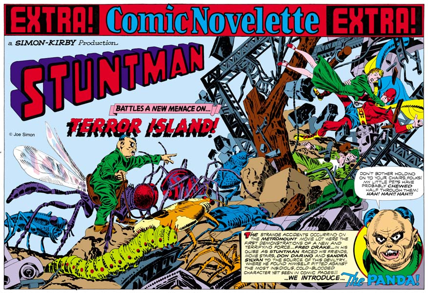
“Terror Island” introduces a new antagonist, the Panda. Of course Stuntman had faced various opponents in his previous stories but they all were rather generic. None of the earlier villains really stood out and it is clear that none were ever meant to reappear in future Stuntman stories. The Panda seems special and I believe was Simon and Kirby’s first attempt to create Stuntman’s nemesis, the equivalent of the Red Skull for Captain America. Basing a villain on a panda may seem an odd choice, after all what could be more cute and cuddly then a panda, at least in the mind of the public. Sure Jack draws the Panda to look as vicious as possible without loosing his panda look. But the real source for this character is not the bear, but China’s leader Mao Tse-tung (nowadays his name is normally transcribed as Zedong). Today with all the world companies scrambling to get a share of the Chinese market it is easy to forget at that time communist China was a very closed society. As China’s leader and his with description of the U.S. as a “paper tiger” Mao was considered a special menace. Still it is not at all clear whether the Panda really could fulfill the role Joe and Jack were casting him for.

The art for this wide splash marked a new approach. All previous double splashes were actually composed of various different sections. But for the “Terror Island” splash no similar attempt was really made. It is true that there is some introductory text and a round panel portraying the Panda, but this hardly compares to the cast of characters often provided in older double splashes. Yes it is also true that space has been left in the upper left for the titles, but no art is associate with these titles. What we are presented with for the first time is an enactment that dominates the entire splash. But what a scene! It sprawls across the pages from the lower left to the upper right. It is just the sort of chaos that we have seen before in the Boy Commandos wide splash. There is some control over the composition. The Panda and his attacking bug army occupy the left page. All are advancing toward the right where we find Stuntman, Sandra Sylvan and Don Daring amid a mass of falling wreckage. Although the uncolored ink art might be a bit confusing, I am sure Jack (who did the penciling) knew how much the final coloring would help to make it understandable. This splash is one of those that Jack could just let his imagination run wild. Previously when discussing the cover for Adventure #98 I had mentioned how Jack was often inaccurate when drawing animals but nonetheless was very successful in giving them a certain life. This splash provides and example of what I meant. A biologist would shudder and the giant bugs Kirby presents us with. Some of the inaccuracies can be explained by the needs of the subject. The wasp like insect that the Panda is mounted on could never fly with its wings in their present location. But if that beast’s wings were in the correct position the Panda could not mount it. But other errors have no artistic excuse. The legs of the insects and the spider are attached in the most bizarre places. If Jack used a biology book for a reference he obviously did not make any attempt to follow it closely. Regardless of these “errors” these giant bugs have a very menacing life to them.

My personal preferences is for the earlier wide splashes with their greater emphasis on design. But there is just no denying the shear brilliance that radiates from these post war double splashes. When you look at the original art for the “Terror Island” splash there are no signs of hesitation or rework. Jack seemed to have it all figured out in his mind before he put it on the illustration board. But with such a complicated drawing how was he able to do that? It just astonishes me.

The Wide Angle Scream, Stuntman #2

Stuntman #2
Stuntman #2 (June 1946) “House of Madness”
Enlarged view

When I finished up the posts of the Captain America double page splashes I said that Simon and Kirby would not repeat those sort of designs. Well I lied. Stuntman #2 has the same sort of emphasis of design over composition seen in the Cap spreads. It is interesting to compare this splash with one from the Boy Commandos with a similar medieval theme.

I have hoped that my discussions on the design elements would make it clear what the distinction was between design and composition, at least as I use the terms. Composition is how a scene is arranged, that is in comics how the figures and non-figurative elements are arranged and how they direct the eye. Design is how disjoint parts, the text and different images, are arranged on the page. For instance in the image on the right side of Stuntman #2 is composed with the attacking knights starting on the lower left and rising as the eye goes toward the right until it meets the pivotal Stuntman and finally the defended Don Darling and Sandra Sylvan. The composition does not end there as the large candlestick brings the eye down, and (although not really part of the scene) the cast of characters bring the eye back to the start of the image. Actually that is just a condensed description. Notice the use of arcs (the curtains, shadows, the stonework for the pillar and the doorway) along the top and how they are used to highlight certain figures. Particularly effective is Stuntman’s placement in front of the pillar, despite the fact that he is closely surrounded by other figures this placement makes him standout. This is a marvelous composition and Kirby’s penciling is just fantastic.

But the right hand scene is just part of the page and that is why I said earlier that the design was more important then the composition in Stuntman #2. Like most of the Cap double splashes, here we find a three part layout. Starting on the left is the title section, followed on the right by the enactment and below with the cast of characters. The title compartment depicts an archery contest. On the left a series of colorful pendants almost hide a figure blowing a horn. The competition between four archers is arranged along the bottom. The archers are alternated with their targets, the backs of which provide the cast of characters. The rest of the title section scene is left bare so that the Simon and Kirby credits, the Stuntman title and the story title are prominently shown. The story title is nicely placed on the drape hanging from the horn, a similar device was used in the Boy Commandos spread. An interesting touch is how the introduction text is placed on a wall in the enactment section and how the text is lined up to fit the perspective of this wall.

Except for the left edge of the enactment compartment, the whole splash is nicely integrated. I find this a much more successful effort then that for Stuntman #1. It is really a shame that this title fell victim to the post-war comic glut. There are three unpublished double page splashes for Stuntman. Unfortunately I do not have any scans for them right now but perhaps I will get a chance to pick up something from Joe Simon.

The Art of Joe Simon, Appendix 5, Harvey Hits #12

Harvey Hits #12
Harvey Hits #12 (August 1958) by Joe Simon

The S&K publishing attempt, Mainline Comics, had failed. The last titles from this company were published by Charlton but that ended in September 1955 (cover date). Further Simon and Kirby productions would follow but without much success. By 1957 Jack Kirby was doing freelance work for DC (Challengers of the Unknown) and Atlas (Yellow Claw). Still further attempts to reboot S&K followed but no financial jackpots. Although there is some evidence that Joe did some solo editorial work for Harvey, unlike Jack he did not seem to do any art. Perhaps Harvey Hits #12 (August 1958) is Joe’s first standard comic book art since the breakup. I use the term standard because there was an advertisement comic Joe produced earlier. I have also seen a proof marked Harvey Hits #1 but I do not know if it was actually published.

Perhaps it is an unfair comparison because Joe had a larger area to work with, but I feel Joe did a much better job on the Phantom and characters then the artist who did the story inside. The story probably was a reprint of the syndication strips. Joe has combined two different scenes, the fight and the appearance of the four armed lady. This rather odd throw that the Phantom uses comes from the story, but Simon makes it a lot more interesting. He even has the dwarf jump in like some sort of tag team wrestling match.

I rather like the cover that Joe has come up with here. Joe does not have Jack Kirby’s talent (who did?) but he still can do a great job. But it is hard to believe that anyone would mistake this for a Kirby piece. However that is exactly what the Overstreet guide does. Using that as an authority, dealers continually sell this comic because of the Kirby attribution. What do you think, willful ignorance?

Art by Joe Simon, Appendix 4, Daring Adventure #16

Art by Joe Simon, Appendix 7, The Spirit #12

The Wide Angle Scream, Stuntman #1

Stuntman #1
Stuntman #1 (April 1946) “House of Madness”
Enlarged view

When Joe Simon rejoined Jack Kirby after the war rather then just return to working for DC the two decided to produce their own comic books. They turned to Joe’s old friend Al Harvey to do the publication for Stuntman and Boy Explorers Comics. Now they had complete control over the contents and did not have to deal with DC’s editors. Wishing to recreate the success they enjoyed with Captain America S&K returned to the use of the double page splash in Stuntman.

The first Stuntman wide splash, “House of Madness” was published three years after the Boy Commandos splash. But the Stuntman Splash does not continue with the type of layout used in the Boy Commandos. Nor does Stuntman look back at the approach for double wide splashes found in Captain America. Instead we find Simon and Kirby using an entirely new design approach. In Stuntman we find two sections separated by a sweeping gutter, as if the splash was composed of two large irregularly shaped story panels.

The left panel starts at the top with the declaration that this is a Simon and Kirby production of Stuntman. The story title, “House of Madness” is embedded in the iris of a large bloodshot floating eye. Proceeding down we see that the eye appears to be some sort of projection by a beam emanating from a building complex on the lower right of the panel. As if in response to this signal, a car races in from the left. It is hard to be sure who the driver is but the red head and blue “collar” suggest it might be Stuntman at the wheel.

The right panel shows a scene of typical Kirby composition. Perhaps composition is not the best term, because Jack laid out his figures more with the intent of covering the area and not as much concern about unifying the movement. We find Stuntman in the midst of a leap. He has just physically burst into the room, the pieces of wood debris are falling with him. It might seem that if you project his flight Stuntman would miss the crowd shown below. But Simon and Kirby splashes (and covers also) should not be taken so literally. Had S&K tried to present a more “correct” representation we would have been presented with the soles of Stuntman’s feet and would not have been able to see his face. No, we can be sure that Stuntman is truly about to attack the crowd below. His opponents include a bearded giant holding Don Darling and Sandra Sylvan easily under each arm. Also appearing is a modern day Icarus about to take flight, a gun firing dwarf and a witch. A sign makes it clear that these characters are both crazy and dangerous.

Including in the panel is text written on what appears to be a scroll like piece of paper. From this text we are provided with the information that it really is Stuntman in the car racing toward a mental hospital to save his friends from the danger of an insane but evil group.

I have mixed feelings about this particular splash. On the one hand it is an interesting idea to use two enactments to introduce the story. However you really need to read the text in the second panel to realize what the first panel is meant to depict. Further there is really little to visually connect the two panels. All there is is the text banner along the top and the partial overlapping by the Stuntman title. Otherwise the panels provide very different views and compositions. This two scene design for a wide splash would not be repeated.

Kirby swipes from Simon

Black Cat #8
Black Cat #8 (November 1947) “The Madness of Dr. Altu” by Joe Simon

To swipe means to whip, to give a sweeping blow. But today it is more commonly used as a slang for to steal. In comics arts it means to copy a design or drawing, but still carries with it the connotation of theft. For many comic fans to show that a comic artist has swiped is paramount to saying that he is an inferior artist. With the artists Jack Kirby and Joe Simon the verdict in the past was generally Kirby = no swipe = good, while Simon = swipe = bad. I would like to think this attitude is changing. Tom Morehouse for instance has done some fine scholarly investigations that reveal the sources for some of Kirby swipes. Jack used this practice long after his period of collaboration with Simon. Actually Kirby’s collages can be considered a form of swiping.

Captain America #213
Captain America #213 (September 1977) “The Night Flyer” by Jack Kirby (original art)

Much has been said about Joe Simon swiping, including here in this blog. It is not surprising that one of Joe’s favorite sources is Jack Kirby. For example Joe used a close copy from Captain America #7 when he put together the cover for The Adventures of the Fly #2 (the cover is shown in Chapter 12 of The Art of Joe Simon). Here I would like to present an example of Kirby swiping from of all people, Joe Simon. Jack’s source was a set of panels that Joe did for a Vagabond Prince story “The Madness of Dr. Altu” in 1947. The use of three panels with close-ups of a face being hit by a fist also occurs in a Captain America story (“The Night Flyer”) by Jack Kirby done 30 years later. It is not a direct copy, Jack would not need any help on how to present such close ups, but it is a swipe nonetheless. I do not think it is a coincidence that in both cases it is the hero of the story receiving the punishment. However there are interesting differences also. In Joe’s story the hero, Prince Vagabond, is initially defeated by his opponent. A short time later there is a re-match which of course the hero wins. That is a plot device more frequently used today but was rather unusual at the time Joe did it. In Kirby’s example a blind and out of uniform Captain America is the receptor of the villain’s blows at the start, but Cap is victorious by the end of the page. Jack does this in an interesting formal device of using panels in a 3/2/1 vertical tier.

Donatello and Michelangelo
Saint John the Evangelist (1412-15) by Donatello and Moses (1513-1516) by Michelangelo

I use the term swipe because it is so entrenched in comic art discussions. But I have to admit I am rather uncomfortable with the word and it’s subtext of stealing. There is no similar expression in the fine arts. No one would speak of Michelangelo’s Moses being swiped from Donatello’s Saint John (By the way the Michelangelo and Donatello I am referring to are Italian Renaissance artists, not mutant ninja turtles). In the fine arts there is a better, richer, understanding on how artists really work. Art is not created from a vacuum by the artist acting alone like some deity. Instead artists (this includes comic artists) extract from previous art, from other art fields, and even from real life. The artist then combines these resources adding his own personal touch into a new piece of art. Recognizing that allows one to appreciate what individual artists bring to their own work and how art continually evolves.