Category Archives: Artists

Harvey Horror: Alarming Tales #1

Harvey released a new title, Alarming Tales, with a cover date of September 1957. This is the same month that Black Cat Mystic #59 was released. Both titles covered the same genre, horror and science fiction. In fact the cover story for Alarming Tales #1 (“Donnegan’s Daffy Chair”) was originally intended to be used in Black Cat Mystic #59 (as shown by the original art for an used cover). Since both titles were bimonthly publications, it was unusual that they would have the same schedule. Normally such similar comics would alternate months (such as Simon and Kirby’s Young Romance and Young Love did). The original art for the unused cover of Black Cat Mystery #59 has a July cover date so perhaps the original intent was for alternating months but something delayed it.
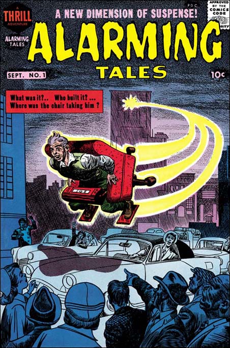

Alarming Tales #1 (September 1957) pencils by Joe Simon and Jack Kirby

I had previously credit the cover art for AT #1 to Joe Simon alone but I now realize that the art is a “Frankenstein” made from different pieces of art. It was not that unusual for Joe to piece together different art (see Cover for Alarming Tales #2, My Third Attribution Attempt). In this case that lower portion came from art that Jack Kirby drew while the upper portion was done by Simon. I suspect that the original art that Kirby made included a figure in a fly chair very much like the one in the actual story. That is the way that the unused cover for BCM #59 was done. That included goggles that covered the figure’s eyes. Such an depiction would fit the story but Joe probably felt (and I agree) that the cover would be more dramatic with the full face exposed. The portion of the art that Simon did was done on a craft tint board with irregularly shaped dots that sometimes is referred to as a mezzotint pattern. Lines were then “inked” over this with a pen to provide interesting dotted lines.
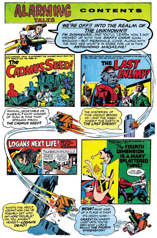

Alarming Tales #1 (September 1957) “Contents”, pencils by Joe Simon and Jack Kirby

It appears that except for the lettering the contents page was created entirely by stats from parts of the book. Simon and Kirby did not do use stats to create comic pages very often while they had their own studio but apparently Harvey either had a stat camera or used a service bureau to provide copies. I love the way the images of Donnegan’s chair are woven through the contents page.
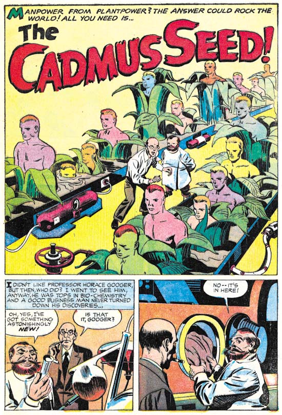

Alarming Tales #1 (September 1957) “The Cadmus Seed”, pencils and inks by Jack Kirby

Scientifically engineered humans sounds like something out of more recent newspapers. However the Simon and Kirby story never mentions DNA or cloning. The structure of DNA had been discovered by this time and it’s importance was well known in the scientific world. But science fiction had not yet caught up with science fact. Nonetheless “The Cadmus Seed” is a delightful story with a mildly humorous ending.
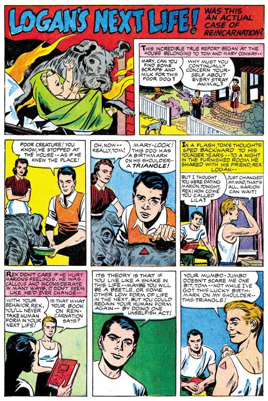

Alarming Tales #1 (September 1957) “Logan’s Next Life”, pencils by Jack Kirby, inks by Joe Simon

“Logan’s Next Life” is the only story in AT #1 that could be describe as belonging to the horror genre. Since is consisted of only two pages it was not that much of a contribution to AT #1. Most of the stories from the Alarming Tales and it’s companion title Black Cat Mystic could best be described as science fiction. But despite being in the minority horror stories would still play a significant part of these titles.

The art for “Logan’s Next Life” was based on an earlier story named “When I Live Again” that had appeared in Black Magic #13 (June 1952, see Little Shop of Horrors, Chapter 5). The original story was penciled and inked by Bill Draut. While Kirby was known to do an occasional swipe, such extensive swiping for a single story would be rare. One example would be “Invisible Irving” from Fighting American #5 (December 1954, see A Simon and Kirby Swipe). Another example of an extensive Simon and Kirby swipe appears to be “Deadly Doolittle from Fighting American #6 (February 1955, see Fighting American, Jumping the Shark) but in that case it was Joe Simon doing the swiping.


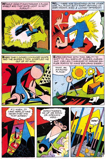
Alarming Tales #1 (September 1957) “The Fourth Dimension Is A Many Splattered Thing”, pencils and inks by Jack Kirby

This story was included in a recent post concerning Kirby’s use of extra-dimensional traveling (Jack Kirby’s Trips to the Fourth Dimension).
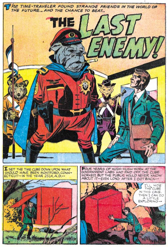

Alarming Tales #1 (September 1957) “The Last Enemy”, pencils and inks by Jack Kirby

This story has longed been recognized as a prototype for Kamandi title that Kirby did for DC from 1972 until 1976. The most significant change is that while except for the protagonist, humans were completely absent from “The Last Enemy” they were present in Kamandi but usually as nothing more than speechless animals. But otherwise the theme of talking animals taking over the world was common to both. Frankly I do not recall how this change was explained in Kamandi, but in “The Last Enemy” it was the results of an atomic war. While that is a perfectly understandable explanation for the lack of humans it is not clear how the change in animals occurred.


Alarming Tales #1 (September 1957) “Donnegan’s Daffy Chair”, pencils and inks by Jack Kirby

Oddly the story featured on the cover of AT #1 was the second shortest in the book. Stories from Black Cat Mystic and Alarming Tales were pretty consistently five pages long but “Donnegan’s Daffy Chair” was only four.

Spirit World

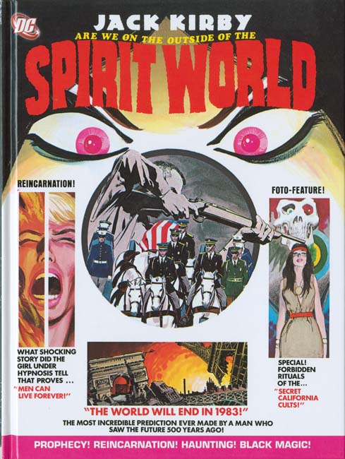
I got a pleasant surprise when I visited my comic book store last night, DC’s reprint of Spirit World. What a marvelous time this is for Kirby fans as more and more of his work is being reprinted. Had someone told me a decade ago that DC would reprint Spirit World I would not have believed them, actually I would have thought they had lost their grip on reality. Spirit World was by no means a Kirby classic. It received remarkably poor distribution. Mark Evanier describes not being able to locate any copies at newsstands but finding bundles of them at a distributor’s warehouse that had never been delivered. DC’s confidence in it was so low that it was cancelled after a single issue, much too soon to be based on any sales figures. It is not even a cult classic, it rarely comes up in discussions about Jack Kirby’s art. But everything Jack did he did well so it is great to see this work back in print.


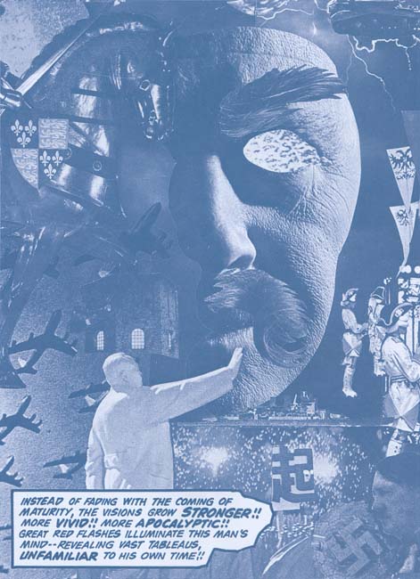
“Amazing Predictions” page 3 (from the reprint)

Kirby wanted Spirit World to be a high quality magazine printed in color but that is not the way DC would publish it. Instead a wash was applied to the line art and the results were printed using a dark cyan ink. Frankly it was not the best approach. But that is the approach that was originally made and was repeated for the reprint. Although I wish DC had initially followed Kirby’s wishes I believe their decision for the reprint to reproduced the effect of the original publication was the correct one. The quality of the reproduction in the reprint is exceptional. There are times when the original magazine was a little clearer but others where the reprint did a better job of presenting the art. But these differences are minor variations unnoticeable unless the two are compared side by side. One important improvement made for the reprint was the paper. I have never been a fan of using a yellowish paper in an attempt to match the current look of comic books. That look is due to aging and was not the look the books had when they first appeared. Using a yellowish paper for the Spirit World reprint would have darkened the cyan inked and ruined the effect. Instead DC has wisely used a flat white paper for this reprint.

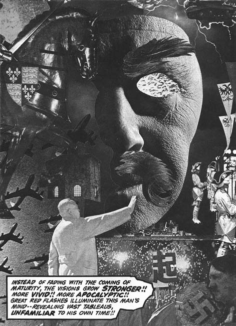
“Amazing Predictions” page 3 (with Photoshop adjustment)

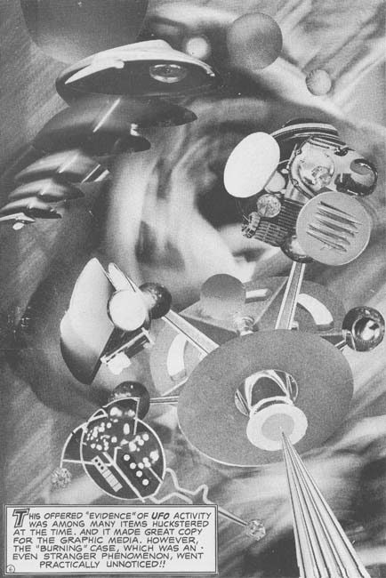
One of the special treats of Spirit World was all the collages that Kirby created for it. Kirby’s collages have been receiving more and more attention in recent years. Recently Steven Brower has devoted an article on the subject (Jack Kirby’s Collages in Context). I must admit that as a young reader I was not overly impressed with Jack’s collages but as an adult I greatly admire them. Part of the problem with the collages was the rather poor printing they originally received. I could not resist using Photoshop to convert one of the Spirit World collage to a better quality black and white. In my opinion it is a distinct improvement. However remember that Kirby originally meant Spirit World to be printed in color and take a look at the original art of the same collage that is included in Brower’s article. What a difference and what a lost opportunity that DC did not follow Kirby’s wishes.


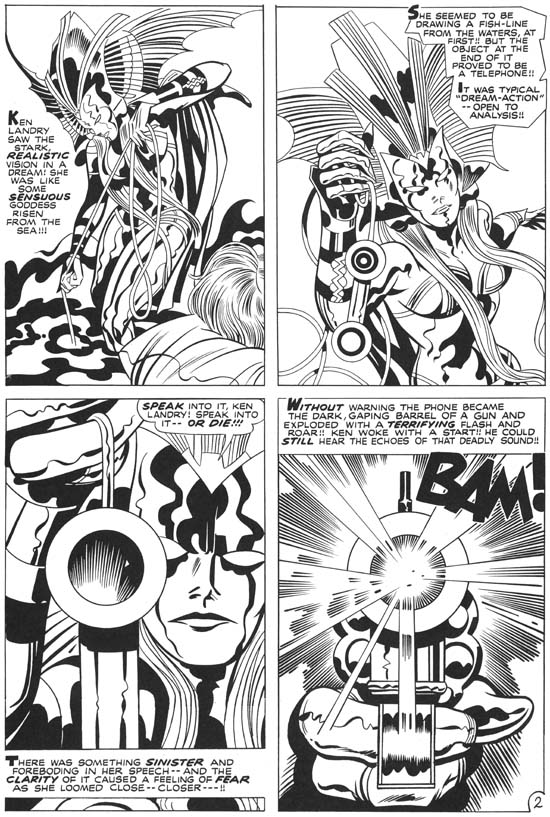
“Witch Queen of Ancient Sumeria?” page 2 (from the reprint)

Spirit World was cancelled after a single issue but Kirby had already completed the art for the second issue. The Spirit World reprint includes the work that had been meant for Spirit World #2. I understand that these stories had been used in some of DC’s horror and mystery comics but the reprint only uses the line art. What a contrast between the two sections of the current book. While Spirit World #1 was inked by Vince Colletta and issue #2 by Mike Royer that is not the real reason for the difference in the appeal of the two sections. What is really shown is the rather detrimental affects of the wash and cyan ink had on the initial issue art. Kirby was at the top of his artistic form and it really shows in this last section.

There is a small essay in this latest book by Mark Evanier. Evanier’s writings have appeared in a number of books on Jack Kirby (including Titan’s The Best of Simon and Kirby). With good reason as there probably is no one more knowledgeable on Kirby (if only he would finally publish his full biography on Jack). But what Evanier has to say is particularly important concerning the Spirit World as he was present and involved in its creation.


“The Burners” page 6 (from the reprint)

Colleges played a small part in the second issue of Spirit World. But I could not resist including the sole exception. I hope to someday to discuss the Spirit World more fully, this has been more a review of the reprint book. I will not try to predict how successful the Spirit World reprint will be but I do believe it is a worthy addition to the collection of any Kirby fan.

Harvey Horror: Black Cat Mystic #59

Nine months separated Black Cat Mystery #57 and Black Cat Mystic #58. Such a lengthy delay would make it difficult for the title to pick up a following of readers. That was bad enough but it would be a further year before Black Cat Mystic #59 hit the stands. What was Harvey thinking? The inking style used by Jack Kirby for BCM #59 does not match very well with his inking found in other publications from 1957 but it is a good match for the inking he did in BCM #58 (Jack Kirby’s Austere Inking, Chapter 8, More Harvey). The original art for one of the stories (“The Great Stone Face”) has a Comic Code approval stamp dated June 1956 which shows that the art was in fact created in 1956. Normally getting the Comic Code approval was the last step before getting ready for the printers which would suggest a planned publication date of October or November 1956. That is just the date that would be expected had Harvey not put the issue on hold. Again what was Harvey thinking? This is not a suggestion that Harvey made a poor decision (although that was true) but a real question on why the apparently sudden change in plans. Poor sales does not seem a likely explanation. Sales figures for BCM #58 would not have been available at the time the decision was made to hold back on BCM #59.


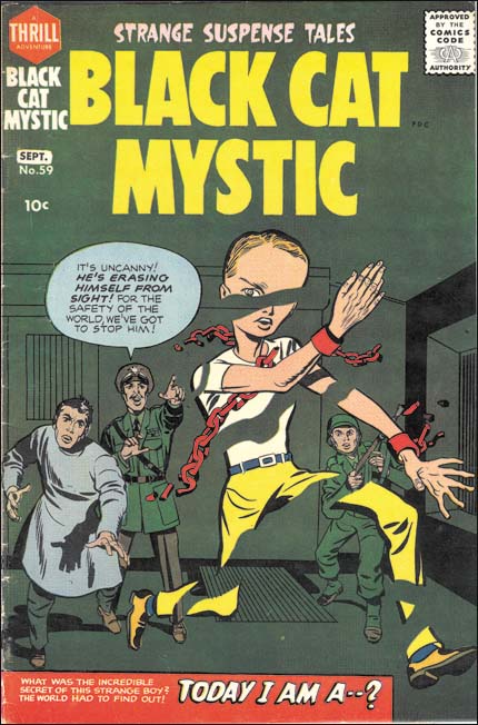
Black Cat Mystic #59 (September 1957), pencils and inks by Jack Kirby

The cover for BCM #59 shows a figure erasing himself away, a rather unusual image to say the least. The figure has six fingers per hand and a large head which indicate he is not truly human. That the figure was also chained indicates that he was considered a threat by the scientist and soldiers shown on the cover.


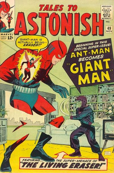
Tales to Astonish #49 (November 1963), pencils and inks by Don Heck (image from GCD)

While by no means identical a similar cover was created years later for Tales to Astonish #49 (November 1963). The cover artist was Don Heck but the story was drawn by Kirby and inked by Heck. Apparently the Living Eraser was for years used as an example of occasional failures by Lee and Kirby collaboration. While the Living Eraser was not up to the standards of comic book antagonists like Galactus he seems better than some of the other early creations such as Paste Pot Pete. At least the Living Eraser provided a memorable image.


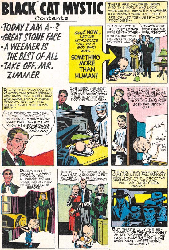
Black Cat Mystic #59 (September 1957) Introduction, pencils by Jack Kirby, inks by Joe Simon

A contents page was pretty much standard at Harvey when Simon began working there as an editor. But it appears to have been Joe that converted the page into an introduction page. This introduction would be a sort of a prequel to one of the stories in the comic. Joe would often try to draw the introduction in the same style as the artist who did the story (Joe Simon’s Turn At Imitating). Joe was good enough of a mimic that some experts still attribute these introduction to the story artist. Jack Kirby also did some introductions for Harvey (Bill Draut and His Imitator, Jack Kirby, Jack Kirby Swiping from Bill Draut, Kirby Imitating John Prentice and Kirby Imitating John Prentice Again). Previously I believed that Jack was imitating the story artist as well. However Kirby was a rather poor imitator and except for one swipe Jack was just being himself. I now realize it was Simon who was purposely inking of these pieces to made them look the story artist. But in the case of the Introduction for BCM #59 Kirby was the story artist and Joe inks the piece in his normal manner.


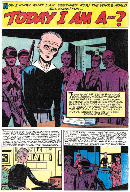
Black Cat Mystic #59 (September 1957) “Today I Am A…”, pencils by Jack Kirby, inks by Joe Simon

Jack Kirby is famous for his high action comic art. Understandably because he was so good at it. But Kirby was also master at building tension into a story and “Today I Am A…” is a great example of that. In the hands of a lesser artist this might have been a rather mundane story but Jack transforms it with his usual magic. “Today I am a man” is a bar mitzvah cliché that was probably lost to most of the young readers when this story first was published but it is a clever title for a story of an exceptional individual becoming of age.


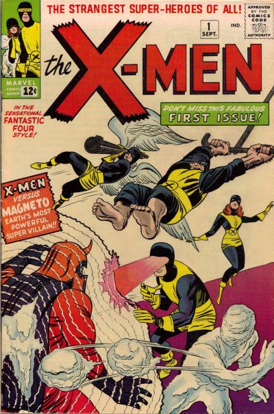
X-Men #1 (September 1963) “X-Men”, pencils by Jack Kirby, inks by Paul Reinman (image from GCD)

The Introduction and story “Today I Am A…” never mention the word mutant. However despite his physical and mental differences the main character Paul was born of normal parents. He was clearly meant to be a sudden and dramatic stage in the evolution of mankind. Normal humans fear and seek to confine him. I do not think I am out of line to suggest that in this story from BCM #59 we find the concepts that would eventually become Homo superior feared by the rest of humanity that would be the basis for the X-Men created by Stan Lee and Jack Kirby. Some fans object to provided creation credits to Lee and Kirby because of all the individual X-Men that were created by other artists. However it was Lee and Kirby that created the premise of mutants and public mistrust that is the foundation of this series right up to today.


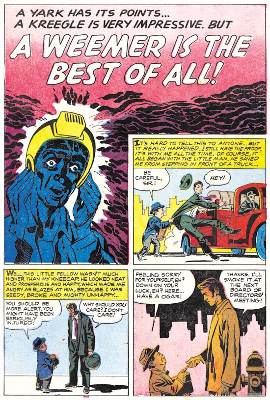
Black Cat Mystic #59 (September 1957) “A Weemer Is the Best of All”, pencils and inks by Jack Kirby

“A Weemer Is the Best of All” is a story in a more humorous vein. Not side-splitting humor but definitely a story not meant to be taken seriously. Humor was frequently a part of Simon and Kirby’s repertoire. Even action stories often had humorous parts to them.


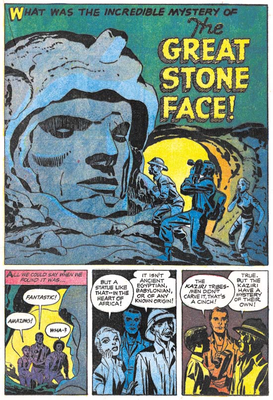
Black Cat Mystic #59 (September 1957) “The Great Stone Face”, pencils and inks by Jack Kirby

A monumental stone sculpture of unknown origin, an African tribe with technical skills, and a rifle slinging anthropologist. This is one of those stories so imaginative that one wonders where they came up with it. I can understand the anthropologist but where did the rest come from? Both Joe and Jack were science fiction fans and I suspect somewhere in the pulp magazines they read supplied the kernels that eventually formed into stories such as this one.


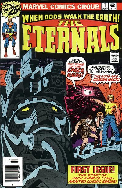
The Eternals #1 (July 1976), pencils by jack Kirby, inks by Frank Giacoia (image from GCD)

The theme of gigantic aliens residing on earth for immense periods of time for mysterious reasons is common to both “The Great Stone Face” and the Eternals (a title Kirby created for Marvel in 1976). Jack would often expand on story lines he worked on earlier in his career.


Black Cat Mystic #59 (September 1957) “Take Off, Mr. Zimmer”, pencils and inks by Jack Kirby

The ghost Mr. Zimmer was presented in BCM #58 and seems to have been planned as a recurring character. In BCM #58 Mr. Zimmer was presented in the first, featured, story. However in BCM #59 Mr. Zimmer became delegated to the final story in the book. While the title Black Cat Mystic would suggest the horror genre the contents were predominately science fiction. So perhaps Mr. Zimmer fall from grace was just a recognition that he was somewhat out of place in the direction the title had gone. But then again horror, although a rather mild version suitable for the Comic Code, would continue to play a roll in the title. In any case this would the last appearance of Mr. Zimmer.

Harvey Horror and Science Fiction: Black Cat Mystery #57

The break up of the Simon and Kirby studio, was not the end of Simon and Kirby collaborations. Even after Kirby began freelancing, Simon would still turn to Jack to help with comic book titles that he would work on. While Kirby contributed to these projects, particularly for the initial issues of a title, these were essentially Simon’s projects. Nonetheless I am sure that Jack had much creative freedom on the pieces he actually drew. I will begin examining, in some cases re-examining, these late collaborations beginning with Black Cat Mystery #57 (January 1956). There is some question as to exactly when the Simon and Kirby studio disbanded. In my opinion the latest date that can be assigned to the breakup would be August 1955 (cover date) when the final issues of the former Mainline titles were published by Charlton (Foxhole #6 and Police Trap #6). However is possible that some of the art to be discussed in this serial post could have been created before the studio breakup.


Black Cat Mystery #57 (January 1956), pencils and inks by Jack Kirby

The Black Cat series had undergone a number of title changes. Starting out as Black Cat based on a female superhero (#1, June 1946), then becoming Black Cat Western while presumably retaining the female hero (#16, March 1949), returning to Black Cat (#20, November 1949), switching to Black Cat Mystery and a horror genre (#30, August 1951), returning once again to Black Cat but retaining the horror content (#44, June 1953) before returning again to Black Cat Western without the horror and with the titled superhero (#54, February 1954). The last switch from horror content may have been prompted by all the adverse public criticism of genre which lead to the establishment of the Comic Code Authority. Black Cat Western #54 (February 1954) and #56 (October 1956) contain much reprint material from earlier issues according to the GCD. Black Cat Mystery #57 brought a returned to the old title and the horror genre although the horror was the mild form suitable for passing the strict Comic Code.

Jack Kirby only contribution to the issue #57 was the art for the cover. With Simon and Kirby there is always the possibility that a particular cover art could have been recycled from an earlier unused cover. However in the case of the cover for BCM #57, there are two reasons to believe that did not happen. The somewhat humorous aspect to the cover would have been out of place for Black Magic the only appropriate alternate source for this type of cover. Further the cover is based on a story found inside (see below). It is doubtful that the inside story was recycled because Black Magic was a pre-Code comic and therefore any story from it would have had difficulty getting Comic Code approval. I suspect that Kirby had not actually seen the interior story since that story had nothing to do with an underwater fish civilization.

The original art for this cover still exists and it would be interesting to see the date of the Comic Code Approval. While this cover was probably made for this issue it is still possible that the entire issue was put together some time previously.


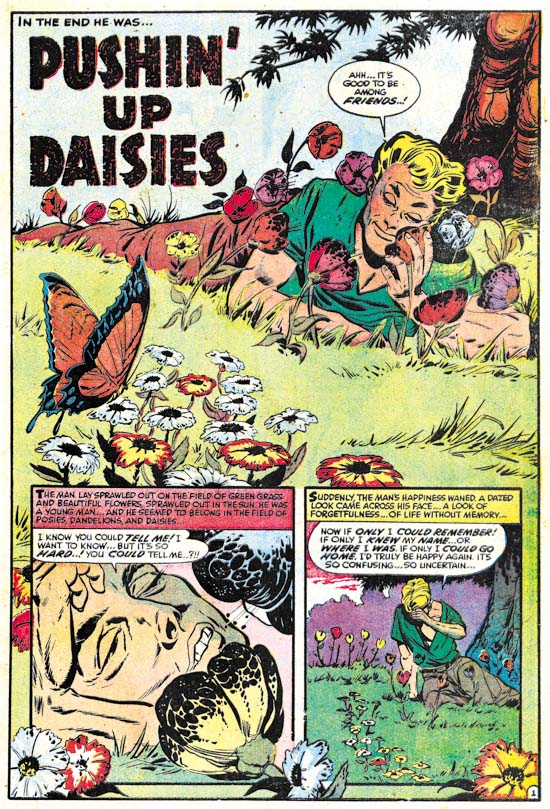
Black Cat Mystery #57 (January 1956) “Pushin’ Up Daisies”, pencils by Bob Powell

Although Bob Powell had occasionally done work for Simon and Kirby, he was largely a Harvey artist having provided much work to that company over many years. Earlier Harvey horror stories were too extreme to pass the Comic Code without modifications but there are no signs of changes so this was almost certainly a new piece created for this title.


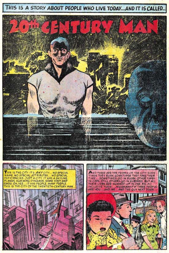
Black Cat Mystery #57 (January 1956) “20th Century Man”, pencils by John Giunta, inks by Manny Stallman?

John Giunta only did a few pieces of work for Simon and Kirby (see Art of Romance Chapter 9 and It’s A Crime Chapter 7). Giunta seems to have worked for a variety of publishers including a few pieces for Harvey. His style is a little dry for my tastes particularly for the crime or romance genre. However his style works very well for this particular story. I especially like the splash. The background with is jumbled silhouettes and scratchy and splashy inking is very effective. It is a little surprising to see such rough work for this artist but otherwise the inking looks like that found in some of his other work inked by Manny Stallman so I believe Stallman may have been the inker here as well.


Black Cat Mystery #57 (January 1956) “Underwater”, pencils by Howard Nostrand

Howard Nostrand is another artist that normally I cannot get too enthusiastic about. But the opening sequence for “Underwater” is just superb. Nostrand was a frequent contributor to Harvey Comics but as far as I know never previously worked for Simon and Kirby.


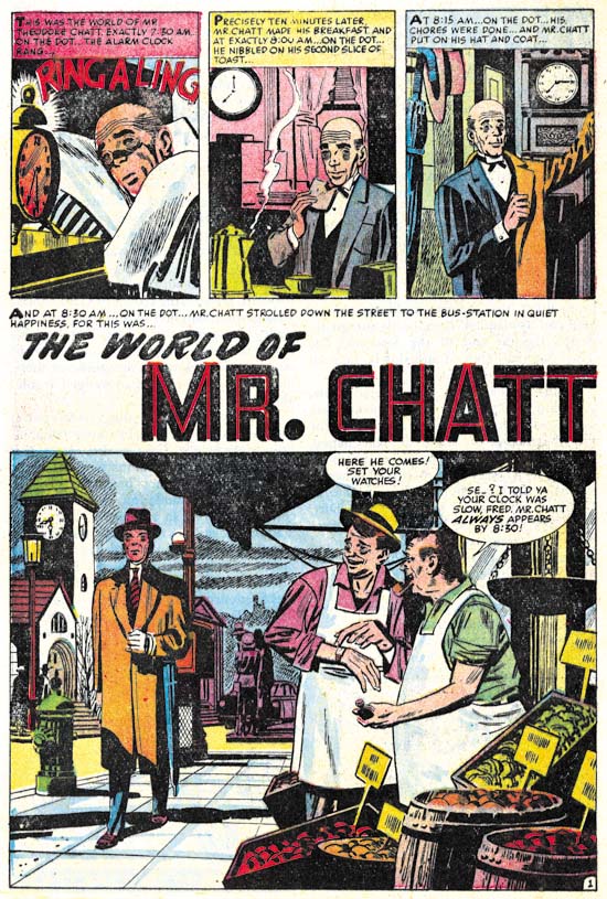
Black Cat Mystery #57 (January 1956) “The World of Mr. Chatt”, pencils by Mort Meskin

The final story, “The World of Mr. Chatt”, was drawn by a former Simon and Kirby regular (or what I sometimes refer to as one of the usual suspects) however Mort did very little work for Harvey. The only other Harvey piece that I am aware of was “Credit and Loss” from Chamber of Chills #24 (July 1954, a real masterpiece) but I have heard he did another earlier piece for Black Cat as well. Meskin was doing a lot of work for DC at this time. Many have criticized Mort’s DC work but in many ways he was still doing great art. But the emphasis of this late work was the almost cinematic approach that Meskin used to graphically tell a story. Mort’s careful control of pacing and view points was just masterful but unfortunately involved subtleties that many readers failed to notice or appreciate. “The World of Mr. Chatt” is a good example of Meskin’s late approach. Note the simple but effective opening sequence to the story. My main criticism of this particular work of art concerns the inking. I have not done a careful study but I suspect that Mort did not ink a lot of this later work and I am pretty certain he did not ink this piece. Again without careful inspection the inking reminds me of George Roussos.

I believe that Joe Simon was responsible for putting Black Cat Mystery #57 together although I have little evidence to back that up other than the cover that Jack Kirby provided. With the exception of Meskin, the artists used in this issue mostly seem to be drawn from Harvey’s talent pool. This is not too surprising as it suggests that the title had to be put together quickly. We shall see later that something similar happened with the first issue of Race for the Moon. The next issue would more clearly show the Simon and Kirby touch.

Jack Kirby’s Trips to the Fourth Dimension


Fantastic Four #51 (June 1966) “This Man, This Monster” page 13, pencils by Jack Kirby, inks by Joe Sinnott, letters by Artie Simek, image from “Hands of Fire”

I am currently reading Charles Hatfield’s “Hands of Fire”. I am sure I will write something about the book in the near future but I thought I would discuss one of the many items Hatfield touches upon. Fantastic Four #51 (June 1966) has the story “This Man, This Monster” in which Mr. Fantastic, Richard Reed, visits the Negative Zone. I do not have the original comic but I use instead a plate from Hatfield’s book which looks to me like it was scanned from the actual comic book. Note panel 3 where Reed exclaims:

IT’S ALMOST MORE THAN HUMAN EYES CAN BEAR! I’M ACTUALLY WHITNESSING A FOUR DIMENSIONAL UNIVERSE – BUT THE EFFECT OF SEEING IT WITH THREE-DIMENSIONAL VISION IS INDESCRIBABLE

But who needs words when we have Jack Kirby to provide an illustration. Off course even Kirby found it difficult to translate four dimensions into just two. The task might be theoretically impossible but the scene that Jack provides is clearly unlike any the reader has ever seen. In the next panel anything remotely naturalistic is replaced with abstract colors.


Fantastic Four #51 (June 1966) “This Man, This Monster” page 14, pencils by Jack Kirby, inks by Joe Sinnott, letters by Artie Simek, image from “Hands of Fire”

As “otherworldly” as the images from page 13, on the next page Kirby presents ultimate in non-reality. Here on the figure of Mr. Fantastic is drawn while the rest is a collage. Kirby was not the first to use photographs from magazines and newspapers in a comic book. However previous uses were rather mundane shortcuts to creating an image and nothing like the innovative collages that Kirby created. The image Jack constructed for page 14 is particularly effective. Photographs gain an acceptance as “truth” that a drawing does not provide. Sure our logical minds know that photographs really are not necessarily true, particularly today with software like Photoshop. However our emotional reaction still accepts photographs as depicting truth. Kirby plays off the photographic “truth” against an scenery that is obviously unreal. That tension is something that a drawing could never quite create.


Blue Bolt #5 (October 1940) page 5, pencils by Jack Kirby, inks by Joe Simon

Mr. Fantastic’s visit to the Negative Zone was not Kirby’s first depiction of the Fourth Dimension, not by a long shot. His earliest occurred in collaboration with Joe Simon in Blue Bolt #5 (October 1940). Blue Bolt enters the Fourth Dimension through a cylinder surrounded by the earliest example of Kirby Krackle (Evolution of Kirby Krackle). On entry the hero is presented with an “odd looking landscape” reminiscent of the effect found in Fantastic Four #51. Blue Bolt then finds he can see through objects and requires special goggles to see in three dimensions.


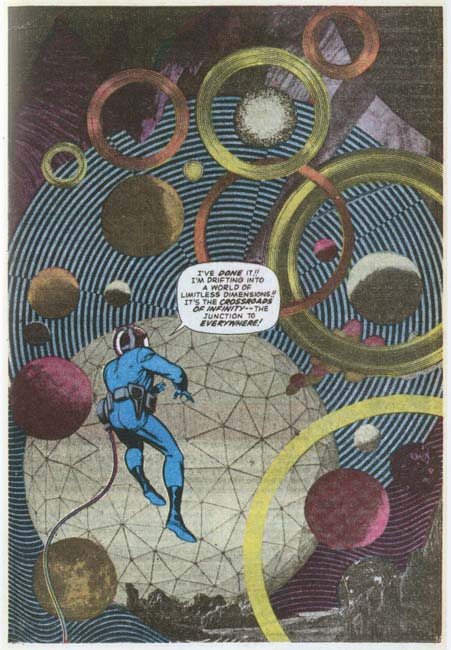
Alarming Tales #1 (September 1957) “The Fourth Dimension is a Many Splattered Thing”, pencils and inks by Jack Kirby

Kirby would return to the Fourth Dimension theme in an appropriately titled story “The Fourth Dimension is a Many Splattered Thing”. This work was done in collaboration with Joe Simon but after the breakup of their studio. Here Jack’s attempt to draw the indescribable result in some of the most unique images from his career.

Kirby had a long career as a comic book artist. It is surprising how certain themes show up repeated at different points in his career. The Fourth Dimension and Kirby Krackle are just two examples of this phenomenon. If it was just one or two incidences like this it would be easy to write it off as of not great significance. But actually there are many more examples that can be found (and I am sure I will post others from time to time). This signifies to me that Kirby was much more than an illustrator to the stories that he worked on. This is not to denigrate individuals like Joe Simon or Stan Lee for their contributions were also important.

A Joe Simon Video

Helping the Simon family has put my work on the next Titan addition to the Simon and Kirby library behind schedule. When there just does not seem enough time life seems to have a way of just making matters even more difficult. Most of my writing for this blog is done during my lunch hour at work but recently I have had to put extra time on my job as well. I hope things will settle down to a more reasonable pace in the near future which will allow me to return to my more regular posting.

In the mean time above is a video of Joe Simon taken by Desert Wind Comics. Joe did signings for Desert Winds. I believe this video was made about a year before his passing.

Joe Simon’s Yearbook

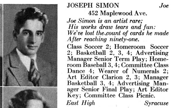
Joe Simon graduated Benjamin Franklin High School of Rochester N.Y. in 1932. Like most American high schools, the graduating class had a year book.

Joe’s artistry was recognized in his yearbook entry along with a fair list his activities. His entry was large enough that it extended into that for the person below. While this was not that unusual it did mean that there were other students who had a smaller entries (otherwise there would not be enough room on the page).

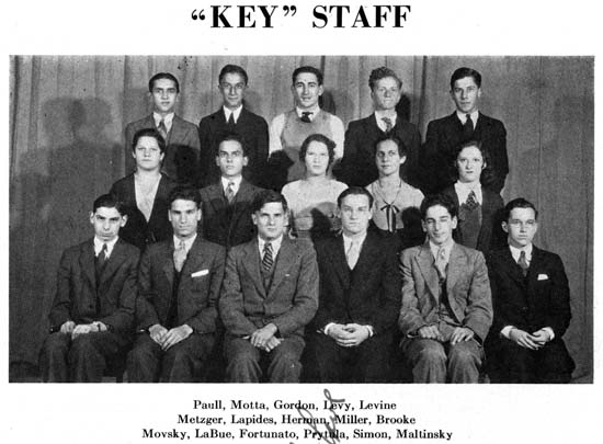
Joe was on the yearbook staff as well. That is him second from the right in the bottom row.

A page was devoted to class prophecy, of which I only show the first paragraph. There he is right at the top of the list. To my knowledge Joe never selected anyone as the prettiest model in New York but he did become a renowned artist. The comic book industry had not started at this time so the art career that he eventually became famous for was not considered.

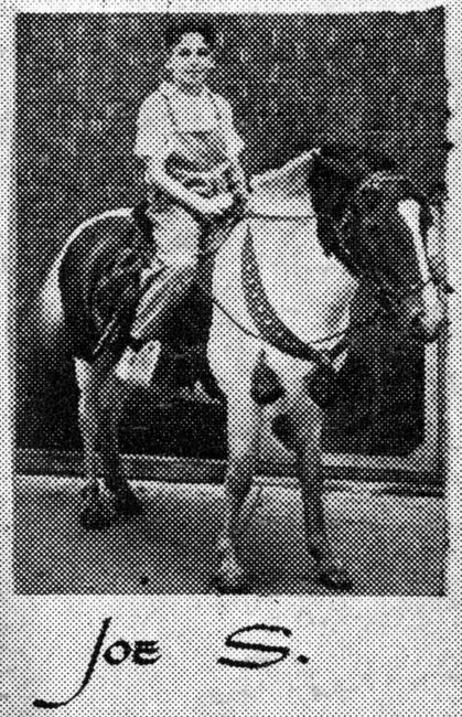
A page in the back of the yearbook titled Rogue’s Gallery was devoted to small photographs of students when they were very young. Joe’s parents were be no means rich (actually rather poor) so this was not Joe’s personal pony. Rather the pony belonged to the photographer who charged to take such photos. There is no question that this is Joe Simon as he was the only Joseph of the graduating class whose last name began with a ‘S’.


Enlarged Image

It is obvious from his yearbook entry that Joe did quite a lot of artwork while in high school. His family still possess some examples of this work. However Joe’s earliest published cartoon appeared in the back of his yearbook. The original art for this work still exists in Joe’s art collection but the image above is from the yearbook. The individuals depicted (obviously not portraits) are all members of the graduating class. Perhaps these were personal friends of Joe’s because most do not seem to have a prominent roll in the graduating class. In particular, Sidney Yates entry is the yearbook is rather short. The one exception is Wayne Boniface who was the class president.

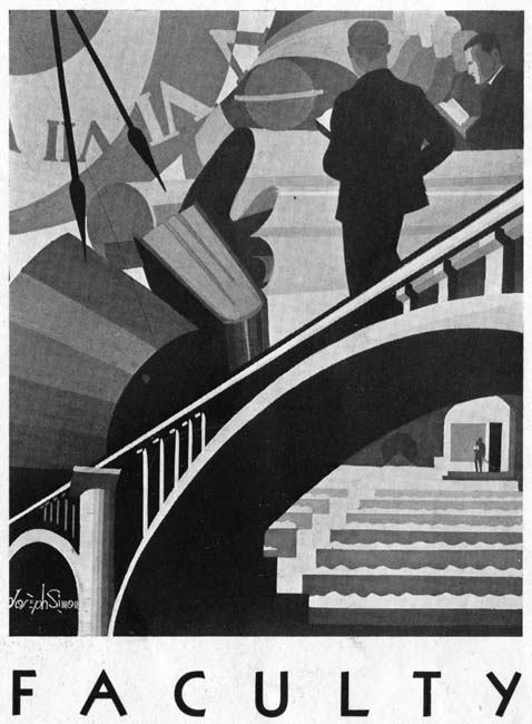
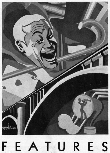
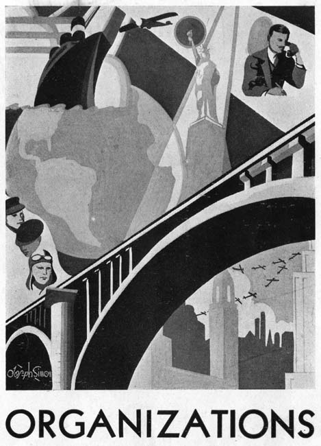
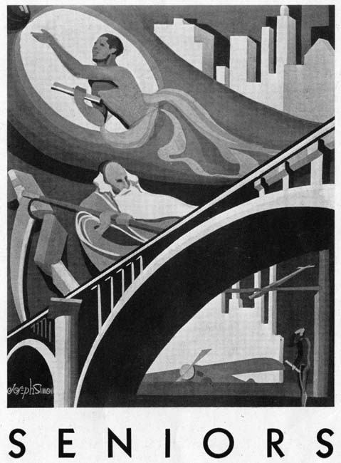
The different sections of the yearbook were opened with a page containing an illustration executed by Joe. The art was influenced by the Art Deco movement popular in the not too distant past. All the art is in shades of gray and the forms are all simple. Much effort was made by Joe to provide interesting compositions. While the art may appear very different than what Simon would produce years later for comic books, already present was an emphasis on interesting layouts. The printer liked the art so much that he paid Joe for its use in other yearbooks.

Blue Bolt Covers


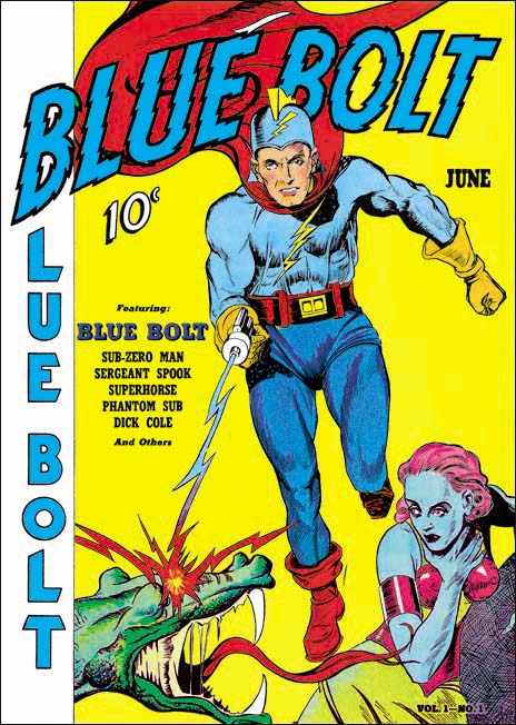
Blue Bolt #1 (June 1940), art by unidentified artist

As previously discussed, Joe Simon’s creation of the feature Blue Bolt occurred somewhat earlier than the cover date of Blue Bolt #1 would suggest. Joe supplied it to Funnies Inc. a shop run by Lloyd Jacquet that put together comic books for other publishers. Blue Bolt was just one of a number of features that Simon created for the shop. But apparently Jacquet and Novelty Press must have seen some special potential in Blue Bolt and used it as the title feature for a new comic book. Had that had been the intention all along it would be expected that Simon would do the cover art but since that was not the case we cannot assume he drew the cover. There are reasons to believe that Simon was not the cover artist and little to suggest he was. To my knowledge only the eyes of the Green Sorceress look like they might have been done by Simon. However many comic book artists found difficulty in getting eyes to sit properly on a face viewed from an angle. Otherwise none of the figures look like any other art that we can more confidently attribute to Joe. The Green Sorceress’ hair seems tamed in comparison to Simon’s depiction in the story. The dragon does not resemble the monsters in the story either. Blue Bolt’s cape lacks the distinct zigzag contour found in the story although Simon would abandon this device in future issues. Blue Bolt’s helmet includes a lightning bolt emblem that is missing from the story art. The gloves and boots have a three dimensional presence that Simon generally avoided and specifically did not use for Blue Bolt. Finally the composition is very untypical of Simon particularly the lack of any background elements causing Blue Bolt to float. It is hard to escape the conclusion that despite what some have claimed the cover art for Blue Bolt #1 was not done by Joe Simon.

Jacquet’s shop had a number of comic book artist which could have been called upon to draw the cover. Perhaps the most famous were Carl Burgos and Bill Everett but I think it can safely be said that the style of the cover art does not match either of these two artists.


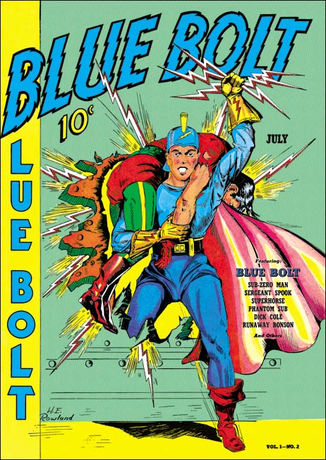
Blue Bolt #2 (July 1940), art by W. E. Rowland

Fortunately the next Blue Bolt cover was signed so there can be no question that it was drawn by William E. Rowland. The cover art for BB #2 shares some features with that for BB #1. In particular the more three dimensional aspects of the gloves and boots as well as the lightning bolt design on the helmet. I feel that the Blue Bolt’s face looks similar in the two covers. However Rowland goes even further in giving the gloves and boots a real physical presence. Further he has added details to the gloves that were missing from the BB #1 cover such as the lightning bolt and small circular shapes and lines that border the opening of the glove. While I would not rule out that Rowland was the cover artist for BB #1, I do not find the similarities strong enough to convince me that he was.


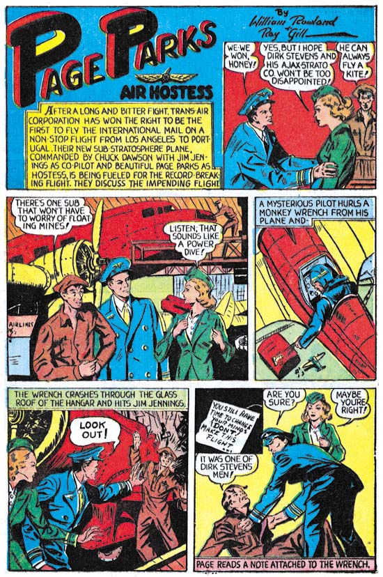
Blue Bolt #1 (June 1940) “Page Parks”, art by W. E. Rowland

The signature on the cover of BB #2 is particularly valuable because I doubt that Rowland would otherwise have been credited for the art. Apparently Rowland only worked on comic books for a few years (1939 to 1942) and even during that period he did not seem to do a lot of work. I have discussed one story by Rowland from Prize Comics #7 (December 1940) previously (Ted O’Neil). Frankly it was a rather unfair comparison of his take on the feature with Simon and Kirby’s. The purpose of the post was to highlight how radical Simon and Kirby’s work was compared to the work by more typical comic book artists even at this early stage in their career. Blue Bolt #1 also has a story drawn by Rowland and a scan of a page is provided above. Rowland is a good comic book artist, better than most contemporaries, but judging from the work I have seen so far it is hard to understand why he would have been selected to provide cover art. Whatever the basis for that decision it turned out to be a good one because Rowland’s cover art is rather nice and far superior to his story art.


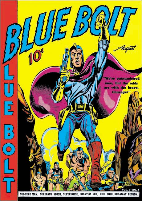
Blue Bolt #3 (August 1940), pencils and inks by Joe Simon

It was only with the third issue that Simon had his single chance to provide the cover art for Blue Bolt. Much could be said about the technical problems with the art. The cloth folds are a confusing mess and the perspective of the forward leg is not quite accurate. But these and others faults are nothing more than nick-picking that do not significantly distract from the cover’s impact. The figure of Blue Bolt was swiped from Alex Raymond’s Flash Gordon (see Art by Joe Simon, Chapter 4, Footnote) but Joe has infused the figure with excitement. Simon also uses a low viewing angle so that Blue Bolt can tower over his supporting soldiers. It is a effective depiction of an attaching force coming through some mountainous pass.

There was a time that some attributed this cover art to Jack Kirby but nowadays there is general agreement that Simon drew the cover. Perhaps the most convincing evidence that Kirby did not draw the figure is the somewhat problematic nature of the perspective of Blue Bolt’s leg, Kirby’s use of perspective was always very convincing. While it is now known that Kirby did sometimes use swipes I have never seen an example of Jack swiping from the same source more than once. However this twice use of Raymond’s Flash Gordon running figure would not be unusual for Simon.


Blue Bolt #5 (October 1940), art by W. E. Rowland

Blue Bolt did not appear on every cover of the comic that bore his name. The next appearance of Blue Bolt was for issue #5 and once again Rowland has the honors. While this cover shares some stylistic features with the one Rowland did for BB #2 there have been important advances as well. Blue Bolt’s glove and boots have an even more exaggerated three dimensional look. The figures have become more massive and muscular and the inking finer and more detailed. While Rowland did a good job on the cover for BB #2, this one is a masterpiece.


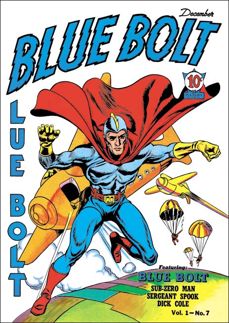
Blue Bolt #7 (December 1940), pencils by Jack Kirby, inks by Joe Simon

Issue #7 marked Blue Bolt’s final cover appearance during the Simon and Kirby run. It would be Jack Kirby’s only Blue Bolt cover. While not a bad cover it was not one of Jack’s finest either. I feel much of the blame comes from the action portrayed. Jumping out of a plane just does not have the impact of, for example, attempting to stop a bomb from exploding (as seen in the cover for Champion #10, August 1940). The rather unimpressive aircraft do not help either. I am not sure what they are meant to be since they lack propellers or jet engines. Rocket planes?

A Small Mystery Solved


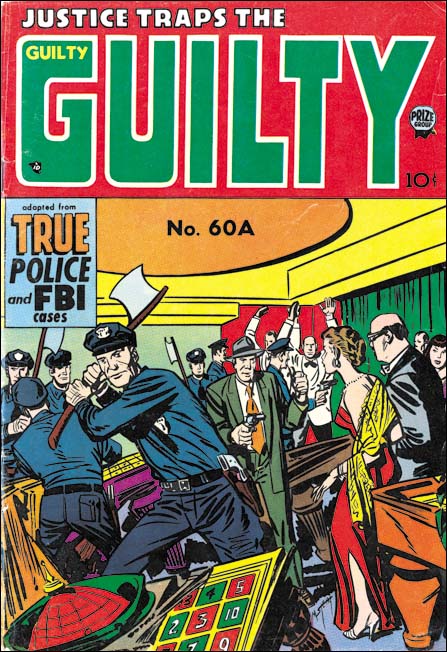
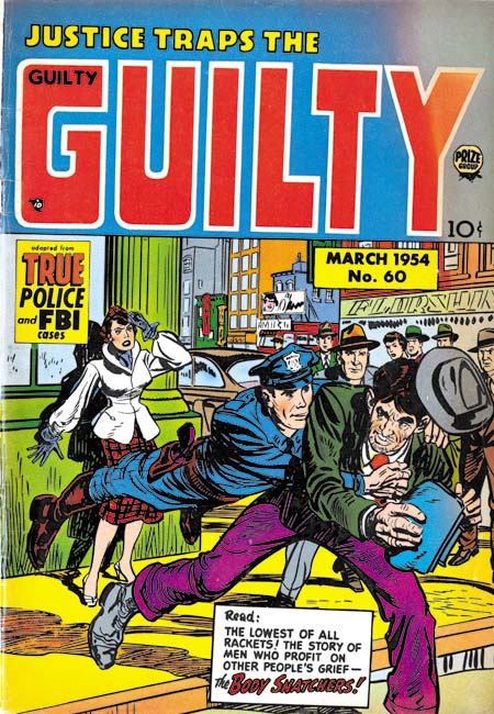
Justice Traps the Guilty #60A (March 1954) pencils and inks by Marvin Stein

There are many mysteries to be found in the history of comic books. Most are small mysteries, the type that might interest only a handful of fans, but they are mysteries nonetheless. One that has puzzled me over the years is the Justice Traps the Guilty #60A issue. Why #60A and not just #60? Like I said, a small puzzle of that might concern only to the few fans that have an interest in the crime comics published by Prize Comics.


Justice Traps the Guilty #58 (January 1954) pencils and inks by Marvin Stein

JTTG issue #58 was dated January 1954. At the time JTTG was a monthly and therefore March 1954 was the proper month for issue #60, so again why the ‘A’? Prize also used volume numbering to identify their issues. JTTG #58 was volume 7 number 4 and JTTG #60A was volume 7 number 6. So JTTG #59 would expected to be volume 7 number 5 and dated February 1954.


Justice Traps the Guilty #60 (February 1954) pencils and inks by Marvin Stein

However I never saw a copy of JTTG #59 and, as it turns out, with good reason. When I finally found a JTTG dated as February 1954 is was issue #60 (without the ‘A’). The volume numbering was just as expected (volume 7 number 5) but it was not the expected issue #59. Apparently when the February comic was created it was mistakingly marked as issue #60. This error was recognized and corrected by assigning the March comic as #60A. That way all subsequent issues would be correctly numbered.

Yes it was a very small mystery indeed but I was still glad to find the solution. It also allowed me to complete the checklist to Justice Traps the Guilty.

Joe’s Dedications

I believe that I was digitally restoring comic book art before anyone else. I say that because I began when consumer scanners first became available. Having my own personal scanner opened up new possibilities. Previously I had used Photoshop to work on my fine arts printmaking. I would have to take my photographic slides to a commercial lab for scanning. It was inconvenient and expensive. After a week or so I would get back a Photo CD. These were special CDs for storing the scans, at the time there were no drives that could burn a standard CD. This was fine for slides, especially since I had no other choice, but having old comic books scanned by a commercial lab was completely out of the question. But when scanners became available to consumers I quickly realized their potential for comic book art restoration. Printers were a different problem as there were few color printers available and they way too expensive. Even the black and white laser printer I bought was a huge investment. But once I assembled these devices I began working on how to use Photoshop to restore the line art from the scans.

After some of what I would describe as trial work I started an ambitious project, to restore the line art for all the Simon and Kirby covers. When I look back I cannot believe decided to do that project. Not only would it require an incredible amount of work but also I did not have all the comics in my collection. It took a long time but I persevered. When I had restored all the covers I bound them by hand into books another time consuming project. In the end I had 24 sets of books (each set consisting of two volumes). Half of these went to Joe Simon for the help he supplied and because, well he was Joe Simon. Some sets went to various people for the scans they provided and a few went out as gifts. A lot of the covers were under copyright protection so it was never my plan to sell any copies and I might add I never have. I have no idea what these books are worth on the market because apparently the recipients valued them so much that none of the books have ever been offered for sale.

With those volumes completed I began to think of my next project. I was a little unhappy about only restoring the line art because comic books were meant to have color, or at least the comics during the period that Simon and Kirby were producing them. Fortunately by then color printers had become affordable. So I decided to begin restoring Simon and Kirby work in full color. This time restoring all the Simon and Kirby stories was not considered an option. It would be great if I succeeded in restoring everything but that would be way too many pages to accomplish in any reasonable amount of time. Once again I would hand bind restorations into books. The books would serve more than a personal purpose, we would use them to show publishers what could be done in the way of reprinting Simon and Kirby. This time I would only make two copies of whatever I restored, one for Joe and one for me. In exchange for his copy Joe would provide mine with some art. This was done on the end paper of the book. Now if Joe had just added pencil sketches there would be no problems since mistakes could be erased. But Joe liked to work in color which meant there was little that could be done with any errors.


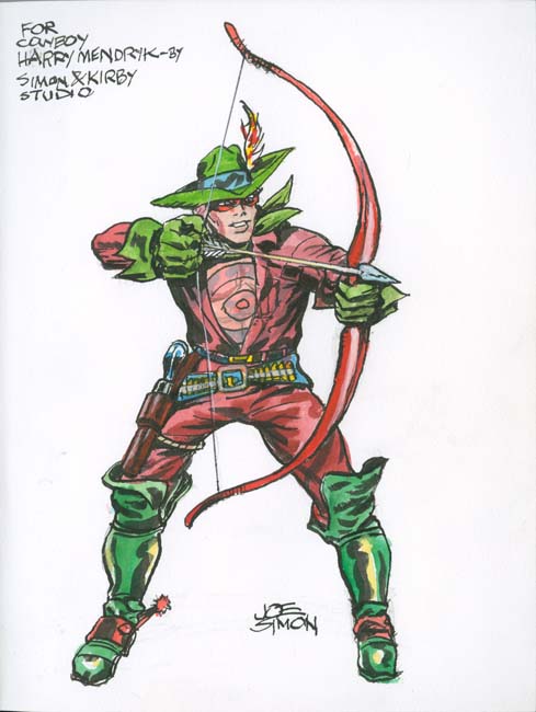
Bullseye volume

What I expected Joe to provide would be the standard character sketches that comic book artists do all the time. Joe did just that sort of thing for the Bullseye book basing his piece on a drawing that Jack Kirby had done.


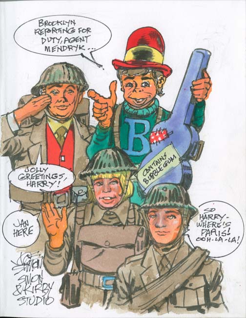
Boy Commandos volume

While the Bullseye was a more traditional character drawing, all the others that Joe did incorporated elements of humor. Not necessarily of the side-splitting variety but you can tell he just was not satisfied with just providing a sketch.


Manhunter volume

Surprisingly Joe drew Sandman in a book of Manhunter stories. The accompanying texts suggest that this was not an accident.


Sandman volume

With Sandman appearing in the Manhunter book it is not too surprising that Manhunter appeared in the Sandman book. Once again the text indicates this was deliberately done.


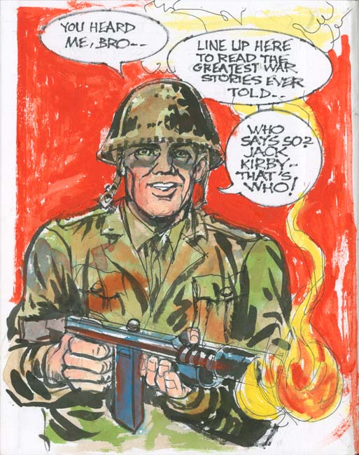
Foxhole volume

A soldier appears in the Foxhole volume but the text imply that this is not just any soldier but is meant to be Jack Kirby. All of Joe’s sketches were done on the end paper at the front of the book except this one which was done on the inside cover.


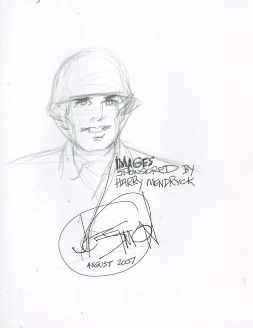
Foxhole volume

The Foxhole contained two sketches; a colored one on the inside cover (shown earlier) and a pencil sketch on the opposite end paper. This was the only book that got this double treatment as well as the only one dated. Usually Joe got the spelling of my name correctly but here he adds an extra ‘c’.


Duke of Broadway and the Vagabond Prince volume

Years before the current debate about growing disparity between the rich and the 99%, Joe provided his irreverent solution, “Eat the Rich” indeed.


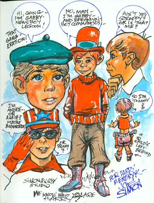
Newsboy Legion volume

Joe sometimes commented about how one youthful character would with minor changes be transformed into another.


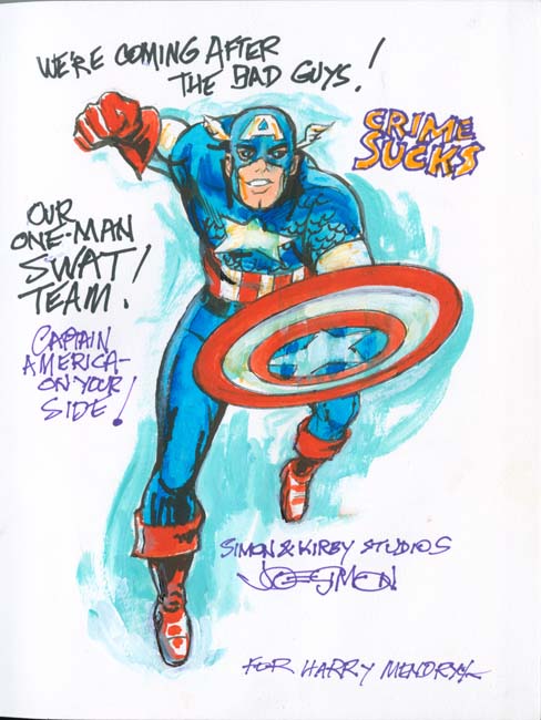
Headline volume

I am not sure why Joe put Captain America in a book of crime stories. Perhaps he felt that his humor was not appropriate for the crime genre? But I am not one to complain about getting Captain America art from one of his creators.


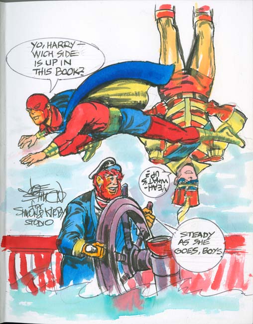
Stuntman and Boy Explorers volume

I inadvertently put the cover on upside down for one of Stuntman and Boy Explorer books. Needless to say I was very annoyed at myself about this but there was no way I was going to give the flawed volume to Joe. With his art Joe turned this defective book into something special.


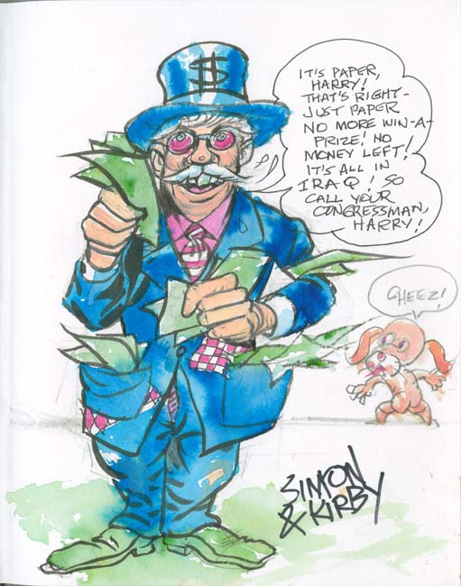
Win A Prize volume

Uncle Giveaway offered prizes to the readers of Win A Prize Comics. Here Joe jokes that money is just paper but there was none left because it all went to Iraq. Joe was a lifelong Republican but he did not like Bush and he felt the Iraq war was a mistake. I believe Joe was still the kind of Republican that was not that unusual when he was younger but today is pretty much extinct, a least on the national level, that is a moderate Republican. Joe was very proud of the work he did to support John D. Rockefeller and similar Republicans.


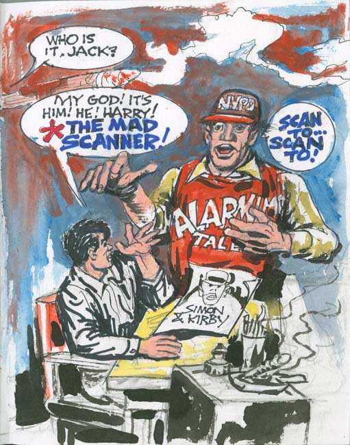
Alarming Tales volume

A personal favorite because here I am depicted in the company of Joe Simon and Jack Kirby.


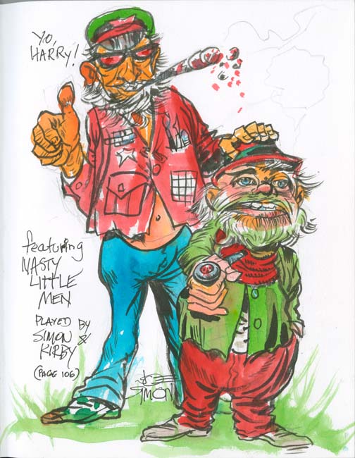
Black Magic volume

Nobody would describe Joe as little and nobody that actually knew him would call him nasty. I never met Jack but nasty does not seem appropriate for him either. While not literally a portrait as far as I know this was the last time Joe drew himself with his old partner Jack.

I made a few more reprint volumes that Joe never added art to. I do not remember why that was but I am sure it was not due to any reluctance on Joe’s part. These final volumes were made about the time that negotiations had begun with Titan to reprint Simon and Kirby material. I think we both had other things on our minds. Now I treasure the volumes that Joe did provide his art and humor.