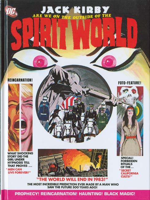
I got a pleasant surprise when I visited my comic book store last night, DC’s reprint of Spirit World. What a marvelous time this is for Kirby fans as more and more of his work is being reprinted. Had someone told me a decade ago that DC would reprint Spirit World I would not have believed them, actually I would have thought they had lost their grip on reality. Spirit World was by no means a Kirby classic. It received remarkably poor distribution. Mark Evanier describes not being able to locate any copies at newsstands but finding bundles of them at a distributor’s warehouse that had never been delivered. DC’s confidence in it was so low that it was cancelled after a single issue, much too soon to be based on any sales figures. It is not even a cult classic, it rarely comes up in discussions about Jack Kirby’s art. But everything Jack did he did well so it is great to see this work back in print.
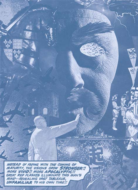
“Amazing Predictions” page 3 (from the reprint)
Kirby wanted Spirit World to be a high quality magazine printed in color but that is not the way DC would publish it. Instead a wash was applied to the line art and the results were printed using a dark cyan ink. Frankly it was not the best approach. But that is the approach that was originally made and was repeated for the reprint. Although I wish DC had initially followed Kirby’s wishes I believe their decision for the reprint to reproduced the effect of the original publication was the correct one. The quality of the reproduction in the reprint is exceptional. There are times when the original magazine was a little clearer but others where the reprint did a better job of presenting the art. But these differences are minor variations unnoticeable unless the two are compared side by side. One important improvement made for the reprint was the paper. I have never been a fan of using a yellowish paper in an attempt to match the current look of comic books. That look is due to aging and was not the look the books had when they first appeared. Using a yellowish paper for the Spirit World reprint would have darkened the cyan inked and ruined the effect. Instead DC has wisely used a flat white paper for this reprint.
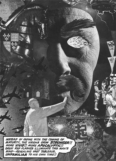
“Amazing Predictions” page 3 (with Photoshop adjustment)
One of the special treats of Spirit World was all the collages that Kirby created for it. Kirby’s collages have been receiving more and more attention in recent years. Recently Steven Brower has devoted an article on the subject (Jack Kirby’s Collages in Context). I must admit that as a young reader I was not overly impressed with Jack’s collages but as an adult I greatly admire them. Part of the problem with the collages was the rather poor printing they originally received. I could not resist using Photoshop to convert one of the Spirit World collage to a better quality black and white. In my opinion it is a distinct improvement. However remember that Kirby originally meant Spirit World to be printed in color and take a look at the original art of the same collage that is included in Brower’s article. What a difference and what a lost opportunity that DC did not follow Kirby’s wishes.
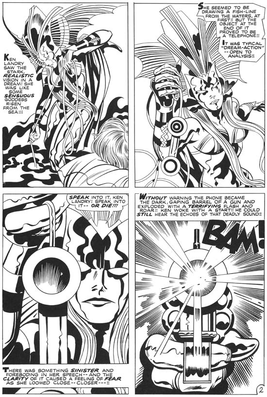
“Witch Queen of Ancient Sumeria?” page 2 (from the reprint)
Spirit World was cancelled after a single issue but Kirby had already completed the art for the second issue. The Spirit World reprint includes the work that had been meant for Spirit World #2. I understand that these stories had been used in some of DC’s horror and mystery comics but the reprint only uses the line art. What a contrast between the two sections of the current book. While Spirit World #1 was inked by Vince Colletta and issue #2 by Mike Royer that is not the real reason for the difference in the appeal of the two sections. What is really shown is the rather detrimental affects of the wash and cyan ink had on the initial issue art. Kirby was at the top of his artistic form and it really shows in this last section.
There is a small essay in this latest book by Mark Evanier. Evanier’s writings have appeared in a number of books on Jack Kirby (including Titan’s The Best of Simon and Kirby). With good reason as there probably is no one more knowledgeable on Kirby (if only he would finally publish his full biography on Jack). But what Evanier has to say is particularly important concerning the Spirit World as he was present and involved in its creation.
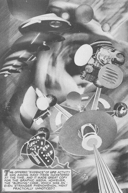
“The Burners” page 6 (from the reprint)
Colleges played a small part in the second issue of Spirit World. But I could not resist including the sole exception. I hope to someday to discuss the Spirit World more fully, this has been more a review of the reprint book. I will not try to predict how successful the Spirit World reprint will be but I do believe it is a worthy addition to the collection of any Kirby fan.


I’m looking forward to seeing this as I hit comic shops in NYC today. Does Mark mention who did the tone work? The original art for the tones has never been seen, as far as I know, and no name has ever been attached to them.
Thanks Harry for the heads up, I look forward to seeing this.
I agree with you on 3 points:
1) I am as surprised as you are that DC published this reprint, great that they did.
2) I wish they would have published the collages in color, since they exist and are stunning.
3) I also wish Mark would finally published his opus on Kirby.
Best,
Steven
Rand,
No mentioned about who did the toning. As I remember it was done by DC without input from Kirby
I would be happier if they reprinted In the Days of the Mob, including the work completed for the unpublished second issue. The Spirit World #2 stories did all appear where the Mob #2 stories did not.
And dare I ask for the complete Dingbats of Danger Street?
Great stuff. I have to get it now.
Remember we talked about an unknown penciller who always draws button noses and thinlegged almost funny figures? You asked where I had seen him and I just saw a prime example in Prize Comics Western #78 – Showdown on the Chisholm Trail. In your index you dn’t mention a penciller or an inker. Small publisher collector JVJ says it is inked by Joe Simon and George Roussos. Roussos I see as well, but I have to confess I can’t really tell the difference between Simon and Simon studio. He also does not have a name for the penciller. Could it be Broderick or is t someone else. He is there for a year and then he changes his style or disappears. But is it a vey distinct style, with traces of Severin and even Kirby himself, although it isn’t either of them.
Ger,
I am afraid I do not recall the conversation. But I have already written about the Chisholm Trail artist:
//kirbymuseum.org/blogs/simonandkirby/archives/3676
Coincidentally I am planning a post on another example by this artist. I do not know JVJ but I can assure you that neither Simon nor Roussos either penciled or inked these pieces.
Has anyone ever remarked on the art of the cover? Two of the insets look like Neal Adams/Tom Palmer work. Or is maybe Gene Colan/Tom Palmer?
The cover was a Neal Adams redraw of a cover that Jack put together with some drawings and some collage. No Tom Palmer in it at all.
Rand-The tones were done directly on the original art by Colletta. I’ve seen one page for sale; a splash for $600. Sadly this book contains very little credit for Vince, who is only mentioned in passing in Mark Evanier’s text piece. He inked the only published issue and while a bio of both Jack and Mike Royer are included there is no bio of Vince Colletta. The stories, from the unpublished #2, inked by Royer(used as filler in 70’s DC mystery magazines) are quite good but give Vinnie a break!
This book is incredibly over priced containing no extras or unpublished art.
Rick,
I’ll grant you that a short biography of Colletta would have been appropriate.
But how do you know that Colletta provided the tones? Seeing similar tones on a piece of original art by no means proves that Vince did it on the original art let alone for Spirit World.
We were told the tones were applied by DC’s production department.
And to clarify: Though Jack wanted Spirit World and In the Days of the Mob to be printed in color, by the time he drew them, he knew DC intended to print them in black-and-white.