Category Archives: Artists

Happy Birthday Jack Kirby!


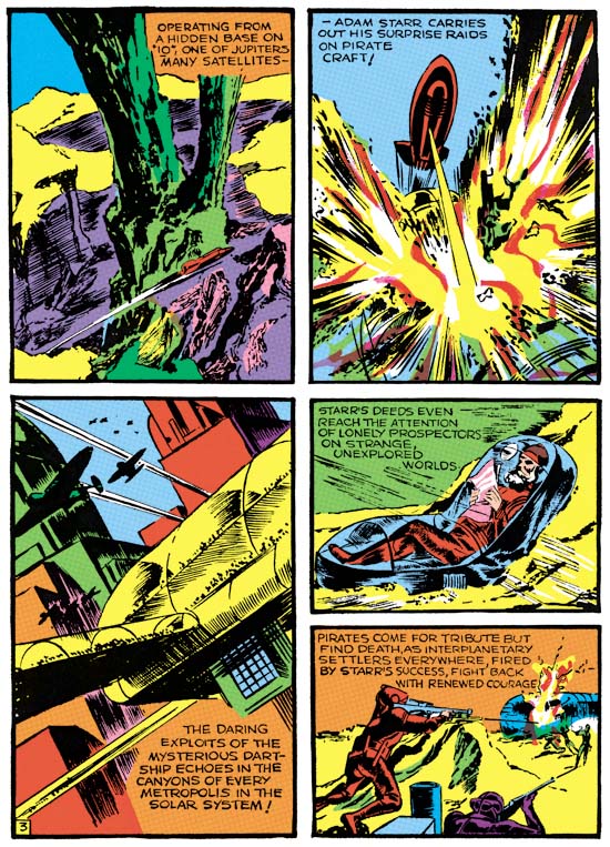
Crash Comics #1 (May 1940) “Solar Legion” page 3, pencils, inks and letters by Jack Kirby

Tuesday, August 28, is Jack Kirby’s birthday. In his honor I include a page from Titan’s up-coming Simon and Kirby Library: Science Fiction. Although at this point Jack probably had already met Joe, I believe his work on the first three appearances of the “Solar Legion” was a solo affair. If this is true, then it is as pure a Kirby as can be found. Kirby pencils, inks, letters and probably writing. I know a number of fans credit Kirby with writing during the Simon and Kirby period but all surviving evidence indicates that is not quite true. Simon and Kirby employed script writers but would alter what they received. Thus it would be more accurate to say Kirby would re-write scripts that he drew as opposed to being the original writer. But during the early days of comic books, artists often wrote what they drew. The rather unique “Solar Legion” stories seems the writing of Jack himself.

This birthday is particularly special as one of Jack’s granddaughters has made an appeal, see Join the Kirby4Heroes campaign for details and a link to her appeal.

Speaking of Art, Marvin Stein


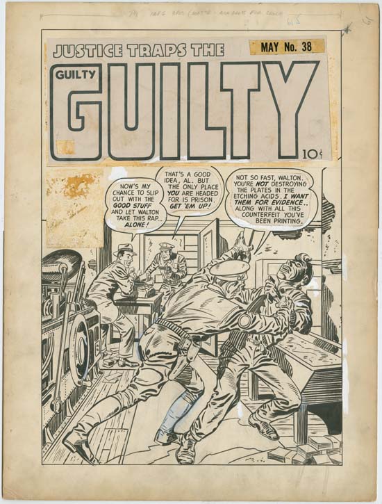
Justice Traps the Guilty #28 (July 1951), pencils and inks by Marvin Stein

In this post about original art I will discuss a cover by Marvin Stein. Stein was one of the few artists who actually worked in the Simon and Kirby studio. Stein is not well known in current comic book fandom but for a long period of time he was the lead artist in Price Comics crime titles, Headline and Justice Traps the Guilty. Except for a few covers done by Jack Kirby and some others based on photographs, Marvin did all the covers for Headline issues #46 to #77 (March 1951 to September 1956) and for Justice Traps the Guilty #24 to #88 (March 1951 to August 1957). For more information on this topic see Criminal Artists, Marvin Stein.

The cover that I post about this time is from relatively early in his work on crime comic books. While the paste-ups are original, they are not the originals for this particular cover, rather they are from issue #38. Rubber cement was often used for attaching paste-ups because it was inexpensive, quick and convenient. Unfortunately there were negative consequences in the long term to this use of rubber cement. Sometimes the chemicals in the rubber cement would stain what they were attaching. Often with time the rubber cement would become brittle and loose its adhesive qualities causing attachments to fall off. It would take years before either of these detrimental qualities took effect. At the time the long term survival of original comic book art had no importance as it was considered worthless once it had fulfilled its role in the production of the published comic book. In this case the original paste-ups fell off and were re-attached to the wrong comic book art.

There is a reason I picked this particular cover art to discuss which I will return to below. Before that I wanted to explore the use of white-out. White-out was applied by comic book artists to correct defects created during the inking of a piece. Inking errors could not be simply erased but could be covered up with white-out. As for instance an erratic brush stroke. That seems to be the case for the white-out applied in the speech balloons and the frame lines on the right.


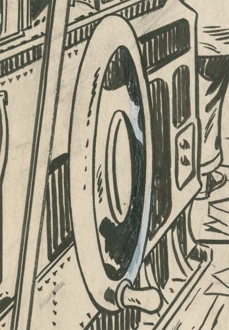
Justice Traps the Guilty #28 (July 1951) close-up, pencils and inks by Marvin Stein

A similar explanation could be used to explain the white-up on the printing wheel. Some of the corrected inking can still be seen under the white-out. Even in this close-up it may be difficult to make out that much of the inking on the right side of the wheel has been done over white-out. This is revealed by numerous small cracks in the inking. Such hair-line cracks often appear when ink is applied on white-out that has not completely dried. While this does appear to be a correction further examples suggest that it was not do to poor control of the actual ink brush.


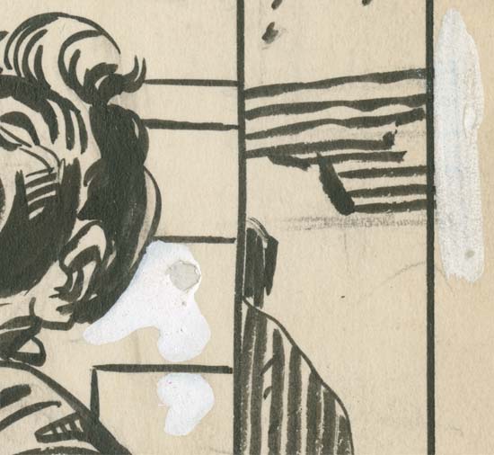
Justice Traps the Guilty #28 (July 1951) close-up, pencils and inks by Marvin Stein

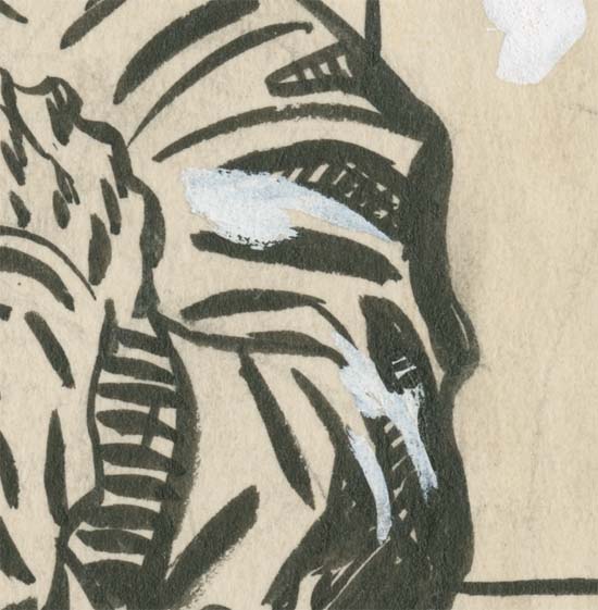
One of the corrections to the frame can be seen in this close-up. While the white-out is too opaque to clearly see what has been hidden there still remains some parts that have not been covered up to suggest that horizontal brushwork had extended beyond the frame and needed to be corrected. Well perhaps not needed because the frame lines were normally trimmed off in the published comic book. There is also white-out applied need the head. Here the ghost of the covered inking can still be observed, at least in part. While the outline has been narrowed slightly it is hard to understand why Stein thought this necessary. Perhaps the true reason for this particular white-out are in areas too opaque to be revealed.


Justice Traps the Guilty #28 (July 1951) close-up, pencils and inks by Marvin Stein

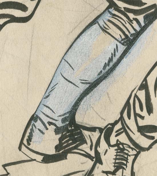
Here Marvin has used white-out to correct a leg. In this case the white-out was used very shortly after the original inking as some of the ink was still wet enough to mix with the white-out, turning it grey. Enough of the original inking is still visible under the white-out to suggest the boot had much thicker outlines.

Note that the penciling can still be seen. Normally these would be erased after the inking was completed but in this case if any erasing was done it was done poorly. This is actually fortunate as it allows a glimpse into the original penciling. It appears that the original pencils were little more than a layout that Stein did not follow closely when inking.


Justice Traps the Guilty #28 (July 1951) close-up, pencils and inks by Marvin Stein

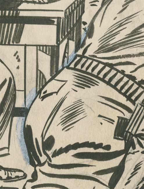
Once again Stein has applied white-out to inking that is still moist enough to cause it to turn grey. Either that or Marvin used the same ink brush to apply the white-out without getting it thoroughly clean first. This does not appear to be a case of Stein narrowing an outline. Instead the effect was to redraw the buttocks and lower back, flattening the buttock a bit and adding curve to the lower back.

Justice Traps the Guilty #28 (July 1951) close-up, pencils and inks by Marvin Stein

The correction shown in the above image is different from the rest. This was not a change in outline but of the spotting. Apparently Stein felt the original spotting was too dark and needed to be lightened up. Today one might wonder if Stein was being a bit much of a perfectionist but he obviously had an idea of what the art should look like and was willing to spend extra time to achieve that end.

Marvin Stein’s pencils were rather loose, without details. Stein did the detail work in the actual inking. That being the case, any corrections would have to be done using white-out. Marvin would become quite good at this approach and maybe someday I will post on one of his later covers. But for now that while the use of white-out does not disappear it seems to become less frequently required. Also Stein would switch to a blue pencil for doing the initial penciling. There were other comic book artists that also did most of their work in the inking stage. Usually such artists become overly concerned in providing detailed inking to the detriment of the art. Joe Maneely is an example who used this approached whose fine detailing resulted, in my opinion, in rather dry art. Marvin Stein never allowed himself get lost in details and his art, particularly for the crime genre, is fresh and full of impact.


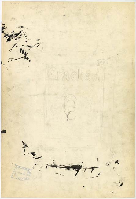
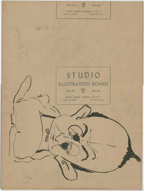
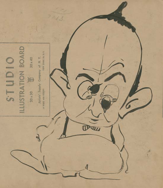
Justice Traps the Guilty #28 (July 1951), by Marvin Stein (back of the original art)

The real reason I picked this particular cover to write about is what appears on the back of the original art.


Justice Traps the Guilty #28 (July 1951), by Marvin Stein (close-up of the back of the original art)

Normally what appears on the back of original art, if there is anything at all, is very limited in size and effort. But this piece is rather large and carefully worked out. It was done entirely in ink without any trace of pencils. The humor in this work is obvious. What is not so clear is why Stein did it at all. All this effort done for no more than some personal reason. But it is fortunate that he did because it provides a side of Stein’s character that was not revealed in the work he did in comic books.


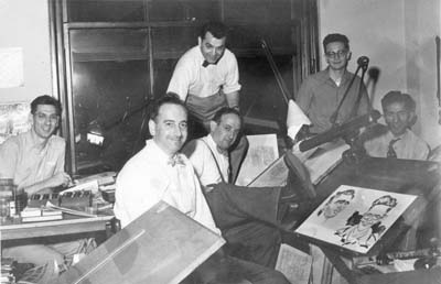
Simon and Kirby studio Left to right: Joe Genalo, Joe Simon, Jack Kirby, Mort Meskin, Jimmy Infantino and Ben Oda. Caricatures (probably drawn by Joe Simon) of Marvin Stein and Jimmy Infantino.

While it is hard to be sure, I believe this might be a caricatures of Mort Meskin, another artist who worked in the Simon and Kirby studio. Note Meskin’s receding hair, suspenders and bow tie.

The Puzzling Simon and Kirby Artist

The Simon and Kirby studio employed a number of artists whose identity has not been determined. So it might seem odd to spend much time writing about just on of them. I have written before about the artist that I will discuss here but he has such a puzzling combination of traits that I want to collect in one place what little I known. (previously in Art of Romance, Chapter 4 and Chapter 8, and What? Who?)


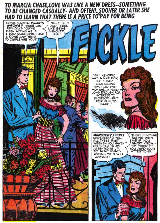
Young Love #1 (February 1949) “Fickle”, pencils by Jack Kirby and inking by an unidentified artist

The earliest piece of work that I believe this artist had a hand in appears in “Fickle” from Young Love #1 (February 1949). The man in the splash panel and second story panel is long and lanky with a small head. This is perhaps the most distinguishing feature of this unidentified artist. Although somewhat stylized, the woman in the first story panel looks very much like she was drawn by Jack Kirby. In fact the entire story consistently looks like Kirby’s work although tall lanky figures appear in different places. There is little doubt that Kirby did the pencils and the unidentified artists was in this case an inker. The quality of the inking in the story is quite variable and so I suspect more than on artist had a hand in the inking. This was after all the unusual practice in the Simon and Kirby studio, at least when it came to work drawn by Jack. For the most part the inking was done in what I describe as studio style inking with such techniques as picket fence crosshatching and abstract arc shadows (Inking Glossary). It does seem that some of the parts that show the tall lanky figures display much less of these techniques.

Many months will pass before the next piece that I attribute to the unidentified artist. That is not to say that he did no more work. Having contributed to the inking of one Kirby piece I suspect he may have help ink others as well. That other inking work just has not yet been identified.


Real West Romances #4 (October 1949) “The Perfect Cowboy”, pencils by Jack Kirby and inking by an unidentified artist

The tall and lanky figure appears once again in “The Perfect Cowboy” from Real West Romances #4 (October 1949). That style is best shown in the splash page but I have chosen a page that portrays a number of this artist’s style. Even so the lanky figure can be seen in panels 1 and 3. The story is inked in the studio style but it exhibits some rather unusual twists to that style. The artist uses picket fence crosshatching in the woman’s hair as can be seen in the last two panels of the page. This gives the hair a rather unusual look and is something I have never seen another artist do. Actually this seems to have been a bit of an experiment by this artist and is one that he did not repeat. Another unusual inking technique is the use of simple crosshatching in the some of the dust clouds such as seen in the third panel. I have never seen another Simon and Kirby artist do that but if this also was an experimental inking technique it was one that the inker was happy with and would use again.

Many of the faces seem somewhat simplified particularly in the way the eyebrows are depicted which is rather like Meskin’s approach. The woman’s eyes often seem to be at a bit of an angle with one another in a manner similar to that used by Marvin Stein. I hasten to add that neither Meskin nor Stein drew lanky figures or used simple crosshatching in dust clouds. While some of the faces may look a little like the work of Meskin or Stein, others look very much like the work of Kirby. In fact the entire story is laid out in manner so typical of Kirby that I have little doubt that Kirby did the pencils for this story and our unidentified artist did the inking. Unlike “Fickle” the inking is consistent throughout the story and I am confident that it was largely the inking by one hand. Frankly I suspect the original pencils were rather nice but the inker’s heavy hand has pretty much overwhelmed Kirby’s pencils.


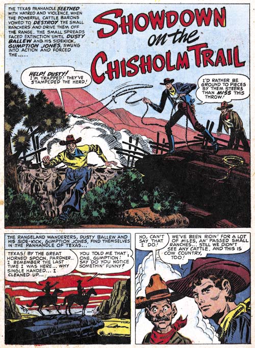
Prize Comics Western #78 (November 1949) “Showdown on the Chisholm Trail” pencils and inks by an unidentified artist

This artist next appears in “Showdown on the Chisholm Trail” from Prize Comics Western #78 (November 1949). The splash provides an excellent example of this artist trademark tall and lanky figures. There are certain panels in the story that seem to look a little like Kirby’s work and others that suggest Mort Meskin. However the great majority of the art seems distinct from either Kirby or Meskin so I feel pretty certain that these are this artists own pencils. Those parts similar to Kirby or Meskin are probably due to swiping.

For the most part this story is inked in the studio style. While the inking has its own unique traits it does resemble Meskin’s inking when that artist inked Kirby pencils. The unidentified artist inked eyebrows very much like Meskin and this may be one of the reason that the art has such a Meskin look to it. Once again we find simple crosshatching applied to dust clouds such as seen in the splash panel above. I have not found any other artist in the Simon and Kirby studio who did this.


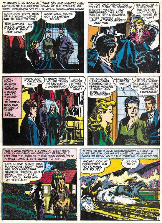
Western Love #3 (November 1949) “The Blue Blood and the Bum” page 7, pencils and inks by an unidentified artist

Another story by this artist, “The Blue Blood and the Bum”, was published in the same month. It appeared in Western Love a title that combined the romance and western genre. As such it makes for easy comparison to “Showdown on the Chisholm Trail”. Some of the same traits appear such as tall and lanky figures, simple cross hatching in dust clouds and simple Meskin-like eyebrows. There does appears that the inking has less of an emphasis on the studio style. The story on a whole seems to mimic less the style of Kirby or Meskin.


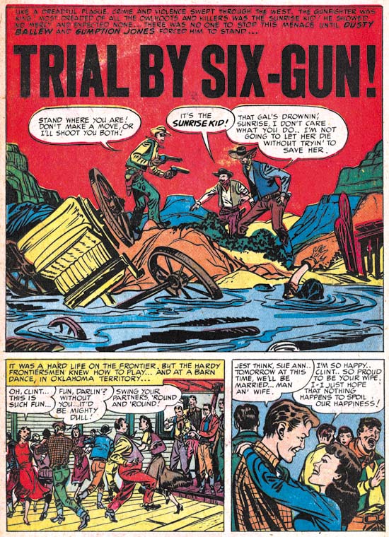
Prize Comics Western #80 (January 1950) “Trial by Six-Gun”, art by two unidentified artists

The final example that I have found for this mystery artist is found in “Trial by Six-Gun” from Prize Comics Western #80 (January 1950). The tall and lanky figures found in the splash panel seem a perfect match for the work of this unidentified artist. However the rest of the story, including the two panels below the splash, look very different from this artist’s work. Two months seem much too short a time to effect such a transformation and so I am sure this is the work of another artist. How such a combination came about will probably remain one of those minor mysteries.

These five stories are all that I could find by this artists despite much searching. I will admit that it is quite possible that he did some inking of Kirby pencils that I did not spot. I guess my main interest in this artist was to come to understand exactly what was his contribution to “The Perfect Cowboy”. A comparison of that story to the others has convinced me that “The Perfect Cowboy” was penciled by Jack Kirby and owes its unusual look to the overwhelming effects of the unidentified artist’s inking.

Daring Disc


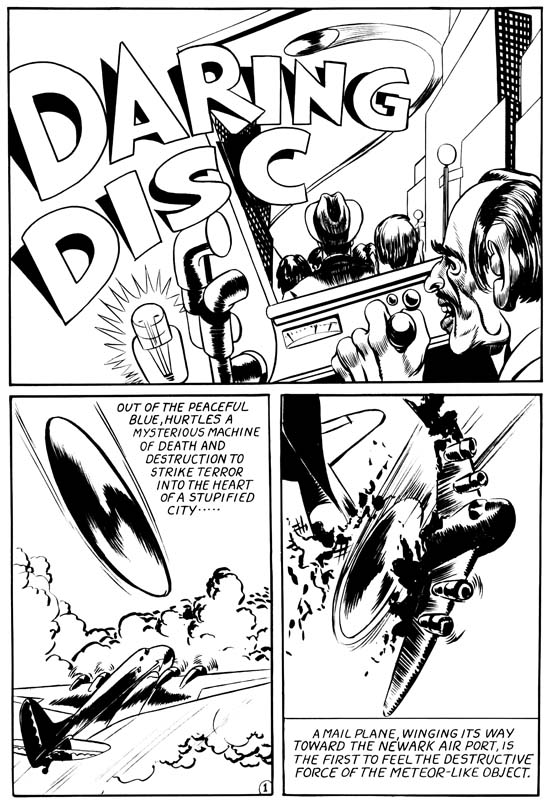
Daring Disk, pencils by Jack Kirby

Occasionally a title would be cancelled leaving Simon and Kirby with some unused art. Even then Joe and Jack would often rework the art so as not to waste the effort that went into it. In one case the work for the Fighting American #8 that was cancelled by Prize Comics in 1955 ended up being used in the comic published by Harvey in 1966. Because of the recycling there is only a limited amount of Simon and Kirby work that avoided publication until the more recent rise of reprint books. For most of the art that escaped being used there is ample evidence for what it was originally intended. All this makes the story Daring Disc is so unusual. It is a very early Simon and Kirby art that originally never got published and for which there is no firm evidence as to what title it was meant for and therefore exactly when it was created.

The art style is such that we can be pretty certain it was done early in the Simon and Kirby collaboration. But I would like to examine the evidence that the work provides that might narrow down when it was created.

I do not believe the inking helps much. It does not look to me like the inking that Kirby did on his own pencils in stories such as the Solar Legion that Jack did for Crash Comics (#1 to 3, May – July 1940). But Kirby was variable in the inking of his very early work (see A Brief Pause, Another Brief Pause and It Ain’t Soup ) so it hard to be sure whether this is his inking or not. It might have been inked by Joe Simon or someone else but that would hardly help in narrowing the time period.


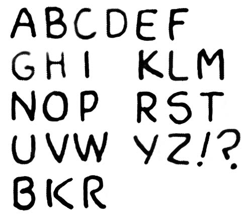
“Daring Disk”, letters by an unidentified letterer

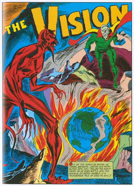
I believe better information can be obtained by the lettering. This is not a very professional letterer (many were not during those early days of comic books). His lettering can easily be distinguished from that by Jack Kirby, Joe Simon or Howard Ferguson, the most frequently used letterers for Simon and Kirby work from the early 40’s (see Chapter 5 of In the Beginning for examples of all three). This trio did most of the most of the lettering during the initial Simon and Kirby collaboration. Joe and Jack most frequently in the earliest period and Howard predominantly later. However other letterers were common during the period from July to September 1940. Sometimes another letterer was used later for example in the Vision story from Marvel Mystery Comics #17 but by then Kirby’s pencils were done in a style that does not match that found in Daring Disk and therefore can be discounted. So based on the use of an non-typical letterer and the art style July to September 1940 seems to be the most likely date* for Daring Disk.


Marvel Mystery #10 (August 1940) “The Human Torch”, letters by an unidentified letterer (from Marvel Masterworks)

While I cannot identify the letterer of Daring Disc his work looks very much like that found in the Human Torch story from Marvel Mystery #10 (August 1940). The lettering examples I provide for both the Daring Disk and MM #10 were derived from the speech balloons while the same type of lettering is found in the captions only it is slanted in both pieces. Further drop capitals** were not used in either work. Simon was the Timely editor so it is likely that he would have known and could supply work to the letterer from MM #10. MM #10 August cover date matches the July to September dates that I suggested above.

These is one other piece of evidence to consider the title of the piece. Why Daring Disc? Horrible Disc, Terrible Disc or something of that nature would seem more appropriate. But perhaps it was called Daring because it was meant for Daring Comics. A similar use of Daring in the title was used for Captain Daring by Jack Kirby (Daring Mysteries #6, September 1940). Simon’s work appeared in the early issues of Daring Mystery but Kirby’s first appeared in Daring Mystery #6 (September 1940) and later in DM #7 (April 1941) and #8 (January 1942). But again Kirby’s art had developed by DM #7 into a style that I do not think matches Daring Disk.

Granted this is not the greatest evidence but it seems the best available. so based largely on the use of a letterer other than Simon, Kirby or Ferguson I would suggest Daring Disk would cover date from July to September 1940. The particular letterer used and the title are even less firm evidence but they agree with those dates as well.

footnotes:

* These are cover dates, calendar dates would put the creation of the art 5 or 6 months early; January to April 1940.

** Drop capitals is the term I use for enlarged and sometimes shadowed first letter of the captions.

Not Kirby? Wrong! Marvel Masterwork’s Marvel Comics Volumes 6 and 7

I have never particularly liked the way that Marvel does their reprint volumes. But even coverless copies of golden age Marvel Mystery Comics are now so expensive and rare that I am certain I will never have a complete run. So I have been buying some of Marvel’s Golden Age Masterworks. I know I have to be careful in using them for study but still Marvel has done everyone a service in providing them. I recently picked up volume 7 of the Marvel Comics series which finishes Simon and Kirby’s run of the Vision feature. Imagine my surprise when I looked at the contents page only to find that some of the Vision stories have been attributed to other artists! I pulled out my copy of Volume 6 and found that this practice had started in that volume. I decided I would write about why these attributions are so very, very wrong. I will only be discussing the pencils as inking attributions are difficult to determine and there is nothing like a consensus of that subject. But hey, if Marvel Masterworks cannot get correct pencil attributions for such a distinctive artist like Jack Kirby, what chance is there that it got the inking attributions right?


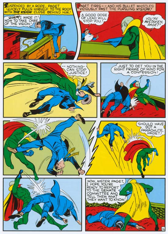
Marvel Mystery Comics #21 (July 1941) “The Vision” page 6, pencils by Jack Kirby, letters by Howard Ferguson (from Marvel Masterworks Marvel Comics volume 6)

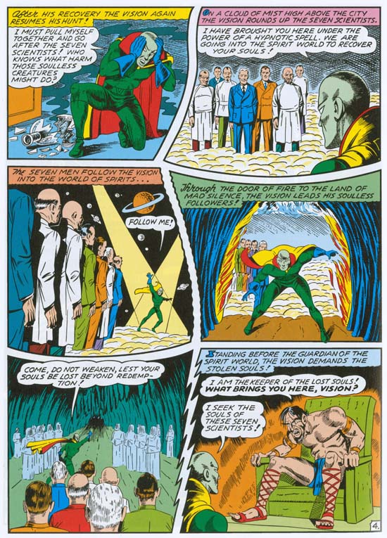
The Masterworks only credit Kirby for the pencils of splash page, the rest of the story is attributed to Al Avison. Not the inks mind you, but the pencils. There is an asterisk on this attribution for a footnote that states:

It was not industry standard in the Golden Age of comics to provide detailed credits for each story. The credits in this volume represents the most accurate information available at the time of publication.

Really? I would have thought that the Jack Kirby Checklist (Gold Edition) would be the most accurate information available and it attributes this story to Jack Kirby. Now I admit there are occasions when I disagree with the JK Checklist (most often because sometimes it credits work to Jack that Joe Simon penciled, an artist who was very familiar with Jack’s art and very good at mimicking him). However the Checklist is the best source for Kirby attributions and I always proceed cautiously when I disagree with it. Now in the case of these Marvel Masterwork credits it is important to remember we are discussing the pencils. Inkers often assert their own personal styles over another artists pencils. The art must be examined for features that would not be derived from the inker. For Jack Kirby two features that I often look for to spot his work is the presence and handling of exaggerated perspective and fist fights. Kirby was the master of these two art forms and no other artist every managed to do them quite like Jack. I am not saying that these are the only distinctive traits that can be used for spotting but that they so common that they often are all that is needed for attribution purposes. Both techniques are presented on page 7 of the Vision story from MM #21. Like many artists, Avison tried to copy Kirby’s slugfest style but he never came close to what can be seen on this page. Particularly panel 5, it is hard to believe that anyone would fail to recognize Kirby’s distinctive hand in that minor masterpiece.


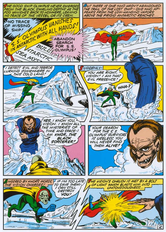
Marvel Mystery Comics #22 (August 1941) “The Vision” page 2, pencils by Jack Kirby, letters by Howard Ferguson (from Marvel Masterworks Marvel Comics volume 6)

Once again for the Vision story in Marvel Mystery Comics #22, Marvel Masterworks only credit the first page to Jack and the rest of the story as penciled by Al Avison. While the story includes some fist fights that look to me like they were done by Kirby they are not as convincing as those found in MM #21. But look at panel 7 of page 2 shown above. Kirby loved to show figure heading forward to the viewer and this panel is a great example of the exaggerated perspective that is required to accomplish that. In this case Kirby brings the torso lower than usual even for his work but he still convincingly pulls it off. I have never seen Al Avison effectively use such exaggerated perspective. I will be providing an example below of how Avison tries something similar but as we shall see it is easy to distinguish from Kirby’s work.


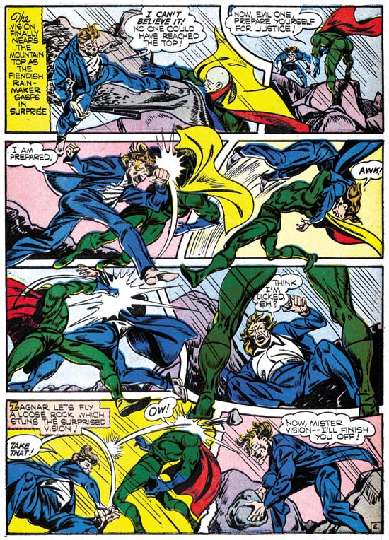
Marvel Mystery Comics #25 (November 1941) “The Vision” page 6, pencils by Jack Kirby, letters by Howard Ferguson (from the original comic book)

Marvel Masterworks correctly credits the pencils for the Visions stories from Marvel Mystery Comics issues #23 and #24 to Jack Kirby so they need not be discussed here. The credits for MM #25 are rather peculiar as Kirby is said to have done the title page and the layouts while the “art” was done by Al Avison, Ernie Hart and Mike Sedowsky. It is well known that Kirby did some layouts during the silver age but he has often been credited for doing layouts during the golden age for such artists as Mort Meskin, Bill Draut and John Prentice. Such claims are bogus in almost all cases as I have frequently shown in posts in this blog, particularly in my Art of Romance serial post. However there was some work from the Simon and Kirby studio that looks like Kirby provided layouts and there are some others that I struggle with whether they are examples of Kirby layouts or inking that overwhelmed Kirby’s original pencils. During the silver age, Kirby’s layout could get rather tight and detailed in some places. Much more than would be expected for something described as an layout. But this would be true only for certain sections while the layouts for the rest of the story seem to have been much looser. so one of the criteria that I use for recognizing Kirby layouts is to look for how consistent the entire story is. A story that looks consistent throughout is more likely to be the result of the work of an inker’s heavy hand no mater how unusual it may look for a piece of Kirby art. Even so making these distinctions can sometimes be difficult but not so in the case of the Vision from MM #25. That story looks so like Kirby’s style throughout the entire story that it is hard to understand why anyone would think it is just Jack’s layouts.

It would not be legally right for me to provide the entire story so I will pick one of the more distinctive pages. This is another slugfest full with examples of exaggerated perspective. All done in so convincing a manner it is hard to believe any artist other than Kirby could have done it. The original pencils must have been so tight that no one should call it a layout. (It is pages like this that show what a master Kirby was at exciting action.) These are not Kirby layouts but true Kirby.

Note the way how some of the figures have their feet rotated somewhat so that the soles face the reader more than would strictly be expected. This is a typical Kirby trait. This is a style that could  be mimic by other artists. After all Simon adopted it as well even in work for the Coast Guard done while Kirby was serving in Europe. But still it would not be expected to show up in work done from layouts.


Marvel Mystery Comics #26 (December 1941) “The Vision”, pencils by Jack Kirby, letters by Howard Ferguson (from Marvel Masterworks Marvel Comics volume 7)

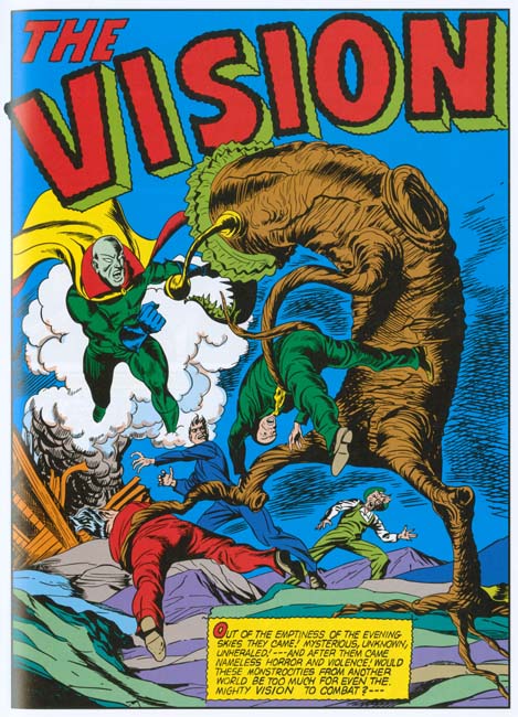
Of all the incorrect attributions found in Marvel Masterworks, the Vision story for Marvel Mystery #26 is the one I understand the most. Not that I agree, but I do think I understand why they went so wrong. This is probable the most unsuccessful Vision story that Kirby ever drew and also one of the most poorly inked. But quality is a poor tool to use when trying to determine the correct attributions. Even the best artist has his bad days. Again it is best to turn to things like the handling of exaggerated perspective when deciding who actually penciled the art. The Masterwork credits Al Avison and Ernie Hart for all the pencils, including the splash page. Look at the figure of the Vision from the splash page. He advances toward the reader in a typical Kirby pose. The neck is hidden and the torso is squat due to the effects of the perspective. One leg retreats while the other is thrust forward as the Visions strides toward the viewer. I have never seen Avison do anything nearly as successful and I doubt anyone can find something that Hart did that looks like this either. While the quality of the art in this story is not Kirby’s best, there are many other examples of exaggerated perspective that I do not think anybody but Kirby could have done.
This story is not without is problems. Look at the man with the blue suit in the splash. His upper body does not seem properly jointed to the lower portion. The tree monster’s root that crosses in front of the figure seems to have confused the artist. A similar thing can be observed on the cover for Young Allies #2 (Winter 1942) a comic that appeared not very long after MM #26 (advertisements for it appear in MM #28). I am uncertain what to say about this. Is it a rare Kirby failure or an example of another artist’s work? I tend to suspect the latter. I can easily see it as an later addition by another artist. If so it is not the only example of a Kirby splash modified during the Timely period (see Captain Daring from Daring Mystery #7 in Chapter 9 of Early Jack Kirby).


Marvel Mystery Comics #27 (January 1942) “The Vision”, pencils by Jack Kirby, letters by Howard Ferguson (from Marvel Masterworks Marvel Comics volume 7)

This is the last Vision story that I would credit to Jack Kirby. In this I agree with the Jack Kirby Checklist but not the Marvel Masterworks which says this was penciled by Al Avison. I must say I am rather puzzled by this as it is one of the better Kirby Vision stories. The inking is not as nice as some of the early Visions stories where Kirby inked his own pencils but superior to most of the inking from towards the end of Simon and Kirby’s stay at Timely. While I warn against using quality as a reference when deciding credits, I still would think that those responsible for the attribution in the Marvel Masterworks would have at least reconsidered when facing such superior work as this. Al Avison would do some great art after Simon and Kirby parted from Timely including the best golden age Captain America by an artist other than Joe and Jack. So good that some would claim Kirby provided layouts to him later in his career. That is another false claim (see Al Avison Did Not Need Any Help) but as good as Avison became his art never approached that shown in the Vision story for MM #27.

But there is no reason to depend on quality to decide who really provided the pencils for this story. Once again examining the exaggerated perspective and fist fights are sufficient. In the splash the Vision leans so far forward there is no sign of his neck while there is a very short distance from his arms to the top of his hips. His left leg advances toward the viewer will the right leg is trust backwards. This is the classical Kirby pose that Avison never truly used. similar expressive perspectives occur frequently elsewhere in the story as well as truly classic Kirby slugging.


Marvel Mystery Comics #28 (February 1942) “The Vision” page 4, pencils by Al Avison (from Marvel Masterworks Marvel Comics volume 7)

The last Simon and Kirby Captain America comic had a January cover date, the same month as Marvel Mystery Comics #27. After which Al Avison took over the primary penciling of Captain America. So it is not surprising that the Vision story from Marvel Mystery #28 (February 1942) was also drawn by Avison, one of the few Vision attributions that I agree with the Masterworks. But it also serves as a comparison for all the Vision work drawn by Kirby that preceded it. The splash page shows the Vision advancing more to the side than toward the reader. While Kirby would sometimes does something similar it is not the classic Kirby pose that dominates the earlier Vision stories. The closest Avison comes in this story to that pose is found in panel 4 from page 4. Yes the neck is hidden and the torso shortened (although not that convincingly) but his left leg is only slightly advanced from the right. While the Kirby pose makes the figure look like he is rapidly advancing towards the reader in this one it looks like the Vision is taking a bow. And while in the future Avison would sometimes draw a rather good fist fight (although not nearly as good as Kirby’s) there are no slugfests to be found in this story. Avison’s Vision compare well with the Captain America stories he did but it remains in stark contrast to Visions stories that should correctly be credited to Kirby.

Except for the occasional signature, golden age comic books almost never provided credits. Attributions are therefore opinions, not facts, and people can be mistaken about their opinions. Even me, which is why in this blog I like to try to explain what the basis is for the credits I supply. But such an approach is not possible for reprint books like the Marvel Masterworks. Which is why it is unfortunate that they choose to provide credits anyway. There will now be many people who will treat the Masterworks credits in these two volumes as fact not opinions. The disclaimer applied to some of the attributions actually makes it worse because of the implication implied to those credits that are not so marked. That is they are so accurate that no disclaimer is needed but they are actually just as prone to error. Readers of the Masterworks volumes would be better served had Marvel avoided detailed crediting rather than depending on the opinions of a small group of people.
Kirby Inkers, Al Williamson

I have previously posted on some of the artists that have inked Jack Kirby’s pencils (Mort Meskin, Marvin Stein and Captain 3D). Unfortunately my restoration work for Titan’s Simon and Kirby Library takes up so much of my time that I have been unable to pursue this topic further. However my work for the upcoming Science Fiction volume has allowed me to examine in detail the inking used for Race for the Moon and Blast-Off. It was particularly fortunate that I had available either the original art or flats (production proofs of the line art) of pretty much all the interior art for these two titles*.
Before discussing the evidence from the art, it would be best to start with a presentation of some of what has been said by others. In his book, Joe Simon, My Life in Comics Joe writes about Race For The Moon:

When I proposed the title, Jack welcomed the work. I wrote most of the stories, although Dick Wood, Dave Wood and Eddie Herron contributed some scripts. Because Kirby was penciling some of them, I was able to sign up three of the best inkers in the business. Reed Crandall, Angelo Torres, and Al Williamson, each of them a brilliant artist in his own right, all wanted to work with Jack. In addition to inking Jack’s pencils, they got to illustrate some stories on their own.

In an interview with Al Williamson from the Jack Kirby Collector #15:

TJKC: Did you and Wally ever discuss how to approach inking Kirby?

AL: No, it was a job. I remember going up to Harvey and getting work there. They said, “We haven’t got any work for you, but we have some stories here that Jack penciled. Do you want to ink them?” I’d never really inked anybody else before, but I said, “Sure,” because I looked at the stuff, and thought, “I can follow this.” It’s all there. I inked it, and they liked it, and they gave me three or four stories to do.

TJKC: I was just reading some of those Race For The Moons. There’s some beautiful stuff there.

AL: Well, he did a beautiful job. Some of it was redrawn by somebody there, I guess because it didn’t pass the Comics Code or something. There’s parts that I didn’t ink, because it’s not my drawing or Jack’s drawing. Somebody went over it and changed some things, like a monster or something to make it more pleasing to the eye, which bothered the hell outta me. I never really thought I did him justice, though. The drawing is there, because it’s Jack Kirby’s drawing, but I just traced what he penciled.

TJKC: Did you feel intimidated to add too much of yourself to it?

AL: I don’t do that. If the job is penciled, I would ink it the way the guy penciled it, because it’s his pencils. If I think it needs something, I’ll call the artist up and say, “Listen, I kinda would like to add a black here. Is this all right with you?” And as a rule, they say, “Sure. No problem.” But I don’t do any redrawing on anybody’s work unless I talk to the artist-and I very seldom have to do that.

Also in the interview, Williamson remarked that he did not ink any covers. So we have Simon crediting the inking to three different artists (Crandall, Torres and Williamson) and Williamson saying he inked somewhere between three and five Kirby stories. It is important to remember that such testimonials is evidence but not the proof that all too many comic book historians take it for. I am continually surprised that so many take evidence based on memory as fact. I would have thought that from what has been learned from legal cases over the years would discredited over reliance on memory. People’s memories are not created like a video recorder saving all that a person sees and hears. Rather memories are more like stories that people create and retell over and over. Such stories are biased and often are like a morality tale that tell more about the person telling them than what actually occurred. As years pass, the memories are effectively retold and change even further. Inaccuracies are expected and not a sign that the person is lying, that is trying to deceive. So I prefer to treat such interviews as evidence but I also turn to the work itself to find further evidence to support or refute what has been said.


Alarming Tales #6 (November 1958) “King of the Ants” page 2, pencils and inks by Al Williamson (from bleached page)

Artists have their own inking techniques that they use over and over. One place to start would be to examine how an artist inks his own work. Fortunately Williamson created a story, “King of the Ants”, for Alarming Tales #6 at the same times that Race for the Moon #3 came out. Regrettably Harvey’s had very poor printing so I use a bleached page to use as an example. Page 2 illustrates a number of techniques that Williamson was fond of. One was the use of multiple very broad brush strokes that are somewhat irregular and placed side by side. Examples can be seen in the lower right corners to panels 2 and 4 in both cases right above the figure’s shoulder. As far as I can tell, these irregular inking patches are not meant to depict any realistic feature but rather serve as an abstract pattern. I do not have a good name for another technique but I sometimes describe it as mottled crosshatching. This can be found in the right side of panel 4 just above the other inking technique described above. Sometimes Williamson uses a looping ink line to describe foliage such as found in bottom center of panel 1 right in front of the fallen tree trunk. Another technique is more of an anti-inking process where Williamson removes a panel’s border such as in panel 6. I have not seen the original art for “King of the Ants” but on original art that I have seen Williamson has cut page with a razor and peeled off the panel border. Of course anyone could have done it but such borderless panels are commonly found in work that Williamson inked but not other stories done for Harvey so I attribute the action to him.


Blast-Off #1 (October 1965) “Space Court” page 5, pencils and inks by Al Williamson

It might seem odd to use work published in 1965 to illustrate Williamson’s inking techniques from 1958 but in fact the Comic Code Authority stamp on the original art was dated March 6, 1958. This date was a few weeks earlier that the approval date for the art for Race for the Moon #3 (cover dated November 1958 but Comic Code approval date of March 28, 1958). It may be a minor mystery about what title this story was originally intended or why it was not published until years later, but it is a perfect match for this discussion about inking techniques.

Some of the previously discussed techniques can be found in the “Space Court” story as well. For instance the removal of panel borders, in whole or in part. Also note the background inking for panel 5 appears to be an expansion of the technique described above. What this page shows is another technique that is not technically inking, that is the use of Ben-Day dots. These are found in panels 3 and 4 giving both a grey background. The Ben-Day patterns were applied as transparent overlay sheets that were carefully cut with a razor to cover the desired areas. Williamson used Ben-Day dots with the standard dot patters arrange in the angles used for printing but also irregular dots (mezzotint patterns) and hexagonal arrangements.


Race for the Moon #2 (September 1958) “Lunar Trap” page 2, pencils by Jack Kirby, inks by Al Williamson

The inking of the Kirby pencils for Race for the Moon and Blast-Off can be placed in three groups that show related features. The first group consists of “The Thing on Sputnik 4” and “Lunar Trap” both from RFTM #2. These works were inked using both pen and brush. They differ from the next group is the general lack of some of the techniques that I have describe Williamson as using. None of the panel borders have been removed in these two stories and there is no use of Ben-Day dots. There is only one example of the looping ink line but this is not too surprising since Williamson often used this technique in rendering foliage and there are no plants on the moon. Two other Williamson inking techniques only appear in one panel; panel 2 from page 2 of “Lunar Trap” shown above. There we find the mottled crosshatching and that irregular broad brush strokes. Despite the infrequence or absence of some of Williamson’s inking techniques I still credit the inking to Al. As far as I can see only one hand was involved in the inking of these two stories and the pen and brush work looks very much like that found in stories I am convinced were inked by Al Williamson. I suspect these two stories were the first ones by Kirby that Williamson inked and he was just getting comfortable with working on Jack’s pencils.


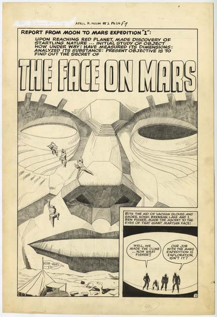
Race for the Moon #2 (September 1958) “The Face on Mars” panel 2 page 2 and panel 5 page 4, pencils by Jack Kirby, inks by Al Williamson

The next group of five Kirby stories are the ones that I am pretty confident in crediting the inking to Al Williamsons. These are “Island in the Sky” and “The Face on Mars” from RFTM #2, and “The Long, Long Years”, “Saucer Man”, “Space Garbage”, and “The Garden of Eden” from RFTM #3. These contain all the techniques that I describe above based on Williamson’s inking of his own pencils. I do not want to leave the impression that these techniques are abundantly found in Williamson’s inking but rather the usually can be found when enough pages are examined. I provide scans of panels from two different panels above to show some of the Williamson techniques found in these stories.


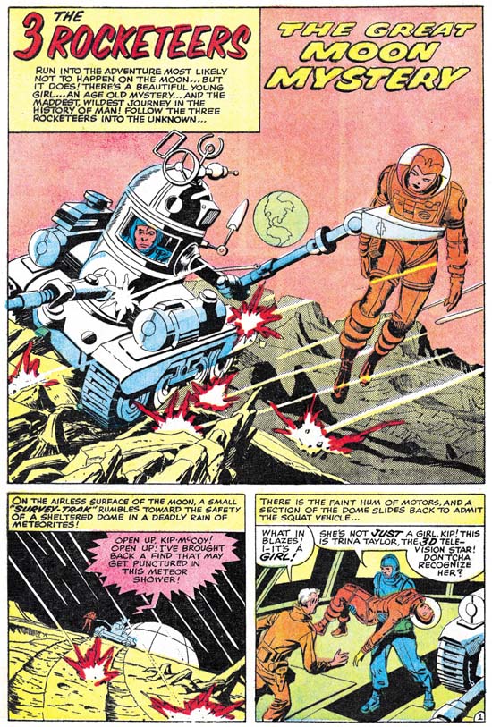
Blast-Off #1 (October 1965) “The Great Moon Mystery”, pencils by Jack Kirby and inks by Al Williamson

The third group consists of the Kirby penciled stories that appeared in “Blast-Off #1 (October 1965) which are “Lunar Goliaths” and “The Great Moon Mystery” Although I have examined the original art for these works they still are another of those minor mysteries. Neither story has Comic Code approval stamps. Further neither story has any indication of a previously intended title. Typically the original art would have on the top left just above the art the comic book title and page number it was intended for. Even when the title changed white out would typically be used to remove the outdated information so the new title and page could be added. No white out was used so the Blast-Off #1 information placed on the original art was the first applied. But both stories are Three Rocketeer stories and that feature first appeared in RFTM #3 so these two stories were likely intended for the unpublished RFTM #4. Certainly Kirby’s pencils are in the same style used for the 1958 RFTM and not at all a match for what he was doing in 1965 for Marvel Comics.

The inking of the two Blast-Off Kirby stories is more like the first, presumably earlier, group. Absent are any sign of most of the techniques I have described from Williamson’s inking of his own pencils. The only exception is the relatively frequent use of Ben-Day dots in “The Great Moon Mystery”, but they are not found at all in “Lunar Goliaths”. You can see the Ben-Day dots in the moon-scape background for the splash panel shown above. Although the comic book shows no sign of Ben-Day in the second (left) panel the original art shows that they were there. However Williamson used such a fine dot pattern that they complete got lost in Harvey’s rather crude production. Despite the fact that some of Williamson’s inking techniques, I still feel that the inking is very much the same as Williamson’s other work, just not as much embellished. I admit that this group and the first one require further study of the techniques used to either confirm or refute my attributions but for now I credit all the inking of Kirby’s pencils for RFTM or Blast-Off to Al Williamson.

In the interview Williamson says that he closely followed Jack’s pencils, as he described it “it’s all there”. My studies seem to support that. Unlike some of Kirby’s inkers, Al does not overwhelm Jack’s pencils, there is never any question that whose penciled it. Most of the effects of Williamson’s inking come from the spotting. It would appear that for RFTM Kirby provided tight line art but left the spotting to the inker. That was the typical technique Kirby used during the Simon and Kirby collaboration. Williamson was a talented artist with great control of his pen and brush work. In my opinion the inking Williamson did was some of the finest ever done on Kirby pencils. Unfortunately the printing used for Harvey Comics in the late 50’s was incredibly poor and some of Williamson’s efforts were lost.

Williamson also claims that someone reworked sections of the stories. “There’s parts that I didn’t ink, because it’s not my drawing or Jack’s drawing”. This clearly indicates that the rework would have happened after Williamson did the inking. However Joe Simon’s collection includes all the original art for the Kirby except for “The Long, Long Years” and I studied them all. Any changes that was done after the initial inking would have to have used white-out or other techniques to remove the original art for replacement with newer work. None of the original art shows any sign that this was done. The only use of white-out or paste-ups was on the lettering. I am sure Williamson believed what he recalled for the interview but it is just another example of the failings of evidence based on memory.

footnotes:
* 40 pages of original art and 11 pages of flats leaving only a single introduction page based only on the printed comics.

Harvey Horror: Alarming Tales #3


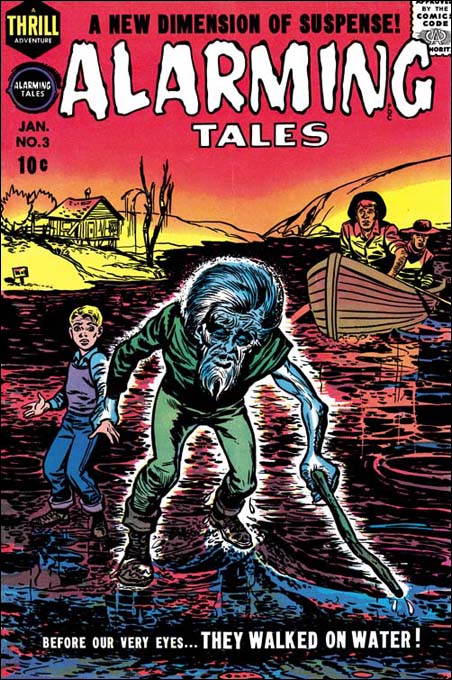
Alarming Tales #3 (January 1958), pencils and inks by Joe Simon

For a long time this cover was considered the work of Jack Kirby but it was actually created by Joe Simon. This confusion is understandable because it is a swipe from an unpublished cover that Jack did (for a more complete discussion see Alternate Versions of the Alarming Tales #3 Cover, although I no longer believe Kirby was the inker on the unused cover).


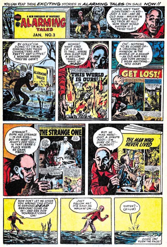
Alarming Tales #3 (January 1958) content page, pencils and inks by Joe Simon

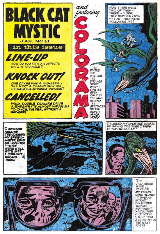
The contents page was used is an house advertisement in Black Cat Mystic #61.


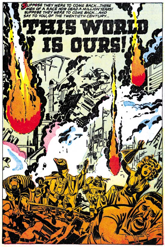
Alarming Tales #3 (January 1958) “This World Is Ours”, pencils by Jack Kirby

The inking of this story has in the past been attributed to Steve Ditko but I think we can confidently reject that claim. The figure in the lower right corner of the splash does look a little like Ditko’s work, however the blunt brushwork is nothing like Ditko’s inking at the time. One explanation could be that the inking of the splash was done by Mort Meskin whose work greatly influenced Ditko. Beyond the figure’s appearance, nothing in the brushwork suggests Meskin’s inking. Still I find it hard to believe that Kirby inked the splash either. The rest of the story does look very much like the inking of Kirby himself.


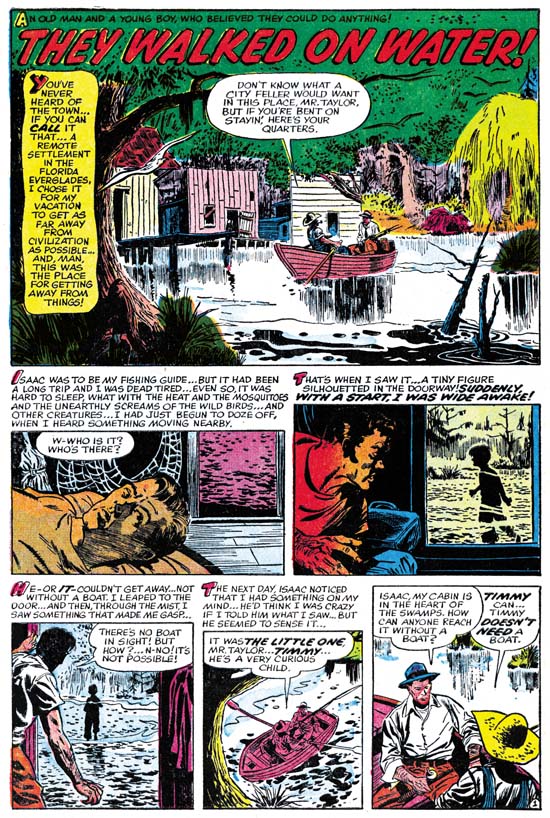
Alarming Tales #3 (January 1958) “They Walked On Water”, pencils and inks by Doug Wildey

There is a lot of work by Doug Wildey in AT #3 and in fact he would be frequently used in later issues of Alarming Tales and Black Cat Mystic. Wildey was an accomplished artist but unfortunately sometimes worked in greater detail than the crude printing of Harvey comics could handle properly.


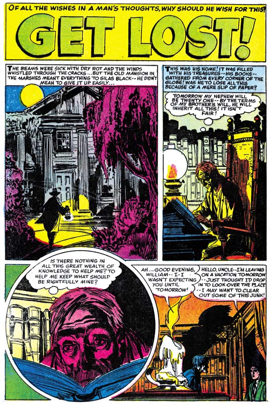
Alarming Tales #3 (January 1958) “Get Lost”, pencils and inks by Ernest Schroeder?

I am really not that familiar with the artists from Harvey at this time and this attribution is from GCD. Ernest Schroeder is said to have worked for Simon and Kirby around 1954 (Who’s Who). I do not find him in my database but that just means that I have not identified his work not that he did not work for them. If he did work for Simon and Kirby he did not sign his efforts. “Get Lost” has some interesting art, particularly the way Schroeder uses lighting to provide dramatic effects.


Alarming Tales #3 (January 1958) house advertisement, pencils and inks by Joe Simon?

The art for this house ad was used as the contents page for Black Cat Mystic #61. Someone commented in my post of that issue that Nostrand was no longer working for Harvey at that time. IF that is true it may be that this content page/ad was done by Joe Simon swiping from an earlier Nostrand piece.


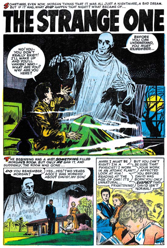
Alarming Tales #3 (January 1958) “The Strange One”, pencils and inks by Doug Wildey

I have to admit I am not a great fan of all the Harvey stories particularly those from after the Comic Code came into effect. While I like the Wildey’s art work for “The Strange One” the story is a bit contrived for my tastes.


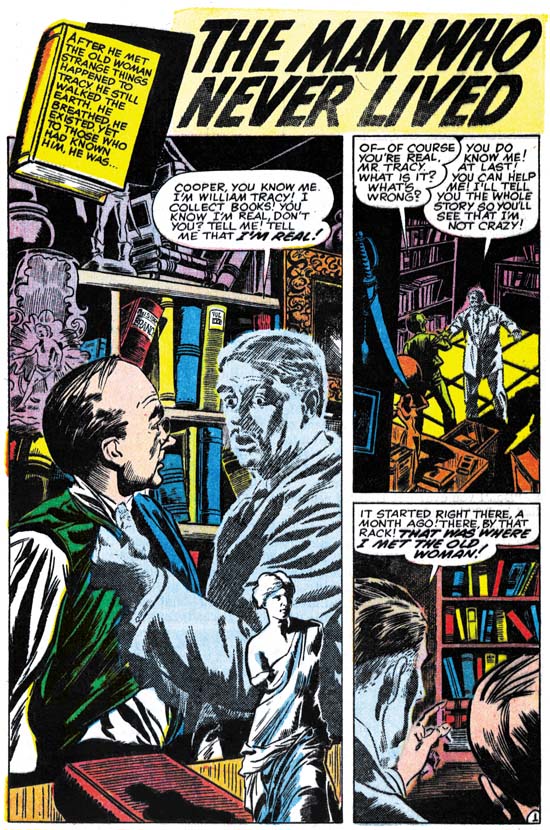
Alarming Tales #3 (January 1958) “The Man Who Never Lived”, pencils and inks by Doug Wildey

It appears to me that Wildey often worked from photographs. That is not to say that all his drawings were done based on photos but that some were. “The Man Who Never Lived” seems to have a larger than normal amount of drawing from photographs.

Harvey Horror: Alarming Tales #2


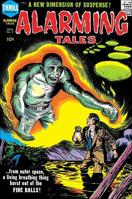
Alarming Tales #2 (November 1957), pencils by Joe Simon

I have discussed this cover on at least three prior occasions. I still feel that my last assessment of the cover art is correct, that is it was drawn by Joe Simon. The large figure looks as though it was done by Mort Meskin but this is easily explained as Joe swiped it from a story that Meskin drew.

While there is a lot of Jack Kirby in this issue, it is technically not an all Kirby comic book as it includes one two page story by Marvin Stein. But the main reason that AT #2 is not as desirable a comic as Alarming Tales #1 or Black Cat Mystic #58 or #59 is the inking which is just not quite as good as those other issues.


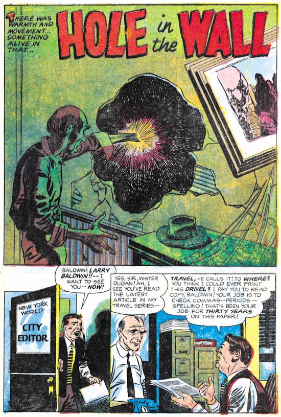
Alarming Tales #2 (November 1957) “Hole In The Wall”, pencils by Jack Kirby

This is another story of dimensional travel (Jack Kirby’s Trips to the Fourth Dimension). Only this time there is no explanation of how the “hole in the wall” came to be. Further the other dimension turns out to be a rather nice place to live.


Alarming Tales #2 (November 1957) “The Hero”, pencils and inks by Marvin Stein

Marvin Stein entered the advertisement field sometime in  1958 (Commercial Work by Marvin Stein) so this work from AT #2 is from near the end of his comic book career. Actually that is not completely accurate because Stein continued to provides some comic book art up to June 1959. Stein’s late style was simple but done with great assurance. I am not sure how he went about creating his story art but his covers were first very roughly drawn with a blue pencil, really nothing more than quick layouts. Marvin would then add details and finish the drawing not in pencil but directly in ink. It is a procedure that very few comic book artists adopted. Stein inked his own art with a very blunt brush but this was by choice. Marvin did some inking for DC on Superboy adhering to the house style with a finer brush. His ability to do quality inking with fine detail can be seen in the inking he did for Jack Kirby in syndication proposal called Space Busters (Bleeding Cool or What If Kirby).

This very short (two pages) story is about the exciting adventurous life of a spaceman. But not everyone could be a spaceman, you had to be very special. Special in this case is of a very small stature. Jack Kirby would take this same theme for one of the story lines he used in Sky Masters (a syndication strip that debuted on September 8, 1958).


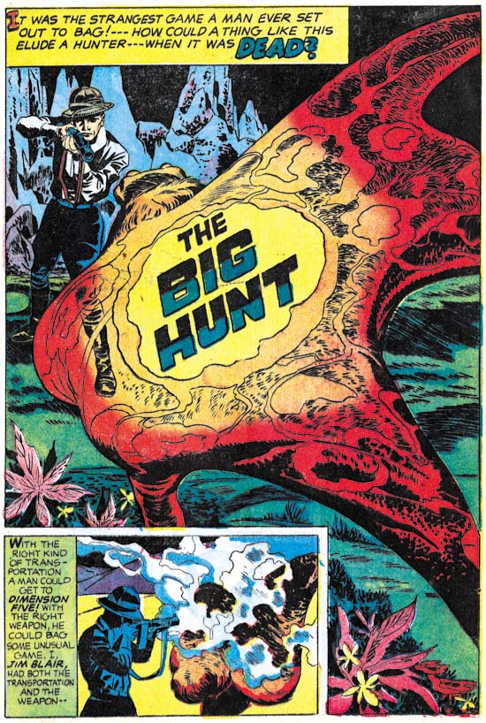
Alarming Tales #2 (November 1957) “The Big Hunt”, pencils by Jack Kirby

Another story of dimensional travel, in this case to dimension five. I find it humorous that a scientist would hire a big game hunter to test his device. Or that the hunter would return without anything from the new dimension. Big game hunters was imposing figures in the culture of the time. A lone individual faced against dangerous prey exemplified bravery. But with today’s the threat of mass extinction, big game hunting seems out of place. Most people would prefer to see a wildlife documentary than some trophy hanging on a wall.


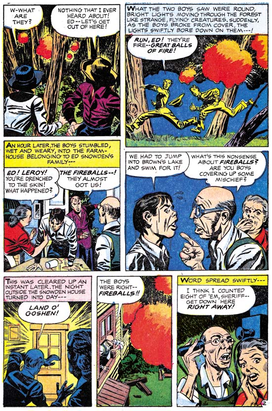
Alarming Tales #2 (November 1957) “The Fireballs” page 2, pencils by Jack Kirby, inks by George Roussos with some touchups by Kirby

“The Fireballs” is the story featured on the cover although in the story there is no monster like figure associated with the fireballs. Such deviations of the cover from the story are not that unusual for Simon and Kirby, or comics books in general at that time.

Previously I had considered this story as inked by Kirby as well. That was based on the inking found in certain sections. Notice the inking on the elderly man’s sleeve in panel 4 of page 2. This type of inking I refer to as picket fence inking (Inking Glossary). The manner that its done, drop strings with penned pickets is typical of Kirby’s inking at this time. I am still very much convinced that Kirby inked this particular piece and some other found in this story.

However inking done on Kirby pencils was often done by more than one individual. At one time inking was often done like an assembly line with different inkers working on different aspects of the same pages. With the end of the Simon and Kirby studio such assembly line inking was no longer used but it was still very common for someone to ink Kirby’s pencils and then Jack would go over it providing touch-ups. That is what happened in the inking of “The Fireballs”. The more simplified eyebrows, use of crosshatching by pen, the rather rush looking to the work, and the common use of lighting directed up from below all remind me of the work of George Roussos to whom I now credit with the majority of the inking of this story.


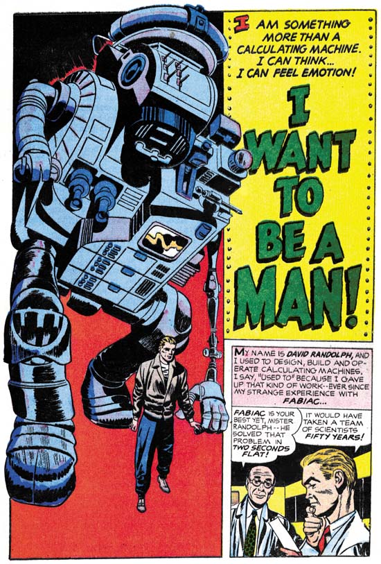
Alarming Tales #2 (November 1957) “I Want To Be a Man”, pencils by Jack Kirby

Robots appeared relatively frequently in Kirby stories during this period (Year of the Robots). I have no good explanation for this. Yes robots appeared in various science fiction movies but none quite like the type of robots that Kirby created. His as large and distinctly mechanical. The one in “I Want to be a Man” is filled with mechanical forms. Throughout his career Kirby had a love of what I call Techno Art (Some Early Jack Kirby Techno Art). Such art would include a multitude of shapes and devices that serve no purpose other than to suggest advanced technology.

Harvey Horror: Black Cat Mystic #60

Black Cat Mystic #60 (November 1957) was another all Kirby issue. Previously that was quite unusual but with the launch of Challengers of the Unknown (Showcase #6, February 1957) all Kirby comics became more common. In my opinion BCM #60 was not quite as good as BCM #59 or Alarming Tales #1 it is still a rather nice read.


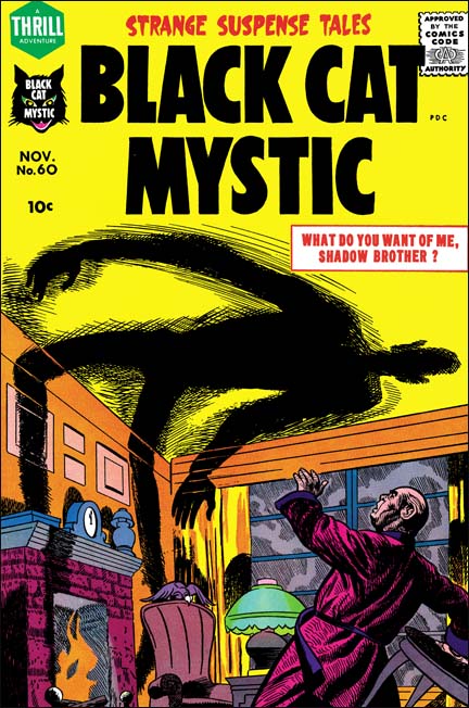
Black Cat Mystic #60 (November 1957), pencils by Joe Simon

Some people still attribute this cover to Jack Kirby but that position is hard to understand. Kirby was the master of comic book perspective. One look at the gentleman’s raised hand should convince anyone that this was not drawn by Kirby. It was Joe Simon that actually drew this cover. Joe was quite good at adopting styles used by other artists, particularly Kirby’s.


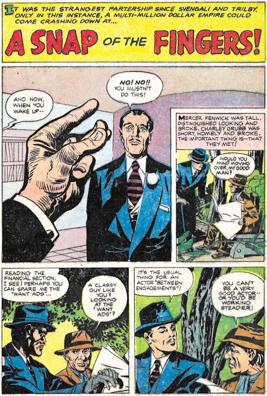
Black Cat Mystic #60 (November 1957) “A Snap Of The Fingers”, pencils and inks by Jack Kirby

Success requires a good appearance and exceptional talent, at least according to “A Snap Of The Fingers”. Two down and out individuals lack one or the other quality so they join forces. Of course this tale belongs to the horror genre so this story does not end with happy ever after. I have to say that I suspect that the story has been modified to get past the Comic Code. In the story an accident occurs that I believe originally was planned murder. The change would not affect the art work only some of the text.


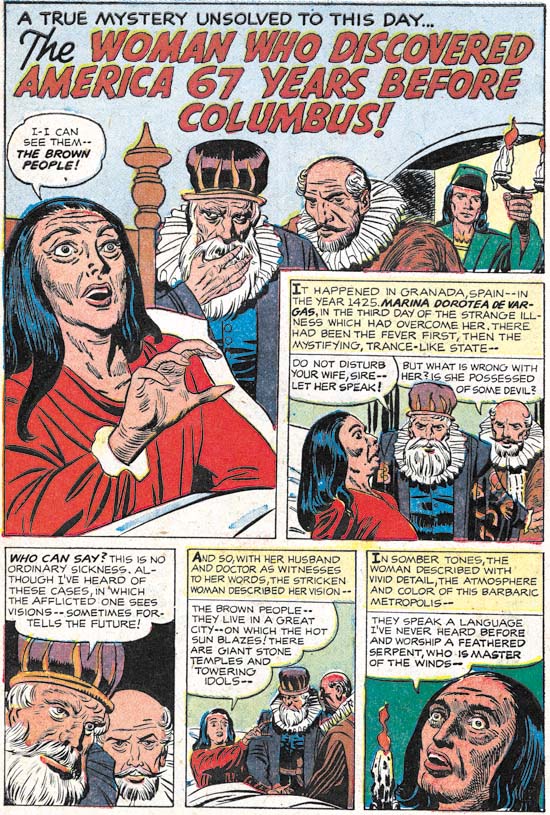
Black Cat Mystic #60 (November 1957) “The Woman Who Discovered America”, pencils by Jack Kirby, inks by Joe Simon

At one time I thought this piece had been drawn by Joe Simon but I later realized it was Simon’s inking that gave the appearance that he had penciled it as well. This is a short piece (two pages) that is about a supposedly true prophecy of the discoverer of the new world. I wonder what Simon and Kirby’s source was for this tale. I had thought it might have been “Stranger Than Science” by Frank Edwards. I remember reading Edwards’ book when I was young and it was full of such stories. However “Stranger Than Science” was first published in 1959 and so is too late to be the source.


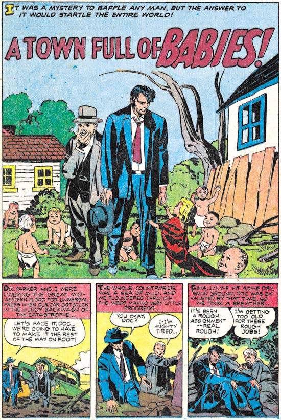
Black Cat Mystic #60 (November 1957) “A Town Full Of Babies”, pencils and inks by Jack Kirby

This story was inked by Kirby himself except for the last page. I am not sure who did that page but it was not Joe Simon. The theme of getting a chance to relive one’s life was used once before by Simon and Kirby. I have to say that somehow this would seem more like a death sentence unless somehow they retained their original memories. But even that might not be such a great gift. Would anyone really want to relive their childhood while retaining the memories of an adult?


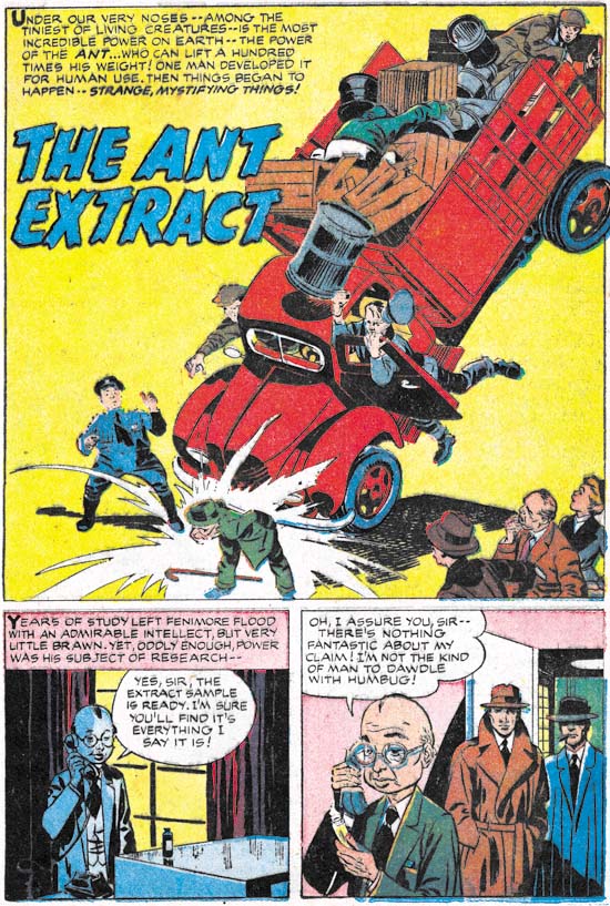
Black Cat Mystic #60 (November 1957) “The Ant Extract”, pencils and inks by Jack Kirby

A diminutive scientist creates a solution that endows the drinker with amazing strength. What is particularly surprising about this discovery is that the scientists announces it before he has even tested it. Simon and Kirby had a rather peculiar idea about what a scientist was and how he would go about his work. But while it was not an accurate portrayal it did make for an interesting story. What would society do with his new scientific breakthrough? It is a humorous story but I will not reveal anything more. You will just have to wait for Titan to release the next volume from the Simon and Kirby Library.


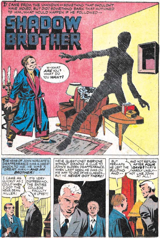
Black Cat Mystic #60 (November 1957) “Shadow Brother”, pencils and inks by Jack Kirby

Another story featuring scientists, in this case a professor type and a boy genius. The story contains some rather bizarre physics but hey, its just a comic. Unfortunately “Shadow Brother” is marred by rather poor printing. Harvey’s comics from the late 50’s had particularly bad printing that affects some stories more than others.


Black Cat Mystic #60 (November 1957) “Shadow Brother”page3 panel 4, pencils and inks by Jack Kirby

Comic books sometimes provide glimpses into the past. Panel 4 from page 3 shows a night watchman at a college. But why does the night watchman carry a purse? Well it is not a purse but a guard tour clock. Night watchmen were expected to petrol premises throughout the night when no one was expected to be around. But since no one was around how could an employer be sure the guard was actually conducting patrols and not sleeping on some couch? This clocking device was the solution to this problem. Special keys would be chained to the wall at various locations usually stored in a small container also mounted the wall. When the night watchman made his rounds he would insert these keys into his guard tour clock which would report what key was used and the time of its use. A record was therefore made that the employer could then examine later to verify that the watchman was performing his duty. Video cameras are so prevalent today that I would have thought that guard tour clocks would have become obsolete but a quick Google shows they are still being sold.

Harvey Horror: Alarming Tales #1

Harvey released a new title, Alarming Tales, with a cover date of September 1957. This is the same month that Black Cat Mystic #59 was released. Both titles covered the same genre, horror and science fiction. In fact the cover story for Alarming Tales #1 (“Donnegan’s Daffy Chair”) was originally intended to be used in Black Cat Mystic #59 (as shown by the original art for an used cover). Since both titles were bimonthly publications, it was unusual that they would have the same schedule. Normally such similar comics would alternate months (such as Simon and Kirby’s Young Romance and Young Love did). The original art for the unused cover of Black Cat Mystery #59 has a July cover date so perhaps the original intent was for alternating months but something delayed it.


Alarming Tales #1 (September 1957) pencils by Joe Simon and Jack Kirby

I had previously credit the cover art for AT #1 to Joe Simon alone but I now realize that the art is a “Frankenstein” made from different pieces of art. It was not that unusual for Joe to piece together different art (see Cover for Alarming Tales #2, My Third Attribution Attempt). In this case that lower portion came from art that Jack Kirby drew while the upper portion was done by Simon. I suspect that the original art that Kirby made included a figure in a fly chair very much like the one in the actual story. That is the way that the unused cover for BCM #59 was done. That included goggles that covered the figure’s eyes. Such an depiction would fit the story but Joe probably felt (and I agree) that the cover would be more dramatic with the full face exposed. The portion of the art that Simon did was done on a craft tint board with irregularly shaped dots that sometimes is referred to as a mezzotint pattern. Lines were then “inked” over this with a pen to provide interesting dotted lines.


Alarming Tales #1 (September 1957) “Contents”, pencils by Joe Simon and Jack Kirby

It appears that except for the lettering the contents page was created entirely by stats from parts of the book. Simon and Kirby did not do use stats to create comic pages very often while they had their own studio but apparently Harvey either had a stat camera or used a service bureau to provide copies. I love the way the images of Donnegan’s chair are woven through the contents page.


Alarming Tales #1 (September 1957) “The Cadmus Seed”, pencils and inks by Jack Kirby

Scientifically engineered humans sounds like something out of more recent newspapers. However the Simon and Kirby story never mentions DNA or cloning. The structure of DNA had been discovered by this time and it’s importance was well known in the scientific world. But science fiction had not yet caught up with science fact. Nonetheless “The Cadmus Seed” is a delightful story with a mildly humorous ending.


Alarming Tales #1 (September 1957) “Logan’s Next Life”, pencils by Jack Kirby, inks by Joe Simon

“Logan’s Next Life” is the only story in AT #1 that could be describe as belonging to the horror genre. Since is consisted of only two pages it was not that much of a contribution to AT #1. Most of the stories from the Alarming Tales and it’s companion title Black Cat Mystic could best be described as science fiction. But despite being in the minority horror stories would still play a significant part of these titles.

The art for “Logan’s Next Life” was based on an earlier story named “When I Live Again” that had appeared in Black Magic #13 (June 1952, see Little Shop of Horrors, Chapter 5). The original story was penciled and inked by Bill Draut. While Kirby was known to do an occasional swipe, such extensive swiping for a single story would be rare. One example would be “Invisible Irving” from Fighting American #5 (December 1954, see A Simon and Kirby Swipe). Another example of an extensive Simon and Kirby swipe appears to be “Deadly Doolittle from Fighting American #6 (February 1955, see Fighting American, Jumping the Shark) but in that case it was Joe Simon doing the swiping.


Alarming Tales #1 (September 1957) “The Fourth Dimension Is A Many Splattered Thing”, pencils and inks by Jack Kirby

This story was included in a recent post concerning Kirby’s use of extra-dimensional traveling (Jack Kirby’s Trips to the Fourth Dimension).


Alarming Tales #1 (September 1957) “The Last Enemy”, pencils and inks by Jack Kirby

This story has longed been recognized as a prototype for Kamandi title that Kirby did for DC from 1972 until 1976. The most significant change is that while except for the protagonist, humans were completely absent from “The Last Enemy” they were present in Kamandi but usually as nothing more than speechless animals. But otherwise the theme of talking animals taking over the world was common to both. Frankly I do not recall how this change was explained in Kamandi, but in “The Last Enemy” it was the results of an atomic war. While that is a perfectly understandable explanation for the lack of humans it is not clear how the change in animals occurred.


Alarming Tales #1 (September 1957) “Donnegan’s Daffy Chair”, pencils and inks by Jack Kirby

Oddly the story featured on the cover of AT #1 was the second shortest in the book. Stories from Black Cat Mystic and Alarming Tales were pretty consistently five pages long but “Donnegan’s Daffy Chair” was only four.