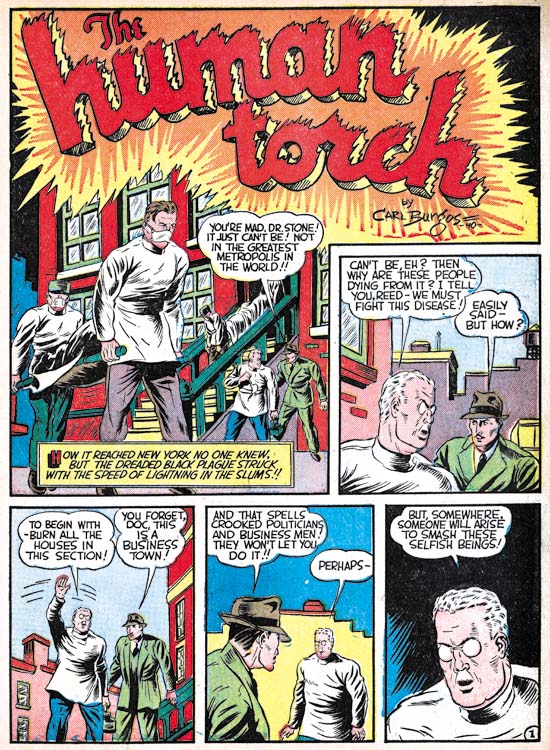
Marvel Mystery #11 (September 1940) “The Human Torch”, pencils by Carl Burgos, letters by Howard Ferguson
Joe Simon was hired by Timely for the purpose of setting up a bullpen so that the comic book art could be created in-house. Previously Timely’s Marvel Mystery Comics, Daring Mystery Comics and Mystic Comics had be done by Funnies Inc. a shop run by Lloyd Jacquet. In “The Comic Book Makers” Joe says that he was to make things difficult for Funnies Inc. so that they would give up on the features they had doing for Timely. This must have put Joe in a rather awkward situation as he at that time he was also supplying Funnies Inc. with Blue Bolt stories.
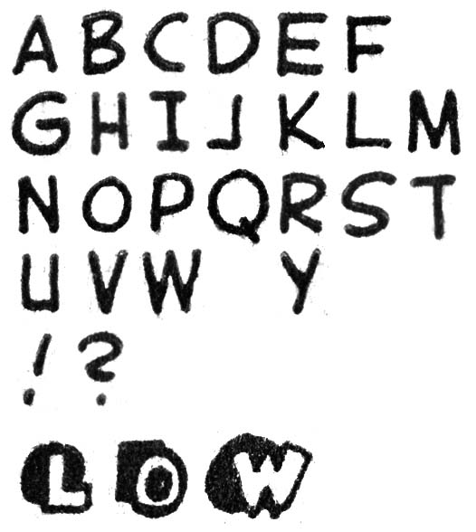
Marvel Mystery #11 (September 1940) “The Human Torch”, letters by Howard Ferguson
September 1940 is the earliest cover date that I comfortably assign lettering credits to Howard Ferguson. This attribution is mainly based on the special lettering Ferguson applied to the first letter of a caption. This was the comic book equivalent of the oversized and often stylized first letter of a chapter that used to be very popular but has more recently gone out of fashion. A number of letterers emphasized the first letter often by enlarging and opening up its interior so that it could be colored. Some also included a “shadow” affect to the letter. But Ferguson was the only letterer that I am aware of who would place behind the letter not its shadow but an abstract black shape often of a square of circular shape. Todd Klein (Howard Ferguson, letterer) does not seem to appreciate them but I find this technique a great way to attract the attention and provide an element of design to the captions which are often overly plain.
Howard lettered a number of stories release in September but based on the form of the letters he used I believe the earliest ones he did were those for “The Human Torch” and “Terry Vance” stories from Marvel Mystery #11 (September 1940). This may seem odd because these stories were still being provided by Jacquet’s shop. Ferguson seems to make an effort to make his lettering special, in particular the special first letters of the captions. Therefore I find it unlikely that he was moonlighting for Funnies Inc. without Simon being aware of it. Perhaps this was part of Joe’s campaign to make things difficult for the Funnies shop.
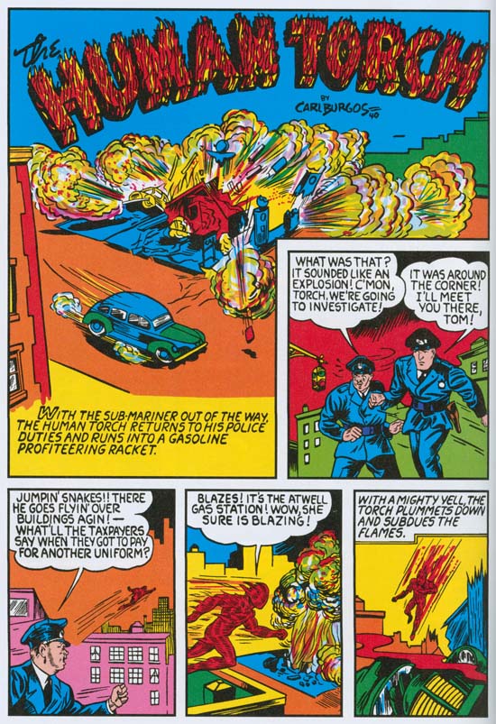
Marvel Mystery #10 (August 1940) “The Human Torch”, pencils by Carl Burgos, letters by an unidentified letterer (from Marvel Masterworks*)
Most captions for the “The Human Torch” and “Terry Vance” from Marvel Mystery #11 (September 1940) have a wavy line for a border. That is except for the one caption found on the splash page. The double line border has been cited as a Ferguson trademark and in fact we will see its use by Ferguson in the future. A double line border also appears in the captions throughout “The Human Torch” from Marvel Mystery #10 (August 1940).
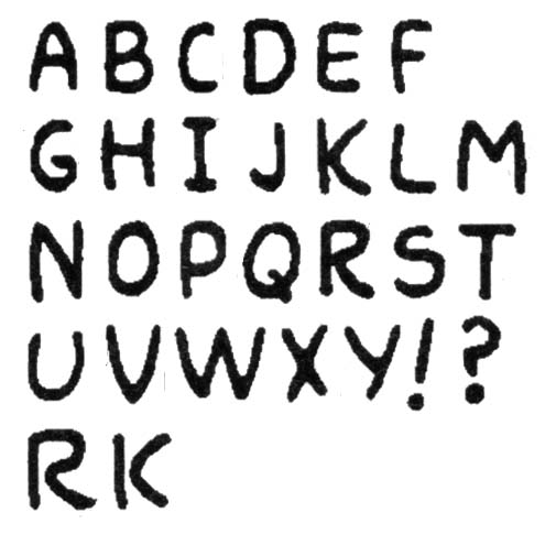
Marvel Mystery #10 (August 1940) “The Human Torch”, letters by an unidentified letterer (from Marvel Masterworks*)
Comparison of the lettering in “The Human Torch” of Marvel Mystery #10 to that found in the same feature from Marvel Mystery #11 suggests that they were not done by the same letterer. Nowhere in MM #10 does the letterer use the special first letters for the captions like Ferguson used for MM #11. The closest the unknown letter gets to that is some over sized and open interior letters. Note the different form used for the letter ‘M’. In MM #10 the letter ‘S’ has the lower portion larger than the upper “half” while Ferguson typically did the reverse. But most importantly the letters for MM #10 just did not have the firm hand that Ferguson had. Often the strokes for the letters are not quite straight but curve slightly instead. In some places the letters ‘R’ and ‘K’ are not correctly connected (I provide some examples at the bottom of the letter guide above). I just do not believe Ferguson lettered “The Human Torch” from Marvel Mystery #10. Because of this and the use of this technique by other letterers it does not seem advisable to use double line caption borders as sufficient criteria for crediting lettering to Howard Ferguson.
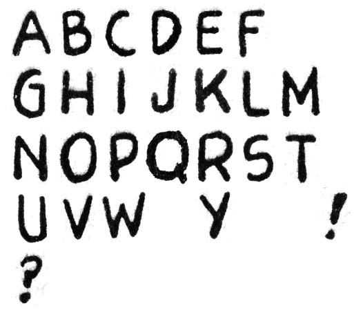
Blue Bolt #3 (August 1940) letters by unidentified letterer
Now that I have Ferguson’s lettering for Marvel Mystery #11 to compare with I want to briefly return to examples from the previous month that some have credited to him. First I would like to compare it to Blue Bolt #3. Note the difference in the letters ‘M’ and ‘W’. In BB #3 the center angle of each does not extend are far as the outer lets while in MM #11 the center angle extends the full distance. Also note the differences between the two for the form of the letter ‘G’ or ‘K’.
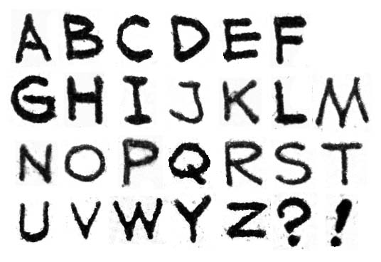
Red Raven #1 (August 1940) “The Red Raven”, letters by unidentified letterer
The lettering for Red Raven #1 also differs from Ferguson’s for Marvel Mystery #11. The letters ‘K and ‘Y’ are different between the two. The outer legs for ‘M’ are almost vertical in MM #11 while they have a distinct slant in RR #1. However it will be shown below that Ferguson’s lettering changed somewhat for Daring Mystery #6 done the same month as Marvel Mystery #11. I believe we are seeing Ferguson in the process of learning what for him was a new craft. It is quite possible that Howard had done some lettering for earlier comics. Perhaps the lettering for Red Raven #1, Blue Bolt #3 or Marvel Mystery #10 might have been done by Ferguson only in yet a more primitive stage of his development. The problem is how to identify which, if any, were done by Ferguson particularly since each seems to have been done by a different letterer. At this time I will simply attribute RR #1, BB #3 and MM #11 to an unknown letterers and accept the work in MM #11 as the earliest examples that can confidently be credited to Ferguson.
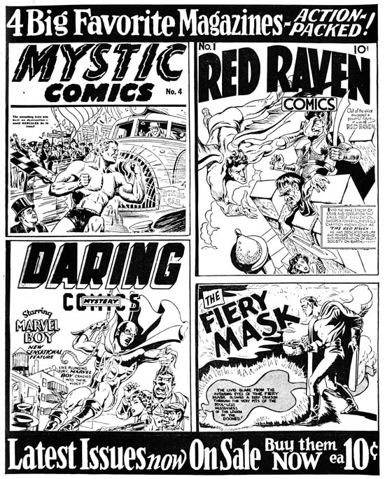
Marvel Mystery #11 (September 1940) house ad
The inside front cover for Marvel Mystery #11 has a black and white house ad which shows the three other titles that Timely was publishing at that time. Red Raven #1 was released in the previous month but being a bi-monthly was still considered the current issue. The fourth panel for the advertisement does not show a cover but advertises a feature, the Fiery Mask. This was a Joe Simon creation that had been included in Daring Mystery although the last couple appearances (Daring Mystery #4 and #5) were not drawn by Simon. The presence of the Fiery Mask in this ad together with the two Kirby covers clearly was an attempt to promote those features which Simon was most responsible for.
Simon probably had little to do with Mystics Comics #4 that was in the Marvel Mystery #11 house ad. It seems that there is an inconsistency in the dating of that comic with the cover indicating August and the indicia listing it as July. Such discrepancies are not that unusual and I always go with the cover date since it was used for indicating when the comic might be removed from the rack and therefore would generally provide a more reliable date.
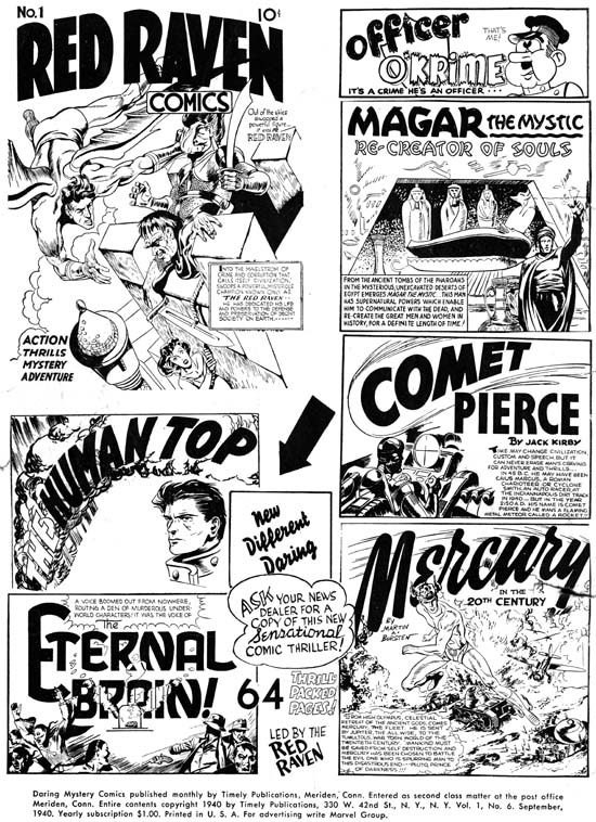
Daring Mystery #6 (September 1940) house ad
The house ad found in Daring Mystery #6 is entirely given over to the Red Raven #1. All Red Raven features are listed including the short comic filler “Officer O’Krime.
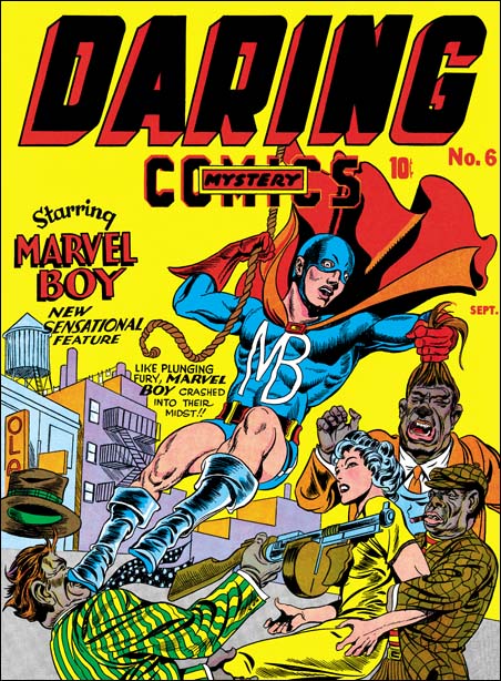
Daring Mystery #6 (September 1940) pencils by Jack Kirby, inking and lettering by Joe Simon
Simon and Kirby involvement in Daring Mystery #6 is obvious as they produced two stories for that issue. The cover was also a Simon and Kirby production with Jack providing the pencils, Joe the inking and lettering. That it was Simon’s lettering is clear by the letter ‘R’ in the word “their” which sometimes turns up in his lettering (see below for an example). Also the ‘W’ in “new” is done in the typical Simon manner (see below as well). The lettering for the covers of Daring Mystery #6 and Red Raven #1 are really well done. This might come as a surprise considering that Joe himself describes his lettering as not professional. However a really well done story lettering requires both precision and speed, a combination that Joe never mastered in his lettering. On the other hand more time would be expended on covers allowing Simon to use his talent for design and his skills with the brush.
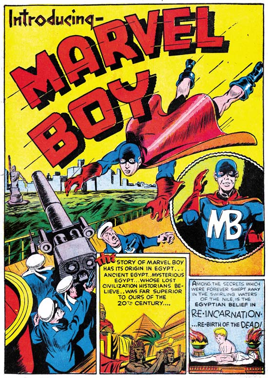
Daring Mystery #6 (September 1940) “Introducing Marvel Boy” pencils and inking by Joe Simon, lettering by Howard Ferguson
The art for “Introducing Marvel Boy” was created by an unusual assortment of artists. The first three pages were drawn and inked by Joe Simon with no sign of any involvement by Jack Kirby. The hero’s gloves, boots and skull cap show would be used again six months later in another Simon and Kirby creation, Captain America.
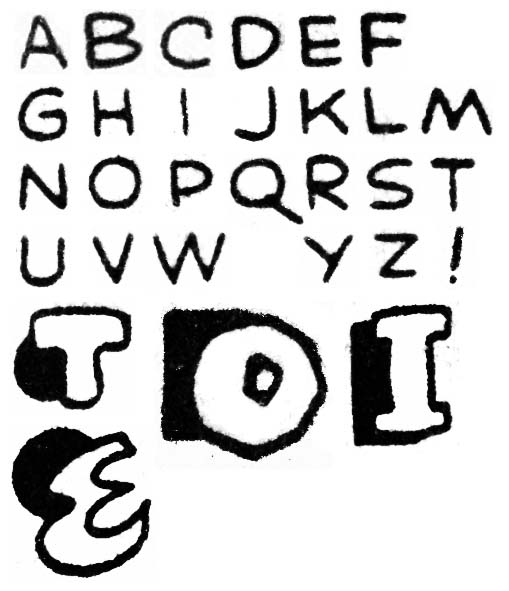
Daring Mystery #6 (September 1940) “Introducing Marvel Boy” lettering by Howard Ferguson
The lettering for the first three pages of the Marvel Boy story, the same pages Simon drew, was done by Howard Ferguson. One of the things that identifies this as Ferguson’s work is the presence of the same first caption letters that we saw in Marvel Mystery #11 (September 1940). Ferguson has even gone further and on the splash page provided the first caption with an enlarged, scripted and colored word “the”. This highlighting of the first word of a caption would appear again in future lettering by Ferguson. I have previously described Marvel Mystery #11 as providing the earliest work that can be confidently credited to Ferguson. The reason I gave MM #11 that distinction and not this story from DM #6 is that the Marvel Boy story shows the first appearance of a small vertical stroke applied to the letter ‘C’. This would be virtual trademark of Ferguson throughout most of his career and an easy and reliable indicator of his lettering. Ferguson has adjusted the letter ‘M’ to his more frequent format with distinctly slanted outer legs although since so many other letterers use this form it is of lesser importance in identifying Howard’s work. Oddly for DM #6 Ferguson has altered his letter ‘K’ to a shape not typical for him at all. But the letter ‘G’ still has not been altered to Ferguson’s more typical later form.
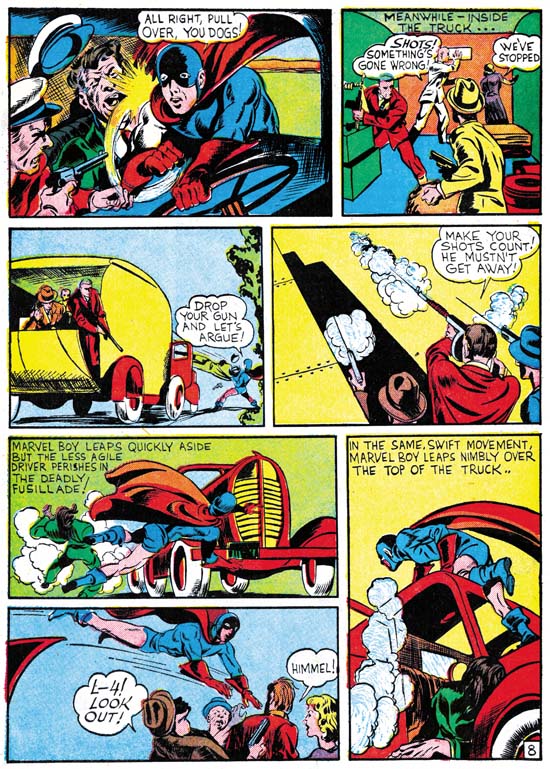
Daring Mystery #6 (September 1940) “Introducing Marvel Boy” page 8, pencils by Jack Kirby, lettering by Joe Simon
While Simon drew the first three pages of the Marvel Boy story it was Jack Kirby who penciled the remaining seven pages. The inking credit for these Kirby pages is hard to determine. Certainly Jack was not inking this work. Perhaps Joe was involved but to me it looks like the work of a number of different inkers. So it seems likely that by this time Simon had hired some studio assistants to help with choirs such as inking. I have been asked a number of times about who did what inking in this early Timely bullpen but to be honest I have not worked that out myself and I am dubious that such inking attributions can be reliably determined. So except for those cases where the inking was done primarily by Kirby or Simon I will leave off inking credits in this serial post.
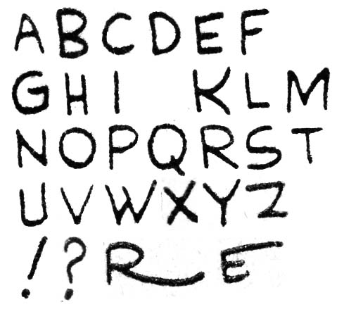
Daring Mystery #6 (September 1940) “Introducing Marvel Boy” lettering by Joe Simon
The lettering for the Kirby pages was not done by Ferguson but by Joe Simon. This clearly indicated by the presence of Joe’s rather unique letter ‘W’. While not quite as useful, Joe’s letter ‘M’ is also of use in spotting his lettering. For the most part Simon tries to be more professional than some of his earlier lettering work but occasionally he provides his letters with dramatic extensions such as the ‘R’ and ‘E’ show at the bottom of the above letter samples. Even today Joe likes to use such flairs in his signature.
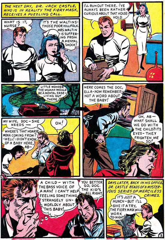
Daring Mystery #6 (September 1940) “The Fiery Mask” page 3, pencils by Joe Simon
Both Simon and Kirby worked on “The Fiery Mask” story in Daring Mystery #6. Once again it is Joe that penciled the start of the story (pages 1 to 4). Also like the Marvel Boy story, Joe inked his own pages. Simon’s pages contain a number of swipes from Alex Raymond’s Flash Gordon (Art by Joe Simon, Chapter 5).
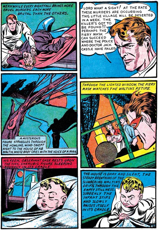
Daring Mystery #6 (September 1940) “The Fiery Mask” page 5, pencils by Jack Kirby
Kirby penciled pages 5 to 10 of “The Fiery Mask”. While Simon’s pages include a number of swipes I am not aware of any in those penciled by Kirby. The most likely conclusion is that in this story Kirby is not working from Simon layouts or if he was Jack felt free to alter them.
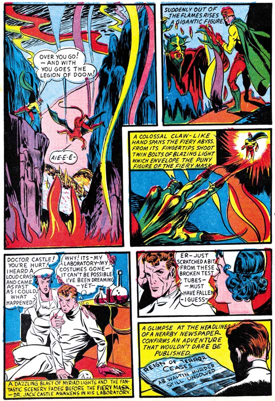
Daring Mystery #6 (September 1940) “The Fiery Mask” page 5, pencils by Jack Kirby with some inking by Joe Simon
Like the Kirby pages from the Marvel Boy story, the inking seems to have been done by a number of different hands. But Simon’s inking seems present in some places particular the lower half of the last page. However there is some inking using fine lines, such as in the second panel of page 5, that is untypical of Simon. None of the inking seems attributable to Kirby.
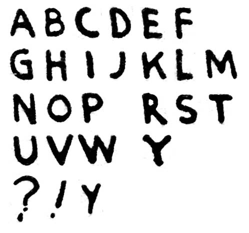
Daring Mystery #6 (September 1940) “The Fiery Mask” lettering by Joe Simon?
The lettering for the Fiery Mask story was handled by two letterers. I very questionably attribute the lettering of the first two pages to Simon. Completely missing is Joe’s characteristic ‘W’ or anything that could be described as flaring of the letters. However the ‘M’ looks very much like Joe’s. The question mark is similar to Simon’s as well. Further the rather amateurish quality to the lettering is very much in agreement with Simon’s ability. Letter size varies and while all the lettering is vertically oriented in some places it actually slants slightly upward to the left. But I would like to emphasize that the attribution of this letter to Simon is provisional as I have not have had a chance to study some of Joe’s later lettering.
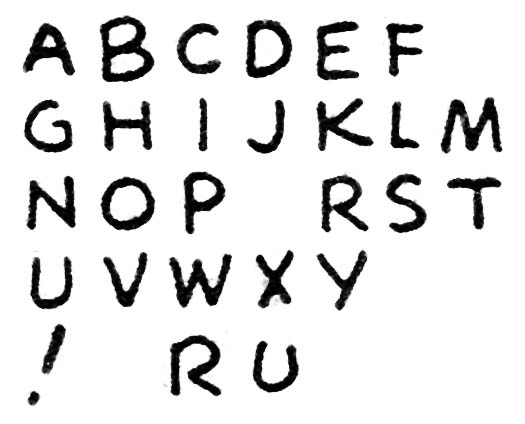
Daring Mystery #6 (September 1940) “The Fiery Mask” lettering by unidentified letter
Pages 3 to 10 of the Fiery Mask story were done by a different lettering. I have taken all the letter examples shown above from the speech balloons where the letters are all vertically oriented. However in all the captions the letters are slanted upward to the right. The letters ‘M’ and ‘Y’ are not like Joe’s. The second letterer does a little more profession job. Letter sizes are more consistent and the letters themselves seemed done with firmer control. However sometimes the letter ‘R’ lacks the connection as shown at the bottom of the lettering examples above. Also occasionally the ‘U’ gets an almost horseshoe shape.
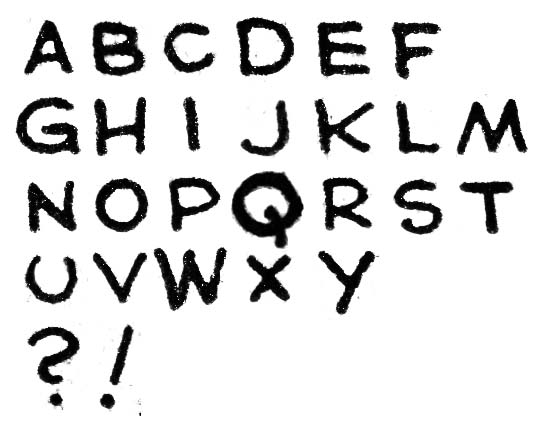
Red Raven #1 (August 1940) “Mercury in the 20th Century” lettering by Jack Kirby
I somehow failed to include an example of Kirby lettering when I discussed Red Raven #1 and so I provide it here. As reported previously, Jack had a very distinctive, horseshoe shaped, letter ‘U’ that is very useful in identifying his work. Kirby’s ‘G’ is also rather distinctive with its small vertical stroke attached to the letter’s hook. While the second letterer for the Fiery Mask story occasionally makes a horse shoe shape ‘U’ Kirby only occasionally makes one that does not have that shape. Further the second letterer’s ‘G’ lacks Kirby’s unique form. So I do not believe the second letter in the Fiery Mask story is Jack.
Still to be discussed is Blue Bolt #4 also cover dated September which I will cover in the next chapter.
* I have been forced to use the Marvel Masterworks because I do not have access to original comics for some of the issues that I will be discussing. This is not without risks because Marvel is notorious for the use of recreated art for their reprints.


Great posting, Harry! Excellent observational research, as usual. That house ad from MARVEL MYSTERY #11, which says “4 Big Favorite Magazines”, makes me wonder if Timely was planning, briefly, to put The Fiery Mask into a book of his own. Also, what’s up with the atrocious coloring on the cover of DARING MYSTERY #6? Jack has drawn the thick-lipped, Edward G. Robinson-style gangsters which were one of his career-spanning trademarks, but it looks as though the colorist misinterpreted his intentions and tried to make them all negroes! Awful!!
I would not call the gangsters Edward G. Robinson-style. Not only did they have thick lips but wide noses as well. They were meant to be African Americans and as such one of the few examples of negative racial stereotyping by Simon and Kirby. The other is Whitewash from Young Allies and by the way Jack played down him in the splashes that he actually drew that he was dictated by Goodman.