Author Archives: Harry Mendryk

Commercial Work by Marvin Stein


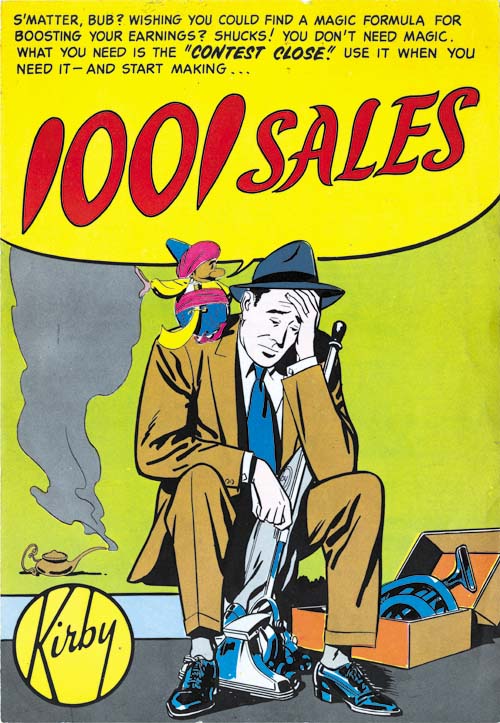
“1001 Sales”, pencils and inks by Marvin Stein

I have to admit when I decided to write a post about some recent commercial comics that I have come across I thought about giving it the title “A Newly Discovered Kirby Comic”. Such a title would surely attract attention and yes the cover to “1001 Sales” has a conspicuously Kirby marking. However it is not Jack Kirby that is referred to but Kirby Vacuum Cleaners. The artist to this commercial comic and two others that I will also discuss was Marvin Stein.

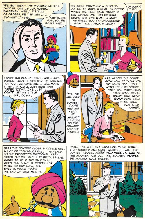
“1001 Sales” is a slim 4 page comic book. Really nothing more than a single sheet that has been folded. The paper is newsprint although perhaps a little better quality than the paper of typical comic books. But otherwise clearly recognizable as a comic book. Political and commercial comics were not that unusual years ago but have are pretty disappeared today.


“1001 Sales” page 4, pencils and inks by Marvin Stein

The first page, which passes as a cover, may not be immediately recognizable as drawn by Stein. But this is due to the unusual pose and expression, at least compared to Marvin’s comic book work. But the art style found on the other pages clearly belong to Stein. The art was a bit more polished than his typical comic book work but this is to be expected for commercial publications. Actually Marvin’s commercial art seems much less dry than typical for this type of work as done by other comic book artists. Stein’s inking plays an important part of what makes this work so appealing.

“1001 Sales” is undated and the only marking on it is “produced by Visual Medium Co., Massapequa, N.Y.”. But the style matches Marvin’s work from 1955 to 1958 (after which Stein stopped drawing for comic books) that it was probably executed not long after.

I cannot resists a comment about the theme of “1001 Sales”. This comic was obviously aimed at Kirby salesmen to promote the use of the “contest close”. This was a device to achieve sales by appealing to potential customer’s better natures. Clearly there really was no contest which offered a special doll as a reward for the most sales. The mention of a daughter expecting the salesman to bring home this prize was obviously nothing more than a technique aimed at a customer’s maternal feelings. It really is surprising that such a blatant lie was being used to increase sales. However a check of Consumer Affairs suggest that similarly objectionable techniques may still be used by Kirby sales personal.


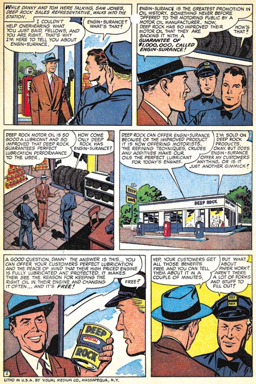
“Engin-Surance”, pencils and inks by Marvin Stein

Stein created another comic “Engin-Surance”. Once again a short four page work, that is nothing more than just a folded sheet. This comic is marked as “Litho in U.S.A. by Visual Medium Co., Massapequa, N.Y.”. This is the same company that “produced” the “1001 Sales” comic. This suggests that Visual Medium was not an advertisement agency but the printer.


“Engin-Surance” page 2, pencils and inks by Marvin Stein

Once again Marvin Stein’s hand is not as obvious on the cover art as it is in the interior pages but I do believe he did the cover as well. Frankly the art for “Engin-Surance” is nowhere nears as nice as in “1001 Sales”. It suffers from being a bit dry which is a typical failure of commercial art.


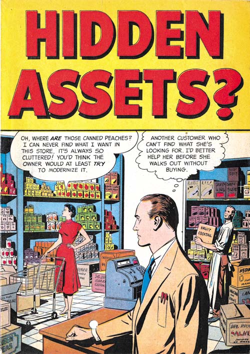
“Hidden Assets?”, pencils and inks by Marvin Stein

The final commercial comic by Marvin Stein that I have come across is “Hidden Assets?”. Unlike the previous examples, this comic is eight pages long. The two sheets that formed the book were not stapled together but rather glued. There are no markings to indicate who produced this comic.


“Hidden Assets?” page 2, pencils and inks by Marvin Stein

The quality of the art falls somewhere between the two previous examples. Note the woman in panel 4. The way her head tilts down and to the side somewhat is a typical Stein pose. Also typical for Marvin is the particular way the perspective does not seemed to be handled quite correctly. The distortion is not enough to make to detract from the beauty of the drawing but enough to be distinctive.

I have seen commercial work by other comic book artists such as George Roussos for General Electric. But I have to say that normally I find the art much too dry for my tastes. But I rather like what Marvin Stein did commercially, particularly “1001 Sales”. Stein never received much recognition but he really was a talented artist.

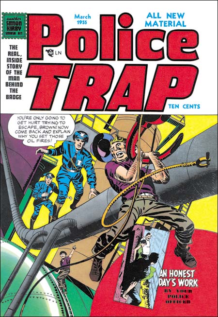
Police Trap #4


Police Trap #4 March 1955), pencils and inks by Jack Kirby

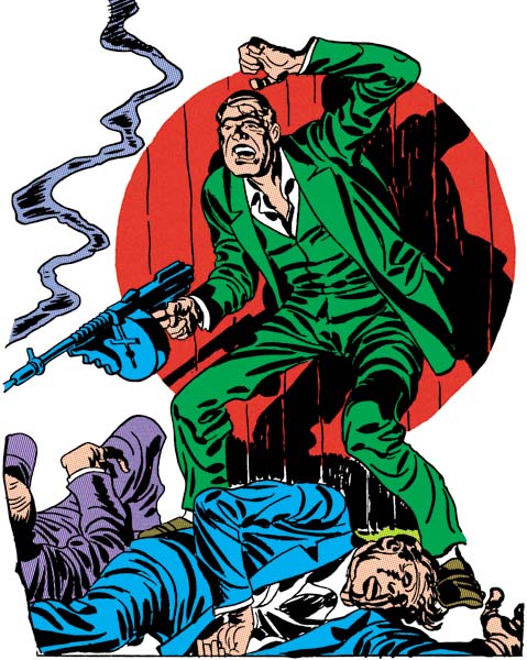
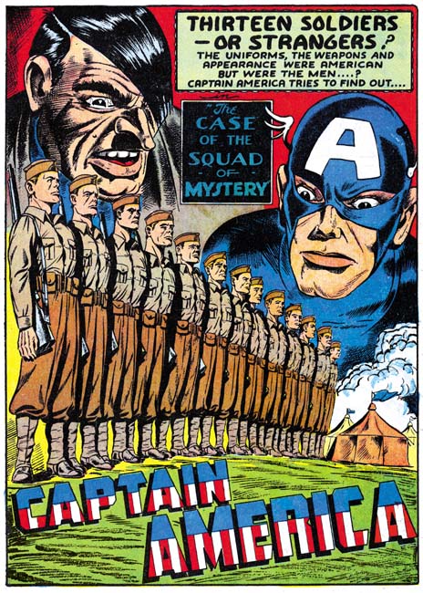
Another dramatic cover by Jack Kirby but the subject matter (setting oil fires) is not a typical crime. The pose of the fugitive is similar to that used on the cover of Captain America #7 (October 1941). The cover includes a little insert for a story drawn by Jo Albistur (to be discussed below). Such use of inserts is not typical of Simon and Kirby covers but was done on occassion (for instance on Young Romance #12, July 1949). Interestingly the covers refer to the story as “An Honest Day’s Work” although in the interior the story is titled “All in a Day’s Work”.

This cover and In Love #4, which came out in the same month, were the first Mainline titles to have a stamp declaring “another Simon Kirby smash hit”. Simon and Kirby were not mentioned in any of the previously released issues and they did not sign any of the art. Such anonimity, quite unusual for the typcially self promotors, was probably an attempt to minimize conflicts with Prize Comics for whom Simon and Kirby continued to produce titles. However Police Trap #4 and In Love #4 included postal statements listing Joe and Jack as the editors so the gig was now up in any case. The choice of a stamp may have been suggested by the coming Comic Code whose stamp of approval would first appear on the next issue.


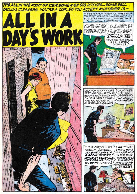
Police Trap #4 March 1955) “All In A Day’s Work”, pencils and inks by Joaquin Albistur

Joanquin Albistur supplied the feature story for this issue, “All In A Day’s Work”. There are a number of features that I find attractive in Albistur’s style all of which are found in this particular story. I particularly like Jo’s careful use of body language and gesture as in the panel with the policeman shaking the newspaper and his brother’s use of the pillow to drown out his lecture. But what really makes this story unique Albistur handling of the skyscraper views. The rendering of the brickwork would normally be overdone but in this case adds much to the effect of the dissy perspectives.


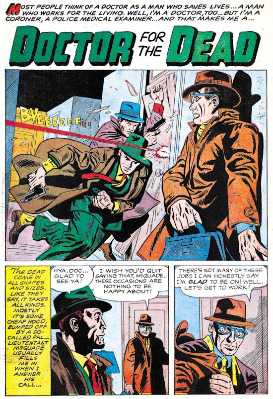
Police Trap #4 March 1955) “Doctor For The Dead”, pencils by an unidentified artist

I may not have identified the artist for “Doctor For The Dead” but that does not mean he did not do a nice job. There are some aspects of the lettering that look unusual for a Simon and Kirby production. For instance the colored ‘M’ that starts the title caption or the scripted ‘T’ from the story caption. Perhaps this is another piece that was picked up from a failed comic book publisher.


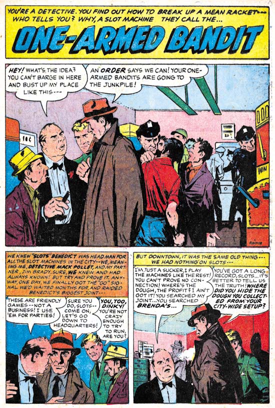
Police Trap #4 March 1955) “One-Armed Bandit”, pencils and inks by Joaquin Albistur

Joaquin Albistur is back as the artist for another story, “One-Armed Bandit”. The splash panel is a great example of why I like this artist so much. The confrontation between a detective and two hoods is all placed on the left side of the panel. You do not need to read the word balloons to determine which of the two criminals is the boss man. The background hardly deserves that term because the figures there are only slightly smaller than the foreground characters. Each person in the splash has their own distinct personality with the exception of the two cops.


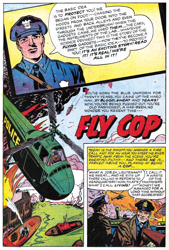
Police Trap #4 March 1955) “Fly Cop”, pencils by an unidentified artist and Jack Kirby

Another unidentified artist provides almost all the art for “Fly Cop”. But there in the insert at the top of the splash page is a contribution by Jack Kirby. Jack often played the role as art director in the Simon and Kirby studio adding and sometime correcting the art drawn by others. Most of the time when this was done Kirby would add something to make the splash page a bit more interesting. Usually Jack would ink these additions himself suggesting that these were last minute alterations. I believe the original art for this page still exists and it would be interesting to see if it shows signs of alterations or whether Kirby’s contribution was planned from the start.

Police Trap #3


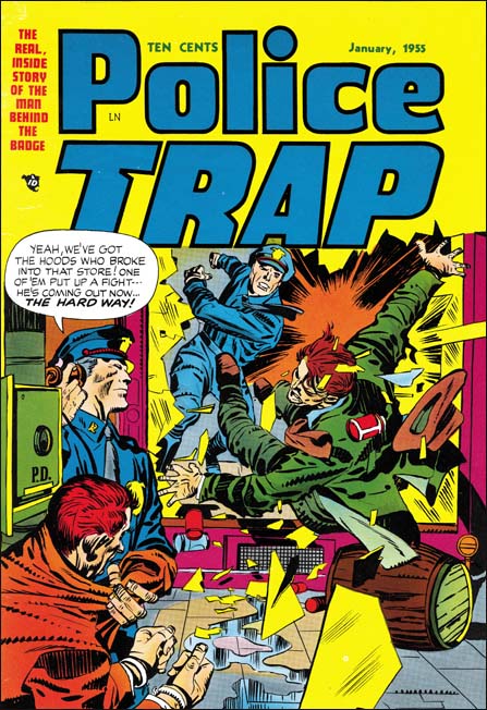
Police Trap #3 (January 1955), pencils and inks by Jack Kirby

The cover for Police Trap #3 departed from the more serene covers used for the first two issues. Instead PT #3 was a typically well done Kirby slugfest. Such dramatic punches were often found in Simon and Kirby stories but rarely appeared on the crime covers. I can think of only one other case (Headline #45, January 1951) and that one was not nearly as nicely done as this cover. There was another cover considered for issue #3 but in the end never used. The alternative cover featured some motorcycle policeman and while a good cover it was not nearly as dramatic as this one.


Police Trap #3 (January 1955), “Hick Cop”, art by W. E. Hargis

It is always nice when an artist signs his work. Otherwise it becomes difficult to determine attributions since credits were not usually provided. There was also another signed S&K production piece by William Hargis (Young Love #62, October 1954, “Too Darned Innocent” ). I really need to do some careful comparison with some of the other unattributed pieces from this period as it is likely there exists some unsigned pieces by Hargis as well. Still it appears that Hargis only worked for Joe and Jack during a short period. Most of his work at this time seemed to have been for Quality Comics.

A number of artists appeared for a short time in Simon and Kirby productions from this period. Most were not that impressive but Hargis was an exception. He graphically tells the story well and has a pleasing drawing style. Hargis uses details to provide insight into his characters. I love the way that the sheriff has a hole in the sole of his shoe in the first story panel.


Police Trap #3 (January 1955), “The Mountie”, pencils and inks by Joaquin Albistur

Albistur is one of my favorite S&K artists from this period. “The Mountie” is a typical example of his talent. The mounted policemen have disappeared from most American cities but still have a presence, although diminished, in New York City. I have not seen any in the last few months but I would regularly hear them go down my street. It is not at all clear to me whether horses are an effective police tool but they certainly make for great public relations. Whenever I see them they always attract photographers and animal lovers.


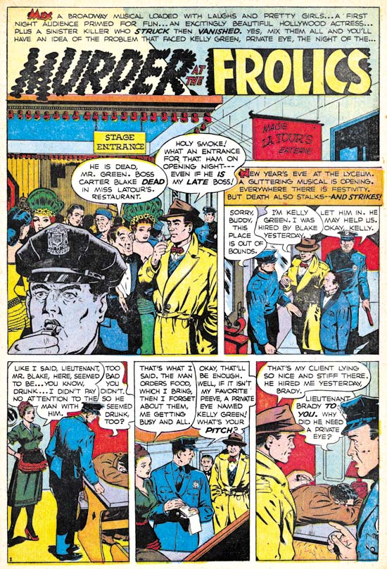
Police Trap #3 (January 1955), “Murder At The Frolics”, art by an unidentified artist

AS I have said, there were a number of artists that worked a short time for Joe and Jack during this period. Of course I wish I could identify them all but for academic reasons as frankly many were little more than adequate. The biggest problem with this particular artist is that his figures tend to be a bit stiff as, for instance, in the last panel of this page.


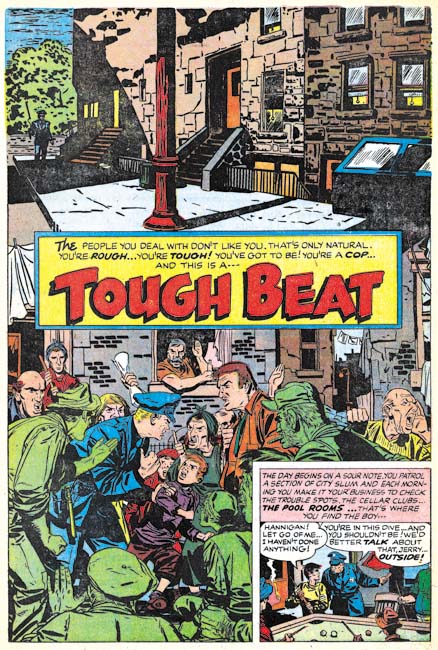
Police Trap #3 (January 1955), “Tough Beat”, pencils and inks by Bill Draut

I really like Bill Draut’s art, at least while he worked for Simon and Kirby. But this particular splash page has got to be one of my favorites. Generally Bill did not do full page splashes and in a way this is not one either. What Draut has done was combine two splashes separated by the title caption. The top shows a deserted neighborhood with only a single policeman in the background. Very simple but lovingly handled with great attention to the tenement buildings. The bottom seems pure chaos but actually is not. Helped by nice work by the colorist, the lower splash focuses on the confrontation between a cop and some locals seemingly concerning some youth the policeman has apprehended. Bill has provided an interesting and varied crowd. The juxtaposition of the quiet and noisy street scenes makes the page all that more interesting.

Police Trap #3 (January 1955), “Tough Beat” last panel of page 6, pencils and inks by Bill Draut

I have seen the original art for “Tough Beat” and the upper portion of the splash page, the quiet street scene, was inked on tracing paper. I found this puzzling until I noticed the last panel of the story was the same street scene with different inking. Apparently Draut placed the tracing paper over the final panel and used it as a guide for working on the upper part of the splash page. Faster than manually copying the art onto the actual illustration board while the use of tracing paper would be undetectable in the final printed version.

Police Trap #2


Police Trap #2 (November 1954), pencils and inks by Jack Kirby

A cover similar in concept to that used for the first issue. This time the muster room is portrayed:

This is where the officers relax, unbutton their jackets, have their shoes shined, smoke, bull session, rough-house, write reports, and just ease up after a hard day on the beat…

But would we really expect a muster room to have a shoe shine stand or a drunk sleeping it off? But perhaps the most unusual feature of this cover is one easy to overlook. Look carefully at the third policeman from our left, he is African American. Race did not play an important part of Simon and Kirby productions. When other races were depicted, most often it was Asians but otherwise Simon and Kirby comics were almost uniformly populated by whites. African Americans were generally invisible as they were in many popular media of the day. One glaring exception was Whitewash from the Young Allies a Simon and Kirby creation for Timely Comics. However stereotypical and (to modern eyes) objectionable characters like Whitewash were not part of Simon and Kirby productions that preceded or followed Young Allies. Further Whitewash seems to be delegated small rolls in the splashes from Young Allies that were actually drawn by Jack Kirby (Young Allies and the L Word). This suggests that the presence of Whitewash in Young Allies was not due to Simon and Kirby idea but dictated by someone else. As for the Police Trap #2 cover it is not at all obvious that the policeman was drawn by Jack Kirby as an African American but rather it was the colorist who made him so. Unlike their other comics where the coloring was the responsibility of the publisher, Simon and Kirby were the actual publisher of Police Trap and therefore they were responsible at some level for the coloring. I do not know if Joe or Jack actually colored this cover but minimally they assigned the colorist and approved the results.


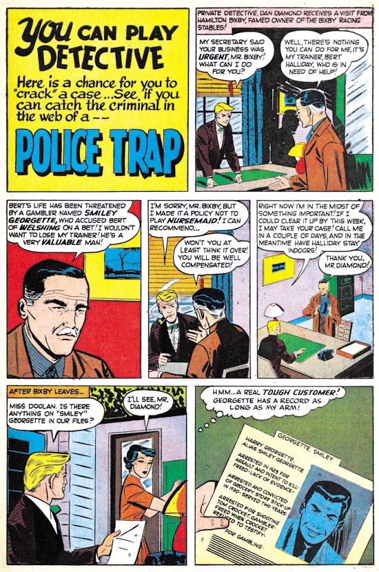
Police Trap #2 (November 1954) “The Hoodlum”, pencils and inks by John Prentice

“Usual suspects” Bill Draut and Mort Meskin are absent from the second issue of Police Trap but it does contain the third of the regular Simon and Kirby artists, John Prentice. John does his typical excellent job on the art. Perhaps my only criticism is that he has made the two policemen too similar in appearance. At times I find it difficult to determine who is being represented as for example the last panel of this page.


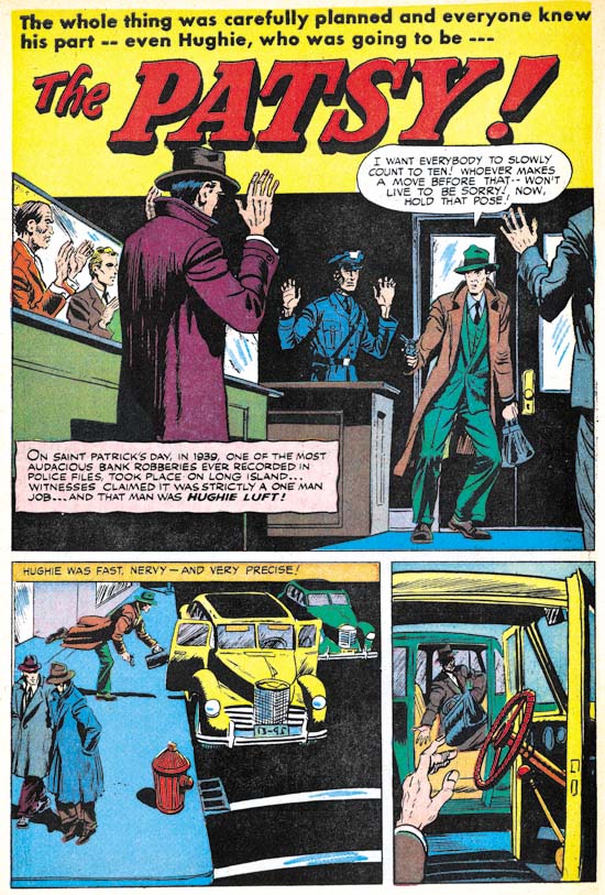
Police Trap #2 (November 1954) “The Patsy”, art by unidentified artist

In the past I have never come up with even a guess on who did the art for “The Patsy”. But on reviewing it now I find parts, just parts, that remind me of Bob McCarty. For instance the man on the extreme left of the splash panel. But there are other parts that seem so untypical for McCarty such as the unusual perspectives found the last two panels on the same page. I am unable to make sense of this combination of aspects that look like McCarty and those that do not so I continue to leave the attribution as unidentified.


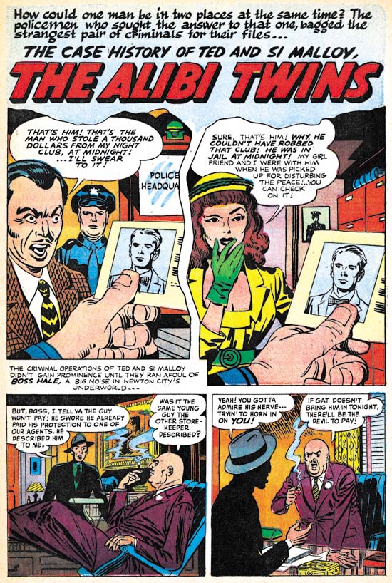
Police Trap #2 (November 1954) “The Alibi Twins”, two panel splash penciled and inks by Jack Kirby, rest of the story by unidentified artist

Except for the covers and one pinup, Jack Kirby did not supply much art for Police Trap until the latter issues. But obviously Jack was still playing his normal roll as untitled art director. Here Kirby provides the first two panels, effectively combining to form a splash, for a story otherwise executed by another unidentified artist. While the vast majority of the stories in Simon and Kirby productions were completely drawn by one artist, it was not that unusual for Kirby to provide the splash either.

The story artist is another of those that appeared only briefly in Simon and Kirby productions of this period. Note the rather bizarre inking in the last panel. The man is completely blacked out except for the hat and his hands. This story is a little longer (9 pages) than most found in Police Trap which were usually 4 to 6 pages long. Further the focus of the story is on the criminal, not the police as was normally the case for this title. Add the unusual lettering in some places (in particular the use of a script for the first letter of captions) and this suggests that the piece may not have been commissioned by Simon and Kirby but instead picked up from some failing comic book publisher.


Police Trap #2 (November 1954) “Desk Sergeant”, pencils and inks by Jack Kirby

I have recently discussed “Desk Sergeant” (The Police Trap Pinup) so will skip commenting on it here.


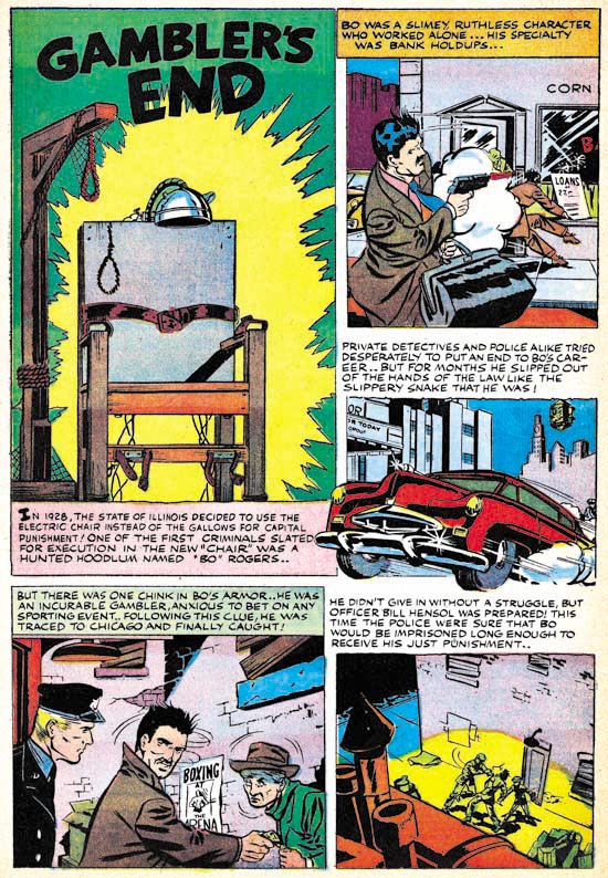
Police Trap #2 (November 1954) “Gambler’s End”, art by unidentified artist

A short two page piece by an unidentified artist. Unusual use of the first letter of some of the captions (for instance the bold ‘I’ in the splash caption) suggests that this story may also have been picked up from some failed comic book publisher.


Police Trap #2 (November 1954) “Police Trap”, art by unidentified artist

Another short two page piece by an unidentified artist. A lot of talking heads. A better artist might have been able to carry it off but this one is too stiff and the result is a rather uninteresting story. I have detected nothing unusual about the lettering so this piece might have been commissioned by Simon and Kirby.


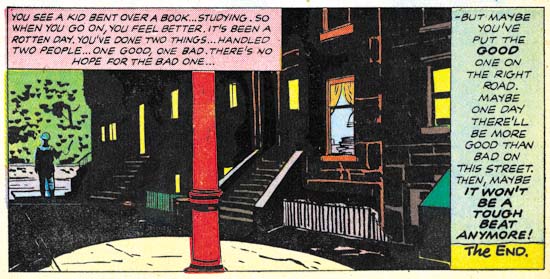
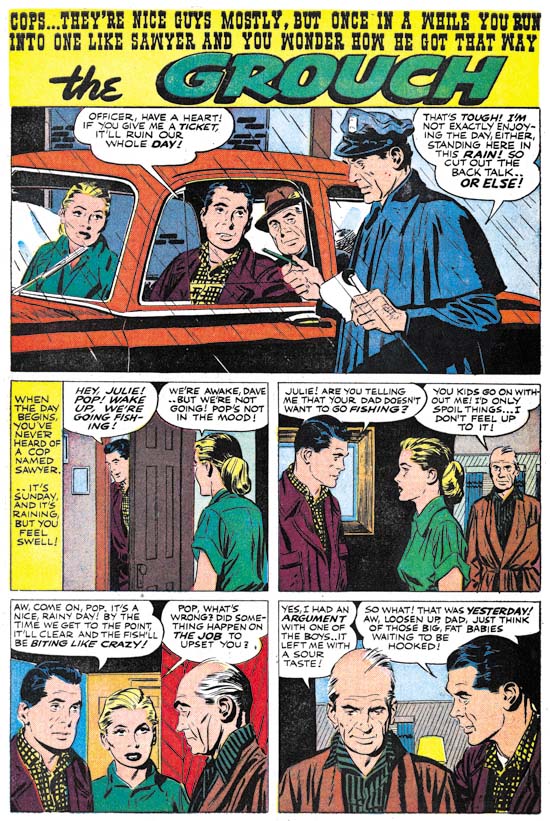
Police Trap #2 (November 1954) “The Grouch”, pencils and inks by John Prentice

Prentice opens and closes this issue of Police Trap. Actually he is the artist who really carries this issue what with a rather minimal contribution by Jack Kirby and none by Bill Draut or Mort Meskin. All the other artists are just nothing more than adequate. So in effect Prentice pretty much carries this issue.

It’s Off to Titan

By now it is no secret that the next entree in the Simon and Kirby Library is Crime. I original assumed that since Titan was releasing “Joe Simon: My Life In Comics” in time for the San Diego show that the Crime book would be come out the following year. I provided Titan with a schedule that showed my restoration work would conclude by the end of August. There must have been some sort of slip up because Titan did not inform me until some months later that they hoped to release S&K Crime in time for the New York Comic Con. With restorations finished in August there was no way the book would be available for the show in October. Fortunately by the time I found out about Titan’s plans my restoration work had been going amazingly well and I was already about a month ahead of schedule. Titan provided a drop dead date that seemed possible but by no means certain. So I buckled under and worked even harder. I was unclear whether Titan’s drop dead date was for the restorations or for putting the entire book together, but in any case I have managed to beat it by a couple of weeks. Now my work is done and it is off to Titan.

I am sure I will write about the S&K Crime volume in greater detail as the release date approaches. A decision has not yet been made on what the next book in the S&K Library will be. But in all honesty I would not say even if the decision had been made. I do not like to leak out information before Titan makes their public announcements. I suggest the reader keep an eye on The Jack Kirby Comics Weblog where Bob keeps track on all the latest Kirby publications and consistently scoops me out.

It’s Here, “Joe Simon: My Life In Comics”

Last week I got a surprise package, some advance copies of “Joe Simon: My Life In Comics”. Advanced? Well those lucky enough to go to Heroes Con had the opportunity to pick up copies of Titan’s newest book. Amazon says they will release the title on June 21. But now I have seen on the Internet that people have already received their copies and my comic book shop had one as well. So I guess advance is not an accurate term for the copies I received. “Joe Simon: My Life In Comics” if finally out.

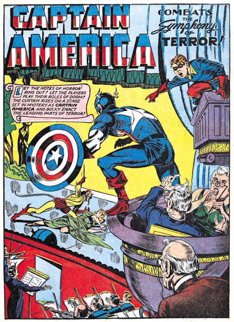
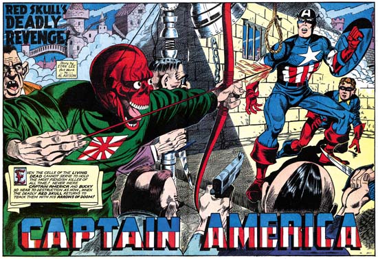
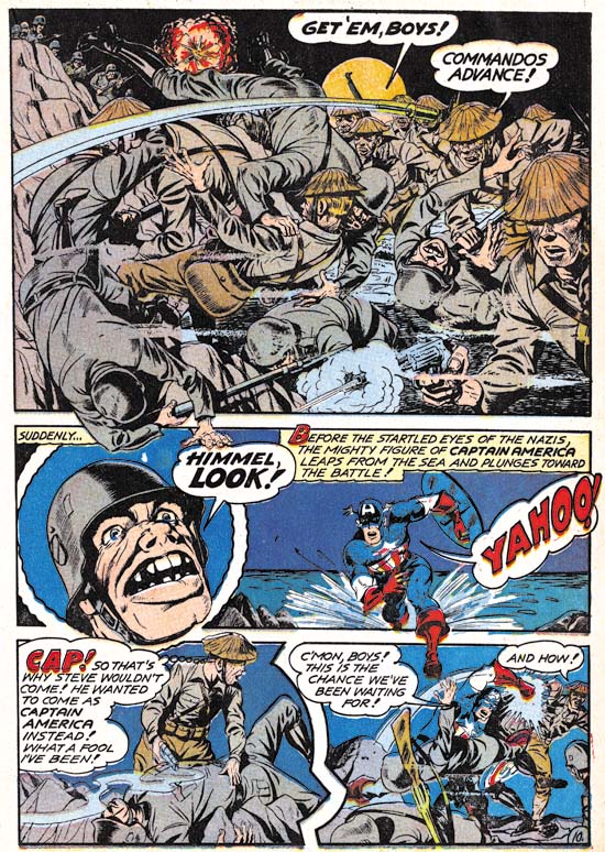
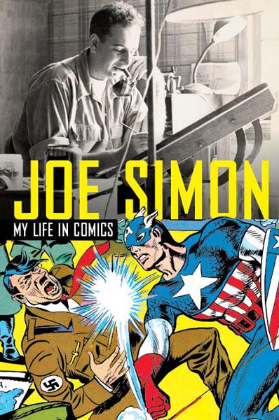
There are always some who will disagree, but I like this book cover. Joe’s name stands out, there is a famous piece of comic book art and my favorite photograph of Joe. There is he is talking on the phone while working on some art and of course smoking his cigar. And what could be timelier than Captain America who will be appearing in movie theaters in the near future? The spine (not shown in the above image) has a figure of Fighting American.

Generally speaking, biographies or autobiographies of artists can be divided into two categories, those that are primarily about the art and those mainly about the biography. This book falls into the second group. The book is the more standard sized book and not the large size usually used for art books. There are black and white illustrations distributed throughout the book and a small section of colored plates. These are good aids to the story Joe presents but I doubt that anyone would pick up this book just for the art. One of the advantages of being primarily a biography is that Titan can keep the price way down. The book lists as $24.95 for 256 pages. Amazon is selling it for $14.67. Hey in my neighbor a movie and some popcorn will come to much more than that!

Now I have heard on the Internet some remarks from some people about why some would not be buying this book. I have no problem with people being careful about what books they buy. Especially now when we still have not recovered from the Great Recession. But allow me to clarify some facts about this book so that the reader can make an informed decision. The most common statement I have heard is that some already have “The Comic Book Makers” so there is no reason to pick up “My Life In Comics”. Simply put “My Life In Comics” is not “The Comic Book Makers” warmed over. Joe is a natural story teller and while both books cover the same life, he tells different stories in each book. So if you want to hear all Joe’s stories you have to read both books. Further “My Life In Comics” covers the years that follow “The Comic Book Makers”. Among other things Simon has some interesting things to say about his second legal battle over Captain America.

Another explanation I have heard about why some are not planning to purchase Joe’s latest book is that their interests lie in comics not in Joe’s life. However the title is “My Life In Comics” which should suggest that actually comics are the subject of this book. Yes there is some information about Simon’s life outside of comics but it is minimal and often has bearing on his career in comic books. Most of the founders of the comic book industry are now gone. Fortunately some of the important artists had been interviewed over the years but not nearly enough. A book written by a golden age artist is nothing short of a treasure for anyone interested in the history of comics. I am sure people will be discussing and arguing about “My Life In Comics” for years to come.

Some Comments About Restoration for Comic Book Reprints

The Comic Journal has recently reviewed Titan’s new trade-back “Fighting American” (Preview: Fighting American). I understand some have already obtained copies of the book but I have yet to see any in the comic book store I use. I do not have a copy but I have had a chance to briefly look at one belonging to Joe Simon. The material included in this trade-back is the same found in the previously released “The Simon and Kirby Superheroes”. So if you already have the Superheroes book you may not feel the need to pick up the “Fighting American” trade-back.

But TCJ’s article is not just a review, it is a preview as well. With Titan’s permission they provide the complete story “Home-Coming Year 3000”). So if you do not have either the Superheroes or the new “Fighting American” books you can see what you are missing.

There is an interesting comment that someone has made to The Comic Journal article. The commenter claims that the art has been touched up and in particular the some of the line art in the book was thicker than in the original comics. I will discuss his claim later in this post but I thought I would use this as an opportunity to discuss a little bit about the restoration of line art that I do for Titan’s Simon and Kirby books.

Readers of my previous posts on the subject of restoration should know that I do not recreate line art (a process that Marvel still continues to use for their reprints of golden age material). However the end result of my restorations is by no means just a scan. I have no problems with describing what I do as “touch ups” only not in the manner that the TCJ commenter uses the term. Frankly the original printing used in these comics was pretty poor. Now as far as I am concerned reprints of just scans is far superior to art recreation however I prefer to try to correct some of the printing flaws.


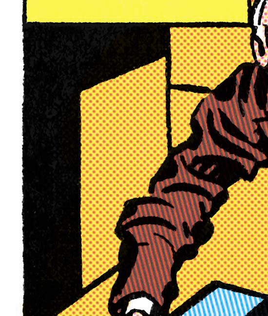
Close Up of Flaws in the Original Printing

The above image gives an example of the types of printing flaws typically found in gold and silver age comics. Note that the area of solid black is not actually solid or black. Instead there are spots that the ink did not cover at all and even where the black ink is applied it is so thin that the underlying magenta ink can be seen*. Also note how the in the upper right there appears to be two closely spaced horizontal lines. Actually there really was only supposed to be one horizontal line but the printing left ink only on the edges of the original line and failed to reach the center of the line.

When selecting an image for this post I debated with myself whether to use the original scan or after it had been processed with Photoshop to enhance the colors. There appears to be no yellow in the area shown but actually almost all of it had yellow. If the reader looks at the very top of the image and compares it to the left edge you should be able to see the very faint yellow remains. With Photoshop I can bring out the colors better which allows for more accurate color restoration.


Close Up of the Restored Art

Above shows an image of the same area after restoration. The solid black is now truly solid, the center of the horizontal line are filled and similar flaws throughout are corrected. But I am not recreating the line art just doing touch ups.

Some may find the restored version rather glaring. The blacks may now seem a bit too much black. However I am not doing restorations for viewing on a computer monitor. The final product is a printed book and things will look different. The image presented is blown up and in the printed version occupies only a very small area of the page. Further the black will not look quite so black when printed.


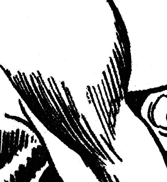
Close up from the Original Comic Version of “Home-Coming Year 3000”

As mentioned earlier, a TCJ commenter claimed that the art lines had been thickened in the restoration. Unfortunately he did not give an specific examples nor have I been able to find any in the story previewed by the Comics Journal. so I can have provided a close-up from the original scan only this time showing it in black and white. Simon and Kirby did not use very fine lines but I selected an area where the lines are as fine as they get in the story.


Close up of the Restored Version  of “Home-Coming Year 3000”

Above is the same area after restoration. Note that small flakes of black can be seen attached or nearby the line art. These are printing flaws in the original printing. They maybe a little hard to see in the scan of the original comic because they are obscured by the colored inks that come out as black dots in the unprocessed original scan but look at the area without such dots on the right and you can see the flaws there as well. I do not try to remove every printing flaw only the ones the more serious ones.


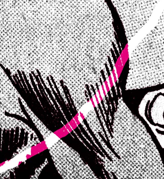
Close up of the Restoration Overlaid of the Original Version  of “Home-Coming Year 3000”

In the above image I have changed the restored version from black to magenta and overlaid it over the original scan. The restoration was so precise that all that magenta of the restored version could not be seen. Had the lines really been thickened in the restoration the blacks would have been ringed with magenta. To bring out how perfectly it is aligned I purposely erased a strip from the original scan so that the magenta version of the restoration could be seen.

So why did the TCJ commenter claim the lines were thicker in the restored versions? I suspect it is all a matter of perception. The blacks are blacker in the restoration than in the original comic book printing. Blacker lines could give the impression of thicker lines. But I believe the most important reason for the TCJ commenter’s error was due to his comparison of Internet images with the original printing. My restorations are based on scans done at 600 dots per inch. Generally everything from 400 dpi and above have fine enough resolution that the human eye can not detect that the image is actually composed of small dots. Actually most people have trouble seeing it at 300 dpi but at lower resolutions the deterioration of the image quality is easily detected. Computer monitors have very low resolution. Monitors differ in size and resolution but for example my monitor has approximately 85 dots per inch. The resolution is so low that the color in “Home-Coming Year 3000” looks solid when in the original comic the dots used for the coloring are clearly visible. You simply cannot make a good judgment on the thickness of lines based on an Internet image of a full page. Which is why I used close-ups to make the comparison.

To see how inaccurate the restorations was in the previous Fighting American reprint see my post “Simon and Kirby Superheroes”, A Must Buy. For further observations about my restoratios see my Newsarama interview.

footnote:

* Although the magenta plate has shifted toward the left that is not why there is colored ink under the black. This was done on purpose to help mask such registration problems. Had the magenta plate shifted to the right the nearby area would still be color correctly but without the overlap a white band would have appeared bordering black. The extending of colored inks under areas meant for black is called trapping. Today trapping is usually created by computer software but before that photographic processes were often used. However when trapping was done for comic books it was done by hand.

Police Trap #1, Title for the Heroes


Police Trap #1 (September 1954), pencils and inks by Jack Kirby

Crime comics received a lot of undesirable attention during their heyday. It is generally acknowledged now that this criticism was pretty much unwarranted but at that time it accepted by most of the public. One criticism was that crime comics glorified the criminals. Again any modern reader would see that this clearly was not the case, at least for the great majority of crime comics and especially for those that had been produced by Simon and Kirby. But Joe and Jack were well aware of this criticism and so when they launched their own publishing company, Mainline, they included a title Police Trap where the focus was not on the criminals but rather on the police.


Police Trap #1 (September 1954) “The Capture”, pencils and inks by Mort Meskin

Mort Meskin was one of the “usual suspects” of artists that contributed frequently to Simon and Kirby productions. He not only arrived in the studio in time to provide art for some of the crime comics produced by Simon and Kirby but he also continued to supply art for the titles even after they were no longer put together by Joe and Jack (Criminal Artists, Mort Meskin). However this would be the only piece that Mort drew for Police Trap. In fact Meskin typically prolific output seems to have decreased greatly at about this time. He would continue to supply work for the Prize romances but very little for any of the Mainline titles.


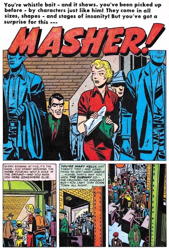
Police Trap #1 (September 1954) “Masher”, pencils and inks by Bill Draut

“Usual suspect” Bill Draut drew and inked “Masher”. Draut is most famous for his romance art but he does a fine job on this story. This is probably the most unusual story of this issue and certainly my favorite. The main protagonist is a female police officer. On a personal note my great grandmother was one of the earliest female detective of the New York Police Department. Unfortunately I know very little about her career but among other things she was used as a decoy. She was not very tall but when it came time to apprehend someone she would hold on to them so tightly that the suspects would be unable to escape before her backup arrived to secure the arrest.


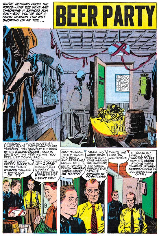
Police Trap #1 (September 1954) “Beer Party”, pencils and inks by John Prentice

John Prentice was also a regular contributor to Simon and Kirby productions which means this issue of Police Trap has all the usual suspects. Prentice first work for Joe and Jack appeared in a May 1951 issue of Young Love and he continued to provide art up until the end of the Simon and Kirby studio. John was used primarily for romance comics but he did provide some art for Black Magic. Unfortunately Simon and Kirby were no longer producing crime titles at the time of Prentice’s first appearance but John did so some really nice work in the crime genre prior to that. So “Beer Party” marks a much appreciated return of Prentice to crime. With some nicely handled action and such beautiful art, what is not to like? I particularly love the splash panel. Nobody appears in the splash but it still is a marvelous portrait. Missing plaster and cracked walls show how run down the police station has become. If anything the minimal decorations seem make the room even more depressing. The title captions talks about a shindig but obviously this was going to be a rather small affair. But could you image having a beer party inside a police station today?


Police Trap #1 (September 1954) “The Grafter”, art by unidentified artist

At this time Simon and Kirby were producing four Mainline and four Prize titles. Most of the titles were bimonthlies except for Young Romance and Young Love which were monthly. I suspect producing these titles and running Mainline required a lot of effort for both Joe and Jack. The amount of art that Kirby penciled seems to have dropped and his only contribution to this Police Trap issue was the cover. Further artists new to Simon and Kirby productions make their appearance. One such artist provided the art for “The Grafter”. I cannot claim to be very excited about art but he did an adequate job.


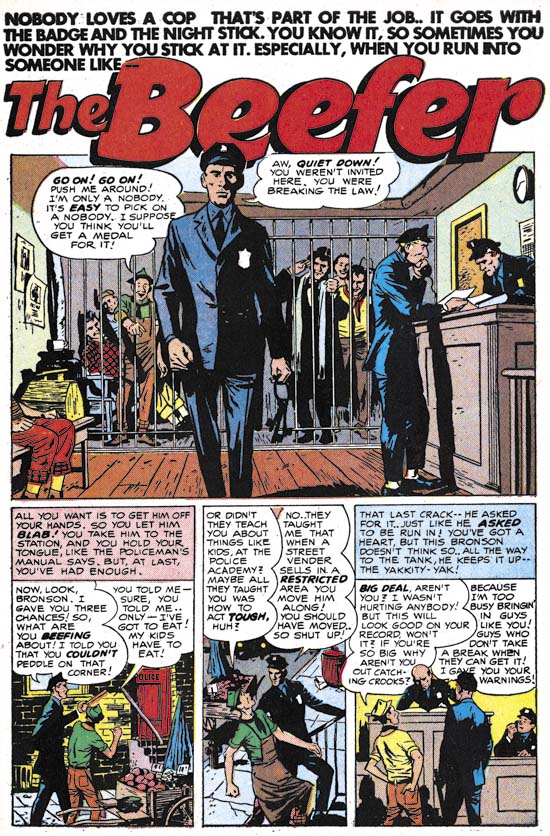
Police Trap #1 (September 1954) “The Beefer”, pencils and inks by Joaquin Albistur

I have recently discussed the part that “The Beefer” played in relationship to the pinup used in Police Trap #2 (The Police Trap Pinup). This story and two others that appeared in Young Romance and Young Love marked the first appearance of Joaquin Albistur in the Simon and Kirby studio. Most of the artist that appeared during this period made rather limited contributions to Simon and Kirby productions but Albistur would provide much work for the relatively short period that he was employed by Joe and Jack (13 months).

It Ain’t Soup


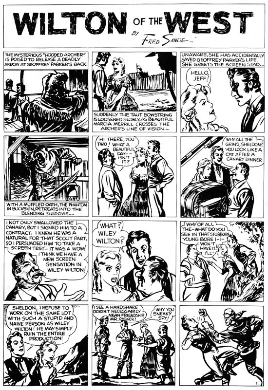
Wilton of the West, pencils, inks and letters by Jack Kirby

Mark Evanier provides an image of a Campbell’s Soup on his blog can when he announces that he is too busy to continue normal posting. It seems I have developed my own tradition, one where I use a scan of a Kirby page from Jumbo comics (see A Brief Pause and Another Brief Pause). Last weekend found me struggling with some particular difficult restorations while remaining determine not to let my schedule slip. In the end I kept to my schedule but was left without any spare time to initiate a post for this blog. So instead I provide a scan of Wilton of the West. This was one of the syndication strips that Kirby did for the Eisner and Iger studio. Some were used in early issues of Jumbo Comics but the image I provide was scanned from a presentation piece which provided higher quality reproduction.

I find Kirby’s work for Eisner and Iger particularly interesting because they show Jack in the process of learning his trade. I know there are some fans who continue to insist that Kirby had already reached a high level of skills but to me this was clearly not the case. Had Kirby’s comic career ended with his work for Eisner and Iger he would have become nothing more than a footnote in the history of comics. Talking heads dominate this page which would have presented a problem for any comic book artist. Kirby tries to keep it interesting by changing the viewing distance as well as adding various props. Jack was not completely successful in this attempt but you can tell he is trying. The page ends with a fist fight. Kirby was famous for his slugfests but here the depicted punch seems rather awkward. The inking is improved over the last page I presented. Kirby varies his inking depending from darker panels such as the first and fourth to simpler lighter ones such as the eighth panel. Here Kirby is still a long way from his mature inking style but that is what makes these pages so interesting. Jack did the lettering as well. Kirby’s lettering here is adequate but nothing more. While his lettering would improve somewhat, Jack never became a master letterer. But then again I cannot think of any golden age comic book artist that was good at both drawing and lettering.

My schedule will remain pretty tough over about the next month so I cannot guaranty that I will not be forced to put up a Jumbo scan again. However I hope that will not be the case because my recent post on the Police Trap pinup reminds me that I have not yet covered that title.

The Police Trap Pinup

For the most part pinups did not play an imported role in the Simon and Kirby repertoire. The most import exception was Boys’ Ranch where double page and inside cover pinups were present in each issue. Other than those from Boys’ Ranch there were only two other pinups that I can think of. One appeared in Win A Prize #1 (February 1955). I have discussed that one previously (The Wide Angle Scream, Almost an Afterthought). While I would not dismiss out of hand Joe’s explanation that the piece was originally meant for Captain America #11, there are a number of details that suggest a later date. Therefore the genesis behind that piece of art remains an unresolved issue.


Police Trap #2 (November 1954) “It’s Your Police Station”, pencils and inks by Jack Kirby

The other Simon and Kirby pinup appeared in Police Trap #2 (November 1954). It is a great pinup with a marvelous cast of characters. Each person depicted in the foreground was given a distinct personality. A complete story is presented in this single panel with the added touch of Simon and Kirby humor. Kirby not only drew the art but did the inking as well. I believe it is one of the relatively few pieces that Jack also did the outline inking, a job normally assigned to others.

The top caption declares this is the first of series of Police Trap pinups of various police officers. However no further pinups were ever placed in the subsequent issues. Nor were pinups found in any other Mainline titles (Win A Prize was published by Charlton). The natural question is why this one?


Police Trap #1 (September 1954) “The Beefer”, pencils and inks by Joaquin Albistur

The explanation can be found in the first issue of Police Trap. That issue contains the story “The Beefer” with art by Jo Albistur. Albistur was from Argentina and seems only to have worked in the United States for brief period. His time working for Simon and Kirby lasted a little over a year but it was very productive period for him. Frankly I am unimpressed by some of the art I have seen that he did for other comic book publishers but he is one of may favorite Simon and Kirby artists. “The Beefer” opens with constant complaining of an arrested street peddler. Kirby would often create a cover based on a story from the same issue but illustrated by another artist. The similarity between “It’s Your Police Station” and “The Beefer” indicates that is what happened here and this pinup was originally intended as the cover for Police Trap #1.


Police Trap #2 (November 1954) “It’s Your Police Station”, pencils and inks by Jack Kirby, original art

The original art for this pinup still exists. It is very unusual for work by Simon and Kirby in that art was constructed from three pieces. The top caption, the art, and the bottom caption are on different illustration boards taped together on the back. In the future Joe Simon would frequently construct art from various separate sources but up to this point such techniques were rarely used. The explanation in this case is that since the art was initially meant for a cover the original top probably had the comic book title. Probably as an expediency this was just cut off. Since Joe and Jack often recycled their work this title may have been used for some other cover. The original art for some of the Police Trap covers still exist and it would be It would be interesting to see if any of them were constructed from two pieces of illustration board. The original bottom of the art was probably not sufficient for the desired caption so it was trimmed as well.


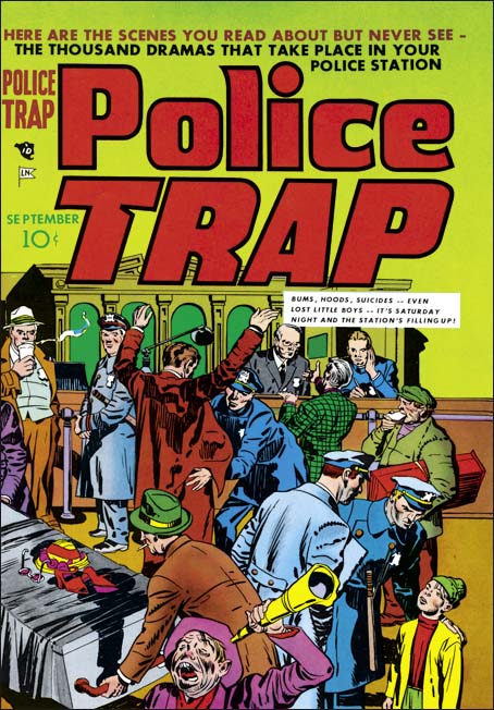
Police Trap #1 (September 1954) “The Beefer”, pencils and inks by Jack Kirby

The Police Trap #1 cover that was published in place of “It’s Your Police Station” is certainly a fine piece of Simon and Kirby art. The portrayed scene shows a multitude of characters each carefully handled. The caption actually seems a little superfluous since the art is all that seems to be needed to tells the individual stories. Yes, this is cover art at its very best. That is not to say that the art for “It’s Your Police Station” was any bit inferior. The most distinct disadvantage for the pinup had was that it was very specific to a single story, “The Beefer”. While Simon and Kirby often took that approach to a cover, they undoubtedly considered that the new comic should be launched with a cover that reflected on the theme of the title and not a particular story. With all the criticism cast at crime comics, Simon and Kirby wanted to emphasize that the police were subject of this new comic not the criminals. This police centric theme is superbly provided by the published cover.