Category Archives: z Archive

Really Bad Clowns

20th Century Danny Boy has been on a roll lately providing a series of interviews with assorted comic book artists. His latest is Alan Kupperberg. I have to admit there is a rather large period from when I stopped reading comics as a young man until I started with them once again. Some of what happened in between I have since picked up on, some of it I am still ignorant about. I have heard of Evil Clown comics but have no first hand experience with them. Frankly I find some of the art that Danny provides somewhat offensive (so be forewarned) but there is no denying Kupperberg’s talent.

The idea of a (morally) bad clown was not new, others have used it as well. There is something about the juxtaposition of a funny costume and an evil nature. It was not a big part of the Simon and Kirby repertoire, but Joe and Jack did use it. And of course anything that Simon and Kirby did, they did very well indeed.

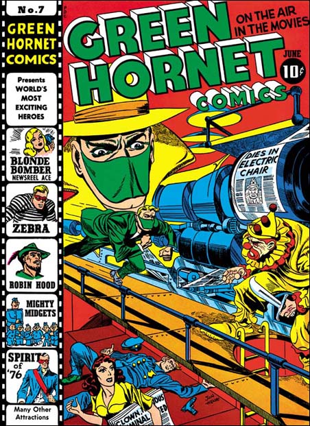
Green Hornet #7
Green Hornet #7 (June 1942), art by Jack Kirby and Joe Simon

I am thinking particularly about the cover for Green Hornet #7 (June 1942) that Joe and Jack did for Harvey Comics. I have already posted on this cover but Danny’s blog has brought it back to mind. This was a joint effort, Jack did most of the pencils but Joe drew the large floating head. The signature says Jon Henri, but do not let that fool you. Henry is Joe Simon’s middle name and Joe was so fond of the name Jon that he gave it, with that unusual spelling, to his first son. I am still uncertain about who did the inking, but my suspicions are that it was done by Al Avison. I like my original description of this piece of art so I am just going to repeat it.

I love the way Simon and Kirby make a cover tell a story. The Green Hornet is rushing to attach a killer clown. If the clown carrying a wicked knife wasn’t enough, the lady on the lower level carries a newspaper with headlines that are hard to make out completely but clearly includes “CLOWN … CRIMINAL …”. Behind her is a fallen policeman, his gun laying at his side, clearly the Green Hornet will be taking on one tough clown. The press above is printing the front page for the latest edition declaring “DIES IN ELECTRIC CHAIR” with a picture of the clown, obviously printed ahead of time because the clown escaped before facing his execution. The Green Hornet had better be careful because this clown has nothing to loose.

Poking Fun at Adolf

Captain America #2
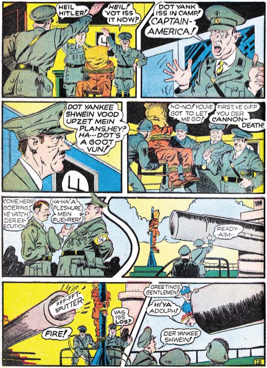
Captain America #2 (April 1941) “Trapped in the Nazi Stronghold”, art by Jack Kirby

Simon and Kirby really hit it big with Captain America. I am sure an important reason about why it became such a large selling comic was the cover. The U.S. was not yet in the war but there were still many who could appreciate a depiction of Captain America slugging Adolp Hitler. What fictional villain could compare with the evil of the all too real Hitler? But brute force was not the only means that Simon and Kirby would use to take Hitler down a peg or two, humor was used as well. It should be obvious from the image above that S&K portrayed Hitler as somewhat of a buffoon.

Speed Comics #16
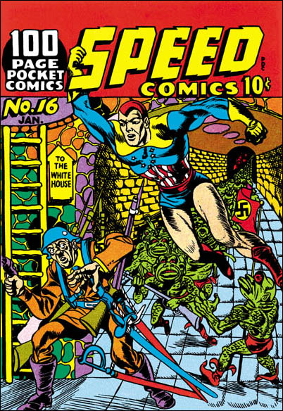
Speed #16 (January 1942), art by Al Avison

Of course once Hitler graced the pages of Simon and Kirby comics, other artists would use Adolf as well. Al Avison had a special advantage, he was one of the crew working for Joe at Timely. Al even drew some Captain America stories. Avison’s efforts never made it into Cap comics, they were recycled as the Patriot in USA #1. (Other then Kirby, the only artist to draw Captain America in the early issues was Simon.) Avison also did some work for Harvey Comics and you tell he learned a lot from Jack. For the cover of Speed #16 Al provides Hitler leading an attack on the White House. Armed with a gun, four rifles and four swords, Avison has also makes Hitler out to be a buffoon. But Avison has overplayed his hand, Adolf and his army are so ridiculous that they hardly seem a threat to Captain Freedom.

Adventure #83
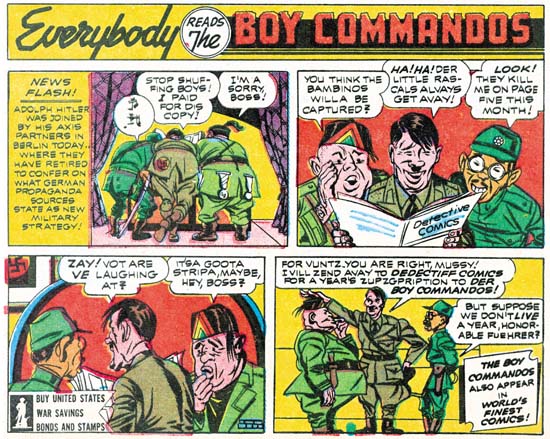
Adventure #83 (February 1943) house ad at the end of a Sandman story, by Jack Kirby

Just because Joe and Jack left Timely and Captain America does not mean that they stopped making fun of Adolf Hitler. Far from it. The original Axis of Evil was jokingly portrayed in a house ad for the Boy Commandos. Only four panels but that is all S&K need. I guess the Axis leaders were the original Three Stooges.

Joe Simon
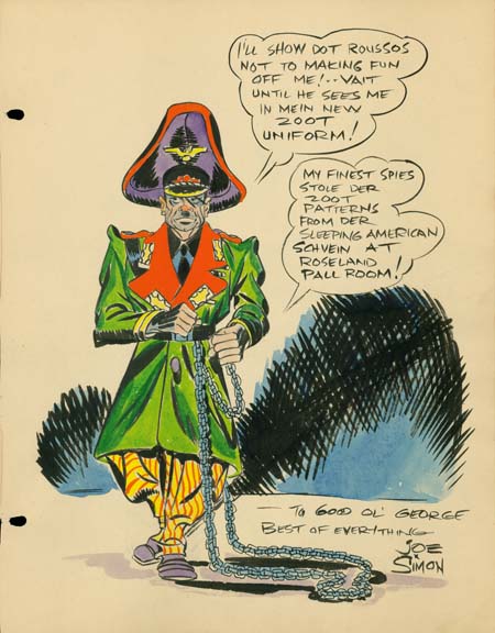
Sketch for George Roussos by Joe Simon (1942)

The above sketch is one of the reasons I have been thinking of Adolf Hitler lately. It is undated but it was from the same George Roussos sketch book that included a drawing by Jack Kirby dated as 1942. Further Joe would shortly be joining the Coast Guard during which I doubt that Roussos would have the opportunity to have Joe add something to his sketch book.

George Roussos was not only a talented artist, he was also an early fanboy. He had some of the greatest talents of the day provide drawings for his book. What a treasure it was. I say was because it recently has been disassembled and the individual pages auctioned off. It is a shame that it was not published before it was taken apart. If you are willing to register with Heritage Auction Galleries you can see the work by searching their Auction Results Archives under original art for George Roussos. Joe’s entry is not dated, but it must have been done about the same time as Jack’s, 1942.

Joe Simon has his own particular brand of visual humor of which this is a very early example. What could be more incongruous then Adolf Hitler in a Zoot suit? Where did he every come up with that? I have no idea. But this sort of irreverent humor would show up again when Joe produced the Mad-close magazine called Sick. In fact it still shows up in the art that he produces today.

I remember years ago someone criticizing Mel Brooks for his movie The Producers. They asked me how anyone could find something funny in Adolf Hitler. Make no mistake about it, Hitler was a monster, the most evil person of our century. We should never forgive or forget the horrible things he did. That however is not enough. There are people who will try to praise Hitler for some of those very awful things. So we must add ridicule on top of our scorn. That is something Joe Simon still understands very well.

Joe Simon’s Correct Age

Mark Evanier wrote a nice post about Joe Simon’s birthday. But Mark got it wrong when he gave Joe’s age as 92. Well let me set the story straight, Joe is now 94 years young. When I last talked to Joe he commented:

I’m telling everybody that I am 95. I mean what kind of number is 94? No, 95 is a much better number. I’m going to say I’m 95.

Is it any wonder that people get confused about Joe’s age? I love Joe, but I always try to remember he favorite piece of advice:

Never let the facts get in the way of a good story.

Joe Simon’s Birthday

Joe Simon
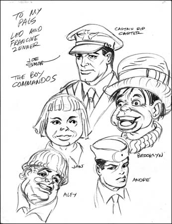
Boy Commandos sketch by Joe Simon (1943 – 1945)

I called Joe yesterday to wish him a happy birthday. He was pleasantly surprised with all the emails he has received. I do not know how many, or what percentage came from readers of my blog. I know Joe answered at least some of them, but if you did not get a reply do not be offended. Joe is not perfect when it comes to using his computer, I know that in the past a number of his emails to me never made it. So even if you did not get a reply from Joe, rest assured from my conversation with him that he was quite pleased by all the attention.

Diego Maya provided his own birthday card to Joe.

For my somewhat tardy Jack Kirby birthday post I included a sketch that he did in 1942 of the Boy Commandos. So here I thought I would use a sketch of the Boy Commandos that Joe did. I asked Joe if he remembered the Zenners and he replied that they must of written him requesting a sketch. Joe added that he had done this while he was in the Coast Guard. So this work can be dated as sometime from 1943 to 1945. Not quite as early as Jack’s version, but still from a period where we have very little independent art by Joe Simon. For examples of his published work from this time see my Chapter 8 of The Art of Joe Simon “Off to War“. I will post about another Simon piece of art from this period in a day or two.

A Special Request for Joe Simon’s Birthday

Sigh, I guess I was too naive. I had hoped that people would honor my request to keep this on this blog. But it got posted on Byrne Robotics forum. It is no longer there but the damage has been done. I hope Joe does not get too many crazies sending him email. Anyway I felt I had to remove Joe’s email address before any more harm was done. Anyone still wishing to send Joe birthday greatings can email me athmendryk at yahoo dot com and I will provide it privately.

It seems a list called Imvan has also ignored my request to keep this on this blog. I have no idea what that group is about but obviously they have little respect. I guess I am going to have to file this as one of my worse ideas.

I visit Joe every two or three weeks and he seems in excellent health. His birthday is approaching so I have a special request to make to the readers of the Simon and Kirby Blog. Actually it is a two part request.

  1. I would like to keep this request and Joe’s email address here, and not have it posted to any other group, blog or list.
  2. I would like my readers to send happy birthday greetings to Joe sometime between now and his birthday (October 11). Say what you like but I am sure Joe would appreciate a kind word about what his work has meant to you. His email is:

Surely my readers are also fan’s of the work done by Simon and Kirby. We no longer have the opportunity to tell Jack what he meant to us, but it is not too late for Joe.

“Romance Without Tears”

Simon and Kirby created the romance comic book genre in 1947 when they produced Young Romance. It was a big success, which in the world of comic books meant that other publishers would shortly release their own romance titles. A better description would be that S&K opened up a flood gate. I have read very little of the romance titles by other publishers, there is just so much that it is overwhelming. That is why I really appreciate “Romance Without Tears”, a collection of stories by the publisher Archer St. John. I was a bit late in coming across this book since it was published by Fantagraphics in 2004. However it is still available at places like Amazon St. John published more then just romance titles and Ken Quattro provides a nice history of the company. Great story, particularly the early part where newsman Archer St. John confronts Al Capone.

“Romance Without Tears” was compiled by John Benson who also wrote the introduction. Benson makes the case that St. John’s romances were unique in having heroines that were intelligent and free spirited. Yes they make mistakes, but they learn from their failures and generally do not suffer because them. Judging from the selection of stories that he provides, Benson’s analysis is accurate. Benson credits most of this to one writer, Dana Dutch. Dutch was obviously an unusual comic book writer. He sometimes places his characters into situations that while not explicitly sexual, are certainly suggestive. Two young couples have a secret overnight trip to a city. A couple returning from a date are caught in a storm in a rather leaky car take refuge by renting a cottage as husband and wife. That sort of thing. Even darker things can be suggested. A woman accompanies a man to a room to do some typing but finds that is not what the man really had in mind. She protests but from the man’s replies it is clear that this would not end well. A rape is not presented but only because of the fortuitous arrival of a bellhop allows her to escape.

Romance Without Tears
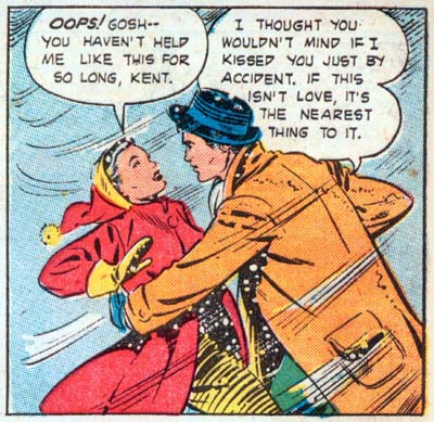
“I Played Kiss and Run” page 8 panel 4 art by Matt Baker

The stories are good, just not as good you might expect with such unusual story lines. The problem appears that Dutch is not so much writing love stories as morality tales. In doing so Dutch can at times be a bit heavy handed in his scripting. Would you really expect a couple to say something like found in the panel I provide above? Examples of such stilted writing are common and are the primary reason for parts of the stories appearing too preachy.

Teen-Age Romances #14
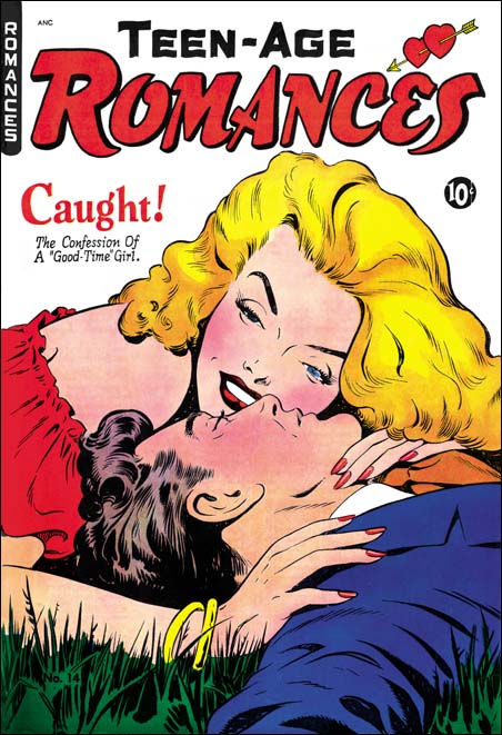
Teen-Age Romances #14 (February 1951) art by Matt Baker

Of course comic books are not just about words, the art is just as important, perhaps even more so. The St. John romance comics were fortunate to make use of the talented Matt Baker. Baker did not do all the art, but the other artists clearly either were greatly influenced by Baker or were selected because they tried a similar approach. The best description of Baker’s style is that it is very illustrative in the best sense of the term. Matt’s art gives the impression of being very realistic, but actually that is misleading as his style is very attuned to the comic book media. Unlike many who try to be realistic, Baker’s art is the antithesis of dry. I do not think there is any comic book artist whose women are as sexy and sensual as Baker’s. Matt’s men are ruggedly handsome as well. His covers are special treats, even though I am a die hard Simon and Kirby fan my collection includes the Teen-Age Romance #14 and I could not resist restoring the cover art.

As a student of Simon and Kirby productions, it is their work that I compare other publications to. Although the S&K romance plots were not as daring or unusual as the St. John stories they were better written. I am just not as big a fan of Dana Dutch’s writing as John Benson is. As for the art, well it just would not be fair to compare Matt Baker to Jack Kirby. The S&K studio artist that comes closest to what Baker was doing was John Prentice. Prentice’s women, at least when he was doing comic books, have a sophisticated beauty while Baker’s are sexier. Prentice did not do many romance covers. Those he did are generally quite nice, just not nearly as well done as those by Baker. Matt’s illustrative approach really comes out well with his covers. As far as interior art is concerned, Matt probably is a better story artist then John as well, but not by so great a margin. While Prentice may not compare well with the talented Matt Baker, he does much better in comparison to the other St. John artists who were not as talented.

All in all I am quite pleased with “Romance Without Tears”. I am not ready to abandon Simon and Kirby and start studying St. John publications, but I now understand why St. John’s fans are so enthusiastic. One thing I really like about this book is how the art is presented. Most golden are reprints are make first by bleaching the comic pages and then re-coloring. With one exception (DC Spirit Archives) I have always found the results completely loose their original feel and look very flat. “Romance Without Tears” uses good quality scans instead. This may seem like a cheap technique, but I actually prefer it. Personally I think it would look even better if the scans were cleaned up a bit.

Artist Loves Model, the Editing of Strips into a Comic

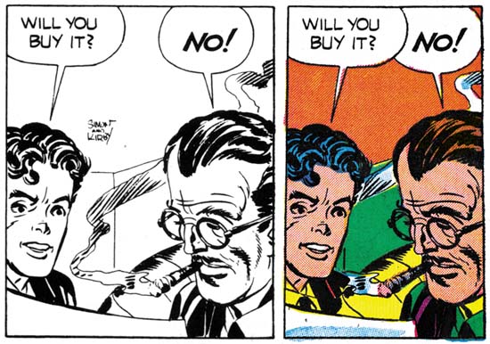
I recently posted on the “Artist Loves Model” story from In Love #3 (December 1954). I appended a note to my blog entry where I admitted forgetting about a post by Bob on the Jack Kirby Weblog about the syndicated strip version of the story. Recently I received a copy of Buried Treasures v1 #2 which includes strips of this syndicate strip proposal. I have compared, panel by panel, the strips to the comic book story. I wrote out all the difference as an aid to my understanding what was done. Just in case anyone wants a blow by blow description I have posted the details. Here I will summarize what was done to convert the syndication strips into the comic book story.

The strips opens with Mayor La Flower. We will never see again, he is just one of Cobb’s fans reading his “Old Man Spry” to his juvenile radio audience. This beginning leaves little doubt that there were no earlier strips. The strips end abruptly with Inky going off to confront Donna Dreame about her illicit dealings. Only the comic book version of the story provides the confrontation. But the book story includes a romance angle between Donna and Inky that was not a part of the syndication strips. Had it been drawn, the confrontation scene for the syndication strips would have been very different. Personally I doubt that Simon and Kirby produced any more strips, as a syndication proposal it would have been better for the story to be open ended.

The most significant difference between the strip and the comic book versions is the number of art panels that never made it into the comic book story. 43 out of 142 strip panels failed this transition. The first panel from the strip that made it into the comic book was the first one on the sixth strip. This means that 20 earlier panels were discarded. Before the first story page of the comic book was completed a further 4 syndicate panels would be dropped. Thus most of the ignored strip panels come from the start of the story. The remaining unused strip panels do not seem randomly distributed among the comic book pages. One group is associated with the first and second meeting between Inky and Donna Dreame (8 skipped panels for pages 8 to 10). The next story arc with a number of unused panels concerns Donna Dreame’s hatching her scheme with Half-tone (page 12 with 5 unused panels). The next dropped set of panels combines Half-tone arriving at Donna’s place with his first meeting with Inky (page 13 with 4 unused panels). More importantly the section dropped off concerns Half-tone and Donna coming back from a night on the town. Considering the love angle between Inky and Donna that was part of the comic book story this strip was particularly inappropriate. There are a few single skipped strip panels in other parts of the comic book story.

Why so many unused strip panels? At 18 pages “Artist Loves Model” is the shortest of the In Love “novel length” feature stories. “Bride of the Star” had 20 pages and “Marilyn’s Men” had 19. It is possible that the length of these stories was dictated by the number of pages that the backup stories would require and not the other way around. However it seems more likely that strip panels were not used simply because they were not necessary. Even without the extra panels, the comic book version of the story reads just as well as the syndication strips. The only negative effect of the dropping of strip panels is the lengthy caption found on the splash page of the comic book. Even Joe Simon criticized it when he recently viewed the splash page. However the wordy caption probably was considered preferable to the 20 art panels it replaces. That would have added over 2 pages without significantly helping the story.

It does seem that the initial intent was to include more of the early syndicate strips in the comic book story. In my earlier post I mentioned an used page of art in Joe Simon’s collection. This page was made from some of the panels from the third strip. I was incorrect with my original suggestion that this art page was discarded because it was taking the story into a different direction. I erred due to my misidentifying one of the characters as Jack Hill (because I was working from memory). Now it seems to me that this page was abandoned in order to condensed the story’s beginning even further.
In Love #3
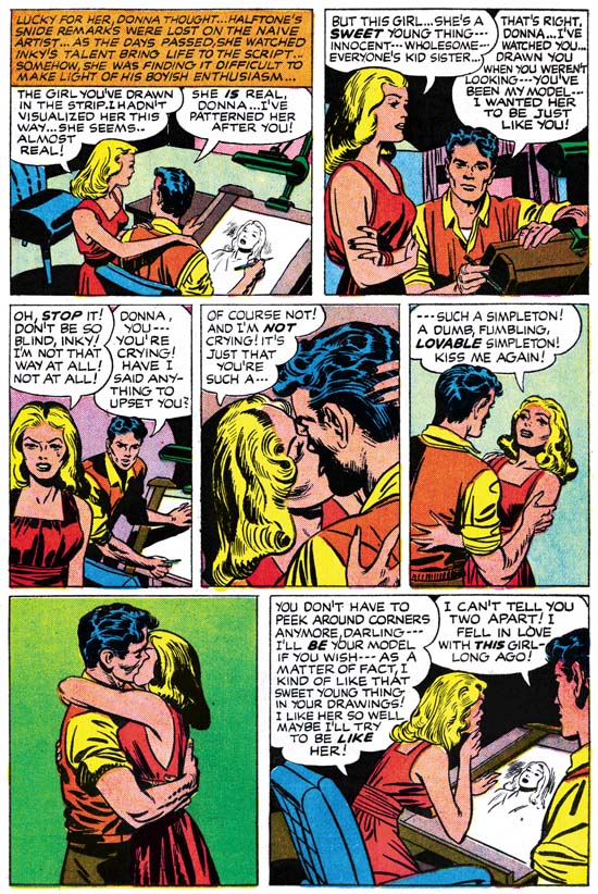
In Love #3 (December 1954) “Artist Loves Model” page 14, pencils by Jack Kirby inks by Joe Simon

Art that did not seem to exist in the syndication strips was added to the comic book. The new art is found in two sections. One is the story arc where Donna Dreame finds out that Inky has used her as a model for one of the characters in the strip they are collaborating on (page 14). A more substantial addition occurs at the very end of the story starting from when Inky confronts Donna Dreame about her dishonest dealings (page 16 through 18). What is significant about these additions is that they concern the romance between Inky and Donna. This romance played no part of the original syndication strip and was added to convert the story for inclusion in a romance comic book title.
In Love #3
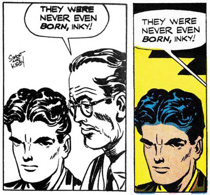
Syndication strip 13 panel 4, art by Jack Kirby from Buried Treasures v1 n2
In Love #3 (December 1954) “Artist Loves Model” page 5 panel 5, art by Jack Kirby
In Love #3
Syndication strip 11 panel 4, art by Jack Kirby from Buried Treasures v1 n2
In Love #3 (December 1954) “Artist Loves Model” page 4 panel 6, art by Jack Kirby

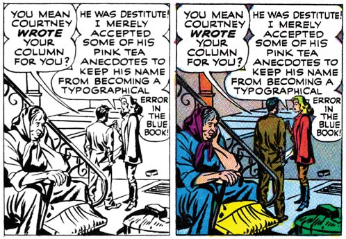
Not all the syndicate panels that did make it into the comic book did so unmodified. The overwhelming majority of strip panels were square. When inserting strip panels into the story 41 of them had their shape altered. 30 panels where horizontally truncated, 10 horizontally extended, and 3 vertically truncated. One of the horizontally expanded panels was used to make a splash panel. This splash was overlaid with another panel so that its shape was no longer rectangular. The new art that was added to expanded panels was kept pretty simple and consisted mostly of backgrounds. Much of the horizontal truncations were done simply by clipping the art. In 2 panels this resulted in the complete elimination of one of two original figures. In 7 occasions where the panel was narrowed horizontally, a character was shifted so as not to be significantly truncated. This explains the unusual cut up nature that I found on Joe’s unused art page. Cutting a strip panel into pieces allowed adjustments to the final shape of the panel for the comic book. It appears that this was done even in cases where in the end the square panel was retained.
In Love #3
Syndication strip 22 panel 2, art by Jack Kirby from Buried Treasures v1 n2
In Love #3 (December 1954) “Artist Loves Model” page 9 panel 3, art by Jack Kirby and Joe Simon

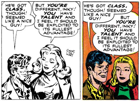
I was not completely accurate above about all the syndicate strip panels that made it into the comic book. Actually I found 14 panels where the art was redrawn either wholly or in part. None of these alterations changed who was portrayed or significantly modified the pose. Most of the time Donna Dreame was redrawn (12 panels), Inky was the only other character to be modified (4 panels). In the syndicate story Inky was portrayed as shorter then most of the other characters. With his short stature and pugnacious nature, I cannot help but feel that Jack Kirby made Inky into a sort of alter ego. The size difference between Inky and Donna may have been fine for the syndicate strips. But this created a problem when romance between the two was added for the comic book, it just would not do to have love between a tall woman and a short man. So in 4 panels Inky was redrawn to be taller. That the romance angle was the reason for this adjustment is shown by the fact that Inky is still shown as shorter then Jack Hill.
In Love #3
Syndication strip 22 panel 3, art by Jack Kirby from Buried Treasures v1 n2
In Love #3 (December 1954) “Artist Loves Model” page 9 panel 4, art by Joe Simon

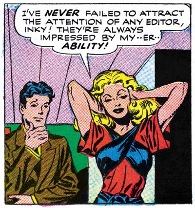
Donna Dreame was altered in a couple of panels as part of the change to reduce her height relative to Inky. That does not explain most of the times that Donna was redrawn. I believe it that these other alterations were done to make Donna more conventionally attractive. Joe Simon once remarked to me that Kirby’s women were not very beautiful, but who cared since Jack drew such great stories. That is a view shared by many others, including Kirby fans. Some have even described Kirby’s woman as ugly. (I hasten to add that I do not share these views and someday I will write a post on why that is.) Joe Simon redrew many of Jack’s women when DC republished some of the old Black Magic stories. Thankfully not all of Jack’s drawings of Donna were redone. This is particular fortunate in the case of a panel which is one of the most sensuous images Kirby ever drew (see image below). Sometimes only Donna’s hair was redone, in these cases the hair was simplified. Kirby used “wild hair” as an indication of a “wild woman”, the hair changes seemed to be done to “tame” Donna a bit.
In Love #3
In Love #3 (December 1954) “Artist Loves Model” page 10 panel 3, art by Jack Kirby

All Simon and Kirby signatures were removed. Other art differences between the syndication strips and the comic book are rarer. Four panels have additions to the background. In two further cases a black band with featuring was added to the top of the panel. All occurrences of Donna’s use of a cigarette holder were removed. Most surprising is a name change, Inky Spotts of the syndication strips became Inky Wells for the comic book. Both names are the sort of appropriate naming that Simon and Kirby often used. It is hard to understand why in the end Wells was considered so much better as to warrant the re-lettering needed to alter the story.

Script changes were not at all extensive. I have noted only two word balloon whose text was modified. One caption from the syndicate strips was deleted and another one rewritten. A caption was added to one comic book panel and most significantly 6 caption panels were added to the book version. None of these affected the plot. All caption additions or alterations seem to have been done just to improve the reading.

Since I have explained the what and the why of the changes made to transform the syndication strips into the comic book story, the question remaining is who was responsible? The syndicate strips had all been drawn by Jack Kirby and much, if not all, of the inking looks like his as well. As for the original syndication scripting, although other writers may have contributed, some of it seems written by Jack. The pencils for the new splash page for the comic book was by Kirby but I believe it was inked by Joe Simon. The same very coarse picket fence inking also shows up in the second splash (page 10) where extending the original syndicate panel resulted in the addition of some art. The art added to the other expanded panels also appears to be inked by Joe. The redrawing of Donna and Inky for the comic also looks like it was done by Joe. Some of the writing for the new or altered captions read like Simon’s effort. However some of the other writing is more “flowery” then typical for Joe, so either he was purposely pushing himself in that direction, or another writer was also involved in the re-scripting. The new art was clearly penciled by Jack but looks different from the rest of the story because Joe did the inking. All in all it would appear that Simon was responsible for editing the syndication strips into the final comic book form with Jack providing newly required art.

Simon and Kirby did a surprisingly number of syndication proposals. Almost all of them consisted of a relatively small number of strips with un-inked pencils. Yet the syndicate “Artists and Models” consists of 36 strips all of which were inked. More significantly, samples were made by George Matthew Adams Syndicate. It is hard to escape the conclusion that “Artists and Models” was considered as the S&K syndication proposal most likely to succeed. The strips do tell a great story and it is one of Simon and Kirby’s best efforts. But I have to agree with Bob of the Jack Kirby Weblog, that it is hard to believe that a comic strip artist could be the basis of enough good stories to keep a syndication strip going for years.
Pop Goes Simon and Kirby

As a general rule comic book fans are very derisive about modern art. They feel that comic artists show greater talent then the fine artists of the last century. Much of modern art is not predicated on realistic depictions. Comic fans, and many of the general public, feel the lack of realistic illustration characteristic of most modern art shows that it is nothing more then a trick played by the artists. Thus a big hoax has been perpetrated on the museums and art collectors of the world and only those who have not studied art history can see that the emperor has no cloths. The irony is that not only have these comic book fans failed to appreciate the goals of fine artists, they also seem ignorant of what comic artists are actually doing. A realistic depiction is not the aim of comic artists either. Invariably these artists are concerned with telling a visual story and realism is often sacrificed toward that end.

Probably no modern artist riles comic book fans more then Roy Lichtenstein. Lichtenstein became a famous Pop artist by transposing comic book art onto large painted canvases. There is a term fans use when one comic artist copies another, they call it swiping. It is not an accident that to swipe was originally a slang expression for to steal. For comic fans it was bad enough that Lichtenstein was swiping from comic artists, what was even worse was his paintings sold for thousands of dollars while the original comic book artist generally struggled to make a living. History adds insult to this story. Let me repeat part of a post I once did where I am talking about comic book artists Irv Novick (from Simon and Kirby Meet the Shield).

Although it is frequently cited that Irv did superhero work for MLJ until 1946, in fact, like many artists, Irv spent some time in the military. During that time Irv befriended Roy Lichtenstein, getting him out of manual work and helping Roy get a job that used his artistic talents. Of course no good deed goes unpunished, after the war Lichenstein became a highly paid pop artist by painting greatly enlarged copies of comic book art originally drawn by a variety of comic artists, including Irv Novick.

Deconstructing Roy Lichtenstein
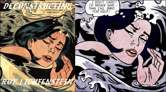
Example from “Deconstructing Roy Lichtenstein

Comic fans’ criticism of Lichtenstein has however missed the mark. Even realistic artists depict their subject matter through their own personal filter. No matter how realistic an artist tries to be or how technically talented he is, the final painting will not truly match the source. In truth it is not how realistic a piece of art is that determines how good it is, more important is how well the artist brings forth his personal vision. Roy Lichtenstein’s work is different only in his subject matter, instead of painting landscapes, portraits, or abstracts, at one time Lichtenstein painted comic book art. Lichtenstein’s paintings are not identical copies of comic book panels. There is a marvelous web site call Deconstructing Roy Lichtenstein that provides examples of Roy’s paintings and the comic book source they were based on. Again and again they final painting deviates from the source. Some of it is editorial changes to improve the effect of the work. After all a painting stands by itself while the original source is just one panel in a sequence of panels telling a story. Coloring would also be adjusted by Lichtenstein. Even the famous Benday dots are actually Lichtenstein’s inventions and have nothing to do with the printing of the original comic book art. The line art was often adjusted by Roy. It would be nice to be able to say that Roy improved the line art, but in fact the final image often is inferior to the source. Lichtenstein could never had been successful as a real comic book artist.

Although I disagree with the criticism leveled by comic book fans at Roy Lichtenstein that does not mean that I approve of his work. I am not bother by his copying comic book art but I do dislike his attitude towards his source. Lichtenstein’s paintings treat the comic book art as camp. The Pop art world could enjoy the impact of the original comic book art but since it was presented as a fine art painting they could view it with a amused sense of superiority. Fine art is supposed to provide more levels of meaning then that found in popular art. Frankly in the case of Roy Lichtenstein’s comic book paintings I just do not find enough deeper meaning to justify his condescending attitude toward comic book art.

The Burlington Magazine
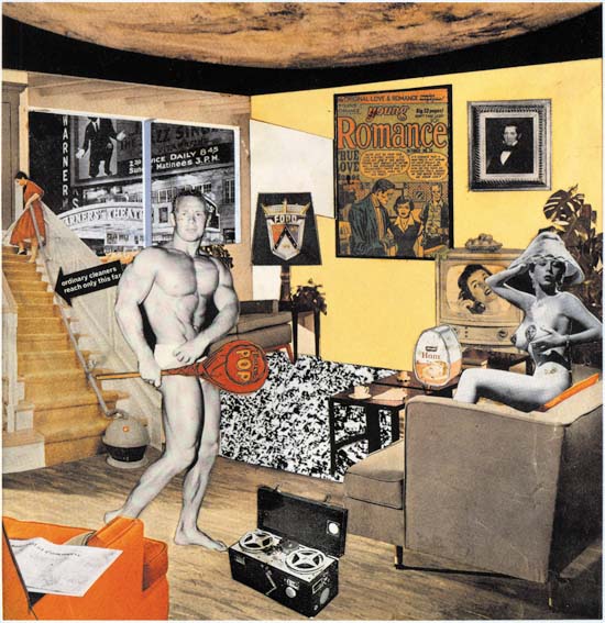
“Just what is it that makes today’s homes so different and appealing?” collage by Richard Hamilton made in 1956.
Image from The Burlington Magazine (September 2007)

My criticism of Roy Lichtenstein does not apply as well to all Pop art. A case in point it the collage by Richard Hamilton, an image of which I provide above. Yes the presence of the Young Romance cover art in the collage does give this work of art special significance for me, more about that below. The comic book art plays only a small portion of the total effect of collage, the same can be said of all the individual pieces. Collages have a special magic, at least when done by an artist with talent. The components of the collage adopt two identities. The individual pieces become part of a bigger image while still remaining recognizable as being clipped from some printed source. The title of the piece (“Just what is it that makes today’s home so different and appealing?”) sounds like it belongs to an article in some home decor magazine. Which makes the image along with all its individual components all the more incongruous. Hamilton’s collage does have a sense of camp to it, but in this case I get the feeling I am a partner in the humor and not the blunt of it. Despite the fact that Hamilton seems to be pocking fun at American middle class society, he seems to have a genuine fondness for each piece of collage element that he uses.

Young Love #15
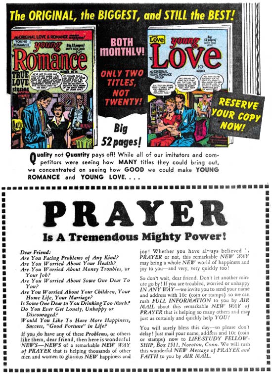
Young Love #15 (November 1950) house ad with the original cover art of both covers by Jack Kirby

There is a reason that I am discussing Hamilton’s collage at this time. The latest issue of The Burlington Magazine has an article on it by John-Paul Stonard. In researching the piece John-Paul has managed to track down the source of most of the collage elements. Interestingly all the parts seem to come from American sources dating prior to 1956. It seems another British artist, John McHale who at the time was studying at Yale, sent a trunk full of material to Hamilton and that formed the basic source for the collage. Unfortunately one of the sources that has not been tracked down is the Tootsie Roll candy that plays such a prominent part of this art piece. The wrapper displays “POP”, a word coined in 1954 to describe the art movement.

The Young Romance “painting” lead Stonard to the Jack Kirby Museum and Rand Hoppe, and Rand in turn lead John-Paul to me. The image provided of “Just what …” may give the impression of a large piece when it actually is about ten inches wide. What appears to be a Young Romance #26 cover clearly is too small to be the actual cover and had to be some sort of house ad. I did a careful search of all the Simon and Kirby productions from about when Young Romance #26 came out (October 1950) up to 1956 the year the collage was made. There were two different ads that the YR #26 was used in. There was a size difference between cover image used in the one variant (used in YL #13) and the second (use in YL #14, #15, YR #27). John-Paul said that the size of the second ad was the correct one. When I sent John-Paul a scan I thought that was as close we were going to be able to come in identifying the source. John-Paul however immediately noticed that the comic title in the scan I provided were in white characters while the one used in the collage were red. When I reviewed the ads again I found only one of the house ads had red letters in the YR #26 image. Thus we could be sure that the source of the collage YR image came from the house ad from Young Love #15.

Young Romance #26
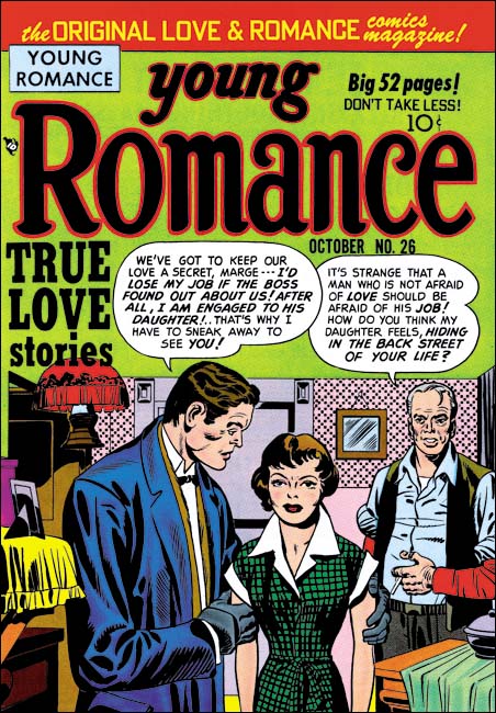
Young Romance #26 (October 1950) art by Jack Kirby

I like the fine arts, but my main interests in recent years has been the comics produced by Simon and Kirby. So I did not want this post only to have an image of the cover of Young Romance #26 as a faded piece in Hamilton’s collage, or even a better version found in the original house ad. Instead I wanted an image of the cover as close as I could make it to how it looked when it first appeared on the newsstands. I believed romance covers always posed a special problem for Jack Kirby in that he could not include action to make an interesting cover. To help compensate, Kirby turned to the use of visual props. I particularly like the way he has placed some in front of the characters. This gives the image a greater feeling of depth and prevents it looking like the people are standing in front of a stage setting. To do so though, Jack had to place some furniture and a shelf at what are really odd angles compared to the rest of the room. But as I have previously commented, comic covers are not meant to be realistic as if taken from a photograph. Usually it is time that is played around with in order to present what actually is a condensed story, here it is space. The only thing that bothers me about this cover is the wallpaper, I find the pattern too distracting.

I admit that I get something out of Simon and Kirby productions, particularly the romance work, that was not part of their original intentions. It is not the sense of camp that Roy Lichtenstein and his admirers enjoy. Rather it is a reflection of the changing attitudes. I am sure the melodrama was probably a bit over the top even when it was published but I doubt it would even be considered a reasonable premise today. But then again today there are no more romance comics. I wonder about manga?

Battleground, Jack Kirby’s Return to Atlas

Battleground #14
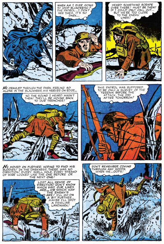
Battleground #14 (November, 1956) “Mine Field” page 2 pencils and inks by Jack Kirby

Jack Kirby turned to freelancing when the Simon and Kirby studio failed. Battleground #14 (November 1956) was the first of his freelance jobs to be published. It also marked Kirby’s return to a company that he left almost 15 years before. Jack probably still remembered Goodman’s unfulfilled promise of royalties for Captain America, but Kirby had a family to support and so had to swallow his pride. His reentry job was a short five page war story called “Mine Field”. The job should have been easy for Jack, only a couple of years before Kirby drew, wrote and edited for Foxhole, a war comic for Simon and Kirby’s own publishing company called Mainline. One story for that title, “Hot Box”, was only two pages long and Jack still managed to make it a masterpiece.

“Mine Field” is a simple tale. A somewhat bumbler of a soldier gets separated from his outfit during a night patrol. He becomes lost in the dark and by daybreak finds himself close to the enemy’s position. From his observations he realizes the Germans plans to lure the Americans into a mine field. Upon dark the soldier rearranges the German marker and finds the way back with the outfit. The table has turned and the enemy falls into their own trap. It is a good story, just not one that plays on what would normally be considered Kirby’s strengths. Jack likes his war action up close and personal and that is not what this story is about, although Jack does manage to sneak in some typical Kirby action in the last panel. But it is because the story does not have a lot of action that it provides a showcase for how good an artist Kirby was. I provide an example page above. Note that there really is not a lot happening on this page. We find the hapless soldier fall into a shell hole and his unsuccessful attempt to find his comrades. Yet by altering the view point and careful use of the landscape Jack manages to make it all interesting. Kirby is able to do this throughout the story. This sort of low action story may not have been the best vehicle for Jack, but he still managed to make it look easy.

Jack’s pencils are always at their best when inked by his greatest inker, Kirby himself. For this story Jack’s inked in a manner which I referred to as the S&K Studio style. That style is categorized by bold brushwork and some unusual techniques. In the image I provide above, note the use of the picket fence pattern (see inking glossary) in the second and fifth panels. By itself there is nothing unusual about Jack’s inking in the Studio style, he had often used it in the past. What is surprising is that this style appeared in a work at this late date. At this time Jack had adopted a similar style but with a finer brush for Prize romance covers or a simpler style without techniques like the picket fence brushing for romance story art. However the inking in “Mine Field” does show one important trait agreeing with both the Fine Studio and Austere styles. Spotting has been downplayed giving the entire art a lighter look. Black areas tend to be limited coverage but when used are done by filling the area with ink. The inking for this story was not as masterful as Jack would shortly do for Atlas in Yellow Claw #2 and #3. However in its own understated way it is a beautiful job without any signs of rushing and loss of control found in “Afraid To Dream” that Kirby also did in the next month.

I have already remarked above how the plot for “Mine Field” was not typical for Kirby. I also find that the actual text writing does not have Kirby’s “voice”. Jack’s writing usually includes exclamations that are a little over the top. I find none of that quality in the script for “Mine Field”. Therefore I do not believe that Jack had much to do with the writing for this story and that he was working from a script supplied by Atlas. This sets this story apart from most pre-Implosion Atlas work which either Kirby seemed to have a lot of control over the writing (Yellow Claw, “Afraid to Dream”, “No Man Can Outdraw Him” and “Pokerface”) or at least some input to the plot (Black Rider Rides Again).

Battleground #14
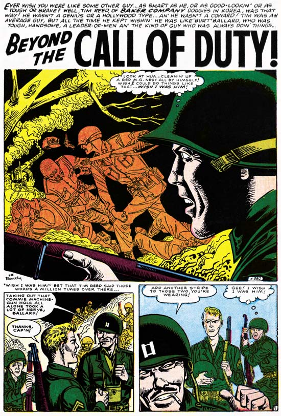
Battleground #14 (November, 1956) “Beyond the Call of Duty” art by Joe Maneely

In my posts for this blog I generally avoid comparing other artists to Jack Kirby. It really is not fair and can result in overlooking the special talents these comic book artists possessed. Effectively Atlas made just such a comparison between Jack Kirby and Joe Maneely and judged Maneely as the better artist. Presumably this judgment was made by Stan Lee and it continued as long as Joe Maneely was alive. It was Joe that was the most frequent Atlas cover artist while Jack did not even get to do the covers for comic books titles where he did all the interior story art. In Battleground #14 Joe got the most important first story while Jack’s contribution was delegated towards the back. But this does not seem to reflect the actual merits of the two stories. Maneely is working from a script with much more action then what Kirby had. For a war title this should almost insure a more interesting story, yet Kirby’s piece is a much better read. Maneely just does not seem to know how to make the action exciting. Under Joe’s hands all of the artwork seems dry and unmoving. Even today there are those who say Joe Maneely was a great artist. I just do not understand exactly what they feel Maneely did so well.

Remembrance

9/11

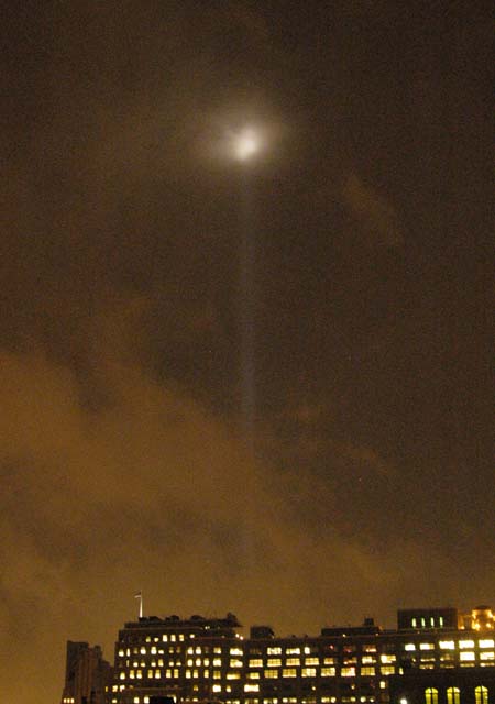
I purposely limit my posting on the Simon and Kirby blog to writings about comic book artists and their art. This just does not seem to be the place to discuss topics like my political views or personal opinions. I have made an exception to commemorate the lives lost in the terrorist attach on this day now six years ago. I trust my readers will forgive me this deviation from my normal writings. This year has brought some people calling for us to put this annual memorial behind us. They say that enough time has past to put an end to our collective mourning. One writer provide examples of other national calamities that we no longer pay an annual tribute to, such as the sinking of the Maine or Pearl Harbor. The irony for me was although I have no idea when the Maine sank, every December 7th I do think about the Japanese attack and the U.S. participation in the war that followed. I think this is because it had such a big impact on the lives of my parents, aunts and uncles. Nonetheless it is expected that the pain we feel will diminish with the passing of time and I have no problem with those who have already reached that point about the events of 9/11. However I do call for them to be tolerant of those of us who have not yet made that transition. For now though this day continues to brings a touch a sadness to me each year. I am not a vengeful person, but I suspect I would find it easier to put 9/11 behind me were it not for the fact that so many of the perpetrators of that crime are still at large with the full intent of inflicting further atrocities against us.