Category Archives: z Archive

In Love #3

In Love #3
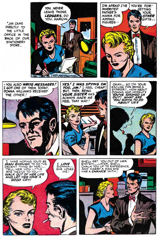
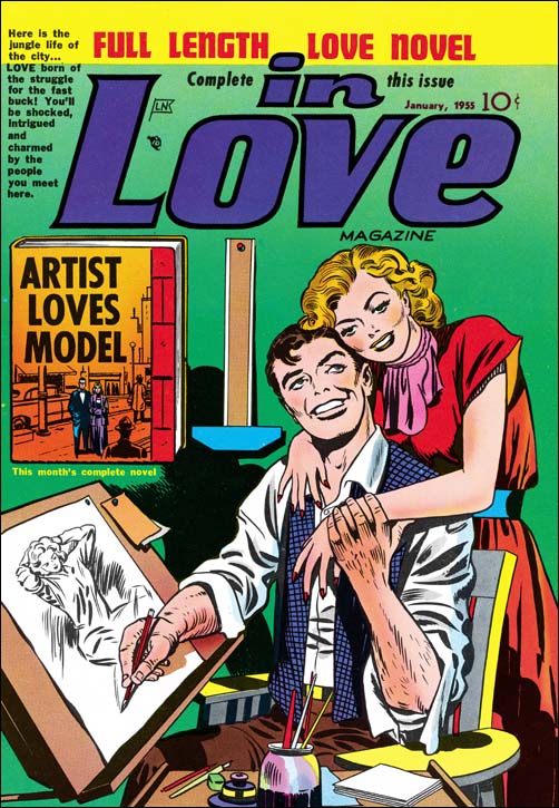
In Love #3 (December 1954) “Artist Loves Model”, art by Jack Kirby

The artist and model theme was one that obviously resonated well with Simon and Kirby. They launched the whole romance comic book genre using the theme on a cover The theme became the basis of a syndication strip proposal most likely from the late ’40s or early ’50s. Later Simon and Kirby then tried to use it as a basis for a new comic book title. Kirby and Bill Draut both made cover proposals for the “Artist And Models” book. Kirby’s version of the cover and the original syndication proposals were used as a basis for the “Artist Loves Model” story for In Love #3. Theakston’s Jack Kirby Treasury vol 2 has one of the syndication strips. 2 panels made it into the comic version of the story, while 2 panels did not. The panels that made it were used in their entirety. Joe Simon’s collection has the original art for what was going to be the first page of the story. Two of the original three rows of panels remain on this page. Everything was cut and pasted, nothing was drawn on the board itself. Unlike the art from the Treasury strip example, this page did not use whole panels, instead these are pieces of panels cut to fit together. I am not sure why this page was abandoned, but it does seem to tell a story that deviates from the published version.
In Love #3
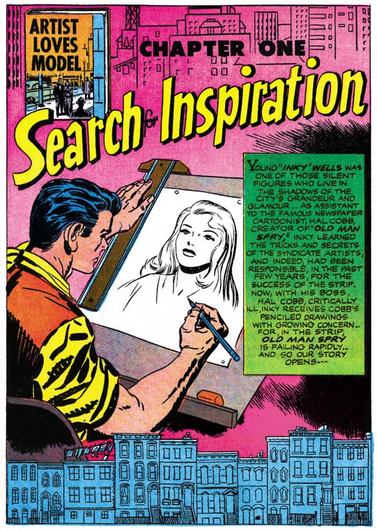
In Love #3 (December 1954) “Artist Loves Model” page 1, pencils by Jack Kirby inks by Joe Simon

We can be certain that the published first page was newly created for the comic book version of the story, a syndication strip would not require a full page splash. I am not certain, but I believe Simon did the inking. It is even blunter then what Kirby was doing at the time without the type of control Jack usually provided. When I showed Joe this page he commented that he felt there was too many words in the caption. It is an unusually wordy introduction for a Simon and Kirby comic. This was probably due to the need to cover the part of the story which had been on the abandoned first page that I talked about above. Although I have attributed the pencils to Jack, he may not have done the rows of buildings at the top and bottom of the page. In any case the tenements on the bottom are a particularly nice touch.

Of all the stories published for the In Love title, or any other Simon and Kirby romance productions, the inclusion of “Artists Loves Model” in the romance genre is the greatest stretch. Although love plays and important part of the story it really is not the central theme. The real theme for this story concerns artistic creativity. The story follows the lead character Inky from the end of his gig as an assistant to a famous and successful syndication strip artist. We see Inky’s failed attempt at creating his own strip. Eventually our hero does accomplish his goal, but only as an unwitting accomplice to intellectual property theft. When Inky realizes what has happen he abandons his new found success and sets things right. But he has not only proved his moral integrity, but his artistic value as well. Inky ends up with a new assignment and there is little doubt that he will be very successful with it.
In Love #3
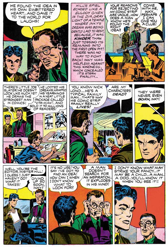
In Love #3 (December 1954) “Artist Loves Model” page 5, pencils by Jack Kirby

“Artist Loves Model” has significance beyond the fact that it is a great story. Both Jack and Joe gave a number of interviews later in their lives. Jack’s interviews in particular give insight into his opinions about the creative process. The prestige of comic book artists is very different from the Silver Age on. I doubt very much if anyone bothered to interviewed Kirby or Simon during their time of collaboration. Therefore “Artist Loves Model” provides a rare opportunity into what Simon and Kirby thought about creativity in comic art at that time. When syndication manager Jack Hill rejects Inky’s initial strip proposal Hill’s explanation is:

BECAUSE YOUR CHARACTERS ARE ARTIFICIAL, INKY … THEY LACK LIFE!

Later Hill makes it clear that he is not just talking about how good the drawing is:

NO EDITOR IN HIS RIGHT MIND WILL ACCEPT THAT LIFELESS CREATION, INKY! IT’S JUST A GOOD-LOOKING CORPSE!

To help Inky understand what he is saying, Hill shows two popular syndication artists at work. One, a small and skinny man, draws a Superman clone (Vita-Man), using his inner most desires as an inspiration. Another artist is a typical family man and therefore can make his comic strip family real for his readers. One particularly interesting comment is made by Mr. Hill:

A MAN DOESN’T SEARCH FOR AN INSPIRATION … IT EXPLODES IN HIS MIND!

The way this particular comment is phrased sounds so like Kirby to me. It is just the sort of thing that Jack might have said thirty years later.

Inky’s love interest is his new found manager, Donna Dreame. Donna is a very beautiful woman with a larcenous heart. Unfortunately Inky is the only one in the story who does not recognize her true nature. Donna is surprised to find that Inky has used her as a model for one of the characters in the strip they are collaborating on. However as Donna remarks:

BUT THIS GIRL … SHE’S A SWEET YOUNG THING … INNOCENT … WHOLESOME … EVERYONE’S KID SISTER …

This is the way the love blind Inky sees Miss Dreame. Donna is so taken by Inky’s idolized version of herself that she resolves to be more like the woman that the artist has portrayed. Real life has inspired art which in turn becomes a source of inspiration. I believe this is a rare presentation of a core, if unspoken, Simon and Kirby philosophy. I can think of no more capable comic book creators at that time then Simon and Kirby. Yet Joe and Jack never went to the extremes found in comics produced by companies like EC. Even before the Comic Code there was a self imposed barrier of good taste that Simon and Kirby would never extend beyond. As businessmen money was very important to them, but never to the point that Joe and Jack would compromise their product. Simon and Kirby wanted their stories to be sources of inspiration for their readers and not just a vehicle for cheap thrills.

“Artist Loves Model” is unique among the numerous Simon and Kirby productions. Unfortunately In Love #3 is probably the rarest of all the Mainline/Charlton Simon and Kirby issues. Further this story has never been reprinted. The story has no superheroes or blazing guns yet I think it is a most important story that every Simon and Kirby fan should read. Perhaps someday that will once again be possible.

The format of the In Love would change after issue #3. Never again would the title include a “book length love novel”. Nor would the stories have the unique flavor that previously even many of the backup stories had. The stories from In Love became indistinguishable from those concurrently being produced by Simon and Kirby for Young Romance, Young Love and Young Brides. I will continue scanning and restoring the remaining issues of In Love but I doubt I will be posting about them at this time. First I need to write about Simon and Kirby’s long and fruitful career in the romance genre.

Addendum:
When I wrote the above I had completely forgotten that Bob on the Jack Kirby Comics Weblog had once posted on the syndicate version of this story. I am in the process of getting a copy of Buried Treasure v1 #2 which Bob reports has 36 strips. When I do I will post on what portion of the original strip made it into the comic book story.

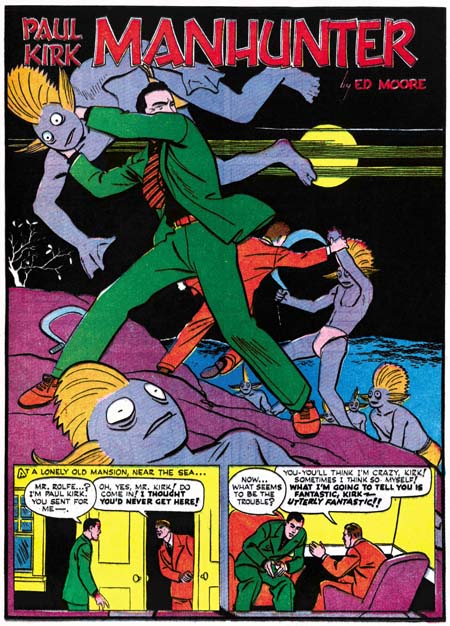
Simon and Kirby’s Manhunter

Adventure #72
Adventure #72 (March 1942) “The Fish-Men”, art by Ed Moore

There is a gap of a couple of months between when Simon and Kirby left Timely and their first published work for their new gig, DC. In his book, The Comic Book Makers, Joe has said that they did some ghosting at first. I am surprised about that because later attempts by Joe or Jack to copy another artist’s style were not very successful. I would think that by now someone would have identified any ghosting that they did for DC. The first known work for DC was a Sandman story in Adventure #72 (March 1942). Simon and Kirby imparted to Sandman their unique storytelling talents. However Sandman was not their own creation, Simon and Kirby did not even create a new costume for the hero.

Adventure #73
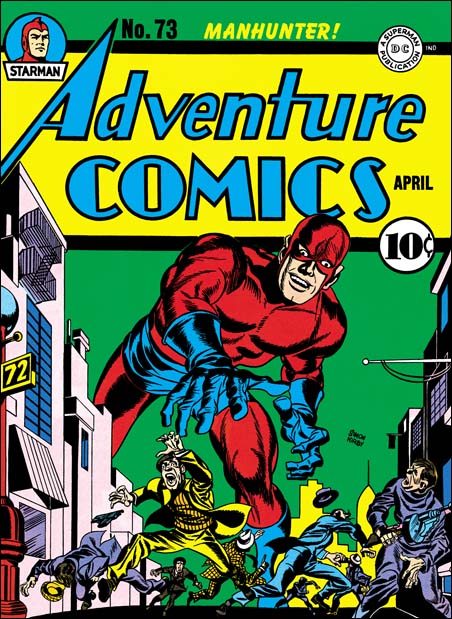
Adventure #73 (April 1942) “Buzzard’s Revenge”, art by Jack Kirby

For the next Adventure issue S&K added another feature, Manhunter. This replaced the series Paul Kirk Manhunter. Joe and Jack kept the concept of a big game hunter using his skills to combat crime. Instead of fighting crime as a detective, Simon and Kirby would give their hero a costume and a secret identity. It seems that Joe and Jack wanted to distance themselves further from the previous strip by calling the hero by a new name, Rick Nelson. Probably at the instigation of DC management, Manhunter’s alter ego changed back to Paul Kirk in the next issue’s story and so would remain.

Adventure #73
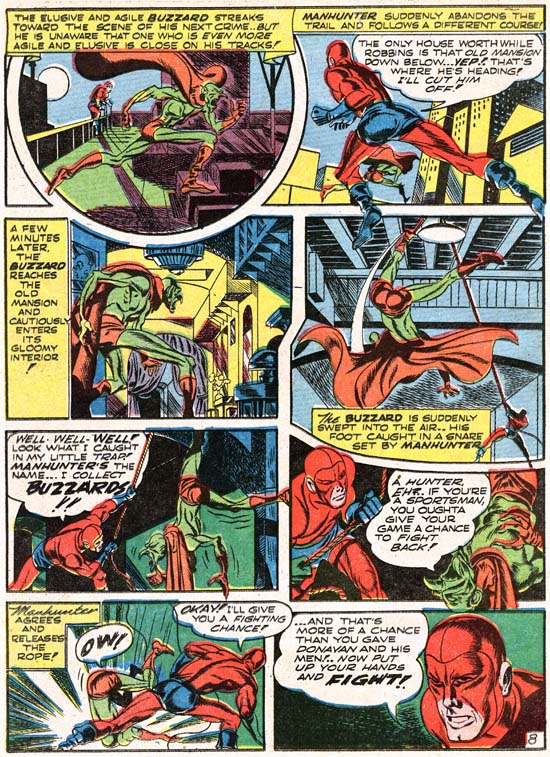
Adventure #73 (April 1942) “Buzzard’s Revenge” page 8, art by Jack Kirby

The name of Manhunter’s secret identity was not the only thing that changed after the first story, there was a costume change as well. Initially Manhunter had a mask which left bare his lower face, very much in the style that Simon and Kirby had used previously for Captain America. This would be replaced afterwards with a blue mask that covers the entire face. It is only the face that is blue, the rest of the head is red like most of the costume. This blue mask is unlike anything that Simon or Kirby did before, and they would never repeat it. There is a separation between the blue mask from the rest of the head gear. The demarcation between the two follows a path about where the hair line would be and then traces down the cheeks. A careful examination reveals that the new costume did not actually start with the second issue, but was used in the first story as well. It is only the coloring used that makes the first story look like it matches the cover art. Chances are when DC noticed the discrepancy between the cover art and the story they asked Simon and Kirby to correct it. On the splash page Manhunter was modified by the addition of a upper face mask. Such a modification probably took too long, and the results were neither matched the cover nor were very satisfactory in its own right. So the rest of the story was altered by the judicious use of color alone.

Aside from the issues of the costume and secret identity, everything for Manhunter was in place right from the start. In Captain America the origin story seemed like something that S&K had to get over with as quickly as possible so that the real tales could be presented. With Manhunter Simon and Kirby handled the origin better, integrating it into the first story quite well. Kirby continued drawing with devices he had adopted in Captain America, variable shaped panels, figures that extended beyond panel boarders, exaggerated perspectives, outrageous running strides, and what would become a Kirby trademark, his socko punches. Jack’s pencils seem better, as if he was now fully in control of what he was doing. But of course Kirby’s art always seem to change and improve as he was never satisfied to rest on his former achievements. For me it was with the early DC work and the Harvey covers that the Simon and Kirby unique artistic vision first congealed. An important part of this was their forging a unique inking style. You can see suggestions of it in Captain America, but perhaps because of all the different hands used to produce that comic it all appeared a bit piece meal. With the DC and Harvey work the brushwork would be bold yet sensitive.

It is not just the art that makes Simon and Kirby productions so great, it is the writing as well. Simon and Kirby managed to leave their unique touch on the Manhunter stories. There was nothing else at the time as exciting as Manhunter in Adventure Comics, or for that matter any of the DC comics, well except of course for the Sandman stories. Manhunter was matched against crime lords, evil scientists, jewel thieves, Nazi spies and escaped convicts. No matter what foe Manhunter pitted himself against he would manage to track them down, although sometimes he would end up being hunted in return. They were all fast pace adventures and in my opinion great reads.

Adventrue #75
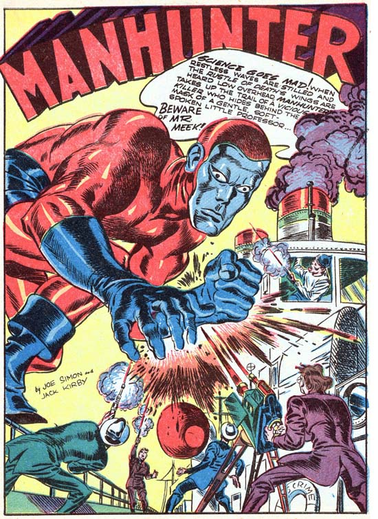
Adventure #75 (June 1942) “Beware of Mr. Meek”, art by Jack Kirby

There was one aspect about Manhunter that Joe and Jack seemed a little uncomfortable with. Simon and Kirby preferred to give their heroes a sidekick, so that they would have someone to talk to as Joe would explain. Simon and Kirby’s solution to this problem in Manhunter was to provide a different sidekick as the need aroused. In “Scavenger Hunt” (Adventure #73) Manhunter teams up with a young man trying to prove his worth to his would be love. For “Beware of Mr. Meek” (Adventure #75) the sidekick is of all things a beautiful jewel thief. A boy scout helps the temporarily blinded Manhunter follow the crooks’ trail in “The Legend of the Silent Bear” (Adventure #76). In “The Stone of Vengeance” (Adventure #77) a shoe shine boy becomes involved in Manhunter’s case against some murderous jewel thieves. The lady in “The Lady and the Tiger” is effectively Manhunters sidekick in Adventure #78. Finally in “Man Trap Island” (Adventure #80) he teams up with a young Indian lad to combat escape convicts. Only in the origin story and “Cobras of the Deep” (Adventure #79) does Manhunter truly work alone.

Simon and Kirby only did eight Manhunter stories. The feature did continue but under much less talented hands. Unfortunately Manhunter was not the sort of character that could continue to be successful without the Simon and Kirby touch. Frankly I am surprised it made it as far as Adventure #92 (June 1944). Reprints of most of the S&K Manhunter stories appeared as backup features for some of Kirby’s DC comics in the early ’70s. Jack would also do a retro version of the Manhunter in 1975 (1st Issue Special #5). These ’70s work must have had an impact because over the years DC would publish a variety of Manhunter avatars, the latest being a female version. With Manhunter’s continued significance in DC continuity I would have thought that a tradeback edition of the original Simon and Kirby stories would be a no brainer. Yet despite all the archive editions published, DC seems reluctant to reprint Manhunter or any of the other Simon and Kirby creations. I wonder why?

A Belated Happy Birthday to Jack Kirby

Jack Kirby

I can offer no excuse for missing Jack’s birthday. I believe it is better to have missed the occasion then to ignore it altogether.

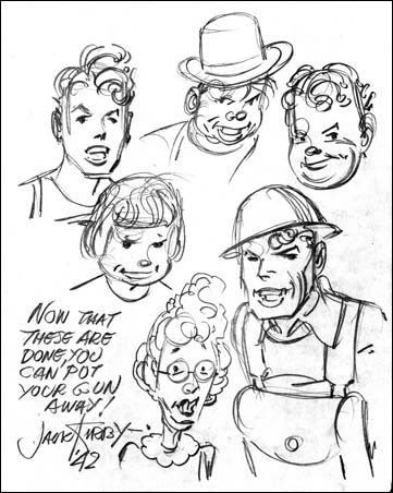
To celebrate Jack I offer a sketch he did in 1942 for George Roussos. The paper turned a strong yellow so I used the magic of Photoshop to make it white again.

I know it is the Boy Commandos, but who is that elderly lady?

In Love #2

In Love #2
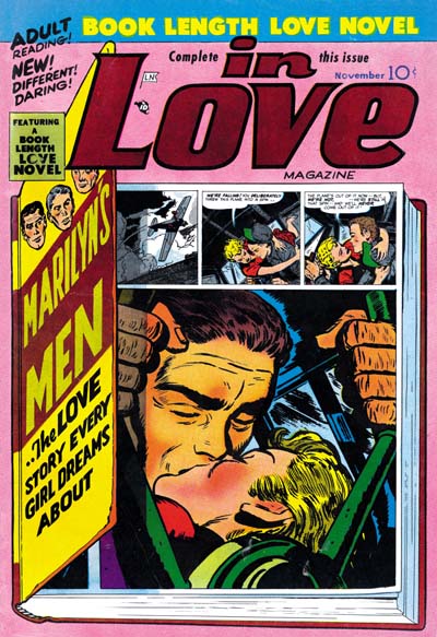
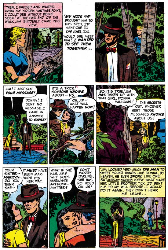
In Love #2 (November 1954) “Marilyn’s Men”, art by Bill Draut

The second issue of In Love kept to the concept of a long story broken up into three chapters. “Marilyn’s Men” is about Marilyn Morgan, her brother Jim, Lawyer Bob (he is actually called that), and Dave an airplane pilot. Jim is a constant source of scandals due to his numerous fights over girls, usually someone else’s. Lawyer Bob loves Marilyn, but unfortunately for him she does not return that affection. Marilyn heart still smolders for her high school flame Dave. Always on the look out for a big money making scheme, Jim entices Marilyn’s interest in a new project because this time it involves a deal with Dave for a new airport. This not only leads to a business partnership, but also to the renewal of love between Marilyn and Dave. All is not well because an attempt by Marilyn to prevent Jim from causing another scandal backfires with Jim leaving the partnership. But another scheme of Marilyn’s brings him back.

In Love #2
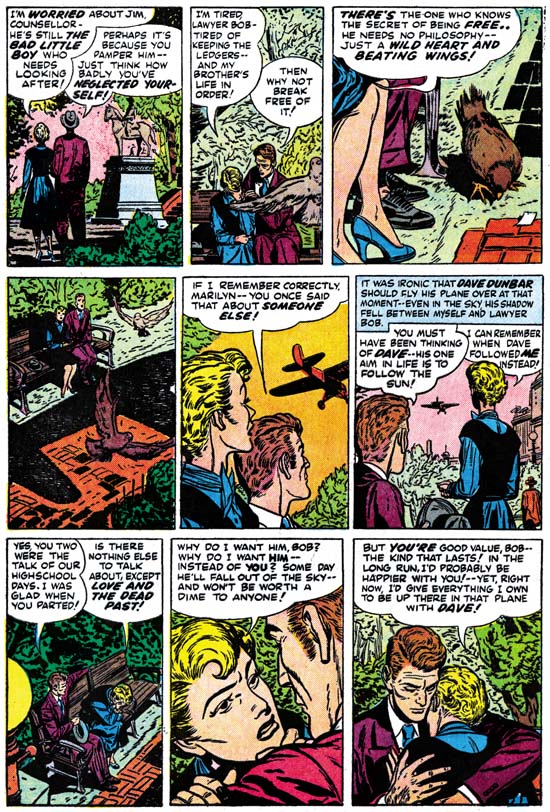
In Love #2 (November 1954) “Marilyn’s Men” page 6, art by Bill Draut

Most of the art in this story was done by Bill Draut, and he does a great job. There are a lot of examples I could provide. There is a nice fight scene that starts the story, a great splash page, some interesting flying sequences, and more. Instead I have selected a page with no real action because it shows how well Bill could choreograph a page. I suspect some of the credit should go to the writer for so nicely directing the whole thing. But it was probably Draut who figured how to visually make it all work. We see Marilyn and Lawyer Bob enter the park. As they sit there is a flying pigeon in the foreground. Next a close-up of a pigeon and the couple’s legs. Marilyn cites the pigeon as a metaphor for freedom. Then the pigeon is startled and flies away with the shadow of a plane showing the source of that disturbance. It is Dave’s plane that the couple look up at as if flies away. Finally it is back to focusing on the couple as we learn the depths of Marilyn’s feeling for and about Dave and Bob. All very cinematic.

In Love #2
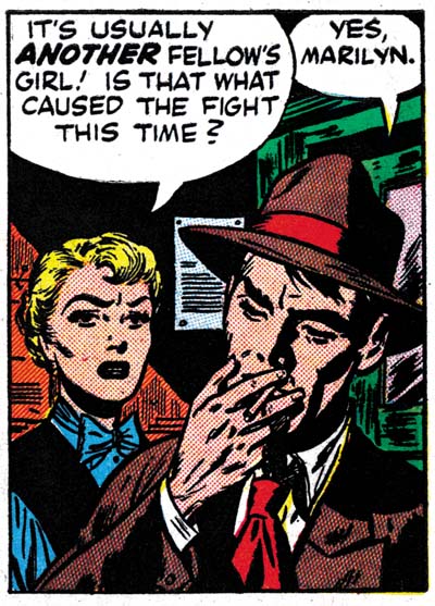
In Love #2 (November 1954) “Marilyn’s Men” page 4 panel 3, art by Bill Draut and Jack Kirby

That page and others do not have a Kirby feel to them so I once again doubt that Draut was working from Kirby layouts. There is one exception, a panel with Jim taking a drag from a cigarette while talking to Marilyn. Marilyn’s pose seems pure Draut, but Jim is so Kirby-like that I suspect Jack has stepped in to redraw the brother.

In Love #2
In Love #2 (November 1954) “Marilyn’s Men” page 18, art by Jack Kirby

Kirby did not draw any of the pages for the first two chapters of the story, but Jack did four of the seven pages of the last chapter. The first three pages are by Jack, followed by three pages by Bill and ending with another page by Kirby. I find it surprising that Jack’s contribution came so late in the story. Draut is a good artist but lets face it, Kirby is a better one, and also the boss. Normally I would expect that if Kirby only worked on part of a story it would be the splash pages and the start. An advertisement in In Love #1 shows that at least some of the art for “Marilyn’s Men” was already completed at the time issue #1 went to the printers. So perhaps Jacks significant involvement in In Love #1 precluded initially working on issue #2 until the last chapter. If chapter 3 is thought of as a story in itself, Jack’s involvement with the starting pages and the end is just what would be expected. Jack did a beautiful job on the splash page, I believe he inked it as well. I will discuss the second page of the chapter below but I do not believe Jack was the primary inker. The third page (shown above) is a bit of a surprise, although clearly drawn by Jack it looks like the inker tried to make it looked like it was done by Draut. I do not think it was Draut who did this inking. Previously I wrote on Kirby imitating Draut and other artists in the content pages of Harvey romances. What was done here was just as unsuccessful. I suspect the attempt was made to provide a transition from the Kirby page to those done solely by Draut. It does provide a transition but at the cost of a truly ugly page of art. The same sort of Kirby transformed into Draut occurs on the last page as well, and it is just as unsuccessful.

In Love #2
In Love #2 (November 1954) “Marilyn’s Men” page 17, art by Jack Kirby

I supply the image for the second page of the third chapter above (page 17 of the entire story). The sequence actually starts with two panels on the splash page showing Marilyn as she passes through the park alone. The first five panels on page 17 is a sequence of two of Marilyn and the man, followed by one of the man meeting another women and then another two of Marilyn and the couple. Except for one panel where the man is up close, Jack generally puts Marilyn in the foreground with the background used for the man or couple, who are the actual focus of the panels. The next two panels show only the couple and the last has the couple again with Marilyn retreating in the background. The whole sequence is just a marvelous example of obtaining drama and tension just by the way the art is laid out. Kirby is justly famous for how he portrays action in a story, action-less drama on the other hand is not something that Jack did not do very often. Although rare, pages like this one or the one I wrote about from Foxhole #2 show that Kirby was a master of pure drama as well.

The writing for this story is truly superior. All the pieces of the plot fit well together. Marilyn’s interference with her brother Jim in the last chapter makes no sense without Jim’s fight and scandal in the first chapter. The plot moves not just to provide an interesting tale, but as a means of presenting the cast of characters and providing their motivations. The character of Marilyn is a particular surprise. Generally a businesswomen in romance comics would be expected to abandon her career and find fulfillment in love. Not Marilyn, she gets it all, love and her career. When Marilyn’s interference in Jim’s love life backfires you would expect that she would have learn her lesson. Instead Marilyn no longer tries to break up Jim and his new girlfriend, but interferes once again in his life to bring him back to business partnership. One thing sets this story apart from many Simon and Kirby romances and that is emphasis on action. Since action is so often found in romance stories that Jack drew, I believe this indicates that Kirby played a significant part in the writing of this story. There are phrases here and there that also sound like Kirby’s writing. However most of the scripting does not sound like Jack’s, so I suppose another writer was involved as well.

As I reread these issues I realize that it is not just the full length feature story that sets In Love apart. Most romance comic book stories can be summarized as boy meets girl, a problem occurs, finally love conquers all. (Do not trivialize romance comics because of this, superhero stories can be summarized into an even simpler formula). The closest that In Love stories come to that formula is “Bride of the Star” that I posted on earlier. Even there it was so much as love conquered all as that the man regained his own self confidence about pitching which allowed love to resume. The two short backup pieces in In Love #1 were both about already married woman. “Marilyn’s Men” is just as much about Marilyn’s relationship with her brother as it is about her love life. The backup in In Love #2 was more about the love of a mother for her child then it was the love between a man and a woman. It does seem that Simon and Kirby were trying to make In Love different from the rest of the romance titles just like the effort to make the rest of the Mainline titles standout from their competitors.

A Daring Cover

Daring Mystery #8
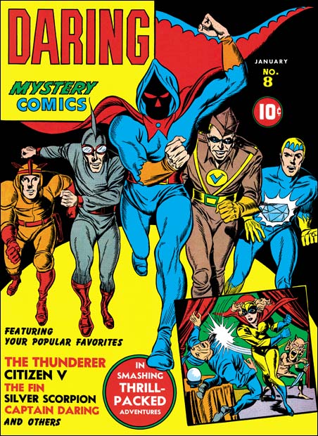
Daring Mystery #8 (January 1942) art by Jack Kirby

Daring Mystery had a rather sporadic schedule. Issue #7 came out seven months after the previous issue and it would take an addition nine months for #8 to be released. What a difference an issue made. Daring Mystery #6 was produced shortly after Simon and Kirby started working for Timely. It included a Fiery Mask story, a hero Joe Simon created for Timely as a freelance artist when he had just started in the comic book business. DM #7 came out shortly after Captain America #1, Simon and Kirby’s first big hit. Issue #8 came out the same month as Cap #10, after which Simon and Kirby moved on to working for DC.

So even though the cover for Daring Mystery #8 is only two issues away from that of DM #6, which I previously wrote about, what a difference that makes! While I am less then enthusiastic about the cover for DM #6, with DM #8 Jack seems to be in full form. One difficulty with anthologies is what do you put on the cover? The most common technique was to just depict one of the comic’s heroes and list the others by text. While that works it may not be effective in attracting buyers more interested in one of the other characters. Some comics therefore include small images of some of the other features. But too many of these small images would limit the area for the main image. For Marvel Mystery and some other Timely comics the solution was a large image that included two or three key heroes (Human Torch, Sub-Mariner and Captain America). To be fully effective that technique required a good artist. someone like Alex Schomburg. But Daring Mystery did not have any of these key characters, its features were constantly changing. I do not know if Simon and Kirby were the first to present a solution like that for DM #8, but Jack sure makes it look easy. Five heroes charging in a ‘V’ formation makes effective use of the cover area. At this point Kirby excels in the use of exaggerated perspective so even the simple act of running looks exciting.

An inserted image shows a rare example of a Simon and Kirby drawing of a female superhero. But more importantly it shows how far Jack has advance in depicting a hero(ine) slugging a foe. In the future Kirby would improve on this even further, but already he made it one of his trademarks. Kirby did not use realism to make the scene so effective. Someone felled by a fist would not have their lower legs come up like drawn here. And exaggerated perspective is not a realistic view at all. A stop action camera would never capture anything that looked like what Jack drew. What Kirby has done was obtain the correct balance of stylized drawing that makes the final result look truer then reality.

Simon and Kirby Pulp, Uncanny Stories

Before their were comics there were pulps, and publication of pulps did not end once comics started being produced. The popularity of pulps must have continued since Martin Goodman issued a new pulp title Uncanny Stories with an April 1941 cover date. Pulps were printed and distributed by the same means as comics. I also believe they had the same sales arrangement whereas newsstands would tear off the titles to books that they did not sell and return them for credit. That would suggest that pulps had cover dates that were about two months later then their actual release date. If correct, this means that you should be able to compare cover dates of comics and pulps. So although Uncanny Stories would come out one month after the first issue of Captain America, it was probably being put together while Captain America #1 was still at the printers. Simon and Kirby as a team had not yet had their big hit. Joe Simon had some success to his name with Blue Bolt, a comic feature that the publisher liked so much they launched a new title for it. Joe was also savvy at how to promote himself and had become Timely’s first art director. Jack Kirby, on the other hand, had little success with the work he had done in comics books prior to Captain America. As Goodman’s only art director, it is not surprising that Simon was called upon to have illustrations produced for the pulp stories. Kirby may not yet have had a big hit, but Joe was well aware of his talent. So it is not unexpected that Joe would have many of the illustrations in the first issue of Uncanny Stories drawn by Jack.

Many pulp illustrations were done on stipple board. Stipple boards have a special surface composed of many small irregularly shaped bumps. Normally penciled illustrations did not reproduced well in publications, intermediate pencil tones would be lost unless they were screened, a process that added expense to production. Penciling on stipple board resulted in translation of tones into small dots. The harder the pencil is pressed, the larger the dots become. With stipple boards the screening of pencil drawings could be skipped without loosing quality. The use of stipple boards in pulps gives us the rare opportunity to see the pencils of comic book artists whose work normally would be inked over.

Uncanny Stories v1 n1
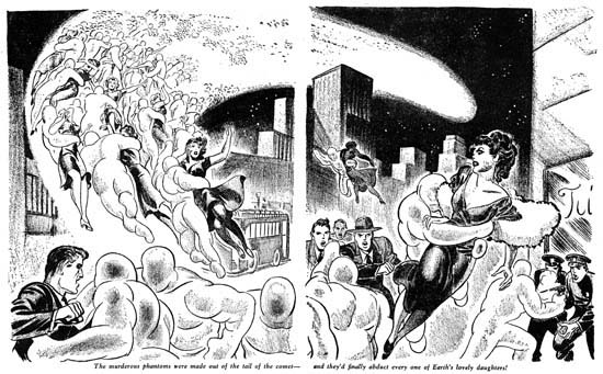
Uncanny Stories v1 n1 (April 1941) Jack Kirby illustration for “Coming of the Giant Germs” by Ray Cummings
larger image

Could this crimson blob, then, huge as a man, be one of the Things that must come when the Comet was in the northern sky? Was this then the murderous phantom that Bob Dean must see consume his own lovely fiancee, to hold her forever there in the heavens where Bob might know her only through a giant telescope?

Jack loved science fiction but I suspect he was a little uncomfortable with illustrating this pulp story. So he transformed the “crimson blob” of the tale into these Pilsbury dough boys. The dough boys may not be as exciting as most of Kirby’s creations, but they are better then a bunch of amorphous blobs. The drawing shows the dough boys flying up with their captives. They do so in such numbers that they actually form the tail of the comet that is in the sky, a rather nice touch. I am sure some other artist would have presented more alluring victims but Kirby does a nice job on the men’s futile struggle to prevent the mass abductions.

Pulps are basically made from a stack of printed papers stapled along one edge. Unlike comic books they have no center fold so double page drawings such as this one are made with gap down the middle. Generally the originally drawing was just split into the two pieces but in this case something was lost. Note how the shoulder of the man in the center just terminates and he is missing his right arm. A thin strip was somehow left out from the center. I have positioned the two pieces so that the gap represents the approximate size the missing piece.

Uncanny Stories v1 n1
Uncanny Stories v1 n1 (April 1941) Jack Kirby illustration for “Coming of the Giant Germs” by Ray Cummings

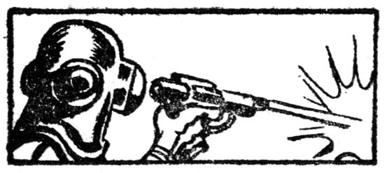
Jack also provided a small insert in the story. I doubt that it really is meant to illustrate anything in the novella. It shows nothing more then a helmeted man firing a ray gun, we cannot even see what it is the ray is striking. It truly is a small drawing and could easily be missed as Kirby’s work were it not for the hand. No stipple board this time, just brush and ink.

Uncanny Stories v1 n1
Uncanny Stories v1 n1 (April 1941) Jack Kirby illustration for “Man from the Wrong Time-Track” by Denis Plimmer

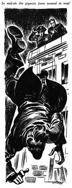
Not all illustrations that Kirby did for this issue of Uncanny Stories are worthy of mention. But there is this one from “Man from the Wrong Time-Track”, a very dramatic drawing of a man plummeting from a building. The man’s face is almost completely in shadows so it is hard to judge what his reaction is to his situation. The caption does not help either, “In mid-air the gigantic form seemed to stop”. Of course pulp illustrations are not really meant to help with the story, but rather to entice a viewer to buy the magazine to find out what it is all about. Jack must have been very satisfied with this illustrations, it is a rare example of a pulp with his signature.

Uncanny Stories v1 n1
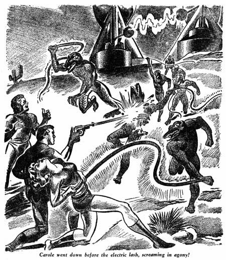
Uncanny Stories v1 n1 (April 1941) Joe Simon illustration for “The Earth-Stealers” by Frederic Arnold Kummer, Jr.

As Timely’s art editor, Joe Simon would generally turn to other artists to provide pulp illustrations but he would on occasion produce one himself. Joe was familiar with working on stipple boards from his previous work as a newspaper artist. Perhaps that is why Joe provides more of a tonal range then Kirby normally did. This illustrations has all the right components; a damsel in distress, weird aliens, frightful weapons (electric lashes), and a mysterious machine (in the background). Nonetheless Joe does not quite pull it off and this pulp illustration is not one of his better efforts.

Uncanny Stories v1 n1
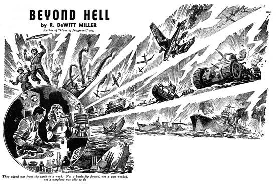
Uncanny Stories v1 n1 (April 1941) Alex Schomburg illustration for “Beyond Hell” by R. DeWitt Miller
larger image

For “Beyond Hell” Simon turned to another talented artist working for Timely, Alex Schromburg. Alex was a natural for pulp illustration. As a comic book artist, cover illustrations was all Schromburg ever did, as far as I know he never drew a story. As an illustrator Alex had a well deserved reputation, particularly for producing complicated comic covers. This emphasis on complexity can be seen in Alex’s drawing for “Beyond Hell”. I have rejoined the two pieces of art by eliminating the gutter. The joint is not perfect and unfortunately combining the pieces only calls attention to how tilted the background art was. However that does not detract from the spectacle that the scientist has unleashed. German soldiers, big guns, airplanes, tanks and fighting ships all fall to the force of science. For many Americans at that time, this must have seemed what was needed to save them from being pulled into the wars that currently enveloped the world. In reality science was never as good at creating the implements of peace as it was of developing the weapons of war.

Joe and Jack had been working for Timely for a little over a half a year before working on Uncanny Stories or more significantly on Captain America. Captain America changed everything for Joe and more importantly Jack. After the first few issues of Captain America, Jack would end up drawing all the Cap stories. This along with penciling the Vision for Marvel Mystery Comics would keep Jack quite busy. Too busy to continue his pulp illustrator career.

In Love #1

In Love
In Love #1 (September 1954) “Bride of the Star”, art by Jack Kirby

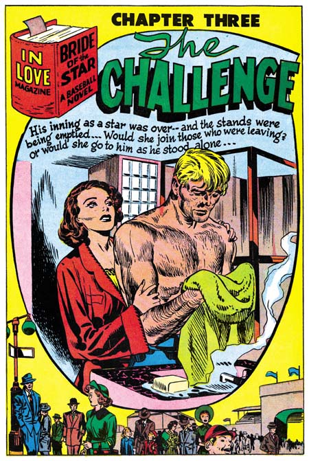
I have begun to scan and restore the Simon and Kirby title, In Love. By the time they published this title in 1954 under Mainline, their own company, Simon and Kirby had a long history of producing romance comics. In fact no one had a longer history because they had started the romance comic book genre (See my post The First Romance Comic). Joe and Jack wanted all the Mainline titles to be different and for In Love their hook was that it was a “book length love novel”. That claim was not completely accurate because besides the feature story the comic would contain a couple of short stories as well. But the feature would be, at least for the first few issues, longer then any other romance story that Simon and Kirby had ever produced. Long enough that they could divide it up into three chapters. The feature story for In Love #1 was “Bride of the Star” and was entirely drawn by Jack Kirby. I have already outlined the plot in the same First Romance post that I linked to above. But rather then ask the reader to read it from the link I have copied the appropriate paragraph:

A young lady nearly gets beaned with a baseball. This becomes the first meeting between the new rookie Warren and Patty, who just happens to be the daughter of the teams owner. Romance and then marriage follows. But having the father-in-law as the teams owner brings in difficulty. Warren insists in not getting special treatment. Betty stays home as the team travels and follows her husband’s progress, or lack thereof using newspapers. Warren is not doing well as a pitcher, wants to be sent back to the minors and resents that his special relationship with the owner is the only reason he hasn’t been. Eventually Warren leaves both baseball and Patty. Sometime later Warren returns to pick up his things. During a discussion with Patty, Warren wants to know if she still loves him. Patty says she wants to love him and it is not important that he is not a big star. But Warren has changed, before he wouldn’t accept defeat, now he was a quitter. Warren stays, the owner/father has a medical breakdown, and Warren helps Patty run the team. The team’s pitching staff all have injuries so Warren decides to step in and pitch. He declares he has kept himself in training. His pitching wins the game. Warren tells Patty that winning the game was not that important, it was winning her respect that mattered. Obviously their love has returned as the story ends with a kiss.

In Love #1
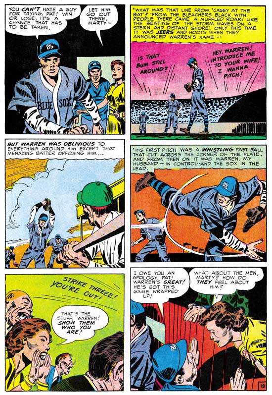
In Love #1 (September 1954) “Bride of the Star” page 19, art by Jack Kirby

Kirby’s romance stories generally have characteristics that make them unique from all stories by other artists that worked for the Simon and Kirby studio. Kirby emphasized action in his romance stories. This can be scene in “Bride of the Star” in the part that baseball plays. The story is a romance but on certain pages that can almost be missed because of the sport aspect.

In Love #1
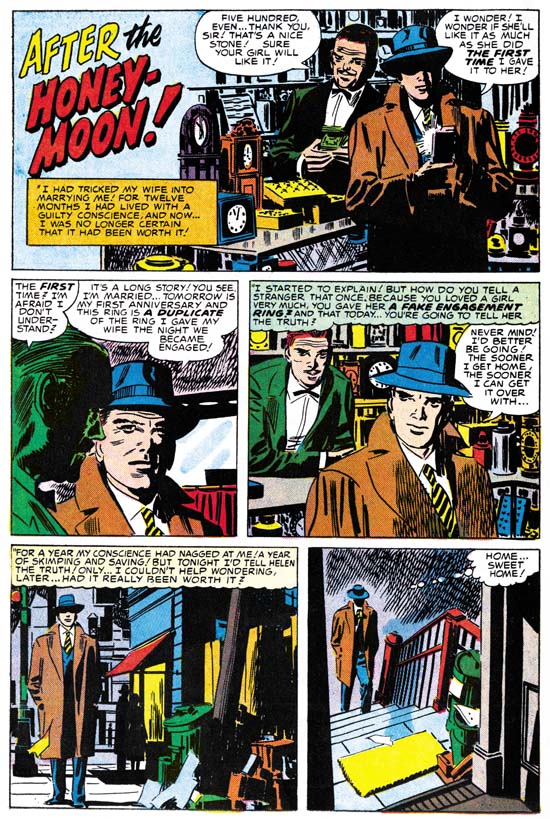
In Love #1 (September 1954) “After the Honeymoon”, art by Mort Meskin

As mentioned above In Love would also include some short romances along with the feature story. One of these for In Love #1 was a two page tale drawn by Mort Meskin. Despite its short size it is a rather well executed story. In the first three panels (the splash is really part of the story) Meskin provides a conversation between a man and a merchant. Talking heads are always a problem in comics and particularly so for romances. Mort uses the contents of the store to keep the first and third panel interesting. For the second panel Meskin accomplishes this with the use of dramatic lighting on the merchant. Note in all three panels the main character faces us, normally in the depiction of a conversation you would expect one of the faces to be viewed from behind. This is exactly what happens in the second panel to the merchant. In the first panel Mort has the man turn about for a better light in which to view his purchase in the light. In the third panel although still conversing with the merchant, the man has already turned around to leave. In such a short story it is important to present the main character as much as possible to make a connection with the reader. Mort has done this rather well with such unobtrusive means. Because the story is so condensed, there is only a two panel bridge between the man’s dealings with the merchant and his meeting with his wife. Two panels are not much, but Mort manages to infuse them with necessary mood. After the preceding close-ups we are now presented with more distant view as the man as he walks alone. The night time is the proper setting for his troubled state. Pieces of paper blown by the wind are visual clues to the man’s unsettled thoughts. Beat up garbage pails reflect on the man’s unprosperous condition. The final panel uses a dramatic view from atop the steps, making the simple act of preparing to walk into his house as a struggle over the apprehension he has for the coming confrontation. The story, inspired by the short O’Henry tales, is one about the self sacrifice aspect of love.

Mort Meskin has manipulated the presentation of the story so well it is easy to miss what he has been doing. Mort’s drama is not the dynamic action that someone like Jack Kirby preferred. Rather Meskin works unobtrusively to set the proper emotional tone. Because it is so unassertive Mort’s efforts are often overlooked. I am not saying everything Meskin did was at this level, but it is not that unusual either. I previously examined on an even better story “The Dreaming Tower” in my post on Strange World of Your Dreams.

I like to believe that my studies of the comics produced by Simon and Kirby have given me an broad understanding of the last days of the Simon and Kirby studio. My views have not changed much from those I presented in my serial post The End of Simon and Kirby. Sure I would like to have more precise dates on some of the key events. I also admit that there is the possibility that I could be wrong in my interpretation of the data. Still I think I have an overall understanding of the relationship between Joe and Jack as well as some of the more important artists of their studio. However that understanding does not include Mort Meskin. Previously Mort played an important part in S&K productions. Mort significantly contributed to Boys’ Ranch, more then I think many realize. Yet when S&K launched Mainline that line included only three stories by Meskin, and all of those from the early issues. Bill Draut and John Prentice played much more important roles in Mainline titles, as did the newcomer Jo Albistur. Why did not Meskin show up more in Mainline? Mort’s presence in the Prize romance comics of this time did increase. But so did Draut, Prentice and Albistur due to Kirby’s absence. When Kirby returned to provide pretty much all the art for the Prize romance titles, Draut and Prentice show up in Harvey romances which at the time were being edited by Joe Simon. Why did not Meskin make that transition as well? I can think a number of possible explanations, but none that I can support with actual data. Mort Meskin’s relationship with Simon and Kirby during these times remains a bit of a mystery to me.

Night Fighter, an Abandoned Superhero

In Love #1
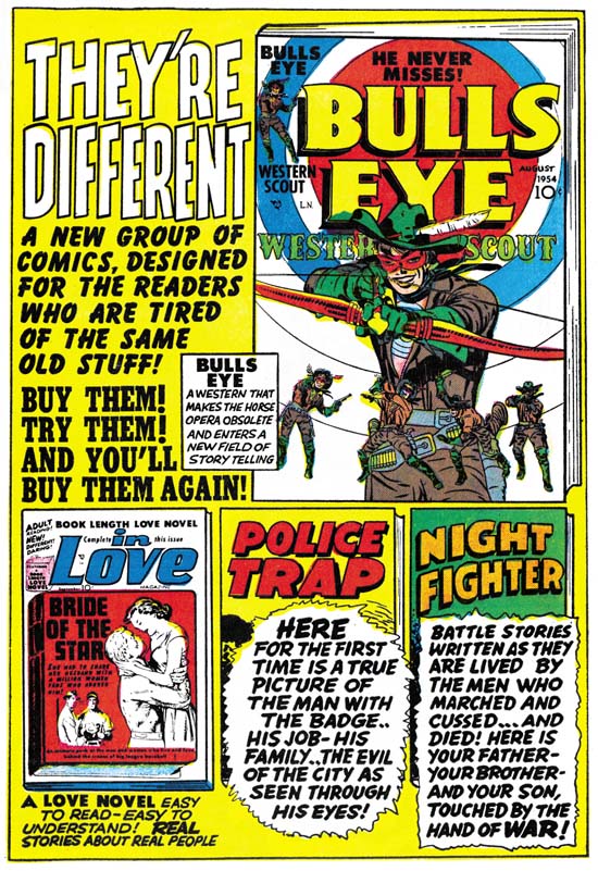
Mainline Advertisement from In Love #1 (September 1954)

Simon and Kirby launched their own comic publishing company, Mainline, with Bullseye (August 1954). The first issue of Bullseye ran an advertisement for the next issue, but no mention of other titles. For the next month, September, two additional titles were released, Police Trap and In Love. Like Bullseye, Police Trap ran an ad for the second issue. However inside In Love was an advertisement for all the Mainline titles. It was a diverse lineup including western, crime, romance and war comics. At this point only the Foxhole had not been released. But it is clear from the description that S&K had already decided on the theme for their war title:

BATTLE STORIES WRITTEN AS THEY ARE LIVED BY THE MEN WHO MARCHED AND CUSSED…AND DIED! HERE IS YOUR FATHER – YOUR BROTHER – AND YOUR SON, TOUCHED BY THE HAND OF WAR!

Right above the blurb the comics title is given and it is Night Fighter instead of Foxhole. Night Fighter just does not make sense as a title for a war comic. There is nothing in the blurb to suggest the comic would only be about nighttime battles.

Night Fighter
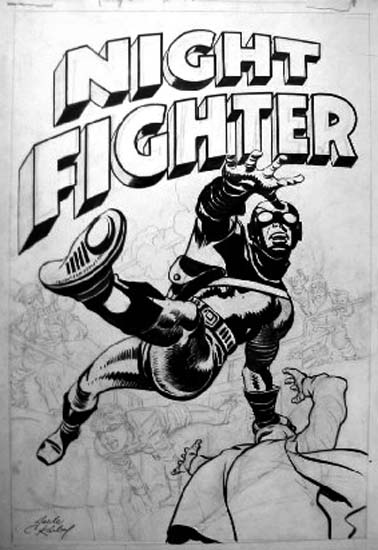
Night Fighter, unpublished cover

Night Fighter was also the title used for a superhero proposal that Simon and Kirby came up with. The original art is known for two covers. The one whose image I show above was created by altering an unused Fighting American cover. This and the other Night Fighter cover can also be seen in Greg Theakston’s Jack Kirby Treasury volume 2. Both covers show a hero with special equipment, boots that allow him to walk on walls and goggles that permit him to see in the dark.

But the use of name Night Fighter in the Mainline advertisement and for the unused superhero is not a coincidence. Compare the logo from the unused Night Fighter covers with the one in the In Love advertisement. There is no question, both are the same design. The most reasonable explanation is that the superhero Night Fighter was originally planned as part of the Mainline lineup and was included in the first state of the In Love ad. Before In Love #1 was sent to the printers Simon and Kirby decided to replace the superhero entry of the Mainline comics with one from the war genre. They replaced the blurb in the advertisement with one appropriate for the new war title. Somehow S&K never got around to changing the title from Night Fighter in the ad. Perhaps they had not yet decided what to call the war comic and simply forgot to correct it in the advertisement by the time they decided to name it Foxhole.

Why did Simon and Kirby decide to drop the superhero Night Fighter from their lineup? With the part that Jack played in the creation of the Marvel universe as well as all the superheroes Simon and Kirby worked on during the war, it is easy to conclude that superheroes were important for the S&K team. However during the years after the war until the breakup of the studio superheroes only played a small part of the comics that Simon and Kirby produced. Stuntman and the Red Demon quickly failed during the comic book blot that followed the war. Captain 3D had an even shorter life when 3D comics turned out to just be a fad. Simon & Kirby had created Fighting American for Prize Comics just before starting Mainline. Fighting American #1 has a cover date of April which would indicate a calendar date for its release as February. In Love #1 with a cover date of September would have gone to the printers at a calendar date of May. Since their deal with Prize was to share the profits, it is possible S&K may have known the sales return for FA #1 in May and perhaps these were not as good as hoped. The only problem with this scenario is that when In Love #1 was sent to the printers it would be expected that some work may have already begun for the next month’s titles. Yet all the art that seems to remain for Night Fighter are the two unused covers. So it is hard to be sure whether or not sales figures for Fighting American affected the decision not to launch Night Fighter. Whether influence by sales figures for Fighting American or not, Simon and Kirby apparently decided the time was not right for launching a new superhero. Perhaps if Mainline had been a success they might have later expanded their line to include Night Fighter.

More Simon and Kirby Robots

I have previously written on some Simon and Kirby or just Kirby stories from the late ’50s linked by the subject of a giant humanoid robot (here and here). In the comments to the first post, Luke Blanchard pointed out Eando Binder’s pulp stories about Adam Link as likely inspirations for these S&K robot stories.

Marvel Stories v2 n2
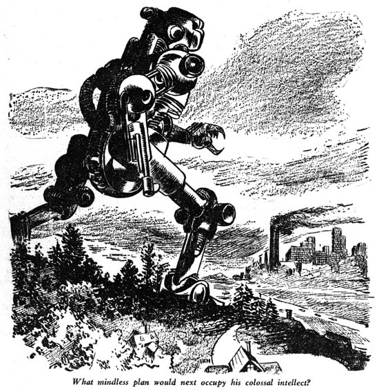
Marvel Stories v2 n2 (November 1940) “A Dictator for all Time” art by Joe Simon and Jack Kirby

I offer another image from the golden age of pulps. The table of contents list Joe Simon and Jack Kirby as the illustrators for the stories. Joe was Timely’s art editor at this time but this was before Simon and Kirby’s great success with Captain America. The illustration is a good model for the type of robot S&K would use in 1957 and 1958. Overall humanoid in shape, but blocky enough so that its mechanical nature is obvious.

Still unresolved is why robot stories became so important Simon and Kirby in the late ’50s.

Some Stories from The Final Issues of Alarming Tales

In a previous post I mentioned that some of the stories for the two final issues of Alarming Tales had an Atlas flavor to them. My understanding of Atlas comics of this period is limited so I would not want to over emphasize this similarity. I guess I should give some examples of these Atlas-like stories, but instead I want to comment on three stories that engage me one way or another when I read them.

Alarming Tales #5
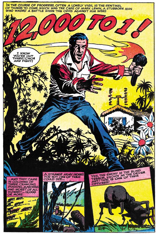
Alarming Tales #5 (September 1958) “12,000 To 1” by unidentified artist

A man sets up some sort of television or radio station deep in the jungle. He encounters an unexpected opponent to his efforts. What follows can only be described as warfare. The man uses a number of ingenious methods to defeat his enemy, but to no avail. In the end only the appearance of another target for his opponents saves the man. The hostile enemy are driver ants. The story brings to mind Alfred Hitchcock’s movie, “The Birds”. That movie was released in 1963 so there can be no relationship between this story and the film. Rather the story’s author had probably viewed a nature program about driver ants, which are also known as army ants. The writer gets some of the facts correct. The swarming of the ants and the fact that they are actually blind. The scripter does not call them army ants but he obviously must have heard the term. But the writer takes the name literally as the ants seem to act as a military unit. While reading I kept wondering if these were meant to be real army ants or whether some radioactive origin would be revealed. Would normal driver ants be expected to pause and contemplate an obstacle that the man has created? Would the male drones for the colony actually be expected to attack and destroy a radio/tv antenna? Would real ants care to reek havoc on electronic equipment? The whole story is so preposterous that it keeps you reading as you wonder what next peak of absurdity would be attempted. Because of, not despite, the peculiarities of the story I actually enjoyed it.

Alarming Tales #6
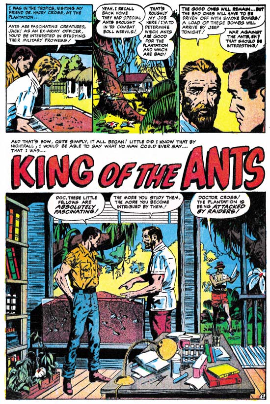
Alarming Tales #6 (November 1958) “King of the Ants”, art by Al Williamson

I guess one ant story was not enough, Alarming Tales #6 includes “King of the Ants”. A tropical plantation is attacked by some raiders. As a result of some gunfire our hero is accidentally showered with chemicals. He awakens to find he has shrunken to a very small size. Ants seize him, presumable for food, but after the man defeats an enemy, a beetle, the ants bring the man back to rule the colony. I wonder what the mystery food that the ants provided the man was? Perhaps it is bests not to know. Eventually the man returns to normal size while the plantation is still fighting the raiders. The hero uses a tactic he learned from the ants to defeat his human foes. The plot of a man shrinking to a small size and his encounter with an ant colony would appear in Marvel’s Tales to Astonish #27 (January 1962). The similarities of the two plots maybe significant or may just be a coincidence. Ultimately the inspiration for this plot may have been the movie “The Incredible Shrinking Man” that was released in 1957. As I remember it, that movie did not include any ants. But it was common to describe something that looked very small as ant-size so it may not have been too surprising to connect a shrunken man with ants. This story does not have any of the entertaining excesses of “12,000 To 1” but having Al Williamson as the artist more then makes up for that.

Alarming Tales #6
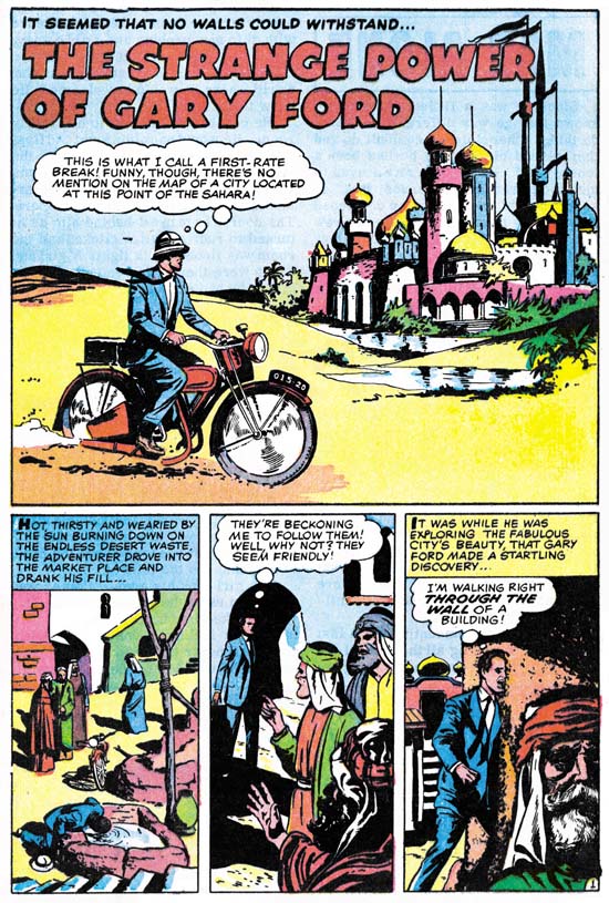
Alarming Tales #6 (November 1958) “The Strange Power of Gary Ford” by unidentified artist

Next I want to write about “The Strange Power of Gary Ford”, another weird story. A man, Gary, finds a city in the desert where none should be. Here he discovers that he now has the ability to walk through walls and other solid structures. The man credits this to the local water, adding that the city’s citizens do not share this ability because they probably are used to the water. (I do not know what seems odder, that the man made this conclusion or that the water allows the man’s clothes to go through walls as well). The town people welcome Gary and introduce him to their ruler. Gary captures the heart of the shieks’s daughter and professes his love. But actually Gary becomes enamored with another outsider, an attractive redhead. Gary convinces her to leave with him, but not before Gary, using his power, helps himself to the ruler’s jewels. The two escape separately, Gary on his motorcycle and the lady on a horse. No sooner does Gary evade his pursuers then the city disappears and he finds the jewels have turned to sand. Gary regrets that it all was an illusion since the redhead was just the sort a girl he could have married. We next see the redhead also alone in the empty desert, also saying it was too bad it was all an illusion because she really would have liked to marry Gary. This is another of those stories so odd that you just have to shake your head go along with its goofy premise.

At the time that Alarming Tales #6 was published the Comic Code had been in operation for a few years. The Comic Code purpose was to insure that susceptible youngsters did not fall under the comic books bad influence and become delinquents. So here is “The Strange Power of Gary Ford” where the hero rewards the welcome he has received from the city’s inhabitants by leading on the sheik’s daughter and stealing a ruler’s jewels. That sounds to me like just the type of morals Comic Code was trying to protect developing minds from. Oh I forgot, the citizens of the city were Arabs, I guess that made it all right.