Category Archives: 6 Mainline

Featured Cover, Foxhole #3

Foxhole #3
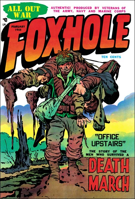
Foxhole #3 (February 1955) by Jack Kirby

I love the Kirby list, but sometimes Kirby fans just get carried away. Even the most unsubstantiated claims become accepted fact. Not too many years ago the concept of Kirby Kolors burst into the list. This was the idea that Jack created the color guides for many Simon and Kirby comic work. Not only did Jack do color guides, but experts could tell which ones he did. Never mind that no evidence was ever presented to back up this amazing claim. Never mind that color credits was never given in any of the Simon and Kirby productions. Fans and experts seem to vie with one another in spotting Kirby Kolors. When asked how they did it, the best you would get was talk about years spent examining S&K comics and Jack’s frequent use of “salmon” as a color. If the start of this craze was not bad enough, it soon went to ridiculous extremes. Some were even call some Kirby Atlas/Marvel work as Kirby Kolors! This was at a time when Jack was a freelancer providing pencils for someone else to ink. Yet some fans believed Jack sent in his pencils, it was inked by some other artist, and copies then sent back to Jack to make color guides. Did they think Kirby was being paid the low rates that colorist received at that time, or that Marvel was willing to pay him the same rates for penciling and coloring? I have no idea what these fans were thinking. If that was not bad enough someone asserted that a Bullseye story reprinted by Super Comics in the 60’s was a Kirby Kolor! It was colored differently then when first printed by Simon and Kirby. So if it was Kirby Kolor that meant Jack did them later for Super Comics at a time he was busy with Stan Lee creating the Marvel Universe.

If the comics do not provide credits, what do we know about colorists who work on Simon and Kirby productions? Well one thing is that Joe Simon has said that they did not do the coloring work, that was done by the publisher. This statement may be a little misleading. There is at least one photograph showing a colorist at work in the Simon and Kirby studio (working on a Prize Western cover). When I asked Joe about this, he said that the colorist worked for the publisher. Even though the colorist was not being paid for by S&K, it made sense for him to work in the studio. I am sure under that sort of arrangement Joe or Jack would provide guidance on how the coloring should be done. But it is not believable that Jack would do coloring when he was not getting paid for it. Joe and Jack were too much of businessmen to do that.

Joe still has some color guides for work done after the Simon and Kirby studio breakup. When I asked him if he did the coloring he replied that he might do an occasional color guide for a cover, but never for the stories. Do we have any reason to believe that Jack thought more highly of coloring then Joe did?

By now I am sure you are wondering what has all this talk about Kirby Kolor have to do with the cover for Foxhole #3 Well I do believe that for most of the comics that Simon and Kirby produced the coloring was at least the financial responsibility of the publisher. But for a short period Joe and Jack had their own publishing company called Mainline. Obviously for Mainline they must have been responsible for having the coloring done. That by itself does not mean that Joe or Jack personally did it, but it does raise the possibility. I find it suggestive that so many of the Mainline comic covers have exceptional coloring. I have previously posted on Foxhole #2 and Foxhole #4 covers both of which have unusual and very powerful coloring. With its watercolor effect Foxhole #3 is another example of unusual coloring. Some of the other Mainline titles may not have such extraordinary coloring, but they are all extremely well done. It may not be safe to provide an attribution based solely on quality, but it does make one wonder whether Joe or Jack could have been directly involved in some of this coloring. Although I accept this possibility that does not mean I accept Kirby Kolors. I can think of no way judge between Joe or Jack as the source. Joe has always been a fine colorist. I have seen less of Jack’s efforts in color but all were nicely done. I am not sure how anyone could take any of this work done so late in their careers and use it for attribution of work done during the 50’s for comic books.

Coloring is not the only thing that makes Foxhole #3 a superb piece of art. The inking is just fantastic. The inking for the Mainline covers, and this one in particular, is probably the best Simon and Kirby have ever produced. Bold and assured, but also sensitive. Spotting varied from very sparse in sections to areas of carefully orchestrated lines and dots. However large areas of black are avoided. The composition is nice and takes full advantage of the cover. Even the placing of the blurb in the lower right was carefully handled and balanced with the tree stump on the left.

The blurb announces a story called “Office Upstairs” about the “Death March” while the cover shows a soldier carrying one of his comrades. The reference is to the Bataan Death March. At the start of the war the U.S. army in the Philippines was forced to surrender to the Japanese. The Americans were poorly feed and treated badly. Executions were common, for instance any soldier found to possess Japanese souvenirs was summarily killed. The U.S. soldiers, who were malnourished, were forced to march to a camp 100 miles away. Any prisoner who could not keep up, was executed. The treatment of the Americans was no better when they were interred in the camp. After the war the Japanese general who ordered the march was tried and executed as a war criminal. But the Japanese government has never apologized for their abuse of their prisoners of war.
Foxhole #3
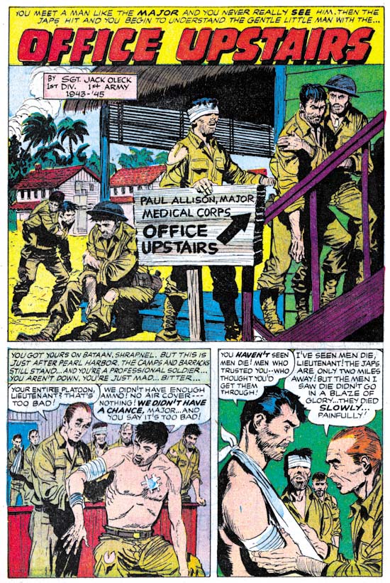
Foxhole #3, “Office Upstairs” by Bob McCarty

A story about the Death March and the prison camp is not something you would expect in a comic book which at that time was aimed at young readers. But the story “Office Upstairs” is a small masterpiece. The “hook” for the Foxhole title was that it was produced by veterans. This story has a box saying that it was by Jack Oleck. Jack was Simon and Kirby’s main writer and Joe’s brother-in-law. Since writing credits were not generally given in S&K productions, these Foxhole issues are real treasures. Although there is no credit for the art it appears to be the work of Bob McCarty. Bob generally did not sign his work for S&K, but because he was a veteran Foxhole gives him credit in some other stories.
Foxhole #3
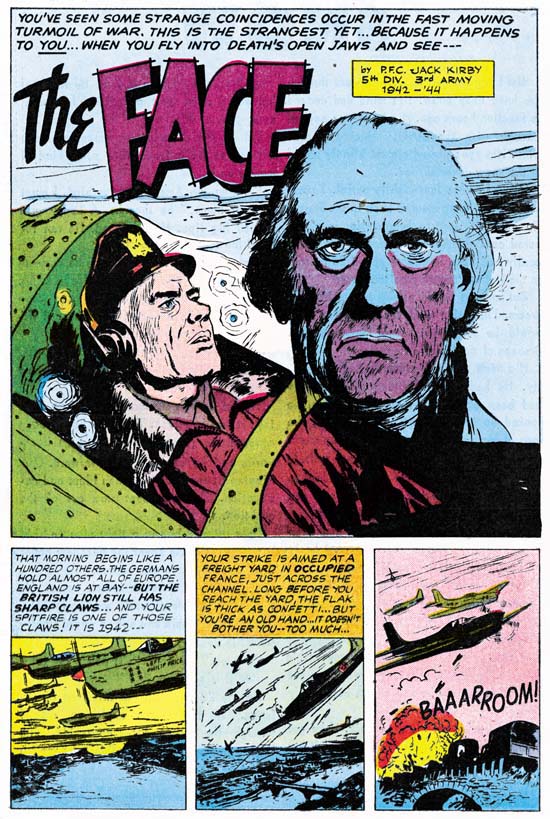
Foxhole #3, “The Face” by John Prentice

This issue provides yet another writing credit, this time by Jack Kirby. Another gem of a story. This time it was drawn by John Prentice, one of my usual suspects (artists who did frequent work for Simon and Kirby). John did some other work in the Foxhole series but surprisingly never was given credit. This is surprising because not only was Prentice a veteran, he was at Pearl Harbor when the Japanese attacked.

UPDATE (2/18/07): My attribution here of “The Face” to John Prentice is incorrect. The proper identification of the artist is Joe Albistur.

Featured Cover, Treasure #10

Treasure Comics #10
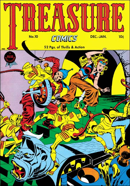
Treasure Comics #10 (December 1946) by Jack Kirby

I come across lists all the time; the top 100 artists, the 100 most important comic books, and so on. All listed in a nicely hierarchy with one selected as the best. I do not know how people are able to make such lists. What criteria does one use to rank one artist as #100 and another as #101 (and so be excluded from the list)? Even the selection of the best can be wroth with difficulties. Should the best comic book artist be based on who did the best work or who had the most influence on the comic books of today? It should come as no surprise who I think is the artist that did the best comic book art. Subtle hint, look at the title of this blog. However if it is influence that counts then I might wonder if Will Eisner may be more appropriate. While not denying Jack Kirby’s tremendous influence on pretty much the entire history of comics, Eisner’s graphic novels launched a whole new genre, one that has even made it into the N.Y. Times Book Review.

But even if I try to adopt a subjective viewpoint I do not find myself in an easier position. My favorite painting varies from day to day. My response to a piece of art depends as much as my mood as with the work of art. But ask me what my favorite Simon and Kirby cover is and most days I would say Treasure #10. This is a rather oddball cover for S&K. Treasure #10 comes not long after the failure of Stuntman and Boy Explorers. The publisher was Prize, Joe and Jack had done some work for them early in their career (Prize Comics #7, 8 and 9; December 1940 to February 1941). In March 1947 Simon and Kirby would launch for Prize the crime genre version of Headline Comics. Treasure #10 was used to introduce the new version of Headline. It includes a crime story (“Tomorrow’s Murder”), the earliest Simon and Kirby crime genre piece. There is an advertisement at the end of the story announcing the “bigger and better” Headline. It includes a copy for the cover for Headline #23. Both the ad and the illustrated comic indicate a January-February cover date. Headline #23 was actually cover dated March-April. Further the cover illustrated in the ad was really used for Headline #24.

Treasure Comics appeared to once have an Arabian Knight feature, it is listed on the cover for Treasure #7. However there is no such feature, or anything like the cover, in TC #10. The GCD shows Treasure #6 and #7 covers (April and June) with an Arabian theme signed by H. C. Kiefer. I am not familiar with Kiefer’s work and it would be easy to dismiss him as a inferior artist compared to Jack Kirby. But such comparisons are really unfair and uninformative. The cover for TC #7 may be a bit crude and the demons looking more goofy then threatening. But TC #6 is a rather nice cover with lots of action and a good composition. Both TC #6 and #7 covers show shields with similarities with that used by Jack for TC #10. Further TC #7 adds an unusual point to the turban, a trait shared with TC #10. This suggests that Kirby used Kiefer’s covers as a jumping off point.

What a cover Jack provides! An Arabian Knight seeks to escape with a beautiful princess. Well perhaps she may not really be a princess, but her exotic diadem suggest she is more then just a beautiful woman. The pair are faced with a swarm of adversaries intent on preventing their escape. Not your usual adversaries but a group of yellow bodied, red tailed monkeys. Not what you normally would think of as much of a challenge to our hero. But these monkeys are armed with exotic weapons and quite energetic in their attack. These are scary monkeys indeed. But not your normal scary monkeys, these wear exotic clothing and rather weird hats (how do those hats stay on?). Judging from the sculpted banister I would suspect there is a whole population of these monkeys that our desperate pair must somehow evade.

Take a look at the monkey with the knife in the center of the picture, look carefully at his feet. The big toe is on the outside of the foot contrary to what is found in either monkeys or men. I used to think that this was done by Kirby on purpose to give them an even more exotic look. But during restoring the cover I noticed that the toe is on the correct side of the foot for the two monkeys on the left. So now I guess it is just another of those errors that Kirby is so famous for.

Win A Prize #1
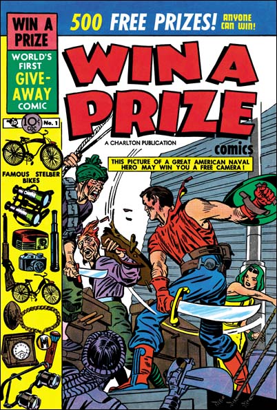
Win A Prize #1 (February 1955)

Simon and Kirby did not do many of this sort of swashbuckler covers. Win A Prize #1 comes to mind as one other. (I wrote about the Win A Prize comic before during my serial post on The End of Simon and Kirby). But Jack was a master of action art and seemed to create such covers almost effortlessly.

A Criminal Swipe

Headline #56
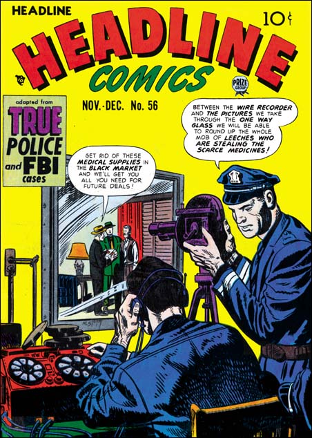
Headline #56 (November 1952) by Marvin Stein (signed)

In 1952 Marvin Stein provided a cover for Headline. I have not said much about Stein yet in this blog. For now let me say that a 1949 photograph from the Jack Kirby Collector #25 shows him in the S&K studio. Marvin’s work also shows up in some of the studio productions from around that time and it has been reported that he did inking work for S&K. It has also been said that he was a great admirer of Jack Kirby.

Initially the crime comics Headline and Justice Traps the Guilty were Simon and Kirby productions and they are listed as editors. Kirby drawn stories were frequent in these comics. All drawn covers (as opposed to the photographic covers) were done by Jack. Early in 1951 this changed. Nevin Fiddler was listed as the editor and Kirby no longer supply work for these crime titles. Marvin Stein now becomes a conspicuous artist for the crime titles. In fact Marvin draws just about all the covers and provides stories for most issues. A photo of the S&K studio of about 1951 or 1952 does not show Meskin. I conclude from all of this that S&K no longer produced the crime titles and that Marvin Stein was mostly providing work for the new editor, Nevin Fiddler.

The Headline #56 covers is signed by Marvin Stein and is in his style so there can be little question that he was the artist. The inking on the policeman whose back is turned to the viewer is reminiscent of S&K studio inking. But the rest of the cover’s inking is not particularly like that done by S&K shop. Nor does the composition seem very like covers produced by Simon and Kirby. The subject of the police using a one-way mirror to trap criminals is, as far as I know, pretty unique for crime comics of the time. The cover does not correspond to any of the interior stories.

Police Trap #6
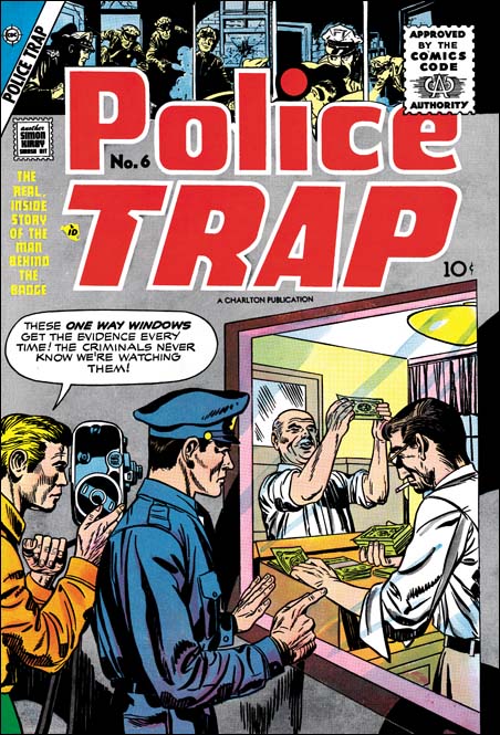
Police Trap #6 (September 1955) by Jack Kirby

In late 1955 Charlton would publish the final issues of titles originally done by Mainline, Simon and Kirby’s own short lived publication company. One of them, Police Tray #6, appears to be a swipe from the Headline #56 cover by Stein. Police Trap #6 was one of Jack’s poorer efforts but he still seems responsible for the pencils. The inking has signs of S&K shop inking, particularly the abstract arc shadows. Hopefully by now most Kirby fans realize that Jack would swipe from time to time. His sources for the swipes were generally from photographs, paintings or illustrations. At this point in his career it was unusual for him to swipe from other comic book artists particularly from someone like Marvin Stein. Police Trap #6 only shares the unusually concept with Headline #56. The composition differs in important ways between the two, mostly due Jack’s policemen being given less of the cover and his criminals brought much more forward. Still it is surprising that Jack would the same unusual subject.

I see no reason to “defend Kirby’s honor”. Unlike some, I have no problems with swiping, as long as the swiper creates something with his own individual touch. It could be said that Jack has certainly done that with Police Trap #6. While not denying the possibility that this is another example of a Kirby swipe, I would like to offer another possible scenario. The covers published by Mainline seem much better then when the titles were done by Charlton. For whatever reasons S&K did not seem to put into the Charlton issues the same effort that they had previously done. If they were trying to do a rush job or cut corners it is very possible that they might turned to previously unused material. Perhaps the PT #6 cover might originally been made for Headline or Guilty but abandoned then because it was not quite good enough. It that is true then Marvin Stein could easily have seen it when he was working in the studio and used the idea a few years later. It would not be the only Stein swipe from Kirby. This is just a thought and I am not convinced one way or the other.

The Day After

I was going to work tonight on a couple more “Not Kirby” posts. But somehow it just does not seem appropriate the day after Jack’s birthday. So I have decided to continue with progressive proofs of covers. As I said yesterday progressive proofs provide prints of the individual colors which I scan separately and combine using Photoshop. I believe this provides the most accurate idea of what the cover looked like when it was first published. No retouching or color adjustments are required. Joe Simon only had progressive proofs for five covers left. Not surprisingly they were all for Mainline Comics, the short lived comic publishing company that Joe and Jack started.

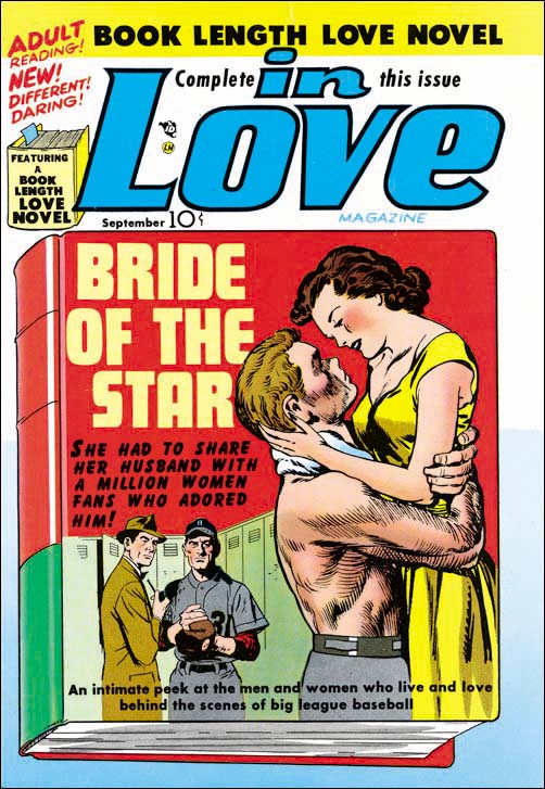
In Love #1
In Love #1 (September 1954) by Jack Kirby and John Prentice

I have posted a smaller image of this cover proof before although I did not mention then that it was based on progressive proofs. In Love was the romance title for Mainline. Jack did the foreground figures and John Prentice drew the background ones. This is a unique example of two S&K artists working on the same cover. I wish that the original art was still around. Perhaps it could provide evidence as to why this was done by two artists.

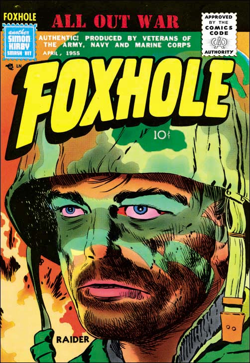
Foxhole4.jpg
Foxhole #4 (April 1955) by Jack Kirby

Joe Simon has told me that they (the S&K shop) did not do the color guides for the comics, that was the responsibility of the publisher. Once Joe was pointing out the artists in a photograph of the S&K studio. Joe said that one of the artists, whose name I forget, was the colorist. At the time I though Joe was contradicting himself. But later Joe described the financial deal that he had for producing comics for Prize. S&K had to cover all costs for producing the comics. When a certain percentage of the printed comics were shipped, S&K would get some money back and then share the profits from the actual sales. But I believe that when the deal was made making the color guides was not part of the work that S&K would have to do. But it would not make sense for the colorist to work elsewhere, in fact Prize may not have had their own artist bullpen. So the colorist would work in the S&K studio but be paid by the publisher Prize.

However Mainline Comics were S&K’s own company and so all work in creating the comics were their responsibility. So they oversaw, if they were not actually involved, in making the color guides. It seems to me that some of the Mainline cover color work is very different from work done for Prize. In fact some of them are in my opinion the best color work ever done for Simon and Kirby comics. The cover for Foxhole #4 is certainly one of these great color jobs. In fact it would not be anywhere near as dramatic without the colors.

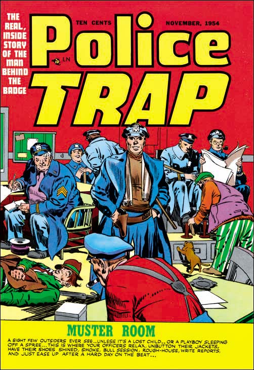
Police Trap #2
Police Trap #2 (November 1954) by Jack Kirby

The first two Police Trap covers show the interior of a police station. Even though they were swipes from some paintings, they are just great Kirby covers.

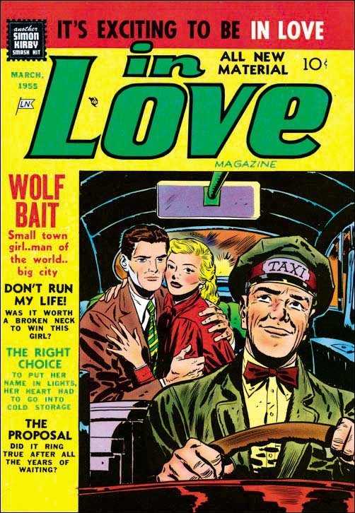
In Love #4
In Love #4 (March 1955) by Bill Draut

Jack Kirby did not draw most of the work in the Mainline comics despite the fact that during this period he stop drawing anything for the Prize romances. Joe Simon is said to have handled most of the business aspects of the S&K shop but I suspect running their own publishing company required more business effort which even Jack had to help with. But there were other fine artists to help such as Bill Draut who did this cover. Actually yesterday when I wrote that Jack Kirby did the cover for In Love #3 that was not technically correct. The insert of the book cover was done by Draut.

Happy Birthday Jack!

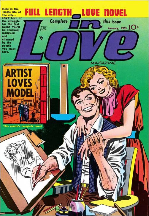
In Love #3
In Love #3 (January 1955) by Jack Kirby

I was not planning to do a post tonight but then I remembered it is Jack Kirby’s birthday so I could not let that date go by without something. The cover I have here is for In Love #3 (January 1955). It is special for me because I have the original art signed by both Jack Kirby and Joe Simon. But I also think it is appropriate because it shows a comic book artist, although a rather idealized one. This image is based on what are called progressive proofs. Before a comic is published the cover printer may provide the publisher with progressive proofs. These proofs include pages of the individual colors (cyan, magenta, yellow and black) as well as pages showing how the printing stages would look. If I remember correctly yellow is printed first, magenta second, cyan third and the black completes it. Printed colors change with age. But with progressive proofs it is possible to scan the individual colors and then combine them together. What results is perhaps the most accurate idea of what the cover originally looked like. I did absolutely no touch-ups on this cover whatsoever.

Art by Joe Simon, Chapter 11, The Party Is Over

After “48 Famous Americans” S&K entered a period of abundant work mainly producing crime, horror and romance genre comics. As far as I can tell, Joe did not pencil anything during this period. I say that rather hesitantly. While working on my serial post “The End of Simon and Kirby” I reexamined a lot of S&K material. Suddenly I realize one story that I always thought as drawn by Kirby and was listed in the Jack Kirby Checklist had actually been done by Joe Simon. It seemed pretty obvious and I was quite surprised that I did not notice it before. I will discuss this story below but the point is if I had missed that work by Simon I might have missed others.

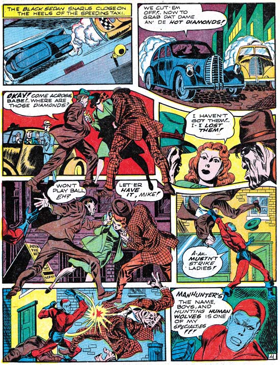
Adventure #75
Adventure #75 (June 1942) “Beware of Mr. Meek” by Jack Kirby

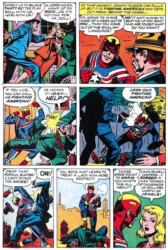
Fighting American #6
Fighting American #6 February 1955) “Deadly Doolittle” by Joe Simon

When we approach the end of the Simon and Kirby collaboration, work penciled by Joe reappears. However in some cases saying Joe is the artist depends on you think what makes someone the creator of a piece. In his book “The Comic Book Makers” Joe describes an incident where S&K got caught by Prize for reusing old romance art with new scripting. So far I have not found the stories that Joe is talking about. But in Fighting American #6 (February 1955) there is a story “Deadly Doolittle” that clearly was redone from “Beware of Mr. Meek” a Manhunter story from Adventure #75 (June 1942). But the FA story was not made by reworking stats from the older comic to change the uniforms, rather the entire story was redrawn. Much of this was done to remove some older layout techniques that Simon and Kirby no longer used. Early in their collaboration parts of figures would frequently extend well beyond the panel edges entering other panels. The FA story was redrawn so that things remained in their panels. But this was not done by just eliminating the parts outside of the original panels but by recomposing the panel instead. I find Simon’s touch in all of this work. It is particularly interesting to see Joe redo some of Jack’s classic socko punches. Joe tries valiantly but does not quite succeed in capturing Jack’s effect. I find a lot of Simon touch in this story and all the Kirby effects seem to be transmitted through Joe’s sensibilities.

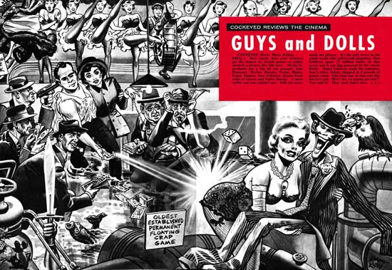
Cockeyed #4
Cockeyed #4 (April 1956) “Guys and Dolls” by Joe Simon
Enlarged view

The last piece of worked signed jointly as Simon and Kirby is the unusual “Guys and Dolls” that appeared in the Mad-takeoff Cockeyed #4 (April 1956). This is included in the Jack Kirby Checklist, although I really cannot say why. The art looks much closer to cover work that Joe would do later for Sick then anything I have seen Jack do. Further the visual humor looks like Joe’s and does not seem to match Jack’s humor work. For me the most convincing evidence is that this works appears to have been done with an air brush. Joe Simon was a master with this tool having learned it while working for a newspaper at the beginning of his career. He would return to using it for not only the Sick covers but also for some of his advertisement work. I have seen nothing that indicates Jack had done any air brush art.

Alarming Tales #1
Alarming Tales #1 (September 1957) by Joe Simon

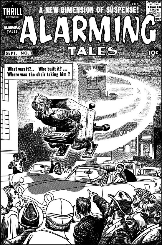
I doubt many would say that the figure in the flying chair and the background from the cover of Alarming Tales #1 (September 1957) were done by Jack Kirby. I clearly see Joe’s touch and believe he did this cover. But I can see why many see Kirby’s presence in the bottom part of the cover. I feel Joe did this portion also but he is swiping or mimicking Jack for parts of it. I presented a color image in a chapter of the “End of Simon and Kirby”. But the coloring makes it difficult to clearly see the figures, so above I provide a restoration of the line art. To me the lady on the left and the man looking out of his car seem to a have Kirby look to them. But the man pointing (third from right) and the man on the far right look more like the work of Simon.

Black Cat #60
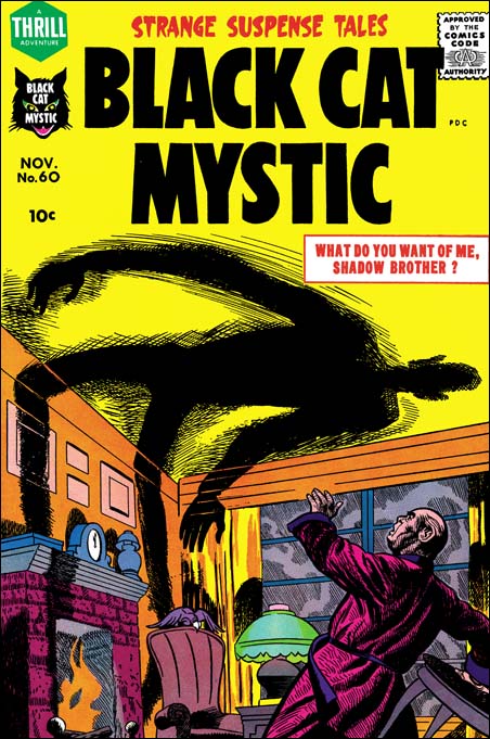
Black Cat Mystic #60 (November 1957) by Joe Simon

Not long after Alarming Tales #1, Joe did a cover for Black Cat Mystic #60 (November 1957). Notice the similarity of the man with the two from the AT #1 cover.

Black Cat #60
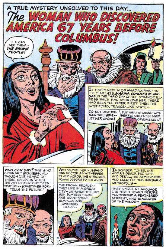
Black Cat Mystic #60 (November 1957) “The Woman Who Discovered America 67 Years Before Columbus” by Joe Simon

Black Cat Mystic #60 has the story drawn by Joe Simon that I mentioned at the beginning of this post. This short (2 pages) story is listed in the Jack Kirby Checklist, but as I said I now disagree with that attribution. We have in this work Joe mimicking Jack quite successfully. The men have a Kirby-ish look but a careful examination of the eyebrows reveal the more simple form that Simon preferred. The woman also comes from a Kirby source, such as some of the unused covers for Black Magic #1. But the woman’s eyes give away the fact that this was Joe’s pencil work. The hand of the woman in the splash panel is not drawn the way that Kirby would have done it. I am sure some will say that some panels of the second page of the Mayans were done by Jack. But I suspect even this includes subjects that were drawn from art history sources that both Joe and Jack used.

Alarming Tales #4
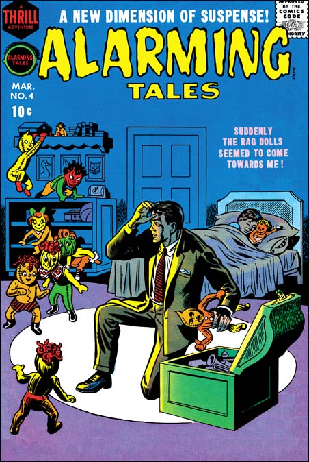
Alarming Tales #4 (March 1958) by Joe Simon

Covers begin to appear at this time where Joe seems to abandon any attempt of mimicking Kirby. I provide an image of Alarming Tales #4 (March 1958) as an example. Here we find a simpler style of drawing and inking that Joe will often use from here on. Once again Joe has adopts a new style.

Art by Joe Simon, Chapter 10, A History Lesson

Art by Joe Simon, Chapter 12, Covering the Fly

Joe Albistur, another forgotten comic book artist

PT #1 The Beefer
Police Trap #1 (September 1954) “The Beefer” by Joe Albistur

I mentioned Joe Albistur briefly in Chapter 3 of my “End of Simon and Kirby” serial post. Joe is another of those forgotten comic book artists. Web searches have provided nothing in the way of real biographical information. To make matters worse, some have misread his signature and refer to him as Al Bistur. It is easy for me to resist the temptation to look down my nose at those who got his name wrong. Honest mistakes made in the study of comic book history deserve correction not criticism. Besides I have to include myself among those who have made that particular mistake.

I asked Joe Simon about Albistur. Although Simon said he felt he should remember the name, and even corrected my pronunciation, he could remember nothing about him. In a way this is not surprising. Simon worked with a lot of artists over the years and Albistur worked for the S&K studio for only a short period of time. But it was that critical time during the Mainline period. Albistur first appeared in Police Trap #1 (September 1954) and last showed in Young Romance (October 1955). During his stay with S&K Joe produced 21 stories; 6 for Police Trap, 1 for Win A Prize and 14 for the Prize romance titles (see checklist). His appearance in these particular comics, but none of the other Prize titles, is one of the reasons I am convinced that Simon and Kirby were still producing the Prize romance titles at the same time they were publishing their own comics under Mainline.

PT #4 All In A Day's Work
Police Trap #4 (March 1955) “All In A Day’s Work” by Joe Albistur

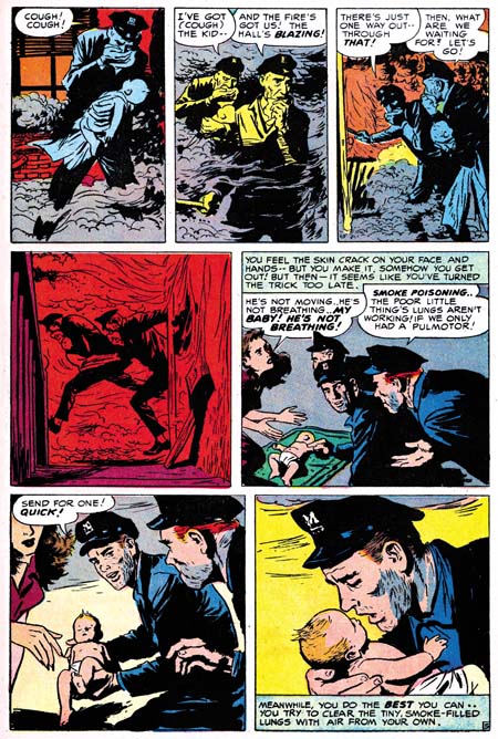
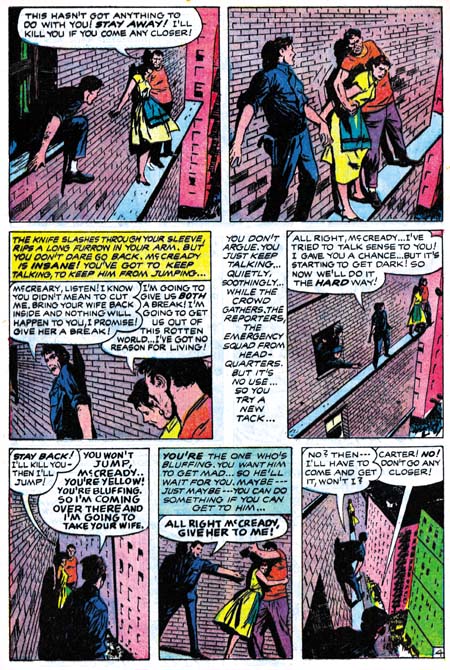
Joe Albistur shows up in S&K productions with a fully developed style, he must have worked in comics elsewhere before this. Joe does a good job in the mild type of crime genre that is supplied by Police Trap. Albistur illustrates the story well and seems comfortable with the action sequences. He excels in presenting a story in unusual situations; on the ledge of a building where a cop tries to talk someone out of suicide, or in burning building rescuing a baby. Kirby is said to have provided layouts for S&K freelancers, but the way Albistur does these stories I doubt it is true in his case.

WP #2 The Handsome Brute
Win A Prize #2 (April 1955) “The Handsome Brute” by Joe Albistur

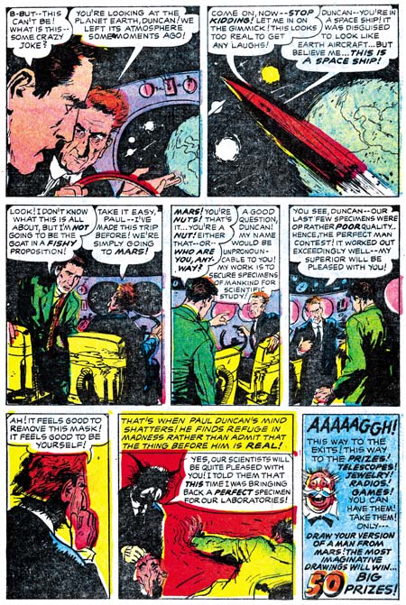
In Win A Prize #2 Joe’s contribution is a science fiction piece. Here again Albistur shows his story telling ability. But it also shows his weakness. When it comes to the part the alien reveals himself, Joe does not seem to know how to visualize him and so casts the face in shadow. Somewhat of a letdown. Of course it may have been difficult working for Jack Kirby, who is a master at this sort of thing. Black Magic had already been cancelled and Win A Prize never went past the second issue, so we never get a chance to see Albistur try his hand at this sort of thing again.

YR #77 The Big Fish
Young Romance #77 (June 1955) “The Big Fish” by Joe Albistur

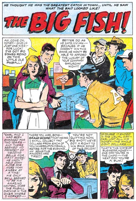
It was in the romance genre that Joe Albistur did most of his work for S&K, filling in for the absent Jack Kirby. Albistur seems an odd match for the romance comics. His women do not have the clear beauty of Bill Draut, nor the sophistication of John Prentice, nor are they stylized like Mort Meskin’s. I am lost for words on how to describe Joe’s women. The best I can do is say that they have a sort of roughness that gives them an earthy look. But we do not need to accept the quality standards of a teenage girl from the 50’s. I am not sure they would have liked Joe Albistur’s work that much, but I do. Joe used some interesting composition devices, like having a panel edge cut off much of the face of the leading woman. Albistur also had an eye for gestures, like the pin ball wizard stretching his fingers. Although Joe’s women may not have a typical comic book beauty, they are done in an easily recognized style. I have little interest in a style for style sake. But I do admire an artist who develops a unique style as a way of expressing his own personal voice. That is a quality that Joe Albistur shared with the best of the S&K artists.

When Jack Kirby returned to providing work for the Prize romances he would begin to do pretty much the entire comic. Therefore Joe Albistur disappears from the Prize romance titles. Unlike Bill Draut and John Prentice, he does not show up in the Harvey romances. I suspect his work was not a good match for the Harvey house style of those romances. I have not seen any of Albistur’s post S&K work, but he does come up a few times in a search of the internet. It appears he did work for Gilberton in 1961 working in the Classics Illustrated and the World Around Us titles. In 1973 and 1974 Joe shows up in the DC titles Forbidden Tales of Dark Mansion and the House of Secrets.

Joe Albistur was not as flashy as some of the more popular artists, you know someone like Jack Kirby. But at least in the work he did for S&K, he was not a run of the mill artist either. Albistur had talent and his own unique voice. He may not have been a superstar but he does not deserve the anonymity that he has fallen into.

A Tale Twice Told

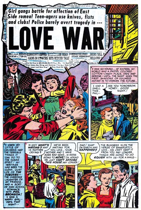
I’m busy tonight working on the next chapter to The End of Simon & Kirby. But I thought I would point out a happy coincidence that occurred in two chapters. I’ll provide links but chances are both chapters are on this page, so it might be easier to just scroll down. In Chapter 2,I included an image of the cover to Young Love #55 done by John Prentice. It turns out that that cover is based on a story done by Jack Kirby in the same issue called “Love Wars”. I just happened to provide a scan of the splash page to Jack’s story in Chapter 5. I find such alternative versions interesting for the insight it provides into the artists. Mind you I am not saying that Jack’s splash gives an idea how he would have done the cover. When it came to the romance comics, Jack’s splash pages seem spicier then his covers.

This example of an artist doing a cover based on a Kirby story may be unique during the S&K collaboration, I’ll have to check. Also rare are examples of Kirby and another artist doing alternate takes of the same cover. I included scans of covers by Jack Kirby and Bill Draut in “Artists and Models“. I can think of only one other example from the S&K period.

There are however a number of examples of Jack doing the cover based on a story by another artist. I think it may be fun sometime to post a series of examples of these alternate interpretations.

The End of Simon & Kirby, Chapter 5, The Return To Romance

YL #55 Love War
Young Love #55 (March 1954) “Love War” by Jack Kirby

Previously in the End of Simon and Kirby we saw the launch of Fighting American for Prize followed shortly by the creation of Mainline, Simon and Kirby’s own publishing company. Although Simon and Kirby continued to produce romance comics for Prize, they stopped including work penciled by Jack. Mainline only lasted a short time before it failed.

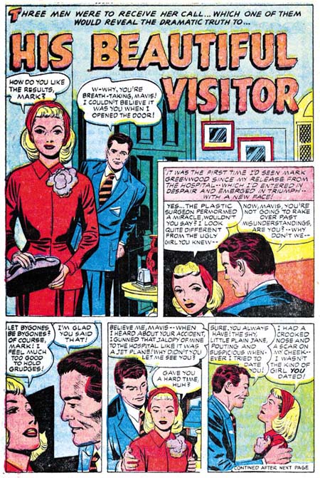
YB #25 His Beautiful Visitor
Young Brides #25 (November 1955) “His Beautiful Visitor” by Jack Kirby

In October, the month after Charlton released the last of what had been Mainline comics, a story penciled by Jack Kirby appeared in Young Romance #79. The next romance (Young Brides #25 November) would have Jack doing three of the four stories. Oddly there was no Kirby in Young Love #68 (December). After this we have a run of romance comics that are almost completely done by Jack Kirby (YR #80 to #85, YL #69 to 73, and YB #26 to #30). Kirby would do all 16 covers, 58 of the 65 stories, and 373 out of 416 pages (excluding covers). The percentage of Kirby in this run would be even higher if we excluded Young Love #71 which only had a single Kirby story. Of the 7 stories done by other artists; 4 were done by Bill Draut (YR #81, YL #71 and two in #73), 1 by Ann Brewster (YL #71), 1 by Ted Galindo (YL #71) and 1 by an unidentified artist (YL #69). Never before in the history of Simon and Kirby do we see anything like this. The closest to it occurred was with the launch of Headline as crime genre. There Jack did all of the first four issues (Headline #23 to #26, March to September 1947).

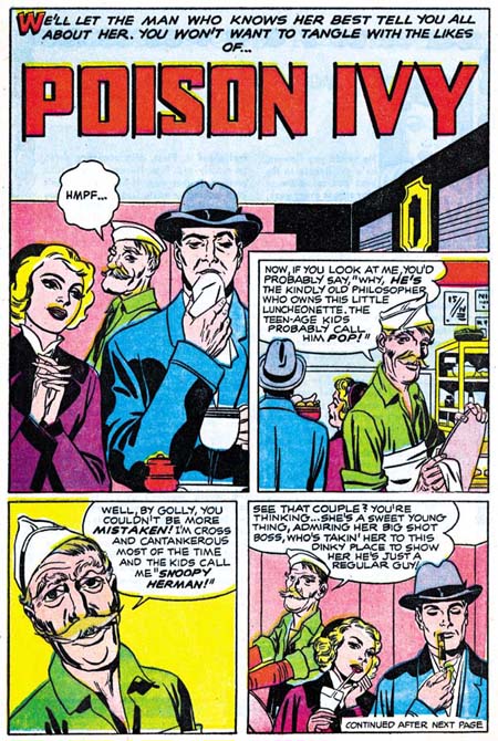
YR #84 Poison Ivy
Young Romance #84 (October 1956) “Poison Ivy” by Jack Kirby

At the beginning of the post I included a splash page from YL #55 that Jack did just before he stopped doing Prize romances in order to concentrate on Fighting American and the Mainline comics. Compare this to a page from YB #25 (“His Beautiful Visitor” see above) from the time of Jack’s return to these romance titles. Despite the similar panel layout the two look different. The spot inking in the earlier page is in the typical S&K shop style. But in the later work there is less spotting, particularly in the figures, giving the page a lighter look. When parts of the figure do get more spotting, it often is done by flooding a larger area, see “Poison Ivy” from YR #84 above. Brush techniques that were standard to the S&K shop style (like the coarse crosshatch that reminds one of a picket fence, or the rows of unconnected short strokes) are encountered less frequently. When these brush methods are used they tend to be done in a finer style then previously. These differences in inking styles seem to be present right when Kirby returned to doing these romance titles, but they appear to become more obvious over time.

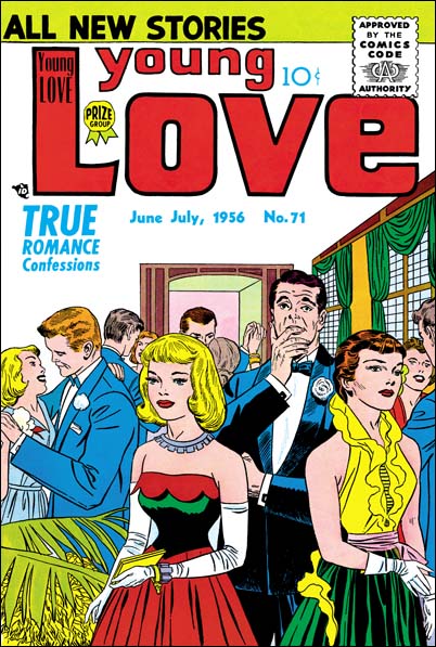
Young Love #71
Young Love #71 (June 1956) by Jack Kirby

The same observations about the change in inking style can be made about the covers. However more effort was usually done on the covers. The old shop style crosshatching appears more often on covers although done in a finer style. Great care was sometimes taken, the lines in YL #71 (above) were done so fine that they look like they were done using a pen but the original art (still in Joe Simon’s collection) show that it was actually done with a brush.

This may be a good place to interrupt with a short discussion about how inking was done in the Simon and Kirby studio. All uninked art by Kirby done during the S&K collaboration that I have seen show that Jack did tight pencils done entirely as lines. No indications for spotting are found and folds in the clothing are indicated by simple lines. The next step appeared to be the inking of the panel outlines, balloons and the lettering. Then the art is inked closely following the penciled lines without any spotting. Next the spotting is done to bring a sort of volume to the forms and provide tonal variations across the page. Thus ignoring the lettering, the art can be said to have three stages; penciling, lining, and spotting. In an interview Carmine Infantino, who worked in the S&K studio mostly in 1948, describes Jack doing the spot inking. Martin Thall once described visiting the studio where a number of individuals were busy doing an inking job. My own examination of original art leads me to believe that often more then one hand was involved in the spotting. Frankly when experts attribute the inking to Jack himself, Joe or some other artists I do not know what they mean. Are they referring to the outlining or the spotting? Are they saying that all the inking was done by that one person or just parts? I really have no clue as to what the inking attributions by the experts means, I sometimes wonder if they know themselves.

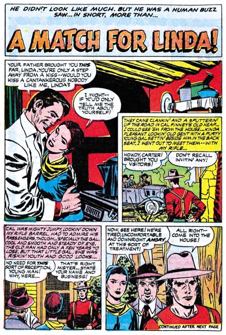
YR #81 A Match For Linda
Young Romance #81 (February 1956) “A Match For Linda” by Jack Kirby

To me it appears that the line inking done during the all Kirby run of romances was done by different individuals. I have little confidence that I can identify most. After all they are following Kirby’s tight pencils and this is not Marvel Comics in the Silver Age with Stan Lee urging inkers to add their personal touches. I am pretty sure Jack wanted the line inkers to be faithful to his pencils. Still there are subtleties to the pencils and different responses to those nuances by the line inkers. One of the line inkers in some of these stories appears to have been Bill Draut. Take a look above at the eyebrows in the female on the splash page to “A Match For Linda”. Notice the tendency to it be a little long and simple. Compare this to a page below from “He Had Only Me” by Draut. Of course not every eyebrow in the Kirby story has the Draut form, after all Bill is trying to keep to the pencils. But when there is deviation from the Kirby look, it seems to be in the direction that Bill Draut would normally do. I have not made a careful examination of all the stories, but I think Bill also had a hand in the line inking for “The Unhappy Housewife” (YB #30), “Torch Song” and “Bust Up” (both from YL #73), and “Lizzie’s Back In Town”, “Lady’s Choice” and “Resort Romeo” (all from YR #85).

YR #81 He Had Only Me
Young Romance #81 (February 1956) “He Had Only Me” by Bill Draut

Although I feel I can see hands other then Bill Draut’s working on the line inking for some of the stories, I believe only one artist was doing the spotting. Yes there is a lot of variation in how the spotting was done or even how much spotting was done at all. But when crosshatching was done it seems finer then previous S&K shop inking. There is a consistent attempt to divide panels into light and dark areas, with the light sections predominating.

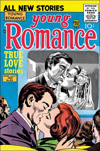
Young Romance #83
Young Romance #83 (June 1956) by Jack Kirby and Joe Simon

The Kirby Checklist does not include the cover for Young Romance #83. Although it is not one of his best efforts, I really believe that Jack did the foreground couple. However the pair in the movie screen does not look like his work, but appears to me to be done by Joe Simon. The movie screen was done using a special product that allows an artist to get grey tones by applying special chemicals. The grey tone is actually achieved by the means of fine lines. Apparently Jack never got into using these sort of materials. But starting here we will find Joe experimenting with new techniques from time to time.

The all Kirby Prize romances were done from December 1955 to December 1956. This effort raises a couple of questions. One is whether the Simon and Kirby collaboration in effect during this time? The answer I believe is yes there still was some sort of joint S&K effort. Joe joined Jack in working on the cover to Young Romance #83. Young Brides #30 depicts a couple with twin babies, Joe had twin girls. Finally Joe still has the original art for the cover of Young Love #71 in his collection. But although I believe Joe and Jack were still jointly working here, the inking done on these issues convinces me that the way this collaboration was handled was different. I suspect that the S&K studio had closed at this point and Joe and Jack were working at their respective homes. They had worked from their houses earlier in their joint careers, but at that time they lived close to one another. Now they lived further apart and this made the same type of working arrangement difficult. Gone were the days of passing art back and forth until both were satisfied. Other then the line inking, most of the work we see here is by Jack. If you want to see the sort of stuff like the Simon and Kirby of earlier years, these romances will probably disappoint you. If your interest is in Kirby’s vision alone, here for the first time in many years you will find a purer Kirby. The quality of the work varies greatly, and this is not just because of the use of various line inkers. Kirby’s spotting can be very minimal at some times, rushed and sloppy at others. However I do not want to leave a negative impression, when all things work well the results can be very nice.

The other question that comes to mind is why do all Kirby issues at all? One possibility is that some change was made in the deal between the artists and Prize so that the money Jack received was not based on just the profits but somehow also on the number of pages he penciled. Or perhaps the finances for S&K were so poor that they could not have enough to pay their freelance artists. Another possibility was that the whole effort was an attempt to boast the sales for these romance comics. If it was an attempt to help a financially ailing line of titles it does not look like it succeeded. Young Love and Young Brides would be cancelled after December 1956. Prize Comics Western was already ended the previous September, so Prize was now down to one monthly (Justice Traps the Guilty) and two bimonthly titles (Headline and Young Romance). This was really a low point for the Prize company. Since Simon and Kirby no longer had a hand in the crime titles, only Young Romance remained as a source of income from Prize. The last Western Tales for Harvey was July 1956 and work for Warfront was limited to a few covers. In the next chapter I will write about Harvey romances, but let me say here that things must have looked pretty grim for Simon and Kirby by the December 1956 cover date.

Chapter 4, A Friend Provides a Helping Hand

Chapter 6, A Friend’s Romance

The End of Simon & Kirby, Chapter 3, Unlikely Port In The Storm

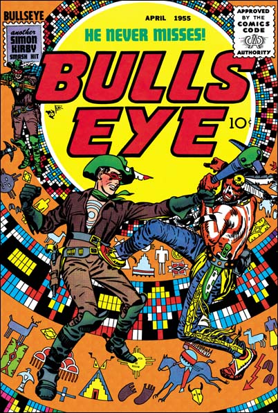
Bullseye #5
Bullseye #5 (April 1955) by Jack Kirby. It and Foxhole #4 were the last Mainline comics.

Previously in the end of Simon and Kirby I discussed the rise of anti-comic book sentiments and the ill timed launched of S&K’s Mainline comics. A number of publishers seemed to be having problems, including Prize for which Simon and Kirby produced some titles. In the end Mailine failed with the last comics dated April 1955.

Win A Prize #1
Win A Prize #1 (February 1955) by Jack Kirby

Two months before the last Mainline comic, Joe and Jack launched a new title Win A Prize published by Charlton. Charlton was notorious for their low page rates. There can be a couple of explanations for this choice of publisher. One explanation is that part of the idea behind Win A Prize was the giving away of prizes. The cover announces “500 free prizes, anyone can win”, and Joe Simon insists that they really did give away prizes. For a small company like Mainline this could be a problem. Not only the cost of the merchandise but the logistics of sending the prizes to the winners. But Charlton had a vertical company structure, they did everything from producing the comics, printing them and doing the distribution. They probably were the ideal outfit to handle this sort of thing. Well except for the problem of being cheap.

The second explanation for making a deal with Charlton to publish Win A Prize is that Joe and Jack might have already known that Mainline was in trouble. With decrease profits from the comics they produced for Prize, S&K may not have had enough cash to finance the launch of another title. The Mainline comics were distributed by Leader News and that company may already have seem like a poor choice. Charlton may not have paid much, but Simon and Kirby may have been desperate at this point.

Win A Prize was unique for Simon and Kirby. They had produced anthologies before but they were always genre specific. They did crime, horror and romance, but Win A Prize with just a general anthology. That sort of thing was common during the war, but I suspect it was unusual in the mid 50’s. Here is a rundown of the stories to show the sort of mix it was.

Win A Prize #1
“The Emissary” by Jack Kirby (science fiction)
“The Tragic Clown” (drama)
“That Giveaway Guy” by Jack Kirby (humor)
“Telltale Heart” (horror, adaptation of story by Edgar Allan Poe)
“War Diary” (war)

WP #1 That Giveaway Guy
Win A Prize #1, “That Giveaway Guy” by Jack Kirby

Win A Prize #2
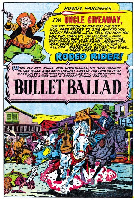
“Bullet Ballad” by Bill Draut (western)
“Sir Cashby Of Moneyvault” by Jack Kirby (humor)
“Torpedoed” (war)
“The Handsome Brute” by Joe Albistur (science fiction)
“The Bull” (sports)

WP #2 Bullet Ballad
Win A Prize #2, Uncle Giveaway by Jack Kirby and “Bullet Ballad” by Bill Draut

They are all relative short stories, the longest is 7 pages. We have seen Bill Draut before, but also included is Joe Albistur. Joe was a relatively recent artist to work for S&K, he first appeared in Police Trap #1 (September 1954). He also did a number of romance stories taking up some of the slack left by Kirby then absent from the Prize romances. All the Win A Prize stories are really nice and I promise to highlight some of them in the future. Although I rather like Win A Prize, it did not last long, ending with issue #2 in April 1955, the same month that Mainline ended. The “hook” really wasn’t the contents, it was the prizes. With all the logistical problems these prizes brought I am sure Charlton wanted to see really good sales really quick. When they failed to materialize, the title was cancelled.
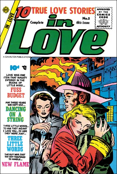
In Love #5
In Love #5 (May 1955) by Jack Kirby

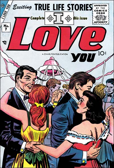
In May 1955, one month after the last Mainline comics, In Love #5 would be published by Charlton. Charlton would soon print the rest of the former Mainline titles; Bullseye, Police Trap and Foxhole. But these former Mainline comics would only last a couple of issue each, the last (Police Trap #6) is dated September. But their termination may not have just been due to poor sales. I think the these Charlton issues were made using material already completed or in progress when Mainline abruptly ended. It would be better for S&K that they get low payment for this artwork from Charlton, then get nothing at all. In September Charlton would change the title of “In Love” to “I Love You”. I Love You #7 has a (rather weak) Kirby cover but the contents do not look like they were produced by Simon and Kirby. I think Charlton was just reusing the volume number, a not uncommon technique to save postal registration fees. Charlton probably assembled the contents and Simon and Kirby only supplied the cover. I Love You turned out to have a run of 115 issues for Charlton ending in December 1976.

I Love You #7
I Love You #7 (July 1955) by Jack Kirby

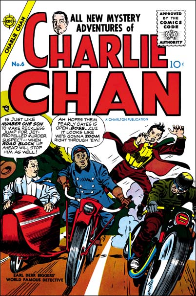
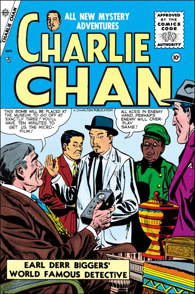
At the same time as Charlton was publishing the remnants of the Mainline comics, they also started to publish Charlie Chan. This was a title that Simon and Kirby originally produced for Prize. Under Prize Charlie Chan lasted 5 issues with the last one dated February 1949. In the original series Jack Kirby penciled all the covers but did not do any of the contents. In the first Charlton issue we again find Jack providing the cover but none of the contents. But I don’t believe that this cover is just unused material from the Prize run. First the inking style is more like the late shop style then what was used during the Prize version of Charlie Chan. Second, originally the Charlie Chan covers were static with the “number one son” getting ready to spring into action. On the Charlton cover the son is in the middle of jumping from one motorcycle to another. This sort of emphasis on action is more in tune with later Simon and Kirby covers. And lastly #6 cover includes Burmingham Brown. This stereotype sidekick did not appear on the Prize covers or contents but would appear on the cover to Charlie Chan #7 and #9. Although Kirby did not do any other pencils for the Charlton Charlie Chan, Simon and Kirby did produce those comics. Issue #7 has the stamp that announces “another Simon and Kirby smash hit” that was used on the late Mainline titles. Joe Simon still has color proofs to all the Charlton covers. Charlie Chan is unique for Simon and Kirby’s work with Charlton in that it lasted a full 4 issues ending in March 1956. Regardless of whether they started with unused Prize artwork, clearly S&K also produced some new material for Charlton.

Charlie Chan #6
Charlie Chan #6 (June 1955) by Jack Kirby

Charlie Chan #9
Charlie Chan #9 (December 1955) by unknown artist

Chapter 2, Problems in the Industry

Chapter 4, A Friend Provides a Helping Hand