Category Archives: 8 Marvel

Genesis of a Cover, Captain America #105

Captain America #105
Captain America #105 (September 1968) by Jack Kirby, John Romita and Dan Adkins?

Usually I confine myself in this blog to the time of Simon and Kirby’s collaboration. Occasionally I venture outside that period, for example in a series of posts I once did on Kirby margin notes. Generally I leave the Kirby’s more recent work to the Jack Kirby Blog where Bob does such a great job with it. But I thought it might be fun to discuss the silver age cover to Captain America #105 (September 1968) and some of its influences back to the beginning of the golden age of comics.

Detective Comics #27
Detective Comics #27 (May 1939) by Bob Kane

You can really go back to the dawn of the golden age of comics and find the motif of a hero arriving via a rope. Heck that is how Batman made his first appearance on the cover for Detective Comics #27. Such use of a rope is a natural for any hero who lacks the power of flight. Of course this sort of transportation can only have a restricted use. It would really be stretching the limits of believability for a hero to travel great distances like a city version of Tarzan. Some early heroes overcome that difficulty by having a gun that could shoot out the wire to swing on. That has always seemed a rather crude technique. It was only years later that Steve Ditko would give Spiderman a more elegant solution to this problem.

Mystery Men Comics #11
Mystery Men Comics #11 (June 1940) by Joe Simon

Even looking for a more immediate influence on Jack Kirby will take us pretty much into the early part of the golden age. Joe Simon’s cover to Mystery Men #11 was done while he was editor at Fox Comics. At that same time Kirby was also there doing the Blue Beetle syndication strip. Joe’s cover has the Blue Beetle using a rope or wire for moving between buildings. Our hero has exited one building just in time to avoid an adversary. However his destination seems if anything even more perilously filled with enemies. I presume the Blue Beetle is using something like a telephone wire that connects the two buildings, that may seem more realistic then a rope that just happens to be conveniently available. Unfortunately it does make it harder to understand how the hero manages to use the wire. With one arm being used to both hold the swooning woman and fire a gun, the Blue Beetle has only one arm to move along the support. It would seem a rather daunting challenge, but then again that what heroes are for.


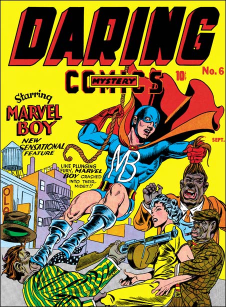
Daring Mystery #6 (September 1940) by Jack Kirby

I presume Jack Kirby liked the idea of the hero using a rope or wire to aid transportation. But he may have been uncomfortable with Joe’s solution of a wire already attached to the source and destination. Certainly rope swinging was both faster and more dramatic then going hand over hand. I believe that the cover for Daring Mystery #6 might have been Jack’s first use of a rope swinging hero.

Captain America Comics #7
Captain America Comics #7 (October 1941) by Jack Kirby

Not that terribly long after Daring Mystery #6 Jack would return to a swinging hero with the cover of Captain America #7. But what a difference a year can make. Cap’s pose, with his arched body and legs spread wide, is a little surprising but there is no denying the rope swinging brings high drama to the cover. Since Cap is taking his sidekick along and not some “helpless female” the hero’s hands are both free to hold the rope while Bucky clings in turn to Cap. Captain America does have one problem that heroes like Batman and Marvel Boy did not share. Generally Cap makes great use of his shield for things such as protection against bullets. Here with rope swinging it just seems to get in the way.


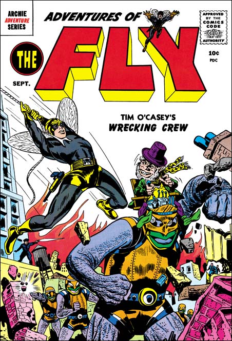
Adventures of the Fly #2 (September 1959) by Joe Simon and another?

I do not think that Kirby used rope swinging that often but it was one of his “tools” that he would pull out and use from time to time. It is hard to be sure about what Joe Simon may have brought to the creation of a particular Simon and Kirby piece. Did Joe provide layouts for the cover for Captain America #7? I will not suggest an answer to that question here. I will say that Joe seems very attached to Captain America’s pose for that cover. It turns up again years later in the cover for Adventures of the Fly #2. Some have attributed this cover to Jack but I am certain that the figure of the Fly was actually done by Joe.

Captain America #105
Unused pencils for Captain America #105 by Jack Kirby and Jim Steranko

I am sure that most, no make that all, of my readers know that Jack Kirby would return to drawing Captain America this time collaborating with Stan Lee. Jack would do some exciting covers for Marvel Comics. Sometimes Stan, as the editor, would request changes to a cover. Perhaps because I am such a Kirby fanboy, I generally do not understand what Stan found so objectionable. This was the fate for Kirby’s pencils for Captain America #105 cover . I will discuss what was done to the pencil version and by whom below. First let us discuss Jack’s return to the rope motif.

Captain America #105
Unused pencils for Captain America #105 Batroc and the Swordsman by Jack Kirby

Yes Jack has once again has the hero travel via a rope but it is not by means of swinging. Instead Kirby has returned to using an attached rope essentially like Joe Simon had used for Mystery Men #11 so many years previously. However Kirby overcame both the awkward questions of how to travel on such a rope and what to do with Cap’s shield. No longer is the shield an impediment but is now the means by which Cap can quickly slide along the rope! This is one of the solutions that only seems obvious once it has been done.

Captain America #105
Unused pencils for Captain America #105 The Living Laser by Jack Kirby

This was one of those cases mentioned above, where Stan had some problems with Jack’s take on the Cap #105 cover. The good news is that this led to Jack’s pencils never being inked. The bad news is the pencil version of the cover as it exists today is not all by Kirby. Basically everything other then the figure of Captain America is pure Kirby, untouched by any other hand.

Captain America #105
Unused pencils for Captain America #105 by Jack Kirby and Jim Steranko with Photoshop adjustments

Cap was modified both by penciling over what was already there, as well as erasing some of Jack’s pencils and adding new ones. Unfortunately there really is nothing that can be done to restore the pencils to the way Jack did it. Instead I have adjusted the scan using Photoshop. While this causes most of the image to deteriorate it helps brings out parts of the drawing that had been erased. Unfortunately it may still be hard to make out but it is the best that I can do. The important point is that Cap’s left leg was flexed and occupied the section that on the pencil version is now open sky.

When Stan was dissatisfied with Kirby efforts on this cover he turned to Jim Steranko to make corrections. Now I am a great admirer of Steranko. Even so I still shudder every time I think of Jim erasing Kirby’s pencils. After removing Jack’s version of Cap’s left leg Jim added his own. Presumable to make the whole figure uniform and to make some small adjustments, Steranko also penciled over the rest of the figure. Although I said the background was pure Kirby when Jim re-positioned the leg an area of the building previously covered by that leg had to be added. Jim kept to Jack’s type of architecture. The only difference that can be detected is that Jim’s pencils are slightly lighter then those by Jack. It is Steranko’s alterations to Kirby’s cover that is the state of the pencil version that exists today.

Lee still was not happy with the Kirby/Steranko version of the cover. But now things get complicated. There exists two rough sketches on tracing paper. Someone has written in blue pencil the names John Romita on one and Dan Adkins on the other. Which came first? To decide this I used Occam’s razor, “all things being equal, the simplest solution is the best one”. The paper used was chosen because it would allow desired portions to be traced. The order I provide here gives the fewest changes to each step keeping particular attention to what tracing was done. Without any claim that this is absolutely correct, I am fairly confident in the sequence I provide here.

Captain America #105
Captain America #105 rough on tracing paper by Dan Adkins?

The Adkins sketch is the most rough one. So much so that I suspect we are just going to have to take the attribution on faith alone. Adkins has redrawn Captain America, swinging his legs around so that they are away from the viewer. In doing so, Adkins has shifted the center of the image to our left. Although done very crudely, the Swordsman, the Living Laser and the building the stand on were traced as one piece. Batroc was also probably traced but so roughly that it is hard to be certain. In any case Batroc’s position was shifted up and toward our left relative to his two companions.

Captain America #105
Captain America #105 rough on tracing paper by John Romita?

Now John Romita (senior) worked on it. Romita traced in regular pencil Cap’s torso from Adkins. He followed Adkins closely for the left elbow, the left side of the left forearm, the left side of the torso, the upper right shoulder area, the belt, the shorts and the right thigh. The upper edge of the shield is pretty close to Adkins placement. Romita lowered Cap’s left leg, moved the right lower leg to the right, and moved Cap’s right forearm out a bit. As can be seen, Romita tightened up the entire figure. (Here I must confess that I have not closely studied Romita’s work so I am counting on the silver age scholars among my readers to express their opinion on whether this attribution to John Romita is accurate.) Captain America is pretty close to the published version. With Cap’s new pose, clearly something had to be done about the background. Using blue pencil Romita has traced portions of Kirby’s architecture but shifting their locations. John did redraw the tall building on the right making it more angular relative to the horizon. Cap’s foes have also been trace from Kirby’s pencils. Batroc was moved a little bit higher then even Adkin’s placement. Romita switched the relative locations of the Swordsman and the Living Laser. I suspect that was done because he felt that the Swordsman would otherwise be too crowded. Batroc and the Living Laser adhere pretty close to Kirby’s pencil. The upper half of the Swordsman was traced while the pose for the lower body was altered.

At this point work must have begun on regular Strathmore paper, I am sure they would not want to end up inking on tracing paper. But further alterations were made from Romita’s rough. As I said previously the figure of Cap on the finished cover is pretty close to Romita’s drawing. The main differences are that both lower legs were made a little longer and the forearms placed a little further out. The lower rope follows both Dan’s and John’s path closely. But the upper portion is more faithful to Dan’s, leaving at the same place on Cap’s shield but angling a little more sharply. The rest of the background was rearrange once again, using Kirby’s pencils to trace from. Batroc’s position shifted down compared to Romita’s placement and his final placement is closest to that indicated by Adkins. The Swordsman and the Living Laser switch positions once again.

In the end on the published cover the buildings details follow Kirby, Cap’s foes are close traces from Jack, Cap himself is close to Romita’s drawing, and the overall background compositions is closest (but by no means matches) Adkins’ sketch. Of course the whole idea of using the shield to slide down a rope was Kirby’s. The Jack Kirby Checklist attributes the Cap #105 cover to “Kirby/Romita/Adkins” which sounds like an accurate description to me.

Captain America #105
Sketch on back of pencils for the cover for Captain America #105 by unidentified artist

If that was not complicated enough, on the back of the Kirby/Steranko pencils is a small sketch. What part did it play in creation of the cover for Cap #105? I do not have a clue, but I will say I do not believe that this was done by Jack. I have never seen any evidence of Jack using crude sketches such as this one. Even in some work stopped at the very early stages Kirby had better placed lines and none of this pencil swirling.

Marvel Super Action #7
Marvel Super Action #7 (April 1978) by Mike Zeck

But that still is not the end of the story. Years later Mike Zeck did the cover for Marvel Super Action #7. Is it a homage to Kirby/Romita/Adkins or a swipe? You can make your own decision. What do I think? I think I have written a long enough post as it is.

Not Joe Simon, Daring Adventures #11 and #17

Daring Adventures #17
Daring Adventures #17 (1964) by Ross Andru and Mike Esposito?

I guess one theme of this post, at least for me, is what was I thinking? When I did my original serial post on the Art of Joe Simon, I stated that I believed Joe did the covers for Daring Adventure #10 to #17. At that time I had only seen (and restored) the cover to DA #15, but Joe had also included DA #16 in his book “The Comic Book Makers”. But I had only seen DA #9, 10, 11, 12, 17 and 18 on GCD. The images they provide are not the highest quality (it would almost seem they have a policy of excluding restored covers). Apparently I could see enough to exclude #9 and 18 from being Joe’s work. But for some reason I thought that #10, 11 and 17 might be, I just cannot remember what that reason was. After I had a chance to restore DA #12 and 16 I posted that I no longer sure that #11 and 17 were by Joe but that I wanted think about it some more (apparently I had already excluded DA #10). Well I thought some more, but I can really find nothing in DA #11 or 17 to suggest that they were Simon’s creations.

I decided to restore DA #17 anyway as I thought it might make an interesting comparison to Joe’s work at that time. Similar comparisons could be made to DA #11. The GCD attributes both of these covers to penciling by Ross Andru and inking by Mike Esposito. I am familiar with Andru’s romance work during the 50’s because some of it appeared in the Prize comics that Simon and Kirby produced. I am not knowledgeable about Andru’s later or superhero work. So I have used the GCD attribution above, with a question mark not because I think it is wrong but because I just do not know enough to make a judgment. In the rest of this post I will assume the pencil artist really was Andru. I would greatly appreciate it if there is anyone reading this who feels they are familiar enough with Ross Andru’s work to give an opinion.

Daring Adventures #17
Daring Adventures #17 “Riddle of Toys” (reprint) by Mac Raboy
Larger Image

The first think that strikes one about DA #17 compared to Simon’s DA covers it how good the figure drawing is in DA #17. It is not that Joe is a bad figure artist, it is just that at least here Andru seems so much better. Really nice form and although the anatomy is not completely accurate the short comings really do not distract from overall affect, quite the contrary. It is a bit hard to imagine a real figure under Falstaff’s cloths. The legs are too widely separated and there does not seem to be enough room in the torso for both hips and chests. But to me these are really not truly “errors”. With these sort of distortions Ross has presented a truly marvelous and intimidating villain. Although the cover Falstaff is clearly based on the character for the reprinted story inside the comic, the Andru has created an even better version. That is no small compliment because the story was drawn by Mac Raboy, one of the greatest of the golden age artists. The Green Lama is not quite as impressive but his slimmer figure is appropriate for this particular hero. There is one unfortunate change, the Green Lama’s original hood has been modified to a face mask. That by itself is not so bad, but Ross leaves the back of the hood as a small bump which gives the hero a rather ridiculous look.

Although based on this cover I would believe that Andru was a better figure drawer then Simon, when it comes to the composition or design of the cover the reverse is true. There are some rare exceptions, but in general Joe does an very good job of laying out his covers. In DA #17 notice how all the toys in the background are scattered around the the main characters. Although this “clutter” might be more realistic, it detracts from the antagonists and the story the cover is trying to present. Joe seems much more sensitive to where he places secondary features and he makes sure that the action is well placed. Raboy’s splash shows how this could be done. Notice how the toys almost ring about villains while the Green Lama flies in as if toward a target. With all the toys you would think the image should be cluttered, but with careful arrangement it not only do the toys not detract but actually direct the eye.

As I mentioned above, Falstaff by himself is a well done threatening villain. But the pose adopted by the Green Lama is rather unfortunate. Because of him I always feel the two are dancing rather then about to enter a fight. What is the hero supposed to be doing? Whatever it is meant to be, it just is not properly done. Again this is the sort of mistake that you rarely see Joe Simon fall into.

The Art of Joe Simon, Appendix 7, The Spirit #12

The Spirit #12
The Spirit #12 (1963) by Joe Simon

Super Comics published reprints of comic stories. Producers of comics that had fallen on hard times could sell the plates to Isreal Waldman at what I am sure was a low price. In the “The Comic Book Makers” Joe Simon describes selling Mainline titles to Waldman and the buyer’s concern with just getting the plates and his lack of interest in the copyrights. That must have also been true with whatever deal Eisner made since Will always kept the copyrights to the Spirit (except for a period where he did his wartime military service).

Although the contents of Super Comics were reprints the covers were new. I have to admit when I saw this cover in Joe’s book I thought Simon was taking liberties with the Spirit character. The Spirit attacking a mad scientist and his robots seem to me to be a little out of character for Eisner’s feature. But the comic does have such a story inside. I guess I have been biased by my reading of DC reprints of the Spirit. By the way these are absolutely the best books of comic reprints that have ever been produced. DC is doing a fantastic job, I just wish more archives were done that way. Most unfortunately still continue to use glossy paper and overly bright colors. However the Spirit Archives have not reached the final years. I know Wally Wood ghosted for Will on some Spirit adventures in space. So I suppose that this story is also a late one with a story line different from the earlier years that I am familiar with from reading the archives. Anyway Joe did take some liberties, there is no fight scene in the story quite like the one on the cover. I love the way Joe has turned the robot eyes into headlamps that provide a spotlight on the Spirit. Also Joe changes the arm stumps of the robots in the story to more manlike hands which gives them a much more menacing affect. I am less thrilled with the visor Joe has provided the villain with. And what is the significance of the large eye on the instrument’s CRT?

The Spirit #12
The Spirit #12 (1963) by Will Eisner

This post is not only a post of an example of some solo work by Joe, it is also an Alternate Take post, only this time with Simon not Kirby as the cover artist. But the splash page for the story was probably originally a cover for the newspaper comic book insert. Will Eisner was the master when it came to cover/splash designs. He was always changing the logo and often provided designs the integrated the logo with the art. Although this splash is more of a composition then a design it is still wonderfully done. The empty background brings all attention to the figure of the villain dropping his army of robots. A low viewpoint allows the robot formations to still seem threatening despite their small size. Notice how most of the figure is in shadow, this allows the falling robots to really standout. While Joe gave an exciting fight scene, Will was more subtle and using just visual effects provided a threat. I am no scholar on Will Eisner, for instance I have trouble distinguishing some of the ghosting Lou Fine did on the Spirit during the war from Will’s art. Still this splash looks very much like Eisner’s work to me.

The Spirit #12
The Spirit #12 (1963) by unidentified artist

Although I am convince Will Eisner was responsible for the splash, the rest of the story looks like someone else was ghosting for Will.

Art by Joe Simon, Appendix 5, Harvey Hits #12

Art by Joe Simon, Chapter 1, In The Beginning

The Art of Joe Simon, Appendix 4, Daring Adventure #16

Daring Adventure #16
Daring Adventure #16 (1964) by Joe Simon

Another cover that Joe Simon did for the reprint title Daring Adventure. Joe describes selling former Mainline titles to Isreal Waldman in his book “The Comic Book Makers”. From his description you would think that Super Comics would do rather cheap productions. Actually the comics I have seen were well done. Some of the interior stories are by great artists and in full color. But the covers are not reprints but original art produced for the various titles. Despite the fact that Joe did a number of these covers I do not think he did any covers for titles that included the Mainline features Joe sold to Waldman.

DA #16 shows Dynamic Man attaching an officer (general?) being tied up and threatened by little green men. A fire is present so I suspect the general will also be tortured. This is all being done within sight of some tents and a plane. The flags indicate that this is a US base, but where are the soldiers to protect this unfortunately officer? But no matter, the Dynamic Man jumps in to save the day. A literal interpretation of this enactment would indicate that Dynamic Man is leaping past his adversaries. But as we have seen before, for example in the cover for Target #10 (November 1940), that Simon would position the hero more to improve his prominence then to provide accurate portrayal. Judging from the interior story, Joe has made some mistakes on Dynamic Man’s costume. The gloves are wrong and the boots have the Captain America type of folding over at their tops. But the most glaring discrepancy is due to the colorist, not Joe. Joe provides the proper shorts for Dynamic Man but the colorist has painted the legs blue not flesh color.

This is not a bad cover, just not as interesting as DA #12 or DA #15. I have not seen the covers for DA #13 and #14 but coming between known Simon covers one might suspect that Joe did them also. I had previously felt that Joe also did DA #11 and DA #17 covers. But having restored DA #12, #15 and #16 I am not so sure. I will post on DA #11 and #17 later when I had a chance to think about them some more.

Art by Joe Simon, Appendix 2, Daring Adventures #12

Art by Joe Simon, Appendix 5, Harvey Hits #12

The Art of Joe Simon, Appendix 2, Daring Adventures #12

Daring Adventures #12
Daring Adventures #12, (1963) by Joe Simon

If we exclude work done for the humor magazine Sick, Joe Simon’s comic book work is rather modest compared to that of Jack Kirby. Although very incomplete, the Checklist I provide is only about a couple of pages long while The Jack Kirby Checklist has 90 pages of fine print. Yes I believe some of the work in the Kirby Checklist was really done by Simon but even in my most generous estimate that still would be a miniscule fraction of Jack’s output. But to achieve correct attributions it is not enough to recognize Jack’s style, one must also be able to spot Joe’s mannerisms as well. This is particularly important because Joe frequently adopted Kirby trademarks. Because there is not that much solo Simon work I thought it would be useful to extend my previous serial blog “The Art of Joe Simon” with appendices that provide further examples of solo Simon art.

Daring Adventures #12 appeared sometime in 1963. This comic title contained reprinted stories, this issue features the Phantom Lady. But even though the stories were reprints the covers were new. Although unsigned issue #12 was obviously done by Joe Simon. Joe appears to have worked on the entire cover, including designing the logo. The same logo, using different coloring, appears on issues Daring Adventures #15 and #16 for which Joe also did the cover art.

The cover art is more then just a scene composition, it is a complete design. The “The Great Stamp Robbery” is introduced by placing the story title and an image of the Phantom Lady on a stamp. Included on the stamp is a caption “Action Series” in case the young readers were not familiar with this heroine. The whole stamp is made with the fine lines of zip tones and the coloring is subdued. The physically of the stamp is revealed by the lavender shadow that it casts, surprisingly on a tilted background.

In front of the stamp, in bold inking and strong coloring are two figures. One, the hero, provides a solid slug to the other who falls backward. I am unclear why a male hero was used on a cover for a comic devoted to Phantom Lady. Giving Joe’s working method and Kirby’s excelling at this sort of slugfest, one would expect that these figures were swiped from Jack. However the pose of the left figure is extreme even for Jack. A similar extremely wide stride appears on the logo to the Harvey Fighting American but that pose is given to the flying slugged figure. Since that Harvey comic was published in 1966 it does not help in providing the source for the figure on this Daring Adventures cover. I cannot provide any Kirby prototype for this example but I wonder if there truly is a single source. Perhaps this figure is a composite, the torso from a Kirby slugging figure and the legs from a running one. Therefore the left figure is quite possibly not a close swipe. The figure on the right is handled so well that although I cannot provide a source for it either I strongly suspect it was a more close swipe from Jack. The figure is falling back, away from the viewer. That manner seemed more common early in Kirby’s career so I would suspect an early source.

The portrayal of the Phantom Lady is a bit stiff but otherwise this is marvelous work by Joe from a period after the Simon and Kirby breakup. The design is really well done and shows Joe has not lost his touch with this sort of approach.

Art by Joe Simon, Chapter 13, Wrap Up

Art by Joe Simon, Appendix 4, Daring Adventure #16

One Goofy Cover

Captain America #197
Captain America #197 (May 1976) by Jack Kirby (original art)

Jack Kirby did some goofy things from time to time. I always got a chuckle out of the cover for Captain America #197. Cap faces the viewer in a hail of bullets and exclaims “I’ve found an army of underground killers! .. and I’ve got to stop them alone!”. Well of course if he is alone, who is he yelling to? This was done in 1976 and Jack was artist, writer and editor. So you would expect that this was Jack’s doing.

Recently The Jack Kirby Museum has made available to members xeroxes of the pencils for some Captain America art done by Jack. If you are not a member maybe you should consider joining. I say this not really because of the chance to see some great Kirby pencils. Nor because the Kirby Museum hosts my blog. Those are good reasons I guess but I feel you should support the museum as they are one of the few organizations out there actively promoting the study of Jack Kirby. With member support they have done great things but with continuing support I am sure that is only the beginning.

Anyway because it is a member’s only viewing I cannot link to the pencil version of Cap #197 that they have. But I hope it is alright if I were to quote what Cap says on the pencils which is “This way for action!! I’ve found an underground army of desperate killers”. Not as punchy as the final version but not at all goofy.

All the blurbs on the cover are paste ups on the original art. The pencils had been completely inked, even in places that later were covered by the blurbs. Jack’s penciled word balloon was not inked and the space it had occupied was inked with the same wreck that is found along all the edges. I guess it is possible that Jack changed his mind in the last minute about what should be in the blurbs. But I really suspect that someone at Marvel decided to make changes even though Kirby was supposed to be editor. “This way for action” was removed from Cap’s speech and placed in an arrow and Cap’s exclamation was rewritten somewhat. Just one more example of the lack of respect by some at Marvel at that time for Jack’s efforts.

Even though I now feel that Cap’s speech was not Kirby’s fault, I have to admit I like it. It is good for comic art to be goofy at times.

Art by Joe Simon, Chapter 13, Wrap Up

When I started this serial post on Joe Simon’s art, I outlined for myself what topics I was going to cover. Initially my plan was to end about the time of the Simon and Kirby breakup. I wanted to avoid the final part of Joe’s career as a comic artist because frankly I do not have a very good handle on all of it. But in the end I have decided to discuss what little I know and admit my ignorance. Joe writes about this part of his career in his book “The Comic Book Makers”. But if you are not careful, it is easy to come away from a reading of what he says with the idea that this was an unimportant part of his career. The fact is the covers Joe drew after the breakup of Simon and Kirby outnumbers what he did earlier.

Young Romance v14 n5
Young Romance v14 n5 (August 1961) by Joe Simon (signed)

With the exception of one publication (Sick), most of what Joe did after S&K was unsigned and for low budget titles. Outside of Sick, the above Young Romance cover is the only signed late work by Joe Simon that I am aware of. Joe was the editor for some of the Prize comics (Young Love, Young Romance and Black Magic) towards the end of those titles. In Chapter 9 of “The End of Simon and Kirby” I had included an image of another of Joe’s Prize work Young Love #77 (August 1960). As I said in the beginning of this post I do not have a very good handle of Joe’s style, that is particularly true with these romances. I believe there are other Young Love and Young Romance covers by Joe. Although I have not located a convincing example yet, I strongly suspect that Joe also did some covers for the relaunched Black Magic series.

Young Hearts #17
Young Hearts In Love #17 (from proof) by Joe Simon

Joe Simon also did cover work for Super Comics. That publisher would buy art from failed comic books and reprint the material with new covers. In his book Joe describes selling them some of the S&K Mainline comics. Super Comics had a lot of different titles but were probably not big sellers and I do not have access to very many of them. The above image of Young Hearts #17 is from a proof in Joe’s collection. Notice the similarity of the title lettering to that originally used for Young Love and Young Romance. Joe also did the cover for Young Hearts #18.

Daring Adventures #15
Daring Adventure #15 (1964) by Joe Simon

But Joe not only did romance covers for Super Comics, he also did some superheroes. I believe he did the covers for Daring Adventures #10 to #17 (1963 and 1964). For these Joe used the rather simple style we saw before in Alarming Tales #4. But notice on DA #15 the Kirby-ish leaping figure. Also note the use of the oversized figure, in this case of the villain, that we have seen Simon use all the way back on his work on Blue Beetle for Fox Comics. Joe also did the cover for The Spirit #12 (1964) where unexpectedly the Spirit is attacking a foe with the villain’s own robot.

Jigsaw #3
Jigsaw #3 (unpublished, from original art) by Joe Simon

From 1965 until 1967 Joe did some editorial work for Harvey Comics on some, mostly superhero, titles. I do not believe he did any of the stories, but Joe did supply some of the covers. Perhaps because they were done for his long time friend’s company, I feel Joe put more effort into them then he did on the Super Comics covers. Although Simon still mostly worked in the simpler drawing and inking style, in the cover for Jigsaw #3 he returned to a bold inking not much removed from the old S&K shop style. Joe commented to me that he thought he had copied the Jigsaw figure from the splash page of the story. But I am unable to confirm that since Jigsaw #3 was never published.

Dick Tracy #129
Dick Tracy #129 (from proof) by Joe Simon

But the late 60’s covers were not the only ones Joe did for Harvey. Earlier he also did some Dick Tracy covers. Determining which ones is a bit of a problem. Joe was essentially ghosting on these covers, adopting the rather simple and stylized drawing of the original newspaper strips. To make it even more difficult Al Avison was also doing some of these covers at about the same time. The above proof is from Joe’s collection so we can be pretty certain it was done by him.

Harvey Hits
Harvey Hits Magazine (from proof) by Joe Simon

Simon also did some Phantom covers for Harvey. Here he did not have to copy another’s style. To me they seem like standard Simon art for after the S&K breakup and do not at all suggest work by Jack Kirby. But apparently there must be something in them to suggest Jack, because dealers often credit Kirby for these covers.

Sick #69
Sick #69 (August 1969) by Joe Simon

However it is the covers to Sick Magazine that comprises most of the art work Joe did after Simon and Kirby. Joe was editor for this Mad imitation for a number of years (1960 to 1968) during which he did many of the covers but even afterwards he continued to supply cover art. In this work Joe let loose his visual humor and he obviously put much effort into these covers.

Well that wraps up my serial post on the Art of Joe Simon. I have added a checklist but like all my checklists it is a work in progress. Joe was a talented artist, better them most people give him credit for. Unfortunately that talent, particularly his talent for adopting different styles, has led many experts and scholars to attribute some of his works to other artists. Over and over again I get the uncomfortable feeling that critics have used quality of the work as a means of distinguishing between artists; if a page is good Kirby must have done it, otherwise it was done by Simon. I feel this is a flawed technique and the proper way to determine artistic credit is to examine a piece of work for the traits of the individual artists. It is also to keep in mind that when one artists tries to mimic another that some traits are easy to copy and should not be relied upon. Other features are more unique to one artists and are harder for another artist to duplicate; these are the ones useful for attributions. I did not do this serial post with the idea of convincing everyone of the correctness of the work I credit to Simon. But it would be great if I could help move the problem of attributions toward a discussion of the evidence from the art itself and away from the simple credit declarations that the experts are so fond of.

Art by Joe Simon, Chapter 12, Covering the Fly

Art by Joe Simon, Appendix 2, Daring Adventures #12

The End of Simon & Kirby, Chapter 10, A Fly In The Mix

Adventures of the Fly #1
The Adventures of the Fly #1 (August 1959) by Jack Kirby

Previously in the End of Simon and Kirby we saw that after the failure of Mainline and with a decrease in work for Prize, Jack Kirby turned to working as a freelance artist. Joe Simon continued to get Harvey comics to publish various S&K projects but none of them became hits.

After the end of Alarming Tales and Race For The Moon in November 1958, Harvey comics was probably reluctant to try any other new ideas from Joe Simon, at least right away. But that did not stop Joe from coming up with them. As Simon tells the story in The Comic Book Makers, in 1953 C. C. Beck wanted to get back into the comic business and asked Joe to come up with an idea. From this came a character called the Silver Spider and Beck would do a rough drawing of a story that was scripted by Joe’s brother-in-law Jack Oleck. This was presented to Harvey without generating any interest. Years later when Goldwater from Archie Comics wanted a couple of superhero comics, Joe remembered the Silver Spider concept, retrieved the art from Harvey, and rethought the idea. Joe sent Beck’s Silver Spider art to Jack Kirby and ask Jack to update it as the Fly. Joe’s story makes sense to me. Had the Silver Spider originally been a S&K concept, Kirby would certainly have done the original story, not Beck. But it would seem that Jack came up with the costume for the Fly, basing it in part on a unused S&K concept called the Night Stalker.

Double Life of Private Strong
The Double Life Of Private Strong #1 (June 1959) by Jack Kirby

Joe took this concept of the Fly to Archie Comics and added to it a proposal to re-do an old superhero called the Shield. The original Shield was the first patriotic hero from before when the company was referred to as MJL. The new Shield would be given great powers and would have a secret identity as a soldier, sort of combining the original Shield with Captain America and Superman. Well Archie must have liked Joe’s ideas because The Double Life of Private Strong would come out in June 1959 and the Adventures of the Fly would follow in August. As Joe tells it, a threat of a lawsuit by DC put an end the new improved Shield with issue #2, also released in August.

Silver Spider page 1
Silver Spider (1953) page 1 by C. C. Beck

Silver Spider page 2
Silver Spider (1953) page 2 by C. C. Beck

The Oleck/Beck story was pretty much retained when Kirby updated it for the Fly. The main difference is that Jack replaced the original genie with an emissary from the Fly People. Kirby did introduce a discrepancy, in both versions the superintendent of the orphans is shown as under threat by mobsters because of a gambling dept. But in Jack’s version he is latter presented receiving his share of the of the orphanage racket and thus acting as one of the gang. This was probably done to streamline the story. Beck’s version required the Fly to first confront the superintendent before proceeding to the gangsters. While Jack made one fight by making the superintendent a gang member.

Adventures of the Fly page 1
The Adventures of the Fly #1 (August 1959) “The Strange World of the Fly” page 1 by Jack Kirby

Adventures of the Fly page 2
The Adventures of the Fly #1 (August 1959) “The Strange World of the Fly” page 2 by Jack Kirby

Although Kirby came up with the how the Fly should look like, Simon really was the driving force behind this new character. In previous new titles Kirby would generally supply the art, at least for the initial issues. But with the Fly Simon would turn to a number of artists to create the contents; Jack Davis, George Tuska, Al Williamson. He even got Carl Burgos to do layouts. Joe once showed me a list someone made of what artists did what. Unfortunately he followed this by saying that the list maker got it all wrong. Frankly I am not even going to try, with so many hands involved I am not always sure I can always pick out the work that Kirby did. Was Jack too busy with work at Atlas, or did Joe decide he might be better off using different artists? Unlike the Fly, Private Strong did get the Kirby treatment. At least for the first issue, which is all Jack. But the second only has one Kirby story.

Joe still has a lot of the original art and it is interesting as it shows Joe’s working practices at that time. For some of the stories much of the pages are cut and paste jobs. I do not know whether Joe was condensing, rearranging or adding to the story. But a fair portion of these comics went through this special type of editing. Joe would also construct some of the covers in a similar way. He would even swipe Captain America from a 1941 cover (Captain America #7) to make the Fly for the cover to issue #2. As far as I am concerned all the prior projects that came out after Mainline’s failure were Simon and Kirby productions of some kind. But the Fly and the Shields were not, the Simon and Kirby collaboration was over. With the Fly Joe finally seemed to have at least a limited success. But apparently Archie Comics was not completely satisfied and felt it could be better. So after just four issues (January 1960) Simon was out and a new crew took over the Fly.

Sick #1
Sick #1 (August 1960) by Joe Simon

On the face of it Teddy Epstein’s new idea just does not sound like a great one. I am amazed that after so many years and so many clones that Prize would want to try publishing yet another copy of Mad. Even more unbelievable is that fact that it succeeded! At lease one reason for that success was Prize turned to Joe Simon to produce it. Joe’s talent for visual humor would now be unleashed in Sick. Of course another reason for the success of Sick was the wonderful artists that Joe would hire. In a way even Jack Kirby showed up when Simon reworked some Fighting American art for a cover (Sick #42 February 1966). Joe would be editor of Sick from until 1968 and would still provide art for it for some time afterwards. During this period Joe Simon would work on other projects, primarily for Harvey Comics. At some point Joe would enter advertisement, but I still do not have a good handle on when that was.

Sick #42
Sick #42 (February 1966) by Jack Kirby altered by Joe Simon

Sick #66
Sick #66 (March 1969) by Joe Simon

Appendum 9, Mea Culpa

Epilog

Kirby erasers at Marvel

I previously posted about margin notes and my use of Photoshop manipulations to reveal erased text. But these image adjustments also showed a number of erasures of penciled art. I am not talking about inked lines that did not precisely follow the pencils. That sort of thing is common in Silver Age inking. These were more serious changes to positions of feet, arms, legs or even the whole figure. It is well known that Stan would asked for changes, often by whoever was available at the office. But my impression is that these changes were done by Kirby himself. I also believe that Jack did these changes before Stan got to see the art. I say this because some of the erased pencils are errors that are so bad that I don’t believe Jack would have left them like that. This will be more obvious with the Avengers #6 page, but check the Cap in panel 5 of page 5 and panel 2 of page 21 of Strange Tales #114.

Strange Tales #114

Strange Tales #114

As I mentioned these erasures of penciled art are also present in Avengers #6 page 20. For this page I feel even more strongly that the erasures was done by Jack before the art was presented to Stan. I just can’t believe that Kirby would have let the art go with Cap’s left arm where it originally was in panel 3. It just seems too large an error.

Avengers #6

Similarly Cap’s original head in panel 6 is much too seriously wrong. These are not the sort of mistakes that you ever see Kirby make.

Avengers #6

I also subjected the art for Tales of Suspense #92 page 9 to Photoshop adjustments for high contrast. One other thing is interesting about this page and that is what is not there. What we no longer find are erasures of the corrected art. It is possible that Kirby did a better job of removing them. But I don’t think so. Why would he put the extra effort, after all he had no reason to hide it from someone someday using Photoshop on it. It is very difficult to make out the erased pencils on ST #114 and Av #6 without the aid of Photoshop.

Kirby was said to have created his composition in his head before he committed it to paper. By doing that he did not have to erase anything. Then why do we see more erasures on ST #114 and Avergers #6 then on TOS #92. Was Jack’s ability to mentally compose his page a skill he got better at over the years? I don’t think so, Kirby seem to have the same talent while working on the Simon & Kirby comics. In fact it may have been a remark by Joe that got Jack working in this manner. I’ve heard that Joe once complained about Jack erasing saying that he was erasing away money. However I have not (yet) subjected S&K art to the same Photoshop enhancement that I did with these Cap pages, so I could be wrong about not seeing erased pencils in S&K pages.

But there could be another explanation for all the corrections in ST #114 and Av #6. Perhaps these were rush jobs, either because of schedule difficulties or the amount of work Jack was doing at the time. Perhaps because he was trying to work faster, he was making more mistakes.

Tales Suspense #92, more on margin notes

I have another silver age Kirby Cap page that gives some insight into the use of margin notes. This one is page 9 from Tales of Suspense #92, cover dated August 1967. Joe Sinnott inks. Here is a scan that once again has been processed in Photoshop to increase the contrast.

Tales of Suspense #92

All margins have been trimmed for production. But in this case enough remains help identify the handwriting. Some of the margin notes to the right of panel 3 were done in blue pencil but have been scribbled over with standard pencil. But through the magic of Photoshop I provide another high contrast scan that brings out the blue.

Tales of Suspense #92

Notice that blue pencils (now erased) were used to rough out the position for the balloons. Each balloon was also numbered. Close examination of the black plate shows that there was no penciled text in the balloons. I believe that originally there were sheets made to provide the letterer with the text and it used the balloon numbers to indicate exactly what balloons the text should go.

Nick commented:

I’m sure the numbering system was Stan’s, something I’ve also seen in this period on FF, and your theory sounds correct. At this point he may have had someone typing up his notes for the letterer.

As for the previously hidden margin notes to the right of panel 3 Nick wrote:

Yes, that’s Stan’s handwriting to Sol. I think it reads: “Sol, more black in the explosion lines”

Note that Lee’s margin notes are directions for corrective actions, they no longer are roughing out script. But there are other margin notes done in standard pencil. About the notes to the left of panel 3 Nick said:

Something to the effect of “Cap takes the hardest hit yet” and those are Kirby’s margin notes.

Also about the notes below panel 4 Nick wrote:

More margin notes by Jack. I think it says “Cap has never known…” such force?

I wish the page was not trimmed so we could make out exactly what Jack comments were. But it seems that by this time we no longer had Stan using margin notes to rough out his scripts, but we now have Jack providing his own rough scripts. This page has a marvelous build up to Caps final line “Only one of us is going to walk out of here– under his own steam–“. It is Lee/Kirby at their best. But who do we blame for the finishing of Cap’s speech on the first panel of the next page as “and it won’t be me”? What a great snafu.

I have one more blog concerning these pages but that is on another subject. As for the margin notes I want to leave off with a comment that Nick Caputo left to one of these blogs.

As I may have mentioned elsewhere, I believe Lee’s work method evolved with time. He stopped writing directly on the pages when he became involved in writing most of the titles and initiaiting Heck and Ayers into working from a short synopsis (either written or verbal). He then left it up to the artists to make notes in the margins to remind him of what was going on, and the artists would add other bits of business that were probably not in the synopsis. Later on, just about all the artists (Romita, Colan, Buscema, Roth, Everett) would work in this manner.