Category Archives: 7 Freelance

Featured Story, “Unfit To Manage” by Bill Draut

True Bride-To-Be Romances
True Bride-To-Be Romances #18 (June 1956)
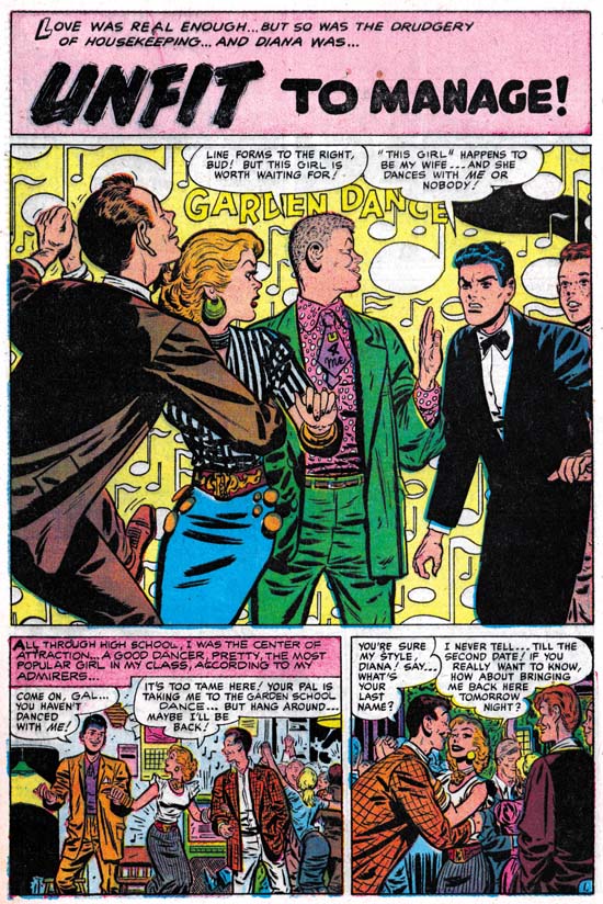
“Unfit to Manage” by Bill Draut

In 1956 Jack Kirby was doing pretty much all the artwork for the Prize romance comics. This was after the failure of the Simon and Kirby publishing company called Mainline. It seems that Joe Simon was doing some editorial work for Harvey Comics. Jack provided some covers but does not appear to have done much else for Harvey. Although I believe Joe was the editor, I think it would be a mistake to consider these Harvey romances as Simon and Kirby productions. Some of the artists had been doing work for these comics before Joe was editor. Also the format of the stories did not change with Joe’s arrival. But two regulars for Simon and Kirby productions, Bill Draut and John Prentice, started to provide material for the Harvey romances. I presume this helped these artists to makeup for the loss of work from the Prize romances since Kirby was now doing all of that. For reasons that can only be guessed at Mort Meskin, another S&K regular, never made the transition to Harvey.

I must admit I generally prefer the S&K produced romances over the Harvey comics. The Harveys tend to be done to a formula while the S&K productions are more variable. But there are some real gems in the Harvey romances and it probably is not a coincidence that these tend to occur with Simon as editor and Draut or Prentice as artist. “Unfit to Manage” is one of those small masterpieces.

Bill Draut is one of those artists that nowadays tends to be overlooked. Part of the problem was that much of Bill’s work was for the romance comics, a now pretty much extinct genre. Further most of Bill’s work was for Simon and Kirby productions. This meant that he was overshadowed by Jack Kirby (weren’t most artists?). Some of Bill’s work has even been attributed to Jack (here, and here). Finally after S&K, Draut went to DC where his art seemed to suffer. I suspect he was trying to adapt his drawing to be more like the DC house style. Although I am not very familiar with this period it seems to me that Bill lost some of his best features without gaining enough in his newer manner.

The panel layout for the first page of “Unfit to Manage” is one very typical of Harvey romances. But the splash panel itself is a real gem. The background is a field of floating musical notes and the words “Garden Dance”. The “Garden Dance” might suggest a banner but otherwise the background is abstract. This sort of suggestive rather then depicted background was a device rarely used in S&K productions and probably never by Kirby. Here it is very effective for Draut and there is little doubt that we are in some dance. An especially good touch are the characters that Bill presents almost like they are some sort of frieze. Starting from the left we find a young man so engrossed in his dance that he is oblivious to the unfolding drama. What a dancer he is with his left leg brought up high and his head thrust back. Next is is partner who has already stopped dancing and looks surprised to our right. The next character is what I am sure was meant to be a hipster. Was the somewhat comical figure he presents due to our modern eyes or was it apparent when the comic was published? Look at that wild shirt and the incredibly short but wide tie that reads “U 4 Me”. Our hipster asserts his right to be the woman’s next dance partner. Our eyes are continued to be directed to our right by his turn of the head. Our direction to the right is finally halted by an angry man looking in the opposite direction. He declares himself the woman’s husband and denies others any dancing privileges. Although limited to half a page, this splash panel does everything you could expect of it. It is visually interesting, the composition controls what we see and when we see it, and that with a few short sentences provides a summary for the story to entice the potential purchaser.

In the story we find a popular and fun loving young woman. Surprising she falls in love with a young man who acts older then his years. The woman does try to be a dutiful wife and then mother, but still enjoys going out. The husband reluctantly indulges her until he looses his job. Unable to support their nice house and the life style his wife enjoys, the man wants to move. The wife refuses to go along and the man leaves with the child and divorce court follows. The lady finally recognizes what she is about to loose and convinces the man to try again before the divorce becomes final. It is a well written story. The overall story of couple meet, couple have problems and couple reunite at end is a standard for romance comics. Keep in mind other that genre at that time such as superhero comics followed their own predictable overall formulas. But “Unfit to Manage” has enough variations within that story outline to make it rather different from most romance comic book stories.

I am unable to read these older romance stories without reflecting how much different the world that they project is from our present one. Actually that is one of the things I enjoy about these romance comics. In “Unfit to Manage” the woman is presented in a bad light while the man comes off rather lightly. This despite the fact that in one scene the woman reaches for her child who the man grabs and raises out of her reach. I am sure that such a use of a baby as pawn in the battle between a couple continues today, but most of the public would consider it unacceptable behavior. The divorce court is interesting because the judge clearly is taking the man’s side and is about to award him custody. But it is not at all clear that the woman’s action were truly so negligent as to justify such an action. Of course a comparison between now and then was not original a goal for such a story. But that does not mean it cannot or should not be one for us today.

The Wide Angle Scream, “Terror Island”

Stuntman
Stuntman #3 (unpublished) “Terror Island”
Enlarged view

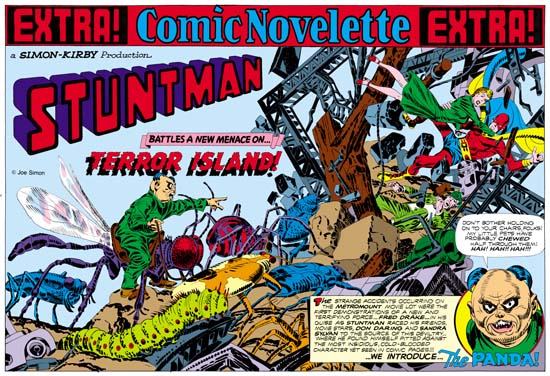
Joe Simon and Jack Kirby must have had high expectations for their creation, Stuntman. There exist three double page splashes that were never published, at least not as regular Simon and Kirby productions. Since S&K always placed their wide splashes in the centerfold, this meant that they had already started working for up to Stuntman issue #5. That is until the post-war comic book glut caused the early demise of their new comic books. Joe still has the three splash pages and with their double size art they are really marvelous to behold. However when reduced to the size necessary for use on the Internet they can be difficult to appreciate. Therefore I hope my readers will understand that I felt it necessary to provide my own coloring for use in this blog. I would have like to have used the color version that Joe did for his book “The Comic Book Makers” but so far I have not found it in his collection. The “extra!” strip on the top, the “a Simon-Kirby Production” and the Stuntman title are missing from the art and I provided them from other wide splashes. Glue marks clearly indicated that the “extra!” strip is was present, or something like it. However I did not scan the original art (it is much too large) and the source of the image does not indicate the placement for the “production” (if it was even present) or the title.

Because two of the double splashes are completely inked I am not absolutely sure which was originally meant for Stuntman #3. I choose “Terror Island” to post on first. However this choice was not completely arbitrary. As mentioned above “Terror Island” clearly had an “extra!” along the top a feature that it shares with the double wide splashes for Stuntman #1 and #2. The other completely inked splash did not have this “extra!” strip, the lack of which it shares with the unfinished Stuntman double splash.

Mao Tse-tung“Terror Island” introduces a new antagonist, the Panda. Of course Stuntman had faced various opponents in his previous stories but they all were rather generic. None of the earlier villains really stood out and it is clear that none were ever meant to reappear in future Stuntman stories. The Panda seems special and I believe was Simon and Kirby’s first attempt to create Stuntman’s nemesis, the equivalent of the Red Skull for Captain America. Basing a villain on a panda may seem an odd choice, after all what could be more cute and cuddly then a panda, at least in the mind of the public. Sure Jack draws the Panda to look as vicious as possible without loosing his panda look. But the real source for this character is not the bear, but China’s leader Mao Tse-tung (nowadays his name is normally transcribed as Zedong). Today with all the world companies scrambling to get a share of the Chinese market it is easy to forget at that time communist China was a very closed society. As China’s leader and his with description of the U.S. as a “paper tiger” Mao was considered a special menace. Still it is not at all clear whether the Panda really could fulfill the role Joe and Jack were casting him for.
The art for this wide splash marked a new approach. All previous double splashes were actually composed of various different sections. But for the “Terror Island” splash no similar attempt was really made. It is true that there is some introductory text and a round panel portraying the Panda, but this hardly compares to the cast of characters often provided in older double splashes. Yes it is also true that space has been left in the upper left for the titles, but no art is associate with these titles. What we are presented with for the first time is an enactment that dominates the entire splash. But what a scene! It sprawls across the pages from the lower left to the upper right. It is just the sort of chaos that we have seen before in the Boy Commandos wide splash. There is some control over the composition. The Panda and his attacking bug army occupy the left page. All are advancing toward the right where we find Stuntman, Sandra Sylvan and Don Daring amid a mass of falling wreckage. Although the uncolored ink art might be a bit confusing, I am sure Jack (who did the penciling) knew how much the final coloring would help to make it understandable. This splash is one of those that Jack could just let his imagination run wild. Previously when discussing the cover for Adventure #98 I had mentioned how Jack was often inaccurate when drawing animals but nonetheless was very successful in giving them a certain life. This splash provides and example of what I meant. A biologist would shudder and the giant bugs Kirby presents us with. Some of the inaccuracies can be explained by the needs of the subject. The wasp like insect that the Panda is mounted on could never fly with its wings in their present location. But if that beast’s wings were in the correct position the Panda could not mount it. But other errors have no artistic excuse. The legs of the insects and the spider are attached in the most bizarre places. If Jack used a biology book for a reference he obviously did not make any attempt to follow it closely. Regardless of these “errors” these giant bugs have a very menacing life to them.

My personal preferences is for the earlier wide splashes with their greater emphasis on design. But there is just no denying the shear brilliance that radiates from these post war double splashes. When you look at the original art for the “Terror Island” splash there are no signs of hesitation or rework. Jack seemed to have it all figured out in his mind before he put it on the illustration board. But with such a complicated drawing how was he able to do that? It just astonishes me.

Kirby Or Not, Young Romance #84

Young Romance #84
Young Romance #84 (October 1956)

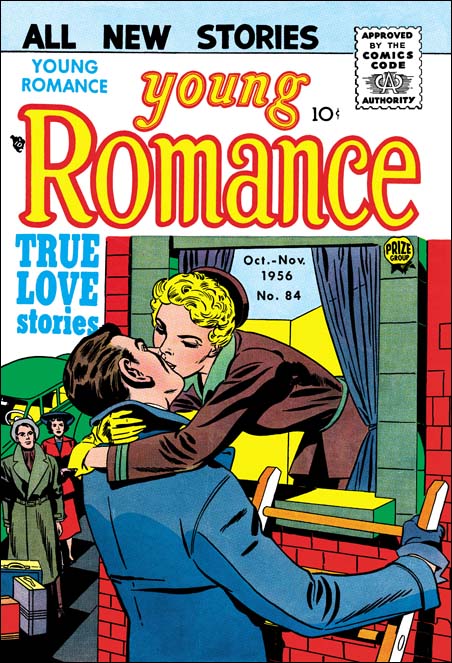
The Jack Kirby Checklist does not include the cover for Young Romance #84 among works by this artist. Unlike my previous post on YR #85 in this case I can understand why. The woman has an angular face which is not typical of Jack’s work. The man’s face is of no help because it is almost completely hidden. But the man’s overly large ear is one clue. In earlier years, particularly while working for DC, Jack always seemed to make large ears for heads viewed from the back. Later Kirby seemed to make a conscious effort to correct this. But he would still slip into his old habit from time to time as in this cover. Another Kirby touch, although by no means unique to him, is the perspective view provided here. Jack was the master of the use of perspective. But for me it is the couple looking up on the left that provides the best evidence that this cover was penciled by Kirby. Despite their small size, or perhaps because of it, they seem to be classic examples of Jack’s distinctive background figures.

YR #84 was one of the comics from the period where Kirby was doing almost the entire comics for all the Prize romances. Previously in “The End of Simon & Kirby” I posted on this period. In that blog post I commented that some of the outline inking in these all Kirby romances seems to have been done by Bill Draut. Although it is difficult to be sure, I suspect Bill may also have done outline inking for the YR #84 cover. The simplicity of the woman’s eyebrows reminds me of Draut. I hasten to add that woman’s face it not due to Bill. Although not typical of Kirby, the woman is even less typical of Draut. In particular Bill preferred much longer eyebrows. The spot inking for this cover was not done in Bill’s own manner either. Most of the spot inking for the all Kirby romances seems to have been done by Jack himself and I think that is true for this cover as well. Inking for the all Kirby romances ranges from the exceptionally beautiful to the rather poor. My suspicion is that with all the work Jack was doing sometimes he was quite rushed and the inking would therefore either suffer or be minimal. The inking for YR #84 is an example of a job done well but with limited amounts of spotting.

The main part of the story depicted on the covers is pretty obvious, the ladder indicates that the man and woman are about to elope. I am less clear about the part played by the couple on the left. With the bags in front of them it is certain that they are not just on lookers. Either this is going to be a double marriage (the bags are theirs) or they are going as witnesses (the bags belong to the foreground couple). In either case the car that will be used to take them all away is parked behind them. Like most Simon and Kirby covers this one is carefully crafted. But it is constructed to best tell the story, not to be the equivalent of a snapshot. The ladder the man is on is way to far to the right of the window. It is hard to believe that the woman could safely transfer to the ladder. But placing the ladder correctly in relationship to the window would mean the man would also be moved more to our left. This would be disastrous to the composition, all the figures would be on one side of the cover while the other would be pretty much bare. Correcting the ladder placement would also mean covering the background couple and hurt the story that the cover is meant to tell.

Kirby Or Not, Young Romance #85

Young Romance #85
Young Romance #85 (December 1956) by Jack Kirby

I have renamed this topic from “Not Kirby” to “Kirby Or Not”. The title was fine originally since most of my post were about entries in the Jack Kirby Checklist that attributed work to Jack that was actually done by other artists. But lately I have delt with some work actually done by Kirby that was not included in the Checklist. The greatest majority of errors in the Checklist are those that falsely attribute work to Jack, but there are some of the opposite mistakes. I believe this imbalance is due to the fact that most experts look for “signs” of Kirby but fail to look for indications typical of other artists. Jack Kirby was much respected among artists and influenced their work either directly (swiping), indirectly (model), or all the grades between. Since experts are not always carefully watching for indications of other artist “fingerprints”, the tendency will be to err on the side of falsely attributing work to Kirby.

This particular cover comes toward the end of the Simon and Kirby collaboration. Previously they had tried to launch their own comic publishing company called Mainline. During the Mainline period Jack stopped penciling anything for the Prize romance comics, although I believe S&K still produced these comics. I suspect the business effort involved in Mainline was more then Joe could handle and so required Jack’s involvement also. Artists like Ann Brewster, Joe Albistur and John Prentice would take the place in these romance comics of the missing Kirby. But when Mainline finally failed Jack returned to doing work for Prize romances with a vengeance. For about a year Kirby would do pretty much all the art for Young Romance, Young Love and Young Brides. Such all Kirby comics were pretty unusual and had only occurred once before when S&K turned Headline into a crime genre comic. In the case of Headline all Kirby comics were done because Joe and Jack were trying to start up their studio after a previous failed attempt (Stuntman and Boy Explorers Comics). Once Headline was shown to be successful S&K began to use other artists. The late all Kirby romances was probably a similar attempt to restore the studio after the Mainline failure. If so it was not successful and Jack would begin doing freelance work for DC and Atlas.

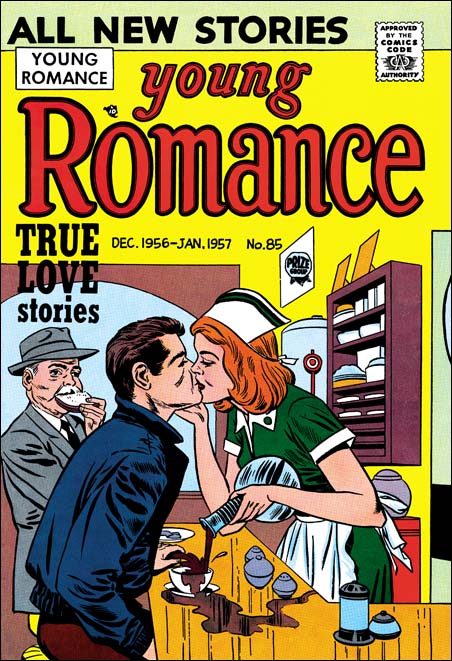
I do not know why the Checklist missed attributing this cover to Jack. It seems a pretty obvious Kirby to me. I am not sure who did the inking but it was not the greatest job. The poor inking does have the affect of hiding Jack’s more subtle penciling. But the elderly man appears to be one of Kirby’s stock background characters.

Although not the best romance cover that Jack penciled I am still rather fond of it. It is pretty obvious that the humor was supposed to be the waitress so intent on the kiss that she fails to stop pouring the coffee. But for me the real humor is the old man. I love the way he stuffs his face with the piece of bread as he observes the couple.

The Wide Angle Scream, Stuntman #2

Stuntman #2
Stuntman #2 (June 1946) “House of Madness”
Enlarged view

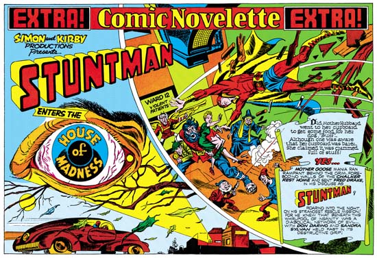
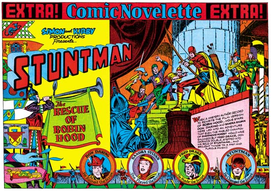
When I finished up the posts of the Captain America double page splashes I said that Simon and Kirby would not repeat those sort of designs. Well I lied. Stuntman #2 has the same sort of emphasis of design over composition seen in the Cap spreads. It is interesting to compare this splash with one from the Boy Commandos with a similar medieval theme.

I have hoped that my discussions on the design elements would make it clear what the distinction was between design and composition, at least as I use the terms. Composition is how a scene is arranged, that is in comics how the figures and non-figurative elements are arranged and how they direct the eye. Design is how disjoint parts, the text and different images, are arranged on the page. For instance in the image on the right side of Stuntman #2 is composed with the attacking knights starting on the lower left and rising as the eye goes toward the right until it meets the pivotal Stuntman and finally the defended Don Darling and Sandra Sylvan. The composition does not end there as the large candlestick brings the eye down, and (although not really part of the scene) the cast of characters bring the eye back to the start of the image. Actually that is just a condensed description. Notice the use of arcs (the curtains, shadows, the stonework for the pillar and the doorway) along the top and how they are used to highlight certain figures. Particularly effective is Stuntman’s placement in front of the pillar, despite the fact that he is closely surrounded by other figures this placement makes him standout. This is a marvelous composition and Kirby’s penciling is just fantastic.

But the right hand scene is just part of the page and that is why I said earlier that the design was more important then the composition in Stuntman #2. Like most of the Cap double splashes, here we find a three part layout. Starting on the left is the title section, followed on the right by the enactment and below with the cast of characters. The title compartment depicts an archery contest. On the left a series of colorful pendants almost hide a figure blowing a horn. The competition between four archers is arranged along the bottom. The archers are alternated with their targets, the backs of which provide the cast of characters. The rest of the title section scene is left bare so that the Simon and Kirby credits, the Stuntman title and the story title are prominently shown. The story title is nicely placed on the drape hanging from the horn, a similar device was used in the Boy Commandos spread. An interesting touch is how the introduction text is placed on a wall in the enactment section and how the text is lined up to fit the perspective of this wall.

Except for the left edge of the enactment compartment, the whole splash is nicely integrated. I find this a much more successful effort then that for Stuntman #1. It is really a shame that this title fell victim to the post-war comic glut. There are three unpublished double page splashes for Stuntman. Unfortunately I do not have any scans for them right now but perhaps I will get a chance to pick up something from Joe Simon.

The Art of Joe Simon, Appendix 5, Harvey Hits #12

Harvey Hits #12
Harvey Hits #12 (August 1958) by Joe Simon

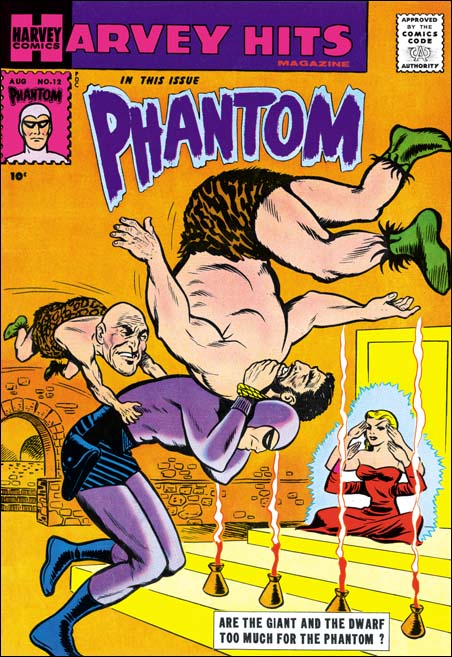
The S&K publishing attempt, Mainline Comics, had failed. The last titles from this company were published by Charlton but that ended in September 1955 (cover date). Further Simon and Kirby productions would follow but without much success. By 1957 Jack Kirby was doing freelance work for DC (Challengers of the Unknown) and Atlas (Yellow Claw). Still further attempts to reboot S&K followed but no financial jackpots. Although there is some evidence that Joe did some solo editorial work for Harvey, unlike Jack he did not seem to do any art. Perhaps Harvey Hits #12 (August 1958) is Joe’s first standard comic book art since the breakup. I use the term standard because there was an advertisement comic Joe produced earlier. I have also seen a proof marked Harvey Hits #1 but I do not know if it was actually published.

Perhaps it is an unfair comparison because Joe had a larger area to work with, but I feel Joe did a much better job on the Phantom and characters then the artist who did the story inside. The story probably was a reprint of the syndication strips. Joe has combined two different scenes, the fight and the appearance of the four armed lady. This rather odd throw that the Phantom uses comes from the story, but Simon makes it a lot more interesting. He even has the dwarf jump in like some sort of tag team wrestling match.

I rather like the cover that Joe has come up with here. Joe does not have Jack Kirby’s talent (who did?) but he still can do a great job. But it is hard to believe that anyone would mistake this for a Kirby piece. However that is exactly what the Overstreet guide does. Using that as an authority, dealers continually sell this comic because of the Kirby attribution. What do you think, willful ignorance?

Art by Joe Simon, Appendix 4, Daring Adventure #16

Art by Joe Simon, Appendix 7, The Spirit #12

The Wide Angle Scream, Stuntman #1

Stuntman #1
Stuntman #1 (April 1946) “House of Madness”
Enlarged view

When Joe Simon rejoined Jack Kirby after the war rather then just return to working for DC the two decided to produce their own comic books. They turned to Joe’s old friend Al Harvey to do the publication for Stuntman and Boy Explorers Comics. Now they had complete control over the contents and did not have to deal with DC’s editors. Wishing to recreate the success they enjoyed with Captain America S&K returned to the use of the double page splash in Stuntman.

The first Stuntman wide splash, “House of Madness” was published three years after the Boy Commandos splash. But the Stuntman Splash does not continue with the type of layout used in the Boy Commandos. Nor does Stuntman look back at the approach for double wide splashes found in Captain America. Instead we find Simon and Kirby using an entirely new design approach. In Stuntman we find two sections separated by a sweeping gutter, as if the splash was composed of two large irregularly shaped story panels.

The left panel starts at the top with the declaration that this is a Simon and Kirby production of Stuntman. The story title, “House of Madness” is embedded in the iris of a large bloodshot floating eye. Proceeding down we see that the eye appears to be some sort of projection by a beam emanating from a building complex on the lower right of the panel. As if in response to this signal, a car races in from the left. It is hard to be sure who the driver is but the red head and blue “collar” suggest it might be Stuntman at the wheel.

The right panel shows a scene of typical Kirby composition. Perhaps composition is not the best term, because Jack laid out his figures more with the intent of covering the area and not as much concern about unifying the movement. We find Stuntman in the midst of a leap. He has just physically burst into the room, the pieces of wood debris are falling with him. It might seem that if you project his flight Stuntman would miss the crowd shown below. But Simon and Kirby splashes (and covers also) should not be taken so literally. Had S&K tried to present a more “correct” representation we would have been presented with the soles of Stuntman’s feet and would not have been able to see his face. No, we can be sure that Stuntman is truly about to attack the crowd below. His opponents include a bearded giant holding Don Darling and Sandra Sylvan easily under each arm. Also appearing is a modern day Icarus about to take flight, a gun firing dwarf and a witch. A sign makes it clear that these characters are both crazy and dangerous.

Including in the panel is text written on what appears to be a scroll like piece of paper. From this text we are provided with the information that it really is Stuntman in the car racing toward a mental hospital to save his friends from the danger of an insane but evil group.

I have mixed feelings about this particular splash. On the one hand it is an interesting idea to use two enactments to introduce the story. However you really need to read the text in the second panel to realize what the first panel is meant to depict. Further there is really little to visually connect the two panels. All there is is the text banner along the top and the partial overlapping by the Stuntman title. Otherwise the panels provide very different views and compositions. This two scene design for a wide splash would not be repeated.

Kirby swipes from Simon

Black Cat #8
Black Cat #8 (November 1947) “The Madness of Dr. Altu” by Joe Simon

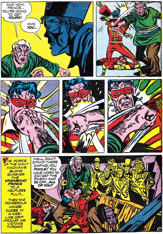
To swipe means to whip, to give a sweeping blow. But today it is more commonly used as a slang for to steal. In comics arts it means to copy a design or drawing, but still carries with it the connotation of theft. For many comic fans to show that a comic artist has swiped is paramount to saying that he is an inferior artist. With the artists Jack Kirby and Joe Simon the verdict in the past was generally Kirby = no swipe = good, while Simon = swipe = bad. I would like to think this attitude is changing. Tom Morehouse for instance has done some fine scholarly investigations that reveal the sources for some of Kirby swipes. Jack used this practice long after his period of collaboration with Simon. Actually Kirby’s collages can be considered a form of swiping.

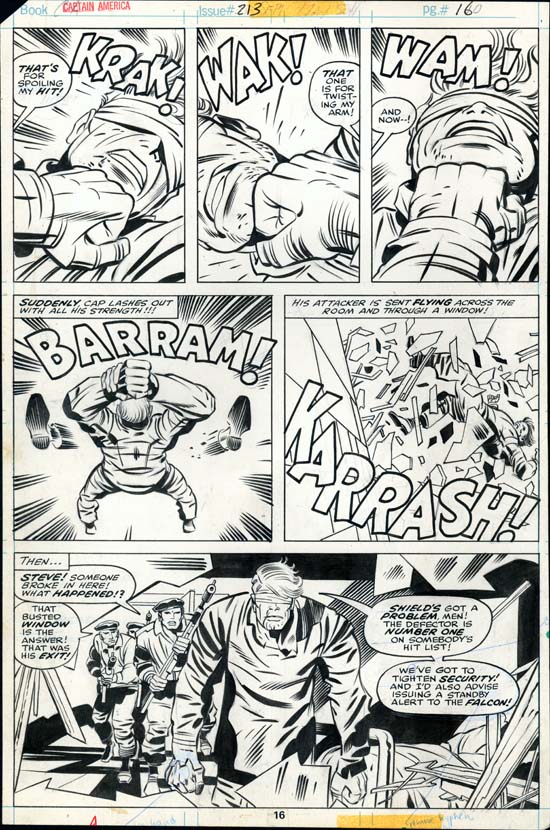
Captain America #213
Captain America #213 (September 1977) “The Night Flyer” by Jack Kirby (original art)

Much has been said about Joe Simon swiping, including here in this blog. It is not surprising that one of Joe’s favorite sources is Jack Kirby. For example Joe used a close copy from Captain America #7 when he put together the cover for The Adventures of the Fly #2 (the cover is shown in Chapter 12 of The Art of Joe Simon). Here I would like to present an example of Kirby swiping from of all people, Joe Simon. Jack’s source was a set of panels that Joe did for a Vagabond Prince story “The Madness of Dr. Altu” in 1947. The use of three panels with close-ups of a face being hit by a fist also occurs in a Captain America story (“The Night Flyer”) by Jack Kirby done 30 years later. It is not a direct copy, Jack would not need any help on how to present such close ups, but it is a swipe nonetheless. I do not think it is a coincidence that in both cases it is the hero of the story receiving the punishment. However there are interesting differences also. In Joe’s story the hero, Prince Vagabond, is initially defeated by his opponent. A short time later there is a re-match which of course the hero wins. That is a plot device more frequently used today but was rather unusual at the time Joe did it. In Kirby’s example a blind and out of uniform Captain America is the receptor of the villain’s blows at the start, but Cap is victorious by the end of the page. Jack does this in an interesting formal device of using panels in a 3/2/1 vertical tier.

Donatello and Michelangelo
Saint John the Evangelist (1412-15) by Donatello and Moses (1513-1516) by Michelangelo

I use the term swipe because it is so entrenched in comic art discussions. But I have to admit I am rather uncomfortable with the word and it’s subtext of stealing. There is no similar expression in the fine arts. No one would speak of Michelangelo’s Moses being swiped from Donatello’s Saint John (By the way the Michelangelo and Donatello I am referring to are Italian Renaissance artists, not mutant ninja turtles). In the fine arts there is a better, richer, understanding on how artists really work. Art is not created from a vacuum by the artist acting alone like some deity. Instead artists (this includes comic artists) extract from previous art, from other art fields, and even from real life. The artist then combines these resources adding his own personal touch into a new piece of art. Recognizing that allows one to appreciate what individual artists bring to their own work and how art continually evolves.

The Art of Joe Simon, Chapter 12, Covering the Fly

When I “completed” my recent serial post “The Art of Joe Simon” Stan Taylor pointed out that I had left out Joe’s work on the Archie series “The Adventures of the Fly”. What a slipup! I have renumbered the chapters so that this one gets in the proper sequence. The stories are obviously the work of a number of different artists. Sorting out who did what would be a Herculean task which I am not prepare to venture into at this time. But I get the impression that Joe did little, if any, of the actual interior art. However Joe was involved in all the covers. In fact the Fly covers supply a full range of Simon’s working methods.

I included an image for the cover for Fly #1 (August 1959) in Chapter 10 of “The End of Simon & Kirby”. This cover was made from stats of the double page splash by Jack Kirby, the various parts rearranged to fit the cover properly. I say the cover was made from the splash and not the other way around because the original art for the splash still exists and it includes no stats. It is not certain, but Joe was probably responsible for the physical construction of the cover. Of course that does not take away credit and Jack Kirby should be regarded as the primary penciler for this cover.

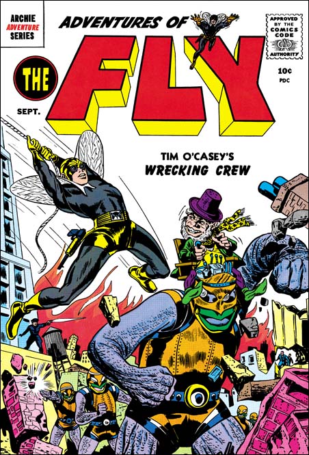
Adventures of the Fly #2
Adventures of the Fly #2 (September 1959) part by Joe Simon

The cover for Fly #2 (September 1959) is generally attributed to Jack Kirby. But I believe Simon put it together using different sources. Joe did the figure of the Fly swiping the pose from Captain America #7. I do not believe that Joe drew the diminutive robot operator it looks like he was done by the same artist that did the interior story and is not a swipe. The robots on the cover however are done in a very different manner then the story. It could have been done by a different artist but it seems unlikely. The operator and the robot fit together so well it is hard to believe that different artist could have done them.

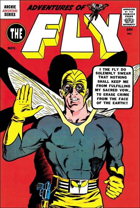
Adventures of the Fly #3
Adventures of the Fly #3 (November 1959) by Joe Simon

With the third Fly cover Joe appears to turn to a more standard penciling approach. It is not possible to prove swiping was not used. Nevertheless the pose seems to be original and not a copy. Joe told me once that he used himself as a model drawing in front of a mirror.

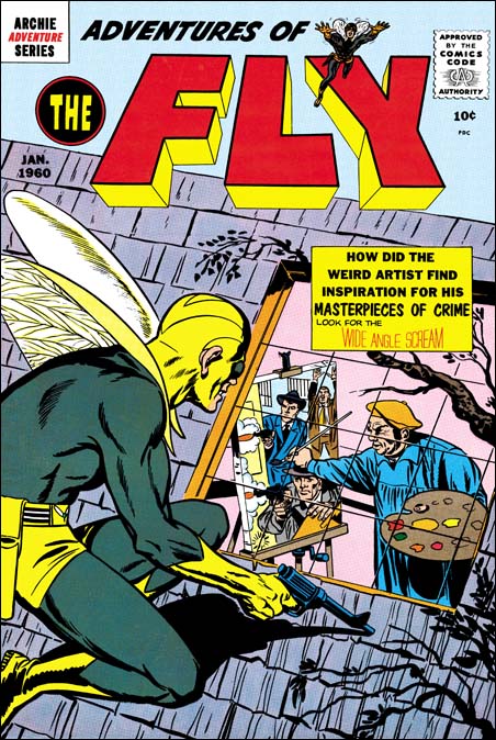
Adventures of the Fly #4
Adventures of the Fly #4 (January 1960) by Joe Simon

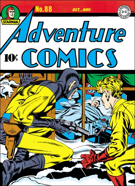
For the cover of the last Fly comic that he produced, Joe turned to what was for him a more standard technique. That is doing the entire cover and turning to swipes for portions of it. The source for figure of the Fly was the Sandman from the cover of Adventure #88 (see below). As by his normal practice, Joe did not do a close copy, but altered it to suit his purpose. The pose is adjusted slightly, largely because Sandman was squatting on a flat ground while the Fly is on a slanted roof. But the position of the right arm was also modified. Joe also corrected Sandman’s ears which Jack had made oversized as he so commonly did at that time. In the end even though the source was Adventure #88 the finished product was all Joe’s. I cannot say if there are any other swipes on this cover, but I would not rule it out. At this stage in his career, Joe is very adept at what he does and this is a nicely designed cover. Yes swiping was used but it is so well done that we know about it only by comparing it to the source material (Adventure #88). Otherwise there is nothing about the cover that gives it away.

Adventure #88
Adventure #88 (October 1943) by Jack Kirby

Art by Joe Simon, Chapter 11, The Party Is Over

Art by Joe Simon, Chapter 13, Wrap Up

Art by Joe Simon, Chapter 11, The Party Is Over

After “48 Famous Americans” S&K entered a period of abundant work mainly producing crime, horror and romance genre comics. As far as I can tell, Joe did not pencil anything during this period. I say that rather hesitantly. While working on my serial post “The End of Simon and Kirby” I reexamined a lot of S&K material. Suddenly I realize one story that I always thought as drawn by Kirby and was listed in the Jack Kirby Checklist had actually been done by Joe Simon. It seemed pretty obvious and I was quite surprised that I did not notice it before. I will discuss this story below but the point is if I had missed that work by Simon I might have missed others.

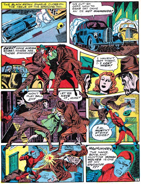
Adventure #75
Adventure #75 (June 1942) “Beware of Mr. Meek” by Jack Kirby

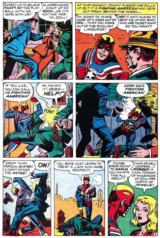
Fighting American #6
Fighting American #6 February 1955) “Deadly Doolittle” by Joe Simon

When we approach the end of the Simon and Kirby collaboration, work penciled by Joe reappears. However in some cases saying Joe is the artist depends on you think what makes someone the creator of a piece. In his book “The Comic Book Makers” Joe describes an incident where S&K got caught by Prize for reusing old romance art with new scripting. So far I have not found the stories that Joe is talking about. But in Fighting American #6 (February 1955) there is a story “Deadly Doolittle” that clearly was redone from “Beware of Mr. Meek” a Manhunter story from Adventure #75 (June 1942). But the FA story was not made by reworking stats from the older comic to change the uniforms, rather the entire story was redrawn. Much of this was done to remove some older layout techniques that Simon and Kirby no longer used. Early in their collaboration parts of figures would frequently extend well beyond the panel edges entering other panels. The FA story was redrawn so that things remained in their panels. But this was not done by just eliminating the parts outside of the original panels but by recomposing the panel instead. I find Simon’s touch in all of this work. It is particularly interesting to see Joe redo some of Jack’s classic socko punches. Joe tries valiantly but does not quite succeed in capturing Jack’s effect. I find a lot of Simon touch in this story and all the Kirby effects seem to be transmitted through Joe’s sensibilities.

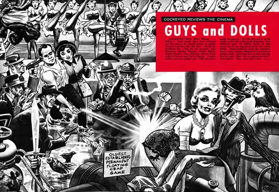
Cockeyed #4
Cockeyed #4 (April 1956) “Guys and Dolls” by Joe Simon
Enlarged view

The last piece of worked signed jointly as Simon and Kirby is the unusual “Guys and Dolls” that appeared in the Mad-takeoff Cockeyed #4 (April 1956). This is included in the Jack Kirby Checklist, although I really cannot say why. The art looks much closer to cover work that Joe would do later for Sick then anything I have seen Jack do. Further the visual humor looks like Joe’s and does not seem to match Jack’s humor work. For me the most convincing evidence is that this works appears to have been done with an air brush. Joe Simon was a master with this tool having learned it while working for a newspaper at the beginning of his career. He would return to using it for not only the Sick covers but also for some of his advertisement work. I have seen nothing that indicates Jack had done any air brush art.

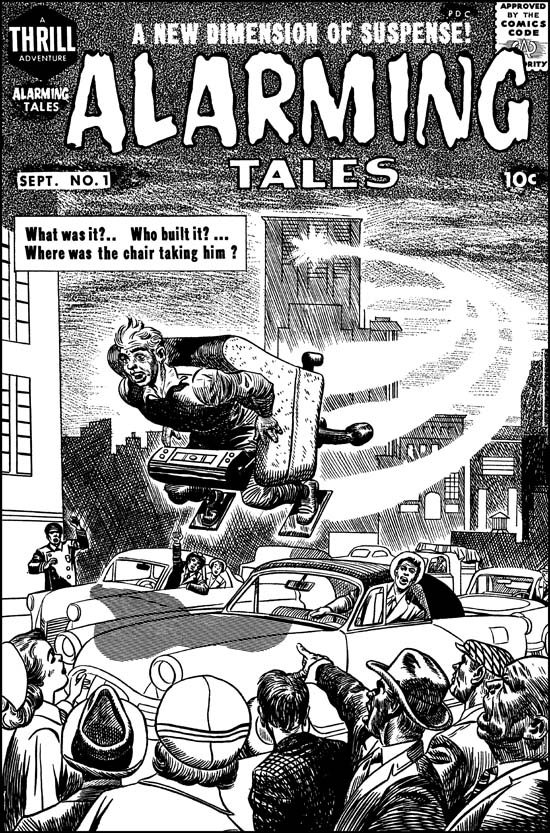
Alarming Tales #1
Alarming Tales #1 (September 1957) by Joe Simon

I doubt many would say that the figure in the flying chair and the background from the cover of Alarming Tales #1 (September 1957) were done by Jack Kirby. I clearly see Joe’s touch and believe he did this cover. But I can see why many see Kirby’s presence in the bottom part of the cover. I feel Joe did this portion also but he is swiping or mimicking Jack for parts of it. I presented a color image in a chapter of the “End of Simon and Kirby”. But the coloring makes it difficult to clearly see the figures, so above I provide a restoration of the line art. To me the lady on the left and the man looking out of his car seem to a have Kirby look to them. But the man pointing (third from right) and the man on the far right look more like the work of Simon.

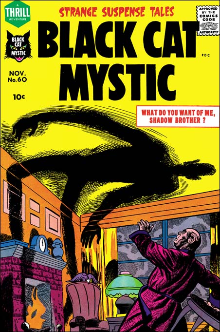
Black Cat #60
Black Cat Mystic #60 (November 1957) by Joe Simon

Not long after Alarming Tales #1, Joe did a cover for Black Cat Mystic #60 (November 1957). Notice the similarity of the man with the two from the AT #1 cover.

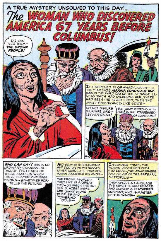
Black Cat #60
Black Cat Mystic #60 (November 1957) “The Woman Who Discovered America 67 Years Before Columbus” by Joe Simon

Black Cat Mystic #60 has the story drawn by Joe Simon that I mentioned at the beginning of this post. This short (2 pages) story is listed in the Jack Kirby Checklist, but as I said I now disagree with that attribution. We have in this work Joe mimicking Jack quite successfully. The men have a Kirby-ish look but a careful examination of the eyebrows reveal the more simple form that Simon preferred. The woman also comes from a Kirby source, such as some of the unused covers for Black Magic #1. But the woman’s eyes give away the fact that this was Joe’s pencil work. The hand of the woman in the splash panel is not drawn the way that Kirby would have done it. I am sure some will say that some panels of the second page of the Mayans were done by Jack. But I suspect even this includes subjects that were drawn from art history sources that both Joe and Jack used.

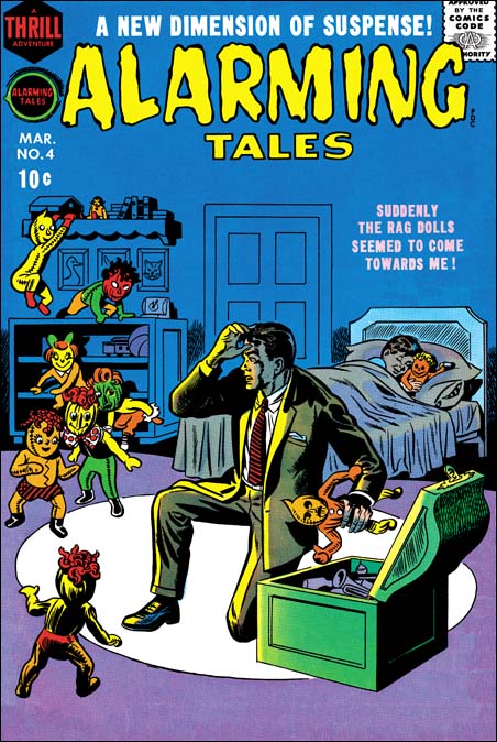
Alarming Tales #4
Alarming Tales #4 (March 1958) by Joe Simon

Covers begin to appear at this time where Joe seems to abandon any attempt of mimicking Kirby. I provide an image of Alarming Tales #4 (March 1958) as an example. Here we find a simpler style of drawing and inking that Joe will often use from here on. Once again Joe has adopts a new style.

Art by Joe Simon, Chapter 10, A History Lesson

Art by Joe Simon, Chapter 12, Covering the Fly