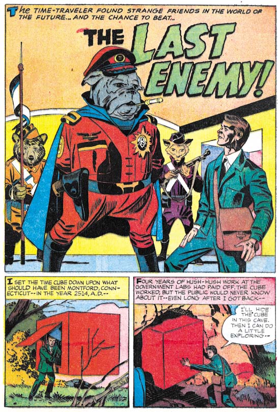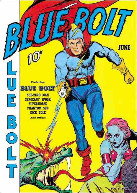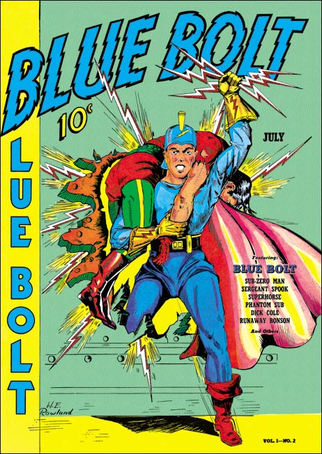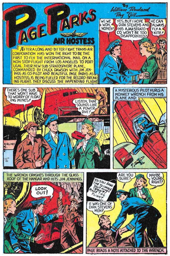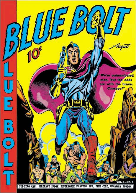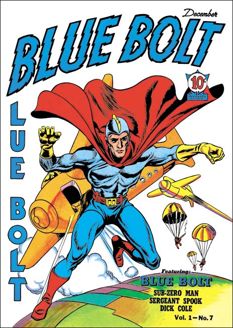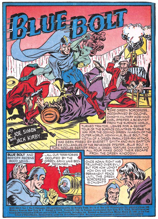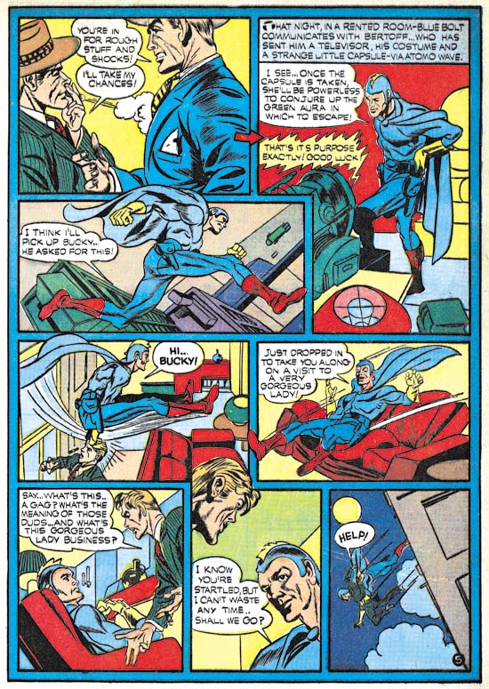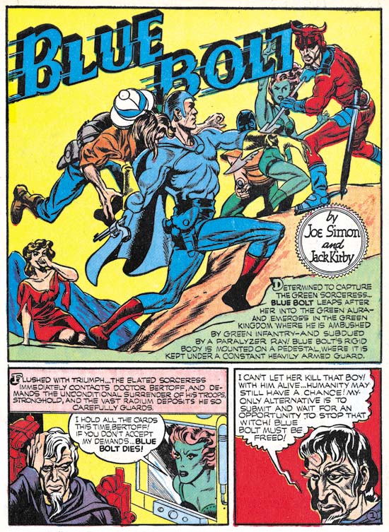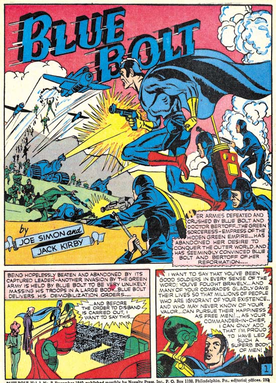
Blue Bolt #7 (December 1940) Blue Bolt, pencils by Jack Kirby, inks by Joe Simon, letters by Howard Ferguson
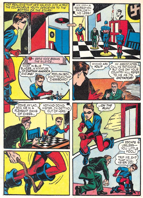
Blue Bolt #7 continues the Simon and Kirby collaboration in its purist form, that is with Jack doing the pencils and Joe providing the inks. The only other feature from December that showed such a degree of collaboration was the Black Owl from Prize Comics #7 which I will discuss below. Both of these features were done while moonlighting. As we will see below the features created for their regular gig at Timely were not quite the same joint effort.
The enlarging World War II, romance, betrayal, spies and assassins are just some of the elements of this engaging story. Simon and Kirby were not satisfied with telling a simple confrontation between a hero and a villain they had to put in as much as possible. Ten pages hardly seemed enough to fit all that they included. It does not seem that Blue Bolt had any significant impact on the rest of the comic book industry of the day but it should have.

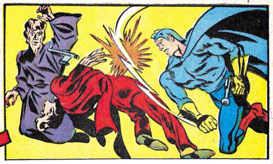
Blue Bolt #7 (December 1940) Blue Bolt page 8 panel 1, pencils by Jack Kirby, inks by Joe Simon, letters by Howard Ferguson (horizontally flipped image)
Sure Blue Bolt was science fiction but that did not mean that the hero always used a ray gun. Previously Kirby had a penchant for dramatic slugfests but now he began to take that art to a new level.
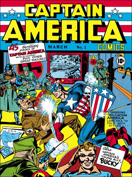
I present the above image in reverse…

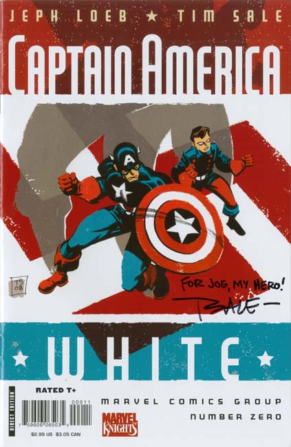
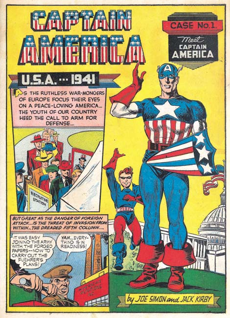
Captain America #1 (March 1941), pencils by Jack Kirby
as I want to highlight that roll Blue Bolt played in laying the groundwork for a future hit. Captain America would appear on newsstands just three months later.

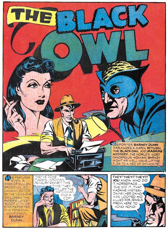
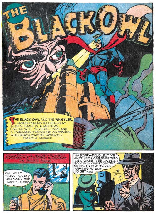
Prize Comics #7 (December 1940) The Black Owl, pencils by Jack Kirby, inks by Joe Simon?, letters by Howard Ferguson
Blue Bolt was not the only moonlighting job that Simon and Kirby produced for December they also did Black Owl for Prize Comics #7. Joe and Jack would end up doing a Black Owl story for three issues which I discussed previously (Simon and Kirby’s Black Owl). All three stories were reprinted in Titan’s “Simon and Kirby Library: Superheroes” (shameless plug). The Black Owl was not a Simon and Kirby creation and I really do not know much about previous appearances of the character. But of course Simon and Kirby added their distinct touch if in nothing more than the story and art.

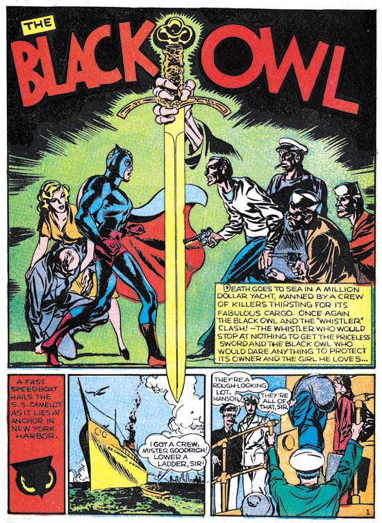
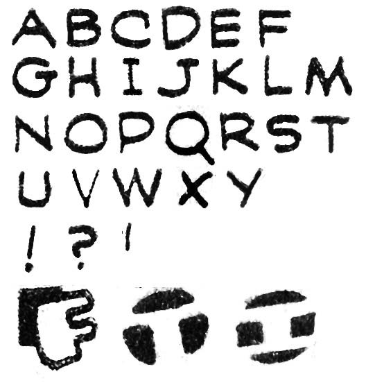
Prize Comics #7 (December 1940) The Black Owl, letters by Howard Ferguson
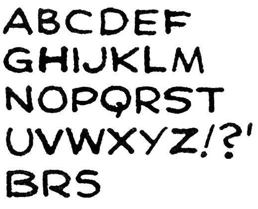
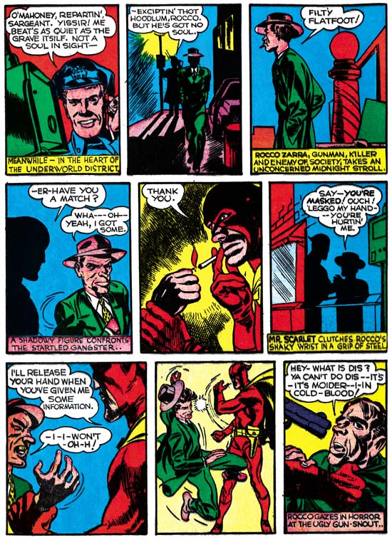
Howard Ferguson provided the lettering for the Black Owl story. I have previously provided the lettering samples for Ferguson’s Prize Comics #7 but I have since made a correction and some additions to it. A recap of the more useful features would seem in order. The most useful trait for identifying Ferguson lettering is the little vertical stroke attached to the upper end of the letter ‘C’. Another useful trait is the very shallow hook for the letter ‘J’ but unfortunately that is not a common letter. Some other traits are less useful but still should be noted particularly the way the upper portions of the letters ‘P’ and ‘R’ predominate over the lower portion. The letter ‘S’ is similarly often affected by a predominate upper portion but there is some variation in this feature. Another trait is found in some but not all ‘N’ is the manner that the left vertical stroke is sometimes tilted downward to the left somewhat. Perhaps not as useful than the letter ‘C’ but certainly easier spot is Ferguson’s special handling of the first letter in captions (examples are provided above). I believe all these traits (except the special ‘N’) were retained by Ferguson the rest of his career. I plan to review his entire career after I finish this serial post.
In is at this time that in my opinion Ferguson’s lettering has gone from good to great. This is not due to form of his letters which has changed only a little from previous work. Rather it steady and firm hand used and the spacing and legibility of the final results. Ferguson’s work is not mechanical but neither is it overly variable.
Besides an improvement in quality, the lettering differs from what was done not that long ago for Blue Bolt #5 (October 1940) by three changes.
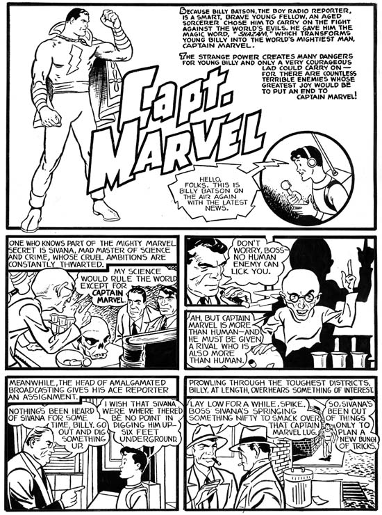
I have previously pointed out the special handling of the first letter in captions. Such enlarged and specially formed letters are similar to the first letter of chapters often found in older books. The analogy is not perfect but it is close enough that I have decided to adopt the name given to them, drop capitals (or drop caps for short). Drop caps were used by other comic book letterers but Ferguson began using a special version where the letter is created a negative space in a black field such as the two final examples in the image above. I shall refer to these as negative drop caps. It was the introduction of negative drop caps that is one of the things that distinguish Prize #7 from Blue Bolt #5. But there appears to be two flavors of negative drop caps. The first that appeared in Blue Bolt #6 and the Terry Vance feature from Marvel Mystery #13 (both November 1940) had vertically oriented letters. Later in Blue Bolt #7, Prize Comics #7 and the Human Torch and the Terry Vance features from Marvel Mystery #14 (all December 1940) Ferguson introduced negative spot caps that were tilted.
The second change in Ferguson lettering concerns the letter ‘G’. In Blue Bolt #6 (November 1940) and earlier Howard constructed the ‘G’ with a small horizontal element on the left side of the bottom of the character and does not extend to the right. In Prize Comics #7 and the Human Torch story from Marvel Mystery #14 (both December 1940) Ferguson extends the small horizontal so that it appears on both the left and the right side. Interestingly Blue Bolt #7 (December 1940) uses the old form of ‘G’ for most of the first page of the story while otherwise using the new ‘G’. The old ‘G’ is used in BB #5 (October), BB #6 (November) and the Terry Vance stories from MM #13 and #14 (November and December). As mentioned both forms of ‘G’ appear in BB #7 (December). Only the newer ‘G’ appears in the Human Torch of MM #14 (December).
The third change involves the form of the letters ‘I’ and ‘J’. Ferguson’s older form for these letters excluded any horizontal elements while the newer form did. While the letter ‘I’ is common enough, horizontal strokes are not supposed to be added when the letter is used with others to form a word. Unfortunately the isolated use of ‘I’ and the use of ‘J’ are not too common. The old form of ‘I’ and ‘J’ appear in BB #5 (October), BB #6, Terry Vance from MM #13 (November) and BB #7 (December) with the new forms used in PC #7 and the Terry Vance feature of MM #14 (both December).
With these three changes in Ferguson’s lettering it would seem possible to sort out the relative order that Ferguson lettered the work appearing in the months from October to December. Regrettably it turns out that no ordering is possible that will satisfy all three criteria for all cases. The few cases of lettering by Ferguson from later periods suggest that perhaps he was not consistent in his use of ‘G’. Hopefully this question will be answered as my review progresses.

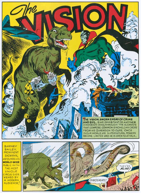
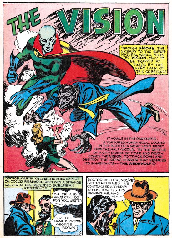
Marvel Mystery #14 (December 1940) The Vision, pencils, inks and letters by Jack Kirby,
The Vision became a regular Marvel Mystery Comics features with his second appearance in MM #14 (December 1940). As in the previous issue, Kirby would provide pencils, inks and letters for the Vision story. Even today the Simon and Kirby Vision is a largely neglected feature and at that time it was very much overshadowed by the Human Torch and the Sub-Mariner. (This story was reprinted in “The Best of Simon and Kirby”, another shameless plug).
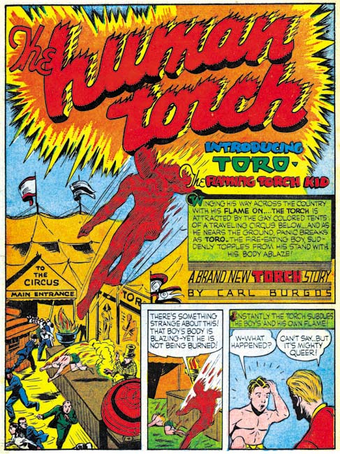
Lettering by Howard Ferguson also appeared in Marvel Mystery #14 in the Human Torch and the Terry Vance features.

Human Torch #2(1) (Fall 1940) the Human Torch “Introducing Toro”, pencils by Carl Burgos, lettering by Howard Ferguson
As mentioned in the previous chapter, Timely did not release a Red Raven #2 issue. Instead that titles mailing license was used instead for a new title, Human Torch Comics #2. That the first issue was numbered 2 has brought about confusion to the numbering of the title even back when it was released. I have added “(1)” to the issue number to indicate it is actually the first issue. The cover is dated as Fall 1940 which means there might be some question as to what month to assign it. However Marvel Mystery #13 (November 1940) and #14 (December 1940) have house advertisement for the Human Torch #2(1). The MM ads provides a release date of September 25. Normally comics are cover dated about two months after their release so it is seems appropriate to assign HT #2(1) to December.
This issue has been reprinted in the Golden Age Masterwork series. Unfortunately Marvel did a horrendous job re-creating it. I have discussed this previously (The Human Torch #2) but I feel I need to emphasize here that the reprint volume is useless for anything beyond a casual reading. It is simply not possible to use this reprint book to examine the art or lettering. Luckily I will be using scans from the original comic in my discussions here.

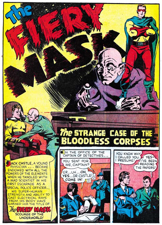
Human Torch #2(1) (Fall 1940) the Fiery Mask “The Strange Case of the Bloodless Corpses”, pencils and inks by Joe Simon, letters by Howard Ferguson
The Fiery Mask was one of Simon’s earliest creations having first appeared in Daring Mystery #1 (January 1940, Daring Mystery and Joe Simon BK (Before Kirby)). Another artist drew the character for Daring Mystery #5 (June 1940) but Simon returned with Kirby’s help to provide the Fiery Mask for Daring Mystery #6 (September 1940). Simon worked on the Fiery Mask one last time for Human Torch #2(1) (Fall 1940). I periodically get asked, but I really feel this was a solo effort because I cannot find any sign that Kirby had anything to do with this Fiery Mask story, “The Strange Case of the Bloodless Corpses”. Simon’s comic book art improved rapidly so that even though only a short period had past the art style for HT #2(1) Fiery Mask story shows it was definitely drawn when Simon became editor at Timely and was not some older inventoried story from when he first started working in comics. Still it would be nice to provide a more accurate date for the story as it theoretically have been done a few months earlier and inventoried or it could have been drawn later specifically for the HT #2(1) issue.
Fortunately the lettering Howard Ferguson did for the story may provide a clue. As mentioned before Ferguson’s work had been undergoing development during this period. The Fiery Mask story lacks negative drop caps and uses the older form of the letters ‘G’, ‘I’ and ‘J’. Therefore I believe it must have been done no later than the work for Blue Bolt #5 (October 1940). It likely was originally intended for Daring Mystery #7 which possibly was meant to be released in October or November but that publication of that issue was delayed until April 1941. Or alternatively it might have been meant for Red Raven Comics #2 which should have come out in October but that title got cancelled. But in any case the Fiery Mask story was done earlier than the Human Torch story in the same issue as that story was lettered by Ferguson but with the tilted negative drop caps, the new ‘I’ and ‘J’ and mostly using the new ‘G’ all of which suggests a December date.
