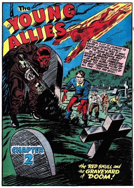
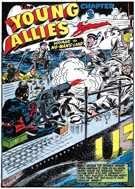
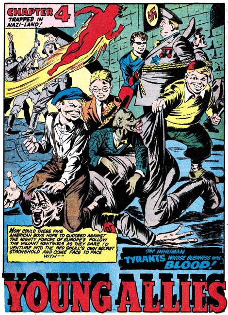
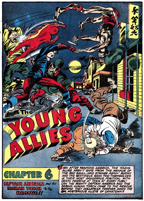
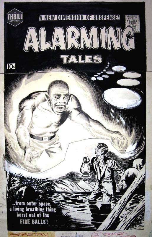
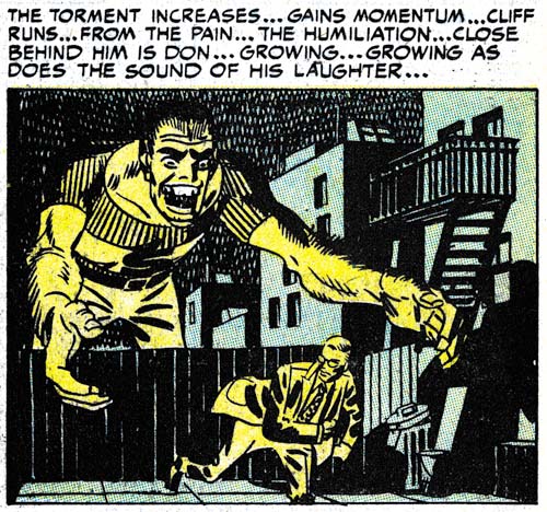
I must admit that I have not done enough carefully studies of the lettering done on Simon and Kirby productions. I always realized the importance of the lettering, both aesthetically and historically, but there always seemed other investigations that attracted my attentions. I have decided that I will no longer postpone examining this subject. I am not going to make a serial post because my investigations will not be following the timeline. But I will group these posts under a Topic on the sidebar.
In this pursuit I like to assemble images of the letters from a single story. Of course there is always a certain amount of variation in the letters but I try to select somewhat typical examples. For these samples I only select letters from captions and balloons that are not bold or oversized.
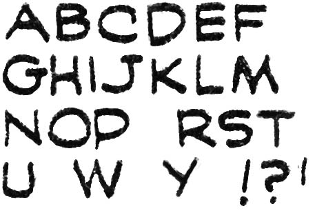
Prize Comics #7 (December 1940) “The Black Owl”, letters by Howard Ferguson
Initially like many early artists both Joe Simon and Jack Kirby did their own lettering. When the duo was working in the Timely bullpen their work began to be lettered by Howard Ferguson. Joe is the first to admit that his own lettering was rather amateurish while he considers Howard was one of the best letters ever. I provide about some examples of his lettering from an early Black Owl story. Note the rather short vertical strokes at the bottoms of the letters ‘P’ and ‘R’. I have selected an ‘S’ that shows a lower ending that is shorter horizontally than the upper one. Actually this is a rather variable feature ranging all the way to an equal length for both the upper and lower arms. However the short lower arm for the ‘S’ can usually be easily found while the reversed almost never occurs. There are two rather distinctive letters. One of them is the ‘J’ with its rather long and flat hook. Unfortunately ‘J’ is not a common letter but when it is used it provides an easy means of spotting Ferguson’s work during this early period. A more common letter that is very useful for identifying Ferguson’s work is the ‘C’. Note the short vertical stroke that descends from the top arm of the ‘C’.
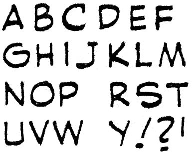
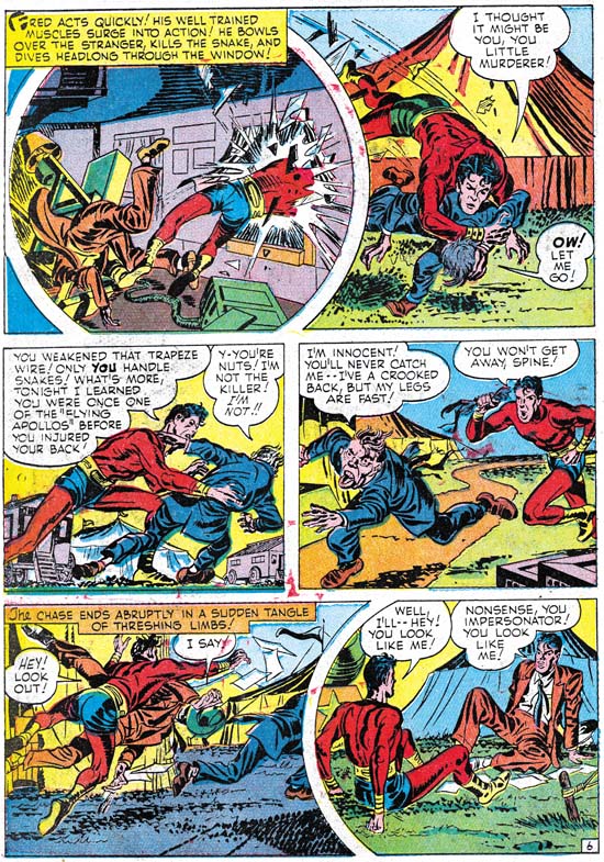
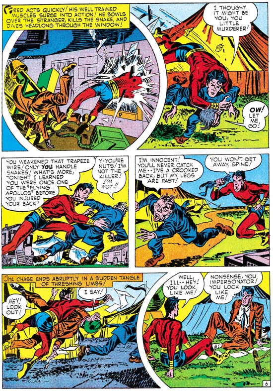
Stuntman #1 (April 1946) “Killer in the Bigtop”, letters by Howard Ferguson
I am going to make a rather long time leap and provide some lettering from late in Ferguson’s career. Despite the years that separate the Black Owl story from this Stuntman work, the ‘C’ is still has that very distinctive short stroke. The ‘J’ is very much unchanged. Examples of ‘S’ with a shorter lower arm can still be found but they are not nearly as common as before. There have been some changes as for example in the ‘G’. The overall shape is the same with the horizontal stroke place rather high in the letter. But note how in the Prize #7 the horizontal line for the ‘G’ extends to the right from the lower arm while in Stuntman #1 it appears to be made from the same stroke and does not extend to the right. The ‘?’ has also been altered having a lower arm that hooks much more to the right giving the main body a look almost like a ‘2’.
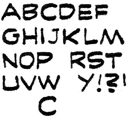
Green Hornet #34, originally published as Stuntman #3 (October 1946) “Rest Camp for Criminals”, letters by Howard Ferguson
I would very much like to determine when Ferguson passed away and was no longer lettering for Simon and Kirby. Unfortunately his most distinctive earlier trait, the ‘C’ with a short vertical stroke, pretty much disappears. Occasionally a ‘C’ will have just a hint of this feature and I provide an example of one at the bottom of the samples. The ‘J’ is still distinctive but like I said it is not a common letter. The ‘P’ and ‘R’ still have short lover vertical strokes but not quite as extreme as in Prize #7. Oddly Howard has gone back to the earlier version of the ‘G’ with that small horizontal stroke to the right.
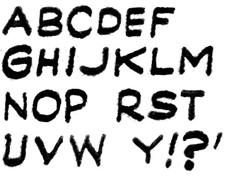
Headline #24 (May 1947) “Trapping New England’s Chain Murderer”, letters by Howard Ferguson?
I am going to close with samples from a crime story from seven months later. There are a number of changes to be found. The ‘J’ is still distinctive but no longer has a horizontal stroke at the top. The ‘G’ reverts once again to the Stuntman form without the short horizontal stroke to the right. However the horizontal stroke no longer sits so high in the letter. The lower vertical strokes for ‘P’ and ‘R’ are not quite so short as before. The apostrophe now has a slant where previously it was always vertical. There are two big surprises. Previously the ‘M’ had been very consistent with a slant to the two outer arms and the inner junction reaching as low as the base for the two outer arms. Now the outer arms of ‘M’ are vertical and the inner junction does not always descend to the base of the letter. The other surprise is found in the letter ‘Y’. Again this letter had bee very consistent in all the earlier works having the lower portion formed by a continuation of the stroke for the right arm giving it a slant. In Headline #24 the lower portion of the ‘Y’ descends vertically.
In conclusion, while there was some variation in Ferguson’s lettering over the years for the most part it seems pretty consistent. That is except toward the end. Frankly I do not know what to make of the changes found in the lettering of “Trapping New England’s Chain Murderer”. Although I have not assembled letter examples, there are other late stories that exhibit variations. All of this work is typically credited to Ferguson but I have to say I have my doubts. However I require further studies of these works before I reject the Ferguson attributions altogether.


