Category Archives: Wide Angle Scream

The Wide Angle Scream, Boy Commandos #2

Boy Commandos #2
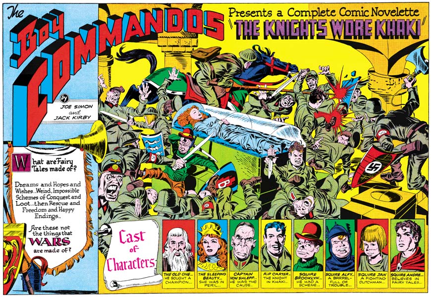
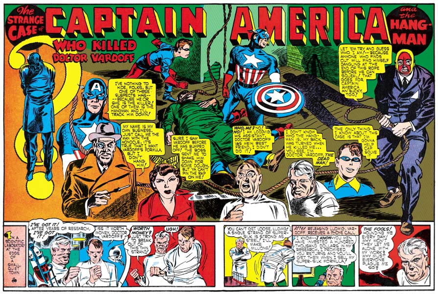
Boy Commandos #2 (Spring 1943) “The Knights Wore Khaki”
Enlarged view

When it comes to double page splashes, there are great differences between Simon and Kirby’s DC years compared to their Timely period. Once the wide splash appeared in Captain America #6 it became a standard part of that title. At DC despite the fact that S&K largely worked on three different features (Sandman, the Newsboy Legion, and the Boy Commandos) there is only a single example of a double page splash. Much of this can be explained by the fact that the wide splash required the use of the center page if publication problems were to be avoided. Planning for this was not an issue with Captain America because Joe Simon was the art editor and with Jack Kirby he produced the entire Cap comic. At DC S&K provided work for other editors and most of their work were for comic titles that included other features (Adventure, Star Spangled and Detective Comics). Under these conditions it was probably difficult for Joe and Jack to plan for the use of the center fold. But this does not explain the lack of wide splashes in Boy Commandos Comics. Even if they were not the editors, Joe and Jack should have been able to have more control in the Boy Commandos Comic, at least initially.

There is a also big design difference between the Cap wide splashes and the single DC example. At a glance at “The Knights Wore Khaki” splash we might feel we have found the same sort of three compartment design that was so common in Captain America. Common to both is are enactment and cast of characters sections. Missing from Boy Commandos is the one constant of Cap wide splashes, the start of the story. Instead we find a new section which brings an importance to the introduction text. But the three sections are not integrated like they were in Cap. Yes there are some visual linkages. The Boy Commandos title goes from the introduction text section into the enactment part. Also in the introduction text section there is a horn that extends into the enactment. The left portion of the host of characters has a scroll below which can be seen part of the enactment. Also all three sections contain middle age thematic material that link them together. But despite all that the compartments really look they are laid out in three distinct sections. This is nothing like the carefully integrated designs of wide splashes found in Captain America.

There really is not a lot to say about the cast of characters section. It is basically a row of simple panels with head shots. Do not get me wrong, Kirby as done his usually marvelous depictions. The glare given by Captain Von Shlepp just hits you in your guts, you can just tell he is not going to be a pleasant person. All the other head shots provide distinctly personalities. But as for the design, there really is nothing new here and it shares a problem that the story start sometimes had in Captain America. Laying out of row of panels tends to visually separate those panels from the rest of the splash and defeats any integration with the reset of the page.

I have more positive feelings about the introduction text compartment. Sure, like the host of characters, it does stand out as a separate identity. But that does have the benefit of providing less distractions to the text. I also love how the drape hanging from the horn is used to frame the text. It was also a good for the design that the start of the Boy Commando title starts in this section since that part takes up so much room. This part may not be integrated with the rest of the page, but within this section we are given a rather nice design.

In the enactment part that we see the greatest change from previous double page splashes. Most of the Cap splash enactments were limited to three or four characters; Cap, Bucky, the foe and/or the victim. But the Boy Commandos have five heroes so the enactment has to be more complicated. Joe Simon once remarked to me how difficult it was to draw a story with such a crew and how well Jack managed it. You can really appreciate this when examining Boy Commando stories not done by S&K. Invariably these stories center on Brooklyn and to a lesser extent Rip Carter. But all the rest of the cast pretty much get shoved to the insignificant parts. But the easy path was not Jack’s way, all the heroes play important parts, and that is true in this splash also.

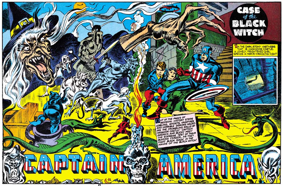
There was one splash (Captain America #8 “Case of the Black Witch”) were Simon and Kirby had a large cast of characters in the enactment. S&K used a candle flame and smoke to divide the ensemble into to half and bring some order to the splash. The Sleeping Beauty serves a similar purpose in this splash. She provides a center focus of calm that visually matches her sleep. But unlike the candle in Cap #8, Sleeping Beauty does not bring order to the rest of the splash. Instead she is eye in the center of a hurricane. She is surrounded by chaos on steroids. An all over composition as if Jackson Pollack had become a comic book artist. No part more significant then others. The fight is not something that can be comprehended at a glance. It takes extended viewing to understand the action. For example in the upper right at first it looks like a Nazi’s shield has been shattered by a blow from a sword. But a closer look reveals that the damage is actually being done by the joisting spear from the soldier on the horse. It may take time to understand in some cases what head belongs to what body. But time spent on viewing this Kirby masterpiece is time well spent. This sort of exciting chaos shows up in other (single) splash pages at this time and we will see further wide splash examples in the future.

Adventure #75
Adventure #75 (June 1942) “The Villain From Valhalla” by Jack Kirby

I will not attempt a detailed description of this scene, that would take way to long and would not be anywhere near the fun of doing your own examination. But I would like to point out relatively low key way that S&K handles the heroes. Brooklyn stands out in the front left because he is not wearing a soldier’s uniform like all the rest. But it is easy to miss Jan on the left because he is turning away from the viewer. Similarly that is Rip Carter on the horse at the top, but we can only tell by his action since his face is hidden. On the upper right we are presented a the back view of Andre. We do get a good view of Alfy in the front right but even he can be missed among all the fighting faces and bodies.

The other thing I want to point out is the Nazi officer on the left. The officer turns towards the viewer and brings up his hand to enforce his yell. One might think that he is yelling at the viewer, but since his is the enemy that does not make any sense. Instead he must be yelling for unseen reinforcements. This is a motif that Jack would use from time to time. We already saw it with a Japanese soldier on the cover the Champ #23 (October 1942). In later years Kirby would modify it and use it with the hero that really is (loudly) addressing the viewer (Captain America #197, May 1976).

I generally concentrate on the visual art of Simon and Kirby. But of course comics are pictures and words. Check out the writing on this splash. It is short but effectively contributes its part to making this a great piece of comic book art. I particularly like how the text in the cast of characters has a staccato rhythm but reads like a long sentence. I have heard stories of DC writers delivering Simon and Kirby with scripts only to find as they left the building the scripts sailing out of the studio windows. That story is actually so great that it makes me doubt its veracity. But writing like that shown on this splash is so excellent, so similar to the writing in Simon and Kirby done after the war, and so dissimilar to DC writing at the time. If Joe and Jack used the scripts provided by DC it was as a template to be modified at will in order to achieve S&K’s unique quality.

This Boy Commandos work makes me really regret that Simon and Kirby did not do other wide splashes during there DC years. But we will see further exciting examples of this demanding pectoral device when Joe and Jack set up their own shop after the war.

The Wide Angle Scream, Captain America #10

Captain America #10
Captain America #10 (January 1942) “The Phantom Hound of Cardiff Moor”
Enlarged view

In Captain America #9 Simon and Kirby continues with an interesting variation in the use of the three compartment design. The splash pages opens on the left, the normal reading order, with a one of those case cards from Captain America’s personal files along with five floating heads. The text indicates that they may all die unless they can be saved by Captain America. However this is not like previous presentations of the various characters. Here no particulars are supplied for the possible victims, not even their names. In a way they are more reminiscent of the ring of floating heads from Cap #7. Both use the floating heads to suggest an emotional content, audio pain in Cap #7 and fear here. But the floating heads here are irregularly arranged, unlike the circular pattern in Cap #7.

The next compartment, the most important center, is used for the enactment. As usually the scene has a minimal cast, in this case Cap, Bucky and their canine foe. The large and obviously vicious hound has leapt from above at our heroes. This was an unexpected attack because Cap and Bucky are depicted off balanced. The attack is aimed at Cap who did not even have time to position his shield, he is unprotected and in dire peril. Cap and Bucky tilt in opposite directions providing an interesting X pattern. However Cap leans his head to face his opponent and his raised right arm goes opposite to leaning of the body. Caps head and right arm therefore connect with the arc of the hound. This along with Bucky’s tilt lead the eye to the right section.

A case can be made that this splash is actually a four, not a three, compartment design. I think of it as three parts because the two sections balance across the center. But the right section is not composed of floating heads, but rather consists of a single circular panel. In fact the panel provides the same character group as the enactment section, but it now includes a victim. Here we are informed that there may be more to the secret of the hound, because he also walks like a man! Sure enough, the hound is now almost man like in form and standing on two feet. The small silhouettes of Cap (identifiable by his shield) and Bucky are approaching. This panel could be interpreted as the prequel to the enactment section. But if that were true then why would the hound have caught our heroes so off guard? Because of the poses of the figures in the enactment portion and the use of a circular panel on the right the two sections are strongly connected in a oval pattern. Even the trees and rock formations lead the eye to this oval and tend to keep it there.

Towards the bottom is the third (or fourth) compartment, the start of the story. Here in smaller then usual panels we are provided with yet another presentation of the canine attack. Alone and at night a man crosses a bleak landscape, obviously the same one as presented above. We then see him alerted to and fleeing from danger, the distant approach of the hound, followed by the actual attack and death of the man. At this point any perspective purchaser should be well aware of what sort of thriller awaits him, provided he parts with his dime.

I described the enactment compartment as placed in the center of the splash. Actually only the attack occurs there, the landscape for the enactment occupies the entire double page. The floating heads, circular panel and story panels give the appearance of being pasted onto the enactment art. The story panels have lifted from the bottom and are free on both sides to help with that affect. Hence the reason for the smaller then normal story panels. To add to the impression of pasted art, the text accompanying the floating heads and round panel cast shadows. These shadows are not only over their panels but over the enactment landscape art as well. But it is best not to take this pasting too literal. On the left a limb of a background tree lies on top of the floating head panels. This despite the fact that the panel in turn lies on top off, or before, a foreground rock. I do not think this was an error. The limb could easily have been shown clearly crossing over the panel. Instead it barely overlaps the panel edge and is easy to overlook. A sort of inside joke. Further some of the floating heads are shown in front of both the text and the shadow. This gives the heads an almost 3D effect.

The double page splash was the most ambitious of all the splashes that Simon and Kirby had done for Captain America. It makes one wonder what they would have done next. Alas it was not to be as this was their last Simon and Kirby issue of Captain America. As we shall see S&K would return to the double page splash. But they would not be the complicated designs found in the Captain America comics.

The Wide Angle Scream, Captain America #9

Captain America #9
Captain America #9 (December 1941) “The Black Talon”
Enlarged view

In Captain America #9 Simon and Kirby returned to a three compartment design for the double page splash. It opens up on the left with the enactment portion. No victim or foe this time, S&K have simplified the enactment to just Cap and Bucky. The pair are in a room, clearly not the tent that they share in their alter egos of private and camp mascot. Behind them on the wall is a portrait of President Lincoln, just the sort of thing you would expect from our patriotic superheroes. The only thing missing is a similar image of George Washington, it was probably on another wall. Cap is shown shuffling through their case files, the cabinet is marked as such on its side. From the first issue these stories have been presented as from Captain America’s cases, here we are provided with a visual representation of that fact.

As the eye moves toward the center of the splash it is led into the second section of the design. A case folder is opened up with the file identification serving also as the story title. Back lighted with the red folder we are presented with an image whose evil demeanor and positioning over a victim indicates that this is obviously the villain. Cap’s foe is posed so that it is clear that his right hand is unnatural. Arranged below and to the right, as if they are the folder’s contents spilling out, are a set of very irregularly shaped panels. These panels are not to be mistaken for the start of the story. Instead the panels are the comic book equivalent of a movie trailer. Joe and Jack mean to present enough to get our interest, but not too much as to spoil the story. To aid this effect none of the trailer panels have any text to clarify what is going on. We are presented with a scene from an operation, the origin of the villains unusually right hand. The doctor stares at what he has done with an intensity that recalls the Frankenstein story. The doctor’s only concern is the miraculous procedure he has just performed. He is unaware of the ramifications of the operation, nor would it have stopped him even if he knew. Another panel presents the outcome as we see the fiendish hand being used to strangle a victim. In the last panel, beside a painting depicting the dark hand strangling Captain America, we find the same thing occurring during a struggle between the villain and Cap. Tied up with ropes, Bucky looks on helplessly. Could this be the end of Captain America? Buy the comic and read the story to find out, or at least that was the intent of trailer compartment of the design.

Finally we leave the trailer section and enter the start of the story in the bottom corner of the splash. The story panels standard panel grid visually separates it from the irregular panels of the trailer. But by placing the two sections adjacent to each other there is also connection.

For me the story panels are still not as well integrated with the rest of the splash as the musical note panels found in the double splash from Captain America #7. But the Cap #9 splash is still an excellently integrated piece of comic book art. The story title and trailer section is just a marvelous idea, even better then the floating head title design of Cap #7. Although I still prefer Cap #7 this Cap double splash is incredible.

The Wide Angle Scream, Captain America #8

Captain America #8
Captain America #8 (November 1941) “Case of the Black Witch”
Enlarged view

Working with a double page allowed Simon and Kirby to do things that just were not feasible with a single page. In the previous two issues of Captain America, the artists were able to construct the splash using three components. Two of the components were common to both Cap #6 and #7; the scene or enactment and the panels for the start of the story. Cap #6 presented the caste of characters as the third component while Cap #7 presented a story title design that included floating heads. Even with the double page such a three part design was only possible because the enactment portion need only show a limited set of characters; Captain America, Bucky, the villain and the victim. Were any more required something would have to give.

Apparently for Cap #8, Simon and Kirby wanted a lot more from the enactment portion. So they abandoned the three component design. There is no presentation of the story’s characters and the story title is simple and placed off in the corner. The Captain America emblem is combined with some eerie heads but it too is restricted to one edge. S&K kept the story introduction, but limited it to a single panel placed with the title on the side. This allowed the staging to include a host of goblins, demons, ghosts and serpents. But even with the extra weird figures all is not chaos. A flame and smoke from a candle rise from the bottom and divide the stage in half. On the right Bucky supports the fallen victim while Cap prepares to defend them. On the other side are all the evil opponents, Cap is certainly up against overwhelming odds. The divide is only crossed twice. Once at the bottom with a crossing by a long serpent like beast (a dragon?), and the other cross at the top by the grasping hand of an oversized witch. Oversized figures was a device not used on any of the Captain America covers but was not all that unusual for the splashes.

The Captain America emblem for this splash has been given an unusual placement, along the bottom instead of the normal location at the top. This emblem appears to always have provided a difficulty. On one hand it was desirous that the emblem stand out on the page. On the other hand it should not intrude on or take over the rest of the art on the splash. These conflicting goals were not completely reconciled in the previous double splashes but appear to have been here. By placing the emblem at the bottom, S&K could take advantage of the long serpent to separate it from the rest of the art. By adding the eerie heads and the small, sometimes humorous, art along the bottom edge the artists have effectively framed the emblem off into its own area.

This is another great composition and probably the best example among the Cap double splashes for a large group in a single depiction. So far each double splash seems to present unique designs as Simon and Kirby explore new territory. Like I said at the start, they may not have been the first to do two pages splashes, but I cannot think of anyone else at that time making such innovative use of this large area.

The Wide Angle Scream, Captain America #7

Captain America #7
Captain America #7 (October 1941) “Horror Plays the Scales”
Larger Image

Simon and Kirby have completely mastered the double page splash with Cap #7. The important center is now occupied by the title “Horror Plays the Scales” and a ring of floating heads. Perhaps you remember me saying that floating heads and oversize figures were devices that Jack Kirby did not use often on covers but were devices that Joe Simon used for covers throughout his career. The Captain America covers did not use either floating heads or oversized figures but both devices appear in the splashes. On this splash the floating heads are obviously under torture with most trying to cover their ears. Behind them is are multicolor rings with musical notes floating about.

If the title and floating heads do not make it obvious about the nefarious use of music, the scene of the splash does. It is divided by the central design into left and right sections. On the left is a violin maestro in the thralls of playing his instrument. The musical notes that he is generating are shown flying up toward the right. The eye follows these notes into the top of the rings of the central design. The eye then follows the stream of musical notes that enters the right section of the scene. The musical notes stream then wraps around the head of a man. Now is revealed what effect the maestros music is having. The man, obviously in a trance, advances with a knife toward Bucky who is tied up on a chair. But Captain America descends from above to save the day. I have no idea where Cap leaped from. While the left section shows a music hall, the right section takes place on a city roof top.

Along the bottom of the splash is the start of the actual story. Unlike what was done in Cap #6, the story section in Cap #7 is well integrated with the rest of the splash. The background to the story panels has strips like the scales of music notation. These scales are given various colors that give them a visual connection to the color rings behind the floating heads. On the left is a musical symbol, I am afraid I am ignorant about music so I do not know what it is called. Following this symbol are a row of musical notes. The round part of the notes are actually the panels of the story.

For me this is perhaps the most interesting design of the Captain America double splashes. That is not to say that the rest are not successful, only that Simon and Kirby would experiment with other different designs.

The Wide Angle Scream, Captain America #6

Captain America #6
Captain America #6 (September 1941) “Who Killed Doctor Vardoff”
Larger Image

I do not think Simon and Kirby invented the double page splash. I seem to remember an earlier example in a Kazar story in Marvel Mystery Comics and I make no claim that was the earliest either. Using the centerfold for such a purpose would seem natural for anyone aware of how a comic was made. Because of the vagaries that occur in the folding and stapling of a comic only in the centerfold could a publisher be sure to get a good double spread without registration problems. No I doubt that S&K were the first to do a double splash, but I do not think anyone else at that time did as many or as well.

S&K already had produced a number of comics before their first double splash. In those previous comics are really terrific examples of single page splashes. So it should be no surprise that their first attempt at a wide splash (Captain America #6) would be so successfully done. In it Joe and Jack integrate a scene as well as a caste of characters. The scene occupies only a relatively small portion of the splash, but it is in the center and so commands attention. We find Captain America and Bucky over the victim of a hanging. Although the victim is now on the ground, the noose is still around his neck and the rest of the rope goes up to the top of the splash and then the end drops back down. But the heads of the characters, even the deceased, are turned to our right where the masked hangman stands holding another noose in both hands. Oddly the shadow that he castes also holds a noose but in just one hand.

The noose’s rope that the hangman holds trails along the lower part of the splash visually connecting the various characters arrayed in a broad ‘U’ shape. Besides Bucky and Cap we find a scientist (the victim), a lab assistant, a mob moll (with her cigarette in her mouth as she speaks, a sure sign that she is not respectable), and a mysterious man (whose monocle and cigarette holder indicate that he is a nefarious foreigner). As the eye follows the rope to our left side in ascends until it is covered by a large question mark. But where the rope disappears is well placed because the eye follows the upper part of the question mark until the rope reappears and the victim is portrayed hanging.

Below the splash are a row of story panels. The splash was used to catch the browser’s eye, while the story panels would get him interested in the story. That way when the newsstand owner called “you buying or what? this ain’t no library” hopefully the reader would have become involved enough to purchase the comic. S&K extend the splash panel’s edges to enclose the story panels also. This attempt to integrate the splash and the story panels is the greatest weakness of this double page. In the future Simon and Kirby would use other means to overcome this defect.

The first double page splash already has some features that we will see in others. Often these wide splashes do not just provide a scene but something more complex. It is not just that this sort of thing takes advantage of the greater width, it actually could not be done effectively on a single page. What is presented in the splash is a well integrated “story”. However like some the Harvey covers that I have written about previously, there are logical inconsistencies in what is presented. The Hangman and his shadow holding the noose differently. The victim shown three times, once on the ground surrounded by Captain America and Bucky, also still hanging on the left side and finally as one of the characters describing himself. But like those Harvey covers I really do not consider these true defects. The splash is not meant to be a snap shot, instead variously timed events are represented together. Everything is well placed to provide a sort of condensed story, without the ending of course!