Category Archives: Serial Posts

Early Jack Kirby, Chapter 6, Daring Mystery #6

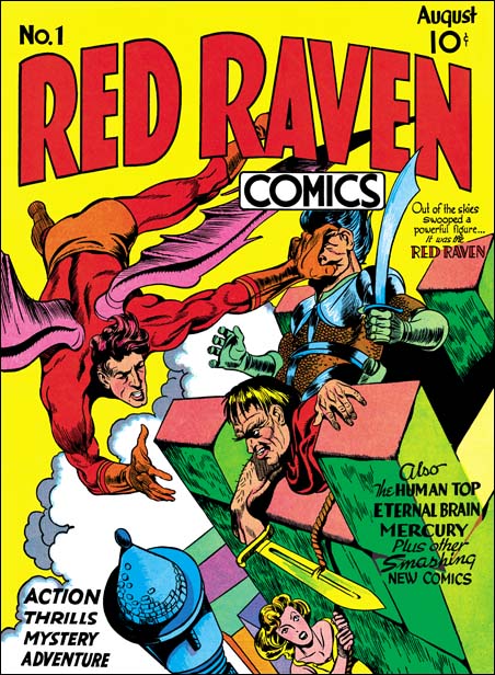
After Red Raven Comics #1 (August 1940) Joe Simon and Jack Kirby would do work for Daring Mystery Comics #6 (September 1940). Previously Joe had done some stories for this title, but now he would be its editor. This Timely title did not have anywhere near the success of Marvel Mystery Comics. Although declared a monthly, in fact Daring Mystery suffered a rather sporadic publication schedule.

Recently Marvel has been publishing reprint volumes of some of its golden age titles. This has been much appreciated as the original comics are rare and rather expensive. Volumes for Marvel Mystery, All Winners, Captain America, the Human Torch and Sub-Mariner have already appeared. I understand a reprint volume of USA Comics will also soon come out. However I doubt that Daring Mystery is ever likely to receive this reprint treatment. The issues are filled with features that would last only a few issues, sometimes even a single one, and then disappear.
Daring Mystery #6
Daring Mystery #6 (September 1940)

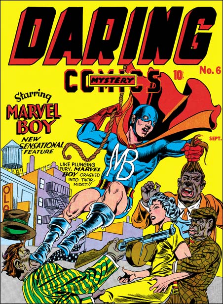
But the obscurity of Daring Mystery’s heroes is not the only reason I doubt it will get reprinted. As I see it another problem with Daring Mystery is the cover for issue #6. I really cannot think of another golden age cover that today is likely to provoke more of a negative reaction then this one. The image of a white woman at the mercy of some African American thugs brings to mind the rise of the KKK in the silent movie “Birth of a Nation”. It is true that when America entered the war there would be similar covers involving stereotyped Japanese or German soldiers. But at least then a war can be used to explain such derogatory works.

Not to excuse it, but those were different times. As uncomfortable as the DM #6 cover may make us feel today, we cannot just ignore it. History is meant to help us understand our past, not to remake it in the image of our present day. African Americans were conspicuous for the absence in comics books of those days. I suspect that in casting them as villains, Joe and Jack were just looking for a way to make their cover stand out on the racks. Whatever their intentions were, they would not repeat it. I can think of only one case where an African American was used as a villain by Simon and Kirby. Captain America #9 introduces the Black Talon. The Black Talon got his hand from an African American criminal who was executed. Pretty tame stuff compared to the cover for DM #6.

But apart from the racial overtones, what can be said about the Daring Mystery #6 cover? We have the hero swinging by a rope simultaneously kicking one thug in the face and pulling the hair of another. It would seem that Jack was trying to make this cover as exciting as possible. This was done early in the history of the comic book industry and both Jack and Joe were still learning. To me this was not that great a cover. I guess much of my feeling is due to the kicking and hair pulling. This is not the type of fighting one would expect from a hero, especially during the golden age. Like the racial reference, this would not be repeated in future Simon and Kirby covers.
Daring Mystery #6
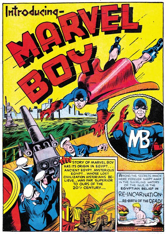
Daring Mystery #6 (September 1940) “Introducing Marvel Boy” page 1 by Joe Simon

Both Joe and Jack were involved in the drawing of two of the interior stories for DM #6, “Introducing Marvel Boy” and “The Fiery Mask”. An interesting pattern is shown by both cases. Joe would do the starting pages of the story and then Jack would do the rest. For Marvel Boy Joe did pages 1 to 3 while Jack did 4 to 10. With the Fiery Mask Joe did 1 to 4 and Jack pages 5 to 10. My interpretation is that as editor Joe wanted to establish the look of the story. Joe had been working with Jack on Blue Bolt so I am sure he was comfortable sharing the drawing with Jack and Knew that the final would look fine. Joe did not use This drawing arrangement with any of the other artist in DM #6.
Daring Mystery #6
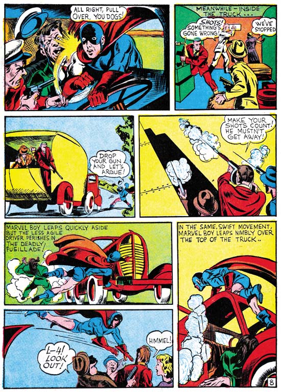
Daring Mystery #6 (September 1940) “Introducing Marvel Boy” page 8

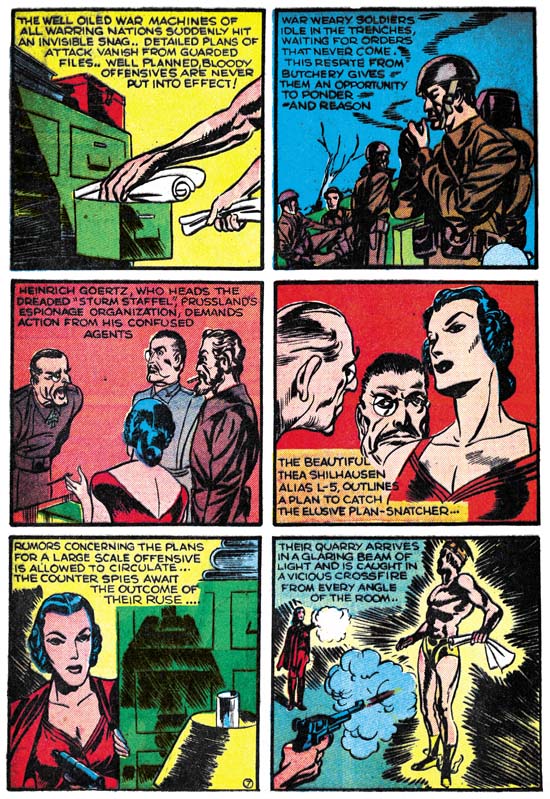
Most of the stories we have seen by Kirby outside of syndication have been science fiction. Now Jack was back to doing something from the superhero genre, and doing a nice job of it as well. Marvel Boy fights an assortment of spies. We are not told what government his foes work for but they all seem to have German accents, say “Heil” while saluting, and one exclaims “Himmel” when attached. To keep things interesting, Kirby keeps changing the view point and makes a lot of use of exaggerated perspective.

Inking on the Marvel Boy story is different on the pages penciled by Joe as compared to those done by Jack. It is tempting to assume that the inking for a page was done by the same artist that did the drawing. But Joe was an editor at Timely and there were other artists available to do inking. The use of various hands in the inking of the same art page was a common practice in the future but it may also be occurring at this early stage.

Marvel Boy had costume features (“skull cap” mask, boots) and a story (fighting spies) that foreshadow a future character, Captain America. Neither Joe or Jack would do any further work on Marvel Boy. Years later there would be one further Marvel Boy feature in USA Comics #7 (February 1943) after which he would disappear completely, like so many other Daring Mystery heroes. In the 50’s a character with the same name would have a short run, but that hero only shares the name with Simon and Kirby’s creation.
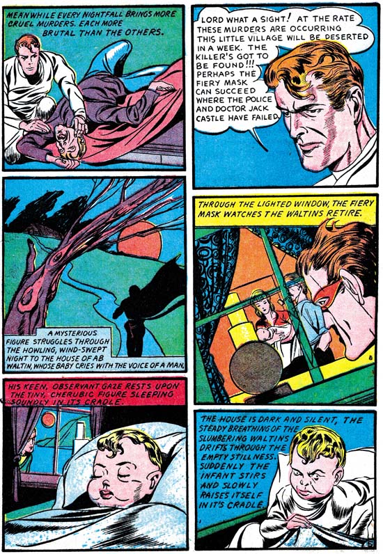

Daring Mystery #6 (September 1940) “The Fiery Mask” page 5

The Fiery Mask first appeared in Daring Mystery Comics #1 (January 1940) is one of Simon’s earliest published comic book work. Although Joe did other work for some of the early issues of Daring Mystery, they did not include the Fiery Mask. Both the GCD and Atlas Tales indicates that the character did reappear in DM #5 (June 1940) but was done by another artist, George Kapitan. I have not seen the contents of this issue and so cannot add my own opinion. While Joe was editor at Timely the Fiery Mask would make two further appearances, here in DM #6 (September 1940) and also in Human Torch #2 (Fall 1940). It is not clear which was done first. DM #6 runs an advertisement for Red Raven Comics #1, not its replacement Human Torch #2. The cover for Marvel Mystery #13 (December 1940) includes a reference to HT #2 comic. Both facts suggest that DM #6 came before HT #2. The Fiery Mask story in HM #2 was drawn entirely by Simon and it is quite possible that it was actually created earlier just not published right away.
Daring Mystery #6
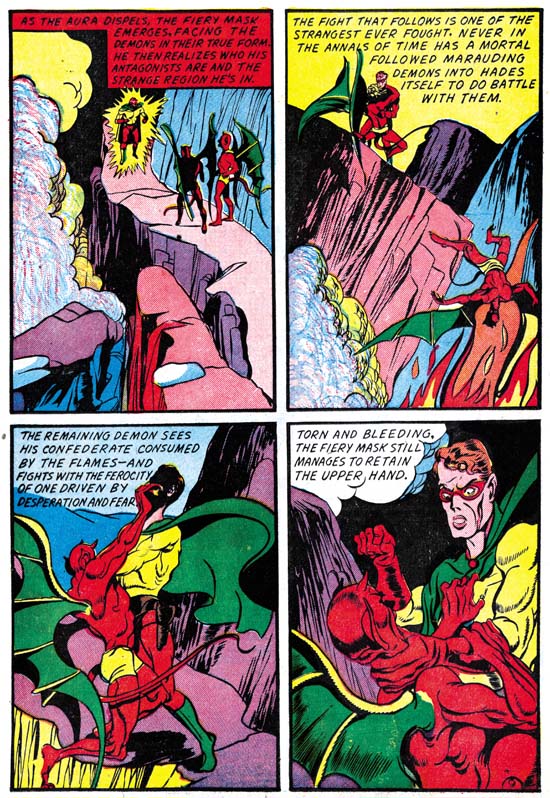
Daring Mystery #6 (September 1940) “The Fiery Mask” page 9

As mentioned above, Joe did the first 4 pages of the Fiery Mask story in DM #6 and then handed the story over to Jack. Jack did an excellent job drawing it. Part of the story involves a child delivered by a demon to a couple to raise. Jack’s transformation of an apparently peacefully sleeping baby in one panel into a malevolent infant in the next is just marvelous. The fight scene between the Fiery Mask and demons from hell is quite exciting.
Daring Mystery #6
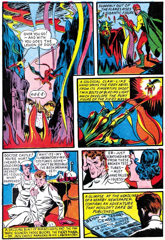
Daring Mystery #6 (September 1940) “The Fiery Mask” page 10

As with the Marvel Boy story the inking appears to be different on the pages drawn by Jack as compared to those penciled by Joe. As previously discussed this could be due to the inker being the same as the penciler. But care must be taken because Joe may have had other artists available and multiple hands may be involved. However there is an exception to the general rule that the inking is the same on the pages drawn by Jack. On page 10 panels 4 to 6 appear to be inked differently. The penciling was still clearly done by Jack but the inking looks to me like it was done by Joe.

Kirby would do further work for Daring Mystery Comics. However because of the erratic publication schedule for this comic DM #7 would not be released until April 1941 and DM #8 would come out in January 1942. It would be best to discuss what Jack did for those comics later in a more appropriate place.

Mea Culpa on Early Kirby

In a recent post of mine, Early Jack Kirby, Chapter 5, Timely and the Red Raven I used a one to two week lead time (the time between when a strip is created and when it actually is published) as part of a calculation of when Jack Kirby started at Timely. Well one of the great things about blogs is that someone may add a comment when I make a mistake. In this case Kirby scholar Stan Taylor questioned my short lead time.

I could not remember where I got the 1 to 2 weak lead time so I could not refer back to my source. So I reached out to Allan Holtz who has the Srippers Guide Blog. Allan is very knowledgeable about syndication strips and his blog is a treasure full of great information.

Allan’s response was that that daily strips are typically done 4 to 6 weeks ahead and Sundays 8 to 12. He added that these lead times hold every since the 20’s and 30’s. His qualification on these times was that if the strip was produced by contract lead times may be even longer.

I plan to make a corrections to some of my posts, but not tonight. I want to do some scanning for my next post as well to have more time to think things over.

So my thanks to both Stan Taylor for pointing out my error and Allan Holtz for giving me more reliable data.

Early Jack Kirby, Chapter 5, Timely and the Red Raven

Red Raven Comics #1
Red Raven Comics #1 (August 1940)

Joe Simon’s last set of covers for Fox Comics were cover dated July 1940. Joe went on to become art editor for Timely. When Joe arrived, Timely had three superhero titles. Marvel Mystery Comics was their big seller, largely due to the Human Torch and Sub-Mariner features. The other two titles, Daring Mystery and Mystic Comics do not appear to have been as successful. Each presented a dazzling assortment of features that would last only a few issues before disappearing. Previously Joe had done some work Daring Mystery through Funnies Inc, the shop that created the art for all Timely’s comics. (see my posts on Daring Mystery #2 and Daring Mystery #3). Now Timely’s owner Martin Goodman wanted to cut out the middleman and set up his own art shop. Although an editor, Joe worked on a freelance basis.

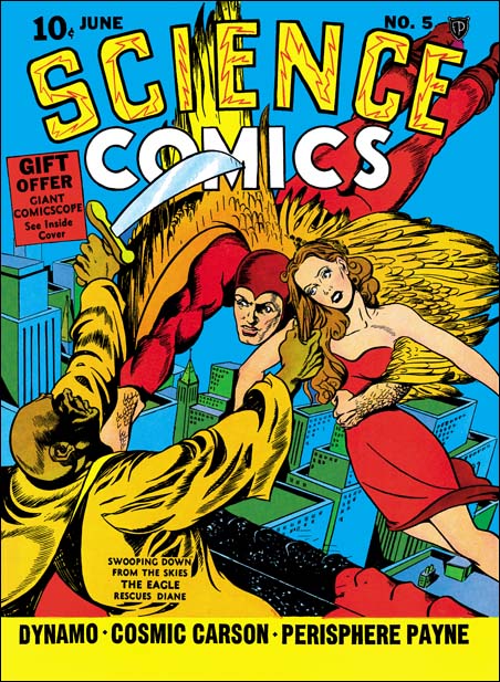
Science Comics #5
Science Comics #5 (June 1940) by Joe Simon

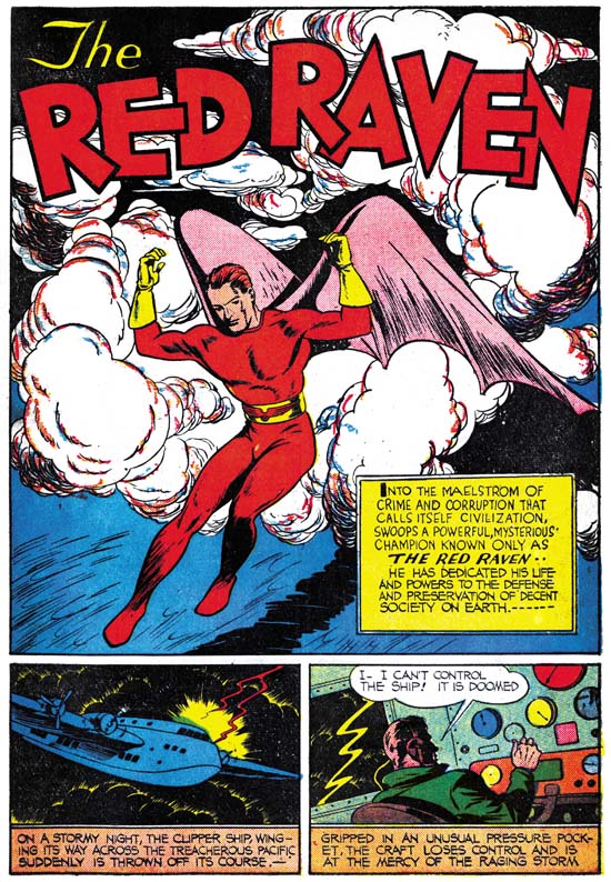
Previous Timely comics had been anthologies, but Joe’s greatest success so far had been with Blue Bolt. Blue Bolt was an anthology also but was named after the key feature. Joe convinced Goodman to do the same thing with a new hero, the Red Raven. While at Fox Comics, Joe had drawn a similar flying figure called the Eagle for the cover of Science Comics #5 (June 1940). But the success of Timely’s new title would depend largely on the key feature. Joe had to make sure the Red Raven story was especially good. The story would be 17 pages long, seven pages more then any other of the features in the comic. But surprisingly the Red Raven story was drawn by an unidentified artist. Jack Kirby drew the cover for Red Raven #1 along with two of the stories, so it is clear that he was available to do work. At this point Kirby was already doing all the drawing for Blue Bolt and was clearly a much better artist then the one Joe actually used. I can understand that as editor Joe might not want to draw it himself, but why did he not turn to Jack for this?

Red Raven Comics #1
Red Raven Comics #1 (August 1940) “The Red Raven” by unidentified artist

According to Joe and Jim Simon’s book, “The Comic Book Makers”, Jack Kirby did not immediately follow Joe to Timely but continued at Fox. In the book Joe says it took three months. The last Blue Beetle strip that Jack did was published on March 9, 1940. Syndication strips are usually created only a week or so before publication. Comic books take longer to be created and the covers are dated with the removal time, not the distribution date. The result of all this is that comics will have a cover date that is five to six months after work started. This means that the first comics that Jack worked on after Fox would be cover dated August or September. I believe that Joe is right about Jack staying at Fox but perhaps it was not for a period of months but actually weeks. If when Joe started work on the Red Raven Jack was only available on a moonlight basis Joe might have reluctant to use him for the all important feature story. By the time Jack transferred to Timely it was too late to change artists.

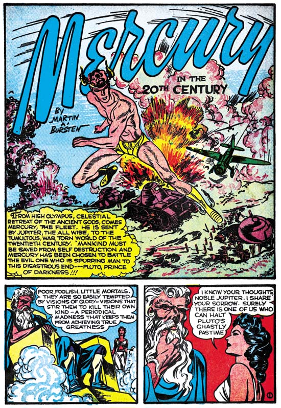
Red Raven Comics #1
Red Raven Comics #1 (August 1940) “Mercury in the 20th Century”

The credit given for “Mercury in the 20th Century” go to the writer, Martin A. Bursten (actually spelt Burstein). This is Kirby’s earliest foray into a feature loosely based on mythological characters. The hero is of course Mercury and his adversary is Pluto. Pluto is causing havoc in the world and has taken the mortal disguise of Rudolph Hedler, leader of Prussland. America was still at peace, but Europe certainly was not. In this story Mercury uses his powers as a god to thwart Pluto war promoting activities.

Red Raven Comics #1
Red Raven Comics #1 (August 1940) “Mercury in the 20th Century” page 7

Inking on this story is different from that on Jack’s pervious comic book work. The inking used to define the form is lighter. Further spotting is not limited to form, but includes shadows and design aspects. Page 7 shown above provides good examples. Although Jack did not limit spotting to form when working for Blue Beetle or Lightn’ and the Lone Rider the way it was used in those works was different then what was done here. I believe someone other then Jack did the inking for this Mercury story.

In panel 4 from page 7 of “Mercury in the 20th Century” notice the large size of the man on our left. Similar large ears on people viewed from behind was a Kirby trait in the future during the years he and Joe worked at DC. But it also shows up occasionally at other times, the image above is perhaps the earliest example. But this trait is not as common during Jack’s period at Timely. This is because during this time Jack would not use this viewpoint as often and when he did he would not always get the ear size wrong.

Red Raven Comics #1
Red Raven Comics #1 (August 1940) “Comet Pierce”

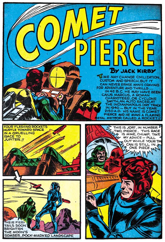
Jack also provided a science fiction feature, Comet Pierce. In many ways this story is written and drawn very much like his previous sci-fi work. The biggest difference is before the hero was a sort of sheriff of the stars while here Comet Pierce is a rocket ship racer. Once again lots of flying rockets, monsters and of course a beautiful woman. Even the inking is similar to the earlier work in that it is largely limited to describing form. But “Comet Pierce” is even more important in that for the first time a story credit’s uses the newly acquired name of Jack Kirby. The credit is for Jack alone, not for Simon and Kirby. Yet another reminder that although Joe and Jack worked together for Blue Bolt, they were not yet truly a team.

But the Red Raven title only lasted one issue. Because of the amount of time it took to get a comic book published, three months, it it clear that Red Raven Comics was discontinued well before any idea could be made about how well it would sell. Martin Goodman may have liked the idea about having a comic title dedicated to one key hero but he may have gotten cold feet about basing a comic on a new, untried, character. Instead it was decided to start a title for the successful Human Torch and (to save money on a new mailing permit) take over the numbering from the Red Raven. The first Human Torch would therefore be issue #2 and would be cover dated as Fall 1940.

Early Jack Kirby, Chapter 4, Enter Joe Simon

Blue Bolt #3
Blue Bolt #3 (August 1940) page 1

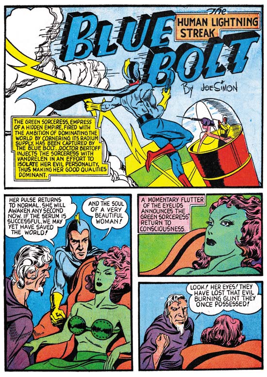
Jack Kirby met Joe Simon when the latter became art editor for Fox Comics. I find it interesting that Jack started doing actual comic book work (as opposed to syndication strips) at the same time as Joe’s first cover for Fox (May 1940). Perhaps it is just coincidence or perhaps Joe gave Jack some Fox features and may even had help Jack get work outside Fox (Crash Comics, see previous chapter). In any case it is clear that Joe quickly recognized Jack’s talent. Previously Joe had submitted a feature called Blue Bolt to Funnies Incorporated, a shop run by Lloyd Jaquet. Initially it was not used but later became the basis for a new comic title. Blue Bolt #1 came out with a cover date of June 1940. Joe did all the art for the first Blue Bolt story since it actually was done prior to his starting work at Fox. But for new issues of the comic, Joe got Jack to give him a hand. The feature in issues #2 and #3 are signed by just Joe Simon. However the art was done by both Joe and Jack, working on different pages. Jacks contribution for these issues was rather limited. For BB #2 Jack did pages 1 (except for the splash), 2, 4 and 5 while Joe did the rest of the 10 page story. For BB #3 Jack would do pages 1, 2 and 7. He may also have done page 5 but I am not sure of that.

Blue Bolt #5
Blue Bolt #5 (October 1940) page 1

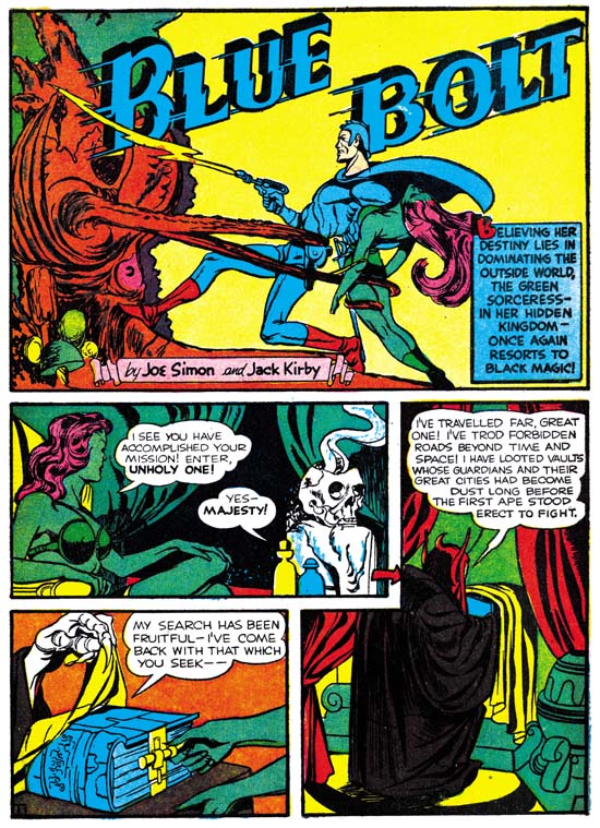
By issue #4 Jack was doing all the penciling as he would do for all the remaining issues. With issue #5 for the first time we find credits as “Joe Simon and Jack Kirby”. It is only fair that Joe’s name comes first, after all he created the feature. Although Joe and Jack were now working together, I think it would be a mistake to consider them at this stage as equals. Simon was art editor at Fox and after that would have the same title at Timely. People were starting to recognize Kirby’s talent but Jack had yet to have a hit. In any case once established, Simon and Kirby would be the credit order for the rest of their time together.

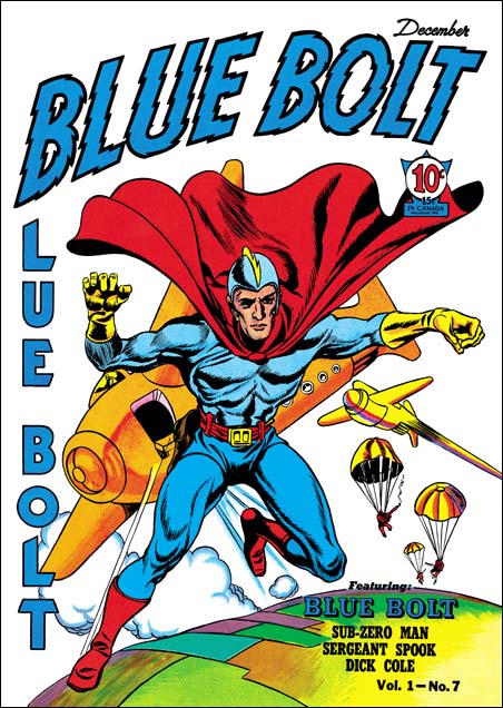
Blue Bolt #7
Blue Bolt #7 (December 1940) by Jack Kirby and Joe Simon

One surprising thing about the Blue Bolt title was how few of the covers were done by Joe or Jack. Joe alone did the cover for Blue Bolt #3. The cover for BB #7 was a joint Simon and Kirby effort. The figure of the Blue Bolt was clearly done by Jack. But the flying ships and the earth do not look like Kirby’s work. Similar blimp-like ships (without the wings) can be found on Simon’s pages from Blue Bolt #2. So I believe Joe is responsible for the background art on this cover.

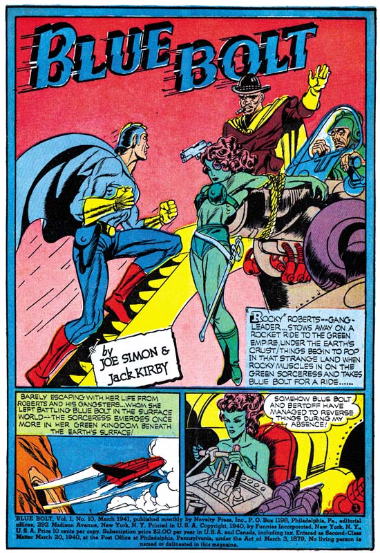
Blue Bolt #10
Blue Bolt #10 (March 1941)

Blue Bolt was a monthly so it provides excellant examples of Kirby’s art as it rapidly improves. It is fortunate that issues #2 to #10 have been reprinted by Verotik Publishing. The book is out of print but can be found on eBay from time to time at a resonable price. Early in the series Kirby’s fight scenes were as awkward as it was in the Blue Beetle syndication. But by Blue Bolt #10 Jack was providing exciting action. The last Simon and Kirby Blue Bolt, issue #10, came out in March, the same month as the first Captain America. But S&K could not have known about how successful Captain America would be when then stopped working on Blue Bolt. Rather I suspect that Joe and Jack were just getting better page rates at that time. Since Blue Bolt was still being handled by Funnies Inc. that shop would get their cut, leaving a lower page rate for S&K.

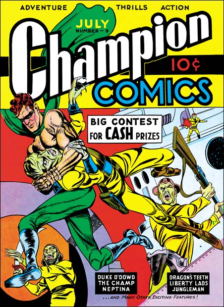
Champion Comics #9
Champion #9 (July 1940)

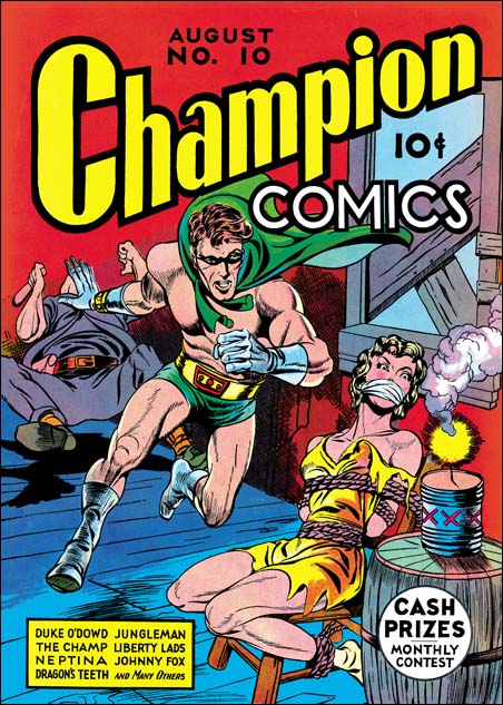
While at Fox Jack and Joe also collaborated on some covers for Champion Comics. Joe had previously done the cover for Champion #8. The cover for Champion #9 along with Blue Bolt #2 were the first Simon and Kirby joint efforts (cover dated August 1940). Champion #9 was also Jack’s first comic book cover. It was a good start, Jack’s depiction was already rather unique for the time. Still you can still see some of Joe Simon’s touch in the face of the hero. With the cover for Champion #10 we get all Kirby. Lots of action and exaggerated perspective.

Champion Comics #10
Champion #10 (August 1940)

Early Jack Kirby, Chapter 3, Moonlighting

Crash Comics #1
Crash Comics #1 (May 1940) The Solar Legion page 3

At the same time Jack Kirby drew his first comic book feature for Fox Comics he also created The Solar Legion for TEM Publishing. Jack did not sign this work, most likely he did not want to draw Victor Fox’s attention to his moonlighting. Work for The Solar Legion is a good match for what Jack did on Cosmic Carson, a good story, lots of action (particularly using spaceships), and good artwork. Kirby continues to use larger and irregularly sized panels. There seems to be a lot more emphasis on long distance views, often in exaggerated perspective, then Jack would use in his later years. The inking is the also the same, the spotting was mostly done to define form and does not play much part in the overall design.

Crash Comics #2
Crash Comics #2 (June 1940) The Solar Legion page 4

One thing Jack was able to do for the first time in The Solar Legion was to draw various monsters. Besides the giant worm in the image above, there was also giant serpent like creature.

Crash Comics #5
Crash Comics #5 (September 1940) The Solar Legion page 4 by unidentified artist

Jack would create Solar Legion stories for the first three issues. Although some sources attribute to Kirby the feature in Crash #4 and #5 this appears to be incorrect. You can see in the image above from issue #5 that the artist tried to imitate Kirby, however with very limited success.

Famous Funnies #74
Famous Funnies #74 (September 1940) Lightin’ and the Lone Rider

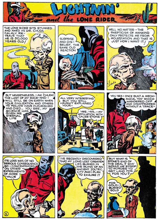
July finds the return of Lightin’ and the Lone Ride to Famous Funnies. You may remember that previous installments were, like all the other features in the comic, reprints of syndicate strips. Jack had completed one story line but the second one was neither finished or published. Now when Jack Kirby returns to the Lone Rider he starts an all new story. But this new installment is very different from the previous one. The most obvious is that the story made of three rows of panels. When the story is read it clearly was not made for syndication publication. The plot paces not one strip at a time, but rather one page at a time. This story was clearly made for publication in the comic book. The artwork is much more advance from the first appearance of Lightin’ and the Lone Rider. The Blue Beetle strip art is closest to this later Lone Rider. Particularly in the inking and the use large areas of blacks as part of the design or for depicting a character in silhouette. However the depiction of action it clearly more advance then in the Blue Beetle. This all suggests that the art was started while Jack was still at Fox Comics but not long before he left.

Famous Funnies #76
Famous Funnies #76 (November 1940) Lightin’ and the Lone Rider

Kirby introduces into the Lone Rider story a character type that he would return to, in one form or another, thoughout his career, a small bodied man with a big head. As in the Blue Beetle, Jack has orchestrated an interesting story that he never finished. Jack leaves us completely unclear where he was going, let alone how he would end it.

Early Jack Kirby, Chapter 2, Working for Fox

Blue Beetle (2/12/40)
The Blue Beetle (February 12, 1940)
Enlarged image

As some point Jack Kirby began working for Victor Fox, owner of Fox Comics. At Fox Kirby helped to bring to syndication a strip based on one of his comic book features, the Blue Beetle. Normally syndications strips are produced about a week before actual publication. However for a new strip a number of the daily strips would be made ahead of time so that they could be shown to perspective newspaper clients. So while the Blue Beetle strip debuted on January 8, 1940, Jack must have started working for Fox sometime well before that. Jack also did some actual comic book work for Fox that was cover dated as May. Unlike syndication strips, comic book production starts 5 to 6 months before the cover date. This means that Jack must have started at Fox at least by November or December 1939.

Blue Beetle (2/16/40)
The Blue Beetle (February 16, 1940)
Enlarged image

The Blue Beetle was the last syndication work that Jack did, that is until after the war. By this time he had make great progress in both his writing and his art. Jack keeps the story going well so that each daily strip is interesting and advances the storyline. No longer are there any awkward breaks in the pace like we saw in Lightning and the Lone Rider. The changes to his art were even more impressive, both in his ability to give cast members unique characterizations and in how Jack would compose each panel. However Jack’s handling of action was still rather awkward. Kirby did not stay at Fox Comics long enough to complete the story arc but what is there is fascinating reading. Unfortunately if you want to read the entire strip you cannot use “The Comic Strip Jack Kirby” by Greg Theakston that I mentioned in the last chapter. Although the book claims to have “the complete Blue Beetle” in fact one strip (February 23) is absent as it was replaced with a repeat of January 24. If you really want read the entire strip you have to get the CD version of “The Complete Jack Kirby Volume One 1917-1941” also by Theakston.

Mystery Men #10
Mystery Men #10 (May 1940) Wing Turner, page 3

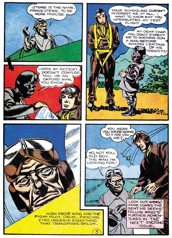
As I mentioned above, Jack also did some comic book work for Fox which were cover dated May. These two Fox features and one for TEM Publications (covered in my next chapter) were Kirby’s first real comic book work. He must have found in liberating after the years of syndication work. Jack experimented with various sized and shaped panels. The panel layouts could become so complicated that at times he needed to add arrows to direct the reading sequence. One feature Jack worked on was Wing Turner. This was signed as Floyd Kelly, but Jack was not using this as an alias. Wing Turner had part of Mystery Men Comics throughout its run. Floyd Kelly was an alias, but it was one for the original artist for this feature. All subsequent artists who worked on this feature, including Jack, were in effect ghosting. Jack’s contribution to Wing Turner is only three pages long. Like a syndication artist, Jack does an interesting story with a great setup for the next month’s installment. But Jack did not return to this feature and another artist continued it, rather poorly. However the issue following that the artist drops the original story line completely.

Science #4
Science #4 (May 1940) Cosmic Carson, page 1

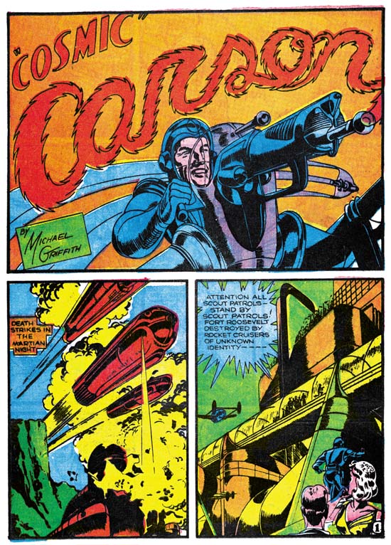
Jack also ghosted as Michael Griffith on Cosmic Carson. I have not seen the earlier installments of this feature, but I be willing to bet they were not as exciting as what Kirby presents. You can tell Jack loves his science fiction. He provides us with a beautiful space pirate, thought controlled “mekkanos”, and an evil giant Martian.

Science #4
Science #4 (May 1940) Cosmic Carson, page 6

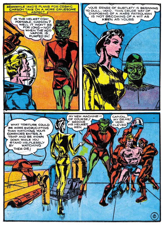
Compared to the short Wing Turner, the eight pages for Cosmic Carson must have seemed a lot. But then again Jack preferred to use larger panels, 4 pages have only three panels on them. Jack did the inking for both of these Fox features. With the larger panels, compared to his previous syndication work, Jack was able to use more form spotting on his figures. But we do not find the effective use of large dark areas that Jack used in the Blue Beetle strips.

Besides Jack’s comic book debut, cover date May was also significant in that it marked the appearance of Joe Simon as a cover artist. This was not a coincidence. Previously Fox Comics were produced by the Eisner-Iger shop. But this business relation soured and Victor Fox started his own artist bullpen. Joe Simon was hired as editor and Jack got his chance to do comic book features. After May Kirby would do other comic book work, but not for Fox. This is rather odd as Jack’s work was well above that done be other Fox artists of this time period. When the Simon and Kirby collaboration began the work they produced was not for Fox Comics, I suspect Fox paid too poorly. But that is not a complete explanation because the S&K team up began in July. So what happened for June?

Both Greg Theakston (The Complete Jack Kirby, 1940-1941) and the Jack Kirby Checklist attribute the inking of the Space Smith feature for Fantastic Comics #10 (September 1940) to Jack. Frankly this attribution is rather astonishing to me. The inking in Fantastic #10 is so poor compared to Jack’s work at that time that it is hard to believe he could have been responsible. The splash page for Space Smith is a clear swipe from Kirby’s Cosmic Carson from Science #4 that I show above. To me it is obvious that the artist for Space Smith tried to swipe Kirby’s inking technique as well.

Early Jack Kirby, Chapter 1, Lighting and the Lone Rider

I have previously done a serial post on The Art of Joe Simon. It would be great to produce an outline of Jack Kirby’s art and how it evolved over the years. However the sheer volume of Kirby material makes such an approach impracticable. Although probably not completely accurate, my database shows that between 1942 and 1957 (that is from the start of working for DC until the time Jack started doing freelance work without Joe) Kirby did 5593 pages of art compared to 184 by Simon. To avoid the problem of an over abundance of work I will instead do some serial posts each focusing on particular periods, this one will be on Jack’s early years. As when discussing Joe Simon’s early work, I am faced with limited access to the publications, they are both rare and expensive. But hopefully I can provide enough to give a general idea of Jack’s early work.

Jack Kirby became a staff artist for Lincoln Features Syndicate in 1936 and stayed there until 1939. Most of his strips can be described as comic humor (for example Socko the Seadog, a take-off of Popeye). Jack also did a lot of “real facts” art (for instance Your Health Comes First). Unfortunately I do not have access to any of this work. Those truly interested in this very early work can find it in the recently published “The Comic Strip Jack Kirby” by Greg Theakston. However some of Jack’s syndication work included some strips with more action and, even better, some of these got reprinted in comics. One, Lighting and the Lone Rider was a daily that appeared in January and much of February 1939. This material was reprinted in Famous Funnies #62 to #65 (September to December 1939). Jack used a number of alias during these early years, here he signed them as Lance Kirby.

Famous Funnies #61
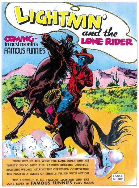
Famous Funnies #61 (August 1939) advertisement

Prior to running the strips, Famous Funnies #61 ran a number of advertisements announcing the appearance of the Lone Rider in their next issue. One ad is particularly important in that it took up a full page. Prior to teaming up with Joe Simon, Jack never did any comic book covers. This full page ad is the only thing we have to compare with some of Joe’s early covers. Like a cover this ad was meant to attract readers, although in this case to the purchase of next month’s issue. One would expect great effort to make this ad interesting and exciting as possible. Instead we find a rather lack-luster piece of comic art. Joe’s earliest covers were much more interesting. As we will see below when we examine his story art, it is not a question of Jack’s lacking artistic skill. One possible explanation is that all his previous work on syndication strips just did not prepare him for the challenges of a single larger piece of comic art. Another suggestion is that already at this early stage of his career, Kirby had developed a preference of story telling over cover art.

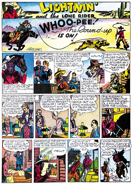
Famous Funnies #62
Famous Funnies #62 (September 1939)

Daily syndication strips require a different story telling pattern then that found in comic books. Whereas a comic book advances the story page by page generally 9 panels to a page, daily strips must tell the story a strip at a time with usually 4 panels. Further a comic book story is meant to be read in one sitting. A daily strip is read one strip at a time over a period of weeks or months. A strip artist must be careful to keep each day’s installment interesting or risk loosing his audience. Jack uses his first strip to just introduce his characters. Frankly I am not sure this was necessary or even a good idea. It probably would have been better to just get the story going and let the cast show up as required. But most peculiar is that there are two characters, Pepito and Texas, that do not appear in the story that follows.

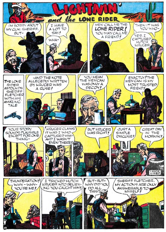
Famous Funnies #65
Famous Funnies #65 (December 1939)

After the first strip, Jack does a good job of telling his story. To be honest the plot itself a bit unrealistic, but if the readers wanted realism they would not be reading a comic strip! The Lone rider uses his side-kick Diego to lure the old sheriff safely out of the way. Meanwhile he goes off to single-handedly capture Hutch Kruger and his gang. But he does so disguised as the old sheriff so everyone is convinced that the sheriff is the hero. All great stuff but then Jack does something very odd. He has the Lone Rider explain the whole plot to the sheriff. This means that for days at a time the reader is presented with what he already knows. For a daily syndication strip this would be a big mistake. The funny thing is the parts of the story that are flaws for a daily strip just do not have the same effect when you read the entire story at one time. Jack was already beginning to think of stories in a bigger way then a daily strip could adequately handle. As for his writing, even at this early date you can already see Jack’s writing style emerge. Take the last panel with the sheriff question and the Lone Rider’s reply:

But, but why did you do all this?

Sheriff Fletcher, my actions are only answerable to myself!

Jack would use this sort of laconic and enigmatic response throughout his career.

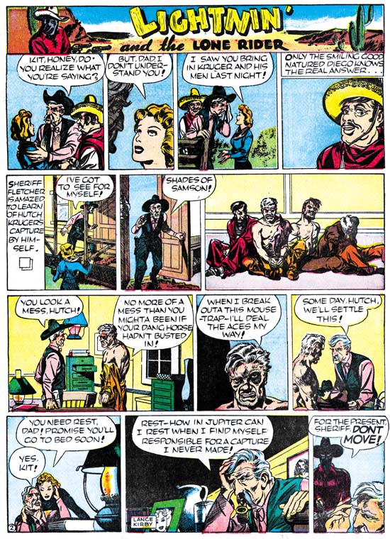
Famous Funnies #64
Famous Funnies #64 (November 1939)

This is not fully developed Kirby art. Fight scenes in particular lack the classic Kirby touch. But even with the small panel size and poor printing quality of Famous Funnies you can see Jack’s talent begin to shine through. Look at the beat-up Hutch in panel 2 of the third strip above, what a miniature masterpiece.

If you remember I said that Kirby introduced two characters, Texas and Pepito, that did not appear in the story. Well The Comic Strip Jack Kirby includes some Lone Rider strips that were never published. In it we find Texas, so in the beginning Jack was already setting things up for next story line. There is also a young boy that Texas calls “little Pete”. At first I thought that Jack had changed his mind about using Pepito so that he changed the character from Diego’s son to that of a rich man. But on reflection it occurred to me that Jack might have been setting up a Prince and the Pauper sort of switch between Peter and Pepito. Unfortunately Jack did not proceed far enough with the story for us to ever know. Although Jack never completed his second story line he did return to do some more work on Lighting and the Lone Rider. But there is a reason I want to discuss that work in another chapter.

The Wide Angle Scream, “Terror Island”

Stuntman
Stuntman #3 (unpublished) “Terror Island”
Enlarged view

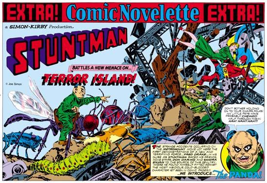
Joe Simon and Jack Kirby must have had high expectations for their creation, Stuntman. There exist three double page splashes that were never published, at least not as regular Simon and Kirby productions. Since S&K always placed their wide splashes in the centerfold, this meant that they had already started working for up to Stuntman issue #5. That is until the post-war comic book glut caused the early demise of their new comic books. Joe still has the three splash pages and with their double size art they are really marvelous to behold. However when reduced to the size necessary for use on the Internet they can be difficult to appreciate. Therefore I hope my readers will understand that I felt it necessary to provide my own coloring for use in this blog. I would have like to have used the color version that Joe did for his book “The Comic Book Makers” but so far I have not found it in his collection. The “extra!” strip on the top, the “a Simon-Kirby Production” and the Stuntman title are missing from the art and I provided them from other wide splashes. Glue marks clearly indicated that the “extra!” strip is was present, or something like it. However I did not scan the original art (it is much too large) and the source of the image does not indicate the placement for the “production” (if it was even present) or the title.

Because two of the double splashes are completely inked I am not absolutely sure which was originally meant for Stuntman #3. I choose “Terror Island” to post on first. However this choice was not completely arbitrary. As mentioned above “Terror Island” clearly had an “extra!” along the top a feature that it shares with the double wide splashes for Stuntman #1 and #2. The other completely inked splash did not have this “extra!” strip, the lack of which it shares with the unfinished Stuntman double splash.

Mao Tse-tung“Terror Island” introduces a new antagonist, the Panda. Of course Stuntman had faced various opponents in his previous stories but they all were rather generic. None of the earlier villains really stood out and it is clear that none were ever meant to reappear in future Stuntman stories. The Panda seems special and I believe was Simon and Kirby’s first attempt to create Stuntman’s nemesis, the equivalent of the Red Skull for Captain America. Basing a villain on a panda may seem an odd choice, after all what could be more cute and cuddly then a panda, at least in the mind of the public. Sure Jack draws the Panda to look as vicious as possible without loosing his panda look. But the real source for this character is not the bear, but China’s leader Mao Tse-tung (nowadays his name is normally transcribed as Zedong). Today with all the world companies scrambling to get a share of the Chinese market it is easy to forget at that time communist China was a very closed society. As China’s leader and his with description of the U.S. as a “paper tiger” Mao was considered a special menace. Still it is not at all clear whether the Panda really could fulfill the role Joe and Jack were casting him for.
The art for this wide splash marked a new approach. All previous double splashes were actually composed of various different sections. But for the “Terror Island” splash no similar attempt was really made. It is true that there is some introductory text and a round panel portraying the Panda, but this hardly compares to the cast of characters often provided in older double splashes. Yes it is also true that space has been left in the upper left for the titles, but no art is associate with these titles. What we are presented with for the first time is an enactment that dominates the entire splash. But what a scene! It sprawls across the pages from the lower left to the upper right. It is just the sort of chaos that we have seen before in the Boy Commandos wide splash. There is some control over the composition. The Panda and his attacking bug army occupy the left page. All are advancing toward the right where we find Stuntman, Sandra Sylvan and Don Daring amid a mass of falling wreckage. Although the uncolored ink art might be a bit confusing, I am sure Jack (who did the penciling) knew how much the final coloring would help to make it understandable. This splash is one of those that Jack could just let his imagination run wild. Previously when discussing the cover for Adventure #98 I had mentioned how Jack was often inaccurate when drawing animals but nonetheless was very successful in giving them a certain life. This splash provides and example of what I meant. A biologist would shudder and the giant bugs Kirby presents us with. Some of the inaccuracies can be explained by the needs of the subject. The wasp like insect that the Panda is mounted on could never fly with its wings in their present location. But if that beast’s wings were in the correct position the Panda could not mount it. But other errors have no artistic excuse. The legs of the insects and the spider are attached in the most bizarre places. If Jack used a biology book for a reference he obviously did not make any attempt to follow it closely. Regardless of these “errors” these giant bugs have a very menacing life to them.

My personal preferences is for the earlier wide splashes with their greater emphasis on design. But there is just no denying the shear brilliance that radiates from these post war double splashes. When you look at the original art for the “Terror Island” splash there are no signs of hesitation or rework. Jack seemed to have it all figured out in his mind before he put it on the illustration board. But with such a complicated drawing how was he able to do that? It just astonishes me.

The Art of Joe Simon, Appendix 7, The Spirit #12

The Spirit #12
The Spirit #12 (1963) by Joe Simon

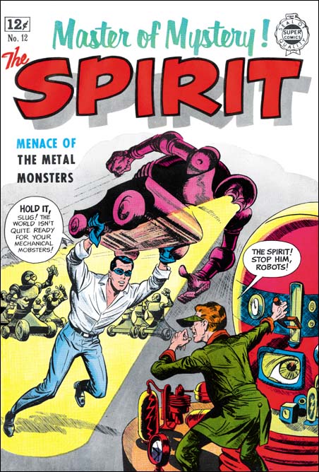
Super Comics published reprints of comic stories. Producers of comics that had fallen on hard times could sell the plates to Isreal Waldman at what I am sure was a low price. In the “The Comic Book Makers” Joe Simon describes selling Mainline titles to Waldman and the buyer’s concern with just getting the plates and his lack of interest in the copyrights. That must have also been true with whatever deal Eisner made since Will always kept the copyrights to the Spirit (except for a period where he did his wartime military service).

Although the contents of Super Comics were reprints the covers were new. I have to admit when I saw this cover in Joe’s book I thought Simon was taking liberties with the Spirit character. The Spirit attacking a mad scientist and his robots seem to me to be a little out of character for Eisner’s feature. But the comic does have such a story inside. I guess I have been biased by my reading of DC reprints of the Spirit. By the way these are absolutely the best books of comic reprints that have ever been produced. DC is doing a fantastic job, I just wish more archives were done that way. Most unfortunately still continue to use glossy paper and overly bright colors. However the Spirit Archives have not reached the final years. I know Wally Wood ghosted for Will on some Spirit adventures in space. So I suppose that this story is also a late one with a story line different from the earlier years that I am familiar with from reading the archives. Anyway Joe did take some liberties, there is no fight scene in the story quite like the one on the cover. I love the way Joe has turned the robot eyes into headlamps that provide a spotlight on the Spirit. Also Joe changes the arm stumps of the robots in the story to more manlike hands which gives them a much more menacing affect. I am less thrilled with the visor Joe has provided the villain with. And what is the significance of the large eye on the instrument’s CRT?

The Spirit #12
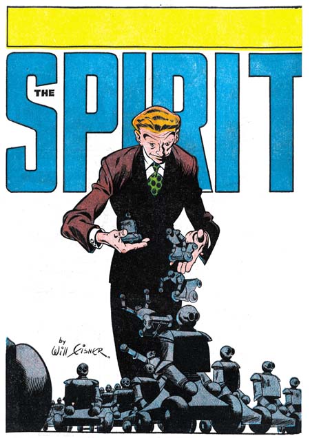
The Spirit #12 (1963) by Will Eisner

This post is not only a post of an example of some solo work by Joe, it is also an Alternate Take post, only this time with Simon not Kirby as the cover artist. But the splash page for the story was probably originally a cover for the newspaper comic book insert. Will Eisner was the master when it came to cover/splash designs. He was always changing the logo and often provided designs the integrated the logo with the art. Although this splash is more of a composition then a design it is still wonderfully done. The empty background brings all attention to the figure of the villain dropping his army of robots. A low viewpoint allows the robot formations to still seem threatening despite their small size. Notice how most of the figure is in shadow, this allows the falling robots to really standout. While Joe gave an exciting fight scene, Will was more subtle and using just visual effects provided a threat. I am no scholar on Will Eisner, for instance I have trouble distinguishing some of the ghosting Lou Fine did on the Spirit during the war from Will’s art. Still this splash looks very much like Eisner’s work to me.

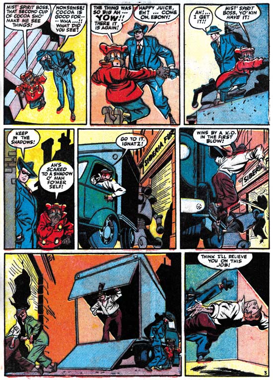
The Spirit #12
The Spirit #12 (1963) by unidentified artist

Although I am convince Will Eisner was responsible for the splash, the rest of the story looks like someone else was ghosting for Will.

Art by Joe Simon, Appendix 5, Harvey Hits #12

Art by Joe Simon, Chapter 1, In The Beginning

The Wide Angle Scream, Stuntman #2

Stuntman #2
Stuntman #2 (June 1946) “House of Madness”
Enlarged view

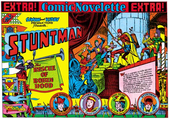
When I finished up the posts of the Captain America double page splashes I said that Simon and Kirby would not repeat those sort of designs. Well I lied. Stuntman #2 has the same sort of emphasis of design over composition seen in the Cap spreads. It is interesting to compare this splash with one from the Boy Commandos with a similar medieval theme.

I have hoped that my discussions on the design elements would make it clear what the distinction was between design and composition, at least as I use the terms. Composition is how a scene is arranged, that is in comics how the figures and non-figurative elements are arranged and how they direct the eye. Design is how disjoint parts, the text and different images, are arranged on the page. For instance in the image on the right side of Stuntman #2 is composed with the attacking knights starting on the lower left and rising as the eye goes toward the right until it meets the pivotal Stuntman and finally the defended Don Darling and Sandra Sylvan. The composition does not end there as the large candlestick brings the eye down, and (although not really part of the scene) the cast of characters bring the eye back to the start of the image. Actually that is just a condensed description. Notice the use of arcs (the curtains, shadows, the stonework for the pillar and the doorway) along the top and how they are used to highlight certain figures. Particularly effective is Stuntman’s placement in front of the pillar, despite the fact that he is closely surrounded by other figures this placement makes him standout. This is a marvelous composition and Kirby’s penciling is just fantastic.

But the right hand scene is just part of the page and that is why I said earlier that the design was more important then the composition in Stuntman #2. Like most of the Cap double splashes, here we find a three part layout. Starting on the left is the title section, followed on the right by the enactment and below with the cast of characters. The title compartment depicts an archery contest. On the left a series of colorful pendants almost hide a figure blowing a horn. The competition between four archers is arranged along the bottom. The archers are alternated with their targets, the backs of which provide the cast of characters. The rest of the title section scene is left bare so that the Simon and Kirby credits, the Stuntman title and the story title are prominently shown. The story title is nicely placed on the drape hanging from the horn, a similar device was used in the Boy Commandos spread. An interesting touch is how the introduction text is placed on a wall in the enactment section and how the text is lined up to fit the perspective of this wall.

Except for the left edge of the enactment compartment, the whole splash is nicely integrated. I find this a much more successful effort then that for Stuntman #1. It is really a shame that this title fell victim to the post-war comic glut. There are three unpublished double page splashes for Stuntman. Unfortunately I do not have any scans for them right now but perhaps I will get a chance to pick up something from Joe Simon.