Category Archives: Periods

Early Jack Kirby, Chapter 9, The End of the Beginning

It has been months since I wrote my last chapter to this serial post so I think I should remind the reader of where I left things off. Jack Kirby met Joe Simon while both were working for Fox Comics. After a few months Joe went on to be art editor for Timely and a short time later Jack followed. Joe’s first job was the launching of a new title, Red Raven Comics, which included work by Kirby. The publisher Goodman must of got a case of cold feet, because Red Raven was cancelled after the first issue, way too early to tell what the sales would be like. Jack would then do the art for a new backup feature for Marvel Mystery Comics called “The Vision”. The Vision would never achieve the prominence of the main Marvel Mystery features (the Human Torch, the Sub-Mariner or even the Angel) but Jack would end up drawing it for as long as he worked for Timely.
Prize #9
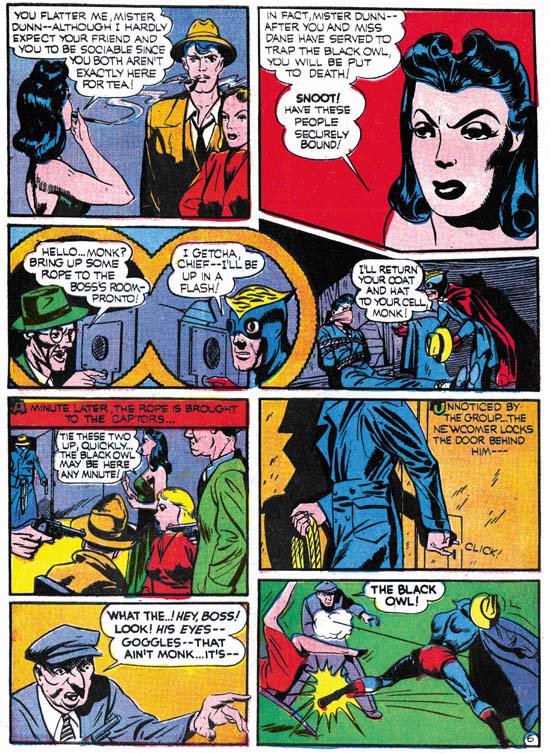
Prize Comics #9 (February 1941) “The Black Owl” page 6 art by Jack Kirby

Perhaps the most important work he was doing just before the launch of Captain America was the drawing for Blue Bolt. Simon and Kirby would now also do some freelance work for Prize Comics starting with a cover date of December 1940. The work for some already running features, the Black Owl and Ted O’Neil. It is not clear if this was truly a Simon and Kirby gig or just Kirby since the work is unsigned. However the stories read very much like what would be done for The Vision and Captain America so I am inclined to believed that Joe was involved also. All penciling was certainly done by Jack.

The Black Owl is one of those forgotten Golden Age superheroes. With good reasons as far as I am concerned. Obviously a take off on Batman, the creators failed to provide a decent costume. The suit and cape are completely nondescript. The only unique portion was the mask. But while Batman’s cowl might inspire fear in his foes, I cannot see the Black Owl’s mask getting more then a smirk. The Black Owl did have one feature that would have historical interest, his goggles. Similar goggles would reappear many years later in a Simon and Kirby creation that was never launched, the Night Fighter. Later yet Kirby would alter the Night Fighter to create the costume of the Fly (Archie Comics).

Despite the weak material they had to work with Simon and Kirby put together pretty good stories as for example in Prize Comics #9 (see image above). In an effort to thwart a mysterious woman gangster and her jewel robbing minions, a newspaper reporter concocts an article where the Black Owl promises to capture the mob. The article is read by a woman sleuth, the Black Owl himself in his secret identity and the female gang leader. That night while alone the reporter hears a noise. Now I have to admit that what follows is more then a little illogical. The reporter believes that the Black Owl is paying an expected visit, so the reporter turns off the lights and grabs the intruder. Only to find when he turns on the lights that he is holding the woman detective! Now if the reporter was really expecting the Black Owl, would he have tried to capture him? If, on the other hand, he wanted to be sure who the intruder was, would the reporter have turned off the lights? Illogical, but it does make for dramatic scene. They would handle this sort of thing a little better in the future, but it is just the twist that Simon and Kirby would often use later. Anyway the sleuth and the reporter wait it out together but instead of the Black Owl appearing, some of the jewel gang shows up to abduct the pair. It turns out that the Black Owl has observed it all and trails them. The kidnapped pair are brought to the lady crime master who plans to use them as bait to catch the Black Owl before being killed. Of course the Black Owl appears to save the day.

The Kirby art is a step up from what he did for Marvel Boy. You can see Jack beginning to put together elements of his classic style. Although reminiscent of what we will find in Captain America it still does not have quite the same punch. I am not sure about the inker, or possibly inkers. There are some parts that look like Joe Simon’s inking to me. For the most part panel layouts are irregularly sized panels that were typical of the work of both Joe and Jack at this point. However there are some uses of circular panels. One is a duel set (see image) showing a gang member speaking over an intercom to who he believes is another gangster but is actually the Black Owl. This pair of circular panels both shows the two sides of the conversation and also makes a visual suggestion to the Black Owl’s goggles. Another circular panel shows up on the next page, but that one is small and appears to have been added later since it both helps fill in the story while intruding on the existing panels. This use of circular panels is another harbinger of what will come when S&K produce Captain America.
Prize #9
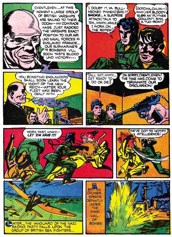
Prize Comics #9 (February 1941) “Ted O’Neil” page 3 art by Jack Kirby

Ted O’Neil is an American pilot in the British Air Force. This is in the days before the U.S. had entered the war. While on leave with his sidekick Hinky, Ted finds himself in an air raid. Without enough time to enter a bomb shelter, the pair retreat to a nearby building. Once inside they hear a suspicious sound as if from a radio set. When they investigate they are knocked out and tied up. Their captors are German spies who are sending information of the position of British warships so that they can be attacked and destroyed. Before the spies can execute them, Ted and Hinky break free of their bonds and turn the tables to capture the spies. After delivering their prisoner to the authorities, Ted and Hinky fly off with their squadron to try to protect the British fleet. A fierce combat ensues which the English eventually win.

The spy angle would of course play an important part in the Captain America stories to come. As would the use of Nazi Germany as the enemy. No circular panels in the layouts, just the variously sized panels that often require arrows to indicate reading order. Kirby pencils throughout but again I am not sure if more then one inker was involved. Parts do suggest to me that Simon was inking at least some of it.
Captain Marvel Special Edition
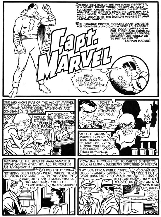
Captain Marvel, Special Edition (March 1941) bleached page art by Jack Kirby

Coming out the same month as Captain America was a special freelance job Simon and Kirby did for Fawcett’s Captain Marvel. Joe and Jack were effectively ghost artists and as such they are trying to mimic another artist’s style. Still you can easily detect their hand in this comic. Because they were ghosting it really is not fruitful to compare the work to other material they were doing. For this reason I am going to skip any analysis.
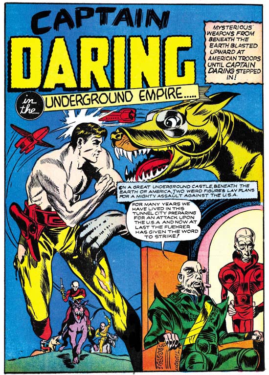
Daring Mystery #7
Daring Mystery #7 (April 1941) “The Underground Empire” page 1 art by Jack Kirby and unidentified artist

The next work by Kirby that I want to discuss is a Captain Daring story from Daring Mystery #7. This comic came out in April which is a month after the first issue of Captain America. But there are two reasons I feel it is appropriate to cover it here with the early Kirby work. One is that although this issue has a cover date of April, Daring Mystery #6 was dated September 1940. With such a long period between issues we cannot be certain about when the art was actually produced. The other reason is that Captain Daring is actually a science fiction story and very much related with other early work in this genre by Kirby.

I will give only the barest of outlines for this story. It concerns the attack on the modern day U.S.A. (that is modern for 1941) by a previously unsuspected underground empire. The enemy is resisted and eventually defeated by Captain Daring and Susan Parker, a beautiful female secret service agent. I do not provide more detail because I fear I am just not up to the task of condensing the story. It has so many jumps you almost get dizzy just from reading it. For instance we are introduced to Susan Parker as she is with Captain Daring watching over a futuristic telescope the destruction unleashed by the underground army. Later we suddenly find her with an army mounted on giant dogs that they liberated from some of the underground forces. She is leading a ground attach while Captain Daring fights above in sun powered rockets. At the end of the story she it is said that she was elected queen of the liberated underground masses. This sort of erratic turns occur throughout the story. It makes for a great read but only if you simply do not worry too much about the continuity of the plot.

There is something funny about the whole story. Although it purports to be taking place in America everything looks futuristic. There are a several fight scenes which the captions state are between Americans and the underground forces but the art depicts all the fighters as dressed in the same shorts and all look like the underground race. Actually the whole concept of an underground race is funny since nothing looks like it is taking place below the surface. I am convinced that this story was rewritten from a early version with minimal, if any, art changes. In fact it could of originally been meant for Solar Legion or Comet Pierce. All the references to the underground race, America and the Fuehrer were added later. Was this an early case of Kirby being rewritten by an editor (with Joe Simon taking the place of Stan Lee)? Or did Kirby do the rewriting himself? I cannot be sure but I would guess the latter, it all sounds like Kirby to me.

“The Underground Empire” is unsigned but in this case it looks like the work of Jack alone without much help from Joe Simon. All the penciling was done by Jack and I also attribute the inking to him. The art as well as the panel layouts are good matches for previous science fiction that Kirby had done. Even the inking style is the same. The only significant difference is the modern day references, which as I commented above I do not believe were part of the story when it was first made. But these alterations could be a reflection of Simon and Kirby’s work on Captain America.

I attributed all the art to Jack alone, but there is one exception. The figure of Captain Daring on the splash page (see image above) was neither penciled nor inked by Jack. I am not sure why this was done, most of the rest on the page surely was by Kirby except maybe the dogs in the background. Perhaps an original figure had something that was too clearly identified with its original source. But if that was the case why didn’t Kirby do the rework? I do not know who the artist was but it does not look like Joe Simon’s work either.

The launch of Captain America brought an end to Kirby’s early period. There was a sudden curtailing of freelance work outside of Timely. Perhaps Simon and Kirby realized that Captain America was likely to be a hit. Maybe producing Cap left little spare time for doing other work. Possibly the money they made at Timely plus the promise (unfulfilled) of royalties made the lower page rates of their freelancing unattractive. Whatever the reason S&K even stopped doing their previously most successful job, Blue Bolt. Joe and Jack did not give up freelancing entirely, however what outside work they they did would be limited to covers.

A big change came over Jack’s art as well. We caught premonitions of what was to come in Blue Bolt, Marvel Boy and the Black Owl. You could say the early work laid the foundations. In Captain America these hints blossomed into extraordinary pieces of comic book art. Irregular shaped panels including circular ones, figures extending beyond the panel boundaries, bodies in unusual posses stretched by the exertions of their action, fast pass stories, and so on. With all the comic history in between, it is hard for us to appreciate how startling Captain America was. There was nothing at all like it at the time. Other artists began copying what Jack and Joe were doing. The public eagerly bought up the comic and Captain America became a big hit. Simon and Kirby became a brand name. But that, as they say, is a story for another day.

Battle Kirby

Recently I posted in some details on Foxhole, Simon and Kirby’s own war comic book. I thought it might be fun to examine some of the work in this genre that Kirby did later in his career. In this post I will look at a couple of stories from Battle, an Atlas title.

Kirby’s work for Atlas as a freelancer was interrupted by the Implosion. Thomas G. Lammers has a marvelous paper called “Tales of the Implosion”. I use the self published version (if you are interested in getting your own copy email Tom at tlammers@new.rr.com). Tom points out that some of the work after the Implosion was from a sort of inventory. He indicates that for Battle new work started to appear with issue #62 (February 1959). By the time Kirby work appears in Battle #67 (December) the comic is produced entirely from new material. The job numbers allow us to distinguish newly produced work from pre-Implosion inventory. All the Kirby battle stories have job numbers starting with T which allows us to say that they are all post-Implosion creations.

Battle #65
Battle #65 (August 1959) cover by Jack Kirby

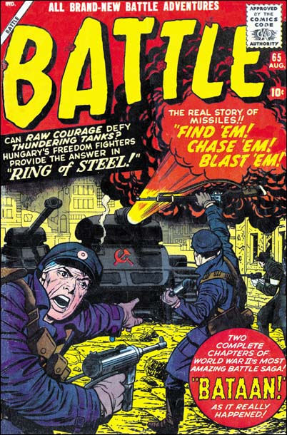
Although Kirby may not have had as much control over his work for Atlas after the Implosion, at least he started to produce covers. The covers that Jack did for Atlas/Marvel varied greatly in quality. Some of that variation is of course due to Jack himself. However for me most of it is due to the various inkers used. Some were more sensitive to Kirby’s pencils, others tended to overwhelm them. Cover layouts for Jack’s Atlas/Marvel period are generally quite different then produced under the Simon and Kirby collaboration. The questions is was this new look really Kirby’s or could it have been due to his working from someone else’s layouts?

I am not going to try to provide a blanket answer. Jack would do a lot of covers for Atlas/Marvel and I suspect the answer to who was responsible for the layouts may have varied. Instead I will focus on the covers Jack did for Battle and use issue #65 as an example. Note the fighter on our left and how he seems to be looking out of the page calling for reinforcements. This is a device that Jack used earlier in his career when depicting combat. Now at the time the combat included superheroes or kid gangs but the general concept was the same. An example of this compositional technique is Champ #23 (October 1942). This is an effective device as it acts to place the viewer as part of the action. Sometimes this can be a bit paradoxical as Jack would sometimes portray a foe as the caller which would place the viewer as one of the enemies. This device was later abandoned by Simon and Kirby. Now part of this can be explained as due to WWII being over. But when S&K produced Foxhole Jack penciled all the covers and he never returned to using the calling figure.

Not only does Battle #65 use this calling soldier device, but it also shows up on issues #66 and #67. When we look at earlier Battle covers although we find soldiers looking out toward the viewer none of them are calling out. Therefore I would suggests that this figure was Kirby’s. On all the Battle covers that use this calling figure it plays an important part of the total composition. I consider it a good indication that Kirby is responsible for these layouts.

It is interesting to observe that once more Jack has turned to using a technique from early in his career. We previously observed circular panels and figures extending past panel borders. Those two techniques resurfaced in Challengers of the Unknown, The Yellow Claw and the Black Rider Rides Again. However in those cases the technique would be dropped after a short period of use, perhaps because the publishers felt it was too old fashion. This fate did not happen to the calling figure device. Jack would not use it frequently but he would occasionally use it throughout his career. The goofy Captain America #197 (May 1976) is a good example.

Battle #65
Battle #65 (August 1959) “Ring of Steel” art by Jack Kirby

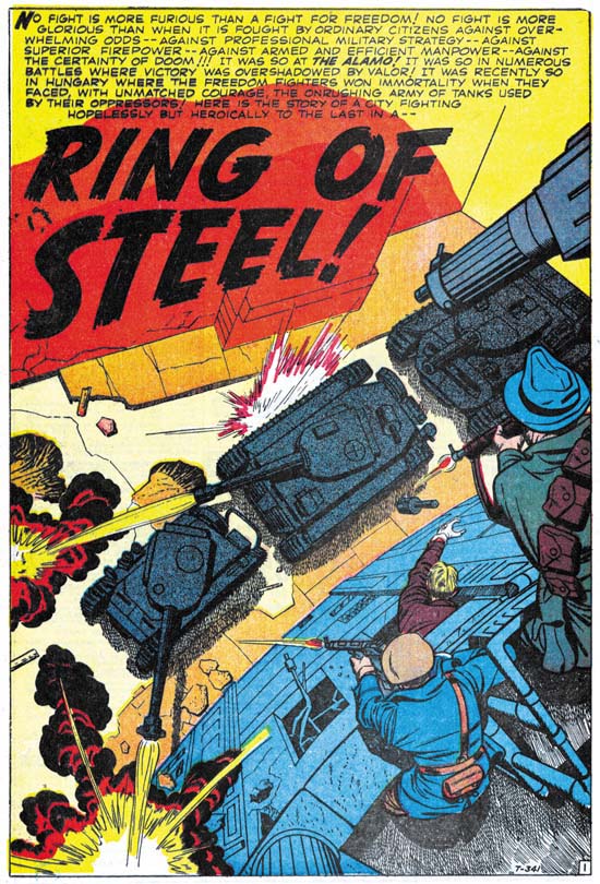
1959 found the U.S. in the grips of the Cold War. The Hungarian Revolt had occurred less then three years before. “Ring of Steel” does not include the start of the rebellion, when a student protest escalated to the point that the Communist government in Hungary was deposed and the Russians expelled. Instead the comic story begins with the reports of Russian tanks grouping outside the city. When the Russians enter the city the citizens fight desperately to keep their freedom. Of course in the end they are defeated by the overwhelming force sent against them.

I was rather young when the Hungarian Revolt toke place. and was raised during the height of the Cold War. My father’s side of my family was Polish with relatives still living under the Communist regime. With my background it is not at all surprising how moving I find “Ring of Steel”. Still even an inspiring story needs a good writer to be truly effective. I feel the author of “Ring of Steel” did an excellent job. For example page four has three rows of panels with two or three panels per row. Each row starts with how the patriots would fight the Russians. Each row would then end with the unfortunate results of those attempts. The same caption is used on the last panel of all the rows, “… against hopeless odds”. Very good scripting. I wish I could credit Jack Kirby with this writing. Frankly it just does not read like his work to me. Particularly things like page four sound more like something from a writer then a visual artist.

A good comic book story needs more then just good writing. It requires great art as well. Of course with Jack Kirby as the artist, the great art in the story is not much of a surprise. I do not know the inker, Silver Age inkers are not an area that I am knowledgeable about. I can say that Jack did not ink this job himself. Whoever the inker was he did a good job. He did not attempt to “correct” Kirby’s pencil nor did he overpower them.

I want to take particular note about the splash page whose image I provide above. Jack was famous for his use of exaggerated perspectives. Still there is something unusual about this splash. In “The Comic Book Makers” Joe Simon describes the proper way to create art for 3D comics. Joe’s prescription is that the art should project out to the user, not into the page. Well Jack generally followed that rule not just for 3D art but whenever he used his special perspective. Early in his career Kirby did not follow that procedure, he developed it as he gained experience. For this splash he completely disregards this canon, but with good reason. The perspective directs us from the freedom fighters with their small arms down to the object of their assault, the massive power of the Russian tanks. In doing so Jack not only condenses all the action into a tightly knitted scene, but also makes the viewer feel as if he is participating in the fight. Kirby’s cover on the same theme (see image above), wonderful though it is, pales by comparison to the splash. What a masterpiece.

Battle #67
Battle #67 (December 1959) “The Invincible Enemy” art by Jack Kirby

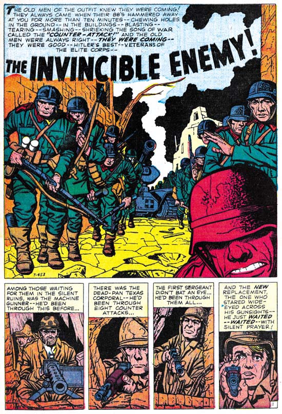
The main character of “The Invincible Enemy” is a new replacement, but some other battle hardened soldiers play secondary roles. They are part of a force trying to hold a town from some elite German forces. The replacement is clearly frightened and when the German counter attack begins he initially freezes up. Prompted by his sergeant he then joins the fray but it is the more experienced fighters that take the lead. One by one these fighters succumb to the Nazi onslaught. The replacement is suddenly filled with fury and becomes a one man assault team. He not only overcomes the German soldiers that attach him, but also takes out a tank. By the time his fury is extinguished, the fight is over and the German counter attach has failed.

This story reminded me a lot of “The Replacement” from Foxhole #2 (December 1954) drawn by Bill Draut. Both concerned an inexperienced replacement and an intense German attack. There are important differences between the two. The replacement is really the only character for the Foxhole story. We are shown some of the “veterans” but none of them stand out or take any significant part of the story. While in the Battle story there are three other soldiers that are unidentified and play a part in the tale. Draut’s replacement fights heroically but you never get the impression that he is any different from the other soldiers in his unit. With Kirby the rest of the unit is defeated while the replacement becomes a sort of super-soldier. In some ways “The Invincible Enemy” is “The Replacement” on steroids. Having said all this, for me it really is not a case of one story being better then the other. Each has their own theme and flavor and I think both are superb works of comic book art. Jack Kirby was a better artist, but Bill Draut’s efforts should not be dismissed.

Jack has once more supplied excellent art. Again Kirby is not inking his own work. After the Atlas Implosion and outside of the late Prize romances, Kirby inking Kirby would be very rare occurrences. Here the inker does a great job and does not overwhelm Jack’s pencils.

You can tell that Kirby and the writer are making great efforts to provide high impact while skirting the Comic Code. The best example of this it the fate of the machine gunner. At the start of the fight we see a German soldier throw a grenade. In the next panel The caption accompanying the violent explosion says that the machine gunner was driven back to another position. But in the following panel we see the German soldiers storming into opening. At their feet on one side are the upturned legs of the machine gun while on the other side a pair of boots are visible and they show that the gunner is face down. Clearly indicating the machine gunners new position actual is. Despite the fierce fighting this is the only death depicted.

Jack did other work for the Battle. The two stories that I discuss here are my favorite, but by no means do I denigrate his other work for this title. All of them are great examples of what Kirby could do. As for the other artists whose creations appear in Battle, well they really are outside of the focus of this blog since they never worked for Simon and Kirby. Still there is some worth while stories here besides those by Kirby. Marvel has been reprinting some of their older material. This effort has largely been focus on their superheroes. But a few volume of their “monster” and western comics have been reprinted. Perhaps, just maybe, someday Battle might be reprinted. I think it would be worth it. Hey a fellow can dream can’t he?

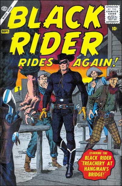
The Black Rider, Another Early Westerns by Jack Kirby

Black Rider Rides Again #1
Black Rider Rides Again #1 (September 1957) “The Legend of the Black Rider” page 1 art by Jack Kirby

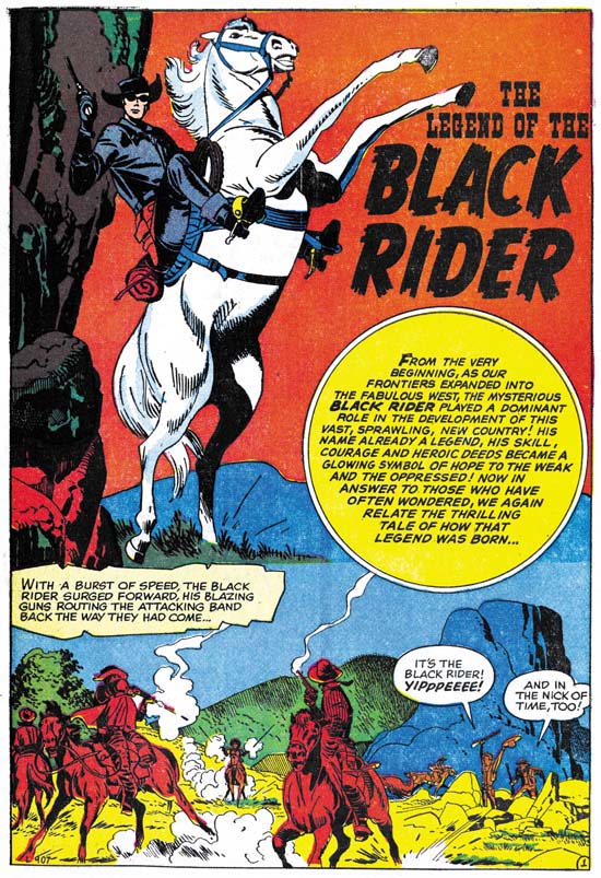
The Black Rider was a western costume hero along the lines of the Lone Ranger. Apparently his first appearance was All Winners Western #2 (Winter 1948). Black Rider Rides Again #1 reintroduces the hero after a lengthy hiatus. Therefore the first story provides information about his origin. We learn that as a very young man our hero’s family was killed by an outlaw. When he was older he tracked down the outlaw and killed him in a gunfight. At his trial he threw himself on the mercy of the court, which gave him probation. The judge then helped him to become a doctor. Doc started his profession during a dispute between some ranchers and rustlers. Doc refuses to help, saying he is not a fighting man. In the end he finds he cannot ignore what is happening, so he puts on a black suit and a mask and saves the day.

The origin story told in the legend has many similarities to that of Bulls-eye, a Simon and Kirby creation. In both the hero’s family is massacred, the hero becomes phenomenal with a gun, maintains a secret identity that projects a unheroic personality, and adopts a mask when performing his heroic exploits. The first appearance of the Black Mask was in 1948, very much earlier then that of Bulls-eye in 1954. However the origin of Black Mask as described by Jess Nevins at A Guide to Marvel’s Pre-FF #1 Heroes sounds like it might be a little different. There is no mention of the death of Black Rider’s family. The circumstances involving the shootout that gets the young hero before a court are vague with no mention of a revenge killing. It sounds that the Black Rider may have been retconned slightly in this relauch attempt.

Black Rider Rides Again #1
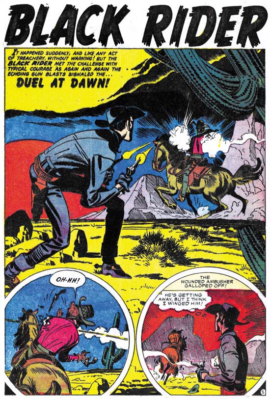
Black Rider Rides Again #1 (September 1957) “Duel At Dawn” page 1 art by Jack Kirby

We enter the story as the Black Rider responds to an ambush attempt. He manages to wound the attacker but did not get a chance to identify him. Back home and back to being a doctor, a man comes in with a wound from a accident with barbed wire. Or so he says, the Doc recognizes it as a bullet wound. Later the Black Rider visits the man who under questioning admitted to having been offered money to ambush him. Before the man was able to say who offered the money, he is shoot. Once again our hero takes on the role as the Doc and saves the man’s life. Now the man will not say who is responsible. While recovering his assailant returns to finish the job, but of course the Black Rider saves the day.

Black Rider Rides Again #1
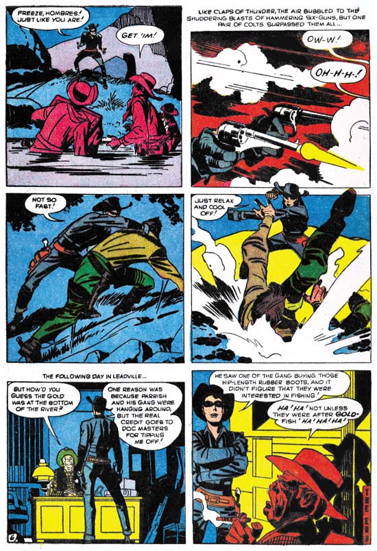
Black Rider Rides Again #1 (September 1957) “Treachery At Hangman’s Bridge” page 6 art by Jack Kirby

The midnight stage coach gets blown up but the Black Rider is nearby and arrives quickly. But not soon enough because he hears The thieves departing. Our hero changes his identity to become the Doc in order the help the wounded. The sheriff finds some men in the area but no sign of the stolen gold so he has to let them go. Doc keeps his eye on them and follows one who purchased supplies. Another change and the Black Rider surprises the thieves as the attempt to recover the stolen gold from the river.

These are not bad stories, but somehow I really cannot get that enthusiastic about them. The Black Rider is a little too successful. When he arrives he saves the day with no real effort. It is never quite clear why the Black Rider must hide his real identify. The rancher’s beautiful daughter’s interest in the Black Rider but not the Doc is a little too contrived. While Jack may have had something to do with retconned origin, on a whole I do not find many convincing Kirby-isms. If Jack was involve with the writing, his more personal touches were edited out.

The art is rather nice with lots of fist fights, blazing guns, galloping horses, and exaggerated perspectives. Just the sort of things that you would expect from a Kirby western. Maybe it is mostly the inking, which I will discuss below, but this comic has more of a Simon and Kirby look then a Lee and Kirby one. Still no matter what your favorite Kirby period was, it is hard to imagine that you will not find something to appreciate in the art. There are also some interesting aspects to the panel layouts. Often figures extend beyond the panel edges. That sort of technique was more commonly used during the earlier days of Simon and Kirby most noticeably in the Captain America stories. But it was used much more sparingly if at all towards the end of the S&K collaboration. Another trait from Black Rider that was frequently used early on but abandoned later is the use of round panels. Interestingly circular panels also occur some of the initial Challengers of the Unknown stories done several months before.

Most of the inking is very much like what we found previously in “No Man Could Outdraw Him”. There generally is no crosshatching, spotting is more limited giving the art a light look, but when black is introduced it generally is produced by flooding an area with ink. In some ways it is very reminiscent of S&K shop style inking. In particular the way that black areas are used in the overall design. Conversely the lack of crosshatching is very unlike the S&K shop style of inking. As I said before I believe Jack developed this austere style of inking after the Simon and Kirby studio had disbanded. It allowed Jack to ink more quickly yet still provide a beautiful and effective job.

Although most of the inking appears to have been done by Jack himself, there are parts that look different. Some areas have been spotted using closely spaced lines, sometimes laid down using a straight edge other times by free hand. Generally the lines are roughly parallel, but occasionally there are some areas of true crosshatching. These lines appear to have been done using a pen, while most of the Kirby inking seems to have been done with a brush.

The splash page for “Duel At Dawn” (see above) provides some good examples of what I am talking about. Most of the inking is the severe style that I attribute to Kirby. But take a look at the mountain in the left part of the right story panel. The lines seem weak and the mountain seems mushy. Not only does it not look like Kirby’s work but the mountain itself seems to detract from the art. The line spotting of the mountains in the splash panel itself seem different and look more like Kirby’s hand. But most of the fine line inking in this book look like the panel version.

Black Rider Rides Again #1
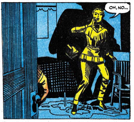
Black Rider Rides Again #1 (September 1957) “Duel At Dawn” page 5 panel 4 art by Jack Kirby

Above I give an example of the use of ruled lines for spotting. For me this use is less objectionable then things like in the hills because it does not change the overall design. But it still seems unnecessary. I believe that this fine pen inking not only was not by Jack, but it was not done under his direction either. I suspect that it was added after the art was delivered to Atlas.

In the past I have remarked that Jack seemed to have a good level of control of the work that he did for pre-Implosion Atlas. But that does not seem to be the case for Black Rider Rides Again #1. If Jack had been involved in the writing, it has been strongly edited. The pencil work is all Jack but the inking is not.

Black Rider Rides Again #1
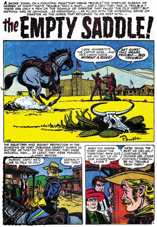
Black Rider Rides Again #1 (September 1957) “The Empty Saddle” page 1 art by Bob Powell

Besides the Kirby Black Rider stories, this comic also includes a short non-Black Rider story drawn by Bob Powell. Now Powell was a very prolific artist and I have only seen a small fraction of his work. I know it is not what he is famous for, but he did some gorgeous art for various Harvey romances. Everything I have seen by him has always impressed me. That is up to now. I got to say I really do not care for the art done in this particular story. Still it is a nice splash panel.

Black Rider Rides Again #1
Black Rider Rides Again #1 (September 1957) cover art by John Severin

Jack Kirby only did a small amount of work for Atlas prior to the Implosion, my database shows 20 stories. What Jack did not do was any covers. I find it surprising that even though Kirby would do all the main stories for Yellow Claw and Black Rider Rides Again, someone else would do the covers. For Black Rider it was John Severin. I guess I really am supposed to say what a fine artist John was. But in all honesty I find most of what he did in this period rather dry. For me this cover is one of his better efforts.

With A Little Help From My Friends

I admit it, when I post about the work that Jack Kirby did after the breakup of the S&K studio I am getting into an area that I really do not have a lot of expertise. But what Jack did during S&K is important to understanding what he afterwards, and visa versa. Further I really feel I have something to contribute in areas such as Kirby’s style of inking his own work. However when it comes to things like DC editors, artists and inkers I am really at a loss. Fortunately I had a couple commenters provide some useful information to a recent post of mine.

I did not respond to Nick Caputo in the comments but I did email him offline to ask him to review the entire Kirby story in All-Star Western #99. When Nick did so this is what he had to say:

I took a look at the All Star Western story and, comparing it to the other stories in that issue which I believe Giella inked (“The Double Life of Sherrif Trigger, pencilled by Carmine Infantino and “Duel of the Twin Indians” penciller unknown, as well as the cover pencilled by Gil Kane) I would credit the majority, if not entire, Kirby story to Frank Giacoia inking. Giacoia has a sharper line than Giella and his faces are more defined. There is also some different techniques used on figures and backgrounds (for instance, the lines on the rocks on page 5, panel 2). While it’s possible that Giella did some background work in places, I see more Giacoia here than Giella.

Bob H. also felt that Giocoia was the inker for this story. But he also added an interesting observation:

… given that it was the only story Kirby did for Julius Schwartz’s editorial stable, where Giacoia was a regular, and the “Foley of the Fighting 5th” was an ongoing feature, this was probably more of a ghosting job for Kirby, which is probably why a lot of his tendencies are repressed. Kirby did similar ghosting for Giacoia on some “Johnny Reb” comic strips in the same period.

Well like I said I do not know much about DC at this period, but Bob’s suggestion that Jack was ghosting makes complete sense.

So my thanks to both Nick Caputo and Bob H. for their contributions.

Two Early Westerns by Jack Kirby

Both Joe Simon and Jack Kirby had drawn some Western comic stories at the start of their careers. After their team up, Simon and Kirby would return to this genre but would combine it with others. Boys’ Ranch was Western plus boy gang and Bullseye added costumed hero to the mix. Simon and Kirby would even produce comics that joined the romance with the Western genre. As for pure Westerns, the only work Simon and Kirby did was some covers. After the break up of the Simon and Kirby collaboration, Jack began doing freelance work for both DC and Atlas, some of which included Westerns. I thought it might be interesting to examine some examples from early in Jack’s freelance period.

All-Star Western #99
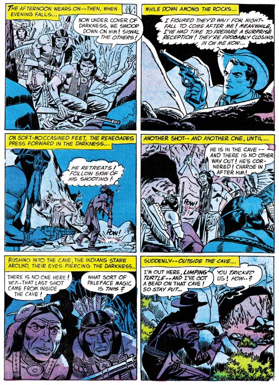
All-Star Western #99 (February 1958) “The Ambush At Smoke Canyon” page 5 art by Jack Kirby

I am going to do this backwards and start with the later of the two stories. “The Ambush At Smoke Canyon” was published by DC with a cover date of February 1958. The six page story begins with the return of a scout’s horse to Fort Desolation without the scout himself. Realizing that something is amiss but with most of the force away on detail, Lt. Dan Foley goes out alone to try to follow the horse’s trail. Foley finds the scout pinned down by some Pawnee. Dan sneaks past the attackers and finds the scout wounded but not badly. Dan convinces the scout to sneak out and use his (Dan’s) horse to get help. Meanwhile Dan lures the Pawnee into a cave and traps them there until help arrives.

I got to say this is not that great a story. Does it seem reasonable that not only was Dan able to sneak past the Pawnee but that the scout was then able to sneak back out again? Even the method Foley uses to lure the Indians into the cave seems more contrived then ingenious. All and all a rather forgettable story.

However Jack Kirby has rescued otherwise uninspiring stories just by the visual excitement that he can add. Unfortunately that is not the case for this story. In fact a quick glance at the art might leave one unsure that it was done by Jack. I believe Kirby did the art, the two Indians of panel 5 of page 5 (see above image) look to me to be good evidence of Kirby’s pencil. There are some other examples in the story as well. But why does Kirby’s involvement seem so unobvious? One reason is a recurring problem now that Jack was freelancing. More and more in the future someone else would ink Kirby’s pencils. At times, and I think this is one of them, the inker seems to deliberately mask some of Jack’s eccentricities and make art look more like the house style. Whether the inker of this story was trying to correct Kirby or just was not talented enough, his overbearing inking has done a great disservice to the art.

Sometimes no matter how poor the inking, Jack’s powerful drawing would shine through. I do not know why that did not happen here. The layouts are not very interesting. There is little use of some of Kirby’s favorite techniques such as exaggerated perspective. Much of the action is from a distance, while Kirby usually favored his action up close and personal. Even the one fight scene included was handled rather poorly. I may not be able to explain why Kirby’s art in this case was one of his more forgettable efforts, but clearly freelance work did not always provide the best circumstances for Jack’s art.

Two-Gun Western #12
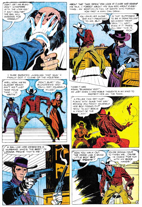
Two-Gun Western #12 (September 1957) art by Jack Kirby “No Man Can Outdraw Him” page 3 art by Jack Kirby

The next Kirby Western we will examine is a five page one done for Atlas with a cover date of September 1957. It tells about the arrival of a gunslinger into a small town. He is “the fastest gun in the west” and no one in the town is anywhere near his match. Therefore the Gunslinger is largely unopposed when he orders people about and takes what he wants. That is until he becomes interested in a beautiful girl.

Two-Gun Western #12 was one of the last comics published before the Atlas Implosion. Like other work for Atlas prior to this event, in “No Man Can Outdraw Him” Kirby seems to have a lot of control over the content. I can not say for sure whether he did the script, but there is something about some of the dialog that is has that slightly over the top quality that Kirby so often used.

The inking looks very different from what Jack for recent work in Yellow Claw (December 1956 and February 1957) or Astonishing #56 (December 1956). For those prior works Jack had adapted the Simon and Kirby house inking style. This style makes use of a special type of crosshatching using a brush instead of a pen. Common to the S&K house style are a set of long roughly parallel lines intersected by a series of shorter lines which I like to think of as a picket fence design. Another technique is the use of a row of tear shaped dots. Kirby used this style for the early Atlas work I mentioned but modified it by using a finer brush. However none of this is found in “No Man Can Outdraw Him”. In that story there really is no crosshatching of any kind. Instead spotting is used more sparingly so that the art has a light look to it. When larger dark areas are introduce they tend to be made by completely flooding an area with ink.

Despite the different styles used between these stories I think it would be a mistake to discount Kirby as the inker for the Two-Gun Western story. Look at the forearm of the gunslinger in the fifth panel of the image I provide above. Notice how the nearest portion is made from a couple of closely placed black strips followed by a larger area of black taking up the rest of the forearm. This same sort of technique for spotting clothing became common around the time of the Mainline titles such as Foxhole. A good example can be seen in the lower leg of the paratrooper in the cover for Warfront #28 cover dated January 1956. This concept of modifying the S&K studio inking style but dropping crosshatching and simplifying the spotting can also be seen in other Kirby works of about this period. For instance in “Town Full Of Babies” (Black Cat Mystic #60, November 1957). I have also previously remarked on this showing up in the all Kirby Prize romances that Jack did staring about November 1955 and going to December 1956). Kirby would evolve the style even further in the late Young Romance (starting about February 1958 and ending with December 1959). I believe that Kirby found the inking technique he used for Yellow Claw too time consuming. His inking therefore evolved into a quicker style. But the style was not just faster, Jack was much too good an artist to settle for that. Instead he used it to great advantage to give his art a stylized or abstract look.

Jack’s drawing seems to adjust to his new inking style, it also adopts a more stylized look. Jack’s figures often take on exaggerated but very expressive posses. Sometimes this results in some strange distortions such as the small torso of the hero in the second panel shown above. For Kirby it was always about depicting the story and giving his figures life, never about being anatomically accurate.

In short “No Man Can Outdraw Him” is a small masterpiece. It did not provide Jack Kirby’s wild imagination an outlet like he had in Yellow Claw but otherwise it shows what Kirby could do when he had control over what his work. The reverse, which is when Jack lost that control, is shown in “The Ambush At Smokey Canyon” that I started this post with. In all fairness these two are extreme examples, there was a whole lot of middle ground that Jack would occupy in later years. Still it brings to mind two “what ifs”. What if Kirby had continued to ink his own work for the Challengers of the Unknown? Wally Wood’s inking is very beautiful but I cannot help but think it would be more expressive had Kirby used his new style on it. Or what if Atlas never imploded? Kirby seem to have more freedom before the Implosion then after. Who knows what sort of masterpieces Jack might otherwise have produced for Atlas?

You can never provide real answers for such “what if” questions. All we can do is enjoy what was actually done. Unfortunately most of Jack Kirby’s pre-Implosion work for Atlas are obscure and have not been reprinted. However I have one other Kirby Western to discuss but that will have to wait for another post.

Foxhole #6, The End of a Masterpiece

Foxhole #6
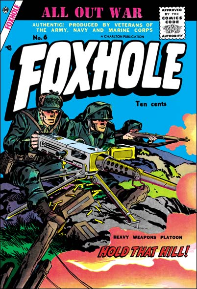
Foxhole #6 (September 1955) art by Jack Kirby

With issue #6 Foxhole looses focus a little bit. The cover still declares it was made by veterans and, except possibly for one story, this is true. One change that occurs is that the credit boxes have disappeared. Once again we must rely mostly on the style to identify the artist. For the first time one story shifts completely out of the WWII or Korean time frame. None of this affects the quality of the comic as a whole. With one exception, all the stories are great reads, penciled by some of the same talented artists that we have seen before. Further Jack Kirby is back! Jack provides two stories and that alone makes this issue memorable. Only two things dampen my enthusiasm for this comic. One of the stories really is not all that good and the cover is way below Kirby’s standard.

It is obvious that Simon and Kirby put much effort into their covers. I do not believe any other team or individual artist produced so many covers of such consistently high quality. Disappointing covers are very rare but Foxhole #6 is one of them. The last covers for Police Trap are also poor efforts. Even the last In Love suffers and that was drawn by Bill Draut. Bullseye #6 is a good cover, but the preceding one is not. So many below par covers from such a short period deserves some sort of explanation. I cannot offer a definitive one, but I suspect that the Simon and Kirby studio and the work practices it supported had broken down.

Foxhole #6
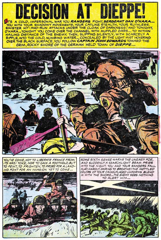
Foxhole #6 (September 1955) “Decision At Dieppe” page 1 art by Joe Albistur

A soldier gets wounded and separated from his unit during a commando probe of Germany held Dieppe. He is discovered by a Frenchman who hides him. The Germans take over the house to use as their headquarters effectively making the American soldier a prisoner. His hidden vantage point provides the soldier with the opportunity to observe the brutality of the German occupation.

This is Joe Albistur’s last effort for Foxhole. He would continue to provide some stories for the Prize romances but after a couple months that would end also. Albistur only worked for Simon and Kirby for about a year. Although he did provide enough material that during that time he really can be considered one of the usual suspects (artists who frequently provided work for Simon and Kirby). Like the other usual suspects (Bill Draut, Mort Meskin and John Prentice). Joe Albistur has his own unique style which is easily recognizable. I previously have admired his work for the Prize romances but his Foxhole art has left me even more impressed. Joe would do further comic book work after his Simon and Kirby period. I have not seen much of that work and what little I have seen does not look as good as his S&K material. Is this because I just have not seen enough of it or did Simon and Kirby provide the kind of freedom for Albistur’s style to flourish?

Without credits I cannot say who is responsible for the “Decision At Dieppe” script. In previous Foxhole stories Albistur’s writers were Jack Oleck and Jack Kirby. I really do not have a handle on Oleck’s style yet, but the writing of this story does not appear to have been by Kirby. It is wordier then Kirby’s writing and reads more like the work by someone with a writers background. “Decision At Dieppe” is a good story but I feel that it suffers a little from the effects of the Comic Code. There is one scene where the American soldier is discovered by a German orderly. The text box tells us that the American attacks the German before any alarm can be sounded. Although the art shows the initial confrontation the next scene shows the American alone. We are never provided with anything from the actual fight. Only from reading the text is the story understandable. I am not suggesting that the Comic Code actually censored this part of the story, just that the writer or artist wanted to avoid any possible rejection.

Foxhole #6
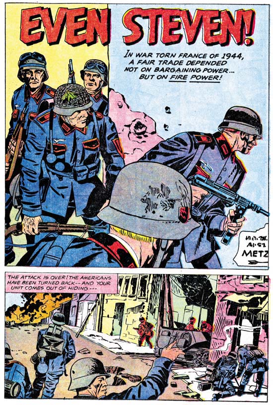
Foxhole #6 (September 1955) “Even Steven” page 1 art by Jack Kirby

I really like some of the artists whose work appeared in Foxhole. Still it is nice to see some more stories by Jack Kirby. “Even Steven” is a tale about the vicissitudes of war as told from the viewpoint of a German soldier. In it an American soldier is captured by the German who later is captured by some Americans. The actions of each mirror that of the other. Yet despite the two characters performing essentially the same actions, the readers reaction to each is not the same. The American soldier embodies good while the German is inherently evil. “Kamakaze Joe” was another story from Foxhole that adopted an enemy as the lead character. “Kamakaze Joe” used that enemy’s narration to provide an explanation of his motivations. While we may not be willing to accept his culture we can understand why a Kamakaze pilot did what he did. In “Even Steven” Kirby does not really attempt to provide any understanding of the German soldier. For Jack evil is a basic trait that does not need any explanation. This will be a one of Kirby’s recurring themes in the years to come.

Foxhole #6
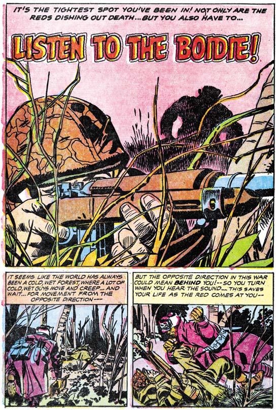
Foxhole #6 (September 1955) “Listen To The Boidie” page 1 art by Jack Kirby

“Listen To The Boidie” provides an example of another of Jack’s interests, that of comic absurdities occurring during events that normally would be considered as rather serious. An American line is being faced with an assault from Koreans. We are told this tale by a former Broadway press agent. The Koreans have been relentless and our soldier owes his life to the efforts of a soldier from the south. This southerner happens to be a crack shot with a rifle but his mains interests seems to be bird whistles. He is constantly trying to have the main character give him an audition.

You can trace Kirby’s interests from the start of his career to the end. They may evolve but they are generally present. However “Even Steven” and “Listen To The Boidie” seem especially characteristic of Jack Kirby’s later work. I do not think they would have been at all out of place had they been published in the title called The Losers that Kirby did in the mid ’70s.

Foxhole #6
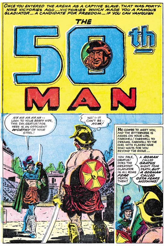
Foxhole #6 (September 1955) “The 50th Man” page 1 art by Bill Draut

With “The 50th Man” Foxhole #6 steps out of the WWII or Korean war time period. Heck it even leaves wartime combat entirely. We now enter the gladiator arena during the Roman empire. This story man seem out of place in a comic with the title Foxhole but I say let us not quibble about that. What really is important is the story itself and “The 50th Man” is a great story. We find a gladiator about to undertake his fiftieth match. Win this one and he gets his freedom. He is a mountain of a man, strong and massive. But then why is he so concerned about his small and skinny opponent?

This is our last chance to see Bill Draut do action, well at least for Simon and Kirby. Once again in “The 50th Man” Bill’s action seems handled different then typical of Kirby, so I do not believe Draut is working from layouts.

Foxhole #6
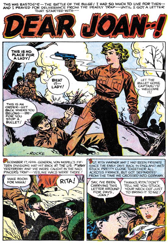
Foxhole #6 (September 1955) “Dear Joan” page 1 art by Rocco “Rocke” Mastroserio

A WAC gets caught in the Battle of the Bulge. While there a letter manages to reach her. It is from her fiance and it is the female equivalent of a “Dear John”. Despondent she goes of to the battle line with a discarded gun hoping to end her pain. She does get shot but is only wounded. Eventually she is taken back to a hospital to recover.

On the face of it this story might seem appropriate for Foxhole. It is after all not your typical war story. With six pages “Dear Joan” would seem to adhere to Foxhole formula of rather short stories. But page count does not tell all. Foxhole stories are general well crafted. It is hard to image how any part a Foxhole tale could be removed without it being severely diminished. They are like well polished gems. “Dear Joan” is not at all like that. Even with only six pages it seems to ramble. We learn from the letter the WAC receives about her romantic ties to a soldier. But then later we are given a flashback to how they met and feel in love. This flashback really seems superfluous. The handling of her attachment to a new soldier that happens in the end seems poorly done. The writing of “Dear Joan” just does not seem up to the Foxhole standard.

The art is signed “Rocke”, which is a nickname used by Rocco Mastroserio. I do not believe Rocke did any previous work for Simon and Kirby but he did have a long history with Charlton. The artistic vision Rocke supplies is also very much at odds with the rest of Foxhole. Although part of the story takes place when the American forces were trapped during the Battle of the Bulge the soldiers all seem clean cut with their uniforms in good shape. Even the heroine seems to be well groomed and wearing makeup. This is WWII as viewed by Hollywood at the time. This is not the sort of war portrayed in the rest of Foxhole.

With Mastroserio’s long involvement with Charlton and because the writing is so unlike the rest of the Foxhole stories, I suspect Charlton supplied this story to augment the rest of the S&K material.

There was a seventh issue of Foxhole published by Charlton. None of the artists for issue #7 had ever worked for Simon and Kirby as far I have been able to determine. The stories themselves are no longer the unique type of tales that are found in the other Foxhole issues. Rather Foxhole #7 has now become a standard war comic and a rather boring one at that. I can only conclude that issue #7 was a purely Charlton production without any input from Simon and Kirby. I understand that for issue #8 Charlton changed the title of the comic and Foxhole was no more. This sort of thing was done to save on postal registration fees and was fairly common. Charlton did the same thing when S&K’s In Love title was changed to I Love You with issue #7 although in that case Kirby supplied the cover.

This is the Simon and Kirby Blog so it should not come as a surprise that I am a big fan of much of the comics that Simon and Kirby produced. That is not to say that everything they put together was of equivalent merit, some of it was better then others. If I were to pick what I felt to be the best S&K title it would be Foxhole. This makes it truly regrettable that this title is out of print (although not out of copyright). Even beat up copies of the original Foxhole comics have become rather pricy. This title begs to receive the same sort of republication that Boys’ Ranch and Fighting American have already received.

But some of Foxhole have been reprinted. In Joe and Jim Simon’s “The Comic Book Makers” Joe describes selling some of the Mainline titles to Israel Waldman. The Foxhole work was published by Super Comics in 1964. The contents of Foxhole #1 was reprinted in Super Comic’s Foxhole #11, Foxhole #2 as Foxhole #12 and Foxhole #3 as Foxhole #18. Super Comics also printed some other comics using the Foxhole title but they do not contain any stories from the original Simon and Kirby’s Foxhole. In keeping with Super Comics general policy, the covers to their Foxhole reprints did not use the original cover art. I have noticed that in the last few years the price of Super Comics have risen dramatically. However this is for high grade books. Low grade Super Comics still show up at comic conventions or eBay from time to time at reasonable prices. The covers may be beat up but who cares, they are not Kirby’s covers anyway! The bad news is that Super Comics are not common so you may have to be patient and diligent.

In 1983 Charlton published two issues of their title Battlefield Action that contain some of the original Foxhole work:

Battlefield Action #83 (October 1983)
“Glide Into Glory” from Foxhole #5
“Morale” from Foxhole #5
“Kamakaze Joe” from Foxhole #5

Battlefield Action #84 (December 1983)
“Listen to the Boidie” Foxhole #6
“Even Steven” Foxhole #6
“Decision At Dieppe” Foxhole #6
“‘Hip Pockets’ and the Paper Bullets Foxhole #5

Again none of the original Kirby cover art. I have not been keeping track of Battlefield Action in the marketplace. Still with a 1983 publication date I would suspect that lower grade copies would be reasonably priced.

Reviewing all the Foxhole comics over a relatively short time has been very useful for me. It has allowed me to correct some early misattributions. By doing so I have come to see that Joe Albistur was even more important to Simon and Kirby productions then I had thought. For this short period of time Albistur is truly one of S&K’s usual suspects (along with Bill Draut, Mort Meskin and John Prentice). Joe Albistur’s Foxhole work has only increased my admiration for this fine but underrated artist. I have now reevaluated Bill Draut’s capabilities for drawing action. His early comic book work may have had some faults in this area, but he does some great action art in Foxhole. One thing that I have not mentioned yet is the absence of Mort Meskin in Foxhole. Actually Mort did little work for any of the Mainline titles although he was still drawing for Prize romance comics during this period. Mort seems to be the only one of the usual suspects who did not play a prominent part in the Mainline titles. I do not know why this should be but it seems worth investigating.

Foxhole #5, A New Publisher

Criticism of comic books by some of the public resulted in decreased sales. This was particularly felt by EC which published some of the more objectionable titles. In a domino affect, decrease EC sales lead to financial problems for their distributor Leading News which in turn created difficulties for Simon and Kirby’s new publishing company Mainline that used the same distributor. Eventually S&K had to shutdown Mainline and they then went to Charlton to publish their titles. While the titles had been on a bimonthly schedule, the first Foxhole issue published by Charlton came out with an extra month delay. The whole change in publishers must have been somewhat unexpected because although this was Charlton’s first issue it had a postal declaration which still listed Mainline as the publisher.

Foxhole #5
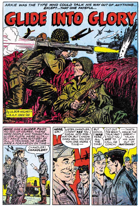
Foxhole #5 (July 1955) “Glide Into Glory” page 1 art by Bob McCarty

“Glide Into Glory” is about Arkie a wacky glider pilot. Are there any other kind? I see no reason to go into details about some of these Foxhole stories but that is not to say they are not good stories. We have seen Bob McCarty’s work before and here he continues to provide his quality art. The script is also entertaining. I guess the moral of the story is how important the independence streak of Americans was to winning the war.

Foxhole #5
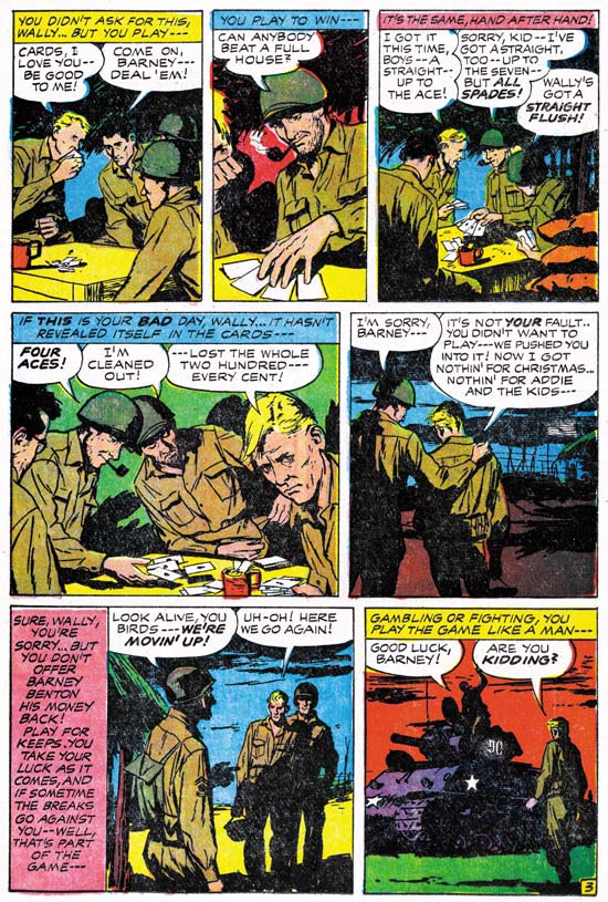
Foxhole #5 (July 1955) “Lucky Stiff” page 3 script by Jack Kirby art by Joe Albistur

Another Kirby and Albistur team up in a story about Wally, a soldier who seems to have all the luck and Barney who wished he had. We previously saw Kirby provide a script that almost seemed appropriate for Black Magic. While “Lucky Stiff” is not so extreme it is still a rather off beat story. I will say that although I understand what Kirby was trying to do I do not feel the end was quite as successful as it should have been. Albistur for his part provides some rather nice art. I like the way he cuts off much of Barney’s face in the second panel of page 3 shown above. I think it is very effective in providing just of note of Barney’s frustration in a panel otherwise devoted to Wally’s calm good fortune.

As I said this is our second example of Jack Kirby as a writer. We have also seen two stories that Jack drew (“Booby Trap” and “Hot Box“). Jack did seem to make writing changes to the stories he drew. In both of these Foxhole stories drawn by Kirby there are small speeches that seem so typical of Jack. This sort of laconic retort shows up not only in other S&K productions drawn by Kirby but in work that Jack did late in his career. These Kirby-ish dialogs do not occur in S&K comics drawn by other artists. Now that does not particularly surprise me but I do find it unexpected that the two examples of Kirby as writer in Foxhole also lack these small Kirby speeches. While it is possible that Jack just did not feel they were appropriate for these stories, I suspect that it reflects on the type of artist Jack was. The scripts that Kirby provided Albistur are rather good but that was not the way Jack preferred to work. It is not so much that Jack was a visual artist as that it was hard for him to separate the writing portion of story telling from the drawing part. Jack’s scripts were more personal when the writing and drawing were done simultaneously.

Foxhole #5
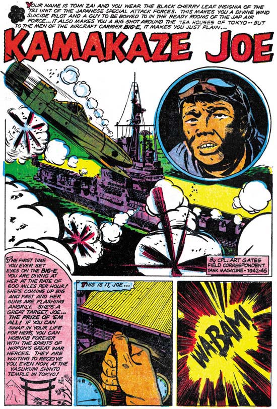
Foxhole #5 (July 1955) “Kamakaze Joe” page 1 art by Art Gates

“Kamakaze Joe” starts with the main character flying his plane into the “Big-E” (the USS Enterprise, an aircraft carrier). This may seem to be more appropriate for near the end of a story, but it was a really effective choice by the writer. After this unusual start, we are taken back to trace the personal history of this Japanese pilot. Here Art Gates really shines. I am sure there was a lot of swiping done but Art has illustrated a story that really seems placed in Japan. The plot makes its way back to where it started and we are then given in the last panel an American perspective of what just happened. I really like “Kamakaze Joe”. Not only does it written from the enemy’s viewpoint but is probably the most realistic story of the entire Foxhole series.

Art Gates also provides the art to a single page story called “Morale”. This is more the Art Gates that I am familiar from S&K romance comics. For them art seemed to specialize in single page pieces. Some gag pieces and other regular stories. But because the emphasis in Foxhole was the veteran status of the creators, S&K also made use of Gates for some longer stories as well.

Foxhole #5
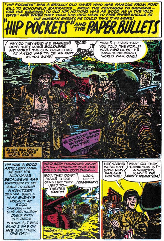
Foxhole #5 (July 1955) “‘Hip Pockets’ And The Paper Bullets” page 1 art by Bill Draut

Bill Draut returns with another very short (three pages) story. I am sure that by now it is pretty obvious that I am very fond of the work by Bill, particularly as seen in Foxhole. I also feel he was a good at inking his own work, using a spotting technique with both similarities and differences from the S&K shop style. However Draut has taken his spotting too far in the splash panel in “Hip Pockets”. I understand what Bill is trying to do. What he wants is to give his soldiers a dirty and unkempt look. It actually works effectively in most of the rest of the story. For the splash panel he was too heavy handed in the spotting and the result is in all honesty a mess.

Otherwise the story itself is a good one. A artillary man nick named “Hip Pockets” was from the old school, that is WW II. While fighting in Korea he is dismayed when he is ordered to fire propaganda leftlets into the enemy line.

Foxhole #4, Enter the Comic Code

Foxhole #4
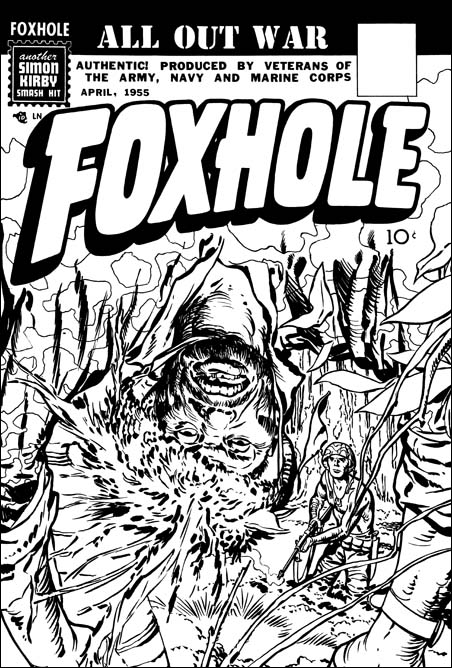
Foxhole #4 (April 1955) unused cover by Jack Kirby

Public criticism about the contents of comics had lead to the creation of the Comic Code. Although not a legal requirement, publishers knew that they must submit their work to this agency for approval or be rejected by most newsstands. Simon and Kirby’s company Mainline was no exception to this. So when along with their other titles Foxhole #4 was submitted for approval the Comic Code rejected the cover. Its depiction of a dead enemy sniper was too much for the delicate sensibilities of the young. In all honesty even without showing any direct signs of violence it is a very compelling but disturbing piece of art. S&K’s substitute cover had a close-ups of a face wear camouflage makeup. Simon and Kirby could still produce great covers within the Comic Code framework.

Foxhole #4
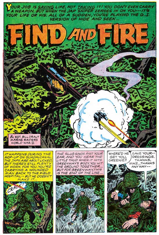
Foxhole #4 (April 1955) “Find And Fire” page 1 art by Bill Draut

The rejected cover for Foxhole #4 was based on an interior story “Find And Fire” by Bill Draut. It is unclear to me whether the cover developed from the story or the other way around. Often Simon and Kirby productions have this cover/story connection. Not infrequently each does not tell quite the same tale. Draut’s story starts with a splash very different from Jack’s original cover. Most of what we see is just the tree foliage. Only the sniper’s hand and firing rifle are visible. By doing so Bill has captured horror of having to cope with an unseen foe. The story itself is about a medical corpsman having to deal with a Japanese sniper alone. As a medic he is not supposed to fight and does not carry a gun. The Japanese, and the sniper in particular, did not care about such niceties and the American is forced to confront the sniper armed with only a knife. Its a great story illustrated by one of S&K’s top talents.

Foxhole #4
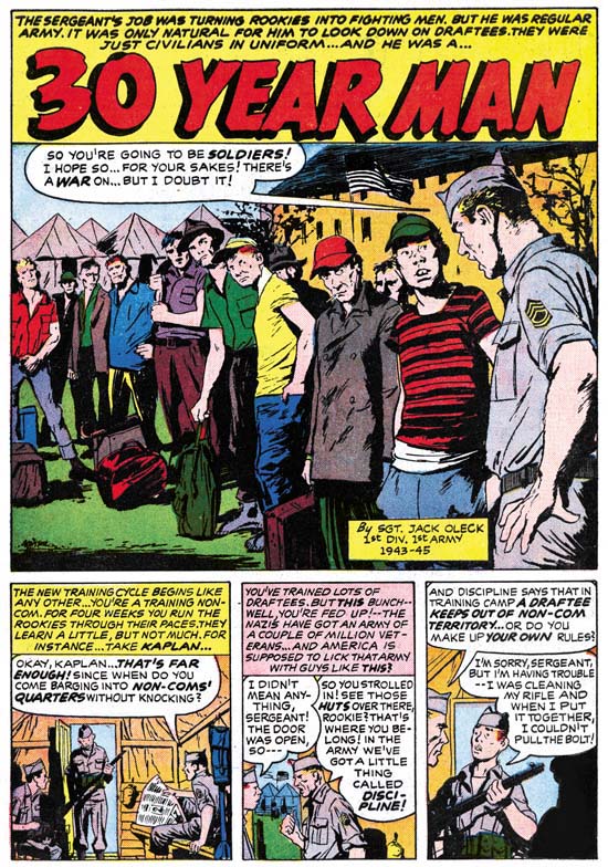
Foxhole #4 (April 1955) “Thirty Year Man” page 1 script by Jack Oleck art by Joe Albistur

This time instead of Jack Kirby, Jack Oleck provided the script for the artist Joe Albistur. It is a great story about a professional soldier and the outfit he first trains and then fights with. The plot is not all that surprising but with it Albistur manages to present some great art. Look at that splash panel. Joe is marvelous at capturing people and their gestures but here he out does himself. There twelve individuals portrayed, each one uniquely. Only the face of two men are partially visible and yet Joe infuses them with personality. Elsewhere in the story there is a fight sequences with four panels without text. Previously we saw Bill Draut draw something similar. Could Oleck have written Draut’s story also and provided similar directions? Or could both artists have decided to do this themselves? However the decision was made it was an effective device to use in cases like this were the image was sufficient and words were not only superfulous but were actually detrimental.

This is the second Foxhole piece credited to Jack Oleck. Two scripts are not much to work with in trying to understand Oleck’s writing style, but it is all we have. Actually that is not true. From Joe Simon’s collection I have part of another script by Oleck. That will be the subject of a future post.

Foxhole #4
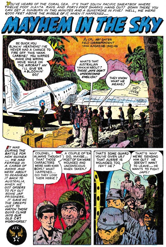
Foxhole #4 (April 1955) “Mayhem In The Sky” page 1 art by Art Gates

As I have said before I enjoy most of the stories in Foxhole. They are generally well written and the artists are very talented. I also get a kick out of “Mayhem In The Sky” but probably for reasons that were not originally intended. It is like watching a slasher movie where much of the fun is knowing that when someone goes out into the night to investigate a noise that he will be the next victim. This story is about an American plane that will be bringing some Japanese prisoner to Australia. The only guard will be wounded Australian soldier. Did I hear the background music become foreboding? When the plane reaches altitude it is placed on autopilot and the co-pilot takes a nap! At this point the background music is downright chilly. Needless to say it is not a stalker that is unleashed but a plane full of Japanese soldiers. Yeah it all seems a bit unbelievable but it is fun.

Foxhole #4
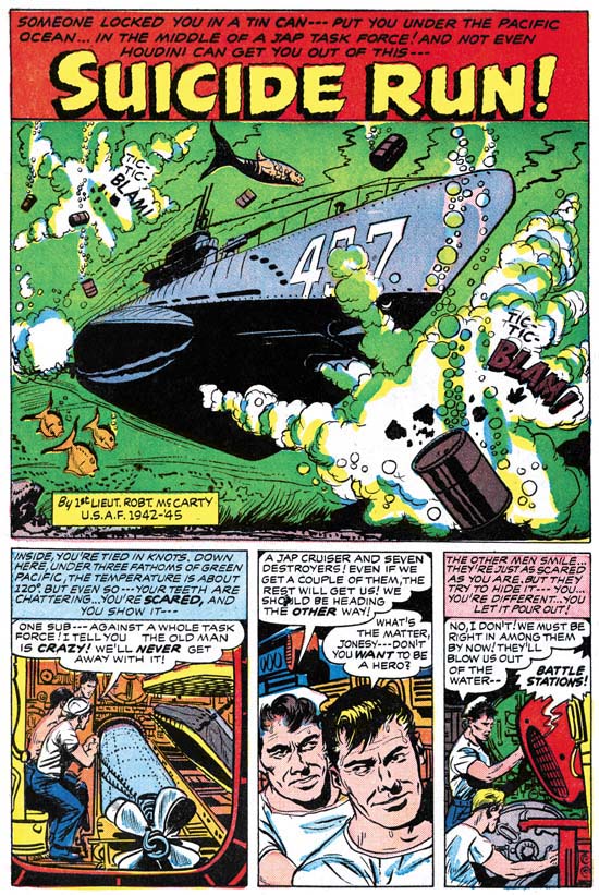
Foxhole #4 (April 1955) “Suicide Run” page 1 art by Bob McCarty

Bob McCarty, a veteran of the Air Force, illustrates a submarine story. This is typical of Foxhole. Although written by veterans they are not autobiographical stories. Still the real service that the creators experienced does imbue Foxhole stories with special qualities. The men in the stories are not the clean cut heroes depicted in movies of that time.

Foxhole #4
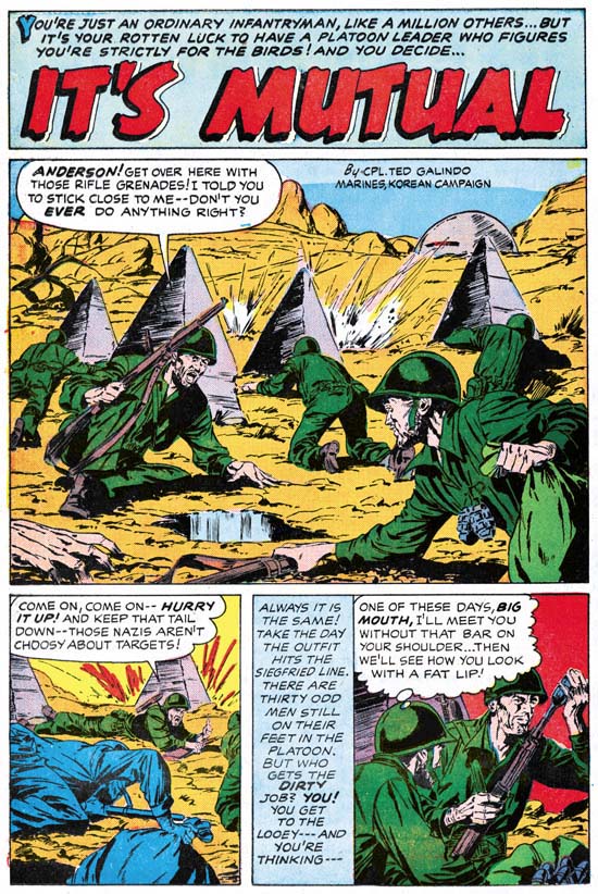
Foxhole #4 (April 1955) “It’s Mutual” page 1 art by Ted Galindo

“It’s Mutual” is the earliest artwork for S&K by Ted Galindo that I am aware of. Hereafter Ted would often be employed by Simon and Kirby and, after the S&K studio breakup, by Joe Simon. Generally Simon and Kirby used the more talented artists of their day. Unfortunately I feel Galindo is an exception, I would call his work adequate at best.

Featured Cover, Fighting American #4

Fighting American #4
Fighting American #4 (October 1954) by Jack Kirby

Another great FA cover done during the period when this title was more about humor then about being the typical superhero. In common with the cover for Fighting American #3 we find our hero about to spring a surprise on his clueless foes. I love the line “let me kill Speedboy just this once”. It is a great cover filled with Kirby’s unique humor touches such as the absurdity of Rhode Island Red lighting her cigar with a torch. I find that Jack had his own way of humor which includes the physical appearance of the subjects. To me it is very different then what Joe Simon did for the covers of Sick. It is also why I am always surprised that many still think that Guys and Dolls was done by Jack when its visual humor is so much like Joe’s.

I am rather surprised about the green face that the colorist provided for Yuscha Liffso. It makes him look not so much funny as weird. I guess it is the only thing about the cover that I find objectionable.

There were three more issues to Fighting American, not including the Harvey issue. Unfortunately these later covers just do not have the “punch” found on the first four issues. These last issues came out at the same time as the Mainline titles so I suspect Jack’s creative energies were going there instead.

Foxhole #3, The Writers Jack Kirby and Jack Oleck

Foxhole #3
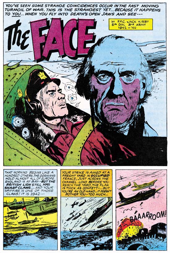
Foxhole Comics #3 (February 1955) “The Face” art by Joe Albistur, script by Jack Kirby

The artist for “The Face” is Joe Albistur who does marvelous work. Earlier I had misattributed this story art to John Prentice. To be honest at that time I did not look carefully at the story and relied on an old attribution from my database. When I scanned and restored the story it was just so obvious that Albistur, not Prentice, was the artist. Albistur’s men are often quite varied and he is good at capturing traits and gestures. Men by Prentice often follow a more restricted mold with long faces and small eyes. At times Joe would do a man’s face in a manner similar to John. Even so Joe’s work can usually be distinguished by their more rough appearance while John’s are done in a smoother manner. When it comes to women the two artists are worlds apart. Prentice’s women have a sophisticated beauty while Albistur’s are more earthy. A nurse in “The Face” is a clear giveaway that the artist is Albistur. Joe only worked for Simon and Kirby for about a year, with cover dates from September 1954 to October 1955. During that time Albistur shows up often and for that limited period he can be considered one of the usual suspects for S&K productions.

Although Albistur is a fine artist what makes “The Face” a special treat is that Jack Kirby is credited. Since the art was obviously not done by Jack that means he must have been the writer. I do not have any doubts that Jack contributed to the writing of many Simon and Kirby productions. We know however that S&K employed writers. My understanding is generally Jack and Joe Simon would verbally provide an outline of a plot to their writers. Then when the script came back S&K might then make whatever alterations they saw fit. The suggestion for “The Face” is that Jack did a more complete approach to the writing. Joe Albistur was from Argentina and did not serve in the U.S. army. So to keep with the basic premise behind Foxhole the writer would have to be someone with military service. Certainly Jack filled that requirement. But I am not sure why someone like Jack Oleck was not used since he also was a veteran. The Kirby & Albistur combination would be used again in another issue of Foxhole. Jack Kirby’s art output had dropped during the period that the Mainline comics were being produced. I cannot help but wonder if one of the reasons for this more limited Kirby art production was due to his doing more writing. Unfortunately credits were not given in the other S&K titles so it is hard to be sure.

Our narrator flies a Spitfire as part of a British air force strike on Nazi occupied France. During a dogfight our hero gets badly wounded by enemy gunfire. With great difficulty he manages to fly his plane back to home base but makes a crash landing. Up to this point this is very much a war story, now it seems to turn into something from Black Magic. While our hero believes himself to be dying and familiar face appears to him. It is not the face of someone close to him but it is familiar nonetheless. We are taken back to before the war when our narrator was visiting Vienna where he met the man. This individual was trying to escape from the Gestapo who were after him because of his religion. The comic does not say, but obviously he is Jewish. Our hero helps the man escape to Switzerland but never managed to find out either his name or profession. Now the story returns to wartime and our injured airman comes to a finds out what the importance of the man whose face he has seen.

It is easy to imagine that this is a Kirby plot. Although a war story it has the sort of plot twist that is common in S&K productions like Black Magic. There is nothing in the writing that suggest that this was not done by Kirby or that anyone else played a significant part in creating the script. On the other hand missing from the script are any of the typical Kirby laconic speeches. I have remarked previously about these. They are frequently delivered as a retort to someone else, have an odd sort of off topic quality, and are a little over the top. These short speeches often are found in Kirby drawn S&K pieces and re-occur late in his career when he once again was able to achieve more control over his work. I leave further discussion of this subject off until later when I review another Kirby/Albistur story from Foxhole.

Foxhole #3
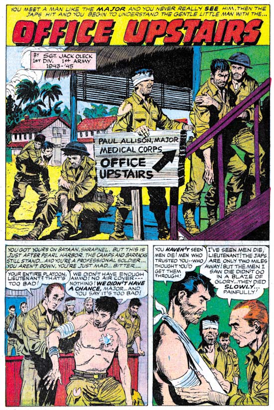
Foxhole Comics #3 (February 1955) “Office Upstairs” art by Bob McCarty and script by Jack Oleck

I previously discussed the background story of “Office Upstairs”. It concerns the Death March and the Japanese POW camp in the Philippines. The story itself is narrated by a soldier and begins shortly after Pearl Harbor. The Americans and Bataan are unprepared for the Japanese assault. The soldier also blames the softness of his fellow Americans. In particular the evident softness of the non-combatant who serves as the medical officer. It is only after the Death March and the struggles in the prison camp that the soldier changes his mind about that medical officer.

I have to admit there are parts of this story that are rather corny. Still I find it incredibly moving. As usual Bob McCarty does a excellent job on the art. This is one of the few S&K productions we can say who the writer was. Jack Oleck may have been Joe Simon’s brother-in-law but this story shows he was an accomplished comic book writer. Although Joe has indicated that Jack did a lot of writing for S&K we rarely can say which stories were his. In a future post I will discuss another Foxhole story that is credited to Oleck. At some time I will also write about a story not from Foxhole that Jack Oleck wrote.