Category Archives: 7 Freelance

Alternate Versions of the Alarming Tales #3 Cover

Alarming Tales #3
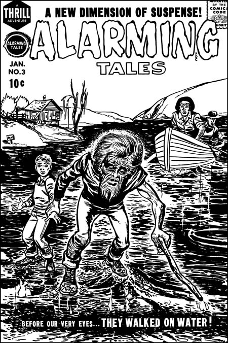
Alarming Tales #3 (January 1958) restored art, by Joe Simon

A recurring theme in my posts is how well Joe Simon could mimic Jack Kirby. This has resulted in a number of pieces that Joe did becoming attributed to Jack. Do not get me wrong, the overwhelming number of the items in the Jack Kirby Checklist are correctly attributed. Still there are a small number of entrees that are wrong and it is important to try to correct those mistakes. I would like to say that my study of Joe Simon’s art has enabled me to spot all the attribution errors that others have made. I would like to say that but it would not be completely true. A case in point is the cover for Alarming Tales #3. I provide an image of the restored line art to this cover above, a color version can be seen in a previous post.

In the past I have followed the Jack Kirby Checklist in saying Kirby did this cover. Not everyone agreed, for one sharp eyed Nick Caputo demurred. I was not completely satisfied with the Kirby attribution because I knew of the existence of another version of the cover art. It seemed to me that a comparison of the two would probably resolve the credit issue. As I hope to show in this post, that has turned out to be the case.Alarming Tales #3
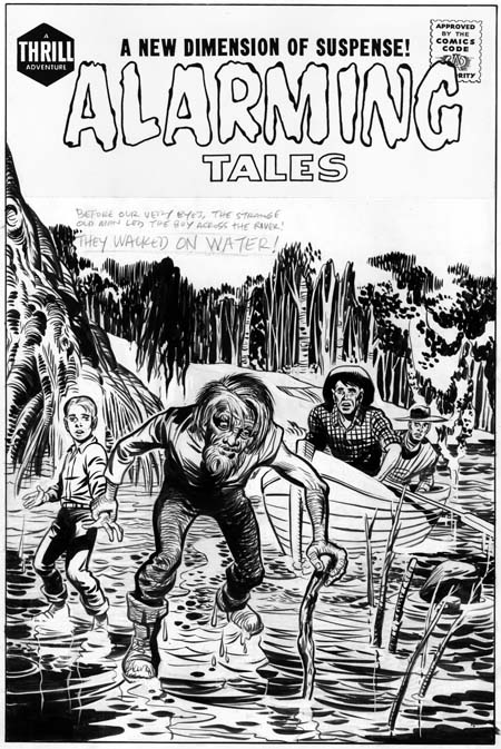
Unused original art for Alarming Tales #3, by Jack Kirby.

I provide an image of the unused version above. A note of caution when comparing the two versions. The unused one is original art and therefore has not been subjected to the blurring and loss of details that are the results of the printing process, all of which the published version has been subjected to. Also the title on the original art is a recent addition. The presence of penciled text indicates the decision to come up with new cover art was made before title stats would have been applied to the original.The derivation of the final cover from the unpublished version is obvious, both have the same cast of characters in about the same positions. The greatest difference is the backgrounds. Not only has the background been completely changed, it has been pushed much further back in the released cover. A closer examination reveals that the people are not identical. The size of the old man has been increased while the relative size of the boy and, even more so, the men in the boat has been reduced. The old man’s head has been enlarged and the position of his left arm has been shifted. The details of all figures have been changed. Curiously the boy’s pants have been given a stripe like those worn by the USPS mail carriers. My original suspicion that reworked stats of the first cover were used to construct the final state was incorrect.I think most readers will agree with me that the original art is more beautiful then the final cover. So why spend the time and effort to replace it? The answer to this riddle is that the purpose of a comic book cover is to entice a viewer to purchase it. To do so it must stand out from the rest of the comics on the rack. The problem with the original version is that the old man is overwhelmed by the background. By simplifying and pushing the other elements back, the old man and his feat of walking on water becomes more obvious and dramatic. It is a question of design taking priority over artistry.

Alarming Tales #3
Close-up of the old man by Jack Kirby and the Joe Simon rendition.

Because the compositions of the two versions are so similar, we must look at the details in order to arrive at the correct attributions. Although not a standard part of Kirby’s repertoire, the old man of the first state seems to be not only his pencils but his inking as well. There are subtleties that his copyist is unable or unwilling to capture. Some of the alterations do seem on purpose, in the final state the old man has been made older and more frail. In doing so the published version has lost the quiet dignity and resolve that the original old man possessed.

Alarming Tales #3
Close-up of the young boy by Jack Kirby and the Joe Simon version

Personally I do not find much in the final state of the old man to suggest who was responsible. For an answer to that question I turn to a close-up of the young boy. Once again the original version seems to have Kirby’s touch all over it. Some of Jack’s style has been preserved in the published interpretation but purposeful alterations have been made as well. Frankly in Kirby’s hands the boy has been given a somewhat dim witted response to his predicament. The copyist on the other hand has widen the boys eyes, raised his eyebrows and furrowed his forehead. All this gives the boy a more intelligent and surprised reaction to being lead by the old man over water. It is the boy’s eyebrows that convince me that the copyist is Joe Simon. Similar eyebrows crop up often in Joe’s work going back as far as the cover for Champ #19 (June 1942) .

The men in the boat are typical Kirby creations. Unfortunately it is hard to compare the two versions because in the published one they have been reduced in size and their finer features lost by the reproduction process.

I mentioned above that I believe Jack Kirby inked his own pencils for the unused Alarming Tales #1 cover. That is not surprising because AT #1 is a comic where Jack did most of the work, including the inking. When I previously discussed the inking in AT #1 I found some of it similar to the standard Studio style while others were closer to the Austere style. On a whole I felt the material was transitional between those two Kirby inking methods. The inking style exhibited on the unused cover is a bit of an anomaly. It is true that the bow of the boat exhibits what looks like typical picket fence brushwork (see the Inking Glossary). It should be noted that it is unusual for the rails of a picket fence inking to depict literal objects like it does here with the bow edges. A better example of typical Kirby brushwork can be found in the folds of the boy’s shirt. They exhibit the tendency to be flatter then the underlying form that was common for Kirby at this time. The form lines on the tree on the left side of the image also look like Jack’s. But other inking methods used are very unusual for Jack, in particular the form lines on the old man’s pants. I do not recall Kirby ever doing something like that before.

Also unusual about the inking is the abundant use of white-out. Although Kirby was a bold inker his control was so great that he usually had to make few adjustments with white-out. Actually some of the white-out on the unused cover were not mistakes at all. Many of the trees in the background and some of the branches in the water were actually created by white-out. The old man’s hair was done by a combination of standard inking and the use of white-out. But mistakes were corrected, for instance the edges of the drooping fronds left of center on the top were worked over. Some earth lines in the background and a water stain on the upper part of the boat were removed. I am not sure what to make of Jack removing the bottom of the boy’s shoes. Perhaps it was done to indicate that he the lacked the old man’s confidence and so could not tread as lightly over the water surface? A most surprising correction is found in the depiction of the water, much of what now looks white has abundant use of white out. The white-out does not completely hide the underlying inking and judging from their faint markings the water surface was originally much darker.

Despite all the features that are not usually found in Jack Kirby’s inking, I find the combination of boldness and control so characteristic of his work that I am pretty confident to credit him with the inking. The published cover shows Joe Simon equally bold with his use of the brush but without the same nuance of control exhibited by Kirby. It is interesting that Joe made the water surface very dark, just the thing that Jack spent so much effort to remove from his own version.

I love comparing different artists’ versions of the same subject. It is not a question of trying to determine who the better artist is. What I find interesting are the different decisions each artist made and what the reasons for those decisions were.

Another Pre-Implosion Atlas Kirby

Quick Trigger Western #16
Quick Trigger Western #16 (February 1957) “The Vengeance Of Growling Bear” page 2 pencils by Jack Kirby

A peace treaty with the Indians threatens the business of gun dealing. To prevent the unwanted peace, the dealers dress up as Indians and raid the community, leaving death and destruction in their path. The Indian leader, Growling Bear, uncovers the truth. His reputation is enough that when the gun dealers realize that he is on to them, their plot unravels before war is resumed.

I must confess I am a bit underwhelmed by this story. Jack’s pencils are good in comparison to other Atlas artists, but then again I have a low opinion of much of the art done at the time for Atlas. In comparison to the rest of Kirby’s oeuvre, this story art is one of his lesser efforts. Nothing particularly wrong, just not as exciting as most of what Kirby did. The writing does not help either. Again it is not that the writing is bad, just that not very exciting either.

One of the reasons that I find Jack’s pre-Implosion work for Atlas so fascinating is the level of control that he appeared to have. Even so Jack did not seem to consistently have full creative leeway. That seems to have been the case here. Unlike many pre-Implosion pieces, the inking was not by Jack, but it may have been inked under his direction. Most of the brushwork is fine and lacking Kirby’s style. But look at the second panel of page 2 (image above), the horse’s leg on our far right has a bold use of a row of dashes. This technique does not occur elsewhere in the story but is part of Kirby’s brush vocabulary (see the similar drop string in the inking glossary). It would appear that Kirby reviewed and touched up the primary inker’s efforts. The writing does not seem to be Jack’s either. The plot, where white men masquerade as Indians, was used previously by Simon and Kirby. So Kirby may have had a hand in the plotting. Then again I remember that plot from some old movies (although I cannot recall which ones) so perhaps it was just a common theme. In any case general plots are easily picked up by other writers and therefore are a poor use in determining attributions.

Now with “The Vengeance Of Growling Bear” I have had a chance to review all Kirby’s work that Atlas published before the Implosion. This consists of 20 stories. Jack did the inking for 16 of them, an impressive proportion. Because credits were not provided, determining the writer is a particular risky business. None the less the writing for 15 of the stories suggest to me that Kirby may have been involved. This amount of creative control by Kirby is in stark contrast to post-Implosion. I know some disagree with me, but I find no examples of post-Implosion writing by Kirby, that is until late in his career. As far as I know, Kirby did not do any inking after the Implosion either until the cover for Fantasy Masterpieces #4 in 1966. Nick Caputo has suggested that Kirby inked some other later covers, but I have not seen this evidence yet.

Battleground #14 (November 1956)
“Mine Field” Kirby inks
Astonishing #56 (December 1956)
“Afraid to Dream” Kirby inks and writing
Strange Tales of the Unusual #7 (December 1956)
“Poker Face” Kirby inks
Yellow Claw #2 (December 1956)
“Concentratet On Chaos” Kirby inks and writing
“The Mystery Of Cabin 361” Kirby inks and writing
“The Yellow Claw” Kirby inks and writing
“Temu-jai, The Golden Goliath” Kirby inks and writing
Quick Trigger Western #16 (February 1957)
“The Vengeance of Growling Bear” Kirby inks and writing
Yellow Claw #3 (February 1957)
“The Microscopic Army” Kirby inks and writing
“UFO, The Lighting Man” Kirby inks and writing
“The Yellow Claw Captured” Kirby inks and writing
“Sleeping City” Kirby inks and writing
Yellow Claw #4 (April 1957)
“The Living Shadows” Kirby writing
“The Screemies” Kirby writing
“Five Million Sleepwalkers” Kirby writing
“The Yellow Claw and the Thought Master” Kirby writing
Black Rider Rides Again #1 (September 1957)
“Legend Of The Black Rider” Kirby inks
“Duel At Dawn” Kirby inks
“Treachery At Hangman’s Bridge” Kirby inks
Two-Gun Western #12 (September 1957)
“No Man Can Outdraw Him” Kirby inks and writing

Job numbers indicate that there are three works that may have actually been done before the Implosion but not published until afterwards. These appear to have intended for the never released Black Rider Rides Again #2. I have not seen two of them, but the one I have seen was was not inked by Jack, and I doubt if he wrote it either.

Gunsmoke Western #47 (July 1958)
“Trouble In Leadville”
Gunsmoke Western #51 (March 1959)
“The Raiders Strike”
Kid Colt Outlaw #86 (September 1959)
“Meeting At Midnight”

Battleground, Jack Kirby’s Return to Atlas

Battleground #14
Battleground #14 (November, 1956) “Mine Field” page 2 pencils and inks by Jack Kirby

Jack Kirby turned to freelancing when the Simon and Kirby studio failed. Battleground #14 (November 1956) was the first of his freelance jobs to be published. It also marked Kirby’s return to a company that he left almost 15 years before. Jack probably still remembered Goodman’s unfulfilled promise of royalties for Captain America, but Kirby had a family to support and so had to swallow his pride. His reentry job was a short five page war story called “Mine Field”. The job should have been easy for Jack, only a couple of years before Kirby drew, wrote and edited for Foxhole, a war comic for Simon and Kirby’s own publishing company called Mainline. One story for that title, “Hot Box”, was only two pages long and Jack still managed to make it a masterpiece.

“Mine Field” is a simple tale. A somewhat bumbler of a soldier gets separated from his outfit during a night patrol. He becomes lost in the dark and by daybreak finds himself close to the enemy’s position. From his observations he realizes the Germans plans to lure the Americans into a mine field. Upon dark the soldier rearranges the German marker and finds the way back with the outfit. The table has turned and the enemy falls into their own trap. It is a good story, just not one that plays on what would normally be considered Kirby’s strengths. Jack likes his war action up close and personal and that is not what this story is about, although Jack does manage to sneak in some typical Kirby action in the last panel. But it is because the story does not have a lot of action that it provides a showcase for how good an artist Kirby was. I provide an example page above. Note that there really is not a lot happening on this page. We find the hapless soldier fall into a shell hole and his unsuccessful attempt to find his comrades. Yet by altering the view point and careful use of the landscape Jack manages to make it all interesting. Kirby is able to do this throughout the story. This sort of low action story may not have been the best vehicle for Jack, but he still managed to make it look easy.

Jack’s pencils are always at their best when inked by his greatest inker, Kirby himself. For this story Jack’s inked in a manner which I referred to as the S&K Studio style. That style is categorized by bold brushwork and some unusual techniques. In the image I provide above, note the use of the picket fence pattern (see inking glossary) in the second and fifth panels. By itself there is nothing unusual about Jack’s inking in the Studio style, he had often used it in the past. What is surprising is that this style appeared in a work at this late date. At this time Jack had adopted a similar style but with a finer brush for Prize romance covers or a simpler style without techniques like the picket fence brushing for romance story art. However the inking in “Mine Field” does show one important trait agreeing with both the Fine Studio and Austere styles. Spotting has been downplayed giving the entire art a lighter look. Black areas tend to be limited coverage but when used are done by filling the area with ink. The inking for this story was not as masterful as Jack would shortly do for Atlas in Yellow Claw #2 and #3. However in its own understated way it is a beautiful job without any signs of rushing and loss of control found in “Afraid To Dream” that Kirby also did in the next month.

I have already remarked above how the plot for “Mine Field” was not typical for Kirby. I also find that the actual text writing does not have Kirby’s “voice”. Jack’s writing usually includes exclamations that are a little over the top. I find none of that quality in the script for “Mine Field”. Therefore I do not believe that Jack had much to do with the writing for this story and that he was working from a script supplied by Atlas. This sets this story apart from most pre-Implosion Atlas work which either Kirby seemed to have a lot of control over the writing (Yellow Claw, “Afraid to Dream”, “No Man Can Outdraw Him” and “Pokerface”) or at least some input to the plot (Black Rider Rides Again).

Battleground #14
Battleground #14 (November, 1956) “Beyond the Call of Duty” art by Joe Maneely

In my posts for this blog I generally avoid comparing other artists to Jack Kirby. It really is not fair and can result in overlooking the special talents these comic book artists possessed. Effectively Atlas made just such a comparison between Jack Kirby and Joe Maneely and judged Maneely as the better artist. Presumably this judgment was made by Stan Lee and it continued as long as Joe Maneely was alive. It was Joe that was the most frequent Atlas cover artist while Jack did not even get to do the covers for comic books titles where he did all the interior story art. In Battleground #14 Joe got the most important first story while Jack’s contribution was delegated towards the back. But this does not seem to reflect the actual merits of the two stories. Maneely is working from a script with much more action then what Kirby had. For a war title this should almost insure a more interesting story, yet Kirby’s piece is a much better read. Maneely just does not seem to know how to make the action exciting. Under Joe’s hands all of the artwork seems dry and unmoving. Even today there are those who say Joe Maneely was a great artist. I just do not understand exactly what they feel Maneely did so well.

Some Stories from The Final Issues of Alarming Tales

In a previous post I mentioned that some of the stories for the two final issues of Alarming Tales had an Atlas flavor to them. My understanding of Atlas comics of this period is limited so I would not want to over emphasize this similarity. I guess I should give some examples of these Atlas-like stories, but instead I want to comment on three stories that engage me one way or another when I read them.

Alarming Tales #5
Alarming Tales #5 (September 1958) “12,000 To 1” by unidentified artist

A man sets up some sort of television or radio station deep in the jungle. He encounters an unexpected opponent to his efforts. What follows can only be described as warfare. The man uses a number of ingenious methods to defeat his enemy, but to no avail. In the end only the appearance of another target for his opponents saves the man. The hostile enemy are driver ants. The story brings to mind Alfred Hitchcock’s movie, “The Birds”. That movie was released in 1963 so there can be no relationship between this story and the film. Rather the story’s author had probably viewed a nature program about driver ants, which are also known as army ants. The writer gets some of the facts correct. The swarming of the ants and the fact that they are actually blind. The scripter does not call them army ants but he obviously must have heard the term. But the writer takes the name literally as the ants seem to act as a military unit. While reading I kept wondering if these were meant to be real army ants or whether some radioactive origin would be revealed. Would normal driver ants be expected to pause and contemplate an obstacle that the man has created? Would the male drones for the colony actually be expected to attack and destroy a radio/tv antenna? Would real ants care to reek havoc on electronic equipment? The whole story is so preposterous that it keeps you reading as you wonder what next peak of absurdity would be attempted. Because of, not despite, the peculiarities of the story I actually enjoyed it.

Alarming Tales #6
Alarming Tales #6 (November 1958) “King of the Ants”, art by Al Williamson

I guess one ant story was not enough, Alarming Tales #6 includes “King of the Ants”. A tropical plantation is attacked by some raiders. As a result of some gunfire our hero is accidentally showered with chemicals. He awakens to find he has shrunken to a very small size. Ants seize him, presumable for food, but after the man defeats an enemy, a beetle, the ants bring the man back to rule the colony. I wonder what the mystery food that the ants provided the man was? Perhaps it is bests not to know. Eventually the man returns to normal size while the plantation is still fighting the raiders. The hero uses a tactic he learned from the ants to defeat his human foes. The plot of a man shrinking to a small size and his encounter with an ant colony would appear in Marvel’s Tales to Astonish #27 (January 1962). The similarities of the two plots maybe significant or may just be a coincidence. Ultimately the inspiration for this plot may have been the movie “The Incredible Shrinking Man” that was released in 1957. As I remember it, that movie did not include any ants. But it was common to describe something that looked very small as ant-size so it may not have been too surprising to connect a shrunken man with ants. This story does not have any of the entertaining excesses of “12,000 To 1” but having Al Williamson as the artist more then makes up for that.

Alarming Tales #6
Alarming Tales #6 (November 1958) “The Strange Power of Gary Ford” by unidentified artist

Next I want to write about “The Strange Power of Gary Ford”, another weird story. A man, Gary, finds a city in the desert where none should be. Here he discovers that he now has the ability to walk through walls and other solid structures. The man credits this to the local water, adding that the city’s citizens do not share this ability because they probably are used to the water. (I do not know what seems odder, that the man made this conclusion or that the water allows the man’s clothes to go through walls as well). The town people welcome Gary and introduce him to their ruler. Gary captures the heart of the shieks’s daughter and professes his love. But actually Gary becomes enamored with another outsider, an attractive redhead. Gary convinces her to leave with him, but not before Gary, using his power, helps himself to the ruler’s jewels. The two escape separately, Gary on his motorcycle and the lady on a horse. No sooner does Gary evade his pursuers then the city disappears and he finds the jewels have turned to sand. Gary regrets that it all was an illusion since the redhead was just the sort a girl he could have married. We next see the redhead also alone in the empty desert, also saying it was too bad it was all an illusion because she really would have liked to marry Gary. This is another of those stories so odd that you just have to shake your head go along with its goofy premise.

At the time that Alarming Tales #6 was published the Comic Code had been in operation for a few years. The Comic Code purpose was to insure that susceptible youngsters did not fall under the comic books bad influence and become delinquents. So here is “The Strange Power of Gary Ford” where the hero rewards the welcome he has received from the city’s inhabitants by leading on the sheik’s daughter and stealing a ruler’s jewels. That sounds to me like just the type of morals Comic Code was trying to protect developing minds from. Oh I forgot, the citizens of the city were Arabs, I guess that made it all right.

The Final Issues of Alarming Tales

As I am in the process of restoring the last issue for Alarming Tales I ponder the significance, if any, of the change that came over the final two books. As I previously mentioned, I find issues #5 and #6 to have an Atlas flavor to them.

Alarming Tales #5
Alarming Tales #5 (September 1958) art by John Severin

An important contribution to giving AT an Atlas look is the cover artist John Severin. Well at least he is listed as the artist in GCD and some other Internet sources. Judging by some of John’s work for Atlas, such as the cover for Black Rider Rides Again #1, this seems like an accurate attribution. Although he had been only been working for Atlas for the last few years Severin had done a lot of work for them and his style was very much in tune to that publisher. Atlas seemed to prefer comic art that emphasized detail, a style I find rather dry. That is what we find for John’s rendition for the Atlas Tales #5 cover. AT #5 is over all realistic, almost illustrative, but note the fish-like mouth of the man in the foreground. Yes lots of details, look at all the machinery that can be seen through the door. But all things considered I am afraid this cover leaves me rather cold.

Alarming Tales #6
Alarming Tales #6 (November 1958) art by John Severin

John’s cover for AT #6 is even more detailed and has more figures. Generally I find this sort of art style dry and uninteresting. Not in the case of the AT #6 cover, Severin has really pulled off a great cover. Yes there is a lot of detail, but John maintains the Ambassador as the center of focus. The background figures provide just the right sort of emotional responses. With one exception, I do find the pointing man to be a bit awkward. A good deal of the success comes from the character of the Ambassador. Why would anyone think that the envoy from another planet should look like a British bureaucratic official? I do not know who came up with him, but he works.

Not to diminish Severin’s art, but part of the success of this cover is due to the colorist. All the background is done in muted blue and purple as if under the shadow cast by the flying saucer. This has the beneficial effect of playing down all the background details allowing the Ambassador to stand out even more. The background figures also show small highlights of white. I am not sure whether these highlights really make any sense but they do add interest and help prevent the figures from appearing too flat.

It was not just the cover art that leads me to say that Alarming Tales had become more Atlas-like. Some of the stories also had that flavor as well. Or at least they are rather different from previous Simon or Simon and Kirby productions. I will be writing about some of the stories in another post so I will leave it at that for now.

Alarming Tales #6
Alarming Tales #6 (November 1958) Contents page, art in part by Joe Simon

AT #5 has a postal statement, the only one found in any Alarming Tales issue, which lists Leon Harvey as the editor and nowhere mentions Joe Simon. Could the alteration that came over Alarming Tales be due to a change in editors? I am not the first to warn against an over reliance on the postal statement. I believe that often the postal statement will list some one company personal as the editor even in cases where another person may be doing the actual work. Leon Harvey is one of the owners of Harvey Comics so we maybe dealing with just that sort of case.

Although Simon did not do the covers for AT #5 or #6 he was not completely absent. I am uncertain whether Joe had any hand in the Contents page for AT #5 but he clearly worked on the Contents for AT #6. The figures in the first art panel look like they were done by Joe. I am less certain about the next two panels. The ambassador in the second panel is particularly well done and faithful to the story art. We have seen in the Harvey romance content pages that Joe could do excellent imitations of other artists. But the best examples of Joe imitations are close swipes from the story. In this portrait of the ambassador I cannot find a source from the story. In the end I am uncertain whether Joe did the whole introduction story or just the first panel. But his presence doing at least part of the contents page suggests that he was still acting as editor.

Of course if Joe Simon was still the editor why did Alarming Tales become so Atlas-like? Unfortunately I just do not have a good answer. Perhaps after the Implosion writers who had worked for Atlas took gigs elsewhere, including at Harvey. Maybe Jack Oleck was doing some of the writing for Alarming Tales. We know Oleck did some work for Atlas before the Implosion perhaps he continued to use some stylistic traits learned there. It is known that Oleck recycled stories from one publisher to another. Perhaps that was being done here, unfortunately I just do not know enough about Altas comics to say if any of their stories are too close for comfort with those in Alarming Tales.

Rambling About Joe Simon and Alarming Tales #4

Previously I mentioned what a fine comic Alarming Tales #1 was. Actually the first four issues are rather good even though Kirby’s presence diminishes with each issue until with Alarming Tales #4 Jack is completely absent. I am less enthusiastic about issues #5 and #6. The final issues seem to have succumbed to a case of Atlas envy which resulted in less satisfying art and stories. I have been scanning and restoring Alarming Tales comics and last weekend I did issue #4. This has inspired me to write about an assortment of subjects with Joe Simon as the tenuously connection.

Alarming Tales #4
Alarming Tales #4 (March 1958), Contents page art by Joe Simon

A standard part of the Harvey comics format was the content page. Generally this was little more then using bits of the art or titles from the stories contained in the comic. With Joe as the editor or producer this simple format was often modified with the use of a short introduction for the featured story. Not long ago I provided examples of this from the romance titles. The romance introductions most often told a prelude to the featured story, but sometimes it was the comic book equivalent of a movie trailer. Interestingly the artist for the romance content page, usually Kirby but sometimes Simon, would imitate the artist for the featured story. Alarming Tales #4 also has a content page with a short story. Here Joe is the artist but he makes no attempt to imitate the featured artist, Jack Kirby. Jack’s story, “Forbidden Journey”, is about a boy who is so eager to escape into space that in order to get to the spaceport he commandeers a vehicle with almost disastrous results. In Simon’s prequel, the boy, appearing even younger, tries to sign up as a cabin boy. The spaceman who confronts him in the second panel seems unnaturally large, almost gigantic. I am sure Joe was well aware of this but does it as a way of indicating how intimidated the boy is. If that was not enough, the third and fourth panels show his interview with the leader. Here Joe uses an enormous screen showing only the leader’s face. This extra intimidation and the leader’s derogatory speech prove too much for the boy.

I fully admit that Joe’s art for the content page really was not among his better efforts. But that seems to be typical failure even when Jack did the introduction story in the romance titles. These content stories really were not that important and probably were rushed jobs done after all the rest of the comic were completed.

Alarming Tales #4
Alarming Tales #4 (March 1958) advertisement for Race for the Moon

Science fiction played a significant part of Alarming Tales yet it only represented a portion of the stories from that title. AT #4 included the above ad for a new title, Race for the Moon, which would be composed entirely of stories from the science fiction genre. Such a full page ad for a comic was unusual for Harvey. Normally ads were either small ones for a single title or full page advertisements for multiple titles. Joe and Harvey must have hoped that such a prominent ad and the recent surge in interests in space due to Russia’s Sputnik would make Race for the Moon a big seller. Unfortunately it did not seem to work.

Included in the ad is a copy of the cover for the first issue of Race for the Moon. However it is not identical to the released cover. It shows the same astronaut and space craft that Kirby drew. The main difference is the more prominent use of the moon surface in the background of the ad version compared to the printed one. Also in the final cover the earth was more completely set in the blackness of space. Joe put particular effort in getting the covers just right during this period. He completely redid the cover for Alarming Tales #1 from the original done by Jack Kirby (although that version was at first meant for Black Cat Mystery). Joe did two versions for the covers for AT #3 and #4 (I now agree with Nick Caputo that the AT #3 cover was done by Simon, not Kirby). In the case of RFTM #1 Joe probably thought that the astronaut and vehicle did not stand out enough in the first state. Simon therefore moved the distracting moon surface to the bottom of the image leaving the man and ship in the darkness of space.

Alarming Tales #4
Alarming Tales #4 (March 1958) art by Joe Simon

As I said not all of Alarming Tales was dedicated to science fiction. As appropriate for a comic with this title, some of the stories belong to the horror genre. Or at least as much of horror that was possible under the Comic Code. The cover for AT #4 depicts one of the interior stories “The Feast of the Rag Dolls”. I suspect when Joe did this cover he was thinking of a story and cover from Black Magic #1. In that story a rag doll with a demonic nature brings murder and mayhem to a family. For the cover to AT #4 Joe brings a whole troop of rag dolls to life. If anything the dolls’ smiles bring a threatening chill for their advance toward the surprised man.

Alarming Tales #4
Alarming Tales #4 (March 1958) “Feast of the Rag Dolls”, final panel for page 4, art by Doug Wildey?

I attribute the story art for “The Feast of the Rag Dolls” to Doug Wildey, albeit questionably. I am not very familiar with Wildey’s work, I do not think he ever did any work for Simon and Kirby prior to this period. Nor did he sign anything he did for Joe at this time. That Doug did work for Simon is indicated because Joe’s collection has original art for “When Time Ran Out” from Thrill-O-Rama #1 (October 1965) with Doug’s name and address written on the back of one of the pages. I have read that Wildey made heavy use of photographs in drawing his comics. I can easily accept that because some of his work combines very realistically rendered images interspaced with more simple ones. In general I prefer a more “cartoony” style for comic books. I feel that with the small size of most panels all the details of an illustrative approach can actually make it hard to project the emotions in a scene. A more simple art combined with some exaggeration can completely overcome the difficulties of telling a story on the small pages of a comic book. Of course Jack Kirby is a great example of what an artist can do without being truly realistic. However I also feel that it is a mistake to look at an art form only from a single aesthetic viewpoint. Sometimes you have to put aside your own assumptions and try to adopt those of the artist in question. So when I try to accept Wildey’s more illustrative style I find that he really is a talented artist. Doug truly knows how to present a story, he is almost cinematic in approach. The only question is did Wildey pencil “The Feast of the Rag Dolls”? I make this attribution because of similarities between this story and the parts of other Wildey pieces that do not seem to be based on photographs. But I just do not know whether Doug would occasionally abandon photographic references throughout an entire story as would be the case if he were the artist for “Feast of the Rag Dolls”.

The threat the rag dolls present to the man on the cover as presented by Joe Simon really was not part of the story. Actually the threat perceived by the boy’s parent is the obsession the boy shows for the dolls and his insistence that they talked to him. The parents appeal for help from the boy’s much older and very idolized brother. That brother decides to use the child psychology he has learned in college. He arranges a party for the boy and all his dolls. The older brother uses the party to indicate to the boy that the rag dolls really cannot talk and are nothing more then toys. It is a panel from that party whose image I have included above. Note that all the rag dolls seem slumped and lifeless in the chairs. But I love the way Wildey uses the shadows casts by the candles to provide the otherwise mundane scene with an eerie overtone.

Alarming Tales #4
Alarming Tales #4 (March 1958) “Feast of the Rag Dolls”, page 1, art by Joe Simon

While I am not certain Doug Wildey penciled the story it is clear that the splash page was drawn by Joe Simon. Joe presents his version of the same party scene that Wildey did in the panel image I presented earlier. I am sure Joe fully knew the story because the older brother gives a speech chiding the rag dolls for not toasting the guest of honor. Yet despite this Simon does not present the rag doll guests in the slumped and lifeless manner as Doug Wildey had. Instead Joe provides us with rag dolls that look lively and are having a very good time. As if the emphasize their dynamic nature, Simon adds above a frieze of rag dolls prancing across with gifts.

I doubt that any art form is grown in isolation from all others. Carefully examine the work of the earlier comic book artists and you will find they were influenced by syndication strips, magazine and pulp illustrations and the movies. Because comics were a part of pop culture it is not surprising that comic artists drew inspiration from other popular arts. What is infrequently found are any references to the fine arts. Crowd scenes are found in many art forms but only in the fine arts is it not unusual for one of the secondary participants to look back out at the viewer. That sort of thing is so rare in comic books that I cannot help but feel that when the rag doll in the lower right corner looks back at us, that is Joe tipping his hat to the fine arts. When an artist wants to include his self portrait in a group painting it is generally as that outward looking individual. So what do you think, is that Joe with his cigar smiling back at us?

More Robots

Blast-Off #1
Blast-Off #1 (October 1965) “Lunar Goliaths” pencils by Jack Kirby inks by Al Williamson

In the comments to my recent post on the Year of the Robot comic scholar Stan Taylor pointed out another robot story “Lunar Goliaths”. As he indicated although it was published in Blast-Off in 1965 it probably was originally intended for Race For The Moon #4 which, if it had not been cancelled, should have been published with a cover date of January 1959. As with the other robot stories that I covered in my previous post, the robot in “Lunar Goliaths” is oversized and although has an broadly human shape is mechanical enough that it would not possible me mistaken for a man. Like two of the previous stories the robot achieves consciousness (in this case when struck by a meteor) but is destroyed by the end of the story.

Blast-Off #1
Blast-Off #1 (October 1965) “Space Court” art by Al Williamson

Joe Simon’s collection still includes much of the original art for Race For The Moon and Blast-Off. Joe has all of Kirby’s contribution to Blast-Off #1 (“Lunar Goliaths” and “The Great Moon Mystery”) as well as most of Al Williamson’s “Space Court”. Despite that fact that the art has not been trimmed, none of the Kirby pages show the Comic Code approval stamp. I suspect that Joe was going to send the pages for approval back in 1958 but did not bother once the title was cancelled. In 1965 Simon probably did not pay much attention and just mistakenly believed the art had already been approved. However all the pages Joe has for “Space Court” had received the Comic Code approval stamp on March 8, 1958. This not only shows that the story was originally meant for Race For The Moon, but was actually approved earlier then some of the art that was published in Race For The Moon #3 which have a March 28, 1958 stamp.

Al Williamson not only provide two stories that were eventually published in Blast-Off #1, the Jack Kirby Checklist also credits him with inking the art that Jack penciled in that same issue. I have not carefully studied Al’s inking techniques but it does seem to me that inking of the Kirby art was much more restrained then that done on the Williamson story. However I am confident that the difference in inking technique was not due to someone else actually inking the Kirby art. The Kirby inker used the back of the art to either test or prepare his brush. He left brush marks that trace a curved path. This brush work only occupies a portion of the paper but it seems the inker also occasionally rotate the paper 90 degrees so that in the end the brushings would form a rough oval shape. This exact type of brush marks are found on the back of Williamson’s “Space Court” as well. Although I have seen other inkers leave brushings on the back of art pages, I have never seen any others remotely resembling Al’s unique marks.

Blast-Off #1
Blast-Off #1 (October 1965) “Space Court” color guide

Simon’s collection also includes some color guides for Blast-Off. As can be seen by comparing the two scans, the printer followed the guide pretty carefully. I asked Joe if he had done the coloring. Joe replied that although he might do color guides for a cover he would never have done one for a story.

The Cover for Alarming Tales #2

Alarming Tales #2
Alarming Tales #2 (November 1957) art by Mort Meskin and Joe Simon

The Simon and Kirby studio must have been closed at the time Joe Simon produced a new title, Alarming Tales, for Harvey Comics. Jack Kirby had been doing freelance work for almost a year. Jack and Joe were still listed as editors for Young Romance and Jack would provide some art for that title. But missing from Young Romance were old S&K studio artists like Bill Draut, John Prentice and Mort Meskin. At this point the “usual suspects” were also absent from the Harvey romance comics that Joe Simon had been editing. John Prentice had begun what would be a long gig as the artist for the syndication strip Rip Kirby. Meskin, a prolific artist, had already been doing work for DC for a few years. What Draut was doing is a bit of a mystery, but he would do work for DC in the 60’s. What is clear is that Draut, Meskin and Prentice were conspicuously absent from the Harvey comics that Joe produced at this time. It is hard to escape the conclusion that the good working relationship these artists shared with Simon and Kirby had not weathered well the breakup of the studio. (This relationship was not permanently damaged because Bill Draut would do a lot of work with Joe in the 60’s.)

Alarming Tales #2
Alarming Tales #2 (November 1957) original art by Mort Meskin and Joe Simon (with thanks to Paul Handler)

The cover for Alarming Tales #2 is surprising, considering Meskin’s otherwise absence from Joe Simon’s productions of 1957 and 1958. Previously I believed this cover was penciled by Joe Simon. Actually I still adhere to that attribution for the man on the lower right. The similarity he has in his facial features and pose to other work by Joe, particularly the cover for Alarming Tales #4, leave me with little doubt that Joe was indeed the penciler. I have come to re-think my position about the figure of the giant after seeing the original art attributed to Mort Meskin by Paul Handler in the Comic Art Forum. (Paul has an excellent original art collection which includes some really nice Simon and Kirby pieces.) The facial features of the giant, particularly the eyebrows, certainly suggest Mort Meskin’s work. Unfortunately I really have no equivalent Meskin piece to compare it with. Meskin had done some work for titles like Black Magic and Strange World of Your Dreams but those titles lacked the science fiction emphasis found later in Alarming Tales and Black Cat Mystic. So the absence of similar figures by Meskin like the one on Alarming Tales #2 is not very surprising.

So what can we make about this cover for Alarming Tales #2? Well here is where the original art really helps. The art shows that it actually consists of two separate pieces that have been combined. The edge that delimits them from each other marks an irregular path between the two figures. The giant does not accurately reflect the story the cover is based on (“Fire Balls”). In the story the strange visitors are roughly human in size and the flames they are ensconced in obscures their features. The differences between the cover and the story maybe nothing more then artistic license, or it might reflect that the Meskin portion was originally meant for something else. Mort did provide work for Black Magic up until the end of the first run (the last issue of the run was #33 cover dated November 1954). As I said above, Black Magic did not have much of a sci-fi bent but that might have been changing. The last issue had a story by Jack Kirby called “Lone Shark” that best belongs in the science fiction genre. So perhaps the Black Magic title was in the process of including more sci-fi just when it was cancelled. I doubt the Meskin piece was meant for a Black Magic cover since previously Kirby did every single cover for that title’s first run. But a splash page seems quite possible or it could have been meant as a cover for a never launched title. Whatever its ultimate source, the Meskin piece appears to have been modified for Alarming Tales #2 by the inking of the background.

This combining of two different sources to make one piece is something I have seen Joe do before. His collection includes an unpublished romance cover constructed in just that manner. In the 60’s many of the covers for comics that Joe produced are combinations of original art and stats.

Year of the Robots

Generally speaking robots did not appear often in Simon and Kirby productions. But for some reason S&K produced three stories about robots over a single year towards the end of their collaboration. Actually I am doing a bit of a stretch when I say that. It is not clear that it is a robot in one story, “Gizmo”, but it sure looks like one. Another story is an early Challengers of the Unknown and although Joe Simon help create that team it is uncertain if he had anything to do with the initial stories.

SPOILER ALERT: I will be discussing stories below including their endings. so do not proceed if you have not read these yet but still want to.

Black Cat Mystic #58
Black Cat Mystic #58 (September 1956) “Gizmo” page 3, art by Jack Kirby

The sudden appearance of the large Gizmo brings terror to a small family. Neither the walls of the house or bullets will stop it. In the end the family’s baby puts an end to Gizmo’s destruction, he was only looking for someone to play with. The arrival of an even larger version showed that Gizmo was just a baby. As I discussed above, Gizmo may not really be a robot. In fact the boy describes him as a man from Mars. But clad in metal he sure looks like a robot and we do not learn he is a baby until the end of the story. After all how could a baby robot possibly grow?

Showcase #7
Showcase #7 (April 1957) “Ultivac Is Loose” page 4, art by Jack Kirby (from DC Archives)

An evil scientist creates the ultimate machine. Unfortunately for him the robot escapes. It is the Challengers of the Unknown team to the rescue! Except a beautiful scientist seems to be the one that convinces Ultivac that he need not fear humans. A meeting is arranged with the leaders of the world where Ultivac promises to help mankind solve many of their problems. But up springs the mad scientist who destroys Ultivac rather then lose his creation. Ultivac can still be used as a computer but is no longer sentient.

Alarming Tales #2
Alarming Tales #2 (November 1957) “I Want To Be a Man” page 1, art by Jack Kirby

A scientist’s advanced computer develops consciousness. To keep Fabiac happy, the scientist makes him a robotic body. This ploy works until Fabiac sees himself in a mirror and realize he never will be human. Gee you would think he would just look at his hands and see something was not right.

There seems to be a common threads to these stories. In all of them the robot is very large and only marginally human in shape. This was done to make so that their fearsome appearance would belie their true nature. In all three stories it turns out that the robot does not truly want to hurt anyone. In two of the stories the robot wants to help mankind, but that help is ultimately lost.

The robot for the last two stories have similar names; Ultivac and Fabiac. These are take-offs from the names of two very real computers. ENIAC (Electronic Numerical Integrator And Computer) was completed in 1946. UNIVAC (UNIVersal Automatic Computer) was first released in 1951. These were very significant and widely reported developments. By the time these stories appeared, UNIVAC cost about a million and a half dollars. That is a lot of money even today (50 years later) especially since the computer may only have had 60 kilobytes of memory.

I have no idea what was the source that sparked these robot stories. Part of the explanation was that S&K stories had gotten substantially more science fiction based at this time. Still it is likely that something in particular inspired this effort. I do not think it was the movies. “The Day the Earth Stood Still” (1951) had a large robot but it was not nearly as large or “roboty” as in these stories. “Forbidden Planet” (1956) had a sufficiently convincing robot but it was neither large nor threatening. I suspect the source was some science fiction pulp or book that Jack and Joe had read.

Kirby Inkers, Marvin Stein

I have written about Kirby inking Kirby, but what about Jack’s other inkers? Scholars of the Silver Age have it comparatively easy, many of Jack’s inkers are actually given credit. This provides a head start even in those cases where no inking credits are given. But in the Simon and Kirby years no inking credits were ever provided. Fortunately most S&K studio artists inked their own work. Therefore examining the work by the studio artists can give insight into what to look for in order to determine if they also were Kirby’s inkers.

I am going to start with Marvin Stein. What I am going to say about Marvin is pretty preliminary. I really have not studied Stein as an artist as much as I have other who had worked for Simon and Kirby. This is probably because I have mixed feelings about Marvin’s art. On the positive side Stein was often good at depicting action. However some of his drawing seems a bit crude.

Marvin Stein starts showing up in Simon and Kirby productions in 1951. Not long after his appearance there seems to have been a change in the production of Headline and Justice Traps the Guilty, two crime titles that S&K had created. Well actually Headline had existed before S&K but was not a more general anthology, it was S&K who converted the title to crime. The postal statement for Headline #46 (March 1951) lists Nevin Fiddler as the editor. About that time the artists for both crime titles changed and Jack Kirby work would no longer appear. Marvin Stein would become a prominent part in the new Prize crime issues. Stein did almost all the covers and usually the first story. It was not that unusual for Stein to provide a second story as well.


Headline #51 (Jan 1952) art by Marvin Stein

There is a photograph that indicates that Marvin worked at the Simon and Kirby studio at one time. Certainly he was greatly influenced by Jack Kirby, particularly in the portrayal of action. But Stein did not pick up any of the typical S&K studio inking. Missing from Marvin’s own work are things like picket fence brush work, abstract arch shadows or shoulder blots (see the inking glossary). Stein did occasionally use something like drop strings.

Justice Traps the Guilty #88
Justice Traps The Guilty #88 (August 1957) “The Spoilers” page 7, art by Marvin Stein

The above image is a typical page of Stein pencils and inking. Marvin’s brushwork tended to be rather blunt. This can be very apparent when the faces are of a smaller size, as for instance in panels 1, 2 and 4. A blunt brush work can even be seen in closer faces as in the criminal in panel 4. Stein often would use very broad cloth folds that seem slightly bent at about the middle of their length as seen on the man in the foreground in the first panel. Cloth folds often have ends that stop abruptly at a right angle (as in the first panel) or a slight angle (there are a couple examples on the man in the second panel). Form and shingle lines are often quite robust. Although not apparent in the image above, Marvin would sometimes make long and simple eyebrows. These eyebrows can resemble those by Bill Draut.

Justice Traps the Guilty #91
Justice Traps the Guilty #91 (February 1958) “Power Failure” page 4 panel 5, art by Marvin Stein

Occasionally Marvin would like to depict faces with a sort of negative highlight, as in the image above. This is done with diagonal brush work and like so much of Stein’s inking in a rather crude manner.

Young Romance #93
Young Romance #93 (April 1958) “Jealousy”, pencils by Jack Kirby, inks by Marvin Stein

Among Jack Kirby’s late Prize romance art is one story, “Jealousy”, where the spotting for the facial features is rather blunt. The facial inking looks so much like Marvin Stein’s that I am certain he was Jack’s inker. Note the final panel where the man’s right eyebrow is extended into a crease above the nose. This is a characteristic often seen in Stein’s own art, for instance panel 3 from the Justice Traps the Guilty #88 page I showed earlier. Surprisingly the spotting other then for the faces in this story seems more carefully done then is typical for Stein.

This blunt treatment of facial features does not seem to occur in inking for any other of Kirby’s work for Prize. But otherwise similar spotting can be found in the inking of a number of Kirby stories. Could it be that Marvin Stein used greater care when inking for Kirby then he did on his own work? Depending on the answer to that question, Stein could have been a frequent inker of Kirby or a rare one.

Showcase #6
Showcase #6 (February 1957) “The Secrets of the Sorcerer’s Box”, page 6, panel 3, pencils by Jack Kirby, inks by Marvin Stein (from DC Archive edition)

When I wrote the DC chapter to “Jack Kirby Austere Inking” I was hampered by my limited access to the work. I am still not ready for a more thorough evaluation of Jack’s DC period but I have gone back over it with Marvin Stein fresh in my mind. Previous I attributed the inking to the initial Challengers of the Unknown stories to Jack. With my latest review I find a number of examples of inking that look like Stein’s work. Take a look at the face in the panel image I provide above, it has Stein’s blunt brushwork style. Also note that a couple of the cloth folds have the slightly off right angle ends that Stein prefers. There is still inking in the first two Showcase issues that look like Kirby’s brush. The red giant in “Dragon Seed” from Showcase #6 seem much better done then I have every seen Stein do. Also the second page from Showcase #7 with its scenes of the Challenger members doing various daring deeds. The problem is that Stein’s blunt brushwork is rather similar to Jack’s Austere style. I now suspect that most of the inking for Showcase #6 and 7 was actually done by Stein with Kirby doing the more difficult parts and perhaps touching up Marvin’s work as well.

Challengers of the Unknown #3
Challengers of the Unknown #3 (August 1958) “The Menace of the Invincible Challenger”, page 10, panel 2, pencils by Jack Kirby, inks by Marvin Stein (from DC Archive edition)

Marvin Stein did some of the inking for later Challenger stories also. The image above from COTU #3 has the same shadow highlights we saw before from Stein’s crime work. But these later inking differ from Showcase #6 and #7 in that Jack Kirby does not seem to have taken a hand in any of the spotting.

I have added a checklist for Marvin Stein, which like all my checklists are works in progress. However a checklist of Stein’s inking Kirby will have to wait, at least until I have reviewed some of the other Kirby inkers.