Previously I mentioned what a fine comic Alarming Tales #1 was. Actually the first four issues are rather good even though Kirby’s presence diminishes with each issue until with Alarming Tales #4 Jack is completely absent. I am less enthusiastic about issues #5 and #6. The final issues seem to have succumbed to a case of Atlas envy which resulted in less satisfying art and stories. I have been scanning and restoring Alarming Tales comics and last weekend I did issue #4. This has inspired me to write about an assortment of subjects with Joe Simon as the tenuously connection.
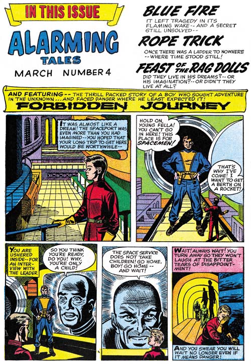
Alarming Tales #4 (March 1958), Contents page art by Joe Simon
A standard part of the Harvey comics format was the content page. Generally this was little more then using bits of the art or titles from the stories contained in the comic. With Joe as the editor or producer this simple format was often modified with the use of a short introduction for the featured story. Not long ago I provided examples of this from the romance titles. The romance introductions most often told a prelude to the featured story, but sometimes it was the comic book equivalent of a movie trailer. Interestingly the artist for the romance content page, usually Kirby but sometimes Simon, would imitate the artist for the featured story. Alarming Tales #4 also has a content page with a short story. Here Joe is the artist but he makes no attempt to imitate the featured artist, Jack Kirby. Jack’s story, “Forbidden Journey”, is about a boy who is so eager to escape into space that in order to get to the spaceport he commandeers a vehicle with almost disastrous results. In Simon’s prequel, the boy, appearing even younger, tries to sign up as a cabin boy. The spaceman who confronts him in the second panel seems unnaturally large, almost gigantic. I am sure Joe was well aware of this but does it as a way of indicating how intimidated the boy is. If that was not enough, the third and fourth panels show his interview with the leader. Here Joe uses an enormous screen showing only the leader’s face. This extra intimidation and the leader’s derogatory speech prove too much for the boy.
I fully admit that Joe’s art for the content page really was not among his better efforts. But that seems to be typical failure even when Jack did the introduction story in the romance titles. These content stories really were not that important and probably were rushed jobs done after all the rest of the comic were completed.
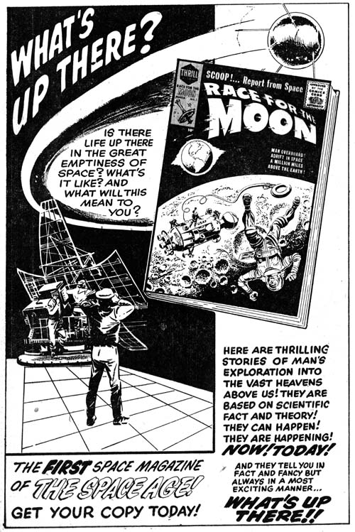
Alarming Tales #4 (March 1958) advertisement for Race for the Moon
Science fiction played a significant part of Alarming Tales yet it only represented a portion of the stories from that title. AT #4 included the above ad for a new title, Race for the Moon, which would be composed entirely of stories from the science fiction genre. Such a full page ad for a comic was unusual for Harvey. Normally ads were either small ones for a single title or full page advertisements for multiple titles. Joe and Harvey must have hoped that such a prominent ad and the recent surge in interests in space due to Russia’s Sputnik would make Race for the Moon a big seller. Unfortunately it did not seem to work.
Included in the ad is a copy of the cover for the first issue of Race for the Moon. However it is not identical to the released cover. It shows the same astronaut and space craft that Kirby drew. The main difference is the more prominent use of the moon surface in the background of the ad version compared to the printed one. Also in the final cover the earth was more completely set in the blackness of space. Joe put particular effort in getting the covers just right during this period. He completely redid the cover for Alarming Tales #1 from the original done by Jack Kirby (although that version was at first meant for Black Cat Mystery). Joe did two versions for the covers for AT #3 and #4 (I now agree with Nick Caputo that the AT #3 cover was done by Simon, not Kirby). In the case of RFTM #1 Joe probably thought that the astronaut and vehicle did not stand out enough in the first state. Simon therefore moved the distracting moon surface to the bottom of the image leaving the man and ship in the darkness of space.
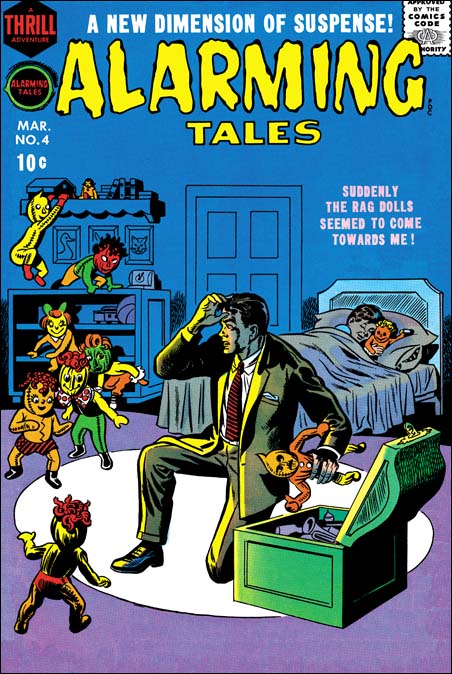
Alarming Tales #4 (March 1958) art by Joe Simon
As I said not all of Alarming Tales was dedicated to science fiction. As appropriate for a comic with this title, some of the stories belong to the horror genre. Or at least as much of horror that was possible under the Comic Code. The cover for AT #4 depicts one of the interior stories “The Feast of the Rag Dolls”. I suspect when Joe did this cover he was thinking of a story and cover from Black Magic #1. In that story a rag doll with a demonic nature brings murder and mayhem to a family. For the cover to AT #4 Joe brings a whole troop of rag dolls to life. If anything the dolls’ smiles bring a threatening chill for their advance toward the surprised man.
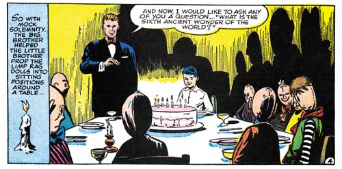
Alarming Tales #4 (March 1958) “Feast of the Rag Dolls”, final panel for page 4, art by Doug Wildey?
I attribute the story art for “The Feast of the Rag Dolls” to Doug Wildey, albeit questionably. I am not very familiar with Wildey’s work, I do not think he ever did any work for Simon and Kirby prior to this period. Nor did he sign anything he did for Joe at this time. That Doug did work for Simon is indicated because Joe’s collection has original art for “When Time Ran Out” from Thrill-O-Rama #1 (October 1965) with Doug’s name and address written on the back of one of the pages. I have read that Wildey made heavy use of photographs in drawing his comics. I can easily accept that because some of his work combines very realistically rendered images interspaced with more simple ones. In general I prefer a more “cartoony” style for comic books. I feel that with the small size of most panels all the details of an illustrative approach can actually make it hard to project the emotions in a scene. A more simple art combined with some exaggeration can completely overcome the difficulties of telling a story on the small pages of a comic book. Of course Jack Kirby is a great example of what an artist can do without being truly realistic. However I also feel that it is a mistake to look at an art form only from a single aesthetic viewpoint. Sometimes you have to put aside your own assumptions and try to adopt those of the artist in question. So when I try to accept Wildey’s more illustrative style I find that he really is a talented artist. Doug truly knows how to present a story, he is almost cinematic in approach. The only question is did Wildey pencil “The Feast of the Rag Dolls”? I make this attribution because of similarities between this story and the parts of other Wildey pieces that do not seem to be based on photographs. But I just do not know whether Doug would occasionally abandon photographic references throughout an entire story as would be the case if he were the artist for “Feast of the Rag Dolls”.
The threat the rag dolls present to the man on the cover as presented by Joe Simon really was not part of the story. Actually the threat perceived by the boy’s parent is the obsession the boy shows for the dolls and his insistence that they talked to him. The parents appeal for help from the boy’s much older and very idolized brother. That brother decides to use the child psychology he has learned in college. He arranges a party for the boy and all his dolls. The older brother uses the party to indicate to the boy that the rag dolls really cannot talk and are nothing more then toys. It is a panel from that party whose image I have included above. Note that all the rag dolls seem slumped and lifeless in the chairs. But I love the way Wildey uses the shadows casts by the candles to provide the otherwise mundane scene with an eerie overtone.
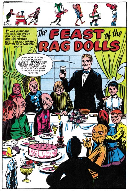
Alarming Tales #4 (March 1958) “Feast of the Rag Dolls”, page 1, art by Joe Simon
While I am not certain Doug Wildey penciled the story it is clear that the splash page was drawn by Joe Simon. Joe presents his version of the same party scene that Wildey did in the panel image I presented earlier. I am sure Joe fully knew the story because the older brother gives a speech chiding the rag dolls for not toasting the guest of honor. Yet despite this Simon does not present the rag doll guests in the slumped and lifeless manner as Doug Wildey had. Instead Joe provides us with rag dolls that look lively and are having a very good time. As if the emphasize their dynamic nature, Simon adds above a frieze of rag dolls prancing across with gifts.
I doubt that any art form is grown in isolation from all others. Carefully examine the work of the earlier comic book artists and you will find they were influenced by syndication strips, magazine and pulp illustrations and the movies. Because comics were a part of pop culture it is not surprising that comic artists drew inspiration from other popular arts. What is infrequently found are any references to the fine arts. Crowd scenes are found in many art forms but only in the fine arts is it not unusual for one of the secondary participants to look back out at the viewer. That sort of thing is so rare in comic books that I cannot help but feel that when the rag doll in the lower right corner looks back at us, that is Joe tipping his hat to the fine arts. When an artist wants to include his self portrait in a group painting it is generally as that outward looking individual. So what do you think, is that Joe with his cigar smiling back at us?

