Category Archives: Harvey

The Wide Angle Scream, More Pinups

Boys� Ranch #4
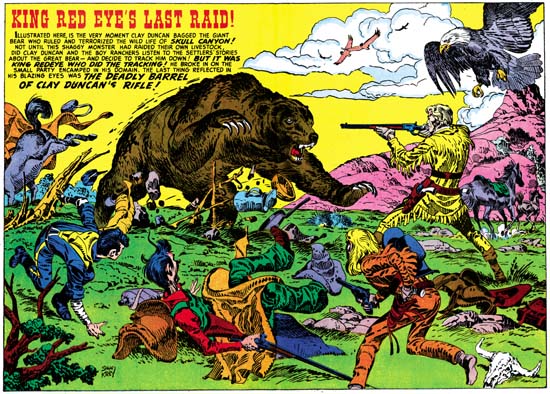
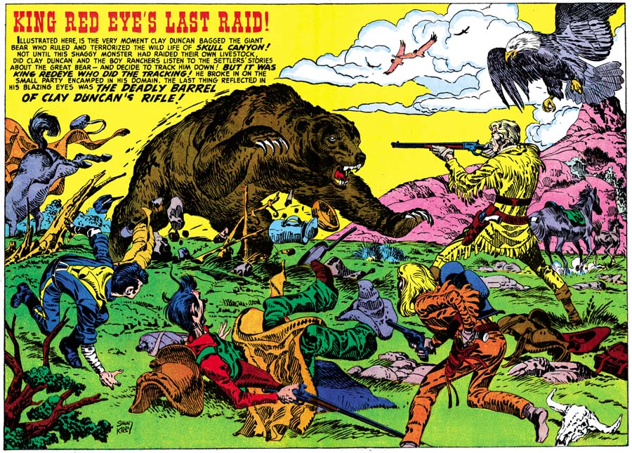
Boys’ Ranch #4 (April 1951) “King Red Eye’s Last Raid” art by Jack Kirby
Larger image

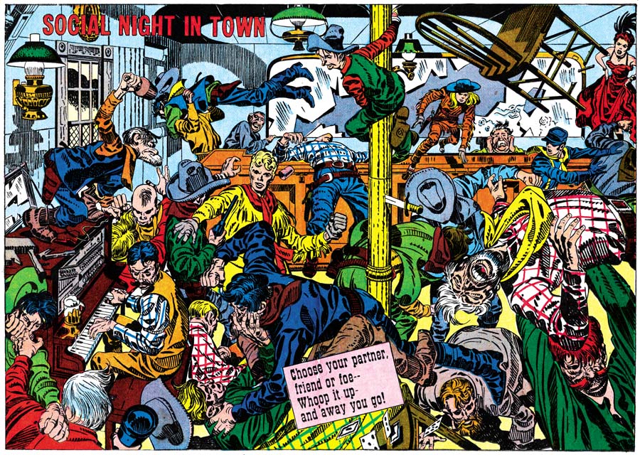
A rampaging grizzly bear, escaping horses, a kicking mule, and the scrambling youngsters of Boys’ Ranch make this image one of chaos. That is except for the firm figure of Clay Duncan as he calmly aims his rifle to make the most of his shot, probably the only one that he will manage to get off. Although the scene is supposed to be chaotic, the composition is anything but that. The mule, boys and Duncan form a broad ‘U’ shape with the bear occupying the center. Each element that forms that ‘U’ directs our attention toward the grizzly. The bald eagle might seem out of place in the portrayed scene. We would not expect the eagle to have been sleeping among the crew and there certainly would seem to be enough Americana in the picture without it. But its does serve the purpose of balancing off the caption on the opposite side of the splash. All in all a carefully composed image not at all like the true chaos found in last month’s splash “Social Night In Town” but every bit as great a piece of art.

Before I continue, I would like to offer a little digression. In 1972 I lived for a short time in Denver. One weekend I went out into the front range of the Rockies to collect fossils. The weather was dry and my original plans were to roll out the sleeping bag and spend the night under the stars. However the area I was in was cattle country and there were absolutely no trees. I found that the cattle liked to visit my car so that they could use it to rub against. I did not relish the possibility of one of them stepping on me while I slept, so I spent the night in the backseat of the car. When I returned to Denver I heard on the radio that a bear had killed some cattle only a few miles from where I was. I felt that I was pretty lucky since the cattle congregating around my car could have easily attracted the bear and had I been outside he may have found me a much easier prey. After a few weeks of killing cattle the bear was finally shot, he was the largest bear killed in Colorado in over 25 years.

Boys� Ranch #5
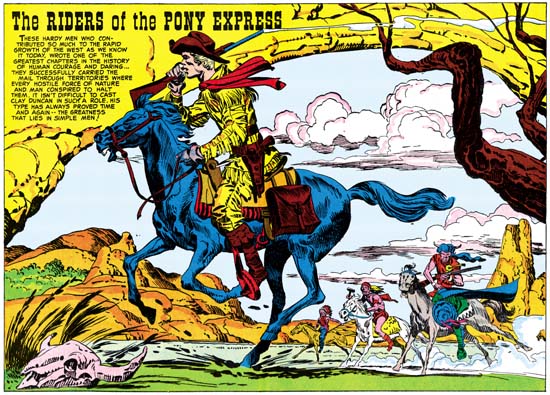
Boys’ Ranch #5 (June 1951) “The Riders of the Pony Express” art by Jack Kirby
Larger image

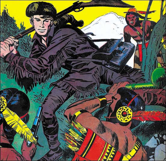
The Pony Express rider runs his horse at full speed as he tries to escape some attacking Indians. The horse seems frantic but the rider appears almost casual with his rifle held over his shoulder. A trail of smoke exits from the gun barrel showing that the rider has already fired it once and will surely do so again if necessary. There is no question about the unpleasant intent of the Indians but the Pony Express rider seems in control of the situation. The Indians are not trailing behind the rider so they appear to have been trying to cut him off. It makes for an interesting composition with the farthest Indian almost at the center with nearer natives placed increasingly towards our right with the Pony Express rider bring the movement back towards the left. That is not the only way the eye is directed, an overhanging rock formation and some tree branches form an oval with all the riders. The caption rests comfortably on the right portion of the rocky arch. It is truly amazing the variations that are found in these wide pinups, each have their unique composition.

Boys� Ranch #6
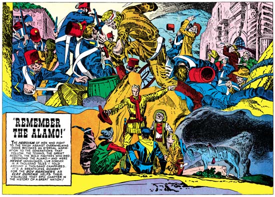
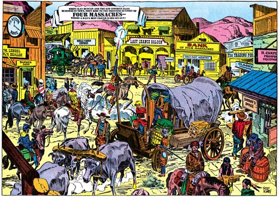
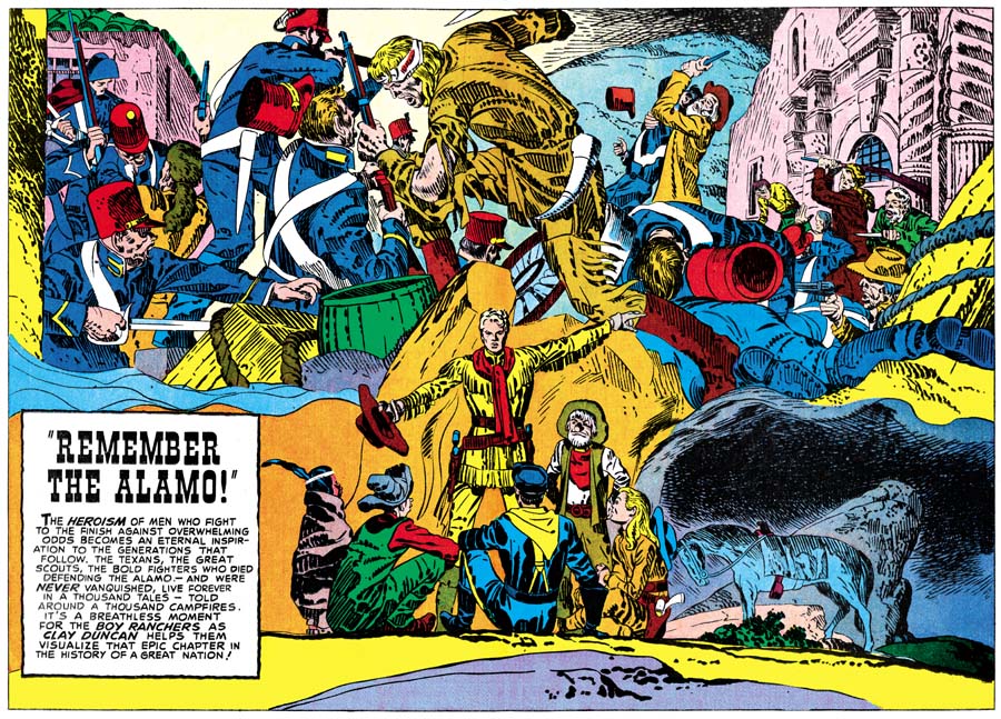
Boys’ Ranch #6 (August 1951) “Remember the Alamo” art by Jack Kirby
Larger image

Clay Duncan enthralls his friends while spending the night out in the prairie with tales of the heroics of the defenders of the Alamo. The lower half of the splash depicts the cast of the Boys’ Ranch while the upper half portrays a dramatic battle. What a battle it is, fully in the Kirby tradition. Gun play takes a decidedly second place to hand to hand combat. This is not an all-over composition like we saw in “Social Night in Town”. A large figure occupies the center separating a left portion of large, mostly Mexican, figures from a right field where the large fallen Mexican figures reveal smaller fighters and a building behind. It would almost seem that the Texans were winning the battle! The only Texan that appears to be in immediate trouble is one in the right background who holds his hands to his face. Of course the Texan success could only be true for a relatively short time before they would succumb to the overwhelming numbers of their opponents. The hard struggle they have had up to this point is suggested by the head bandage and torn costume of our central fighter. He, and two others, one on each side, are obviously frontiersmen. I am tempted to identify the center figure as Jim Bowie because of the large knife he welds, mostly out of the frame. Also tempting would be to identify the wearer of a coon-skin hat as Davy Crockett except that there are two of them. Note how the one on the right brandishes his rifle in the same matter that Crockett does on the cover to Western Tales #32 (March 1956). The central figure’s outfit visually links him to the similarly garbed Clay Duncan below but more importantly suggests a common heroic nature. What a shift from the drama above to the quiet scene below. The members of the Boys’ Ranch are bunched up in the center with backdrops of rock formations and night sky. A lone horse is seen on our right compositionally balancing the caption that appears on the opposite side of the splash. The horse should be unsaddled for the night but a shoe horn and stirrups can be seen but not the rest of the saddle. It is the sort of thing I would expect from Jack, but not from Joe who rode a horse in the Coast Guard. It is however a minor and easy to overlook flaw.

Often the inspiration for Simon and Kirby creations can be found in cinema of the period. Jack and Joe were both of the age that they likely saw the movie “Heroes of the Alamo” but that was released in 1937 and thus does not explain the appearance of the Alamo theme at this particular time. Alamo movies and TV shows became more popular a few years later starting with “The Man from the Alamo” (1953), then “The Last Command” (1955), “Davy Crockett at the Alamo” (1955), “The First Texan” (1956) and pretty much ending with “The Spirit of the Alamo” (1960). The “Davy Crockett at the Alamo” is particularly important as it was part of the made for TV series that Disney produced about Davy Crockett that started a craze among young boys. Afterwards the Alamo largely disappeared from popular culture. At least part of this can be blamed on a shift in social attitudes; one of the freedoms the Texan’s were fighting for was the right to own slaves. Another attempt at the theme was done in 2004 with the film “The Alamo” but it did not achieve much success.

It would not be possible for me to overemphasize what a successful piece of art I think “Remember the Alamo” is. The combination of the action and quiet scenes was done so well it is easy to overlook how unnatural it really should have been. It is arguably the best of the double page pinups from the Boys’ Ranch titles and one of Simon and Kirby’s greatest creations. With the end of the Boys’ Ranch title wide pinups or splashes would disappear from S&K publications for the next few years. For Simon and Kirby it was a relatively quiet period with only one new title, Strange World of Your Dreams in 1952. This was followed by a flurry of new comics starting with Captain 3D (December 1953). The wide format’s small part of the activity will be covered in the next chapter.

The Wide Angle Scream, The Pinup

Towards the end of 1950 Simon and Kirby had some hit titles all published by Prize. For the crime genre there were Headline and Justice Traps the Guilty. Having two titles in the same genre is always a sign of a success. More important would be the Young Romance and Young Love titles for the romance genre that Joe and Jack started. However Simon and Kirby were not ones to just sit back and milk past achievements, they were always trying to produce new titles. October of 1950 would see the release of two new S&K productions. For Prize again they would release their first in the horror genre, Black Magic. That title would run for about five years and would be joined in 1952 by Strange World of Your Dreams, again an indication of success. Simon and Kirby would also release in October Boys’ Ranch, only it would be published by Harvey Comics. Boys’ Ranch is considered by many fans as one of Simon and Kirby’s greatest creations. Unfortunately it was not so well received at the time and the title only lasted six issues.

Boys’ Ranch may not have been as big a success as Joe and Jack had hoped, but it was not for lack of trying. S&K used in Boys’ Ranch some things that they had never tried before, among which were pinups. I am not sure where the idea for the pinups came but Simon and Kirby put it to good use. Each issue of Boys’ Ranch contained both introductory and centerfold pinups. Pinups are unlike splash pages since without any attachment to a story a pinup can be a self sufficient entity. In this respect they are much more like cover art except the image need not be crowded by a prominent title. As stand-alone pieces of art, The Boys’ Ranch pinups represent some of the finest work that Simon and Kirby did. With the expanse that the double page provides, the centerfold pinups are particularly effective.

Boys� Ranch #1
Boys’ Ranch #1 (October 1950) “Boys’ Ranch”, art by Jack Kirby
Larger image

The centerfold for the first issue introduces the cast and the locale. We find Tommy learning how to lasso cattle while Wabash loafs with his guitar. Angel threatens to use his marksmanship to get Wabash moving. Three sides of the image are framed with rough timber with the title hanging from the top post. The complete circumference is edged with cattle skulls, pistols and other western paraphernalia reminiscent of the bottom edge of the wide splash from Captain America #8 (November 1941). This emphasis on design, unusual in the Boys’ Ranch splashes, does not save this particular centerfold. The more distant view used is not Jack Kirby’s forte for he generally does better when he thrusts his cast into the foreground. There are lots of assorted details provided, many requiring explanations from captions, but just not enough interest to hold our attention long. This is a rare example, in my opinion, of a Kirby double page piece of art that does not come up to his usual high standards.

Boys� Ranch #2
Boys’ Ranch #2 (December 1950) “Four Massacres”, art by Jack Kirby
Larger image

Another more distant view but this time Kirby makes it more interesting by providing more to look at. It is a crowded image but because this is in a comic book and a reader would tend to view it from left to right there should have been no difficulty in finding the Boys’ Ranch characters on the far left as they enter the town. I will leave it up to my readers to ferret out all the details. This splash is filled with individuals and groups all telling their own little stories, no need for captions to explain it all. Whatever the reasons for the short comings of the wide pinup from Boys’ Ranch #1, Jack is now clearly getting into the control of this new format.

Boys� Ranch #3
Boys’ Ranch #3 (February 1951) “Social Night in Town”, art by Jack Kirby
Larger image

With “Social Night in Town” Jack Kirby is in top form; this is certainly one of his classic drawings. This is Kirby at his best, a slugfest up close and personal. I like to think of this sort of composition as Kirby’s comic book equivalent of Jackson Pollock. There is no true focus to the image as it is an all over drawing with every portion as important as any other. Jack’s mastery of exaggerated perspective allows him to make this look easy but I honestly cannot think of another comic artist who could come close to providing such an exciting fight scene. Kirby has done this sort of thing before in for example “The Villain from Valhalla” in Adventure Comics #75 (June 1942), but the wide format allows a treatment just not possible on a single page. It would sound much too dry to describe all the details but I cannot help point out Wabash clinging in relative safety high on the near center post enjoying watching all the proceedings. Relative is the operative word because note the knife sticking in the post below him and the chair flying high on the right. The theme of cowboy’s letting off steam in a bar fight may not have been a cliche in 1950 but it soon would be. Comic books could do it in a way that television or movies simple could not match no matter how hard they tried. Not that their directors would likely have noticed Kirby’s work in 1950, but they should have.

As wonderful as “Social Night in Town” is, the best was yet to come. Unfortunately that will have to be covered in the next chapter.

The Wide Angle Scream, American Royalty

I have decided to resurrect this old serial post. I originally started it when I had then begun to restore S&K’s double page splashes. I wanted the restoration to be on the same level that I do for covers. However that required an awful lot of effort since these splashes have twice the area of the covers and the printing quality is much inferior. Eventually the amount of work proved too excessive and other restoration projects became more important. I feel that the subject matter of the serial post is too important and should not be completely abandoned. So I return to the subject although in the future the quality of the restorations will not be quite so high. Since it has now been over a year since my last chapter, I thought I should provide a very broad summary of the previous posts.

Simon and Kirby’s use of a double page splash began with Captain America #6 (September 1941). The five Cap double page splashes had a strong emphasis on design (#6#7#8#9, and #10). The splashes would consist of three sections. One section common to all was what I called the enactment; it is a scene or tableau but is not part of the actual story. The second section is also common to all Captain America wide splashes; it consists of panels for the true start of the story. Although the third section is present in all of these splashes what it comprises of is not consistent, it can be a cast of characters, floating heads or a sort of comic book equivalent of movie trailers.

During the period that Simon and Kirby worked for DC they only produced one double page splash, that was for Boy Commandos #2 (Spring 1943). Here once again the splash was made in three sections. The enactment is present but it consists of a larger number of individuals then ever attempted in Captain America. Some organization is achieved by deploying them around the glass case containing a sleeping beauty, but even so there is so much chaos that it takes some time to sort out all that is taking place. There is also a cast of character sections. Unlike the Cap wide splashes there is no start of the story; instead the third section is given over to a large introductory text.

After returning from the war, Simon and Kirby launched Stuntman and Boy Explorers that were published by Harvey Comics. A wide splash was used with Stuntman. Only two were published but Jack had made worked on three others. The first one (Stuntman #1, April 1946, “The House of Madness”) used an unusual design, effectively two enactments laid out as large panels separated by a sweeping gutter. The second (Stuntman #2, June 1946, “The Rescue of Robin Hood”) reverted to a more standard tri-part design with sections for the title, enactment and cast of characters. Although the exposition is pretty much isolated from the rest of the splash, the title and cast of characters are nicely integrated. I also posted on one of the unpublished wide splash ( “Terror Island”). For the first time Kirby provides just one section, an enactment. There is a title, an introduction and even a floating head of the Panda, but these are subservient to the large enactment and do not achieve the status of their own section.

Because of copyright issues I do not consider it appropriate to reproduce the other two double wide Stuntman splashes. They can be found in Joe Simon’s book “The Comic Book Makers”. Both are further variations of a single large enactment section found in “Terror Island”. In one (“Jungle Lord”) Jack presents a smaller cast as compared to that for “Terror Island”. The enactment takes place in the tree tops where we find Stuntman battling a gorilla in the foreground while in the back Don Daring clings to a tree and a jungle boy makes off with Sandra Sylvan. Since the cast is smaller in the “Jungle Lord” splash as compared to “Terror Island” the action can be brought closer to the reader with dramatic results. The inking of the final wide splash (“The Evil Sons of M. LeBlanc”) was never completed, so it clearly was the last one worked on. This is another single section with Stuntman confronting three opponents. I find that the plain room in “The Evil Sons of M. LeBlanc” as compared to all the foliage of “Jungle Lord” brings greater focus and excitement to the depiction.

The Stuntman period is interesting because it marked the only time during his collaboration with Kirby that Simon did a significant stint at drawing. Early in his association with Jack, the two would draw different pages from the same story. Initially this seemed to be the working method for Captain America but quickly Jack took over all the drawing choirs for the S&K partnership. With the exception of some work done while in the Coast Guard, Joe did not seem to contribute much penciling to what was produced by S&K during the war. But while Kirby was penciling Stuntman and Boy Explorers Joe would pencil three backup features; the Duke of Broadway, the Vagabond Prince and Kid Adonis. Despite what some experts have said, these were drawn entirely by Joe except for a few small parts that Jack altered in his role as an art editor. Joe has said that Harvey kept track of the mail and that the Duke of Broadway got a better reader response then Stuntman. This was likely to be during the period after the original titles had been cancelled and Harvey was printing the unused work in comics such as Green Hornet. After the Harvey Stuntman/Boy Explorers period and until the breakup of the Simon and Kirby team, Joe’s penciling contributions would be uncommon (48 Famous Americans for J. C. Penny and “Deadly Doolittle” for Fighting American).

Boy Explorers #1
Boys Explorers #1 (May 1946) “His Highness the Duke of Broadway”, art by Joe Simon
Larger image

Joe only did one double wide splash for his Harvey features (“His Highness the Duke of Broadway” from Boy Explorers #1, May 1946). It is actually surprising that he did any considering the short lives of these titles (due to a comic book glut) and the fact that his stories are all back-up features. Like the one from Stuntman #1 a month before, this double page splash is comprised of two sections. Not that use of the same number of sections makes these two splashes truly similar. While that from Stuntman #1 is unusual in being composed of two enactments, the splash for the Duke feature is made of two familiar sections, an enactment on our left and a cast of characters on the right. The cast of characters consists of both full figures and floating heads accompanied by short captions that provide their names and a short description. At ten in number it was quite an ambitious cast, Joe obviously wanted a lot of supporting characters so as to provide the potential for much variation in his stories (unfortunately there would only be five). In this splash much of the cast are floating in front of the cityscape. Even those that are attached to the ground seem unnaturally placed because of the way they block the small avenue (surprisingly small since it is meant to be either Broadway or 42nd Street). The cityscape itself is carefully drawn so to provide an interesting background but subtlety rendered so that the cast would still stand out.

Such a large number of cast members required the use of half the splash. But this was the cast for the feature, only some of them would show up in this particular story. With such a large assemblage on the right side Joe needed something on the left to balance. His solution was to present most of the cast together solidly placed on the sidewalk. While this was a satisfactory solution as far as the composition was concerned, frankly it is not very exciting. Joe would do much better and more innovating designs for some of the regular splashes for his features. Still this double wide splash shows an emphasis on design that would disappear from the later ones by Kirby for Stuntman.

Stylistically the drawing for the splash differs from what Joe did in the story itself. Click Collins and Legal Louie are exceptions as they seem to better match what was done for the story. It still looks to me that it was penciled by Simon, only it is closer to what Joe had done previously and to what he would again do later in his career. Nothing on the splash refers to what will be found in the story. Everything is very generic, describing the feature as a whole and not this particular story. All this makes me suspect that Joe did the splash some time before as a presentation piece for the pitch he made to Harvey. Joe was not one to let all that effort to create this splash go to waste, so he appended it to the first story.

Horrible Mort Meskin

By 1954 Mort Meskin had been providing work for the Simon and Kirby studio for four years. Even more important then the amount of time spent was the volume of work; Mort executed more work for S&K then any other studio artist. There were even periods that Mort’s page production rates exceeded Kirby’s who was justly famous for his productivity. Mort’s contribution went beyond volume; he played an important part in the S&K classic Boys’ Ranch (1951). It was Mort who persuaded S&K to create that unusual title Strange World of Your Dreams (1952) for which he listed as an Associate Editor. 1954 was an important year for both Meskin and S&K as well. In that year Simon and Kirby would return to the superhero genre with Fighting American published by Prize. Even more important Joe and Jack would create their own comic publishing company called Mainline. Considering Meskin’s contributions in the past, it would be expected that he would play a significant role in these projects, but he did not. Mort provided no help with Fighting American and only shows up in a few initial issues of the Mainline titles. Since Mort was creating art for the Prize romances (still being produced by Simon and Kirby) his absence from the other projects is hard to explain. 1954 was of note for Mort because it marked his return to providing art for DC. This was not an exclusive arrangement, as mentioned above Mort would continue to provide work for the Prize romances. Meskin also did one work for Harvey’s Chamber of Chills.

The hero of this story is the meek and troubled Oscar Pert. He could have been happy, if only he was not oppressed by his wife, Martha. The only important thing in life for Martha was the continual depositing of money into the bank. Everything else must be sacrificed. Oscar lost his friends when he was no longer able to pay club dues. Martha would not even let him spend a little money for milk to give a stray cat. But finally Oscar devises a new means to happiness. We see him in his cellar stealing moments away from Martha, designing some project. His increased sense of contentment is noticed by all but understood by none. That is until Martha discovers his drafting ruler and pawns it off. Apparently that is the last straw because that night Martha hears a strange ticking noise coming from the cellar. She finds a box down there and when she investigates the box’s opening the trap is set. The story ends with Oscar making his own rather gruesome deposit to the bank vault.

Chamber of Chills #24
Chamber of Chills #24 (July 1954) “Credit and Loss”, art by Mort Meskin

The story was not written by Mort, but he makes the most of it. He is at the top of his form in story telling, and that means a lot because Meskin was a consummate graphic story teller. His shifts in distance and perspective are done not just to provide variation, but as a means to advance the story itself. Take the sequence that starts the tale; a panel of a broken record introduces the theme of repetition, the next panel has advances the theme with a close-up of a woman’s nagging mouth, with the final panel a more distant shot providing an introduction to the main characters of the story and their relationship.

Chamber of Chills #24
Chamber of Chills #24 (July 1954) “Credit and Loss” page 4 panel 5, art by Mort Meskin

Mort’s art is excellent, particularly the inking. The splash panels uses the S&K studio style with bold picket fence brush work (for an explanation of this term, see the Inking Glossary). The image of the skeletal hands with ledger is not a literal summation of the story but it does effectively symbolize the theme. I cannot explain what the ruled background represents, perhaps another visual reference to a financial ledger? In any case it is a pleasing pattern as if designed by Mondrian. After the splash Meskin drops using the S&K studio style and adopts his more typical inking methods. However that is a little misleading as Mort’s inking is here much more elaborate then what he had previously been using in work that he had done for Simon and Kirby. For example Meskin typically constructed eyebrows as a couple of overlapping simple brush strokes, but for close-ups in “Credit and Loss” the eyebrows are made with numerous brushstrokes that suggest the individual hairs. Instead of simple brushing for shadows on faces, here Mort provides some careful crosshatching. Meskin even seems to take much more effort with the drawing as well. The close-ups of Oscar are some of the best portrayals that Mort has ever done. The large soulful eyes and small chin suggest his submissive character. But note how in the panel I provide above how Mort subtlety reveals Oscar’s awakened spirit of resistance.

With such a great piece of art it is a wonder that Mort Meskin did not do more work for Chamber of Chills. I really do not have the timing of Meskin’s non-S&K work down very well, but perhaps it is nothing more then having been returned to the better paying DC Mort felt no need to pursue work from Harvey. Joe Simon’s collection includes the complete original art for “Credit and Loss”, as well as some other art from the same Chamber of Chills issue. So maybe even at this early date Joe was giving Harvey a hand. If so, Simon was not passing onto Harvey excess S&K material, this story much more deserves being called horror then anything found in S&K’s own Black Magic. The tale goes beyond what Joe and Jack would have considered to be in good taste. Whatever the explanation for its unique status, “Credit and Loss” is a masterpiece. Unfortunately its presence in a rare comic means it has not been seen by many. Maybe someday it will get the reprint treatment it so richly deserves.

Kirby Inkers, Mort Meskin

Jack Kirby had a lot of different inkers throughout his long and productive career. During the time of Jack’s collaboration with Joe Simon, most of his inkers were also artists that worked for the S&K studio. Mort Meskin, for one, had a extended and fruitful association with Simon and Kirby. The earliest S&K production that included a Meskin signature was “The Inferior Male” from Young Romance #6 (July 1948) (see previous posts here and here). That particular piece was also signed by Jerry Robinson, the usual assumption is that the first signature (in this case Robinson) was the penciler and the second (Meskin) was the inker. Here support is found in that at least some of the pencils do not appear to by Mort, while the inking is typical of his work that follows. The first work to be signed by Meskin alone came over a year later with “His Engagement Ring” (Young Romance #16, December 1949). There is an even earlier work then both of these that Meskin at least participated in (“Love Or A Career” in Young Romance #3 January 1948). To be honest I am holding back some information that I want to be the subject of my next week’s post. Although Mort’s earlier work for Simon and Kirby was sporadic, from 1950 on he became the most prolific of the studio artists. During this time Meskin’s output may have even exceeded Jack Kirby’s.

Young Romance #18
Young Romance #18 (February 1950) “I Own This Man”, pencils and inks by Mort Meskin

I provide above a splash by Meskin from early in his association with Simon and Kirby. It gives examples of a number of Mort’s spotting techniques. Mort’s most common brush method, actually used much more frequently than apparent in this splash, is to describe clothing folds by using two or more narrow brush lines in close or overlapping paths. These can be found in the pressman’s blue jacket. Note how what the original individual brush strokes are sometimes revealed at the ends of the folds. Another Mort inking style was to often distinctly outline shadows. Once again this splash does not provide the best examples but two of them are present one near the center of the wrestling mat while the other is near Mort’s signature. The wrestlers give Meskin the opportunity to do some real nice simple hatching. The lines vary from thin to quite bold. Often one and occasionally two lines are used to delimit a hatching area. This type of brushing technique is very reminiscent of the S&K Studio style picket fence work. (See the inking glossary for an explanation of my inking terms such as simple hatching and picket fence). I do not know enough about Meskin’s prior inking to say whether this is typical of his work at the time or if this shows he was influenced by the Studio style. The dark spot on the reporter’s right shoulder are suggestive of the Studio style’s shoulder blot. That is misleading as Mort always seems to use these in a way to suggest realistic shadows while in the Studio style they generally appear on both shoulders without any natural explanation.

Young Romance #37
Young Romance #37 (September 1951) “Just to be Near Him” page 2 panel 1, pencils and inks by Mort Meskin

Although it maybe debatable whether my first image represents true Studio style brushwork, later work can certainly be called that. In the above image the pickets of the picket fence inking have become bold and the rails more consistently applied. Mort would sometimes also use standard crosshatching, as seen on our far left and on the lower part of the woman’s dress. When doing so, he would frequently place the crossing lines at an acute angle so that the white spaces are elongated.

Young Romance #29
Young Romance #29 (January 1951) “Diagnosis: Love” page 5 panel 3, pencils and inks by Mort Meskin

The above panel provides a better example of Meskin’s penchant for outlining shadows. That the boldly brushed dark spot on the center man’s jacket is a shadow can be seen by the presence of the profile of a nose. Mort would occasionally have a dark shadow trace a path down one side of a figure, such as the man on our left.

Justice Traps the Guilty #56
Justice Traps the Guilty #56 (November 1953) “G-Man Payoff” page 5 panel 6, pencils and inks by Mort Meskin

When artists both draw and ink their own work the two art stages will sometimes reinforce one another. That is what I believe happened with the eyebrows that Mort gave his men. These eyebrows are inked with a method similar to how Meskin handled clothing folds, two or three narrow overlapping brush strokes would trace the path of the eyebrow. This resulted in eyebrows that were wide, simple and made somewhat angular turns. As we will see below, Mort became so entrenched in inking eyebrows this way that it could affected how he inked Kirby’s pencils.

The above panel also shows how Meskin would sometimes fill in part of a blank background with crosshatching. As is generally the case, here his lines meet at an acute angle, not at right angles some other inkers prefer.

Young Romance #30
Young Romance #30 (February 1951) “My Lord and Master” page 3 panel 1, pencils and inks by Mort Meskin

Sometimes Mort will use his brushwork to create a side of a figure that is both a narrow shadow and a wide outline. This does not show up often, but is very distinctive when it does. I am sure further study of Meskin’s abundant output will show other inking techniques that while not common can be useful in determining attributions.

Young Love #68
Young Love #68 (December 1955), pencils and inks by Mort Meskin

Covers are important for the sale of a comic and the higher quality paper allows a superior printing. Therefore artists take more care in the creating artwork for covers. However the S&K studio artists usually did not get a chance to provide cover art, Jack Kirby would do all cover art when a photograph was not used. But when Simon and Kirby launched their own publication company, Mainline, Jack was so busy that for a year the covers for the Prize romance titles would be done by other artists, including Mort Meskin. On none of his romance covers would Mort use picket fence patterns or any of the other traits of S&K Studio style inking. For the spotting on Young Love #68 Mort relied mostly on his use of narrow brush strokes. Note how on YL #68 the back of the man’s jacket and pants has that narrow shadow or wide outline that we saw before.

Mort Meskin was such a prolific artist that the possibility of the use of assistants has to be considered. In preparation for writing this post I reviewed a lot of Mort’s work from 1950 to 1956, there is so much work that I did not have the time to review it all. This review confirmed my previous conviction, Mort had little if any assistance in inking his art. Almost all the spotting looked like it was done by the same hand.

Some of Meskin’s inking techniques are not limited to him alone. The use of narrow, often overlapping brush strokes can also be found in stories by George Roussos as well. This is not too surprising since Mort and George worked together in the late 40’s. The narrow brush strokes were not the only think George picked up from Mort, a lot of his penciling was clearly influenced by Meskin as well. Nonetheless Roussos did not adopt all Mort’s inking techniques so the two can be distinguished. However a discussion about Roussos will have to await another post. I will say that I have yet to find an example of Roussos inking Kirby (that is until the Silver Age).

Boys’ Ranch #4
Boys’ Ranch #4 (April 1951) “The Bugle Blows at Bloody Knife” page 8, pencils by Jack Kirby, inks by Mort Meskin

The Jack Kirby Checklist attributes most of the inking in the classic Boys’ Ranch to Joe Simon. Actually it is not hard to recognize Mort Meskin’s inking in much, if not most, of it, particularly after the first couple of issues. The biggest difficulty I faced with choosing an example of Mort inking Kirby from Boys’ Ranch was that I believe Mort was the penciler for at least some of the work in that title that has generally been credited to Jack. But the drawing in “The Bugle Blows at Bloody Knife” looks so much like Kirby’s that I am confident that he was the penciler. I am equally as confident that Meskin did the inking. Note the narrow clothing folds in panels 3, 4, 5 and 6. See how the shadows have a strong outline, most obvious in panel 4, but can even be found on the officer’s forehead in panel 1. The back of the soldier in panel 3 could be described as either a narrow shadow or wide outline. The eyebrows in panel 1 and 6 are simple with angular turns. All of these are typical Meskin traits.

Police Trap #6
Police Trap #6 (September 1955) “Only the Guilty Run”, page 1, pencils by Jack Kirby, inks by Mort Meskin

The two gun carrying detectives in the background are so typical of Jack Kirby that he must have been the penciler. At a glance the inking appears typical S&K Studio style. But note how the clothing folds are long and narrow. The final giveaway is the thief’s eyebrows are simple with angular turns. There is little doubt that this is another example of Meskin inking Kirby.

Western Tales #32
Western Tales #32 (March 1956), pencils by Jack Kirby, inks by Mort Meskin

My final image is the cover of Western Tales #32. This work was not included in the Jack Kirby Checklist. The last time I posted on it I attributed both the pencils and inks to Joe Simon. The fact that it was not Kirby’s inking and the stiffness of the Indians (especially the one in the right foreground) suggested to me that Joe might be responsible. After all Simon has shown himself to be excellent at mimicking Kirby. However Crockett’s pose seems more dynamic then what Joe has ever done without using swipes, and it was just the sort of thing that Jack was so good at. Perhaps the awkward pose of the Indian on the right was due to the limited area left over from Davy’s figure. As for the inking it simply is not Kirby’s work. Note the long and narrow clothing folds, Davy’s angular eyebrows, and the way his back is outlined by a narrow shadow. None of these are Kirby traits but all are characteristic of Mort Meskin’s inking. This magnificently inked cover shows that Mort had complete mastery of the S&K Studio style. Mort’s brushwork has the same sort of bold confidence that Jack and Joe also possessed. Although it may not be a reliable enough trait to rely on in determining attributions, Meskin’s brush does seem a little more mechanical then either Simon’s or Kirby’s.

A few months after Western Tales #32 Meskin would stop providing work to Simon and Kirby. If the GCD is correct, Mort had actually returned to working for DC a couple of years earlier. Now having left S&K, DC would become Mort’s main source of income until he abandoned the comic book industry. Meskin’s final DC period overlaps Jack Kirby’s time there, however none of Kirby’s DC work that I have seen was inked by Mort.

I have not made a thorough examination of Jack Kirby’s work for the purpose of determining what ones were inked by Mort Meskin. I want to hold off on that effort until I review some more S&K artist/inkers. So far the only other one I have posted on was Marvin Stein.

Alternate Versions of the Alarming Tales #3 Cover

Alarming Tales #3
Alarming Tales #3 (January 1958) restored art, by Joe Simon

A recurring theme in my posts is how well Joe Simon could mimic Jack Kirby. This has resulted in a number of pieces that Joe did becoming attributed to Jack. Do not get me wrong, the overwhelming number of the items in the Jack Kirby Checklist are correctly attributed. Still there are a small number of entrees that are wrong and it is important to try to correct those mistakes. I would like to say that my study of Joe Simon’s art has enabled me to spot all the attribution errors that others have made. I would like to say that but it would not be completely true. A case in point is the cover for Alarming Tales #3. I provide an image of the restored line art to this cover above, a color version can be seen in a previous post.

In the past I have followed the Jack Kirby Checklist in saying Kirby did this cover. Not everyone agreed, for one sharp eyed Nick Caputo demurred. I was not completely satisfied with the Kirby attribution because I knew of the existence of another version of the cover art. It seemed to me that a comparison of the two would probably resolve the credit issue. As I hope to show in this post, that has turned out to be the case.Alarming Tales #3
Unused original art for Alarming Tales #3, by Jack Kirby.

I provide an image of the unused version above. A note of caution when comparing the two versions. The unused one is original art and therefore has not been subjected to the blurring and loss of details that are the results of the printing process, all of which the published version has been subjected to. Also the title on the original art is a recent addition. The presence of penciled text indicates the decision to come up with new cover art was made before title stats would have been applied to the original.The derivation of the final cover from the unpublished version is obvious, both have the same cast of characters in about the same positions. The greatest difference is the backgrounds. Not only has the background been completely changed, it has been pushed much further back in the released cover. A closer examination reveals that the people are not identical. The size of the old man has been increased while the relative size of the boy and, even more so, the men in the boat has been reduced. The old man’s head has been enlarged and the position of his left arm has been shifted. The details of all figures have been changed. Curiously the boy’s pants have been given a stripe like those worn by the USPS mail carriers. My original suspicion that reworked stats of the first cover were used to construct the final state was incorrect.I think most readers will agree with me that the original art is more beautiful then the final cover. So why spend the time and effort to replace it? The answer to this riddle is that the purpose of a comic book cover is to entice a viewer to purchase it. To do so it must stand out from the rest of the comics on the rack. The problem with the original version is that the old man is overwhelmed by the background. By simplifying and pushing the other elements back, the old man and his feat of walking on water becomes more obvious and dramatic. It is a question of design taking priority over artistry.

Alarming Tales #3
Close-up of the old man by Jack Kirby and the Joe Simon rendition.

Because the compositions of the two versions are so similar, we must look at the details in order to arrive at the correct attributions. Although not a standard part of Kirby’s repertoire, the old man of the first state seems to be not only his pencils but his inking as well. There are subtleties that his copyist is unable or unwilling to capture. Some of the alterations do seem on purpose, in the final state the old man has been made older and more frail. In doing so the published version has lost the quiet dignity and resolve that the original old man possessed.

Alarming Tales #3
Close-up of the young boy by Jack Kirby and the Joe Simon version

Personally I do not find much in the final state of the old man to suggest who was responsible. For an answer to that question I turn to a close-up of the young boy. Once again the original version seems to have Kirby’s touch all over it. Some of Jack’s style has been preserved in the published interpretation but purposeful alterations have been made as well. Frankly in Kirby’s hands the boy has been given a somewhat dim witted response to his predicament. The copyist on the other hand has widen the boys eyes, raised his eyebrows and furrowed his forehead. All this gives the boy a more intelligent and surprised reaction to being lead by the old man over water. It is the boy’s eyebrows that convince me that the copyist is Joe Simon. Similar eyebrows crop up often in Joe’s work going back as far as the cover for Champ #19 (June 1942) .

The men in the boat are typical Kirby creations. Unfortunately it is hard to compare the two versions because in the published one they have been reduced in size and their finer features lost by the reproduction process.

I mentioned above that I believe Jack Kirby inked his own pencils for the unused Alarming Tales #1 cover. That is not surprising because AT #1 is a comic where Jack did most of the work, including the inking. When I previously discussed the inking in AT #1 I found some of it similar to the standard Studio style while others were closer to the Austere style. On a whole I felt the material was transitional between those two Kirby inking methods. The inking style exhibited on the unused cover is a bit of an anomaly. It is true that the bow of the boat exhibits what looks like typical picket fence brushwork (see the Inking Glossary). It should be noted that it is unusual for the rails of a picket fence inking to depict literal objects like it does here with the bow edges. A better example of typical Kirby brushwork can be found in the folds of the boy’s shirt. They exhibit the tendency to be flatter then the underlying form that was common for Kirby at this time. The form lines on the tree on the left side of the image also look like Jack’s. But other inking methods used are very unusual for Jack, in particular the form lines on the old man’s pants. I do not recall Kirby ever doing something like that before.

Also unusual about the inking is the abundant use of white-out. Although Kirby was a bold inker his control was so great that he usually had to make few adjustments with white-out. Actually some of the white-out on the unused cover were not mistakes at all. Many of the trees in the background and some of the branches in the water were actually created by white-out. The old man’s hair was done by a combination of standard inking and the use of white-out. But mistakes were corrected, for instance the edges of the drooping fronds left of center on the top were worked over. Some earth lines in the background and a water stain on the upper part of the boat were removed. I am not sure what to make of Jack removing the bottom of the boy’s shoes. Perhaps it was done to indicate that he the lacked the old man’s confidence and so could not tread as lightly over the water surface? A most surprising correction is found in the depiction of the water, much of what now looks white has abundant use of white out. The white-out does not completely hide the underlying inking and judging from their faint markings the water surface was originally much darker.

Despite all the features that are not usually found in Jack Kirby’s inking, I find the combination of boldness and control so characteristic of his work that I am pretty confident to credit him with the inking. The published cover shows Joe Simon equally bold with his use of the brush but without the same nuance of control exhibited by Kirby. It is interesting that Joe made the water surface very dark, just the thing that Jack spent so much effort to remove from his own version.

I love comparing different artists’ versions of the same subject. It is not a question of trying to determine who the better artist is. What I find interesting are the different decisions each artist made and what the reasons for those decisions were.

Some Stories from The Final Issues of Alarming Tales

In a previous post I mentioned that some of the stories for the two final issues of Alarming Tales had an Atlas flavor to them. My understanding of Atlas comics of this period is limited so I would not want to over emphasize this similarity. I guess I should give some examples of these Atlas-like stories, but instead I want to comment on three stories that engage me one way or another when I read them.

Alarming Tales #5
Alarming Tales #5 (September 1958) “12,000 To 1” by unidentified artist

A man sets up some sort of television or radio station deep in the jungle. He encounters an unexpected opponent to his efforts. What follows can only be described as warfare. The man uses a number of ingenious methods to defeat his enemy, but to no avail. In the end only the appearance of another target for his opponents saves the man. The hostile enemy are driver ants. The story brings to mind Alfred Hitchcock’s movie, “The Birds”. That movie was released in 1963 so there can be no relationship between this story and the film. Rather the story’s author had probably viewed a nature program about driver ants, which are also known as army ants. The writer gets some of the facts correct. The swarming of the ants and the fact that they are actually blind. The scripter does not call them army ants but he obviously must have heard the term. But the writer takes the name literally as the ants seem to act as a military unit. While reading I kept wondering if these were meant to be real army ants or whether some radioactive origin would be revealed. Would normal driver ants be expected to pause and contemplate an obstacle that the man has created? Would the male drones for the colony actually be expected to attack and destroy a radio/tv antenna? Would real ants care to reek havoc on electronic equipment? The whole story is so preposterous that it keeps you reading as you wonder what next peak of absurdity would be attempted. Because of, not despite, the peculiarities of the story I actually enjoyed it.

Alarming Tales #6
Alarming Tales #6 (November 1958) “King of the Ants”, art by Al Williamson

I guess one ant story was not enough, Alarming Tales #6 includes “King of the Ants”. A tropical plantation is attacked by some raiders. As a result of some gunfire our hero is accidentally showered with chemicals. He awakens to find he has shrunken to a very small size. Ants seize him, presumable for food, but after the man defeats an enemy, a beetle, the ants bring the man back to rule the colony. I wonder what the mystery food that the ants provided the man was? Perhaps it is bests not to know. Eventually the man returns to normal size while the plantation is still fighting the raiders. The hero uses a tactic he learned from the ants to defeat his human foes. The plot of a man shrinking to a small size and his encounter with an ant colony would appear in Marvel’s Tales to Astonish #27 (January 1962). The similarities of the two plots maybe significant or may just be a coincidence. Ultimately the inspiration for this plot may have been the movie “The Incredible Shrinking Man” that was released in 1957. As I remember it, that movie did not include any ants. But it was common to describe something that looked very small as ant-size so it may not have been too surprising to connect a shrunken man with ants. This story does not have any of the entertaining excesses of “12,000 To 1” but having Al Williamson as the artist more then makes up for that.

Alarming Tales #6
Alarming Tales #6 (November 1958) “The Strange Power of Gary Ford” by unidentified artist

Next I want to write about “The Strange Power of Gary Ford”, another weird story. A man, Gary, finds a city in the desert where none should be. Here he discovers that he now has the ability to walk through walls and other solid structures. The man credits this to the local water, adding that the city’s citizens do not share this ability because they probably are used to the water. (I do not know what seems odder, that the man made this conclusion or that the water allows the man’s clothes to go through walls as well). The town people welcome Gary and introduce him to their ruler. Gary captures the heart of the shieks’s daughter and professes his love. But actually Gary becomes enamored with another outsider, an attractive redhead. Gary convinces her to leave with him, but not before Gary, using his power, helps himself to the ruler’s jewels. The two escape separately, Gary on his motorcycle and the lady on a horse. No sooner does Gary evade his pursuers then the city disappears and he finds the jewels have turned to sand. Gary regrets that it all was an illusion since the redhead was just the sort a girl he could have married. We next see the redhead also alone in the empty desert, also saying it was too bad it was all an illusion because she really would have liked to marry Gary. This is another of those stories so odd that you just have to shake your head go along with its goofy premise.

At the time that Alarming Tales #6 was published the Comic Code had been in operation for a few years. The Comic Code purpose was to insure that susceptible youngsters did not fall under the comic books bad influence and become delinquents. So here is “The Strange Power of Gary Ford” where the hero rewards the welcome he has received from the city’s inhabitants by leading on the sheik’s daughter and stealing a ruler’s jewels. That sounds to me like just the type of morals Comic Code was trying to protect developing minds from. Oh I forgot, the citizens of the city were Arabs, I guess that made it all right.

The Final Issues of Alarming Tales

As I am in the process of restoring the last issue for Alarming Tales I ponder the significance, if any, of the change that came over the final two books. As I previously mentioned, I find issues #5 and #6 to have an Atlas flavor to them.

Alarming Tales #5
Alarming Tales #5 (September 1958) art by John Severin

An important contribution to giving AT an Atlas look is the cover artist John Severin. Well at least he is listed as the artist in GCD and some other Internet sources. Judging by some of John’s work for Atlas, such as the cover for Black Rider Rides Again #1, this seems like an accurate attribution. Although he had been only been working for Atlas for the last few years Severin had done a lot of work for them and his style was very much in tune to that publisher. Atlas seemed to prefer comic art that emphasized detail, a style I find rather dry. That is what we find for John’s rendition for the Atlas Tales #5 cover. AT #5 is over all realistic, almost illustrative, but note the fish-like mouth of the man in the foreground. Yes lots of details, look at all the machinery that can be seen through the door. But all things considered I am afraid this cover leaves me rather cold.

Alarming Tales #6
Alarming Tales #6 (November 1958) art by John Severin

John’s cover for AT #6 is even more detailed and has more figures. Generally I find this sort of art style dry and uninteresting. Not in the case of the AT #6 cover, Severin has really pulled off a great cover. Yes there is a lot of detail, but John maintains the Ambassador as the center of focus. The background figures provide just the right sort of emotional responses. With one exception, I do find the pointing man to be a bit awkward. A good deal of the success comes from the character of the Ambassador. Why would anyone think that the envoy from another planet should look like a British bureaucratic official? I do not know who came up with him, but he works.

Not to diminish Severin’s art, but part of the success of this cover is due to the colorist. All the background is done in muted blue and purple as if under the shadow cast by the flying saucer. This has the beneficial effect of playing down all the background details allowing the Ambassador to stand out even more. The background figures also show small highlights of white. I am not sure whether these highlights really make any sense but they do add interest and help prevent the figures from appearing too flat.

It was not just the cover art that leads me to say that Alarming Tales had become more Atlas-like. Some of the stories also had that flavor as well. Or at least they are rather different from previous Simon or Simon and Kirby productions. I will be writing about some of the stories in another post so I will leave it at that for now.

Alarming Tales #6
Alarming Tales #6 (November 1958) Contents page, art in part by Joe Simon

AT #5 has a postal statement, the only one found in any Alarming Tales issue, which lists Leon Harvey as the editor and nowhere mentions Joe Simon. Could the alteration that came over Alarming Tales be due to a change in editors? I am not the first to warn against an over reliance on the postal statement. I believe that often the postal statement will list some one company personal as the editor even in cases where another person may be doing the actual work. Leon Harvey is one of the owners of Harvey Comics so we maybe dealing with just that sort of case.

Although Simon did not do the covers for AT #5 or #6 he was not completely absent. I am uncertain whether Joe had any hand in the Contents page for AT #5 but he clearly worked on the Contents for AT #6. The figures in the first art panel look like they were done by Joe. I am less certain about the next two panels. The ambassador in the second panel is particularly well done and faithful to the story art. We have seen in the Harvey romance content pages that Joe could do excellent imitations of other artists. But the best examples of Joe imitations are close swipes from the story. In this portrait of the ambassador I cannot find a source from the story. In the end I am uncertain whether Joe did the whole introduction story or just the first panel. But his presence doing at least part of the contents page suggests that he was still acting as editor.

Of course if Joe Simon was still the editor why did Alarming Tales become so Atlas-like? Unfortunately I just do not have a good answer. Perhaps after the Implosion writers who had worked for Atlas took gigs elsewhere, including at Harvey. Maybe Jack Oleck was doing some of the writing for Alarming Tales. We know Oleck did some work for Atlas before the Implosion perhaps he continued to use some stylistic traits learned there. It is known that Oleck recycled stories from one publisher to another. Perhaps that was being done here, unfortunately I just do not know enough about Altas comics to say if any of their stories are too close for comfort with those in Alarming Tales.

Rambling About Joe Simon and Alarming Tales #4

Previously I mentioned what a fine comic Alarming Tales #1 was. Actually the first four issues are rather good even though Kirby’s presence diminishes with each issue until with Alarming Tales #4 Jack is completely absent. I am less enthusiastic about issues #5 and #6. The final issues seem to have succumbed to a case of Atlas envy which resulted in less satisfying art and stories. I have been scanning and restoring Alarming Tales comics and last weekend I did issue #4. This has inspired me to write about an assortment of subjects with Joe Simon as the tenuously connection.

Alarming Tales #4
Alarming Tales #4 (March 1958), Contents page art by Joe Simon

A standard part of the Harvey comics format was the content page. Generally this was little more then using bits of the art or titles from the stories contained in the comic. With Joe as the editor or producer this simple format was often modified with the use of a short introduction for the featured story. Not long ago I provided examples of this from the romance titles. The romance introductions most often told a prelude to the featured story, but sometimes it was the comic book equivalent of a movie trailer. Interestingly the artist for the romance content page, usually Kirby but sometimes Simon, would imitate the artist for the featured story. Alarming Tales #4 also has a content page with a short story. Here Joe is the artist but he makes no attempt to imitate the featured artist, Jack Kirby. Jack’s story, “Forbidden Journey”, is about a boy who is so eager to escape into space that in order to get to the spaceport he commandeers a vehicle with almost disastrous results. In Simon’s prequel, the boy, appearing even younger, tries to sign up as a cabin boy. The spaceman who confronts him in the second panel seems unnaturally large, almost gigantic. I am sure Joe was well aware of this but does it as a way of indicating how intimidated the boy is. If that was not enough, the third and fourth panels show his interview with the leader. Here Joe uses an enormous screen showing only the leader’s face. This extra intimidation and the leader’s derogatory speech prove too much for the boy.

I fully admit that Joe’s art for the content page really was not among his better efforts. But that seems to be typical failure even when Jack did the introduction story in the romance titles. These content stories really were not that important and probably were rushed jobs done after all the rest of the comic were completed.

Alarming Tales #4
Alarming Tales #4 (March 1958) advertisement for Race for the Moon

Science fiction played a significant part of Alarming Tales yet it only represented a portion of the stories from that title. AT #4 included the above ad for a new title, Race for the Moon, which would be composed entirely of stories from the science fiction genre. Such a full page ad for a comic was unusual for Harvey. Normally ads were either small ones for a single title or full page advertisements for multiple titles. Joe and Harvey must have hoped that such a prominent ad and the recent surge in interests in space due to Russia’s Sputnik would make Race for the Moon a big seller. Unfortunately it did not seem to work.

Included in the ad is a copy of the cover for the first issue of Race for the Moon. However it is not identical to the released cover. It shows the same astronaut and space craft that Kirby drew. The main difference is the more prominent use of the moon surface in the background of the ad version compared to the printed one. Also in the final cover the earth was more completely set in the blackness of space. Joe put particular effort in getting the covers just right during this period. He completely redid the cover for Alarming Tales #1 from the original done by Jack Kirby (although that version was at first meant for Black Cat Mystery). Joe did two versions for the covers for AT #3 and #4 (I now agree with Nick Caputo that the AT #3 cover was done by Simon, not Kirby). In the case of RFTM #1 Joe probably thought that the astronaut and vehicle did not stand out enough in the first state. Simon therefore moved the distracting moon surface to the bottom of the image leaving the man and ship in the darkness of space.

Alarming Tales #4
Alarming Tales #4 (March 1958) art by Joe Simon

As I said not all of Alarming Tales was dedicated to science fiction. As appropriate for a comic with this title, some of the stories belong to the horror genre. Or at least as much of horror that was possible under the Comic Code. The cover for AT #4 depicts one of the interior stories “The Feast of the Rag Dolls”. I suspect when Joe did this cover he was thinking of a story and cover from Black Magic #1. In that story a rag doll with a demonic nature brings murder and mayhem to a family. For the cover to AT #4 Joe brings a whole troop of rag dolls to life. If anything the dolls’ smiles bring a threatening chill for their advance toward the surprised man.

Alarming Tales #4
Alarming Tales #4 (March 1958) “Feast of the Rag Dolls”, final panel for page 4, art by Doug Wildey?

I attribute the story art for “The Feast of the Rag Dolls” to Doug Wildey, albeit questionably. I am not very familiar with Wildey’s work, I do not think he ever did any work for Simon and Kirby prior to this period. Nor did he sign anything he did for Joe at this time. That Doug did work for Simon is indicated because Joe’s collection has original art for “When Time Ran Out” from Thrill-O-Rama #1 (October 1965) with Doug’s name and address written on the back of one of the pages. I have read that Wildey made heavy use of photographs in drawing his comics. I can easily accept that because some of his work combines very realistically rendered images interspaced with more simple ones. In general I prefer a more “cartoony” style for comic books. I feel that with the small size of most panels all the details of an illustrative approach can actually make it hard to project the emotions in a scene. A more simple art combined with some exaggeration can completely overcome the difficulties of telling a story on the small pages of a comic book. Of course Jack Kirby is a great example of what an artist can do without being truly realistic. However I also feel that it is a mistake to look at an art form only from a single aesthetic viewpoint. Sometimes you have to put aside your own assumptions and try to adopt those of the artist in question. So when I try to accept Wildey’s more illustrative style I find that he really is a talented artist. Doug truly knows how to present a story, he is almost cinematic in approach. The only question is did Wildey pencil “The Feast of the Rag Dolls”? I make this attribution because of similarities between this story and the parts of other Wildey pieces that do not seem to be based on photographs. But I just do not know whether Doug would occasionally abandon photographic references throughout an entire story as would be the case if he were the artist for “Feast of the Rag Dolls”.

The threat the rag dolls present to the man on the cover as presented by Joe Simon really was not part of the story. Actually the threat perceived by the boy’s parent is the obsession the boy shows for the dolls and his insistence that they talked to him. The parents appeal for help from the boy’s much older and very idolized brother. That brother decides to use the child psychology he has learned in college. He arranges a party for the boy and all his dolls. The older brother uses the party to indicate to the boy that the rag dolls really cannot talk and are nothing more then toys. It is a panel from that party whose image I have included above. Note that all the rag dolls seem slumped and lifeless in the chairs. But I love the way Wildey uses the shadows casts by the candles to provide the otherwise mundane scene with an eerie overtone.

Alarming Tales #4
Alarming Tales #4 (March 1958) “Feast of the Rag Dolls”, page 1, art by Joe Simon

While I am not certain Doug Wildey penciled the story it is clear that the splash page was drawn by Joe Simon. Joe presents his version of the same party scene that Wildey did in the panel image I presented earlier. I am sure Joe fully knew the story because the older brother gives a speech chiding the rag dolls for not toasting the guest of honor. Yet despite this Simon does not present the rag doll guests in the slumped and lifeless manner as Doug Wildey had. Instead Joe provides us with rag dolls that look lively and are having a very good time. As if the emphasize their dynamic nature, Simon adds above a frieze of rag dolls prancing across with gifts.

I doubt that any art form is grown in isolation from all others. Carefully examine the work of the earlier comic book artists and you will find they were influenced by syndication strips, magazine and pulp illustrations and the movies. Because comics were a part of pop culture it is not surprising that comic artists drew inspiration from other popular arts. What is infrequently found are any references to the fine arts. Crowd scenes are found in many art forms but only in the fine arts is it not unusual for one of the secondary participants to look back out at the viewer. That sort of thing is so rare in comic books that I cannot help but feel that when the rag doll in the lower right corner looks back at us, that is Joe tipping his hat to the fine arts. When an artist wants to include his self portrait in a group painting it is generally as that outward looking individual. So what do you think, is that Joe with his cigar smiling back at us?

More Robots

Blast-Off #1
Blast-Off #1 (October 1965) “Lunar Goliaths” pencils by Jack Kirby inks by Al Williamson

In the comments to my recent post on the Year of the Robot comic scholar Stan Taylor pointed out another robot story “Lunar Goliaths”. As he indicated although it was published in Blast-Off in 1965 it probably was originally intended for Race For The Moon #4 which, if it had not been cancelled, should have been published with a cover date of January 1959. As with the other robot stories that I covered in my previous post, the robot in “Lunar Goliaths” is oversized and although has an broadly human shape is mechanical enough that it would not possible me mistaken for a man. Like two of the previous stories the robot achieves consciousness (in this case when struck by a meteor) but is destroyed by the end of the story.

Blast-Off #1
Blast-Off #1 (October 1965) “Space Court” art by Al Williamson

Joe Simon’s collection still includes much of the original art for Race For The Moon and Blast-Off. Joe has all of Kirby’s contribution to Blast-Off #1 (“Lunar Goliaths” and “The Great Moon Mystery”) as well as most of Al Williamson’s “Space Court”. Despite that fact that the art has not been trimmed, none of the Kirby pages show the Comic Code approval stamp. I suspect that Joe was going to send the pages for approval back in 1958 but did not bother once the title was cancelled. In 1965 Simon probably did not pay much attention and just mistakenly believed the art had already been approved. However all the pages Joe has for “Space Court” had received the Comic Code approval stamp on March 8, 1958. This not only shows that the story was originally meant for Race For The Moon, but was actually approved earlier then some of the art that was published in Race For The Moon #3 which have a March 28, 1958 stamp.

Al Williamson not only provide two stories that were eventually published in Blast-Off #1, the Jack Kirby Checklist also credits him with inking the art that Jack penciled in that same issue. I have not carefully studied Al’s inking techniques but it does seem to me that inking of the Kirby art was much more restrained then that done on the Williamson story. However I am confident that the difference in inking technique was not due to someone else actually inking the Kirby art. The Kirby inker used the back of the art to either test or prepare his brush. He left brush marks that trace a curved path. This brush work only occupies a portion of the paper but it seems the inker also occasionally rotate the paper 90 degrees so that in the end the brushings would form a rough oval shape. This exact type of brush marks are found on the back of Williamson’s “Space Court” as well. Although I have seen other inkers leave brushings on the back of art pages, I have never seen any others remotely resembling Al’s unique marks.

Blast-Off #1
Blast-Off #1 (October 1965) “Space Court” color guide

Simon’s collection also includes some color guides for Blast-Off. As can be seen by comparing the two scans, the printer followed the guide pretty carefully. I asked Joe if he had done the coloring. Joe replied that although he might do color guides for a cover he would never have done one for a story.