
(Justice Traps the Guilty #13 – #23, Headline #39 – #45)
This chapter will cover the Prize crime comics from the period December 1949 through February 1951. This is a longer period then I have lately been using in my serial posts but it defines a period where the art and artists are consistent. Actually the period started with JTTG #12 and Headline #38 that were included in the previous chapter.

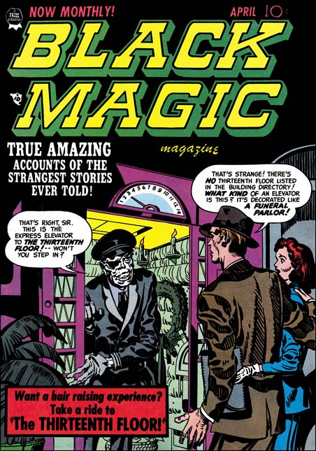
Headline #43 (September 1950)
For much of this period the covers of the crime titles used photographs. When the photo covers began some months before (Headline #36 July 1949, JTTG #12 October 1949) it is clear that Simon and Kirby had a hand in them because both are present on the cover for Headline #37 (September 1949).

Justice Traps the Guilty #5 (July 1948), art by Jack Kirby
While neither artist shows up on any further covers, Simon and Kirby at least influenced the cover for Headline #43. The same theme appeared previously on the cover for JTTG #5 drawn by Jack Kirby. In both the criminal threatens to jump rather then allow himself to be arrested, the policeman has a personal relationship to the criminal (brother-in-law in one and old friend in the other), and a woman, presumably the criminal’s wife, looks on behind the protection provided by the cop. While the two covers have the same theme in reality they could hardly be more different. I do not know who was responsible for the switch to photo covers, but did they really believe that cheesy covers like that were better then those drawn by Kirby? What were they thinking?

Justice Traps the Guilty #18 (September 1950), art by Jack Kirby
Eventually the use of photographic covers ended for four Prize titles. This did not happen at once but was done over a three month period. The last photo cover were Prize Comics Western #82 (July 1950), Young Love #1 (July 1950), Justice Traps the Guilty #17 (August 1950), and Headline #43 (September 1950). The western romance titles had ended prior to the drop of photo covers but interestingly Young Romance did not switch like the other titles and photo covers continued to be used until 1954 (with a couple very short lived revival of art covers; issues #26, #27, #33 and #34). Photo covers for Young Love resumed with issue #23 (July 1951) and then also continued until 1954.
When drawn covers were resumed it was Jack Kirby who provided the initial cover art. In the case of Prize Comics Western this was only for one issue (PCW #83, August 1950) before another artist (so far unidentified) took over. For Headline Kirby would produce two covers (issues #44 November 1950 and #45 January 1951). Justice Traps the Guilty got five Kirby covers (issues #18, #19, #21, #22 and #23, September 1950 to February 1951. Note that the last Kirby covers for JTTG and Headline were dated about the same time but there are over twice as many JTTG Kirby covers. This can be explained by the fact that photo covers were dropped on JTTG before Headline and JTTG was at this point a monthly title while Headline remained a bimonthly.

Justice Traps the Guilty #20 (November 1950), art by Marvin Stein
Perhaps the reader noticed that in the middle of all final Kirby crime covers there was one missing, JTTG #20. This cover is unsigned but clearly was not done by Jack. Instead it was done by an artist, Marvin Stein, who has not yet been discussed in this serial post, It’s a Crime, or The Art of Romance but was discussed briefly in Prize Comics Western, a Rough History. I will be writing about Stein further below but here I would like to say that my attribution of JTTG #20 is based mainly on the policemen. The head of the cop in the foreground has a shallow depth to it that is characteristic of Marvin Stein when he draws a head from slightly behind side view. Stein also has a particular visual shorthand for more distant faces that can be seen in the background policeman.

Justice Traps the Guilty #22 (January 1951) “Brute Force”, art by Marvin Stein
Marvin Stein had an extended relationship with Prize Comics but how long he was actually employed by the Simon and Kirby studio is more uncertain. When interviewed by Jim Amash (Alter Ego #76 March 2008) Joe Simon said that they traded Marvin like he was some baseball player to Crestwood (otherwise known as Prize Comics). However Stein continued to work in the Simon and Kirby studio as Prize Comics had no art department. It would be nice to know when this “trade” occurred and although I will be offering a couple of possibilities the fact none is of my suggestions seems fully satisfactory.
Joe Simon once said to me that initially he did not think Stein’s art was that good but later Marvin improved greatly. Marvin signed many of his work and had a distinctive style over most of his career. The earliest signed work by Marvin Stein that I am aware of is “Brute Force”. The presence of his autograph is particularly important because otherwise it would be hard to provide an attribute since it does not exhibit many of the features that make Stein’s style so distinctive. Frankly I am fully in agreement with Joe’s negative evaluation of Marvin’s early work.

Young Love #19 (March 1951) “The Girl Who Loves Him”, art by Marvin Stein
Marvin Stein’s early work shows much variation. “The Girl Who Loves Him” was published only a couple of months after “Brute Force”. I have included this romance story here because if provides a better example of what Marvin’s early work looked like. While on a whole this early art looks different from later, and more typical, work by Stein, some of his style traits can be detected. Marvin often shows a man from above and to the side and when doing so draws them in a distinctive fashion. This can be seen in the man in the second panel. The woman in the third panel has eyebrows that extend into a thought line without much of a demarcation to distinguish the two facial features; this is also a trait often found in Stein’s later period. In particular, make note of how the woman is drawn in the second, third and fifth panels. Here Marvin’s style is different from his typical period but we will see it again in some unsigned works.

Justice Traps the Guilty #18 (September 1950) “Pirates of the Poor” page 6, art by Jack Kirby and Marvin Stein
While it is clear that during this period Jack Kirby contributed some covers, did he provide any art? Well if you believe The Jack Kirby Checklist, Jack provided two stories, one of them being “Pirates of the Poor”. I must admit that some time ago I had excluded this story from works attributable to Kirby. But one nice thing about the writing these posts that focus on specific periods is that it gives a better perspective when I review the material. There are parts of the art of this story that do look like they were done by Jack as for instance the man in the first panel. There are other parts that look like pure Marvin as in the shallow depths of the head of the men seen from behind in the second and last panels.

Justice Traps the Guilty #18 (September 1950) “Pirates of the Poor” page 9, art by Jack Kirby and Marvin Stein
The third panel has a distinctive Kirby touch to it and is very different from Stein’s manner of drawing either men or women at this time. For me the big giveaway is the manner of graphically telling the story. The use of “camera” angles just looks too advanced compared to other work by Stein in this period. It is, however, just the thing Kirby was so good at. But look how awkward the last two panels are, not the sort of thing you would expect from Kirby. While some may think this story was penciled by Jack and just inked by Stein I believe this is another case of Kirby providing layouts and another artist, in this case Stein, doing the finishing work and inking. In cases like this I credit the art to both artists.

Justice Traps the Guilty #19 (October 1950) “Alibi Guy” page 7, art by Marvin Stein
The other story that The Jack Kirby Checklists credits to Jack is “Alibi Guy”. Again this is a work that for a long time I did not believe was done by Jack. Having changed my mind about “Pirates of the Poor” I gave particular attention in my review of “Alibi Guy”. In this case, however, I still believe that the pencils were not done by Kirby. All the faces look like they were drawn by Stein; the man in the second panel of page 7 is the closest any of them come to Kirby’s style. Perhaps Jack did give a hand in that panel or perhaps Marvin just swiped it. The use of viewpoints in graphically telling the story is handled rather well, but is not suspiciously well done. Nothing in the use of “camera” angles convinces me Kirby was involved in even the layouts. There really is no comparison between “Alibi Guy” and “Pirates of the Poor” and I continue to exclude “Alibi Guy” from Jack’s work.
Marvin Stein was obviously very influenced by Jack Kirby. Even when Marvin was no longer working on Simon and Kirby productions he continued to work in the studio. Which brings the question about exactly when Marvin was “traded” off by Simon and Kirby to Prize? On possible date could be at the start of this period. But we have seen that during this Kirby provide layouts to Stein in “Pirates of the Poor”. So perhaps a better date would be at the end of the period covered in this chapter, which is after February 1951. It will be the subject of a future chapter for It’s A Crime but Stein played an important part in both Headline and Justice Traps the Guilty from March 1951 on. But art by Stein was still appearing in Young Romance and Young Love throughout 1951 and he was involved in Boys’ Ranch as well which ended in August 1951. Putting the “trade” at the end of 1951 would solve that problem but by then Marvin had been fully involved in the Prize crime titles for some time so what was he being “traded” to? Perhaps it is not wise to take the trading of Marvin Stein too literally and remember Joe Simon’s saying “never let facts get in the way of a good story”.
Of course Jack Kirby and Marvin Stein were not the only artists working on Headline and Justice Traps the Guilty during this period. But that will be the subject of the next chapter of It’s A Crime.
Chapter 1, Promoting Crime
Chapter 2, A Revitalized Title
Chapter 3, Competing Against Themselves
Chapter 4, Crime Gets Real
Chapter 5, Making a Commitment
Chapter 6, Forgotten Artists
Chapter 7, A Studio With Many Artists
Chapter 8, The Chinese Detective
Chapter 9, Not The Same


