I have previously discussed Joe Simon’s work as an art director for Timely’s detective magazines. In this post I will therefore be going over familiar ground, but I cannot resist including in my blog some further example that Tom Morehouse has kindly provided. While in my previous post I was largely about the art, this one will chiefly be concerned with layouts that do not use art.
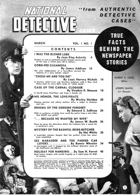
National Detective Cases vol. 1 no. 1 (March 1941)
Joe Simon (since he is listed as the art director, I attribute the layouts to Joe) surrounds the table of contents with a collage. Note how some of the figures encroach across the content’s border. This is of course the converse of having figures extend beyond the panel boarder that Simon and Kirby made such effective use in Captain America at this time. I have seen something similar in the table of contents in a later competitor detective magazines; one wonders whether it already was a common technique in such magazines when this issue of National Detective Cases came out or whether Joe introduced this device and others followed? In any case I particularly like the way the policeman on the left seems to be peering around the content edge.
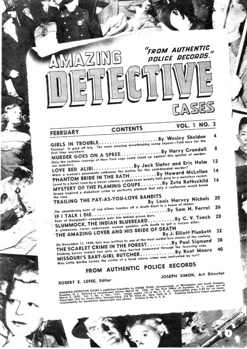
Amazing Detective Cases vol. 1 no. 3 (February 1941)
Above is another content page with a collage background. Nothing crosses the edges of the content proper but Joe gives it all a very 3-D effect by placing the contents at an angle and providing a trompe l’oeil curled top edge.
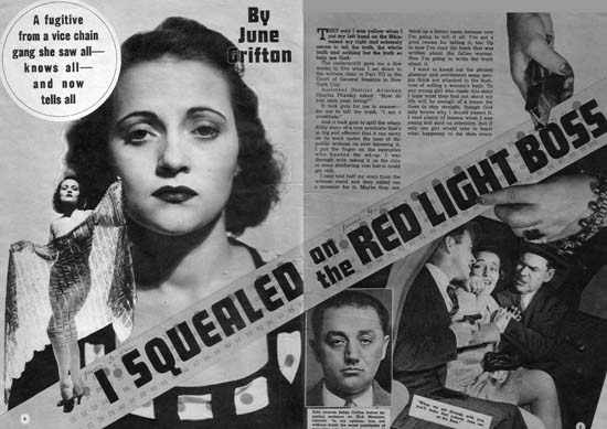
Complete Detective Cases vol. 3 no. 1 (January 1941) “I Squealed on the Red Light Boss”
But it is the opening pages of the stories that Simon provides his most interesting efforts. Pages like those in the image above can obviously be compared to the double page splashes that Simon and Kirby would in a few months do in Captain America (#6, #7, #8, #9 or #10). In some ways there are valid correspondences between the Timely detective layouts and the Captain America double page spreads. Both have designs that include a number of elements in innovative manners. For instance, both share the use of design elements such as circular fields. However the similarity between the magazine and comic spreads is not complete. The magazine layout uses some design techniques that I do not believe were ever used by Simon and Kirby in their comic book work. One of these, the placing of the start of the text at the top and almost in the center, can be explained. The equivalent in a wide splash would be putting the initial story panels in a similar location but that would not be good design because it would result in a confusing layout. This problem does not exist in the magazine layout because by its nature the text is easily distinguishable from the imagery of the rest of the layout. Another design feature for the magazine that I do not believe S&K every used in comics is the diagonally position title. In this case there was no reason why this design technique could not have been incorporated into comic books but I cannot remember any comics where Joe and Jack every used it.
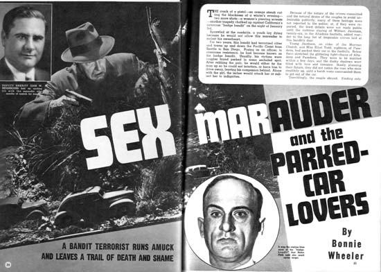
National Detective Cases vol. 1 no. 1 (March 1941) “Sex Marauder and the Parked-Car Lovers”
Above is another layout with a layout with emphasis on the diagonal and the text starting at the top of the second page.
Amazing Detective Cases vol. 1 no. 3 (February 1941)
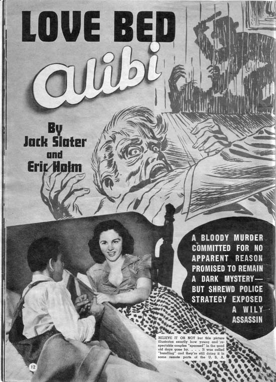
Of course layouts did sometimes include art so I will close this post with one of Jack Kirby’s best efforts for the Timely detective magazines. In “The Amazing World of Carmine Infantino” Carmine describes Kirby’s advice on how to draw a man hitting a woman:
No, try it like this: Do the scene but don’t show the people; just put the shadow on the wall. Let the reader’s imagination fill in the details.
“Love Bed Alibi” shows Jack using a shadow for somewhat different reasons. It is not so much an attempt to mitigate a violent scene as to force the viewer to go to the background shadows in order to make sense of the foreground action. It is as good a crime drawing as any Jack would do years later for Headline or Justice Traps the Guilty. The only detrimental aspect is the photo of the “bundling” bed placed on the bottom of the layout. While it is an interesting digression a more appropriate photograph should have been used.


Harry,
Great to see these Simon art directed pulps. While it is certainly interesting to compare these to the comics, they succeed on their own merit as well. Great innovative layouts and use of type. Joe easily could have had a career as an editorial art director if he so chose. When he moved into advertising was it as an art director?
Best,
Steven
Hi Harry,
Great posts. I love these pulp graphics. The one that really caught my eye was the “I Squealed on the Red Light Boss” The layout is identical to many of the confessional type crime stories that S&K produced for Headline and JTtG, with the stand alone sexy figure of the titular female on the left introducing her sad tale of demise. I often wonder why it took so long for crime comics to become so popular. The crime pulps had a long run.
Stan
Harry,
I’m not at all familiar with Joe Simons work, but this is terrific stuff. I Squealed on the Red Light Boss and Sex Marauder and the Parked-Car Lovers are great, and the work on that previous link is amazing! I’ve bookmarked your site, but Im’ still trying to figure out what the difference is between this blog and the museum one at the root level. I’m going to go share this over at GigPosters.
cheers,
Chris
—–
Chris Grayson: Art Director / Designer
Blog: GigantiCo
Chris,
Simon and Kirby Blog is hosted by the Jack Kirby Museum along with Bob H.’s Jack Kirby Weblog. Both can be reached from the Jack Kirby Museum web site. I am grateful to the Jack Kirby Museum for this hosting.
Harry