Category Archives: z Archive

My Joe


New York Comic Con 2008

There already are numerous essays about Joe Simon’s life on the Internet written by people much more talented than me. The biggest problem for me is how to condense such a productive live into a article short enough that people would actually read without leaving too many important things out. Perhaps I will give it a try later but I thought instead that I would provide a more personal narrative about Joe.

I don’t count the time when I had him sign a Fighting American page of original art as the first time I met Joe Simon. That was at a Big Apple Con when it was held in the basement of St. Paul’s church. The noise level was so high and Joe’s hearing so poor that you could not have any real conversation with him. Still Joe was very kind to me and the other fans even though he was not making any money from us for his signings nor was he selling anything.

For me the first time I really got to meet Joe was at another Big Apple Con this time held at a convention room where you could actually have conversations. I was a big Simon and Kirby fan and had recently embarked on a project to digitally restore the line art to all the Simon and Kirby covers. It was an ambitious project to say the least and at that time I only had completed maybe fifty covers. I decided to make 11 by 14 inch prints of the three Champion covers for Joe and bring along the notebook of the rest of what I had done to show him. Hey what can I tell you, I was and still am a fanboy. When I gave him the Champion prints he stopped, looked at me and said “I am not mad or anything, but how did you manage to get a copy of my restoration of this cover, I just did it a couple of weeks ago”? I tried to explain that they were my own restorations and how I did it, but he was unconvinced and calmly repeated his question. We went around and around on this a couple more times with Carmine Infantino stepping in to try to explain to Joe what I was saying. But it was only when Joe began to notice the small differences between his recreation techniques and mine that he began to realize that it was just a coincidence. But during this whole exchange Joe was calm and friendly, I doubt I would have been if I had been convinced that someone had gotten a hold of my private work. Joe was interested in my project and I offered to give him copies of my restorations. Periodic visits to Joe’s apartment followed as I continued to do line art restorations of Simon and Kirby covers.
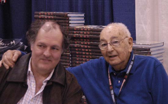

Joe with Mark Evanier signing Mark’s book “Kirby: King of Comics”

Joe was not anything like I expected him to be. If I were to condense the stories I had previously heard it would come down to that Joe was always claiming credit for what others, usually Jack Kirby, had done. All I can say is that this is not the Joe I came to know. For my visits I always brought Joe copies of my latest restorations. I was very interested in what Joe would have to say about them. You could tell Joe enjoyed viewing them very much. He would often make comments like “I had forgotten about that cover”. During the viewings Joe would frequently remark on how talented Jack Kirby was. But it was rare for Joe to say that he, not Jack, had done a particular cover. My experience was that when he took credit for some work he was almost always right. During this time Joe became involved in a lawsuit with Marvel over Captain America copyrights. On the Internet comic fans were often very critical of Joe for doing this, saying that Joe was unfairly trying to exclude Kirby from any credit. However I remember a diner I had with Joe and Carmine Infantino. Joe would not go into any details about any possible settlement with Marvel, but he did say that as part of any agreement Marvel would have to add to the Captain America comics a “created by Joe Simon and Jack Kirby” byline. The details of his settlement that eventually was reached with Marvel were kept confidential but I do not think it was a coincidence that shortly afterwards Marvel began to include creator credits to Simon and Kirby in their Captain America comics.
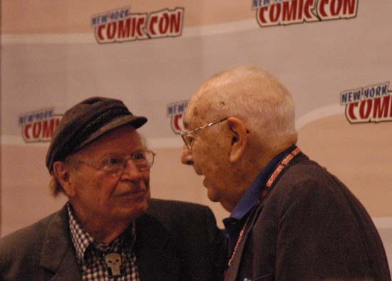

Dick Ayers with Joe and New York Comic Con 2008

I have rarely read an interview of Joe Simon that I thought was any good. Not only were Joe’s answers generally not very informative but they also did not seem to lead the interview along. The Joe presented by these interviews turned out to be another example that was very different from the Joe I got to know from my visits. In this case I feel I understand why the interviews were so unsuccessful. During my initial visits I would ask Joe questions about specific covers or about other detailed issues that I as a fanboy was interested in. But Joe never seemed able to provide answers. The problem was not that Joe was trying to conceal anything nor did he have a bad memory. In fact I found his memory to be quite excellent. Joe could remember the address of the various places he worked. He could even remember the address of a store he used to buy his cigars back in the 50’s. However Joe’s memory was good for the things he was interested and that generally was not the same as the things that a comic aficionado wanted to know. I soon found that I learned more if I just provided copies of work and just let Joe respond as he wanted. When I asked questions I would keep them general. Not that it always worked, but sometimes it would get Joe into telling stories. Joe was a natural, he told great stories. Carmine Infantino once said to me that Joe was one of the best comic book writers, he just did not get the credit for it that he deserved. If you never had the opportunity to hear Joe telling stories then I suggest reading his book “The Comic Book Makers” or the more recent “My Life In Comics”. But do not read like a comic fan for its history, read it for what it is, a collection of stories. Do not look for what you want instead just follow Joe’s tales. That is not to say that there is not a wealth of information in these stories. However I will say that if you try to mine his stories for information you should remember one of Joe’s sayings, “never let facts get in the way of a good story”.

There was one glaring exception to all too often poor interviews of Joe, the one done by Jim Amash for Alter Ego #76. Now much can be said about what a great interviewer Jim is. Amash has many qualities that help to make his work with Joe and other comic artists so successful. His wide knowledge of the subject and experience from years of conducting interviews to name just two. But Jim also had a something special going for him, he was Joe’s friend. During many hours over the telephone Joe opened up to Jim in a way that he only would with a friend. Joe would often grumble to me about how much time he was spending on this interview with Jim but that was all bluff. I could tell how much Joe was enjoying it and Joe never did anything he did not want to. If you want to get some idea about what Joe was really like I can think of no better source than Amash’s interview.
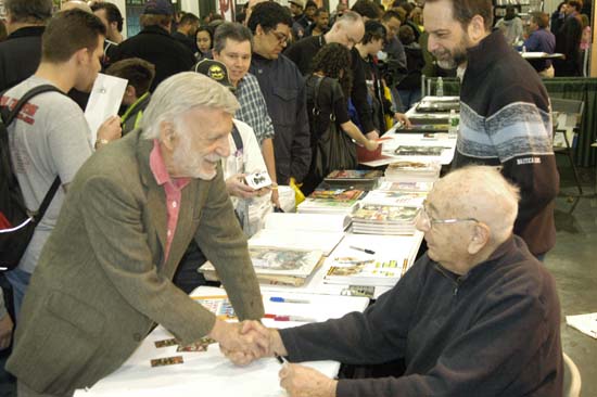

Jerry Robison greeting Joe at New York Comic Con of 2005

Some consider Joe more that of a businessman then as an artist. When I was first getting to know him I sometimes felt that he wanted to believe that also. But even if he did it still was not true. Joe’s response to the cover restorations were always artistic. Sometimes he would suggest ways that the cover could be improved. A figure should placed further from the motorcycle it was leaping from. A different color should have been used in a particular spot. Sometimes Joe would make copies of original art in sections that he would then have to recombine. I watched him once start to use acrylic paint to retouch one of these to hide the edges between the sections. That is what he started to do but Joe ended up redoing much of the art itself. Joe had intended to make a reduced size copy of the original art and ended making a new version of it. One time Joe copied a piece of original art from his old magazine Sick. The art showed a giraffe with rabbit ear antennas coming out of its head. Joe was concerned that today few would know what the rabbit ears were so he retouched it replacing them with a satellite dish antenna. When I arrived once for a visit Joe told me that recently he had been taking xerox copies of one of his drawings of Captain America and hand painting them. Joe said that somehow he found this very relaxing. Sure enough I was able to look through a pile of these Cap pieces, all the same yet each one unique.


Tom Morehouse and Joe with the original cover art for Police Trap #2

I helped Joe at a number of comic conventions which gave me an opportunity to see Joe interact with comic book fans. At one Joe walked around the tables talking with various comic book artists. He was always quick to provide complements when he saw anything he liked. But even though some were showing pieces of Captain America, I got the feeling that none recognized who they were talking to. At the next show Joe did a similar tour of the artists but this time the artists would often realize at some point who Joe was. It was always amusing to see a comic artist turn from being a professional to just another fanboy. If they had a camera, they always wanted their photograph to be taken with Joe. He treated regular fans well also. At the shows Joe was promoting his reprinted edition of “The Comic Book Makers”. Joe would prepare some copies with a full color work of Captain America inside that would be sold at the show. Joe would also do quick sketches of Cap in books at the show. Yes Joe made money for this work but many of them immediately ended up on eBay where they were sold for up to twice what Joe charged. Joe was well aware of this but it did not bother him at all. Like most artists Joe was happy to sign what ever the fans brought. One fan had an unfinished drawing with a large stain on it. Joe said he remembered it but that he threw it away uncompleted because he spilled coffee over it. Someone had fished it out of the garbage and sold it on eBay. Joe chuckled about what had occurred, was a bit surprised that anyone would value such a damaged and unfinished piece, but he was happy to signed it.


J. David Spurlock, Joe and Roy Thomas at the 2005 Big Apple Con

Joe had a certain irrelevant humor about comics and even himself. When a major comic publisher sent him a royalty check for fifty cents, Joe framed it with a doctored picture of himself. To the picture Joe added a cup, scruffy hair and an eye patch transforming himself into a street beggar. During one of his legal battles over Captain America copyrights Marvel threaten to kill off the character. Joe proceeded with the help of his daughter Gail to paint a version of Leonardo’s Last Supper replacing Jesus with Captain America and the disciples with various super heroes. The meal itself was populated with numerous modern products. Joe had a penchant for cutting off pieces of his hair, adding them to a photograph of himself and then making from this a xerox. He would say he wanted to improve the look of his hair, but you could tell he knew full well how ridiculous the final results looked.


Joe and Stan Lee at the 2008 New York Comic Con

I only got to know Joe during the final years of his life but I did get to see at first hand a change in how Joe was perceived by the public. Earlier it often seemed that when Joe was not being ignored by comic fans, he was being abused by them. Joe once commented about a Kirby list on the Internet was that “they all hate me”. While that was not strictly true it was not all that far off from the mark either. Our attempts to get a publisher interested in reprinting Simon and Kirby work all seemed to fail, they just were not interested enough. When Joe was remembered by comic book fans at all, they usually viewed him as the one who handled all the business while Kirby took care of all the art. Over the years and little by little this neglect by the public began to change. I like to think I played my small part in making that change happen. Joe lived to hear Stan Lee describe seeing him draw Captain America alongside Jack Kirby, what a wonderful artist he was and how Joe was his mentor. And to read Neil Gaiman praising him as a great writer in the introduction to the Superheroes volume of Titan’s Simon and Kirby Library. Joe never made a big deal about these and other praise that he began to receive but I could tell it was very gratifying to him. Finally a publisher, Titan, was found with the foresight to begin reprinting some of the Simon and Kirby work. I saw first hand how excited he was to see the initial volumes that have been released by Titan. Unfortunately there was a negative consequence to this change as Joe lived to see others rush to reprint material before Titan could get it out so that once again Simon and Kirby would be exploited by a publisher. I will say that once Joe realized that this publisher would not be swayed by appeals to fairness he became very philosophical about the matter and did not let himself be upset about it. His final year was a particularly good one for Joe. During that time he saw the publication of his autobiography “My Life In Comics” and the release of the Captain America movie. Both of these gave him much pleasure.


Steve Saffel, Joe and two grand-daughters at 2011 New York Comic Con

I could go on writing about Joe Simon. After all I have been writing about Simon and Kirby in this blog for almost six years. But I fear I have already been rambling too long in this post. Joe was important figure in the history of comic books, truly a legend. It has been my great fortune to have been able to get to know the man behind that legend, to work with him and to be his friend.
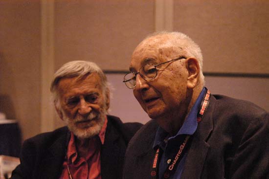

Jerry Robinson and Joe at the 2008 New York Comic Con

Early Joe Simon and Flash Gordon

The most certain way of spotting a comic book swipe* is, of course, to find the earlier version that from which it was swiped. But it is possible to recognize a swipe even when the original has not yet been found. Deviations in art style or level of detail in the art is one method that can be used to suggest that swiping has been used. Repetition of a particular image is another.


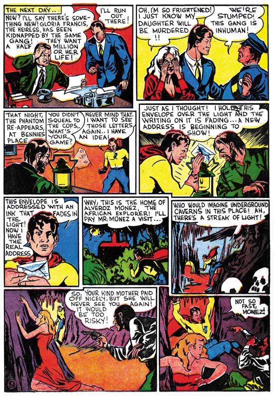
Daring Mystery #2 (February 1940) “Phantom Bullet” page 9, pencils, inks and letters by Joe Simon

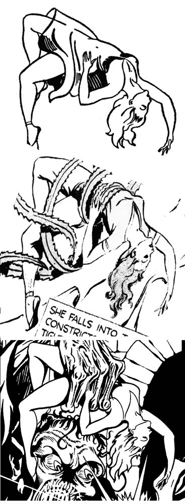
An early assignment for Joe Simon (released only one month after his earliest published work) was “Phantom Bullet” for Timely Comics. Note the despairing female in the second to last panel from page 9. Actually there is little in the art to suggest that this is might be a swipe. Perhaps only that the woman’s pose seems not to match very well to the action. However such a defect could easily be excused since Simon had just begun to learn his trade as a comic book artist. His previous experience as a staff artist for a newspaper did not overly prepare him for the special requirements of sequential art.


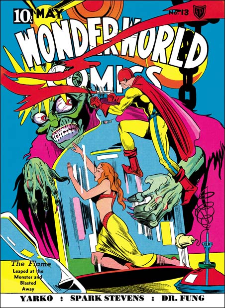
Wonderworld Comics #13 (May 1940), pencils and inks by Joe Simon

When Simon became editor for Fox Comics he would draw the cover art. The same damsel in distress shows up on the cover of Wonderworld #13. The Wonderworld figure is a close match for the one in Phantom Bullet but by no means identical.


Flash Gordon (February 4, 1934), art by Alex Raymond

So at this point nearly the same figure appears on two occasions. While this is not proof that the figure was swiped it certainly is strongly suggestive that it was. The proof came when I recently noticed a panel shown above from the newspaper syndication strip Flash Gordon. Simon was a big fan of Raymond’s Flash Gordon (as well as Hal Foster’s Prince Valiant). Other swipes by Simon from Flash Gordon have been previously reported (Art by Joe Simon, Chapter 4, Footnote) so the fact that Raymond is the source of the female figure is not totally unexpected. Still it is nice to have confirmation on a swipe that was already expected based on its repeated use. The biggest surprise is that date of the Raymond original, February 1934, six years prior to Simon’s swipe. It is possible that Simon and kept a copy over the years but it is also possible that he had picked up a reprint book. Raymond’s Flash Gordon was very popular at the time and reprints the publisher Whitman had released at least one volume in 1940.


Wonderworld Comics #13 (May 1940) art by Joe Simon
Flash Gordon (February 4, 1934) art by Alex Raymond
Daring Mystery #2 (February 1940) art by Joe Simon

Above I have scaled the figures to the same dimensions for an earlier comparison. It can be seen how much of the damsel in the Wonderworld #13 cover was copied from Flash Gordon. Even much of the detailing of the folds and shadows of the woman’s dress are shared between the two. Not surprisingly the figure from the Phantom Bullet panel has less details but even in it some of the folds of the dress were copied from Raymond’s work. While the similarity of both of Simon’s version to the Flash Gordon original are too close for anything other than swiping, they are not so close to suggest anything other than a hand drawn copy. There was a time on the defunct Kirby-list where some claimed Simon used a copying device such as an overhead projector. They may all seem very similar but when I tried to overlay one drawing over another there were so many differences that the resulting overlay was too confusing. As an example compare the female’s buttocks. They are much longer in the two drawings by Simon than they are in the Raymond original. Such mistakes would are quite typical of hand drawn copies but would not be expected to be found in a copy made with the aid of a mechanical or optical device.


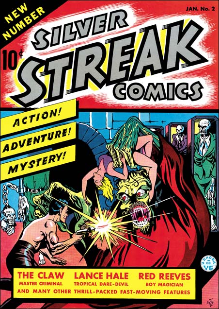
Silver Streak #2 (January 1940), pencils and inks by Joe Simon

One of the first pieces of comic book art that Joe Simon ever did was the cover for Silver Streak #2 (January 1940). One can question the anatomical accuracy but nonetheless it is a great cover full of energy and interest. Again by itself there is nothing in the cover art that glaringly suggests the use of swipes. However familiarity with Simon’s art style suggests that the gun firing hero might, just might, be a swipe because of the amount of detail provided for the anatomy.


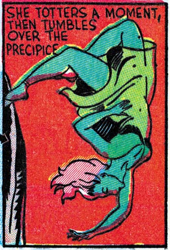
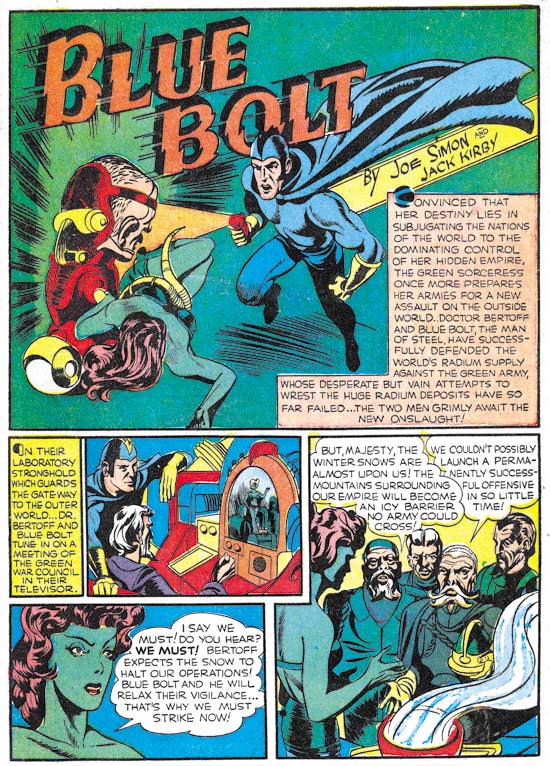
Blue Bolt #1 (June 1940) “The Human Lighting Streak” panel 4 of page 6, pencils, inks and letters by Joe Simon.

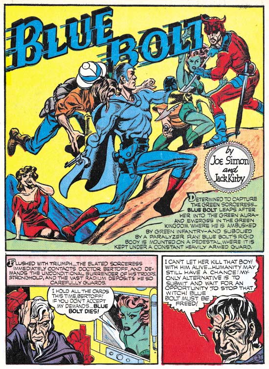
Not long afterwards Simon created Blue Bolt. Actually as I discussed in a previous post (In the Beginning, Chapter #1, Blue Bolt #1) the origin story for Blue Bolt may have been created earlier than its cover date indicates. The same female figure appears once again although under more general circumstances the green sorceress would not be described as a damsel in distress. But while usually a villainess she would periodically become in need of saving by Blue Bolt. Once more repetition suggests the use of a swipe.


Flash Gordon (April 22, 1934), art by Alex Raymond

Earlier I believed that this second female image was little more than an altered version of the first. However on reviewing the material in preparation for this post I concluded that there must be a different source for the second figure. However considering the great similarity between the two figures I believed that the Alex Raymond was also the source of the second swipe. I then did more searching and found the source of the second female figure in the Flash Gordon strip from April 22, 1934.


Blue Bolt #1 (June 1940) art by Joe Simon
Flash Gordon (February 4, 1934) art by Alex Raymond
Silver Streak #2 (January 1940) art by Joe Simon

AgainI have matched the original and the two swipes as closely as possible. While sharing some even rather small details the two Simon images are not exact copies of the Raymond original.

Flash Gordon is once again going to be reprinted this time by two publishers, IDW and Titan. IDW’s first volume is already out and Titan’s is scheduled for release in March. I am sure that many more sources for Simon’s swiping will be found in these volumes.

Footnotes:

* I find “swipe” to be an objectionable term because of the connotation of theft that it is based on. There is no similar expression in the fine arts where no one would describe Michelangelo’s Moses as being a swipe of Donatello’s St. John the Evangelist (as shown in Kirby Swipes from Simon). However the term swipe is so entrenched in discussions on comic books that it must be accepted.

In the Beginning, Chapter 12, Their First Hit


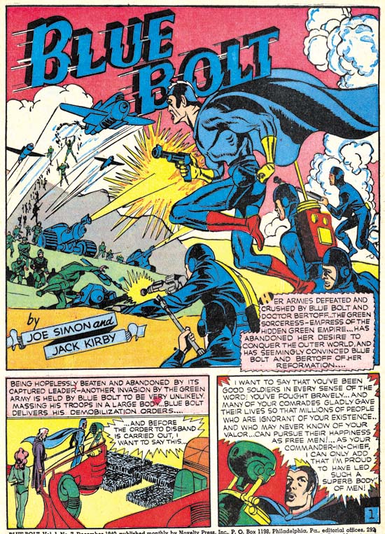
Blue Bolt #10 (March 1941) Blue Bolt, pencils by Jack Kirby, letters by Howard Ferguson

Blue Bolt was a comic serial feature. Except for the first issue, the plot for each story reached a satisfactory completion but the end always included what effectively was the start of the next story. However the story for BB #10 ends with the green sorceress promising to give up her evil goals of domination and letting Blue Bolt go free. What would Blue Bolt be without the green sorceress as a nemesis? The inside cover was titled “Ye Editor’s Page” which states:

Most of you are tired of seeing the green sorceress constantly fighting Blue Bolt. Hereafter, this strip will be improved by showing new and more exciting action without the green sorceress.

Blue Bolt would continue but without Simon and Kirby. 


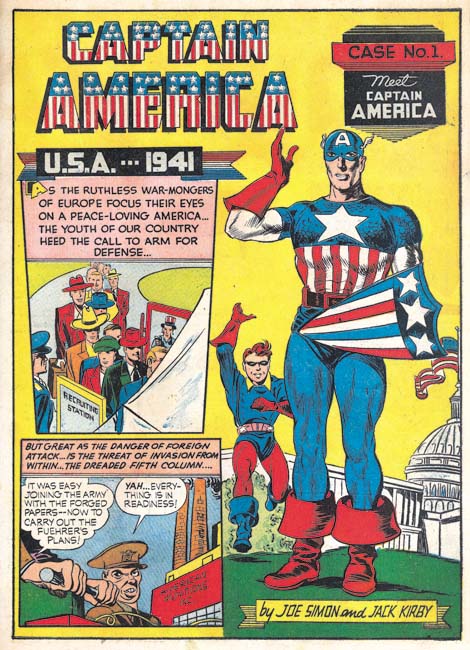
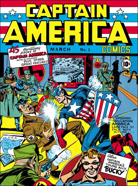
Captain America #1 (March 1941) Meet Captain America, pencils by Jack Kirby and Joe Simon, letters by Howard Ferguson

I doubt very much whether Simon and Kirby’s leaving Blue Bolt had anything to do with any dissatisfaction with the work they had done on the feature. Rather I suspect they stopped moonlighting to devote more attention to Captain America, their new creation for Timely Comics. Joe and Jack had made a deal with Goodman, the owner of Timely, in which they would get a share in the profits. It therefore made sense to give priority to the work that they would do for Timely. Since Simon and Kirby would create all the work that appeared in Captain America, 61 pages for the first issue, this meant a substantial increase in they amount of work they had to produce each month. (Although the Captain Marvel Adventures that Simon and Kirby had done previously required a similar number of pages.)

While Kirby is usually credited with drawing Captain America, some of it was actually penciled by Simon particularly in the first issue. For instance the standing figure of Captain America shown above was drawn by Joe while the rest of the page, including the running Bucky, were done by Kirby.


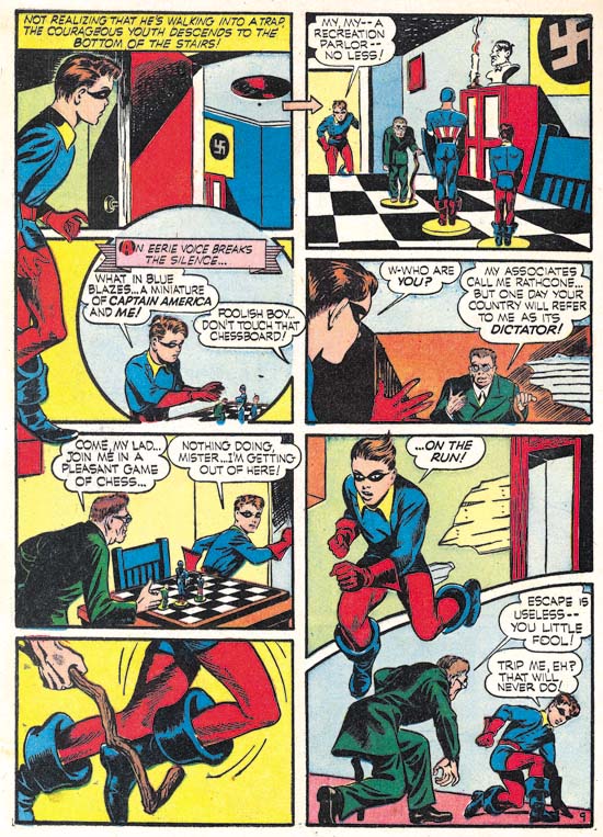
Captain America #1 (March 1941) Captain America and the Chess-board of Death page 9, pencils by Jack Kirby, letters by Howard Ferguson

In a previous post (Chapter 10) it was observed that Simon and Kirby had begun using some new layout devices. One, picked up from Lou Fine, was to extend figures beyond the panel borders. If anything, Joe and Jack made even greater use of this device in Captain America. Sometimes to extremes as for instance the standing Bucky in the upper left of the page shown above whose figure extends over three panels. In Captain America Simon and Kirby began using unusually shaped panels as well such as the circular panel and others with a curved border shown above. Even Ferguson got into the act by using vertical letters for normal text in the speech balloons while using slanted letters in captions and when emphasis was desired. It appears that Simon and Kirby were doing whatever they could to make Captain America art stand out.


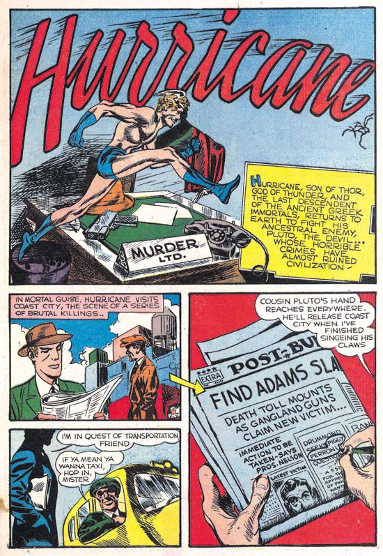
Captain America #1 (March 1941) Hurricane, pencils, inks and letters by Jack Kirby

While all the Captain America stories from the first issue were drawn by both Kirby and Simon, inked by various hands and lettered by Howard Ferguson there were two backup features that were drawn, inked and lettered by Kirby alone. That is not to say that Simon was not involved just that there is no evidence to prove he was. One feature, Hurricane, concerned the return of the god Mercury to the human sphere. As such it was the first Kirby piece with a mythological theme.


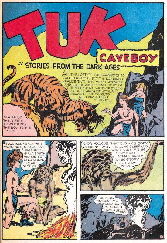
Captain America #1 (March 1941) Tuk Caveboy, pencils, inks and letters by Jack Kirby

The other all Kirby piece was Tuk Caveboy.


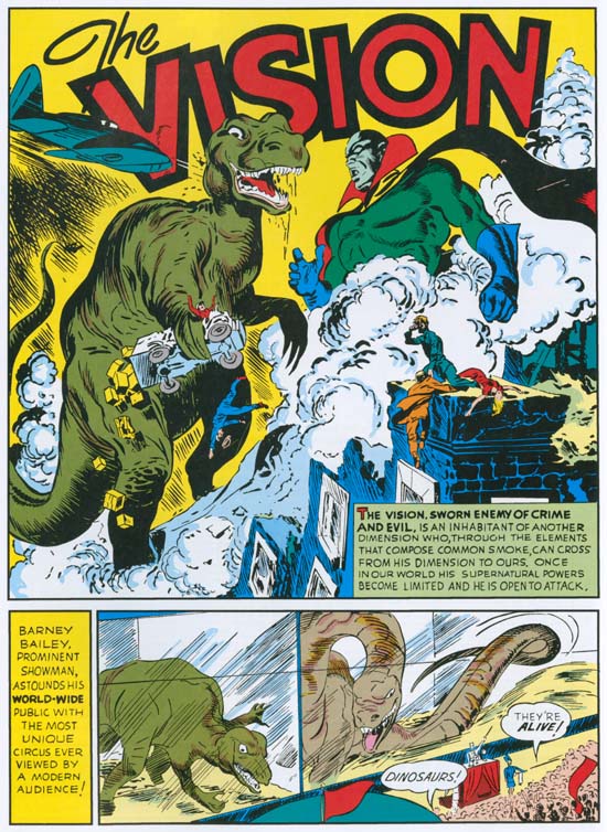
Marvel Mystery #17 (March 1941) Vision, pencils and inks by Jack Kirby, letters by unidentified letterer (from Golden Masterworks reprint)

Kirby also drew and inked the Vision story for Marvel Mystery #17 but, as with the previous issue, he did not do the lettering.

Captain America was a break through comic for Simon and Kirby, particularly for Kirby. Simon’s Blue Bolt had been an important enough of a creation to be the featured story of a new comic book title with the same name. It probably was popular enough but nowhere near as big a seller as Captain America. Up until then none of Kirby’s comics received any real attention. Captain America changed all that and made Simon and Kirby a brand name. While somewhat primitive compared to what Simon and Kirby would produce even a single year later, Captain America was well advanced relative to the comics published at that time. Pretty much everyone noticed and the comic book industry was changed forever.

It would be a great story to say that when Simon met Kirby they shortly began their classic collaboration. A great story but not what actually happened. Instead what appeared to occur was a variety of working conditions. Sometimes Jack helped out with some pages of art (for instance Blue Bolt #2 and #3), sometimes Kirby would do the pencils and Simon the inking (Blue Bolt #4 to #7), sometimes Kirby would do the pencils and other the inking (Blue Bolt #8 and #9), occasionally both Joe and Jack would pencil and others would do the inking (Captain America #1) and finally both might do their own individual projects (like Simon’s Fiery Mask in the Human Torch #2(1) and Kirby’s Vision stories in Marvel Mystery #13 to #15). While the overall tendency was for greater dependency on Kirby’s undeniable artistic skills as time went on, what appears to be happening was Simon taking on the roll of a true or acting editor using Kirby (or not) in whatever combination needed to get the job done. In my opinion it was not until Simon and Kirby left Timely for DC that they began to truly forge their business and artistic collaboration.

So ends another serial post. I am sure that someday I will do one on Joe and Jack’s Captain America but that day is not today.

The Simon and Kirby Library: Crime Makes the NY Times Best Selling List

Titan’s new book, “The Simon and Kirby Library: Crime” has made it to #5 on the NY Times best selling list of hardcover graphic books. There it is among such luminaries as Neil Gaiman (Sandman), Alan Moore (Neonomicon), Robert Kirkman (the Walking Dead), Graig Thompson (Habibi) and others. I think that is quite an accomplishment for comics produced over 60 years ago.

In the Beginning, Chapter 11, Calm Before the Storm


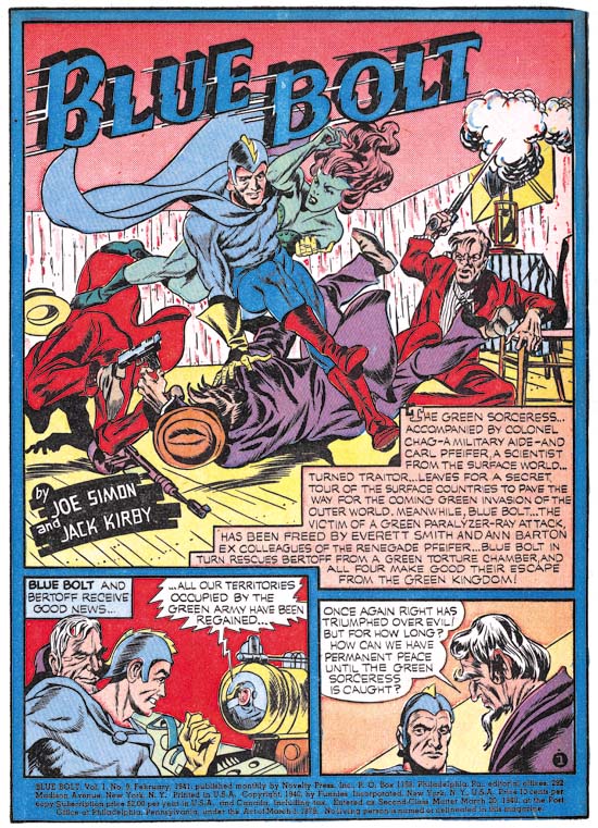
Blue Bolt #9 (February 1941) Blue Bolt, pencils by Jack Kirby, letters by Howard Ferguson

Once again some rather poor inking mars an otherwise great Simon and Kirby piece. As mentioned previously the inking was very likely the work of one or more of the Timely studio assistants; Al Avison, Al Gabriel and Syd Shores. Unfortunately this time Kirby did not even ink the splash.

A recent “innovation” was the used of a blue field to encircle the page and separate the panels. Simon and Kirby had not used this device either before or since. The other features in the comic book had similar color fields although using colors other than cyan (blue) so it was likely an addition by the publisher. I have to say I find this color field unnecessary and somewhat distracting.


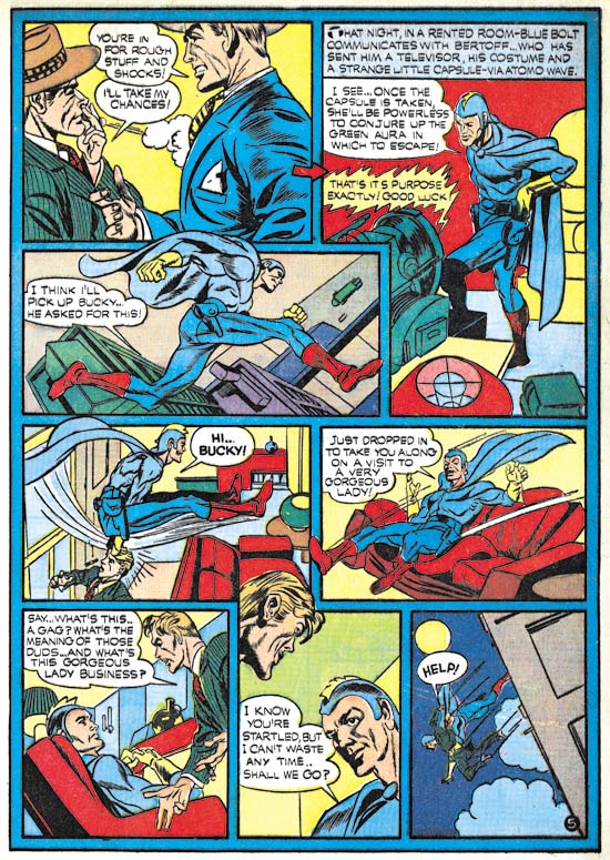
Blue Bolt #9 (February 1941) Blue Bolt page 5, pencils by Jack Kirby, letters by Howard Ferguson

Joe and Jack included in this story a reporter by the name of Bucky Williams. Of course Bucky was the name of Captain America’s sidekick and actually Bucky Williams fills the roll of a temporary sidekick. The use of the name Bucky was not the only things found in BB #9 to predate their use in Captain America which would premier next month. For the first time Simon and Kirby would extend figures outside of the panel borders (see above image). This was not an Simon and Kirby innovation (they picked it up from Lou Fine) but nonetheless was followed by some other artists once Captain America became a big success.


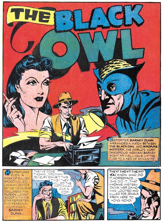
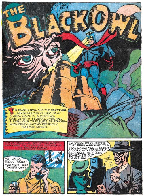
Prize Comics #9 (February 1941) Black Owl, pencils by Jack Kirby, inks by Joe Simon, letters by Howard Ferguson

Simon and Kirby return for one final Black Owl story. With Simon providing inks to Kirby’s pencils this story is much more attractive than the Blue Bolt #9 from the same month. The story includes a reporter who plays the part of a temporary sidekick for the Black Owl. This is basically the same plot device played by the reporter Bucky Williams in BB #9. In the art for this story Simon and Kirby extended figures beyond the panel borders just as they had in Blue Bolt #9.

I do not know who to blame, but note the rather odd shadowing of the letter ‘O’ in the title, in particular the center of the letter. When I restored this page for the “Simon and Kirby Library: Superheroes” book I got a email from an editor at Titan asking if I got the restoration wrong. Well of course it is wrong only it was not my error.


Marvel Mystery #16 (January 1941) The Human Torch, pencils by Carl Burgos, letters by Howard Ferguson (from Golden Age Masterworks reprint volume)

Howard Ferguson provided the lettering for the Human Torch story from Marvel Mystery #16. Ferguson did not provide the lettering for all the Human Torch stories in the issues of Marvel Mystery but he did letter some of the Human Torch and Terry Vance stories but only those two features. Why Howard was restricted to just those two features is unclear but that would eventually change but not during the period covered by this serial post.


Marvel Mystery #16 (January 1941) Vision, pencils and inks by Jack Kirby, letters by unidentified letterer (from Golden Age Masterworks reprint volume)

While Ferguson provided lettering for all the moonlighting work that Simon and Kirby produced for this month he did not letter their single Timely piece, the Vision from Marvel Mystery #16. That would not been surprising had Kirby provided the lettering as has he had done in previous Visions stories but oddly some other letterer was used. Since credits were not supplied in the comics of those days it is unlikely this particular letterer will ever be identified.

In the Beginning, Chapter 10, Captain Marvel and Others


Blue Bolt #8 (January 1941) Blue Bold, pencils and splash inks by Jack Kirby, letters by Howard Ferguson

Blue Bolt #8 initiates a working methodology that Simon and Kirby would use often in years to come. Kirby would ink his own splash panel while leaving the rest of the story to be inked by other artists (besides Joe Simon). Kirby’s inking tops off an already spectacular splash. While in later years Jack’s primary interest was the story art, during his collaboration with Joe much emphasis was placed on covers and splashes. Great stories may have built the Simon and Kirby reputation but covers and splashes are what drew attention and persuaded comic book readers to spend their money. Of course having all the story inked by either Kirby or Simon would be preferable but if that was not possible the next best thing was for Jack to ink the splash.

It has been said that Kirby pencils could withstand even poor inkers. Well the story art to Blue Bolt #8 certainly puts that claim to the test. As I mentioned previously, I will not try to identified the inkers other than either Kirby or Simon but one or more of the assistants from the Timely bullpen were likely candidates for this work. Al Avison, Al Gabriel and Syd Shores were very young and just learning their trade.


Prize Comics #8 (January 1941) Black Owl, pencils and letters by Jack Kirby, inks by Joe Simon

Blue Bolt was a serialized comic feature. Not quite like in the movie serials as Blue Bolt did not have “cliff hangers” endings. Instead each story would be complete but with an ending that left open the question of where the tale would go from there. The Black Owl feature from Prize Comics #7 leads to PC #8 in the same manner. However the ending in PC #8 does not suggest further development of the story in the next issue.  This issue was included in a previous post (Simon and Kirby’s Black Owl).


Prize Comics #8 (January 1941) Black Owl, letters by Jack Kirby

Kirby provided the lettering for PC #8 and since I have prepared samples for a previous post (Jack Kirby as a Letterer) I will repeat them here. But truth be told Kirby’s lettering really has not changed from the previous sample that I provided (Red Raven #1, August 1940, shown in Chapter 5).


Marvel Mystery #15 (January 1941) Vision, pencils, inks and letters by Jack Kirby (from Marvel’s Golden Age Masterpieces reprint)

As with Marvel Mystery #13 and #14, Kirby seemingly does it all, or at least all the visuals, for the Vision story in MM #15 (January 1941). Of course Simon might have had something to do with this feature, he was after all the editor.

Ferguson provided the lettering in Marvel Mystery #15 for the Human Torch and Terry Vance features.


Captain Marvel Adventures #1, Pencils by Jack Kirby (from a bleached page)

I have chosen this chapter to include some moonlighting work that Simon and Kirby did for Fawcett. Unfortunately the dating of this work for is uncertain as the comic books lack dates on the covers or in the indices. One of the works was Captain Marvel Adventures #1. This was the first comic book dedicated to Fawcett’s new hit Captain Marvel. It must have seemed a rather troublesome assignment. Not only did the art have to look like the work that C. C. Beck had previously done on the character, but also Simon and Kirby were not allowed to alter the scripts (Joe Simon’s Fawcett Testimony). The pencils had to be returned to Fawcett for lettering and then picked up again for inking. Yet despite all this the final art is rather nice. Kirby was never very good at imitating other artists and despite the simple lines of the artwork Kirby style keeps showing up. Beck might not have been pleased but in my opinion Simon and Kirby’s version was much more interesting. I have no idea who the inker was but it certainly was not Kirby, Simon or any of the assistants from the Timely bullpen. Whoever it was they did a marvelous job.


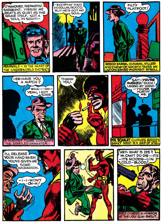
Wow Comics #1, Mister Scarlet, Pencils and inks by Jack Kirby, letters by Jack Kirby and Joe Simon

It is uncertain whether this work was done before or after Captain Marvel. In the Fawcett testimony Simon said it came later however that testimony was given some eight years later and therefore might not be accurate.

Mister Scarlet appears to largely be the work of Jack Kirby but Joe Simon’s presence is revealed in some of lettering. His distinctive ‘W’, ‘M’ and other letters make their appearance in some of the text as for instance in the captions in panels 1, 4 and 6 from page 2 shown above. All the Simon letter that I have spotted so far comes from captions and not the word balloons. This suggests that Joe was trying to make an existing story clearer. This feature is also a good reminder about the problems of identifying Joe’s contributions in Simon and Kirby productions. Had this story been lettered by someone other than Kirby and Simon, Joe’s additions would have gone unnoticed.

In the Beginning, Chapter 9, More Moonlighting


Blue Bolt #7 (December 1940) Blue Bolt, pencils by Jack Kirby, inks by Joe Simon, letters by Howard Ferguson

Blue Bolt #7 continues the Simon and Kirby collaboration in its purist form, that is with Jack doing the pencils and Joe providing the inks. The only other feature from December that showed such a degree of collaboration was the Black Owl from Prize Comics #7 which I will discuss below. Both of these features were done while moonlighting. As we will see below the features created for their regular gig at Timely were not quite the same joint effort.

The enlarging World War II, romance, betrayal, spies and assassins are just some of the elements of this engaging story. Simon and Kirby were not satisfied with telling a simple confrontation between a hero and a villain they had to put in as much as possible. Ten pages hardly seemed enough to fit all that they included. It does not seem that Blue Bolt had any significant impact on the rest of the comic book industry of the day but it should have.


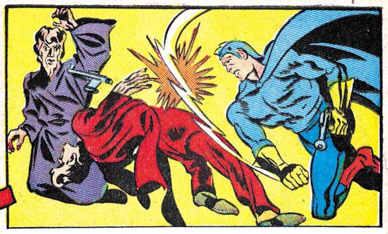
Blue Bolt #7 (December 1940) Blue Bolt page 8 panel 1, pencils by Jack Kirby, inks by Joe Simon, letters by Howard Ferguson (horizontally flipped image)

Sure Blue Bolt was science fiction but that did not mean that the hero always used a ray gun. Previously Kirby had a penchant for dramatic slugfests but now he began to take that art to a new level.

I present the above image in reverse…


Captain America #1 (March 1941), pencils by Jack Kirby

as I want to highlight that roll Blue Bolt played in laying the groundwork for a future hit. Captain America would appear on newsstands just three months later.


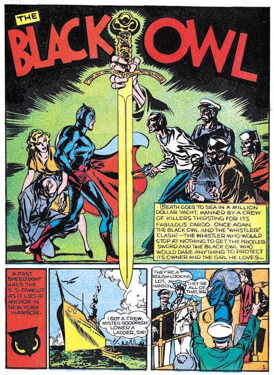
Prize Comics #7 (December 1940) The Black Owl, pencils by Jack Kirby, inks by Joe Simon?, letters by Howard Ferguson

Blue Bolt was not the only moonlighting job that Simon and Kirby produced for December they also did Black Owl for Prize Comics #7. Joe and Jack would end up doing a Black Owl story for three issues which I discussed previously (Simon and Kirby’s Black Owl). All three stories were reprinted in Titan’s “Simon and Kirby Library: Superheroes” (shameless plug). The Black Owl was not a Simon and Kirby creation and I really do not know much about previous appearances of the character.  But of course Simon and Kirby added their distinct touch if in nothing more than the story and art.


Prize Comics #7 (December 1940) The Black Owl, letters by Howard Ferguson

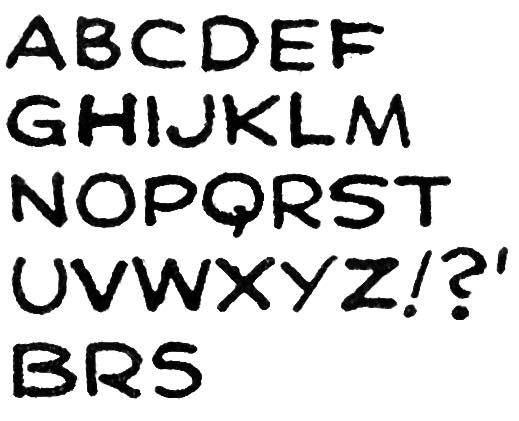
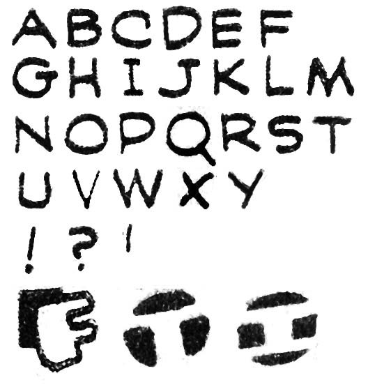
Howard Ferguson provided the lettering for the Black Owl story. I have previously provided the lettering samples for Ferguson’s Prize Comics #7 but I have since made a correction and some additions to it. A recap of the more useful features would seem in order. The most useful trait for identifying Ferguson lettering is the little vertical stroke attached to the upper end of the letter ‘C’. Another useful trait is the very shallow hook for the letter ‘J’ but unfortunately that is not a common letter. Some other traits are less useful but still should be noted particularly the way the upper portions of the letters ‘P’ and ‘R’ predominate over the lower portion. The letter ‘S’ is similarly often affected by a predominate upper portion but there is some variation in this feature. Another trait is found in some but not all ‘N’ is the manner that the left vertical stroke is sometimes tilted downward to the left somewhat. Perhaps not as useful than the letter ‘C’ but certainly easier spot is Ferguson’s special handling of the first letter in captions (examples are provided above). I believe all these traits (except the special ‘N’) were retained by Ferguson the rest of his career. I plan to review his entire career after I finish this serial post.

In is at this time that in my opinion Ferguson’s lettering has gone from good to great. This is not due to form of his letters which has changed only a little from previous work. Rather it steady and firm hand used and the spacing and legibility of the final results. Ferguson’s work is not mechanical but neither is it overly variable.

Besides an improvement in quality, the lettering differs from what was done not that long ago for Blue Bolt #5 (October 1940) by three changes.

I have previously pointed out the special handling of the first letter in captions. Such enlarged and specially formed letters are similar to the first letter of chapters often found in older books. The analogy is not perfect but it is close enough that I have decided to adopt the name given to them, drop capitals (or drop caps for short). Drop caps were used by other comic book letterers but Ferguson began using a special version where the letter is created a negative space in a black field such as the two final examples in the image above. I shall refer to these as negative drop caps. It was the introduction of negative drop caps that is one of the things that distinguish Prize #7 from Blue Bolt #5. But there appears to be two flavors of negative drop caps. The first that appeared in Blue Bolt #6 and the Terry Vance feature from Marvel Mystery #13 (both November 1940) had vertically oriented letters. Later in Blue Bolt #7, Prize Comics #7 and the Human Torch and the Terry Vance features from Marvel Mystery #14 (all December 1940) Ferguson introduced negative spot caps that were tilted.

The second change in Ferguson lettering concerns the letter ‘G’. In Blue Bolt #6 (November 1940) and earlier Howard constructed the ‘G’ with a small horizontal element on the left side of the bottom of the character and does not extend to the right. In Prize Comics #7 and the Human Torch story from Marvel Mystery #14 (both December 1940) Ferguson extends the small horizontal so that it appears on both the left and the right side. Interestingly Blue Bolt #7 (December 1940) uses the old form of ‘G’ for most of the first page of the story while otherwise using the new ‘G’. The old ‘G’ is used in BB #5 (October), BB #6 (November) and the Terry Vance stories from MM #13 and #14 (November and December). As mentioned both forms of ‘G’ appear in BB #7 (December). Only the newer ‘G’ appears in the Human Torch of MM #14 (December).

The third change involves the form of the letters ‘I’ and ‘J’. Ferguson’s older form for these letters excluded any horizontal elements while the newer form did. While the letter ‘I’ is common enough, horizontal strokes are not supposed to be added when the letter is used with others to form a word. Unfortunately the isolated use of ‘I’ and the use of ‘J’ are not too common. The old form of ‘I’ and ‘J’ appear in BB #5 (October), BB #6, Terry Vance from MM #13 (November) and BB #7 (December) with the new forms used in PC #7 and the Terry Vance feature of MM #14 (both December).

With these three changes in Ferguson’s lettering it would seem possible to sort out the relative order that Ferguson lettered the work appearing in the months from October to December. Regrettably it turns out that no ordering is possible that will satisfy all three criteria for all cases. The few cases of lettering by Ferguson from later periods suggest that perhaps he was not consistent in his use of ‘G’. Hopefully this question will be answered as my review progresses.


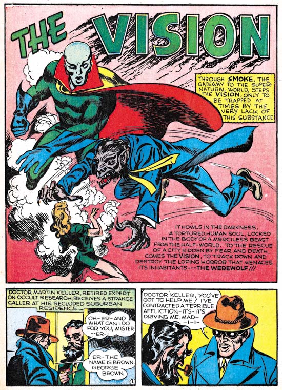
Marvel Mystery #14 (December 1940) The Vision, pencils, inks and letters by Jack Kirby,

The Vision became a regular Marvel Mystery Comics features with his second appearance in MM #14 (December 1940). As in the previous issue, Kirby would provide pencils, inks and letters for the Vision story. Even today the Simon and Kirby Vision is a largely neglected feature and at that time it was very much overshadowed by the Human Torch and the Sub-Mariner. (This story was reprinted in “The Best of Simon and Kirby”, another shameless plug).

Lettering by Howard Ferguson also appeared in Marvel Mystery #14 in the Human Torch and the Terry Vance features.


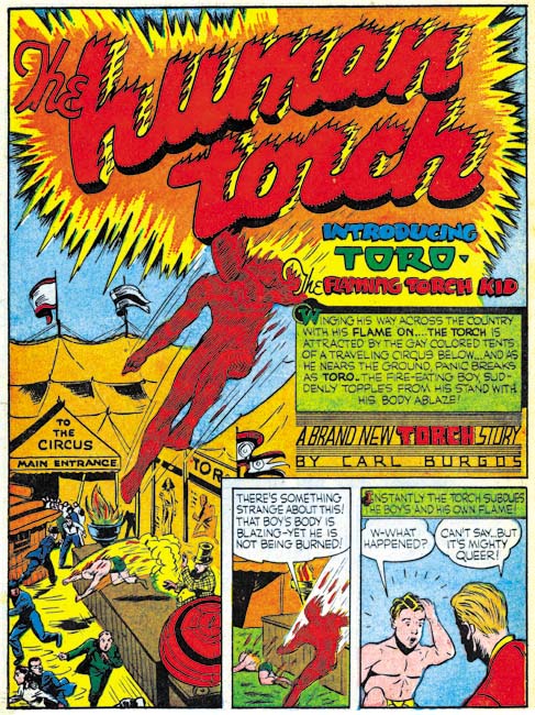
Human Torch #2(1) (Fall 1940) the Human Torch “Introducing Toro”, pencils by Carl Burgos, lettering by Howard Ferguson

As mentioned in the previous chapter, Timely did not release a Red Raven #2 issue. Instead that titles mailing license was used instead for a new title, Human Torch Comics #2. That the first issue was numbered 2 has brought about confusion to the numbering of the title even back when it was released. I have added “(1)” to the issue number to indicate it is actually the first issue. The cover is dated as Fall 1940 which means there might be some question as to what month to assign it. However Marvel Mystery #13 (November 1940) and #14 (December 1940) have house advertisement for the Human Torch #2(1). The MM ads provides a release date of September 25. Normally comics are cover dated about two months after their release so it is seems appropriate to assign HT #2(1) to December.

This issue has been reprinted in the Golden Age Masterwork series. Unfortunately Marvel did a horrendous job re-creating it. I have discussed this previously (The Human Torch #2) but I feel I need to emphasize here that the reprint volume is useless for anything beyond a casual reading. It is simply not possible to use this reprint book to examine the art or lettering. Luckily I will be using scans from the original comic in my discussions here.


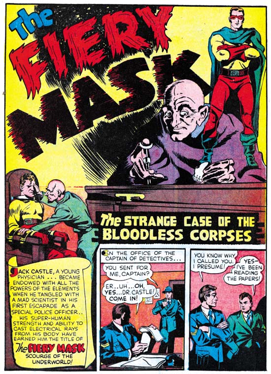
Human Torch #2(1) (Fall 1940) the Fiery Mask “The Strange Case of the Bloodless Corpses”, pencils and inks by Joe Simon, letters by Howard Ferguson

The Fiery Mask was one of Simon’s earliest creations having first appeared in Daring Mystery #1 (January 1940, Daring Mystery and Joe Simon BK (Before Kirby)). Another artist drew the character for Daring Mystery #5 (June 1940) but Simon returned with Kirby’s help to provide the Fiery Mask for Daring Mystery #6 (September 1940). Simon worked on the Fiery Mask one last time for Human Torch #2(1) (Fall 1940). I periodically get asked, but I really feel this was a solo effort because I cannot find any sign that Kirby had anything to do with this Fiery Mask story, “The Strange Case of the Bloodless Corpses”. Simon’s comic book art improved rapidly so that even though only a short period had past the art style for HT #2(1) Fiery Mask story shows it was definitely drawn when Simon became editor at Timely and was not some older inventoried story from when he first started working in comics. Still it would be nice to provide a more accurate date for the story as it theoretically have been done a few months earlier and inventoried or it could have been drawn later specifically for the HT #2(1) issue.

Fortunately the lettering Howard Ferguson did for the story may provide a clue. As mentioned before Ferguson’s work had been undergoing development during this period. The Fiery Mask story lacks negative drop caps and uses the older form of the letters ‘G’, ‘I’ and ‘J’. Therefore I believe it must have been done no later than the work for Blue Bolt #5 (October 1940). It likely was originally intended for Daring Mystery #7 which possibly was meant to be released in October or November but that publication of that issue was delayed until April 1941. Or alternatively it might have been meant for Red Raven Comics #2 which should have come out in October but that title got cancelled. But in any case the Fiery Mask story was done earlier than the Human Torch story in the same issue as that story was lettered by Ferguson but with the tilted negative drop caps, the new ‘I’ and ‘J’ and mostly using the new ‘G’ all of which suggests a December date.

“Simon and Kirby Library: Crime” Has Been Released

While some individuals were fortunate enough to be able to pick up a copy of Titan’s latest release, “Simon and Kirby Library: Crime”, at the New York Comic Con it has not been available to the general public until this last week. I have seen a number of books reviews including one by USA Today (see links below) all of which are very favorable. Four of the links provide sample stories from the book and I will put them at the top of the list of links and provide the title of the story previewed.
I hope this book does well. As I mentioned previously crime and romance are my favorite Simon and Kirby genre. If this books sells well enough Titan may publish a second crime book that would include all the rest of S&K crime stories.
USA Today (“Queen of the Speed-Ball Mob”)

Crave On Line (“A Phantom Pulls the Trigger”)

boingboing (“Burned at the Stake”)

IGN (“The Life and Death of Public Enemy Number One”)

Comics Worth Reading

The Daily Blam!

Comics Cavern

Comic Book Collectors Club

In the Beginning, Chapter 8, A New Title


Blue Bolt #6 (November 1940), pencils by Jack Kirby, inks by Joe Simon, letters by Howard Ferguson and Joe Simon

Blue Bolt #6 is the second feature to include Simon and Kirby credits. Once again Kirby provides the pencils while Simon does the inking. Although it is not known who wrote the script, the story has the special Simon and Kirby quality that already was very different from the standard comic book fare of the day. Now the green sorceress is joined by Marto, a man with enlarged head and an atrophied body who uses a special mechanical device to overcome his physical limitations.


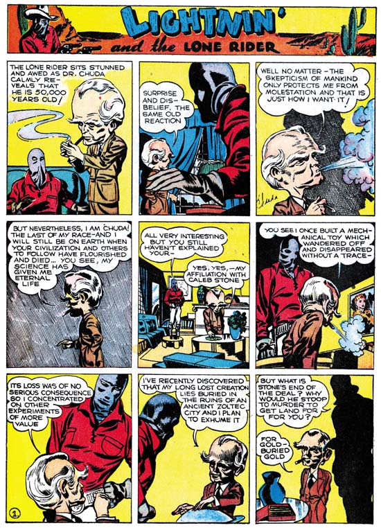
Famous Funnies #76 (November 1940) Lightnin’ and the Lone Rider, pencils, inks and letters by Jack Kirby

Kirby seemed to have a fascination with advanced beings with large heads. The earliest prototype appeared in a western feature that Jack work on called Lightnin’ and the Lone Rider. Actually this feature had been appearing in Famous Funnies at the same time as Blue Bolt #6. The Lone Rider was initially developed as a syndication strip back in late 1938 to early 1939 (Early Jack Kirby, Chapter 1, Lighting and the Lone Ranger). However it appears Kirby returned to the feature sometime later. Exactly when is uncertain but I believe it was while Kirby was still working for Fox Comics (Early Jack Kirby, Chapter 3, Moonlighting). However based on the art style I believe it was done before Kirby started working with Joe Simon and therefore outside the current discussion. However the recent appearance of the large headed adversary in Famous Funnies may have inspired Kirby to create an updated version for Blue Bolt.


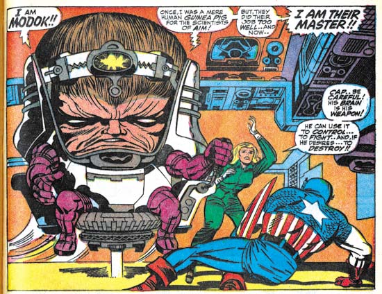
Tales of Suspense #94 (October 1967) pencils by Jack Kirby, inks by Joe Sinnott, letters by Sam Rosen

It is surprising how some ideas seem to lay dormant for years before Kirby would return to them. If there was another appearance of the Marto character I do not recall it. But in 1967 Kirby returned to the theme when he created Modok. While the background stories were very different, the similarity between Marto and Modok is too great to be require much discussion.


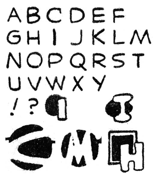
Blue Bolt #6 (November 1940), letters by Howard Ferguson

The first six pages of the Blue Bolt feature were lettered by Howard Ferguson. The seventh page has some lettering by Ferguson but most of the page was lettered by Joe Simon. The style of the letters has not change at all from examples from the previous month. The use of circular or square shapes attached to the first letter of captions is also the same as what has been seen earlier. One new feature in Ferguson’s repertoire is the use of other abstract shapes with the first caption letter such as the oval and double square show above. The most interesting addition is the rendering of the letter as a negative space on a circular black field such as the ‘C’ and ‘M’ shown above. This simple but elegant design was the most effective design that Ferguson adopted. Unfortunately Ferguson had no control on how the colorist would handle it. When a separate color was added the letter would stand out. But without that special color addition the design becomes more abstract and harder to read as a letter. Unfortunately the colorist failed to apply a separate color to many of these negative letters in Blue Bolt #6.


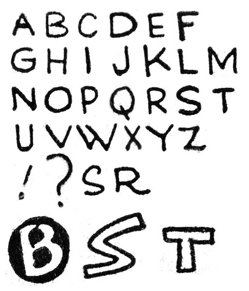
Blue Bolt #6 (November 1940), letters by Joe Simon

Joe Simon did the lettering for most of page 7 and all of pages 8 to 10. Here Simon does a more careful job at lettering but the basic form of the letters remains the same. As mention previously the ‘W’ that Simon used is very helpful in spotting his work and while not quite as distinct his ‘M’ is useful as well. There still are occasional little elaborations that Simon uses like the ‘S’ and ‘R’ shown above. The lettering for page 9 seems particularly well done. Also found on that page are special first caption letters, something Simon normally did not do. While unusual for Simon, the use of open letters (which allow the addition of a color) was also done by other letterers. However Joe places one ‘B’ as a negative letter on a black circular field. This must have been a response to what Ferguson was doing in the same story. Simon’s design is not as abstract as Ferguson’s but it still an effective device.


Marvel Mystery #13 (November 1940) The Vision, pencils, inks and letters by Jack Kirby

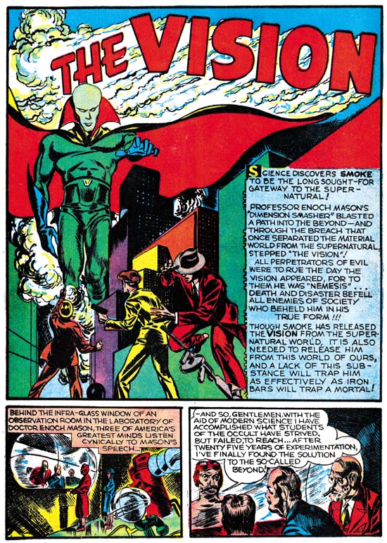
In the previous chapter I mentioned the unusual lack of Kirby art in the Timely comics for October. The one explanation I provided was that Kirby might have done some art for Red Raven #2 only it was never published due to the abrupt cancellation of that title. Here I will suggest another (but not necessarily conflicting) explanation. Kirby might have been busy creating a new feature as in this month Marvel Mystery #13 debuted “The Vision”. The pencils, inks and letters were all done by Kirby. The only thing that suggests that Simon was involved (other than as the editor) was the motif of the Vision being able to appear from smoke of any kind. This is similar to the power of the Flame, a Fox comics feature, who could transport using fire as a portal. While Kirby had worked for Fox Comics he had nothing to do with the Flame. Simon on the other hand was not only the editor for the comics that included the Flame but had also drew the character on some of the covers.

As I mentioned Jack did the lettering for the Vision story. Kirby’s lettering was unchanged from the last time we saw it (Red Raven #1, August 1940 see In the Beginning, Chapter 5). Ferguson provided lettering for the Terry Vance feature from MM #13 in a style that matches his work in Blue Bolt #6.

Eddie Campbell on Romance Comics

Eddie Campbell has recently blogged about the Prize romance comics (It’s just comics- part 4). He has some complimentary things to say about my serial post the Art of Romance. But my suggestion is to visit his blog and scroll down until you find the start of It’s just comics and proceed to read all the parts. It will be worth your while because Campbell has some interesting things to say about the comics of the 50’s.

In one chapter Campbell discusses the work Alex Toth did for Standards Comics. Frankly Toth is an artist that I really do not know much about. He never worked for the Simon and Kirby studio and I do not believe he appeared in the comic books that I followed when I was young. Toth is highly praised by a lot of fans. I cannot say I understand what the fans are so excited about but neither am I turned off by what I have seen (unlike some other artists I can think of). Campbell does such a nice job of discussing Toth that I am encouraged to take the plunge and pick up a book about him. I have to admit at this time I am reluctant to purchase anything from the publisher whose book Campbell discusses but there is another book out about Toth that might do very well.

It is pleasant to see a blog from such a fine comic book artist as Eddie Campbell. I am a great admirer of the work he did on “From Hell”. I have to admit that I am not familiar with his other work but that should not be interpreted as any reflection on him. Unlike many Kirby fans I think great comics are still being made. In fact in my opinion we are going through a second golden age. Perhaps not in the number of books sold but in the variety and quality of what is being published. The only problem is that I only have the time and money to read a small fraction of what is out there. But I have no doubts that I will at some time read more work by Campbell.