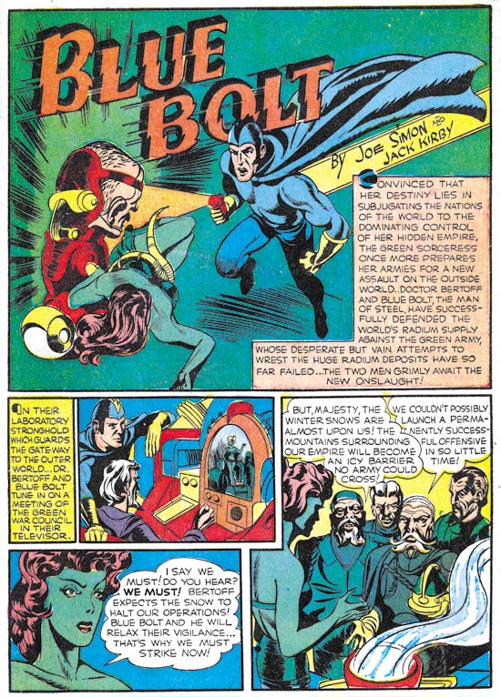
Blue Bolt #6 (November 1940), pencils by Jack Kirby, inks by Joe Simon, letters by Howard Ferguson and Joe Simon
Blue Bolt #6 is the second feature to include Simon and Kirby credits. Once again Kirby provides the pencils while Simon does the inking. Although it is not known who wrote the script, the story has the special Simon and Kirby quality that already was very different from the standard comic book fare of the day. Now the green sorceress is joined by Marto, a man with enlarged head and an atrophied body who uses a special mechanical device to overcome his physical limitations.
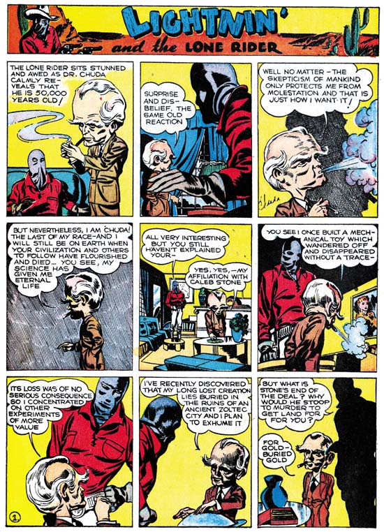
Famous Funnies #76 (November 1940) Lightnin’ and the Lone Rider, pencils, inks and letters by Jack Kirby
Kirby seemed to have a fascination with advanced beings with large heads. The earliest prototype appeared in a western feature that Jack work on called Lightnin’ and the Lone Rider. Actually this feature had been appearing in Famous Funnies at the same time as Blue Bolt #6. The Lone Rider was initially developed as a syndication strip back in late 1938 to early 1939 (Early Jack Kirby, Chapter 1, Lighting and the Lone Ranger). However it appears Kirby returned to the feature sometime later. Exactly when is uncertain but I believe it was while Kirby was still working for Fox Comics (Early Jack Kirby, Chapter 3, Moonlighting). However based on the art style I believe it was done before Kirby started working with Joe Simon and therefore outside the current discussion. However the recent appearance of the large headed adversary in Famous Funnies may have inspired Kirby to create an updated version for Blue Bolt.
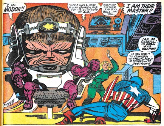
Tales of Suspense #94 (October 1967) pencils by Jack Kirby, inks by Joe Sinnott, letters by Sam Rosen
It is surprising how some ideas seem to lay dormant for years before Kirby would return to them. If there was another appearance of the Marto character I do not recall it. But in 1967 Kirby returned to the theme when he created Modok. While the background stories were very different, the similarity between Marto and Modok is too great to be require much discussion.
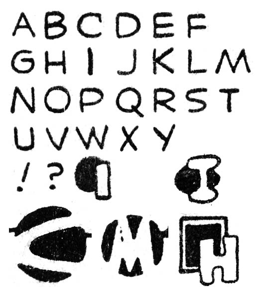
Blue Bolt #6 (November 1940), letters by Howard Ferguson
The first six pages of the Blue Bolt feature were lettered by Howard Ferguson. The seventh page has some lettering by Ferguson but most of the page was lettered by Joe Simon. The style of the letters has not change at all from examples from the previous month. The use of circular or square shapes attached to the first letter of captions is also the same as what has been seen earlier. One new feature in Ferguson’s repertoire is the use of other abstract shapes with the first caption letter such as the oval and double square show above. The most interesting addition is the rendering of the letter as a negative space on a circular black field such as the ‘C’ and ‘M’ shown above. This simple but elegant design was the most effective design that Ferguson adopted. Unfortunately Ferguson had no control on how the colorist would handle it. When a separate color was added the letter would stand out. But without that special color addition the design becomes more abstract and harder to read as a letter. Unfortunately the colorist failed to apply a separate color to many of these negative letters in Blue Bolt #6.
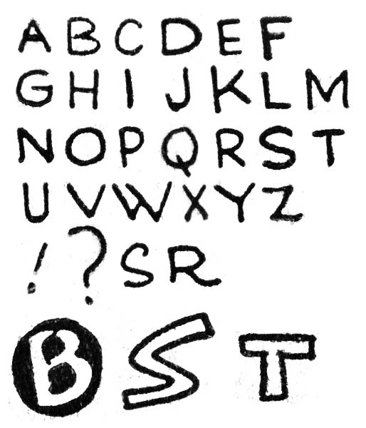
Blue Bolt #6 (November 1940), letters by Joe Simon
Joe Simon did the lettering for most of page 7 and all of pages 8 to 10. Here Simon does a more careful job at lettering but the basic form of the letters remains the same. As mention previously the ‘W’ that Simon used is very helpful in spotting his work and while not quite as distinct his ‘M’ is useful as well. There still are occasional little elaborations that Simon uses like the ‘S’ and ‘R’ shown above. The lettering for page 9 seems particularly well done. Also found on that page are special first caption letters, something Simon normally did not do. While unusual for Simon, the use of open letters (which allow the addition of a color) was also done by other letterers. However Joe places one ‘B’ as a negative letter on a black circular field. This must have been a response to what Ferguson was doing in the same story. Simon’s design is not as abstract as Ferguson’s but it still an effective device.
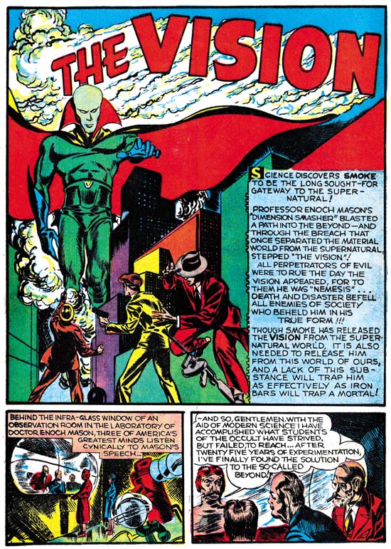
Marvel Mystery #13 (November 1940) The Vision, pencils, inks and letters by Jack Kirby
In the previous chapter I mentioned the unusual lack of Kirby art in the Timely comics for October. The one explanation I provided was that Kirby might have done some art for Red Raven #2 only it was never published due to the abrupt cancellation of that title. Here I will suggest another (but not necessarily conflicting) explanation. Kirby might have been busy creating a new feature as in this month Marvel Mystery #13 debuted “The Vision”. The pencils, inks and letters were all done by Kirby. The only thing that suggests that Simon was involved (other than as the editor) was the motif of the Vision being able to appear from smoke of any kind. This is similar to the power of the Flame, a Fox comics feature, who could transport using fire as a portal. While Kirby had worked for Fox Comics he had nothing to do with the Flame. Simon on the other hand was not only the editor for the comics that included the Flame but had also drew the character on some of the covers.
As I mentioned Jack did the lettering for the Vision story. Kirby’s lettering was unchanged from the last time we saw it (Red Raven #1, August 1940 see In the Beginning, Chapter 5). Ferguson provided lettering for the Terry Vance feature from MM #13 in a style that matches his work in Blue Bolt #6.

