Category Archives: z Archive

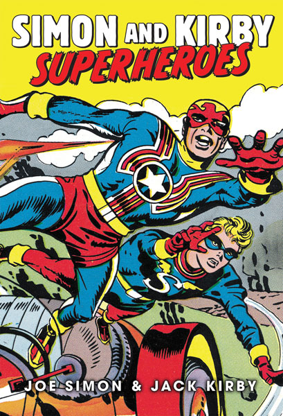
Simon and Kirby Superheroes

Simon and Kirby Superheroes

The reader might think that my big event for last weekend was the Eisner nomination for “The Best of Simon and Kirby”. As great and unexpected as that was it was far from the most significant event. No, my big event was completing the final pages for “Simon and Kirby Superheroes”.

Doing the art restoration for that book was an arduous and lengthy process. It began about a year ago at a time when Titan had not yet made a decision about the contents of the book. Normally I would not want to begin such a project without a clearly defined plan but I was assured that no matter what the book would include Fighting American. It turned out there was good reason for the indecision. Originally the superheroes were to be done in two volumes but Titan had found a way to publish it as a single book but at a cost that will be a lot less than the two separate volumes.

While the prospect of 480 pages of Simon and Kirby should warm the heart of any fan, I must admit it left mine filled with trepidation. How could I come up with a schedule for so much work with such a wide range of restoration challenges? Well I just did the best I could. It turned out that for about a half a year I was able to meet my schedule. Then unfortunately I encountered some restoration problems that seriously threw me out of the schedule. I eventually figured out techniques that allowed me to handle similar problems in a much faster manner but I was never able to recover the slipped time. So in the end my restoration went much beyond the original plan. I am happy to say that Titan believes it can recover from my lateness and still get “Simon and Kirby Superheroes” out with the same release date which is late summer or early fall (Amazon is still listing it as October 12). I am also told that Titan hopes to have advanced copies available for those lucky enough to attend this year’s San Diego show.

And what a book “Simon and Kirby Superheroes” will be! The size will be about 7 1/2 by 11 inches. This is the same size as Marvel’s old Visionary line of books which should be able to reproduce the art in its original dimensions. And while my restoration took longer than any of us would have liked this had no impact whatsoever on the quality of the results. In fact I am certain that the reader will find it superior to the work in “The Best of Simon and Kirby”. When I worked on BoSK the Captain America story was about the last thing I did. It was done using original flats (proofs of the line art) that Joe Simon had kept all these years. I was so please with the results that I resolved to make use of that technique whenever I could. It means extra work but the results are worth it.

As for the contents it will be all the superheroes that either Jack Kirby or Joe Simon drew that are not owned by either Marvel or DC. Specifically that means:

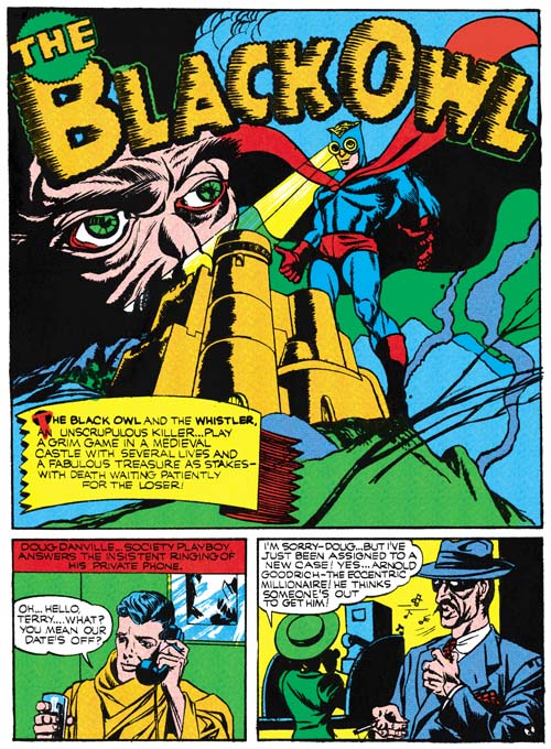
  • The Black Owl
  • Stuntman
  • Vagabond Prince
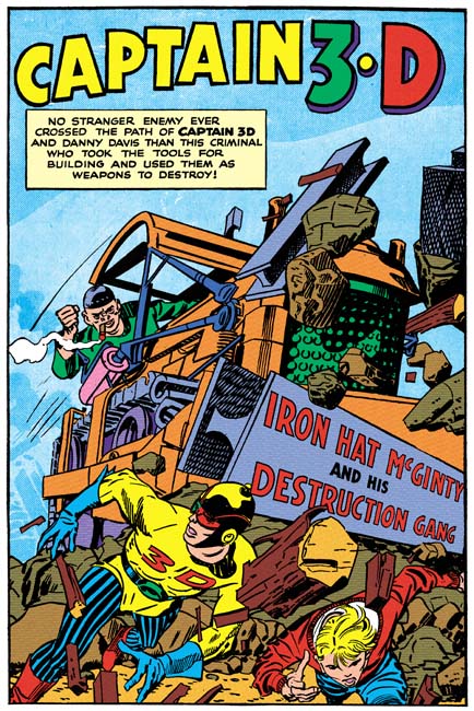
  • Captain 3-D
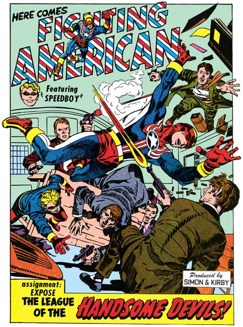
  • Fighting American
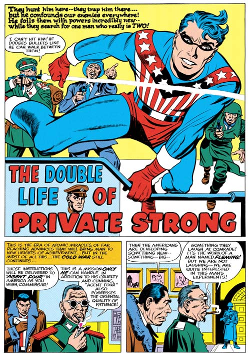
  • The Shield (Private Strong)
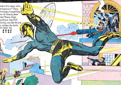
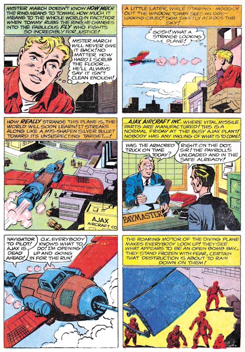
  • The Fly

Simon and Kirby Superheroes

The Black Owl was among Simon and Kirby’s earliest superhero work. Only Marvel Boy and the Vision for Timely predate the Black Owl, and even then only be a few months. Simon and Kirby’s Black Owl shows the beginnings of some of their trademarks that made Captain America such a success. (Simon and Kirby’s Black Owl)
Simon and Kirby Superheroes

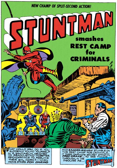
I have not written solely about Stuntman for some time, but only because I posted on it early in my blog (Stuntman). What can I say, Stuntman is filled with great art, action and humor. Of course Titan’s upcoming book will have all the published Stuntman stories but as a special treat it will also include the previously unpublished “Jungle Lord”; this thanks to the help of John Morrow (of The Jack Kirby Collector fame). The sudden cancellation of Stuntman left “Jungle Lord” without the finishing spotting but all the lettering and the outline inking were completed. As an additional bonus, two of the Stuntman stories were restored from original flats from the Simon collection. While every effort was made to restore all the scans to the best possible quality you simply cannot beat line art from flats or original art.
Simon and Kirby Superheroes

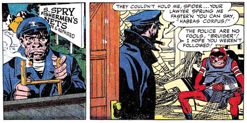
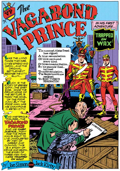
Many fans have underestimated Joe Simon’s talents as a penciler. Hopefully “Simon and Kirby Superheroes” will enlighten them. All three Vagabond Prince tales will be included one of which (“Trapped on Wax”) has never been published in its entirety. “Trapped on Wax” was restored from the original art and the other two stories from original flats. Harvey Comic’s of Vagabond Prince were exceedingly poor (even for Harvey) so Titan’s versions will be really special. (Vagabond Prince, Trapped on Wax, The Madness of Doctor Altu, and Death-Trap De Luxe)
Simon and Kirby Superheroes

Not surprisingly, Captain 3-D #1 has never been reprinted. Originally it posed a problem for Titan as well. What would they do, offer the book with 3D glasses? The solution I offered was to drop the 3D effect and restore it to the line art. After all Jack Kirby’s perspective was so effective it did not need the 3D gimmick. I have also colored the material in a manner consistent with methods used in other Simon and Kirby productions. Captain 3-D was inked by an array of artists including the Steve Ditko at the start of his career. Now readers will be able to judge for themselves who inked what; you can get my take on this subject in my post Captain 3D.
Simon and Kirby Superheroes

Titan’s book will contain all the original Fighting American stories, not just those with art by Simon and Kirby. It will include Simon’s cover for Harvey Fighting American #2 and the George Tuska drawn “The Mad Inker” neither of which have been published before. “The Mad Inker” is missing the splash page but this does not seem to affect the story which is otherwise complete. Marvel reprinted Fighting American in 1989 but a good portion of it was what Marvel now terms reconstructed art. In “Simon and Kirby Superheroes” you will get nothing but pure Simon and Kirby.
Simon and Kirby Superheroes

Most of Private Strong and all of the Fly stories were restored from original art. I even got permission from Titan to re-master “Come into My Parlor” which appeared in “The Best of Simon and Kirby”. Not that the restoration in BoSK was that bad but the restoration from original art is just so much more special.

There is an introduction by Neil Gaiman. I do not think that for anyone who has read Gaiman’s Sandman series would be surprised that he is a big Simon and Kirby fan. I have to say the fact that Gaiman was going to do the introduction for this book impressed my niece more than anything else concerning the projects I have worked on. There are also a couple of short essays by Jim Simon. I have not read Jim’s contribution but judging by the introduction Jim wrote for Marvel’s Boys’ Ranch reprint I am looking forward to what he has to say.

Future volumes of Titan’s Simon and Kirby library will include great material. But I do not think any of them will so thoroughly cover Simon and Kirby’s collaboration. “Simon and Kirby Superheroes” spans from some of their earliest work together until nearly their last (only the retro Sandman for DC was a latter collaboration).

PS
It has been implied on the Internet that some of my recent posts have used restorations from “Simon and Kirby Superheroes”. That simply is not true. However, all the images I have used in this entry are from Titan’s upcoming book. Unfortunately the low resolution of images used for the Internet does not give them justice. The reader will have to buy the book to get the full impact. You will not regret it.

Questions on Some Inking in Adventures of the Fly

I have recently posted on the initial issues of the Adventures of the Fly (here and here). There are still unidentified artists that penciled those issues (and more in the two Fly issues that followed). Identifying inkers is an even bigger challenged particularly because I am not that familiar with the brushwork of most of the possible inkers. However I recently noticed some inking in the Adventures of the Fly that was very familiar.

Adventures of the Fly #2
Adventures of the Fly #2 (September 1959) “Sneak Attack” page 2 (part), pencils by Jack Kirby

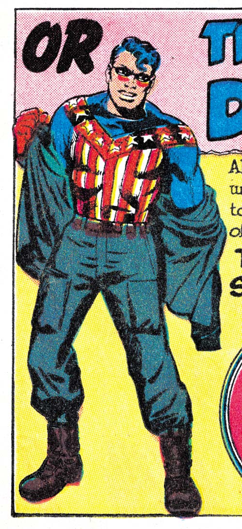
When I last wrote about “Sneak Attack” I attributed the pencils to Joe Simon. Well that was not the complete attribution. The bottom of the second page was an advertisement for the other Archie superhero comic, Double Life of Private Strong. The only art the ad contains is a standing figure of Private Strong changing into the Shield. It seems clear that the art was drawn by Jack Kirby. It is odd that the story and ad were done by different artists. I have studied the original art from Joe Simon’s collection and I can assure the reader that no cut and paste was performed to accomplish this.

The inking for the ad was really nicely done but unfortunately the details of which are obscured by rather poor printing. It is hard to see but the inner sides of both thighs were inked using picket fence crosshatching (Inking Glossary). The good news is that in the upcoming Simon and Kirby Superheroes volume from Titan “Sneak Attack” and the other stories I will be discussing here will be restored from the original art. Similarly robust picket fence brushwork was one of the characteristics of what I refer to as the Studio Style inking used during the Simon and Kirby collaboration. Not only did both Joe and Jack use this technique at that time but Mort Meskin did as well. I think, however, we can dismiss Meskin as the possible inker for the ad because he was no longer working with either Kirby or Simon and the inking here is a bit more spontaneous than was normal for Mort.

Adventures of the Fly #2
Adventures of the Fly #2 (September 1959) “Marco’s Eyes” splash (part), pencils by Jack Kirby

The spotting of the large figure of the Fly in the double page splash for “Marco’s Eyes is more finely worked than typical for either Simon or Kirby although either of them was certainly capable of it. Actually it is more finely worked than the inking found in any of the Fly art. So far I have not identified any brushwork in the figure that helps in determining an inking attribution.

Adventures of the Fly #2
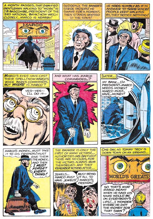
Adventures of the Fly #2 (September 1959) “Marco’s Eyes” page 4, pencils by Jack Kirby

The story art for “Marco’s Eyes” shows an important characteristic that was typical of Studio style inking, what I refer to as shoulder blots (Inking Glossary). It is prominently shown in panels 2, 3 and 5 from page 4 but occurs elsewhere in the story as well. Numerous inkers have provided their shoulders with shadows but shoulder blots are distinct in that they occur on both shoulders regardless of how a shadow would expect to be cast. So far I have only seen Joe Simon and Jack Kirby make use of shoulder blots in their inking.

Adventures of the Fly #2
Adventures of the Fly #2 (September 1959) “The Master of Junk-Ri-La” page 2, pencils by Jack Kirby

There are no shoulder blots in “The Master of Junk-Ri-La” unless the shadow in panel 4 from page 2 is counted as one (but I am not inclined to do so). There are, however, a number of examples of course picket fence crosshatching. The first panel from page 2 shows a scallop pattern to the shadow on the boy’s arm. This scallop inking frequently showed up in Kirby’s inking. But the inking of the eyes and eyebrows of the boy look very much like the work of Simon.

Adventures of the Fly #1
Adventures of the Fly #1 (August 1959) “Come Into My Parlor” story panels 3 and 4 from the double page splash, pencils by Jack Kirby

The double page splash and accompanying story panels of “Come Into My Parlor” also contains what looks like Studio style inking. Particularly note the spotting of the sailor from story panels 3 and 4. Observe the two cloth folds on the man’s shoulder in panel 4. These cloth folds show no indication of the tip of the brush which is a technique that was typical of Kirby’s inking. I am less convinced about the inking of the rest of the story. It should be kept in mind that it was common during the Simon and Kirby collaboration for Kirby to be involved with the spotting of the splash and leave the rest of the story to other inkers.

Studio style inking techniques are not limited to the four stories that I have discussed here. But their occurrence elsewhere in the first two issues of Adventures of the Fly seems limited to what looks like touch-ups of the work by other inkers. Such touch-up were almost certainly the work of Simon since Kirby was then a freelancer working from his house.

I only become confident about inking attributions after I have “lived” with them for some time. However it is my policy to present my current views in this blog even if they are likely to be subject to change. At this time I believe “The Master of Junk-Ri-La” was inked by Joe Simon. I am also fairly certain that Jack Kirby inked the splash pages of “Come Into My Parlor”. I am less confident about the inking attributions for the ad from “Sneak Attack” or “Marco’s Eyes”. I currently am crediting Kirby for that inking but I am bother about the frequent appearance of the tip of the brush in the inking which previously was not typical for Kirby although it was for Simon.

Mort Meskin’s “Kirby” Faces

Young Love #10
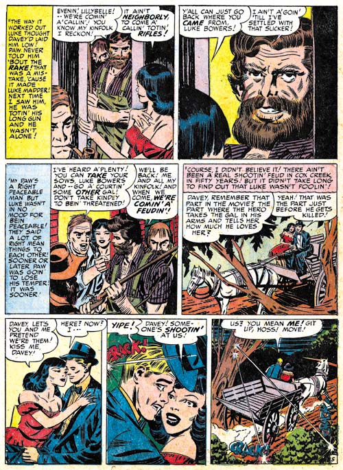
Young Love #10 (June 1950) “My Backwoods Love” page 5, art by Mort Meskin

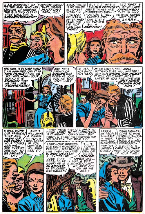
There is a great web site devoted to Mort Meskin. Among its many attractions is a biography that includes a picture of Mort working on a romance page. I have often wondered what story the page was from but until recently I never could place it. A few weeks ago I spotting it while looking at “My Backwoods Love” (Young Love #10, June 1950). Actually I should have noticed it earlier since I included the splash in one of posts (The Art of Romance, Chapter 11, After the Glut). But Meskin did 1033 pages of romance art for Simon and Kirby so a single page is easily overlooked. Comic books dates are a guide to when a title should be removed from a newspaper stand and so are a couple months advanced from the actual release date. Also time must be allotted for printing and distribution. Generally the cover date must be adjusted by 5 or 6 months to arrive at the calendar date for when the art was done. This would place the photograph as being done around January 1950. All indications are that Simon and Kirby did not keep much of an inventory so that date is probably accurate to within a couple of months.


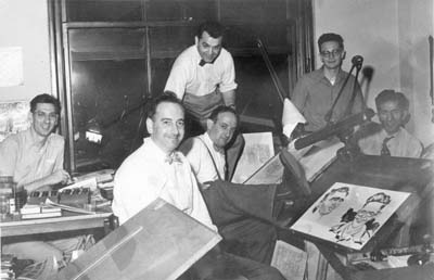
Simon and Kirby studio (probably from 1951 or 1952) Left to right: Joe Genalo, Joe Simon, Jack Kirby, Mort Meskin, Jimmy Infantino and Ben Oda. Caricatures (probably drawn by Joe Simon) of Marvin Stein and Jimmy Infantino.

It may not be obvious, but Meskin biography photograph of Mort has been staged. You can tell because he is holding a pencil despite the fact that the entire page has already been drawn and all but the final panel inked. I have seen other photos from this period taken of the Simon and Kirby studio and they are less candid than they try to appear. I show above one of my favorite pictures where obviously no attempt was made to portray this as a candid scene. They might have been hard working artists but you got to think they all enjoyed a laugh from time to time.

The Meskin website biography states that the rugged man in the upper right panel was drawn by Jack Kirby. I have often wondered whether this was correct. Certainly this character type appears in Meskin’s art very rarely. I can think of only one other example. However it should also be said that not many of the stories Mort worked on at that time would call for such a character either. Meskin actually worked in the Simon and Kirby studio (almost all artists working for Joe and Jack did not) so Jack was certainly available to provide a little penciling. But is that what actually happened? While the features of the man in “My Backwoods Love” are unusual for Meskin remove some of the abundant hair and the facial characteristics do not deviate that much from Mort’s typical man; perhaps only a bit heftier.

The rest of the page is typical Meskin. Nor is Kirby providing layouts as has so often been claimed. The panel layout includes a lot of vertical captions that Meskin preferred at that time but which Kirby did not. It seems unlikely that Jack would switch his preferences when creating layouts for another artist to use.

Young Romance #58
Young Romance #58 (June 1953) “Too Good For Me” page 4, art by Mort Meskin

The other story with a “Kirby” face that I mentioned is “Too Good for Me”. A comparison between the two stories suggests two commonalities. They both have a lot of hair and are close-ups. Beards and mustaches were not commonly depicted by Mort and such fully grown examples are even rarer still. Turning to the close-up nature of these drawing it can be said that Meskin would often modify his inking of features by providing more lines. This had the affect of transforming his generally simply eyebrows into more complicated and interesting ones. This change in eyebrows makes the work look more like Kirby’s since Jack was famous for his extravagant and expressive eyebrows. But while in close-ups Meskin’s depictions of eyebrows become more complicated they really are not done in the same manner as Kirby’s.

In “Too Good for Me” Meskin makes frequent use of tall narrow panels such as can be seen on the bottom of page 4. This was a common panel layout technique used by Mort during this period. Such tall narrow panels, however, were not often used by Jack Kirby during the same period. So once again I believe we can dismiss any claim that Kirby supplied layouts for “Too Good for Me”.

I cannot completely reject the possibility of Kirby providing a helping hand in the drawing of these particular faces. Nor would I deny the possibility of a Kirby influence on Meskin; after all they were both working in the same studio and early work by Mort was influenced by Jack (Early Mort Meskin). However I do believe that these “Kirby” faces were most likely drawn by Meskin without any direct assistance from Jack.

Replacing Simon and Kirby, Chapter 1, The Newsboy Legion

While Simon and Kirby were working for DC they knew that at some time they both would be entering military service. To prepare for this the two went into hyper drive and started generating an inventory for DC to use while they were gone. This was very successful and Simon and Kirby covers and stories appeared long after Joe and Jack were working for Uncle Sam. But the inventory was not large enough to last until Simon and Kirby were back from helping to protect our country. By early 1944 (cover dates) there were no more Simon and Kirby story art left.

The question of Simon and Kirby’s replacement came back to my attention recently while reading DC’s Simon and Kirby Sandman archive. There were two stories in it that were listed as being done by Joe and Jack but to me looked like they were actually by some other artist (“Courage a la Carte”, Adventure #91, April 1944 and “Sweets for Swag”, Adventure #100, October 1945). The issue came up again when I recently obtained a copy of DC’s Simon and Kirby Newsboy Legion archive. For the Newsboy Legion volume, DC decided to include material that clearly was not drawn by Simon and Kirby. The replacement artist for most of the Newsboy Legion was credited in the DC volume as Gil Kane. It is an attribution that I have used previously as well. However when I talked with Joe Simon about this he insisted that Gil Kane was not the artist and suggested that it was the brothers Arturo and Luis Cazeneuve.

Simon and Kirby’s replacements was a subject that I have always meant to investigate a little further. This will be the start of another serial post. It will be a bit more erratic than most of my serial posts because I am not going to do this in a strictly chronological order. Instead I will begin with several chapters examining the Newsboy Legion, then look at Sandman and finally cover the Boy Commandos.

Star Spangled #29
Star Spangled #29 (February 1944) “Cabbages and Comics”, pencils by Jack Kirby

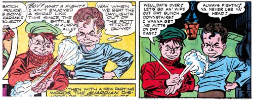
I will start with the Newsboy Legion because the work covered in this chapter can all be found in DC’s recent archive volume. Thus the reader will be able to view more examples than I can provide in this blog. The first story I will remark on is what I believe to be the last published complete Newsboy Legion story by Simon and Kirby before they went off into military service. Because of the push to create inventory and the use of other hands in the inking, the art by this time was not quite as good as early in the Newsboy Legion run. But even poorer quality Simon and Kirby art is still much better than what most other artists were doing. And while many artists might try to imitate Kirby’s dynamic art they were unable to keep it up page after page. In short I have no doubt that this story is in fact a Simon and Kirby production.

The Jack Kirby Collector (issue #21) published an interview with Gil Kane. Two of Kane’s answers are particularly pertinent to this discussion:

TJKC: What were your job duties with S&K?

Gil: Mine was penciling. I would try to turn out a job every week or so. [They were] 12-page stories. I was copying-tracing-Jack’s work.

TJKC: What happened when Simon & Kirby went into the service? What happened to you?

Gil: I got a “Newsboy Legion” job to do by myself (like I had done the rest of them except they didn’t fix it up or do the splash), but when I walked through the door with the finished job, they said, “You’re fired.” They didn’t even look at the work. I really was lousy and I was out! At that point, I was about seventeen and I worked for Continental Comics for a guy named Temmerson. (I penciled and Carmine Infantino inked.) But that only lasted until I went into the Army.

There are a couple of really significant points in Gil’s short answers. Kane describes having previously done work that Simon and Kirby fixed up or provided the splash. Now it is possible that Gil Kane had something to do with earlier stories such as “Cabbages and Comics” but if so it was only in a minor capacity. Kane may have done things like help with the inking but I am sure that Kirby was the penciler.

Star Spangled #30
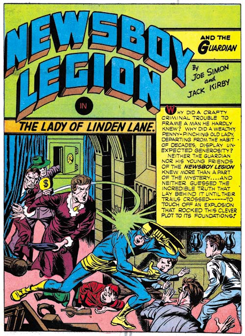
Star Spangled #30 (March 1944) “The Lady of Linden Lane”, pencils by Jack Kirby

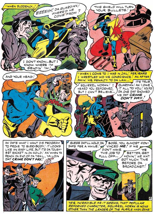
There is no sign of Gil Kane, or any other artist other than Simon and Kirby, in the splash for “The Lady of Linden Lane” (Star Spangled #30, March 1944). It is a great splash with plenty of action and a little bit of humor with the normally fearless Guardian trying to duck from the blows of an elderly lady. The hoods in the background are a typical Simon and Kirby feature. This was inventoried material and so perhaps was executed in a hurry, but it still is great comic book art. Joe entered the Coast Guards before Jack went into military service so some of the inventory art may have been done by Kirby without Simon. However there is no reason to believe that DC published the inventoried art in the same order that Joe and Jack produced it. Nor are there any signs that I can find that distinguish this story from others there were done by both Simon and Kirby.

Star Spangled #30
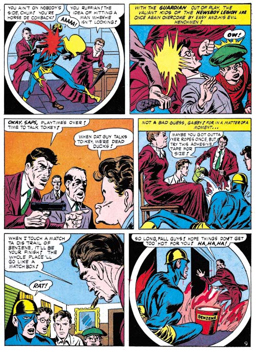
Star Spangled #30 (March 1944) “The Lady of Linden Lane” page 9, art by Gil Kane?

While the splash for “The Lady of Linden Lane” is work that can be attributed convincingly to Simon and Kirby, the rest of the story is not. The art is crude and stilted. There are parts that really do look like Kirby’s pencils but they appear to be swipes. For instance the cigar smoker in panel 5 of page 9 (shown above) is shown in the type of perspective that Kirby favored however it appears to be based on Guardian from the cover of Star Spangled #26 (November 1943).

Star Spangled #8 and #30
left Star Spangled #8 (May 1942) “Last Mile Alley” page 13 panel 2, pencils by Jack Kirby
right Star Spangled #30 (March 1944) “The Lady of Linden Lane” page 7 panel 5, art by Gil Kane?

An even more obvious swipe can be found in the figures of Snapper and Gabby shown above. Unlike my previous example this is a close swipe showing only minor alterations. Kirby did swipe on occasion but one thing I have never seen him do was swipe from himself. Jack did have some favorite poses that he often repeated but they are always done with such variation that it seems clear that he is not copying any previous drawing. Simon did swipe from Kirby, in fact rather often. But Joe was a good artist in his own right and his art is much better than this crudely drawn story. Further I can detect none of Simon’s drawing style in “The Lady of Linden Lane”. While I am not familiar enough with the work of Arturo or Luis Cazeneuve to confidently spot their work, what I have seen is much better than these crude drawings. The combination of a Kirby drawn splash with story done by another artist fits very well the interview reply that Kane gave. Add to that the use of swipes and Kane’s admitted poor artistry (he was 16 at the time). So assuming that there is at least some truth to his statements I am questionably attributing the story art for “The Lady of Linden Lane” to Gil Kane. The one problem with this attribution is that there is only one Newsboy Legion story that fits this description while Kane statement suggests he did multiple works in this fashion.

Star Spangled #31
Star Spangled #31 (April 1944) “Questions, Please” page 6, art by unidentified artist

The next issue of Star Spangled Comics had a very different Newsboy Legion story. No clear sign of Simon and Kirby here, neither in the splash or the story art. Nor is this the same artist that produced the story art from “The Lady of Linden Lane” I must admit that I have slighted this artist in the past. His more “cartoony” approach gives the impression that he could be considered an “anti-Simon & Kirby”. But it would be a mistake to dismiss this artist. Put aside any comparisons to Joe and Jack and I am sure the reader will see this is a rather interesting and talented artist. Sure his faces and figures are exaggerated but they are full of life. He makes good use of varying the point of view. He seems to purposely distort background scenery giving it an almost cubist look. This artist may be rather bizarre but he is definitely not boring. I will cover this artist in more detail in the next chapter of this serial post.

But who is this artist? In the past I, and at least some others, have thought this was Gil Kane. Now I attributing “The Lady of Linden Lane” to Gil Kane but is there any other reason to reject Kane as the replacement artist for “Questions, Please” and other Newsboy Legion stories? Actually there is. Gil Kane went into the army shortly after his 18th birthday and he spent 19 months in service. Since he was born on April 6, 1926 that would mean he was in the army sometime about April or May 1944. However, as we will see in the next chapter, this replacement artist would provide work up to Star Spangled #49 (October 1945). This is well into the time that Kane was doing military service. Unlike Simon and Kirby, I doubt that DC would consider the replacement artist important enough to provide an inventory of works to use while he was gone. So it can be said with good confidence that Gil Kane was not the primary Simon and Kirby replacement artist.

But what about Joe Simon’s suggestion of the Cazeneuve brothers? I prefer to put off trying to answer that question until the next chapter where I will review more of the primary replacement artist’s Newsboy Legion work.

Joe Simon and the Newsboy Legion Archives

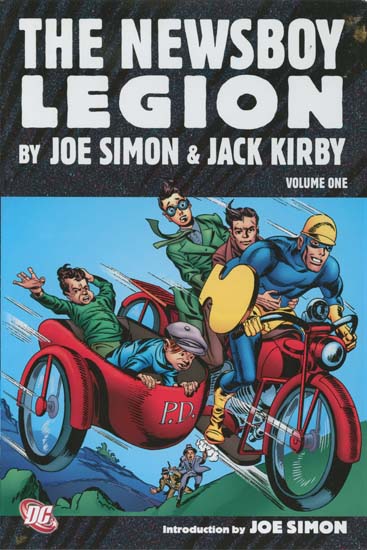
The Newsboy Legion, volume 1

During a recent visit to Joe Simon I picked up a copy of DC’s “The Newsboy Legion by Joe Simon and Jack Kirby” volume 1. This post will not be an unbiased review as I was one of the contributors having provided all the covers. I have been extremely busy with restorations for “Simon and Kirby Superheroes” but I had previously scanned and cleaned up these Star Spangled covers so providing them to DC did impact my commitment with Titan. The covers are generally not what I would call full restorations but I think they came out rather well. The restoration of the stories was done by others (Rick Keene and Mike Montagna) and is even better than the work done for “Simon and Kirby’s Sandman”. I know there are some who are critical of DC’s approach but I am not one of them. I am pleased to see that only Marvel continues to follow the outdated technique of art “reconstruction” (a code word for recreation).

This first volume covers the work that appeared in Star Spangled issues #7 to #32 (April 1942 to May 1944). Joe and Jack provided DC with a handsome inventory before they went into military service. Because of that inventory this volume is almost exclusively work by Simon and Kirby with only three stories and a single cover drawn by other artists.

There are some aspects about this archive that I am less satisfied with. Mainly the smaller dimensions of the book requires that the art must be slightly reduced in size with narrow the gutters and margins. This was true for the Sandman archive as well. But I suspect this was all done to keep the cost of the book low. The dust jacket shows re-colored Simon and Kirby art. I am not a fan of the use of modern coloring on gold and silver age comic art. The line art was made for the type coloring and printing that it originally received. I have not seen any examples of the successful use of modern coloring applied to older art. But hey it is just the dust jacket and it is the contents of the book that really count.

A particular appeal feature of this reprint is the introduction written by Joe Simon. It seems so obvious a choice that I do not know why Joe is not asked to do more of these. Joe is a great writer and this is another of his fascinating essays. I will not discuss the contents at this time so the reader will just have to buy the book. But it does cover a wide range of the history that lies behind the Newsboy Legion.

Simon and Kirby’s Captain America was so innovative that it changed the comic book industry. However it was at DC that the Simon and Kirby collaboration really jelled. Which is why I am so pleased that DC will be reprinting so much of this important material. There should be a volume two for the Newsboy Legion and DC has announced the first Boy Command volume as coming out in November. Simon and Kirby fans live in exciting times.

My Two Cents: Vince Colletta Apologists

Young Romance #91
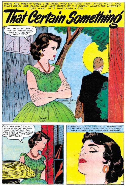
Young Romance #91(December 1957) “That Certain Something”, art by Vince Colletta

I do not understand apologists for Vince Colletta. This is not a rant against Colletta and his inking. I recently reread Kirby’s Fourth World series and I actually liked Colletta’a inking on those comics. There Vince showed a mastery of the use of a brush that was very admirable; not overly tight but still controlled. But the facts remain that Colletta did erase some of the pencils by Kirby and other artists. It should not be at all surprising that many fans of those artists object to Vince’s deletions.

The recent issue of the Jack Kirby Collector (#54) has an article by Colletta apologist Bruce Hannum (“Vince Colletta Not Always the Culprit”. It is an interesting article that shows the original version of two covers drawn by Kirby and the changes directed by Stan Lee for the published comics. For one cover this amounted to the removal of a minor item while the other cover was altered significantly by the elimination of a lot of back ground features. The topic of the changes made to an artist’s creation in preparation for publication is a fascinating one and the article would have been very pleasing had it been left at that. However Hannum proceeded to try to attempt to associate the Lee directed changes to Kirby’s art with the erasures by Colletta, even suggesting that Colletta was taking Lee’s actions as a guide to his inking of Kirby. In short Hannum is trying to justify Colletta’s use of an erasure by Lee’s editorial changes.

I have two big problems with the Colletta to Lee comparison. The first is the motivation. There is little doubt as to Lee’s motivation; he felt it the alterations would help with sales. You do not have to agree with Lee’s decisions to recognize that was why he made them. Frankly I often wished Stan would leave Kirby’s art alone (Genesis of a Cover, Captain America #105). But I am a fan with an interest in the art while Lee was an editor interested in sales. Joe Simon made similarly motivated decisions about Jack’s covers although he usually redid rather than reworked the cover (Alternate Versions of the Alarming Tales #3 Cover). And while the two examples in this article show the elimination of art not all of Lee’s directed modifications of Kirby covers were just elimination. One thing that Stan’s actions certainly were not and that was they were not attempts to save time.

However Colletta’s erasures do look like a time saving measure. None of the examples I have see look remotely like aesthetical decisions. Since the erasures were in unobtrusive parts of the story art they were not likely to affect sales either. Further unlike Stan, I have seen nothing to indicate Vince ever significantly added to or altered Kirby art. No, the Colletta apologists have made an unconvincing case that Colletta was trying to improve Kirby’s art.

But for argument’s sake let us accept the proposition that Colletta’s goal was improved art. This brings me to the second big problem with the Colletta to Lee comparison; they don’t compare. Simply put, Stan Lee was the editor. His responsibility went beyond just assigning work to artists; it went to the entire finished comic. If a comic was a disaster, in eyes of Goodman (his boss) it would be Stan’s fault not the artists. Kirby and the other comic book artists might not agree with Lee’s decisions but I doubt any questioned that those decisions were Stan’s to make. But the same would not be true for Colletta as an inker. It is only from Colletta apologists that I have heard the suggestion that the final art was the more responsibility of the inker than the artist who drew it. I suspect that most pencilers and their fans would not agree.

But why is such effort expended in defending Colletta? Do the apologists really feel that inkers are more important than pencilers? Or do they actually believe that Colletta is a better artist than Kirby? And if they do think Colletta is such a great artist what is that opinion based on? I have heard that Colletta drew really nice romance comic art. However none of the Colletta apologists seem that interested in romance comics and romance fans seem to prefer other artists over Colletta. And can the apologists really feel Kirby was wrong to stop using Colletta’s inking services? After all Jack was the editor for his Fourth World comics, why shouldn’t that have been his prerogative?

Like I said, I just do not understand Vince Colletta’s apologists.

Happy Fourth Anniversary!

Who cares about Simon and Kirby? Well judging by the first two years of this blog’s existence only a small number of fans. But it was not just the low number of visits to my blog that suggested that Simon and Kirby were pretty much forgotten by the larger public. 2006 and 2007 also did not really have much in the way of books with significant Simon and Kirby content on the market. But all that has changed. In the last two years the number of visits to the Simon and Kirby Blog has increased by a factor of ten and it keeps on rising. The last year saw the publication of Titan’s “Best of Simon and Kirby” and DC’s “Simon and Kirby Sandman”. This year should see DC release books on the Newsboy Legion and the Boy Commandos. Even more important Titan will be publishing the “Simon and Kirby Superheroes” (okay I’m biased). I still believe what I wrote in my last anniversary post, that the key event to this change in interest was due to the publication of Mark Evanier’s “Kirby: King of Comics”.

I did not envision any of this when I wrote my first post on March 17, 2006. I just wanted to spend some time writing about my favorite comic book collaborators and the artists who worked for them. I had been studying Simon and Kirby for quite some time before starting this blog but something changed once I did. I found that writing helped clarified my thoughts. That and the studies that accompanied my posts greatly increased my knowledge. I have learned much more about Simon and Kirby in the last four years then I have all the time before that.

I admit that keeping the blog going during the last year has been quite difficult. My restoration work for “Simon and Kirby Superheroes” has taken up much of my time (I will be posting about that in the not too distant future). But I love writing this blog and do not want to give it up even for a short while. And there is so much more to write about. My serial post Art of Romance has gone 28 chapters so far but is only up to the end of 1954 while I intend to take it up to 1960. Another serial post, Little Shop of Horrors, has gone 9 chapters but alas will end with the next one. And yes I know there are other serial posts that have long been idle (It’s a Crime and Wide Angle Scream) however I fully intend to write more on them at some point. In the past I posted about two titles (Foxhole and In Love) from Simon and Kirby’s short attempt at being publishers but I have yet to give Bullseye and Police Trap a similar treatment. DC is reprinting their Simon and Kirby material and that provides an added incentive to writing about Sandman, the Newsboy Legion and the Boy Commandos. With so much to discuss about Simon and Kirby I am sure this blog will have many more anniversaries to come!

Joe Simon, Some Comics from the Coast Guard

Simon and Kirby was a brand name that helped sell comics. So it comes to no surprise that although the Boys Commandos story (“Brooklyn Botches the Bakas”) from World’s Finest Comics #20 (Winter 1945) was signed Simon and Kirby they had nothing to do with it. All inventory that Joe and Jack provided DC before entering military service had since been used up. But that did not stop DC; they just added Simon and Kirby’s names to stories actually drawn by other artists. Like I said, Simon and Kirby’s names sold comics.

World's Finest #20
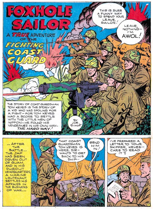
World’s Finest #20 (Winter 1945) “Foxhole Soldier”, art by Joe Simon

While neither creator contributed to the Boy Commandos story, the next story in World’s Finest #20 was penciled, and probably inked, by Joe Simon. There is no question that this piece was by Joe. It is in his distinctive style with no attempt at mimicking another artist (Joe’s imitations of Jack Kirby and Lou Fine have fooled experts). And if that were not enough it is even signed by Joe. Such a solo signature is unique during the period of the Simon and Kirby collaboration. Even the cover and short story that Joe did for Boy Commandos #12 (Fall 1945) were signed Simon and Kirby despite the fact that Jack was still in the army and certainly had nothing to do with them (Art by Joe Simon, Chapter 8, Off to War). For “Foxhole Soldier” I would guess that only used his signature to please his superiors since Simon was still in the Coast Guard when this story was created. Both the BC #12 and WF #20 pieces were clearly done as Coast Guard promotion.

The next issue of World’s Finest (#21, March 1946) featured a Boy Commandos story (“Brooklyn and Columbus Discover America”) actually drawn by the recently returned Jack Kirby. What a difference that made. However Joe was still in the Coast Guards and was not there to help. Very unfortunate because the inking to the Boy Commandos feature was atrocious.

World's Finest #21
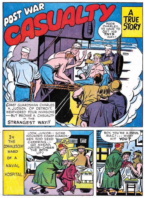
World’s Finest #21 (March 1946) “Post War Casualty”, art by Joe Simon

While Joe was not on hand to help Jack with the Boy Commandos story, World’s Finest #21 had another story (“Post War Casualty”) penciled and inked by Simon. This story is unsigned but Joe’s style is easily detected. The job seems a little more rushed then “Foxhole Soldier”. The elderly lady shown in the first two story panels bears a remarkable resemblance to Apple Annie from the Duke of Broadway feature that Joe drew latter a couple months later (The Wide Angle Scream, American Royalty).

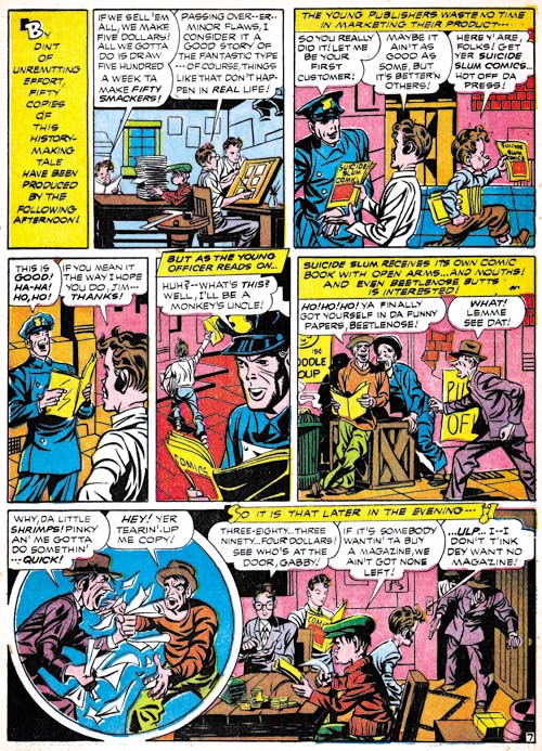
I had earlier reported about another short piece drawn by Simon, “Combat Photographer” from Real Fact #2, May 1946 (More Obscure Simon and Kirby). In that case there was no Coast Guard connection and the piece was published the same time Simon and Kirby’s Stuntman and Boy Explorers Comics. “Combat Photographer” indicates that Joe did some work for DC after returning from his stint in the Coast Guard.

I was unaware of Joe Simon’s two World’s Finest features until I recently saw them in a post on the Marvel Masterworks forum. In it Steven Utley remarked that Simon and Kirby’s Manhunter stories would make a rather thin archive volume if DC decided to publish them. Steven suggested that it thickened up a little bit more by including other assorted Simon and Kirby pieces. It could be fleshed out even a little bit more if DC were to include some pieces by Kirby alone, in particular his retro Manhunter from the 70’s. The complete list for such a volume would be:

Manhunter, Adventure Comics #s 73-80, 76 pages
“Coast Guard Reconnaissance,” Boy Commandos # 12, 3 pages
“Foxhole Sailor,” World’s Finest Comics #s 20, 3 pages
“Post War Casualty,” World’s Finest Comics # 21, 3 pages
“Pirate or Patriot,” Real Fact Comics # 1, 4 pages
Just Imagine, “The Rocket Lanes of Tomorrow,” Real Fact Comics # 1, 2 pages
Just Imagine, “A World of Thinking Machines,” Real Fact Comics # 2, 2 pages
Just Imagine, “Combat Photographer,” Real Fact Comics # 2, 4 pages
“Backseat Driver,” Real Fact Comics # 9, 4 pages
“Space Ships of the Past”, Showcase #15, 2 pages
Manhunter, First Issue Special #5, 19 pages

For a total of 122 pages. I think it is a great idea since some of these pieces would probably not otherwise be reprinted.

Marvel Masterwork’s Daring Mystery Volume 2

Some time ago I posted about the practice of reconstructing art that Marvel was using in their Masterworks reprint volumes (Recreation Vs. Restoration, How Should Reprints Be Done?). I was, and still am, rather critical of that approach. My criticism is not just theoretical, some of the reconstructions made in the past have been very poor indeed (The Human Torch #2). I concluded my Recreation Vs. Restoration post with the observation that the use of reconstructed art makes Marvel reprints of little use for me and that I would no longer be buying them. But of course, one should never say never.

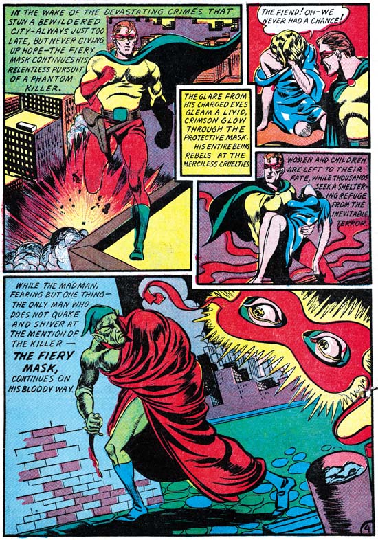
I have long been on the look-out for a copy of Daring Mystery #5 (June 1940). Some have claimed that the Trojak story contained in the issue was drawn by Joe Simon. This was altogether possible because I believe Joe did do the Trojak in Daring Mystery #4 (May 1940) and he certainly drew the Fiery Mask story in Daring Mystery #6 (September 1940). Even if Simon had not drawn Trojak story in DM #5 I still thought it would be nice to see the story of this Simon created character. However Daring Mystery comics are rare in any shape and I have searched for many years in vain for an affordable copy of issue #5. So when I saw the recently released Marvel Masterwork’s Daring Mystery Volume 2 I decided that even reconstructed art was good enough for my purposes and bought a copy.

Although I had not bought a Masterwork volume for some time I did have an occasion to see the quality of the reconstruction was done in a Marvel Mystery Comics reprint volume. When the Best of Simon and Kirby book came out I received some criticism on the Marvel Masterwork forum for the restoration that I did on the volume. At one point someone posted a scan of the splash page of the Vision story from a Masterwork book. A comparison of the scan with one from the same splash from BoSK showed some rather poor reconstruction in certain areas in the Masterwork version.


Daring Mystery #6 (September 1940) “The Fiery Mask” page 4, pencils by Joe Simon

Now that I had the Daring Mystery volume I was curious on how well the reconstruction was done. Of course I did not have a copy of DM #5 but I did have copies of the other issues. At a glance the reconstruction of the story art (by Pacific Rim Graphics) looked pretty good. But I decided to take one example (the demon figure from the Fiery Mask page shown above) and overlay scans from the original comic and the reprint.

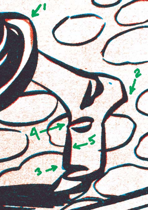
I digitally bleached both scans so that for the most part only the line art remained. I changed the line art of the original comic to red and that from the Masterwork to cyan (blue). If both were identical the resulting lines would look black but deviations would show up in one of the two colors. Experience has shown that you never get perfect overlays. Even scans from the same comic will vary from day to day. Paper “breaths”, it expands or contracts with humidity changes.

Daring Mystery comparison
Original: red line art
Masterwork: blue line art

To illustrate what I found I have shown a close-up of the Demon’s foot. I have marked the most glaring difference as item 1. However the error in this case is due to the digital bleaching I did. The robe was red while the background was green. The registration was not perfect and the cyan (blue) of the background printed over a portion of red. The red (magenta and yellow) and cyan inks combined to form black. Chemical bleaching would have removed the erroneous black but digital bleaching does not. But the black due to the registration error and the black ink of the line art are not identical. If I were doing the restoration I would edit the result based on that difference and as far as I can tell the Masterwork’s reconstruction is accurate.

My registration is not perfect and as I described above variations due to paper expansion or contraction are also expected. Therefore I would not judge most of the failures to overlay correctly to be of any significance. The one I marked as 5 shows that the original comic was slightly to our right. However the line on the opposite side of the foot is also slightly to the right. I expect both “errors” are due to the problems I described above and are not reconstruction errors. There are also other variations in line width that could be explained by variations in the printing. However it is also possible that they are reconstruction errors but I cannot tell without seeing the actual comic used in the Masterwork reconstruction.

Now look closely at the heel (marked as 2). The bottom of the heel in the original comic was not smooth but deviated slightly near the end. This cannot be explained by the factors discussed above and is I believe an error in the reconstruction. On the opposite side of the foot (marked 3) is a case were the reconstruction has added an angle that was not present in the original. The fold spotting pointed to by item 4 also deviates in ways that seem to reconstruction errors.

One might think that I am criticizing Pacific Rim Graphics for the reconstruction job they did. Actually far from it, I believe they did an excellent job. These are really small errors that can only be seen when magnified and would be difficult to spot with the naked eye.

The covers were reconstructed by another (Michael Kelleher). This is same reconstructor that I mentioned in my earlier post who admitted to using a primitive reconstruction method (inking on tracing paper) and was completely clueless why some would find this objectionable. I did not do an overlay of his work but careful examination suggests it was accurate. The only thing I noticed was that his lines were consistently narrower than those from the original comics. Perhaps the original comics he used had been better printed or perhaps this was done on purpose.

I did not have time to make detailed comparisons of all the work from Daring Mystery issues 6 to 8 with the Masterwork volume but overall they looked good. I feel this volume does justice to the original artists. Does that mean I approve of the use of reconstructed art? Not at all, I still prefer scans. No matter how well done, a reconstruction is still one artist’s interpretation of another artist’s work. But let us be frank, the reader will unlikely to find a single coverless issue of Daring Mystery for the price of the Masterwork volume.

One little warning about the Masterwork book, the cover for Daring Mystery #7 was not drawn by Joe Simon. I have no idea how such an obvious mistake was made.

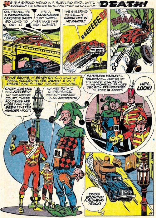
Vagabond Prince, “Death-Trap De Luxe”

Black Cat #7
Black Cat #7 (September 1947) “Death-Trap De Luxe” page 2, art by Joe Simon

The last created Vagabond Prince story, “Death-Trap De Luxe”, ended up being the first one published. Thus readers would have had no idea what brought the Vagabond Prince and his two companions together to fight crime. Actually even if the reader had been familiar with the other two stories he still would have no idea where the Jester came from. This is the only appearance of this character but the story treats him as if there was nothing particularly unusual about his presence.

Neither the story nor the art is quite as good in “Death-Trap De Luxe” compared to the other two Vagabond Prince stories, but it still is well worth reading. In this case Vagabond Prince’s adversary is an unscrupulous capitalist car maker. Of course the plot is completely exaggerated for use in a comic book. After all no car manufacturer in those days, or today, would ever put profit above public safety. You can tell the car make in this story is especially evil, he provides his cat with live birds!

The Vagabond Prince stories suffer from some of the defects of golden age comics, or for that matter the superhero genre from any period. The concept that a hero can routinely come across crime is a bit of a stretch. Nor is it easy to accept that clues can be so conveniently found and would so easily be used to track down the criminals. However these improbable plot devices must be accepted by the reader of superhero comics or the stories would never proceed at a fast enough pace. And Joe’s Vagabond Prince stories, like all Simon and Kirby productions, do move at an enjoyable pace. What makes Vagabond Prince stories special for me is how the hero comes from the poor to defend them against the financial and cultural elite. Sure the stories are a bit over the top, but that is not only an acceptable characteristics for comics it is actually desirable.

Besides the Vagabond Prince, Joe Simon also created and drew five Duke of Broadway and three Kid Adonis stories (one of which has never been printed). Therefore this relatively brief period was Joe’s most productive as a comic book penciler. One wonders how comic book history would have played out if the Stuntman and Boy Explorers Comics had somehow made it into more newspaper stands racks. Would Simon have continued penciling more stories? Would there have been romance comics?