Category Archives: Odds & Ends

Joe Simon at New York ComicCon 2009

As promised I have some more information about Joe Simon’s appearance at this year’s ComicCon. Joe will be doing a signing at the Titan booth on Saturday (Feb. 7) from 2:30 to 3:30. Then from 4:00 to 5:00 will be the subject of a special panel “Secret Origins of the Comic Book World”. Joe will then return for more signing at the Titan booth from 5:30 to 6:30. This is all of the Joe Simon appearances that have been announced, but if that changes I will post about that as well.


Fighting American Lithograph

Titan first book, “The Best of Simon and Kirby”, will not be released until this summer, so what will Joe be signing? Well for one thing Titan will be offering two limited editions lithographs. One will be featuring the cover from Fighting American #1 (see above) while the other will be from the splash from the story “The Girl Who Tempted Me” from Young Romance #17 (see below). I have not seen the actually lithographs but I understand that the image size will be 11 by 16 inches (Fighting American) and 11 1/2 by 16 (Young Romance). The paper size I believe will be 14 by 18 inches. The edition size of each lithograph will be limited to 100, each signed by Joe Simon and are priced at $75 a piece. The two lithographs are being made specifically for this ComicCon and have never been offered elsewhere.


Young Romance Lithograph

At this point I have to admit that my observations and opinions are completely biased, I did the restorations for these lithographs. So take that in account when I say both are just stunning. No line art recreations here, both are based on scans from the original comics; pure Simon and Kirby. Colors were carefully done to accurately restore the original colors while correcting comic book printing problems such as registration errors. What can I say I am truly pleased with how they came out. With such a small edition size I am sure that these lithographs are going to quickly become collectors items.

Black Magic at DC

It has been some time since I posted about Black Magic. The last, and only, blog entry solely about the title was almost three years ago (The Old Black Magic). I hope to begin posting more about it in the near future but today I would like to write about the nine Black Magic reprint comics that DC published between November 1973 and May 1975. These show up frequently on eBay and at comic conventions and generally are still reasonably priced. Given the value placed today on even poor copies of the original Black Magic series the DC reprints may seem like a cost effective alternative. They may be as long as the purchaser is aware of what he is getting.
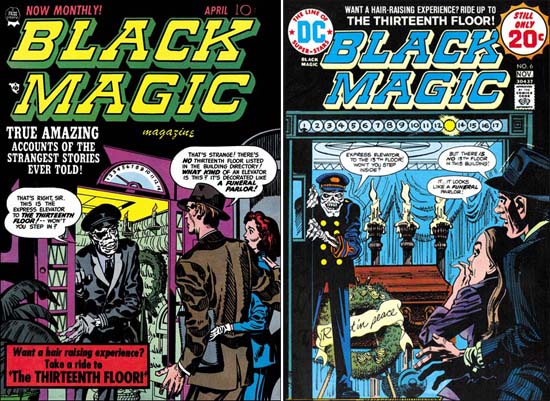

Black Magic #11 (April 1952) by Jack Kirby (on left)
DC Black Magic #6 (November 1974) by Jerry Grandenetti (on right)
Larger image of Black Magic #11
Larger image of DC Black Magic #6

Seven of the covers of the DC reprints were penciled by Jerry Grandenetti and inked by Craig Flessel. Actually my crediting of the inking to Flessel is not based on any study but from conversations with Joe Simon. Joe told me that Craig did a lot of work for him at the time. When I asked what work that was Joe said he used Flessel to do Grandenetti’s inking but he did not identify any work in particular. Most of the covers, like issue #6 shown above were reinterpretations of the covers that were originally done by Jack Kirby. Today it sounds like an odd thing to do but when the reprints were published most readers probably had not seen any of the original Black Magic comics. Three of the coves were original compositions by Grandenetti based on reprinted stories. Frankly Jerry’s reinterpretations are better then his own more fully original covers.
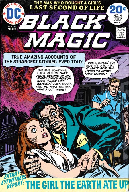

DC Black Magic #4 (July 1974)

One of the covers used for DC’s Black Magic reprints was one never published before. There are at least three versions of this image that Simon and Kirby intended for the first Black Magic cover. I guess in the end they were not satisfied with any of the versions and used a story about an evil doll as the basis for the published cover. The version used for DC issue #4 was altered slightly by the odd inclusion of an upside down lion in the upper left. I really do not know what to make of it. It seems so out of place with Simon’s typical designs and the art does not seem to match Grandenetti’s style either.
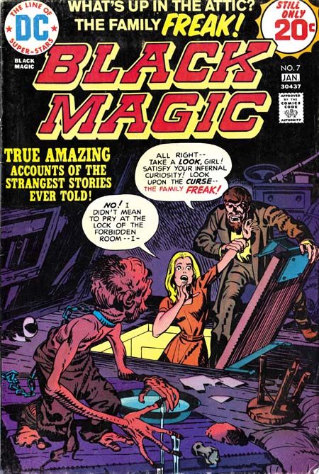

DC Black Magic #7 (January 1975)

The other Kirby cover appeared on DC issue #7 but originally on Black Magic #17 (October 1952). It was a great choice it was one of the best from the entire Black Magic series. But look at that woman’s face, that does not look like Kirby! In fact it does not match the original version and looks like the work of Joe Simon.
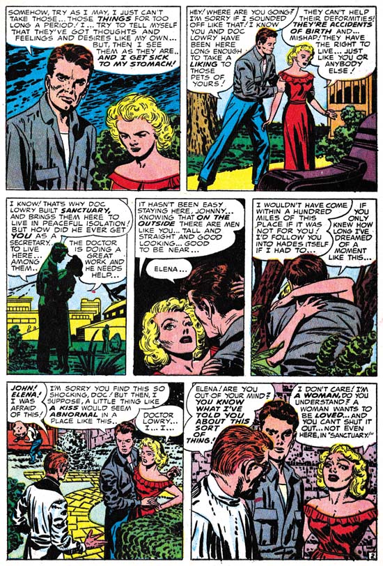

Black Magic #29 (March 1954) “The Greatest Horror of Them All” page 2, art by Jack Kirby

I have heard it from many people, Kirby did not draw beautiful women. It is a remark that I truly do not understand, at least for the period of the Simon and Kirby collaboration. Granted the lady in the first panel of the image above leaves much to be desired but surely as depicted in panel 4 she would be described as pretty? Even in the last panel where she is overwhelmed by emotions, I would hardly call her unattractive.
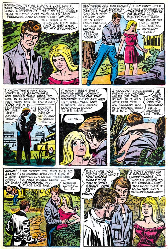

DC Black Magic #1 (November 1973) “The Greatest Horror of Them All” page 2, art by Jack Kirby and Joe Simon

Surprisingly Joe Simon shares the same general opinion. In the earlier issues of the DC reprints he replaced Jack’s woman with a creation of his own. Is it truly an improvement? Well the first panel came out better and I leave it up to the reader whether which version of panel 4 is the most attractive. However in the last panel Joe has completely lost the emotion. It is in conveying the emotions of woman that Kirby is truly at his best and that, for me, is why his females are truly beautiful.


“The Angel of Death” panel from page 6, art by Jack Kirby
Black Magic #15 (August 1952) top
DC Black Magic #3 (May 1974) bottom

A careful observer may have noticed that the two pages of “The Greatest Horror of Them All” are not identical even when Joe was not purposely changing the art. There are subtle differences in the inking as well. The art presented in the DC reprints was not made from bleached comic pages. Simon probably knew even then how to remove the color from old comic books. But the bleaching process does not completely remove the color and more importantly the copiers need to provide a quality finish to the process were not yet commonly available in the early ’70s. Instead I believe Joe worked with a technique that I know he used earlier in the Harvey reprints of Fighting American. He re-inked the art on tracing pages over blown up copies the original, but probably bleached, comic book pages. Generally Simon was very careful to trace the original brushstrokes, but sometimes, such as the panel from “The Angel of Death” he did not do so. It may seem surprising that Joe, who had done so much inking over Kirby’s pencils, would have trouble re-inking the reprints, but the use of tracing paper obscures the art in a way that working on the original pencils did not.

Also not that panel from the DC reprint is higher then the original. Oddly this was due to the smaller size of the comics in the ’70s as compared to the ’50s. The size difference is not in the height but in the width of the page. The art in the DC was slightly reduced in size to accommodate the narrower page. To avoid an overly large top and bottom margins some panels were extended in a vertical direction. There in a small strip of art that was not present in the original comics. Expanding the panels was only done in the earlier DC issues. Later the Black Magic title that appeared at the top of the page was replaced with a larger version that was also moved further from the panels. This fixed the problem of the over sized top and bottom margins without the extra work involving in adding the new art to the extended panels.
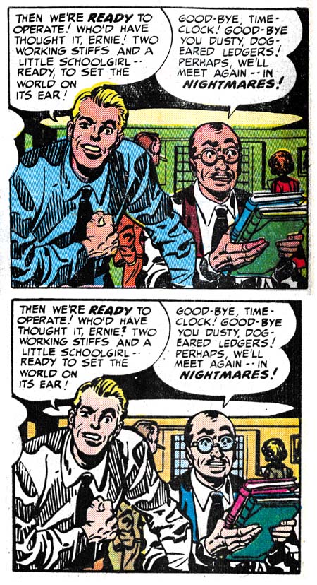

“The Girl Who Walked on Water” page 6, art by Jack Kirby

The examples I have provided of the re-inking are really the extremes. Most of the art was recreated well enough that only a close examination reveals the differences. But starting in DC issue #6 and completely dominating issues #7 to #9, are some completely heavy handed re-inking. Even without comparison to the original Black Magic stories it is easy to see something is wrong. Look at the inking in the bottom panel from “The Girl Who Walked on Water”; it looks more like a wood cut then the work of a brush. The sudden appearance of this type of inking convinces me that Joe was not the re-inker. He had handed off the work to less skillful hands with rather disastrous results.
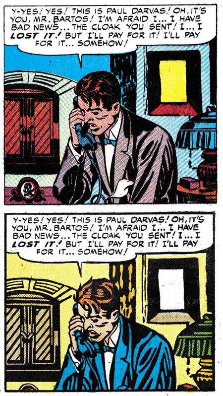

“The Clock”, panel from page 6, art by Jack Kirby
Black Magic #2 (December 1950) top
DC Black Magic #7 (January 1975) bottom

It is like watching a train wreck. I just cannot help myself from providing another comparison between the “woodcut” inking and the masterly studio style inking of the original.
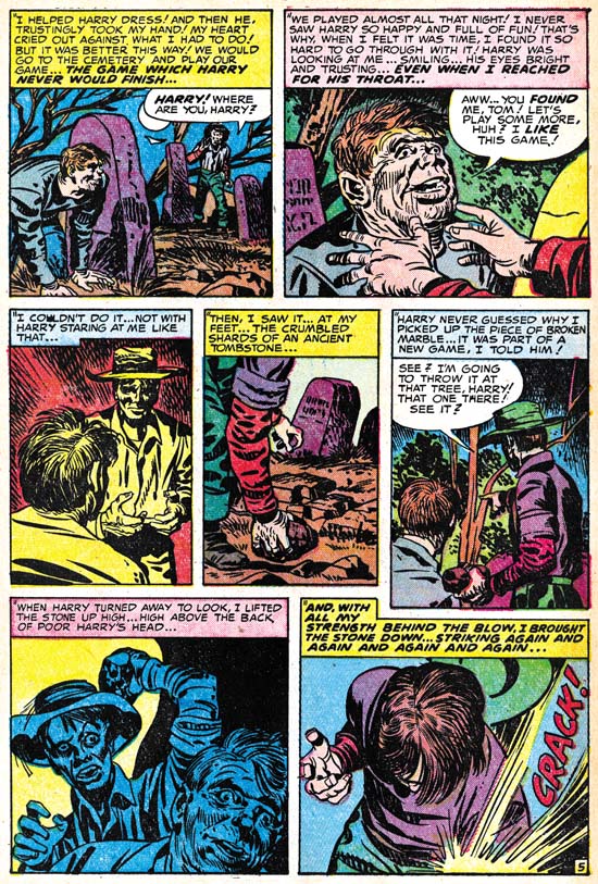

Black Magic #32 (September 1954) “Maniac” page 5, art by Jack Kirby

So far I have been describing the art, but were the stories changed when DC reprinted them? There is good reason to expect that they might have been as the original Black Magic was produced before the creation of the Comic Code Authority. In fact one aim of the Comic Code was to eliminate horror comics completely. In this they succeeded and Black Magic was one of the casualties. But after awhile the Code was relaxed slightly and Prize resurrected the Black Magic title in 1957 this time with the help of Joe Simon alone. Although the title was brought back the content could not be, the Comic Code would not allow it. However by the ’70s the Code had been relaxed even further. In fact horror comics were in a period of popularity. It was still tame stuff compared to what was done pre-Code at say EC, but at least it was permissible to have stories about vampires, werewolves and other monsters. It is an indicator about how relaxed the Comic Code had become in the ’70s as well as how comparatively tame the original Black Magic series were in the early ’50s that I have only found a single case of a story changed for the DC reprint. This was the total elimination of page 5 of the story “Maniac” along with some minor modifications to the captions of the next page to accommodate the sudden leap in the story.

So are the DC Black Magic comics a relatively cheap replacement for the much more expensive Prize Comics version? Yes if all you want is a good read. But if you want to study the art closely the reprints are simply not the thing to examine. The best description of the process used in making the reprints is recreation. In discussions about the art recreations in recent Marvel reprints many have pointed back to the technique that Simon used as justification for similar methods used today. This is ironic because while Simon was limited by the primitive technology then available, today we have computers, scanners and quality printing.

I have created a checklist for the DC Black Magic that includes references to the original source. It is available in the sidebar as well.

Titan Announces Expanded Simon and Kirby Library

The following is a press release from Titan:

THE OFFICIAL SIMON AND KIRBY

Titan to Collect the Works of Two Comic Book Legends


Titan Books Signs Exclusive Agreement to Publish Works by Comics’ Greatest Creative Team, with Full Involvement of Living Legend Joe Simon and the Jack Kirby Estate

Titan Books has expanded its publishing agreement with comic book pioneer Joe Simon, co-creator of Captain America, to launch The Official Simon and Kirby Library beginning in 2009. In addition to the previously announced volumes The Best of Simon and Kirby and The Simon and Kirby Superheroes, the library will include volumes collecting the greatest horror, detective, and romance stories ever produced by the legendary Dream Team of comics.

Joe Simon and Jack Kirby first joined forces on the superhero character Blue Bolt in 1940, and later that year created the seminal hero Captain America (soon to be featured in a major motion picture by Marvel Studios). “When Jack and I created Captain America, it sent a shock across the nation even before America had entered World War II,” Simon noted. “But that was only the beginning, and we followed it up with titles like Boy Commandos and Young Romance. They weren’t superhero books, but each one sold millions of copies.”

Beginning in summer 2009 with The Best of Simon and Kirby, Titan Books will release full-color hardcover editions featuring some of the greatest stories ever told in the graphic medium, painstakingly restored by Simon and Kirby historian Harry Mendryk. Simon himself will oversee the process, and will offer original insights and secrets from behind the scenes.

The volume will feature the team’s most famous characters, including Fighting American, Stuntman, and The Fly, as well as genre adventures from such legendary titles as Black Magic, Justice Traps the Guilty, and the industry’s first romance title, Young Romance. Through the generous support of Marvel Comics and DC Comics, The Best of Simon and Kirby will include stories featuring Captain America, The Vision, Sandman, and The Boy Commandos.

“It’s simply astonishing, the materials Joe has kept over the years,” Titan owner and publisher Nick Landau said. “It shows uncanny foresight that he retained so many rights, and preserved those wonderful stories so that today’s readers will be able to enjoy some of the finest comics ever produced.” Details on the contents and format of the books are still being determined, as Landau added, “We want to come up with editions that are as perfect as they can be.”

Simon will attend the February 2009 New York ComicCon to celebrate the launch of The Official Simon and Kirby Library, and will sign exclusive limited edition lithographs. Titan plans to release two books a year, and these will be the only editions authorized by both Joe Simon and the estate of Jack Kirby. In addition to The Official Simon and Kirby Library, Titan will publish the autobiography of Joe Simon in 2010.

Titan Books is a leading publisher of licensed entertainment. The UK’s top publisher of graphic novels and World renowned for television and film companions, including Tim Burton’s Sweeney Todd, Frank Miller and Will Eisner’s The Spirit, Watching the Watchmen by Dave Gibbons, plus the official Watchmen and Terminator: Salvation movie tie-ins. Titan Books also publishes a series of high-end art books, and biographies such as the New York Times bestselling My Boring-Ass Life: The Uncomfortably Candid Diary of Kevin Smith.

I would like to emphasize of few points found in the release. The first is that I did not write this release and was surprised to find that I was mentioned in it. I am sure I will comment further on my contribution; most likely when the first book, “The Best of Simon and Kirby”, gets released this summer.

When Titan told me they wanted to include some stories from Marvel and DC in “The Best of Simon and Kirby” I must admit I was a bit skeptical. I have never been so pleased to have been proven wrong. The release describes DC Comics and Marvel Comics support as “generous” with which I heartedly agree.

I said this before, but it is worth repeating. Both Joe Simon and the Jack Kirby estate will financially benefit from these books.

Most immediately important is that the release mentions Joe Simon will be appearing at upcoming New York ComicCon. Joe does not make many appearances so this will be a special chance for fans to meet him. I will have further announcements in the near future when his schedule becomes firmed up.

Joe Simon’s Newspaper Art

I recently wrote about Joe Simon’s newspaper career (Joe Simon, Editor) and earlier as well (Joe Simon as a Newspaper Staff Artist). I discussed how Joe did more then just sport illustrations. I never expected that someone would actually check to see if I was right. But that is exactly what Ger Apeldoorn did and he posted his initial results on his blog (previously called Those Fabulous Fifties, but now apparently unnamed). He is using microfiche copies of the Syracuse Herald, a search I also mean to do if I can ever find the time.

I am all for preserving old newspapers with techniques such as microfiche otherwise much would be lost about the history of our culture. Even so the quality leaves much to be desired. Ger attributed one illustration dated December 13, 1936 to Joe but could not find his signature. Was that because it was removed before publication, or has it been obscured by scratches on the microfiche film? In this case we are fortunate because Joe still has the original art in his collection. Ger may not have needed a signature to recognize Simon’s hand, but it is always nice to have confirmation.

Joe Simon’s Political Comics

Joe Simon’s book, “The Comic Book Makers” (written with Jim Simon), includes a chapter “Marty, The Unknown Writer” that discusses Joe’s work on political comic books and how it came about. As usual it is interesting reading, however no examples of the comic books were provided. I thought they might provide the subject of a further post of Joe’s work outside the standard comic book field.


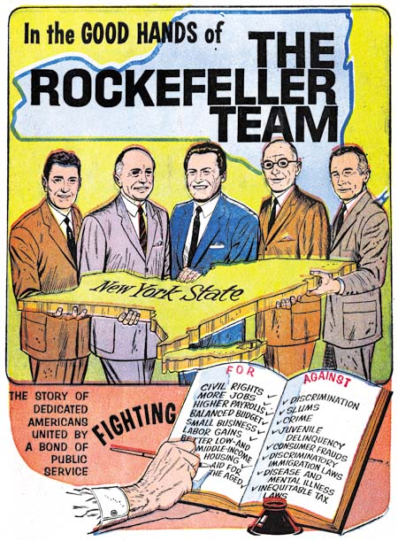
“The Rockefeller Team”, art by Joe Simon, script by Martin A. Bursten

The above image is from the cover but like all examples that I provide here the covers were done on the same newsprint paper as the rest of the comic book. The individuals shown are, from left to right, Judge John P. Lomenzo, U. S. Senator Jacob K. Javits, New York Governor Nelson Alodrich Rockefeller, N. Y. Attorney General Louis J. Lefkowitz, and N. Y. Lieutenant Governor Malcolm Wilson. Actually those are the titles they had at the time, but some went on to hold other positions. For instance Nelson Rockefeller was selected to be U. S. Vice President with Gerald Ford after Richard Nixon resigned from the presidency. The comic book is undated but had to been done between 1959 when Nelson first became Governor and 1974 when he left that position to become Vice President.


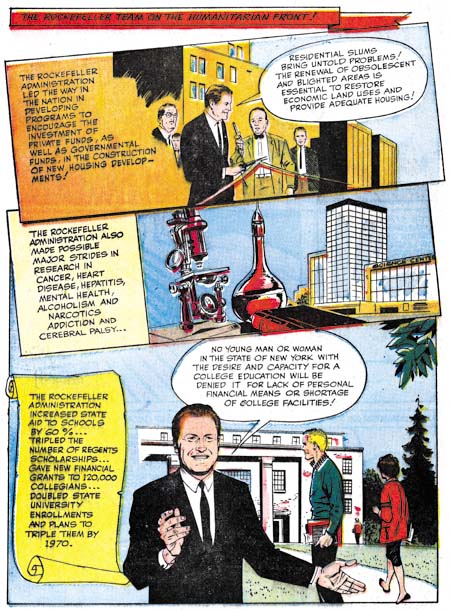
“The Rockefeller Team”, art by Joe Simon, script by Martin A. Bursten

The art for all these comics was done in a realistic style which is not unexpected given the political purpose they were created for. They are all short in length having only 8 pages (including the cover). Generally the layout have the standard comic book panels, but occasionally, as shown above, a more interesting panel arrangement is presented.


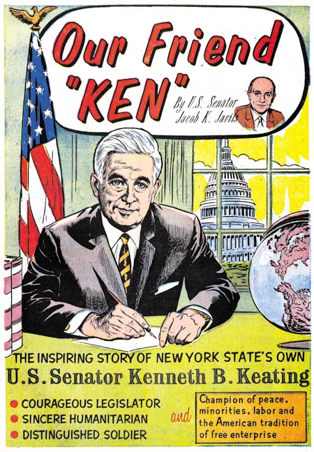
“Our Friend Ken”, art by Joe Simon, script by Martin A. Bursten

The Ken of this comic is Kenneth B. Keating, U. S. Senator from 1959 until 1965 when he lost the seat to Robert F. Kennedy. This provides a narrower period for when the comic was published and Keating’s absence from “The Rockefeller Team” suggests that comic was produced after 1965.

Joe Simon is credited with the art to both of these comics while the script is by Martin A. Bursten. This is the same Bursten whose name appeared in “Mercury in the 20th Century” (Red Raven #1, August 1940) that Jack Kirby drew which previously led to the mistaken idea that the name was an alias of Jack’s. In “The Comic Book Makers” Joe explains that he did this political comic book work on a free lance basis for Bursten’s advertising and public relation firm. The name of that firm was Burstein and Newman and was located in Marty’s home in Great Neck. Both “The Rockefeller Team” and “Our Friend Ken” were produced by Country Art Studios in Woodbury, which is where Joe lived at the time.


“Solo en America, La Historia de Louis J. Lefkowitz” art by Joe Simon, script by Martin A. Bursten, translation by Dr. Carmen Marrero

Lefkowitz appears a little older then in “The Rockefeller Team” so I believe this was done even later. There are no art credits in this comic but the style is so similar to the others that I have no doubt that Joe Simon was responsible for it as well. Unfortunately I cannot read Spanish so I am unsure if this was just a translated version or if the comic was made specifically for a Hispanic reader.
These three are the only political comics by Simon that I have seen. But given their use in political campaigns their survival is even more unlikely then standard comics. These copies were all given to me by Joe himself and I have never seen examples anywhere else. But although Joe liked to keep copies of his work for his own collection that does not mean that these were the only ones he did. Perhaps others will eventually be found.

Joe Simon’s Career in Advertising

In the comments to my post on Joe Simon, Art Director Steven Brower asked whether Joe Simon worked in advertising as an art director. I did not answer Steven then because I decided it was time I wrote a little about Joe’s career outside of comics.


Interior of a folded brochure for Cyder House

There were a number of comic book artists who made the transition into advertising. Generally those that did ended up working for some advertisement agency. Joe followed a different route, he established his own company, Northart Concepts Inc., and sold his services. Much of this work was designing brochures and advertisements. This amounted to laying out art, photographs and text where the art was not his own. Perhaps not very exciting but it was bread and butter worked that supplied income.


Advertisement for Miller Cardboard

The above is an example of an ad Simon designed for Miller Cardboard. Joe created a number of advertisements for Miller. This is an interesting connection because most of the Simon and Kirby art was done on illustration boards manufactured by Miller or King. There is an ad Joe did, I believe for King, which unfortunately I cannot locate right now. In it Simon endorses the illustration board and says he used them to create comic book characters. The ad is provided with a drawing of a patriotic superhero that looks very much like, but is not identical, to Captain America.


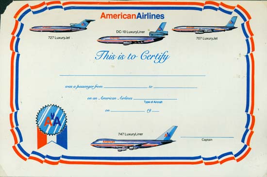
Certificate for American Airlines

Most of Joe’s customers were small clients, too small to have their own art department. But Simon also did some work for large businesses such as American Airlines. The above is certificate Joe did. Today air travel is so common it is hard to imagine a day not that long ago where a company might give a certificate to a customer for taking a flight.


Dust Jacket for Pageant Books (missing back portion)

Joe Simon even did some book cover designs. Pageant Books is still in business today.


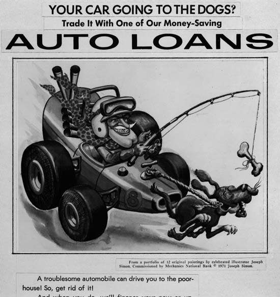
Auto Loan Advertisement for Mechanics National Bank

Sometimes Joe would provide the art as well. In the early ’70s Joe did a number of illustrations for Mechanics National Bank. The Internet provides information about Mechanics National Bank but this all seems about a particular bank building in Philadelphia. I believe Joe’s art was for banks in New Jersey. These are among his best work but are unknown to comic book fans. Joe still has the original art but unfortunately I have not scanned any of it yet. Instead I will use some copies Joe made of some of the ad layouts. The original art is all nicely colored but these particular layouts were done in black and white.

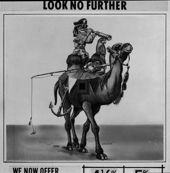
Advertisement for Mechanics National Bank

The Mechanics National art all uses the same character. Occasionally Joe refers to him as Forester Bill, but most commonly as Hector Protector. The name comes from a nursery rhyme:

Hector Protector was dressed all in green;
Hector Protector was sent to the Queen.
The Queen did not like him,
Nor more did the King;
So Hector Protector was sent back again.

The humor found in these Hector Protector pieces is obviously related to that found in Sick. There is, however, a greater emphasis on the odd juxtaposition of imagery; here a ship caption with his anchor, fishing rod and parrot atop of a camel in the desert.

A Brief Pause

The deadline for a Simon and Kirby project I am working on is approaching. It is a deadline I fully intend to meet. Unfortunately that means I really do not have time for much of a post this week, but I will return next week to more typical postings. However I did not want to leave my visitors without anything to look at…


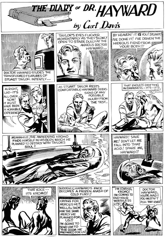
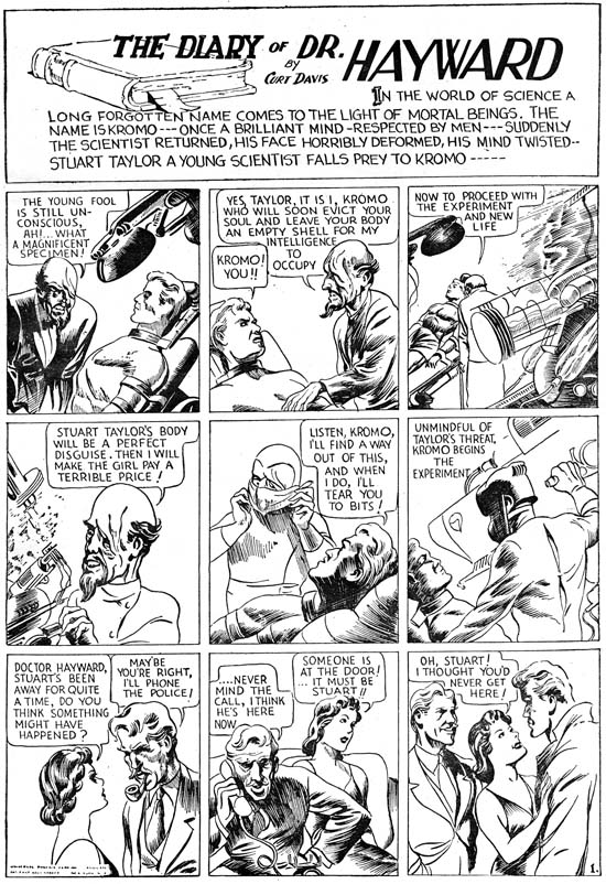
“The Diary of Dr. Hayward” by Jack Kirby

This is one of the works that Kirby did for the Eisner and Iger studio. I believe it appeared in Jumbo Comics #3 (November 1938) but my scan is from a sales print. The existence of such sales prints indicates that despite Will Eisner later comments, the main objective of the studio he formed with Jerry Iger was to market new syndication strips. Their appearance in titles such as Jumbo Comics was just a means of generating income in the mean time. The Eisner and Iger studio did later provide art specifically created for comic book, most famously for Marvel Mystery #1 Wonder Comics #1.

This particular strip is unusual for Kirby. In most of the work that Jack did for Eisner and Iger the backgrounds were uninked white or used a simple grey tone dot screen. In this case Kirby uses a variety of background inking. It would seem that he is experimenting on the effects of the different techniques. Most of these inking methods would not become part of Kirby’s inking style in the years to come.

Jumbo Comics Addendum, Kirby Or Not?


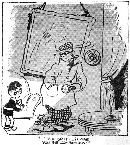
Jumbo Comics #1 (September 1938)

Stan Taylor mentioned this gag cartoon that he believed was by Jack Kirby. I have to admit I do not share his opinion, but I thought I would include an image so everyone can see it. Identifying early work by Jack Kirby can be particularly troublesome and opinions can be expected to differ.

Jumbo Comics


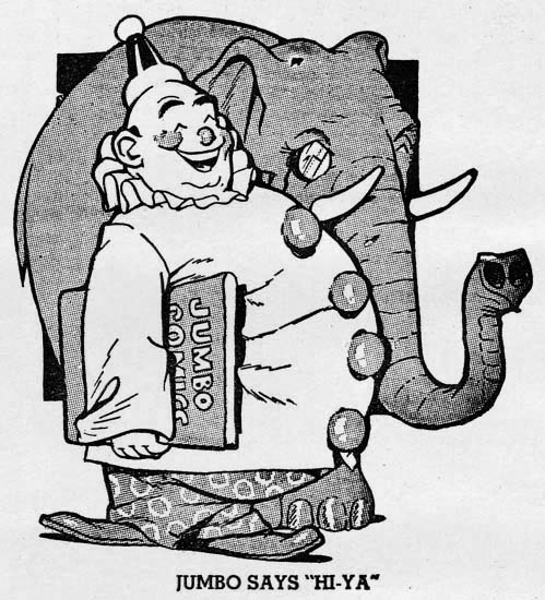
Jumbo Comics #1 (September 1938) Jumbo, the mascot

Will Eisner and Jerry Iger teamed up in 1936 or 1937 to become one of the first studios to provide complete comic book packages to publishers. Previously comic books were largely reprint compilations of newspaper syndication strips. Years later Will Eisner said that he believed there would not be enough syndications material available to meet the rising demand for comic books and so there would be a market for new material created specifically for comic books. That may have been true but one of Eisner and Iger’s packages Jumbo Comics #1 (September 1938) published by Fiction House was actually composed of syndication strips. I have no idea on how many of the strips from Jumbo Comics #1 had previously appeared in newspapers but at least some of them had been printed in the British magazine Wags. Others may have truly been new creations but in a format showed that they were meant for syndication strips.

Jumbo Comics certainly lived up to its name as it was printed in what is called tabloid size (10.5 by 14.25 inches). Except for the cover, no color was used. Perhaps to compensate for the lack of color, the paper used came in two tones; one the normal “white” and the other dyed a pinkish color. (I have removed the page color from all images presented in this post.) All pages followed the same format. There would be a title panel that would normally occupy the entire top of the page although sometimes a single story panel might be included. Below would be three or four rows of panels with three panels per row (occasionally two panels would be combined to form a longer one). While there would be three or four pages provided for each title, all pages would have the same format including the title.


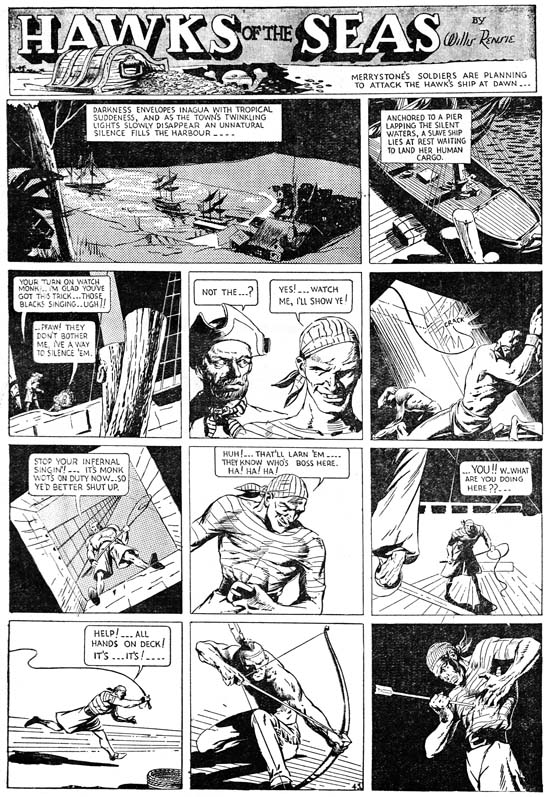
Jumbo Comics #1 (September 1938) “Hawks of the Sea” by Will Eisner

Will Eisner was very conscious about the small size of his operation. While Eisner was involved in many aspects in the making of the strips found in Jumbo Comics but, his name appears on none of them. However, in the title “Hawks of the Sea” is credited to Willis Rensie; Rensie is Eisner spell backwards. This is years before his famous work on the Spirit, but here Eisner is already an accomplished comic artist. Note Eisner’s dramatic use of sifting perspective. As we will see, a number of the artists appearing in Jumbo Comics who would later achieve great fame but none of them supplied art at that time with quite the quality as found in “Hawks of the Sea”.


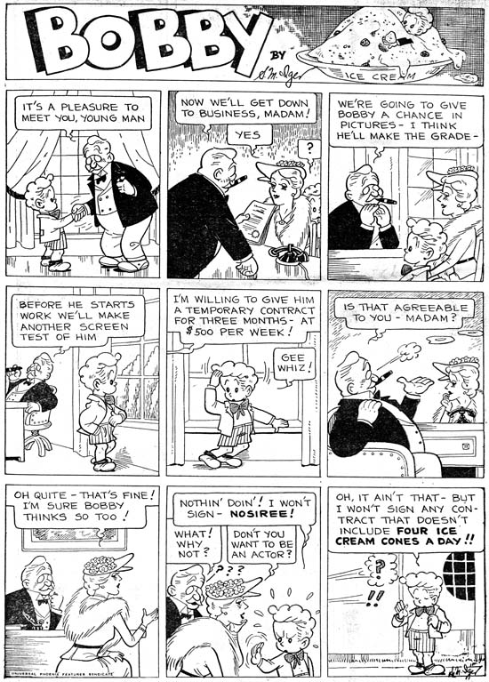
Jumbo Comics #1 (September 1938) “Bobby” by Jerry Iger

“Bobby” is credited to S. M. Iger, but surely that must be an alias for Jerry Iger. Iger was supposed to have been the salesman of the Eisner & Iger partnership, but here he shows how talented artist he was as well. Or it would if we can be sure that this piece was actually done by Jerry. In an interview (The Jack Kirby Collector #16) Eisner said that Iger was not a good artist but he could letter. Was this sour grapes about a former partner or realistic evaluation? I have no way of knowing. It all depends on whether “Bobby” was really done by Iger.

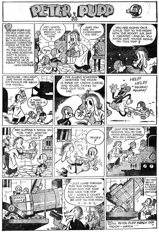
Jumbo Comics #1 (September 1938) “Peter Pupp” by Bob Kane

Bob Kane was a high school friend of Will Eisner, so his presence in Jumbo Comics is not surprising. Batman did not debut until May 1939 so Kane almost certainly did not yet have his studio of ghost artists that he became famous for in later years. I have always found the earliest Batman art, presumably done by Kane, as stiff and rather unappealing. Because of that “Peter Pupp” is quite a surprise. Granted it is of the funny animal and not the hero genre but it shows a suppleness totally absent from Batman. Mickey Mouse would seem to be an obvious inspiration for this strip. I particularly find amusing how the villain’s minion sports Mickey Mouse ears.


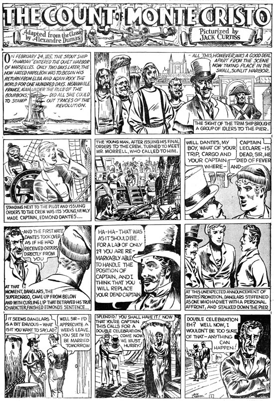
Jumbo Comics #1 (September 1938) “The Count of Monte Cristo” by Jack Kirby

Jack Kirby has said that his first published comic book work be for Wild Boy Magazine, although I do not believe anyone has been able to confirm that. The earliest work that can be confirmed is probably “The Count of Monte Cristo” which appeared in the British magazine Wags in March 1938. These Kirby strips were used again in Jumbo Comics #1. The name Jack Kirby was one he adopted later while his birth name was Jacob Kurtzberg but in this strip he signed his name as Jack Curtiss. By any name this was a far cry from the work Jack would do in just a few years. Even though Kirby’s art would progress much further, his art in Jumbo Comics shows that he already was a very gifted artist, better then most of his peers.


Jumbo Comics #1 (September 1938) “The Diary of Dr. Hayward” by Jack Kirby

Jack also drew “The Diary of Dr. Hayward” this time under the name Curt Davis. While “The Count of Monte Cristo” was based on the book by Alenandre Dumas, the Dr. Hayward strip was all new writing. It is hard to be sure, but the plot seems to be similar to those Jack would write later and so I credit the scripting here to Kirby as well. Without the classic trappings of “The Count of Montet Cristo”, Jack seems quite comfortable both in art and script with the more science fiction story of Dr. Hayward. A handsome hero, a mad scientist and body switching it all provides a setting for a morality tale about good versus evil.

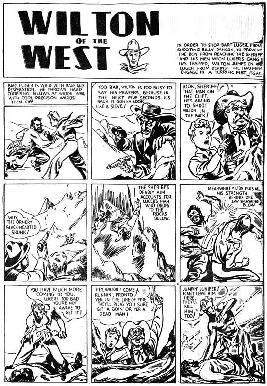
Jumbo Comics #1 (September 1938) “Wilton of the West” by Jack Kirby

It would seem two strips were not enough for the already prolific Kirby as he did a western as well but this time without signing it. It is here that we can see that while Kirby had a way to go before he reached his full potential, he already had developed his predilection for slugfests. The smashing blow depicted in panel 6 is done in a manner far from his signature style but it still embodies Kirby’s enthusiasm. He may not have mastered his use of exaggerated perspective but look how Jack has in panel 7 the hero bend at the torso while thrusting his face forward so that no neck is seen. It is the beginnings of a pose that would become Jack’s trademark.


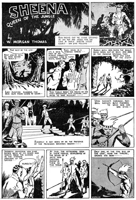
Jumbo Comics #1 (September 1938) “Sheena Queen of the Jungle” by Mort Meskin

Of all the strips present in Jumbo Comics, the most enduring was “Sheena Queen of the Jungle”. It would eventually dominate the long running Jumbo Comic (1938 to 1953) as well as achieving its own title. Sheena even became a television show (1955) and a movie (1984). The title block credits Sheena to W. Morgan Thomas but this was just one of the pseudonyms adopted by Will Eisner to hide the small size of his studio staff. For the Sheena strips in the Jumbo Comics the artist was Mort Meskin as can be seen by the signature in the final panel. This is the earliest published work by Meskin that I am aware of. While not as polished as Will Eisner or Jack Kirby, Mort’s art already has an energy to it. Look how he composes the figures of the armed natives in panel 6 all on the left side of the panel and on the right in panel 8. Over and over in these strips you can see Meskin’s concerns about how to graphically tell a story. It may be the start of his professional career, but Mort already had his own unique vision.


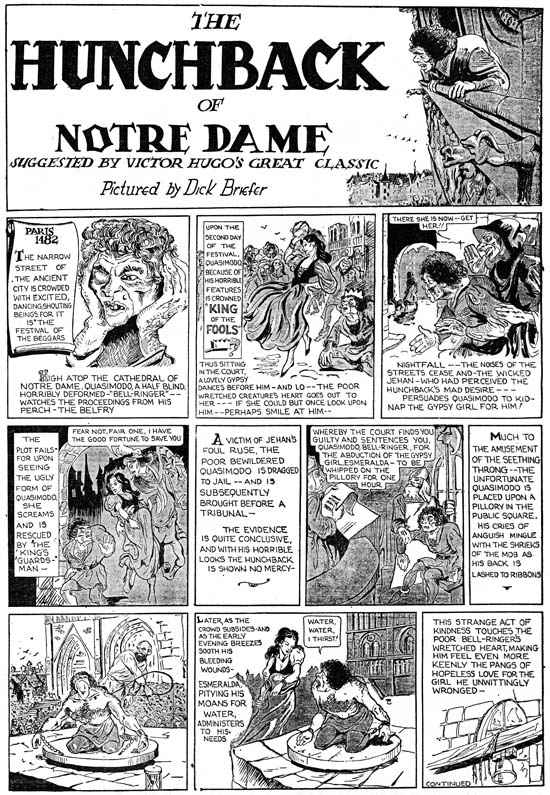
Jumbo Comics #1 (September 1938) “The Hunchback of Notre Dame” by Dick Briefer

It is hard to recognize some of the artists appearing in Jumbo Comics when you are only familiar with their later work. This is especially true with the first strip of “The Hunchback of Notre Dame” by Dick Briefer. What makes this particular strip so unlike some familiar work by Briefer is mainly the detailed pen work so different from the simpler and more fluid inking found much later in Briefer’s Frankenstein. One thing to note is that while the other artists reviewed in this post had adopted a very grid-like panel layout, Dick’s use of caption boxes and panels breaks from that familiar rigid pattern.


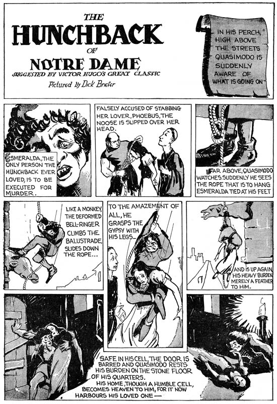
Jumbo Comics #1 (September 1938) “The Hunchback of Notre Dame” by Dick Briefer

The fine inking was abandoned immediately after the first strip and the results make it much easier to recognize Briefer’s participation. I choose to use the fifth strip but in terms of technique it does not differ from the second. But what a great page! While Dick is no longer using the same captions he still deviates from a grid panel layout. Note how the fifth panel was extended vertically down into and how the last panel really is two panels in the same boarder separated by a caption.

There are other strips in Jumbo Comics #1 done by talented artists that are unsigned. Considering the pretenses Eisner maintained of a larger shop there is a good possibility that they some were made by Eisner himself deceptively adopting another style. Or perhaps assigning the finishing or inking to a different artist. I am sure Eisner provided direction to all the artists working for him but I am just as certain that did not include laying out the art. Each of the artists reviewed here had their own unique manner of graphically telling the story which would not have been true if they were working from layouts. It is amazing to see so much talent, albeit in its earliest flowering, in one comic book. Jack Kirby would be also included in Jumbo Comics #2 and #3 for his work on “The Diary of Dr. Hayward” and “Wilton of the West”. Mort Meskin would work on “Sheena Queen of the Jungle” even longer (at least until issue #5). Bob Kane and Dick Briefer would also make further appearances. Eventually Jumbo Comics would abandon its oversize format and adopt a more standard comic book content but for a while it was a most unusual comic book.

“Tales of the Implosion” Available Again

I understand that reprints of Thomas Lammers’ “Tales of the Implosion, A History of the 1957 Atlas Implosion” are available once again. This work originally appeared in Alter Ego #49 (June 2005) but Tom expanded on it and added tables for his self published reprint. This is the best investigation available of the Atlas Implosion, the upheaval that forced the company that was to become Marvel Comics to cancel numerous titles and restrict their output. In relationship to the theme of this blog, this period is important in what it reveals about Jack Kirby’s return to being a freelance artist after the break-up of the Simon and Kirby studio. I frequently reference it and consider “Tales of the Implosion” one of the finest, most scholarly pieces of comic book history. It has my highest recommendation and at $12 is a steal. To order email Tom Lammers at tlammers@new.rr.com.