Category Archives: Kirby, Jack

Police Trap #2


Police Trap #2 (November 1954), pencils and inks by Jack Kirby

A cover similar in concept to that used for the first issue. This time the muster room is portrayed:

This is where the officers relax, unbutton their jackets, have their shoes shined, smoke, bull session, rough-house, write reports, and just ease up after a hard day on the beat…

But would we really expect a muster room to have a shoe shine stand or a drunk sleeping it off? But perhaps the most unusual feature of this cover is one easy to overlook. Look carefully at the third policeman from our left, he is African American. Race did not play an important part of Simon and Kirby productions. When other races were depicted, most often it was Asians but otherwise Simon and Kirby comics were almost uniformly populated by whites. African Americans were generally invisible as they were in many popular media of the day. One glaring exception was Whitewash from the Young Allies a Simon and Kirby creation for Timely Comics. However stereotypical and (to modern eyes) objectionable characters like Whitewash were not part of Simon and Kirby productions that preceded or followed Young Allies. Further Whitewash seems to be delegated small rolls in the splashes from Young Allies that were actually drawn by Jack Kirby (Young Allies and the L Word). This suggests that the presence of Whitewash in Young Allies was not due to Simon and Kirby idea but dictated by someone else. As for the Police Trap #2 cover it is not at all obvious that the policeman was drawn by Jack Kirby as an African American but rather it was the colorist who made him so. Unlike their other comics where the coloring was the responsibility of the publisher, Simon and Kirby were the actual publisher of Police Trap and therefore they were responsible at some level for the coloring. I do not know if Joe or Jack actually colored this cover but minimally they assigned the colorist and approved the results.


Police Trap #2 (November 1954) “The Hoodlum”, pencils and inks by John Prentice

“Usual suspects” Bill Draut and Mort Meskin are absent from the second issue of Police Trap but it does contain the third of the regular Simon and Kirby artists, John Prentice. John does his typical excellent job on the art. Perhaps my only criticism is that he has made the two policemen too similar in appearance. At times I find it difficult to determine who is being represented as for example the last panel of this page.
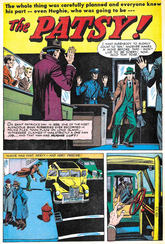

Police Trap #2 (November 1954) “The Patsy”, art by unidentified artist

In the past I have never come up with even a guess on who did the art for “The Patsy”. But on reviewing it now I find parts, just parts, that remind me of Bob McCarty. For instance the man on the extreme left of the splash panel. But there are other parts that seem so untypical for McCarty such as the unusual perspectives found the last two panels on the same page. I am unable to make sense of this combination of aspects that look like McCarty and those that do not so I continue to leave the attribution as unidentified.
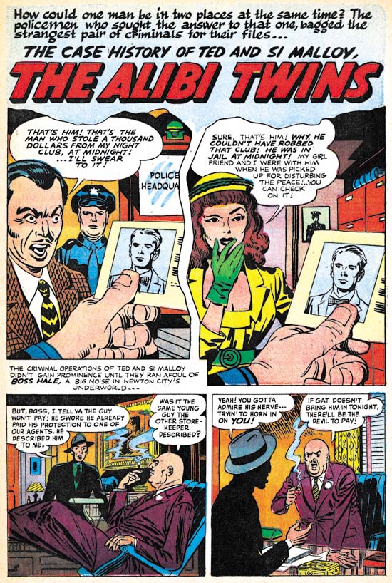

Police Trap #2 (November 1954) “The Alibi Twins”, two panel splash penciled and inks by Jack Kirby, rest of the story by unidentified artist

Except for the covers and one pinup, Jack Kirby did not supply much art for Police Trap until the latter issues. But obviously Jack was still playing his normal roll as untitled art director. Here Kirby provides the first two panels, effectively combining to form a splash, for a story otherwise executed by another unidentified artist. While the vast majority of the stories in Simon and Kirby productions were completely drawn by one artist, it was not that unusual for Kirby to provide the splash either.

The story artist is another of those that appeared only briefly in Simon and Kirby productions of this period. Note the rather bizarre inking in the last panel. The man is completely blacked out except for the hat and his hands. This story is a little longer (9 pages) than most found in Police Trap which were usually 4 to 6 pages long. Further the focus of the story is on the criminal, not the police as was normally the case for this title. Add the unusual lettering in some places (in particular the use of a script for the first letter of captions) and this suggests that the piece may not have been commissioned by Simon and Kirby but instead picked up from some failing comic book publisher.


Police Trap #2 (November 1954) “Desk Sergeant”, pencils and inks by Jack Kirby

I have recently discussed “Desk Sergeant” (The Police Trap Pinup) so will skip commenting on it here.
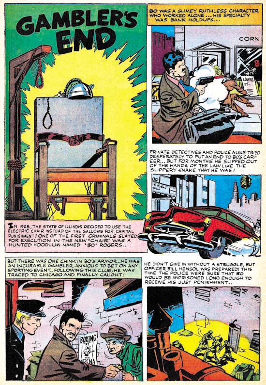

Police Trap #2 (November 1954) “Gambler’s End”, art by unidentified artist

A short two page piece by an unidentified artist. Unusual use of the first letter of some of the captions (for instance the bold ‘I’ in the splash caption) suggests that this story may also have been picked up from some failed comic book publisher.
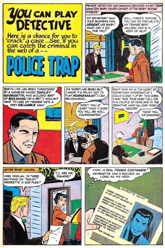

Police Trap #2 (November 1954) “Police Trap”, art by unidentified artist

Another short two page piece by an unidentified artist. A lot of talking heads. A better artist might have been able to carry it off but this one is too stiff and the result is a rather uninteresting story. I have detected nothing unusual about the lettering so this piece might have been commissioned by Simon and Kirby.
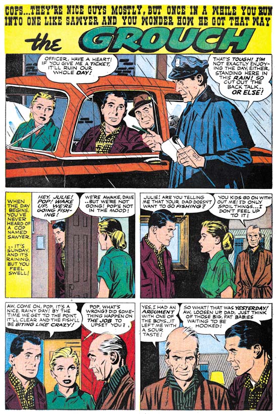

Police Trap #2 (November 1954) “The Grouch”, pencils and inks by John Prentice

Prentice opens and closes this issue of Police Trap. Actually he is the artist who really carries this issue what with a rather minimal contribution by Jack Kirby and none by Bill Draut or Mort Meskin. All the other artists are just nothing more than adequate. So in effect Prentice pretty much carries this issue.

Police Trap #1, Title for the Heroes


Police Trap #1 (September 1954), pencils and inks by Jack Kirby

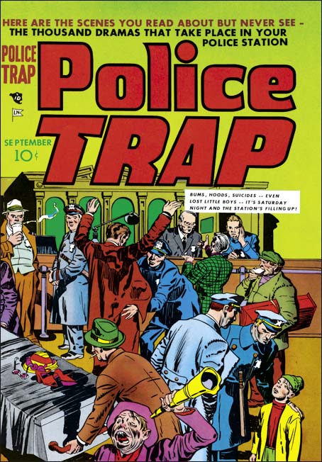
Crime comics received a lot of undesirable attention during their heyday. It is generally acknowledged now that this criticism was pretty much unwarranted but at that time it accepted by most of the public. One criticism was that crime comics glorified the criminals. Again any modern reader would see that this clearly was not the case, at least for the great majority of crime comics and especially for those that had been produced by Simon and Kirby. But Joe and Jack were well aware of this criticism and so when they launched their own publishing company, Mainline, they included a title Police Trap where the focus was not on the criminals but rather on the police.


Police Trap #1 (September 1954) “The Capture”, pencils and inks by Mort Meskin

Mort Meskin was one of the “usual suspects” of artists that contributed frequently to Simon and Kirby productions. He not only arrived in the studio in time to provide art for some of the crime comics produced by Simon and Kirby but he also continued to supply art for the titles even after they were no longer put together by Joe and Jack (Criminal Artists, Mort Meskin). However this would be the only piece that Mort drew for Police Trap. In fact Meskin typically prolific output seems to have decreased greatly at about this time. He would continue to supply work for the Prize romances but very little for any of the Mainline titles.


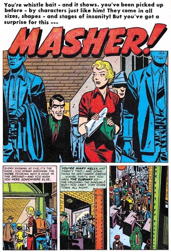
Police Trap #1 (September 1954) “Masher”, pencils and inks by Bill Draut

“Usual suspect” Bill Draut drew and inked “Masher”. Draut is most famous for his romance art but he does a fine job on this story. This is probably the most unusual story of this issue and certainly my favorite. The main protagonist is a female police officer. On a personal note my great grandmother was one of the earliest female detective of the New York Police Department. Unfortunately I know very little about her career but among other things she was used as a decoy. She was not very tall but when it came time to apprehend someone she would hold on to them so tightly that the suspects would be unable to escape before her backup arrived to secure the arrest.


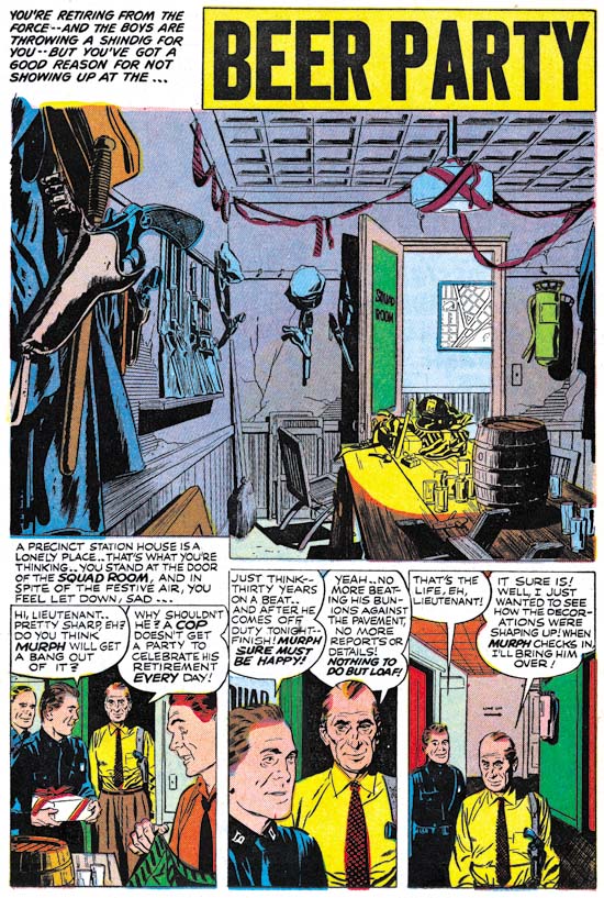
Police Trap #1 (September 1954) “Beer Party”, pencils and inks by John Prentice

John Prentice was also a regular contributor to Simon and Kirby productions which means this issue of Police Trap has all the usual suspects. Prentice first work for Joe and Jack appeared in a May 1951 issue of Young Love and he continued to provide art up until the end of the Simon and Kirby studio. John was used primarily for romance comics but he did provide some art for Black Magic. Unfortunately Simon and Kirby were no longer producing crime titles at the time of Prentice’s first appearance but John did so some really nice work in the crime genre prior to that. So “Beer Party” marks a much appreciated return of Prentice to crime. With some nicely handled action and such beautiful art, what is not to like? I particularly love the splash panel. Nobody appears in the splash but it still is a marvelous portrait. Missing plaster and cracked walls show how run down the police station has become. If anything the minimal decorations seem make the room even more depressing. The title captions talks about a shindig but obviously this was going to be a rather small affair. But could you image having a beer party inside a police station today?


Police Trap #1 (September 1954) “The Grafter”, art by unidentified artist

At this time Simon and Kirby were producing four Mainline and four Prize titles. Most of the titles were bimonthlies except for Young Romance and Young Love which were monthly. I suspect producing these titles and running Mainline required a lot of effort for both Joe and Jack. The amount of art that Kirby penciled seems to have dropped and his only contribution to this Police Trap issue was the cover. Further artists new to Simon and Kirby productions make their appearance. One such artist provided the art for “The Grafter”. I cannot claim to be very excited about art but he did an adequate job.


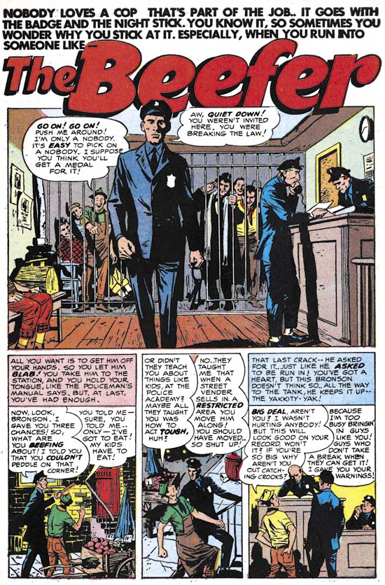
Police Trap #1 (September 1954) “The Beefer”, pencils and inks by Joaquin Albistur

I have recently discussed the part that “The Beefer” played in relationship to the pinup used in Police Trap #2 (The Police Trap Pinup). This story and two others that appeared in Young Romance and Young Love marked the first appearance of Joaquin Albistur in the Simon and Kirby studio. Most of the artist that appeared during this period made rather limited contributions to Simon and Kirby productions but Albistur would provide much work for the relatively short period that he was employed by Joe and Jack (13 months).

It Ain’t Soup


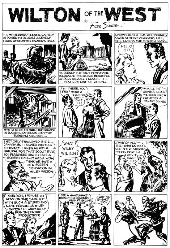
Wilton of the West, pencils, inks and letters by Jack Kirby

Mark Evanier provides an image of a Campbell’s Soup on his blog can when he announces that he is too busy to continue normal posting. It seems I have developed my own tradition, one where I use a scan of a Kirby page from Jumbo comics (see A Brief Pause and Another Brief Pause). Last weekend found me struggling with some particular difficult restorations while remaining determine not to let my schedule slip. In the end I kept to my schedule but was left without any spare time to initiate a post for this blog. So instead I provide a scan of Wilton of the West. This was one of the syndication strips that Kirby did for the Eisner and Iger studio. Some were used in early issues of Jumbo Comics but the image I provide was scanned from a presentation piece which provided higher quality reproduction.

I find Kirby’s work for Eisner and Iger particularly interesting because they show Jack in the process of learning his trade. I know there are some fans who continue to insist that Kirby had already reached a high level of skills but to me this was clearly not the case. Had Kirby’s comic career ended with his work for Eisner and Iger he would have become nothing more than a footnote in the history of comics. Talking heads dominate this page which would have presented a problem for any comic book artist. Kirby tries to keep it interesting by changing the viewing distance as well as adding various props. Jack was not completely successful in this attempt but you can tell he is trying. The page ends with a fist fight. Kirby was famous for his slugfests but here the depicted punch seems rather awkward. The inking is improved over the last page I presented. Kirby varies his inking depending from darker panels such as the first and fourth to simpler lighter ones such as the eighth panel. Here Kirby is still a long way from his mature inking style but that is what makes these pages so interesting. Jack did the lettering as well. Kirby’s lettering here is adequate but nothing more. While his lettering would improve somewhat, Jack never became a master letterer. But then again I cannot think of any golden age comic book artist that was good at both drawing and lettering.

My schedule will remain pretty tough over about the next month so I cannot guaranty that I will not be forced to put up a Jumbo scan again. However I hope that will not be the case because my recent post on the Police Trap pinup reminds me that I have not yet covered that title.

The Police Trap Pinup

For the most part pinups did not play an imported role in the Simon and Kirby repertoire. The most import exception was Boys’ Ranch where double page and inside cover pinups were present in each issue. Other than those from Boys’ Ranch there were only two other pinups that I can think of. One appeared in Win A Prize #1 (February 1955). I have discussed that one previously (The Wide Angle Scream, Almost an Afterthought). While I would not dismiss out of hand Joe’s explanation that the piece was originally meant for Captain America #11, there are a number of details that suggest a later date. Therefore the genesis behind that piece of art remains an unresolved issue.

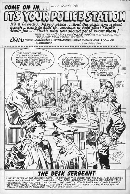
Police Trap #2 (November 1954) “It’s Your Police Station”, pencils and inks by Jack Kirby

The other Simon and Kirby pinup appeared in Police Trap #2 (November 1954). It is a great pinup with a marvelous cast of characters. Each person depicted in the foreground was given a distinct personality. A complete story is presented in this single panel with the added touch of Simon and Kirby humor. Kirby not only drew the art but did the inking as well. I believe it is one of the relatively few pieces that Jack also did the outline inking, a job normally assigned to others.

The top caption declares this is the first of series of Police Trap pinups of various police officers. However no further pinups were ever placed in the subsequent issues. Nor were pinups found in any other Mainline titles (Win A Prize was published by Charlton). The natural question is why this one?


Police Trap #1 (September 1954) “The Beefer”, pencils and inks by Joaquin Albistur

The explanation can be found in the first issue of Police Trap. That issue contains the story “The Beefer” with art by Jo Albistur. Albistur was from Argentina and seems only to have worked in the United States for brief period. His time working for Simon and Kirby lasted a little over a year but it was very productive period for him. Frankly I am unimpressed by some of the art I have seen that he did for other comic book publishers but he is one of may favorite Simon and Kirby artists. “The Beefer” opens with constant complaining of an arrested street peddler. Kirby would often create a cover based on a story from the same issue but illustrated by another artist. The similarity between “It’s Your Police Station” and “The Beefer” indicates that is what happened here and this pinup was originally intended as the cover for Police Trap #1.


Police Trap #2 (November 1954) “It’s Your Police Station”, pencils and inks by Jack Kirby, original art

The original art for this pinup still exists. It is very unusual for work by Simon and Kirby in that art was constructed from three pieces. The top caption, the art, and the bottom caption are on different illustration boards taped together on the back. In the future Joe Simon would frequently construct art from various separate sources but up to this point such techniques were rarely used. The explanation in this case is that since the art was initially meant for a cover the original top probably had the comic book title. Probably as an expediency this was just cut off. Since Joe and Jack often recycled their work this title may have been used for some other cover. The original art for some of the Police Trap covers still exist and it would be It would be interesting to see if any of them were constructed from two pieces of illustration board. The original bottom of the art was probably not sufficient for the desired caption so it was trimmed as well.


Police Trap #1 (September 1954) “The Beefer”, pencils and inks by Jack Kirby

The Police Trap #1 cover that was published in place of “It’s Your Police Station” is certainly a fine piece of Simon and Kirby art. The portrayed scene shows a multitude of characters each carefully handled. The caption actually seems a little superfluous since the art is all that seems to be needed to tells the individual stories. Yes, this is cover art at its very best. That is not to say that the art for “It’s Your Police Station” was any bit inferior. The most distinct disadvantage for the pinup had was that it was very specific to a single story, “The Beefer”. While Simon and Kirby often took that approach to a cover, they undoubtedly considered that the new comic should be launched with a cover that reflected on the theme of the title and not a particular story. With all the criticism cast at crime comics, Simon and Kirby wanted to emphasize that the police were subject of this new comic not the criminals. This police centric theme is superbly provided by the published cover.

True Kirby Kolors and Simon Too

It has been a couple of years since I discussed the topic of Kirby Kolors (Kirby Kolor, a Kirby Myth and Kirby Kolors, Revisited). Here I though I would write about some true Kirby Kolors, although they are rather special cases.


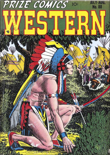
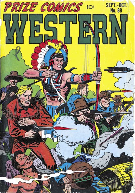
Prize Comics Western #88 (July 1951) pencils by John Severin


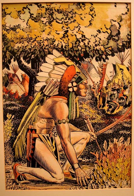
Prize Comics Western #88 (July 1951) pencils by John Severin, original art colored by Jack Kirby

Recently Kirby scholar and former assistant Steve Sherman sent me some scans of comic art still in the possession of the Kirby family. The one I show above was the original art for the cover of Prize Comics Western #88 (July 1951). This art was not done by Jack Kirby but instead was penciled by John Severin. Bill Elder inked much of the work that Severin did for Prize comics but I cannot say if that was the case here. But the thing that makes this work truly unusual is the coloring that has been applied. The color guides provided to the printers were originally done on silver prints of the line art, not on the original art itself. That this was true in for this cover can be seen on the many differences between the art and the published cover. For instance the original art shows American Eagle with a bright orange band in his head piece that was colored blue or cyan on the published cover. The teepees in the background of the art show a variety of colors while on the actual cover they are all light orange. The bush in the lower right corner has three colors in the art but a single green on the printed version.

The original art for the #88 cover has an overall reddish tone. This was not the original intent of the colorist but is the result of deterioration over time. The colors were applied to the art using dyes as opposed to a pigment based material. While direct sunlight should always be avoided with colored art, those based on dyes are particularly susseptical to damage by light. The presence of matting in the above image suggests that is what happened here. While there is good reason to believe that originally blue and green played a much more important part presently only some limited areas of green are left and even they seem to be rather dingy. I believe that the very faint pink band in American Eagle’s head piece was originally a bright blue.
While the colors have changed there is still much that can be seen in the original art. In particular notice how American Eagle’s skin tone is varied to suggest volume. Volume was also suggested in the published cover although the details are very different (as I said the coloring of the original art was not done as a color guide). Such use of gradient coloring was not that unusual for comic book covers at that time as the greater quality printing of covers allowed for such effects.
 

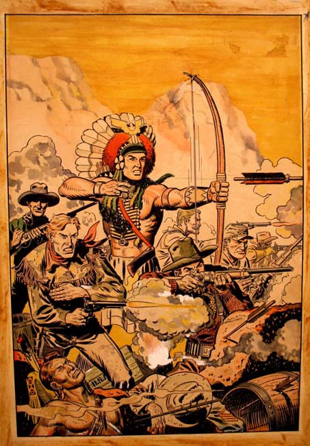
Prize Comics Western #89 (September 1951) pencils by John Severin


Prize Comics Western #89 (September 1951) pencils by John Severin, original art colored by Jack Kirby

The original art for the Prize Comics Western #89 cover (September 1951) is similarly colored and shows the same deterioration. Again it is the blue and perhaps green colors that were most affected. Note the soldier that has collapsed at the bottom of the image. His uniform appears grey except for the lowest part of his left arm where the blue survives.

It may seem odd that Jack Kirby would have these two pieces of art in his own collection. After all it does not appear that Simon and Kirby had produced the art for Prize Comics Western other then supply a couple of covers (for PCW #75 and #83, April 1949 and August 1950 respectively). However Prize Comics did not have a seperate bullpen. The colorist that Prize employed, Joe Genalo, did his work in the Simon and Kirby studio. I suspect that art for Prize Comics Western was delivered to the studio as well. Jack would certainly have a chance to see that art and pick up a couple of nice covers after their usefullness to production had ended. Original art was not highly valued at that time.


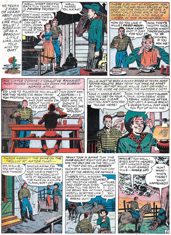
Bullseye #5 (April 1955) “Tough Little Varmint” page 2, art by unidentified artist


Bullseye #5 (April 1955) “Tough Little Varmint” page 2, art by unidentified artist, original art colored by Jack Kirby (image provided by Steven Brower)

The Severin covers were not the only pieces of art from Jack Kirby’s collection that had been colored. The first two pages from “Tough Little Varmint” (Bullseye #5, April 1955) were also originally owned by Kirby and had been covered. Fortunately the dyes have not deteriorated very much if at all. A comparison with the published version shows even more clearly that the coloring was not meant for use as a color guide. Not only are there some rather unusually coloring present there is also frequent use of different color tones on what normally have been a single color. For instance the pants of the man in the background of panel 1, the face of the eating man in panel 2, or the face of the background man in panel 4.

The case that the above works were colored by Jack Kirby is not completely air tight. However there are other pieces that pased through Jack’s hands that are similarly colored so it seems quite likely that he colored all of them. Nor was it only other artists that Kirby colored, he did so on some of his own pieces as well. A nice Boys’ Ranch double page pinup can be seen in that great site What if Kirby (see the site’s Boys’ Ranch #4).


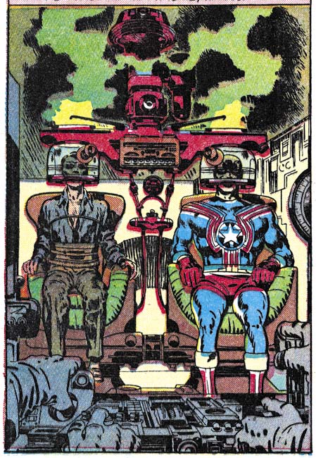
Fighting American #1 (April 1954) “Break The Spy-Ring” page 7 panel 3, pencils by Jack Kirby


Fighting American #1 (April 1954) “Break The Spy-Ring” page 7 panel 3, pencils by Jack Kirby, original art colored by Joe Simon

There is another Simon and Kirby piece of original that has been colored. The above Fighting American art was originally conceived as a cover for the first issue but instead ended up as an oversize story panel. Some have claimed that this piece also was colored by Kirby but there are problems with that attribution. When Simon and Kirby’s collaboration ended this piece belonged to Joe Simon. Joe eventually reworked the image to use as a cover for Sick #42 (February 1966). But the proof of the correct coloring attribution comes from a photograph that Joe Simon has showing him at work coloring it. An examination of an enlargement of the photo shows that coloring was not yet finished with the blue missing from Fighting American’s costume. The coloring of the original art must have been done prior to the Sick cover since except for the replaced Speedboy the coloring between the two are identical.

Jack Kirby’s “In the Days of the Mob”

Simon and Kirby produced crime comics during two periods; for Prize and Hillman (1947 to 1951) and for their own publishing company Mainline (1954 to 1955). Perhaps the genre was already in decline but after the introduction of the Comic Code crime comics all but disappeared. I know that Justice Traps the Guilty continued to be published until 1958, but were there any other crime comics that lasted long under the Comic Code? It would seem that crime was pretty much a forgotten comic genre until Jack Kirby did In the Days of the Mob for DC in 1971.

Was In the Days of the Mob ahead of its time, another example of Kirby’s visionary genius? It, and the sister publication Spirit World, were very different than all the other comics released at the time. Different in size and printing. Not the normal comic book size but that of a magazine. And not the normal comic book coloring but all with tones of black. Mark Evanier, an assistant to Jack at that time, has said that it was Kirby’s idea to produce a more adult oriented comic. The magazine size therefore makes sense since it would allow the title to escape the Comic Code censorship. Which was clearly necessary if the stories were going to be anything stronger than the mild superhero comics that dominated the industry at that time. Evanier has also said that Kirby’s intentions were that In the Days of the Mob would be printed in color and that the gray wash that the magazine was subjected to was DC’s idea. It certainly seems like a visionary idea since In the Days of the Mob was years ahead of Heavy Metal (first appearing in 1977) another magazine size comic for a more adult audience.

But what about the stories? Was Kirby looking at the future there as well? Right away the reader is presented with Warden Fry, warden of Hell. Fry will introduce the stories and provide a link between each. Using a character as a spokesperson for a comic had been done before but perhaps not always so well as In the Days of the Mob. The interior is largely one long graphic sequence. Page numbering is for the entire magazine and not for the individual stories. Only the splash pages give notice of the start of the next tale. This is a magazine meant to be read in the order that it is produced.


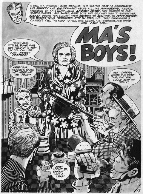
In the Days of the Mob (Fall 1971) “Ma’s Boys”, pencils by Jack Kirby inks by Vince Colletta

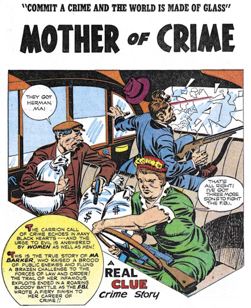
The first story is “Ma’s Boys” a tale of Ma Barker and her criminal sons. Jack had told this story before, or more accurately Simon and Kirby had. “Mother of Crime” had appeared in Real Clue Crime Stories (volume 2 number 4, June 1947). I have briefly discussed it before (Crime’s Better Half) and it was include in Titan’s “The Best of Simon and Kirby”. Since these stories are supposed to be real, it would not come as much of a surprise that there are similarities between the old and the newer versions of the story. But actually it is obvious that there is much more than a casual connection between the two because in the Simon and Kirby version Ma Barker relates her story from hell. Undoubtedly in 1971 Jack’s inspiration came from the Simon and Kirby story. He not only retold the story he expanded the use of hell from this single story to become a theme for the entire magazine.

The story of Ma Barker as gang leader may have been fiction but one that did not originate from Simon and Kirby. While Ma traveled with the gang, surviving members insisted she took no part in the planning or executing the crimes. They claimed that such matters were not even discussed in her presence. It was said that the story was fabricated to protect the public image of the FBI after it was found that they had killed an elderly mother.


Real Clue Crime Stories v. 2 n. 4 (June 1947) “Mother of Crime”, pencils and inks by Jack Kirby


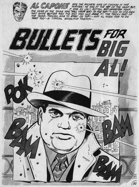
In the Days of the Mob (Fall 1971) “Bullets for Big Al”, pencils by Jack Kirby inks by Vince Colletta

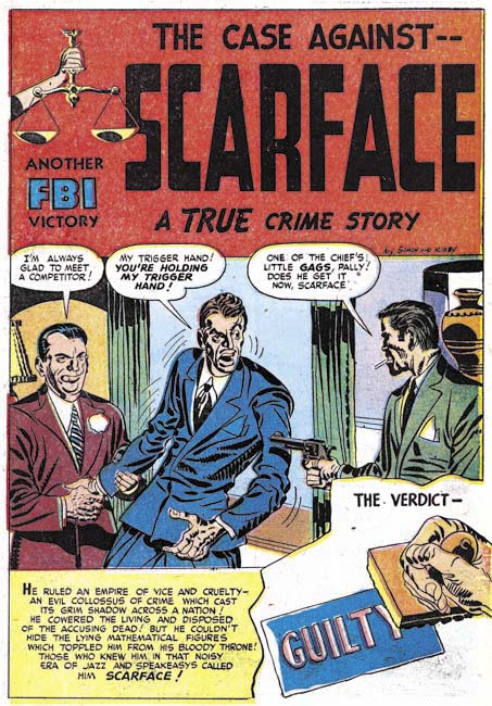
The next story from In the Days of the Mob is about Al Capone. It turns out that Simon and Kirby had done a story about Capone as well called “The Case Against Scarface” (Justice Traps the Guilty #1, October 1947). However the story that Jack did for In the Days of the Mob is not the same one covered by Simon and Kirby. So while the older story might have gotten his creative juices flowing, Jack ended up with an entire new tale. By the way “The Case Against Scarface” also appears in “The Best of Simon and Kirby”.


Justice Traps the Guilty #1 (October 1947) “The Case Against Scarface”, pencils and inks by Jack Kirby


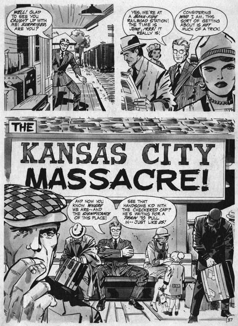
In the Days of the Mob (Fall 1971) “The Kansas City Massacre”, pencils by Jack Kirby inks by Vince Colletta

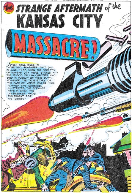
The third story, “The Kansas City Massacre”, was also one covered by Simon and Kirby (“The Strange Aftermath of the Kansas City Massacre”, Headline #26, September 1947). Solo Kirby concentrated on the massacre itself while Simon and Kirby covered that and also the events that followed. Kirby’s later version went in more detail than what was done earlier by Simon and Kirby but basically it is the same story.


Headline #26 (September 1947) “The Strange Aftermath of the Kansas City Massacre”, pencils and inks by Jack Kirby


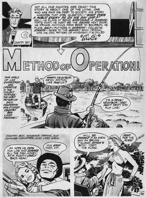
In the Days of the Mob (Fall 1971) “Method of Operation”, pencils by Jack Kirby inks by Vince Colletta

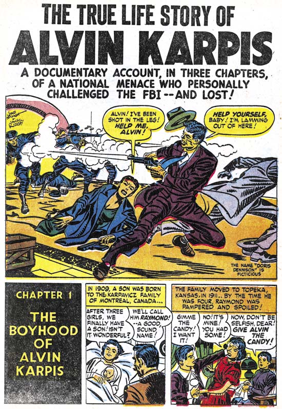
The final story that Kirby did for In the Days of the Mob was an unusual one called “Method of Operation”. The story is about a gangster whose fondness for fishing leads to his arrest by the head of the FBI, J. Edgar Hoover himself. The oddest thing about the story is Jack refers to the criminal as “country boy” and nowhere does Kirby actually identify him. However there is no doubt that country boy was Alvin Karpis. By this point it should come as no surprise that Simon and Kirby had previously done a story called “The True Life Story of Alvin Karpis” (Justice Traps the Guilty #2, December 1947).

The official story is that J. Edgar Hoover did in fact arrest Karpis, grabbing Karpis before he was able to get a rifle from the back seat. However Karpis claimed that Hoover never appeared until the FBI agents already had him safely in custody. However the fact that the car Karpis was driving did not have a back seat certainly casts doubt on the FBI version of the story. Of course this awkward detail never made it into either the Simon and Kirby or the solo Kirby stories.


Justice Traps the Guilty #2 (December 1947) “The True Life Story of Alvin Karpis”, pencils by Jack Kirby

It seems clear that with In the Days of the Mob Jack Kirby was looking back to when he was collaborating with Joe Simon. This is not at all surprising. Kirby came to work for DC because he did not receive the credit he felt he deserved during his time at Marvel. Further Kirby was unhappy with the changes that Stan Lee would impose on some of his creations. Kirby sought and obtained from DC a greater control over what he produced. The sort of control he had while he was collaborating with Simon. So it was natural for Kirby to think about and use as inspiration some of the more successful Simon and Kirby efforts. That is not to say that In the Days of the Mob were just a repeat of the Simon and Kirby crime comics. None of the specific text or imagery for Kirby’s crime magazine appears to have been lifted from the earlier Simon and Kirby efforts. Kirby completely redid the stories to fit his 70’s vision of how comics should be done. His art is full of impact. As for his writing, well let us just admit that his scripting was not, as still is not, universally admired. With In the Days of the Mob, Jack Kirby was both a visionary looking forward to a new market and a reactionary looking back on successful early creations. What Kirby was not, in this case, a man of his time. DC did not know what to do with Kirby’s new crime magazine and had no faith in it at all. The title was cancelled before the second issue was ever printed.

In closing I would like to add a note about the inking of In the Days of the Mob. Vince Colletta has been criticized, quite rightly in my opinion, for the liberties he took in erasing pencils in order to speed up inking. However Colletta’s inking in this title seems very solid and not at all overbearing. I like it very much. Which is more than I can say about the final ink wash used.

Tom Field has written about In the Days of the Mob as well (Jack Kirby Collector #16). Also Bob has covered it in The Jack Kirby Comics Weblog.

Criminal Couples

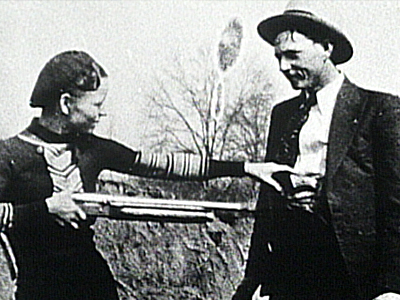
I had previously discussed how crime by women was handled by Simon and Kirby (Crime’s Better Half). However here I would like to briefly discuss the criminal couple, much rarer perpetrators of crime in Simon and Kirby or real life. The most famous today would be Bonnie and Clyde. Bonnie Parker and Clyde Barrow and other members of their gang were active between 1932 and 1934. It was the fact that they were a couple that projected Bonnie and Clyde into national infamy. The gang really were not very talented criminals. They only rarely robbed banks and never got much for their efforts for their few attempts. Generally Barrow gang robbed smaller institutions like grocery stores and gas stations. They were cold blooded killers quick to use their weapons against lawmen or civilians alike. Frankly the Barrow gang without Bonnie would not a received much attention outside of Texas.


The real Bonnie and Clyde hamming it up (1933)

During one quick get-a-way, the Barrow gang left behind a some rolls of film. The photographs that came from the developed film were sensationally. Among them were shots of Bonnie holding up Clyde at gun point and another of Bonnie with a cigar and a gun. These photos of the gang fooling around were just that, nothing more than fiction. Bonnie did not participate much in the actual crimes and she did not smoke cigars. But the photos provided a lot of national publicity and played an important part in the legend that followed.


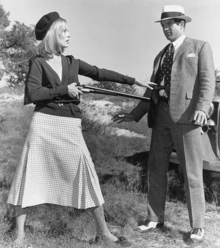
Faye Dunaway and Warren Beatty from Bonnie and Clyde (1967)

And Bonnie and Clyde did become a legend with two movies and one made for TV movie; the Bonnie Parker Story (1958) and the more important Bonnie and Clyde (1967) and Bonnie & Clyde, the True Story (1992). Eighty years later they are still well known.


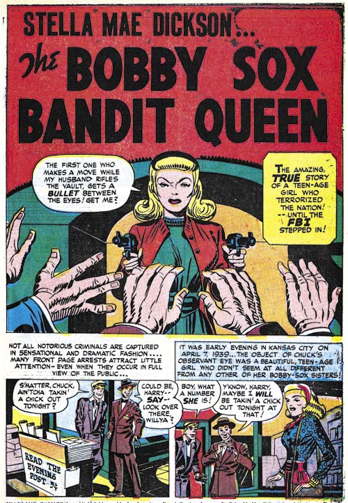
Headline #27 (November 1947) “The Bobby Sox Bandit Queen”, pencils and inks by Jack Kirby

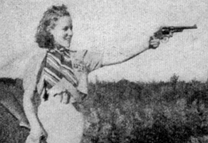
While Bonnie and Clyde may have been the most famous criminal couple Simon and Kirby never featured them in any crime comic. There was, however, another criminal couple that were made into a Simon and Kirby story; Stella Mae and Bennie Dickson in “The Bobby Sox Bandit Queen” from Headline #27 (November 1947). Stella and Bennie were not as famous (or infamous) as Bonnie and Clyde. They were reported in the press of the day but as far as I know no movies were ever made based on them. But in many ways they were a much better criminal couple then Bonnie and Clyde. For one they were much more successful in robbing banks. In one bank hold up they got away with about $47,000. Not bad by today’s standards but pretty good during the depression and much better than the Barrow gang ever did. One bank robbery by Bonnie and Clyde got them $115. And while Bonnie posed with a gun for pictures but was not really participate much in the actual crimes, Stella was very handy with a gun and a big asset in the robberies. In fact her sharp shooting of a police car’s tires during a chase allowed the criminal couple to make a clean get-a-way.


Stella Mae Dickson

It is easy to see why Simon and Kirby picked Stella Mae and Bennie for a story but why did they never do a story on Bonnie and Clyde? Could it be the rather gruesome end that Bonnie and Clyde had under a barrage of bullets? Seems doubtful since Joe and Jack had depicted similar deaths in the past and did show Bennie Dickson’s comparable end. No, I think the real reason Bonnie and Clyde were off limits as far as Simon and Kirby were concerned was due to their marital status, or more precisely lack thereof. Stella Mae and Bennie were legally married, Bonnie and Clyde were not. That Bonnie and Clyde were unmarried, romantically involved and living together added spice to their story. But while that sold papers it was not the sort of thing that many would consider appropriate for a young audience. Dr. Wertham may have declared that comic books corrupted their youthful readers but Simon and Kirby were really more careful about what they included in the comic stories they created than their critics would admit. Still I would have loved to have seen what Simon and Kirby would have done with Bonnie and Clyde.

Simon and Kirby Firsts, Part 2


Captain America #4 (June 1941) “Ivan the Terrible” page 8, pencils by Jack Kirby.

Not so long ago I posted Simon and Kirby Firsts. What I had to say about Simon and Kirby first was a work in progress and hoped that my readers would correct any mistakes that I made. Well diligent Marty Erhart met my challenge and pointed out that there was an earlier Simon and Kirby story splash then the two I had reported on. So “Ivan the Terrible” in Captain America #4 (June 1941) appears to be the first Simon and Kirby story spalsh. It had already been clear that Simon and Kirby were not the first to do a full page splash and in my previous post I reported the finding that the honor seem to go to Bob Kane and Jerry Robinson for a story from Detective #39 (May 1940). Well Marty beat that as well by pointing out that Siegal and Shuster had done a full page splash for a Slam Bradley story from Detective Comics #1 (March 1937). You can see it in Wikipedia. So kudos for Marty Erhart for his great work.

In my previous post I had also remarked that Simon and Kirby were not the first artists to do a double page splash as I had remembered an earlier example from a Ka-Zar story in Marvel Mystery Comics. However I no longer remember which issue it was. Well sleuth Brian Cronin took my imprecise memory and nailed it down in Comic Book Legends Revealed #309. It was Marvel Mystery Comics #11 (September 1940) that had the Ka-Zar story in question. So Ben Thompson was the first comic book artist to do a double page splash a year before Simon and Kirby. But not only did Thompson do a wide splash his was also a story splash. So Thompson takes that first away from Simon and Kirby as well!

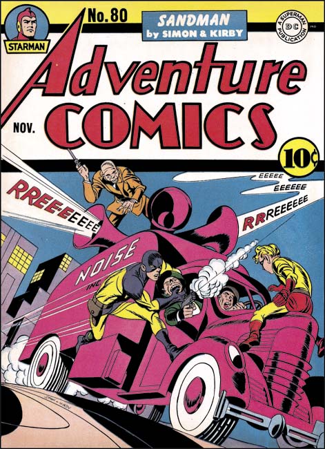
As I have said before it was not the firsts that Simon and Kirby did that made them so important. It was how great they did everything and how influential they were to comic book history. But there do seem to be two firsts that Simon and Kirby still retain. They were the first to create a romance comic book (Young Romance #1 September 1947) and the first artists whose names were used on a cover to promote the comic (Adventure #80 November 1942, to be clear artist signatures do not count).

Simon and Kirby Firsts

I have a busy schedule with little spare time for wandering around the Internet. However there are a handful of blogs that I try to keep up with and one of them is Comics Should Be Good on the Comic Book Resources. They came to my attention when I was asked to do a guest blog there a little over four years ago (Simon and Kirby Meet the Shield). I am surprised they had found me out since at the time my Simon and Kirby Blog had a miniscule following. I have been following their blog ever since and I am particularly a fan of Comic Book Legends Revealed. I try to stop by once a week but sometimes my schedule just does not allow even that infrequent of a visit. That is what happened to me some weeks (before my undesired sabbatical) and so I was caught completely unaware of a recent entry for Comic Book Legends Revealed. One legend that Brian Cronin discussed was “Jack Kirby was the first comic book artist to draw splash pages” which he answered quite correctly as false.

I will discuss the subject of Simon and Kirby splashes further below but Brian’s post brought to mind the whole question of Simon and Kirby firsts. Not necessarily that Simon and Kirby did these firsts before other comic book artists but I will try to discuss that aspect as well. I should also admit that what I present here is a first attempt and by no means a definitive list. There is so much Simon and Kirby material that it would be easy to miss some earlier example. So I look at this as a work in progress subject to correction. Perhaps some of my readers can correct my mistakes.


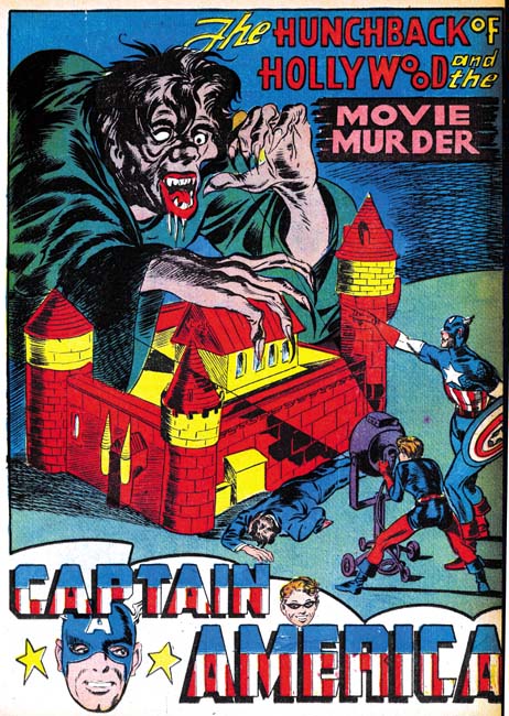
Captain America #3 (May 1941) “The Hunchback of Hollywood and the Movie Murder”, pencils by Joe Simon

So back to the question of Kirby or Simon and Kirby splash pages. Now I believe we have to be careful with our definitions. Besides references to liquids, a dictionary will define a splash as displaying conspicuously. Therefore one can say that any oversized panel in a comic book could be a splash. This is however a somewhat trivial definition and this type of splash appear well before either Kirby or Simon began doing comics. But Cronin’s question was about “splash pages” and by this I believe he means a full page splash without any story panels. Simon and Kirby have a long history of spectacular full page splashes. I believe the first full page splash by Simon and Kirby was “The Hunchback of Hollywood and the Movie Murder” from Captain America #3 (May 1941). But as Cronin points out full page splashes appeared in Detective Comics #39 (May 1940) so unless someone can come with an earlier example Bob Kane and Jerry Robinson should get the credit for that first.


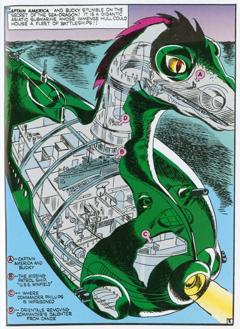
Captain America #5 (August 1941) “The Gruesome Secret Of The Dragon Of Death” page 8, pencils by Jack Kirby (from “Captain America, the Classic Years”)

Jack Kirby was famous for his interior splashes, that is a splashes that not just an introduction but are part of the story itself. The earliest example I am aware of is found in “The Gruesome Secret Of The Dragon Of Death” from Captain America #5 (August 1941).


Adventure #75 (June 1942) “The Villain From Valhalla” page 8, pencils by Jack Kirby

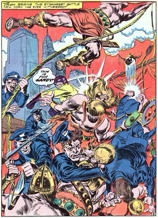
However I suspect some readers will find the Captain America example unconvincing as this splash seems more like a diagram than part of the actual story. In that case the next example would by “The Villain From Valhalla” from Adventure Comics #75 (June 1942). And what a fantastic example it is, one of my favorite splashes. But is this truly the first interior splash page? I can by no means claim to have made a thorough search but I have never seen one earlier. In fact I cannot remember any other golden age artist doing it. So this might, just might, be a first for Simon and Kirby.


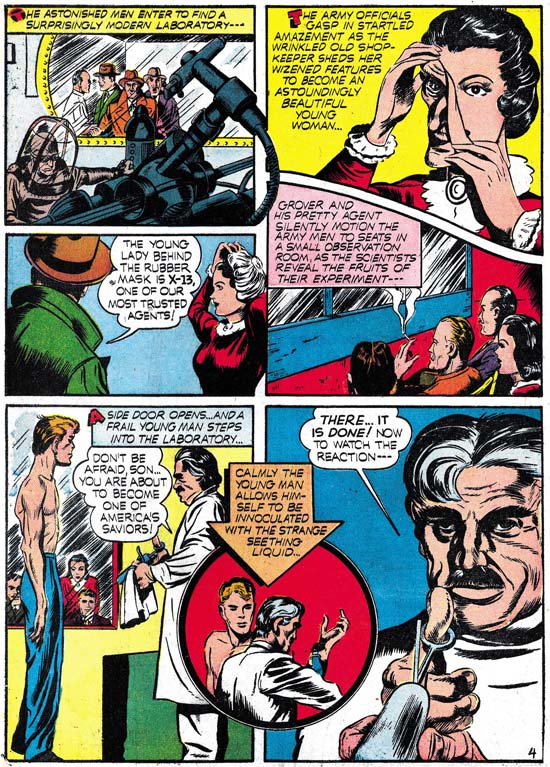
Captain America #1 (March 1941) “Meet Captain America” page 4, pencils by Jack Kirby

One of the things Simon and Kirby were famous for, at least early in the collaboration was the use of unusually shaped panels. I fear looking for the earliest Simon and Kirby use of irregularly shaped panels might end up in endless hair splitting. How far off from a rectangular does a panel have to be before it can be declared irregular in shape. So instead I went searching for Joe and Jack’s earliest use of a circular panel. Simon and Kirby’s first use of a circular panel was on page 4 of “Meet Captain America” from Captain America Comics #1 (March 1941). Circular panels played an important roll in Simon and Kirby productions until about 1947 when they were phased out (along with irregular panels as well). But were Simon and Kirby the first to introduce circular panels? Nope. It has been pointed out to me that circular panels appeared in earlier Batman stories. I cannot say when they started to use circular panels but Bob Kane and Jerry Robinson may have been responsible for that first as well.


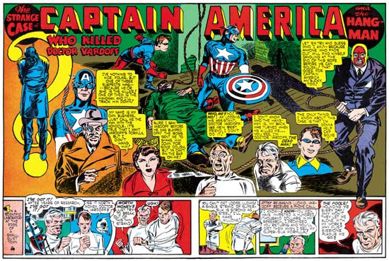
Captain America #6 (September 1941) “Who Killed Doctor Vardoff”, pencils by Jack Kirby
Larger Image

Simon and Kirby have often been cited as the first to do double page splashes. Their first wide splash appeared in “Who Killed Doctor Vardoff” from Captain America #6 (September 1941) (see The Wide Angle Scream). However I am pretty certain that Simon and Kirby were not the first comic book artists to do a double page splash. I clearly remember seeing a Kazar story from an earlier Marvel Mystery Comics although I do not remember the artist or what issue it appeared in.


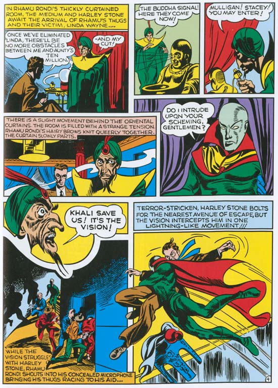
Marvel Mystery #15 (January 1941) “The Vision” page 4, pencils by Jack Kirby (from “Golden Age Marvel Comics” volume 4)

Another early technique that Simon and Kirby became famous for was extending figures outside a panel’s border. Done properly (and Simon and Kirby always seemed to do it well) this device could make a page visually exciting. Simon and Kirby used this technique during roughly the same period that they used irregularly shaped panels. The great success of Captain America influenced numerous comic book artists, but like the circular panel, cross panel border figures were probably not done first by Simon and Kirby. I cannot say for sure but I remember seeing earlier comic book art by Lou Fine which prominently showed this technique. Both Joe Simon and Jack Kirby were fans of Fine’s work and its seems probable that they picked up this technique from him. However I have no idea if Fine was the first to do this.


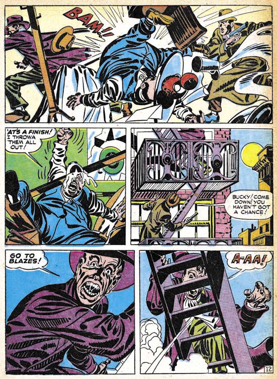
Real Clue Crime Stories, vol. 2 num. 6 (August 1947) “Get Me the Golden Gun” page 12, pencils and inks by Jack Kirby

Simon and Kirby generally inked their work in a blunt manner. After the war they developed a very distinctive style of inking which I call the Studio style. It was characterized by drop strings, abstract arches and most particularly by picket fence crosshatching (Inking Glossary). The picket fence crosshatching seemed to have a sudden appearance in their work. It appears in a fully developed manner and I have yet to find anything like it in early Simon and Kirby productions.


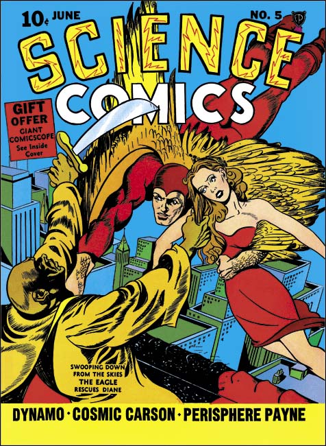
Science Comics #5 (June 1940), pencils and inks by Joe Simon

While picket fence crosshatching may have been unused by Simon and Kirby until they started doing crime comics, Simon used it much earlier before he teamed up with Kirby. The technique can be found in one of the covers Joe did for Fox Comics during his short stay as editor for that company. (It is a little hard to see in the scan above, but the picket fence inking shows up on the right sleeve of the yellow robed individual.) The example shown above may not done in a more refined and smaller manner but it looks very much what would be done years latter. Simon was purposely trying to imitate Lou Fine who had previously done the covers so I would not be surprised if Joe had picked that technique up from Fine as well. I know Will Eisner used picket fence crosshatching but I do not know if he had started using it at this point.


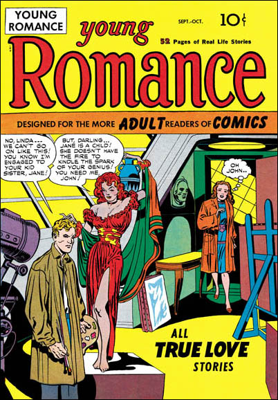
Young Romance #1 (September 1947) pencils by Jack Kirby

There is one first that I do believe truly belongs to Simon and Kirby and that is they were the first to create a love comic, Young Romance. Some have been very adamant in denying this but their case is without merit. Some cite My Date as the first romance comic (which would still give credit to Simon and Kirby) but My Date is a Archie swipe, not a romance comic. Others say Romantic Picture Novelettes was the first romance comic. But that comic was a reprint of the syndication strip Mary Worth was a soap opera and not a romance. And yes there is an important and distinct difference between the two. If that was not bad enough it is not at all clear that Romantic Picture Novelettes was published in 1946 as so often claimed. The comic itself bears no date and no one has supplied any evidence to backup the early date. For a more thorough discussion of this issue see my early post The First Romance Comic.


Adventure #80 (November 1942) pencils by Jack Kirby

Simon and Kirby’s great influence on comic book artists was not based on being the first to use some techniques but rather in doing so many things so well. Simply what makes Simon and Kirby important was they were the first to create really good comics. Now that is a first that is totally subjective and one I am sure some will disagree with and so it would be desirable to use a more concrete accomplishment. And there is one, Simon and Kirby were the first comic book artists whose names were used to sell comics. That is the first artist names to appear on the cover of a comic book. That was a big deal because initially it was characters that sold comics not creators. While other artists may have had their fans, it was Simon and Kirby who first became a brand name for quality.

A Story too Incredible to be Real


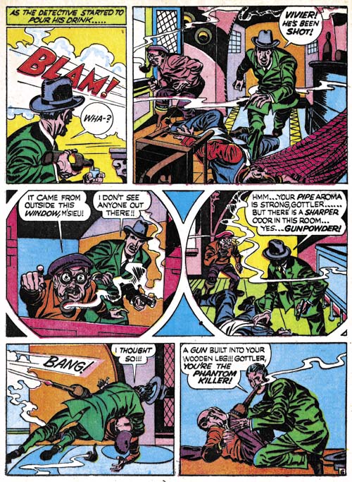
Headline #24 (May 1947) “A Phantom Pulls The Trigger” page 6, pencils and inks by Jack Kirby

They said it on the cover, “All True Famous Detective Cases”. Would Joe Simon and Jack Kirby say that if it was not true? But surely not all the stories in Headline Comics #24 could be true? Who would be credulous enough to believe the tale told in “A Phantom Pulls The Trigger”? A man going about the French countryside killing individuals for the sole reason of keeping the size of the population down? Whose philosophy comes from reading Thomas Malthus’ “Over-Population”? A man who avoids detection by using a gun installed inside his wooden leg? Who after being uncovered and arrested is allowed to keep his now disarmed wooden leg and has friends smuggle in a new gun and bullets? Who uses his re-armed wooden leg right before his execution with unintended results? Who could possibly believe such an incredible story to be true?

Except it was.

Well as true as any story told by Simon and Kirby who seemed to adhere to the philosophy of never letting the facts get in the way of a good story. But the basic facts portrayed in “A Phantom Pulls The Trigger” all appear to be true. There really was a man who went by the names of Herman Gottler and Raoul Croc as presented in the story but not included in the story were his other names Gottlieb Einhalter and Armande Giraud. His armed and deadly wooden leg was so devious that after he had been found in the vicinity of several murders it remained undetected even though he was carefully searched. He undoubtedly would have continued to evade the law for some time had not one of his victims lived long enough to report seeing smoke coming from the end of the wooden leg. After capture, Raoul was quite open about what he had done and why he did it. In fact he attracted a number of admirers. And yes the authorities really did allow him to keep his unarmed wooden leg which Raoul re-armed with the help of his friends. While seated waiting for the executioner’s sword, Raoul aimed his leg at one of his followers and set his pistol off. Only it seems the pistol’s muzzle had become blocked with mud and stone and therefore exploded instantly killing Raoul.

But how had Simon and Kirby come across this story? The events occurred in France during the early part of the 19th century so it was unlikely to have been a object of discussion in New York City during the mid 20th century. A Google search revealed a few possible French links (I cannot read French) but only a single English source. That source was “Howitt’s Journal of Literature and Popular Progress, Volume 1” by William Howitt and Mary Botham Howitt published in 1847 (the story told on pages 103 to 105 and 122 to 125). This does not seem to be likely reading material for either Joe or Jack. Perhaps Jack heard the story told in France while he was there as a soldier during World War II.

“A Phantom Pulls The Trigger” is special not only for its amazing story but also because it had one of the only two double page splashes for a crime comic (The Wide Angle Scream, It’s a Crime);