Category Archives: Hillman

Simon and Kirby Colorists, Chapter 1, Hillman

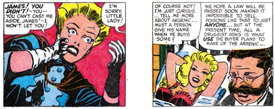
Generally little is known about the comic book colorists during the golden age. Credits usually were not provided and while pencilers and inkers would sometimes leave signatures there was no outlet for colorists to make their contribution known. Occasionally there is documentary evidence about particular colorists but largely they remain anonymous. None the less I have begun to investigate coloring done on Simon and Kirby productions. I may not be able to identify all the colorists but I am still interested in seeing what can be learned about the effect different colorists had upon the comics.

Currently I have been examining interior coloring. Covers were typically handled by different printers than the interior pages. The special paper and attention given to covers allowed the use of colors and tonal gradations that did not appear in the interior art. Both the cover and interior art was printed using cyan, magenta, yellow and black inks (CMYK). In general, CMYK printing allows a wide range of colors to be represented. Actually not every color can be created by combinations of the CMYK inks but those that cannot are a very small part of the color spectrum and are so close to colors that can be printed by CMYK that their absence is difficult to notice.

However the interior art in comic books was printed using a very limited palette. CMYK printing achieves color tones by the amount of area the ink covers. Typically, and this will be true of all the comics I will be discussing here, interior inks were limited to three tones 100%, 50% and 25%. It is possible to use 75% ink tones but printers find it difficult to do properly with the primitive presses and poor quality paper used for comic books. I have seen 75% tones used in comic books but it is quite rare and with a special exception to be discussed below it was not done in the books I will be discussing.

There are further limitations. No tones were used for the black ink. Actually this was not too limiting because black tones, that is the grays, can be achieved using combinations of CMY inks. Another limitation is that none of the comics I will be discussing use 50% yellow. I have seen it done elsewhere but again it is very rare. With three levels of cyan and magenta, two levels of yellow and one level of black it is possible to create at most 48 colors* (including white, the absence of any ink). The palette is actually even more limited in practice since about a dozen are rarely used. Most are combinations that include 25% yellow.


Generalized Comic Color Palette

C, C50, C25, CM50, CM25, X, X, X
M, M50, M25, MY, YM50, YM25, X, X
Y, Y25, M50Y25, M25Y25, X, MC50, MC25, M50C25
CY, YC50, YC25, CYM50, CYM25, CY25, C50Y25, C25Y25
CM, C50M50, C25M25, C50M25, C50M25Y25, C25M25Y25, X, X
MYC50, MYC25, YC50M50, YM50C25, YC25M25, YC50M25, X, X

Referring to colors as, for example, 100% yellow plus 50% magenta plus 25% cyan (brown), is somewhat tiring. The industry uses a designation which I find confusing so instead I will adopt my own using the first initial followed, if not 100%, by the percentage. So my brown example would be YM50C25. I always placed them in the order of dominance or (when two inks are equally strong) the order they are found in CMY. While this is an improvement it is still too difficult to use lists of such color designations when comparing palettes used. So I have also developed a matrix to show the color palettes. I show above the standard color palette that I will be using followed by the corresponding color designations (where an X indicates an unused matrix location shown as black). If a color is not used in a particular palette it will be ‘X’ out in the matrix. The first row is for blues; the second for reds; the third row for yellows, flesh colors and purples; the fourth row for greens; the fifth row for violets and grays; and the sixth for browns and one dirty green (YC50M25). In the future I will either use some of the currently undefined matrix locations or add additional rows for colors not included in the current matrix.


Color Palette used by Hillman in Clue and Real Clue Comics.

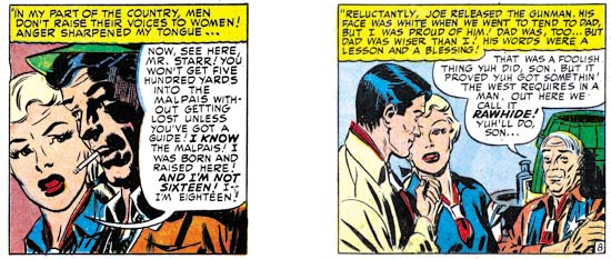
Joe Simon has said that the coloring was the responsibility of the publisher. There was a period (cover dates March to September 1947) where Simon and Kirby were producing work for crime comics from two different publishers; Clue Comics and Real Clue Crime Stories for Hillman and Headline Comics for Prize. It would therefore be interesting to compare the coloring between the two. The Simon and Kirby work produced for Clue and its renamed title Real Clue used a more complete palette than those for Headline. The Hillman work used 38 colors (excluding black and white). But this is a little misleading because some of the colors were rarely used; deep blue (CM50), some of the purple tints (MC25 and M50C25), and red brown (MYC25).


Real Clue Crime Stories v.2 n.5 (July 1947) “The Terrible Whyos”, pencils and inks by Jack Kirby

Perhaps the most distinctive feature of the Hillman palette was the common use of light yellow (Y25). We will see that this color was not used in Prize’s Headline Comics. Considering how most colors that include Y25 are avoided, it is surprising how often light yellow (Y25) was used. In one case Y25 was used for an automobile but it seems a poor choice for coloring prominent objects. However light yellow was generally used for background areas and it was surprisingly effective in making accompanying white areas stand out.

As mentioned previously, red brown (MYC25) was rarely employed but the other browns (dark MYC50, heavy YC50M50, medium YM50C25 and light YC25M25) were more frequently used. However not equally so as light brown (YC25M25) was not used nearly as commonly as the other three browns. Another not so frequently used color was dirty green (YC50M25).


Real Clue Crime Stories v.2 n.7 (September 1947) “Gang War” page 5, pencils by Jack Kirby

Besides light yellow (Y25) the only other unusual colors with frequent use from the Hillman palette are pale green (C25Y25) and dark grey (C50M25Y25). Frankly with the very limited palette available for comic books the presence or absents of particular colors are of limited use in distinguishing different colorists. Also of use is how the artists uses the colors for the different objects. For instance the Hillman colorist generally uses middle green (YC50) for foliage and only much more rarely green (CY) or pale green (C25Y25). Police uniforms are dark blue (CM25) with brown shoes or boots. Caption boxes were colored with a variety of light colors; yellow (Y), light yellow (Y25), pale green (C25Y25), light orange (YM25) and even white. Desks and chairs are usual have a single color; generally dark brown (YMC50), heavy brown (YC50M50) or light brown (YM50C25).


Real Clue Crime Stories v.2 n.5 (July 1947) “The Terrible Whyos” page 4, pencils and inks by Jack Kirby

Most golden age colorists were more concerned with providing clarity to a scene by providing the different objects with distinct colors. Realistic coloring was not a high priority. So with the Hillman colorist we get such oddities as multi-color sidewalks, pale green buildings and some really bizarre interiors. Not very realistic, but all more interesting than if a more realistic, and therefore more limited, selection of colors were used.


Real Clue Crime Stories v.2 n.6 August 1947) “Get Me the Golden Gun” page 13, pencils and inks by Jack Kirby

As previously mentioned, golden age colorists did not generally use graduated color tones for interior art. That is colors were restricted to mixtures of 100%, %50 or %25 of the cyan, magenta or yellow inks. But there was an exception to this rule and that was the use of simple color gradient usually to the background. The Hillman colorist made use of this varying a one ink of a color from 75% to 25%. Usually this was done rather smoothly but occasionally less care was taken. This was the sole exception that the Hillman colorist made to not using a 75% ink. The use of a starting value of 75% was not a whim. With the primitive presses used for comic books, 75% would sometimes fill in and become effectively 100%. If this happened to a gradient that started at 100% then a poor gradient would result with over much of it a pure color. With gradients starting at 75% any similar filling in would still provide a suitable gradient.

Although I have concentrated on the coloring of the Simon and Kirby pieces, the same colorists seemed to work on the stories drawn by other artists as well. The pencilers and inkers for Clue and Real Clue were used in other Hillman comics and were not the same ones that Simon and Kirby used for Prize’s Headline Comics. I therefore believe that Simon and Kirby were just supplying art to Hillman and not producing the entire comic as they were doing for Prize. I will compare the Hillman colorist to that used for Prize’s Headline Comic next week.

footnotes
* the complete comic color palette for three levels of cyan and magenta, two of yellow and a single of black. Those marked with asterisk are not shown in my standard comic palette:

K        CMY25*      CM
C50MY    C50MY25*    C50M
C25MY    C25MY25*    C25M
MY       MY25*       M
    
CM50Y    CM50Y25*    CM50
C50M50Y  C50M50Y25*  C50M50
C25M50Y  C25M50Y25*  C25M50
M50Y     M50Y25*     M50

CM25Y    CM25Y25*    CM25
C50M25Y  C50M25Y25   C50M25
C25M25Y  C25M25Y25   C25M25
M25Y     M25Y25      M25

CY       CY25*       C
C50Y     C50Y25      C50
C25Y     C25Y25      C25
Y        Y25         W

Posted in 2011/03, 5 Studio, Hillman, Periods, S&K Colorists, Serial Posts, z Archive | Tagged , | 1 Comment

The Gangs of New York

Simon and Kirby crime tales, at least the earlier ones, were based on true stories. In a recent post I wrote about Simon and Kirby’s “Let Me Plan Your Murder” and the serial killer H. H. Holmes on which the story was based. I noted differences between the story which Joe and Jack presented and the facts that can be found on the Internet. These differences could be explained either as “poetic license” or inaccurate sources. Unfortunately there is no way to decide between the two explanations without knowing the actual sources used by Simon and Kirby. I remember reading somewhere (but regrettably I am not sure where) that one of the books Simon and Kirby used was “The Gangs of New York” by Herbert Asbury (1928). The book covers New York’s criminal elements from 19th to the early 20th centuries. Apparently this book was quite popular as there were four printings in the first year alone.


Clue Comics vol. 2 no. 1 (March 1947) “King of the Bank Robbers”, pencils by Jack Kirby

One of Simon and Kirby’s first entries in the crime genre was “King of the Bank Robbers” which was about George Leonidas Leslie. The same title was used for Chapter 10 of Asbury’s TGoNY. Asbury’s presentation pretty much matches the story depicted by Simon and Kirby. The main difference between the two takes is that Asbury went into more details than Simon and Kirby. However Joe and Jack embellished the facts to make it more of a story.


Real Clue Crime Stories vol. 2 no. 5 (July 1947) “The Terrible Whyos”, pencils and inks by Jack Kirby

Another example of a story taken from TGoNY was “The Terrible Whyos”. Without Asbury’s book a reader might doubt the accuracy of some of the things presented by Simon and Kirby. For instance in the story of perspective new member to the gang being rejected because he had not killed anyone. This might seem like an exaggeration but according to Asbury:

It has been said that during their period of greatest renown the captains of the Whyos would accept no man as a member until he had committed a murder, or at least had man an honest effort to thus enroll himself among the aristocracy of the underworld.

At one point Pike Ryan presents a poster showing the business rates, that is what to charge for commissioned crime ranging from blackening eyes to “da big sleep”. In the book Ashbury describes how when arrested Pike Ryan was found to have just a list and while the wording is not identical the rates were just as Simon and Kirby provided.


Real Clue Crime Stories vol. 2 no. 4 (June 1947) “Dandy Johnny Dolan”, art by unidentified artist

Simon and Kirby where not the only ones making use of Ashbury’s TGoNY. “Dandy Johnny Dolan” had no involvement from Simon and Kirby. While it just does not have the Simon and Kirby magic touch, it still is a rather nicely written and drawn story. But once again the events found in the story match what Ashbury presents in TGoNY, particularly how a cane Dolan took off one of his victims lead to being arrested for the crime.

All the comic book artists that used “The Gangs of New York” took liberties with the facts presented by Ashbury. In some case just to make a better story but in other cases because the true facts might be a little bit too much even in those pre-Comic Code days. Simon and Kirby might present some woman as a gangster’s girl friend but in reality she might have been a prostitute (and the criminal a pimp).

Even today “The Gangs of New York” is an enjoyable read. I understand it was reprinted about the same time as the movie of the same name came out. Ashbury does have a peculiar take on gangsters. As he tells it the gangs were all a thing of the past:

for there are now no gangs in New York, and no gangsters in the sense that the word has come into common use

It is hard to understand what Ashbury’s use of the word gangsters was if it excluded organized crime of his day. “The Gangs of New York” was published in 1927 about eight years after prohibition came into effect with the Eighteenth Amendment of the Constitution. Trade in illegal booze provided an abundant criminal income which propelled organized crime to great strength. Ashbury may have been blind to the new gangster, but the crime comics, including Simon and Kirby, were not.

Posted in 2010/12, 5 Studio, Artists, Hillman, Kirby, Jack, Odds & Ends, Periods, Prize, Topic, z Archive | Tagged , | Leave a comment

Simon and Kirby and Their True Stories


Real Clue Crime Stories v. 2 n 6 (August 1947) “Let Me Plan Your Murder” pencils by Jack Kirby

During Joe Simon’s deposition given in DC versus Fawcett he described the work that they were presently doing as being based on true stories. At that time (1948) Simon and Kirby were producing crime and romance comics. It is hard to say how true their romance stories were but they did run advertisements offering to pay for reader submitted stories. While romance did not usually make the newspapers, crime certainly did. Therefore it is possible to compare what Joe and Jack created with historical facts.

I plan to research a number of crime stories but here I will start with “Let Me Plan Your Murder, H. H. Holmes the Monster of Chicago”. There really was a murderer with the name Henry H. Holmes, or rather that was the name he was using when finally captured (his original name was Herman W. Mudgett). Holmes was a famous serial killer whose exploits can be found in great detail on the Internet (The Murder Castle of H. H. Holmes, The Master of the Murder Castle, and Wikipedia’s H. H. Holmes  to mention just a few). There is no definitive count of the number of Holmes’ victims. The best estimates are in the range of 20 to 200. I will return to this issue below.

I will not summarize what is known about Henry Holmes as it is covered in detail in the links I supplied above. There is a lot to his story, much too much to cover in seven pages of a comic book. So it is not surprising that that much was left out in the story that Simon and Kirby told. But the question that interests me is how accurate were Joe and Jack for what they did tell? To start with how accurate was their portrayal of Holmes himself. The most prominent feature that Holmes’ possessed was his moustache. Kirby drew a distinctive moustache but that went out and slightly up while the real Holmes had a moustache that went down at the ends.

The story produced by Simon and Kirby have seven essential facts:

  • Holmes constructed his castle with frequent firing of the workers so that no one would understand the true nature of what he was building.

This is an accurate description of how Holmes’ constructed his castle. Frequent dismissal of the work crews not only hid what he was doing but Holmes would also refuse to pay them. Holmes may have built his elaborate building without spending any of his own money!

  • Numerous visitors to Chicago mysteriously disappeared.

Holmes operated his castle during the Chicago World’s Fair. He would rent out rooms to visitors. Apparently many visitors to the Fair never returned home. Did they stay at Holmes’ castle and become his victims or did they just go on to a new life and never return home? I cannot imagine that such a question could not be answered today but in 1892 they were left with only suspicions.

  • Holmes concocted an insurance fraud with Howard Pietzel but instead of substituting the body of some victim actually kills Pietzel.

This is correct. Left out of Simon and Kirby’s account was the story of Pietzel’s wife and children. Holmes somehow convinced Mrs. Pietzel to give him custody of three of her five children. Holmes would end up killing the three children and there are suggestions that was to be the fate of Mrs. Pietzel as well.

  • The cellar to Holmes’ castle was uncovered during the construction of a tunnel.

Simon and Kirby present this as an accident that started the unraveling of Holmes’ killing spree. Actually the tunneling was done after Holmes was apprehended and was done from the castle’s cellar. A large metal tank was found which when opened produced a horrendous stench. Despite the odor someone lit a match to see what was inside. The result was an explosion that fortunately left the workers without serious injury but any evidence of what the tank was used for was destroyed. 

  • Police investigated the Pietzel case for proof of Holmes’ criminal doings.

The tunnel was not what brought Holmes to justice what did that was fallout from the Pietzel insurance scheme. Holmes offered another criminal Marion Hedgepeth, a fee for the name of a lawyer who could be trusted. The lawyer’s name was provided and the fraud executed but Hedgepeth never was given his finder’s fee. A bad move on Holmes part because in revenge Hedgepeth reported Holmes scheme to the police. A examination of Pietzel’s remains did show that he had been murdered.

  • Holmes’ real name was Herman Mudgett.

Not much to say on this point as Simon and Kirby got it right.

  • After conviction Holmes confessed his crimes.

His confessions were well publicized but apparently not specific enough to indicate how many people Holmes actually killed. Probably so many that Holmes lost track.

Simon and Kirby got six of the seven essential facts correct. The one thing they got wrong (Holmes’ cellar discovered during tunnel construction) was not completely made up but did not play the part Joe and Jack presented. I do not know what source Simon and Kirby used for the story. Was the source material inaccurate or did Joe and Jack make the change on purpose? Without know the source we simply cannot tell.

On a side note, Simon and Kirby present “Let Me Plan Your Murder” as if told to a researcher. The motif of using someone tell the story was commonly used by Joe and Jack. The researcher of this story looks very much like “Red Hot” Blaze who regularly played the story telling roll in the Headline Comics stories that Simon and Kirby were doing at the same time. It is quite likely that “Let Me Plan Your Murder” was originally meant for Prize’s Headline Comics but for some reason switched to Hillman’s Real Clue.

Posted in 2010/12, 5 Studio, Artists, Hillman, Kirby, Jack, Periods, z Archive | Tagged , , | Leave a comment

Crime’s Better Half


Headline #26 (September 1947), art by Jack Kirby

Simon and Kirby only worked in the crime genre during two periods. The first, and most extensive one, was from 1947 to about 1950 when the worked on Clue and Real Clue Comics for Hillman, as well as producing Headline and Justice Traps the Guilty for Prize. The second occasion was when they produced Police Trap for the own publishing company Mainline. Joe and Jack were always very creative and the crime genre gave them a wide range of subjects. They produced stories about gangsters, western outlaws, and other historical criminals. Another variation Simon and Kirby seemed fond of were women criminals. By no means were Joe and Jack the sole comic book creators that did work about crime by females (there even was a title Crimes By Women published by Fox). However like pretty much everything Simon and Kirby did, they created some very memorable work about women criminals.


Clue Comics volume 2, number 3 (May 1947) “The Battle For Packy Smith” page 11, pencils by Jack Kirby

The first of Simon and Kirby’s beautiful villains was Velvet. She appeared in the second story about Packy Smith, a gentlemen highly sought after for the element X contained in his body. Packy was much very taken with the charming Velvet Silver, only to end up betrayed by her for the bounty that a crime lord had placed on his head. But once she was paid for her efforts, Velvet then proceeded to betray in turn the crime lord and freed Packy. Velvet may have been larcenous but she also had a heart of gold. A villain you cannot help but love.


Real Clue Crime Stories volume 2 number 6 (August 1947) “Get Me the Golden Gun”, art by Jack Kirby

Packy never made a third appearance, but Velvet returned without Packy in “Get Me the Golden Gun”. It was the hero, Gunmaster, who now fell under her spell. While Packy had been a criminal himself, Gunmaster of course was not. So he found his attraction to Velvet to be very troublesome. While she was not quite so villainous as Velvet, Simon and Kirby developed a similar relationship between Riot O’Hara and Link Thorne in “The Flying Fool” (produced at the same time and for the same publisher Hillman).


Justice Traps the Guilty #4 (May 1948) “Queen of the Speed-Ball Mob”, art by Jack Kirby

Gunmaster and Velvet were clearly meant to be fictional however the work Simon and Kirby produced for Prize were meant to be considered as true stories (or at least initially). So similar mismatched romance between a hero and a criminal were not repeated in Headline or Justice Traps the Guilty. Still women criminals played an important part of the Simon and Kirby repertoire for Prize. Often when the lead character was a female, Simon and Kirby would present the story as if it was told by the woman. Generally in such cases, the story would start with what I describe as a soliloquy splash. A splash were the main character introduces the story with their speech balloon forming the feature’s title. This device was common in Simon and Kirby romance publications but only seems to be used by Joe and Jack for the crime genre when the protagonist was a woman. Most likely this was because male criminals generally had a very bad ending while the woman repent and paid her debt to society. Apparently Simon and Kirby preferred not to kill or execute even villainous women but had no qualms about providing the male criminals with such fates. In all honesty this form of sexual discrimination is still very much prevalent today.


Real Clue Comics volume 2 number 4 (June 1947) “Mother Of Crime”, art by Jack Kirby

The Simon and Kirby rule was all female villains where young and beautiful and would in the end repent their life in crime. But of course every rule has exceptions. I doubt many would call Ma Barker either young or beautiful. Not only does she come to a bad end, she does not sound very repentful either. It is a marvelous story that fortunately was included in “The Best of Simon and Kirby”. If you have not bought the book yet, what are you waiting for?


Headline #25 (July 1947), pencils by Jack Kirby, inks by Joe Simon

Posted in 2010/11, 5 Studio, Artists, Hillman, Kirby, Jack, Odds & Ends, Periods, Prize, Topic, z Archive | Tagged | 2 Comments

It’s A Crime, Chapter 4, Crime Gets Real

(Real Clue Crime Comics vol. 2 num. 4 – 7, vol. 4 num. 4)

With Hillman’s June 1947 issue, Clue Comics became Real Clue Crime Stories. It was not just a cosmetic name change, the contents changed as well. Real Clue became a true crime comic. No longer would costume heroes Nightmare or Micro Face make any appearances. The feature Iron Lady, which was not a pure crime genre, would not appear again until three issues later (September). Most importantly the star feature, Gun Master, would no longer be the first story and would only appear once in each issue. In my opinion Simon and Kirby had little influence on Clue Comics; Hillman was already moving the title to give it a more crime genre feel. In essence though, Clue remained a hero genre book. I cannot help conclude Simon and Kirby had much to do with the change to Real Clue. Joe and Jack stories for Clue had showed how effective a purer version of the crime genre could be. Simon and Kirby would dominate the newly titled comic and for the first time provide all the covers.


Real Clue Crime Stories vol. 2, num. 4 (June 1947) “Whistle-Stop Murder”, story and art by Dan Barry

Gun Master may have been pushed out of the leading feature spot but it was not completely abandoned as an important part of the new Real Clue. For the first three issues of Real Clue, Gun Master would place as the last story in the comic. Even more significant the stories would be, at 15 pages, the longest story in the comic. In an uncommon move the first Gun Master story, “Whistle-Stop Murder”, credits both the story and art to Dan Barry. In the early days of the history of comic books it was not at all unusual for the artist to do all aspects of the story. But that soon gave way to an industrial like division of labor with the penciler working from a script written by someone else. Examples like Dan Barry’s “Whistle-Stop Murder” became rather rare. Barry is an excellent artist but this shows he was a talented writer as well. I do not know if it was his idea or he was working from some directive, but Barry made an important change to Gun Master. No longer would the mysterious Councils of Elders appear and now Gun Master would get involved in a case through the simple expediency of a call for help from the authorities. Gun Master had now pretty much dropped all the trappings of the hero genre. This change may explain why although Simon and Kirby did further Gun Master stories (I was in error when I said in the last chapter that they would not) they never returned to the Packy Smith story arc. Mastermind criminals and explosive element X while fine in the hero genre, just had no place in the more typical crime stories that Gun Master would now appear in.


Real Clue Crime Stories vol. 2, num. 7 (September 1947) “The Boy Who Would Be King”, art by Bernard Sachs

For whatever reason, in the fourth issue of Real Clue the Gun Master ending feature was replaced by an Iron Lady story. No changes were made to Iron Lady so her feature seems a little out of place in Real Clue’s emphasis on a purer variety of crime stories. The artist was Bernard Sachs who we saw in the last chapter as an inker for a Carmine Infantino story. Sachs would ink a number of different artists for Hillman Publications but here he is acting as penciler.


Real Clue Crime Stories vol. 2, num. 4 (June 1947) “The Trail Of The Gun-Loving Killer”, art by Jack Kirby

The splash for “The Trail Of The Gun-Loving Killer” has a multitude of guns. Those on the table are particularly well handled even though some of the guns are laying on top one another. There is only one gun on the table that does not seem quite correct. On the other hand I have no idea how the rifles and other weaponry on the right are being held up. There is one rifle that seems leaning on something, but it is a story panel that visually holds it up. Simon and Kirby continued in Real Clue to exclude rounded panels from their story art and the above splash page is the only one from that title to have a semicircular panel. The drawing style adopted for Simon and Kirby crime stories remains in use. In reality the style is not so much adapted for crime as it also appears in The Flying Fool feature for Airboy. The inking style remains the same as seen previously in Clue Comics. Some of the traits for the Studio style are found such as drop strings and, as seen in the splash above, abstract arch shadows (see my Inking Glossary for explanation of the inking terms I use). The criminal has something akin to a shoulder blot but note how it seems made from overlapping form lines. This is an approach seen much earlier in work done for DC such as the Newsboy Legion.


Real Clue Crime Stories vol. 2, num. 4 (June 1947) “The Trail Of The Gun-Loving Killer” page 7 panel 4, art by Jack Kirby

Shoulder blots typical of the Studio style appear in the same story. This one panel has shoulder blots, drop strings and an abstract arch shadow; the only key Studio style technique missing is picket fence crosshatching.


Real Clue Crime Stories vol. 2, num. 5 (July 1947) “Wyatt Earp’s Bluff”, art by Jack Kirby

The shadow on the figures whose back is turned to us is not a typical Studio style shoulder blot, but those of his two opponents certainly are. At this time shoulder blots seemed to be used either to depict a shadow (as in the splash above) or to provide some form to the shoulder (in which case the blot would be narrower). Later Simon and Kirby would use of shoulder blots more abstractly; shoulder blots would appear without a hat to suggest a shadow or without providing a real sense of form. Again we find drop strings and abstract shadow arches in this splash. But no picket fence crosshatching. Simon and Kirby did make more frequent use of simple hatching as here in the center man’s hat and waist. At times the parallel lines would butt up against a line or row of drop strings so as to begin to resemble typical picket fence brushwork.

Simon and Kirby never produced a pure western genre comic. Boys’ Ranch was a combination of western and boy gang genre while Bullseye brought together the western and hero categories. The western romance comics were more romances then western. It is stories like “Wyatt Earp’s Bluff” in the crime comics that provides an idea of how Simon and Kirby would have handled a western comic. Too bad they never did, it would have been great. But then again S&K were great at just about every genre they tried their hand in.

The splash page has a compositional device that Simon and Kirby had made use of before; a low view point combined with a symmetrical placement of figures. The low viewing angle allows the central figure to tower above the others without seeming to look unnatural. The whole arrangement results in a triangular formation, a classic compositional device in the fine arts. For other examples of this type of layout see the covers for Daring Mystery #8 and Boy Commandos #1. In this splash however the central figure has his back turned to the reader thereby adding an element of mystery to the image’s tension.


Real Clue Crime Stories vol. 2, num. 6 (August 1947) “Get Me The Golden Gun” page 12 panel 4, art by Jack Kirby

“Get Me the Golden Gun” from the August issue provides the earliest example of true picket fence crosshatching in the Hillman comics. When it does show up the picket fence brushwork is completely typical of the Studio style. The pickets are thick bold brushstrokes and they are associated with well defined rails. It would seem that the typical picket fence crosshatch did not evolve from the simple crosshatching but was just suddenly picked up. Perhaps when we return to Headline we may learn something more. The picket fence technique would be used in other panels in this story but not many of them. Further other stories from the same issue and the next one would not use this type of brushwork. After trying the new technique, it seemed that Simon and Kirby were not yet committed to it.


Real Clue Crime Stories vol. 2, num. 6 (August 1947) “Get Me The Golden Gun” page 12 panel 4, art by Jack Kirby

Jack Kirby considered himself primarily a story artist. Yes he did great covers and splashes but they were not as important to him as the story. I am sure at least some of the credit for the great splashes and covers goes to Joe Simon who Jack would later describe as a master at cover layouts. By this point in Jack’s career I seriously doubt that Joe did any story layouts for him. So when I see a panel like the one shown above I have to believe the credit goes to Jack. It is the final panel of the Gun Master story. The page uses a 4 panel layout and so the panel is larger then Kirby generally used. Even so it only covers a quarter of the page but the design gives it as much an impact of any splash or cover.

I simply cannot be sure what the pattern on the ceiling is meant to be. I presume is some sort of dome but it seems so oddly done. But that is my rational mind talking, as a design element is makes complete sense; in fact is crucial. The swirl it provides a bridge between the word balloon and the figures. Echoes of this swirl are found throughout the room; which if anything seems even more irrational then ceiling. Are those recesses in the background? How would that cornice on our right edge have connected to the ceiling? How could the round shape of the room in the background meet the rectangular shape of the cornice? What is that thing in our lower right corner? I do not know the answers to any of those questions but the bold curvilinear patterns visually connect all of these elements of the room and keep the eye constantly moving.

The foreground sculpture does not truly share the room’s pattern but has its own instead. The spotting on the figurine is bold but not when compared to the background. Still the spotting of the sculpture provides a life of its own giving the eye much to explore. I am a great admirer of how well Kirby handled the figure under the clothing. There is no doubt that the figurine’s leg nearest the view is flexed while the other leg is represented as holding the weight yet both legs are hidden by the flowing dress. The classical Greek sculptors figured out how to do this but while many fine artists have studied classical art there were few that could do it well. Kirby consistently makes it look easy even though as far as I can tell he never studies classical Greek sculpture.

The background room and the foreground statue provide busy surfaces to look at and therefore normally would be expected to dominate the image. However the simpler and more stable spotting provided to the two men actually attracts the eye and gives them an importance that overcomes their diminished size. The whole panel is a tour de force.


Real Clue Crime Stories vol. 2, num. 4 (June 1947) “Dandy John Dolan”, art by unidentified artist

Simon and Kirby provided a lot of the art for the early issues of Real Clue. Besides the cover the duo would contribute 3 to 4 stories. But other artists make their appearances as well. Unfortunately I have no idea who drew “Dandy John Dolan”. He did other work for Real Clue and really is an excellent artist. Compositionally the splash for “Dandy John Dolan” is a good job but I have to admit what the seated figure is supposed to represent. He obviously is meant to be the same person ascending the gallows, but as he does not seem to be telling the story, what other function was he meant for?


Real Clue Crime Stories vol. 2, num. 5 (July 1947) “The Car Barn Gang”, art by unidentified artist

“The Car Barn Gang” is another work by an obviously talented individual that I am unable to identify. Another of those splashes that action is not always required for a good piece of comic art. In this case much of the interest comes from careful depiction of a dilapidated neighborhood. But another reason I like this splash had nothing to with the artist’s original intention. The dapper gang members that have taken over the neighborhood are an amusing comparison to the clothing that a modern day gang-banger would wear while in the hood.


Real Clue Crime Stories vol. 2, num. 6 (August 1947) “Brain-Man of Crime”, art by Robert Fujitani

One artist who makes his appearance in Real Clue is Robert Fujitani (who sometimes signed his work as B. Fuje). My primary interest is the Simon and Kirby studio but by no means does that mean that I do not admire artists who did not work for Joe and Jack. Certainly what little I have seen of Fujitani’s work impresses me a good deal. Overall what strikes me about the artists appearing in Clue and Real Clue, and that includes those I have not identified, is that they do not appear to have worked elsewhere for Simon and Kirby (except perhaps much later Dan Barry would). Keep in mind that S&K were producing Headline at the same time and would also create Young Romance in September. This suggests that despite the large influence that Simon and Kirby may have exerted on Real Clue Crime Stories, they really were not actually producing it.

Simon and Kirby would only work on four issues of Real Clue with the last cover dated September 1947. Other work for Hillman would end as well in the next few months. This suggests that although Hillman represented a good opportunity for well needed income to keep the Simon and Kirby collaboration going, it was not all that rewarding in the long run. The agreements Joe and Jack struck with Prize Comics were clearly much better financially and provided plenty of work. Having finally escaped the difficulties caused by the collapse of the Stuntman and Boy Explorer titles, Simon and Kirby would now build up their comic production studio.


Real Clue Crime Stories vol. 4, num. 4 (June 1949) “Captain Thayer’s War”, by an unidentified artist.

Normally with Simon and Kirby’s exit my discussion of Real Clue Crime Comics would end. Frankly with a single exception I have no access to any further issues. The Hillman titles deserve a good examination, but unfortunately I am not the one able to do it. However The Jack Kirby Checklist includes “Captain Thayer’s War” from the June 1949 issue as being inked, but not penciled, by Jack Kirby. As I have said before I would love to see how Jack would ink another artist’s work. However on close examination I do not find any of these inking attributions convincing and “Captain Thayer’s War” is no exception. I certainly understand how this mistake was made as the story is inked in the Studio style. Picket fence crosshatching and drop strings, hallmarks of the Studio style, are found in abundance. There are no true abstract arch shadows, but there are some rounded shadows of the type that S&K often used such as the one on the seat in the back. The only common feature of the Studio style that is missing is shoulder blots. However there are other inking manners that do not match those used by Jack Kirby. It is a little hard to make out in the image I have provided, but the shadow on the hat of the man on our right is made from five broad lines with rounded ends. I have never seen Jack use that inking technique. Nor have I ever seen an example by Kirby like the shadow of the hat in the second panel. Similar disparities occur throughout the story. I am convinced that this was not inked by Kirby, or Simon either for that matter. Do not let the cartoony style of the drawing mislead, the penciling of this story mimics Kirby’s style as well. The artist obviously has made a careful study of Simon and Kirby’s work. In cases like this one must not just look at the similarities between inking styles but also study the differences.

Chapter 1, Promoting Crime
Chapter 2, A Revitalized Title
Chapter 3, Competing Against Themselves

Chapter 5, Making a Commitment
Chapter 6, Forgotten Artists
Chapter 7, A Studio With Many Artists
Chapter 8, The Chinese Detective
Chapter 9, Not The Same
Chapter 10, The Master and His Protege
Chapter 11, The New Team

Posted in 2008/08, 5 Studio, Artists, Hillman, Kirby, Jack, Periods, z Archive | Tagged , , , , , , , , | Leave a comment