Category Archives: 1 Early

It Ain’t Soup


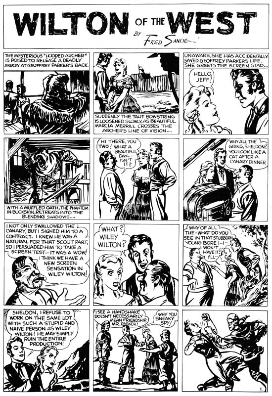
Wilton of the West, pencils, inks and letters by Jack Kirby

Mark Evanier provides an image of a Campbell’s Soup on his blog can when he announces that he is too busy to continue normal posting. It seems I have developed my own tradition, one where I use a scan of a Kirby page from Jumbo comics (see A Brief Pause and Another Brief Pause). Last weekend found me struggling with some particular difficult restorations while remaining determine not to let my schedule slip. In the end I kept to my schedule but was left without any spare time to initiate a post for this blog. So instead I provide a scan of Wilton of the West. This was one of the syndication strips that Kirby did for the Eisner and Iger studio. Some were used in early issues of Jumbo Comics but the image I provide was scanned from a presentation piece which provided higher quality reproduction.

I find Kirby’s work for Eisner and Iger particularly interesting because they show Jack in the process of learning his trade. I know there are some fans who continue to insist that Kirby had already reached a high level of skills but to me this was clearly not the case. Had Kirby’s comic career ended with his work for Eisner and Iger he would have become nothing more than a footnote in the history of comics. Talking heads dominate this page which would have presented a problem for any comic book artist. Kirby tries to keep it interesting by changing the viewing distance as well as adding various props. Jack was not completely successful in this attempt but you can tell he is trying. The page ends with a fist fight. Kirby was famous for his slugfests but here the depicted punch seems rather awkward. The inking is improved over the last page I presented. Kirby varies his inking depending from darker panels such as the first and fourth to simpler lighter ones such as the eighth panel. Here Kirby is still a long way from his mature inking style but that is what makes these pages so interesting. Jack did the lettering as well. Kirby’s lettering here is adequate but nothing more. While his lettering would improve somewhat, Jack never became a master letterer. But then again I cannot think of any golden age comic book artist that was good at both drawing and lettering.

My schedule will remain pretty tough over about the next month so I cannot guaranty that I will not be forced to put up a Jumbo scan again. However I hope that will not be the case because my recent post on the Police Trap pinup reminds me that I have not yet covered that title.

Another Brief Pause and a Joe Simon Interview

Normally I provide at least one post every week. This is often difficult because I have a full time day time and in my “spare time” I am actively working on restorations for Titan’s Simon and Kirby library. The only way I can succeed in keeping my blog going is plan my post ahead of time and write it during my lunch hour. Unfortunately this week when I came to do the actually writing I realized that my planned subject (an opinion piece) really did not warrant posting. But with my tight schedule I was unable to switch to another topic. So this will be one of those rare weeks when I will have to take a brief pause. I should return to my normal blogging next week.


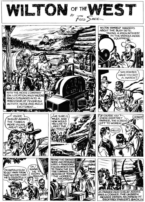
“Wilton of the West”, pencils and inks by Jack Kirby

However, I do not want to leave my readers without something to look at so I will follow the example of an earlier pause (A Brief Pause) and provide an image from Jack Kirby’s early work for the Eisner and Iger studio. This particular strip appeared in Jumbo Comics #3 (November 1938) but my image is from a scan of what was either a proof or presentation piece. Presentation pieces were made to be provide potential clients with examples of a proposed syndication strip. The nice thing about proofs like this one is that the paper was of a much higher quality and so provides a superior copy.


“Wilton of the West” panel 1, pencils and inks by Jack Kirby

The work that Kirby did for Eisner is interesting because you can see him learning his trade. Jack was already better than many of the contemporary comic book artists but that is not saying much because there were a lot of really poor comic book artists at that time. However Kirby was not yet as talented as the artist then working on published syndication strips. On this particular “Wilton of the West” you can see Jack not completely successful experimenting on his inking. Kirby has put a lot of effort into the brush work, particularly on the splash like panel I show above, but it is not very effective. I believe much of the problem is that all parts of the panel seem to get the same amount treatment. The final result seems cluttered and unfocused. Kirby quickly learned from his mistakes and had already improved in a Dr. Hayward strip done a short time later (shown in the same A Brief Pause post that I linked to before).

On a different subject, the reader might be interested in a recent interview that Joe Simon gave Big Shiny Robot.

Early Lettering by Joe Simon

Like most comic book artists from the earliest period, Joe Simon lettered his own art. Actually Joe was doing lettering long before he began his career in comic books. While working as a newspaper staff artist Simon would letter his sport illustrations. Joe’s lettering for these sport drawings was quite variable even within the same individual work.

Silver Streak #2
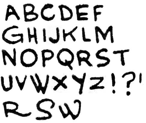
Silver Streak #2 (January 1940) “Solar Petrol” letters by Joe Simon

Simon’s lettering for his earliest comic book work was rather amateurish as even he admits. Letter size varied a bit in different parts of the same page as did line spacing. I tried to get most of my letter samples from “Solar Petrol” from the same regions but even so there some of this variation can be seen above. Interestingly, Simon did his ‘G’ similarly to the way Jack Kirby did it. This was just a coincidence because when Joe did “Solar Petrol”, his first published comic book story, he had not yet met Jack. While some of the other letters are not very useful in distinguishing Joe from Jack one helpful one is the letter ‘M’ where Joe’s version has vertical side strokes while Jack made his ‘M’ with slanting sides. Further Joe never gave his ‘U’ the horse-shoe shape that Kirby used. The most useful letter for spotting Simon’s hand is ‘W’. Joe did this letter in a very distinctive manner that I have not seen others use.

One of Simon’s characteristics found in his earliest lettering is the way he would occasionally embellish a letter. I provide examples for the letters ‘R’, ‘S’ and ‘W’ at the bottom of the image. It is important to note that Joe did not do this sort of embellishment often but some can found in all the early stories and are quite distinctive when found.

The samples from Silver Streak are pretty typical for Simon’s early comic book art. Similar lettering can be found in the following:

  • Daring Mystery #1 (January 1940) “The Fantastic Thriller of the Walking Corpses” (Fiery Mask)
  • Daring Mystery #2 (February 1940) “The Phantom Bullet”
  • Daring Mystery #2 (February 1940) “Trojak the Tiger Man”
  • Target #1 (February 1940) “The Case of the Black Widow Spider”
  • Amazing Man #10 (March 1940) “Ranch Dude”
  • Target #2 (March 1940) “Sabotage”

Daring Mystery #3
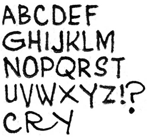
Daring Mystery #3 (April 1940) “Trojak” letters by Joe Simon

In later works Simon seemed to restrain his use of embellished letters although they still occur with some examples on the bottom line shown above. Joe changed the way he usually did the letter ‘Y’ writing it with a vertical lower stroke. However there are occasional uses of a diagonal lower stroke of the ‘Y’ with an example on the last line from Daring Mystery #3. Such mixed use of letter forms is often the sign of two different hands; one the original letterer and the other making alterations. But I do not believe that this is the case here because we will see later works where the use of the two versions of “Y” seems characteristic of Joe.

I only had the time to put together these two samples of Joe Simon’s lettering so I will be return later with some other examples.

Jack Kirby as a Letterer

Creator credits were pretty much never supplied before the silver age of comics. Therefore we have no good idea who the letterers actually were for a long period of comic book history. In the case of Simon and Kirby we are more fortunate because they have told us who some of the letterers were. It is only a guess but I would not be surprised if over 95% of the lettering on works created by Jack Kirby and Joe Simon up to the breakup of their collaboration can be attributed to just four artists. Actually the overwhelming percentage of it was done by just Howard Ferguson and Ben Oda. However early in their careers both Jack and Joe generally lettered the works that they drew themselves. This was not surprising because typically there was no division of labor in the earliest years of comic books and artists were expected to supply fully inked and lettered art.

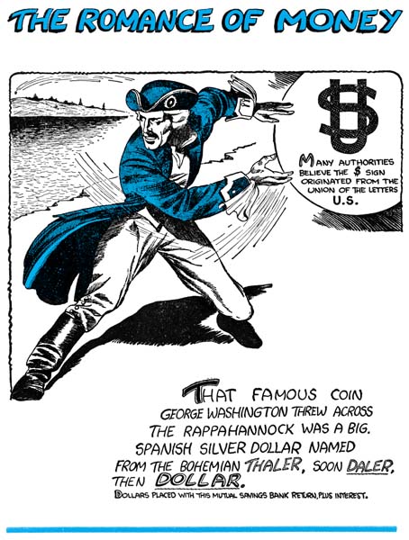
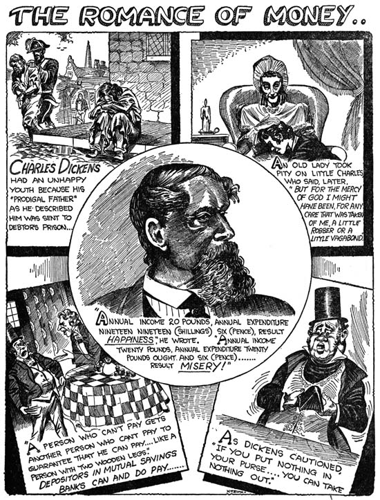
For this post I will be writing about the lettering by Jack Kirby. Jack’s earliest work was not in comic books but work intended for publication in newspapers. I suspect much of this was lettered by Jack himself but I am not completely sure. For instance “The Romance of Money” (link 1) was printed as a bank give-a-way in 1937. There are some suggestions that this was Kirby’s writing but it is hard to be sure because some of his more distinctive traits from a few years later are not found.

Kirby also did some lettering in the work that he did for the Iger and Eisner studio. At this point Kirby’s lettering is very much the same as in the examples that I will provide below from a latter period. An example of Kirby lettering from that period can be found in a previous post (see A Brief Pause).

Kirby also did the lettering for the syndication strip Lightin’ and the Lone Rider. Actual I am not sure if this strip was every published in a newspaper but Greg Theakston includes some proofs in his Complete Jack Kirby 1917 – 1940. The Lone Rider strip was included in Famous Funnies however the lettering was redone by some other artist for all the early issues (Famous Funnies #62 to #65, August to December 1939, see Chapter 1 of Early Jack Kirby). Jack’s original lettering was retained for Famous Funnies #72 to #76 (July to November 1940, see Chapter 3 of Early Jack Kirby).

LettersBlueBeetleFebruary
The Blue Beetle (February 1940), letters by Jack Kirby

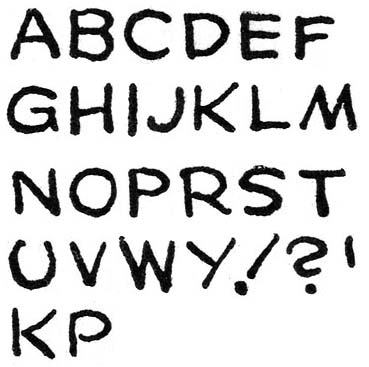
The earliest samples of Kirby’s own lettering that I will supply come from the Blue Beetle syndication strip that Jack did for Fox Comics in 1940. Others who have previously written about detecting Kirby’s lettering have placed much emphasis on his distinctive ‘U’ with its ends curved inwards in a “horseshoe” shape. Kirby’s ‘U’ is very helpful for detecting Kirby’s lettering but I have also found his ‘G’ helpful as well. Observe the small vertical stoke that drops from the lower end of the letter. The vertical stroke does not always dip below the rest of the letter but even so its straight form can often be detected. Some letters by Kirby are not so distinctive from those used by other letterers but still are useful in cases where the ‘U’ and ‘G’ are not so helpful. In particular are ‘J’ without a cross stroke at the top, ‘M’ with slopping sides, and a ‘Y’ with a diagonal lower portion. Despite the vertical characteristic of Kirby’s alphabet he nonetheless executes his exclamation point at an extreme angle. Not infrequently Kirby fails to connect the strokes that form letters and I provide examples of such a failing for ‘K’ and ‘P’ and the bottom.

For an example of Kirby lettering for the Blue Beetle please see Chapter 2 of Early Jack Kirby.

LettersPrize08
Prize Comics #8 (January 1941), letters by Jack Kirby

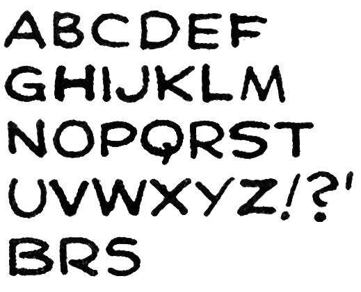
I provide above letters from a somewhat later period taken from the Black Owl story published in Prize Comics #8. It can be seen that little has changed in Kirby’s lettering. In fact most of the differences that can be seen between the two examples I provide are actually not due to some evolution of Kirby style but rather to the wide range of variation that occurred in the lettering of a single story. For example I show from Prize Comics #8 two versions of the letter ‘S’. I also provide two further examples of letters (‘B’ and ‘R’) where Kirby fails to connect the strokes.

Captain America #2
Captain America #2 (April 1941) “Hurricane”, letters by Jack Kirby

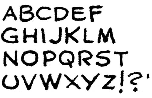
My final set of letters by Kirby come from a story that probably was the last published one he ever lettered, “Hurricane” from Captain America #2. Also published in April was “The Underground Empire” from Daring Mystery #7 but that story was probably reworked material originally done earlier for the never published Red Raven Comics #2. Again there is little changed to be observed in Kirby’s lettering. Perhaps the most significant is that Jack now provides a more vertical form to his exclamation points.

Captain America was a big success and Jack Kirby would from then on concentrate on the art and would no longer letter his stories. The period that Kirby did lettering was relatively short and I provide below all the comics that I believe he lettered. However care must be used in some of the cases because Jack’s was not the only hand involved. But I will go into that in more detail later.

Captain America (Timely (Marvel))
     1    Mar  1941   10p "Murder, Ltd."
     1    Mar  1941    6p "Stories From The Dark Ages"
     2    Apr  1941   10p "Hurricane"

Crash (Tem Publishing)
   a 1    May  1940    5p "The Solar Legion"
   a 2    June 1940    5p "The Solar Legion"
   a 3    July 1940    5p "The Solar Legion"

Daring Mystery (Timely (Marvel))
     7    Apr  1941    8p "The Underground Empire"

Famous Funnies (Eastern Color)
     72   July 1940    2p "Lightnin' and The Lone Rider"- (Kirby lettering page 2)
   a 73   Aug  1940    2p "Lightnin' and The Lone Rider"
   a 75   Oct  1940    2p "Lightnin' and The Lone Rider"
   a 76   Nov  1940    2p "Lightnin' and The Lone Rider"

Jumbo (Fiction House Magazines)
   a 1    Sept 1938    4p "The Count of Monte Cristo"
     1    Sept 1938    4p "Wilton of the West"- (Kirby letters page 4)
   a 2    Oct  1938    4p "The Count of Monte Cristo"
   a 2    Oct  1938    4p "The Diary of Dr. Hayward"- (Kirby lettering page 3)
   a 2    Oct  1938    4p "Wilton of the West"- (Kirby letters pages 3 & 4)
   a 3    Nov  1938    4p "The Diary of Dr. Hayward"
   a 3    Nov  1938    4p "Wilton of the West"

Marvel Mystery (Timely)
     13   Nov  1940    8p "The Vision"
     14   Dec  1940    7p "The Vision"
     15   Jan  1941    7p "The Vision"

Mystery Men (Fox)
   a 10   May  1940    3p "Wing Turner"

Prize (Prize)
     8    Jan  1941    6p "Black Owl"
     8    Jan  1941    6p "Ted O'Neill"

Red Raven (Timely (Marvel))
     1    Aug  1940    8p "Mercury In The 20th Century"
   s 1    Aug  1940    7p "Comet Pierce"

Romance of Money (Natamsha Publishing)
          **** 1937   24p ""- (bank give-away)

Science (Fox)
   a 4    May  1940    8p "Cosmic Carson

Wow (Fawcett)
     1    Spr  1941    7p "Mr. Scarlet"

The Romance of Money


The Romance of Money (1937) page 1 (cover), art by Jack Kirby

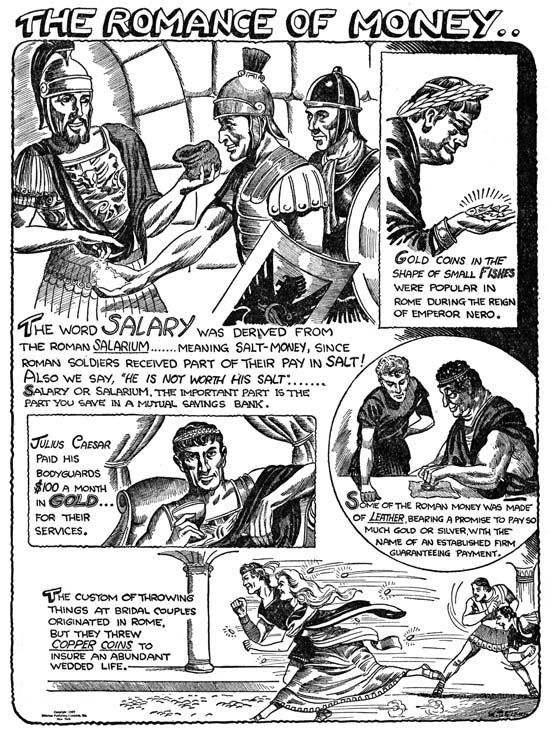
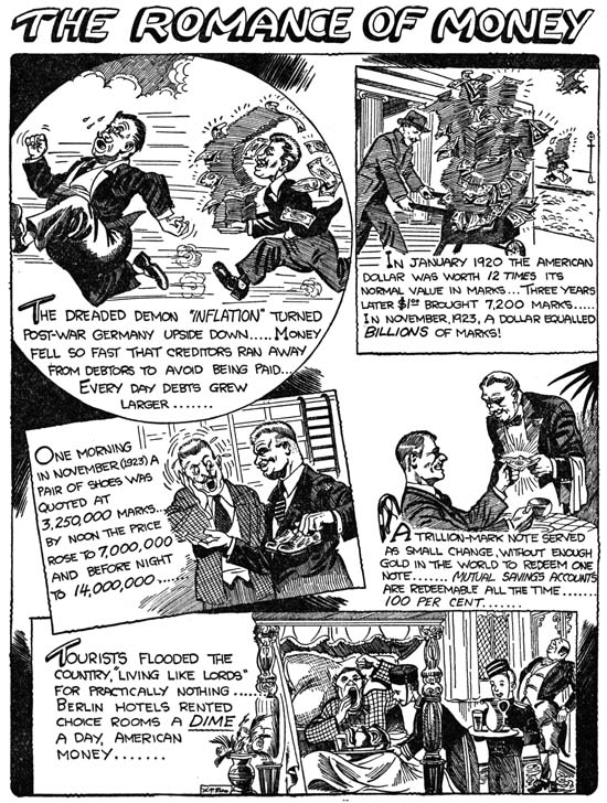
Early in his career Jack Kirby was employed by Lincoln News. There Jack worked on a number of strips for syndication but he also did the art for a give-away to be used by banks, “The Romance of Money”. Since this publication has a 1937 copyright date, some have designated it as Kirby’s first comic book work. Well I guess it all depends what the reader’s definition of a comic book is. “The Romance of Money” is a small book (5 by 6.5 inches) that is just a little larger then half the size of a normal comic book. It is only 24 pages long including the covers. The cover and all interior pages are printed on the same type of paper. The paper is not newsprint, has a nice white color and is a heavier stock then what is found in a typical comic book. The interior of the book is printed in black and white while the front and back covers also include a single color, cyan.


The Romance of Money (1937) page 5, art by Jack Kirby

The subject of this book is, not surprisingly, money. The approach taken is very similar to the old Ripley’s Believe it or Not comic strips. Except for the covers, each page presents a number of related subjects. Despite the presence of a H. T. Elmo signature, Jack Kirby did all the artwork. Horace T. Elmo was not an alias of Jack’s but rather the owner of Lincoln News. Art with his signature appears in both pocket books and comics up to at least 1957. Most of what I have seen are gag cartoons. However considering how Elmo signed work actually done by Kirby, I would be cautious about attributing to him any of the art with his signature.


The Romance of Money (1937) page 19, art by Jack Kirby

The inking in ROM is incredibly detailed, particularly considering the small size of the publication. The Elmo signature is so small that I suspect that originally a larger sized book was planned. I have never seen a comic book printed with such fine lines although I have seen numerous cases where even less detailed work failed to print properly. Either a letter press was not used or the printer was particularly skilled. The higher quality of the paper compared to that normally used in comics may have helped as well. Frankly the fine pen work is uncharacteristic of Kirby and raises the question as to whether Jack did the inking. At this point in his career it is hard to believe that Kirby would have been given the luxury of only providing the pencils. On the other hand the inking is rather poor in some places (for instance the portrait of Charles Dickens on page 19). My belief is that this is in fact Jack’s inking but he was inexperienced with the fine pen work that he was attempting (perhaps at the direction of H. T. Elmo).


The Romance of Money (1937) page 6, art by Jack Kirby

Most of the work Jack did for Lincoln News had cartoon-like imagery which can sometimes be hard to relate to his later comic book work. The more realistic style used in “The Romance of Money” makes for easier comparisons with the work from much of Jack’s career then the rest of what Jack did for Lincoln News. While Kirby had a long way to go some of his stylistic traits can already be detected. Note for example the wide strides of the running couple in the bottom scene of page 6.


The Romance of Money (1937) page 13, art by Jack Kirby

“The Romance of Money” was republished in 1942 using the same artwork. I understand that the older and later versions can be distinguished by the cover but I have heard two reports of how this can be done. One is that 1942 version used red ink for the color instead of cyan. The other explanation is that the 1942 issue uses colored paper for the cover. Unfortunately I am unable to say which explanation, if any, is the correct one.


The Romance of Money (1937) page 23, art by Jack Kirby

Jest Laffs


Jumbo Comics #2 (October 1938) “Jest Laffs”

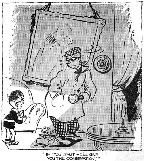
A few posts ago I present the image of the gag cartoon of a burglar from Jumbo Comics #1. Kirby scholar Stan Taylor had suggested that it may have been done by Jack Kirby. The cartoon was from page called Jest Laffs. Jest Laffs also appears in Jumbo Comics #2 and two of the cartoons there look like they were done by the same artist as the burglar from JC #1. There are a number of features that are shared, some more important then others. The use of darker regions with a raggy edge or the way the mouth is often placed off to the side of the face. I find the manner of depicting the nose and ears to be particularly interesting. It is in minor details like that individual artists often provide distinct mannerisms.


Jumbo Comics #2 (Octoer 1938) “Jest Laffs”

While the Jest Laffs page in JC #1 provides no credits, the title in JC #2 gives a Bob Kane attribution. There are other gags in the Jest Laffs page in both issues that are done in other styles. This could mean they were actually done by other artists. Or it could mean that Bob Kane adapted his style to one appropriate for the particular gag. After all Kane’s Peter Pupp, also in Jumbo Comics, was very done in a different style than his Batman.

I do not know enough about Bob Kane’s work to say whether any of it shows the same distinctive ears and noses found in the gag cartoons. It does not show up in Peter Pupp but that could just be due to the different nature between Peter Pupp and Jest Laffs. I have also examined much of Jack Kirby’s early cartoon work and could not find those distinctive ears and noses in any of it; including the one Jack did of a burglar.

For me this does not provide a definitive answer to the question of who did these particular gag cartoons but it does mean the Bob Kane should be considered along with Jack Kirby. Jack Kirby only appeared in the first three issues of Jumbo Comics. Although I have seen later issues, I was not examining them in relation to this question. If there are issues later then JC #3 with Jest Laffs gags that share the same traits then I doubt that Jack Kirby would have been the artist, if they stop with JC #3 then that would be another piece of evidence that they were done by Jack.

Joe Simon’s Newspaper Art

I recently wrote about Joe Simon’s newspaper career (Joe Simon, Editor) and earlier as well (Joe Simon as a Newspaper Staff Artist). I discussed how Joe did more then just sport illustrations. I never expected that someone would actually check to see if I was right. But that is exactly what Ger Apeldoorn did and he posted his initial results on his blog (previously called Those Fabulous Fifties, but now apparently unnamed). He is using microfiche copies of the Syracuse Herald, a search I also mean to do if I can ever find the time.

I am all for preserving old newspapers with techniques such as microfiche otherwise much would be lost about the history of our culture. Even so the quality leaves much to be desired. Ger attributed one illustration dated December 13, 1936 to Joe but could not find his signature. Was that because it was removed before publication, or has it been obscured by scratches on the microfiche film? In this case we are fortunate because Joe still has the original art in his collection. Ger may not have needed a signature to recognize Simon’s hand, but it is always nice to have confirmation.

A Brief Pause

The deadline for a Simon and Kirby project I am working on is approaching. It is a deadline I fully intend to meet. Unfortunately that means I really do not have time for much of a post this week, but I will return next week to more typical postings. However I did not want to leave my visitors without anything to look at…


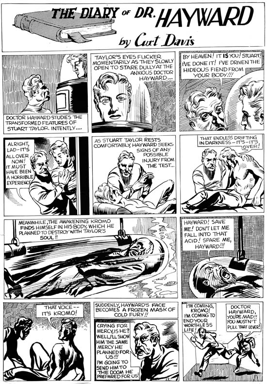
“The Diary of Dr. Hayward” by Jack Kirby

This is one of the works that Kirby did for the Eisner and Iger studio. I believe it appeared in Jumbo Comics #3 (November 1938) but my scan is from a sales print. The existence of such sales prints indicates that despite Will Eisner later comments, the main objective of the studio he formed with Jerry Iger was to market new syndication strips. Their appearance in titles such as Jumbo Comics was just a means of generating income in the mean time. The Eisner and Iger studio did later provide art specifically created for comic book, most famously for Marvel Mystery #1 Wonder Comics #1.

This particular strip is unusual for Kirby. In most of the work that Jack did for Eisner and Iger the backgrounds were uninked white or used a simple grey tone dot screen. In this case Kirby uses a variety of background inking. It would seem that he is experimenting on the effects of the different techniques. Most of these inking methods would not become part of Kirby’s inking style in the years to come.

Jumbo Comics Addendum, Kirby Or Not?


Jumbo Comics #1 (September 1938)

Stan Taylor mentioned this gag cartoon that he believed was by Jack Kirby. I have to admit I do not share his opinion, but I thought I would include an image so everyone can see it. Identifying early work by Jack Kirby can be particularly troublesome and opinions can be expected to differ.

Jumbo Comics


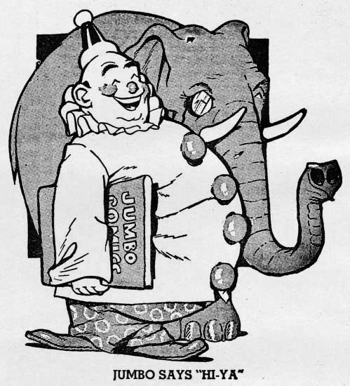
Jumbo Comics #1 (September 1938) Jumbo, the mascot

Will Eisner and Jerry Iger teamed up in 1936 or 1937 to become one of the first studios to provide complete comic book packages to publishers. Previously comic books were largely reprint compilations of newspaper syndication strips. Years later Will Eisner said that he believed there would not be enough syndications material available to meet the rising demand for comic books and so there would be a market for new material created specifically for comic books. That may have been true but one of Eisner and Iger’s packages Jumbo Comics #1 (September 1938) published by Fiction House was actually composed of syndication strips. I have no idea on how many of the strips from Jumbo Comics #1 had previously appeared in newspapers but at least some of them had been printed in the British magazine Wags. Others may have truly been new creations but in a format showed that they were meant for syndication strips.

Jumbo Comics certainly lived up to its name as it was printed in what is called tabloid size (10.5 by 14.25 inches). Except for the cover, no color was used. Perhaps to compensate for the lack of color, the paper used came in two tones; one the normal “white” and the other dyed a pinkish color. (I have removed the page color from all images presented in this post.) All pages followed the same format. There would be a title panel that would normally occupy the entire top of the page although sometimes a single story panel might be included. Below would be three or four rows of panels with three panels per row (occasionally two panels would be combined to form a longer one). While there would be three or four pages provided for each title, all pages would have the same format including the title.
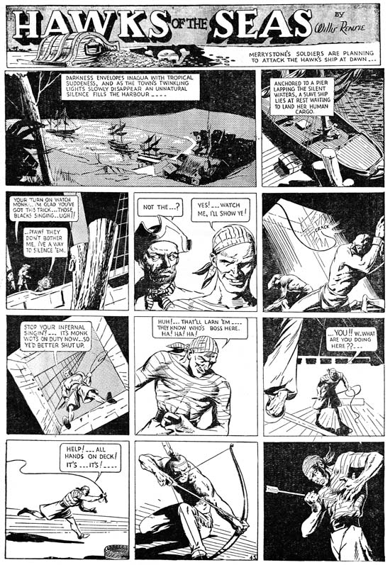

Jumbo Comics #1 (September 1938) “Hawks of the Sea” by Will Eisner

Will Eisner was very conscious about the small size of his operation. While Eisner was involved in many aspects in the making of the strips found in Jumbo Comics but, his name appears on none of them. However, in the title “Hawks of the Sea” is credited to Willis Rensie; Rensie is Eisner spell backwards. This is years before his famous work on the Spirit, but here Eisner is already an accomplished comic artist. Note Eisner’s dramatic use of sifting perspective. As we will see, a number of the artists appearing in Jumbo Comics who would later achieve great fame but none of them supplied art at that time with quite the quality as found in “Hawks of the Sea”.
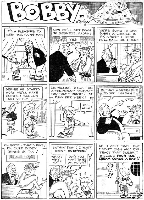

Jumbo Comics #1 (September 1938) “Bobby” by Jerry Iger

“Bobby” is credited to S. M. Iger, but surely that must be an alias for Jerry Iger. Iger was supposed to have been the salesman of the Eisner & Iger partnership, but here he shows how talented artist he was as well. Or it would if we can be sure that this piece was actually done by Jerry. In an interview (The Jack Kirby Collector #16) Eisner said that Iger was not a good artist but he could letter. Was this sour grapes about a former partner or realistic evaluation? I have no way of knowing. It all depends on whether “Bobby” was really done by Iger.
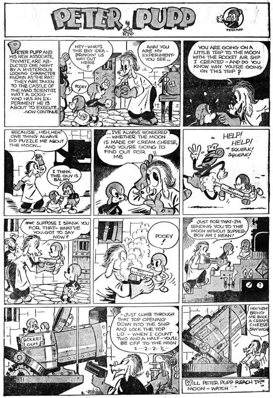

Jumbo Comics #1 (September 1938) “Peter Pupp” by Bob Kane

Bob Kane was a high school friend of Will Eisner, so his presence in Jumbo Comics is not surprising. Batman did not debut until May 1939 so Kane almost certainly did not yet have his studio of ghost artists that he became famous for in later years. I have always found the earliest Batman art, presumably done by Kane, as stiff and rather unappealing. Because of that “Peter Pupp” is quite a surprise. Granted it is of the funny animal and not the hero genre but it shows a suppleness totally absent from Batman. Mickey Mouse would seem to be an obvious inspiration for this strip. I particularly find amusing how the villain’s minion sports Mickey Mouse ears.
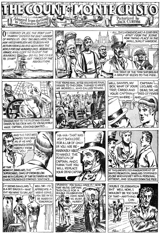

Jumbo Comics #1 (September 1938) “The Count of Monte Cristo” by Jack Kirby

Jack Kirby has said that his first published comic book work be for Wild Boy Magazine, although I do not believe anyone has been able to confirm that. The earliest work that can be confirmed is probably “The Count of Monte Cristo” which appeared in the British magazine Wags in March 1938. These Kirby strips were used again in Jumbo Comics #1. The name Jack Kirby was one he adopted later while his birth name was Jacob Kurtzberg but in this strip he signed his name as Jack Curtiss. By any name this was a far cry from the work Jack would do in just a few years. Even though Kirby’s art would progress much further, his art in Jumbo Comics shows that he already was a very gifted artist, better then most of his peers.
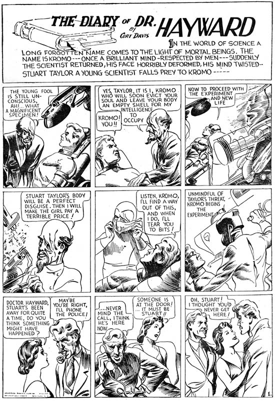

Jumbo Comics #1 (September 1938) “The Diary of Dr. Hayward” by Jack Kirby

Jack also drew “The Diary of Dr. Hayward” this time under the name Curt Davis. While “The Count of Monte Cristo” was based on the book by Alenandre Dumas, the Dr. Hayward strip was all new writing. It is hard to be sure, but the plot seems to be similar to those Jack would write later and so I credit the scripting here to Kirby as well. Without the classic trappings of “The Count of Montet Cristo”, Jack seems quite comfortable both in art and script with the more science fiction story of Dr. Hayward. A handsome hero, a mad scientist and body switching it all provides a setting for a morality tale about good versus evil.
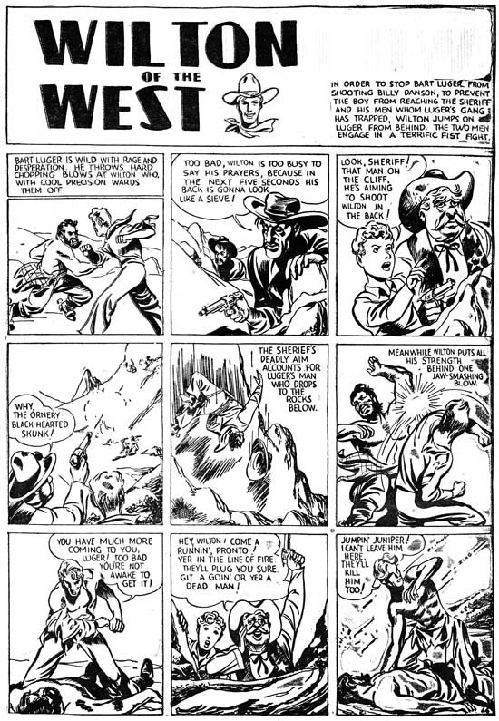

Jumbo Comics #1 (September 1938) “Wilton of the West” by Jack Kirby

It would seem two strips were not enough for the already prolific Kirby as he did a western as well but this time without signing it. It is here that we can see that while Kirby had a way to go before he reached his full potential, he already had developed his predilection for slugfests. The smashing blow depicted in panel 6 is done in a manner far from his signature style but it still embodies Kirby’s enthusiasm. He may not have mastered his use of exaggerated perspective but look how Jack has in panel 7 the hero bend at the torso while thrusting his face forward so that no neck is seen. It is the beginnings of a pose that would become Jack’s trademark.
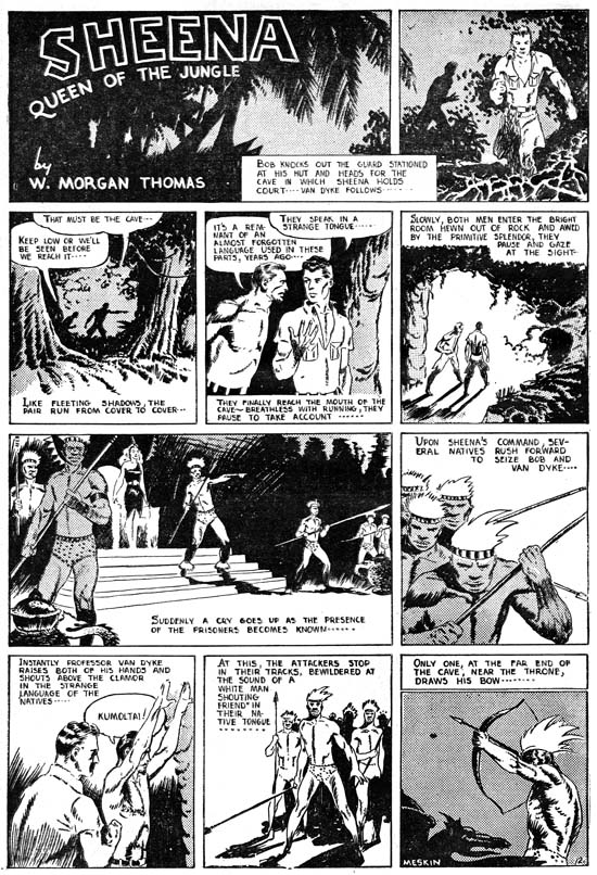

Jumbo Comics #1 (September 1938) “Sheena Queen of the Jungle” by Mort Meskin

Of all the strips present in Jumbo Comics, the most enduring was “Sheena Queen of the Jungle”. It would eventually dominate the long running Jumbo Comic (1938 to 1953) as well as achieving its own title. Sheena even became a television show (1955) and a movie (1984). The title block credits Sheena to W. Morgan Thomas but this was just one of the pseudonyms adopted by Will Eisner to hide the small size of his studio staff. For the Sheena strips in the Jumbo Comics the artist was Mort Meskin as can be seen by the signature in the final panel. This is the earliest published work by Meskin that I am aware of. While not as polished as Will Eisner or Jack Kirby, Mort’s art already has an energy to it. Look how he composes the figures of the armed natives in panel 6 all on the left side of the panel and on the right in panel 8. Over and over in these strips you can see Meskin’s concerns about how to graphically tell a story. It may be the start of his professional career, but Mort already had his own unique vision.
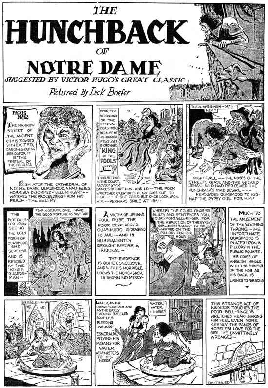

Jumbo Comics #1 (September 1938) “The Hunchback of Notre Dame” by Dick Briefer

It is hard to recognize some of the artists appearing in Jumbo Comics when you are only familiar with their later work. This is especially true with the first strip of “The Hunchback of Notre Dame” by Dick Briefer. What makes this particular strip so unlike some familiar work by Briefer is mainly the detailed pen work so different from the simpler and more fluid inking found much later in Briefer’s Frankenstein. One thing to note is that while the other artists reviewed in this post had adopted a very grid-like panel layout, Dick’s use of caption boxes and panels breaks from that familiar rigid pattern.
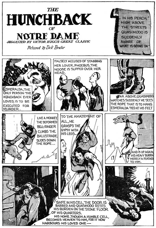

Jumbo Comics #1 (September 1938) “The Hunchback of Notre Dame” by Dick Briefer

The fine inking was abandoned immediately after the first strip and the results make it much easier to recognize Briefer’s participation. I choose to use the fifth strip but in terms of technique it does not differ from the second. But what a great page! While Dick is no longer using the same captions he still deviates from a grid panel layout. Note how the fifth panel was extended vertically down into and how the last panel really is two panels in the same boarder separated by a caption.

There are other strips in Jumbo Comics #1 done by talented artists that are unsigned. Considering the pretenses Eisner maintained of a larger shop there is a good possibility that they some were made by Eisner himself deceptively adopting another style. Or perhaps assigning the finishing or inking to a different artist. I am sure Eisner provided direction to all the artists working for him but I am just as certain that did not include laying out the art. Each of the artists reviewed here had their own unique manner of graphically telling the story which would not have been true if they were working from layouts. It is amazing to see so much talent, albeit in its earliest flowering, in one comic book. Jack Kirby would be also included in Jumbo Comics #2 and #3 for his work on “The Diary of Dr. Hayward” and “Wilton of the West”. Mort Meskin would work on “Sheena Queen of the Jungle” even longer (at least until issue #5). Bob Kane and Dick Briefer would also make further appearances. Eventually Jumbo Comics would abandon its oversize format and adopt a more standard comic book content but for a while it was a most unusual comic book.