(May – October 1956: Young Romance #83 – #84, Young Love #71 – #72, Young Brides #28 – #29)

Number of Romance titles 1947 – 1958 (the period covered in this chapter is shaded in blue)
This is part of the period that saw the collapse of comic, the end of the golden age. While the number of romance titles has been steady the number of publishers of romance comics has been declining (The Real Reason for the Decline of Comics).

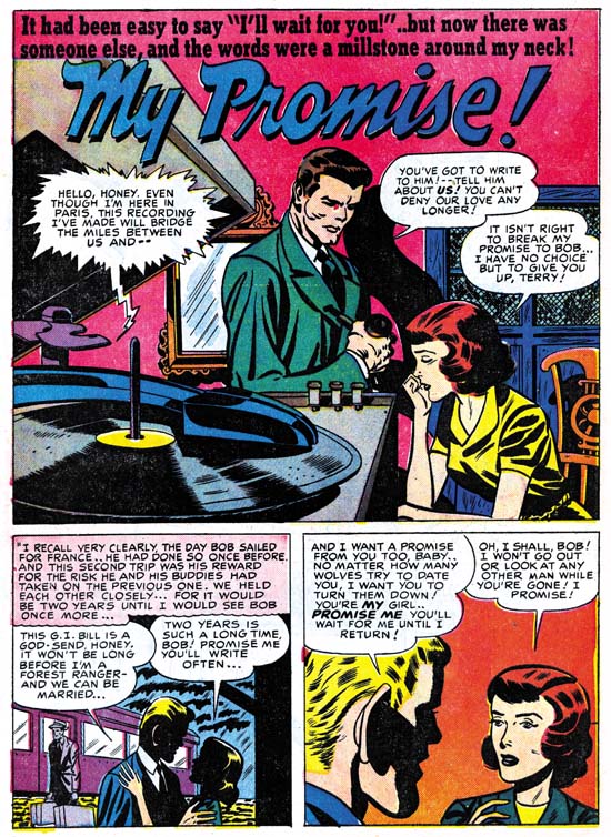
Young Love #71 (June 1956) “Love Me Or Leave Me”, pencils and inks by Bill Draut
Although I describe this period as being all Kirby romances, that is not completely accurate as other artists did appear. Of the six issues discussed in this chapter five were truly all Kirby while one (Young Love #71) was a more normal Simon and Kirby production. For YL #71 Kirby does the cover and one story but the three other stories were by other artists. It is odd that all the artists were placed in this one issue while Young Romance #83, which came out in the same month, was all Kirby. All of the artists for YL #71 had been used prior to this year but one only in a war genre title. Therefore it is uncertain whether this was left over inventory or not.
Bill Draut’s art has the somewhat cleaner look that his art showed in the last chapter. Clothing folds are smoother and more sweeping and not so blotchy as was his style previously. The GCD lists Bill in DC’s Tales of the Unexpected #2 (April 1956) so I wonder if this change is an attempt to change his style to one more acceptable to DC. If so it is the beginning of a change that would rob Draut’s art of much of what I admire and replace it with a style that was not that much appreciated by DC or any other publisher.

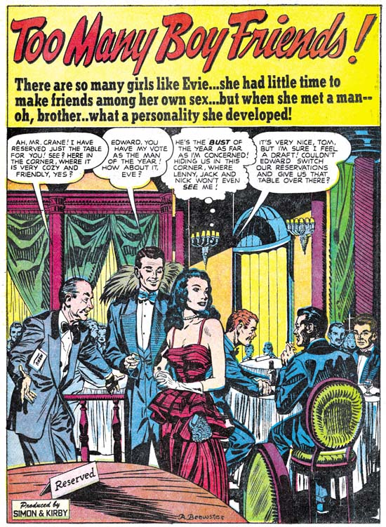
Young Love #71 (June 1956) “Birthday Present” page 3, pencils and inks? by Ann Brewster
“Birthday Present” would be Ann Brewster’s last work for Simon and Kirby. Joe and Jack only used her for the romance titles but this story does allow Ann to show how she can handle action. That she does so well with action should not come as a surprise because he she was doing superheroes earlier in her career (Ann Brewster, Not One of the Guys).

Young Love #71 (June 1956) “Love That Money”, pencils and inks? by Ted Galindo
This is Ted Galindo’s first appearance in the “Art of Romance” but he did work for Simon and Kirby in Foxhole (Foxhole #4, Enter the Comic Code). Frankly the art for Foxhole was not all that great so it comes as a surprise what a wonderful job Galindo would do in “Love That Money”. We will see even more impressive work by Ted when I cover him in “Criminal Artists”, my serial post on the post S&K Prize crime titles. For “Love That Money” Ted’s women are beautiful and elegant and he works in a more modern comic book art style. It is a shame that Simon and Kirby did not make more use of Galindo before this but perhaps they also were put off by the poorer job he did for Foxhole.

Young Romance #83 (June 1956), pencils by Jack Kirby and Joe Simon
There was one other exception to the otherwise all Kirby art for this chapter besides those found in Young Love #1 and that is the cover for Young Romance #83 (June 1956). Oh that certainly is Kirby’s pencils for the foreground figures but he did not do the figures projected on the screen. The black and white art looks like the work of Joe Simon. The screen was done using special art boards that provide several degrees of tone based on chemical applied to it. Years later these boards were used by Joe and the artists working for him for work on Sick. Joe still has some of these boards and once offered to show me how they worked. Unfortunately all the required chemicals that I could find had dried up.

Young Love #71 (June 1956), pencils and inks by Jack Kirby
Young Love #71 provides a more typical example of a Prize romance cover than Young Romance #83. The inking for this cover was done in Austere inking style that Kirby worked in during this period (Jack Kirby’s Austere Inking). The ink lines are so fine that it would be reasonable to suggest that the work was done using a pen. However the original art is part of Joe Simon’s collection and a close examinations shows that it was done with a brush. While story art was usually done twice up (twice the size compared to as it would be published), generally the art for the Prize covers were done at about 1 1/2 size. But the truly twice up size of the original art for YL #71 allowed Kirby to achieve such fine lines with a brush.

Young Romance #83 (June 1956) “Dancing Doll” page 7, pencils by Jack Kirby, inks by Jack Kirby and Marvin Stein?
I find Kirby inking Kirby to be particularly interesting and therefore want to provide a number of examples below. However much of the inking of Kirby’s pencils during this period was not done by Jack himself. I therefore think I would be remiss if I did not provide at least one example of Kirby inked by another artist. While the inking on “Dancing Doll” is rather nice it does have some characteristics that I believe exclude crediting it to Kirby. For instance, although it is hard to make out from the image I provide, the cheek of the main in panel 4 has some fine feathering that I have not seen Kirby use. Inking attributions during this period are particularly difficult. There are two leading candidates; Bill Draut and Marvin Stein. There are some examples that can be confidently attributed to each of them. But these are the exceptions and in most cases it is hard to tell if one of them inked it or some unidentified artist. “Dancing Doll is just such an example. However the way the inking is done around the mouth of the man in panel 4 suggests to me it might have been done by Marvin Stein.

Young Romance #83 (June 1956) “The Serious Type”, pencils and inks by Jack Kirby
Some of the work from this period appears to be a combination of inking by Jack himself and some other artist. This is true for “The Serious Type” with the other inker questionably identified as Marvin Stein. However the work on the splash page appears to me to be inked by Kirby alone. Note the simple, spatulate forms that the clothing folds on the waitress in the splash and the shoulder blots throughout. Admittedly not the most exciting splash, even by standards of the romance genre, but still a well executed piece.

Young Brides #28 (May 1956) “Under New Management” page 4, pencils and inks by Jack Kirby
“Under New Management” is another jointly inked work and again by Kirby and possibly Stein. This seems to be a case of inkers working on particular pages; Kirby on pages 2 to 4 and 7 with Stein doing pages 1, 5 and 6. Besides the simply shaped clothing folds and shoulder blots there are also a couple of abstract arch shadows (panels 1 and 4). These are all typical of Kirby’s inking although Joe Simon used these techniques as well. I feel it fair to point out that I am a bit uncertain about whether Kirby inked the nose and eyebrows of the man in panel 4.

Young Brides #28 (May 1956) “New Boy In Town”, pencils and inks by Jack Kirby
I believe that all of the “New Boy In Town” was inked by Jack himself. Again while I cannot fault his drawing or inking it is not one of his more exciting splashes. The same theme is covered in a much more interesting manner on the cover.

Young Brides #29 (July 1956) “The Sound Of Wedding Bells”, pencils and inks by Jack Kirby
Only the wedding couple’s hands are shown in the foreground. Behind their hands are the man presiding over the ceremony (a judge?) and a witness. The background is filled with clamoring bells announcing the festive occasion. This is certainly the most interesting romance splash Kirby has done during this period.
Still more all-Kirby romance comics to come in the next chapter of The Art of Romance.
Chapter 1, A New Genre (YR #1 – #4)
Chapter 2, Early Artists (YR #1 – #4)
Chapter 3, The Field No Longer Their’s Alone (YR #5 – #8)
Chapter 4, An Explosion of Romance (YR #9 – #12, YL #1 – #4)
Chapter 5, New Talent (YR #9 – 12, YL #1 – #4)
Chapter 6, Love on the Range (RWR #1 – #7, WL #1 – #6)
Chapter 7, More Love on the Range (RWR #1 – #7, WL #1 – #6)
Chapter 8, Kirby on the Range? (RWR #1 – #7, WL #1 – #6)
Chapter 9, More Romance (YR #13 – #16, YL #5 – #6)
Chapter 10, The Peak of the Love Glut (YR #17 – #20, YL #7 – #8)
Chapter 11, After the Glut (YR #21 – #23, YL #9 – #10)
Chapter 12, A Smaller Studio (YR #24 – #26, YL #12 – #14)
Chapter 13, Romance Bottoms Out (YR #27 – #29, YL #15 – #17)
Chapter 14, The Third Suspect (YR #30 – #32, YL #18 – #20)
Chapter 15, The Action of Romance (YR #33 – #35, YL #21 – #23)
Chapter 16, Someone Old and Someone New (YR #36 – #38, YL #24 – #26)
Chapter 17, The Assistant (YR #39 – #41, YL #27 – #29)
Chapter 18, Meskin Takes Over (YR #42 – #44, YL #30 – #32)
Chapter 19, More Artists (YR #45 – #47, YL #33 – #35)
Chapter 20, Romance Still Matters (YR #48 – #50, YL #36 – #38, YB #1)
Chapter 21, Roussos Messes Up (YR #51 – #53, YL #39 – #41, YB #2 – 3)
Chapter 22, He’s the Man (YR #54 – #56, YL #42 – #44, YB #4)
Chapter 23, New Ways of Doing Things (YR #57 – #59, YL #45 – #47, YB #5 – #6)
Chapter 24, A New Artist (YR #60 – #62, YL #48 – #50, YB #7 – #8)
Chapter 25, More New Faces (YR #63 – #65, YLe #51 – #53, YB #9 – #11)
Chapter 26, Goodbye Jack (YR #66 – #68, YL #54 – #56, YB #12 – #14)
Chapter 27, The Return of Mort (YR #69 – #71, YL #57 – #59, YB #15 – #17)
Chapter 28, A Glut of Artists (YR #72 – #74, YL #60 – #62, YB #18 & #19, IL #1 & #2)
Chapter 29, Trouble Begins (YR #75 – #77, YL #63 – #65, YB #20 – #22, IL #3 – #5)
Chapter 30, Transition (YR #78 – #80, YL #66 – #68, YBs #23 – #25, IL #6, ILY #7)
Chapter 30, Appendix (YB #23)
Chapter 31, Kirby, Kirby and More Kirby (YR #81 – #82, YL #69 – #70, YB #26 – #27)
Chapter 32, The Kirby Beat Goes On (YR #83 – #84, YL #71 – #72, YB #28 – #29)
Chapter 33, End of an Era (YR #85 – #87, YL #73, YB #30, AFL #1)
Chapter 34, A New Prize Title (YR #88 – #91, AFL #2 – #5, PL #1 – #2)
Chapter 35, Settling In ( YR #92 – #94, AFL #6 – #8, PL #3 – #5)
Appendix, J.O. Is Joe Orlando
Chapter 36, More Kirby (YR #95 – #97, AFL #9 – #11, PL #6 – #8)
Chapter 37, Some Surprises (YR #98 – #100, AFL #12 – #14, PL #9 – #11)
Chapter 38, All Things Must End (YR #101 – #103, AFL #15 – #17, PL #12 – #14)