Tag Archives: Jack Kirby

Hand of Fire: The Comics Art of Jack Kirby by Charles Hatfield

Hatfield devotes a chapter to discussing Kirby’s art and in particular his style. This section was of particular interest to me because it is by using aspects of an artist’s style, particularly seemingly insignificant ones, that an artist’s work can be identified. Much of the books’ discussion concerns applying, or rather attempting to apply, the theories of Charles Sander Peirce to Kirby’s work. I believe that Hatfield does a good job of describing Peirce’s theories, but then again since I was completely unfamiliar with them I cannot say how accurately they are presented. By his own admission applying Peirce’s theories on Kirby’s art is a difficult match but Hatfield feels that there is much to be learned from the attempt. It certainly provided me with an alternate way of looking at things which is the chief value in a book like “Hand of Fire”.

Hatfield also makes use of a definition of Will Eisner that “style results from the failure and frustration, from grappling with one’s own weaknesses as an artist and turning them to advantage”. While there is some truth in this, I feel it is only partial explanation of how an artist’s style is accomplished. Some aspects of an artist’s style may originate from his deficiencies, particularly earlier in a career. Kirby’s penchant for big ears during his first DC period comes to mind. But an artist style usually evolves over time and this generally is not due to any deterioration of his capabilities. Rather artist often go through a process of refining their work by filtering out what they consider unimportant aspects and emphasizing those of greater personal significance. Kirby’s style while working on the Fourth World books was, in my opinion, his best graphical efforts and this certainly not due to his failure to grapple with his weaknesses.

There is a chapter on the history and authorship of the Marvel Universe. It is a balance view which while emphasizing Kirby’s importance does not diminish or discredit Stan Lee’s contributions. I suspect Kirby Cultists will not be pleased but I was. Hatfield’s discussion of two common misapprehensions (that Marvel made superhero stories realistic and that the comics were created with a pre-planned continuity).

Included in the book is a lengthy analysis of Kirby’s work for DC, that what is commonly called the Fourth World. Hatfield obviously feels that this was the most important point of Kirby’s career. I admit that is an opinion that I do not share. But I still find his discussion about this work to be insightful and interesting. In fact the best that I have ever read.

“Hand of Fire” is not the type of book one would pick up to see great art. There is a small color section and some black and white illustrations scattered through the text. All the work shown was selected to match discussions in the text. So this is not a book to pick up just to see great Kirby art. But it is a great book if you want to enter into a discussion about Jack Kirby and his art. You may not agree with everything Hatfield writes, but you will understand why he takes the positions that he does and you may his ideas challenging.

My Two Cents: The Auteur Theory of Comics

I recently posted on a review of Jack Kirby as Auteur by Barry Pearl. In the comments section of that post Arlen Schumer placed text “adapted from the visual presentation at the New York Comic Con panel, Saturday, October 15th, 2011”. I felt that Schumer’s text was much too important to leave in the relative obscurity of a comment section, so with his permission I have posted it below. I believe this is the first time I have ever had a guest posting in my blog.

I would like to add my two cents. Frankly when I first heard of the idea I already hated the term used. I rather dislike it when foreign words are wrapped around a simple concept. After all auteur is just the French word for author. However the term is relatively unimportant, at least compared to the underlying concept. I attended Schumer’s panel and found the presentation quite convincing. I do, however, have a couple of quibbles.

One has to do with the panel’s and text’s discussion of the legal issues between the Jack Kirby estate and Disney, Marvel’s recent owner. While the court battles concerning these issues might have been the instigation for the developing of the Auteur Theory of Comics, the legalities have no bearing on the theory and the theory has no bearing on the legal issues. As long as the work by Kirby is legally considered work for hire it does not matter if he is considered the author of the work, his estate cannot claim the copyrights.

The other quibble is not so much a disagreement with Schumer but rather an uncertainty on my part about how far the term author can be applied. While is seems eminently suitable for artists that work under the Marvel Method, should it be applied to artists who worked from a script? Such artists could be described as illustrators but I feel they have much more impact to the finished work than a typical book illustrator. However to me there still seems a great difference between artists who worked the Marvel Method and those who worked from scripts.

I believe ideas such as the Auteur Theory of Comics have great importance. We may not be able to correct past financial injustices, but we can correct failures to provide proper credits. While working with Stan Lee, the most credit Kirby (or Ditko) ever received beyond providing pencils was for supplying the plot. However artists who worked the Marvel Method did much more than plotting. While we normally think of authors as writers the definition includes creators. Therefore I think it is quite appropriate to describe Lee/Kirby (or Lee/Ditko, etc.) as the authors of the comics that they collaborated on.

“The Auteur Theory of Comics” by Arlen Schumer

Text adapted from the visual presentation at the New York Comic Con panel, Saturday, October 15th, 2011.

The recent court loss for the Jack Kirby estate in its battle with Disney, Marvel’s corporate owner, over copyright/ownership of the Marvel characters, revealed Stan Lee’s testimony as being the usual lynchpin in deciding the case in his, and Marvel’s, favor, that testimony essentially promulgating the same misconception that he, not Kirby, was the true author of the Marvel Universe by dint of his salaried role as editor and writer, and Kirby’s professional status as a work-for-hire employee. This misconception ignores the actual role Kirby played in the actual creation of those seminal comic books, as the auteur—author in French—of their stories. “Auteur” in the way Franco-cinemaphiles in the 1950s—first Francois Truffaut in the journal Cahiers du Cinema, and then American counterparts like The Village Voice’s film critic Andrew Harris—postulated their Auteur Theory of Film, that a film’s director, and not the screenwriter, as was previously thought, was a film’s true author.

So too can the Auteur Theory of Film be accurately applied to the “Marvel Method” of comic book authorship, innovated by Lee, who gave his artists (originally and primarily Jack Kirby and Steve Ditko) anything from a typed synopsis of a story to a verbal springboard of an idea—the equivalent of the screenplay in film—and the artists drew out/plotted/staged/paced the story visually to fill the page count given, using two-dimensional versions of the same tools and devices a movie director uses to craft a film: casting, editing, lighting, sound, choreography—after which Lee would add the dialogue and captions to the artists’ work.

Stan’s interviews from the ‘60s, which stand in contrast, and somewhat of a contradiction, to his testimony in this case, were submitted in documents—eventually thrown out by the judge—during the testimony of Kirby experts John Morrow (publisher of The Jack Kirby Collector) and Mark Evanier (Kirby’s biographer); here’s an example:

“I would tell Jack the main idea that I wanted, and then we would talk about it, and we’d come up with something. I would give him the outline for the story. As we went on, and we had been working together for years, the outlines I gave him were skimpier and skimpier. I might say something like: ‘In this story let’s have Dr. Doom kidnap Sue Storm, and the Fantastic Four has to go out and rescue them. And in the end, Dr. Doom does this and that.’ And that might have been all I would tell him for a 20-page story. If the book was 20 pages long, I’d receive back 20 beautifully drawn pages in pencil which told a story. Jack would just put in all the details and everything. And then it was—I enjoyed that. It was like doing a crossword puzzle. I get the panels back, and I have to put in the dialogue and make it all tie together. So we worked well together that way for years.”

Ergo it was the artists who were the actual storytellers, not “just” the artists, with Lee, of Marvel Comics, like the directors of films have been considered the true authors of their films for over 50 years now, entitled to the benefits of credit and copyright protection of their films.
At the same time, this is not to deny Lee’s co-authorship and creatorship of Marvel Comics—he deserves exactly 50% of the credit, for his absolutely crucial contributions as editor/writer/art director/salesman and spokesman—but not a percent more or percent less. The sad fact of the matter is that Lee has successfully campaigned throughout his post-working relationships with Kirby and Ditko to create the perception—and therefore the “reality”—that he was the 100%, primary, sole creator of the Marvel Universe, relegating Kirby, specifically, to the historically demeaning role of the artist as merely a “pair of hands,” a “wrist” who robotically drew up Lee’s scripts, the only “theory”/process of comic book creation the judge was presented with.

(Comic creators like Will Eisner and Jim Steranko, who both write and draw their own work, are not germane to this discussion; they’re already 100% creators of their works. The Auteur Theory in both film and comics, as I’m applying it, pertains to those directors and comic artists who did/do not write their movies or comics, but collaborate with screenplay writers or comic writers; by dint of the act of directing a film, and drawing a comic book story, the director and the artist are the true authors/auteurs of their respective final product. The comic book works of writers like Alan Moore and Harvey Kurtzman are trickier to evaluate; for who is the auteur of Moore and artist Dave Gibbons’ Watchmen? Who is the auteur of Two Fisted Tales/Frontline/Mad? Because both Moore and Kurtzman functioned as much as art directors as writers—Moore verbally with his notorious panel descriptions and Kurtzman visually with his layouts—they’re legitimate exceptions. The overarching concept of the Auteur Theory of Comics is that it applies to any artist who does the visualizing of a comic book story, because the act of illustrating a comic book script—whether old-school full-script “DC style,” “Marvel style,” or whatever style—makes that artist a de facto auteur of the final “product” and therefore a de facto 50/50 co-creator of the work.)

The Marvel Method comic-creation working relationship of Lee & Kirby operated, in actuality, more like the Beatles’ Lennon & McCartney songwriting team; just as the early Lee/Kirby Fantastic Fours were closer to true 50/50 collaborations (see Lee’s 1960’s interview recollections and typed script/synopsis for FF #1), so too were Lennon/McCartney’s initial songs together. But as the years went on, Beatles songs became more often de facto solo projects, like McCartney’s “Yesterday,” or his “Hey Jude,” in which Lennon’s lyric, “The movement you need is on your shoulder,” is his sole contribution—essentially no different than Lee suggesting to Kirby in ’65 to have the FF fight a really big villain, and Kirby coming up with the entire Galactus/Silver Surfer trilogy (as in penciling the entire story out, and writing dialogue bits and notes in the margins). Since every Beatle song could never be perfectly quantified as to who did what, John and Paul decided early on to credit their Beatles songs to an across-the-board 50/50 split, “Lennon & McCartney,” making it easier to share in the real world of publishing credit and royalties. That’s how Lee should’ve worked with Kirby, who did the heavy lifting of actually “telling” the stories so that Lee could “write” multiple comics—the practical, economic imperative behind perhaps the greatest storytelling breakthrough in comic book history.

“That whole thing that he and Jack started was strictly for expediency because he didn’t have the scripts ready. That’s the reason. It was not done out of any stroke of genius, it was done out of expedience. Jack would call up and say, ‘Stan, I didn’t get the story yet, or the script” and Stan would say, “Ok, what I’m going to do is describe the first five or six pages in action for you, do them without words and when you send them in I’ll put the words in.’ That’s how it grew into the Marvel method of art first and script second. It was like sunlight had come into the room because this was a visual medium that had become a verbal medium for fifty ears, and suddenly it was the visual medium that it had intended to be in the first place. I think that the biggest thing Stan and Jack contributed to the industry was that. Visual first was a huge step forward; it was like a quantum leap.”
—John Romita

Yet despite this grand recollection, Stan always took full writer’s pay, while artists like Romita were never remunerated for their co-plotting and de facto writing. The most egregious example of this practice taken to an absurd degree is the famous Nick Fury, Agent of SHIELD #1 (June ’68) opening sequence written and illustrated by Jim Steranko, whom Stan didn’t want to pay as a writer because, according to Steranko, “…there were no words on the pages”! This myopia of Lee speaks not only to the primacy of word over image in both the lay public’s and the average comic reader’s—and creator’s—minds, but to the misunderstanding of the entire process of visual storytelling in comics, where the artist has control over sound as well as lighting and staging of a writer’s words; If he feels a sequence in the story can best be told silently, as in film or television, he has that paint in his palette. Theoretically, if Stan himself had written that SHIELD story—even traditionally, in full-script, with the dialogue he would’ve preferred—the auteurship of that sequence would still be Steranko’s!

Because the artist in comics has always been the auteur of the comic book reading experience, due primarily to the primacy of the visuals themselves; or, as artist Gil Kane put it once: “The only thing that makes comics worth reading is the art.” And Gene Colan said: “Every story I ever drew was like being the director of a film.” These simple statements are part and parcel of the Auteur Theory of Comics, the elephant in the room that no one wants to acknowledge: that in the verbal/visual medium known as comic books, the visual creation of a story is a de facto act of co-creation (and therefore morally and ethically entitled to all the legal benefits of co-creatorship).

Take the origin story, probably the most important component establishing the legal provenance of a comic character. Lee has always maintained, in court and out, that he created the character concepts first, and thus “created” them fully. But there was a little-known “character concept” bandied about for 15 years, called “Spiderman,” that didn’t become a copyrightable/trademarkable/successful character until artist Steve Ditko put pencil to paper and created the “Spider-Man” we know of, of stage, screen, comics, merchandise and de facto logo of Marvel, as the mouse ears are to Disney. As Ditko’s iconic Spider-Man “self-portrait” implies, a comic book “creation” isn’t fully “created” until an artist visualizes his own or a writer’s idea/synopsis/script. Which begs the question: was Stan Lee’s verbal origin story of Spider-Man more “important” in the overall/eventual success of the character than the greatest costume design in the history of comic book superheroes by Steve Ditko?

Are Gaines’ and Feldstein’s overwritten captions and word balloons to those classic EC Comics more “important” to their renown than the golden-age-of-illustration artwork that conformed to their prepared panels?

Are Bob Haney’s great 1968-69 Brave & Bold stories more “important” than the auteurism of Neal Adams’ artwork/storytelling, in which he changed all of Haney’s daytime scenes to night, just as a director of a film might alter the screenplay to more effectively work on the screen, not the printed page as the screenwriter wrote it?

Are Marv Wolman’s Tomb of Dracula concepts/writing/dialoguing more “important” to that ‘70s success story than the auteurist, atmospheric artwork/storytelling of Colan/Palmer?

When I was reading those Batman reprints from the ‘50s in those eighty-page annuals during the ‘60s, I was entertained by a raft of reprints, all uncredited, as was the DC policy then. So why did the stories illustrated by (we later found out) the great Dick Sprang stand out from the surrounding hackwork of Bob Kane ghosts? Because, despite working from complete scripts and tight editorial control (just like that of the Hollywood movie studios) Sprang’s confident, direct, exaggerated qualities that we came to love about Sprang made every story he illustrated a “Dick Sprang story,” no matter whether Edmond Hamilton or Bill Finger or whomever wrote them, because Sprang was the auteur of those Batman stories—just as the great film directors Hitchcock, Hawks and Ford, who worked from others’ screenplays within an extremely collaborative/edited/oft-censored medium, with producer control no better or worse than comic book artists had to deal with (and are still dealing with), were later declared auteurs of their films by the French film theorists.

Like film, comics are a synchronistic collaboration of words and pictures, ergo any form of a verbal script is only half of the art form known as the “comic book”—whether it’s as brief as Lee’s capsule directives to Kirby, or as extensively detailed as Alan Moore’s panel exegeses for Gibbons to follow in Watchmen.

To those who still damn Gibbons with faint praise for Watchmen’s success because, to one online poster, “a raccoon could have drawn that story and it would have been awesome,” Watchmen is, indeed, a 50/50 collaboration no matter how you parse Moore’s and Gibbons’ individual contributions, and good luck to you if you’re going to try—it’ll always be purely subjective. Moore’s Watchmen script is only worth what someone’s willing to pay to read it in its original form, just like screenplays to films are available to those who want to read them—but neither are complete artistic entities on their own. Moore himself would be the first one to admit that all of his comic book collaborations, with a who’s who of artistic greats like Eddie Campbell, Brian Bolland and Bill Sienkiewicz are equivalent in their contributions of words and pictures (hence Moore’s equitable sharing of both the legal and financials of each property). And to further diminish the line of “reasoning” that Gibbons’ “contribution” to Watchmen was somehow minimized by Moore’s gargantuan talent, imagine what a less-cerebral 2000 AD artist than Gibbons would’ve done with Moore’s Watchmen scripts—or what an average Marvel artist like Don Heck would have done with Lee’s “Have the FF fight a really big villain” idea, or what kind of costume artist Larry Lieber would’ve designed for Spider-Man!

There is a reason that Alan Moore gets more credit from the general public for Watchmen than Gibbons does; it’s why Stan also gets more credit than Jack. Literary criticism far outweighs visual/art criticism in terms of both column inches and overall impact and ubiquity, with far more literature courses taught in universities than art history. And because the graphic novel and serious criticism of comics as a visual/literary hybrid are still relatively recent—and even then, because most comics fans are not visually literate enough to actually discuss the artistic merits (and faults) of comic book art to the same degree that they discuss story/character, comics criticism pretty much follows the standard story/characters discussion, with a backhanded compliment of the “art chores” usually falling to the penultimate paragraph of most comics reviews. Combined with the fact that both the lay and comic audiences know far more about traditional “art”—painting and sculpture, and now computer graphics—than they know about how comic book art is actually produced, and you have the current situation, in which Stan Lee is thought of as both the writer/creator and the artist of Marvel Comics! Want proof? From a recent issue of Comic Shop News (#1259), by Cliff Biggers & Ward Batty in cooperation with newsarama.com:

“Comics icon Stan Lee, creator of the Mighty Marvel Universe and characters such as Spider-Man, Incredible Hulk, X-Men, and Iron Man…”

Think of this Auteur Theory of Comics being the testimony in defense of Kirby that could have/should have followed Lee’s entirely self-serving testimony, enlightening the court, the media covering the trial, comic book readers and the general public to truly understand, maybe for the first time, the role of the artist in the de facto co-creation of a comic book work, and to the truth of the Marvel Method in actual practice, asserting an artist of the magnitude of Jack “King” Kirby his morally and ethically rightful place as the auteur of the Marvel Comics Universe.

My Two Cents: Jack Kirby as Auteur

Barry Pearl has recently posted an article Jack Kirby Takes an Auteur Detour. Pearl is a fine comic book scholar which makes this particular post so surprising. Surprising because he gets so many things wrong. In the comments section to his post Barry says that

The first time I had heard the term “Auteur” applied to Jack Kirby was at the NY Comic Con in 2011 when there was a seminar on that subject.

Actually that was my first time as well. It was a great presentation by Arlen Schumer along with panelists Rand Hoppe, John Morrow, J. David Spurlock and Michael Bonestell. There is a summary of what would be presented here. It is too bad that Barry Pearl did not review this summary.

Perhaps he would not have stated that they were advocating Kirby as the actual and sole creator. No, Schumer and all the panelists that I can remember gave credit to Stan Lee as well. By no means was there a claim that Kirby did it all by himself.

Or perhaps then he would not have stated that the Jack Kirby as Auteur concept takes credit away from other creators. No it was explicitly stated that the term auteur could also be applied to Steve Ditko and any of the other artists who worked under the Marvel Method.

I could go on and on about the various inaccuracies in Pearl’s post. He has presented a straw man version of the theory of Jack Kirby as Auteur. He then uses this straw man to try to make the case that a movie director was not the proper analogy for what artist like Jack Kirby were doing. But with all the distortions about the auteur theory and what happens in movies it is small wonder that Pearl gets it all wrong and ends with:

In collaborative media, auteurs need not apply

But the idea of a film director as auteur is based on movies that are very much a collaborative effort.

I have a lot of respect for Barry so I wonder at what prompted such an inaccurate post. Perhaps Pearl’s post was not a response to Schumer’s theory but a distorted version of it by someone else. I no longer follow any Kirby list as they all seem to attract Kirby Cultists. It is not the extremes of their positions that bothers me so much as their lack of manners in their avocation (name calling and disrespect for alternate views). I can easily envision the use Kirby Cultists would make with a distorted version of Kirby as Auteur. But it would be unfortunate if Barry’s post was a response to a distorted version of the Auteur Theory because the true version is worthy of much thoughtful discussion.

Jack Kirby’s Trips to the Fourth Dimension


Fantastic Four #51 (June 1966) “This Man, This Monster” page 13, pencils by Jack Kirby, inks by Joe Sinnott, letters by Artie Simek, image from “Hands of Fire”

I am currently reading Charles Hatfield’s “Hands of Fire”. I am sure I will write something about the book in the near future but I thought I would discuss one of the many items Hatfield touches upon. Fantastic Four #51 (June 1966) has the story “This Man, This Monster” in which Mr. Fantastic, Richard Reed, visits the Negative Zone. I do not have the original comic but I use instead a plate from Hatfield’s book which looks to me like it was scanned from the actual comic book. Note panel 3 where Reed exclaims:

IT’S ALMOST MORE THAN HUMAN EYES CAN BEAR! I’M ACTUALLY WHITNESSING A FOUR DIMENSIONAL UNIVERSE – BUT THE EFFECT OF SEEING IT WITH THREE-DIMENSIONAL VISION IS INDESCRIBABLE

But who needs words when we have Jack Kirby to provide an illustration. Off course even Kirby found it difficult to translate four dimensions into just two. The task might be theoretically impossible but the scene that Jack provides is clearly unlike any the reader has ever seen. In the next panel anything remotely naturalistic is replaced with abstract colors.


Fantastic Four #51 (June 1966) “This Man, This Monster” page 14, pencils by Jack Kirby, inks by Joe Sinnott, letters by Artie Simek, image from “Hands of Fire”

As “otherworldly” as the images from page 13, on the next page Kirby presents ultimate in non-reality. Here on the figure of Mr. Fantastic is drawn while the rest is a collage. Kirby was not the first to use photographs from magazines and newspapers in a comic book. However previous uses were rather mundane shortcuts to creating an image and nothing like the innovative collages that Kirby created. The image Jack constructed for page 14 is particularly effective. Photographs gain an acceptance as “truth” that a drawing does not provide. Sure our logical minds know that photographs really are not necessarily true, particularly today with software like Photoshop. However our emotional reaction still accepts photographs as depicting truth. Kirby plays off the photographic “truth” against an scenery that is obviously unreal. That tension is something that a drawing could never quite create.


Blue Bolt #5 (October 1940) page 5, pencils by Jack Kirby, inks by Joe Simon

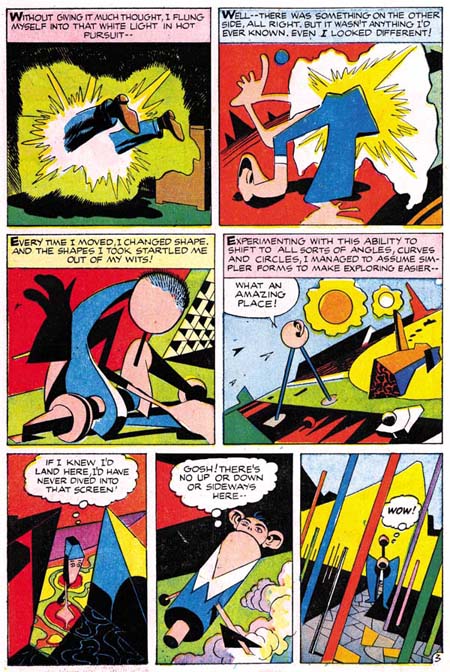
Mr. Fantastic’s visit to the Negative Zone was not Kirby’s first depiction of the Fourth Dimension, not by a long shot. His earliest occurred in collaboration with Joe Simon in Blue Bolt #5 (October 1940). Blue Bolt enters the Fourth Dimension through a cylinder surrounded by the earliest example of Kirby Krackle (Evolution of Kirby Krackle). On entry the hero is presented with an “odd looking landscape” reminiscent of the effect found in Fantastic Four #51. Blue Bolt then finds he can see through objects and requires special goggles to see in three dimensions.


Alarming Tales #1 (September 1957) “The Fourth Dimension is a Many Splattered Thing”, pencils and inks by Jack Kirby

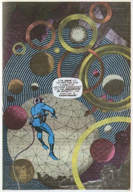
Kirby would return to the Fourth Dimension theme in an appropriately titled story “The Fourth Dimension is a Many Splattered Thing”. This work was done in collaboration with Joe Simon but after the breakup of their studio. Here Jack’s attempt to draw the indescribable result in some of the most unique images from his career.

Kirby had a long career as a comic book artist. It is surprising how certain themes show up repeated at different points in his career. The Fourth Dimension and Kirby Krackle are just two examples of this phenomenon. If it was just one or two incidences like this it would be easy to write it off as of not great significance. But actually there are many more examples that can be found (and I am sure I will post others from time to time). This signifies to me that Kirby was much more than an illustrator to the stories that he worked on. This is not to denigrate individuals like Joe Simon or Stan Lee for their contributions were also important.

Blue Bolt Covers


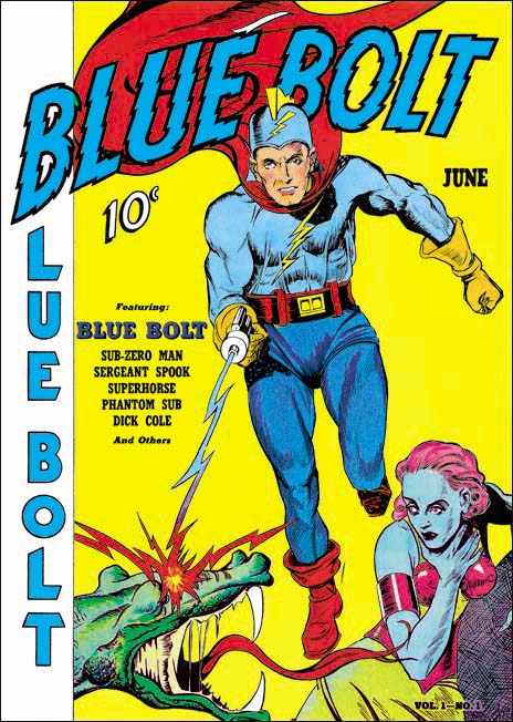
Blue Bolt #1 (June 1940), art by unidentified artist

As previously discussed, Joe Simon’s creation of the feature Blue Bolt occurred somewhat earlier than the cover date of Blue Bolt #1 would suggest. Joe supplied it to Funnies Inc. a shop run by Lloyd Jacquet that put together comic books for other publishers. Blue Bolt was just one of a number of features that Simon created for the shop. But apparently Jacquet and Novelty Press must have seen some special potential in Blue Bolt and used it as the title feature for a new comic book. Had that had been the intention all along it would be expected that Simon would do the cover art but since that was not the case we cannot assume he drew the cover. There are reasons to believe that Simon was not the cover artist and little to suggest he was. To my knowledge only the eyes of the Green Sorceress look like they might have been done by Simon. However many comic book artists found difficulty in getting eyes to sit properly on a face viewed from an angle. Otherwise none of the figures look like any other art that we can more confidently attribute to Joe. The Green Sorceress’ hair seems tamed in comparison to Simon’s depiction in the story. The dragon does not resemble the monsters in the story either. Blue Bolt’s cape lacks the distinct zigzag contour found in the story although Simon would abandon this device in future issues. Blue Bolt’s helmet includes a lightning bolt emblem that is missing from the story art. The gloves and boots have a three dimensional presence that Simon generally avoided and specifically did not use for Blue Bolt. Finally the composition is very untypical of Simon particularly the lack of any background elements causing Blue Bolt to float. It is hard to escape the conclusion that despite what some have claimed the cover art for Blue Bolt #1 was not done by Joe Simon.

Jacquet’s shop had a number of comic book artist which could have been called upon to draw the cover. Perhaps the most famous were Carl Burgos and Bill Everett but I think it can safely be said that the style of the cover art does not match either of these two artists.


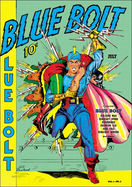
Blue Bolt #2 (July 1940), art by W. E. Rowland

Fortunately the next Blue Bolt cover was signed so there can be no question that it was drawn by William E. Rowland. The cover art for BB #2 shares some features with that for BB #1. In particular the more three dimensional aspects of the gloves and boots as well as the lightning bolt design on the helmet. I feel that the Blue Bolt’s face looks similar in the two covers. However Rowland goes even further in giving the gloves and boots a real physical presence. Further he has added details to the gloves that were missing from the BB #1 cover such as the lightning bolt and small circular shapes and lines that border the opening of the glove. While I would not rule out that Rowland was the cover artist for BB #1, I do not find the similarities strong enough to convince me that he was.


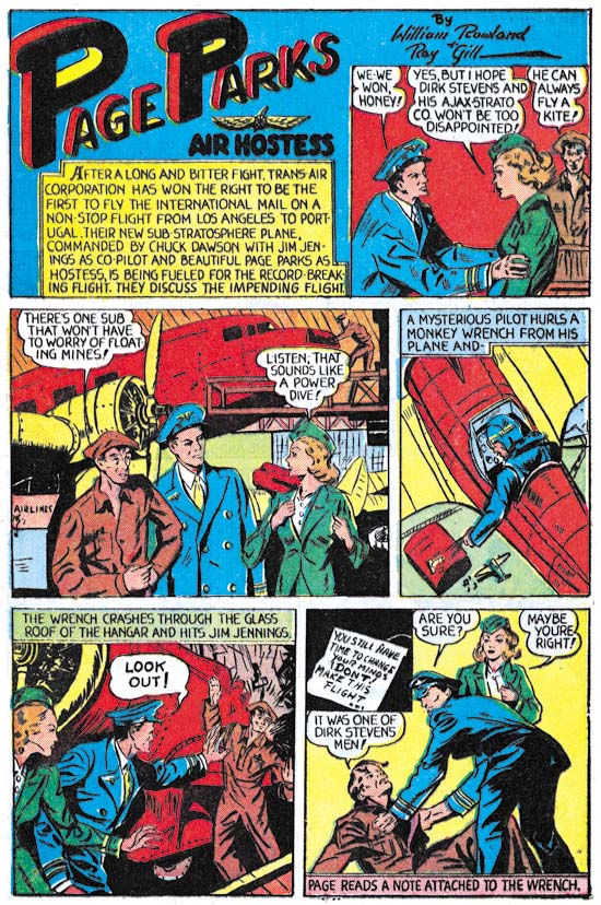
Blue Bolt #1 (June 1940) “Page Parks”, art by W. E. Rowland

The signature on the cover of BB #2 is particularly valuable because I doubt that Rowland would otherwise have been credited for the art. Apparently Rowland only worked on comic books for a few years (1939 to 1942) and even during that period he did not seem to do a lot of work. I have discussed one story by Rowland from Prize Comics #7 (December 1940) previously (Ted O’Neil). Frankly it was a rather unfair comparison of his take on the feature with Simon and Kirby’s. The purpose of the post was to highlight how radical Simon and Kirby’s work was compared to the work by more typical comic book artists even at this early stage in their career. Blue Bolt #1 also has a story drawn by Rowland and a scan of a page is provided above. Rowland is a good comic book artist, better than most contemporaries, but judging from the work I have seen so far it is hard to understand why he would have been selected to provide cover art. Whatever the basis for that decision it turned out to be a good one because Rowland’s cover art is rather nice and far superior to his story art.


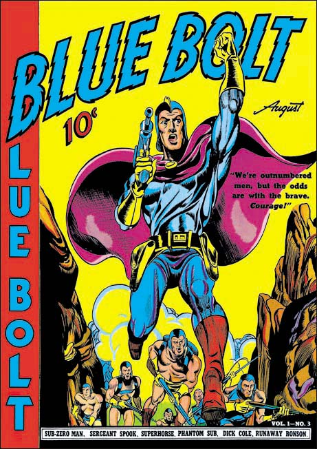
Blue Bolt #3 (August 1940), pencils and inks by Joe Simon

It was only with the third issue that Simon had his single chance to provide the cover art for Blue Bolt. Much could be said about the technical problems with the art. The cloth folds are a confusing mess and the perspective of the forward leg is not quite accurate. But these and others faults are nothing more than nick-picking that do not significantly distract from the cover’s impact. The figure of Blue Bolt was swiped from Alex Raymond’s Flash Gordon (see Art by Joe Simon, Chapter 4, Footnote) but Joe has infused the figure with excitement. Simon also uses a low viewing angle so that Blue Bolt can tower over his supporting soldiers. It is a effective depiction of an attaching force coming through some mountainous pass.

There was a time that some attributed this cover art to Jack Kirby but nowadays there is general agreement that Simon drew the cover. Perhaps the most convincing evidence that Kirby did not draw the figure is the somewhat problematic nature of the perspective of Blue Bolt’s leg, Kirby’s use of perspective was always very convincing. While it is now known that Kirby did sometimes use swipes I have never seen an example of Jack swiping from the same source more than once. However this twice use of Raymond’s Flash Gordon running figure would not be unusual for Simon.


Blue Bolt #5 (October 1940), art by W. E. Rowland

Blue Bolt did not appear on every cover of the comic that bore his name. The next appearance of Blue Bolt was for issue #5 and once again Rowland has the honors. While this cover shares some stylistic features with the one Rowland did for BB #2 there have been important advances as well. Blue Bolt’s glove and boots have an even more exaggerated three dimensional look. The figures have become more massive and muscular and the inking finer and more detailed. While Rowland did a good job on the cover for BB #2, this one is a masterpiece.


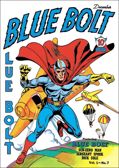
Blue Bolt #7 (December 1940), pencils by Jack Kirby, inks by Joe Simon

Issue #7 marked Blue Bolt’s final cover appearance during the Simon and Kirby run. It would be Jack Kirby’s only Blue Bolt cover. While not a bad cover it was not one of Jack’s finest either. I feel much of the blame comes from the action portrayed. Jumping out of a plane just does not have the impact of, for example, attempting to stop a bomb from exploding (as seen in the cover for Champion #10, August 1940). The rather unimpressive aircraft do not help either. I am not sure what they are meant to be since they lack propellers or jet engines. Rocket planes?

In the Beginning, Chapter 12, Their First Hit


Blue Bolt #10 (March 1941) Blue Bolt, pencils by Jack Kirby, letters by Howard Ferguson

Blue Bolt was a comic serial feature. Except for the first issue, the plot for each story reached a satisfactory completion but the end always included what effectively was the start of the next story. However the story for BB #10 ends with the green sorceress promising to give up her evil goals of domination and letting Blue Bolt go free. What would Blue Bolt be without the green sorceress as a nemesis? The inside cover was titled “Ye Editor’s Page” which states:

Most of you are tired of seeing the green sorceress constantly fighting Blue Bolt. Hereafter, this strip will be improved by showing new and more exciting action without the green sorceress.

Blue Bolt would continue but without Simon and Kirby. 


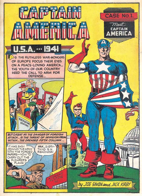
Captain America #1 (March 1941) Meet Captain America, pencils by Jack Kirby and Joe Simon, letters by Howard Ferguson

I doubt very much whether Simon and Kirby’s leaving Blue Bolt had anything to do with any dissatisfaction with the work they had done on the feature. Rather I suspect they stopped moonlighting to devote more attention to Captain America, their new creation for Timely Comics. Joe and Jack had made a deal with Goodman, the owner of Timely, in which they would get a share in the profits. It therefore made sense to give priority to the work that they would do for Timely. Since Simon and Kirby would create all the work that appeared in Captain America, 61 pages for the first issue, this meant a substantial increase in they amount of work they had to produce each month. (Although the Captain Marvel Adventures that Simon and Kirby had done previously required a similar number of pages.)

While Kirby is usually credited with drawing Captain America, some of it was actually penciled by Simon particularly in the first issue. For instance the standing figure of Captain America shown above was drawn by Joe while the rest of the page, including the running Bucky, were done by Kirby.


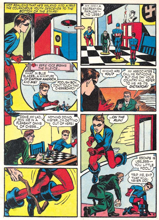
Captain America #1 (March 1941) Captain America and the Chess-board of Death page 9, pencils by Jack Kirby, letters by Howard Ferguson

In a previous post (Chapter 10) it was observed that Simon and Kirby had begun using some new layout devices. One, picked up from Lou Fine, was to extend figures beyond the panel borders. If anything, Joe and Jack made even greater use of this device in Captain America. Sometimes to extremes as for instance the standing Bucky in the upper left of the page shown above whose figure extends over three panels. In Captain America Simon and Kirby began using unusually shaped panels as well such as the circular panel and others with a curved border shown above. Even Ferguson got into the act by using vertical letters for normal text in the speech balloons while using slanted letters in captions and when emphasis was desired. It appears that Simon and Kirby were doing whatever they could to make Captain America art stand out.


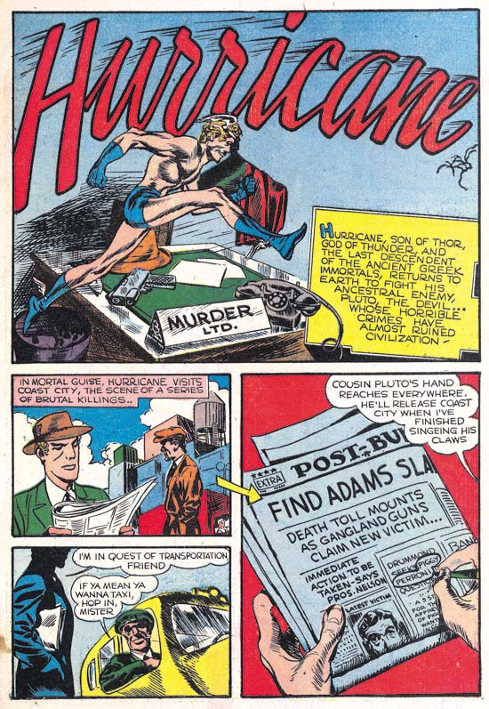
Captain America #1 (March 1941) Hurricane, pencils, inks and letters by Jack Kirby

While all the Captain America stories from the first issue were drawn by both Kirby and Simon, inked by various hands and lettered by Howard Ferguson there were two backup features that were drawn, inked and lettered by Kirby alone. That is not to say that Simon was not involved just that there is no evidence to prove he was. One feature, Hurricane, concerned the return of the god Mercury to the human sphere. As such it was the first Kirby piece with a mythological theme.


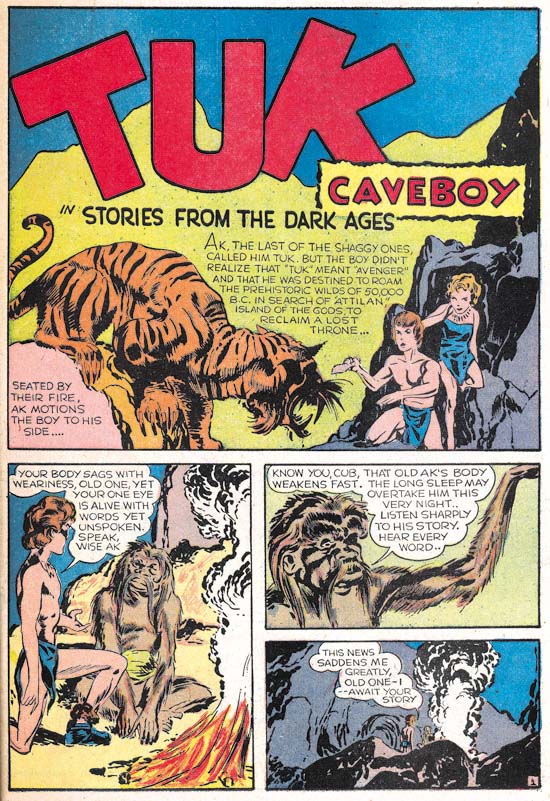
Captain America #1 (March 1941) Tuk Caveboy, pencils, inks and letters by Jack Kirby

The other all Kirby piece was Tuk Caveboy.


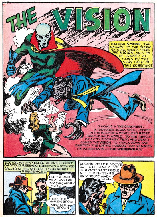
Marvel Mystery #17 (March 1941) Vision, pencils and inks by Jack Kirby, letters by unidentified letterer (from Golden Masterworks reprint)

Kirby also drew and inked the Vision story for Marvel Mystery #17 but, as with the previous issue, he did not do the lettering.

Captain America was a break through comic for Simon and Kirby, particularly for Kirby. Simon’s Blue Bolt had been an important enough of a creation to be the featured story of a new comic book title with the same name. It probably was popular enough but nowhere near as big a seller as Captain America. Up until then none of Kirby’s comics received any real attention. Captain America changed all that and made Simon and Kirby a brand name. While somewhat primitive compared to what Simon and Kirby would produce even a single year later, Captain America was well advanced relative to the comics published at that time. Pretty much everyone noticed and the comic book industry was changed forever.

It would be a great story to say that when Simon met Kirby they shortly began their classic collaboration. A great story but not what actually happened. Instead what appeared to occur was a variety of working conditions. Sometimes Jack helped out with some pages of art (for instance Blue Bolt #2 and #3), sometimes Kirby would do the pencils and Simon the inking (Blue Bolt #4 to #7), sometimes Kirby would do the pencils and other the inking (Blue Bolt #8 and #9), occasionally both Joe and Jack would pencil and others would do the inking (Captain America #1) and finally both might do their own individual projects (like Simon’s Fiery Mask in the Human Torch #2(1) and Kirby’s Vision stories in Marvel Mystery #13 to #15). While the overall tendency was for greater dependency on Kirby’s undeniable artistic skills as time went on, what appears to be happening was Simon taking on the roll of a true or acting editor using Kirby (or not) in whatever combination needed to get the job done. In my opinion it was not until Simon and Kirby left Timely for DC that they began to truly forge their business and artistic collaboration.

So ends another serial post. I am sure that someday I will do one on Joe and Jack’s Captain America but that day is not today.

The Simon and Kirby Library: Crime Makes the NY Times Best Selling List

Titan’s new book, “The Simon and Kirby Library: Crime” has made it to #5 on the NY Times best selling list of hardcover graphic books. There it is among such luminaries as Neil Gaiman (Sandman), Alan Moore (Neonomicon), Robert Kirkman (the Walking Dead), Graig Thompson (Habibi) and others. I think that is quite an accomplishment for comics produced over 60 years ago.

In the Beginning, Chapter 11, Calm Before the Storm


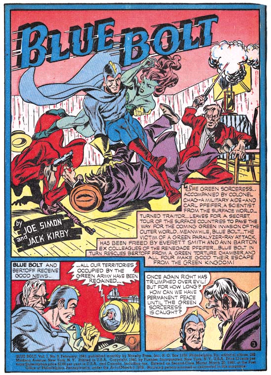
Blue Bolt #9 (February 1941) Blue Bolt, pencils by Jack Kirby, letters by Howard Ferguson

Once again some rather poor inking mars an otherwise great Simon and Kirby piece. As mentioned previously the inking was very likely the work of one or more of the Timely studio assistants; Al Avison, Al Gabriel and Syd Shores. Unfortunately this time Kirby did not even ink the splash.

A recent “innovation” was the used of a blue field to encircle the page and separate the panels. Simon and Kirby had not used this device either before or since. The other features in the comic book had similar color fields although using colors other than cyan (blue) so it was likely an addition by the publisher. I have to say I find this color field unnecessary and somewhat distracting.


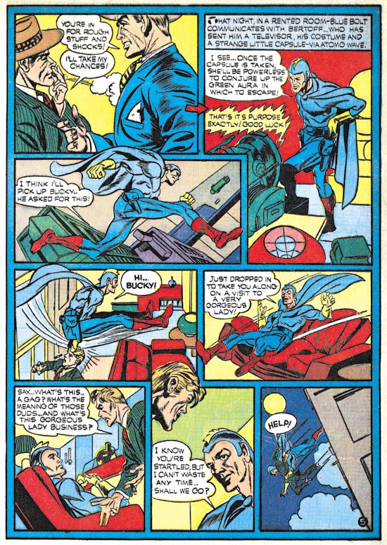
Blue Bolt #9 (February 1941) Blue Bolt page 5, pencils by Jack Kirby, letters by Howard Ferguson

Joe and Jack included in this story a reporter by the name of Bucky Williams. Of course Bucky was the name of Captain America’s sidekick and actually Bucky Williams fills the roll of a temporary sidekick. The use of the name Bucky was not the only things found in BB #9 to predate their use in Captain America which would premier next month. For the first time Simon and Kirby would extend figures outside of the panel borders (see above image). This was not an Simon and Kirby innovation (they picked it up from Lou Fine) but nonetheless was followed by some other artists once Captain America became a big success.


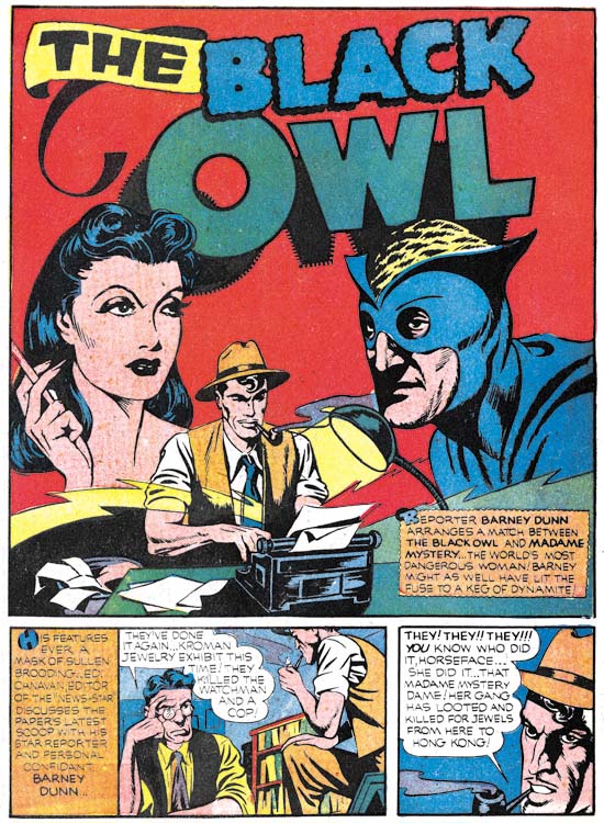
Prize Comics #9 (February 1941) Black Owl, pencils by Jack Kirby, inks by Joe Simon, letters by Howard Ferguson

Simon and Kirby return for one final Black Owl story. With Simon providing inks to Kirby’s pencils this story is much more attractive than the Blue Bolt #9 from the same month. The story includes a reporter who plays the part of a temporary sidekick for the Black Owl. This is basically the same plot device played by the reporter Bucky Williams in BB #9. In the art for this story Simon and Kirby extended figures beyond the panel borders just as they had in Blue Bolt #9.

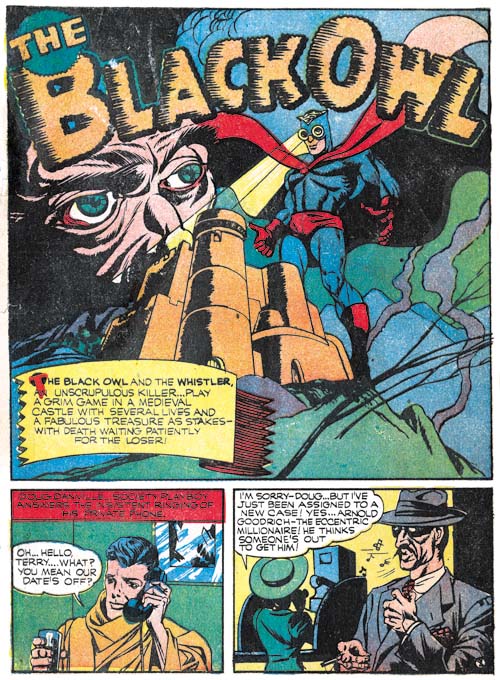
I do not know who to blame, but note the rather odd shadowing of the letter ‘O’ in the title, in particular the center of the letter. When I restored this page for the “Simon and Kirby Library: Superheroes” book I got a email from an editor at Titan asking if I got the restoration wrong. Well of course it is wrong only it was not my error.


Marvel Mystery #16 (January 1941) The Human Torch, pencils by Carl Burgos, letters by Howard Ferguson (from Golden Age Masterworks reprint volume)

Howard Ferguson provided the lettering for the Human Torch story from Marvel Mystery #16. Ferguson did not provide the lettering for all the Human Torch stories in the issues of Marvel Mystery but he did letter some of the Human Torch and Terry Vance stories but only those two features. Why Howard was restricted to just those two features is unclear but that would eventually change but not during the period covered by this serial post.


Marvel Mystery #16 (January 1941) Vision, pencils and inks by Jack Kirby, letters by unidentified letterer (from Golden Age Masterworks reprint volume)

While Ferguson provided lettering for all the moonlighting work that Simon and Kirby produced for this month he did not letter their single Timely piece, the Vision from Marvel Mystery #16. That would not been surprising had Kirby provided the lettering as has he had done in previous Visions stories but oddly some other letterer was used. Since credits were not supplied in the comics of those days it is unlikely this particular letterer will ever be identified.

In the Beginning, Chapter 9, More Moonlighting


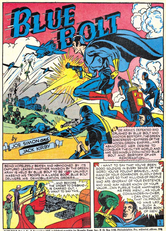
Blue Bolt #7 (December 1940) Blue Bolt, pencils by Jack Kirby, inks by Joe Simon, letters by Howard Ferguson

Blue Bolt #7 continues the Simon and Kirby collaboration in its purist form, that is with Jack doing the pencils and Joe providing the inks. The only other feature from December that showed such a degree of collaboration was the Black Owl from Prize Comics #7 which I will discuss below. Both of these features were done while moonlighting. As we will see below the features created for their regular gig at Timely were not quite the same joint effort.

The enlarging World War II, romance, betrayal, spies and assassins are just some of the elements of this engaging story. Simon and Kirby were not satisfied with telling a simple confrontation between a hero and a villain they had to put in as much as possible. Ten pages hardly seemed enough to fit all that they included. It does not seem that Blue Bolt had any significant impact on the rest of the comic book industry of the day but it should have.


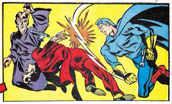
Blue Bolt #7 (December 1940) Blue Bolt page 8 panel 1, pencils by Jack Kirby, inks by Joe Simon, letters by Howard Ferguson (horizontally flipped image)

Sure Blue Bolt was science fiction but that did not mean that the hero always used a ray gun. Previously Kirby had a penchant for dramatic slugfests but now he began to take that art to a new level.

I present the above image in reverse…


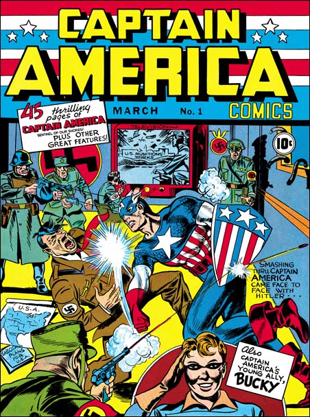
Captain America #1 (March 1941), pencils by Jack Kirby

as I want to highlight that roll Blue Bolt played in laying the groundwork for a future hit. Captain America would appear on newsstands just three months later.


Prize Comics #7 (December 1940) The Black Owl, pencils by Jack Kirby, inks by Joe Simon?, letters by Howard Ferguson

Blue Bolt was not the only moonlighting job that Simon and Kirby produced for December they also did Black Owl for Prize Comics #7. Joe and Jack would end up doing a Black Owl story for three issues which I discussed previously (Simon and Kirby’s Black Owl). All three stories were reprinted in Titan’s “Simon and Kirby Library: Superheroes” (shameless plug). The Black Owl was not a Simon and Kirby creation and I really do not know much about previous appearances of the character.  But of course Simon and Kirby added their distinct touch if in nothing more than the story and art.


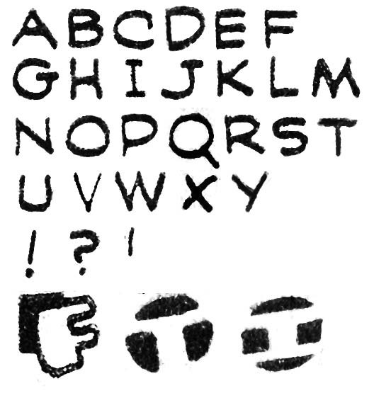
Prize Comics #7 (December 1940) The Black Owl, letters by Howard Ferguson

Howard Ferguson provided the lettering for the Black Owl story. I have previously provided the lettering samples for Ferguson’s Prize Comics #7 but I have since made a correction and some additions to it. A recap of the more useful features would seem in order. The most useful trait for identifying Ferguson lettering is the little vertical stroke attached to the upper end of the letter ‘C’. Another useful trait is the very shallow hook for the letter ‘J’ but unfortunately that is not a common letter. Some other traits are less useful but still should be noted particularly the way the upper portions of the letters ‘P’ and ‘R’ predominate over the lower portion. The letter ‘S’ is similarly often affected by a predominate upper portion but there is some variation in this feature. Another trait is found in some but not all ‘N’ is the manner that the left vertical stroke is sometimes tilted downward to the left somewhat. Perhaps not as useful than the letter ‘C’ but certainly easier spot is Ferguson’s special handling of the first letter in captions (examples are provided above). I believe all these traits (except the special ‘N’) were retained by Ferguson the rest of his career. I plan to review his entire career after I finish this serial post.

In is at this time that in my opinion Ferguson’s lettering has gone from good to great. This is not due to form of his letters which has changed only a little from previous work. Rather it steady and firm hand used and the spacing and legibility of the final results. Ferguson’s work is not mechanical but neither is it overly variable.

Besides an improvement in quality, the lettering differs from what was done not that long ago for Blue Bolt #5 (October 1940) by three changes.

I have previously pointed out the special handling of the first letter in captions. Such enlarged and specially formed letters are similar to the first letter of chapters often found in older books. The analogy is not perfect but it is close enough that I have decided to adopt the name given to them, drop capitals (or drop caps for short). Drop caps were used by other comic book letterers but Ferguson began using a special version where the letter is created a negative space in a black field such as the two final examples in the image above. I shall refer to these as negative drop caps. It was the introduction of negative drop caps that is one of the things that distinguish Prize #7 from Blue Bolt #5. But there appears to be two flavors of negative drop caps. The first that appeared in Blue Bolt #6 and the Terry Vance feature from Marvel Mystery #13 (both November 1940) had vertically oriented letters. Later in Blue Bolt #7, Prize Comics #7 and the Human Torch and the Terry Vance features from Marvel Mystery #14 (all December 1940) Ferguson introduced negative spot caps that were tilted.

The second change in Ferguson lettering concerns the letter ‘G’. In Blue Bolt #6 (November 1940) and earlier Howard constructed the ‘G’ with a small horizontal element on the left side of the bottom of the character and does not extend to the right. In Prize Comics #7 and the Human Torch story from Marvel Mystery #14 (both December 1940) Ferguson extends the small horizontal so that it appears on both the left and the right side. Interestingly Blue Bolt #7 (December 1940) uses the old form of ‘G’ for most of the first page of the story while otherwise using the new ‘G’. The old ‘G’ is used in BB #5 (October), BB #6 (November) and the Terry Vance stories from MM #13 and #14 (November and December). As mentioned both forms of ‘G’ appear in BB #7 (December). Only the newer ‘G’ appears in the Human Torch of MM #14 (December).

The third change involves the form of the letters ‘I’ and ‘J’. Ferguson’s older form for these letters excluded any horizontal elements while the newer form did. While the letter ‘I’ is common enough, horizontal strokes are not supposed to be added when the letter is used with others to form a word. Unfortunately the isolated use of ‘I’ and the use of ‘J’ are not too common. The old form of ‘I’ and ‘J’ appear in BB #5 (October), BB #6, Terry Vance from MM #13 (November) and BB #7 (December) with the new forms used in PC #7 and the Terry Vance feature of MM #14 (both December).

With these three changes in Ferguson’s lettering it would seem possible to sort out the relative order that Ferguson lettered the work appearing in the months from October to December. Regrettably it turns out that no ordering is possible that will satisfy all three criteria for all cases. The few cases of lettering by Ferguson from later periods suggest that perhaps he was not consistent in his use of ‘G’. Hopefully this question will be answered as my review progresses.


Marvel Mystery #14 (December 1940) The Vision, pencils, inks and letters by Jack Kirby,

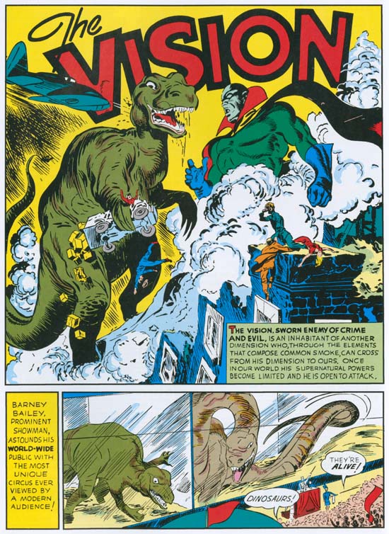
The Vision became a regular Marvel Mystery Comics features with his second appearance in MM #14 (December 1940). As in the previous issue, Kirby would provide pencils, inks and letters for the Vision story. Even today the Simon and Kirby Vision is a largely neglected feature and at that time it was very much overshadowed by the Human Torch and the Sub-Mariner. (This story was reprinted in “The Best of Simon and Kirby”, another shameless plug).

Lettering by Howard Ferguson also appeared in Marvel Mystery #14 in the Human Torch and the Terry Vance features.


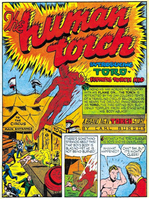
Human Torch #2(1) (Fall 1940) the Human Torch “Introducing Toro”, pencils by Carl Burgos, lettering by Howard Ferguson

As mentioned in the previous chapter, Timely did not release a Red Raven #2 issue. Instead that titles mailing license was used instead for a new title, Human Torch Comics #2. That the first issue was numbered 2 has brought about confusion to the numbering of the title even back when it was released. I have added “(1)” to the issue number to indicate it is actually the first issue. The cover is dated as Fall 1940 which means there might be some question as to what month to assign it. However Marvel Mystery #13 (November 1940) and #14 (December 1940) have house advertisement for the Human Torch #2(1). The MM ads provides a release date of September 25. Normally comics are cover dated about two months after their release so it is seems appropriate to assign HT #2(1) to December.

This issue has been reprinted in the Golden Age Masterwork series. Unfortunately Marvel did a horrendous job re-creating it. I have discussed this previously (The Human Torch #2) but I feel I need to emphasize here that the reprint volume is useless for anything beyond a casual reading. It is simply not possible to use this reprint book to examine the art or lettering. Luckily I will be using scans from the original comic in my discussions here.


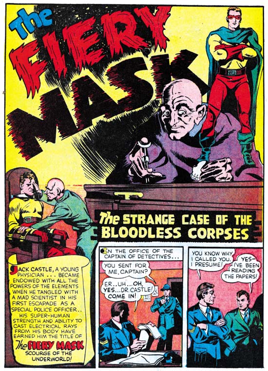
Human Torch #2(1) (Fall 1940) the Fiery Mask “The Strange Case of the Bloodless Corpses”, pencils and inks by Joe Simon, letters by Howard Ferguson

The Fiery Mask was one of Simon’s earliest creations having first appeared in Daring Mystery #1 (January 1940, Daring Mystery and Joe Simon BK (Before Kirby)). Another artist drew the character for Daring Mystery #5 (June 1940) but Simon returned with Kirby’s help to provide the Fiery Mask for Daring Mystery #6 (September 1940). Simon worked on the Fiery Mask one last time for Human Torch #2(1) (Fall 1940). I periodically get asked, but I really feel this was a solo effort because I cannot find any sign that Kirby had anything to do with this Fiery Mask story, “The Strange Case of the Bloodless Corpses”. Simon’s comic book art improved rapidly so that even though only a short period had past the art style for HT #2(1) Fiery Mask story shows it was definitely drawn when Simon became editor at Timely and was not some older inventoried story from when he first started working in comics. Still it would be nice to provide a more accurate date for the story as it theoretically have been done a few months earlier and inventoried or it could have been drawn later specifically for the HT #2(1) issue.

Fortunately the lettering Howard Ferguson did for the story may provide a clue. As mentioned before Ferguson’s work had been undergoing development during this period. The Fiery Mask story lacks negative drop caps and uses the older form of the letters ‘G’, ‘I’ and ‘J’. Therefore I believe it must have been done no later than the work for Blue Bolt #5 (October 1940). It likely was originally intended for Daring Mystery #7 which possibly was meant to be released in October or November but that publication of that issue was delayed until April 1941. Or alternatively it might have been meant for Red Raven Comics #2 which should have come out in October but that title got cancelled. But in any case the Fiery Mask story was done earlier than the Human Torch story in the same issue as that story was lettered by Ferguson but with the tilted negative drop caps, the new ‘I’ and ‘J’ and mostly using the new ‘G’ all of which suggests a December date.