Category Archives: Periods

Champ #19 (June 1942)

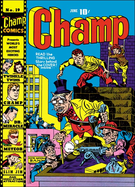
Champ #19

This is one my favorites of the Harvey covers. Once again there is a Jon Henri signature, but this time it was Joe Simon doing the pencils. The visual humor found in the primary crook, will reappear later in the Duke of Broadway. Even the bullet’s near miss of the policeman is more humorous then it is suspenseful. Joe portrays the Liberty Lads younger then Jack did. If they look familiar that is because they actually are Gabby and Scrapper from the Newsboy Legion.

It is amazing to see how well all the pieces of the story are present. The robbed bank, most of the policemen ineffectively on the other roof, the single policeman in the correct location is about to taken care of by the crooks before they make their get-away. That is except for the Liberty Lads approaching unseen from the back, about to save the day. What a masterpiece.

Joe could work in a style close enough to Kirby’s that to this day many are fooled. But he had his own vision too and I am a bit surprised that so many experts still attribute this cover to Kirby. I suspect many use aesthetics to distinguish the two; for them if it is one of the better covers Jack must have done it. Jack did most of the penciling and Joe acknowledges that Kirby was an incredible artist. But I am here to tell you that Joe Simon is a lot better artist then many give him credit for.

Again this cover was published in 1942, not 1941 as listed in the Checklist.

Ken Riley, The Forgotten Comic Book Artist

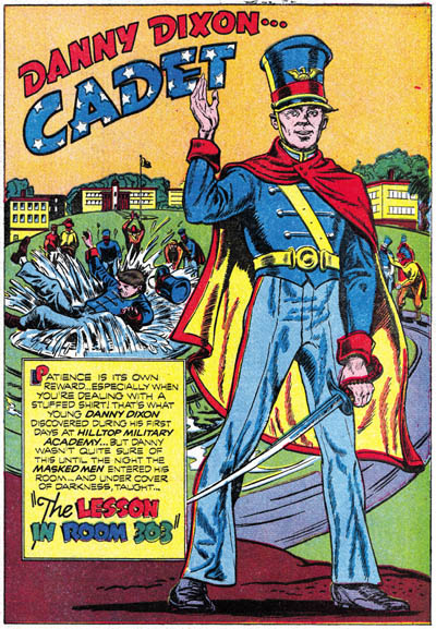
After returning from military service, Simon and Kirby made a deal with Al Harvey to produce some comics. Jack would draw Stuntman and the Boy Explorers. Joe worked on the Duke of Broadway, Vagabond Prince and Kid Adonis. As I mentioned in a previous post, S&K created some series for Bill Draut (The Furnished Room, Calamity Jane and the Demon). They also created a series “Danny Dixon, Navy Cadet” for Boy Explorers to be done by an artist by the name of Ken Riley. Even hard core S&K scholars would probably respond with: who? Ken Riley was a Coast Guard combat artist for the war who Joe met during their joint service in Washington. But perhaps it would more accurate to call Danny Dixon an intended series as Boy Explores was one of the victims of a comic glut at that time. Only one issue was distributed to news stands. The second issue, sent to subscribers only, was very reduced in size and printed in black and white.

Boy Explorers #1

Boy Explorers #1 (May 1946) “The Lesson In Room 303”
Boy Explorers #2 (September 1946) “The Loaded Oyster Bed”
Black Cat #4 (February 1947) “The Imitation Atlas”
Black Cat #5 (April 1947) “Adventure, South American Style”
Black Cat #6 (July 1947) “The Loaded Oyster Bed” (reprint)

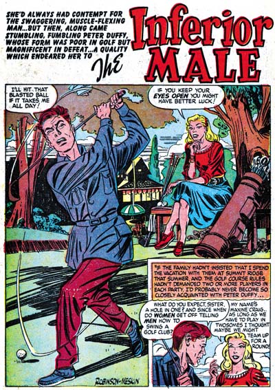
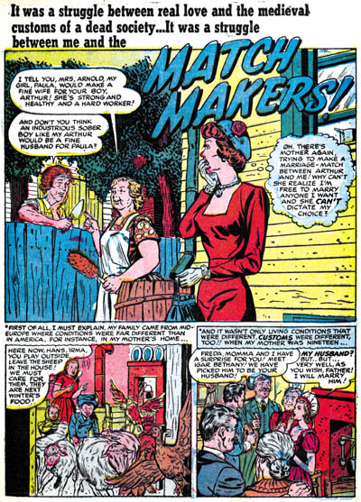
But Ken returned to do at least one story for Young Love #3 (June 1949) “Match Makers”. Here his work is more polished then in Danny Dixon. Since he already was a accomplished artist, this was probably because the romance format allowed him to use a more realistic approach. I think he did a real nice job of that story. Joe still has the original art for the splash page. Much of the fine inking quality was lost in the printing of the comic.

Young Love #3

apparently Riley did not stay in comics for long. Later he did some illustration work for Saturday Evening Posts, Life and National Geographic. I’ve also seen cover art for the book “The African Queen” that was said to have been done by a Ken Riley in 1949. Ken turned to fine arts and moved out west. The paintings I have seen by him are all of Native Americans.

Ken Riley did not sign his comic work. There may be more of it remaining to be identified. The only reason for attributing the above works to Ken are margin notes on some original art and discussions with Joe Simon. Ken Riley did not have much of a comic career, but it did come at a pivotal time at the start of the Simon and Kirby studio after the war. However the real reason I posted this is that his comic work has all but been forgotten. Comics find no place in the biographies of Riley that I have read. In comics histories, the only mention of Ken that I have found was in “The Mainline Comics Story: An Initial Examination” in The Jack Kirby Collector #25 written by Robert Beerbohm (unfortunately misspelling Ken’s name as Reilly). Ken truly was a forgotten comic artist, it just seems a shame for that to remain the case.

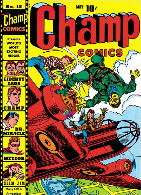
Champ #18 (May 1942)

Champ Comics #18

Joe and Jack had done three covers for this series when it was published by Worth under the title Champions. Now the line was being done by Harvey after his unsuccessful pocket comics. Here and in the comics published at the same by National, we find the start of the real Simon & Kirby style. I believe the reason this happened now is that before at Timely there was a large crew working on Captain America. But initially there was probably only Joe and Jack at National. This really forged their collaboration. The Captain America covers were exiting but now Joe and Jack have taken it to a new level. Forget about how the Liberty Lads managed to get into this aerial fight. Who cares how one of them is able to slug a Jap off the plane with the propeller in between them? What matters is the story of the daring rescue of our capitol from the Japanese menace. How could a kid possibly pass this cover up without at least stopping to see what was inside. Unfortunately the contents did not, could not, live up to the cover. For that the comic reader would have to buy National’s Adventure or Star Spangled comics.

Another Harvey cover signed as Jon Henri. But does anyone have a doubt, that Kirby penciled this cover?

By the way, the Checklist uses an incorrect date for this cover as well as for #19, #20 and #21. They were all done in 1942, not 1941.

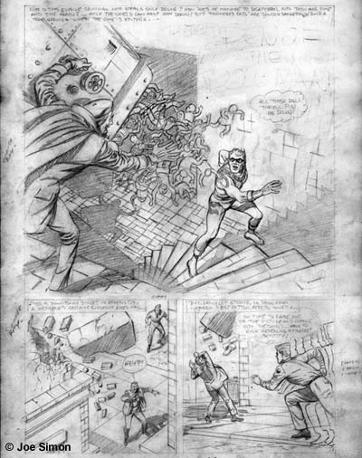
Gray Morrow does the Shield

In 1959 Joe Simon made an agreement with Archie Comics to produce two superhero lines, “The Adventures of the Fly” and “The Double Life of Private Strong”. The Fly was a new creation, although it was based on an earlier, unpublished Simon & Kirby idea, “The Silver Spider”. The hero for Private Strong was called the Shield. But it was not the same character as the orignal Shield that Archie (then called MJL) published during the war. This Shield had a new origin and new powers. Perhaps the Shield’s new powers were a little too good. As Joe tells it, once over a poker game DC threatened to sue Archie because the Shield was too much like Superman. That would explain why the “The Double Life of Private Strong” only lasted two issues. A cancellation that was much too soon to have been based on sales.

Probably because of the untimely termination of Private Strong, Joe ended up with a six page Shield story (“The Den Of The Doll Man”) that was never published. The story was penciled by Gray Morrow but was never inked. Morrow was just out of service during the Korean War and I don’t believe he had worked for Simon before. Even though the story was not used, Joe must have been happy with it because Gray would later do work for Joe’s comic magazine called Sick. Morrow worked on the Shield story in a very light pencil. I’ve used Photoshop to bring up the contrast in the scan I provide. He used a more realistic style then was done on previous Private Strong or Fly stories. Generally speaking Gray handles the action scenes well. But in one panel he has the Shield hurdling through space only you have to read the legend to realize that he has just jump off the Brooklyn Bridge. My biggest problem with the Shield story has to do with the script. For one thing the pacing is a bit off. There is a fairly long chase sequence leading to a confrontation that is over much too quickly. Even more important then the pacing, is frankly the story is just too lame. It involves the Shield trying to find out who is stealing dolls from children. If that wasn’t bad enough the thief’s secret weapon against the Shield is to dump a load of dolls on him.

The Den of the Doll Man

There is a larger image here.

Although Private Strong was cancelled, the Adventures of the Fly continued. At some point Joe decided not to let Morrow’s Shield story go to waste. In the margins of the art pages, Joe began to rewrite it into a Fly story. It would seem that Simon also felt the script could use some improvement. Where the Shield saved a man from an accident, the Fly not only saves him but in doing so reveals his secret identity. Joe was also going to change the villian’s use of dolls into a strange ray gun. But Joe did not get too far. His margin notes end on the second page and other then erasing the title, no art work was modified. Joe Simon’s production of the Fly ended with the fourth issue. A very different Adventures of the Fly would continue without Simon and perhaps this explains why Gray Morrow’s art work failed to get used a second time.

But in a way Joe was not done with the Fly. Many years later the copyrights for the Fly would come up for renewal. As creator Joe decided to try to regain the rights. This may sound like what played out twice with Marvel and Captain America. But actually it is a really different story. The Adventures of the Fly had ended years ago (1965). Archie Comics really had little interest in superheroes, they still make too much money off of Archie and his pals. Joe and Archie made a deal part of which has Simon getting the copyrights back. I’ve seen the original document for this deal, it is hand written by the two parties. I am sure lawyers were later brought in to formalize the agreement. But initally it was just a couple of guys sitting at a table, talking over their differences and reaching some compromise. Doesn’t this sound like how things should be done?

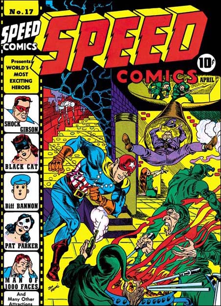
Speed #17 (April 1942)

Al Harvey must have been a great salesman. As Joe Simon tells it, Al’s great idea of pocket size comics (Pocket, Speed and Spitfire) were very popular. Unfortunately one of the reasons for their popularity was the ease that kids could steal them. That fact did not make them popular with the newsstand owners. You would have thought that when the last of these small comics were published in January 1941, that would have been the end of Harvey’s publishing career. Instead not only did Speed Comics return in April as a regular size comic, Harvey took over publishing Champ Comics in May, and then even more surprising Green Hornet in June. Al would turn again to Joe Simon, and now Jack Kirby also, to help with the covers.

Speed #17

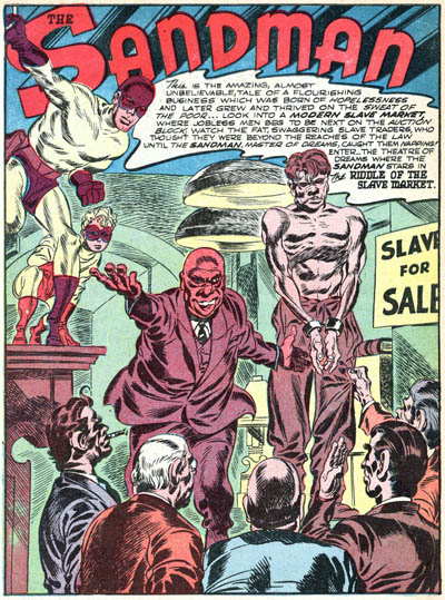
When Harvey resumed publishing, S&K were working for National. Joe and Jack’s version of Sandman was out in March (see image below), their version of Manhunter and their own creation the Newsboy Legion came out at the same time as Speed #17, and their creation Boy Commandos would come out in October. National was even using the Simon and Kirby name on their covers. It was pretty unusual at that time to use the creator names to promote the comic. Even so Joe and Jack would do covers art for Harvey. But they would not sign these with their own names. Instead some of the work is signed Jon Henri. I don’t believe that anybody in the industry or at National was fooled by this. I think the real reason that they did not use their own names is that Simon and Kirby had now become a brand name. It is one thing to give Al Harvey a helping hand, it is another to compete against yourself.

Adventure #72

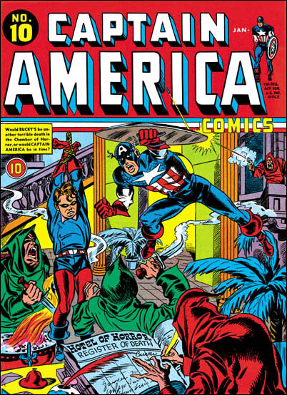
This cover has the Jon Henri signature. In later posts I shall show that other Henri covers would be penciled by either Jack or Joe. The overall composition is not unlike a classic Al Schromberg. Despite all that is going on, S&K seem to handle it well and present a clear story. But it is a layout style that was pretty unusual for them. Even though published by Harvey, this is very much a Captain America cover. Compare it to Captain America #10 which even has similar hooded figures. The art style is closest to what had been done at Timely. But the typical Simon and Kirby art had already appeared and National and would also show up on all the later Henri covers. I suspect that this cover was actually done just after leaving Timely and before their work at National gave birth to a true S&K style. Penciling was primarily done by Jack Kirby.

I admit that I am not comfortable with golden age ink attributions. But on this cover there is a peculiar inking pattern in the chute and the ceiling of the room above it. A similar inking style appears on the splash page that Al Avison did for Pocket #1. I have also seen it in “Red Skull’s Deadly Revenge” from Captain America #16, again by Al Avison. However I have also seen something similar on the covers for Champion #8 (Joe Simon) and #9 (Jack Kirby).

Bill Draut (usual suspect #1)

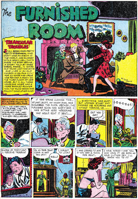
In previous posts I mention three artists that did a lot of work for the S&K studio over a long period of time. Because of the frequent appearance in S&K productions, I often refer to them as the usual suspects. In this post I would like to write about Bill Draut, the first of the usual suspects to work for the studio. During the war Joe Simon served in the Coast Guard. Joe spent a good part of this service in Washington working as a Coast Guard artist. One of the other artist who worked with Simon was friends with Bill Draut, then in the marines. When Joe got to know Draut he told him that after the war Bill should look him up in New York. When Joe rejoined Jack Kirby after the war, they made a deal with Harvey to produce Stuntman and Boy Explorers. Bill Draut joined in this effort and his first comic book work appeared in Stuntman #1. As part of their work with Harvey, Simon and Kirby would create comic series to be done by other artists. For Bill they developed The Furnished Room, Calamity Jane, and The Demon. Unfortunately Stuntman and Boy Explorers got caught in a comic glut, and were discontinued after a very few issues. But Draut’s contribution, the Furnished Room and Calamity Jane, would reappear in other Harvey comics about a year later. They probably represent unused material from the cancelled comics.

The Furnished Room

The Furnished Room was the first to be published appearing in Stuntman #1 in April 1946 (all dates for comics are cover dates). As was pointed out by Stan Taylor, this series was a S&K’s take on the popular syndication strip Mary Worth. The Furnished Room was essentially a soap opera with an elderly dowdy lady (this series version of Mary Worth). This dowdy lady would generally play a more peripheral part in the stories. The real stories were about the people who rented rooms from her. Because of the lack of superheroes, the Furnished Room may have been a little out of place in Stuntman but the series was really well done. The Furnished Room had a short run, all done by Bill Draut:

Stuntman #1 (April 1946) “The Furnished Room”

Stundman #2 (June 1946) “Triangular Troubles”

Green Hornet #37 |(January 1948) “The Smiling Salesman”

Green Hornet #38 (March 1948) “The Furnished Room” (reprint)

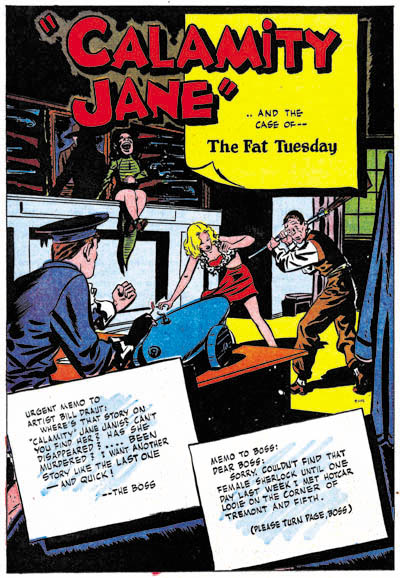
Calamity Jane

For Boys Explorer S&K created Calamity Jane which Draut would draw. This series were about a hardboiled detective who happened to be a female. The source for this idea seems to have been what is now called film noire. But in those movies the detective was a man, and women just played supporting rolls. The stories are presented as told by Calamity to the artist Draut. This was another good series which unfortunately did not last long, only three stories. But there is a story by Draut in Justice Traps the Guilty #3 that appears to be a reworked Calamity Jane. The detective was now named Ruth Lang, but a supporting character (the cabbie called Hack) remained unchanged. I previously posted on editorial changes Joe Simon did on one of the Calamity Jane stories.

Boy Explorers #1 (May 1946) “The Case Of The Hapless Hackie”

Green Hornet #35 (August 1947) “The Fat Tuesday”

Green Hornet #36 (November 1947) “The Man Who Met Himself”

Justice Traps The Guilty #3 (March 1948) “My Strangest Crime Case”

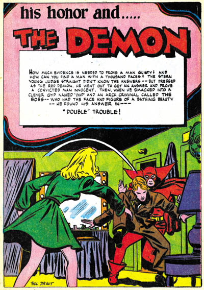
The Demon

The Demon was first published in Black Cat #4 (February 1947). The full title of the series is “His Honor the Demon”. The Demon has a rather unusual origin in that the hero is a judge frustrated because the law sometimes is helpless in finding and punishing the guilty. After one such case of a murdered man, he decides to investigate on his own. At one point he wears the same costume that the murdered victim was wearing at a party when he got killed. The judge did this in an attempt flush out the murderer. After a successful conclusion to this case, the judge decides to continue his extra-legal efforts using the same costume of a red demon. Again Bill was the only artist to work on this short run series.

Black Cat #4 (February 1947) “Double Trouble”

Black Cat #5 (April 1947) “The Man Who Didn’t Know His Own Strength”

Black Cat #6 (July 1947) “The Midnight Killer” (origin story)

Black Cat #7 (August 1947) “Too Cold For Crime”

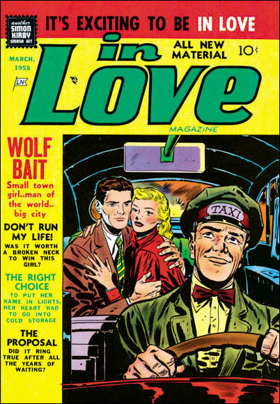
In Love #4

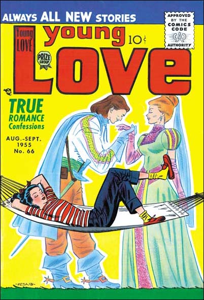
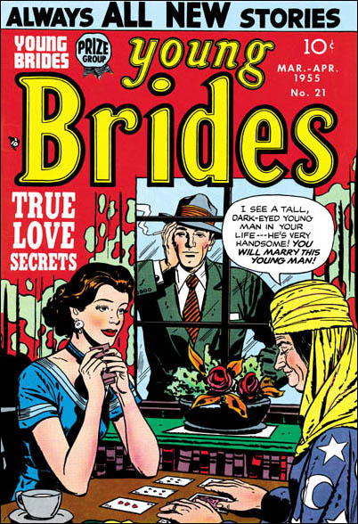
After those failed series, Bill Draut continued to work for the Simon & Kirby studio. Although he did provide some crime (Headline and Justice Traps The Guilty) and horror (Black Magic) work, most of the stories he did was for romance comics (Young Romance, Young Love, Young Brides and In Love). I previously posted on an unpublished Artist and Model cover that he did. His style seems very conducive to romance work. His women have beautiful eyes with simple but effective eyebrows. But Bill’s simple eyebrows seem more awkward on his men. Strong action did not seem to be Draut’s forte, but that was not an issue for the love stories. He was gifted enough of an artist and observant enough of the S&K style, that one of the covers he did (Young Brides #21) has been attributed to Jack by the Kirby Checklist.

Young Brides #21

Joe Simon has always maintained that he and Jack encouraged their artists to sign their work. Bill Draut does seem to have taken advantage of that and often added his signature to his earlier work. Later his stopped signing his material but his style is still easily recognizable. Draut does not seem as productive as the other usual suspects (Mort Meskin and John Prentice). As far as I know during his association with the S&K studio, he worked for them exclusively. When the studio disbanded in the mid 50’s Jack and Joe continued as editors for Young Romance with Kirby penciling a story in most issues. But for whatever reason, Bill Draut did not do any work for those Young Romance comics. I am not sure what Bill did in the late 50’s but he seems to have stayed in comics. When Joe Simon produced some hero comics for Harvey in the mid 60’s, Bill Draut would pencil some stories. I also know he did some work for DC at that time. His work seemed delegated to lesser profile series and I don’t think his style was very popular in the 60’s.

Carl Burgos does the Fly

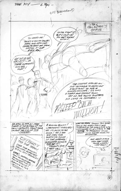
In 1959 Joe produced The Adventures of the Fly for Archie Comics. It was based on the Silver Spider, a never published Simon & Kirby creation. Jack was involved in some of the art, in particular the origin story. But other artists also did work on the Fly comics. Joe’s involvement on the Fly only lasted 4 issues. Perhaps that end came suddenly because Joe still has layouts for a Fly story (“Asleep on a Million”). When I asked him about them, he said that they were done by Carl Burgos. I was aware that Joe knew Carl well, but I did not know that Burgos had anything to do with the Fly. Need I add that Carl was the creator and frequent artist of the Human Torch for Timely.

Asleep On A Million

There is a larger image here. In the top margin of the first page is a note: “The Fly – 6 pgs”. But Joe only has 4 pages. They were all in the same envelope so I don’t think the missing 2 pages were misplaced. I suspect that they were never actually done. The art work for the layouts are very rough and done in light pencil. The script is in stronger pencil but still rough. However the script text itself looks like the it was meant to be the final draft. There are also margin notes providing directions such as “city background” for the splash. Or “make TV look patched up instead of new” for panel 4. One note makes it obvious that these layouts were meant for another to finish (“artist add crime graf behind news caster”).

Having seen this one layout, it makes you wonder whether Carl Burgos may have made some of the layouts for some of the Fly stories that were published. It also makes you curious about why he was not going to do the finishing pencils himself.

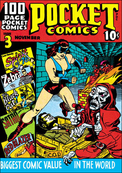
Pocket Comic #3 (November 1941)

I have saved Pocket Comics #3 as the last small sized cover that I would post on. If Speed #14 to #16 were done by Al Avison and if Pocket #1, #2 and #4 covers were done by Joe Simon, it would seem natural to say Joe also did Pocket #3. In fact the depiction of the Black Cat matches the one Joe does for Pocket #2 and #4. On none of the Speed covers is there any indication that Avison could execute such a convincing pose for the Black Cat. But as soon as we turn to the rest of the cover, problems set in. The soldier being prepared for shipping (via C.O.D) just does not seem to lay down in the box. The Nazis are white skeletal figures in red hooded clocks. I would describe the robbed figures with the same term I used for Speed #15 and #16, goofy. The track record so far for the pocket comics is that Joe did well executed covers, Al rather crude ones, Joe presents intimidating villains, Al goofy Nazis.

Pocket Comics #3

The action takes place in a long corridor done in forced perspective. There are more red clocked Nazis advancing from the end of the hallway. This is all similar to the tunnel in Speed #16 but not seen elsewhere. This suggests that both covers were done by the same artist.

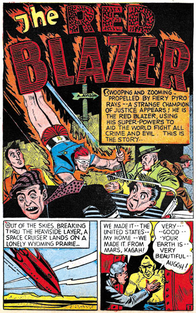
My conclusion is that the cover for Pocket #3 was done by Al Avison, perhaps with an assist by Joe Simon on the Black Cat figure. After S&K left Timely, Al would not work for them again. But their paths would cross at Harvey comics after the war. I am sure I will post on that sometime but until then, and in difference to Nick (who wanted to see more Avison) here is a splash page from Pocket Comics #1.

Pocket Comics #1

At this point we have examined all the Harvey pocket comics. The best is yet to come, however they will be different not only in size but also in style. So let’s recap the attributions so far.

Pocket 1 (August 1941) Joe Simon
Pocket 2 (September 1941) Joe Simon
Pocket 3 (November 1941) Al Avison
Pocket 4 (January 1942) Joe Simon

Speed 14 (September 1941) Al Avison (signed)
Speed 15 (November 1941) Al Avison
Speed 16 (January 1942) Al Avison

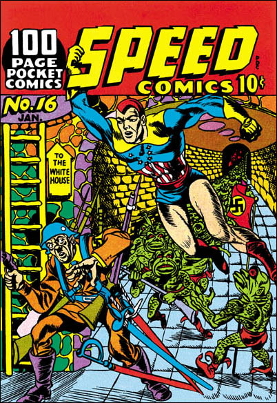
Speed Comics #16 (January 1942)

Speed Comics #16

Everybody makes mistakes, even experts. So when I say that when the Jack Kirby Checklist included Speed #16 it made a whooper, that does not diminish the value of that list. But all that needs to be done to dispel that misattribution is to compare the cover to one by Jack that came out in the same month (January 1942). There can be no question, Speed #16 was not done by Kirby.

Captain America #10

But I have a confession to make. I included Speed #16 in the books I once made of the complete Simon and Kirby covers. I did so because I thought it was possible that Joe Simon might have been the artist. Now I am not so sure. Comparing it with the covers for Speed #14 and Speed #15, I wonder if perhaps like them it was done by Al Avison. Particularly the goofy Speed #15 with its little red Nazis. Speed #16 has little green froglike Nazis and is also goofy, but in a different way. I do not believe that the humorous quality to Speed #15 was intentional. But in Speed #16 is clearly was. It is hard to believe that anyone would take seriously an attach by Hitler on the White House. But even if they did, it wouldn’t be this ridiculous Adolf carrying four rifles and three swords. This sort of visual humor would later be a Simon trademark in his comic magazine Sick. But if Avison was the artist, as far as I know he would never return to this particular type of humor.

One feature of this cover that should be noted is the long corridor in forced perspective. It is from the end of that tunnel that Hitler and his green army have come. We have not yet seen such a long hallway, but we will when I next get to Pocket Comics #3. And there are a variations of this theme in a later Harvey publications (Champ #19). But we have seen an alternative version, and perhaps source, on Speed #14. On that cover beyond an entranceway we see another room and a staircase. In the room a uniformed figure, presumably defeated by Shock Gibson, is rising from the ground. More similarly clothed figures are coming down the stairs. Not quite the same thing as here on Speed #16, but it might have been the jumping point.

Assuming that my attribution is right, Speed #16 would be the last cover by Al Avison for Harvey’s wartime comics. Frankly I find Al’s efforts on Speed #14 to #16 on the crude side. Their interest lies mainly as early examples of Avison’s work. These covers really do not stand out from what a host of other artists were doing at the time. Al’s first cover for Captain America would come out in the next month. What a difference! It is hard to believe how great the improvement was. In fact if Speed #14 had not been signed I doubt I would have believed it. I can only surmised that it was only after S&K were out of the picture, that Al felt comfortable enough to push himself. It is small wonder that Avison became the primary artist for Captain America until he went into the service.

Pocket Comics #4 (January 1942)

Pocket Comics #4

I want to skip for now Pocket Comics #3, and proceed to #4. This is my favorite of the Pocket Comic covers. It is a great design, particularly since the text has been relegated to smaller areas as compared to the other issues. The Spirit of ’76 is a good match for that on Pocket #1 or Pocket #2. I am sure this cover was also done by Joe Simon. A new feature is the Nazi falling after being hit. It is not the way Jack Kirby would have done it, but you can tell that was the source for Joe’s inspiration. No longer do we find oversized figures. But although the design still works, it really doesn’t make logical sense. How could the Spirit of ’76 have delivered his blow if the Nazi had been standing behind him? Or how could the Black Cat jump through the window in the middle of the room and still manage to grab the arm of the Nazi in the back of the room? But as far as I am concern comics art is not meant to try to capture an instance in time. It is meant to tell a story. Without a single line of text, this cover is complete comprehensible. All the distortions of time and space were all done to advance that aim. The logical flaws are in fact its strengths.

The original art for this cover still exists. The inking was just marvelous, but unfortunately much of its quality was lost when printing the small sized cover. So here is a scan from the art.

Pocket Comics #4

Pocket Comics #4 has a cover date of January 1942. This is the same month that the last Simon and Kirby Captain America came out. Coincidentally this was the last month that Harvey would publish pocket size comics. The next time Simon and Kirby work would reach the racks it would be dated April.