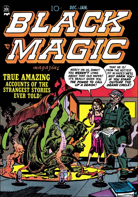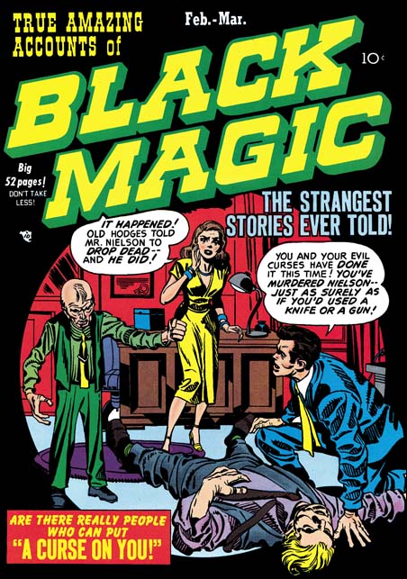
Black Magic #3 February 1950) by Jack Kirby
As I mentioned previously, Jack Kirby would often draw a cover based on a story done by another artist. This is not unexpected because Simon and Kirby produced comics. They came up with the plots, had writers provide the scripts, made alterations to the writing, farmed the work out to various artists to draw, made corrections to the art that was returned, and provided the publisher with a complete comic. All of that activity was paid for by S&K, they would then get a share in the profits. The only work that they did not finance was the coloring. But although the colorist was paid by the publisher, a photograph shows one working in the studio. Having all this control S&K were well aware what would be in a particular comic. Some of these artists were very talented but Jack would earned the title “the King” for a reason. S&K were well aware Jack’s importance to the sales. The cover was also vital for attracting the comic buyer so Jack would end up providing pretty much all the covers for S&K productions with the exception of photo covers. Sometimes Jack would draw a cover for a story that he also drew but often it was for a story based on another artist.
This is the case of the cover for Black Magic #3 (February 1950). The goal for a S&K cover seemed to be to provide a summation of an entire story in just one scene without of course giving the ending. Both Joe and Jack were just so good at that. Although BM #3 was obviously drawn by Jack, who can say exactly what Joe’s contribution was. However their collaboration worked, what was produced were cover masterpieces the likes of which were never seen again after their breakup. We may not know exactly how the man died on the cover to BM #3, but there is little doubt who was responsible. The sight of the frail little man shaking his fist over the body is just chilling. The other characters provide the information needed as well as the appropriate reactions. The scene is enclosed in a circular field. Well perhaps enclosed is not completely accurate because the characters and the rug interrupt the circle at various points. The use of this design technique dates back to one of Joe Simon’s first covers, Keen Detective #17 (January 1940). Black was often used as a background color for Black Magic and it is particularly effective when used with the circular field here in BM #3.
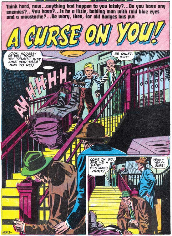
Black Magic #3 February 1950) “A Curse on You” by Mort Meskin (signed)
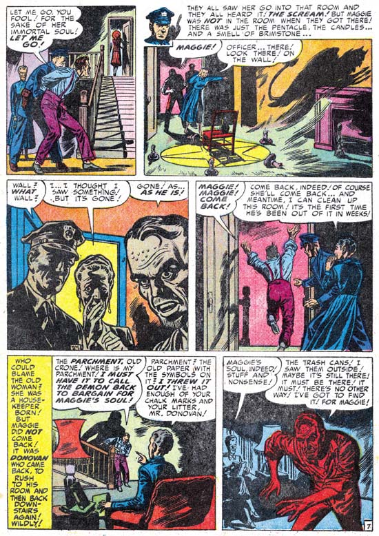
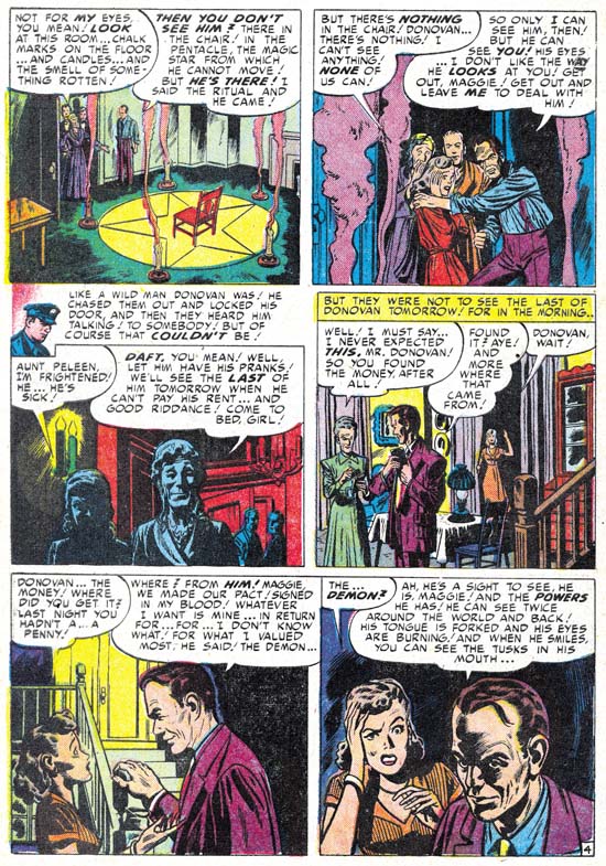
Mort Meskin seems the perfect artist for a story like this. Jack was great but action was he forte. Mort was able to develop a story very effectively and “A Curse on You” is no exception. This is the 50’s and S&K are not Bill Gaines so you know that in the end that little man from the cover will get his just desserts. Some have unfavorably compared Black Magic to the more extreme horror comics of the time. But the use of excessive violence or gruesome depictions were never an interest for Joe and Jack. The stories in Black Magic are very much the same as Simon and Kirby did for titles in other genre. It is hard to understand how someone can praise Simon and Kirby but condemn Black Magic.
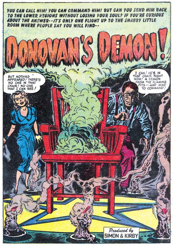
Usually the splash panel served a purpose similar to that of the cover, it tries to visually grab the reader’s interest for the story that follows. Mort’s splash panel is rather unusual in that it is also very much part of the story. Here we are provided with the details of how the cover’s victim met his demise. The cast of characters is not quite the same, Jack had replaced the boy with the woman who plays a different part in the story.
A number of people have made the claim that Jack provided layouts for even artists like Meskin. It is really hard to believe in this case. I am sure Kirby would never had shown a man falling down a staircase like this. He would have shown the man with the face in horror and the arms stretching to the reader as the figure almost flies through the air. Mort provides a more literal version of a man who trips and ends up helplessly heels over head. Kirby’s version would be more exciting visually but Mort’s sets up the story better. These sort of differences are also found throughout the story.


