The Jack Kirby Omnibus Volume 1

DC’s latest Kirby archive has been out for a couple weeks but I have only just recently received my copy from Amazon. I thought I would provide some comments about what I consider a very important book. Before I do that I first must avoid legal prosecution and say that I was involved with this book although in a marginal capacity. I am credited in the book for providing some restorations and scans. Technically that is correct but the only restoration I did was the cover of Real Fact #1 which I had already restored for personal use and was provided to DC with the raw scan for their use if they so desired. I did provide some scans but only for a handful of covers. So my involvement in the book is even less than some previously issued Simon and Kirby archives.

Much of this book has never been reprinted before, or at least in this country. There are a few pieces that Simon and Kirby did for Real Fact Comics upon their return from military service. Regrettably “Pirate Or Patriot?” was not included in this archive. This is surprising since the cover and another story from the same issue were reprinted. The largest part of the book is devoted to work that Jack Kirby did during his second period of working for DC from 1957 to 1959. Among this are reprints from titles like House of Secrets, House of Mystery and My Greatest Adventure. I usually refer to them as horror genre but of course this was done during the Comic Code period so perhaps mystery, fantasy or in some cases science fiction would be better descriptions. The only superhero genre included are some Green Arrow stories and there is also a single western story.

During his first period of working for DC with Joe Simon, Kirby had a lot freedom in plotting and rewriting scripts. Unfortunately during his return to DC that was not the case. Still Jack did manage at times to have some creative input into the writing most notably in the Green Arrow stories which were unlike any other superhero stories published by DC at that time.

Artistically the work Kirby did reprinted in this archive was just fantastic but that can be said about the art from any part of his long career. What really sets the work in this archive apart is the inking. Fans often argue about who was the best inker of Kirby’s pencils. Personally I feel they almost always get it wrong. There was no better inker of Kirby art than Jack Kirby himself. Kirby was a master of the brush and of course he knew better than anyone what he was trying to achieve in his pencils. During his partnership with Joe Simon Kirby would often ink his own work but usually in collaboration with other inkers. In later years Jack’s work was generally limited to pencils with the inking assigned to others. But during the late 50’s Kirby did a lot of his own inking either alone or with some help from his wife Rosalind. The inking of the higher profile Challengers of the Unknown art was normally done by other artists but the horror and Green Arrow art was largely inked by Kirby himself so this volume has a lot of Kirby inking Kirby. Kirby inked it in a style that is just beautiful. I love this inking style so much I once wrote a serial post ten chapters long on it (Jack Kirby’s Austere Inking) with a chapter devoted to the material now covered in this omnibus (Chapter 7, DC).


Example page from The Jack Kirby Omnibus Volume 1

Of course many fans do not need to be convinced of Jack Kirby’s talent. For them what is important is how well done is the reprint. There is a lot of disagreement on how restoration should be handled on material from older comic books. Reprinting from the original comics is fraught with difficulties with results that are almost guaranteed not to please everyone. I am happy to say that is not an issue that needs to be addressed here. Most of the line art in this volume was taken from the original film. You just cannot get better than that and it shows. The work had to be recolored but that was all done in a manner faithful to the original comics. It is hard to believe anyone will be dissatisfied with the results. The only negative comment that can be made about this volume is the size of the book which requires that the art be reduced somewhat in size. Of course had the original size been maintained the volume’s cost would have had to been higher.

To sum up; interesting stories, great Kirby art, Kirby inking Kirby, reproduced from the original film. As far as I am concerned this is a must have book.

Police Trap #5

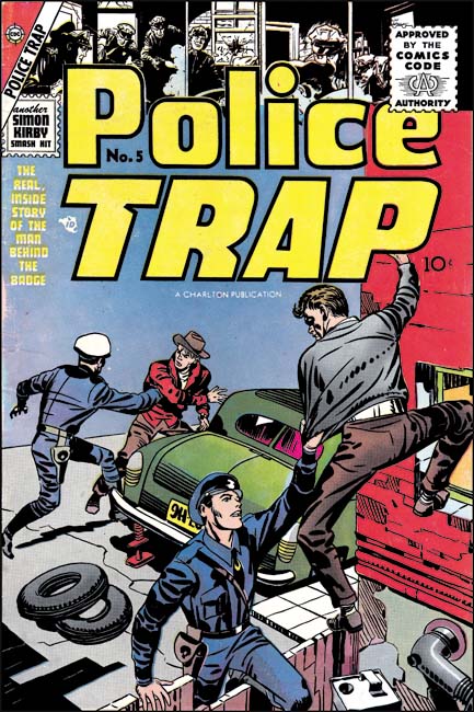
Police Trap and the other Mainline titles had been distributed by Leader News. During this period there was a renew public protest about the contents of comic books. The publisher that attracted the greatest amount of negative criticism was probably EC and some newsstands refused to accept their comics. Unfortunately Leader News also distributed EC and the boycott lead to their eventual failure. Without a distributor this meant the end of Simon and Kirby’s publishing company as well. But work had already begun on the art for the unpublished issues of the Mainline comics so Joe and Jack looked for a publisher willing to take on the titles. They made a deal Charlton and after an addition two month delay Police Trap #5 finally made it to the newsstands. This was the first issue of Police Traps to be submitted to the new Comic Code Authority although I doubt there was much of a problem with getting approval.


Police Trap #5 (July 1955), pencils and inks by Jack Kirby

Compared to previous issue, the cover was not all that great. I cannot think of a Simon and Kirby cover that I would describe as poor but obviously some were better than others and this one was one of their poorest. I suspect that with the failure of Mainline and the search for a new publisher, Simon and Kirby just did not give the cover art as much attention as they previously would have.


Police Trap #5 (July 1955) “The Gun”, pencils and inks by Bill Draut

Bill Draut had drawn stories for Police Trap #1 and #3 so his presence here comes as no surprise. Draut provides “The Gun” with his usual well crafted art. However coming after his really great work on “Tough Beat” (Police Trap #3) this story can seem to be a bit of a let down. Due to financial problems arising from the collapse of Mainline, Simon and Kirby were forced to close down their studio. It seems that Joe and Jack continued to work together for a time but limited or stopped employing other artists. “The Gun” was probably work already completed before Mainline’s sudden collapse. Simon and Kirby would use some further work by Draut in the coming months but not much. Draut would work for other publishers but with the collapse of the comic book industry it must have been a difficult time for him. I am sure he eventually looked back at his time with Simon and Kirby as the golden age of his career.


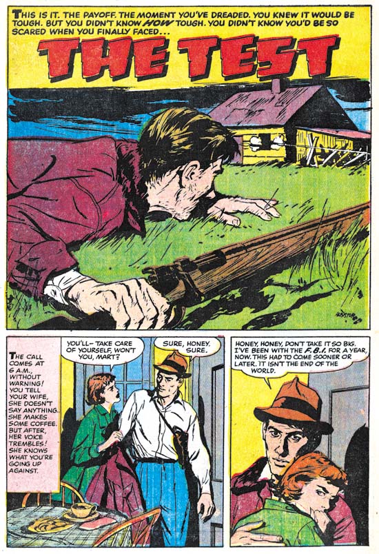
Police Trap #5 (July 1955) “The Test”, pencils and inks by Joaquin Albistur

“The Test” was another fine piece of work by Joaquin Albistur. Albistur only worked for Simon and Kirby for a limited period of time, a little over a year. Probably Joaquin also looked for work after the closing of the Simon and Kirby studio. I have seen some original art for a smaller publisher but I am not sure when it was done. Albistur may have found some work but it does not appear he found much. At some point he returned to his native country Argentina.


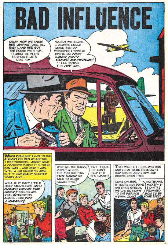
Police Trap #5 (July 1955) “Bad Influence”, art by an unidentified artist

I am not sure who the artist was that drew “Bad Influence”. I will not claim he was one of my favorite Simon and Kirby artists but he did a good job on this story.


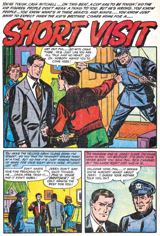
Police Trap #5 (July 1955) “Short Visit”, art by an unidentified artist

Another unidentified artist only in this case not nearly as talented as the one who did “Bad Influence”. Note the rather awkward pose of the policeman.


Police Trap #5 (July 1955) “Alibi?”, pencils by Jack Kirby, inks by Mort Meskin?

Up to now, Jack Kirby’s contribution to Police Trap was limited to the covers, one pinup (derived from an unused cover) and one splash panel. Was “Alibi” originally planned for issue #5 or was Jack filling in for working missing at the time of the collapse of Mainline? Who can say? But it is nice to see a Kirby working on a crime story again since the last one he did back in 1950. The tall vertical splash was rather unusual for Kirby and a reminder that Kirby was comfortable with any panel layout.

I am a little puzzled by the inking of this piece. Previously I have attributed the inking to Mort Meskin and there are parts that remind me of his work. Particularly the elderly woman in the second story panel. However there are other portions that do not look like Meskin’s brush for instance the sleeve of the older detective in the splash panel. During earlier periods I would explain this by the use of multiple artists sometimes used to ink Kirby’s art (describe by Joe Simon as an assembly line). With the bust up of the Simon and Kirby studio this now seems likely that only a single inker would be used (although either Simon or Kirby could be expected to do some touch up work). While I may hesitate to attribute the inking of this piece to Meskin, Mort was the inker for some other Kirby pencils that will be discussed when issue #6 is covered.

The Golden Age of Captain America, A Brief Return


Young Men #24 (December 1953) “Back from the Dead”, pencils by John Romita

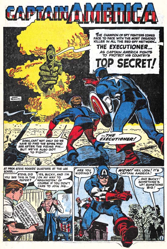
The popularity of superheroes declined after World War II to the extent that only a handful remained by the end of the 40’s. However true peace did not follow the defeat of the Axis powers, at least not for long. The Communist took control over China, the United States became involved in the Korean War, and domestic politicians claimed that Communists had infiltrated society and government. If superheroes were popular in the last war it was reasonable that they might once again sell comics now that the Cold War had begun. At least that was probably the logic behind the return of the big three; the Human Torch, Sub-Mariner and Captain America. All three heroes returned in separate stories in Young Men #24 (December 1953). “Back from the Dead” was drawn by a young John Romita. John Romita would end up drawing all the Captain America art for this revival with a single exception.


Young Men #25 (February 1954) “Top Secret”, pencils by John Romita

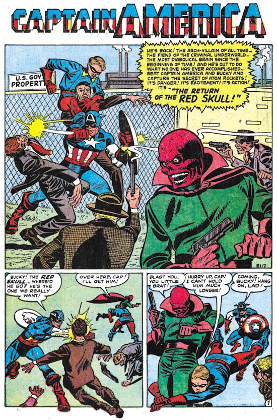
Romita’s art may seem crude compared to the work he did later in his productive life but his art was a cut above that which appeared toward the end of the first run of Captain America Comics. The art that Romita did for the relaunched Captain America is packed with energy. I am sure this was a labor of love. Simon and Kirby would release their own version of a patriotic hero called Fighting American but the timing is such that I doubt Romita saw it while he was still working on Captain America. Considering his age it is likely that Romita had not seen Simon and Kirby’s original take on Captain America either. But clearly Romita was familiar with the earlier run of Captain America. Romita often extended figures beyond the panel border a technique that can be traced back to Simon and Kirby but also used by subsequent Captain America artists Al Avison and Syd Shores. Romita also strove to give his figures a deep dimension another characteristic found in Kirby, Avison and Shores.


Young Men #27 (April 1954) “The Return of the Red Skull”, pencils by John Romita

The Red Skull returned as well, he clearly was too good a villain to let languish in hell. Of course after the defeat of the Axis powers he no longer served fascism. Nor was he a Communist. Rather he was a criminal quite willing to sell secrets to Communist powers.


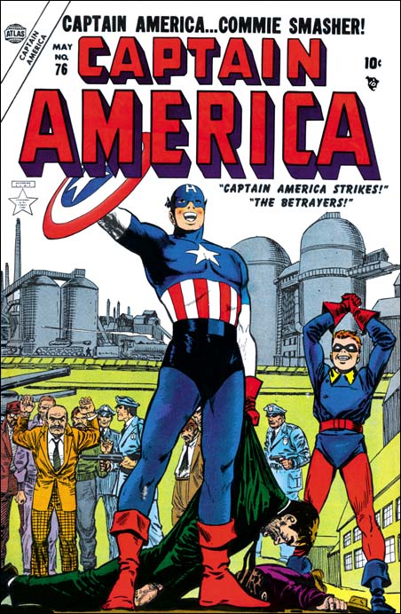
Captain America #76 (May 1954)<, art by unidentified artist

Months after their reappearance each of the big three heroes got their own titles. Normally I would interpret this as an indication of good sales but considering how short the entire run of the relaunched heroes was I rather suspect it was a pre-planned roll out.

The cover art for the first new issue of the Captain American was the only Cap art from this run not executed by John Romita. I cannot say who did it but it is quite possible more than one artist was involved. There seems to be a distinct stylistic difference between Captain America and Bucky compared to the rest of the figures. This might be considered intentional if it was just criminals that had the rougher look but the policemen received the same treatment.


Captain America #76 (May 1954) “Captain America Strikes”, pencils by John Romita

It maybe hard for the younger readers to understand how threatening Communism seemed in the 50’s. With Eastern Europe falling under Soviet domination after the war and the Red takeover of China, Communism seemed to many to be steadily expanding. Captain America appeared perfectly suited to be the hero to combat such an evil. That certainly was the approach often taken in the relaunched Captain America comics.

Note that Steve Rogers, Captain America’s alter ego, was depicted above as belonging to the Army. However in Young Men #24 (December 1953) he was presented as a teacher which was the position he had at the end of the last Captain America run. I am not sure if they ever explained the transition back to the military. I suspect they did not since continuity was not a large concern during the golden age.


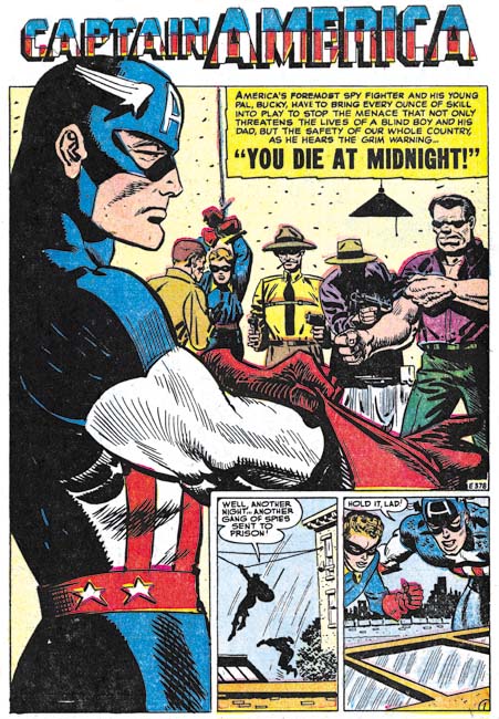
Captain America #77 (July 1954) “You Die at Midnight”, pencils by John Romita

Most of the Captain America splashes in Young Men or Men’s Adventure this period only used two thirds of the page but in Captain America Comics the full page was used although story panels were included in the corner. Romita made good use of the extra space. Again Romita’s art was not yet as good as that previously done by Avison or Shores but they still are rather nice splashes.


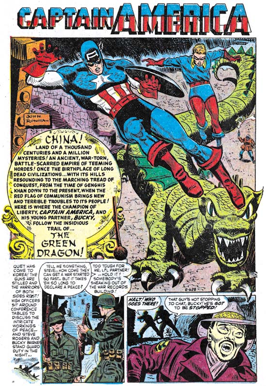
Captain America #78 (September 1954) “The Green Dragon”, pencils by John Romita

Probably the penciling and inking was separate jobs done assigned to different artists (most likely by Stan Lee). This was a very different arrangement from that found in Simon and Kirby productions. I do not know what inkers worked on Romita’s Captain America but I think they did a good job. At least the care taken for the inking seems to match the effort on the pencils.


Captain America #78 (September 1954) “His Touch is Death”, pencils by John Romita

In my last chapter about the previous run of Captain America I commented that while it now seems obvious that superheroes need super villains that logic was largely ignored during the golden age. This second run of Captain America repeated this error and only in the last issue is a super villain presented. Actually the quality of the stories themselves war inferior during this second run of Captain America.

The Golden Age of Captain America, Revamping a Failing Title


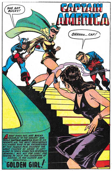
Captain America #66 (April 1948), “Golden Girl”, art by Syd Shores, 2299

Captain America had a shield to protect himself against flying bullets but poor Bucky did not. Despite this lack of protection Bucky managed to survive seven years with the single mishap of once been shot with an arrow by the Red Skull. Now Bucky’s luck has run out. Of course today he would have killed off but during the golden age of comics heroes did not come back from the dead so instead Bucky was just severely wounded. But back then, and it is still true today, death or injury were both a means of trying to boasts comic book sales. With Bucky out of commission, Captain America turned to Betsy Ross to become Golden Girl, his new partner. Syd Shores provides an impressive splash but the villainess seems to have fired not at Bucky but the Golden Girl instead.

The backup story still features Bucky. Prefixes have been dropped from the job numbers which seem to have continued from the series that previously used ‘SL’. The “Golden Girl” story has job number 2299 while “Swords of the Cavaliers” was number 1708. Thus this story appears to have been older material that would be used up while it still could be.


Captain America #67 (July 1948), “The Secret Behind the Mirror”, art by Syd Shores, 2189

“The Secret Behind the Mirror” was not the best Captain America art that Syd Shores provided but it would be the last (at least during the golden age). Shores removal from Captain America certainly was not a reflection on this artistic talent. Syd was one of the best artists to pencil Cap during the golden age exceeded only by Jack Kirby and Al Avison. Superheroes in general, and Captain America in particular, were in a decline and Shores was transferred to other more lucrative titles. Unfortunately the artists who were left to take his place were just not nearly as talented.


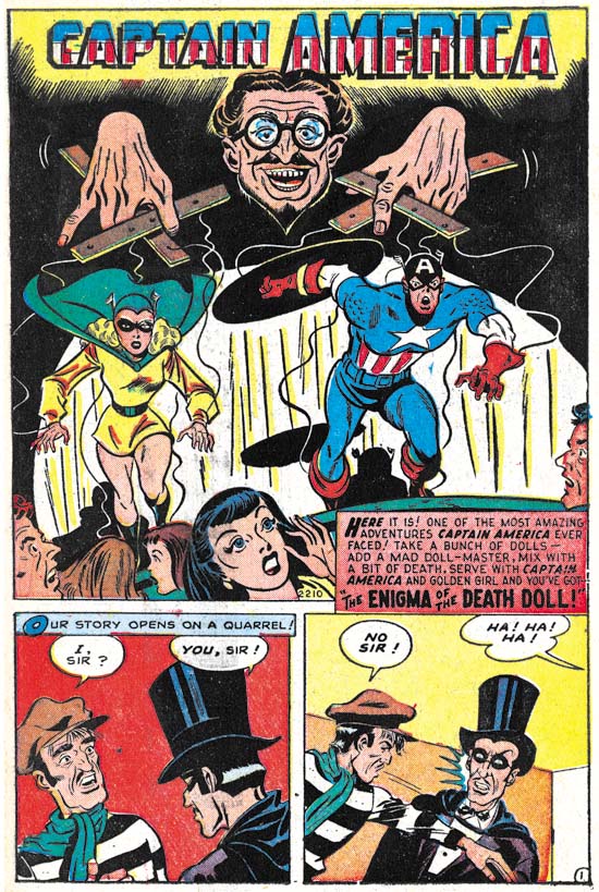
Captain America #68 (September 1948), “The Enigma of the Death Doll”, art by an unidentified artist, 2210

Not only had Syd Shores departed from the title but full page splashes disappeared as well. Thus ended a long series of really impressive comic book art. I am not contending that all the Captain America splashes were first rate pieces of art but a great number of them were. As the case with the period covered in the last chapter, none of the art was signed and for the most part I have really no idea what artists to credit the work to.


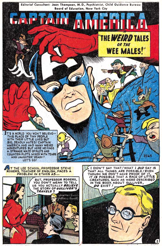
Captain America #69 (November 1948), “The Weird Tales of the Wee Males”, art by an unidentified artist, 3563

Golden Girl was introduced in the hope of increasing sales. But that was not the only attempt to improve the title’s popularity. After years of stories of Captain America versus spies and criminals the title began to include more fantastic stories. Actually such stories were not totally new for Captain America as Simon and Kirby had included stories with a distinct horror aspect. Captain America #10 was the last issue that Simon and Kirby had completed but that had already created a double page splash for issue #11 with Captain America amidst a host of very small people. Ironically years later “The Weird Tales of the Wee Males” returned to this same theme. Normally I would not consider the artist used for this story as a particularly good match for Captain America but he does such a marvelous job on the “Wee Males”. I am not claiming this feature is a masterpiece but it is full of fun and marks the beginning of some imaginative stories.


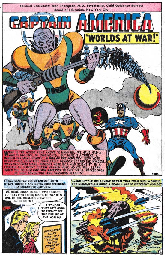
Captain America #70 (January 1949), “Worlds at War”, art by an unidentified artist, 3984

Captain America versus Martians. What kid could resist this? I know I can’t. Perhaps the unidentified artist may not have been the most masterful drawer of Captain America but this is another story saved by a imaginative writer. Not Pulitzer Prize material but much better than the by now stale run of common criminals.


Captain America #70 (January 1949), “The Man Who Knew Everything”, art by Peter Tomlinson?, 4248

Unfortunately “The Man Who Knew Everything” is not as interesting as “The Weird Tales of the Wee Males” or “Worlds at War” and normally I would pass it by without a mention. During this period Captain America was drawn by a number of artists that remain unidentified. It would be nice to rectify this situation even though some of the artists were less than stellar. Possible clues can come from unexpected sources. My copy of Captain America #70 has a note accompanying “The Man Who Knew Everything” story to the effect that it was drawn by Peter Tomlinson (or perhaps Tumlinson). By no means am I suggesting that such an attribution should be accepted on face value but I do believe it warrants further investigation. Unfortunately so far I have been unable to locate any information about an artist with that name.


Captain America #71 (March 1949), “Trapped by the Trickster”, art by an unidentified artist, 4615

Bucky’s last appearance in Captain America Comics occurred almost a year before “Trapped by the Trickster”. In an unusual example of continuity during the golden age of comics Bucky is released from the hospital and rejoins with Captain America for an adventure. There is no sign of the Golden Girl and the story ends without any indication as to whether Bucky might appear again. Surely this story was meant to see if there would be some sort of reader response. If that was the purpose apparently either there was little response or most favored the Golden Girl. Bucky would not reappear again during this run of the title.


Captain America #72 (May 1949), art by an unidentified artist

The splash panel for “Murder in the Mind” was nothing more than a very reduced size copy of the cover colored only in yellow. So I will use an image of the actual cover instead. This story is another where Captain America has a rather unorthodox adventure. This time through a special form of hypnosis Cap and the Golden Girl enter the mind of a criminal. Of course such a journey cannot be taken seriously but given that premise what follows is an interesting and inventive story.


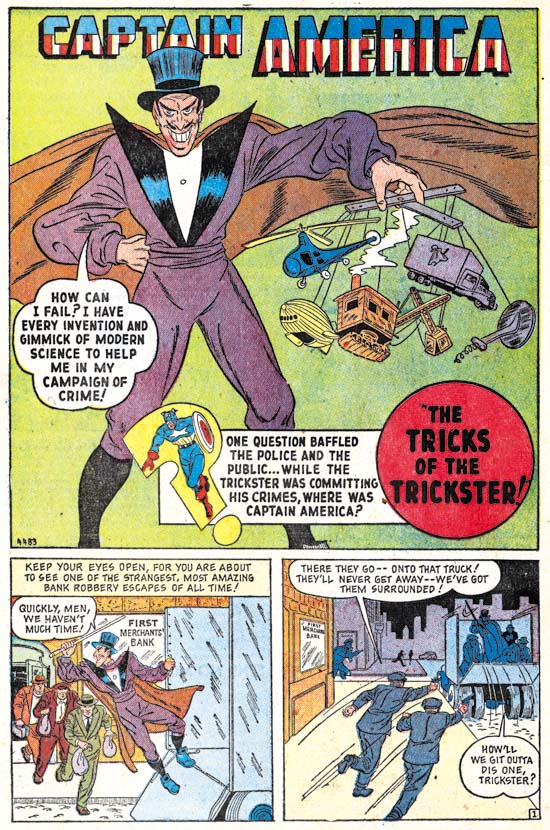
Captain America #72 (May 1949), “The Tricks of the Trickster”, art by an unidentified artist, 4483

The Trickster appear in the last issue yet here he is again. But with the exception of the Red Skull such repeat performances were unusual. This time Captain America was not accompanied by either Bucky or the Gold Girl.


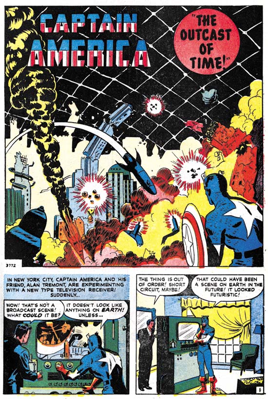
Captain America #73 (July 1949), “The Outcast of Time”, art by an unidentified artist, 3772

“The Outcast of Time” is another imaginative story where Captain America journeys through time. Oddly the GCD attributes this story to Gene Colan. It might bed hard to believe that such a crudely drawn story could have been done by such a master, however Colon would have been quite young at this time. Unfortunately I have not studied Gene Colon’s career and so will leave it to others to determine the accuracy of this surprising attribution.


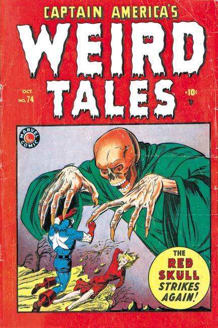
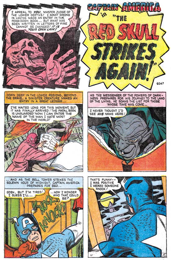
Captain America’s Weird Tales #74 (October 1949), art by Martin Nodell?, 6047

Once again I am going to deviate from my general practice in this serial post and include an image of a cover. As I have mentioned above there is little information available as to who did the art for Captain America during the period covered in this chapter so any evidence about possible artists should not be ignored. GCD has the following comment on this cover:

Updated cover credits from Tony Isabella from Gary Colabuono who was able to glean the information from Marty Nodell’s personal effects (August 6, 2006).

I have also noticed that Atlas Tales also questionably attributes this cover art to Martin Nodell and I will follow their example.

Note the title change from Captain America Comics to Captain America’s Weird Tales with the emphasis largely on the Weird Tales. The backup stories belonged to the horror genre and as mentioned above even the Captain America features were often not typical superhero material.


Captain America’s Weird Tales #74 (October 1949), “The Red Skull Strikes Again”, art by an unidentified artist, 6047

It seems fitting that the last Captain America story of the run would feature his old nemesis the Red Skull. Apparently in his last appearance the Red Skull really did die as this story shows him residing in hell. The Red Skull contrives to have Captain America brought down to hell for one last battle. Do I have to say who wins?

Unlike previous issues, Captain America #74 had only a single Cap feature. There was a Captain America’s Weird Tales #75 but it did not include any Captain America stories and so will not be covered here. After a run of nearly eight years Captain America would come to an end. While not every story was a masterpiece it was an interesting run well deserving of being reprinted. Unfortunately at the rate that Marvel is currently releasing the golden age archives of Captain America it will be many, many years before they reprint the entire series. (That is not criticism, it is to Marvel’s credit that they are reprinting so much golden age material.) Next week I hope to cover the attempt by Atlas to relaunch the title in the next decade.

A Review of Lettering by Howard Ferguson

Todd Klein provides a fascinating post of Simon and Kirby letterer Howard Ferguson. I do not always agree with him but it is great to read one letterer’s opinions about another. One word of caution, Todd includes a quote that claims Ferguson was an African American, not true. I even called Joe Simon to make sure.

Some More Joe Simon Interviews

I previously reported on an interview with Joe Simon and added that I thought there would be more coming out. Actually one appeared in Comic Book Resources a while ago but escaped my attention. A more recent one is in ABC News/Entertainment. With the recent release of the movie Captain America, the First Avenger it is not surprising that Joe is getting a bit of attention lately.

The Golden Age of Captain America, Crime Fighter

Unfortunately I do not have access to any of the Captain America Comics from immediately after the war ended. It would be interesting to see how Timely handled the transition to peace. Did they use up stories about Axis spies even after the war had ended? Or did they trash the outdated stories and create new ones? Or rework them to seem new? With the war over Captain America might seem a hero without suitable foes. Actually the post-war period was a difficult time for all superheroes, not just the patriotic ones. But Cap problems really began during the war. Captain America Comics became a bi-monthly with issue #42 (October 1944), a clear indication of diminished sales. Because Cap never was a true Super Soldier, the transition from spy smasher to crime fighter really was not that great.
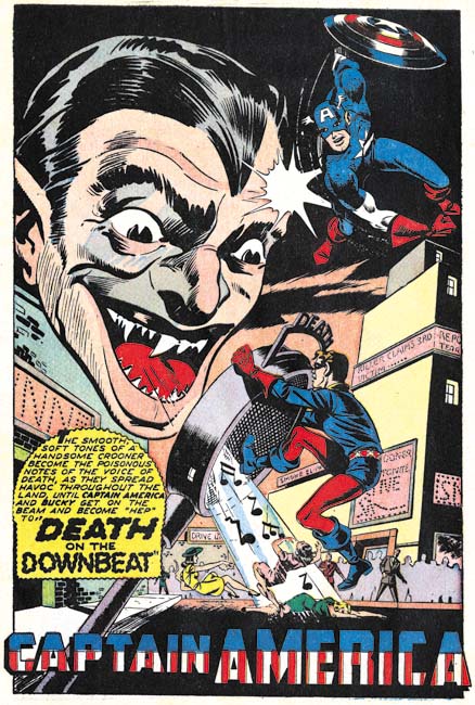

Captain America #57 (July 1946), “Death on the Downbeat”, pencils by an unidentified artist

Identification of the artists working on Captain America is a greater problem in this chapter compared to previous ones. There is not a single artist signature from Captain America #57 on. (Such a complete absence of signatures surely was a policy decision.) The way inking was handled seems to have changed. Previously the same inker would be used on a particular penciller. It appears that Al Avison was generally inked by Syd Shores and when Syd Shores became a penciller he was inked by Vince Alascia. While I have not been able to identify the other Cap pencillers they seemed to be finished by the same unidentified inkers. However after the war it seems that the inker used for a particular penciller could vary. Another problem is that the quality of the art had become more variable. None of the art produced after the war ended seems to have the attention to detail that previously was found.

The GCD lists Al Avison as the artist for “Death on the Downbeat”. There really is nothing by Avison that seems comparable. Certainly his earlier Captain America art was done in a very different style. But that may not be a sufficient criteria since some artists returned from the war with a changed style. Some art by Avison was appearing in some Harvey titles at this time so he was back working as a comic book artists. I have not seen Avison’s Harvey work from this same time but a story done a year later is in a very different style. Although without some uncertainty my opinion this was not done by Al Avison. The boots that Cap and Bucky wear lack flaring and so I am sure this was not done by Syd Shores either. Whoever the artist was he did a real nice job. Look at the great handling of Cap in an unusual perspective although it is always possible this was swiped.
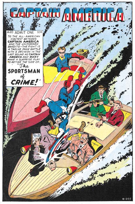

Captain America #58 (September 1946), “The Sportsman of Crime”, pencils by Dick Briefer?, D-205

GCD also lists Al Avison as the artist for “The Sportsman of Crime”. The thugs in the splash seem consistent with Avison’s style. However Cap’s figure is much more robust that I have seen Avison use. The rest of the story art is even further removed from Avison’s style. It does remind me of another artist’s work and here I am really going out on a limb but I think it may be Dick Briefer. Briefer was doing Frankenstein and an occasional Prize Comics Western piece for Prize Comics in a much more simpler and cartoon-like style so this attribution might seem a bit far fetch. However Dick used a more realistic style both earlier and later in his career. The Human Top story Briefer did for Red Raven Comics #1 (August 1940) is actually a fairly good match for “The Sportsman of Crime” despite the years that separate the two works. Unfortunately I have not seen anything by Briefer in a more realistic style from this period to compare with so I consider my attribution to Briefer as very tentative. Since this is a blog I prefer to voice my latest opinions even though there is a good chance that I may change my mind in the future.
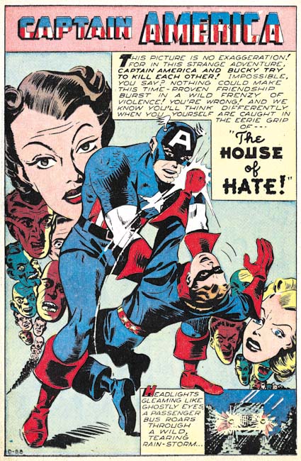

Captain America #58 (September 1946), “The House of Hate”, pencils by an unidentified artist, D-88

I have no idea who the artist might have been for “The House of Hate” and frankly he is not one of the better artists used in Captain America. But I use it here as a segue into a short discussion of job numbers. Job numbers were not used for Timely art during the war years but become prevalent afterwards. During the period covered in this chapter there is only a single story without a job number somewhere in the splash. There really is nothing that can be said with any certainty about the significance of the job numbers other than they obviously were used to help keep track of the work. Other than that we are left with deductions based on the occurrence of the job numbers themselves.

The best discussions of job numbers can be found in Tom Lammers’ “Tales of the Implosion”. Lammers has observed that there are three periods; at first job numbers had a prefix (D, R, SL and others), by 1948 the job numbers were without prefixes, and finally starting in 1952 prefixes returned. But there is a difference between the two prefix periods. During the final period prefixes seemed to be reintroduced as a method to simplify overlong job numbers. As the job number for a given prefix became too large a new letter (generally the next letter in the alphabet) was chosen and the numbering restarted. Thus generally there would be no long periods of concurrent use of two or more different prefixes.

In the earlier period prefixes were used concurrently. The prefixes found in the Captain America Comics covered in this chapter are ‘D’, ‘R’ and ‘SL’. Within each prefix series the numbers generally increase with time but not with any great consistence. For instance issue #58 has one Cap story with the job number D-88 and the other D-205. The numbers for prefixes ‘D’ and ‘R’ were lower and seemed to progress slower than those for ‘SL’. The ‘R’ job numbers appear only in the Human Torch stories that appeared in each issue of Captain America Comics and only one Human Torch story has a ‘SL’ prefix. With two exception the Captain America stories all have ‘D’ or ‘SL’ job numbers. One exception was one without any job number and another with a job number without a prefix. The prefix-less job number is in the same numerical range as some of the ‘SL’ job numbers so I suspect the ‘SL’ was just inadvertently left off.

So what does it all mean? Well it seems likely that ‘SL’ has some connection to Stan Lee. But what connection? My interpretation is that the prefix has some editorial connotation. ‘SL’ job numbers were used for stories that Stan Lee was the editor while the ‘D’ and ‘R’ were for stories handled by another editor. Now that interpretation is nothing more than a working hypothesis but if it is true may help in winnowing out the stories that could have been written by Stan Lee. Not that an ‘SL’ job number means that Lee wrote the story but rather any story with a ‘D’ or ‘R’ prefix number would probably not have been written by Stan.
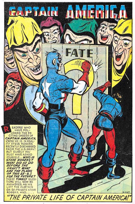

Captain America #59 (November 1946), “The Private Life of Captain America”, pencils by Dick Briefer?, D-227

Captain America #59 marked a special occasion as it formally brought Captain America into the post-war period. Previously Cap’s alter ego, Steve Rogers, was a private in the army. With the war over he now became a teacher and Bucky became his ward and pupil. With his spy-smashing days behind him (or at least for now) Roger’s life as a civilian simplified his new crime fighting career.

Issue #59 also provided the first editorial credits that have appeared in Captain America Comics for some time. Stan Lee was the Editorial and Art Director, Syd Shores the Art Associate and Al Sulman the Editor. I do not know if this marked the first Cap issue since Stan Lee returned from the military but it is suggestive that previous Captain America issues lacked ‘SL’ job numbers.
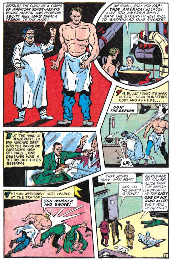

Captain America #59 (November 1946), “The Private Life of Captain America” page 3, pencils by Dick Briefer?

“The Private Life of Captain America” also includes a retelling of Captain America’s origin story. I believe this is the first time Cap’s origin has been told since his creation in March 1941. The story follows the original one close enough that I suspect the artist and writers were using a copy of Captain America Comics #1 as a reference.
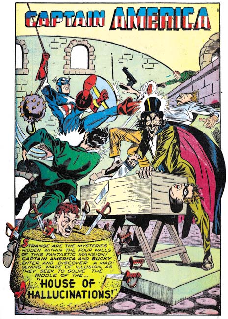

Captain America #59 (November 1946), “House of Hallucinations”, pencils by Syd Shore, SL-663

“House of Hallucinations” matches Syd Shore’s style so well that a signature really is not required to provide him credit. With all the fine inking I wonder if Shores was inking himself as well. It is a great splash with lots of action going on.
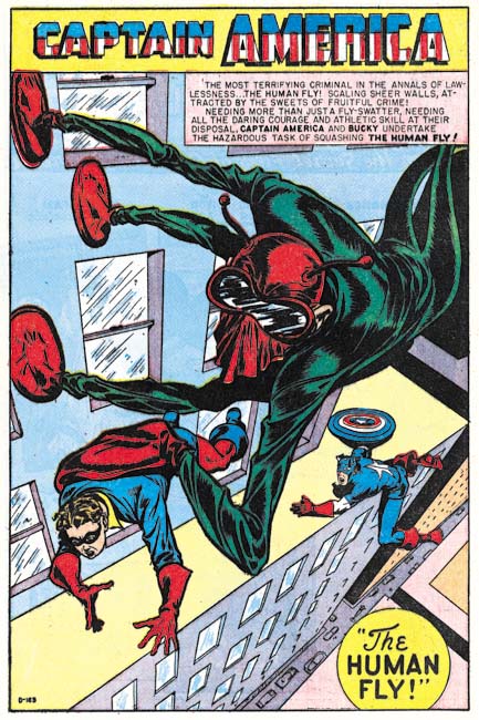

Captain America #60 (January 1947), “The Human Fly”, pencils by Syd Shores?, D-163

It seems so obvious today that if you are going to have a superhero you should also have super-villains for him to combat. But this simple concept was not followed very often during the golden age. Most of Captain America’s foes were nothing more than spies or criminals. Some might put on a costume but otherwise they were just normal people. The Human Fly of this story is an example of a proper super-villain. Not only does he have a costume and a secret identity but he has special gear that allows him to walk up walls (he was not bitten by a radioactive fly).

I like this splash but there are lots of problems with the perspective. The Human Fly’s foot and hand gear does not sit properly on the building’s side, the perspective of the upper part of the building is at odds with the lower part, and Captain America is precariously placed on the ledge (although that might have been intentional). But the odd perspective used in portraying the Human Fly and Bucky seemed handled rather well. This is all not surprising if my attribution of this piece to Syd Shores is correct. Shores did a better job handling perspective than most golden age artists but he still had problems with it.
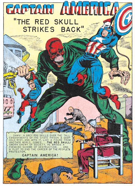

Captain America #61 (March 1947), “The Red Skull Strikes Back”, pencils by Syd Shores?, D-243

The Red Skull was Captain America’s arch nemesis during the period he battled Axis spies and saboteurs. The reader may be forgiven for thinking that the Red Skull would have been dropped now that the war was over. But of course he was much too impressive a villain to retire. No explanation was given on why he was back and had become just another criminal mastermind. Captain America in the splash is a mirror image swipe from the cover to Captain America #7 (see Genesis of a Cover, Captain America #105). Not a close or mechanical copy but a swipe nonetheless. Such swiping is unusual in either Captain America Comics or art by Syd Shores.
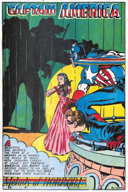

Captain America #62 (May 1947), “Melody of Horror”, pencils by Syd Shores, SL-1394

I do not believe all the Captain America art from this period was done by Syd Shores but it does seem that all the interesting art was. The splash for “Melody of Horror” is simply a great compositions. Only the villain shadow is shown which make him all the more mysterious and threatening. The unusual posses of Cap and Bucky are handled very well. The lady violinist, the center of all the attentions, seems sufficiently endangered. What more can you ask from a splash?
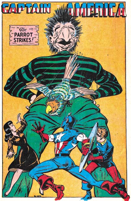

Captain America #63 (July 1947), “The Parrot Strikes”, pencils by Syd Shores, SL-1406

Is it just me or are some of the villains just lame. I mean how dangerous could a bad guy called the Parrot be? How threatening could a big nose be? This splash reflects Shores often penchant for symmetrical and triangular compositions. The one saving grace is the very dynamic pose that Shores has given Captain America.
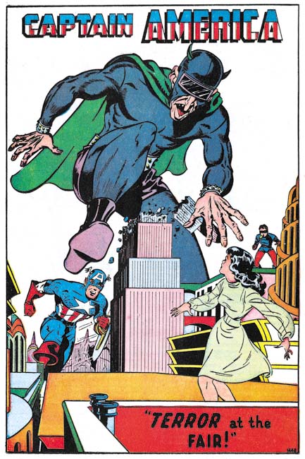

Captain America #64 (October 1947), “Terror at the Fair”, pencils by Syd Shores, 1445

Another triangular and somewhat symmetrical compositions. But in this case the villains’ dramatic stomp saves the day. It helps that the villain wears a costume. He may not have had true super-powers but at least he was no ordinary criminal.
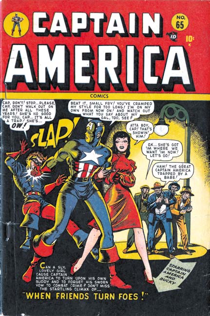

Captain America #65 (January 1948), pencils by Syd Shores

For these posts I have concentrated on the stories and not the cover art. During the war many of the covers were done by Alex Schomberg. Schomberg was a great artist but his covers generally had nothing to do with the comic book’s contents. But the cover for Captain America #65 actually does a better job of indicating the theme of story “When Friends Turn Foes” than the splash does. Horrors, a woman has come between Captain America and Bucky. Say it ain’t so! Well of course it ain’t so. But it appears that Timely was thinking about Captain America and his partnership with Bucky which would lead to dramatic changes that began in the next issue. It is also a good place to end this post but next week I hope to discuss what I believe are some of the most interesting Captain America comics since Simon and Kirby left Timely.
The Golden Age of Captain America, Syd Shore and the War Years


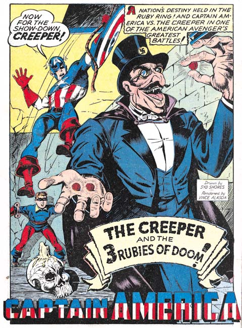
Captain America #21 (December 1942), “The Creeper and the 3 Rubies of Doom”, pencils by Syd Shores, inks by Vince Alascia (signed)

As mentioned in my previous post Captain America #19 was the last issue that Al Avison appeared in before going off to perform military service. Syd Shores assumed Avison’s position as Associate Editor while Stan Lee remained, for a time, Managing and Art Editor. While I admit to being critical of Shores as an inker his pencils are rather nice although not quite as good as Avison. There seems to be quite a bit of problems in the GCD concerning work attributed or misattributed to the two artists. I am not expert in identifying Timely artists but one feature that can often be used to identify Shore’s Captain America and Bucky are the exaggerated flaring that he provides to the folded portions of the boots. Syd’s handling of fore and background figures make interesting compositions. Shore also used extreme perspectives although not without some problems.

Now that Shores has become the primary Captain America artist his inking chores were handed off to others. Most, if not all, inking of Syd’s pencils was done by Vince Alascia. I do not believe that Alascia was part of the original Simon and Kirby shop. Since at the time most comic book artists were young most of them ended up in the military. Timely was very lucky to get someone of Alascia’s obvious talent. While Alascia used fine lines in his inking he never seemed to get obsessed with detailed inking like Shores did. In my opinion Alascia was a much finer inker than Shores.


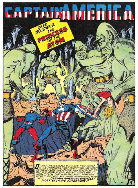
Captain America #25 (April 1943), “The Princess of the Atom”, pencils by Syd Shores

Captain America stories could be quite lengthy with 20 page stories not being at all unusual. However “The Princess of the Atom” is quite exceptional in being a two part story; the only one I am aware of from Captain America Comics. With a combined length of 46 pages it is effectively a comic book novella. It is an imaginative and captivating story and could have replaced “Red Skull’s Deadly Revenge” as my favorite post S&K Captain America story if not for the fact that I have never been able to read the second part. Atlas Tales lists Ray Cummings as the writer of this story. Apparently it is a recycle of his novel “The Girl in the Golden Atom”. This is welcome information as so few golden age comic stories can be attributed to a specific writer.


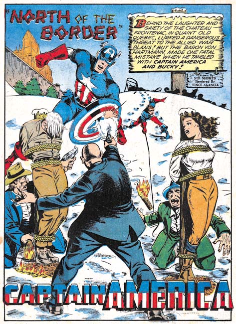
Captain America #27 (June 1943), “North of the Border”, pencils by Syd Shores, inks by Vince Alascia (signed)

Another example of Syd Shores inked by Vince Alascia. A classical triangular composition with Cap at the apex. However the triangle is offset from the center to allow the placement of the caption which is rendered as a wooden sign.

I do not have access to all the Captain America issues, but #22 lists Stan Lee as the Editorial and Art Director and Syd Shores as Associate, #25 provides no credits and #27 lists Vince Fago as the Managing Editor with Syd Shores continuing as the Associate Editor. Stan Lee had started his military service. Normally an artists entering the military would be considered a period where his contributions to comics would end. Simon and Kirby created a backup of material for DC but I am unaware of any other artist doing that. I could swear that I have seen a story with PFC Stan Lee credits (Private First Class) however I have been unable to relocate the source of that information.
 

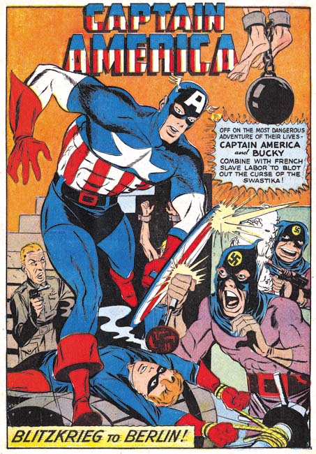
Captain America #27 (June 1943), “Blitzkrieg to Berlin”, pencils by unidentified artist

When Al Avison was the primary artist he seemed to draw most if not all the Captain America stories. But that does not seem to have been the case when Syd Shores became lead artist. Other artists sometimes did the backup Captain America stories and it seems they did so more often in later years. “Blitzkrieg to Berlin” is an example of one artist who appeared to have done a number of Cap stories. Note the very different figure proportions, the simpler faces and the much larger rendering of Captain America as compared to Syd Shores. Other than Shores most of the Cap artists did not sign their work so it is not clear who did this art.

“Blitzkrieg to Berlin” is one the few stories from the period covered in this chapter that I have seen where Captain America actually goes to war although in this case he joins up with some French resistance fighters. A Timely Bonus provides another example at Cap fighting in the war. As before Captain America was much busier combating spies than playing the part of a super soldier.


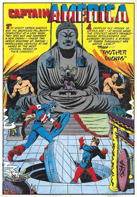
Captain America #33 (December 1943), “Mother Wong”, pencils by Syd Shores

While unsigned “Mother Wong” appears to be the work of Syd Shores and Vince Alascia. I do love these Captain America splashes. With the exception of a few double page spreads the splashes are invariably take up a full page. These generous splashes were put to great use by the creative talents of Avison and Shores. Even some of the backup artists could be quite impressive.


Captain America #34 (January 1944), “The Cult of the Assassins”, pencils by Syd Shores, inks by Vince Alascia, script by Zac Gabel (signed)

Writer credits, other than for Stan Lee, are so rarely provided that a special note is warranted for the credit to Zac Gabel provide in the splash of “The Cult of the Assassins”. Unfortunately very little is known about Gabel. All I have been able to find so far is that Who’s Who lists him as doing work for Holyoke as well (Blue Beetle, Green Mask and the Grey Mask). One wonders if he is the same Zac Gable who wrote the play “Horse Fever” (November 23 to December 14, 1940)?


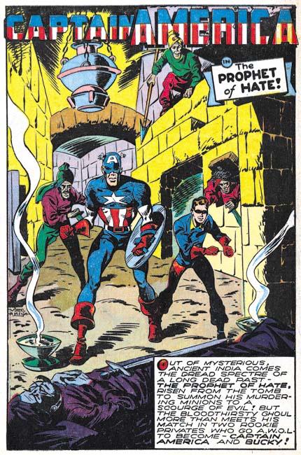
Captain America #44 (January 1945), “The Prophet of Hate”, pencils by Vince Alascia (signed)

Vince Alascia inked most, if not all, of Syd Shore’s art but he was a penciller as well. Vince was not as talented draftsman as Syd but his work still was interesting. Note the background figures threatening Captain America and Bucky. This sort of motif was often used by Simon and Kirby. Since this was a device not used by Avison or Shores it seems reasonable to assume that Alascia had seen and admired Joe and Jack’s work. The inking is done by a blunt brush very different from the inking that Alascia used on Shore’s pencils. Was it inked by someone else or did Alascia adopt a finer inking style to satisfy Shore?


Captain America #47 (June 1945), “The Monster of the Morgue”, pencils by Vince Alascia

“The Monster of the Morgue” is unsigned but the style looks the same as that Vince Alascia used for “The Prophet of Hate” so I attribute this work to him as well. This splash also has a figure with a weapon in the background a motif often used by Simon and Kirby.

I do not have access to many Captain America Comics from this period and it will be probably be years before Marvel’s golden age archives reaches up to the end of the war. Nonetheless next week I hope to discuss Captain America from the period just following the war.

Joe Simon Sees Captain America

I had the privilege last night of accompanying Joe Simon to a private screening of the soon to be released “Captain America, the First Avenger”. Joe had previously been invited to tour of the London filming set and to the Los Angeles premier but declined because the traveling would have been to difficult at his advance age. However his grand-children did go to Los Angeles for the movie’s premier although I have not heard yet how that went. Since he could not travel it was really nice that they arranged for Joe to attend this private screening. A good time was had by all. Joe has poor hearing so I was not surprised to hear him remark that he could not hear much of what went on “but that was okay because there was plenty of action”.

I will not review the movie since I am too much a Captain America fan to provide an unbiased assessment. I will say that not surprisingly the movie deviates from the comics as did the previous Hulk, Iron Man and Thor movies. However I really impressed by the numerous references to the comics. The writers clearly knew their comics and were not just ignoring them. Stan Lee does make a cameo appearance as he does in so many of the Marvel movies. The end credits included “based on the Marvel Comics by Joe Simon and Jack Kirby”. A special thanks section also listed Joe, Jack, Stan and three others.

With all the attention that the movie is getting, Joe has been giving some interviews. The A.V. Club has one interview but I believe there will be more.

The above image is a limited edition poster that was provide to participants of the making of the movie. But they were also kind enough to send Joe a copy as well. Captain America punching out Adolph Hitler. Where does Hollywood come up with such great ideas?

Negro Romance Comic on NPR’s History Detective

PBS has a weekly show where the show’s detectives try to uncover the history behind various artifacts. Last week they were presented with a coverless copy of Negro Romance Comics. I had known about the existence of this comic but because comics specifically aimed at African-Americans were so rare and are now so sought after, I have never actually seen a copy. Not that it ever occurred to me that there would be any connection between Negro Romance Comics and my main focus, Simon and Kirby. However it turns out that the art for Negro Romance Comics was done by Alvin C. Hollingsworth. Now the reader can be forgiven if that name does not ring any bells because while he did work for Simon and Kirby it appears he only provided art for four stories. Despite this limited amount of work, Joe Simon still remembers Hollingsworth; probably because there were so few African-American comic book artists then. You can see examples of his work in It’s A Crime, Forgotten Artists and The Captain Aero Connections. The History Detective episode can be viewed on PBS’s web site but be sure to scroll down to the bottom where scans of one of the stories from Negro Romance Comics is presented.