Blue Bolt #2
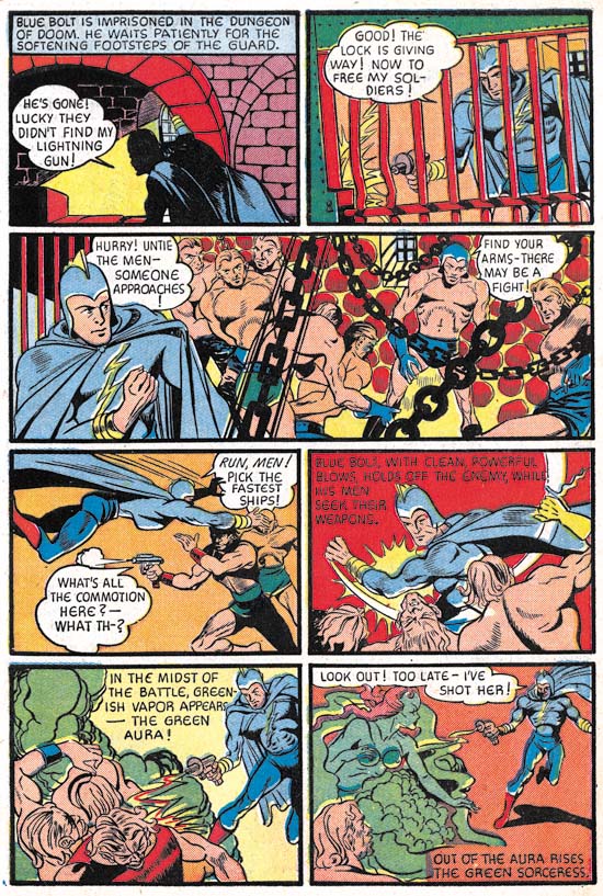
Blue Bolt #2 (July 1940) page 9, pencils and inks by Joe Simon
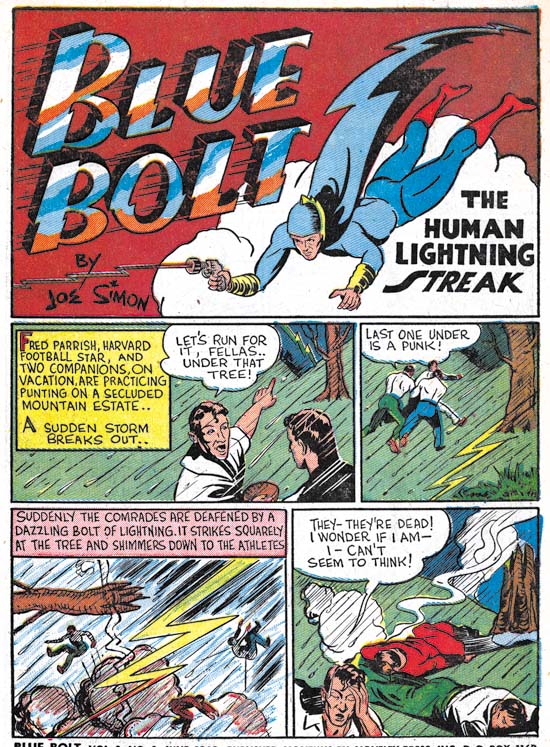
The story art for Blue Bolt #2 looks rather different from that from its predecessor. One reason for this is that (as mentioned in the previous chapter) the first issue was created earlier then the cover date would suggest. While Blue Bolt was drawn earlier it really was not that much earlier, probably just a matter of a few months. The difference between Simon’s art for the two stories show how rapidly he was adapting to working on comic books. The figure art has improved as well as what can be best described as his ability to graphically tell a story. There also appears to be a greater use of design. For example the interesting architecture in the first panel. Even better examples can be found in the long third panel. The wall is built with round stones giving an overall pattern to the background. Frankly this was not so successful as it gives the image a rather cluttered look. More effective are the chains which besides reflect on the imprisonment of Blue Bolt’s men add interest to the panel without disturbing what is important to the story. The chains are inked as silhouettes which removes them of the third dimension but emphasizes their function as a design element.
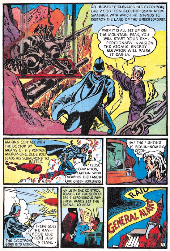
Blue Bolt #2 (July 1940) page 4, pencils and inks by Jack Kirby
The other reason that the art for Blue Bolt #2 looks so different from that in #1 is that some of it was created by Jack Kirby although only Joe Simon was given credit in the splash. In the future Kirby would be the primary penciller of Simon and Kirby productions but that was not the case here. Simon created 6 1/3 of the pages while Kirby only did 3 2/3 pages. Fractions are used in these counts because on the first page Joe did the splash while Jack did the story art. The precise tally is that Simon did pages 1 (splash only), 3 and 6 through 10 while Kirby did pages 1 (story only), 2, 4 and 5. Each artist inked his own pencils.
Note that Kirby introduces a foreground chain in the first splash-like panel but to very different effect. Here the chain is not so much a design element as a means of adding depth to the image. The chain is also carefully inked to provide it with a full dimensionality that is very different from the flat silhouettes that Simon used.
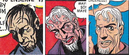
Blue Bolt #1, art by Joe Simon
Blue Bolt #2, page 10, panel 7, art by Joe Simon
Blue Bolt #2, page 1, panel 2, art by Jack Kirby
It is interesting to compare Simon’s artistic progress from Blue Bolt #1 to #2 as well as Kirby’s efforts from issue #2. I have chosen close-up of Dr. Bertoff to provide these comparisons. In BB #1 and much of BB #2 Simon portrays Dr. Bertoff as a rather “ratty” looking individual. A surprising unflattering depiction of a scientific genius. However Dr. Bertoff gets better treatment in some of Simon’s BB #2 art. Now part of this improvement can be credited to Joe’s rapid advancements as a comic book artist. However comparing Simon’s best depiction of Dr. Bertoff with that by Kirby suggests that Joe was also being influenced by Jack. Kirby was never very good at adopting other comic book artists styles but that was something that Simon was very adept at. During this time Joe was doing the cover art for the Fox Comics successfully mimicking Lou Fine. Now Joe was trying to copy Jack’s style. This was desirable because it would give stories produced by Simon and Kirby a unified look. At this early time Simon only achieved limited success at mimicking Kirby but he would greatly improve in the future.
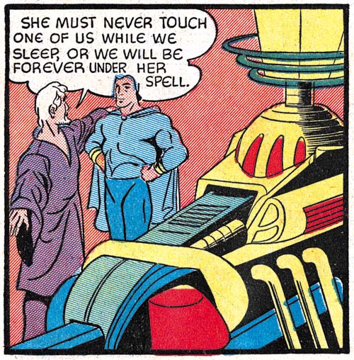
Blue Bolt #2 (July 1940) page 3 panel 5, pencils and inks by Joe Simon
Kirby drew impressive machinery throughout his career. This can be seen even at this early stage in his career as for example the “electro-beam atom smasher” from the splash-like first panel of page 4 shown earlier. Jack did similarly impressive devices on every page of this Blue Bolt story that he drew. Machinery appeared on some of the pages that Simon did but generally more distant views less rich in details. Even in the few close-ups that Joe provided (such as the example from page 5 provided above) his versions were no match for Kirby’s more interesting depictions. It is not clear whether Kirby was given those pages to draw because they would contain such machinery or that Jack inserted such fantastic devices whenever he could.
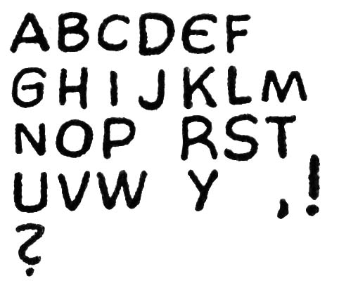
Blue Bolt #2 (July 1940) story letters by unidentified letterer
From past work that Joe Simon and Jack Kirby did it might be expected that either they would letter the pages that they drew or the lettering would be done by one of them. But neither of these likely possibilities was the case. Both Joe and Jack had very distinctive lettering styles (see Early Lettering by Joe Simon and Jack Kirby as a Letterer). But nowhere in Blue Bolt #2 can be found the unique lettering such as Joe’s ‘W’ or Jack’s ‘U’. Instead the story has one rather remarkable ‘E’, shaped like a ‘C’ with a bisected with a short horizontal stroke. I have never seen either Joe or Jack use anything quite like it. Joe’s lettering would improve in years to come and some of his more eccentric traits would become more conservative. In particular his peculiar ‘W’ would become more standardized. So while it is possible that Joe might have temporarily stopped using his more unusual ‘W’ and adopted an equally unique ‘E’ the rest of the lettering still do not look like Simon’s. The BB #2 letters seem rather squat and blocking compared to Joe’s. The ‘R’ often exhibit a curved right leg however when Joe curved that same leg it he curved it in the opposite direction. As for Kirby not only does the Blue Bolt #2 lack Jack’s horseshoe shaped ‘U’ but the manner of writing ‘K’ is also different between the two. My conclusion is that just like Simon brought Jack in to help with the art, he brought in someone else to do the lettering.
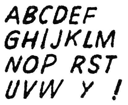
Blue Bolt #2 (July 1940) splash letters by unidentified letterer
The lettering in the splash looks different from the story lettering. Of course much of this is due to the fact that the splash lettering is slanted while in the story the letters are all very vertical. But the splash lettering also looks less squat and uses a more standard form for the ‘E’ and ‘R’ letters. There is one exception found on the last panel on page 8 where the tilted splash lettering is used for a single word. The switch in lettering could have been done to put more emphasis on the word (nowhere in the story does the letterer use the common technique of employing bold lettering to provide emphasis). But it is also possible that the tilted lettering was added later to correct some problem with the original script or lettering. Without the original art it is hard to be sure. My suspicion is that all the lettering, including the splash, was done by one individual. The main piece of evidence to support this is the form of the letter ‘G’ common to both where there is a straight vertical or near vertical segment attached to the horizontal stroke.
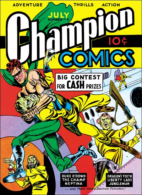
Champion Comics #9 (July 1940) art by Joe Simon and Jack Kirby
Champion Comics #9 came out the same month as Blue Bolt #2. It featured cover art that should be credited to Joe Simon and Jack Kirby. As I mentioned in the previous chapter of this serial post (Blue Bolt #1) I suspect that the Champion #8 (June 1940) cover was the first joint work by Simon and Kirby but I admit not everyone may favor that opinion. Most agree that Champion #9 was a Simon and Kirby production. It appears that Kirby was involved in at least some, if not most, of the penciling. Some have pointed out the way the sole of the runner’s foot is turned to the viewer and have credited this as a Kirby trait. However both Joe and Jack would use this device in the future. As far as I know this is the earliest occurrence of the peculiar technique and therefore it cannot be used to distinguish between the two artists. For it to be used an earlier example would have to be found used by one but not the other artist and to date I have not seen one. While the figure art has a Kirby appearance it is not completely typical of Kirby. I attribute that to Simon’s involvement in the art. The form lines on the runner’s boots look like the work of Simon but much of the rest of the inking does not look like either Joe’s or Jack’s work. So I suspect a third artist may have been involved in the inking.


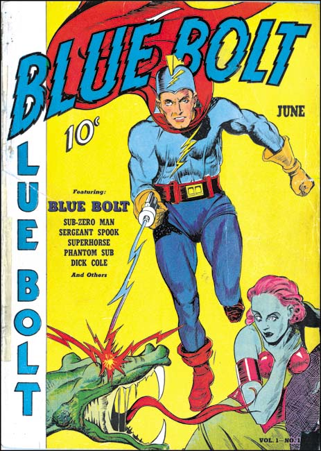
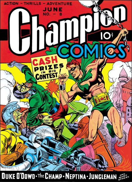 Champion Comics #8 (June 1940) art by Joe Simon and Jack Kirby?